© white rose maths 2019© whiterose maths 2019 · drawing line graphs is a year 5 science...
TRANSCRIPT

© White Rose Maths 2019© White Rose Maths 2019
© White Rose Maths 2019
In this document, you will find suggestions of how you
may structure a progression in learning for a mixed-age
class.
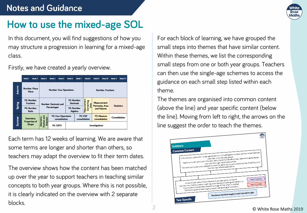
Firstly, we have created a yearly overview.
Each term has 12 weeks of learning. We are aware that
some terms are longer and shorter than others, so
teachers may adapt the overview to fit their term dates.
The overview shows how the content has been matched
up over the year to support teachers in teaching similar
concepts to both year groups. Where this is not possible,
it is clearly indicated on the overview with 2 separate
blocks.
For each block of learning, we have grouped the
small steps into themes that have similar content.
Within these themes, we list the corresponding
small steps from one or both year groups. Teachers
can then use the single-age schemes to access the
guidance on each small step listed within each
theme.
The themes are organised into common content
(above the line) and year specific content (below
the line). Moving from left to right, the arrows on the
line suggest the order to teach the themes.
2

© White Rose Maths 2019
Here is an example of one of the themes from the Year
1/2 mixed-age guidance.
In order to create a more coherent journey for mixed-age
classes, we have re-ordered some of the single-age
steps and combined some blocks of learning e.g. Money
is covered within Addition and Subtraction.
The bullet points are the names of the small steps from
the single-age SOL. We have referenced where the steps
are from at the top of each theme e.g. Aut B2 means
Autumn term, Block 2. Teachers will need to access both
of the single-age SOLs from our website together with
this mixed-age guidance in order to plan their learning.
Points to consider
• Use the mixed-age schemes to see where
similar skills from both year groups can be
taught together. Learning can then be
differentiated through the questions on the
single-age small steps so both year groups are
focusing on their year group content.
• When there is year group specific content,
consider teaching in split inputs to classes. This
will depend on support in class and may need to
be done through focus groups .
• On each of the block overview pages, we have
described the key learning in each block and
have given suggestions as to how the themes
could be approached for each year group.
• We are fully aware that every class is different
and the logistics of mixed-age classes can be
tricky. We hope that our mixed-age SOL can
help teachers to start to draw learning together.
3
Year 1 (Aut B2, Spr B1) • How many left? (1)• How many left? (2) • Counting back• Subtraction - not crossing 10 • Subtraction - crossing 10 (1)• Subtraction - crossing 10 (2)
Year 2 (Aut B2, B3)• Subtract 1-digit from 2-digits • Subtract with 2-digits (1)• Subtract with 2-digits (2)• Find change - money

© White Rose Maths 20194

© White Rose Maths 20195
In this section, content from single-age blocks are matched together to show teachers where there are clear links across the year groups.
Teachers may decide to teach the lower year’s content to the whole class before moving the higher year on to their age-related expectations.
The lower year group is not expected to cover the higher year group’s content as they should focus on their own age-related expectations.
In this section, content that is discrete to one year group is outlined.Teachers may need to consider a split input with lessons or working with children in
focus groups to ensure they have full coverage of their year’s curriculum. Guidance is given on each page to support the planning of each block.
Year 5 content
Year 6 content

© White Rose Maths 2019
Year 5/6 | Spring Term | Week 11 – 12– Statistics
6
Year 5 (Aut B3)• Read and interpret line graphs• Draw line graphs• Use line graphs to solve problemsYear 6 (Sum B3)• Read and interpret line graphs• Draw line graphs• Use line graphs to solve problems
Year 6 (Sum B3)• Read and interpret pie charts• Pie charts with percentages• Draw pie charts
Year 6 (Sum B3)• Circles
Year 5 (Aut B3)• Read and interpret tables• Two-way tables• Timetables
Year 6 (Sum B3)• The mean

© White Rose Maths 2019© White Rose Maths 2019

© White Rose Maths 2019
Children read and interpret line graphs. They make links back to using number lines when reading the horizontal and vertical axes. Children can draw vertical and horizontal lines to read the points accurately. Encourage children to label all the intervals on the axes to support them in reading the line graphs accurately. When reading between intervals on a line graph, children can give an estimate of the value that is represented.
Here is a line graph showing the temperature in a garden.
Estimate the time when the temperature was 0°C.Estimate the temperature at 6 p.m.
This line graph shows the population growth of a town.
How can we use a ruler to support us to read values from a line graph?
Where do we see examples of line graphs in real life?
How is the line graph different to a bar chart? How is it the same?
How can we estimate the value between intervals? Does it matter if we are not perfectly accurate? Why?
Year 5 | Spring Term | Week 11 to 12 – Statistics
8
What was the temperature at 5 p.m.?What was the difference in temperature between 3 p.m. and 7 p.m.?When was the temperature 4°C?
What was the population in 1985?
How much did the population grow between 1990 and 2010?
When was the population double the population of 1985?

© White Rose Maths 2019
The graph shows the number of cars
sold by two different companies.
•How many more cars did Ace Motors
sell than Briggs in April?
•From January to March, how many cars
did each company sell? Who sold
more? How many more did they sell?
•Crooks Motors sold 250 more cars
than Briggs each month.
Plot Crooks Motors’ sales on the graph.
2,000
Ace 5,500
Briggs 4,500
Difference of
1,000
Ace sold more.
Points on graph
are all half an
interval up from
Briggs.
Match the graph to the activity. The first graph
matches with the
second statement.
Second graph with
the third
statement.
Third graph with
the first statement.
A car travels at constant
speed on the motorway.
A car is parked
outside a house.
A car drives to the end of the
road and back.
9
Key- Ace Motors - Briggs
Year 5 | Spring Term | Week 11 to 12 – Statistics

© White Rose Maths 2019
Children use their knowledge of scales and coordinates to represent data in a line graph. Drawing line graphs is a Year 5 Science objective and has been included here to support this learning and link to reading and interpreting graphs.Children draw axes with different scales depending on the data they are representing. Encourage children to collect their own data to present in line graphs focusing on accurately plotting the points.
The table shows average rainfall in Leicester over a year.Complete the graph using the information from the table.
Here is a table showing the conversion between pounds and rupees. Present the information as a line graph.
On the rainfall graph, if the vertical axis went up in intervals of 5 mm, would the graph be more or less accurate? Why?
What scale will you use for the rupees on the conversion graph?
Which axis will you use for the pounds on the conversion graph? Explain why you have chosen this axis.
How can we use multiples to support our choice of intervals on the vertical axis?
10
Year 5 | Spring Term | Week 11 to 12 – Statistics

© White Rose Maths 2019
Encourage the children to collect their own data and present it as a line graph. As this objective is taken from the science curriculum, it would be a good idea to link it to investigations. Possible investigations could be:• Measuring shadows over time• Melting and dissolving substances• Plant growth
Here is a table of data.
Which intervals would be the most appropriate for the vertical axis of the line graph?Explain your answer.
Rosie has used the data in the table to
plot the line graph.
What mistakes has Rosie made?
Can you draw the line graph correctly?
Rosie has plotted the time for 11:40 inaccurately, it should be closer to 160 than 120
She has mixed up the points for 12:20 and 12:40 and plotted them the other way round.
11
Children will present a range of line graphs over the year.
Children may give different answers but should give clear reasons. Intervals may range from 2s up to 10s. The most appropriate scale may be in 5s.
Year 5 | Spring Term | Week 11 to 12 – Statistics

© White Rose Maths 2019
Children use line graphs to solve problems. They use prepared graphs or graphs which they have drawn themselves, and make links to other subjects, particularly Science.
Children solve comparison, sum and difference problems. They can also generate their own questions for others to solve by reading and interpreting the line graphs.
What was the highest/lowest temperature? What time did they occur? What is the difference between the highest and lowest temperature? How long did the temperature stay at freezing point or less?
How long did it take for the pulse rate to reach the highest level? Explain youranswer, using the graph to.help.What could have happened at 5 minutes?What could have happened at 7 minutes?
Estimate what the pulse rate was after 2 and a half minutes. How did you get an accurate estimate?
How does drawing vertical and horizontal lines support me in reading the line graph?
How will you plan out your own heart rate experiment? What information will you need to gather? What unit will you measure in? How will you label your axes?
Can we measure the temperature in our classroom? How could we gather the data? How could we present the data?
12
Year 5 | Spring Term | Week 11 to 12 – Statistics

© White Rose Maths 2019
Carry out your own exercise experiment
and record your heart rate on a graph
like the one shown in the section above.
How does it compare?
Can you make a set of questions for a
friend to answer about your graph?
Can you put the information into a
table?
Various answers.
Children can be
supported by
being given part-
drawn line graphs.
Here is a line graph showing a bath time.
Can you write a story to explain what is
happening in the graph?
How long did it take to fill the bath?
How long did it take to empty?
The bath doesn’t fill at a constant rate.
Why might that be?
Discussions
around what
happens to the
water level when
someone gets in
the bath would be
useful.
Approximately 9
and a half mins to
fill the bath.
Approximately 3
and a half mins to
empty.
One or two taps
could be used to
fill.
13
Year 5 | Spring Term | Week 11 to 12 – Statistics

© White Rose Maths 2019
What is the same and what is different about the two graphs?
Here is a graph showing daily water consumption over two days.
At what times of the day was the same amount of water consumed on Monday and Tuesday?
Was more water consumed at 2 p.m. on Monday or Tuesday morning? How much more?
Children will build on their experience of interpreting data in context from Year 5, using their knowledge of scales to read information accurately. Examples of graphs are given but it would be useful if real data from across the curriculum e.g. Science, was also used. Please note that line graphs represent continuous data not discrete data. Children need to read information accurately, including where more than one set of data is on the same graph.
Where might you see a line graph used in real life?
Why is the ‘Water Consumption’ graph more difficult to interpret?
How can you make sure that you read the information accurately?
14
Year 6 | Spring Term | Week 11 to 12 – Statistics

© White Rose Maths 2019
Eva has created a graph to track the growth of a plant in her house.
Eva recorded the following facts about the graph.
a) On the 9th of July the plant was about 9 cm tall.
b) Between the 11th and 19th July the plant grew about 5 cm.
c) At the end of the month the plant was twice as tall as it had been on the 13th .
Can you spot and correct Eva’s mistakes?
a) On the 9th July a more accurate measurement would be 7.5 cm.
b) Correct.
c) On the 31st the plant was approximately 28 cm tall, but on the 13th it was only 10 cm which is not half of 28 cm. The plant was closer to 14 cm on the 17th July.
Write a story and 3 questions for each of the 3 graphs below.
Possible context for each story:
a) A car speeding up, travelling at a constant speed, then slowing down.
b) The height above sea level a person is at during a walk.
c) Temperature in an oven when you are cooking something.
15
a b
c
Year 6 | Spring Term | Week 11 to 12 – Statistics

© White Rose Maths 2019
This table shows the
height a rocket reached
between 0 and 60
seconds.
Create a line graph to
represent the information.
The table below shows the population in the UK and Australia from 1990 to 2015.
Create one line graph to represent the population in both countries. Create three questions to ask your friend about your completed graph.
Children will build on their experience of reading and interpreting data in order to draw their own line graphs.
Although example contexts are given, it would be useful if children can see real data from across the curriculum.
Children will need to decide on the most appropriate scales and intervals to use depending on the data they are representing.
What will the 𝑥-axis represent? What intervals will you use?
What will the 𝑦-axis represent? What intervals will you use?
How will you make it clear which line represents which set of data?
Why is it useful to have both sets of data on one graph?
16
Year 6 | Spring Term | Week 11 to 12 – Statistics

© White Rose Maths 2019
This graph shows the distance a car travelled.
Rosie and Jack were asked to complete the graph to show the car had stopped.
Here are their completed graphs.
Rosie:
Jack:
Who has completed the graph correctly?
Explain how you know.
Rosie has completed the graph correctly. The car has still travelled 15 miles in total, then stopped for 15 minutes before carrying on.
This table shows the distance a lorry travelled during the day.
Create a line graph to represent the information, where the divisions along the 𝑥-axis are every two hours.
Create a second line graph where the divisions along the 𝑥-axis are every hour.
Compare your graphs. Which graph is more accurate?
Would a graph with divisions at each half hour be even more accurate?
Children may find that the second line graph is easier to draw and interpret as it matches the data given directly.
They may discuss that it would be difficult to draw a line graph showing half hour intervals, as we cannot be sure the distance travelled at each half hour.
17
Year 6 | Spring Term | Week 11 to 12 – Statistics

© White Rose Maths 2019
Ron and Annie watched the same channel, but at different times. The graph shows the number of viewers at different times.
Ron watched ‘Chums’ at 5 p.m. Annie watched ‘Countup’ at 8 p.m.
What was the difference between the number of viewers at the start of each programme? What was the difference in the number of viewers between 6 p.m. and 8 p.m.? Which time had twice as many viewers as 6 p.m.?
Two families were travelling to Bridlington for their holidays. They set off at the same time but arrived at different times.
What time did family A arrive?
How many km had each family travelled at 08:45?
Which family stopped midway through their journey?
How much further had they left to travel?
Once children can read, interpret and draw lines graphs they need to be able to use line graphs to solve problems.
Children need to use their knowledge of scales to read information accurately. They need to be exposed to graphs that show more than one set of data.
At this point, children should be secure with the terms 𝑥 and 𝑦axis, frequency and data.
What do you notice about the scale on the vertical axis? Why might it be misleading? What other scale could you use?
How is the information organised? Is it clear? What else does this graph tell you? What does it not tell you?
How can you calculate ________?Why would this information be placed on a line graph and not a different type of graph?
18
Year 6 | Spring Term | Week 11 to 12 – Statistics

© White Rose Maths 2019
What could this graph be showing?
Label the horizontal and vertical axes to show this.
Is there more than one way to label the axes?
Possible response:
This graph shows the height of two drones and the time they were in the air.
For example:
The graph below shows some of Mr Woolley’s journeys.
What is the same and what is different about each of these journeys?
What might have happened during the green journey?
Possible responses:
All the journeys were nearly the same length of time.
The journeys were all different distances.
The red and blue journey were travelling at constant speeds but red was travelling quicker than blue.
During the green journey, Mr Woolley might have been stuck in traffic or have stopped for a rest.
19
Year 6 | Spring Term | Week 11 to 12 – Statistics

© White Rose Maths 2019© White Rose Maths 2019

© White Rose Maths 2019
Children read tables to extract information and answer questions. There are many opportunities to link this learning to topic work within class and in other subject areas.
Encourage children to generate their own questions about information in a table. They will get many opportunities to apply their addition and subtraction skills when solving sum and difference problems.
Here is a table with information about planets. Use the table to answer the questions.
What is the difference between the diameter of Mars and Earth?What is the difference between the time for rotation between Mercury and Venus?
Use the table to answer the questions.
What is the difference between the highest and lowest population?Which two cities have a combined population of 621,000?How much larger is the population of Liverpool than Coventry?
Why are column and row headings important in a table?
If I am finding the difference, what operation do I need to use?
Can you think of your own questions to ask about the information in the table?
Why is it important to put units of measure in the table?
21
How many planets take more than one day to rotate?Which planets take more than one year to make one revolution?Write the diameter of Jupiter in words.
Year 5 | Spring Term | Week 11 to 12 – Statistics

© White Rose Maths 2019
Ron thinks that he won the 100 m sprint because he has the biggest number.
Do you agree? Explain your answer.
Ron’s number is the biggest but this means he was the slowest therefore he did not win the 100 m sprint.
This table shows the 10 largest stadiums in Europe.
True or False?• The fourth largest stadium is the San
Siro.
• There are 6 stadiums with a capacity
of more than 80,000
• Three of the largest stadiums are in
England.
False
False
False
22
Year 5 | Spring Term | Week 11 to 12 – Statistics

© White Rose Maths 2019
Children read a range of two-way tables. These tables show two different sets of data which are displayed horizontally and vertically.
Children answer questions by interpreting the information in the tables. They complete two-way tables, using their addition and subtraction skills. Encourage children to create their own questions about the two-way tables.
This two-way table shows the staff at Liverpool police station.
• How many female inspectors are there?• How many male sergeants are there?• How many constables are there altogether?• How many people work at Liverpool police station?• How many male inspectors and female constables are there
altogether?
Complete the table.
Write questions about the information for a friend to solve.
Which column do I need to look in to find the information?Which row do I need to look in to find the information?
How can I calculate the total of a row/column?If I know the total, how can I calculate any missing information?
Can you create your own two-way table using information about your class?
23
Year 5 | Spring Term | Week 11 to 12 – Statistics

© White Rose Maths 2019
This table shows how many children
own dogs and cats.
Fill in the missing gaps and answer the
questions below.
• How many more boys have dogs
than girls?
• How many more girls have cats
than dogs?
• How many more children have
dogs than cats?
Completed table:
43
32
17
120 people were asked
where they went on
holiday during the
summer months of
last year.
Use this information to create a two-way
table.
In June, 6 people went to France and 18
went to Spain.
In July, 10 people went to France and 19
went to Italy.
In August,15 people went to Spain.
35 people went to France altogether.
39 people went to Italy altogether.
35 people went away in June.
43 people went on holiday in August.
You can choose to give children a blank template.
Children may not know where to put the 120, or realiseits importance.
Children will need to work systematically in order to get all of the information.
As a teacher, you could choose not to give the children the complete total and let them find other possible answers.
Boys Girls Total
Dogs 44
Cats 38
Total 125 245
24
Year 5 | Spring Term | Week 11 to 12 – Statistics

© White Rose Maths 2019
Children read timetables to extract information. Gather local timetables for the children to interpret to make the learning more relevant to the children’s lives, this could include online timetables.
Revisit children’s previous learning on digital time to support them in reading timetables more accurately. Consider looking at online apps for timetables to make links with ICT.
Use the timetable to answer the questions.
On the 06:35 bus, how long does it take to get from Shelf to Bradford?Can you travel to Woodside on the 07:43 bus from Halifax?Which journey takes the longest time between Shelf Village and Bradford?If you needed to travel from Halifax to Odsal and had to arrive by 08:20, which would be the best bus to catch? Explain your answer.Which bus takes the longest time from Halifax to Bradford?Amir travels on the 06:35 bus from Halifax to Woodside, how many minutes is he on the bus?The 08:15 bus is running 12 minutes late, what time does it arrive at Odsal?
Where do you see timetables and why are they useful?
What information is displayed in a row when you read across the timetable?
What information is displayed in a column when you read down the timetable?
Why is it important to use 24-hour clock or a.m./p.m. on a timetable?
25
Year 5 | Spring Term | Week 11 to 12 – Statistics

© White Rose Maths 2019
Ron wants to watch the following TV
programmes: Cheese Please, What’s the
Q, aMAZEment, Budget Baker, Safari,
Dance & Decide.
Will Ron be able to watch all the shows
he has chosen?
It is 18:45. How long is it until ‘Guess the
Noise’ is on?
No, Budget Baker
is on at the same
time as
aMAZEment.
Safari also
overlpas with
Dance & Decide by
15 minutes.
Guess the Noise is
on in 1 hour and 15
minutes.
Here is Rosie’s weekly timetable from
secondary school.
True or False?• Rosie has 2 hours and 20 minutes of
PE in a week.
• Rosie has 130 minutes of literacy in a
week.
• Rosie does Art for the same length
of time as Maths each week.
• Rosie does Art for the same length
of time as English each week.
True
False, 120 mins (2
hours)
True
False (150 mins of
Art, 140 mins of
English)
26
Year 5 | Spring Term | Week 11 to 12 – Statistics

© White Rose Maths 2019© White Rose Maths 2019

© White Rose Maths 2019
Using the labels complete the diagram:
Find the radius or the diameter for
each object below:
The radius is ___. The diameter is ___. I know this because ___.
Complete the table:
Children will illustrate and name parts of circles, using the words radius, diameter, centre and circumference confidently.
They will also explore the relationship between the radius and the diameter and recognise the diameter is twice the length of the radius.
Why is the centre important?
What is the relationship between the diameter and the radius? If you know one of these, how can you calculate the other?
Can you use the vocabulary of a circle to describe and compare objects in the classroom?
28
Radius
Diameter
Centre
Circumference
Year 6 | Spring Term | Week 11 to 12 – Statistics

© White Rose Maths 2019
Alex says:
Do you agree? Explain your reasoning.
Spot the mistake!
Tommy has measured and labelled the diameter of the circle below. He thinks that the radius of this circle will be 3.5 cm.
Is Tommy right? Explain why.
I agree with Alex because the diameter is always twice the length of the radius.
Tommy has measured the diameter inaccurately because the diameter always goes through the centre of the circle from one point on the circumference to another.
Here are 2 circles. Circle A is blue; Circle B
is orange. The diameter of Circle A is 3
4the
diameter of Circle B.
If the diameter of Circle B is 12 cm, what is the diameter of Circle A?
If the diameter of Circle A is 12 cm, what is the radius of Circle B?
If the diameter of Circle B is 6 cm, what is the diameter of Circle A?
If the diameter of Circle A is 6 cm, what is the radius of Circle B?
29
a) 9 cm
b) 16 cm
c) 4.5 cm
d) 8 cm
A bar model may support children in working these out e.g.
The bigger the radius
of a circle, the bigger
the diameter.
Year 6 | Spring Term | Week 11 to 12 – Statistics

© White Rose Maths 2019© White Rose Maths 2019

© White Rose Maths 2019
There are 600 pupils at Copingham Primary school.
Work out how many pupils
travel to school by:
a) Train
b) Car
c) Cycling
d) Walking
Classes in Year 2 and Year 5 were asked what their favourite drink was. Here are the results:
What fraction of pupils in Year 5 chose Fizzeraid?
How many children in Year 2 chose Rolla Cola?
How many more children chose Vomto than Rolla Cola in Year 2?
What other questions could you ask?
Children will build on their understanding of circles to start interpreting pie charts. They will understand how to calculate fractions of amounts to interpret simple pie charts.
Children should understand what the whole of the pie chart represents and use this when solving problems.
What does the whole pie chart represent? What does each colour represent?
Do you recognise any of the fractions? How can you use this to help you?
What’s the same and what’s different about the favourite drinks pie charts?
What other questions could you ask about the pie chart?
31
Year 6 | Spring Term | Week 11 to 12 – Statistics

© White Rose Maths 2019
In a survey people were asked what their favourite season of the year was. The results are shown in the pie chart below.
If 48 people voted summer, how many people took part in the survey?
Explain your method.
Summer is a quarter of the whole pie chart and there are 4 quarters in a whole, so 48 × 4 = 184 people in total.
96 people took part in this survey.
How many people voted for cats?3
8of the people who voted for dogs were
male. How many females voted for dogs?
What other information can you gather from the pie chart?
Write some questions about the pie chart for your partner to solve.
1
2of 96 = 48
1
4of 96 = 24
1
8of 96 = 12
12 people voted cats.
48 people voted dogs.1
8of 48 = 6
6 × 3 = 18.
18 females voted for dogs.
32
Year 6 | Spring Term | Week 11 to 12 – Statistics

© White Rose Maths 2019
150 children voted for their favourite ice cream flavours. Here are their results:
How many people
voted for Vanilla?
How many more
people voted for
Chocolate than
Mint Chocolate Chip?
How many people
chose Chocolate,
Banana and Vanilla altogether?
There are 200 pupils in Key
Stage 2 who chose their
favourite hobbies.
How many pupils chose
each hobby?
Children will apply their understanding of calculating percentages of amounts to interpret pie charts.
Children know that the whole of the pie chart totals 100 %.
Encourage children to recognise fractions in order to read the pie chart more efficiently.
How did you calculate the percentage? What fraction knowledge did you use?
How else could you find the difference between Chocolate and Mint Chocolate?
If you know 5 % of a number, how can you work out the whole number?
If you know what 5 % is, what else do you know?33
Year 6 | Spring Term | Week 11 to 12 – Statistics

© White Rose Maths 2019
15 people in this survey have no siblings. Use this information to work out how many people took part in the survey altogether.
Now work out how many people each segment of the pie chart is worth.
Can you represent the information in a table?
120 boys and 100 girls were asked which was their favourite subject. Here are the results:
Jack says:
Do you agree? Explain why.
Jack is incorrect because the same amount of girls and boys like maths.
Boys: 50 % of 120 = 60
Girls: 60 % of 100 =60
34
More girls prefer Maths than boys because 60 % is bigger than 50 %.
Year 6 | Spring Term | Week 11 to 12 – Statistics

© White Rose Maths 2019
Construct a pie chart using the data shown in this percentage bar model.
A survey was
conducted to show
how children in
Class 6 travelled
to school.
Draw a pie chart to
represent the data.
Pupils will build on angles around a point totalling 360 degrees to know that this represents 100 % of the data within a pie chart.
From this, they will construct a pie chart, using a protractor to measure the angles. A “standard” protractor has radius 5 cm, so if circles of this radius are drawn, it is easier to construct the angles.
How many degrees are there around a point? How will this help us construct a pie chart?
If the total frequency is ____ , how will we work out the number of degrees representing each sector?
If 180˚ represents 15 pupils. How many people took part in the survey? Explain why.
35
Year 6 | Spring Term | Week 11 to 12 – Statistics

© White Rose Maths 2019
A survey was conducted to work out Year 6’s favourite sport. Work out the missing information and then construct a pie chart.
Children will then use this to draw a pie chart.
A restaurant was working out which Sunday dinner was the most popular. Use the data to construct a pie chart.
Miss Jones is carrying out a survey in class about favourite crisp flavours. 15 pupils chose salt and vinegar.
How many fewer
people chose
ready salted?
Children will then use this table to draw a pie chart.
15 pupils = 180˚
180 ÷ 15 = 12
12˚ = 1 pupil
72 ÷ 12 = 6 pupils
15 − 6 = 9
9 fewer students chose ready salted over salt and vinegar.
36
Year 6 | Spring Term | Week 11 to 12 – Statistics

© White Rose Maths 2019© White Rose Maths 2019

© White Rose Maths 2019
Here is a method to find the mean.
The mean number of glasses of
juice drunk
is 3
Use this method to calculate the mean
average for the number of slices of pizza
eaten by each child.
Calculate the mean
number of crayons:
Hassan is the top batsman for the cricket team. His scores over the year are: 134, 60, 17, 63, 38, 84, 11
Calculate the mean number of runs Hassan scored.
Children will apply their addition and division skills to calculate the mean average in a variety of contexts. They could find the mean by sharing equally or using the formula:Mean = Total ÷ number of items.Once children understand how to calculate the mean of a simple set of data, allow children time to investigate missing data when given the mean.
What would the total be? If we know the total, how can we calculate the mean?
Do you think calculating the mean age of the family is a good indicator of their actual age? Why? (Explore why this isn’t helpful).
When will the mean be useful in real life?
38
Year 6 | Spring Term | Week 11 to 12 – Statistics

© White Rose Maths 2019
The mean number of goals scored in 6 football matches was 4.
Use this information to calculate how many goals were scored in the 6th match:
Three football teams each play 10 matches over a season. The mean number of goals scored by each team was 2.
How many goals might the teams
have scored in each match?
How many solutions can you find?
As the mean is 4, the total must be
6 × 4 = 24.
The missing number of goals is 3
Any sets of 10 numbers that total 20 e.g.
2, 2, 2, 2, 2, 2, 2, 2, 2 and 2
3, 1, 4, 5, 3, 1, 3, 0, 0 and 0 etc.
Work out the age of each member of the family if:
Mum is 48 years old.
Teddy is 4 years older than Jack and 7 years older than Alex.
Calculate the mean age of the whole family.
23
39
Year 6 | Spring Term | Week 11 to 12 – Statistics