4) how effective is the combination of your main products and ancillary texts?
TRANSCRIPT

4) How effective is the combination of your main products and ancillary texts?

When creating my horror trailer, magazine and poster I wanted to be able to have a clear link between the three products so that the audience know that they relate, and when recognising an aspect on the product they can recognise this is ‘Dollways’’.

A strong link between the three products is the use of the doll, I used the doll a lot in my trailer therefore I used it on my magazine front cover and poster so that the audience can recognise this doll is from ‘’Dollways’’.
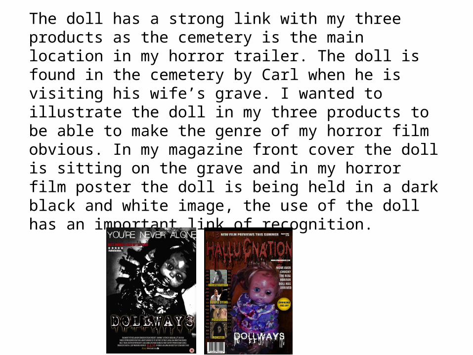
The doll has a strong link with my three products as the cemetery is the main location in my horror trailer. The doll is found in the cemetery by Carl when he is visiting his wife’s grave. I wanted to illustrate the doll in my three products to be able to make the genre of my horror film obvious. In my magazine front cover the doll is sitting on the grave and in my horror film poster the doll is being held in a dark black and white image, the use of the doll has an important link of recognition.
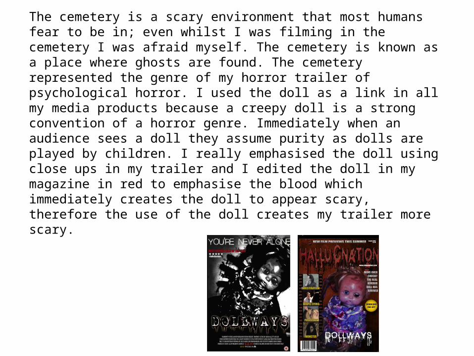
The cemetery is a scary environment that most humans fear to be in; even whilst I was filming in the cemetery I was afraid myself. The cemetery is known as a place where ghosts are found. The cemetery represented the genre of my horror trailer of psychological horror. I used the doll as a link in all my media products because a creepy doll is a strong convention of a horror genre. Immediately when an audience sees a doll they assume purity as dolls are played by children. I really emphasised the doll using close ups in my trailer and I edited the doll in my magazine in red to emphasise the blood which immediately creates the doll to appear scary, therefore the use of the doll creates my trailer more scary.

The typography of my horror magazine and poster seems like a blood drop, I used a similar font not too much of the red on the magazine I did this because I wanted my audience to be able to make a link between my magazine, and poster however I didn’t use the text in the trailer, as I didn’t specify a specific date of the film’s release date. I made my typography with blood drops as I used fake blood in my trailer on the doll which is very significant. In addition I wanted my audience to be able to make a link between the typography and the horror genre, as blood is often a suspicious fear in humans. My horror magazine and poster, creates tension and suspicion to my target audience with the use of blood this makes the audience want to see the film.
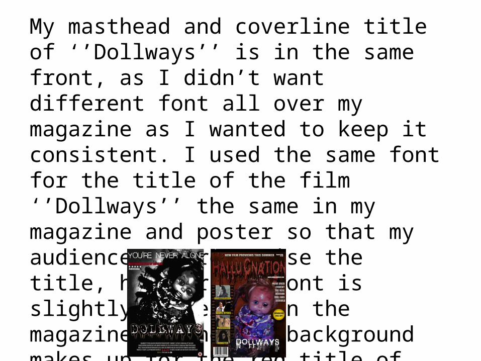
My masthead and coverline title of ‘’Dollways’’ is in the same front, as I didn’t want different font all over my magazine as I wanted to keep it consistent. I used the same font for the title of the film ‘’Dollways’’ the same in my magazine and poster so that my audience can recognise the title, however the font is slightly different on the magazine as the red background makes up for the red title of the film and isn't necessary.

My three media products are very effective in attracting my target audience and the use of horror creates suspicion and an excitement of fear for my audience wanting to see the film, or purchase a magazine.