5. income poverty, affluence and ... - tony-atkinson… aaberge, anthony... · 5. income poverty,...
TRANSCRIPT

5. INCOME POVERTY, AFFLUENCE AND POLARISATION
VIEWED FROM THE MEDIAN
Rolf Aaberge, Anthony B. Atkinson and Henrik Sigstad1
5.1 Introduction
EU-SILC provides a rich source of evidence about the distribution of income in different
countries. At the same time, the very richness of the data is a challenge, and it is not surprising
that much of the analysis has tended to focus on particular features of the distribution, such as
the extent of income poverty or the tendency for the middle of the distribution to be hollowed
out. But, as the recent debate about inequality has brought out, it is not enough to look at one
single indicator. Our statistics have to be encompassing. This becomes even more important as
policymakers become increasingly concerned with linking macro-economic outcomes with their
impact on the well-being of individual citizens. It is not enough to replace GDP per head by just
another number. As has been well recognised in the design of the EU social indicators, there is
need for contextual information.
The aim of the present chapter is to bring together different features of the distribution – income
poverty, affluence and dispersion – in a single framework that allows ready comparisons across
countries and across time. We believe that such a unified framework contributes both to the
policy debate and to the theoretical understanding of inequality. The former is well illustrated
by the recent media and political interest in inequality generated by the publication of the
English translation of Thomas Piketty’s Capital in the Twenty First Century (Piketty, 2014).
Attention in the debate has focused on the top 1 per cent, and how their share of income is
racing away, particularly in Anglo-Saxon countries. But others have asked how this relates to
what is happening at the bottom of the income ladder. Do rising top shares have implications for
the ambitions of the European Union to reduce the number at risk of poverty or social exclusion
under the Europe 2020 agenda? Are the countries with rising top incomes also those that are
failing to meet the objective of reducing income poverty and social exclusion? When one turns
to the academic arena, one finds too a need to bring together separate debates. There are at
present largely separate literatures on the measurement of income poverty, (to a limited degree)
affluence, and on bi-polarisation.2
In relation to the EU social indicators, the present chapter may be seen as providing
complementary information. Methods developed at Statistics Norway (set out in Aaberge and
Atkinson, 2013) are applied to the EU-SILC data for 2012 to show how these tools extend the
concept of contextual indicators. One major purpose of this complementary information is to
test the robustness of the conclusions drawn to the choice of indicator. As has been recognised
from the outset, there is a degree of arbitrariness to the choice of a particular percentage (60 per
cent) of the median as the at-risk-of-poverty threshold. When comparing the progress made by
different Member States towards the Europe 2020 targets, we need to know how sensitive the
conclusions are to the percentage cut-off. Has a country achieved a substantial reduction in
income poverty by “gaming the system”, concentrating financial help on those nearest to the
1 This work has been supported by the second Network for the analysis of EU-SILC (Net-SILC2), funded by
Eurostat. The European Commission bears no responsibility for the analyses and conclusions, which are solely those
of the authors. Authors’ affiliations: Aaberge and Sigstad, Statistics Norway, Atkinson, Nuffield College, Oxford. Contact: [email protected]. We are most grateful to Anne-Catherine Guio and Veli-Matti Törmälehto
for their valuable comments on the previous version. 2 We refer to this as “bi-polarisation”, to distinguish it from other concepts of polarisation, notably those pioneered by
Esteban and Ray (1994, 1999 and 2012) and Duclos, Esteban and Ray (2004).
2
cut-off? How should the evolution of the income poverty rate be seen in terms of the changes in
the income distribution as a whole? For these purposes, the existing contextual EU indicators,
the quintile share ratio and the Gini coefficient, while together informative, may not be
sufficient. In particular, they do not address two of the issues that have surfaced in recent
debate: the “squeezing of the middle” and the “racing away” of the top 1 per cent.
5.2 Poverty, affluence and dispersion in theory
The key elements in the approach adopted here are familiar ones. They are characterised by the
keywords: graphics, dominance, and cumulation. All three have a long history, having been
embodied in the Lorenz curve introduced in 1905. The Lorenz curve is a graphic device. It is
based on cumulating people and incomes from the bottom; and it allows us to see whether one
distribution is Lorenz-superior to (dominates) another. Where we depart is in taking the median
as a point of reference. In a sense, we are following a trend. As has been widely recognised,
with the rise in inequality at the top in a number of countries, notably the United States, the
mean has become a less satisfactory indicator of overall progress, and attention is turning to the
median. As it was put by the Stiglitz Commission, “median consumption (income, wealth)
provides a better measure of what is happening to the “typical” individual or household than
average consumption (income or wealth)” (Stiglitz et al, 2009, pages 13-14 of Executive
Summary). In the literature on the “middle class”, this group is typically defined in terms of a
range around the median. Following the recommendation of the Eurostat Task Force (1998) on
social exclusion and poverty statistics, the EU social indicators for income poverty (referred to
at EU level as poverty risk3) are based on an income threshold defined as a percentage of the
median, rather than the mean as had previously been employed (see Atkinson et al, 2002, page
94).
5.2.1 The median and poverty measurement How is the median taken as a point of reference? We start from the fact that, in the countries
covered by EU-SILC, poverty is a minority phenomenon. No one would consider poor a person
with income (by which we mean equivalised disposable income per person in the household) at
the median. If we define z as income relative to the median, then the poverty line is set at z*,
where z* is below 1, and the poverty headcount is F(z*), where F() is the cumulative
distribution. Whereas there may be a range of views about the choice of z*, there is general
agreement that z* should be below some z+, where z+ < 1.
The distribution of income below the median is illustrated in left hand part of Figure 5.1, which
shows F(z) from 0 to ½ at z = 1 (the median). For any z* we can read off the headcount from
the vertical axis, as shown by the dashed lines. The maximum poverty line z+ demarcates the
range of permissible poverty lines. If for two countries the curves do not intersect in the range
from 0 to z+, then the lower curve dominates and we can conclude that there is a lower rate of
income poverty for all permissible poverty lines. The first important point to be noted is that
the poverty line is defined in primal space: i.e. income. We define poverty in terms of income
below a specified level and the unknown is the percentage of people. An alternative would be
to define poverty as people in the bottom x per cent, when the unknown would then be the
income at the x-th percentile. This “dual” approach is not one that has been adopted in the EU
at-risk-of-poverty indicators, although it is widely used when investigating the distribution of
earnings, when the OECD and others report the earnings at the bottom decile (as a proportion of
3 In this chapter, “poverty” always refers to income poverty.

3
the median). In what follows, though, the distinction between primal and dual approaches runs
through the chapter.
5.2.2 Affluence The left hand part of Figure 5.1 is familiar. Eurostat publishes the Dispersion around the at-risk-
of-poverty threshold, taking cut-offs of 40, 50, 60 and 70 per cent. The right hand part of Figure
5.1 is less familiar. This construction, which is due originally to Foster and Wolfson
(1992/2010) (we have simply turned their Figure 9 upside down) shows the half of the
distribution above the median in the form of (1-F(z)) for z ≥ 1. In effect, this inverts the upper
half of the cumulative distribution, showing the proportion of people above any given threshold.
Concern with “affluence” is commonly presented in terms of the top 10 per cent or the top 1 per
cent. In terms of the distinction drawn in the previous paragraph, this approaches the
measurement of affluence from the perspective of the dual. In Figure 5.1, as shown by the
dashed lines, it means starting from a given percentage on the vertical axis, such as F**, and
reading across to the income required to enter this group. For example, from the World Top
Incomes Database (http://topincomes.g-mond.parisschoolofeconomics.eu) one can see that, in
France in 2009, to appear in the top 1 per cent of gross incomes it was necessary to have an
income 4.8 times the mean.
Figure 5.1: Poverty and affluence curves
Reading Note: The left hand (“poverty”) curve shows the proportion of the population
with income less than or equal to a poverty defined relative to the median; the right
hand (“affluence”) curve shows the proportion of the population with income equal to
or above an affluence threshold defined relative to the median.
There are however good reasons for considering a primal approach to measuring affluence. Not
only does this parallel the approach adopted in the measurement of poverty, but defining a cut-
off above which people can be classified as “rich” allows the proportion of rich people to vary.
There will always be a top 1 per cent, but a society concerned about the distance between the
top and the bottom may seek to reduce the number of people with incomes above the
Income relative to the median z
Figure 1 Poverty and affluence
curves
●½
1z*
F**
median
Affluence curve
Poverty curve
Proportion of the
population

4
“affluence” cut-off.4 Such an approach to defining affluence has been adopted by Peichl,
Schaefer and Scheicher (2010, page 608), who take the richness line to be twice the median,
describing it as “arbitrary but common practice”, whereas Brzezinski (2010) also considers lines
equal to three and four times the median.
Again, we may apply a dominance test to the affluence curve, 1-F. Suppose that we are agreed
that the affluence threshold z** is no lower than z-. Where the curve for one country lies
everywhere below that for another country for all z ≥ z-, then the affluence score is lower for all
cut-offs. This is important, since, as the examples above suggest, there is less agreement about
the appropriate threshold. It may for example be agreed that a person cannot be rich unless they
have at least twice the median (z- = 2), but people disagree whether z** should be 2, 3, 4 or
higher.
5.2.3 Intersection and cumulation Application of the principle of dominance only allows us to make definite comparisons in cases
where the relevant curves do not intersect. The ranking can only be extended by attaching a
weighting. In the inequality measurement literature, this has proceeded by cumulation, based on
the assumption that a higher weight is attached to those who appear earlier in the sum (or
integral). This allows us to move from first-degree dominance (of the cumulative distribution)
to second-degree dominance (of the Lorenz curve). The crucial question then concerns the
starting point for the cumulation. When measuring poverty, it is natural to cumulate from the
lowest income, attaching most weight to the poorest. This is the procedure embodied in the
Lorenz curve, and the basis for Lorenz dominance is that it ranks distributions in the same way
as all social welfare functions where the marginal valuation of income falls (or does not
increase) with income. It follows that, if the poverty curve for country A starts out above that
for country B, then it can never dominate.
In contrast, when measuring affluence we may wish to attach most weight to transfers affecting
those at the top of the income scale.5 This means cumulating downwards, as proposed in
Aaberge (2009). In terms of Figure 5.1, it means integrating from the right. If the affluence
curve for country A ends above that for country B, then it can never dominate.
5.2.4 Specific measures In order to make a complete ranking, and attach numerical values, further assumptions have to
be made so as to yield a specific indicator. Table 5.1 shows the different indicators employed
here, where, as already signalled, we consider both primal and dual approaches. In arriving at
specific indicators, the first key assumption is an independence axiom, which ensures linearity
of the indicator in the relevant variable (F in the case of the first line in Table 5.1). The axiom
takes a different form in the primal and dual cases. The second assumption is that the remaining
part of the indicator should be a power function, leaving the choice of the parameter k that
determines how rapidly the weights fall away. The effect of weighting may be seen in the case
of the first indicator, which is the integral of poverty headcounts measured at each value of z (z
is equal to x/M) from 0 to 1, weighted by the gap from the median (1-z) to the power of (k-1).
This primal indicator of poverty may therefore be viewed as corresponding to the Foster-Greer-
Thorbecke (FGT) poverty measure; the dual indicator shown in the second line of Table 5.1
4 Reasons why societies may be concerned with the top of the distribution are discussed in Atkinson (2007). 5 It should be noted that, in contrast to Peichl, Schaefer and Schleicher (2010), we are assuming that the principle of
transfers applies.

5
corresponds to the Sen (1976) poverty measure.6 Where k=1, the two indicators are equal, but
for k greater than 1 the two indicators diverge. In both cases, the weights vary between k (at
z=0, F=0) and 0 (at z=1, F=½), but the pattern of weighting is different. With the primal
indicator, with k = 2, a person with zero income has a weight of 2, but a person with an income
equal to half the median has half the weight. With the dual indicator, half weight would be
reached when we are at the lower quartile, which is typically further up the distribution. If this is
the case, then it explains why primal measures may be more sensitive to outliers than dual
measures.
Table 5.1: Summary indicators
Poverty
k
1
1
0
1 ( )k
k z F M z d z
Primal: weight = income gap from
median
k 1
1
0
(1 2 ( )) (1 ) ( )k
k F M z z d F M z
Dual: weight = rank in bottom half
of distribution (median = 0)
Affluence
k
1
1
1 1 ( )k
k z F M z d z
Primal: weight = income minus
median
k
1
1
( 2 ( ) 1) 1 ( )k
k F M z z d F M z
Dual: weight = rank from top
down in top half of distribution
(median = 0)
Notes:
(1) x denotes income; M denotes the median; k is a parameter; F denotes the cumulative
distribution; t denotes rank.
(2) The formulae for the affluence indices apply only to values of k for which the integral
converges.
5.3 Poverty and affluence in EU-SILC
The approach described above has been implemented using the EU-SILC data for 2012. These
data refer in general to the income year 2011 (exceptions are Ireland and the UK; see Chapter
2). Negative incomes have been set to zero. All households with missing income data and those
consisting only of students have been excluded. The fact that we use one year as the analytical
period instead of a life-cycle perspective means that we are unable to capture the full economic
value of being a student. Students partly live on loans justified by higher expected income in
the future. Students’ low cash income is temporary and thus will not be considered to be
associated with poverty. This practice is consistent with the (national) official poverty statistics
in several countries.
5.3.1 Dominance
6 See Aaberge and Atkinson (2013). By replacing the median M with a poverty threshold T less than M,
k
coincides with the FGT poverty measure of power k and 2
coincides with a modified version of the Sen poverty
measure.

6
We begin with Figure 5.2, which illustrates well three considerations. It shows the poverty and
affluence curves for Norway, Poland and Portugal. In each case, the poverty curves are for the
full range z from 0 to 1, and the affluence curves from z = 1 to z = 5. The curves meet at (1,½).
The first two considerations are methodological. First, there is considerable “noise” at the tails
of the distribution. The same occurs (but is less obvious in Figure 5.2) as the median is
approached. From the standpoint of considering dominance, this suggests that the dominance
condition should be applied to a restricted range. On a primal approach, we should limit the
range of z over which dominance is tested.
Figure 5.2: Poverty and affluence curves for Norway, Poland and Portugal, 2012
Reading Note: The solid curves relate to Norway and show that over much of the
income range poverty and affluence are both lower than in Poland or Portugal.
Source: EU-SILC cross-section 2012 UDB from August 2014.
The second point concerns the statistical criterion for ranking. As may be seen from Figure 5.2,
the poverty curves for Poland and Portugal are virtually indistinguishable over much of the
range and we would not expect a statistical test, taking account of the sampling error, to reject
the hypothesis that the poverty curves coincide (over a restricted range). However, as argued in
Atkinson, Marlier, Montaigne and Reinstadler (2010), sampling error is not the only
consideration when considering the policy significance of differences in poverty rates. When
examining changes over time, Atkinson et al (2010) took a two percentage point difference as
salient, and the same practice is followed here. A country is said to dominate another where the
poverty/affluence curve is at least 2 percentage points lower at some point and is nowhere more
than 2 percentage points higher. No ranking can be made where the differences are everywhere
less than 2 percentage points (“identical”), or where both countries are at some point at least 2
percentage points lower (“intersecting”). (Alternatively the dominance condition could be stated
in terms of differences measured horizontally.)
The third point is substantive. It may be seen by eye from Figure 5.2 that the curves for Norway
dominate over most of the range in both directions. Fewer people proportionately in Norway are
0
0.1
0.2
0.3
0.4
0.5
0 1 2 3 4
Pro
po
rtio
n o
f p
op
ula
tio
n
Income as share of median
Norway
Poland
Portugal

7
below any poverty threshold; and fewer people are above any affluence threshold. The poverty
curve for Poland is slightly below that for Portugal. Also, the affluence curve for Poland lies
clearly inside that for Portugal for much of the income range. We have therefore a clear picture
of the differences between the distributions in the three countries, which can be summarised as
follows, where the Table 5.2 should be read horizontally.
Table 5.2: Ranking of Norway, Poland and Portugal, 2012
Poland Portugal
Norway Dominant on poverty Dominant on poverty
Dominant on affluence Dominant on affluence
Poland Dominant on poverty
Dominant on affluence
Reading Note: Dominant on X means less X.
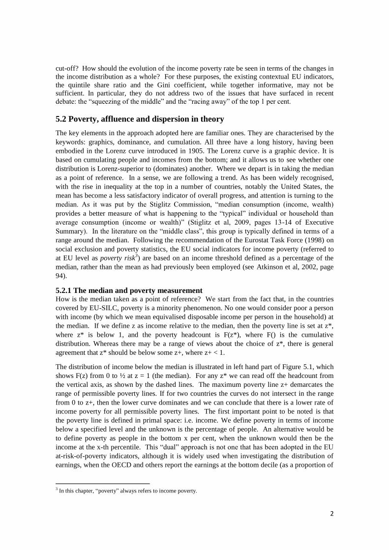
A selection of results for other countries is shown in Figures 5.3 to 5.5, where in each case we
compare three countries. Figure 5.3 compares Finland, France and Spain. As would be expected
from the published Eurostat figures, the poverty curve for Spain is well outside those for the
other two countries at 60 per cent of the median, and this is true throughout the range of z. The
poverty curves for Finland and France, on the other hand, seem indistinguishable. In contrast,
the affluence curve for Finland lies inside those for the other two countries for most of the
range. On the other hand, the affluence curves for France and Spain intersect, suggesting that
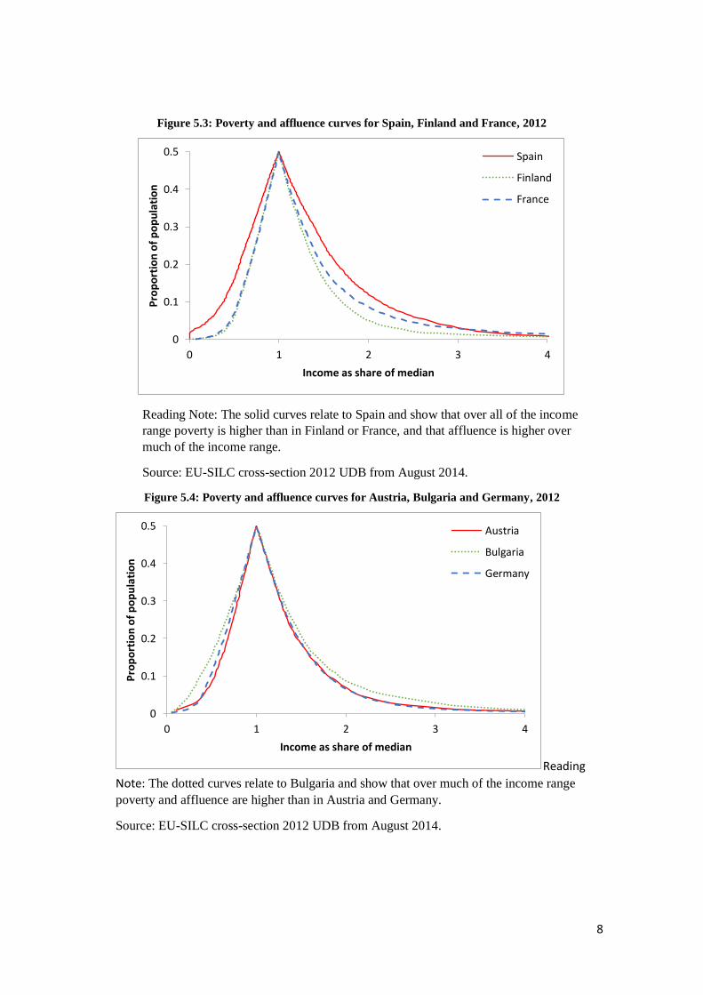
there are more rich households in France for cut-offs above 3 times the median. Figure 5.4
compares Austria, Bulgaria and Germany. In this case, Bulgaria clearly lies outside on both
sides of the median. Above the median, Austria and Germany appear to be indistinguishable,
but below the median the poverty curves intersect. At low levels of the poverty cut-off,
Germany has a lower poverty rate, so that it cannot be dominated by Austria. However, the
poverty curves intersect well before we reach 50 per cent of the median, leading to Austria
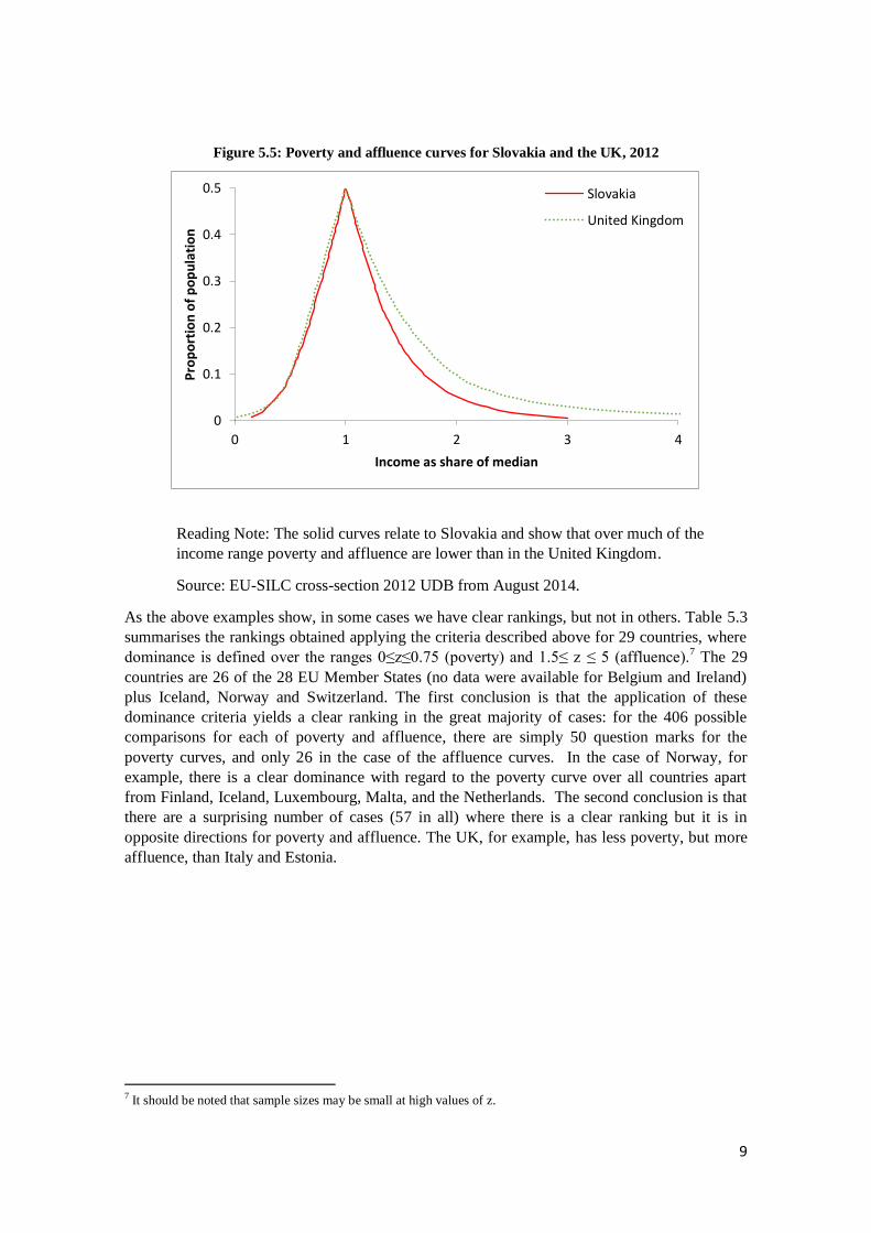
performing better on the AROP indicator. Figure 5.5 compares Slovakia and the UK. Slovakia
clearly performs better in terms of the affluence curve.
8
Figure 5.3: Poverty and affluence curves for Spain, Finland and France, 2012
Reading Note: The solid curves relate to Spain and show that over all of the income
range poverty is higher than in Finland or France, and that affluence is higher over
much of the income range.
Source: EU-SILC cross-section 2012 UDB from August 2014.
Figure 5.4: Poverty and affluence curves for Austria, Bulgaria and Germany, 2012
Reading
Note: The dotted curves relate to Bulgaria and show that over much of the income range
poverty and affluence are higher than in Austria and Germany.
Source: EU-SILC cross-section 2012 UDB from August 2014.
0
0.1
0.2
0.3
0.4
0.5
0 1 2 3 4
Pro
po
rtio
n o
f p
op
ula
tio
n
Income as share of median
Spain
Finland
France
0
0.1
0.2
0.3
0.4
0.5
0 1 2 3 4
Pro
po
rtio
n o
f p
op
ula
tio
n
Income as share of median
Austria
Bulgaria
Germany
9
Figure 5.5: Poverty and affluence curves for Slovakia and the UK, 2012
Reading Note: The solid curves relate to Slovakia and show that over much of the
income range poverty and affluence are lower than in the United Kingdom.
Source: EU-SILC cross-section 2012 UDB from August 2014.
As the above examples show, in some cases we have clear rankings, but not in others. Table 5.3
summarises the rankings obtained applying the criteria described above for 29 countries, where
dominance is defined over the ranges 0≤z≤0.75 (poverty) and 1.5≤ z ≤ 5 (affluence).7 The 29
countries are 26 of the 28 EU Member States (no data were available for Belgium and Ireland)
plus Iceland, Norway and Switzerland. The first conclusion is that the application of these
dominance criteria yields a clear ranking in the great majority of cases: for the 406 possible
comparisons for each of poverty and affluence, there are simply 50 question marks for the
poverty curves, and only 26 in the case of the affluence curves. In the case of Norway, for
example, there is a clear dominance with regard to the poverty curve over all countries apart
from Finland, Iceland, Luxembourg, Malta, and the Netherlands. The second conclusion is that
there are a surprising number of cases (57 in all) where there is a clear ranking but it is in
opposite directions for poverty and affluence. The UK, for example, has less poverty, but more
affluence, than Italy and Estonia.
7 It should be noted that sample sizes may be small at high values of z.
0
0.1
0.2
0.3
0.4
0.5
0 1 2 3 4
Pro
po
rtio
n o
f p
op
ula
tio
n
Income as share of median
Slovakia
United Kingdom

10
Table 5.3: Dominance of affluence (upper row) and poverty curves (lower row), 2012
IS NO NL CZ SI FI FR CY SE AT CH LU HU MT DK SK DE UK PL PT LT HR IT EE BG LV ES RO GR
IS - + + - + + + - + + + + + ? + + + + + + + + + + + + + +
+ + + + + + + + + + + + + + + + + + + + + + + + + + + +
NO + + + + + + + + + + + + + + + + + + + + + + + + + + +
? + + ? + + + + + ? + ? + + + + + + + + + + + + + + +
NL - - ? + + - + + + + + - ? + + + + + + + + + + + + +
+ + + + + + + + + + + + + + + + + + + + + + + + + +
CZ - - + + - + + + + + - - + + + + + + + + + + + + +
+ ? + + + + + ? + ? + + + + + + + + + + + + + + +
SI + + + ? + + + + + + + + + + + + + + + + + + + +
? + + + + + ? + ? + + + + + + + + + + + + + + +
FI + + - + + + + + - ? + + + + + + + + + + + + +
+ + + + + + + + + + + + + + + + + + + + + + +
FR + - - - - - - - - - + + + + ? + + + + + ? +
+ + + + + + + + + + + + + + + + + + + + + +
CY - - - - - - - - - + + + + ? - + ? + + + -
? ? ? ? + ? ? + + + + + + + + + + + + + +
SE + + + + + ? + + + + + + + + + + + + + +
+ ? ? ? ? ? + + + + + + + + + + + + + +
AT ? + - - - - ? + + + + + + + + + + + +
? ? ? ? + + + + + + + + + + + + + + +
CH + ? - - - ? + + + + + + + + + + + +
? + ? ? + + + + + + + + + + + + + +
LU - - - - - + + + + + + + + + + + +
? + ? ? + + + + + + + + + + + + +
HU - - - ? + + + + + + + + + + + +
? ? + + + + + + + + + + + + + +
MT - - + + + + + + + + + + + + +
? ? + + + + + + + + + + + + +
DK + + + + + + + + + + + + + +
? ? ? ? ? ? ? + + ? + + + +
SK + + + + + + + + + + + + +
? + + + + + + + + + + + +
DE + + + + + + + + + + + +
? + + + + + + + + + + +
UK ? + + - - - - + + ? -
+ + + + + + + + + + +
PL + + - - ? - + + + -
+ + + + + + + + + +
PT ? - - - - + ? ? -
? + + + + + + + +
LT - - - - + + + -
+ + + + + + + +
HR - + ? + + + +
? - + + + + +
IT + ? + + + +
+ + + + + +
EE - + + + -
+ + + + +
BG + + + ?
? + + +
LV - ? -
+ + +
ES ? -
? +
RO -
?

11
Reading Note: The first row compares Iceland with other countries. The entry in the
second column of the first row compares Iceland and Norway: the minus sign in the
upper part means that affluence is higher in Iceland; the plus sign in the lower row
means that poverty is lower in Iceland.
Source: EU-SILC cross-section 2012 UDB from August 2014.
5.3.2 Summary measures The indices described in Section 5.2 (Table 5.1) may be used to summarise the performance of
different countries in the poverty and affluence dimensions. Figure 5.6 shows the ranking of the
29 countries using values of k=1, which is the gap measure (where the primal and dual
coincide). Many countries are ranked similarly for poverty and affluence. These include
Norway and Slovenia, with low scores (high rankings), Austria, Germany and Switzerland in
the middle, and Romania and Spain with high scores (low rankings). But there are countries
that perform better on poverty than on affluence. Portugal and the UK, for example, have high
affluence scores but do better in terms of their poverty ranking. France and Cyprus are much
better performers in terms of poverty than of affluence.
How sensitive are these rankings to the choice of index? Figures 5.7a and 5.7b show the primal
and dual indices for poverty starting from k=1, but then considering the higher values of k=2,
k=3 and k=4. As may be seen, there are some changes in rankings, and there is some indication
that the dual measures are less sensitive to the choice of k. Figure 5.8 shows that the primal
measures of affluence are much more affected. (In considering these results, one has to ask how
far they are influenced by the use of different data sources. It is possible that the register
countries have more extensive coverage of higher incomes.)
Figure 5.6: Comparing measures of affluence and poverty, 2012
Reading Note: Iceland is ranked first with the poverty measure, whereas Norway is
ranked first with the affluence measure.
AT
BG
CH
CY
CZ
DE
DK
EE
ES
FI
FR GR
HR
HU
IS
IT
LT
LU
LV
MT NL
NO
PL
PT
RO
SE SI
SK
UK
0.15
0.2
0.25
0.3
0.35
0.4
0.12 0.14 0.16 0.18 0.2 0.22
Aff
luen
ce (Λ₁)
Poverty (Ψ₁)
12
Source: EU-SILC cross-section 2012 UDB from August 2014; no data for BE and IE.
Figure 5.7a: Ranking by primal measures of poverty, 2012
Reading Note: Iceland is ranked first with the primal poverty measures 1 2, and
3 ,
whereas Finland is ranked first with 4
.
Source: EU-SILC cross-section 2012 UDB from August 2014.
Figure 5.7b: Ranking by dual measures of poverty, 2012
Reading Note: Iceland is ranked first with all four dual poverty measures.
Source: EU-SILC cross-section 2012 UDB from August 2014.
0
5
10
15
20
25
30
35IS
NO NL
CZ SI FI FR CY SE AT
CH LU HU
MT
DK SK DE
UK PL
PT LT HR IT EE BG LV ES RO
GR
Ran
k
Ψ₁ Ψ₂ Ψ₃ Ψ₄
0
5
10
15
20
25
30
35
IS
NO NL
CZ SI FI FR CY SE AT
CH LU HU
MT
DK SK DE
UK PL
PT LT HR IT EE BG LV ES RO
GR
Ran
k
Π₁ Π₂ Π₃ Π₄
13
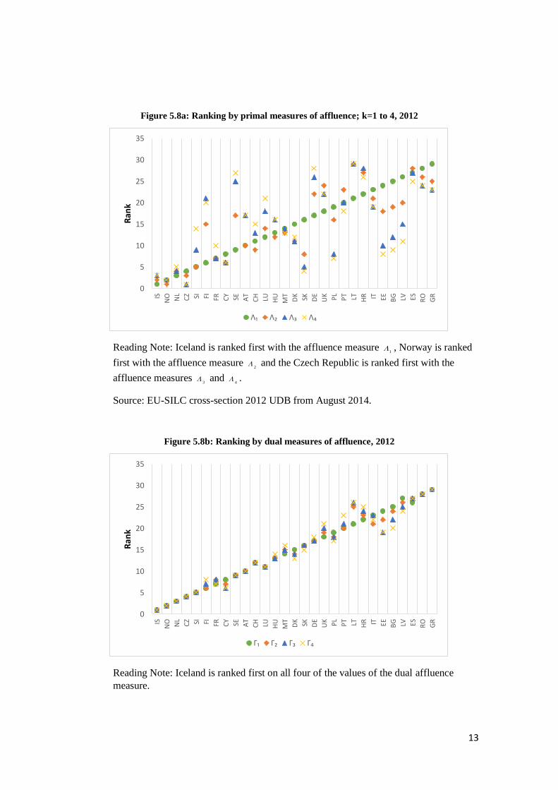
Figure 5.8a: Ranking by primal measures of affluence; k=1 to 4, 2012
Reading Note: Iceland is ranked first with the affluence measure 1
, Norway is ranked
first with the affluence measure 2
and the Czech Republic is ranked first with the
affluence measures 3
and 4
.
Source: EU-SILC cross-section 2012 UDB from August 2014.
Figure 5.8b: Ranking by dual measures of affluence, 2012
Reading Note: Iceland is ranked first on all four of the values of the dual affluence
measure.
0
5
10
15
20
25
30
35
IS
NO NL
CZ SI FI FR CY SE AT
CH LU HU
MT
DK SK DE
UK PL
PT LT HR IT EE BG LV ES RO
GR
Ran
k
Λ₁ Λ₂ Λ₃ Λ₄
0
5
10
15
20
25
30
35
IS
NO NL
CZ SI FI FR CY SE AT
CH LU HU
MT
DK SK DE
UK PL
PT LT HR IT EE BG LV ES RO
GR
Ran
k
Γ₁ Γ₂ Γ₃ Γ₄

14
Source: EU-SILC cross-section 2012 UDB from August 2014.
5.4 Dispersion, bi-polarisation and tail-heaviness
In this section, we bring together the two curves shown earlier in Figure 5.1. We focus on a
special case of the general notion of dispersion given by Bickel and Lehmann (1979, page 34).
We define dispersion in terms of the distance between the affluence and poverty curves. The
distance in terms of income (defined relative to the median) between percentiles equi-distant
from the median, indexed by t, where t runs from 0 (at the median) to 0.5, gives a measure of
the spread of the income distribution. Since this dispersion curve is defined in terms of the
percentiles, we refer to it as a dual measure. For formal definitions of dispersion, bi-polarisation
and tail-heaviness curves and associated summary measures we refer to Aaberge and Atkinson
(2013).
The dispersion curve combines what we have learned separately from the poverty and affluence
curves, so that it is not surprising that they confirm what we have already found. In Figure 5.9a,
the dispersion curves show that Norway is less dispersed than Poland, and Poland in turn is less
dispersed than Portugal. In Figure 5.9b, Finland is the least dispersed, and Spain the most
dispersed, with the dispersion curve for France moving from one towards the other.
Figure 5.9a: Dispersion curves for Norway, Poland and Portugal, 2012
Reading Note: The solid curve relates to Norway and show that over all of the income
range dispersion is lower than in Poland and Portugal.
Source: EU-SILC cross-section 2012 UDB from August 2014.
0
0.2
0.4
0.6
0.8
1
1.2
1.4
1.6
1.8
2
0 0.2 0.4 0.6 0.8 1
Dis
pe
rsio
n c
urv
e
Percentile
Norway Poland Portugal

15
Figure 5.9b: Dispersion curves for Spain, Finland and France, 2012
Reading Note: The solid curve relates to Spain and show that over all of the income
range dispersion is higher than in Finland and France.
Source: EU-SILC cross-section 2012 UDB from August 2014.
Suppose however that we wish to go further and to cumulate the distance measure. As noted in
Section 5.2, the cumulation can be from the bottom or from the median. Cumulating from the
bottom is equivalent to cumulating from the tails, and this is in the same direction as for the
separate poverty and affluence measures. As discussed in Aaberge and Atkinson (2013), this is
related to the concept of tail-heaviness (Doksum, 1969, page 1169): the measures of tail-
heaviness are the sum of the measures of poverty and affluence. Put differently, we can see the
measures of poverty and affluence as decomposing total tail-heaviness. In Norway in 2012 for
example total tail heaviness, with k = 1 (when the primal and dual measures coincide), was 0.32
and this was made up of 0.13 from poverty and 0.19 from affluence (figures rounded). The
Czech Republic has a similar score for poverty but 0.49 for affluence.
Table 5.4 shows the decomposition for the 29 countries for k=1, ranked in order of tail-
heaviness. The results provide valuable diagnostic information. For 10 of the 29, the tail-
heaviness score exceeds 1. Of these, three countries (Spain, Latvia and Romania) have both a
relatively high poverty score (in excess of 0.17) and a high affluence score (in excess of 0.33).
Three (Bulgaria, Estonia and Greece) have a relatively high poverty score; the remaining four
(Lithuania, Poland, Portugal and the UK) are tail-heavy on account of their relatively high
affluence score. At the same time, it is clear that countries are in general ranked very similarly
for poverty and affluence. It is not the case that countries can score well on poverty while be
quite “relaxed” about high levels of affluence.
The tail-heaviness measure cumulates from the tails. Cumulating from the median, on the other
hand, yields the measures of bi-polarisation (Foster and Wolfson, 1992/2010), which give more
weight to differences close to the median. Where the dispersion curves intersect, these tell a
different story about the relative ranking of different countries. Figure 5.10 provides an
illustration. It shows the dual measures, with k=2, of tail-heaviness and bi-polarisation. While
for many countries their rankings remain the same, there are a number of countries with similar
0
0.2
0.4
0.6
0.8
1
1.2
1.4
1.6
1.8
2
0 0.2 0.4 0.6 0.8 1
Dis
pe
rsio
n c
urv
e
Percentile
Spain Finland France

16
scores for tail-heaviness that score quite differently on bi-polarisation. This is the case with
France and Italy, and with Bulgaria and Lithuania.
Table 5.4: Decomposition of tail-heaviness with respect to poverty and affluence, 2012
Country Poverty (psi1) Affluence (lambda1) Tail-heaviness
Norway 0.13 0.19 0.32
Slovenia 0.14 0.20 0.34
Iceland 0.12 0.24 0.36
Sweden 0.15 0.22 0.36
Czech Republic 0.13 0.25 0.38
Netherlands 0.14 0.24 0.38
Slovakia 0.15 0.23 0.38
Denmark 0.14 0.25 0.39
Finland 0.15 0.24 0.39
Malta 0.15 0.27 0.42
Austria 0.15 0.27 0.42
Hungary 0.15 0.27 0.42
Switzerland 0.15 0.28 0.43
Germany 0.16 0.27 0.43
Luxembourg 0.15 0.28 0.44
France 0.14 0.33 0.48
Bosnia 0.18 0.30 0.48
Cyprus 0.15 0.34 0.48
Italy 0.18 0.31 0.49

17
Poland 0.17 0.34 0.50
Bulgaria 0.18 0.33 0.51
Estonia 0.19 0.33 0.51
Lithuania 0.17 0.35 0.52
United Kingdom 0.16 0.36 0.53
Greece 0.21 0.33 0.54
Portugal 0.17 0.38 0.55
Romania 0.20 0.35 0.55
Spain 0.20 0.36 0.56
Latvia 0.19 0.40 0.59
Reading Note: The poverty and affluence measures are defined in Table 5.1, with k=1. Tail-
heaviness is the sum of these two measures. For Latvia, the poverty measure is 0.19 and the
affluence measure is 0.40, giving a tail-heaviness measure of 0.59.
Source: EU-SILC cross-section 2012 UDB from August 2014.

18
Figure 5.10: Comparing measures of bi-polarisation and tail-heaviness, 2012
Reading Note: Norway is ranked first with the tail-heaviness measure 2
as well as
with the bi-polarisation measure 2
and Slovenia is ranked second with both measures.
Source: EU-SILC cross-section 2012 UDB from August 2014.
5.5 Conclusions
The chapter has brought together different features of the income distribution – poverty,
affluence and dispersion – in a single framework that allows one to see the relation between
different concepts. The framework helps us see, for example, the difference between primal and
dual measures (Foster-Greer-Thorbecke versus Sen poverty measures) and between tail-
heaviness and bi-polarisation. It has shown how the at-risk-of-poverty measures embodied in
the EU social indicators can be related to the wider distribution of income, allowing the full
range of the EU-SILC income data to be exploited. We have focused on cross-country
comparisons that allow one to identify the sources of differing performance across countries
without reducing the analysis to a single indicator. As we have seen, some countries perform
better at the bottom and some at the top of the income distribution, but in general the two move
closely together. The different parts of the income distribution story cannot be separated.
References
Aaberge, R., 2009, “Ranking intersecting Lorenz curves”, Social Choice and Welfare, vol 33:
235-259.
Aaberge, R. and Atkinson, A. B., 2013, “The median as watershed”, Discussion Paper 749,
Research Department, Statistics Norway.
Atkinson, A. B., 2007, “Measuring top incomes: Methodological issues” in A. B. Atkinson and
T. Piketty, editors, Top incomes over the twentieth century, Oxford University Press, Oxford.
AT
BG
CH
CY
CZ
DE
DK
EE
ES
FI
FR
GR
HR
HU
IS
IT
LT
LU
LV
MT
NL
NO
PL PT
RO
SE
SI
SK
UK
0.3
0.35
0.4
0.45
0.5
0.55
0.6
0.45 0.55 0.65 0.75 0.85
Bip
ola
risa
tio
n (Δ₂*)
Tail-heaviness (Δ₂**)

19
Atkinson, A. B., Cantillon, B., Marlier, E. and Nolan, B., 2002, Social indicators: The EU and
social inclusion, Oxford University Press, Oxford.
Atkinson, A. B., Marlier, E., Montaigne, F. and Reinstadler, A., 2010, “Income poverty and
income inequality” in A. B. Atkinson and E. Marlier, editors, Income and living conditions in
Europe, Publications Office of the European Union, Luxembourg.
Brzezinski, M., 2010, “Income Affluence in Poland”, Social Indicators Research, vol 99: 285-
299.
Duclos, J.-Y., Esteban, J. and Ray, D., 2004, “Polarization: Concepts, measurement,
estimation”, Econometrica, vol 72: 1737-1772.
Esteban, J. and Ray, D., 1994, “On the measurement of polarization”, Econometrica, vol 62:
819-851.
Esteban, J. and Ray, D., 1999, “Conflict and distribution”, Journal of Economic Theory, vol 87:
379-415.
Esteban, J. and Ray, D., 2012, “Comparing polarization measures” in M. Garfinkel and S.
Skaperdas, editors, Oxford Handbook of the Economics of Peace and Conflict, Oxford
University Press, Oxford, pages 127-151.
Eurostat Task Force, 1998, Recommendations on social exclusion and poverty statistics, EU
Statistical Programme Committee meeting 26-27 November 1998.
Foster, J. E. and Wolfson, M. C., 1992/2010, “Polarization and the decline of the middle class:
Canada and the U.S.”, Journal of Economic Inequality, vol 8: 247-273.
Peichl, A., Schaefer, T. and Scheicher, C., 2010, “Measuring Richness and Poverty: A Micro
Data Application to Europe and Germany”, Review of Income and Wealth, series 56: 597-619.
Piketty, T., 2014, Capital in the twenty-first century, Harvard University Press, Cambridge,
Mass.
Stiglitz, J. E. (chair) 2009, Report of the Sen-Stiglitz-Fitoussi Commission.