activity 14: r plots learning some simple plotting ... · understanding and communicating...
TRANSCRIPT

Understanding and Communicating Multimodal Transportation Data 51
Activity 14: R Plots
LeArning some simPLe PLotting FeAtures oF r 15This independent exercise will help you learn how R plotting functions work. This activity focuses on how you might use graphics to help you interpret large data sets. The sample data we are using – stop level data for TriMet’s route 19 from six days in March 2007 (March 4-9, 2007) includes 29,928 observations of 26 variables. In short, a lot of data.
You should think of figure creation in R as “painting”. The basic plot functions will make readable, useable graphs for your interpretation and exploration without much effort on your part. Customization will require you to adopt this “painting” logic and add or subtract elements. You will need to become familiar with margins, layouts, and plot regions to become an R graph guru. You will explore More on this in later activities.
PurPose LeArning objectiveThe purpose of this activity is to give you the opportunity to become familiar with plotting in R.
Become familiar with some basic plotting options in R.
required resources• R, R Studio• TriMet Route 19 Map: http://www.trimet.org/schedules/r019.htm (Note that this is the current
Route 19 which is slightly different than the route in 2007.)• TriMet Data Dictionary
time ALLocAted 60 minutes in class
tAsks
A. Readinthedatafilepostedontheweb
First, load the data frame with stop-level data for TriMet’s route 19 from six days in March 2007 (March 4-9, 2007) from the web using the following syntax:
trimet <-
read.csv(“http://www.transportation-data.com/resources/route19march07.csv”, header=TRUE, sep=”,”, na.strings=”NA”, dec=”.”, strip.white=TRUE)
B. A Simple Plot
As you work through this exercise, enter these R commands in the R Studio file and use it to process R operations by using the send line or group of lines option. Check with a fellow student or instructor if you don’t know how to use the R Studio interface yet.
R’s base graphics can produce default plots that look pretty decent without specifying any customization. Let’s create a scatterplot of the stop_time and the est_load on the bus. By convention, let’s plot the time on x-axis and dwell on the y-axis:
plot( trimet$stop_time, trimet$est_load)

52 Understanding and Communicating Multimodal Transportation Data
Figure 15 Plot of trimet$stop_time vs trimet$est_load
This plot of 29,928 observations does a few things. First, it is clear from the plot that there are two “peaks” of the load data. Second, there are many records with an estimated load of zero.
IMPORTANT TIP: To save the windows graphics output, size the window to the desired dimensions and use the export option in R Studio. You can also use the File Copy to Clipboard to paste in a Word or PPT document. The windows metafile option produces the best quality for copy/paste options.
Sometimes it is helpful to just ask R to return a plot of the variable. Depending on the type of data, the call to plot with just one variable returns the “best” of R’s base plots to show the variables. For example, the call to plot with just estimated load plot(trimet$est_load) returns an index plot (Figure 16).
Figure 16 Plot of trimet$est_load
Figure 16 is a scatterplot with the x-axis labeled ’Index’ and the y-axis labeled ‘trimet$est_load’. The index is the “row number”, so this plot shows the data as it appears in the data frame. Notice that these two plots are not the same (Figures 15-16).
Activity 15: Learning Some Simple Plotting Features of R Activity 15: Learning Some Simple Plotting Features of R

Understanding and Communicating Multimodal Transportation Data 53
Activity 15: Learning Some Simple Plotting Features of R
1. What do the differences between Figure 15 and Figure 16 indicate about the order of the data in the TriMet data frame?
The calls to plot for data that are “factors” returns a barplot. R considers these discrete data. The call to plot(trimet$service_day) returns the barplot shown in Figure 17.
Figure 17 Plot of trimet$service_day
These plots can be helpful because they allow you to quickly see the range of the data. In the plot above, you can clearly see the dates in the data frame and the number of records that appear for each day.
2. Why do you think March 4, 2007 has so few records compared to other days?
3. Can you find another variable that R considers a factor and plot it?
C. Some Simple Customizations
Let’s explore the plot function options in more detail by checking in on the help menu. Do this by typing,
? plot
R’s help can be helpful or not, depending on your perspective. The call to plot allows many, many options. The help file lists the details for type, main, sub, xlab, ylab, and asp options. Note that there is a line that says: Arguments to be passed to methods, such as graphical parameters (see par). Many plot options are controlled in the par settings, but more on those later. Let’s first see how some of the plot options are specified. Options are specified with the option= specification. The points type is the default. Let’s try plotting the lines connecting the points.
plot( trimet$stop_time, trimet$est_load, type=”l”)
54 Understanding and Communicating Multimodal Transportation Data
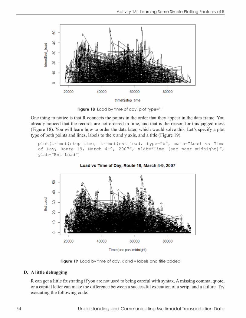
Figure 18 Load by time of day, plot type=”l”
One thing to notice is that R connects the points in the order that they appear in the data frame. You already noticed that the records are not ordered in time, and that is the reason for this jagged mess (Figure 18). You will learn how to order the data later, which would solve this. Let’s specify a plot type of both points and lines, labels to the x and y axis, and a title (Figure 19).
plot(trimet$stop_time, trimet$est_load, type=”b”, main=”Load vs Time of Day, Route 19, March 4-9, 2007”, xlab=”Time (sec past midnight)”, ylab=”Est Load”)
Figure 19 Load by time of day, x and y labels and title added
D. A little debugging
R can get a little frustrating if you are not used to being careful with syntax. A missing comma, quote, or a capital letter can make the difference between a successful execution of a script and a failure. Try executing the following code:
Activity 15: Learning Some Simple Plotting Features of R

Understanding and Communicating Multimodal Transportation Data 55
plot(trimet$stop_time, trimet$est_load, ylab)
Oops! Something is missing from the above statement — what is it? The R console gives you pretty good feedback on what the error is:
Error in plot.xy(xy, type, ...) : object ‘ylab’ not found
So it is telling you it doesn’t know what to do with ‘ylab’. Sometimes you forget to close a function call and R is still waiting for you to send it something. The consoled line changes from > to +. If you hit the ESC key, R cancels your command and returns to the > prompt as long as the Console window is the active window.
plot(trimet$stop_time, trimet$est_load, ylab=
As debug tool, it is sometimes helpful to run pieces of the statement to see if you can detect the error. For example, if you just sent the command to plot with no options
plot(trimet$stop_time, trimet$est_load)
and it executed, you now know that your error is in the options you have specified. It is easy to do this in R Studio by just selecting the code you want to execute, sending it to the R Console with the
icon, and typing any needed closing code such as the parentheses. An approach like this could help you find the error in your statement.
The trimet data stop_time field is seconds past midnight. Maybe seconds past midnight isn’t that interpretable for you. To convert seconds past midnight to hour of the day, just divide by 3600 (Note: You can just perform the operation in the plot function itself).
plot( trimet$stop_time/3600, trimet$est_load)
Figure 20 Load by time of day
E. Some Par Settings
In R, you have near infinite control of the plotting options. Anything can be changed; you just have to remember how to do it! Options passed in the plot() command are only active for that call. Meaning, if you change the line type, the next plot will have the default line type not the one specified previously. Many parameters can be passed through the plot command and are listed in the par options. Open help on par settings – Wow! You can see the detail that R will allow over plot options!
Activity 15: Learning Some Simple Plotting Features of R Activity 15: Learning Some Simple Plotting Features of R

56 Understanding and Communicating Multimodal Transportation Data
Let’s try some changes and you can explore other options on your own.
i. X and Y Plotting Limits
One of the nice features of the default plotting option is that it does a pretty good job of selecting the axis limits. The xlim and ylim options allow you to change the plotting window limit of the respective axes. It requires the limits in a vector format, c(start, end). Try these options reflected in Figures 21 and 22.
plot(trimet$stop_time/3600, trimet$est_load, xlim=c(0,25))
plot(trimet$stop_time/3600, trimet$est_load, xlim=c(14,18), ylim=c(0,30))
Figure 21 Plot of trimet$stop_time vs trimet$est_load with modified x-axis (0,25)
Figure 22 Plot of trimet$stop_time vs trimet$est_load with modified x-axis (14, 18) and y-axis limits (0,30)
Activity 15: Learning Some Simple Plotting Features of R Activity 15: Learning Some Simple Plotting Features of R

Understanding and Communicating Multimodal Transportation Data 57
ii. Symbols, Line Type, Line Weight
The plotting symbol, line type and weight can be controlled with pch, lty, and lwd options Line Type: lty Symbol type: pch
Figure 23 Line Type and Symbol Type (from Murrell, R Graphics)iii. Colors
Color is one important element in building accurate and effective representation of data. Misuse of color can distort the meaning of underlying data, leading you to incorrect interpretations and conclusions. This next task will familiarize you with basic color functions in R. Colors are sent to R in hexadecimal format. If you are not familiar with this color coding, see this article: http://en.wikipedia.org/wiki/Web_colors
Color by names: At the simplest level, R has a set of built-in color names. If you type colors() at the R console it will return a complete list of possible color names. Figure 24 on the following page (from Maindonald & Braun, Data Analysis and Graphics Using R, Cambridge University Press, 2003) shows these names color ranges. This same figure, “Selection of Color Palettes” is also posted on the course website. It is not a bad idea to print a color copy of this key reference. Note that col=“blue”, col= “blue1”, col= “blue2”, col= “blue3”, and col= “blue4” are predefined colors.
Colors by integer: You can also refer to colors by an integer such as col=1. The 1 refers to the first color in the default R palette. To see what those currently are you can type palette() at the R console. It will return a list of colors:
> palette()
[1] “black” “red” “green3” “blue” “cyan” “magenta” “yellow” “gray”
So when you specify col=1, R will use “black”. Likewise, col=2 will use “red”. You can change the default palette if you desire.
Colors by hexadecimal code: The named colors are in essence aliases for referring to the colors by hexadecimal values. No one will expect you to remember these but as an example these are equivalent: col= “#FF0000” and col= “red”.
Activity 15: Learning Some Simple Plotting Features of R

58 Understanding and Communicating Multimodal Transportation Data
Figure 24 Selection of Color Palettes (from Maindonald & Braun, Data Analysis and Graphics Using R, Cambridge University Press, 2003)
Colors by RGB code: Finally, you can also set colors by referring to the red, green, values for each color. The rgb() function returns the hex format of a color given the red, green, and blue values. One nice aspect is that you can give this function a transparency level. By using the transparency value, the problem caused by over plotting can be mitigated. In the following plot below (Figure 25), as more data points appear on top of each other, the color becomes more saturated.
plot (trimet$stop_time/3600, trimet$est_load, col=rgb(r=255,b=0,g=0,a=10, maxColorValue=255), pch=16)
Figure 25 Plot of trimet$stop_time vs trimet$est_load pch=16 and col=”red” with a 10% tranparency value
Activity 15: Learning Some Simple Plotting Features of R Activity 15: Learning Some Simple Plotting Features of R

Understanding and Communicating Multimodal Transportation Data 59
The function col2rgb returns the rgb values for any of R’s named colors. This can be helpful if you want to apply transparency values to a named color.
Lastly, R has many options to prepare color ramps. These are a vector list of n colors that can be used for plotting. The default palettes are shown in Figure 26. The package R Color Brewer has an excellent set of additional ramps which we will explore later. You can use these ramps to show a third dimension on a plot.
Figure 26 Default color palettes in R, here shown with n=16 elements
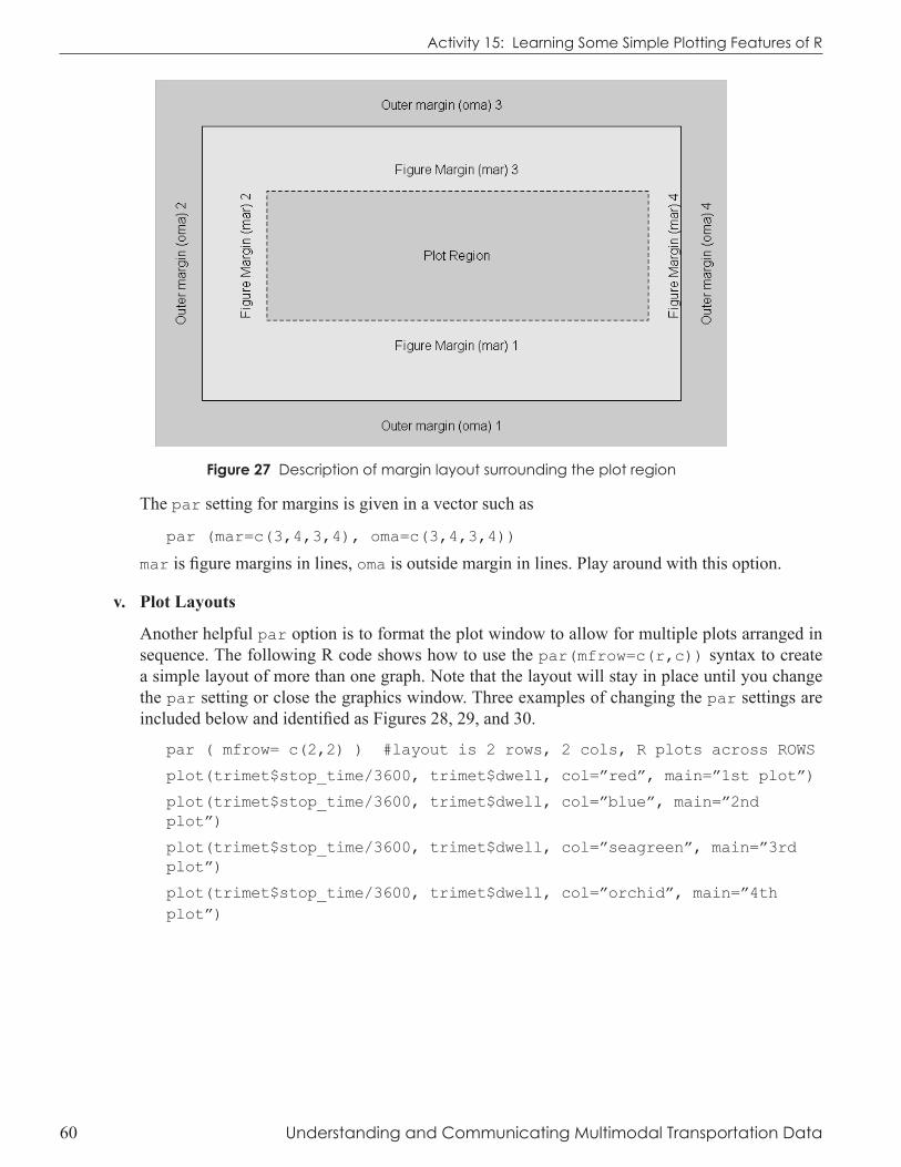
iv. Margins
Many par options can be set globally for one session of a graphics window. Calls to par will apply to the open graphics device (usually the screen) until you close it. A couple of helpful options are margins and layout. Margins are set by the number of lines (or inches) for both outer and figure region margins.
Activity 15: Learning Some Simple Plotting Features of R
60 Understanding and Communicating Multimodal Transportation Data
Figure 27 Description of margin layout surrounding the plot region
The par setting for margins is given in a vector such as
par (mar=c(3,4,3,4), oma=c(3,4,3,4))
mar is figure margins in lines, oma is outside margin in lines. Play around with this option.
v. Plot Layouts
Another helpful par option is to format the plot window to allow for multiple plots arranged in sequence. The following R code shows how to use the par(mfrow=c(r,c)) syntax to create a simple layout of more than one graph. Note that the layout will stay in place until you change the par setting or close the graphics window. Three examples of changing the par settings are included below and identified as Figures 28, 29, and 30.
par ( mfrow= c(2,2) ) #layout is 2 rows, 2 cols, R plots across ROWS
plot(trimet$stop_time/3600, trimet$dwell, col=”red”, main=”1st plot”)
plot(trimet$stop_time/3600, trimet$dwell, col=”blue”, main=”2nd plot”)
plot(trimet$stop_time/3600, trimet$dwell, col=”seagreen”, main=”3rd plot”)
plot(trimet$stop_time/3600, trimet$dwell, col=”orchid”, main=”4th plot”)
Activity 15: Learning Some Simple Plotting Features of R

Understanding and Communicating Multimodal Transportation Data 61
Figure 28 Plot of trimet$stop_time versus trimet$dwell with 2 row and 2 column layout.
Figure 29 Plot of trimet$stop_time versus trimet$dwell with 2 row and 3 column layout.
Activity 15: Learning Some Simple Plotting Features of R Activity 15: Learning Some Simple Plotting Features of R

62 Understanding and Communicating Multimodal Transportation Data
Figure 30 Plot of trimet$stop_time versus trimet$dwell with 2 row and 3 column layout with ordering completed down columns
No doubt, all of the par options can be daunting but once you figure out how this works, you will be able to really control the appearance of graphs. The options bg, lwd, pch, col, cex, and las are some of the more common ones and can be passed to the graphics options in the plot command.
4. In your R script, include code that shows changing at least three of these options (and include multiple examples of the option changes, perhaps even in a nice layout option). Try at least four other par options that look interesting to you not listed previously. Prepare an R code that you can share with the class showing your experiment.
F. Adding Other Data to Graph
This is the first example of how R “paints” graphs. Note that the first call to plot sets the x and y limits so if you might need to adjust the xlim and ylim so that both data sets fit, or change the order.
plot(trimet$stop_time/3600, trimet$dwell, col=”red”)
points( trimet$stop_time/3600, trimet$est_load, col=”blue”)
points is a function that adds points to an existing plot window.
5. Reverse the order of how dwell and est_load are plotted. Do you see how the first call sets the plot window?
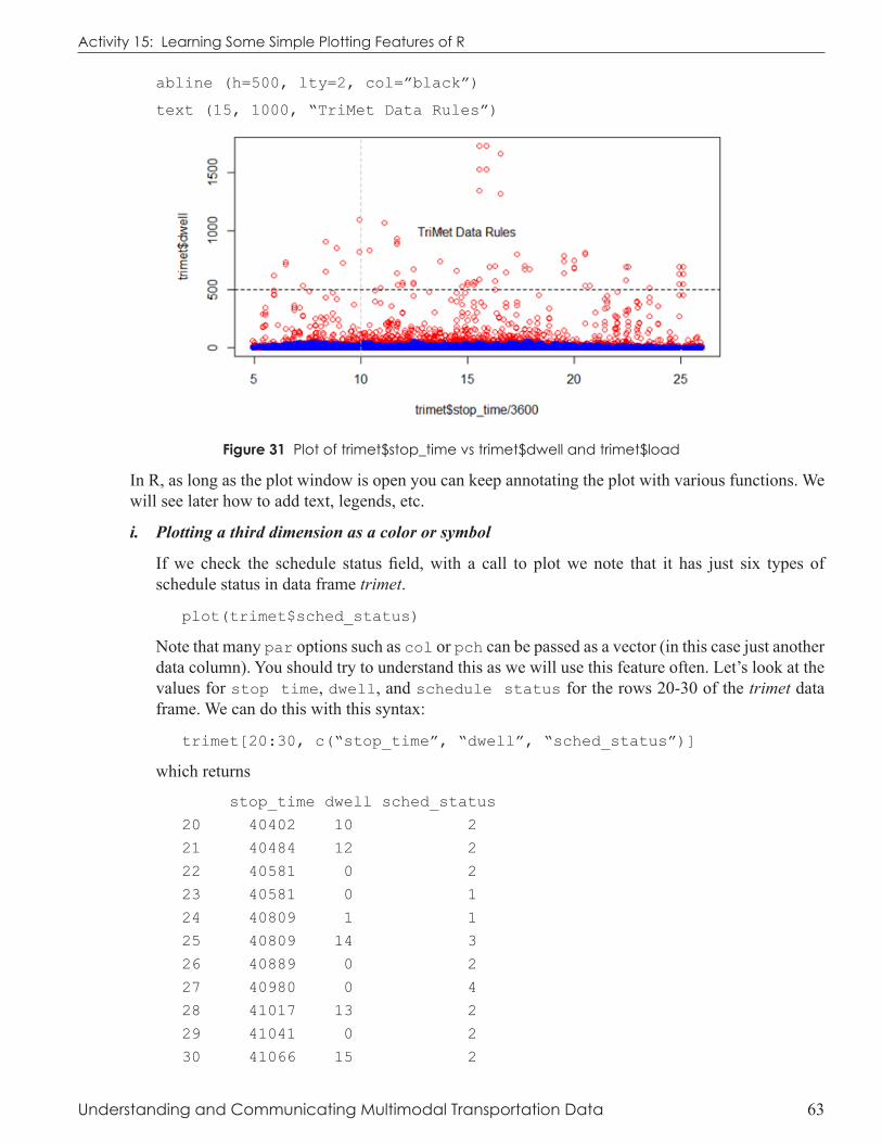
Try adding a special line with this function (see Figure 31):
abline (v=10, lty=2, col=”grey”)
Activity 15: Learning Some Simple Plotting Features of R Activity 15: Learning Some Simple Plotting Features of R
Understanding and Communicating Multimodal Transportation Data 63
abline (h=500, lty=2, col=”black”)
text (15, 1000, “TriMet Data Rules”)
Figure 31 Plot of trimet$stop_time vs trimet$dwell and trimet$load
In R, as long as the plot window is open you can keep annotating the plot with various functions. We will see later how to add text, legends, etc.
i. Plotting a third dimension as a color or symbol
If we check the schedule status field, with a call to plot we note that it has just six types of schedule status in data frame trimet.
plot(trimet$sched_status)
Note that many par options such as col or pch can be passed as a vector (in this case just another data column). You should try to understand this as we will use this feature often. Let’s look at the values for stop time, dwell, and schedule status for the rows 20-30 of the trimet data frame. We can do this with this syntax:
trimet[20:30, c(“stop_time”, “dwell”, “sched_status”)]
which returns
stop_time dwell sched_status
20 40402 10 2
21 40484 12 2
22 40581 0 2
23 40581 0 1
24 40809 1 1
25 40809 14 3
26 40889 0 2
27 40980 0 4
28 41017 13 2
29 41041 0 2
30 41066 15 2
Activity 15: Learning Some Simple Plotting Features of R

64 Understanding and Communicating Multimodal Transportation Data
Let’s say we want to color code the points by the value of schedule status. The stop time is the x value (1st dimension), the dwell time is the y-axis (2nd dimension), and we can color code the symbol to represent the schedule status (3rd dimension). To help you see how R can make things easier, let’s plot these eleven elements for rows 20-30 (which we have assigned to s_plot):
plot(s_plot$stop_time, s_plot$dwell, pch=16, col=s_plot$sched_status)
text (s_plot$stop_time, s_plot$dwell, s_plot$sched_status, pos=3)
As shown in the plot, each point is plotted at the x and y values above. The color is specified as the value of the sched_status field. For convenience, we’ve plotted the value of the schedule status as text above the data point. Remember that col=1 is black, col=2 is red, col=3 is green and col=4 is blue. So for the data point in row 27, the x-value is 40980, the y-value is 0, and the color=sched_status=4, which is blue!
Figure 32 Plot of s_plot$stop_time vs. s_plot$dwell with third dimension of sched_status differentiated by color
Now, let’s apply this same strategy to the entire data frame.
plot(trimet$stop_time/3600, trimet$dwell, col=trimet$sched_status, pch= trimet$sched_status)
You can add a legend to the plot with the legend() function
legend (“topright”, col= sort(unique(trimet$sched_status)), pch= sort(unique(trimet$sched_status)), c(“1 = unscheduled stop”,
“2 = regular stop”,
“3 = pseudo stop (unofficial time point)”,
“4 = time point (official time point)”,
“5 = first stop in trip”,
“6 = last stop in trip”
))
Activity 15: Learning Some Simple Plotting Features of R Activity 15: Learning Some Simple Plotting Features of R

Understanding and Communicating Multimodal Transportation Data 65
Figure 33 Plot of trimet$stop_time vs trimet$dwell with schedule_status as 3rd dimension
6. Look at the legend code. Can you see why that we applied the sort(unique()) function to the column of schedule stops? One helpful tip is just run unique(trimet$sched_status) to see what it returns. You might need to refer to the legend help function.
We could be a little more specific in applying the color to the plot, rather than letting the colors be set by the integers 1, 2, 3. So , what if I make a vector of the colors I want and name it schedule:
schedule <- c(“green”, “blue”, “yellow”, “orange”, “red”, “black”)
Determine for yourself that schedule[1] or schedule [2] returns a plot color. Now, if we stick this in the plot call, R will plot the color of the symbol by looking up the color from schedule based on the value in trimet$sched_status column. Play with the R code until you can see what is happening.
plot(trimet$stop_time/3600, trimet$dwell, col=schedule[trimet$sched_status], pch= 16)
You can add a legend to the plot with legend() function with a slight variation
legend (“topright”, fill=schedule, c(“1 = unscheduled stop”,
“2 = regular stop”,
“3 = pseudo stop (unofficial time point)”,
“4 = time point (official time point)”,
“5 = first stop in trip”,
“6 = last stop in trip”
))
Activity 15: Learning Some Simple Plotting Features of R

66 Understanding and Communicating Multimodal Transportation Data
Activity 15: Learning Some Simple Plotting Features of R
Figure 34 Plot of trimet$stop_time vs trimet$dwell with schedule_status as 3rd dimension
7. What does this plot reveal about the high dwell times?
This really is one of the strengths of plotting large amounts of data. If you had blindly calculated average dwell time, your result would be biased by including the first, last and some unscheduled stops. Perhaps these are relevant data points in the analysis that you will conduct, but this simple exploration helps you detect that.
deLiverAbLe
Save your R script file. Clear the list of objects in R memory, then rerun your script to make sure all works. Revise your R code so that it includes just the answers to the seven questions in this activity. Include comments in your R script. Submit in the course dropbox.
AssessmentThe following points are assigned and will be used to a score to your assignment.
All code executes and has good, clear comments = 4
Interesting par options = 2
Answers to questions = 4
Total points = 10