analysis of visual rhetoric for official website city ... · region, the pasupati flyover, monument...
TRANSCRIPT

Analysis Of Visual Rhetoric for
Official Website City Government
M. Syahril Iskandar Departement of Visual Communication
Design
Universitas Komputer Indonesia Bandung, Indonesia
Abstract— The aim of the research to analyse benefits of
the official website of city government. In addition, the
main focus of this study is to examine visual rhetoric on
the official website of Bandung City Government in an
effort to attract the public to visit the site and can
represent Bandung as the Creative City of the World.
Unlike the previous, Information can only be accessed by
a certain circle only or better known as Asymmetric
Information. Now, the Information Technology Age has
made it easy for people to access the information they
want. In fact, the world and the information that is
inside it can be accessed through the gadget in hand.
Bandung City Government responded to this
development by creating an official government website.
Through its website, the city government of Bandung
provide information on Employee Data and Mayor,
Government Work Program, Public Service, Financial
transparency, Tax and Retribution, until Public Patch.
A Website cannot only present a number of Data but
how to persuade and attract people to access the data
through visual created so as to form Lead Public
Perception. Visual image is a phenomenon of visual
communication that transmits messages (government) to
the message receiver (the people).Visual sign in text and
still images is a representation of an object that produces
a different understanding in viewing the visual object in
semiotics study.
Keywords—Visual Rhetoric, website, Government
I. INTRODUCTION
Technology and information era has changed everything
including selling and marketing system, education, and
government system. A few years ago, when public need an
information about government policy they need to come
directly to the government office. Now a day public is able
to access the news from the official website to get the data
which is run by the local government. Almost every
governmental in Indonesia has running the information
trough website one of it are the city government of
Indonesia [1].
Bandung is known as a creative city. A city of pop culture
such as pop art, leisure, music, creative education, and life
style. This message has been declared and issued with a
notice by the UNESCO on December 2015 that Bandung as
one of the creative cities network
Embedding Bandung as one of creative city by world
organization as UNESCO is a world class rewarded and
have special value to attract foreign tourists to visit
Bandung, to fulfill the need of foreign tourism Bandung
needs to provide website media that is easy to access from
all over the world. Not only accessible but also persuasively
attractive for people to get a complete information by
visualizing the whole website design about Bandung. The
main issue is had the visual design of website representing
Bandung as a creative city? That can pursue the audience to
access the information and persuasively invite the audience
to visit Bandung.
Persuasion in visual is known as visual rhetoric. Douglas
Ehninger in Smith., et al (2005, h 141) said rhetoric is not
only about verbal symbol or visual, it’s a wider
understanding about visual object. The audience’s mind and
behavior can be influenced by visual rhetoric through
strategic symbols. Therefore, its became the main issue to
study the visual rhetoric of city government website as a
creative city network.
II. METHOD
Visual rhetoric has two meanings. First, it refers to the
visual image itself which in Visual Communication Design
terminology is an objective study. While the second
meaning is perspective reference or rhetorical approach used
through three aspects of visual imagery: nature, function and
evaluation. So in this study will reveal the first meaning of
visual rhetoric, namely dissecting visual imagery built on
the website and provide an overview of how visual rhetoric
is built on the Bandung city government website as a
creative city of the world. The method used in this study is
qualitative descriptive method.
III. RESULTS AND DISCUSSION
In the Rhetoric perspective, visual rhetoric has two
meanings, namely: visual rhetoric as a communication
artifact that is visual works that have been created or exist
using visual symbols that aim to influence the target
audience from both psychological and behavioral
perspectives. And the second is the visual rhetorical
perspective which is an analysis to be able to see the
communicative dimensions of visual works by looking at
the whole picture which in the context of this research is the
whole picture on the Bandung city government website from
the first page (home page) to other pages.
First is the elements presented such as images, the style of
images used through the main and other pages on the
International Conference on Business, Economic, Social Sciences and Humanities (ICOBEST 2018)
Copyright © 2018, the Authors. Published by Atlantis Press. This is an open access article under the CC BY-NC license (http://creativecommons.org/licenses/by-nc/4.0/).
Advances in Social Science, Education and Humanities Research, volume 225
226
website. On the whole picture the main page will appear
motifs resembling light blue and dark blue batik
combinations, seen in Figure 1.
Fig 1. The main motive on the website display
From the view of design style, the picture represent
bandung identity as a city of batik with geometric style and
contemporary describe specific shape, as Teteh Cahyati
from Batik Hasan said before. Antoher explanation coming
from Netty Prasetyani about the different between
Bandung’s batik with other batik is because bandung has
known as melting point or iconic city of other area in West
Java.
On the left corner of website homepage there is a logo of
Bandung with the acronym of Bandung City: .bdg followed
by ‘bandung.go.id’ in blue. And under the caption written
‘Portal Resmi Kota Bandung’. Meanwhile on the right top
corner there is a searching menu represented by the symbol
of loop or eye symbol, seen in Figure 2.
Fig 2. The top part of the website
The placement of the logo of the city of Bandung placed
on the left side of the display in accordance with the
direction of the eye, which is commonly used in Indonesian
society and many countries move from left to right. This can
be indicated as an effort by the government to inform the
public of the identity and information on the position of the
page that the audience is looking at. Through affirmation of
the words as the official portal of the Bandung city
government.
After the menu of various facilities available on the
website, such as organizational structure (Pemerintah),
facilities and infrastructure, at a glance, News about
Bandung (Bandung Hari Ini) to the public service image
shown next in the picture on the main page of the Bandung
city government website featuring two figures the Bandung
City leader used the flat design technique, namely Ridwan
Kamil (as a Mayor) in the lower left corner of the screen and
Oded M Danial (as a Deputy of Mayor) placed in the lower
right corner of the screen, seen in Figure 3.
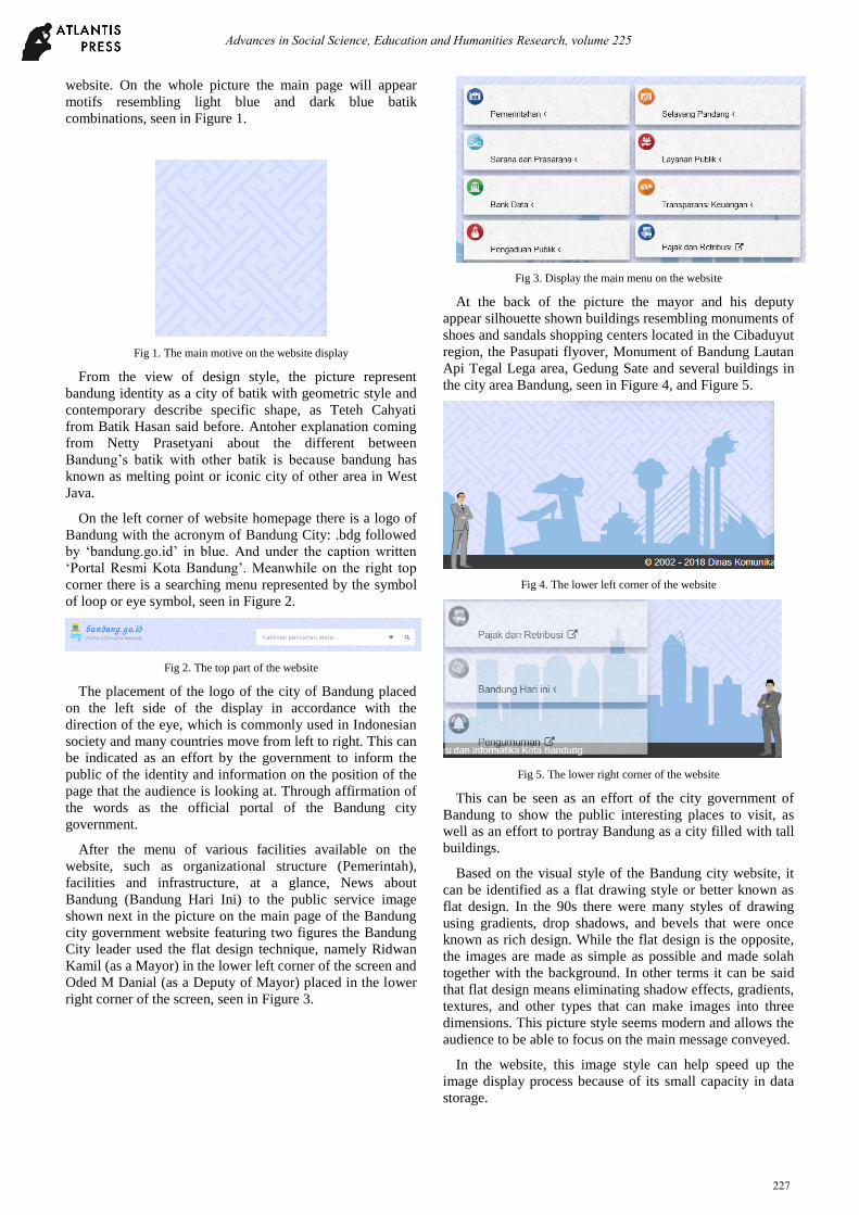
Fig 3. Display the main menu on the website
At the back of the picture the mayor and his deputy
appear silhouette shown buildings resembling monuments of
shoes and sandals shopping centers located in the Cibaduyut
region, the Pasupati flyover, Monument of Bandung Lautan
Api Tegal Lega area, Gedung Sate and several buildings in
the city area Bandung, seen in Figure 4, and Figure 5.
Fig 4. The lower left corner of the website
Fig 5. The lower right corner of the website
This can be seen as an effort of the city government of
Bandung to show the public interesting places to visit, as
well as an effort to portray Bandung as a city filled with tall
buildings.
Based on the visual style of the Bandung city website, it
can be identified as a flat drawing style or better known as
flat design. In the 90s there were many styles of drawing
using gradients, drop shadows, and bevels that were once
known as rich design. While the flat design is the opposite,
the images are made as simple as possible and made solah
together with the background. In other terms it can be said
that flat design means eliminating shadow effects, gradients,
textures, and other types that can make images into three
dimensions. This picture style seems modern and allows the
audience to be able to focus on the main message conveyed.
In the website, this image style can help speed up the
image display process because of its small capacity in data
storage.
Advances in Social Science, Education and Humanities Research, volume 225
227
The first flat design style was introduced by The Swiss
Style with the name Typographic, The Swiss Style which
dominated in 1940 - 1950. Next Flat Design was found in
the era of minimalism, where the design style in this era
uses only the necessary elements, such as geometric shapes,
related design ornaments, bright colors and clean lines. Like
the work of The Blue Epoch Yves Klein. Which is now
popular again through the design of world-leading
companies such as Apple and Nike's design styles that are
closely related to the company's image that is full of
creativity and innovation.
Based on the description above can be captured the
message to be constructed is Bandung as a creative city that
is displayed through the style of images used on the official
website of the city of Bandung.
Second, Suggested is big themes presented through the
main and other pages on the website. Because one of the
main factors of successful communication is when the
message can be conveyed to the audience both through
textual, verbal and visual. Like the ornament, lay out and
color used on the Bandung city government website as a
creative city.
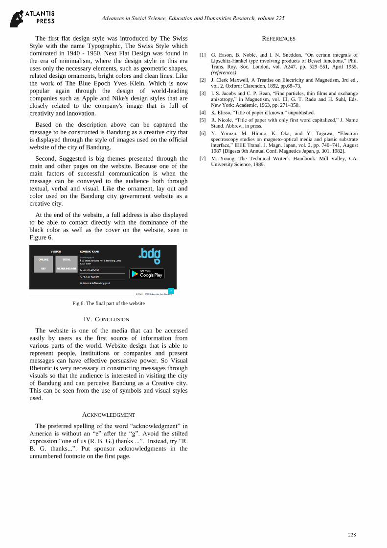
At the end of the website, a full address is also displayed
to be able to contact directly with the dominance of the
black color as well as the cover on the website, seen in
Figure 6.
Fig 6. The final part of the website
IV. CONCLUSION
The website is one of the media that can be accessed
easily by users as the first source of information from
various parts of the world. Website design that is able to
represent people, institutions or companies and present
messages can have effective persuasive power. So Visual
Rhetoric is very necessary in constructing messages through
visuals so that the audience is interested in visiting the city
of Bandung and can perceive Bandung as a Creative city.
This can be seen from the use of symbols and visual styles
used.
ACKNOWLEDGMENT
The preferred spelling of the word “acknowledgment” in
America is without an “e” after the “g”. Avoid the stilted
expression “one of us (R. B. G.) thanks ...”. Instead, try “R.
B. G. thanks...”. Put sponsor acknowledgments in the
unnumbered footnote on the first page.
REFERENCES
[1] G. Eason, B. Noble, and I. N. Sneddon, “On certain integrals of
Lipschitz-Hankel type involving products of Bessel functions,” Phil. Trans. Roy. Soc. London, vol. A247, pp. 529–551, April 1955. (references)
[2] J. Clerk Maxwell, A Treatise on Electricity and Magnetism, 3rd ed., vol. 2. Oxford: Clarendon, 1892, pp.68–73.
[3] I. S. Jacobs and C. P. Bean, “Fine particles, thin films and exchange anisotropy,” in Magnetism, vol. III, G. T. Rado and H. Suhl, Eds. New York: Academic, 1963, pp. 271–350.
[4] K. Elissa, “Title of paper if known,” unpublished.
[5] R. Nicole, “Title of paper with only first word capitalized,” J. Name Stand. Abbrev., in press.
[6] Y. Yorozu, M. Hirano, K. Oka, and Y. Tagawa, “Electron spectroscopy studies on magneto-optical media and plastic substrate interface,” IEEE Transl. J. Magn. Japan, vol. 2, pp. 740–741, August 1987 [Digests 9th Annual Conf. Magnetics Japan, p. 301, 1982].
[7] M. Young, The Technical Writer’s Handbook. Mill Valley, CA: University Science, 1989.
Advances in Social Science, Education and Humanities Research, volume 225
228