biased behavior in web activities: from understanding to unbiased visual exploration
TRANSCRIPT
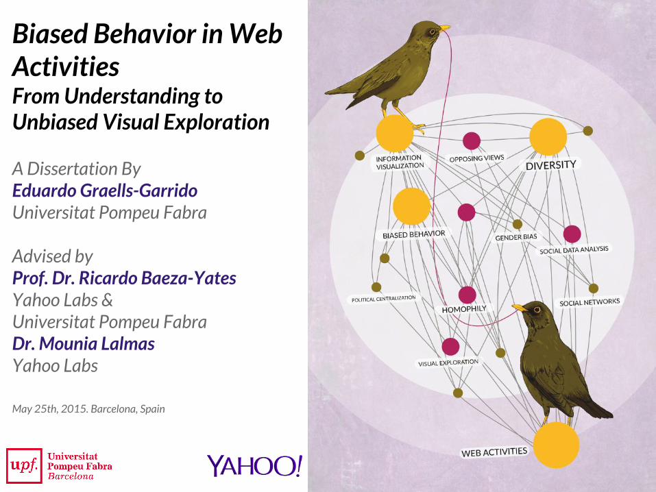
Biased Behavior in Web ActivitiesFrom Understanding to Unbiased Visual Exploration
A Dissertation ByEduardo Graells-GarridoUniversitat Pompeu Fabra
Advised byProf. Dr. Ricardo Baeza-YatesYahoo Labs &Universitat Pompeu FabraDr. Mounia LalmasYahoo Labs
May 25th, 2015. Barcelona, Spain
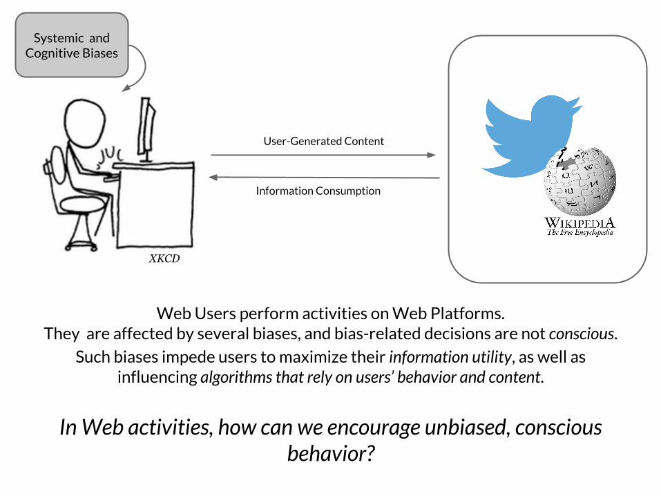
Web Users perform activities on Web Platforms. They are affected by several biases, and bias-related decisions are not conscious.
Such biases impede users to maximize their information utility, as well as influencing algorithms that rely on users’ behavior and content.
In Web activities, how can we encourage unbiased, conscious behavior?
Systemic and Cognitive Biases
User-Generated Content
Information Consumption
XKCD

Current Approaches
Previously, many paths have been pursued to make people explore and consume diverse information:
- Filtering Algorithms [Munson et al., 2009]
- Clustering, Sorting & Highlighting [Park et al., 2009; Munson and Resnick, 2010]
- Visualizations [Faridani et al., 2010; Munson et al., 2013; Liao and Fu, 2014]
- User Control of Political Attributes [An et al., 2014]
They have found that, in the context of biases related to information consumption:
- Users still behave in biased ways even when confronting unbiased content or using different user interfaces...
- ... because users do not value diversity.
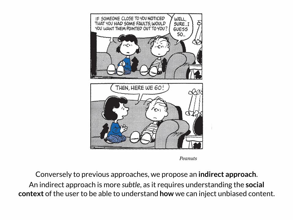
Conversely to previous approaches, we propose an indirect approach.
An indirect approach is more subtle, as it requires understanding the social context of the user to be able to understand how we can inject unbiased content.
Peanuts
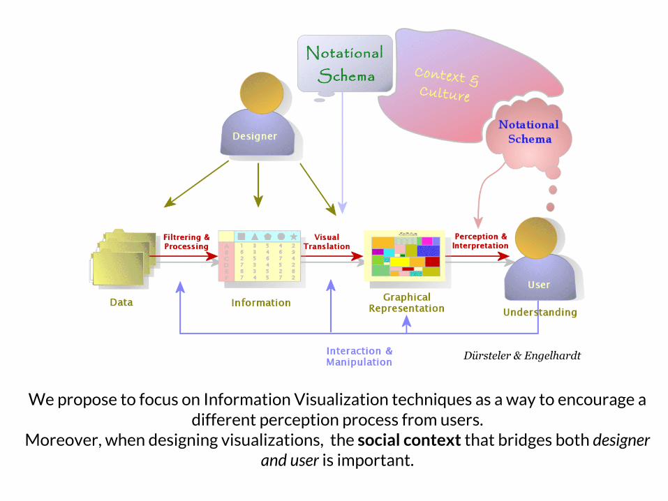
We propose to focus on Information Visualization techniques as a way to encourage a different perception process from users.
Moreover, when designing visualizations, the social context that bridges both designer and user is important.
Dürsteler & Engelhardt
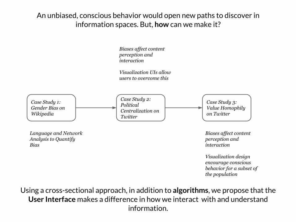
Case Study 1:Gender Bias on Wikipedia
Case Study 2: Political Centralization on Twitter
Case Study 3: Value Homophily on Twitter
Language and Network Analysis to Quantify Bias
Biases affect content perception and interaction
Visualization UIs allow users to overcome this
Biases affect content perception and interaction
Visualization design encourage conscious behavior for a subset of the population
Using a cross-sectional approach, in addition to algorithms, we propose that the User Interface makes a difference in how we interact with and understand
information.
An unbiased, conscious behavior would open new paths to discover in information spaces. But, how can we make it?
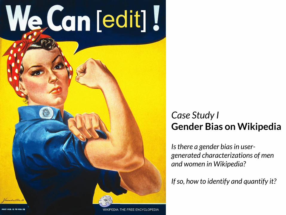
Case Study IGender Bias on Wikipedia
Is there a gender bias in user-generated characterizations of men and women in Wikipedia?
If so, how to identify and quantify it?

Cumulative fraction of Women in time and fraction of
biographies per year, between years 1600 and 2000.
Women presence, although low, is steadily increasing, in
particular for women after the French Revolution (1800).
Why Wikipedia and Gender Bias?
Largest Open-Knowledge Repository. It has a community bias: only 16% of editors are women (gender gap)..
Although of 893,380 biographies in DBPedia, only 15% are from women, we do not focus on presence fraction as a form of bias. In fact, women presence is increasing!
We focus on characterization, because editors choose their own words when editing articles.
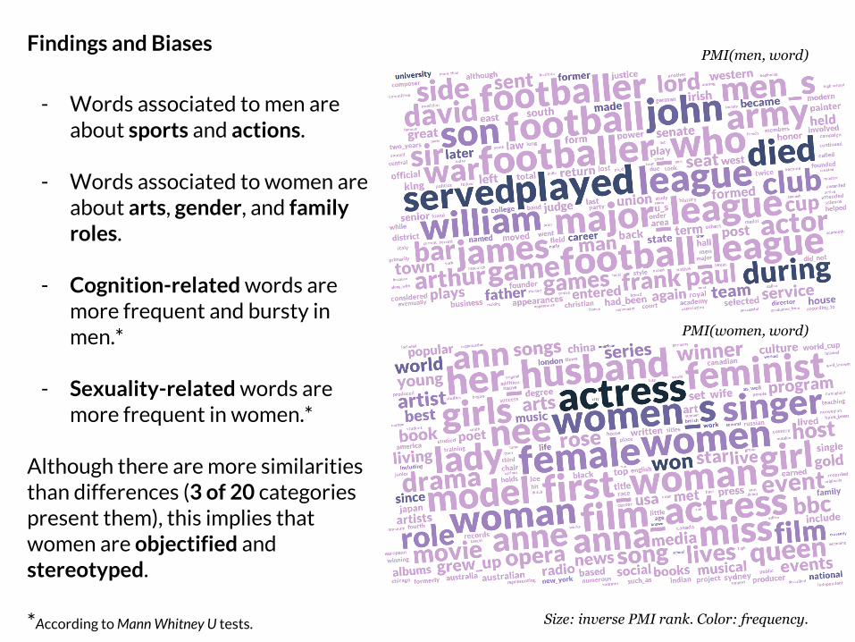
Findings and Biases
- Words associated to men are about sports and actions.
- Words associated to women are about arts, gender, and family roles.
- Cognition-related words are more frequent and bursty in men.*
- Sexuality-related words are more frequent in women.*
Although there are more similarities than differences (3 of 20 categories present them), this implies that women are objectified and stereotyped.
*According to Mann Whitney U tests.
PMI(men, word)
PMI(women, word)
Size: inverse PMI rank. Color: frequency.
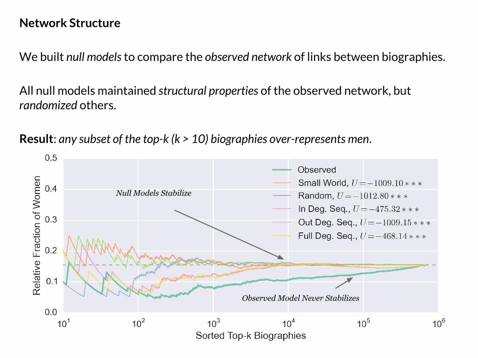
Network Structure
We built null models to compare the observed network of links between biographies.
All null models maintained structural properties of the observed network, but randomized others.
Result: any subset of the top-k (k > 10) biographies over-represents men.
Null Models Stabilize
Observed Model Never Stabilizes
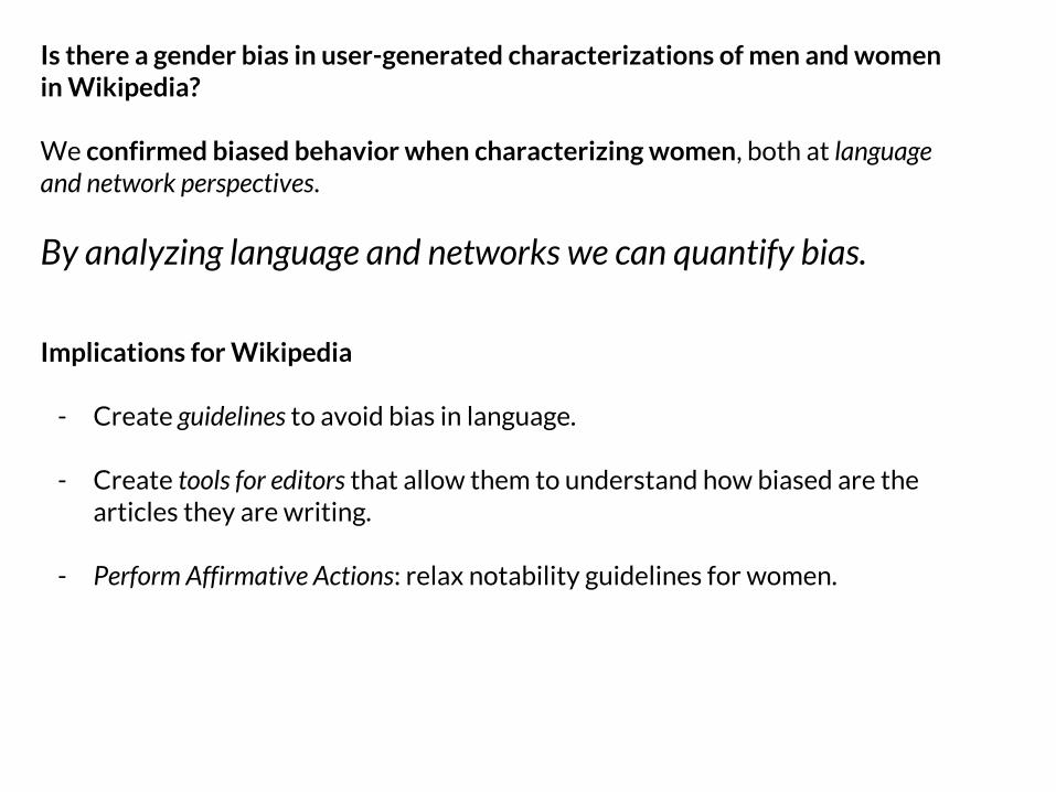
Is there a gender bias in user-generated characterizations of men and women in Wikipedia?
We confirmed biased behavior when characterizing women, both at language and network perspectives.
By analyzing language and networks we can quantify bias.
Implications for Wikipedia
- Create guidelines to avoid bias in language.
- Create tools for editors that allow them to understand how biased are the articles they are writing.
- Perform Affirmative Actions: relax notability guidelines for women.
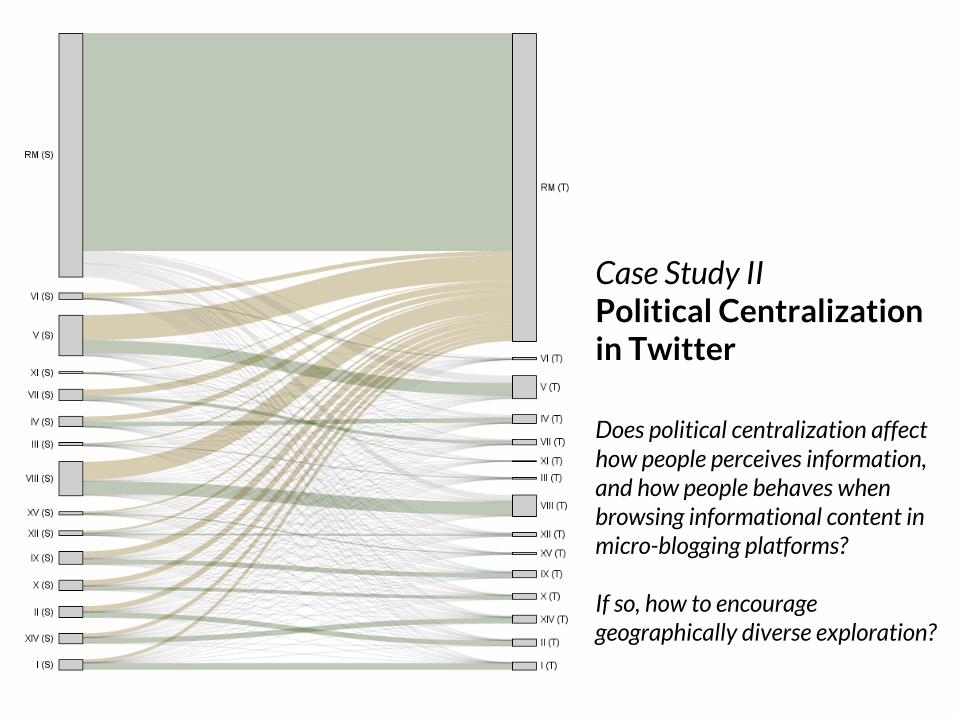
Case Study IIPolitical Centralization in Twitter
Does political centralization affect how people perceives information, and how people behaves when browsing informational content in micro-blogging platforms? If so, how to encourage geographically diverse exploration?
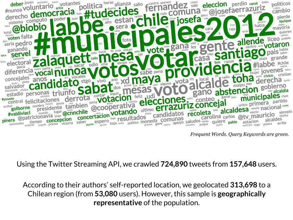
Using the Twitter Streaming API, we crawled 724,890 tweets from 157,648 users.
According to their authors’ self-reported location, we geolocated 313,698 to a Chilean region (from 53,080 users). However, this sample is geographically
representative of the population.
Frequent Words. Query Keywords are green.
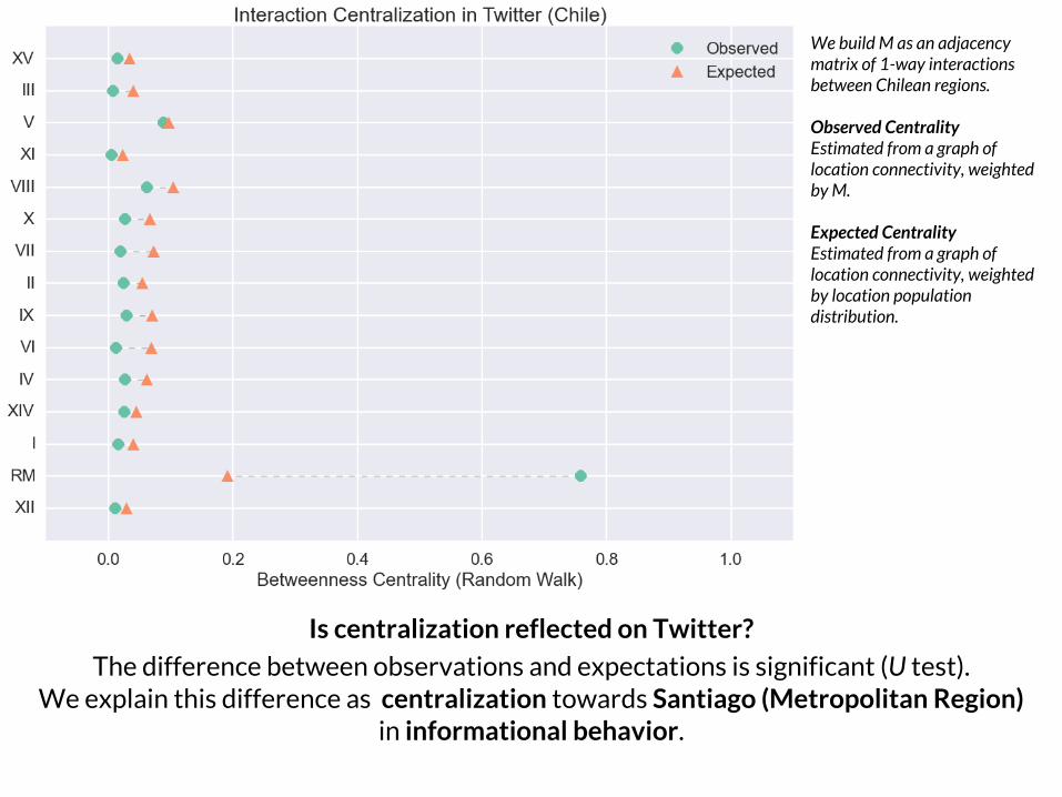
Is centralization reflected on Twitter?
The difference between observations and expectations is significant (U test).We explain this difference as centralization towards Santiago (Metropolitan Region)
in informational behavior.
We build M as an adjacency matrix of 1-way interactions between Chilean regions.
Observed CentralityEstimated from a graph of location connectivity, weighted by M.
Expected CentralityEstimated from a graph of location connectivity, weighted by location population distribution.
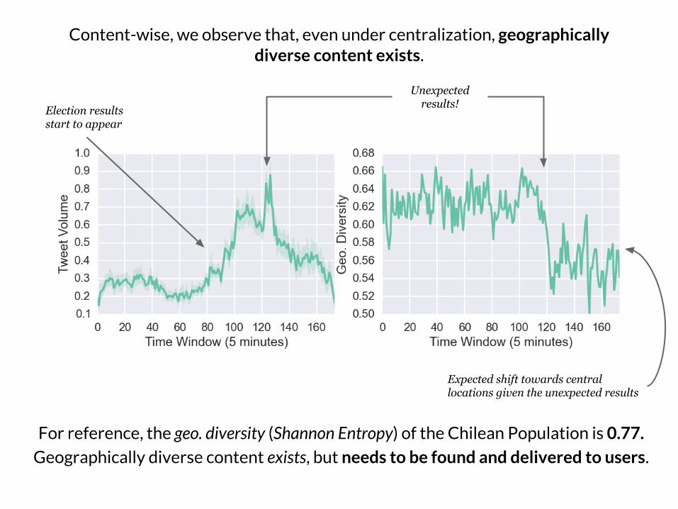
For reference, the geo. diversity (Shannon Entropy) of the Chilean Population is 0.77.
Geographically diverse content exists, but needs to be found and delivered to users.
Content-wise, we observe that, even under centralization, geographically diverse content exists.
Election results start to appear
Unexpected results!
Expected shift towards central locations given the unexpected results
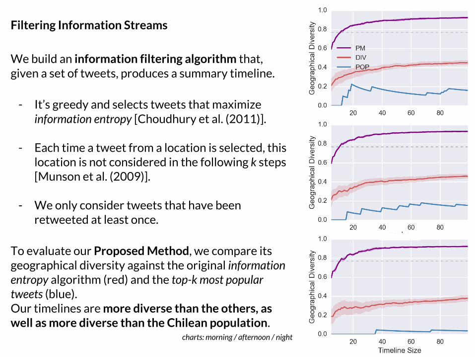
Filtering Information Streams
We build an information filtering algorithm that, given a set of tweets, produces a summary timeline.
- It’s greedy and selects tweets that maximize information entropy [Choudhury et al. (2011)].
- Each time a tweet from a location is selected, this location is not considered in the following k steps [Munson et al. (2009)].
- We only consider tweets that have been retweeted at least once.
To evaluate our Proposed Method, we compare its geographical diversity against the original information entropy algorithm (red) and the top-k most popular tweets (blue). Our timelines are more diverse than the others, as well as more diverse than the Chilean population.
charts: morning / afternoon / night
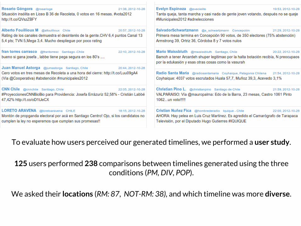
To evaluate how users perceived our generated timelines, we performed a user study.
125 users performed 238 comparisons between timelines generated using the three conditions (PM, DIV, POP).
We asked their locations (RM: 87, NOT-RM: 38), and which timeline was more diverse.
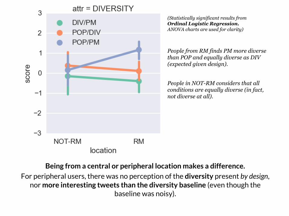
Being from a central or peripheral location makes a difference.
For peripheral users, there was no perception of the diversity present by design, nor more interesting tweets than the diversity baseline (even though the
baseline was noisy).
People in NOT-RM considers that all conditions are equally diverse (in fact, not diverse at all).
People from RM finds PM more diverse than POP and equally diverse as DIV (expected given design).
(Statistically significant results from Ordinal Logistic Regression. ANOVA charts are used for clarity)
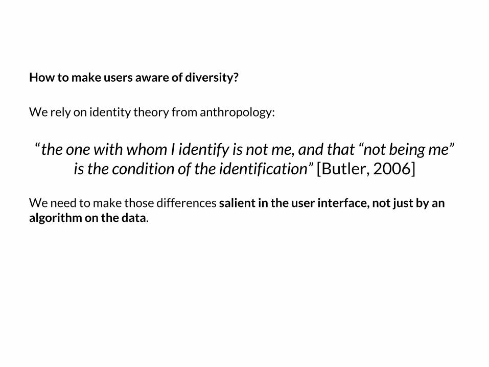
How to make users aware of diversity?
We rely on identity theory from anthropology:
“the one with whom I identify is not me, and that “not being me” is the condition of the identification” [Butler, 2006]
We need to make those differences salient in the user interface, not just by an algorithm on the data.
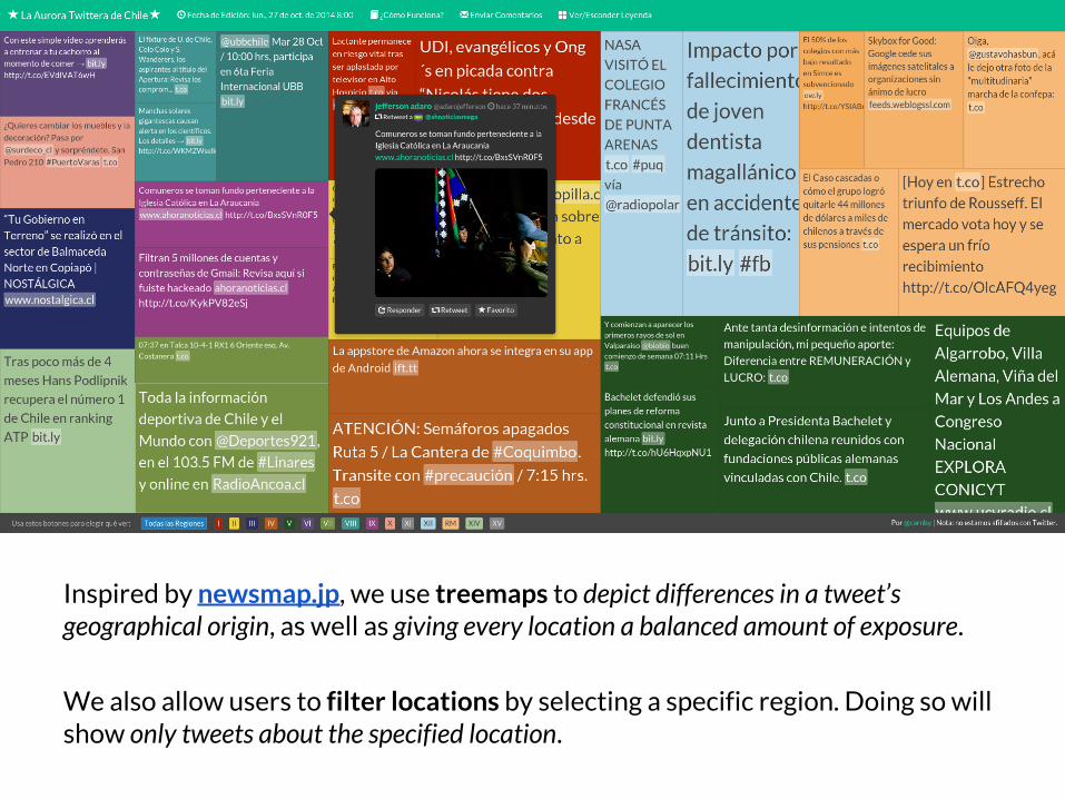
Inspired by newsmap.jp, we use treemaps to depict differences in a tweet’s geographical origin, as well as giving every location a balanced amount of exposure.
We also allow users to filter locations by selecting a specific region. Doing so will show only tweets about the specified location.
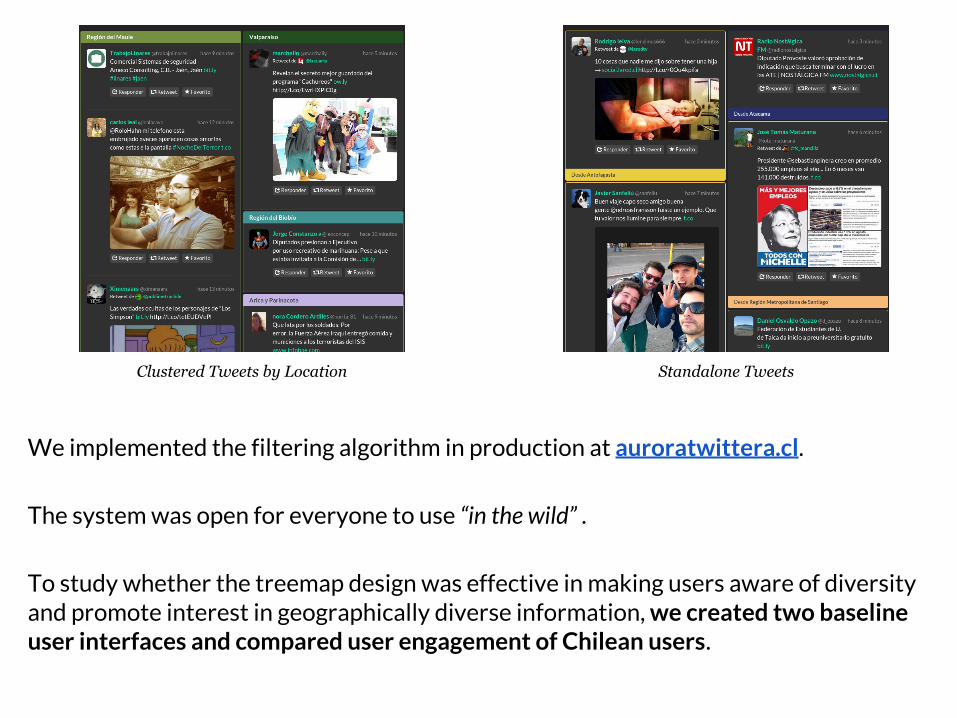
We implemented the filtering algorithm in production at auroratwittera.cl.
The system was open for everyone to use “in the wild” .
To study whether the treemap design was effective in making users aware of diversity and promote interest in geographically diverse information, we created two baseline user interfaces and compared user engagement of Chilean users.
Clustered Tweets by Location Standalone Tweets

N = 298 RM (173), NOT-RM (125)treemap (123), standalone (86), clustered tweets (89).
Users in RM (central) spend more time on the site (interest), but they do not return to it (they don’t need to).
Users in NOT-RM (peripheral) are more prone to return to the site and perform more location selections (utility).
The treemap condition made users more prone to return to the site, as well as to perform more location selections, regardless of location.
(Statistically significant results from Negative Binomial and
Gamma regressions. ANOVA charts are used for
clarity)
Main Results
- Geographical origin with respect to Political Centralization influences behavior, perception and engagement.
- Visualization was effective in engaging users into exploration of geographically diverse timelines, given an unbiased input (timelines generated by our method).
Implications for Platform Design
- Diversity is not valued because it is not seen. Information Visualization techniques makes diversity salient.
- User Interface should be customized for users to exploit their engagement patterns according to central/peripheral origin.
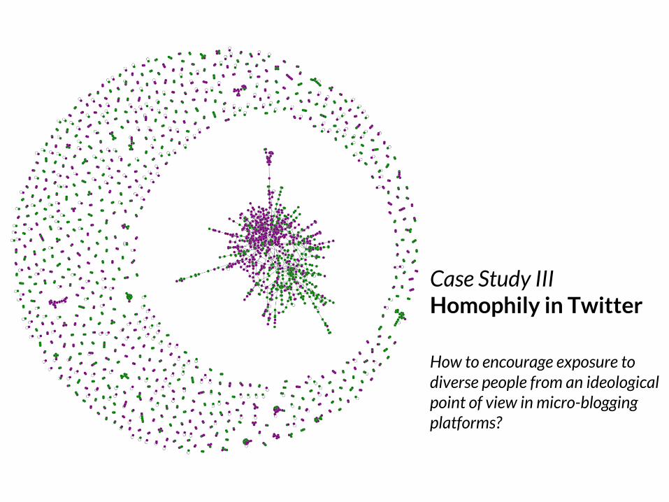
Case Study IIIHomophily in Twitter
How to encourage exposure to diverse people from an ideological point of view in micro-blogging platforms?
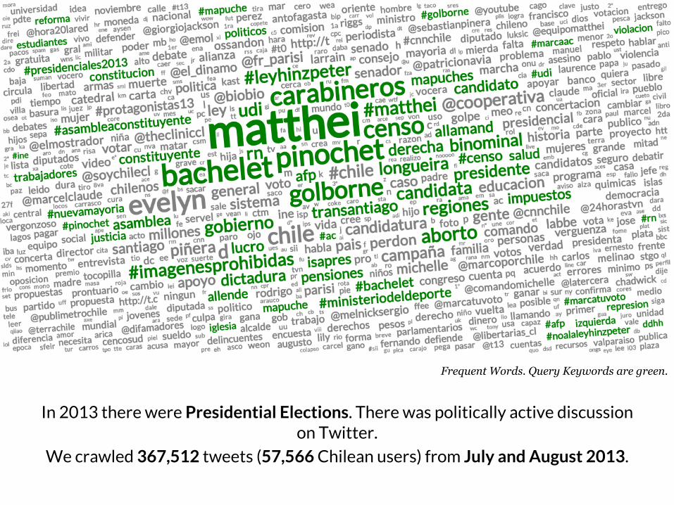
In 2013 there were Presidential Elections. There was politically active discussion on Twitter.
We crawled 367,512 tweets (57,566 Chilean users) from July and August 2013.
Frequent Words. Query Keywords are green.
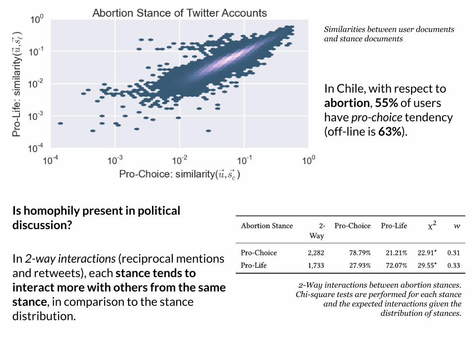
Is homophily present in political discussion?
In 2-way interactions (reciprocal mentions and retweets), each stance tends to interact more with others from the same stance, in comparison to the stance distribution.
Similarities between user documents and stance documents
In Chile, with respect to abortion, 55% of users have pro-choice tendency (off-line is 63%).
2-Way interactions between abortion stances. Chi-square tests are performed for each stance
and the expected interactions given the distribution of stances.
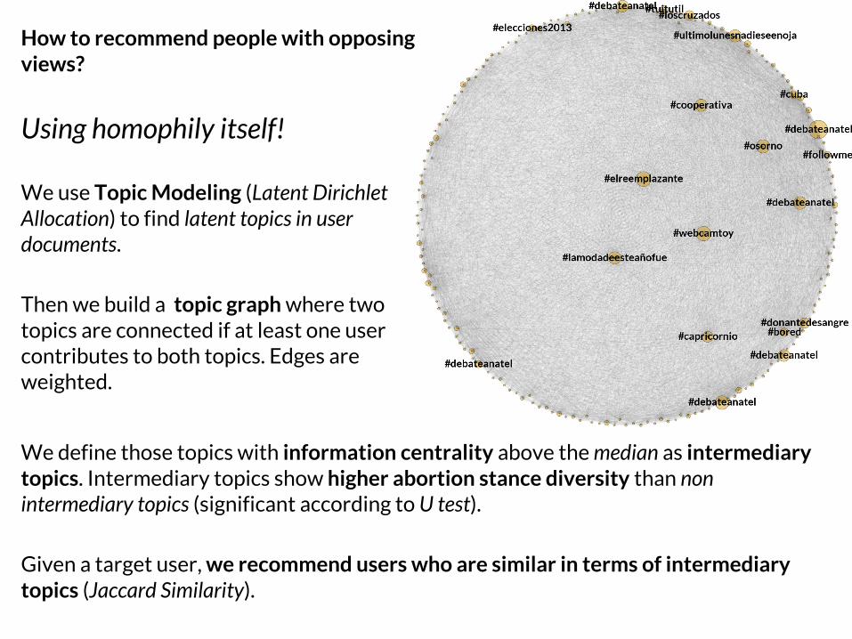
How to recommend people with opposing views?
Using homophily itself!
We use Topic Modeling (Latent Dirichlet Allocation) to find latent topics in user documents.
Then we build a topic graph where two topics are connected if at least one user contributes to both topics. Edges are weighted.
We define those topics with information centrality above the median as intermediary topics. Intermediary topics show higher abortion stance diversity than non intermediary topics (significant according to U test).
Given a target user, we recommend users who are similar in terms of intermediary topics (Jaccard Similarity).
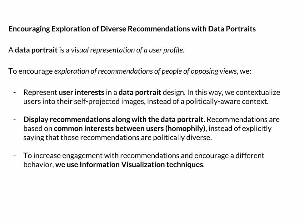
Encouraging Exploration of Diverse Recommendations with Data Portraits
A data portrait is a visual representation of a user profile.
To encourage exploration of recommendations of people of opposing views, we:
- Represent user interests in a data portrait design. In this way, we contextualize users into their self-projected images, instead of a politically-aware context.
- Display recommendations along with the data portrait. Recommendations are based on common interests between users (homophily), instead of explicitly saying that those recommendations are politically diverse.
- To increase engagement with recommendations and encourage a different behavior, we use Information Visualization techniques.
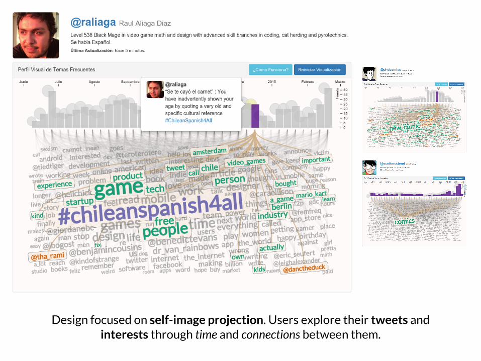
Design focused on self-image projection. Users explore their tweets and interests through time and connections between them.
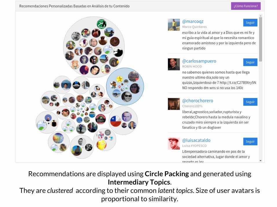
Recommendations are displayed using Circle Packing and generated using Intermediary Topics.
They are clustered according to their common latent topics. Size of user avatars is proportional to similarity.
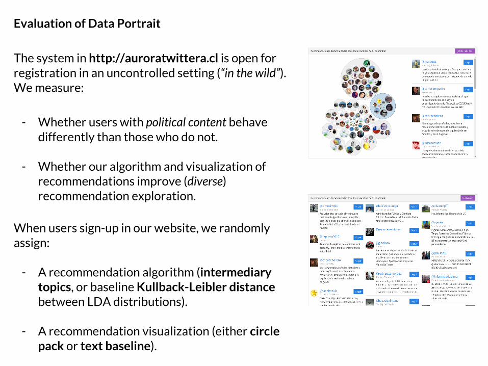
Evaluation of Data Portrait
The system in http://auroratwittera.cl is open for registration in an uncontrolled setting (“in the wild”). We measure:
- Whether users with political content behave differently than those who do not.
- Whether our algorithm and visualization of recommendations improve (diverse) recommendation exploration.
When users sign-up in our website, we randomly assign:
- A recommendation algorithm (intermediary topics, or baseline Kullback-Leibler distance between LDA distributions).
- A recommendation visualization (either circle pack or text baseline).

Circle pack increases recommendation events.
Baseline algorithm increases recommendation events.
Baseline algorithm increase likelihood of acceptance.
Politically vocal users are more likely to accept recommendations.
Circle pack + Intermediary Topics increase dwell time for
politically vocal users.
N = 136 base recs.: 65, IT: 71base UI: 62, C.P.: 74
(Statistically significant results from Negative Binomial and Gamma regressions. ANOVA charts are used for clarity)
This implies that politically-involved users who received Intermediary Topics recommendations, visualized with Circle Pack, performed a reflexive exploration (they take time to decide to accept or not).
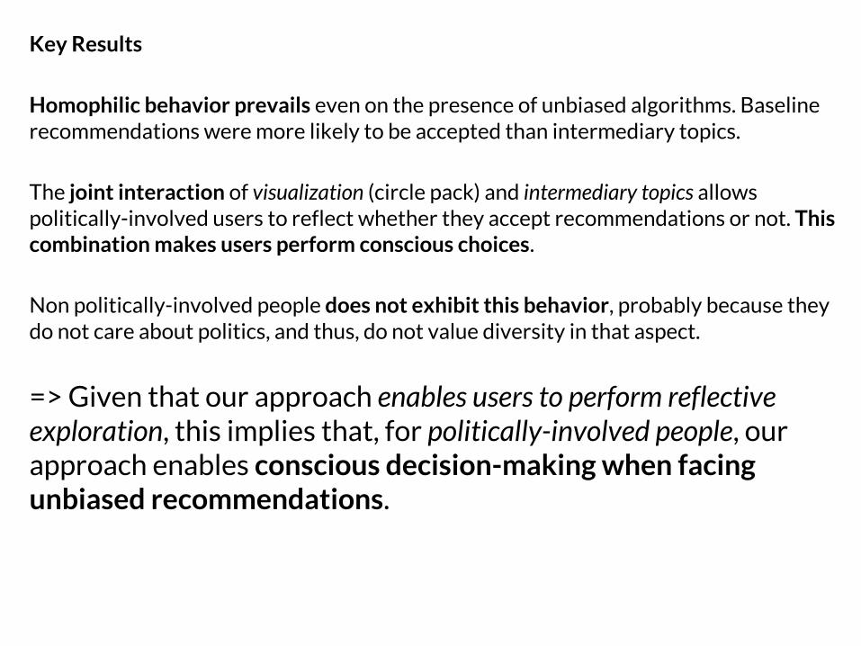
Key Results
Homophilic behavior prevails even on the presence of unbiased algorithms. Baseline recommendations were more likely to be accepted than intermediary topics.
The joint interaction of visualization (circle pack) and intermediary topics allows politically-involved users to reflect whether they accept recommendations or not. This combination makes users perform conscious choices.
Non politically-involved people does not exhibit this behavior, probably because they do not care about politics, and thus, do not value diversity in that aspect.
=> Given that our approach enables users to perform reflective exploration, this implies that, for politically-involved people, our approach enables conscious decision-making when facing unbiased recommendations.
Conclusions

Case Study 1:Gender Bias on Wikipedia
Case Study 2: Political Centralization on Twitter
Case Study 3: Value Homophily on Twitter
Language and Network Analysis to Quantify Bias
Biases affect content perception and interaction
Known Visualization UIs allow users to overcome this
Biases affect content perception and interaction
Novel visualization designs encourage conscious behavior for a subset of the population
Dissertation Key Findings
- Users’ behavior, perception and engagement in Web platforms are affected by off-line biases.
- Unbiased algorithms are necessary but not sufficient to encourage unbiased behavior.
- Information Visualization encourages exploration of diverse, unbiased content by making diversity salient and changing the way users perceive information.
Main Implications
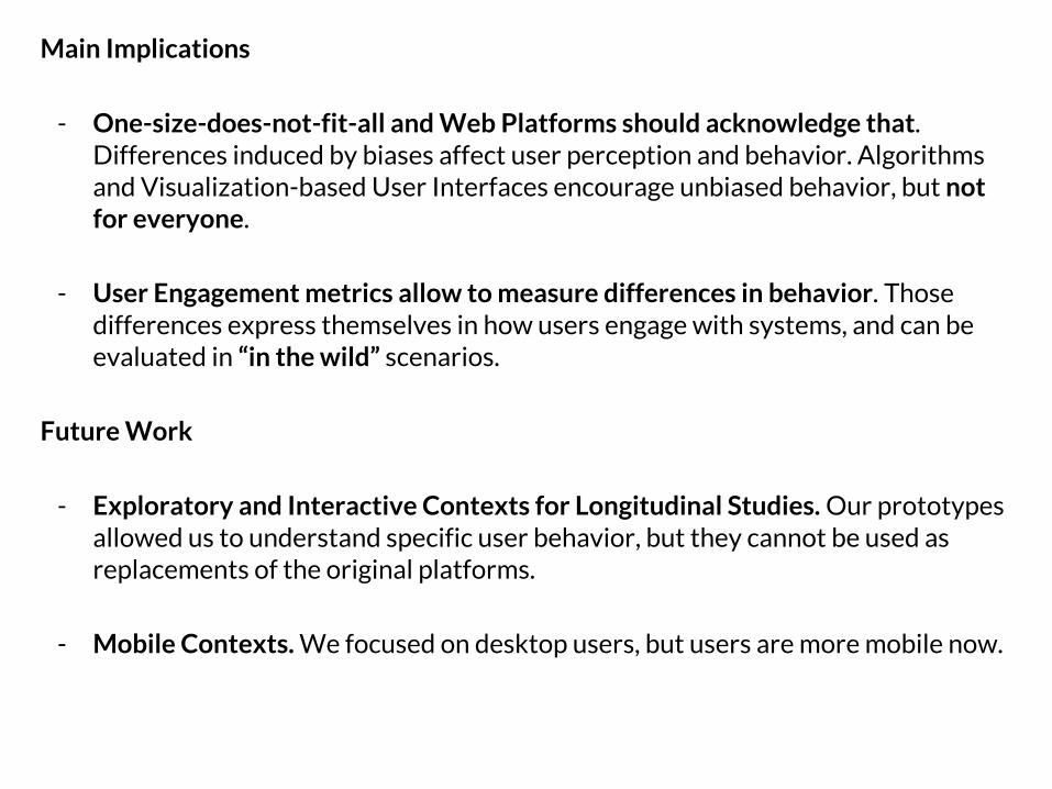
- One-size-does-not-fit-all and Web Platforms should acknowledge that. Differences induced by biases affect user perception and behavior. Algorithms and Visualization-based User Interfaces encourage unbiased behavior, but not for everyone.
- User Engagement metrics allow to measure differences in behavior. Those differences express themselves in how users engage with systems, and can be evaluated in “in the wild” scenarios.
Future Work
- Exploratory and Interactive Contexts for Longitudinal Studies. Our prototypes allowed us to understand specific user behavior, but they cannot be used as replacements of the original platforms.
- Mobile Contexts. We focused on desktop users, but users are more mobile now.

Thanks for your attention!Questions?
Some parts of the process...
Thank you!
Contact Information:
@carnby
http://carnby.github.io / http://ficciones.cl
Acknowledgements
Daniela Pajarito, and my family.Ricardo and Mounia.Alejandro Jaimes, Bárbara Poblete, Daniele Quercia, Filippo Menczer.Luca Chiarandini, Diego Sáez-Trumper, Luz Rello, María Arteaga, and Jay Byongkyu Kang.Sergio Salgado, Denis Parra, Andrés Lucero y Raúl Aliaga.Yahoo Labs, Barcelona Media and Universitat Pompeu Fabra. Ruth, Michele and Janette.And all our friends in Barcelona.
This dissertation is dedicated to the loving memory of Eduardo Graells-Salazar.
Illustrations: Paula Pérez (@athziri, cover), Cecilia Villacres (@lovecatscl, conclusions), Sergio Lantadilla (@peerro, acknowledgements).

BACKUP SLIDES
Gender Bias on Wikipedia

Dataset: Biographies from the English Wikipedia.
Abstract
Infobox
Meta-data
Full Biography
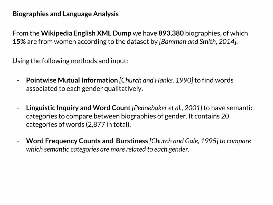
Biographies and Language Analysis
From the Wikipedia English XML Dump we have 893,380 biographies, of which 15% are from women according to the dataset by [Bamman and Smith, 2014].
Using the following methods and input:
- Pointwise Mutual Information [Church and Hanks, 1990] to find words associated to each gender qualitatively.
- Linguistic Inquiry and Word Count [Pennebaker et al., 2001] to have semantic categories to compare between biographies of gender. It contains 20 categories of words (2,877 in total).
- Word Frequency Counts and Burstiness [Church and Gale, 1995] to compare which semantic categories are more related to each gender.
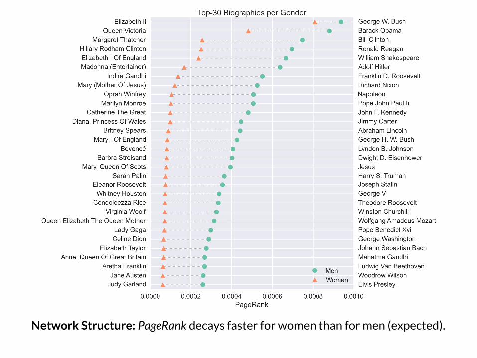
Network Structure: PageRank decays faster for women than for men (expected).
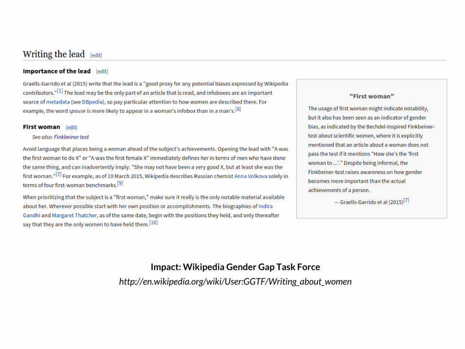
Impact: Wikipedia Gender Gap Task Force
http://en.wikipedia.org/wiki/User:GGTF/Writing_about_women
Political Centralization
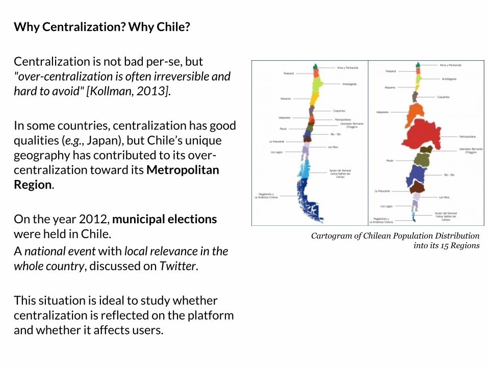
Why Centralization? Why Chile?
Centralization is not bad per-se, but "over-centralization is often irreversible and hard to avoid" [Kollman, 2013].
In some countries, centralization has good qualities (e.g., Japan), but Chile’s unique geography has contributed to its over-centralization toward its Metropolitan Region.
On the year 2012, municipal elections were held in Chile.
A national event with local relevance in the whole country, discussed on Twitter.
This situation is ideal to study whether centralization is reflected on the platform and whether it affects users.
Cartogram of Chilean Population Distribution into its 15 Regions
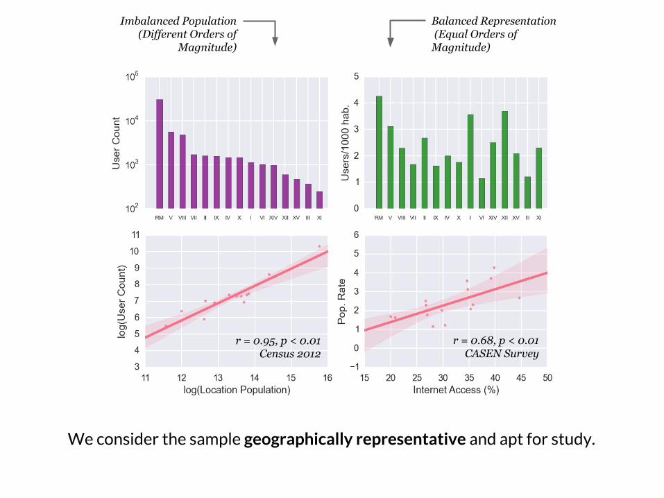
We consider the sample geographically representative and apt for study.
Imbalanced Population(Different Orders of
Magnitude)
Balanced Representation (Equal Orders of Magnitude)
r = 0.68, p < 0.01CASEN Survey
r = 0.95, p < 0.01Census 2012
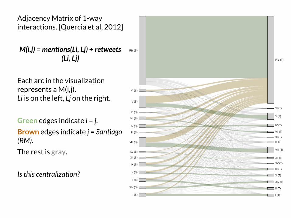
Adjacency Matrix of 1-way interactions. [Quercia et al, 2012]
M(i,j) = mentions(Li, Lj) + retweets(Li, Lj)
Each arc in the visualization represents a M(i,j). Li is on the left, Lj on the right.
Green edges indicate i = j.
Brown edges indicate j = Santiago (RM).
The rest is gray.
Is this centralization?
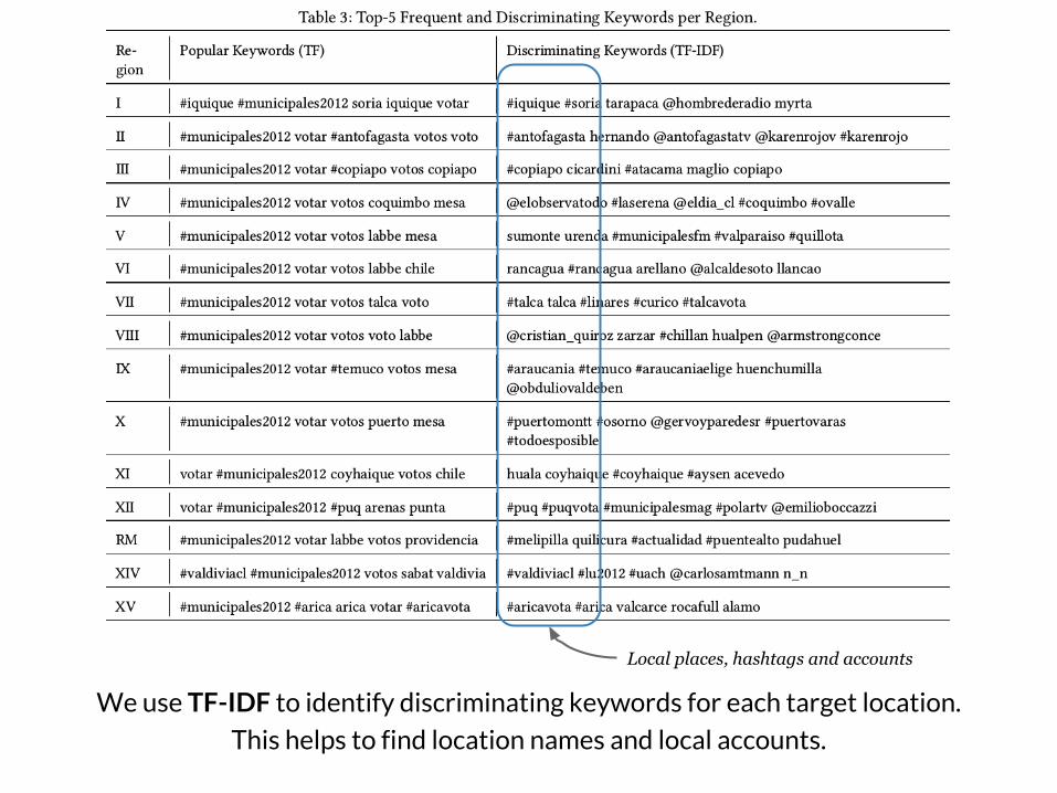
We use TF-IDF to identify discriminating keywords for each target location.
This helps to find location names and local accounts.
Local places, hashtags and accounts

We have an imbalanced population, with centralized behavior.
We evaluate whether this affects content-processing algorithms by testing if we can classify tweets into locations.
We test classifiers using imbalance-aware similarity-features (with TF-IDF weighting) and Bag-of-Words. We implement different classifiers and perform a 10-fold cross-validation.
For each we estimate accuracy and geo. diversity (Shannon Entropy),
Overall good accuracy
Few have diversity!

We build an information filtering algorithm that mixes two algorithms from prior work. A greedy information entropy-based algorithm by Choudhury et al. (2011),
and Sidelines by Munson et al. (2009).
Data Portraits
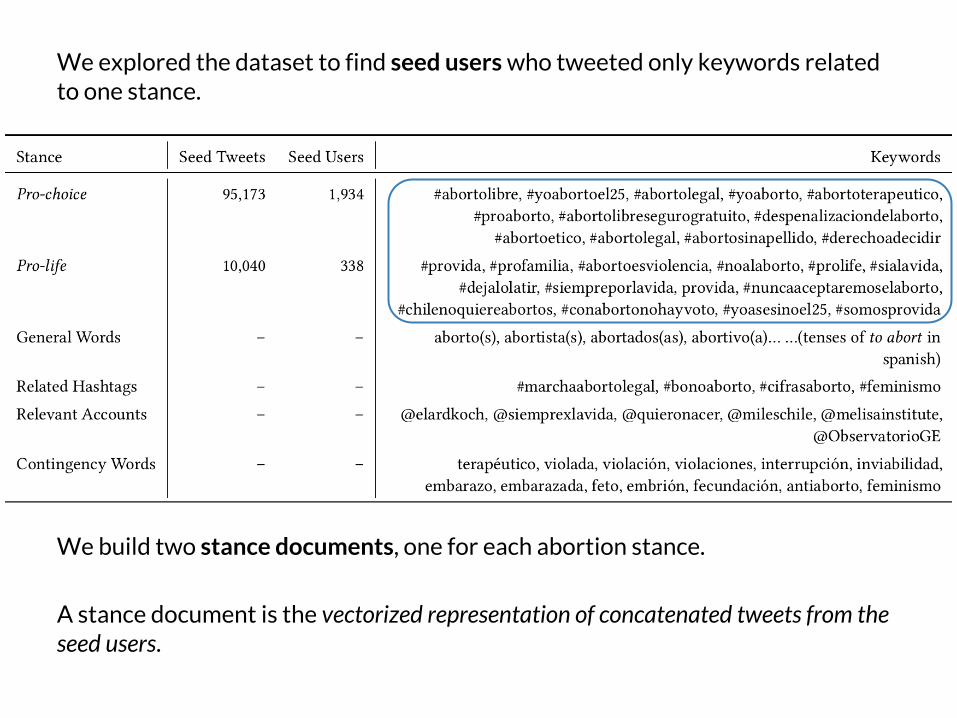
We build two stance documents, one for each abortion stance.
A stance document is the vectorized representation of concatenated tweets from the seed users.
We explored the dataset to find seed users who tweeted only keywords related to one stance.
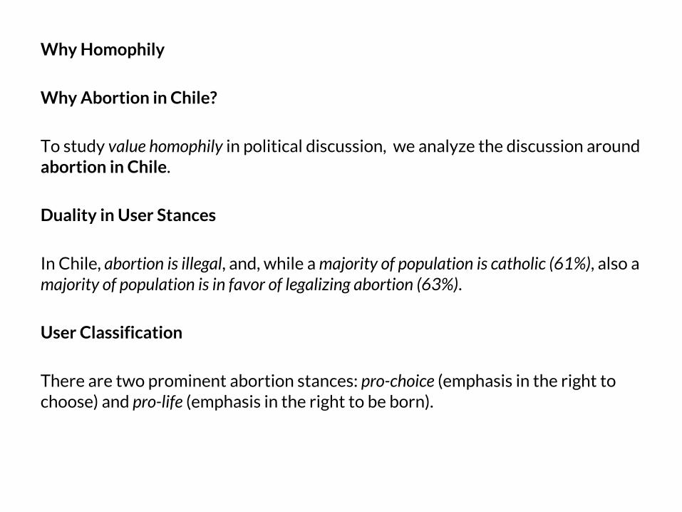
Why Homophily
Why Abortion in Chile?
To study value homophily in political discussion, we analyze the discussion around abortion in Chile.
Duality in User Stances
In Chile, abortion is illegal, and, while a majority of population is catholic (61%), also a majority of population is in favor of legalizing abortion (63%).
User Classification
There are two prominent abortion stances: pro-choice (emphasis in the right to choose) and pro-life (emphasis in the right to be born).