celine's canadian artists project
TRANSCRIPT
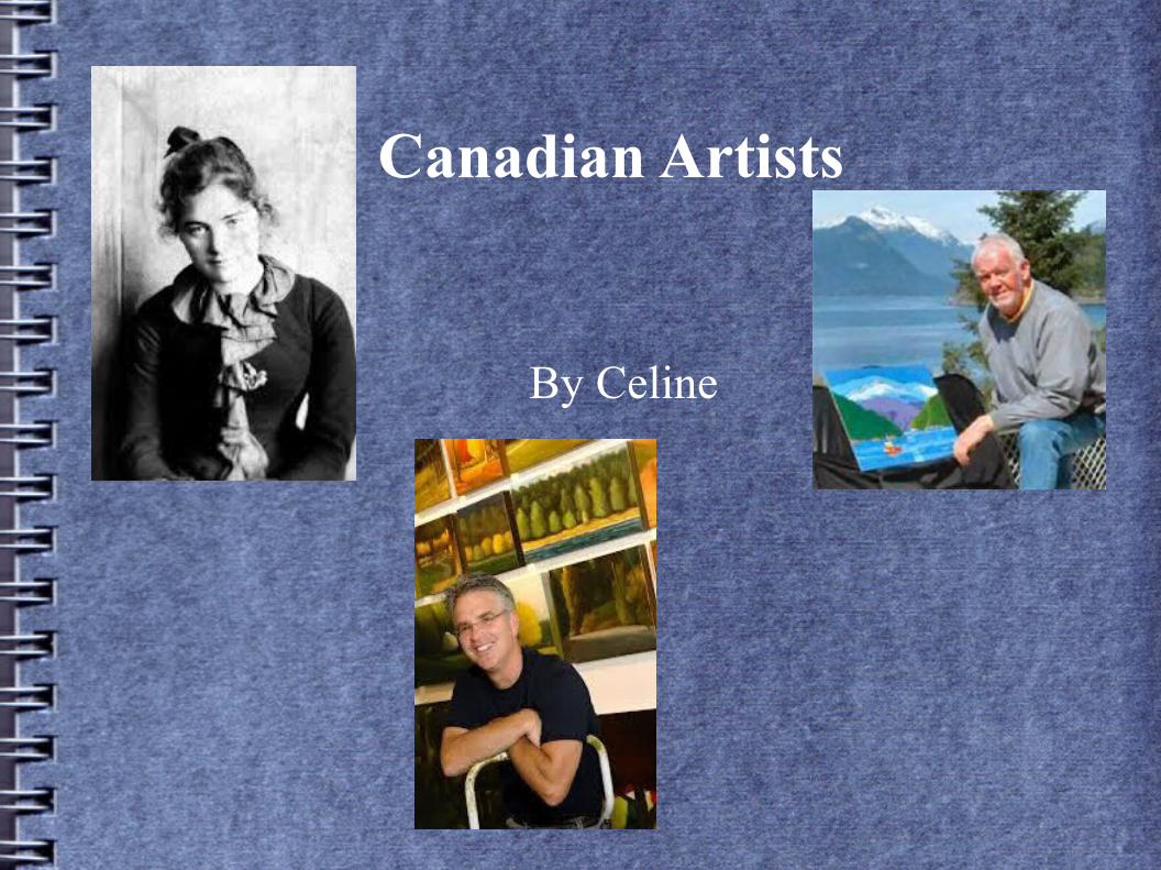
Canadian Artists
By Celine
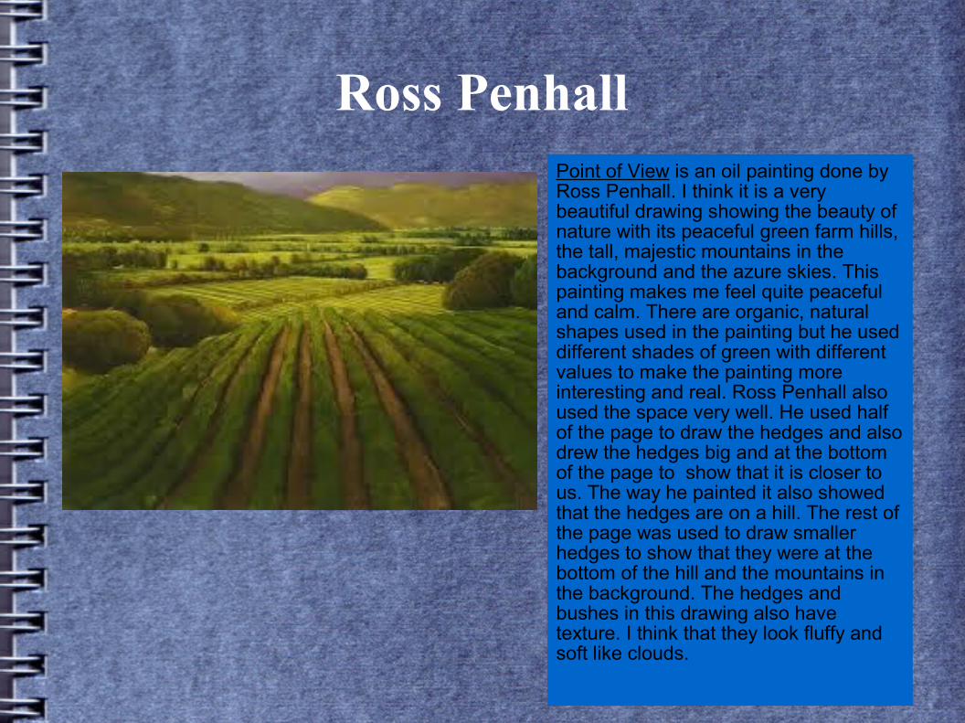
Ross PenhallPoint of View is an oil painting done by Ross Penhall. I think it is a very beautiful drawing showing the beauty of nature with its peaceful green farm hills, the tall, majestic mountains in the background and the azure skies. This painting makes me feel quite peaceful and calm. There are organic, natural shapes used in the painting but he used different shades of green with different values to make the painting more interesting and real. Ross Penhall also used the space very well. He used half of the page to draw the hedges and also drew the hedges big and at the bottom of the page to show that it is closer to us. The way he painted it also showed that the hedges are on a hill. The rest of the page was used to draw smaller hedges to show that they were at the bottom of the hill and the mountains in the background. The hedges and bushes in this drawing also have texture. I think that they look fluffy and soft like clouds.
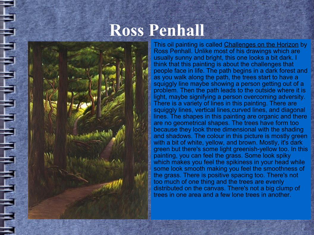
Ross PenhallThis oil painting is called Challenges on the Horizon by Ross Penhall. Unlike most of his drawings which are usually sunny and bright, this one looks a bit dark. I think that this painting is about the challenges that people face in life. The path begins in a dark forest and as you walk along the path, the trees start to have a squiggly line maybe showing a person getting out of a problem. Then the path leads to the outside where it is light, maybe signifying a person overcoming adversity. There is a variety of lines in this painting. There are squiggly lines, vertical lines,curved lines, and diagonal lines. The shapes in this painting are organic and there are no geometrical shapes. The trees have form too because they look three dimensional with the shading and shadows. The colour in this picture is mostly green with a bit of white, yellow, and brown. Mostly, it's dark green but there's some light greenish-yellow too. In this painting, you can feel the grass. Some look spiky which makes you feel the spikiness in your head while some look smooth making you feel the smoothness of the grass. There is positive spacing too. There's not too much of one thing and the trees are evenly distributed on the canvas. There's not a big clump of trees in one area and a few lone trees in another.
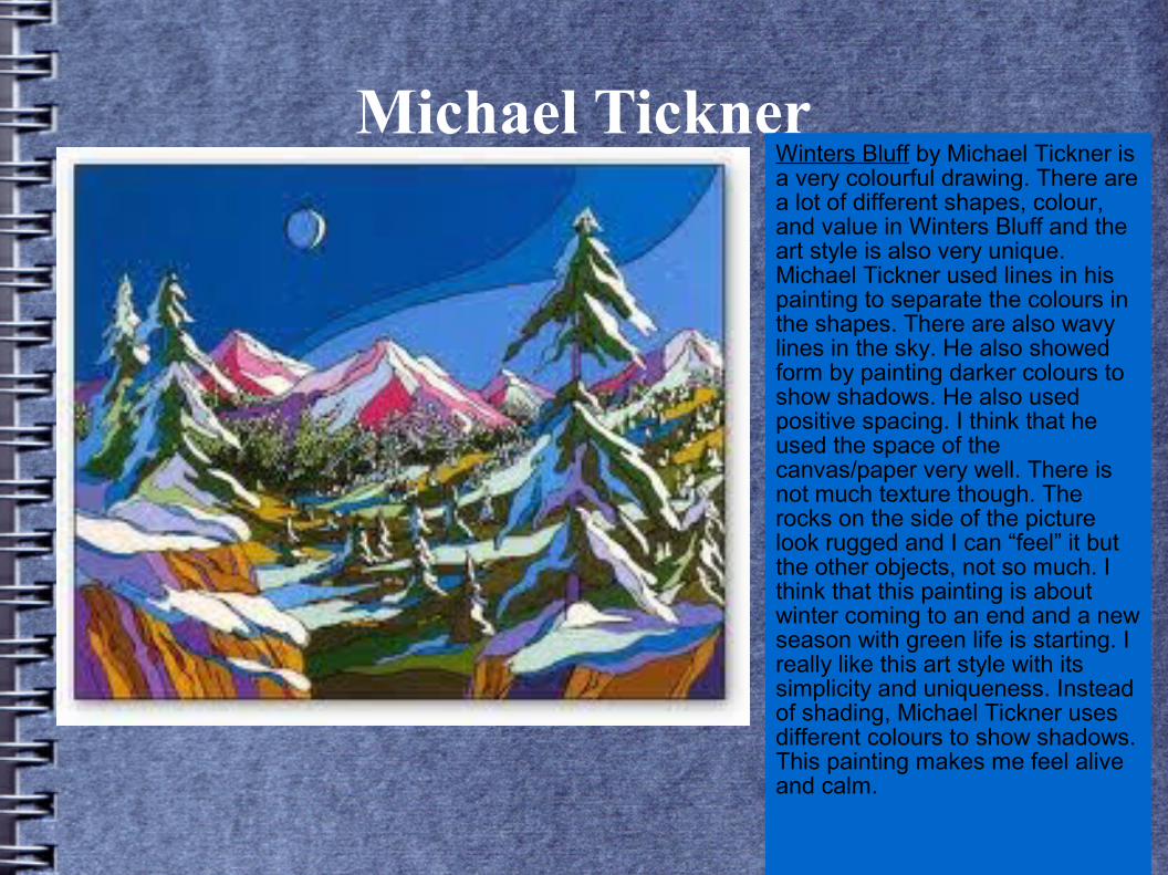
Michael TicknerWinters Bluff by Michael Tickner is a very colourful drawing. There are a lot of different shapes, colour, and value in Winters Bluff and the art style is also very unique. Michael Tickner used lines in his painting to separate the colours in the shapes. There are also wavy lines in the sky. He also showed form by painting darker colours to show shadows. He also used positive spacing. I think that he used the space of the canvas/paper very well. There is not much texture though. The rocks on the side of the picture look rugged and I can “feel” it but the other objects, not so much. I think that this painting is about winter coming to an end and a new season with green life is starting. I really like this art style with its simplicity and uniqueness. Instead of shading, Michael Tickner uses different colours to show shadows. This painting makes me feel alive and calm.
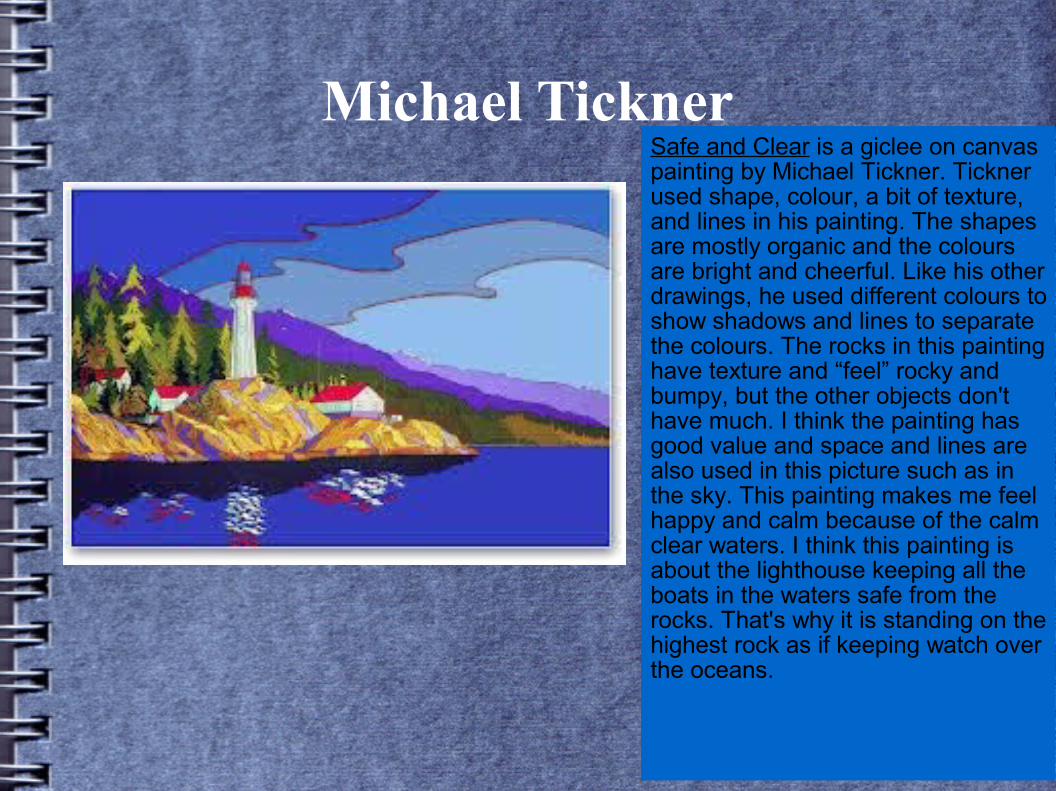
Michael TicknerSafe and Clear is a giclee on canvas painting by Michael Tickner. Tickner used shape, colour, a bit of texture, and lines in his painting. The shapes are mostly organic and the colours are bright and cheerful. Like his other drawings, he used different colours to show shadows and lines to separate the colours. The rocks in this painting have texture and “feel” rocky and bumpy, but the other objects don't have much. I think the painting has good value and space and lines are also used in this picture such as in the sky. This painting makes me feel happy and calm because of the calm clear waters. I think this painting is about the lighthouse keeping all the boats in the waters safe from the rocks. That's why it is standing on the highest rock as if keeping watch over the oceans.
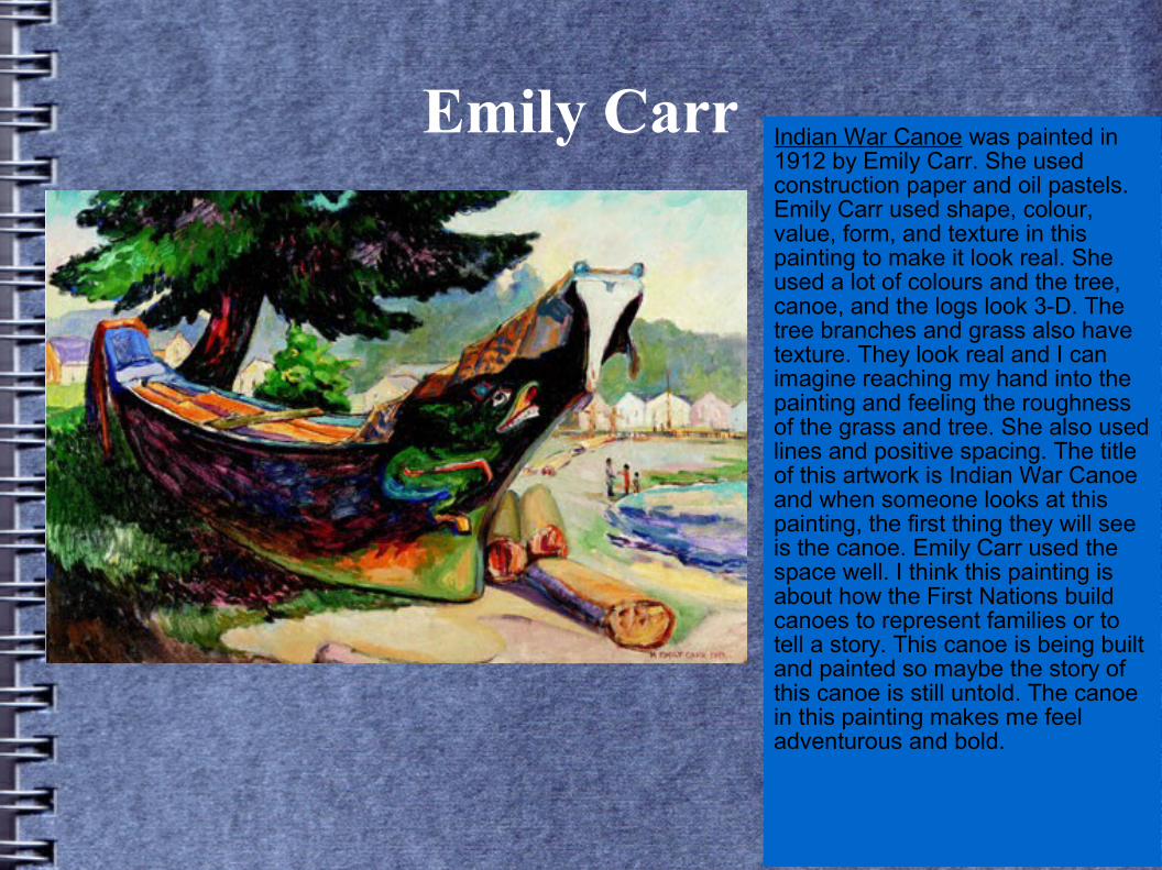
Emily Carr Indian War Canoe was painted in 1912 by Emily Carr. She used construction paper and oil pastels. Emily Carr used shape, colour, value, form, and texture in this painting to make it look real. She used a lot of colours and the tree, canoe, and the logs look 3-D. The tree branches and grass also have texture. They look real and I can imagine reaching my hand into the painting and feeling the roughness of the grass and tree. She also used lines and positive spacing. The title of this artwork is Indian War Canoe and when someone looks at this painting, the first thing they will see is the canoe. Emily Carr used the space well. I think this painting is about how the First Nations build canoes to represent families or to tell a story. This canoe is being built and painted so maybe the story of this canoe is still untold. The canoe in this painting makes me feel adventurous and bold.
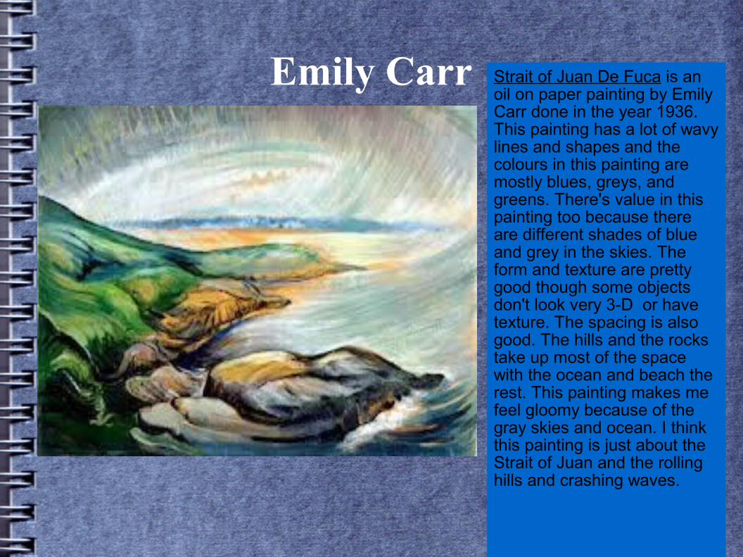
Emily Carr Strait of Juan De Fuca is an oil on paper painting by Emily Carr done in the year 1936. This painting has a lot of wavy lines and shapes and the colours in this painting are mostly blues, greys, and greens. There's value in this painting too because there are different shades of blue and grey in the skies. The form and texture are pretty good though some objects don't look very 3-D or have texture. The spacing is also good. The hills and the rocks take up most of the space with the ocean and beach the rest. This painting makes me feel gloomy because of the gray skies and ocean. I think this painting is just about the Strait of Juan and the rolling hills and crashing waves.