control charts - department of statisticswild/chanceenc/ch13.pdf · control charts this chapter ......
TRANSCRIPT
13.1 Introduction 1
CHAPTER 13
of Chance Encounters by C.J.Wild and G.A.F. Seber
Control Charts
This chapter discusses a set of methods for monitoring process characteristicsover time called control charts and places these tools in the wider perspective ofquality improvement. The time series chapter, Chapter 14, deals more generallywith changes in a variable over time. Control charts deal with a very specializedtype of problem which we introduce in the first subsection. The discussiondraws on the ideas about Normally distributed data and about variability fromChapter 6, about the sampling distributions of means and proportions fromChapter 7, hypothesis tests from Chapter 9 and about plotting techniquesfrom Chapters 2 and 3.
13.1 Introduction
13.1.1 The Setting
The data given in Table 13.1.1, from Gunter [1988], was produced by aprocess that was manufacturing integrated circuits (ICs). The observations arecoded measures of the thickness of the resistance layer on the IC for successiveICs produced. The design of the product specifies a particular thickness, here205 units. Thus, 205 is the target value. If the thickness of the layer straystoo far from 205 the performance of the IC will be degraded in various ways.Other manufacturers who buy the ICs to incorporate in their own productsmay well impose some limits on the range of thicknesses that they will accept.Such limits are called specification limits. Any ICs that fall outside this rangeare unacceptable to these customers.
So the manufacturer is trying to manufacture ICs with the target resistance-layer thickness of 205, but despite the company’s best efforts, the actual thick-nesses vary appreciably. This is typical of the products of any process. No twoproducts are ever absolutely identical. There are differences due to variation inraw materials, environmental changes (e.g. humidity and temperature), varia-tions in the way machines are operating, variations in the way that people do
2 Control Charts
things. In addition to variation in the actual units themselves, the measure-ment process introduces additional variation into our data on the process. Asdiscussed in Section 6.4.1, a general principle of producing good quality prod-ucts (and services) is that variability must be kept small. Thus, in the aboveexample, we want to produce ICs with a resistance-layer thickness close to thetarget value of 205 and varying as little as possible.
Table 13.1.1 : Coded Thickness of Resistance Layeron Integrated Circuita
206 204 206 205 214 215 205 202 210 212 202 208 207 218188 210 209 208 203 204 200 198 200 195 201 205 205 204203 205 202 208 203 204 208 215 202 218 220 210aSource: Gunter [1988]. Data in time order (1st, 2nd, 3rd, ...) reading across rows.
Time Order0 10 20 30 40
190
200
210
220
0 4 8Frequency
12
Th
ickn
ess
190
200
210
220
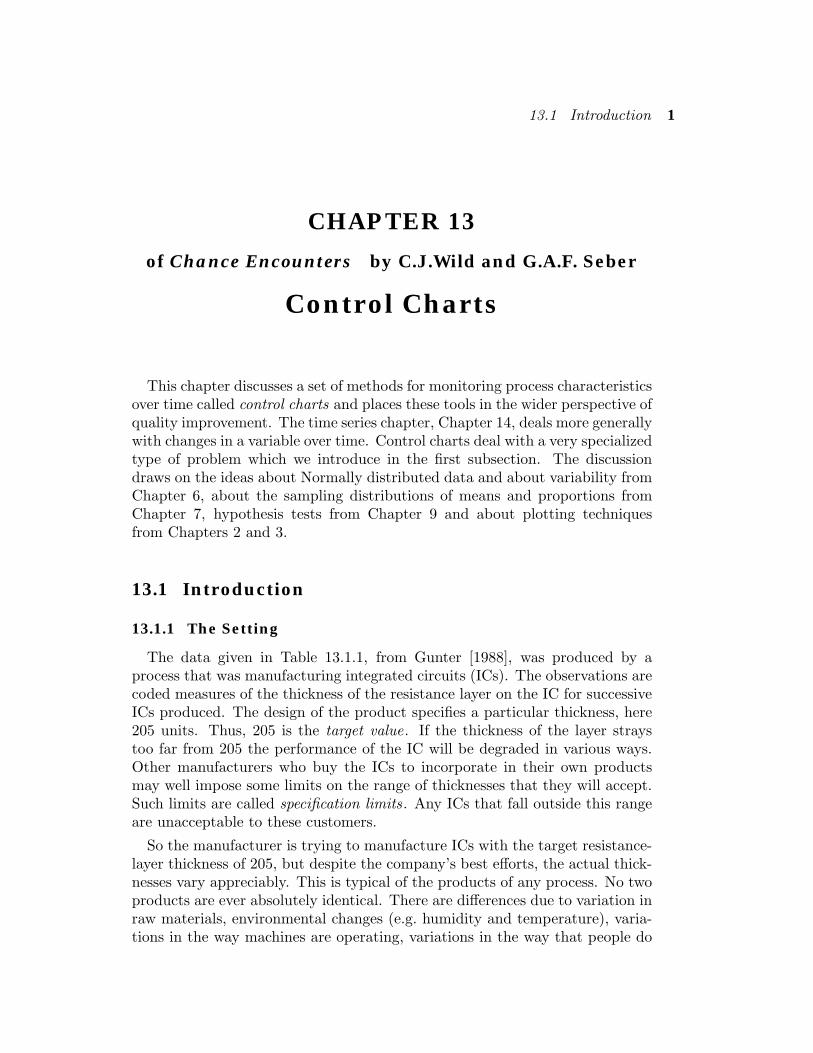
Figure 13.1.1 : Run chart and histogram of the data in Table 13.1.1.
Run chart
The data in Table 13.1.1 is plotted in two different ways in Fig. 13.1.1.The left-hand side of Fig. 13.1.1 is a run chart , namely a scatter plot of themeasurements versus the time order in which the objects were produced (1=1st ,2=2nd , etc.). The data points are linked by lines, a practice which enables usto see patterns that are otherwise not visible. Run charts provide a useful wayof looking at the data to see if (and how) things have been changing over time.We add a horizontal line at the position of the target value if we want to seewhether the process is centered on target or straying from target. Alternatively,we could use a horizontal (center-) line at the position of the mean if we wanteda visual basis for detecting changes in average level over time.
The right-hand side of Fig. 13.1.1 gives a histogram of the IC thicknesseswhich highlights the average level and variability of the whole set of measure-ments.
13.1 Introduction 3
2.00
2.01
0 5 10 15 20 25sample number
Vol
um
e (i
n li
tres
)
USL
LSL
Upper Specification Limit
Lower Specification Limit
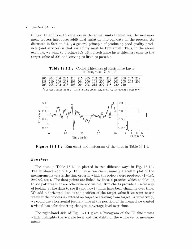
Figure 13.1.2 : The volumes of 25 successive cartonssampled at 5-min. intervals.
Specification limits
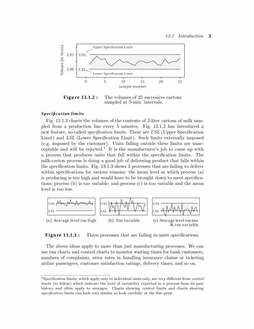
Fig. 13.1.2 charts the volumes of the contents of 2-liter cartons of milk sam-pled from a production line every 5 minutes. Fig. 13.1.2 has introduced anew feature, so-called specification limits. These are USL (Upper SpecificationLimit) and LSL (Lower Specification Limit). Such limits externally imposed(e.g. imposed by the customer). Units falling outside these limits are unac-ceptable and will be rejected.1 It is the manufacturer’s job to come up witha process that produces units that fall within the specification limits. Themilk-carton process is doing a good job of delivering product that falls withinthe specification limits. Fig. 13.1.3 shows 3 processes that are failing to deliverwithin specifications for various reasons: the mean level at which process (a)is producing is too high and would have to be brought down to meet specifica-tions; process (b) is too variable; and process (c) is too variable and the meanlevel is too low.
USL
LSL
USL
LSL
USL
LSL
(a) Average level too high (b) Too variable (c) Average level too low& too variable
Figure 13.1.3 : Three processes that are failing to meet specifications.
The above ideas apply to more than just manufacturing processes. We canuse run charts and control charts to monitor waiting times for bank customers,numbers of complaints, error rates in handling insurance claims or ticketingairline passengers, customer satisfaction ratings, delivery times, and so on.
1Specification limits, which apply only to individual units only, are very different from controllimits (to follow) which indicate the level of variability expected in a process from its pasthistory and often apply to averages. Charts showing control limits and charts showingspecification limits can look very similar so look carefully at the fine print.
4 Control Charts
13.1.2 Statistical stability
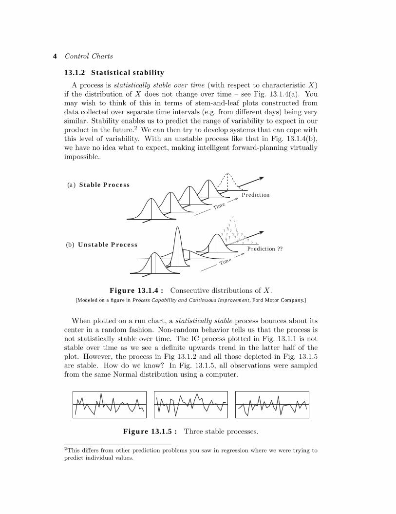
A process is statistically stable over time (with respect to characteristic X)if the distribution of X does not change over time – see Fig. 13.1.4(a). Youmay wish to think of this in terms of stem-and-leaf plots constructed fromdata collected over separate time intervals (e.g. from different days) being verysimilar. Stability enables us to predict the range of variability to expect in ourproduct in the future.2 We can then try to develop systems that can cope withthis level of variability. With an unstable process like that in Fig. 13.1.4(b),we have no idea what to expect, making intelligent forward-planning virtuallyimpossible.
??
?
?
??
Prediction
Time
(a) Stable Process
(b) Unstable Process
? ?????
? ???
?
???
? ??
??
?? ?
?
Time
Prediction ??
??
Figure 13.1.4 : Consecutive distributions of X.[Modeled on a figure in Process Capability and Continuous Improvement, Ford Motor Company.]
When plotted on a run chart, a statistically stable process bounces about itscenter in a random fashion. Non-random behavior tells us that the process isnot statistically stable over time. The IC process plotted in Fig. 13.1.1 is notstable over time as we see a definite upwards trend in the latter half of theplot. However, the process in Fig 13.1.2 and all those depicted in Fig. 13.1.5are stable. How do we know? In Fig. 13.1.5, all observations were sampledfrom the same Normal distribution using a computer.
Figure 13.1.5 : Three stable processes.
2This differs from other prediction problems you saw in regression where we were trying topredict individual values.
13.1 Introduction 5
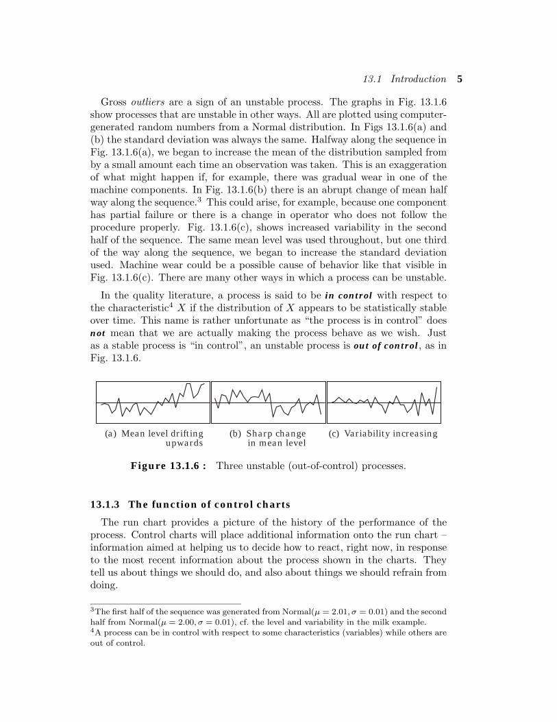
Gross outliers are a sign of an unstable process. The graphs in Fig. 13.1.6show processes that are unstable in other ways. All are plotted using computer-generated random numbers from a Normal distribution. In Figs 13.1.6(a) and(b) the standard deviation was always the same. Halfway along the sequence inFig. 13.1.6(a), we began to increase the mean of the distribution sampled fromby a small amount each time an observation was taken. This is an exaggerationof what might happen if, for example, there was gradual wear in one of themachine components. In Fig. 13.1.6(b) there is an abrupt change of mean halfway along the sequence.3 This could arise, for example, because one componenthas partial failure or there is a change in operator who does not follow theprocedure properly. Fig. 13.1.6(c), shows increased variability in the secondhalf of the sequence. The same mean level was used throughout, but one thirdof the way along the sequence, we began to increase the standard deviationused. Machine wear could be a possible cause of behavior like that visible inFig. 13.1.6(c). There are many other ways in which a process can be unstable.
In the quality literature, a process is said to be in control with respect tothe characteristic4 X if the distribution of X appears to be statistically stableover time. This name is rather unfortunate as “the process is in control” doesnot mean that we are actually making the process behave as we wish. Justas a stable process is “in control”, an unstable process is out of control, as inFig. 13.1.6.
(a) Mean level driftingupwards
(b) Sharp changein mean level
(c) Variability increasing
Figure 13.1.6 : Three unstable (out-of-control) processes.
13.1.3 The function of control charts
The run chart provides a picture of the history of the performance of theprocess. Control charts will place additional information onto the run chart –information aimed at helping us to decide how to react, right now, in responseto the most recent information about the process shown in the charts. Theytell us about things we should do, and also about things we should refrain fromdoing.
3The first half of the sequence was generated from Normal(µ = 2.01, σ = 0.01) and the secondhalf from Normal(µ = 2.00, σ = 0.01), cf. the level and variability in the milk example.4A process can be in control with respect to some characteristics (variables) while others areout of control.
6 Control Charts
The temptation to tamper
Let us go back to the thicknesses of IC resistance layers in Fig. 13.1.1. Weknow that the target for the thickness is 205 and we want to have as littlevariation about this target as possible. Faced with a variable output from theprocess, a natural human response is to tinker with the system. The resistancelayer on this IC is a little thick so let’s change some settings to try and makethe next IC-layer thinner. If the next IC-layer is still too thick make an evenlarger adjustment, and an even larger one. If we get one IC where the layeris too thin, make an adjustment in the other direction and so on. One of themajor discoveries of Walter Shewhart, who invented the first control charts inthe late 1920’s, was that when a process is subject only to variation whichlooks random, such tampering with a process only makes things worse (morevariable). In such situations, one should keep one’s hands off the process untilthe causes of the variation are well understood. Ever since, control charts havebeen helping establish this as common practice in industry.
Looking locally for causes
Another natural human impulse we often have to guard against is the ten-dency to look around very locally for the causes of a problem. The authors’country, New Zealand, is a very small country in population terms. Because itis so small, there is a great deal of variability between the numbers of peoplekilled on the roads in a holiday weekend one year and the number on the corre-sponding holiday the next year. At the end of every holiday weekend, a policeofficial will appear on the television news to explain why the figures turnedout the way they did this year – to explain to us what we have (collectively)done right or wrong this time. They “look locally” for causes. In other words,their explanations arise from asking themselves questions like, “What have wechanged recently?” or “What was unusual this time?” It turns out that thereare times when “looking locally” is a good strategy for finding causes of varia-tion and even more times when it is a bad strategy. Control charts help us tellthese situations apart.
Common-cause versus special-cause variation
When trying to understand the variation evident in a run chart, it is useful tobegin with the idea of stable, background variation which appears random andis called common-cause variation. (Further variation may be superimposed ontop of this.) Common-cause variation is present to some extent in all processes.It is an inherent characteristic of the process which stems from the naturalvariability in inputs to the process and its operating conditions. When onlycommon-cause variation is present, adjusting the process in response to eachdeviation from target increases the variability. “Looking locally” for causesof common-cause variation is fruitless. This variability is an inherent charac-teristic of the way the system operates and can only reduced by changing thesystem itself in some fundamental way.
13.1 Introduction 7
On the other hand, for variation which shows up as outliers or specific iden-tifiable patterns in the data, asking questions like, “What have we changedrecently?” or “Did something particularly unusual happen just prior to thisand what was it?” very often turns up a real cause, such as an inadequatelytrained operator or wear in a machine. This latter type of variation is classifiedas special-cause variation.5 Special-cause variation is unusual variation, so itmakes sense to look for “something unusual” as its cause. The investigationshould take place as soon as possible after the signal has been given by the chartso that memories of surrounding circumstances are still fresh. If the cause canbe located and prevented from recurring, a real improvement to the processhas been made. In summary, control charts tell us when we have a problemthat is likely to be solved by looking for “something unusual” as its cause.
Reducing common-cause variation
The reduction of common-cause variation is also very important, but controlcharts are not designed for this task. Quite different tools and ways of thinkingare required. For example, it may be possible and worth while to control vari-ability in some inputs to the process or aspects of the operating environment.In order to do this, however, we must first find out what types of variability inthe inputs and operating environment are most important as causes of variabil-ity in the end-product. It may be possible to modify some internal parts of theprocess. Making changes without knowing what effects they are likely to haveon the product constitutes tampering, with all its ill effects. Making informedchanges requires planned investigation. Methods include observing the effectsof experimental interventions, and also performing observational studies whichrelate “upstream” variables (such as measurements on aspects of incoming rawmaterials, operators, procedures, machines involved, etc.) to characteristics ofthe product. Regression methods are often useful for this. But let us return tocontrol charts.
Control chart construction – the basic idea
If we start with a process showing a stable pattern of variation, control chartssignal a change from that pattern — when things have started to “go wrong.”They try, informally, to trade off two sets of costs. We want the signal to comeearly enough to avoid accumulating big costs from low-quality production, butwe do not want to react to common-cause variation. So we need some criteriafor deciding whether what we are seeing is only background variation or whetherthe process is starting to go out of control.
Normal distribution: 99.7% of observations fall within µ ± 3 σ(3-sigma limits)
5Also called assignable cause.
8 Control Charts
Recall from Section 6.2.1 that 99.7% of observations sampled from a Normaldistribution fall within 3 standard deviations of the mean, i.e. between thelimits µ ± 3σ. Thus, if observations started to appear outside these limitsthen we would suspect that the process is no longer in control, and that thedistribution ofX had changed.6 What if the distribution ofX is not Normal? Afamous result called the Chebyshev’s inequality tells us that, irrespective of thedistribution, at least 89% of observations fall within the 3-sigma limits.7 Theprobability of falling within the 3-sigma limits increases towards 99.7% as thedistribution becomes more and more Normal. Many physical measurements areapproximately Normally distributed and we shall improve the approximationby using means of groups of observations (see Section 13.2.1). Thus, 3-sigmalimits give a simple and appropriate way of deciding whether or not a process isin control. You might ask why not use narrower limits such as 2-sigma limits.Experience has shown that when 2-sigma limits are used, the control chartoften indicates special causes of variation that cannot be found. When 3-sigmalimits are used, a diligent search will often unearth the special cause.8
We will learn about three kinds of control charts: x-charts which are usedfor looking for a change in the average level; R-charts to look for changes invariability; and p̂-charts which monitor proportions (e.g. proportion of itemswhich are defective).9 For most of the chapter, we will concentrate on pointsfalling outside the 3-sigma limits as a signaling the likely presence of a specialcause. Section 13.6 will introduce a range of patterns to look for which are alsosignals of the presence of special causes.
Quiz for Section 13.11. What is a run chart?2. What are the main purposes of control charts?3. Two types of variation were described. What are they?4. What type of variation are control charts intended to detect? What do we do when we
detect evidence of such variation?5. When all variation is common-cause variation, there is something we should not do with
the process. What is it and why?6. How should we approach the reduction of common-cause variation?7. What is meant by a process being “in control”? What does “in control” not mean?
6Thus, control charts can be thought of as visual hypothesis tests.7Chebyshev’s inequality: pr(|X − µ| < kσ) > 1 − (1/k)2 ≈ 0.89 when k = 3. (It applies todistributions that have a finite standard deviation.)8The above is an over-simplification. One has to trade off false-positive rates (expending timeand effort looking and not finding anything) and false-negative rates (doing nothing whenone should have acted) in the environment in which one is working. It may also dependon the frequency with which data is generated. Less stringent 2-sigma limits are often usedfor processes that generate data only very slowly (e.g. monthly accounts). Some processesgenerate huge numbers of data points each day, and sometimes even 4-sigma limits are usedfor these.9p̂-charts are conventionally called p-charts. The change from p to p̂ emphasizes the fact thatsample proportions are charted.
13.2 Control Charts for Groups of Data 9
8. Describe one advantage of having a stable process over having an unstable process.9. Why do we use 3-sigma limits and not 2-sigma limits?
10. What percentage of observations on a stable, Normally-distributed process fall within3-sigma limits?
13.2 Control Charts for Groups of Data
13.2.1 Monitoring average level: the x–chartThe x-chart is used to look for changes in the average value ofX-measurements
as time goes on. As the measured characteristic of the process may not be Nor-mally distributed, we make use of the Central Limit effect by working with sam-ple means instead of individual X-values so that we are working with quantitiesthat have a distribution that is closer to Normal. Typically data are collectedin at least 20 subgroups of size 3 to 6 (typically 5) measurements and the meanof each of subgroup is computed. Recall from Section 7.2 that if we are sam-pling from a distribution with mean µ and standard deviation σ, the samplemeans from subgroups of n observations vary according to a distribution withmean and standard deviation given by:
(Subgroups of size n) µX̄
= µ, σX̄
=σ√n
.
and almost all subgroup means will lie within the 3-sigma limits:(3-sigma limits for subgroup means) µ
X̄± 3 σ
X̄.
If we knew the true values of µ and σ, we would use µX̄
+ 3σX̄
as the uppercontrol limit (UCL), and µ
X̄− 3σ
X̄as the lower control limit (LCL). New
subgroup means outside this range would be considered to provide a signal thatthe process was out of control. In practice however, one never knows µ and σand the control limits must be estimated from the data.
As well-known American statistician J. Stuart Hunter likes to point out inhis seminars, each time a new subgroup mean is plotted and one checks whetherit is inside the control limits, one is essentially performing an hypothesis testgraphically. The hypothesis is that the new mean comes from a distributionwith mean µ
X̄. The alternative is that the mean has changed. Using 3σ
X̄limits corresponds to rejecting the hypothesis only for P -values considerablysmaller10 than 5%. One reason for being very conservative in this sense isto protect against multiple-comparisons problems as so many tests are beingperformed (each new mean plotted corresponds to another test).
10The minimum P -value for rejection would be 0.3% in the idealized situation in which thedata was coming from a Normal distribution with known standard deviation.
10 Control Charts
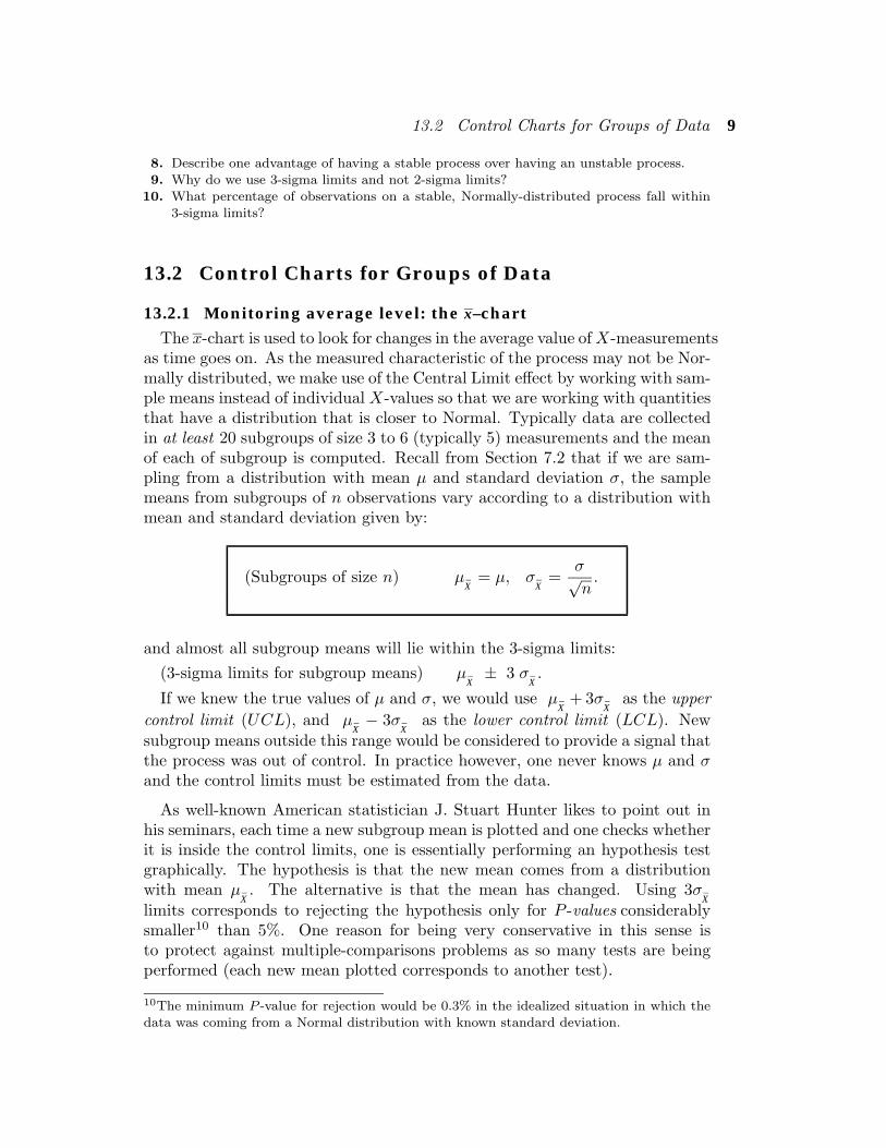
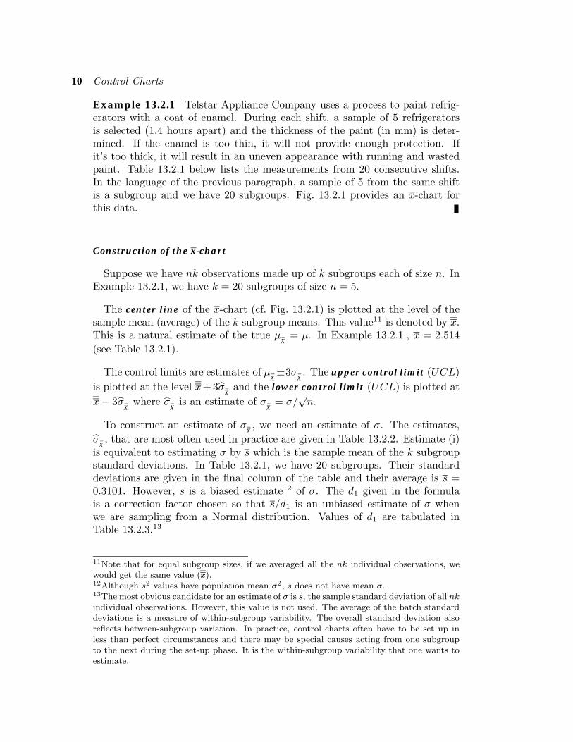
Example 13.2.1 Telstar Appliance Company uses a process to paint refrig-erators with a coat of enamel. During each shift, a sample of 5 refrigeratorsis selected (1.4 hours apart) and the thickness of the paint (in mm) is deter-mined. If the enamel is too thin, it will not provide enough protection. Ifit’s too thick, it will result in an uneven appearance with running and wastedpaint. Table 13.2.1 below lists the measurements from 20 consecutive shifts.In the language of the previous paragraph, a sample of 5 from the same shiftis a subgroup and we have 20 subgroups. Fig. 13.2.1 provides an x-chart forthis data.
Construction of the x-chart
Suppose we have nk observations made up of k subgroups each of size n. InExample 13.2.1, we have k = 20 subgroups of size n = 5.
The center line of the x-chart (cf. Fig. 13.2.1) is plotted at the level of thesample mean (average) of the k subgroup means. This value11 is denoted by x.This is a natural estimate of the true µ
X̄= µ. In Example 13.2.1., x = 2.514
(see Table 13.2.1).
The control limits are estimates of µX̄±3σ
X̄. The upper control limit (UCL)
is plotted at the level x+ 3σ̂X̄
and the lower control limit (UCL) is plotted atx− 3σ̂
X̄where σ̂
X̄is an estimate of σ
X̄= σ/
√n.
To construct an estimate of σX̄, we need an estimate of σ. The estimates,
σ̂X̄, that are most often used in practice are given in Table 13.2.2. Estimate (i)
is equivalent to estimating σ by s which is the sample mean of the k subgroupstandard-deviations. In Table 13.2.1, we have 20 subgroups. Their standarddeviations are given in the final column of the table and their average is s =0.3101. However, s is a biased estimate12 of σ. The d1 given in the formulais a correction factor chosen so that s/d1 is an unbiased estimate of σ whenwe are sampling from a Normal distribution. Values of d1 are tabulated inTable 13.2.3.13
11Note that for equal subgroup sizes, if we averaged all the nk individual observations, wewould get the same value (x).12Although s2 values have population mean σ2, s does not have mean σ.13The most obvious candidate for an estimate of σ is s, the sample standard deviation of all nkindividual observations. However, this value is not used. The average of the batch standarddeviations is a measure of within-subgroup variability. The overall standard deviation alsoreflects between-subgroup variation. In practice, control charts often have to be set up inless than perfect circumstances and there may be special causes acting from one subgroupto the next during the set-up phase. It is the within-subgroup variability that one wants toestimate.
13.2 Control Charts for Groups of Data 11
Table 13.2.1 : The Thickness of Paint on Refrigeratorsfor Five Refrigerators from Each Shift
(Subgroup) Subgroup
Shift no. Thickness (in mm) Mean Range Std Dev.
1 2.7 2.3 2.6 2.4 2.7 2.54 0.4 .18172 2.6 2.4 2.6 2.3 2.8 2.54 0.5 .19493 2.3 2.3 2.4 2.5 2.4 2.38 0.2 .08374 2.8 2.3 2.4 2.6 2.7 2.56 0.5 .20745 2.6 2.5 2.6 2.1 2.8 2.52 0.7 .25886 2.2 2.3 2.7 2.2 2.6 2.40 0.5 .23457 2.2 2.6 2.4 2.0 2.3 2.30 0.6 .22368 2.8 2.6 2.6 2.7 2.5 2.64 0.3 .11409 2.4 2.8 2.4 2.2 2.3 2.42 0.6 .2280
10 2.6 2.3 2.0 2.5 2.4 2.36 0.6 .230211 3.1 3.0 3.5 2.8 3.0 3.08 0.7 .258812 2.4 2.8 2.2 2.9 2.5 2.56 0.7 .288113 2.1 3.2 2.5 2.6 2.8 2.64 1.1 .403714 2.2 2.8 2.1 2.2 2.4 2.34 0.7 .279315 2.4 3.0 2.5 2.5 2.0 2.48 1.0 .356416 3.1 2.6 2.6 2.8 2.1 2.64 1.0 .364717 2.9 2.4 2.9 1.3 1.8 2.26 1.6 .702118 1.9 1.6 2.6 3.3 3.3 2.54 1.7 .782919 2.3 2.6 2.7 2.8 3.2 2.72 0.9 .327120 1.8 2.8 2.3 2.0 2.9 2.36 1.1 .4827
Column mean = 2.514 0.77 .3101
(x ) (r) (s)
Table 13.2.2 : Commonly Used Estimates of σX̄
(i) σ̂X̄
=1d1
s√n, where s is the mean of the subgroup std dev’s
(ii) σ̂X̄
=1d2
r√n, where r is the mean of the subgroup ranges
Values of d1 and d2 depend upon the subgroup size n.A range of values are tabulated in Table 13.2.3.
0 5 10 15 20sample number
UCL
LCL2.0
Xba
r
3.0
2.2
2.4
2.6
2.8
(Upper Control Limit)
(Lower Control Limit)
x–chart
UCL: x + 3 σ̂X̄
Center Line: x
LCL: x − 3 σ̂X̄
Figure 13.2.1 : x–chart for the data in Table 13.2.1.
12 Control Charts
The value of σ̂X̄
given as estimate (ii) in Table 13.2.2 corresponds to esti-mating σ using the information about spread contained in the average ofthesubgroup ranges, r. It turns out that, for a Normal distribution, r/d2 is anunbiased estimate of σ. Values of d2 are also tabulated in Table 13.2.3.
Because much less computation is required by method (ii) than method (i),method (ii) is usually used for charts constructed and updated by hand. Itworks very well with the small subgroup sizes used in practice. However,method (i) is better for computerized charts as s provides a more precise esti-mate of σ and is less affected by outliers.
Example 13.2.1 cont. For the data in Table 13.2.1, x = 2.514. The subgroupranges are given as the second to last column of Table 13.2.1. The average ofthe subgroup ranges appears at the bottom of the column. Thus, we see thatr = 0.77. Since n = 5, Table 13.2.3 tells us that d2 = 2.3259. Thus,
σ̂X̄
=1d2
r√n
=1
2.32590.77√
5= 0.14805,
UCL = x+ 3 σ̂X̄
= 2.96,
LCL = x− 3 σ̂X̄
= 2.07.and
The control chart is drawn in Fig. 13.2.1 and we see that we have a point (the11th) outside the control limits indicating that the process is not in control.Subsequent points all look fine making this appear to be an isolated problem.Nevertheless, we would try to find out what caused the problem with the 13thobservation and prevent the recurrence of such problems.
Even having all of the sample means lie between the control limits is noguarantee that the process is control. There may still be some internal featuresof the chart which suggest instability and the presence of special causes. Somerules for detecting such problems are discussed later in Section 13.6. If thereare points outside the control limits, then we should try and find special causesfor these points. If causes are found then the offending points can be removedand the center line and control limits re-calculated.
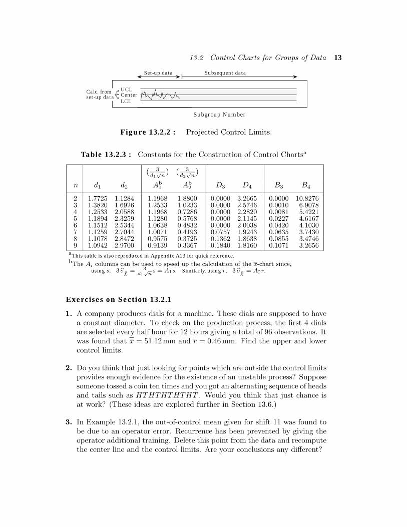
Use of projected control limits
In Example 13.2.1, we used all of our data to construct the control limits. Inpractice, it is usual to have a set-up phase of perhaps 20 or 30 subgroups, fromwhich the center line and control limits are calculated. If the process has beenreasonably stable over the set-up phase, a chart will be constructed plottingthe set-up data and the corresponding limits projected out into the future, asin Fig. 13.2.2. Future data points will be plotted on that chart to monitor thebehavior of the process as time goes on. The limits will not be updated unlessthere has been a substantial change in the process.
13.2 Control Charts for Groups of Data 13
UCL
LCLCenter
Subgroup Number
Calc. fromset-up data
Subsequent dataSet-up data
Figure 13.2.2 : Projected Control Limits.
Table 13.2.3 : Constants for the Construction of Control Chartsa
( 3d1√n
) ( 3d2√n
)
n d1 d2 Ab1 Ab
2 D3 D4 B3 B4
2 1.7725 1.1284 1.1968 1.8800 0.0000 3.2665 0.0000 10.82763 1.3820 1.6926 1.2533 1.0233 0.0000 2.5746 0.0010 6.90784 1.2533 2.0588 1.1968 0.7286 0.0000 2.2820 0.0081 5.42215 1.1894 2.3259 1.1280 0.5768 0.0000 2.1145 0.0227 4.61676 1.1512 2.5344 1.0638 0.4832 0.0000 2.0038 0.0420 4.10307 1.1259 2.7044 1.0071 0.4193 0.0757 1.9243 0.0635 3.74308 1.1078 2.8472 0.9575 0.3725 0.1362 1.8638 0.0855 3.47469 1.0942 2.9700 0.9139 0.3367 0.1840 1.8160 0.1071 3.2656
aThis table is also reproduced in Appendix A13 for quick reference.bThe Ai columns can be used to speed up the calculation of the x-chart since,
using s, 3 σ̂X̄
= 3d1√ns = A1s. Similarly, using r, 3 σ̂
X̄= A2r.
Exercises on Section 13.2.1
1. A company produces dials for a machine. These dials are supposed to havea constant diameter. To check on the production process, the first 4 dialsare selected every half hour for 12 hours giving a total of 96 observations. Itwas found that x = 51.12 mm and r = 0.46 mm. Find the upper and lowercontrol limits.
2. Do you think that just looking for points which are outside the control limitsprovides enough evidence for the existence of an unstable process? Supposesomeone tossed a coin ten times and you got an alternating sequence of headsand tails such as HTHTHTHTHT . Would you think that just chance isat work? (These ideas are explored further in Section 13.6.)
3. In Example 13.2.1, the out-of-control mean given for shift 11 was found tobe due to an operator error. Recurrence has been prevented by giving theoperator additional training. Delete this point from the data and recomputethe center line and the control limits. Are your conclusions any different?

14 Control Charts
13.2.2 Control Charts for Variation: the R–chartAn x–chart focuses attention on the constancy of average level (µ) and is not
good at detecting changes in variability (σ).14 An R-chart (or range chart) isspecifically designed for detecting changes in variability. This time we plot thesubgroup ranges, ri, rather than the subgroup means. Fig. 13.2.3 is an R-chartfor the refrigerator data in Table 13.2.1.
If µR
and σR
are respectively the mean and standard deviation of the rangeR of n observations sampled from a Normal distribution, then it can be shownthat σ
Ris of the form σ
R= dµ
Rfor some constant d. The desired upper control
limit (UCL) for the subgroup ranges is µR
+ 3σR. Now,
µR
+ 3σR
= µR(1 + 3d) which is of the form D4µR
.
Similarly, the lower control limit (LCL) is of the form D3µR. The formulae for
UCL and LCL given on the right of Fig. 13.2.3 follow when we estimate µR
bythe sample mean of the subgroup ranges, namely r. Values of D3 and D4 aretabulated in Table 13.2.3. Negative values of D3 are not permitted as a samplerange cannot be negative. Consequently, negative values are set to zero.15
In using the R–chart, subgroup ranges lying outside the control limits indi-cate that the process is “out of control”. Trends in the R–chart may indicatea problem like wear in the machine.16
0.0
1.0
2.0
Ran
ge (R
)
0 5 10 15 20sample number
UCL
LCL
R–chart
UCL = r+3σ̂R
= D4r
Center Line: r
LCL = r−3σ̂R
= D3r
[See Table 13.2.3 for values ofD3 and D3.]
Figure 13.2.3 : R–chart for the data in Table 13.2.1.
Example 13.2.1 cont. We refer again to the refrigerator data in Table 13.2.1.From Table 13.2.1, r = 0.77 and this forms the center line. Table 13.2.3 tellsus that when n = 5, D3 = 0 and D4 = 2.1145. Thus we have,
UCL = D4r = 1.63 and LCL = D3r = 0.
14e.g. if µ is constant but σ occasionally becomes larger, then the process could still appearto be in control on an x-chart because of the averaging effect.15Note from Table 13.2.3 that D3 = 0 for n less than 7.16When s is readily calculated we can construct a so-called s–chart using s instead of r andconstants B3 and B4 instead of D3 and D4 (see Gitlow et al. [1995, p. 246]).
13.2 Control Charts for Groups of Data 15
The control chart, given in Fig. 13.2.3, clearly indicates that the process is outof control, and not just because one point is above UCL. The range seemsto be steadily increasing, telling us that the variability of the original paintthickness is increasing over time. This picture is in strong contrast to the x–chart of Fig. 13.2.1 which seems to suggest that things aren’t too bad. Clearlyan x–chart is not sufficient on its own and needs to be supplemented with an R–chart. To sum up, the painting process that produced the data in Table 13.2.1is out of control, not because of changes in mean thickness, but because ofincreasing variability in paint thicknesses.
Exercises on Section 13.2.2
1. Would you expect D4 to increase or decrease with n, the subgroup size?Check your reasoning by referring to Table 13.2.3.
2. In the Exercises 13.2.1, problem 1, the subgroups of size 4 gave r = 0.46 mm.Compute the control limits.
13.2.3 Control Charts for Proportions: p̂–chart
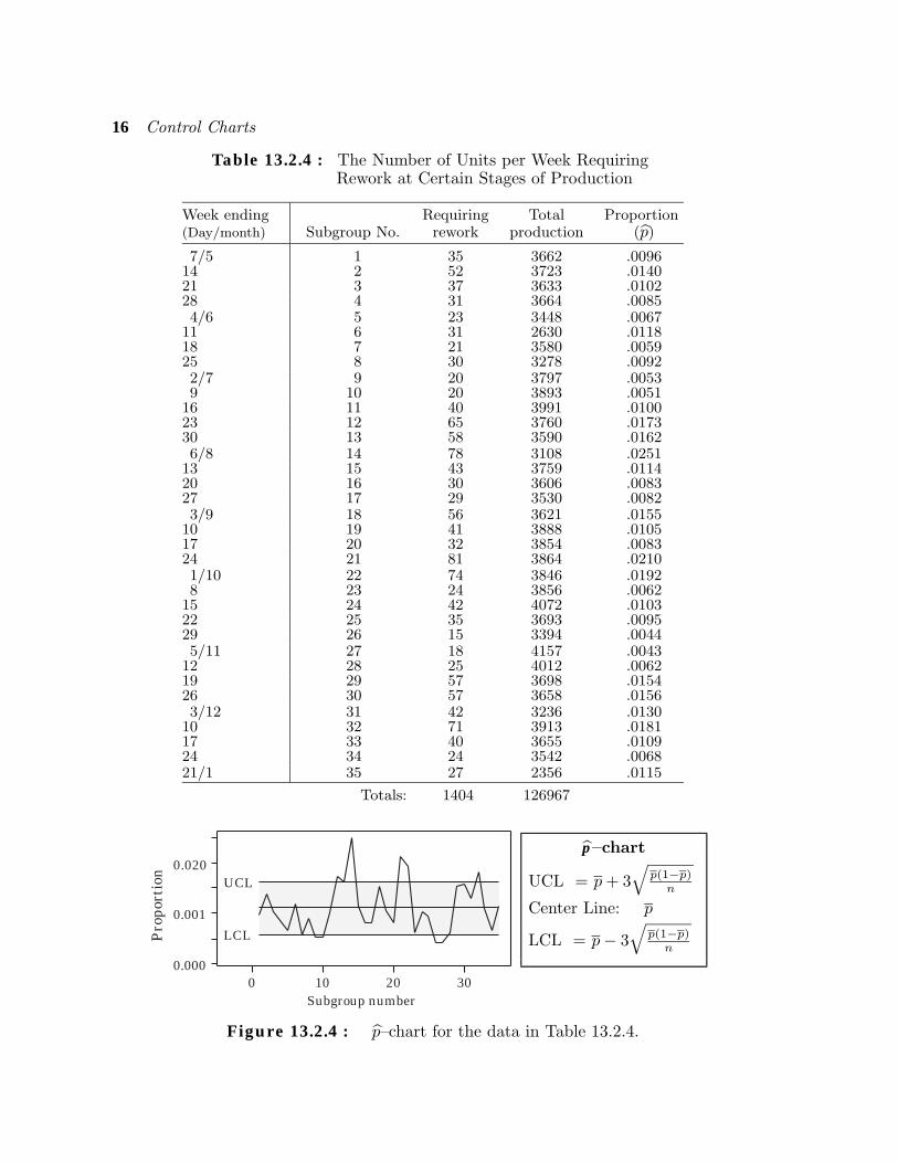
Example 13.2.2 Table 13.2.4 gives the number of units produced by acompany each week during part of 1994 which require rework at certain stagesof production because of faults. Rework is additional work required to bringa substandard unit up to standard and is an additional cost one wishes toavoid. We omit further details for reasons of confidentiality. The weeks areconsecutive except for the last one (in 1995) when the factory closed down overthe Christmas holiday period.17 We want to chart the percentages requiringrework over time to see whether the process is in control. Such a chart is givenin Fig. 13.2.4.
Example 13.2.2 is just one of many examples in which we want to chartthe proportion of items produced by a process that are defective in some way.The resulting charts are traditionally called p–charts. However, they monitorthe behavior of the sample proportion (p̂ in our notation) of defective itemsover time. We select subgroups of n items and compute the sample proportion(p̂) of defectives for each subgroup. We then plot each successive subgroupproportion on the chart, as in Fig. 13.2.4.
The limits µP̂± 3σ
P̂for p̂ are p ± 3
√p(1−p)n . If the process is in control,
then p, the unknown true probability that an item is produced defective, isthe same for all items regardless of what subgroup they come from. If we take
17Christmas is in the summer in NZ and many factories shut down for 2 or 3 weeks.
16 Control Charts
Table 13.2.4 : The Number of Units per Week RequiringRework at Certain Stages of Production
Week ending Requiring Total Proportion(Day/month) Subgroup No. rework production (p̂)
7/5 1 35 3662 .009614 2 52 3723 .014021 3 37 3633 .010228 4 31 3664 .00854/6 5 23 3448 .0067
11 6 31 2630 .011818 7 21 3580 .005925 8 30 3278 .00922/7 9 20 3797 .00539 10 20 3893 .0051
16 11 40 3991 .010023 12 65 3760 .017330 13 58 3590 .01626/8 14 78 3108 .0251
13 15 43 3759 .011420 16 30 3606 .008327 17 29 3530 .00823/9 18 56 3621 .0155
10 19 41 3888 .010517 20 32 3854 .008324 21 81 3864 .02101/10 22 74 3846 .01928 23 24 3856 .0062
15 24 42 4072 .010322 25 35 3693 .009529 26 15 3394 .00445/11 27 18 4157 .0043
12 28 25 4012 .006219 29 57 3698 .015426 30 57 3658 .01563/12 31 42 3236 .0130
10 32 71 3913 .018117 33 40 3655 .010924 34 24 3542 .006821/1 35 27 2356 .0115
Totals: 1404 126967
0 10 20 30Subgroup number
UCL
LCL
0.000
0.020
Pro
port
ion
0.001
p̂–chart
UCL = p+ 3√
p(1−p)n
Center Line: p
LCL = p− 3√
p(1−p)n
Figure 13.2.4 : p̂–chart for the data in Table 13.2.4.
13.2 Control Charts for Groups of Data 17
k (e.g. at least 20) subgroups of data all of the same size n so that the totalnumber inspected is nk, then a natural estimate of p is the average of all of thesubgroup proportions,
p̄ =1k
(p̂1 + p̂2 + · · ·+ p̂k)
=1nk
(np̂1 + np̂2 + · · ·+ np̂k)
=Total number of defectives
Total number inspected.
The estimate p leads to the control limits given to the right of Fig. 13.2.4. Thelatter expression for p can be used even for unequal subgroup sizes. We notethat if LCL falls below zero18 we use LCL = 0.
How large should the subgroup size be? In order for the Central Limit effectto begin to operate, n should be such that19 np ≥ 2, which often means thatn > 50. Since n is usually large, more data is needed for a p–chart than for x–and R–charts.
Unfortunately, the subgroup size n is not constant in Example 13.2.2. Thenumber of items produced in week i, denoted ni, varies somewhat from weekto week. So what value of n do we use to calculate the control lines? Themost accurate method would be to work out individual values of UCL andLCL using ni. However, this ignores the motivational impact of a simple easy-to-understand chart. An alternative approximation is to use n, the averagevalue of n, in calculating UCL and LCL. When will this approximation besatisfactory? One rule of thumb is to use it when n does not vary from n bymore than about 25% of n. Once the control chart has been plotted, any pointi near or outside the limits could be checked by recalculating the limits usingni.
Example 13.2.2 cont. Using the totals in Table 13.2.4, the center line forour p̂–chart is plotted at
p =Total number of defectives
Total number inspected=
1404126967
= 0.011058.
(Center Line)
n =∑nik
=Total production
Number of weeks observed=
12696735
= 3627.63.Also,
18We then only need to check whether UCL is exceeded or not as we can never fall belowLCL, though we may get a p̂ equal to zero when there are no defects in a subgroup.19A variety of rules are suggested in the literature e.g. Gitlow et al. [1995] suggest usingnp ≥ 2. This implies that we should expect to find at least 2 defectives in a subgroup. Ourprevious 10% rule for approximate Normality of the underlying Binomial distribution is tooconservative for control chart applications.
18 Control Charts
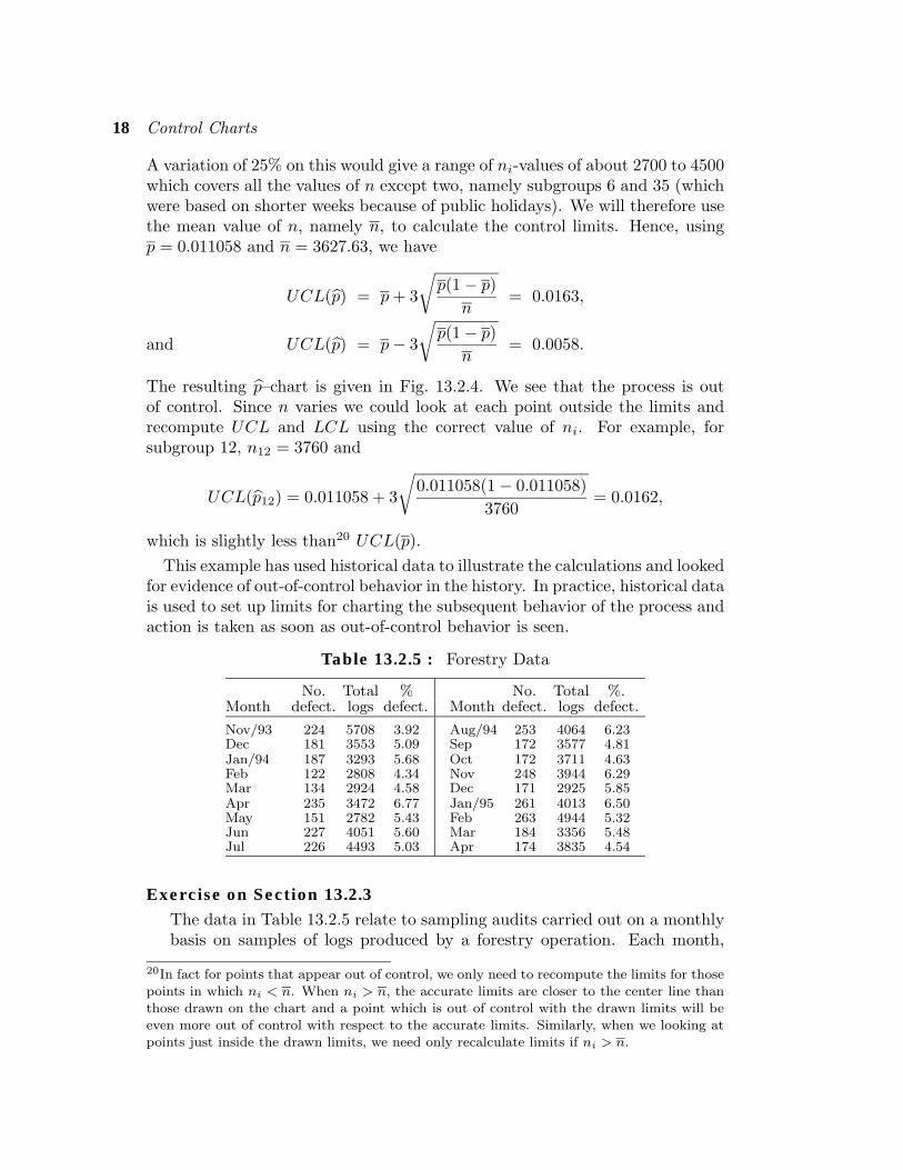
A variation of 25% on this would give a range of ni-values of about 2700 to 4500which covers all the values of n except two, namely subgroups 6 and 35 (whichwere based on shorter weeks because of public holidays). We will therefore usethe mean value of n, namely n, to calculate the control limits. Hence, usingp = 0.011058 and n = 3627.63, we have
UCL(p̂) = p+ 3
√p(1− p)
n= 0.0163,
UCL(p̂) = p− 3
√p(1− p)
n= 0.0058.and
The resulting p̂–chart is given in Fig. 13.2.4. We see that the process is outof control. Since n varies we could look at each point outside the limits andrecompute UCL and LCL using the correct value of ni. For example, forsubgroup 12, n12 = 3760 and
UCL(p̂12) = 0.011058 + 3
√0.011058(1− 0.011058)
3760= 0.0162,
which is slightly less than20 UCL(p).This example has used historical data to illustrate the calculations and looked
for evidence of out-of-control behavior in the history. In practice, historical datais used to set up limits for charting the subsequent behavior of the process andaction is taken as soon as out-of-control behavior is seen.
Table 13.2.5 : Forestry Data
No. Total % No. Total %.Month defect. logs defect. Month defect. logs defect.
Nov/93 224 5708 3.92 Aug/94 253 4064 6.23Dec 181 3553 5.09 Sep 172 3577 4.81Jan/94 187 3293 5.68 Oct 172 3711 4.63Feb 122 2808 4.34 Nov 248 3944 6.29Mar 134 2924 4.58 Dec 171 2925 5.85Apr 235 3472 6.77 Jan/95 261 4013 6.50May 151 2782 5.43 Feb 263 4944 5.32Jun 227 4051 5.60 Mar 184 3356 5.48Jul 226 4493 5.03 Apr 174 3835 4.54
Exercise on Section 13.2.3The data in Table 13.2.5 relate to sampling audits carried out on a monthlybasis on samples of logs produced by a forestry operation. Each month,
20In fact for points that appear out of control, we only need to recompute the limits for thosepoints in which ni < n. When ni > n, the accurate limits are closer to the center line thanthose drawn on the chart and a point which is out of control with the drawn limits will beeven more out of control with respect to the accurate limits. Similarly, when we looking atpoints just inside the drawn limits, we need only recalculate limits if ni > n.
13.3 Getting On With the Job 19
as shown, a number of logs (from a number of subcontractors) is sampled,and the number of defective logs is noted. (Defects may be : wrong length,damage to the surface, wrong small-end diameter, wrongly classified, toogreat a degree of “sweep” and knot-holes too large). Draw a p̂–chart anddraw in the center line and the control limits. What do you conclude?(Compute any individual control limits that you think you might need.)
Quiz for Section 13.21. Define the three lines used on a control chart for means.
2. At least how many subgroups should be used for constructing a control chart for means?
3. Why do we need both an x–chart and an R–chart?
4. What size subgroups should we use for a p̂–chart?
13.3 Getting On With the JobGenerally a team approach is needed for establishing control charts. In a
complex process with many parts, it is better to have several charts spreadthroughout the process at strategic points than a single chart at the end.Having several charts makes it easier to track down special causes when theirpresence has been signalled. Once a chart signals that the process is “out ofcontrol”, immediate action is necessary to find the cause while memories ofsurrounding circumstances are fresh – otherwise the whole idea of a controlchart is negated. It is much harder to look for special causes some time afterthe event than immediately. As the charts tend to be very conservative, sucha signal generally means a problem. Once a signal occurs, it is very temptingto take another sample to verify the signal. This should be avoided as it canlead to accepting that the process is stable when it is not.
The choice of subgroup, which requires choosing the number and frequency ofmeasurements and the time between subgroups, is important as measurementsin a subgroup should all be affected equally if a special cause is acting. Variationwithin a subgroup should be largely due to common causes only. How farapart in time should measurements be made in a subgroup? The wider theyare apart, the less sensitive is the mean of the subgroup in picking up changesas the effects of the changes tend to get averaged out. The mean would bemost sensitive when the measurements are close together, such as consecutiveobservations, so that all the measurements in a subgroup are observed underas similar conditions as possible. Initially the measurements could be morewidely spaced to try and pick up special causes with large effects. Once theseare removed the spacing could be reduced.
The system of measurement needs to be reliable and reproducible so thatdifferent people should obtain almost identical measurements for a given object.Clearly it is a good idea to carry out a preliminary study of the measurementsystem.
20 Control Charts
We have noted how charts are formed using historical data, or data from aset-up phase, at which point lines are added and projected into the future.21
Periodically, the lines would need to be updated using past data collectedwhen the process was in control: out of control points can be ignored in thecalculations. In setting up (or updating) a chart, any points outside the controllimits should be checked to see if they are due to some special cause. All out-of-control points for which the cause can be identified (e.g. an operator error thatis unlikely to recur) are removed and then the control lines are recalculated.When points are removed and the control lines recalculated, other points maynow appear to be out of control. However, the process of removing points andrecalculating limits is usually only performed once.
It is helpful to have a standard form for entering the data and constructingthe chart. This will help cut down transmission errors. It is also useful to joinup consecutive points, as we have done, to highlight any trends.
Quiz for Section 13.31. If a chart signals that the process is out of control for 1 point out of 15, which of the
following is the correct action: (a) observe further points to see if the problem persists,(b) wait until the end of the run and take a look at the overall picture, or (c) look for aspecial cause immediately?
2. In choosing a suitable subgroup, what conditions would you like the measurements in asubgroup to satisfy?
3. How would you determine the time period between subgroups?4. In using a control chart, when do you redraw the center line and control limits?5. If both the x–chart and the R–chart are out of control, which one should be dealt with
first?
13.4 Control Charts for Single MeasurementsExample 13.4.1 A company involved with the marketing of a range of plasticproducts has recorded the number of customer complaints on a monthly basis.The data are given in Table 13.4.1 (ignore the “|diff.|” column for the timebeing).
Sometimes, as in Example 13.4.1, data may be available only weekly, monthly,or even yearly so that we do not get sufficient data quickly enough to be ableto form subgroups. In this case we are forced to construct a control chart usingjust individual measurements of the form µ̂
X± 3σ̂
X. (Note, however, that if a
suitable way of grouping the data is available, it is always better to use the x–and R–charts as they are more sensitive in detecting special causes.)
The center line of the chart based on single observations (the “individualschart”) is drawn at µ̂ = x, the sample mean of all the observations. The main
21We do not redraw the chart after each point is calculated, which would lead to a new centerline and new limits each time.
13.4 Control Charts for Single Measurements 21
problem in constructing an individuals chart is that of estimating variability.One measure is based upon the average moving range mR which is found bytaking all the unsigned differences between consecutive measurements (e.g. the“|diff|” column in Table 13.4.1) and then averaging.22 It turns out that we canestimate 3σ
Xby 2.66m
R. This leads to the control lines given to the right of
Fig. 13.4.1. Usually we would want at least 20 measurements.23 The resultingchart does not detect changes in variability directly, though very long linesbetween consecutive points on the chart indicate instability.
Where observations are very costly to get, or the time period between obser-vations is long, we may end up with a lot less than 20 observations. In this caseit is preferable to use 2-sigma limits in the control chart rather than 3-sigmalimits for greater sensitivity (i.e. use x ± 1.77mR).
Table 13.4.1 : The Number of Customer Complaints per Monthfor 31 Months (June 1992 to December 1994 inc.)
Month No. |diff.| Month No. |diff.| Month No. |diff.|1 30 12 26 9 23 34 182 26 4 13 21 5 24 28 63 18 8 14 34 13 25 23 54 17 1 15 41 7 26 34 115 40 23 16 33 8 27 29 56 34 6 17 40 7 28 23 67 18 16 18 30 10 29 35 128 26 8 19 11 19 30 50 159 23 3 20 18 7 31 27 23
10 47 24 21 31 1311 35 12 22 52 21
0 10 20 30Month
UCL
LCL0
20
No.
com
plai
nts
40
60Individuals chart
UCL = x + 2.66mR
Center Line: x
LCL = x − 2.66mR
mR = average unsigned diff.
Figure 13.4.1 : Individuals chart for the observations in Table 13.4.1.
22If there are k observations we use a divisor of k−1 as there are k−1 consecutive differences.23Because of the variability of single observations, Gitlow et al. [1995] recommend at least100 observations. However, this may not always be possible.
22 Control Charts
Example 13.4.1 cont. For the data in Table 13.4.1, the mean of the 31observations is x = 30.13 and the mean of the unsigned differences betweenconsecutive observations (the |diff.| column in the table) is
mR =131
(4 + 8 + · · ·+ 23) = 10.833.
The control lines plotted in Fig. 13.4.1 are:
UCL = x + 2.66mR = 58.95LCL = x − 2.66mR = 1.31 .and
From the control chart given in Fig. 13.4.1 we see that all the points lie withinthe control limits. This suggests that the situation is stable with regard to thenumber of customer complaints.
13.5 Specification Limits: Keeping the Customer Satisfied
The following distinctions between the purposes of specification limits andcontrol limits are very important.
Specification limits are externally imposed by the customer.They apply to individual units.
Control limits indicate the limits of variability, in a processunder control, which we would expect from its past history.
They often apply to subgroups (e.g. subgroup mean).
A process may be in control but not satisfy the manufacturing specificationsUSL and LSL and vice-versa. Specification limits, which apply to individualunits, should not appear on a chart constructed using subgroup means. Havingall the subgroup means lying within specification limits could give a false senseof security. It is actually possible to have all measurements in a subgroup lyingoutside the specified limits but have the subgroup average within the limits.For example, the numbers -3.4, 4.5, 3.2, and -4.3 have a mean of zero.
If a process is under control but not delivering within specification limits,fundamental changes are required that are not indicated by the charts. It isoften easier to change the mean level of a process than its variability. We cansee whether USL and LSL lie outside the corresponding control limits for singleobservations, namely µ± 3σ which is estimated by x± 3σ̂. It is also helpful tocompare USL − LSL with 6σ̂ to see if the process is capable of satisfying thespecifications if it is centralized properly.
13.6 Looking for Departures 23
13.6 Looking for DeparturesWe have used the phrase “in control” in a technical sense only of points lying
between two lines. However this does not necessarily mean that the distributionof X is actually stable. The combination of having 3-sigma limits, which arevery conservative, and a small subgroup size (e.g. 3 to 6) means that the x–chart will not be sensitive to small shifts in the centering of the process. In thecase of an R–chart there may be a steady reduction in variability. For, examplewith processes where the skill of the operator has a major influence on s, themere introduction of a control chart can often cause a reduction24 in σ.
We will now discuss some additional indicators of out of control behavior,namely criteria other than points lying outside the control limits. If the processis stable with a distribution with mean µ that is close to being symmetric, thenthe probabilities of a point lying above or below the center line, respectively,are both approximately one half. Observing each point on the chart is then liketossing a fair coin, with “heads” referring to obtaining an observation above thecenter line and “tails” referring to below the center line. The sequence of thesigns of points relative to the center line can then be represented by a sequenceof heads and tails. Recall from Section 5.3 that where Y is the number of headsin a sequence of n tosses of a fair coin, then Y ∼ Binomial(n, p = 0.5). If thereare any trends due to special causes, for example x steadily increasing so that“heads” becomes more likely, then we will start seeing runs of heads which havea low probability under the assumption of a fair coin. Grant and Leavenworth[1980] suggest looking for special causes if any of the following sequences of runson the same side of the center line occurs: (a) 7 or more consecutive points onthe same side; (b) 10 or more out of 11 consecutive points on the same side;(c) 12 or more out of 14; and (d) 14 or more out of 17 consecutive points onthe same side of the center line. The probabilities of obtaining these events ina process under control are:25 (a) 0.016; (b) 0.012; (c) 0.013; and (d) 0.013.As these probabilities are small (of the order of 1%), the occurrence of any ofthe above events would suggest a change in the process, possibly a shift in theprocess mean.
A whole range of rules for detecting other kinds of shifts have been developedand eight of these are described by Nelson [1984]. Assuming Normality, eachof the eight patterns has a probability of less than 0.005 of occurring when theprocess is in control. His first four basic rules are:
(i) one point outside the control limits;
24Often, this may just be a Hawthorne effect – a temporary change in behavior due to theawareness of being watched which tends to disappear as the subject becomes accustomed tothis.25All probabilities from Y ∼ Binomial(n, p = 0.5):(a) pr(Y = 0) + pr(Y = 7) with n = 7; (b) pr(Y ≤ 1) + pr(Y ≥ 10) with n = 11;(c) pr(Y ≤ 2) + pr(Y ≥ 12) with n = 14; (d) pr(Y ≤ 3) + pr(Y ≥ 14) with n = 17.These probabilities apply to runs in the next sequence of points and not runs occurringsomewhere in a longer sequence of observations. The latter are much harder to compute.
24 Control Charts
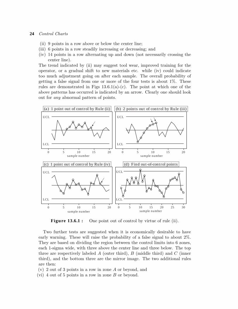
(ii) 9 points in a row above or below the center line;(iii) 6 points in a row steadily increasing or decreasing; and(iv) 14 points in a row alternating up and down (not necessarily crossing the
center line).The trend indicated by (ii) may suggest tool wear, improved training for theoperator, or a gradual shift to new materials etc. while (iv) could indicatetoo much adjustment going on after each sample. The overall probability ofgetting a false signal from one or more of the four tests is about 1%. Theserules are demonstrated in Figs 13.6.1(a)-(c). The point at which one of theabove patterns has occurred is indicated by an arrow. Clearly one should lookout for any abnormal pattern of points.
(d) Find out-of-control points
(a) 1 point out of control by Rule (ii) (b) 2 points out of control by Rule (iii)
0 5 10 15 20sample number
UCL
LCL
0 5 10 15 20sample number
UCL
LCL
0 5 10 15 20sample number
UCL
LCL
0 5 10 15 20 25 30sample number
UCL
LCL
(c) 1 point out of control by Rule (iv)
Figure 13.6.1 : One point out of control by virtue of rule (ii).
Two further tests are suggested when it is economically desirable to haveearly warning. These will raise the probability of a false signal to about 2%.They are based on dividing the region between the control limits into 6 zones,each 1-sigma wide, with three above the center line and three below. The topthree are respectively labeled A (outer third), B (middle third) and C (innerthird), and the bottom three are the mirror image. The two additional rulesare then:(v) 2 out of 3 points in a row in zone A or beyond, and(vi) 4 out of 5 points in a row in zone B or beyond.
13.7 Summary 25
Rules (v) and (vi) are appropriate when there may be more than one datasource. We shall not go into details.
Clearly a variety of rules are possible and different handbooks will have somevariants of the above. Also there are some redundancies in the above rules asone rule can sometimes include another. The important thing is that theseformal rules should not be followed slavishly. Anything unusual in the patternof points is a signal to go hunting for a special cause. For the exercises in thisbook we shall confine ourselves to just rules (i)–(iv).
Exercise on Section 13.6.1 According to the rules (i)–(iv) there are 6points out of control in Fig. 13.6.1(d). Can you find them?
Quiz for Sections 13.4 to 13.61. Describe a situation where single observations rather than averages have to be used.
(Section 13.5)
2. What is the essential distinction between specification limits and control limits?
3. Why is it best not to include specification limits on a chart for averages? (Section 13.6)
4. List six rules for determining whether a process is in control or not. Which four are wegoing to use? (Section 13.7)
13.7 Summary1. A run chart for a process is a graph in which the data are plotted in
the order in which they were obtained in time, and consecutive points arejoined by lines.
2. Control charts are useful for• conveying a historical record of the behavior of a process;• allowing us to monitor a process for stability;• helping us detect changes from a previously stable pattern of variation;• signaling the need for the adjustment of a process;• helping us detect special causes of variation.
3. A process is said to be in control (with respect to some measured char-acteristic X of the product) if the distribution of X does not change overtime.
4. There are two types of causes that produce the variation seen in a runchart:
• common (chance) causes. These are generally small and are due to themany random elements that make up a process.
• special (assignable) causes. These are more systematic changes in pat-tern for which the real cause is often found when their presence is sig-nalled by a control chart.
26 Control Charts
5. Control charts for subgroups of data.• x–chart: plots successive subgroup means to monitor the behavior of
the average level of X (see Fig. 13.2.1).• R–chart: plots successive subgroup ranges to monitor the behavior of
the variability of X (see Fig. 13.2.3).• p̂–chart: plots successive subgroup proportions to monitor the be-
havior of the proportion of items produced which are “defective” (seeFig. 13.2.4).
6. Individuals chart. These are used when data from the process is producedtoo slowly for grouping to be feasible (see Fig. 13.4.1).
7. The upper and lower specification limits (USL and LSL) are externallyimposed, for example by the customer, and are not a reflection of thebehavior of the process. Also they apply to individual units, not averages.
8. The four tests we shall use for determining when a process is out of controlare as follows:( i ) One or more points outside the control limits.(ii) 9 points in a row above or below the center line.(iii) 6 points in a row steadily increasing or decreasing.(iv) 14 points in a row alternating up and down (not necessarily crossing
the center line).
Review Exercises 13
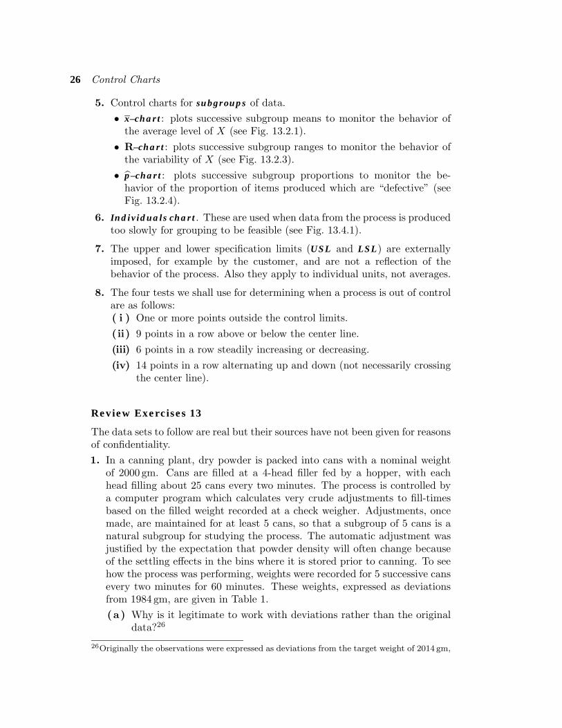
The data sets to follow are real but their sources have not been given for reasonsof confidentiality.1. In a canning plant, dry powder is packed into cans with a nominal weight
of 2000 gm. Cans are filled at a 4-head filler fed by a hopper, with eachhead filling about 25 cans every two minutes. The process is controlled bya computer program which calculates very crude adjustments to fill-timesbased on the filled weight recorded at a check weigher. Adjustments, oncemade, are maintained for at least 5 cans, so that a subgroup of 5 cans is anatural subgroup for studying the process. The automatic adjustment wasjustified by the expectation that powder density will often change becauseof the settling effects in the bins where it is stored prior to canning. To seehow the process was performing, weights were recorded for 5 successive cansevery two minutes for 60 minutes. These weights, expressed as deviationsfrom 1984 gm, are given in Table 1.(a) Why is it legitimate to work with deviations rather than the original
data?26
26Originally the observations were expressed as deviations from the target weight of 2014 gm,
Review Exercises 13 27
(b) Calculate the center line and the control limits for an x–chart.
( c ) Construct the x–chart. Are there any points outside the control limits?
(d) Construct an R–chart. What does the chart tell you?
( e ) It turns out that because of the crude adjustment scheme, the between-subgroup variation is much greater than the within-subgroup varia-tion. Therefore using the within subgroup variation to determine thecontrol limits could be regarded as unreasonable. To get round thisproblem, treat the 30 subgroup means in the table as 30 single ob-servations and construct an individuals control chart. How does thisaffect your decision about the stability of the process?
Table 1 : Canning PLant Data
Subgroup Weight-1984 gm Mean Range
1 32.3 31.6 13.3 14.3 16.6 21.62 19.02 23.2 32.9 30.1 34.8 29.9 30.18 11.63 8.1 17.5 11.9 11.4 12.5 12.28 9.44 19.6 26.2 27.8 27.4 17.1 23.42 10.75 31.4 35.7 29.2 29.7 26.9 30.58 8.86 37.5 22.6 8.1 12.9 14.5 19.12 29.47 20.0 18.0 23.6 9.0 16.1 17.34 14.68 7.9 4.4 4.4 3.9 3.7 4.86 4.29 17.8 17.1 18.4 24.9 21.5 21.94 7.8
10 25.4 26.9 27.3 21.6 29.2 27.16 7.611 35.9 42.8 41.1 37.4 24.8 36.40 18.012 26.6 33.4 27.9 25.1 29.9 28.58 8.313 13.7 11.8 20.6 6.2 14.2 13.10 14.414 32.3 23.1 17.7 22.1 12.1 21.46 20.215 27.4 26.0 29.4 29.5 32.5 28.96 6.516 36.5 42.4 30.7 27.0 23.3 31.98 19.117 24.0 36.8 31.5 22.5 25.6 28.08 14.318 26.2 18.0 14.4 6.8 11.3 15.14 9.419 25.7 26.3 23.2 17.8 18.1 22.22 8.520 16.4 44.1 33.4 29.7 32.2 33.16 27.721 13.2 23.3 23.7 21.0 16.7 19.58 10.522 24.5 32.8 24.4 29.2 22.0 26.58 10.823 16.7 24.9 27.8 29.3 31.4 26.02 14.724 34.2 25.6 11.5 8.5 2.6 16.48 31.625 33.6 17.4 17.5 18.4 15.6 20.50 18.026 27.2 37.2 27.4 28.2 21.2 28.28 16.027 29.6 39.0 35.7 32.5 29.3 33.22 9.728 18.9 54.3 40.4 35.3 28.3 35.44 35.429 19.1 28.6 23.8 29.9 27.1 25.70 10.830 29.9 29.4 30.8 30.3 38.5 31.78 9.1
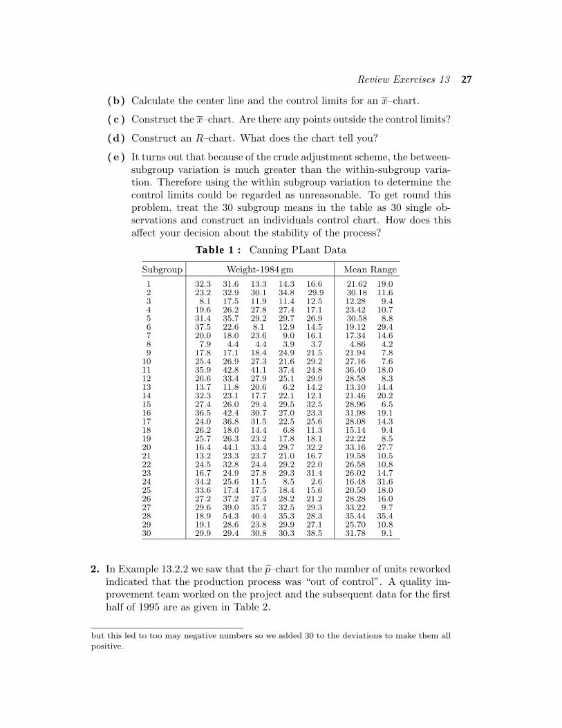
2. In Example 13.2.2 we saw that the p̂–chart for the number of units reworkedindicated that the production process was “out of control”. A quality im-provement team worked on the project and the subsequent data for the firsthalf of 1995 are as given in Table 2.
but this led to too may negative numbers so we added 30 to the deviations to make them allpositive.
28 Control Charts
Table 2 : Units Requiring Rework After Changes
Week ending Requiring TotalDay/month rework production %
11/2 27 2405 1.1218 27 2672 1.0125 28 3057 0.924/3 20 3053 0.66
11 16 3062 0.5218 5 2489 0.2025 34 3685 0.921/4 25 3305 0.768 15 3339 0.45
15 14 2536 0.5522 17 2701 0.6329 30 2843 1.066/5 32 3809 0.84
13 15 3050 0.4920 17 3173 0.5427 14 3205 0.443/6 10 2937 0.34
10 9 2559 0.35
(a) Construct a p̂–chart using the average value of n.(b) Do you think that the team was successful in stabilizing the process?( c ) What else was achieved by the team in terms of variability?
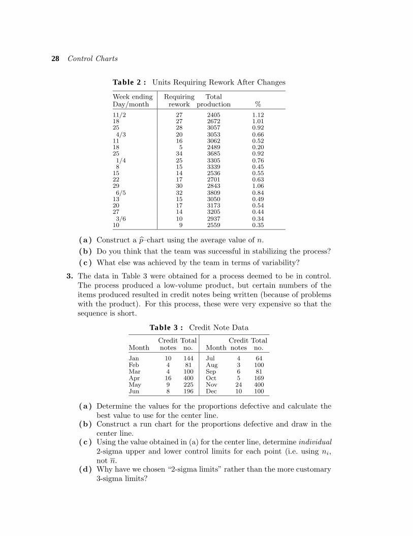
3. The data in Table 3 were obtained for a process deemed to be in control.The process produced a low-volume product, but certain numbers of theitems produced resulted in credit notes being written (because of problemswith the product). For this process, these were very expensive so that thesequence is short.
Table 3 : Credit Note Data
Credit Total Credit TotalMonth notes no. Month notes no.
Jan 10 144 Jul 4 64Feb 4 81 Aug 3 100Mar 4 100 Sep 6 81Apr 16 400 Oct 5 169May 9 225 Nov 24 400Jun 8 196 Dec 10 100
(a) Determine the values for the proportions defective and calculate thebest value to use for the center line.
(b) Construct a run chart for the proportions defective and draw in thecenter line.
( c ) Using the value obtained in (a) for the center line, determine individual2-sigma upper and lower control limits for each point (i.e. using ni,not n.
(d) Why have we chosen “2-sigma limits” rather than the more customary3-sigma limits?

Review Exercises 13 29
( e ) What do you conclude from the chart?
4. To monitor the performance of a vehicle, the mileage was recorded eachtime fuel was added. After 30 measurements we have the following distances(Mge.) traveled per unit volume of fuel used. The unsigned differences forconsecutive pairs (|diff.|) are also given in Table 4.
Table 4 : Fuel Consumption Data
No. Mge. |diff.| No. Mge. |diff.| No. Mge. |diff.|1 11.4 11 11.7 0.9 21 12.5 0.02 11.3 0.1 12 11.6 0.1 22 11.3 1.23 11.9 0.6 13 11.6 0.0 23 11.4 0.14 11.4 0.5 14 13.2 1.6 24 13.1 1.75 12.5 1.1 15 12.3 0.9 25 12.0 1.16 12.0 0.5 16 12.3 0.0 26 12.9 0.97 9.6 2.4 17 11.9 0.4 27 13.5 0.68 11.9 2.3 18 11.3 0.6 28 12.6 0.99 12.6 0.7 19 11.9 0.6 29 13.1 0.5
10 12.6 0.0 20 12.5 0.6 30 13.1 0.0
(a) What sort of control chart would you use here?
(b) Construct your chart and draw in the center line and the control limits.What do you conclude?
( c ) It was found that the vehicle was used for a lot of very short trips inthe city during the time when the 7th sample value was calculated.Exclude this point and recompute your limits. What do you conclude?
Table 5 : Plastic Film Data
Roll Thick1 Thick2 Mean Roll Thick1 Thick2 Mean
1 115 123 119.0 26 116 126 121.02 114 124 119.0 27 113 123 118.03 115 122 118.5 28 115 124 119.54 114 123 118.5 29 112 122 117.05 114 125 119.5 30 111 124 117.56 115 124 119.5 31 113 123 118.07 112 127 119.5 32 113 120 116.58 115 126 120.5 33 114 124 119.09 113 124 118.5 34 111 125 118.0
10 113 125 119.0 35 115 124 119.511 117 126 121.5 36 113 124 118.512 115 128 121.5 37 112 124 118.013 116 127 121.5 38 114 127 120.514 113 121 117.0 39 117 127 122.015 112 125 118.5 40 116 126 121.016 113 124 118.5 41 117 127 122.017 114 125 119.5 42 117 127 122.018 113 123 118.0 43 113 125 119.019 116 125 120.5 44 113 125 119.020 114 127 120.5 45 114 126 120.021 112 120 116.0 46 114 129 121.522 110 119 114.5 47 115 129 122.023 117 125 121.0 48 116 129 122.524 116 126 121.0 49 116 130 123.025 113 126 119.5
30 Control Charts
5. The data in Table 5 were collected by a factory producing rolls of plasticfilm. The 49 pairs of measurements represent the thickness (in microns)measured at the ends of 49 successive rolls. Each roll represents about 20minutes of manufacturing and measurements may be taken only at the endof each roll. The two measurements from each roll are measured at twofixed positions across the film, one at the edge and one in the middle.
(a) Construct an x–chart using subgroups of size 2. Comment on thestability of the process. It looks too good to be true doesn’t it! Whatdo you think is wrong?
(b) Using the means in the above table construct an individuals chart.Explain why this chart is more reliable than the previous one.
( c ) What does the chart show?
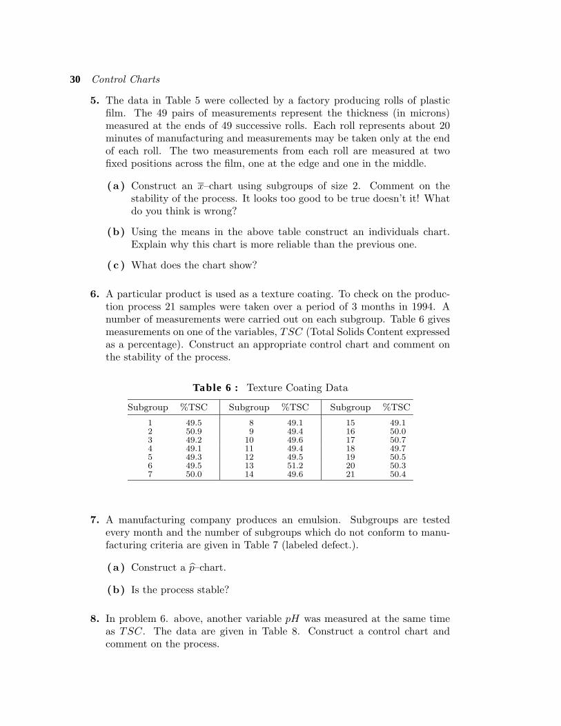
6. A particular product is used as a texture coating. To check on the produc-tion process 21 samples were taken over a period of 3 months in 1994. Anumber of measurements were carried out on each subgroup. Table 6 givesmeasurements on one of the variables, TSC (Total Solids Content expressedas a percentage). Construct an appropriate control chart and comment onthe stability of the process.
Table 6 : Texture Coating Data
Subgroup %TSC Subgroup %TSC Subgroup %TSC
1 49.5 8 49.1 15 49.12 50.9 9 49.4 16 50.03 49.2 10 49.6 17 50.74 49.1 11 49.4 18 49.75 49.3 12 49.5 19 50.56 49.5 13 51.2 20 50.37 50.0 14 49.6 21 50.4
7. A manufacturing company produces an emulsion. Subgroups are testedevery month and the number of subgroups which do not conform to manu-facturing criteria are given in Table 7 (labeled defect.).
(a) Construct a p̂–chart.
(b) Is the process stable?
8. In problem 6. above, another variable pH was measured at the same timeas TSC. The data are given in Table 8. Construct a control chart andcomment on the process.
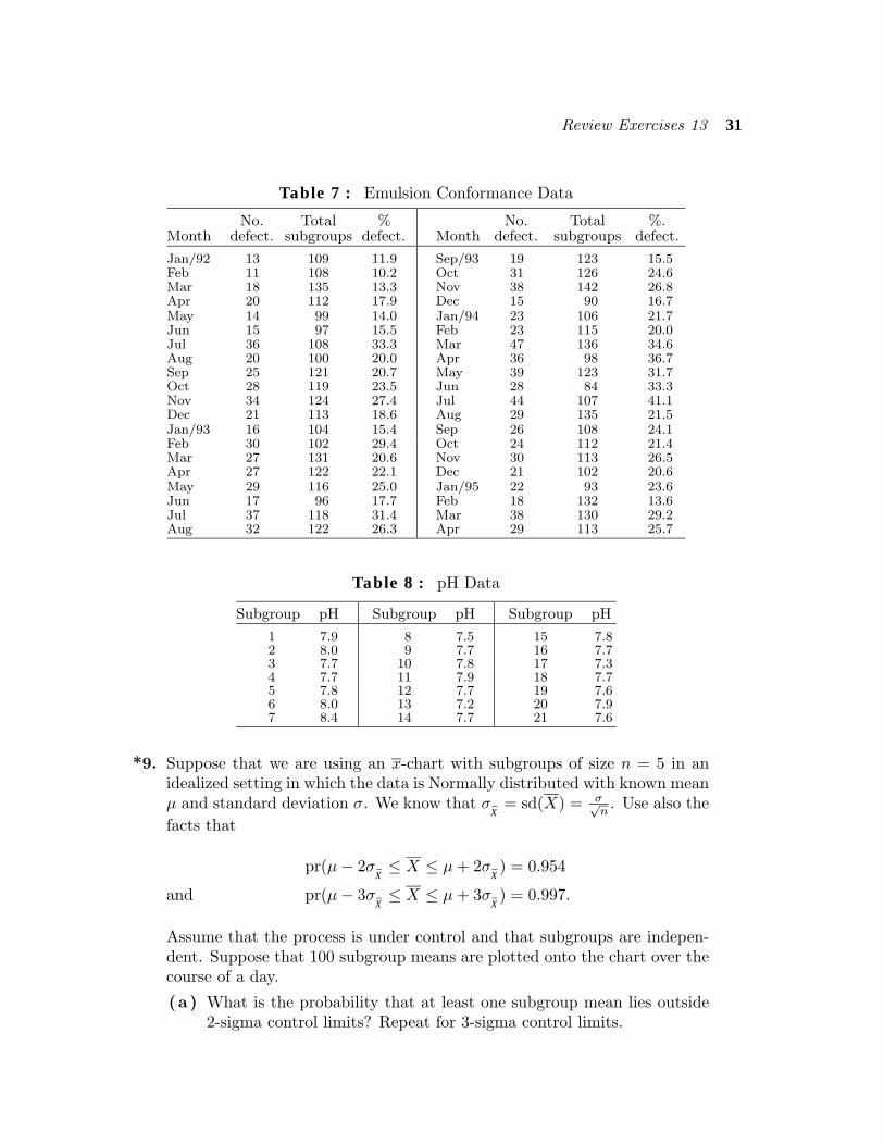
Review Exercises 13 31
Table 7 : Emulsion Conformance Data
No. Total % No. Total %.Month defect. subgroups defect. Month defect. subgroups defect.
Jan/92 13 109 11.9 Sep/93 19 123 15.5Feb 11 108 10.2 Oct 31 126 24.6Mar 18 135 13.3 Nov 38 142 26.8Apr 20 112 17.9 Dec 15 90 16.7May 14 99 14.0 Jan/94 23 106 21.7Jun 15 97 15.5 Feb 23 115 20.0Jul 36 108 33.3 Mar 47 136 34.6Aug 20 100 20.0 Apr 36 98 36.7Sep 25 121 20.7 May 39 123 31.7Oct 28 119 23.5 Jun 28 84 33.3Nov 34 124 27.4 Jul 44 107 41.1Dec 21 113 18.6 Aug 29 135 21.5Jan/93 16 104 15.4 Sep 26 108 24.1Feb 30 102 29.4 Oct 24 112 21.4Mar 27 131 20.6 Nov 30 113 26.5Apr 27 122 22.1 Dec 21 102 20.6May 29 116 25.0 Jan/95 22 93 23.6Jun 17 96 17.7 Feb 18 132 13.6Jul 37 118 31.4 Mar 38 130 29.2Aug 32 122 26.3 Apr 29 113 25.7
Table 8 : pH Data
Subgroup pH Subgroup pH Subgroup pH
1 7.9 8 7.5 15 7.82 8.0 9 7.7 16 7.73 7.7 10 7.8 17 7.34 7.7 11 7.9 18 7.75 7.8 12 7.7 19 7.66 8.0 13 7.2 20 7.97 8.4 14 7.7 21 7.6
*9. Suppose that we are using an x-chart with subgroups of size n = 5 in anidealized setting in which the data is Normally distributed with known meanµ and standard deviation σ. We know that σ
X̄= sd(X) = σ√
n. Use also the
facts that
pr(µ− 2σX̄≤ X ≤ µ+ 2σ
X̄) = 0.954
pr(µ− 3σX̄≤ X ≤ µ+ 3σ
X̄) = 0.997.and
Assume that the process is under control and that subgroups are indepen-dent. Suppose that 100 subgroup means are plotted onto the chart over thecourse of a day.
(a) What is the probability that at least one subgroup mean lies outside2-sigma control limits? Repeat for 3-sigma control limits.
32 Control Charts
(b) What is (i) the distribution, and (ii) the expected value of the numberof subgroup means that will lie outside 2-sigma control limits? Repeatfor 3-sigma control limits.
Suppose now that the process goes out of control in that the mean shiftsfrom µ to µ+ 0.5σ. (The variability remains unchanged.)
**( c ) Show that the probability that the next subgroup mean lies outsidethe 2-sigma control limits is 0.19 [This is the probability that the control chart
signals the change with the first post-change subgroup.]
(d) What is the probability that at least one of the next 5 subgroup meanslies outside the 2-sigma control limits?
( e ) Repeat (c) and (d) but for 3-sigma limits.( f ) What have you learned from the calculations in this question?