qi charts - quality improvement · rules for special ause ... for further information on...
TRANSCRIPT

2
Contents
Installing QI charts onto your computer……………………. …….. 3
Missing QI Charts toolbar………………………………………………….. 3
Data Orientation……………………………………………………………….. 5
Shewhart Chart Selection Flowchart………………………………….6
Creating a Run Chart…………………………………………………………. 9
About Phases…………………………………………………………………….. 14
Testing Process Changes by Extending the Last Phase……….18
The different types of Shewhart (Control) charts………………. 20
C Chart………………………………………………………………………. 20
P Chart………………………………………….…………………………….22
U Chart……………………………………………….………………………. 23
G and T Chart…………………………………………..………………….. 25
I-MR Chart……………………………………………………………..……. 28
X-bar S chart…………………………………………………………………30
Decision Tree for Chart Selection………………………………………. 34
Rules for Special Cause……………………………………………………… 35
Annotations………………………………………………………………………. 35
APPENDIX A: Chart Types in QI Charts………………………………..38

3
Installing QI charts onto your computer
If you don’t have QI charts already installed onto your computer, please find instructions below on how
to get it installed.
Step 1: Contact IT service desk (0207 655 4004) and request QI charts to be installed on your computer.
You will need to provide IT with the following information:
PC MH/ELMCHT Number (this can be found on the sticker on your computer tower or laptop)
Location
Contact details
Step 2: Once the software has been installed onto your computer, you will see the QI charts toolbar
when you start up Excel (figure 1).
Step 3: In Excel 2007 or later, click the “Add-in” tab in the Excel ribbon to view the QI charts toolbar.
Missing QI Charts Toolbar
If for any reason the toolbar has not appeared (or disappeared) try the following steps:
Step 1: Open Excel, click “File” and then “Options” (figure 2)
Figure 1 - QI Charts Toolbar
Figure 2

4
Step 2: Select “Add-Ins” from the options on the left (figure 3)
Step 3: Under “Manage” (located at the bottom of the pop up screen), select “Excel Add-Ins” from the
drop down list and press “Go” (figure 4)
Step 5: Make sure the “QI Charts Add-in” box is ticked (figure 5). Then press close and restart Excel. You
should now be able to see the “Add-Ins” option in the ribbon.
Figure 4
Figure 3 – Select “Add-Ins”
Figure 5

5
Data Orientation
When using QI charts, your data may be arranged either vertically (column oriented) or horizontally
(row oriented), Table 1 and 2 show an example of both.
Date Y Values
Jan-15 43
Feb-15 46
Mar-15 52 Apr-15 42
May-15 38
Jun-15 49 July-15 61
Aug-15 69
Sept-15 72 Oct-15 71
Nov-15 75
Dec-15 68
In the above example, the first column (the index) contains values that will appear on the X-axis of the
chart. These may be dates or times, labels, or a number series. Index values should be unique, if
possible. Column headings are optional but are advised.
A row oriented version of the above data can be seen in Table 2.
Date Jan-15
Feb-15
Mar-15
Apr-15
May-15
Jun-15
Jul-15
Aug-15
Sept-15
Oct-15
Nov-15
Dec-15
Y Values 43 46 52 42 38 49 61 69 72 71 75 68
Although both options work just as well as each other, we advise always having your data oriented in
columns.
In order to select the correct chart for your data, you will need to understand the different types of
control charts that are available. The flowchart in the next page explains how to select the correct
chart.
For further information on interpreting Run and Control charts, click on the following links:
Run Charts
Control Charts
Table 1 – Column oriented data
Table 2 – Row oriented data
Data
arranged
in columns
Optional column
headings
Index
values are
unique
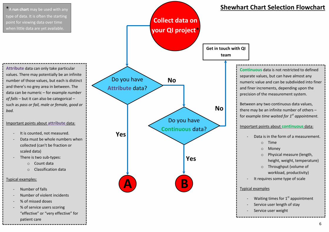
Shewhart Chart Selection Flowchart *A run chart may be used with any
type of data. It is often the starting
point for viewing data over time
when little data are yet available.
Do you have
Continuous data?
Do you have
Attribute data?
Collect data on
your QI project*
A B
Get in touch with QI
team
Yes
Yes
No
No
Attribute data can only take particular
values. There may potentially be an infinite
number of those values, but each is distinct
and there’s no grey area in between. The
data can be numeric – for example number
of falls – but it can also be categorical –
such as pass or fail, male or female, good or
bad.
Important points about attribute data:
- It is counted, not measured.
- Data must be whole numbers when
collected (can’t be fraction or
scaled data)
- There is two sub-types:
o Count data
o Classification data
Typical examples:
- Number of falls
- Number of violent incidents
- % of missed doses
- % of service users scoring
“effective” or “very effective” for
patient care
Continuous data is not restricted to defined
separate values, but can have almost any
numeric value and can be subdivided into finer
and finer increments, depending upon the
precision of the measurement system.
Between any two continuous data values,
there may be an infinite number of others –
for example time waited for 1st appointment.
Important points about continuous data:
- Data is in the form of a measurement.
o Time
o Money
o Physical measure (length,
height, weight, temperature)
o Throughput (volume of
workload, productivity)
- It requires some type of scale
Typical examples
- Waiting times for 1st appointment
- Service user length of stay
- Service user weight
6

Count
- 1, 2, 3, 4 etc. (errors, occurrences,
defects, complications)
- Numerator can be greater than
denominator
Typical examples:
- Number of falls
- Number of incidents of physical
violence
- Complaints per 1,000 visits
Classification
- Either/or, pass/fail, yes/ no
- Percentage or proportion
- Numerator cannot be greater
than the denominator
- Can have an equal or unequal
subgroup size
Typical examples:
- Did Not Attend (DNA) rate
- % of service user
participation
- % of safety huddles
completed every week
A
Do you have
Count data? Yes
Do you have
Classification
data?
No
Get in touch with QI
team
No
P Chart
Yes
E.g. Number of Falls causing
harm as a % of all falls
reported
Is it a rare
event?
No Yes T Chart
E.g. Days between
number of Falls
Do you have an equal area of
opportunity?
Typical examples:
- Number of incidents per week
- Number of uses per month
No Yes C Chart
U Chart
E.g. Number of Falls per
1,000 occupied bed days E.g. Number of Falls
7

B
Does each data point on the
chart consist of a single
observation?
Typical examples:
- Cost per episode of care
- Waiting time for each patient
- Average decibel reading for noise level
Typical examples:
- Average waiting time for 1st appointment
across multiple teams
- Average cost per case for all cases this week
- Average weight gain for all service users this
month
No Yes I
Chart X Bar S
Chart
X Bar S chart characteristics:
- Two charts are created:
o An average chart known as the X bar chart
Upper and lower control limit vary with
sample size
Y-axis usually the average of a measurement
o A standard deviation chart known as the S chart
Y-axis is the standard deviation of all data
points making up each point on the X bar
chart
E.g. Cost per episode of Falls E.g. Average cost per episode of
falls across all inpatient wards
8

9
Creating a Run Chart
The following example will use the data from Table 1 to create a run chart using QI charts. The
procedure for creating other chart types is similar and will be explained later.
Step 1: Open the Excel workbook that contains your data, or enter the data into a new worksheet
(figure 6).
Step 2: In the QI-Charts toolbar (“Add-Ins” in the Excel ribbon), click on “New Control Chart”.
Step 3: Complete the “New Control Chart” dialog of the wizard (figure 7).
Select “Run Chart” from the “Type of Chart” option.
Select all your data including your field headers in the “Data Range” option
Figure 6 - Column oriented data in Excel
Figure 7 - New Control Chart wizard
Our data includes
column headers (the
first row), so make
sure you tick this box.
10
Step 4: [OPTIONAL] You can specify the location of where you want the chart to appear. If you leave
this option blank, the chart will appear just to the right of your data range.
Step 5: Click “Next>>”
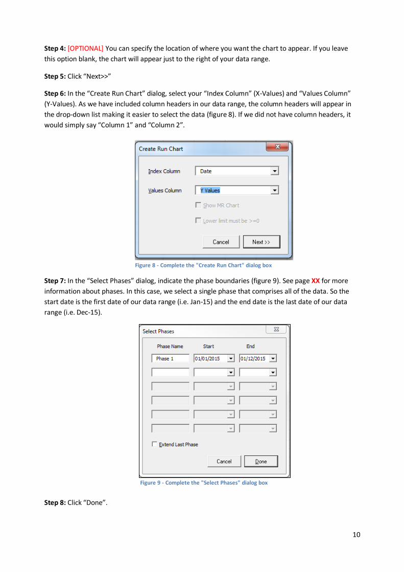
Step 6: In the “Create Run Chart” dialog, select your “Index Column” (X-Values) and “Values Column”
(Y-Values). As we have included column headers in our data range, the column headers will appear in
the drop-down list making it easier to select the data (figure 8). If we did not have column headers, it
would simply say “Column 1” and “Column 2”.
Step 7: In the “Select Phases” dialog, indicate the phase boundaries (figure 9). See page XX for more
information about phases. In this case, we select a single phase that comprises all of the data. So the
start date is the first date of our data range (i.e. Jan-15) and the end date is the last date of our data
range (i.e. Dec-15).
Step 8: Click “Done”.
Figure 8 - Complete the "Create Run Chart" dialog box
Figure 9 - Complete the "Select Phases" dialog box

11
Step 9: QI Charts places the new control chart just to the right of your data range (figure 10).
Step 10: You may adjust the chart titles, axis scaling and overall appearance of the chart using the
regular Excel chart menus.
a) To modify the chart titles, select the chart. The “Chart Tools” options should now appear in the
Excel ribbon. Click on “Layout” and then under the “Labels” category you will see the “Chart
Title” and “Axis Titles” option. You can use these options to add a chart title and a label for the
X and Y axis.
b) To adjust the axis scale, right click on the axis you would like to change and select “Format
Axis”.
Formatting the X-Axis (changing the formatting of the date)
1. Click on any of the values in the X-Axis once to highlight the whole axis. Then right click
and select “Format Axis” (figure 11)
Figure 10 - The run chart is placed to the right of the data
Figure 11 - Right click on the X-Axis and select "Format Axis"
12
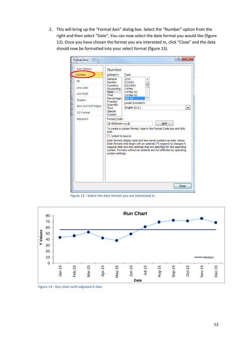
2. This will bring up the “Format Axis” dialog box. Select the “Number” option from the
right and then select “Date”. You can now select the date format you would like (figure
12). Once you have chosen the format you are interested in, click “Close” and the data
should now be formatted into your select format (figure 13).
0
10
20
30
40
50
60
70
80
Jan
-15
Fe
b-1
5
Ma
r-1
5
Ap
r-1
5
Ma
y-1
5
Jun
-15
Jul-
15
Au
g-1
5
Se
p-1
5
Oct-
15
Nov-1
5
Dec-1
5
Y V
alu
es
Date
Run Chart
Median
Figure 13 - Run chart with adjusted X-Axis
Figure 12 - Select the date format you are interested in

13
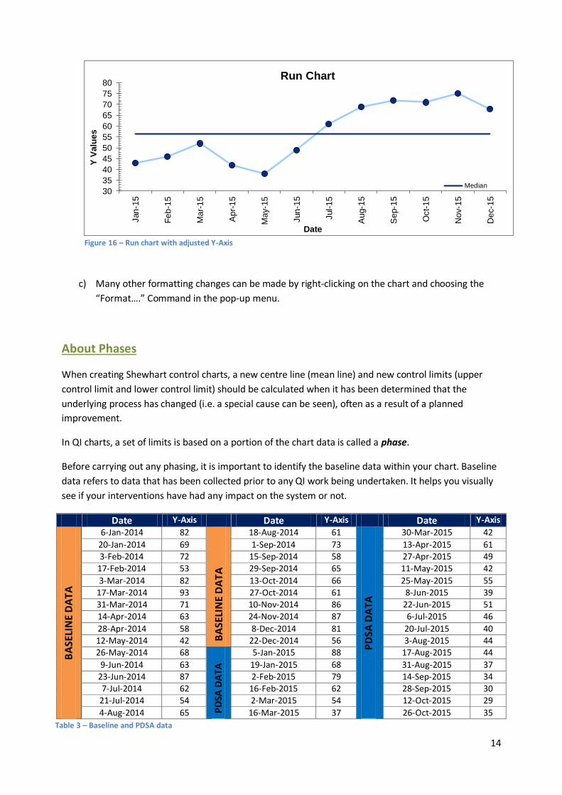
Formatting the Y-Axis (reducing the scale)
3. Click on any of the values in the Y-Axis once to highlight the whole axis. Then right click
and select “Format Axis” (figure 14)
4. Since none of our data has a Y value less than 30, we can get the Y-Axis to start at 30.
This way we will be able to see variation better. To do this, under “Axis Options”
change the minimum value to 30 by selecting “Fixed” first and then editing the value
from 0 to 30 (figure 15). If you wanted to reduce the maximum value of the Y-Axis, you
could do this by changing the maximum value. The end result can be seen in figure 16.
Figure 14 - Right click on the Y-Axis and select "Format Axis"
Figure 15 - Adjusting the Y-Axis
14
c) Many other formatting changes can be made by right-clicking on the chart and choosing the
“Format….” Command in the pop-up menu.
About Phases
When creating Shewhart control charts, a new centre line (mean line) and new control limits (upper
control limit and lower control limit) should be calculated when it has been determined that the
underlying process has changed (i.e. a special cause can be seen), often as a result of a planned
improvement.
In QI charts, a set of limits is based on a portion of the chart data is called a phase.
Before carrying out any phasing, it is important to identify the baseline data within your chart. Baseline
data refers to data that has been collected prior to any QI work being undertaken. It helps you visually
see if your interventions have had any impact on the system or not.
Date Y-Axis Date Y-Axis Date Y-Axis
BA
SELI
NE
DA
TA
6-Jan-2014 82
BA
SELI
NE
DA
TA
18-Aug-2014 61
PD
SA D
ATA
30-Mar-2015 42
20-Jan-2014 69 1-Sep-2014 73 13-Apr-2015 61
3-Feb-2014 72 15-Sep-2014 58 27-Apr-2015 49
17-Feb-2014 53 29-Sep-2014 65 11-May-2015 42
3-Mar-2014 82 13-Oct-2014 66 25-May-2015 55 17-Mar-2014 93 27-Oct-2014 61 8-Jun-2015 39 31-Mar-2014 71 10-Nov-2014 86 22-Jun-2015 51
14-Apr-2014 63 24-Nov-2014 87 6-Jul-2015 46
28-Apr-2014 58 8-Dec-2014 81 20-Jul-2015 40 12-May-2014 42 22-Dec-2014 56 3-Aug-2015 44
26-May-2014 68
PD
SA D
ATA
5-Jan-2015 88 17-Aug-2015 44
9-Jun-2014 63 19-Jan-2015 68 31-Aug-2015 37
23-Jun-2014 87 2-Feb-2015 79 14-Sep-2015 34
7-Jul-2014 62 16-Feb-2015 62 28-Sep-2015 30
21-Jul-2014 54 2-Mar-2015 54 12-Oct-2015 29
4-Aug-2014 65 16-Mar-2015 37 26-Oct-2015 35
30
35
40
45
50
55
60
65
70
75
80
Jan
-15
Fe
b-1
5
Ma
r-1
5
Ap
r-1
5
Ma
y-1
5
Jun
-15
Jul-
15
Au
g-1
5
Se
p-1
5
Oct-
15
No
v-1
5
De
c-1
5
Y V
alu
es
Date
Run Chart
Median
Figure 16 – Run chart with adjusted Y-Axis
Table 3 – Baseline and PDSA data
15
Table 3 provides a set of count data. As this is count data, we would use a C chart. You will notice that
baseline data was collected from 6-Jan-2014 to 22-Dec-2014. It is important than when we create our C
chart, we fix our baseline from 6-Jan-2014 to 22-Dec-2014. This means the centre line (mean) will be
calculated using data values from within this data range. Any points after this data range will not affect
the centre line, allowing us to clearly distinguish between common cause variation and special cause
variation.
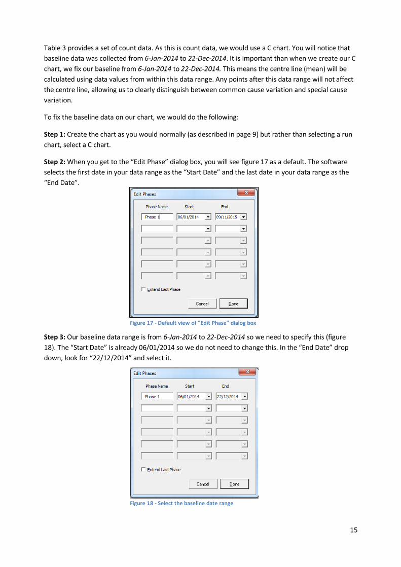
To fix the baseline data on our chart, we would do the following:
Step 1: Create the chart as you would normally (as described in page 9) but rather than selecting a run
chart, select a C chart.
Step 2: When you get to the “Edit Phase” dialog box, you will see figure 17 as a default. The software
selects the first date in your data range as the “Start Date” and the last date in your data range as the
“End Date”.
Step 3: Our baseline data range is from 6-Jan-2014 to 22-Dec-2014 so we need to specify this (figure
18). The “Start Date” is already 06/01/2014 so we do not need to change this. In the “End Date” drop
down, look for “22/12/2014” and select it.
Figure 17 - Default view of "Edit Phase" dialog box
Figure 18 - Select the baseline date range
16
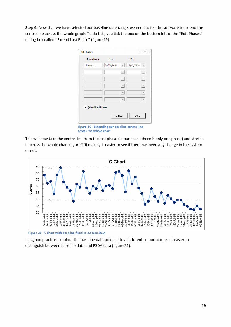
Step 4: Now that we have selected our baseline date range, we need to tell the software to extend the
centre line across the whole graph. To do this, you tick the box on the bottom left of the “Edit Phases”
dialog box called “Extend Last Phase” (figure 19).
This will now take the centre line from the last phase (in our chase there is only one phase) and stretch
it across the whole chart (figure 20) making it easier to see if there has been any change in the system
or not.
It is good practice to colour the baseline data points into a different colour to make it easier to
distinguish between baseline data and PSDA data (figure 21).
Figure 19 - Extending our baseline centre line across the whole chart
UCL
LCL
25
35
45
55
65
75
85
95
06
-Ja
n-1
4
20
-Ja
n-1
4
03
-Fe
b-1
4
17
-Fe
b-1
4
03
-Ma
r-1
4
17
-Ma
r-1
4
31
-Ma
r-1
4
14
-Ap
r-1
4
28
-Ap
r-1
4
12
-Ma
y-1
4
26
-Ma
y-1
4
09
-Ju
n-1
4
23
-Ju
n-1
4
07
-Ju
l-1
4
21
-Ju
l-1
4
04
-Au
g-1
4
18
-Au
g-1
4
01
-Se
p-1
4
15
-Se
p-1
4
29
-Se
p-1
4
13
-Oct-
14
27
-Oct-
14
10
-No
v-1
4
24
-No
v-1
4
08
-De
c-1
4
22
-De
c-1
4
05
-Ja
n-1
5
19
-Ja
n-1
5
02
-Fe
b-1
5
16
-Fe
b-1
5
02
-Ma
r-1
5
16
-Ma
r-1
5
30
-Ma
r-1
5
13
-Ap
r-1
5
27
-Ap
r-1
5
11
-Ma
y-1
5
25
-Ma
y-1
5
08
-Ju
n-1
5
22
-Ju
n-1
5
06
-Ju
l-1
5
20
-Ju
l-1
5
03
-Au
g-1
5
17
-Au
g-1
5
31
-Au
g-1
5
14
-Se
p-1
5
28
-Se
p-1
5
12
-Oct-
15
26
-Oct-
15
09
-No
v-1
5
Y-A
xis
C Chart
Figure 20 - C chart with baseline fixed to 22-Dec-2014

17
If we look at the figure 21, we can see that there is a special cause variation from 16-Feb-2015 onwards
(there are eight or more points below the centre line – to learn about the rules of interpreting control
charts, click here).
A new centre line and control limits need to be calculated now that we have determined the underlying
process has changed. To do this, we go back to the “Edit Phases” dialog box.
Step 1: Click on the chart, go to “Add-Ins” and click on “Edit Chart Phases”
Step 2: Un-tick the “Extend Last Phase” box
Step 3: As we are now adding a new phase, we need to define the date range for it. The first point (of
the eight or more points below the centre line) is for 16-Feb-2015 so this will be the “Start Date” for our
new phase. We need to change the “End Date” for our initial baseline phase (phase 1) to the date just
before 16-Feb-2015, which is 02/02/2015 (figure 22). Once you have done this, click “Done” and you
will see presented with a C chart with two phases (figure 23).
UCL
LCL
25
35
45
55
65
75
85
95
06
-Ja
n-1
4
20
-Ja
n-1
4
03
-Fe
b-1
4
17
-Fe
b-1
4
03
-Ma
r-1
4
17
-Ma
r-1
4
31
-Ma
r-1
4
14
-Ap
r-1
4
28
-Ap
r-1
4
12
-Ma
y-1
4
26
-Ma
y-1
4
09
-Ju
n-1
4
23
-Ju
n-1
4
07
-Ju
l-1
4
21
-Ju
l-1
4
04
-Au
g-1
4
18
-Au
g-1
4
01
-Se
p-1
4
15
-Se
p-1
4
29
-Se
p-1
4
13
-Oct-
14
27
-Oct-
14
10
-No
v-1
4
24
-No
v-1
4
08
-De
c-1
4
22
-De
c-1
4
05
-Ja
n-1
5
19
-Ja
n-1
5
02
-Fe
b-1
5
16
-Fe
b-1
5
02
-Ma
r-1
5
16
-Ma
r-1
5
30
-Ma
r-1
5
13
-Ap
r-1
5
27
-Ap
r-1
5
11
-Ma
y-1
5
25
-Ma
y-1
5
08
-Ju
n-1
5
22
-Ju
n-1
5
06
-Ju
l-1
5
20
-Ju
l-1
5
03
-Au
g-1
5
17
-Au
g-1
5
31
-Au
g-1
5
14
-Se
p-1
5
28
-Se
p-1
5
12
-Oct-
15
26
-Oct-
15
09
-No
v-1
5
Y-A
xis
C Chart
Figure 21 - C Chart with fixed baseline coloured in orange
Figure 22 - Edit the phases in the "Edit Phases" dialog box to add the new phase
18
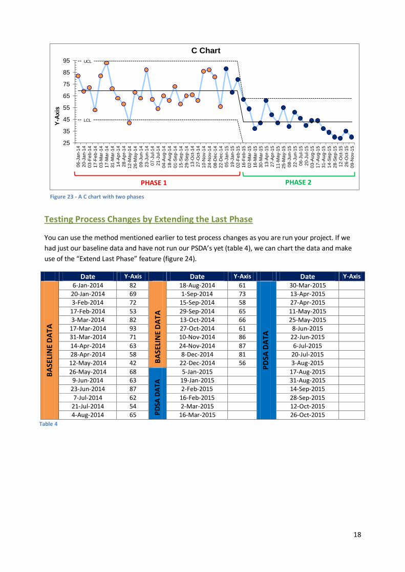
Testing Process Changes by Extending the Last Phase
You can use the method mentioned earlier to test process changes as you are run your project. If we
had just our baseline data and have not run our PSDA’s yet (table 4), we can chart the data and make
use of the “Extend Last Phase” feature (figure 24).
Date Y-Axis Date Y-Axis Date Y-Axis
BA
SELI
NE
DA
TA
6-Jan-2014 82
BA
SELI
NE
DA
TA
18-Aug-2014 61
PD
SA D
ATA
30-Mar-2015
20-Jan-2014 69 1-Sep-2014 73 13-Apr-2015
3-Feb-2014 72 15-Sep-2014 58 27-Apr-2015
17-Feb-2014 53 29-Sep-2014 65 11-May-2015 3-Mar-2014 82 13-Oct-2014 66 25-May-2015
17-Mar-2014 93 27-Oct-2014 61 8-Jun-2015
31-Mar-2014 71 10-Nov-2014 86 22-Jun-2015
14-Apr-2014 63 24-Nov-2014 87 6-Jul-2015 28-Apr-2014 58 8-Dec-2014 81 20-Jul-2015 12-May-2014 42 22-Dec-2014 56 3-Aug-2015
26-May-2014 68
PD
SA D
ATA
5-Jan-2015 17-Aug-2015 9-Jun-2014 63 19-Jan-2015 31-Aug-2015
23-Jun-2014 87 2-Feb-2015 14-Sep-2015
7-Jul-2014 62 16-Feb-2015 28-Sep-2015
21-Jul-2014 54 2-Mar-2015 12-Oct-2015
4-Aug-2014 65 16-Mar-2015 26-Oct-2015
Figure 23 - A C chart with two phases
UCL
LCL
25
35
45
55
65
75
85
95
06
-Ja
n-1
4
20
-Ja
n-1
4
03
-Fe
b-1
4
17
-Fe
b-1
4
03
-Ma
r-1
4
17
-Ma
r-1
4
31
-Ma
r-1
4
14
-Ap
r-1
4
28
-Ap
r-1
4
12
-Ma
y-1
4
26
-Ma
y-1
4
09
-Ju
n-1
4
23
-Ju
n-1
4
07
-Ju
l-1
4
21
-Ju
l-1
4
04
-Au
g-1
4
18
-Au
g-1
4
01
-Se
p-1
4
15
-Se
p-1
4
29
-Se
p-1
4
13
-Oct-
14
27
-Oct-
14
10
-No
v-1
4
24
-No
v-1
4
08
-De
c-1
4
22
-De
c-1
4
05
-Ja
n-1
5
19
-Ja
n-1
5
02
-Fe
b-1
5
16
-Fe
b-1
5
02
-Ma
r-1
5
16
-Ma
r-1
5
30
-Ma
r-1
5
13
-Ap
r-1
5
27
-Ap
r-1
5
11
-Ma
y-1
5
25
-Ma
y-1
5
08
-Ju
n-1
5
22
-Ju
n-1
5
06
-Ju
l-1
5
20
-Ju
l-1
5
03
-Au
g-1
5
17
-Au
g-1
5
31
-Au
g-1
5
14
-Se
p-1
5
28
-Se
p-1
5
12
-Oct-
15
26
-Oct-
15
09
-No
v-1
5
Y-A
xis
C Chart
PHASE 1 PHASE 2
Table 4

19
As we collect our PDSA data, we can make use of the “Refresh Chart Data” option in the “Add-Ins” bar.
All we need to do is populate the table with the data and the click refresh. The chart will then
automatically add the new data sets. Figure 25 is 12 weeks into collecting PDSA data.
Figure 26 shows a special cause (eight or more points below the centre line) so we can phase the chart
(figure 27) now using the steps mentioned earlier.
UCL
LCL
25
35
45
55
65
75
85
95
06
-Ja
n-1
4
20
-Ja
n-1
4
03
-Fe
b-1
4
17
-Fe
b-1
4
03
-Ma
r-1
4
17
-Ma
r-1
4
31
-Ma
r-1
4
14
-Ap
r-1
4
28
-Ap
r-1
4
12
-Ma
y-1
4
26
-Ma
y-1
4
09
-Ju
n-1
4
23
-Ju
n-1
4
07
-Ju
l-1
4
21
-Ju
l-1
4
04
-Au
g-1
4
18
-Au
g-1
4
01
-Se
p-1
4
15
-Se
p-1
4
29
-Se
p-1
4
13
-Oct-
14
27
-Oct-
14
10
-No
v-1
4
24
-No
v-1
4
08
-De
c-1
4
22
-De
c-1
4
05
-Ja
n-1
5
19
-Ja
n-1
5
02
-Fe
b-1
5
16
-Fe
b-1
5
02
-Ma
r-1
5
16
-Ma
r-1
5
30
-Ma
r-1
5
13
-Ap
r-1
5
27
-Ap
r-1
5
11
-Ma
y-1
5
25
-Ma
y-1
5
08
-Ju
n-1
5
22
-Ju
n-1
5
06
-Ju
l-1
5
20
-Ju
l-1
5
03
-Au
g-1
5
17
-Au
g-1
5
31
-Au
g-1
5
14
-Se
p-1
5
28
-Se
p-1
5
12
-Oct-
15
26
-Oct-
15
09
-No
v-1
5
Y-A
xis
C Chart
Figure 24 - C Chart of just baseline data
UCL
LCL
25
35
45
55
65
75
85
95
06
-Ja
n-1
4
20
-Ja
n-1
4
03
-Fe
b-1
4
17
-Fe
b-1
4
03
-Ma
r-1
4
17
-Ma
r-1
4
31
-Ma
r-1
4
14
-Ap
r-1
4
28
-Ap
r-1
4
12
-Ma
y-1
4
26
-Ma
y-1
4
09
-Ju
n-1
4
23
-Ju
n-1
4
07
-Ju
l-1
4
21
-Ju
l-1
4
04
-Au
g-1
4
18
-Au
g-1
4
01
-Se
p-1
4
15
-Se
p-1
4
29
-Se
p-1
4
13
-Oct-
14
27
-Oct-
14
10
-No
v-1
4
24
-No
v-1
4
08
-De
c-1
4
22
-De
c-1
4
05
-Ja
n-1
5
19
-Ja
n-1
5
02
-Fe
b-1
5
16
-Fe
b-1
5
02
-Ma
r-1
5
16
-Ma
r-1
5
30
-Ma
r-1
5
13
-Ap
r-1
5
27
-Ap
r-1
5
11
-Ma
y-1
5
25
-Ma
y-1
5
08
-Ju
n-1
5
22
-Ju
n-1
5
06
-Ju
l-1
5
20
-Ju
l-1
5
03
-Au
g-1
5
17
-Au
g-1
5
31
-Au
g-1
5
14
-Se
p-1
5
28
-Se
p-1
5
12
-Oct-
15
26
-Oct-
15
09
-No
v-1
5
Y-A
xis
C Chart
Figure 25 - C chart with our baseline and PDSA data
UCL
LCL
25
35
45
55
65
75
85
95
06
-Ja
n-1
4
20
-Ja
n-1
4
03
-Fe
b-1
4
17
-Fe
b-1
4
03
-Ma
r-1
4
17
-Ma
r-1
4
31
-Ma
r-1
4
14
-Ap
r-1
4
28
-Ap
r-1
4
12
-Ma
y-1
4
26
-Ma
y-1
4
09
-Ju
n-1
4
23
-Ju
n-1
4
07
-Ju
l-1
4
21
-Ju
l-1
4
04
-Au
g-1
4
18
-Au
g-1
4
01
-Se
p-1
4
15
-Se
p-1
4
29
-Se
p-1
4
13
-Oct-
14
27
-Oct-
14
10
-No
v-1
4
24
-No
v-1
4
08
-De
c-1
4
22
-De
c-1
4
05
-Ja
n-1
5
19
-Ja
n-1
5
02
-Fe
b-1
5
16
-Fe
b-1
5
02
-Ma
r-1
5
16
-Ma
r-1
5
30
-Ma
r-1
5
13
-Ap
r-1
5
27
-Ap
r-1
5
11
-Ma
y-1
5
25
-Ma
y-1
5
08
-Ju
n-1
5
22
-Ju
n-1
5
06
-Ju
l-1
5
20
-Ju
l-1
5
03
-Au
g-1
5
17
-Au
g-1
5
31
-Au
g-1
5
14
-Se
p-1
5
28
-Se
p-1
5
12
-Oct-
15
26
-Oct-
15
09
-No
v-1
5
Y-A
xis
C Chart
Figure 26 - C chart showing a special cause
20
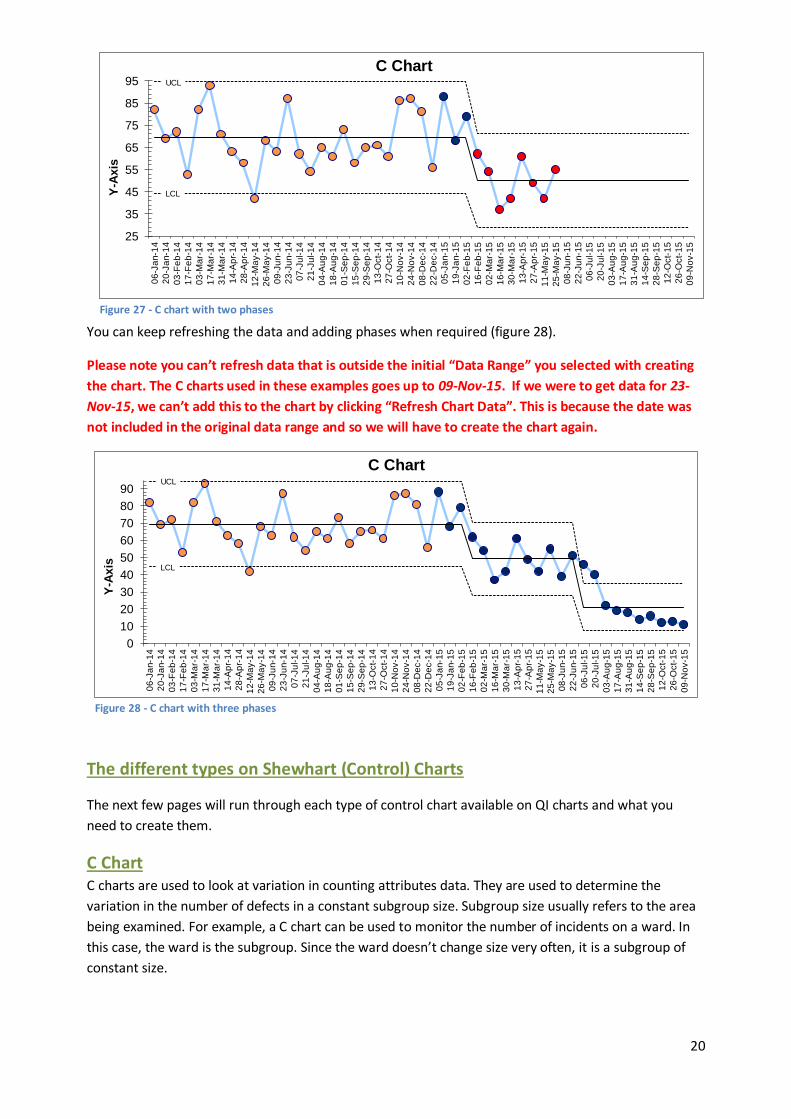
You can keep refreshing the data and adding phases when required (figure 28).
Please note you can’t refresh data that is outside the initial “Data Range” you selected with creating
the chart. The C charts used in these examples goes up to 09-Nov-15. If we were to get data for 23-
Nov-15, we can’t add this to the chart by clicking “Refresh Chart Data”. This is because the date was
not included in the original data range and so we will have to create the chart again.
The different types on Shewhart (Control) Charts
The next few pages will run through each type of control chart available on QI charts and what you
need to create them.
C Chart C charts are used to look at variation in counting attributes data. They are used to determine the
variation in the number of defects in a constant subgroup size. Subgroup size usually refers to the area
being examined. For example, a C chart can be used to monitor the number of incidents on a ward. In
this case, the ward is the subgroup. Since the ward doesn’t change size very often, it is a subgroup of
constant size.
UCL
LCL
25
35
45
55
65
75
85
95
06
-Ja
n-1
4
20
-Ja
n-1
4
03
-Fe
b-1
4
17
-Fe
b-1
4
03
-Ma
r-1
4
17
-Ma
r-1
4
31
-Ma
r-1
4
14
-Ap
r-1
4
28
-Ap
r-1
4
12
-Ma
y-1
4
26
-Ma
y-1
4
09
-Ju
n-1
4
23
-Ju
n-1
4
07
-Ju
l-1
4
21
-Ju
l-1
4
04
-Au
g-1
4
18
-Au
g-1
4
01
-Se
p-1
4
15
-Se
p-1
4
29
-Se
p-1
4
13
-Oct-
14
27
-Oct-
14
10
-No
v-1
4
24
-No
v-1
4
08
-De
c-1
4
22
-De
c-1
4
05
-Ja
n-1
5
19
-Ja
n-1
5
02
-Fe
b-1
5
16
-Fe
b-1
5
02
-Ma
r-1
5
16
-Ma
r-1
5
30
-Ma
r-1
5
13
-Ap
r-1
5
27
-Ap
r-1
5
11
-Ma
y-1
5
25
-Ma
y-1
5
08
-Ju
n-1
5
22
-Ju
n-1
5
06
-Ju
l-1
5
20
-Ju
l-1
5
03
-Au
g-1
5
17
-Au
g-1
5
31
-Au
g-1
5
14
-Se
p-1
5
28
-Se
p-1
5
12
-Oct-
15
26
-Oct-
15
09
-No
v-1
5
Y-A
xis
C Chart
Figure 27 - C chart with two phases
UCL
LCL
0
10
20
30
40
50
60
70
80
90
06
-Ja
n-1
4
20
-Ja
n-1
4
03
-Fe
b-1
4
17
-Fe
b-1
4
03
-Ma
r-1
4
17
-Ma
r-1
4
31
-Ma
r-1
4
14
-Ap
r-1
4
28
-Ap
r-1
4
12
-Ma
y-1
4
26
-Ma
y-1
4
09
-Ju
n-1
4
23
-Ju
n-1
4
07
-Ju
l-1
4
21
-Ju
l-1
4
04
-Au
g-1
4
18
-Au
g-1
4
01
-Se
p-1
4
15
-Se
p-1
4
29
-Se
p-1
4
13
-Oct-
14
27
-Oct-
14
10
-No
v-1
4
24
-No
v-1
4
08
-De
c-1
4
22
-De
c-1
4
05
-Ja
n-1
5
19
-Ja
n-1
5
02
-Fe
b-1
5
16
-Fe
b-1
5
02
-Ma
r-1
5
16
-Ma
r-1
5
30
-Ma
r-1
5
13
-Ap
r-1
5
27
-Ap
r-1
5
11
-Ma
y-1
5
25
-Ma
y-1
5
08
-Ju
n-1
5
22
-Ju
n-1
5
06
-Ju
l-1
5
20
-Ju
l-1
5
03
-Au
g-1
5
17
-Au
g-1
5
31
-Au
g-1
5
14
-Se
p-1
5
28
-Se
p-1
5
12
-Oct-
15
26
-Oct-
15
09
-No
v-1
5
Y-A
xis
C Chart
Figure 28 - C chart with three phases
21
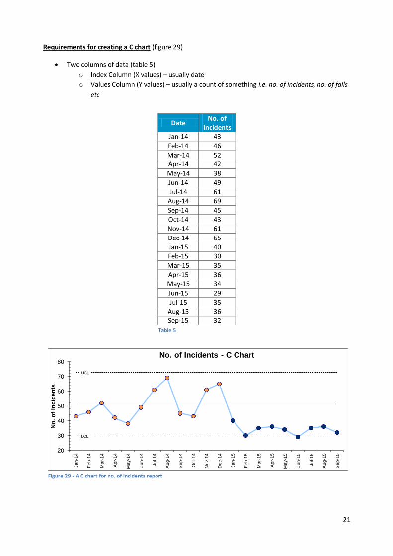
Requirements for creating a C chart (figure 29)
Two columns of data (table 5)
o Index Column (X values) – usually date
o Values Column (Y values) – usually a count of something i.e. no. of incidents, no. of falls
etc
Date No. of
Incidents Jan-14 43
Feb-14 46
Mar-14 52 Apr-14 42
May-14 38
Jun-14 49
Jul-14 61 Aug-14 69
Sep-14 45
Oct-14 43 Nov-14 61
Dec-14 65
Jan-15 40 Feb-15 30
Mar-15 35
Apr-15 36 May-15 34
Jun-15 29
Jul-15 35 Aug-15 36
Sep-15 32
Table 5
UCL
LCL
20
30
40
50
60
70
80
Ja
n-1
4
Fe
b-1
4
Ma
r-1
4
Ap
r-1
4
Ma
y-1
4
Ju
n-1
4
Ju
l-1
4
Au
g-1
4
Se
p-1
4
Oct-
14
No
v-1
4
De
c-1
4
Ja
n-1
5
Fe
b-1
5
Ma
r-1
5
Ap
r-1
5
Ma
y-1
5
Ju
n-1
5
Ju
l-1
5
Au
g-1
5
Se
p-1
5
No
. o
f In
cid
en
ts
No. of Incidents - C Chart
Figure 29 - A C chart for no. of incidents report
22
Characteristics of a C chart
The LCL and UCL remain constant. This is because the sample size does not change.
The Y-Axis is usually a count of something.
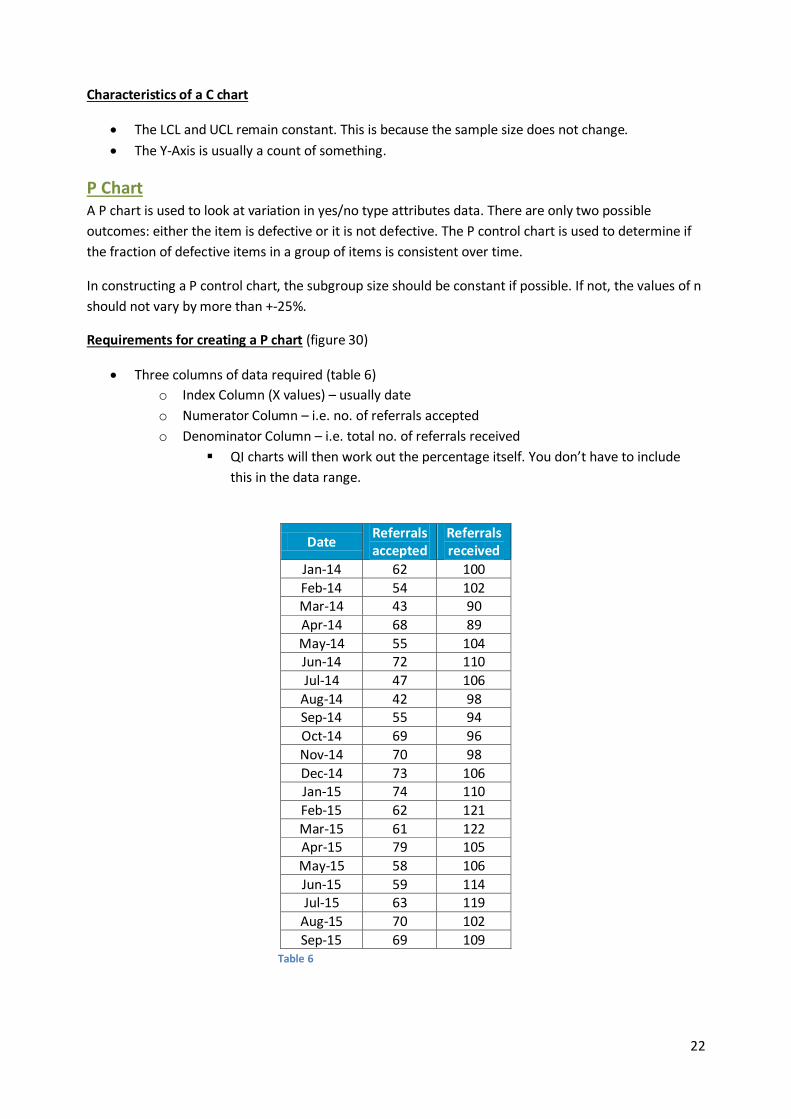
P Chart A P chart is used to look at variation in yes/no type attributes data. There are only two possible
outcomes: either the item is defective or it is not defective. The P control chart is used to determine if
the fraction of defective items in a group of items is consistent over time.
In constructing a P control chart, the subgroup size should be constant if possible. If not, the values of n
should not vary by more than +-25%.
Requirements for creating a P chart (figure 30)
Three columns of data required (table 6)
o Index Column (X values) – usually date
o Numerator Column – i.e. no. of referrals accepted
o Denominator Column – i.e. total no. of referrals received
QI charts will then work out the percentage itself. You don’t have to include
this in the data range.
Date Referrals accepted
Referrals received
Jan-14 62 100
Feb-14 54 102 Mar-14 43 90
Apr-14 68 89
May-14 55 104 Jun-14 72 110
Jul-14 47 106
Aug-14 42 98 Sep-14 55 94
Oct-14 69 96
Nov-14 70 98
Dec-14 73 106 Jan-15 74 110
Feb-15 62 121
Mar-15 61 122 Apr-15 79 105
May-15 58 106
Jun-15 59 114 Jul-15 63 119
Aug-15 70 102
Sep-15 69 109
Table 6

23
Characteristics of a P chart
The LCL and UCL vary point to point. This is because the sample size is different for every data
point.
The Y-Axis is usually a percentage.
U Chart There are two types of attributes data: yes/no and counting. You use the P control chart with yes/no
type data. With this type of data, there are only two possible outcomes: something is either defective
or not defective. When the data is a bit more complicated and you can’t simply class it as yes/no data
then we use a U chart, typically for when we are dealing with rates.
The U chart is used to track the total count of defects per unit (u) that occur during the sampling period
and can track a sample having more than one defect. However, unlike a P chart, a U chart is used when
the number of samples of each sampling period may vary significantly for example you would use a U
chart for charting the number of incidents taking place on a ward per occupied bed days.
Requirements for creating a U chart (figure 31)
Three columns of data required (table 7)
o Index Column (X values) – usually date
o Numerator Column
o Denominator Column
Similar to P charts, QI charts will then work out the rate itself. You don’t have to
include it in the data range.
UCL
LCL
40%
45%
50%
55%
60%
65%
70%
75%
80%
Ja
n-1
4
Fe
b-1
4
Ma
r-1
4
Ap
r-1
4
Ma
y-1
4
Ju
n-1
4
Ju
l-1
4
Au
g-1
4
Se
p-1
4
Oct-
14
No
v-1
4
De
c-1
4
Ja
n-1
5
Fe
b-1
5
Ma
r-1
5
Ap
r-1
5
Ma
y-1
5
Ju
n-1
5
Ju
l-1
5
Au
g-1
5
Se
p-1
5
No
. o
f R
efe
rra
ls A
cc
ep
ted
/ %
% of referrals accepted - P Chart
Figure 30 - P chart for % of referrals accepted
24
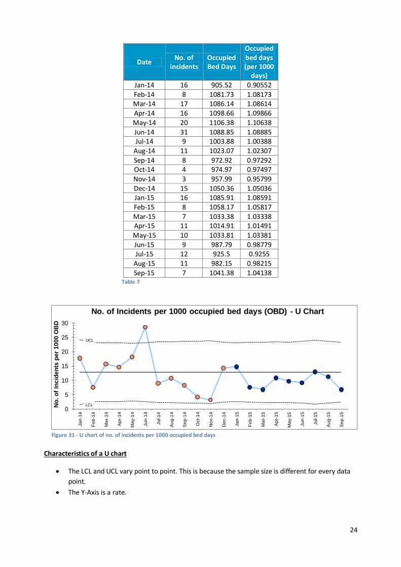
Date No. of
incidents Occupied Bed Days
Occupied bed days (per 1000
days)
Jan-14 16 905.52 0.90552
Feb-14 8 1081.73 1.08173 Mar-14 17 1086.14 1.08614
Apr-14 16 1098.66 1.09866
May-14 20 1106.38 1.10638
Jun-14 31 1088.85 1.08885 Jul-14 9 1003.88 1.00388
Aug-14 11 1023.07 1.02307
Sep-14 8 972.92 0.97292 Oct-14 4 974.97 0.97497
Nov-14 3 957.99 0.95799
Dec-14 15 1050.36 1.05036 Jan-15 16 1085.91 1.08591
Feb-15 8 1058.17 1.05817
Mar-15 7 1033.38 1.03338 Apr-15 11 1014.91 1.01491
May-15 10 1033.81 1.03381
Jun-15 9 987.79 0.98779 Jul-15 12 925.5 0.9255
Aug-15 11 982.15 0.98215
Sep-15 7 1041.38 1.04138
Characteristics of a U chart
The LCL and UCL vary point to point. This is because the sample size is different for every data
point.
The Y-Axis is a rate.
Table 7
UCL
LCL 0
5
10
15
20
25
30
Ja
n-1
4
Fe
b-1
4
Ma
r-1
4
Ap
r-1
4
Ma
y-1
4
Ju
n-1
4
Ju
l-1
4
Au
g-1
4
Se
p-1
4
Oct-
14
No
v-1
4
De
c-1
4
Ja
n-1
5
Fe
b-1
5
Ma
r-1
5
Ap
r-1
5
Ma
y-1
5
Ju
n-1
5
Ju
l-1
5
Au
g-1
5
Se
p-1
5
No
. o
f In
cid
en
ts p
er
10
00
OB
D
No. of Incidents per 1000 occupied bed days (OBD) - U Chart
Figure 31 - U chart of no. of incidents per 1000 occupied bed days

25
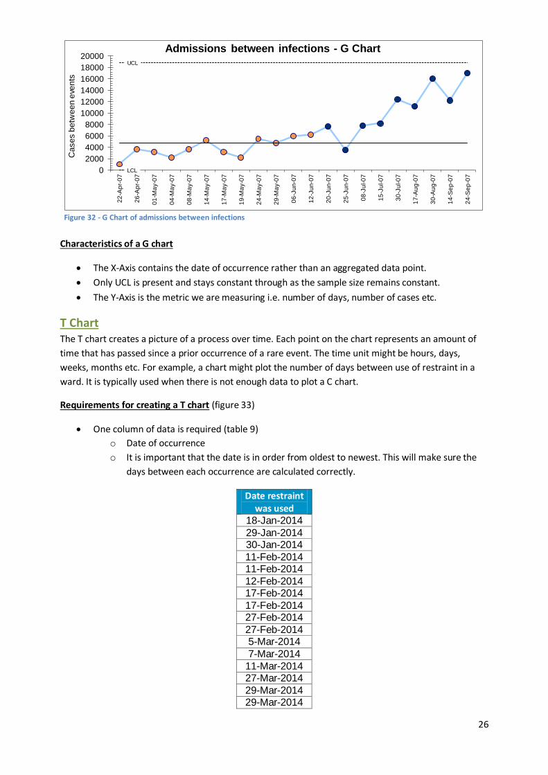
G and T Chart G and T charts are both useful for evaluating infrequent events. Use a G chart when you can count the
number of cases, events, or items between the events of interest i.e. the number of doses administered
between adverse drug events. T charts track the time between events of interest, and are a useful
alternative when the number of intervening events is not known.
G Chart There is a number of options with a G chart. One option is to track the time (number of days) between
rare events (similar to a T chart). There is a point plotted on the chart for each event. Another option is
to track the number of units between events. For example, tracking the number of hospital admissions
before an event occurs.
Requirements for creating a G chart (figure 32)
Two columns of data required (table 8)
o Index Column (X values) – usually date of rare event
o Values Column (Y values) – usually a count of cases, events or items between the event
of interest i.e. days between infections, admissions between infection etc
Date Admissions
between infections
22-Apr-2007 1037 26-Apr-2007 3698
1-May-2007 3222
4-May-2007 2157 8-May-2007 3689
14-May-2007 5203
17-May-2007 3131 19-May-2007 2179
24-May-2007 5447
29-May-2007 4726 6-Jun-2007 6003
12-Jun-2007 6215
20-Jun-2007 7644 25-Jun-2007 3528
8-Jul-2007 7834
15-Jul-2007 8220
30-Jul-2007 12421 17-Aug-2007 11173
30-Aug-2007 15984
14-Sep-2007 12201 24-Sep-2007 17005
Table 8
26
Characteristics of a G chart
The X-Axis contains the date of occurrence rather than an aggregated data point.
Only UCL is present and stays constant through as the sample size remains constant.
The Y-Axis is the metric we are measuring i.e. number of days, number of cases etc.
T Chart The T chart creates a picture of a process over time. Each point on the chart represents an amount of
time that has passed since a prior occurrence of a rare event. The time unit might be hours, days,
weeks, months etc. For example, a chart might plot the number of days between use of restraint in a
ward. It is typically used when there is not enough data to plot a C chart.
Requirements for creating a T chart (figure 33)
One column of data is required (table 9)
o Date of occurrence
o It is important that the date is in order from oldest to newest. This will make sure the
days between each occurrence are calculated correctly.
Date restraint was used
18-Jan-2014
29-Jan-2014 30-Jan-2014
11-Feb-2014 11-Feb-2014
12-Feb-2014 17-Feb-2014
17-Feb-2014 27-Feb-2014
27-Feb-2014 5-Mar-2014
7-Mar-2014
11-Mar-2014 27-Mar-2014
29-Mar-2014 29-Mar-2014
Figure 32 - G Chart of admissions between infections
UCL
LCL 0
2000
4000
6000
8000
10000
12000
14000
16000
18000
20000
22
-Ap
r-0
7
26
-Ap
r-0
7
01
-Ma
y-0
7
04
-Ma
y-0
7
08
-Ma
y-0
7
14
-Ma
y-0
7
17
-Ma
y-0
7
19
-Ma
y-0
7
24
-Ma
y-0
7
29
-Ma
y-0
7
06
-Ju
n-0
7
12
-Ju
n-0
7
20
-Ju
n-0
7
25
-Ju
n-0
7
08
-Ju
l-0
7
15
-Ju
l-0
7
30
-Ju
l-0
7
17
-Au
g-0
7
30
-Au
g-0
7
14
-Se
p-0
7
24
-Se
p-0
7
Ca
se
s b
etw
ee
n e
ven
ts
Admissions between infections - G Chart

27
30-Mar-2014
13-Apr-2014
17-Apr-2014 19-Apr-2014
19-Apr-2014 22-Apr-2014
26-Apr-2014 3-Jun-2014
20-Jul-2014 28-Jul-2014
2-Aug-2014 17-Aug-2014
8-Sep-2014
Characteristics of a T chart
The X-Axis contains the date of occurrence rather than an aggregated data point.
Only UCL is present and stays constant through as the sample size remains constant.
The Y-Axis is time between events (usually days).
Table 9
0
10
20
30
40
50
60
70
18
-Ja
n-1
4
29
-Ja
n-1
4
30
-Ja
n-1
4
11
-Fe
b-1
4
11
-Fe
b-1
4
12
-Fe
b-1
4
17
-Fe
b-1
4
17
-Fe
b-1
4
27
-Fe
b-1
4
27
-Fe
b-1
4
05
-Ma
r-1
4
07
-Ma
r-1
4
11
-Ma
r-1
4
27
-Ma
r-1
4
29
-Ma
r-1
4
29
-Ma
r-1
4
30
-Ma
r-1
4
13
-Ap
r-1
4
17
-Ap
r-1
4
19
-Ap
r-1
4
19
-Ap
r-1
4
22
-Ap
r-1
4
26
-Ap
r-1
4
03
-Ju
n-1
4
20
-Ju
l-1
4
28
-Ju
l-1
4
02
-Au
g-1
4
17
-Au
g-1
4
08
-Se
p-1
4
Tim
e b
etw
ee
n e
ve
nts
/ d
ays
Days between use of restraint - T Chart
Figure 33 - T Chart of days between use of restraint
28
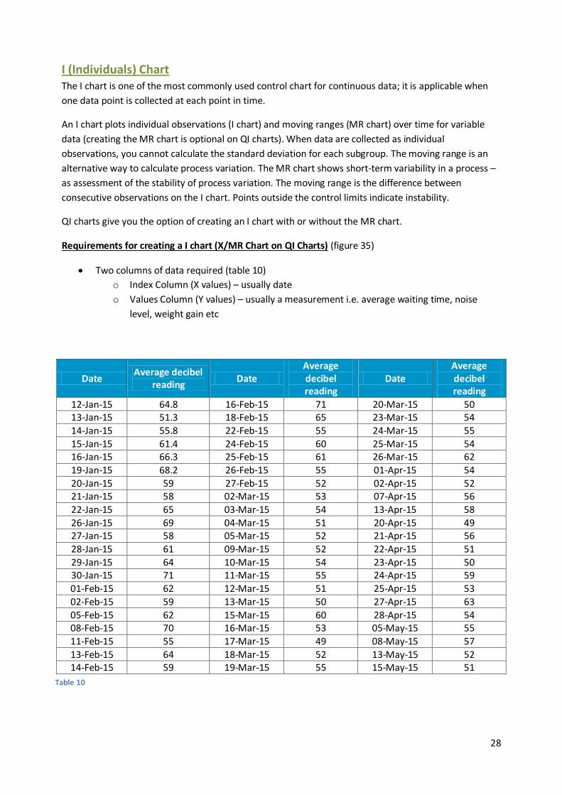
I (Individuals) Chart The I chart is one of the most commonly used control chart for continuous data; it is applicable when
one data point is collected at each point in time.
An I chart plots individual observations (I chart) and moving ranges (MR chart) over time for variable
data (creating the MR chart is optional on QI charts). When data are collected as individual
observations, you cannot calculate the standard deviation for each subgroup. The moving range is an
alternative way to calculate process variation. The MR chart shows short-term variability in a process –
as assessment of the stability of process variation. The moving range is the difference between
consecutive observations on the I chart. Points outside the control limits indicate instability.
QI charts give you the option of creating an I chart with or without the MR chart.
Requirements for creating a I chart (X/MR Chart on QI Charts) (figure 35)
Two columns of data required (table 10)
o Index Column (X values) – usually date
o Values Column (Y values) – usually a measurement i.e. average waiting time, noise
level, weight gain etc
Date Average decibel
reading Date
Average decibel reading
Date Average decibel reading
12-Jan-15 64.8 16-Feb-15 71 20-Mar-15 50 13-Jan-15 51.3 18-Feb-15 65 23-Mar-15 54
14-Jan-15 55.8 22-Feb-15 55 24-Mar-15 55
15-Jan-15 61.4 24-Feb-15 60 25-Mar-15 54 16-Jan-15 66.3 25-Feb-15 61 26-Mar-15 62
19-Jan-15 68.2 26-Feb-15 55 01-Apr-15 54
20-Jan-15 59 27-Feb-15 52 02-Apr-15 52 21-Jan-15 58 02-Mar-15 53 07-Apr-15 56
22-Jan-15 65 03-Mar-15 54 13-Apr-15 58
26-Jan-15 69 04-Mar-15 51 20-Apr-15 49 27-Jan-15 58 05-Mar-15 52 21-Apr-15 56
28-Jan-15 61 09-Mar-15 52 22-Apr-15 51
29-Jan-15 64 10-Mar-15 54 23-Apr-15 50 30-Jan-15 71 11-Mar-15 55 24-Apr-15 59
01-Feb-15 62 12-Mar-15 51 25-Apr-15 53
02-Feb-15 59 13-Mar-15 50 27-Apr-15 63
05-Feb-15 62 15-Mar-15 60 28-Apr-15 54 08-Feb-15 70 16-Mar-15 53 05-May-15 55
11-Feb-15 55 17-Mar-15 49 08-May-15 57
13-Feb-15 64 18-Mar-15 52 13-May-15 52 14-Feb-15 59 19-Mar-15 55 15-May-15 51
Table 10

29
When choosing the “Index Column” and “Values Column” during the “Create Individuals Chart” dialog
box, you will notice there is now a tick box called “Show MR Chart” (figure 34). As you are creating an I
chart it gives you the option to create the MR (Moving Range) chart along with it. If you would like to
create the MR chart, make sure the check box is ticked. If you do not need the MR chart, make sure you
un-tick the box.
UCL
LCL
40
45
50
55
60
65
70
75
80
12
-Ja
n-1
51
3-J
an-1
51
4-J
an-1
51
5-J
an-1
51
6-J
an-1
51
9-J
an-1
52
0-J
an-1
52
1-J
an-1
52
2-J
an-1
52
6-J
an-1
52
7-J
an-1
52
8-J
an-1
52
9-J
an-1
53
0-J
an-1
50
1-F
eb
-15
02
-Fe
b-1
50
5-F
eb
-15
08
-Fe
b-1
51
1-F
eb
-15
13
-Fe
b-1
51
4-F
eb
-15
16
-Fe
b-1
51
8-F
eb
-15
22
-Fe
b-1
52
4-F
eb
-15
25
-Fe
b-1
52
6-F
eb
-15
27
-Fe
b-1
50
2-M
ar-
15
03
-Ma
r-1
50
4-M
ar-
15
05
-Ma
r-1
50
9-M
ar-
15
10
-Ma
r-1
51
1-M
ar-
15
12
-Ma
r-1
51
3-M
ar-
15
15
-Ma
r-1
51
6-M
ar-
15
17
-Ma
r-1
51
8-M
ar-
15
19
-Ma
r-1
52
0-M
ar-
15
23
-Ma
r-1
52
4-M
ar-
15
25
-Ma
r-1
52
6-M
ar-
15
01
-Ap
r-1
50
2-A
pr-
15
07
-Ap
r-1
51
3-A
pr-
15
20
-Ap
r-1
52
1-A
pr-
15
22
-Ap
r-1
52
3-A
pr-
15
24
-Ap
r-1
52
5-A
pr-
15
27
-Ap
r-1
52
8-A
pr-
15
05
-Ma
y-1
50
8-M
ay-1
51
3-M
ay-1
51
5-M
ay-1
5
Ave
rag
e D
ecib
el R
ea
din
g
Average decibel reading - I Chart
0.0
5.0
10.0
15.0
20.0
25.0
12
-Ja
n-1
51
3-J
an-1
51
4-J
an-1
51
5-J
an-1
51
6-J
an-1
51
9-J
an-1
52
0-J
an-1
52
1-J
an-1
52
2-J
an-1
52
6-J
an-1
52
7-J
an-1
52
8-J
an-1
52
9-J
an-1
53
0-J
an-1
50
1-F
eb
-15
02
-Fe
b-1
50
5-F
eb
-15
08
-Fe
b-1
51
1-F
eb
-15
13
-Fe
b-1
51
4-F
eb
-15
16
-Fe
b-1
51
8-F
eb
-15
22
-Fe
b-1
52
4-F
eb
-15
25
-Fe
b-1
52
6-F
eb
-15
27
-Fe
b-1
50
2-M
ar-
15
03
-Ma
r-1
50
4-M
ar-
15
05
-Ma
r-1
50
9-M
ar-
15
10
-Ma
r-1
51
1-M
ar-
15
12
-Ma
r-1
51
3-M
ar-
15
15
-Ma
r-1
51
6-M
ar-
15
17
-Ma
r-1
51
8-M
ar-
15
19
-Ma
r-1
52
0-M
ar-
15
23
-Ma
r-1
52
4-M
ar-
15
25
-Ma
r-1
52
6-M
ar-
15
01
-Ap
r-1
50
2-A
pr-
15
07
-Ap
r-1
51
3-A
pr-
15
20
-Ap
r-1
52
1-A
pr-
15
22
-Ap
r-1
52
3-A
pr-
15
24
-Ap
r-1
52
5-A
pr-
15
27
-Ap
r-1
52
8-A
pr-
15
05
-Ma
y-1
50
8-M
ay-1
51
3-M
ay-1
51
5-M
ay-1
5
Average decibel reading - MR Chart
Figure 35 - I chart and MR chart for average decibel reading
Figure 34 - Show MR Chart option now available

30
Characteristics of a I chart
Two charts are created (an I chart and a MR chart).
The X-Axis contains the date
The LCL and UCL stay constant as the sample size remains constant.
The Y-Axis on the I chart is usually a measurement. The Y-Axis on the MR chart is the difference
between two consecutive points in the I chart.
XBar-S Chart
When continuous data are obtained from a process, it is sometimes of interest to learn about both the
average performance of the process and the variation about the average level. For example, it may be
useful to learn about the average length of stay (LOS) per month for a particular ward and the variation
among the service users comprising that average. In these cases, we use the XBar S charts.
The XBar chart and the S chart are displayed together because you should interpret both charts to
determine whether your process is stale. Examine the S chart first because the process variation must
be in control to correctly interpret the XBar chart.
QI charts give you the option of creating an XBar chart with or without the S chart.
Requirements for creating a XBar-S chart (X-bar/S Chart on QI Charts) (figure 35)
Four columns of data required (table XX)
o Index Column (X values) – usually date
o Average Column
o N-Values Column
o Std Dev Column
Date Case
1 Case
2 Case
3 Case
4 Case
5 Case
6 Case
7 Case
8 Case
9 Case 10
Jan-15 4 1 3 2 3 4 5 5 5 4 Feb-15 2 1 3 5 5 4 5 5 5
Mar-15 4 1 3 2 3 4 5
Apr-15 5 4 3 5 5 5 5 5 5 4 May-15 4 1 3 2 3 4 5 5 5 4
Jun-15 2 1 3 5 5 4
Jul-15 4 1 3 2 3 4 5 5 5 Aug-15 2 1 3 5 5 4 5 5
Sep-15 4 1 3 2 3 4 5 5 5 4
Oct-15 2 1 3 5 5 4 5 5 5 4
Nov-15 4 1 3 2 3 4 5 5 5 Dec-15 2 1 3 5 5 4 1 3 2 3
XBar-S charts require some special preparation. Consider the following data set, which shows length of
stay (LOS) for up to 10 patients sampled on the first day of each month for 12 months.

31
Step 1:
To create an XBar-S chart using QI charts, you need to begin by calculating the Mean, N values and
Standard Deviation of each sample. Enter the formulas as shown in below (figure 36) into cells L2, M2
and N2, then copy them into rows 3-13 to calculate the values for each sample.
Step 2:
Click the “New Control Chart” button in the “Add-Ins” Toolbar and select “X-bar/S Chart” from the
drop-down list (figure 37).
Table 11
Figure 36 - Calculating the Mean, N Value and Std Dev =average(B2:K2)
=count(B2:K2)
=stdev(B2:K2)
Figure 37 - Selecting the "X-bar/S Chart" option from the "New Control Chart" dialog box

32
You will notice that in the “Data Range” section, we have selected all the columns (A to N). This is
perfectly fine as we will be selecting the specific columns we need in the next dialog box.
Step 3:
Configure the “Create XS Chart” dialog box as shown selecting the relevant columns. Note that the
dialog utilizes only the index column and the three columns of formulas you created.
Also note that, the “Show S Chart” tick box is ticked. If we did not want to create the S chart, we could
simply un-tick this box and only a X-Bar chart would have been created.
Step 4:
Select your phases, in this case you will notice we have ended our first phase on 01/09/2015 and then
extended the last phase. This means data from 01/01/2015 to 01/09/2015 is our baseline data.
Figure 39 - Select phases
Figure 38 - Select the relevant columns from the data range

33
Step 5:
The X-bar chart and S chart are then created (figure 40).
UCL
0
0.5
1
1.5
2
2.5
3
Jan
-15
Fe
b-1
5
Ma
r-1
5
Ap
r-1
5
Ma
y-1
5
Jun
-15
Jul-
15
Au
g-1
5
Se
p-1
5
Oct-
15
Nov-1
5
Dec-1
5
Sta
nd
ard
De
via
tio
n
Length of Stay - S Chart
UCL
LCL
1
1.5
2
2.5
3
3.5
4
4.5
5
5.5
6Jan
-15
Fe
b-1
5
Ma
r-1
5
Ap
r-1
5
Ma
y-1
5
Jun
-15
Jul-
15
Au
g-1
5
Se
p-1
5
Oct-
15
No
v-1
5
De
c-1
5
Ave
rag
e L
en
gth
of
Sta
y (
LO
S)
Length of Stay (LOS) - X-bar Chart
Figure 40 - X-bar and S chart for Length of Stay (LOS)

34
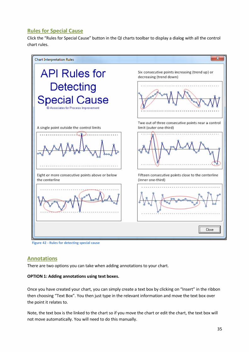
Decision Tree for Chart Selection Click the “Rules for Special Cause” button in the QI Charts toolbar to display a decision tree showing the
types of control charts available in QI charts, and the type of data they are appropriate for. It is
essentially the same information as the flowchart on page 6 but this flowchart is installed within the QI
charts programme allowing you access whenever you need it.
Figure 41 - Chart Selection Flowchart in the QI charts software
35
Rules for Special Cause Click the “Rules for Special Cause” button in the QI charts toolbar to display a dialog with all the control
chart rules.
Annotations There are two options you can take when adding annotations to your chart.
OPTION 1: Adding annotations using text boxes.
Once you have created your chart, you can simply create a text box by clicking on “Insert” in the ribbon
then choosing “Text Box”. You then just type in the relevant information and move the text box over
the point it relates to.
Note, the text box is the linked to the chart so if you move the chart or edit the chart, the text box will
not move automatically. You will need to do this manually.
Figure 42 - Rules for detecting special cause

36
OPTION 2: Adding annotations using the data label option
This is a more advanced option but the benefits of using this method is that the labels are linked to the
specific points on the chart. So whenever you move the chart the annotations will move along with it.
Step 1:
Select the data point you want to create an annotation for. Do this click on the data point once and it
will highlight all the data points within the chart, click on the data point again and it will select the data
point alone.
Step 2:
Click on “Layout” under “Chart Tools”, then click on “Data Labels” and choose and option (figure 43).
Figure 43 - Add a data label to the data point you are interested in
37
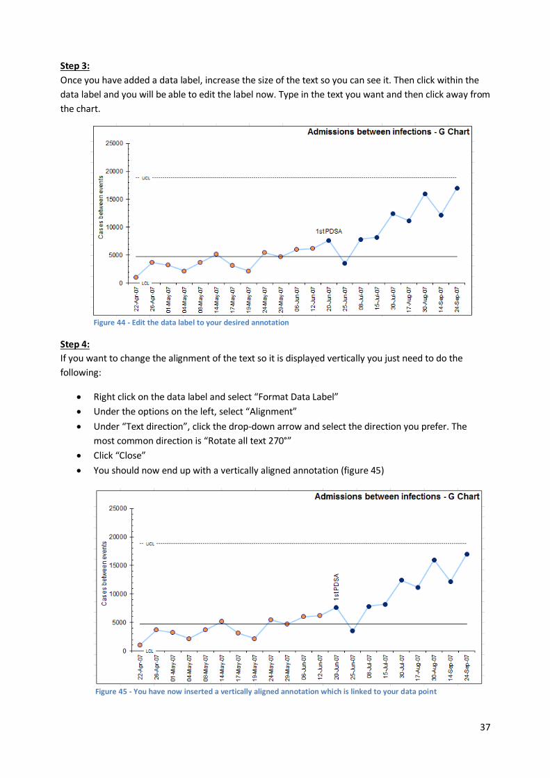
Step 3:
Once you have added a data label, increase the size of the text so you can see it. Then click within the
data label and you will be able to edit the label now. Type in the text you want and then click away from
the chart.
Step 4:
If you want to change the alignment of the text so it is displayed vertically you just need to do the
following:
Right click on the data label and select “Format Data Label”
Under the options on the left, select “Alignment”
Under “Text direction”, click the drop-down arrow and select the direction you prefer. The
most common direction is “Rotate all text 270°”
Click “Close”
You should now end up with a vertically aligned annotation (figure 45)
Figure 44 - Edit the data label to your desired annotation
Figure 45 - You have now inserted a vertically aligned annotation which is linked to your data point

38
APPENDIX A: Chart Types in QI Charts
Name in QI-Charts
Full (or other) Name
Description
C Chart C chart
A Shewhart C chart (or count chart) is used when actual counts of incidence (often called nonconformities) are made. A subgroup is defined as an area of opportunity, when working with count data and must be approximately constant for a C chart.
G Chart G chart
The G chart (or Geometric chart) plots the number of units or cases between the incidence of interest. It is an alternative to the P chart or C chart when the incidence of interest is relatively rare and some discrete determination of opportunity (cases, patients, admits, etc) can be obtained.
Individuals Chart
(X/MR)
XMR, I chart, or X chart
A Shewhart chart for continuous individual measurements. In the literature, this type of chart is also called as X-chart, Xmr chart, and Individuals chart.
P Chart P chart
The Shewhart P chart (or percent chart) is appropriate whenever the data is based on classifications made in two categories. The number is the category of interest is divided by the subgroup size (n) and multiplied by 100 to display as a percentage. The P chart can be used with either fixed or variable subgroup sizes.
P’ Chart P prime
chart
An alternative to the P chart for very large (>3000) subgroup sizes. If the limits on an initial P chart appear very close to the center line with many points outside the limit, consider this alternative.
Run Chart Run chart
A run chart is a graphical display of data plotted in some type of order, usually over time. The run chart is also called a trend chart or a time series chart. It does not have control limits, and so the decision rules for detecting special cause do not apply.
T Chart T chart
The T chart (or time-between chart) is an alternative to a standard attribute chart when the incident of interest is relatively rare and the time between each occurrence of the incident can be obtained. The time (in minutes, hours, days, etc.) since the last incidence is plotted each time an incidence occurs.
U Chart U Chart
A Shewhart U chart (or rate chart) is used when counts of incidence (often called nonconformities) are made and the subgroup size , as defined an area of opportunity, is not constant. The counts are divided by the actual number of “standard areas of opportunities” to calculate the u statistic. A “rate base” of 100, 1000, or 10,000 are commonly used as the standard area of opportunity.
U’ Chart U prime
chart
An alternative to the u chart for very large areas of opportunity. If the limits on an initial u chart appear very close to the center line with many points outside the limit, consider this alternative.
X-BAR/S Chart
Xbar and S Chart
A set of two Shewhart charts used to study a process: the X-bar chart (or average chart) and the S chart (or standard deviation chart). The data for the construction of X-bar and S charts requires that the data be organized in subgroups. A subgroup for continuous data is a set of measurements which were obtained under similar conditions or during the same time period. The subgroup size may vary for the X bar and S chart. The X-bar chart contains the averages of each subgroup and the S chart the standard deviation) between the measurements within each subgroup. To construct the chart, need to calculate the average (x-bar), standard deviation (S), and subgroup size (n) for each index value.