designing interaction and visualization for exploration …844942/fulltext01.pdf · designing...
TRANSCRIPT
Designing Interaction and Visualization forExploration of System Monitoring Data
A design-oriented research study on exploring new ways of designing usefulvisualizations and interaction for system monitoring data using web technologies
JONATAN DAHL
Master’s Thesis at CSCSupervisor: Anders Lundström
Examiner: Kristina Höök
Company: Spotify ABSupervisor: Niklas Ek
2014-06-23

Abstract
System monitoring is a practice that is frequent withincompanies providing digital products to consumers and is acommon way to help developers contribute to a good end-user experience by ensuring a high availability and goodperformance of the product.
This thesis is a design-driven exploratory study on de-signing interaction and visualization for system monitoringdata, using web technologies. The design space spans overinteraction design and technical domains, exploring systemmonitoring data interaction and visualization from an HCIperspective as well as technical possibilities and limitationsof the web platform.
An artifact embodying new ideas and design visions re-garding the topic is created in close collaboration with thetarget users. The artifact expresses possible and poten-tially valuable inventions regarding exploration of systemmonitoring data. It also emphasizes the close relationshipbetween system monitoring and physical space and how theinteraction with it can provide a useful sense of place to thedata.
Technical insights and good practices regarding devel-oping performant data visualization user interfaces is alsopresented and motivated, where two methods providing dif-ferent strengths and weaknesses are described.
Contents
1 Introduction 11.1 Purpose and goal . . . . . . . . . . . . . . . . . . . . . . . . . . . . . 21.2 Problem definition . . . . . . . . . . . . . . . . . . . . . . . . . . . . 21.3 Scope and delimitations . . . . . . . . . . . . . . . . . . . . . . . . . 21.4 Definitions . . . . . . . . . . . . . . . . . . . . . . . . . . . . . . . . . 3
2 Background 52.1 System Monitoring . . . . . . . . . . . . . . . . . . . . . . . . . . . . 52.2 Software Reliability Engineering - SRE . . . . . . . . . . . . . . . . . 62.3 About Spotify . . . . . . . . . . . . . . . . . . . . . . . . . . . . . . . 6
2.3.1 System Monitoring . . . . . . . . . . . . . . . . . . . . . . . . 6
3 Theory 93.1 Data and Information Visualization . . . . . . . . . . . . . . . . . . . 93.2 Exploring Data . . . . . . . . . . . . . . . . . . . . . . . . . . . . . . 10
3.2.1 Data exploration techniques . . . . . . . . . . . . . . . . . . . 123.3 Research and design methods . . . . . . . . . . . . . . . . . . . . . . 15
3.3.1 Research through design . . . . . . . . . . . . . . . . . . . . . 153.3.2 Rapid prototyping . . . . . . . . . . . . . . . . . . . . . . . . 17
3.4 Space and place in HCI . . . . . . . . . . . . . . . . . . . . . . . . . 17
4 Method 194.1 Research and design process . . . . . . . . . . . . . . . . . . . . . . . 19
4.1.1 Current and preferred state . . . . . . . . . . . . . . . . . . . 194.2 Target users . . . . . . . . . . . . . . . . . . . . . . . . . . . . . . . . 20
5 Pre-study 215.1 Introduction . . . . . . . . . . . . . . . . . . . . . . . . . . . . . . . . 215.2 Method . . . . . . . . . . . . . . . . . . . . . . . . . . . . . . . . . . 21
5.2.1 Brainstorming sessions . . . . . . . . . . . . . . . . . . . . . . 225.3 Results . . . . . . . . . . . . . . . . . . . . . . . . . . . . . . . . . . . 225.4 Discussion and Conclusions . . . . . . . . . . . . . . . . . . . . . . . 23
6 Design phase 25
6.1 Introduction . . . . . . . . . . . . . . . . . . . . . . . . . . . . . . . . 256.2 Method . . . . . . . . . . . . . . . . . . . . . . . . . . . . . . . . . . 256.3 Results . . . . . . . . . . . . . . . . . . . . . . . . . . . . . . . . . . . 27
6.3.1 Description of the Final Prototype . . . . . . . . . . . . . . . 286.3.2 Technologies used . . . . . . . . . . . . . . . . . . . . . . . . 296.3.3 Value and usefulness . . . . . . . . . . . . . . . . . . . . . . . 33
6.4 Discussion and conclusions . . . . . . . . . . . . . . . . . . . . . . . . 336.4.1 Process . . . . . . . . . . . . . . . . . . . . . . . . . . . . . . 336.4.2 A sense of place . . . . . . . . . . . . . . . . . . . . . . . . . 34
7 Discussion 357.1 Research and design process . . . . . . . . . . . . . . . . . . . . . . . 357.2 Data and place in system monitoring . . . . . . . . . . . . . . . . . . 367.3 Technical evaluation . . . . . . . . . . . . . . . . . . . . . . . . . . . 36
7.3.1 Processing data in the browser . . . . . . . . . . . . . . . . . 377.3.2 Rendering in the browser . . . . . . . . . . . . . . . . . . . . 377.3.3 An accessible platform . . . . . . . . . . . . . . . . . . . . . . 38
7.4 Extensions . . . . . . . . . . . . . . . . . . . . . . . . . . . . . . . . . 38
8 Conclusions 41
References 43

Chapter 1
Introduction
There are many important factors that a�ect the success of a digital product andone of them, that has gotten more and more important over the last years, is theuser experience. Furthermore, there are a great deal of factors that influence theuser experience, and one of those factors is the performance of the product. Forexample, an unusually long delay of the response to an action performed by a useris likely to a�ect the user experience negatively.
One way to help ensure a good performance of a digital product is to monitorit in di�erent ways. By monitoring it, developers can obtain important informationthat helps them keep the product performing well. This can be done using tools thatcollect and visualize di�erent metrics in the product, usually related to software orhardware performance. Alerting developers in times of a severe software or hardwarefailure is also common.
Spotify has a large amount of services (software) and servers (hardware) thatmake up the internal infrastructure of their music streaming service. A service isa piece of software that usually handles the logic behind a specific feature, suchas playing songs, searching for a song or handling playlists. A server is a piece ofhardware on which these services run. One service can be run on multiple serversfor increased performance and capacity.
The concept of monitoring services and servers like this is referred to as SystemMonitoring (IBM, 2013). At Spotify, there is an elaborate internal infrastructurebuilt for this. There is software, or tools, used by certain developers to collect, storeand visualize di�erent sorts of data from these services and servers to help themgain valuable information about how they are performing, which enables them tofind and solve potential or existing problems. This, in turn, helps them ensure ahigh availability and good performance of the Spotify services, thus contributingpositively to the resulting end-user experience of the Spotify product.
System monitoring can hence be summarized as being a toolbox to help devel-opers ensure a high availability and good performance of a digital product, and thisdesign-driven thesis investigates new ways for developers at Spotify AB to exploresystem monitoring data.
1

1.1 Purpose and goal
Within the context described in the previous section, the purpose of this thesis isto explore visualization and interaction with large volumes of system monitoringdata, having the developers at Spotify who are using monitoring tools as the targetaudience.
The goal is to produce a design artifact (Zimmerman, Forlizzi, & Evenson,2007), to create new knowledge about what is possible to do regarding data explo-ration within system monitoring at Spotify AB. A second aim is to gain insightsabout technical limitations and opportunities given the choice of technologies andplatform.
1.2 Problem definition
It can be di�cult to find the right information quickly in large volumes of data,especially if the type of information sought for is unknown. If it is known, tools canbe specifically designed to help the user extract that type of information from thedata. However, if it’s unknown, a better approach might be to design a tool in away that lets the user explore the data more freely and thus have a better chanceof finding useful information within it (Keim, 2002). How a tool like this should bedesigned is not completely obvious though. The problem is under-constrained, anddi�erent designs needs to be explored and tested to come up with useful solutionsto it.
1.3 Scope and delimitations
The produced design artifact is a functional web application prototype that aims tolead to discoveries of new information regarding the subject of this thesis, and notto be released as a polished product for widespread use at Spotify AB.
The application will be using modern web technologies and run in modern webbrowsers but there will be no evaluation of cross-browser compatibilities or impli-cations using legacy web browsers or technology.
Huge volumes of data being tracked and stored within companies today is oftenreferred to as big data, being defined as "Big data is a term describing the storage andanalysis of large and or complex data sets using a series of techniques including, butnot limited to: NoSQL, MapReduce and machine learning." (Ward & Barker, 2001).In my personal experience, big data is often associated with business intelligenceanalytics with the purpose of creating valuable insights for strategic decision-makingprocesses. Though technologies like MapReduce and machine learning occur withinsystem monitoring practices, it’s not within the scope of this thesis and will not bea part of the project. This thesis focuses on the HCI aspects of exploring data andnot the computational side.
2
1.4 DefinitionsSpotify service
The Spotify service refers to the product that is exposed to the end-users;the desktop or mobile client where private individuals may log in using theirSpotify account and play music.
Spotify servicesThe Spotify services are the internal software that together make up the Spo-tify service; the software that runs on one or multiple servers in the Spotifyback-end, that handles logic such as authenticating users or delivering songsto the clients.
SpotifySpotify or Spotify AB refers to the company and not the product.
3

Chapter 2
Background
This chapter provides explanations of central concepts and definitions required
to fully understand all parts of the report. Terms like System Monitoring
and Software Reliability are explained, both in general and in the context of
Spotify.
2.1 System MonitoringDigital products with millions of active users, like Spotifys music streaming service,can have a large and complex back-end1 consisting of a huge amount of servers withnumerous pieces of software running on them that communicate with end-users andeach other. Monitoring all of those servers and systems closely helps developers tomaintain them e�ciently and have the product perform well, contributing positivelyto the end-user experience.
“ System Monitoring refers to collecting key system performance metricsat periodic intervals over time ” (IBM, 2013)
Usually, monitored metrics range from low-level metrics like CPU2 performance,memory management or read-write operations on the disk to high level metrics suchas the amount of connected users, number of failed user logins or number of searchesperformed by a user, etc. Metrics like these can be visualized as time series, to showtheir change in value over time, or trigger alerts if their value falls below or exceedsa certain threshold. Alerts are meant to instantly notify developers when anythingthat could critically a�ect the products performance or availability occurs, for ex-ample issues that could have economical consequences or have seriously negativeimpact on the end-user experience. The alerted developers are then responsible forresolving the issue as quickly as possible.
1The internal infrastructure of hardware and software that a digital product consists of
2Central Processing Unit: handles most of the calculations in a computer
5
2.2 Software Reliability Engineering - SREWithin technology departments there are often certain developers whose main re-sponsibility is to ensure that the service that the company provides is availableto the end-users. These developers are often frequent users of system monitoringtools. It’s important that they have access to good tools that help them find theright information quickly so that they can find and fix problems that might a�ectthe availability of the service. They’re usually referred to as Software ReliabilityEngineers (Geraci, 1991).
"On-call" A developer who is on-call will be instantly notified when an alert istriggered. They are usually on-call for a specified period of time. Being on-callmeans that they might be awakened at any time of the day, including in the middleof the night. This type of alerts should only be triggered when something reallysevere occurs.
2.3 About SpotifySpotify is a Swedish company providing a music streaming service to private indi-viduals. Spotify was founded in 2006 and launched in 2008 and has since grown toa global service having over 10 million subscribers, over 40 million active users andacting in over 56 markets in the world (Spotify, 2014).
The mission Spotify has is to change the way people listen to and access music,by changing the way the music industry and its licensing has worked in the past.What used to be stored on physical media and could only be acquired in recordstores can now be accessed instantly from anywhere in the world over the Internet,using the Spotify service.
The company has grown a lot since 2006 and so has the complexity of its product,which increases the need for e�ective system monitoring solutions.
2.3.1 System MonitoringAt Spotify, there is a team of developers responsible for providing an infrastructureof system monitoring tools and services. They have developed a monitoring pipelinethat collects metrics, stores them and allows for retrieval of them in visualizationinterfaces. The target users for the monitoring team are other developers at Spotify,especially Software Reliability Engineers.
Exactly what metrics are being collected by these monitoring tools are decidedby their users. They track the metrics they want - on the servers and softwarethey work with - and send them into the monitoring pipeline for storage and thenretrieval in the visualization interfaces, or monitoring interfaces, provided by themonitoring team.
In other words, the monitoring team maintains an infrastructure that enablesother developers to easily track metrics that are important to them, and visualize
6
them in web based user interfaces. These interfaces often consist of line graphsdisplaying time series, and o�er interaction to allow for some data exploration. Themonitoring team constantly works on improving the monitoring infrastructure andthe visualization tools. This thesis explores new ways of interacting with and visual-izing data in tools like these. The designs being explored are independent from theexisting visualization tools but depends on the back-end monitoring infrastructure,i.e. the existing data collection and storage solutions.
7

Chapter 3
Theory
This chapter describes theory behind data visualization, data exploration and
interaction techniques that have been used in the development of the pro-
totype. The ideas behind the design-oriented research method used for this
thesis is also explained.
3.1 Data and Information VisualizationThe purpose of visualizing data is to help us gain insight, to acquire new informationand knowledge that we wouldn’t be able to acquire by observing raw data. Bylooking at diagrams or charts we create mental interpretations and draw conclusionsfrom the visualized data. The visualized data in itself is not telling us anythingdirectly, but with the help of how it is represented visually, we are able to gaininsights from it (Spence, 2007). In this way, how data is visualized will probablya�ect our ability to draw conclusions from it, and that’s one of the areas to beexplored by this thesis.
Spence (2007) further proves the point that the result of observing charts anddiagrams is created entirely in the mind of the viewer by demonstrating a fewexamples of data visualizations. Today, it might be easy to assume that datavisualizations are results of calculations done by computers. However, computersare rather a tool that makes it easier to create the visualizations. Figure 3.1 is aclassic example within data and information visualization history. It’s the frenchengineer Charles Joseph Minards visualization of Napoleons march to, and retreatfrom, Moscow. The visualization is quite self-explanatory and gives the viewer a lotof information about the expedition without having to spend a considerably higheramount of time to read about it in a book, or similar. And it’s easy to remember.
Another interesting example is one where a cholera epidemic in 1800’s Londonwas e�ectively stopped thanks to insight gained from correlating data, which wasmade possible as a result of the way the data was visualized. Figure 3.2 shows amap over the Soho district in London. By establishing that the deaths from cholerawere clustered around one of the water pumps, which was made possible with the
9

Figure 3.1. Minard’s map of Napoleons march to, and retreat from, Moscow. (Tufte,
1983)
visualization, the epidemic could be stopped.The process of visualizing data can be split into 4 phases. (1) capture the data,
(2) prepare the data, (3) process the data and (4) visualize the data (Schroeder& Noy, 2001). The first step happens in the start of the monitoring pipeline atSpotify, where developers set up what metrics to track and send them into themonitoring pipeline for storage. Step 2 and 3 is partially handled by the monitoringinfrastructure when retrieving the data from a monitoring interface. This projectfocuses on the visualization step and to some extent on the processing step.
Thanks to the advancement of digital technology we are now able to explore dataand gain information using methods that weren’t available before the informationtechnology era. It’s nowadays possible to interact with data in real time to increaseour ability to gain insights from it, using exploration techniques such as filtering,linking and brushing that I will explain in the following sections.
3.2 Exploring DataThe amount of data tracked and stored at companies today, including Spotify, canbe vastly large. The bigger the volume of data, the more complex it may be tointerpret; to find valuable information within it. If it’s hard to understand the data,calculating complex algorithms - for generating insights and valuable information -might not be such a good approach. Instead, it’s could be more valuable to designsolutions that allows humans to explore the data and use their perceptive skills tomine information from it (Keim, 2002).
The process of exploring data is, according to Keim (2002), also a hypothesisgenerating process. The exploration leads to insights that change the hypothesis
10
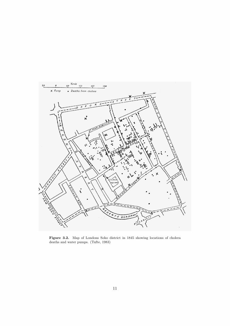
Figure 3.2. Map of Londons Soho district in 1845 showing locations of cholera
deaths and water pumps. (Tufte, 1983)
11

iteratively, or create new hypotheses. He also states that human exploration ofvisualized data often leads to a higher confidence in the validity of the findings.
Shneiderman (1996) phrased the "Information Seeking Mantra" as: Overviewfirst, zoom and filter, and then details-on-demand. When exploring data, the usershould be first presented with an overview of all the data. The user can then,using interactive tools, zoom the visualizations and filter out irrelevant data to findinteresting patterns. When the user has succeeded in filtering out a subset of thedata that is the most interesting to their current hypothesis or exploration goal, theuser can request additional details about this data.
3.2.1 Data exploration techniquesSimple and low dimensional data can often be easily visualized and explored usingbasic line graphs, x-y plots and histograms. However, more complex data with manydimensions may need di�erent approaches to be able to be e�ciently explored bya human user. Keim (2002) classifies data exploration techniques for complex andlarge data sets based on three criteria:
(1) The data to be visualized
The dimensionality in data is decided by the number of variables to be found. Forexample, comparing di�erent car models could mean that each car has variableslike mileage, horse powers, weight, construction year and more. This data is con-sidered multidimensional and requires other types of visualization and interactiontechniques to be able to be e�ectively explored.
Some data may be of the relational type where di�erent pieces of the data,called "nodes", have a relationship to one or more other nodes. Examples are e-mailconversations among people or the file structure of a hard disk.
(2) The visualization technique
In addition to 2D and 3D visualizations such as line graphs, bar charts and x-y-zplots, there are some other visualization techniques that can be used to make senseof complex data that is of higher dimensionality or relational/hierarchical.
When visualizing and exploring high dimensional data, parallel coordinates is agood solution (Figure 3.4) for better understanding the data or to find interestingvariable correlations or patterns. The principle of this technique is to display allthe dimensions (variables) parallel to each other and have lines connect all variablesthat belongs to the same entity. As in the car example mentioned earlier, each linewould be a car.
For hierarchical data, the treemap is a useful visualization solution to allow forexploration of the data. The treemap is a rectangular area subdivided by everylevel of the hierarchy, where each child node are grouped inside their parent node.The treemap was created by Ben Shneiderman (Shneiderman, 1992).
12

Figure 3.3. Treemap for hierarchical data. (JuiceAnalytics, 2009)
To give further meaning to the visualized data and communicate a certain di-mension, di�erent encodings such as color, position or size can be applied (Iliinsky& Steele, 2011).
(3) The interaction and distortion technique
Interaction is a crucial component of data exploration. Not only does it providethe steps necessary for the "Information Seeking Mantra" mentioned in the previoussection, but it fills the gap between them (Keim, 2002). Interaction allows theusers to actively explore the data by manipulating the visualizations in real time,allowing for finding relations and correlations within the data. There are a coupleof commonly used interaction techniques for exploring data. Among other, thereare brushing, linking, zooming and filtering:
BrushingBrushing is to change encoding in one or more items as response to a userinteraction with another element (Spence, 2007). In figure 3.5 it’s shownby changing the non-selected items into a gray color, to make them appeardimmed and help the user focus on the chosen set of elements.
13
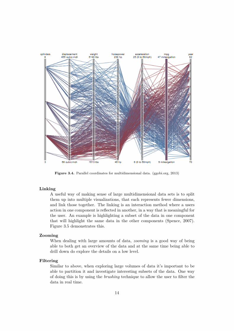
Figure 3.4. Parallel coordinates for multidimensional data. (ggobi.org, 2013)
LinkingA useful way of making sense of large multidimensional data sets is to splitthem up into multiple visualizations, that each represents fewer dimensions,and link those together. The linking is an interaction method where a usersaction in one component is reflected in another, in a way that is meaningful forthe user. An example is highlighting a subset of the data in one componentthat will highlight the same data in the other components (Spence, 2007).Figure 3.5 demonstrates this.
ZoomingWhen dealing with large amounts of data, zooming is a good way of beingable to both get an overview of the data and at the same time being able todrill down do explore the details on a low level.
FilteringSimilar to above, when exploring large volumes of data it’s important to beable to partition it and investigate interesting subsets of the data. One wayof doing this is by using the brushing technique to allow the user to filter thedata in real time.
14

Figure 3.5. Brushing and linking
3.3 Research and design methodsGiven the exploratory and design-oriented topic of this thesis, a methodology usinga model for design research is applied. The execution relies on a combination of thedesign-oriented research model and rapid prototyping.
3.3.1 Research through designThe term design has previously been more common in HCI practice than in HCIresearch, and has often been associated with usability engineering; the process ofmodeling requirements and specifications for user needs and shaping the productaccordingly (Zimmerman et al., 2007). In recent years, design has found its way into
15
HCI research and Zimmerman et al. (2007) has developed a model describing andmotivating the role of design within HCI research and how to evaluate its outcomes.
In this model, they highlight some of the strengths of interaction designers wayof working and how that can contribute to both HCI research and HCI practice.One of the biggest strengths of designers is their ability to tackle under-constrained,or "wicked", problems - complex problems with conflicting ideal outcomes, opposingstakeholder goals and many other unknown or complicated variables that makes ithard to define one optimal solution (Rittel & Webber, 1973). The way designersdo this is by continuously re-framing the problem by iteratively creating and cri-tiquing design artifacts that aims to transform the world from its current state toa preferred state (Zimmerman et al., 2007), eventually proposing a solution to theunder-constrained problem.
They describe 5 ways interaction designers contribute to HCI research and prac-tice: First, in their process of finding a preferred state they create opportunitiesand motivation for research engineers to develop new technologies that hasn’t pre-viously existed. Second, the created artifacts embodies their ideas, which facilitatesthe communication to the HCI practice community that can bring them to life incommercial products. Third, they facilitate for the HCI research community toengage in under-constrained, "wicked", problems that are di�cult to tackle usingtraditional methods. Fourth, interaction designers make research contributions us-ing their biggest strength; re-framing problems by iteratively trying to design theright thing. Fifth, they motivate the HCI community to discuss the impacts thedesign artifacts and ideas might have on the world.
Evaluation criteria
Since the design oriented way of performing research di�ers from traditional wayswithin HCI, so does the evaluation of the outcomes. Zimmerman et al. (2007)outlines the evaluation criteria as follows:
ProcessIn interaction design research, there is no expectation that repeating the pro-cess will yield the exact same results. Instead, the process will be judged as apart of the whole research contribution and needs to be thoroughly describedand motivate all rationales and decisions.
InventionThe result of an interaction design research project must be something new,that contributes something novel back to the HCI research community. Todemonstrate this, a literature review must be made to situate the result andprove that it’s an advancement of existing knowledge. By elaborately articu-lating the invention, the details about the invention is communicated to theHCI community, guiding them on what to build. This directly relates to thesecond type of contribution that interaction design researchers can provide tothe research community mentioned earlier.
16

RelevanceIn traditional research methods, validity is one form of evaluation of the re-sults. This is typically done by either benchmarking the performance increaseof the new solution or by disproving the null hypothesis.In the research through design approach, this is not always applicable. Thereis no way of proving that the solution is the right one. Two designers followingthe exact same method are highly unlikely to come up with the same results.Instead, the relevance is evaluated. Relevance is positioning the contributionin the real world and evaluating its impact. For example, is this useful? Doesit transform the world to a better state? The "better", or "preferred", statemust also be elaborately articulated and there needs to be motivations on whyit is better.
ExtensibilityThe final criterion for evaluating an interaction design research contributionrequires that the community are able to build upon the outcomes. Eitherby applying the methods used on future research or by leveraging the knowl-edge produced by the resulting artifacts. The research needs to have beendocumented well so that this is possible.
3.3.2 Rapid prototypingResearch through design might be considered to implicitly include rapid prototypingmethodologies, but to further clarify the principles and benefits of the method, it’shere described in more detail.
When rapidly prototyping a software, the development process is done iterativelyand in close collaboration with the target users. Features are delivered incrementallyand the requirements change over the course of the development process accordingto the continuous feedback gathered from the users (Luqi, 1989).
The motivation for the use of this method is the lack of exact requirements andknowledge about the artifact that was going to be produced. Rapid prototypingallows for exploration of requirements and features iteratively and minimizes therisk of errors or bad design decisions thanks to the close involvement of the users.
3.4 Space and place in HCIThe later stages of the project lead to the discovery of a connection to some conceptsthat exists within interaction design, the notion of space and place. The metaphorof space has been used a long time by interaction designers to design user friendlysystems (Harrison & Dourish, 1996). A typical example is the desktop metaphorwhen designing user interface for computer operating systems (such as Windows,Linux and OS X).
The concept of place shares properties with space but is also di�erent from it ina couple of ways. While a space is a three dimensional physical room, a place is all
17
that but with some additional properties. Place is defined by how it relates to itscontext and surroundings and by how we adapt and appropriate the space it existsin. A house is a space but my house is a place.
The point that Harrison and Dourish (1997) make is that it is actually the notionof place that frames our behavior when interacting with systems, especially theones providing collaborative features, and not space, as previously believed. Whilethe application created in this project is not collaborative in the same sense as thesystems they are describing, it’s however interesting to view how system monitoringis closely tied to physical space and how interacting with this application gives thesephysical spaces a sense of place.
18

Chapter 4
Method
This thesis follows a design-oriented research methodology and is initiated
with a theroetical enquiry on relevant theory for this project that is combined
with a contextual pre-study followed by a design phase, which are described
in detail in their own separate chapters following this chapter. The design
driven approach of the thesis follows the model of Zimmerman et al. (2007) of
how interaction design contributes to human-computer interaction research,
as described in their concept of Research Through Design.
4.1 Research and design process
The project starts with a pre-study to map out the existing system monitoringtools at Spotify to understand what their purpose are and how they are being usedby the developers. A study is also made on the practice of system monitoring ingeneral and why it’s important for companies with digital products of this size. Thisis combined with an inquiry about data visualization with an emphasize on dataexploration. Guidelines and good practice for how to design interaction for dataexploration and how to visualize data are investigated. The pre-study also resultsin possible starting points for the development av a functional prototype.
This is followed by a design phase where a design artifact is produced using ideasand knowledge generated from the pre-study. The artifact is rapidly prototyped anditeratively tested on the target users. The prototyping process does not include lo-fiand hi-fi sketches but instead real development of a web application directly fromthe start, the motivation for this being the requirement of using live monitoringdata for the purpose of design exploration.
4.1.1 Current and preferred state
In accordance with the Research Through Design method this thesis applies, thecurrent and preferred state of the world must be articulated and motivated so that
19
it is possible to determine the relevance of the design artifact, the purpose of theartifact being to shift the state from current towards the preferred.
Current stateAt Spotify AB, there are some ways of visualizing and interacting with systemmonitoring data.
Preferred stateAt Spotify AB, there are new and useful ways to visually explore and interactwith system monitoring data.
4.2 Target usersThe main users of the monitoring tools at Spotify are the so called Software Re-liability Engineers, which makes them natural to have as target audience for thisproject as well.
The fact that this audience possesses deep knowledge about the system moni-toring and back-end architecture of Spotify influences the design of the prototypeas certain assumptions can be made regarding how they will perceive elements ofthe interface and how they will interact with it. There is no need for extensive ex-planations on what data is available and how to interpret, for example, time seriesthat are generated from it, as they are already used to working with tools providingthat type of presentation.
20
Chapter 5
Pre-study
5.1 Introduction
Given the open ended nature of this thesis, the project started with brainstormingsessions to explore interesting challenges and opportunities regarding designing forsystem monitoring.
The mission of the monitoring team is to enable developers1 to quickly identifyand fix technical issues, which is why that was made the goal of this project as well.This is especially important in times of serious technical issues that might havea severe impact on the user experience of the Spotify service, such as user beingcompletely unable to play music, that could lead to economical consequences forthe company.
The aim of the pre-study was to explore and define the current situation regard-ing system monitoring at Spotify AB; to dive and look into how things work, whattools exist, how people work and what the monitoring infrastructure looked like,and eventually find good starting approaches to the project.
5.2 Method
Three meetings were held during the first few weeks, where I and three developersbrainstormed interesting problems and challenges related to system monitoring. Agoal with these meetings was to understand was system monitoring really meantand what possible opportunities there where for proposing new and useful designideas.
I also reviewed and tested the existing system monitoring tools being used withinSpotify AB to help me understand basic concepts about system monitoring and howthe developers use these tools.
1Service Reliability Engineers
21
5.2.1 Brainstorming sessionsThe participants in the brainstorming sessions were three developers at Spotify AB:
• Developer 1: Front-end web developer in the monitoring team. Designs andbuilds interfaces for the monitoring tools. Has been at Spotify for 1 year
• Developer 2: Back-end developer and team leader for the monitoring team.Has been at Spotify for 3 years.
• Developer 3: Web developer and team leader for all front-end web develop-ers. Has been at Spotify for 1 year.
5.3 ResultsBy studying the existing monitoring applications I learned how developers usedthem and what the objective of using those tools were. Typical use cases are:investigating ongoing technical issues, post-mortems and capacity planning. Post-mortem means to investigate a technical issue after it’s been resolved, to determinewhat happened, why, and what knowledge can be gained from it to know how toprevent it from happening again in the future. Capacity planning is to ensure thesystems have su�cient memory and processing power, etc, and plan for upgrades.
The brainstorming sessions generated three major ideas on possible design ex-plorations, all of which would provide features missing from the current monitoringsolutions:
(1) Sharable graph dashboardsThe first idea that emerged from the brainstorming sessions was to design anapplication where developers could create their own dashboard of monitoringgraphs2. These dashboards would then be able to be shared among other de-velopers. The value of this would be that developers would create dashboardsfor certain troubleshooting cases, i.e. for a specific type of problem that mightoccur not only once. Then other developers would be able to more quicklytroubleshoot a problem by reusing an existing dashboard that someone elsecreated for a similar problem, and thus be able to e�ciently solve the problem.
(2) Graph annotationsA second idea was to translate real life interaction into digital by observinghow developers interact with and discuss monitoring graphs in person andthen design a solution that would allow the same type of interaction digitally.This can be described as a distributed digital model of real life interactionthat would not only potentially enable larger scale collaboration between de-velopers but also persistent storage of the communication.
2A collection of visualization were each visualization would show relevant system monitoring
data
22
(3) Health overview of servicesThe third idea was to design a solution that would enable developers to moree�ortlessly get an overview of the overall status of all the services in the Spotifyinfrastructure. This solution would rely on defining one or a few specificmetrics that would define the "health" of a service; whether it’s functioningnormally or not. This would provide developers with insights regarding theoverall "health status" of the entire infrastructure and could possible lead themto earlier discoveries of potential system failures.
The last idea gained most interest among the developers and was decided to bethe starting point for the project.
5.4 Discussion and ConclusionsThe brainstorming sessions and the review of existing tools provided the knowledgerequired to be able to start exploring useful design solutions for data visualizationand interaction. By knowing how the tools worked and how the developers usedthem, along with what the developers considered was missing from the currentsolutions, the project was able to start transitioning into the design phase and theactual creation of a design artifact.
Commonly across all the ideas were the challenges of providing developers withthe right information at the right time, and enabling that to happen during a shortamount of time. This is especially challenging when the type of information soughtfor is unknown, which supports the idea of designing a solution that allows devel-opers to explore through a "top-down" approach, as suggested in design proposition3.
23

Chapter 6
Design phase
6.1 Introduction
Following the pre-study, the development of the prototype started with the initialidea to provide a service health overview that would help developers to more quicklyidentify potential system failures, or knowing where they had occurred. However,this eventually proved to have some di�culties tied to it and the prototype designchanged direction. The new form was a data exploration tool where informationcould be correlated to the physical location of their sources. This also opened upfor the exploration of the HCI concepts space and place and their representation inthe prototype.
6.2 Method
The prototype creation required quick development of a functional application thatcould be directly tested on the target users, as well as decisions about what the datavisualization process would look like from a technical point of view. No analoguelo-fi or hi-fi sketch prototypes were made, the digital application logic was developeddirectly from the start. The reason for this was the benefit of being able to use thesystem monitoring data instantly and have the interaction and visualization with ittested on developers from the beginning.
As part of the rapid prototyping, informal and spontaneous user testing wasperformed continuously to gather feedback to help making new design decisions.These user sessions consisted of demonstrating for, in total, 5 service reliabilityengineers, 2 monitoring engineers and 5 web developers the latest progress of theprototype and gather their feedback on what features that could potentially improveits usefulness.
25
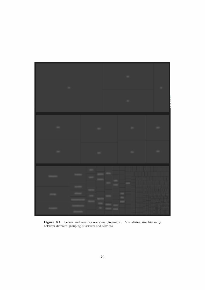
Figure 6.1. Server and services overview (treemaps). Visualizing size hierarchy
between di�erent grouping of servers and services.
26
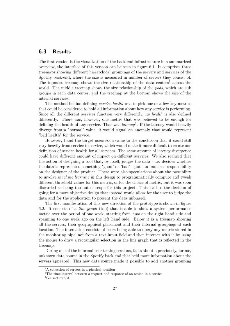
6.3 ResultsThe first version is the visualization of the back-end infrastructure in a summarizedoverview, the interface of this version can be seen in figure 6.1. It comprises threetreemaps showing di�erent hierarchical groupings of the servers and services of theSpotify back-end, where the size is measured in number of servers they consist of.The topmost treemap shows the size relationship of the data centers1 across theworld. The middle treemap shows the size relationship of the pods, which are subgroups in each data center, and the treemap at the bottom shows the size of theinternal services.
The method behind defining service health was to pick one or a few key metricsthat could be considered to hold all information about how any service is performing.Since all the di�erent services function very di�erently, its health is also defineddi�erently. There was, however, one metric that was believed to be enough fordefining the health of any service. That was latency2. If the latency would heavilydiverge from a "normal" value, it would signal an anomaly that would represent"bad health" for the service.
However, I and the target users soon came to the conclusion that it could stillvary heavily from service to service, which would make it more di�cult to create onedefinition of service health for all services. The same amount of latency divergencecould have di�erent amount of impact on di�erent services. We also realized thatthe action of designing a tool that, by itself, judges the data - i.e. decides whetherthe data is represented something "good" or "bad" - puts an immense responsibilityon the designer of the product. There were also speculations about the possibilityto involve machine learning in this design to programmatically compute and tweakdi�erent threshold values for this metric, or for the choice of metric, but it was soondiscarded as being too out of scope for this project. This lead to the decision ofgoing for a more objective design that instead would allow for the user to judge thedata and for the application to present the data unbiased.
The first manifestation of this new direction of the prototype is shown in figure6.2. It consists of a line graph (top) that is able to show a system performancemetric over the period of one week, starting from now on the right hand side andspanning to one week ago on the left hand side. Below it is a treemap showingall the servers, their geographical placement and their internal groupings at eachlocation. The interaction consists of users being able to query any metric stored inthe monitoring pipeline3 from a text input field and then interact with it by usingthe mouse to draw a rectangular selection in the line graph that is reflected in thetreemap.
During one of the informal user testing sessions, facts about a previously, for me,unknown data source in the Spotify back-end that held more information about theservers appeared. This new data source made it possible to add another grouping
1A collection of servers in a physical location
2The time interval between a request and response of an action in a service
3See section 2.3.1
27

Figure 6.2. Final prototype, early version. A line graph (above) and a treemap
(below) displaying a system performance metric (a time series spanning one week)
and the physical grouping and geographical placement of the data sources.
dimension to the treemap. The new treemap also shows how the servers are groupedin racks which heightens the resolution of the physical placement information (seefigure 6.3).
6.3.1 Description of the Final Prototype
The final version can be summarized as an objective and exploratory tool wherethe users can explore the system performance data of the Spotify back-end as timeseries, and correlate that data to the physical location of their sources. The final userinterface is shown in figure 6.3, it consists of two visualizations that are interactivelylinked together by the input of the user: a line graph and a treemap. Details aboutthe final prototype are explained in the next section.
Line graphThe line graphs retrieves temporal system monitoring performance data froma data source that exists within the monitoring back-end at Spotify. Thedata it retrieves is processed by the application and then rendered in the webbrowser onto the screen. The processing consists of transforming the incoming
28

data structure to a form that is compliant with the functions that calculatesthe screen coordinates of the data points that make up each line.After some experimenting with di�erent methods of rendering large amountsof lines in the browser the canvas-method was chosen, which is more perfor-mant than the svg-method for a large volume of data points (see section 7.3.2for an explanation of the two methods).The line graph shown in figure 6.3 is showing user activity over one week. Thepeaks and dips signifies day and night cycles. Di�erent groupings of lines canbe observed in the line graph, and some of them are o� phase with others.This signifies their ties to di�erent physical locations, which connects themwith di�erent time zones.
TreemapThe treemap visualizes all the servers in the Spotify back-end, the way they aregrouped, the relationships of the groups and their geographical and physicalplacement. It retrieves its data from a source within the Spotify back-end,processes it and renders it in the browser. The processing of the data includestransforming the structure of the incoming data to a hierarchical structurethat is appropriate for the functions that calculates the sizes and positions ofthe rectangles that make up the visualization.
Interaction
As previously established, interactivity is a fundamental criteria when designingfor data exploration. The interactivity in the final prototype consists of a realtime linking of selections in both visualizations. The user can brush (select) asubset of the data in the line graph and the sources of the selected data will behighlighted in the treemap (figure 6.4 and 6.5). This allows for exploration ofinteresting patterns in the line graphs and their correlation to physical groupingand geographical placement of their data sources. For example, selecting a peak inone group of lines and then selecting a peak in another group of lines that is o�phase with the first one would inform the user that the first group of lines belongto servers and services located in Europe while the other are located in North orSouth America.
Following the "Information Seeking Mantra", the treemap o�ers details-on-demandwhen the user hovers the mouse cursor over a specific server (figure 6.6). That ac-tion provides the user with information about the name of the server and groups itbelongs to, which the user can use in other monitoring tools to gain more knowledgeabout that server and the situation being explored.
6.3.2 Technologies usedThis prototype was built using web technologies, these included HTML5 (W3C,2014a), CSS3 (W3C, 2014b) and JavaScript (ECMA International, 2011). To sup-
29

Figure 6.3. Final prototype. A line graph (above) and a treemap (below) displaying
a system performance metric (a time series spanning one week) and the physical
grouping and geographical placement of the data sources.
Figure 6.4. Final prototype. The selection made in the line graph is linked and
mirrored in the treemap
30
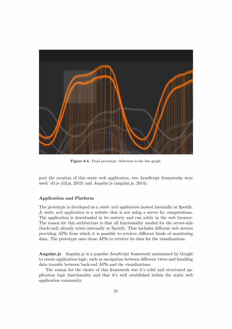
Figure 6.5. Final prototype. Selection in the line graph.
port the creation of this static web application, two JavaScript frameworks wereused: d3.js (d3.js, 2013) and Angular.js (angular.js, 2014).
Application and Platform
The prototype is developed as a static web application hosted internally at Spotify.A static web application is a website that is not using a server for computations.The application is downloaded in its entirety and run solely in the web browser.The reason for this architecture is that all functionality needed for the server-side(back-end) already exists internally at Spotify. That includes di�erent web serversproviding APIs from which it is possible to retrieve di�erent kinds of monitoringdata. The prototype uses those APIs to retrieve its data for the visualizations.
Angular.js Angular.js is a popular JavaScript framework maintained by Googleto create application logic, such as navigation between di�erent views and handlingdata transfer between back-end APIs and the visualizations.
The reason for the choice of this framework was it’s solid and structured ap-plication logic functionality and that it’s well established within the static webapplication community.
31

Figure 6.6. Final prototype. Tooltip on mouseover displaying detailed information
about a server. "Details-on-demand"
Visualizations
The visualizations are built using a combination of JavaScript, HTML5 and CSS3.JavaScript for computations and processing of the data retrieved from the monitor-ing back-end (See 2.3.1), and the overall application logic regarding visualizations.HTML5 for structure and CSS3 for presentational aesthetics. The use of these tech-nologies allows for rich interactivity of the visualizations, which is the fundamentalbase for exploring data.
D3.js D3.js is a powerful JavaScript framework to craft custom data visualiza-tions. There are other frameworks that come shipped with finished componentssuch as line graphs, bar charts and other standard types of diagrams, but d3 is aset of tools and functions to allow developers to design their own custom chartsand diagrams, which can range from simple line graphs to more advanced multi-dimensional visualizations.
This was chosen as a visualization framework because of its flexibility in allow-ing developers to create custom visualizations. A framework like this is ideal forexploratory design-oriented projects.
32

6.3.3 Value and usefulness
The goal throughout the process has been to create something useful for the targetusers, and especially exploring what could be useful, given the current state of thedesign artifact but also what it could become, which is one important factor toconsider when evaluating design outcomes from interaction design research. Basedon the feedback from the users, there are some value propositions for this prototypein its current state:
Capacity planning
All servers, or nodes, in a large back-end like this carries di�erent amount of net-work tra�c, or load. This needs to be evenly distributed among them to functionas e�cient as possible, and support a good user experience without latency anddelays. By visually seeing the geographical grouping of servers and what servicesthey are connected to, and a specific metric value at a certain time, it would bepossible to determine whether some places are over- or under-provisioned regardingcomputational power and network capacity, etc. For example, a graph showing agroup of servers having all their bandwidth used up - and they’re all in the samelocation - could mean that a certain group of users will experience latency problemsin the near future, which in turn could lead to them being unable to log in or playsongs.
Post-mortems
When a serious issue has occurred, developers investigate what happened, and why,to learn from it and prevent it from happening again. This is referred to as post-mortem. By correlating a certain metric with the geographic placement of theirsources (servers) it would be possible to gain insight about the cause of the problem,if its somehow related to the organization, grouping or interrelationships betweenthe servers.
6.4 Discussion and conclusions
6.4.1 Process
The form of the prototype changed continuously throughout the design process.Ideas that initially seemed useful and interesting later proved to be either too dif-ficult to implement or not as interesting anymore. This is the strength of rapidlyprototyping a design artifact to create knowledge within a given context; the prob-lem is constantly re-framed and better and more interesting results are yielded.
There were no specifically planned milestones or organized user testing sessionsthroughout the design phase. The designer (me) being constantly physically presentnext to the target users allowed for spontaneous but e�ective user testing of the
33
prototype and ideas. I believe that this ease of interacting with the target userscontributed positively to the evolution of the prototype.
6.4.2 A sense of placeThe final application prototype allows for looking into closed rooms, into physicalspaces located far from where the observer is. It’s a digital, simplified representationof physical spaces; servers organized in racks that are placed in large server halls indi�erent locations around the world.
Bringing back Harrison and Dourish (1996) ideas regarding space and place ininteraction design, I would not argue that there is a sense of placeness that framesthe interaction and user behavior in the prototype in its current state, accordingto their definition. However, if one would envision a state where users are ableto appropriate and adapt this virtual space together through their interaction bycontributing persistent data and content of their own, generated from their behaviorand usage of the prototype, a placeness that more closely resembles their definitioncould be created. One usefulness of this could be found in how this could influencefuture behavior of users by potentially helping them solve problems more quicklyby relying on relevant content created by previous users.
The design of the prototype has been influenced by spatial properties of the realworld, such as grouping and hierarchy of the servers. Additionally, another typeof placeness can be observed in the prototype through the interactive linking ofthe visualization components. The relation between the physical locations and thetemporal data is what di�erentiates these virtually represented physical spaces fromeach other and adds a dimension of place to it. This place information can be usefulfor developers when searching for information in the data in the way that di�erentmetric values have di�erent meaning depending on the relative time and location oftheir sources. The significance of place contextuality of the data can be observed byenvisioning a scenario where all servers that handles user logins are located in thesame geographical location, and a power outage occurs, then no users are able to login. However, if the servers are instead distributed over several locations, the tra�cfrom users a�ected by an outage in one location could be transferred to anotherlocation that isn’t a�ected.
Paradoxically, these spaces are still represented spacelessly, there is no notion ofdistance between di�erent servers or server groups nor between data centers acrossthe world. Distance has meaning when sending digital information between physicallocations as it a�ects the time it takes to reach its destination, digital messages aretransferred very fast but not instantaneous. However, in this visual representation,the distance has been completely abstracted away. This might not necessarily bepreferable, but its likely not vitally a�ecting the quality of the exploration experienceof the user. This topic could be further investigated in another research projectthough.
34
Chapter 7
Discussion
Throughout the process of this thesis, insights were gained regarding the de-
sign process and the final design artifact, as well as the role of space and place
within system monitoring. Those findings are discussed and evaluated in this
chapter
7.1 Research and design processA strength I observed with the research through design methodology is how thedesign is shaped together with the target users; how it defines the feedback anddesign decisions loop. Instead of having discussions about possible or impossiblefeatures and trying to envision what might be and demand constructive and creativefeedback from the users based on something that doesn’t yet physically exist - thatis just an idea - it’s instead possible to present the physical creation and they cansee it for what it is, and understand the possible opportunities and concepts of it.This way it’s easier for the users to give feedback on the product. To communicatean idea to someone is much easier and more e�ective when showing it, embodied ina physical object, than using verbal language explaining its features and propertiesand expecting them to fully understand the scope of the vision.
Zimmerman et al. (2007) points out that it’s also important to not only considerthe final result as something "final", but rather as something that has created insightand knowledge in the process and might become much more, given further iterationsand tests. This is very accurate regarding the prototype created in this thesis.Knowledge regarding technical implementation solutions and interaction with andexploration of system monitoring data has been gained. Additionally, many ideasand suggestions about features have been expressed throughout the process but hasnot been manifested in the prototype. But can, however, potentially be implementedin the future.
My interpretation of the preferred state, that Zimmerman et al. (2007) stressesas an important part of design research in their model, is that it is something to aimfor but not necessarily achieve by all means. Both for the reason that the knowledge
35
generated in the process is that which is of value and because I believe that thepreferred state is impossible to achieve. The reason being that it’s not possible todefine it in a complete and absolute manner to be able to actually validate whetherit’s been achieved, nor the design artifact. In the case of this project, the designartifact has definitely shifted the current state towards the preferred state but ithasn’t completely fulfilled it. Not even including all the possible extensions andvisions of what it could be. However, I think the goal has been achieved throughthe generation of new ideas and opportunities for what is possible to do regardingexploration of system monitoring data at Spotify AB.
7.2 Data and place in system monitoringAnother interesting discovery generated from the final prototype is how it empha-sizes that system monitoring is tightly linked to the physical world. The finalprototype presents an interface for visually correlating data to the geographical andphysical placement of the sources. What has been created is a virtual space con-necting physical places. The prototype enables users to look into closed rooms indi�erent places of the world, concurrently. The feat to link temporal system per-formance data to the physical placement of their source in this way is new withinthe scope and context of this thesis; system monitoring at Spotify AB. Based onZimmermans et al. (2007) criteria for evaluating design artifacts in design research,this is the invention criterion of the design.
This feature is also what adds a dimension of place to this visual representation.The linking of selections in the performance metric data to the server data givesthe representations context in the form of geographical and physical location as wellas time and grouping which adds more meaning to the data. For example, certainpatterns in the data have di�erent meaning whether it’s day or night, whether theirsources are located in Europe or America or whether the servers are grouped in thesame rack. All of this is likely to have meaning when correlated to other patternsin the system monitoring data. Examples of this is, as mentioned earlier, that useractivity patterns are heavily tied to their geographical location as well as time ofday. Or when a piece of software running on multiple servers, the servers should beas physically separated and distributed as possible to minimize the risk of softwarefailure in case of technical hardware issues that could a�ect multiple servers if theyare physically grouped tightly together.
7.3 Technical evaluationThe web as platform imposes a couple of technical restrictions. Most notably,computational power, both for processing data and visualizing data. There aremany di�erent choices that can be made to a�ect the performance of the prototype.The implications of the di�erent options are explained as well as which ones arebest suited for what situation:
36

7.3.1 Processing data in the browserProcessing large volumes of data requires strong computational power. A webbrowser on a single agent running a JavaScript application is limited in resources,compared to the large cluster of servers collecting and storing the data in the Spotifyback-end. Therefore, the data received to the web browser should be pre-processed,preferably down-sampled using a sensible algorithm, so that the volume receivedcan be processed in a reasonable amount of time by the browser. There is no pointin having more data points than the amount of pixels the screen is able to render.This time variable is very likely an important factor a�ecting the user experienceof the application.
7.3.2 Rendering in the browserVisualizing, i.e. rendering, large volumes of data in a web browser will also requiresignificant amount of computational power. A sensible thing to do in the processingstage, in the browser, is to further down-sample the data so that the amount of datapoints available in one axis is not higher than the amount of pixels in the pixel rangerequired to display it on the screen.
Two techniques were used for the rendering of data. The first one uses multiplesvg elements in the web browser and the second one uses one canvas element inthe browser. Both of which are o�cial html5 elements. These two techniques posedi�erent strengths and weaknesses:
SVG: The technique of rendering visualizations using svg elements means produc-ing a very high amount of html elements on the page. Each html element renderedon a web page takes up memory and processing power, and a large amount of themwill eventually lead to very bad performance, which in turn creates a bad user ex-perience. So, using svg elements for a high volume of data has a high risk of leadingto bad performance of the web browser.
However, the benefits of using svg is that they are easy to implement interactionfor since web browsers allow for very easy attachment of di�erent input listenersto every html element, or node, it contains. Therefore, adding interactivity - suchas listening to click or drag events on the mouse - to an svg visualization requiresrelatively little work.
CANVAS: Visualizing using canvas di�ers from svg in the sense that there isonly one element being rendered in the browser. There’s only one canvas element,as opposed to the svg method where all visualization elements are comprised ofmany di�erent svg elements.
The canvas is one element only containing pixels in di�erent colors, which ismuch cheaper performance-wise for the browser to render. So in the processingphase, all screen coordinates of the visualizations are calculated on the canvas andpainted as a pixel with a certain color.
37
The disadvantage of canvas though, is that it’s much harder to implement in-teractivity to the visualizations. Because the canvas is just a 2-dimensional areacontaining painted pixels, instead of an abstract tree of html nodes. There is noway to attach any input event listeners to it, as it would be when having many htmlnodes as in the svg method.
It’s still possible to implement interaction with the visualization, though it needsa lot more work.
7.3.3 An accessible platformA big benefit of using the web as platform for developing an application such asthis is the high level of accessibility it provides for the users. A web applicationdoes not require any cumbersome acquirement procedures, such as downloading andinstalling a software on the system, which is a time consuming task, and requires ahigher gain expectation from the user to be willing to go through with it.
Since a web application is instantly accessible by a the user through a webbrowser, I think the conversion rate from non-users to users are much higher thanif they would have to download and install a software. I believe it’s easier to let auser use an application and discover its value by themselves rather than having toexplain it, or even trying to convince, them about it.
7.4 ExtensionsThere are many ideas that are not incorporated in the final prototype, but are usefuland could provide great value if implemented.
More detailsThere exists a lot more information about the servers visualized in the treemapthan what is shown. Not all servers are actually active, some are being initi-ated and some are not being used at all. This information would be useful tovisualize, and allow for the users to filter and correlate the status of the datasources (servers) with the data.
Correlate di�erent data typesCurrently, it’s only possible to correlate one data type, one metric, with itsdata source. By overlaying multiple metrics in the line graph and linking themto their sources in the treemap with color encoding, further insights could begained about the state of the back-end servers and software. For example,bandwidth usage of incoming tra�c is likely to correlate with the number ofconnected users.
Modes of explorationFurther opportunities of exploring the data using human perception wouldpossibly be created by allowing for changing the scales of the line graph.Examples could be to have logarithmic scales, normalized scales or integrals.
38
It’s hard to say what exact purpose this would serve but since the wholemeaning of this prototype is to explore the data and not just display it for apre-defined reason, it might be useful features to have.It could prove useful to be able to add, divide or subtract values betweendi�erent metrics. In the example from the previous section, this could be ex-emplified as dividing the number of bits of the incoming tra�c by the numberof currently connected users; incoming bits per user. Again, it’s hard to pre-dict exactly what insights this information would create but it’s aligned withthe basic concepts of data exploration; to let human perception do the work.
39

Chapter 8
Conclusions
The purpose and goal of this project was to explore new ways of visualizing andinteracting with system monitoring data at Spotify AB. The work resulted in a de-sign artifact that embodies knowledge about some of the things that are possible toachieve regarding data exploration within this context and an additional emphasizeis also given to the relation between system monitoring data and physical space,and its meaning within system monitoring at Spotify AB.
This research contribution shows that by geographically and physically contex-tualizing system monitoring data, a sense of place is added that helps developerscorrelate system performance with physical placement of software and hardware, topredict future performance related bottlenecks or investigate whether past incidentswere related to the physical placement of the systems. It also exposes possibilitiesfor providing general assistance in the developers work on investigating technicalissues and ensuring a high availability of the Spotify service by potentially allowingfor new types of interaction with the data, such as overlaying metric visualizationsor performing math operations on di�erent sets of metrics as means of exploringpossible correlations. The design artifact produced materializes these design visionsand acts as a conduit to communicate these ideas to the developers at Spotify AB,increasing the likelihood that they will result in products for widespread use withinthe company.
Technical insights regarding good practices and e�ective solutions to ensureperformant and useful user interfaces for data visualization when using web-basedtechnologies have been gained as well, where the recommendation is to use thepixel graphic based canvas method for very large volumes of data, and the nodetree based svg method when the amount of data is smaller and the requirementfor interactivity is higher. This further emphasizes the strength in creating designartifacts for research contribution in the way this feeds back technological knowledgeto the human-computer interaction and the computer science community.
Hopefully the results and conclusions of this thesis will serve as inspirationfor further development of useful monitoring tools within Spotify AB as well as aresource for continued exploration and research on this topic.
41

References
angular.js. (2014). Retrieved 2014, from https://angularjs.org/d3.js. (2013). Retrieved 2014, from http://d3js.org/ECMA International. (2011, June). Ecmascript language specification. 5.1. ECMA
International.Geraci, A. (1991). Ieee standard computer dictionary: compilation of ieee standard
computer glossaries (F. Katki, L. McMonegal, B. Meyer, J. Lane, P. Wilson,J. Radatz, . . . F. Springsteel, Eds.). Piscataway, NJ, USA: IEEE Press.
ggobi.org. (2013). Retrieved 2014, from http://www.ggobi.org/Harrison, S. & Dourish, P. (1996). Re-place-ing space: the roles of place and space
in collaborative systems. Citeseer, 7, 67–76.IBM. (2013). Operational monitoring of system performance. Retrieved October
15, 2013, from http://pic.dhe.ibm.com/infocenter/db2luw/v9r7/index.jsp?topic=/com.ibm.db2.luw.admin.perf.doc/doc/c0054690.html
Iliinsky, N. & Steele, J. (2011). Designing Data Visualization. O’Reilly Media.JuiceAnalytics. (2009). Retrieved 2014, from http://www.juiceanalytics.com/Keim, D. A. (2002). Information visualization and visual data mining. IEEE Trans-
actions on Visualization and Computer Graphics, 8. doi:10.1109/2945.981847Luqi. (1989, May). Software evolution through rapid prototyping. Computer, 22 (5),
13–25. doi:10.1109/2.27953Rittel, H. W. J. & Webber, M. M. (1973). Dilemmas in a general theory of planning.
In Policy sciences 4 (pp. 155–166).Schroeder, M. & Noy, P. (2001). Multi- Agent Visualisation Based on Multivariate
Data, 85–91.Shneiderman, B. (1992, January). Tree visualization with tree-maps: 2-d space-
filling approach. ACM Trans. Graph. 11 (1), 92–99. doi:10.1145/102377.115768Spence, R. (2007). Information visualization: design for interaction (2nd edition).
Upper Saddle River, NJ, USA: Prentice-Hall, Inc.Spotify. (2014). Retrieved 2014, from http://press.spotify.com/se/information/Tufte, E. R. (1983). The visual display of quantitative information. Cheshire: CT,
Graphic Press.W3C. (2014a). Retrieved 2014, from http://www.w3.org/html/wg/drafts/html/
master/W3C. (2014b). Retrieved 2014, from http://www.w3.org/Style/CSS/specs.en.html
43

Ward, J. S. & Barker, A. (2001). Undefined By Data : A Survey of Big Data Defi-nitions. arXiv: arXiv:1309.5821v1
Zimmerman, J., Forlizzi, J., & Evenson, S. (2007). Research through design as amethod for interaction design research in HCI. Proceedings of the SIGCHIconference on Human factors in computing systems - CHI ’07, 493. Retrievedfrom http://portal.acm.org/citation.cfm?doid=1240624.1240704
44