the physical visualization of information: designing data...
TRANSCRIPT
The Physical Visualization of Information: Designing Data Sculptures in an Educational Context
Andrew Vande Moere and Stephanie Patel
Design Lab, Faculty of Architecture, Design and Planning
The University of Sydney, Australia {andrew;stephie}@arch.usyd.edu.au
Abstract. This paper is a qualitative case study analysis of the issues involved in designing and implementing data sculptures, the physical “embodiment” of data in a tangible presence, shape or form, within the context of an undergraduate design studio. It demonstrates how approaches and theories from the field of data visualization can form a rich contextual resource and motivational tool for teaching principles of creative design. A relatively short, two-week assignment challenged students to investigate and convey a meaningful data-driven insight through a tangible representation. In this paper, we analyze the resulting collection of physical artifacts developed by the students to reveal notable design approaches of embodying abstract information. We present a novel classification of data sculptures based on a semiotic taxonomy (symbolic, iconic, or indexical) and consider the qualities of representational fidelity and narrative formulation, for instance when the unfolding of the data-driven narrative is seen as a process, rather than an outcome. In addition, we investigate how the introduction of digital fabrication techniques influenced the design strategies chosen by the students versus hand-made approaches.
Keywords: design, education, data visualization, information aesthetics, data sculpture, digital fabrication.
1 Introduction
Information visualization (infovis) is traditionally viewed as a means to understand and analyze complex data sets. Its main tasks typically include: the accurate detection of data patterns, the facilitation of decision making based on data trends, and the communication of data-driven information and knowledge. With of its deep roots in scientific reasoning, research into information visualization has mainly focused on supporting scientific goals and optimizing analytic tasks. As a result, visualization is traditionally considered a tool that is neutral, dispassionate and objective, as it caters for the solutions to well-defined and specialized task of its expert users.
In recent years, there has been a tendency to “democratize” the practice of data visualization, which is characterized by (1) the ability to develop visualizations through free, open and well-supported software development platforms by computer
novices, (2) the increasing number of freely available, large, complex and interesting data sets from government, science and business sources, and (3) the refocusing of traditional data visualization goals towards including the education of a large, lay audience about data-supported insights. In the context of this last point, the fields of arts, design, media and sciences have a common interest in utilizing innovative forms of visualization to represent the knowledge, relevance and meaning hidden within complex information structures. By articulating the common interests and goals of visualization across these academic fields, shared problems are addressed in a multi-perceptual space and a broader cultural context [1, 2, 3].
Several new visualization taxonomies have been proposed that incorporate the increasing artistic tendencies in the practice of data visualization. For instance, Warren Sack [4] has noticed how the “anti-sublime” information visualization has outgrown science and engineering and has ultimately become embraced by conceptual art. He proposes looking beyond whether such visualizations are pretty, beautiful, or easy to use, and instead recognize their aesthetics of governance – the interpretation and articulation of meaning, rather than just the purity of the information being represented, as a creative response to visual forms of contemporary art. Pousman et al. [5] coined the term casual visualization as conveying an “increased focus on activities that are less task driven, data sets that are personally meaningful, and built for a wider set of audiences”. Viegas and Wattenberg [6] use the term artistic data visualization for those data depictions that embody a forceful point of view by recognizing the power of visualization as a potential communication medium. In turn, we defined information aesthetic visualization to denote the interlocking combination of aesthetics and design (e.g. visual style, user experience), a shift in focus, away from conveying patterns and trends towards narrating meaning and underlying principles, and finally, a tendency towards more fluid user interaction and user participation (e.g. flow, user feedback) [7]. The term information “aesthetics” here refers to the degree of involvement and engagement it facilitates, rather than denote a subjective measure for visual appeal or even the quality of the work. Similarly, the term database aesthetics has been used in the field of Design and Media Arts to denote a new aesthetic approach undertaken by a collection of artists who use the vast amounts of available information as their medium of expression [8] [8]. At this extreme of what some might doubt can still be called “visualization”, the visual ordering and organization of information has become an artistic choice, a choice motivated by the intent to influence and critique the digitization of daily life.
This rich spectrum of approaches shows the importance of design and creativity in the visualization field. To explore the potential of design and of data visualization as a communication medium in its own right, the main author has coordinated and taught an undergraduate Design Studio at the University of Sydney. In particular, the studio course aimed to combine the fields of design, new forms of digital technology and data visualization as a platform for research-led teaching in design education. As such, one of its assignments comprised of the design and the implementation of a “data sculpture”. The main aim of this paper is to report on the design strategies and experimentation by the students within the context of this assignment. It will present a novel classification of data sculptures based on a semiotic taxonomy (symbolic, iconic, or indexical) and the qualities of representational fidelity and narrative formulation.
2 Designing a Data Sculpture
We define data sculpture as the physical “embodiment” of data in a tangible presence, shape or form [9]. That is, a data sculpture is a direct externalization of the data it represents: except of its aesthetic expression that might relate to its perceivable or tangible features, it possesses no additional direct functionality other than conveying meaning to its onlookers. This meaning is often based on quantitative data, which directly determines its visual characteristics such as its shape, color or size. However, data sculptures could even aim to reveal more qualitative measures, such as emotion, context or background that relate to the circumstances around dataset or the insight shown. The “raison d’être” (reason for being or existence) for a data sculpture is thus communicating insight, which might range from a scientifically founded causal correlation, over simple visual similarities in time-based trends, to an emotion based on a consequence of a data pattern. Its design is often motivated by exploiting physical qualities to capture the attention of lay people to data-related issues that would be otherwise disregarded if shown as factual descriptions, journalistic articles, infographic illustrations or data graphics. The novelty and aesthetic of its sculptural form and its physical affordances often drive the interest of people to attempt to decipher the content.
2.1 Physical Qualities
Although humans are well experienced in navigating, interpreting and interacting with physicality in everyday life, designing (and implementing) a tangible artifact that allows for abstract meaning to be gathered through physical form is not an obvious task. In particular, we believe that a useful data sculpture requires a strong design rationale underlying its perceived physical qualities, including: embodiment, metaphorical distance, multi-modality, interaction, affordance and physicality.
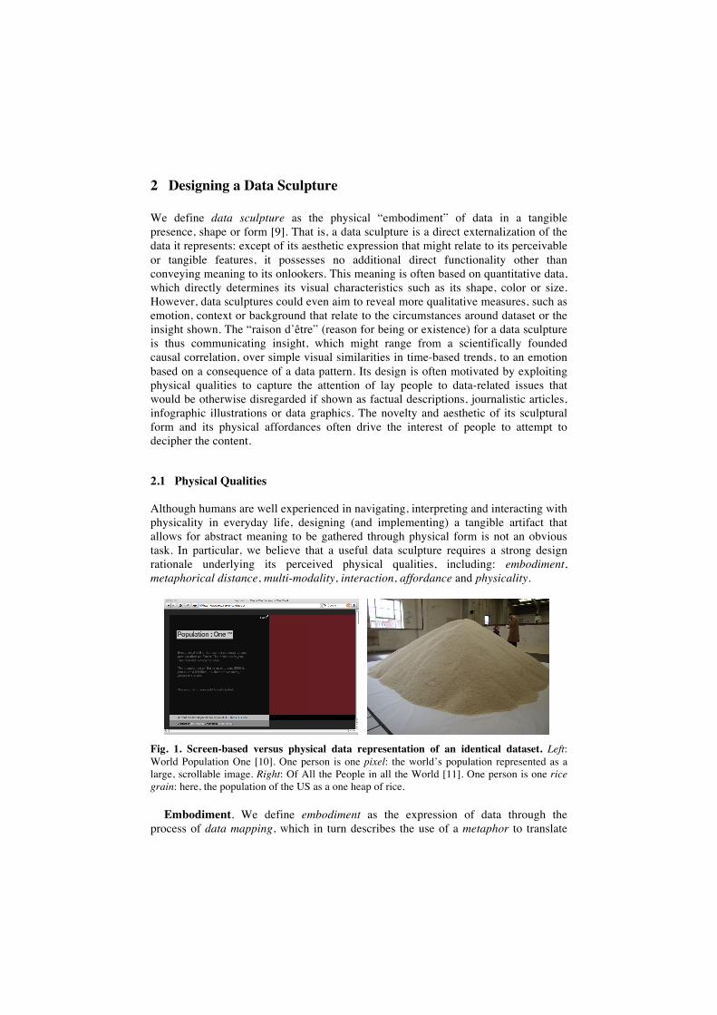
Fig. 1. Screen-based versus physical data representation of an identical dataset. Left: World Population One [10]. One person is one pixel: the world’s population represented as a large, scrollable image. Right: Of All the People in all the World [11]. One person is one rice grain: here, the population of the US as a one heap of rice.
Embodiment. We define embodiment as the expression of data through the process of data mapping, which in turn describes the use of a metaphor to translate
(inherently non-physical) data values into a perceivable form [9]. While determining a useful and useable data mapping is already a well-known consideration in the design of a data visualization technique, we believe that the physical character of a data sculpture has the potential to significantly influence the sense-making process of its users who interpret its meaning. For example, as shown in Figure 1, the experience of seeing a population represented as a collection of data pixels [10] versus a heap of rice [11] seems to be significantly different. While the first instance resembles that of scrolling through a huge digital image file, the unanticipated magnitude and unfamiliar shape conveyed by a huge rice heap leads to a stark and memorable experience that has the ability to surprise and intrigue onlookers.
Metaphorical Distance. The design of a data sculpture touches the issue of metaphorical distance, the distance between the chosen metaphor and the data itself, and between the metaphor and the perceived reality [9]. In other words, while most screen-based depictions are of abstract or iconic quality due to the limited available bandwidth for representation, reality offers the freedom to simulate meaning closer to our mental image, preconceptions and expectations, and provides for a broader contextual interpretation. A data sculpture, seen as a whole, combines two metaphorical depictions: that of the meaning it reveals when seen as a physical depiction of an object with all its connotations (e.g. rice, food, mountain), and that of a shape that is determined by data (e.g. size and height convey a meaning).
Multi-Modality. It is still an open question as to what aspects of the huge vocabulary of non-visual representation could be used for the effective communication of information in data sculptures. Some early experimentation has lead to advancements in the field of ambient display, which proposed to turn everyday architectural spaces into “interfaces” by changing the state of the physical matter, solids, liquids and gases that they contain by well-chosen data-driven values [12]. However, while such multi-modal “rendering” of information might increase the perceivable bandwidth of a user while providing for a memorably experience, it also highlights the question of our ability to inverse the stimulation of our senses into a meaningful insight.
Interaction. While contemporary computational interfaces are mainly based on mouse and touch-screen interaction metaphors, representing information as a physical reality has the potential to use our inherent experience of interacting with the everyday physical world that surrounds us. The exploration of our environment through grasping, poking, caressing or squeezing has been encouraged since our early childhood years. Data sculptures could exploit such exploratory playful actions (and many more) as ways to overview, zoom, filter or select information.
Affordance. Next to its metaphorical connotation, information can also be carried by a physical shape through its affordance(s), the externally perceivable quality that allows an individual to recognize its potential to perform a specific action. We believe that designing data sculptures by exploiting its affordances has the promise to reveal powerful perceptual cues for accurately and intuitively deciphering the information that is embodied in a particular physical form. Similar to the use of visual cues in traditional visualization, affordances could have the capacity to be learned and interpreted in a functional way, thereby conveying informational meaning and foregoing higher-level visual abstraction. However, even in reality, most affordances are learnt through past experience, education or trial-and-error actions, and porting
everyday physical usage scenarios to the most abstract issue of communicating information is complex.
Physical Properties. Since most data visualization techniques have been specifically designed to be presented on two-dimensional media such as paper or computer screens, a different design approach required when developing “equivalent” representations in the physical realm. The most obvious challenge is to withhold reverting back to pixel-based graphics or simply “giving depth” to already known data visualization metaphors such as scatter plots, line graphs or pie charts. In fact, besides the high degree of resolution of pixel-based representations, there is no real compelling reason why physical displays should mimic purely computer-based visual languages. What a “pixel-less” display might loose in resolution, it could make up in a richer experience that may also include aspects of multi-modality in form of touch (e.g. texture, granularity), sound (e.g. shaking noise) or even smell (e.g. from material). The design of such a physical artifact needs to take into account various considerations, of which ergonomics (e.g. dimensionality, use), materiality (e.g. appropriateness, tangible quality), robustness (e.g. for long-time interaction), sustainability and cost are just a few.
2.2 Digital Fabrication
Early versions of the data sculpture assignment deliberately left open any constraints in terms of fabrication. As a result, most students chose for hand-made constructions based on cheap, of-the-shelf parts. In the last year, however, the assignment was integrated within the context of digital fabrication, or the use of rapid prototyping machines such as a laser cutter, a milling machine and a 3D plotter. The aim of this integration was two-sided: firstly, to allow students to learn how to integrate digital technology within the process of designing physical artifacts; and secondly, to encourage a more sophisticated form-finding design process, for instance allowing large quantities of data values to be exactly matched to physical measurements.
The laser cutter facilitates the accurate production of highly complex 2D design work by enabling the cutting or engraving of sheet material. A wide range of materials can be cut, including paper, fabric, card, thin plywood, acrylic sheet or Perspex. Despite being solely capable of producing 2D shapes, complex and visually appealing 3D structures can be constructed using these forms as interlocking modules of the overall structure. While being a quick and relatively cheap method, the main design challenge moves towards how these modules fit together and how material properties influence the overall aesthetic and structural integrity of the produced form. The milling machine has the capability of cutting 2D and 2.5D objects from digital height data. More specifically, it can produce 2.5D objects using 3D model form information as well as 2.5D relief surfaces. A typical milling machine can mill a range of medium and low-density materials such as hardboards, plywood, resin board and Styrofoam. The 3D printer (plotter) is able to produce complex 3D forms with internal and external structures from 3D CAD data, using a process by which thin 2D layers are sequentially built up on top of each other. 3D forms can also be developed as molds for ceramic and metal casting, as well as creating models that can be sanded,
drilled, tapped, painted and electroplated (depending on the material powder composite used for the printing).
As a result, the student works discussed hereafter will show either hand-made or digital fabricated artifacts, depending on the year the assignment was given. In Section 3.4, we will discuss some general qualitative differences in perceived design approaches between the two fabrication methods.
3 Designing Data Sculptures
The qualitative case study analysis described below is based on a collection of student works created during a design studio assignment provided to 3rd year Design Computing undergraduate students at the University of Sydney, taught between 2005 and 2009. With an average student number of 28, the total collection of data sculptures consists of about 140 works. The small subset of pieces mentioned in this paper were chosen for their quality and documentary value, although we claim that the proposed design strategy model can be applied to all student works. The data sculpture assignment was of an intensive nature, as students were only provided with two (sometimes three) weeks from initial design brief to final submission. Intermediate presentations focused on the chosen data insights and the design of the sculptures themselves. Although one might note that the limited time aspect restricts the degree of design experimentation and the sophistication of the execution, the primary focus of the assignment was to teach students to use creative design as a means for explorative research and lateral thinking. The focus of the main design assignment of this particular course unit has been described in a previous paper [13].
3.1 Educational Context
Students were asked to establish a remarkable or worthwhile insight that underlies a specific, potential data pattern they were personally interested in (e.g. local traffic patterns). They had then to find two different and freely available datasets that contained the probable proof for this particular pattern to occur (e.g. weather, car traffic data). A minimum of three different data attributes between the two chosen datasets had to be selected (e.g. time, ambient temperature, car counts), and at least one appealing data trend or pattern between them had to be identified (e.g. less cars travel through the city when it rains). The main challenge of this assignment focused on designing a data mapping technique that represents the finding in a physical form in an understandable way, whilst also demonstrating aesthetic qualities that would encourage lay people to spend time to learn and experience it.
Next to the learning involved in discovering, retrieving, handling, and analyzing obscure datasets, one of the most practical learning outcomes of this assignment was to encourage students to consider the communication of information beyond the traditional computer screen, and to experiment with metaphorical storytelling when representing data outside of the virtual realm. They had to design and implement an “information artifact”, of which the form was as much as possible “determined” by
quantitative data. The resulting object should be decorative, inquisitive and informative, while exploiting the unique qualities of physicality to communicate meaning without the need for separate or extensive labels, captions or legends. In other words, the sculpture should be sufficiently beautiful and mesmerizing to be exhibited in a typical living room. But it should also be able to reveal a compelling (data-supported) insight when visitors accidentally discover it, and curiously ponder, look closer, or interact with it.
3.2 Preliminary Data Sculpture Design Taxonomy
We propose two conceptual design dimensions that capture the rich and broad design space explored by the students: representational fidelity and storytelling formulation. These dimensions were chosen to highlight the relationships between data-mapping metaphor, expressed physical form, offered interaction affordance and the generation of form as a means of facilitating insight through tangible and visual discovery.
Representational Fidelity refers to the design rationale behind the embodiment of
data to convey underlying data patterns through the physical aesthetic form of a data sculpture. It encompasses both the chosen data-mapping metaphor and its metaphorical distance to the data that it represents. This metaphorical distance or rather, the level of abstraction, can be described in the language of semiotics, the field of philosophy that studies the use or interpretation of signs and symbols. A semiotic sign is comprised of three properties [14]: the signified, the signifier and the sense. An object, the signified, stands in place of a physical thing or idea. Representing the object is a signifier, which aims to create the same sense that an observer can understand by experiencing or seeing the signified. Signs can describe a notion in a symbolic, iconic or indexical term, which we chose as the basis for classifying the representational fidelity of a data sculpture. A symbolic representation is an embodiment in which the signifier bears no resemblance to the signified. The relationship between the two must be learned using a defined convention in order to understand it. An indexical representation is one in which the signifier bears a direct relationship (either physically or causally) with the signified. It is through this direct relationship on which an understanding is formulated. An iconic representation lies somewhere between the two, in which the signifier bears some resemblance to the signified through a defined metaphorical relationship. The metaphor facilitates understanding between the signifier and the signified by transporting knowledge from the source domain to the target domain [15], for instance by analogy in emotional tone, theme or functionality. As will be shown, representational fidelity greatly influences how narrative is generated through the underlying data patterns that are captured by a data-mapping algorithm, metaphorical translation or causal outcome.
Narrative Formulation describes how a data sculpture facilitates the discovery of information through its external physical form and any interactive affordances it provides. Physical properties provides for a multi-sensory interpretation using the visual aesthetics, sound qualities and tangible features of a sculpture. The use of form proposes a largely passive behavior, solely based on the visual and tangible perception by the user. Affordance and interactivity, on the other hand, suggests a
more proactive attitude where the conveying of meaning relies on the active discovery of insights through actively handling components of the data sculpture by the user. This category highlights how the intuitive or learned manipulation of physical affordances of a data sculpture has the potential to augment insight discovery and sense making as a form of sequential storytelling.
3.3 Representational Fidelity
This section discusses the different forms of design rationale that were observed in the student works in the context of representational fidelity, amongst both the digitally fabricated sculptures and hand-made sculptures. As mentioned before, works can be described as being symbolic, indexical or iconic reflections of the signified.
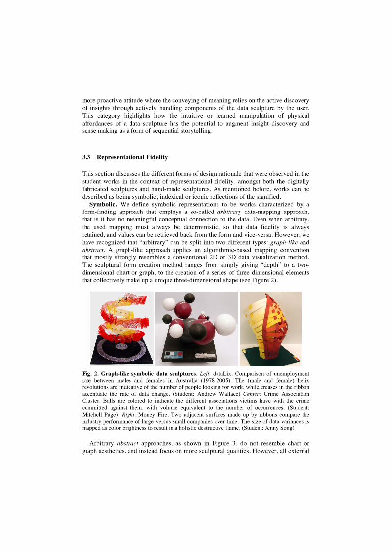
Symbolic. We define symbolic representations to be works characterized by a form-finding approach that employs a so-called arbitrary data-mapping approach, that is it has no meaningful conceptual connection to the data. Even when arbitrary, the used mapping must always be deterministic, so that data fidelity is always retained, and values can be retrieved back from the form and vice-versa. However, we have recognized that “arbitrary” can be split into two different types: graph-like and abstract. A graph-like approach applies an algorithmic-based mapping convention that mostly strongly resembles a conventional 2D or 3D data visualization method. The sculptural form creation method ranges from simply giving “depth” to a two-dimensional chart or graph, to the creation of a series of three-dimensional elements that collectively make up a unique three-dimensional shape (see Figure 2).
Fig. 2. Graph-like symbolic data sculptures. Left: dataLix. Comparison of unemployment rate between males and females in Australia (1978-2005). The (male and female) helix revolutions are indicative of the number of people looking for work, while creases in the ribbon accentuate the rate of data change. (Student: Andrew Wallace) Center: Crime Association Cluster. Balls are colored to indicate the different associations victims have with the crime committed against them, with volume equivalent to the number of occurrences. (Student: Mitchell Page). Right: Money Fire. Two adjacent surfaces made up by ribbons compare the industry performance of large versus small companies over time. The size of data variances is mapped as color brightness to result in a holistic destructive flame. (Student: Jenny Song)
Arbitrary abstract approaches, as shown in Figure 3, do not resemble chart or graph aesthetics, and instead focus on more sculptural qualities. However, all external
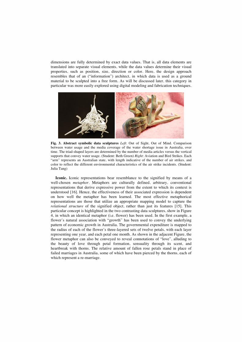
dimensions are fully determined by exact data values. That is, all data elements are translated into separate visual elements, while the data values determine their visual properties, such as position, size, direction or color. Here, the design approach resembles that of an (“information”) architect, in which data is used as a ground material to be sculpted into a free form. As will be discussed later, this category in particular was more easily explored using digital modeling and fabrication techniques.
Fig. 3. Abstract symbolic data sculptures Left: Out of Sight, Out of Mind. Comparison between water usage and the media coverage of the water shortage issue in Australia, over time. The triad-shaped layers are determined by the number of media articles versus the vertical supports that convey water usage. (Student: Beth Green) Right: Aviation and Bird Strikes. Each “arm” represents an Australian state, with length indicative of the number of air strikes, and color to reflect the different environmental characteristics of the air strike incidents. (Student: Julia Tang)
Iconic. Iconic representations bear resemblance to the signified by means of a well-chosen metaphor. Metaphors are culturally defined, arbitrary, conventional representations that derive expressive power from the extent to which its context is understood [16]. Hence, the effectiveness of their associated expression is dependent on how well the metaphor has been learned. The most effective metaphorical representations are those that utilize an appropriate mapping model to capture the relational structure of the signified object, rather than just its features [15]. This particular concept is highlighted in the two contrasting data sculptures, show in Figure 4, in which an identical metaphor (i.e. flower) has been used. In the first example, a flower’s natural association with “growth” has been used to convey the underlying pattern of economic growth in Australia. The governmental expenditure is mapped to the radius of each of the flower’s three-layered sets of twelve petals, with each layer representing one year, and each petal one month. As shown in the adjacent Figure, the flower metaphor can also be conveyed to reveal connotations of “love”, alluding to the beauty of love through petal formation, sensuality through its scent, and heartbreak with thorns. The relative amount of fallen rose petals stand in place of failed marriages in Australia, some of which have been pierced by the thorns, each of which represent a re-marriage.
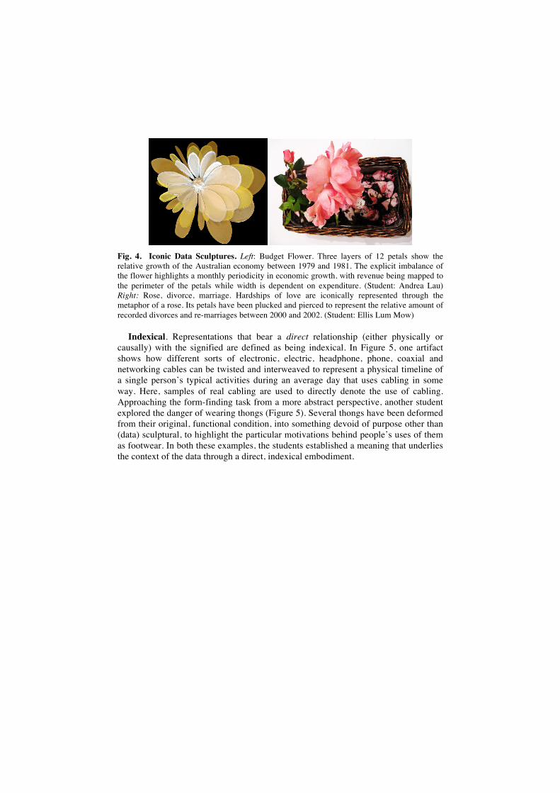
Fig. 4. Iconic Data Sculptures. Left: Budget Flower. Three layers of 12 petals show the relative growth of the Australian economy between 1979 and 1981. The explicit imbalance of the flower highlights a monthly periodicity in economic growth, with revenue being mapped to the perimeter of the petals while width is dependent on expenditure. (Student: Andrea Lau) Right: Rose, divorce, marriage. Hardships of love are iconically represented through the metaphor of a rose. Its petals have been plucked and pierced to represent the relative amount of recorded divorces and re-marriages between 2000 and 2002. (Student: Ellis Lum Mow)
Indexical. Representations that bear a direct relationship (either physically or causally) with the signified are defined as being indexical. In Figure 5, one artifact shows how different sorts of electronic, electric, headphone, phone, coaxial and networking cables can be twisted and interweaved to represent a physical timeline of a single person’s typical activities during an average day that uses cabling in some way. Here, samples of real cabling are used to directly denote the use of cabling. Approaching the form-finding task from a more abstract perspective, another student explored the danger of wearing thongs (Figure 5). Several thongs have been deformed from their original, functional condition, into something devoid of purpose other than (data) sculptural, to highlight the particular motivations behind people’s uses of them as footwear. In both these examples, the students established a meaning that underlies the context of the data through a direct, indexical embodiment.
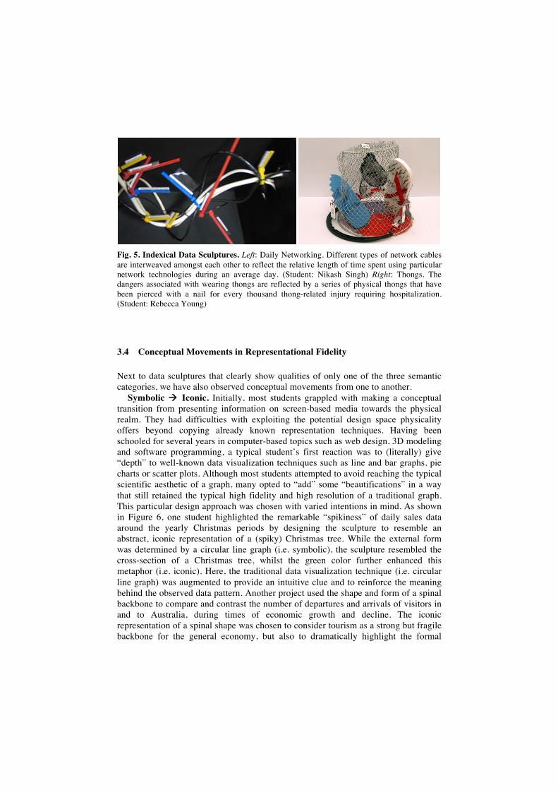
Fig. 5. Indexical Data Sculptures. Left: Daily Networking. Different types of network cables are interweaved amongst each other to reflect the relative length of time spent using particular network technologies during an average day. (Student: Nikash Singh) Right: Thongs. The dangers associated with wearing thongs are reflected by a series of physical thongs that have been pierced with a nail for every thousand thong-related injury requiring hospitalization. (Student: Rebecca Young)
3.4 Conceptual Movements in Representational Fidelity
Next to data sculptures that clearly show qualities of only one of the three semantic categories, we have also observed conceptual movements from one to another.
Symbolic Iconic. Initially, most students grappled with making a conceptual transition from presenting information on screen-based media towards the physical realm. They had difficulties with exploiting the potential design space physicality offers beyond copying already known representation techniques. Having been schooled for several years in computer-based topics such as web design, 3D modeling and software programming, a typical student’s first reaction was to (literally) give “depth” to well-known data visualization techniques such as line and bar graphs, pie charts or scatter plots. Although most students attempted to avoid reaching the typical scientific aesthetic of a graph, many opted to “add” some “beautifications” in a way that still retained the typical high fidelity and high resolution of a traditional graph. This particular design approach was chosen with varied intentions in mind. As shown in Figure 6, one student highlighted the remarkable “spikiness” of daily sales data around the yearly Christmas periods by designing the sculpture to resemble an abstract, iconic representation of a (spiky) Christmas tree. While the external form was determined by a circular line graph (i.e. symbolic), the sculpture resembled the cross-section of a Christmas tree, whilst the green color further enhanced this metaphor (i.e. iconic). Here, the traditional data visualization technique (i.e. circular line graph) was augmented to provide an intuitive clue and to reinforce the meaning behind the observed data pattern. Another project used the shape and form of a spinal backbone to compare and contrast the number of departures and arrivals of visitors in and to Australia, during times of economic growth and decline. The iconic representation of a spinal shape was chosen to consider tourism as a strong but fragile backbone for the general economy, but also to dramatically highlight the formal
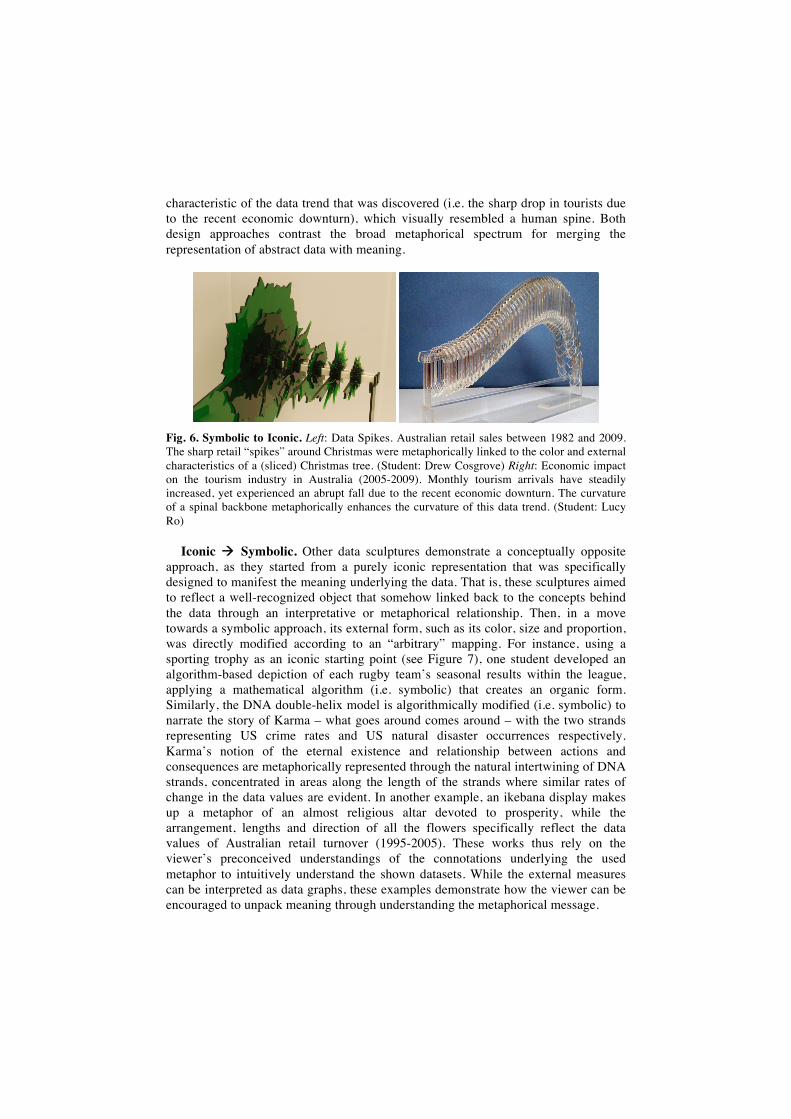
characteristic of the data trend that was discovered (i.e. the sharp drop in tourists due to the recent economic downturn), which visually resembled a human spine. Both design approaches contrast the broad metaphorical spectrum for merging the representation of abstract data with meaning.
Fig. 6. Symbolic to Iconic. Left: Data Spikes. Australian retail sales between 1982 and 2009. The sharp retail “spikes” around Christmas were metaphorically linked to the color and external characteristics of a (sliced) Christmas tree. (Student: Drew Cosgrove) Right: Economic impact on the tourism industry in Australia (2005-2009). Monthly tourism arrivals have steadily increased, yet experienced an abrupt fall due to the recent economic downturn. The curvature of a spinal backbone metaphorically enhances the curvature of this data trend. (Student: Lucy Ro)
Iconic Symbolic. Other data sculptures demonstrate a conceptually opposite approach, as they started from a purely iconic representation that was specifically designed to manifest the meaning underlying the data. That is, these sculptures aimed to reflect a well-recognized object that somehow linked back to the concepts behind the data through an interpretative or metaphorical relationship. Then, in a move towards a symbolic approach, its external form, such as its color, size and proportion, was directly modified according to an “arbitrary” mapping. For instance, using a sporting trophy as an iconic starting point (see Figure 7), one student developed an algorithm-based depiction of each rugby team’s seasonal results within the league, applying a mathematical algorithm (i.e. symbolic) that creates an organic form. Similarly, the DNA double-helix model is algorithmically modified (i.e. symbolic) to narrate the story of Karma – what goes around comes around – with the two strands representing US crime rates and US natural disaster occurrences respectively. Karma’s notion of the eternal existence and relationship between actions and consequences are metaphorically represented through the natural intertwining of DNA strands, concentrated in areas along the length of the strands where similar rates of change in the data values are evident. In another example, an ikebana display makes up a metaphor of an almost religious altar devoted to prosperity, while the arrangement, lengths and direction of all the flowers specifically reflect the data values of Australian retail turnover (1995-2005). These works thus rely on the viewer’s preconceived understandings of the connotations underlying the used metaphor to intuitively understand the shown datasets. While the external measures can be interpreted as data graphs, these examples demonstrate how the viewer can be encouraged to unpack meaning through understanding the metaphorical message.
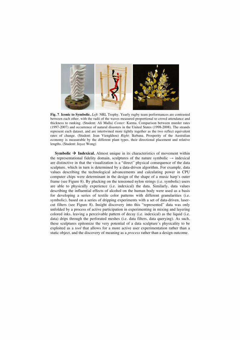
Fig. 7. Iconic to Symbolic. Left: NRL Trophy. Yearly rugby team performances are contrasted between each other, with the radii of the waves measured proportional to crowd attendance and thickness to ranking. (Student: Ali Malla) Center: Karma. Comparison between murder rates (1997-2007) and occurrence of natural disasters in the United States (1998-2008). The strands represent each dataset, and are intertwined more tightly together as the two reflect equivalent rates of change. (Student: Jean Viengkhou) Right: Ikebana. Prosperity of the Australian economy is measurable by the different plant types, their directional placement and relative lengths. (Student: Joyce Wong)
Symbolic Indexical. Almost unique in its characteristics of movement within the representational fidelity domain, sculptures of the nature symbolic indexical are distinctive in that the visualization is a “direct” physical consequence of the data sculpture, which in turn is determined by a data-driven algorithm. For example, data values describing the technological advancements and calculating power in CPU computer chips were determinant in the design of the shape of a music harp’s outer frame (see Figure 8). By plucking on the tensioned nylon strings (i.e. symbolic) users are able to physically experience (i.e. indexical) the data. Similarly, data values describing the influential effects of alcohol on the human body were used as a basis for developing a series of textile color patterns with different granularities (i.e. symbolic), based on a series of dripping experiments with a set of data-driven, laser-cut filters (see Figure 8). Insight discovery into this “represented” data was only unfolded by a process of active participation in experimenting in mixing and layering colored inks, leaving a perceivable pattern of decay (i.e. indexical) as the liquid (i.e. data) drips through the perforated meshes (i.e. data filters, data querying). As such, these sculptures epitomize the very potential of a data sculpture’s physicality to be exploited as a tool that allows for a more active user experimentation rather than a static object, and the discovery of meaning as a process rather than a design outcome.
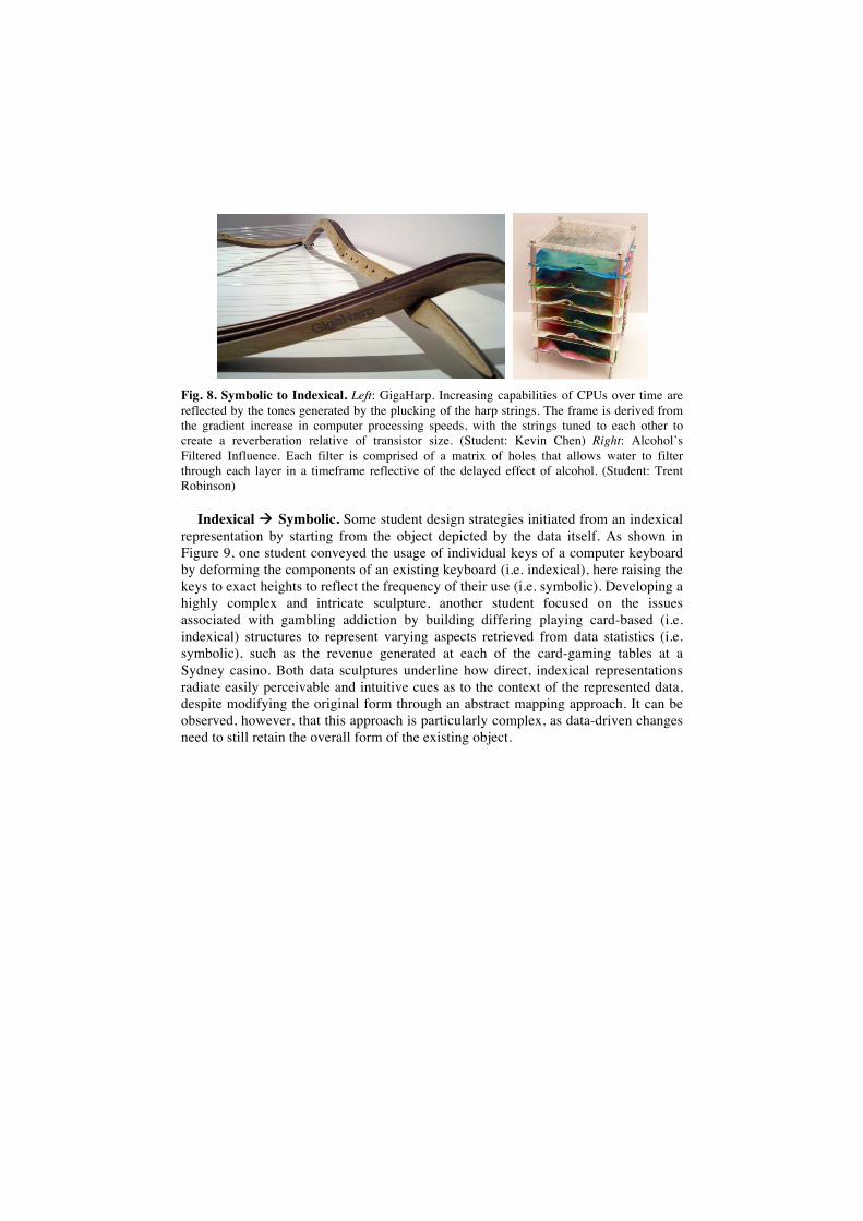
Fig. 8. Symbolic to Indexical. Left: GigaHarp. Increasing capabilities of CPUs over time are reflected by the tones generated by the plucking of the harp strings. The frame is derived from the gradient increase in computer processing speeds, with the strings tuned to each other to create a reverberation relative of transistor size. (Student: Kevin Chen) Right: Alcohol’s Filtered Influence. Each filter is comprised of a matrix of holes that allows water to filter through each layer in a timeframe reflective of the delayed effect of alcohol. (Student: Trent Robinson)
Indexical Symbolic. Some student design strategies initiated from an indexical representation by starting from the object depicted by the data itself. As shown in Figure 9, one student conveyed the usage of individual keys of a computer keyboard by deforming the components of an existing keyboard (i.e. indexical), here raising the keys to exact heights to reflect the frequency of their use (i.e. symbolic). Developing a highly complex and intricate sculpture, another student focused on the issues associated with gambling addiction by building differing playing card-based (i.e. indexical) structures to represent varying aspects retrieved from data statistics (i.e. symbolic), such as the revenue generated at each of the card-gaming tables at a Sydney casino. Both data sculptures underline how direct, indexical representations radiate easily perceivable and intuitive cues as to the context of the represented data, despite modifying the original form through an abstract mapping approach. It can be observed, however, that this approach is particularly complex, as data-driven changes need to still retain the overall form of the existing object.
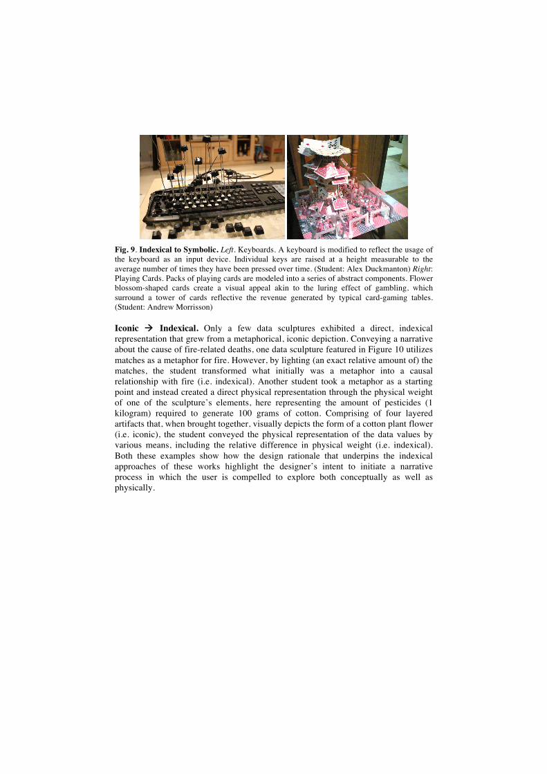
Fig. 9. Indexical to Symbolic. Left. Keyboards. A keyboard is modified to reflect the usage of the keyboard as an input device. Individual keys are raised at a height measurable to the average number of times they have been pressed over time. (Student: Alex Duckmanton) Right: Playing Cards. Packs of playing cards are modeled into a series of abstract components. Flower blossom-shaped cards create a visual appeal akin to the luring effect of gambling, which surround a tower of cards reflective the revenue generated by typical card-gaming tables. (Student: Andrew Morrisson)
Iconic Indexical. Only a few data sculptures exhibited a direct, indexical representation that grew from a metaphorical, iconic depiction. Conveying a narrative about the cause of fire-related deaths, one data sculpture featured in Figure 10 utilizes matches as a metaphor for fire. However, by lighting (an exact relative amount of) the matches, the student transformed what initially was a metaphor into a causal relationship with fire (i.e. indexical). Another student took a metaphor as a starting point and instead created a direct physical representation through the physical weight of one of the sculpture’s elements, here representing the amount of pesticides (1 kilogram) required to generate 100 grams of cotton. Comprising of four layered artifacts that, when brought together, visually depicts the form of a cotton plant flower (i.e. iconic), the student conveyed the physical representation of the data values by various means, including the relative difference in physical weight (i.e. indexical). Both these examples show how the design rationale that underpins the indexical approaches of these works highlight the designer’s intent to initiate a narrative process in which the user is compelled to explore both conceptually as well as physically.
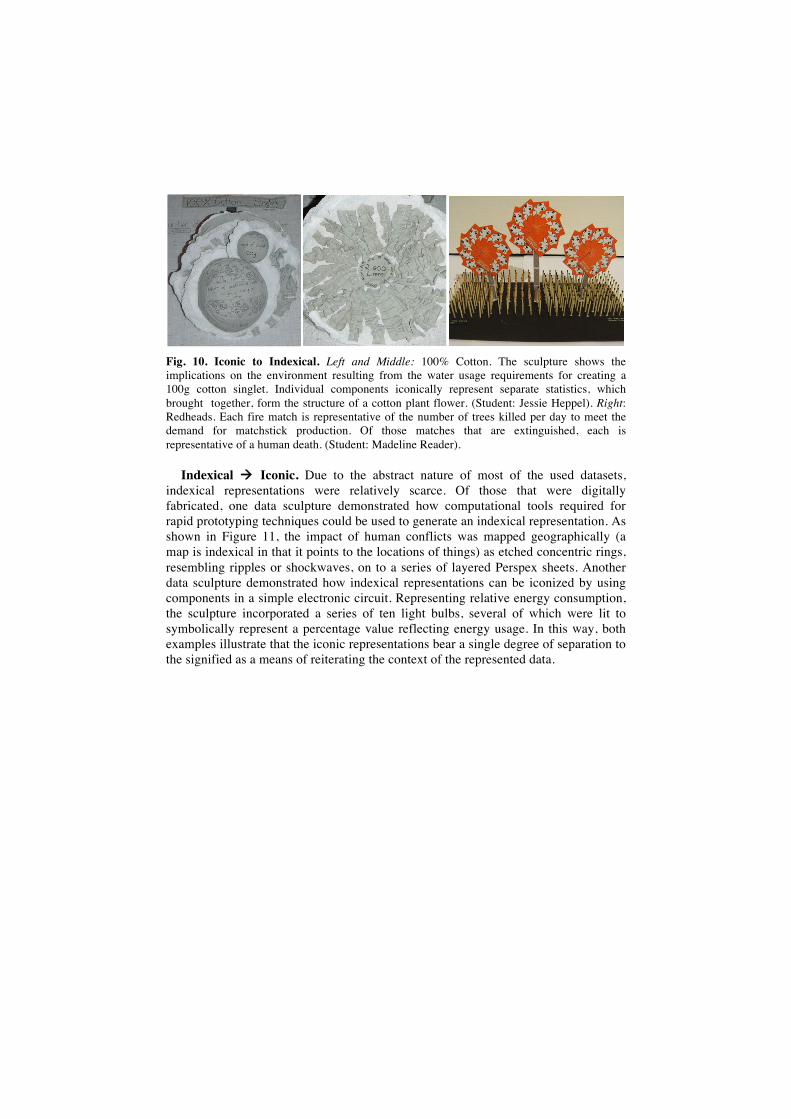
Fig. 10. Iconic to Indexical. Left and Middle: 100% Cotton. The sculpture shows the implications on the environment resulting from the water usage requirements for creating a 100g cotton singlet. Individual components iconically represent separate statistics, which brought together, form the structure of a cotton plant flower. (Student: Jessie Heppel). Right: Redheads. Each fire match is representative of the number of trees killed per day to meet the demand for matchstick production. Of those matches that are extinguished, each is representative of a human death. (Student: Madeline Reader).
Indexical Iconic. Due to the abstract nature of most of the used datasets, indexical representations were relatively scarce. Of those that were digitally fabricated, one data sculpture demonstrated how computational tools required for rapid prototyping techniques could be used to generate an indexical representation. As shown in Figure 11, the impact of human conflicts was mapped geographically (a map is indexical in that it points to the locations of things) as etched concentric rings, resembling ripples or shockwaves, on to a series of layered Perspex sheets. Another data sculpture demonstrated how indexical representations can be iconized by using components in a simple electronic circuit. Representing relative energy consumption, the sculpture incorporated a series of ten light bulbs, several of which were lit to symbolically represent a percentage value reflecting energy usage. In this way, both examples illustrate that the iconic representations bear a single degree of separation to the signified as a means of reiterating the context of the represented data.
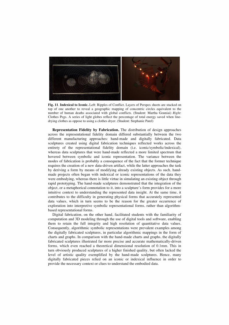
Fig. 11. Indexical to Iconic. Left: Ripples of Conflict. Layers of Perspex sheets are stacked on top of one another to reveal a geographic mapping of concentric circles equivalent to the number of human deaths associated with global conflicts. (Student: Martha Gouniai) Right: Clothes Pegs. A series of light globes reflect the percentage of total energy saved when line-drying clothes as oppose to using a clothes dryer. (Student: Stephanie Patel)
Representation Fidelity by Fabrication. The distribution of design approaches across the representational fidelity domain differed substantially between the two different manufacturing approaches: hand-made and digitally fabricated. Data sculptures created using digital fabrication techniques reflected works across the entirety of the representational fidelity domain (i.e. iconic/symbolic/indexical), whereas data sculptures that were hand-made reflected a more limited spectrum that hovered between symbolic and iconic representation. The variance between the modes of fabrication is probably a consequence of the fact that the former technique requires the creation of a new data-driven artifact, while the latter approaches the task by deriving a form by means of modifying already existing objects. As such, hand-made projects often began with indexical or iconic representations of the data they were embodying, whereas there is little virtue in simulating an existing object through rapid prototyping. The hand-made sculptures demonstrated that the integration of the object, or a metaphorical connotation to it, into a sculpture’s form provides for a more intuitive context to understanding the represented data insight. At the same time, it contributes to the difficulty in generating physical forms that accurately represented data values, which in turn seems to be the reason for the greater occurrence of exploration into interpretive symbolic representational forms, rather than algorithm-based representational forms.
Digital fabrication, on the other hand, facilitated students with the familiarity of computation and 3D modeling through the use of digital tools and software, enabling them to retain the full integrity and high resolution of quantitative data values. Consequently, algorithmic symbolic representations were prevalent examples among the digitally fabricated sculptures, in particular algorithmic mappings in the form of charts and graphs. In comparison with the hand-made charts and graphs, the digitally fabricated sculptures illustrated far more precise and accurate mathematically-driven forms, which even reached a theoretical dimensional resolution of 0.1mm. This in turn obviously produced sculptures of a higher finished quality, but often lacked the level of artistic quality exemplified by the hand-made sculptures. Hence, many digitally fabricated pieces relied on an iconic or indexical influence in order to provide the necessary context or clues to understand the embodied data.
The capability for producing higher resolution sculptures could also be the reason behind the greater range of interactive pieces amongst the digitally fabricated sculptures. A higher resolution provides for a greater control for sculpting physical form, allowing concepts like puzzles and interlocking modules as a tool for narrative discovery and open exploration. In turn, very few hand-made sculptures displayed both intricate and accurate data value representations through the narrative formulation.
3.4 Narrative Formulation Fidelity Among Student Works
Some of the data sculptures aimed to facilitate the discovery of information through the inclusion of affordance properties and interactive features that unfold the narrative of the underlying data as a process, rather than an outcome. Students approached developing an integrated narrative formulation from differing perspectives, with some sculptures conveying insights largely through physical properties and affordances of the sculpture’s form, while others relied solely on the use of interactive features.
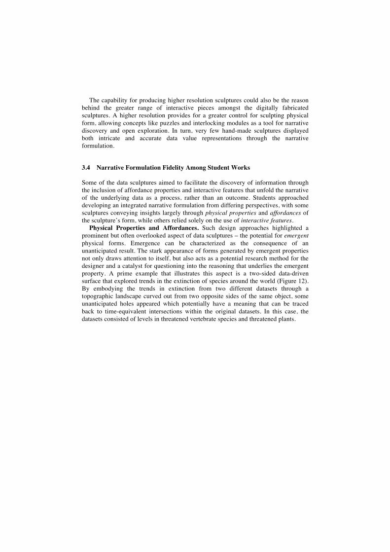
Physical Properties and Affordances. Such design approaches highlighted a prominent but often overlooked aspect of data sculptures – the potential for emergent physical forms. Emergence can be characterized as the consequence of an unanticipated result. The stark appearance of forms generated by emergent properties not only draws attention to itself, but also acts as a potential research method for the designer and a catalyst for questioning into the reasoning that underlies the emergent property. A prime example that illustrates this aspect is a two-sided data-driven surface that explored trends in the extinction of species around the world (Figure 12). By embodying the trends in extinction from two different datasets through a topographic landscape curved out from two opposite sides of the same object, some unanticipated holes appeared which potentially have a meaning that can be traced back to time-equivalent intersections within the original datasets. In this case, the datasets consisted of levels in threatened vertebrate species and threatened plants.
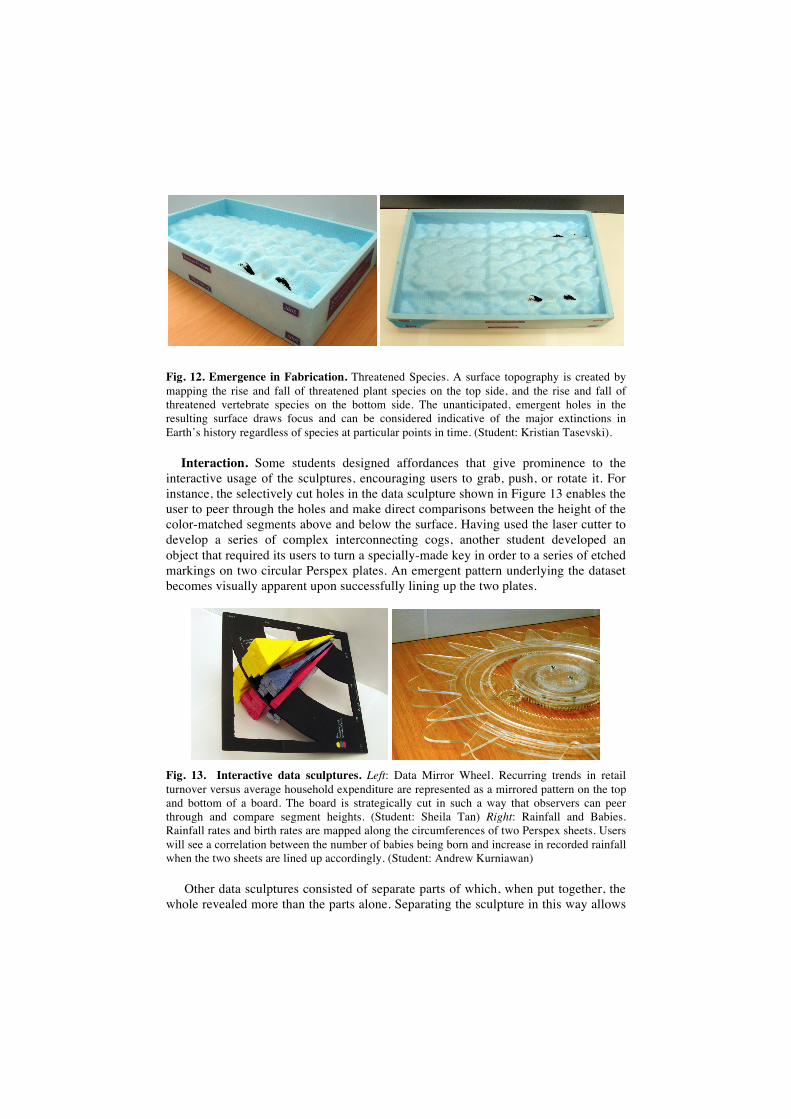
Fig. 12. Emergence in Fabrication. Threatened Species. A surface topography is created by mapping the rise and fall of threatened plant species on the top side, and the rise and fall of threatened vertebrate species on the bottom side. The unanticipated, emergent holes in the resulting surface draws focus and can be considered indicative of the major extinctions in Earth’s history regardless of species at particular points in time. (Student: Kristian Tasevski).
Interaction. Some students designed affordances that give prominence to the interactive usage of the sculptures, encouraging users to grab, push, or rotate it. For instance, the selectively cut holes in the data sculpture shown in Figure 13 enables the user to peer through the holes and make direct comparisons between the height of the color-matched segments above and below the surface. Having used the laser cutter to develop a series of complex interconnecting cogs, another student developed an object that required its users to turn a specially-made key in order to a series of etched markings on two circular Perspex plates. An emergent pattern underlying the dataset becomes visually apparent upon successfully lining up the two plates.
Fig. 13. Interactive data sculptures. Left: Data Mirror Wheel. Recurring trends in retail turnover versus average household expenditure are represented as a mirrored pattern on the top and bottom of a board. The board is strategically cut in such a way that observers can peer through and compare segment heights. (Student: Sheila Tan) Right: Rainfall and Babies. Rainfall rates and birth rates are mapped along the circumferences of two Perspex sheets. Users will see a correlation between the number of babies being born and increase in recorded rainfall when the two sheets are lined up accordingly. (Student: Andrew Kurniawan)
Other data sculptures consisted of separate parts of which, when put together, the whole revealed more than the parts alone. Separating the sculpture in this way allows
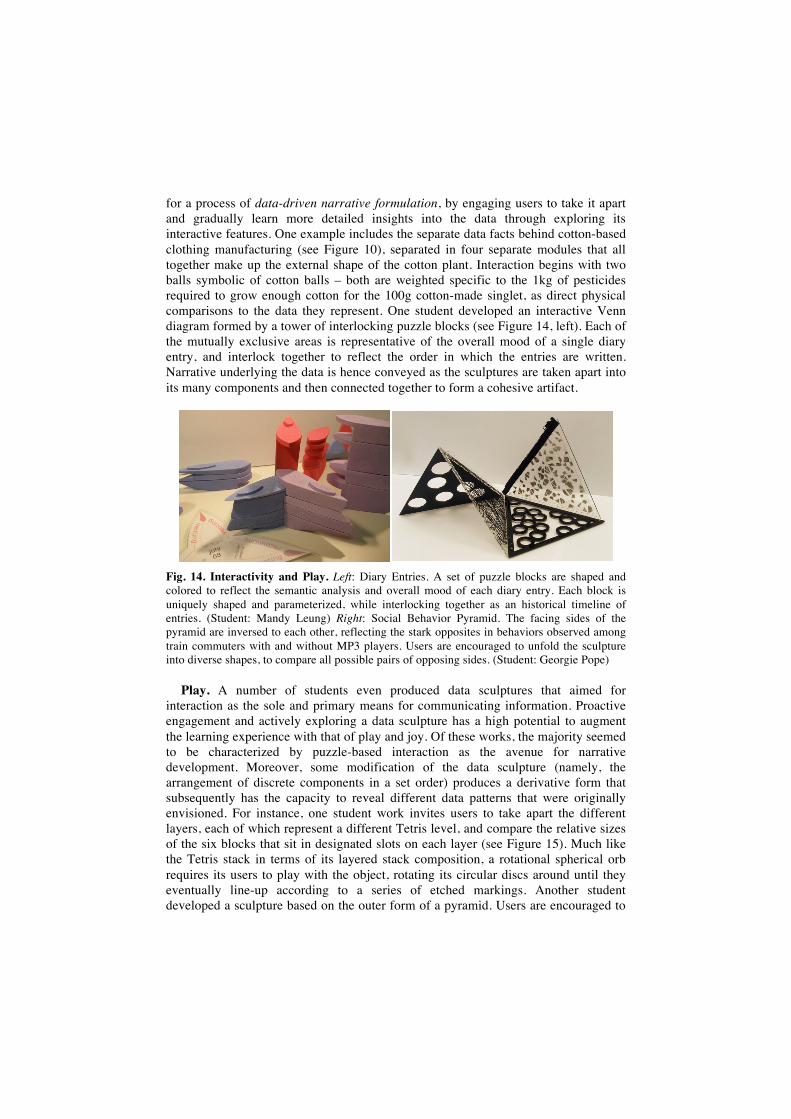
for a process of data-driven narrative formulation, by engaging users to take it apart and gradually learn more detailed insights into the data through exploring its interactive features. One example includes the separate data facts behind cotton-based clothing manufacturing (see Figure 10), separated in four separate modules that all together make up the external shape of the cotton plant. Interaction begins with two balls symbolic of cotton balls – both are weighted specific to the 1kg of pesticides required to grow enough cotton for the 100g cotton-made singlet, as direct physical comparisons to the data they represent. One student developed an interactive Venn diagram formed by a tower of interlocking puzzle blocks (see Figure 14, left). Each of the mutually exclusive areas is representative of the overall mood of a single diary entry, and interlock together to reflect the order in which the entries are written. Narrative underlying the data is hence conveyed as the sculptures are taken apart into its many components and then connected together to form a cohesive artifact.
Fig. 14. Interactivity and Play. Left: Diary Entries. A set of puzzle blocks are shaped and colored to reflect the semantic analysis and overall mood of each diary entry. Each block is uniquely shaped and parameterized, while interlocking together as an historical timeline of entries. (Student: Mandy Leung) Right: Social Behavior Pyramid. The facing sides of the pyramid are inversed to each other, reflecting the stark opposites in behaviors observed among train commuters with and without MP3 players. Users are encouraged to unfold the sculpture into diverse shapes, to compare all possible pairs of opposing sides. (Student: Georgie Pope)
Play. A number of students even produced data sculptures that aimed for interaction as the sole and primary means for communicating information. Proactive engagement and actively exploring a data sculpture has a high potential to augment the learning experience with that of play and joy. Of these works, the majority seemed to be characterized by puzzle-based interaction as the avenue for narrative development. Moreover, some modification of the data sculpture (namely, the arrangement of discrete components in a set order) produces a derivative form that subsequently has the capacity to reveal different data patterns that were originally envisioned. For instance, one student work invites users to take apart the different layers, each of which represent a different Tetris level, and compare the relative sizes of the six blocks that sit in designated slots on each layer (see Figure 15). Much like the Tetris stack in terms of its layered stack composition, a rotational spherical orb requires its users to play with the object, rotating its circular discs around until they eventually line-up according to a series of etched markings. Another student developed a sculpture based on the outer form of a pyramid. Users are encouraged to
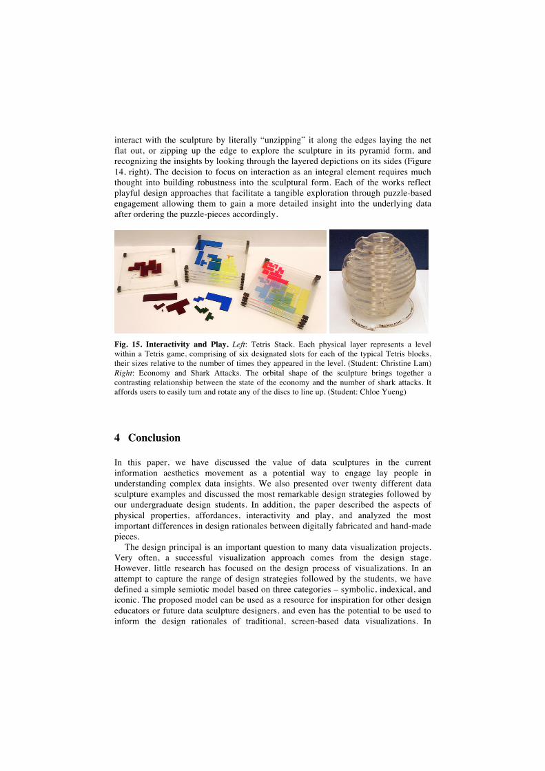
interact with the sculpture by literally “unzipping” it along the edges laying the net flat out, or zipping up the edge to explore the sculpture in its pyramid form, and recognizing the insights by looking through the layered depictions on its sides (Figure 14, right). The decision to focus on interaction as an integral element requires much thought into building robustness into the sculptural form. Each of the works reflect playful design approaches that facilitate a tangible exploration through puzzle-based engagement allowing them to gain a more detailed insight into the underlying data after ordering the puzzle-pieces accordingly.
Fig. 15. Interactivity and Play. Left: Tetris Stack. Each physical layer represents a level within a Tetris game, comprising of six designated slots for each of the typical Tetris blocks, their sizes relative to the number of times they appeared in the level. (Student: Christine Lam) Right: Economy and Shark Attacks. The orbital shape of the sculpture brings together a contrasting relationship between the state of the economy and the number of shark attacks. It affords users to easily turn and rotate any of the discs to line up. (Student: Chloe Yueng)
4 Conclusion
In this paper, we have discussed the value of data sculptures in the current information aesthetics movement as a potential way to engage lay people in understanding complex data insights. We also presented over twenty different data sculpture examples and discussed the most remarkable design strategies followed by our undergraduate design students. In addition, the paper described the aspects of physical properties, affordances, interactivity and play, and analyzed the most important differences in design rationales between digitally fabricated and hand-made pieces.
The design principal is an important question to many data visualization projects. Very often, a successful visualization approach comes from the design stage. However, little research has focused on the design process of visualizations. In an attempt to capture the range of design strategies followed by the students, we have defined a simple semiotic model based on three categories – symbolic, indexical, and iconic. The proposed model can be used as a resource for inspiration for other design educators or future data sculpture designers, and even has the potential to be used to inform the design rationales of traditional, screen-based data visualizations. In
particular, the model could be used to refine teaching strategies, or recognize the qualitative differences between the fields of data visualization, information aesthetics and data art. The proposed model thus illustrates the rich metaphorical spectrum of design approaches that might range from mapping data in fully abstract or arbitrary ways, over metaphorical constructions, to more process-driven causal effects. It also illuminates the true qualities of a data sculpture as a potential effective tool through which (data-supported) meaning can be conveyed, for instance in an educational context, advertising campaign, or public exhibition or museum settings. Furthermore, we have shown that the tangible qualities of data sculptures have the potential to facilitate the formulation of narrative, promoting exploration into the represented data by a process of interaction and play. In addition, this particular assignment shows how students can be motivated in the tedious task of exploring, collecting and analyzing obscure and complex datasets, while allowing for creative and lateral thinking. More practical students are allowed on focusing on the sophistication of implementation and fabrication, either by hand-made manufacturing or digital modeling.
We realize that the claim of using a data sculptures as effective information communication media deserves more attention, in particular in proving their usefulness and usability. While interesting and challenging in a creative design education context, it is still an open question whether physical depictions like data sculptures are indeed effective or efficient in conveying information in a more enjoyable or memorable way than traditional screen-based media. Developing and executing appropriate evaluation studies that respect the unique qualities of physicality should therefore be the focus of future research.
Acknowledgements
We would like to thank all the students, tutors and teaching assistants who took part in the past infostudio courses, and in particular Justin Clayden, Sucharita Patra, Nick Cawthon, Monika Hoinkis, Andrea Lau, Martin Tomitsch and Gabriele Ulacco.
References
1. Bertelsen, O. W., Pold, S.: Criticism as an Approach to Interface Aesthetics. In: Nordic conference on Human-Computer Interaction, Tampere, Finland, pp. 23-32. ACM (2004)
2. Judelman, G.: Aesthetics and Inspiration for Visualization Design: Bridging the Gap between Art and Science. In: International Conference on Information Visualisation (IV'04), pp. 245-250. IEEE (2004)
3. Vande Moere, A.: Form follows Data: the Symbiosis between Design and Information Visualization. In: International Conference on Computer-Aided Architectural Design (CAADfutures'05), pp. 31-40. Vienna, Austria, OKK Verlag (2005).
4. Sack, W.: Aesthetics of Information Visualization. In: Context Providers. C. Paul, V. Vesna and M. Lovejoy (eds.). Boston, MIT Press (2006)
5. Pousman, Z., Stasko, J., Mateas, M.: Casual Information Visualization: Depictions of Data in Everyday Life. In: IEEE Transactions on Visualization and Computer Graphics 13(6): 1145-1152. IEEE Press (2007)
6. Viegas, F. B., Wattenberg M.: Artistic Data Visualization: Beyond Visual Analytic. In: Lecture Notes in Computer Science 4564(15): 182-191. (2007)
7. Lau, A., Vande Moere A.: Towards a Model of Information Aesthetic Visualization. In: International Conference on Information Visualisation (IV'07), Zurich, Switzerland, pp.87-92. IEEE (2007)
8. Vesna, V.: Database Aesthetics - Art in the Age of Information Overflow, University of Minnesota (2007).
9. Zhao, J., Vande Moere A.: Embodiment in Data Sculpture: A Model of the Physical Visualization of Information. In: Conference on Digital Interactive Media in Entertainment and Arts (DIMEA'08), Athens, Greece, pp. 343-350. ACM (2008)
10. Mautner, B.: Population One - One Person is One Pixel, URL, http://www.royalsapien.com/pop1/ (2006)
11. Cafe, S.: Stan's Cafe, Of All the People in All the World, URL, http://www.stanscafe.co.uk/ofallthepeople/ (2008)
12. Wisneski, C., Ishii, H., Dahley A., Gorbet, M., Brave, S., Ullmer B., Yarin, P.: Ambient Displays: Turning Architectural Space into an Interface between People and Digital Information. In: International Workshop on Cooperative Buildings (CoBuild '98), pp. 22-32. Springer (1998)
13. Vande Moere, A.: infostudio: Teaching Ambient Display Design using Home Automation. In: Conference of the Australian Computer-Human Interaction (OZCHI'05), Canberra, ACM (2005)
14. Ogden, C. K., Richards, I. A.: The Meaning of Meaning." 8th Ed. New York, Harcourt, Brace & World, Inc. (1923)
15. Johnson-Laird, P. N.: Analogy and the exercise of Creativity. In: Vosniadou, S and Ortony, A. (eds.) Similarity and Analogical Reasoning, pp 313—331. Cambridge University Press, New York (1989)
16. Ware, C.: Information Visualization: Perception for Design. Morgan Kaufmann, San Francisco (2000)