developing storefront classic widgets for oracle commerce
TRANSCRIPT

Developing Storefront Classic Widgets forOracle Commerce
F41711-02July 2021
Developing Storefront Classic Widgets for Oracle Commerce,
F41711-02
Copyright © 1997, 2021, Oracle and/or its affiliates.
This software and related documentation are provided under a license agreement containing restrictions onuse and disclosure and are protected by intellectual property laws. Except as expressly permitted in yourlicense agreement or allowed by law, you may not use, copy, reproduce, translate, broadcast, modify, license,transmit, distribute, exhibit, perform, publish, or display any part, in any form, or by any means. Reverseengineering, disassembly, or decompilation of this software, unless required by law for interoperability, isprohibited.
The information contained herein is subject to change without notice and is not warranted to be error-free. Ifyou find any errors, please report them to us in writing.
If this is software or related documentation that is delivered to the U.S. Government or anyone licensing it onbehalf of the U.S. Government, then the following notice is applicable:
U.S. GOVERNMENT END USERS: Oracle programs (including any operating system, integrated software,any programs embedded, installed or activated on delivered hardware, and modifications of such programs)and Oracle computer documentation or other Oracle data delivered to or accessed by U.S. Government endusers are "commercial computer software" or "commercial computer software documentation" pursuant to theapplicable Federal Acquisition Regulation and agency-specific supplemental regulations. As such, the use,reproduction, duplication, release, display, disclosure, modification, preparation of derivative works, and/oradaptation of i) Oracle programs (including any operating system, integrated software, any programsembedded, installed or activated on delivered hardware, and modifications of such programs), ii) Oraclecomputer documentation and/or iii) other Oracle data, is subject to the rights and limitations specified in thelicense contained in the applicable contract. The terms governing the U.S. Government’s use of Oracle cloudservices are defined by the applicable contract for such services. No other rights are granted to the U.S.Government.
This software or hardware is developed for general use in a variety of information management applications.It is not developed or intended for use in any inherently dangerous applications, including applications thatmay create a risk of personal injury. If you use this software or hardware in dangerous applications, then youshall be responsible to take all appropriate fail-safe, backup, redundancy, and other measures to ensure itssafe use. Oracle Corporation and its affiliates disclaim any liability for any damages caused by use of thissoftware or hardware in dangerous applications.
Oracle and Java are registered trademarks of Oracle and/or its affiliates. Other names may be trademarks oftheir respective owners.
Intel and Intel Inside are trademarks or registered trademarks of Intel Corporation. All SPARC trademarks areused under license and are trademarks or registered trademarks of SPARC International, Inc. AMD, Epyc,and the AMD logo are trademarks or registered trademarks of Advanced Micro Devices. UNIX is a registeredtrademark of The Open Group.
This software or hardware and documentation may provide access to or information about content, products,and services from third parties. Oracle Corporation and its affiliates are not responsible for and expresslydisclaim all warranties of any kind with respect to third-party content, products, and services unless otherwiseset forth in an applicable agreement between you and Oracle. Oracle Corporation and its affiliates will not beresponsible for any loss, costs, or damages incurred due to your access to or use of third-party content,products, or services, except as set forth in an applicable agreement between you and Oracle.

Contents
1 About This Guide
2 Create an Extension
Understand extensions 2-1
Create an extension ID 2-2
Create the extension structure 2-2
Create and load the extension bundle 2-3
3 Create a Widget
Understand widgets 3-1
Download widget source code 3-1
Create the widget structure 3-1
Define widget meta-data in widget.json 3-2
Acceptable values for the imports property 3-4
Create the widget template file 3-6
Create custom widget JavaScript 3-7
Configure a widget’s style 3-10
Localize a widget 3-11
Bundle images or other assets within widget 3-13
Use ccLink binding for quicker page loading 3-14
Understand widget versioning 3-15
Add customizable widget settings 3-16
Assign a global widget to multiple sites 3-20
4 Fragment a Widget into Elements
Understand elements 4-1
Create the element directory structure 4-2
Define element meta-data in an element.json file 4-3
Create the presentation for an element 4-4
iii
Create custom element JavaScript 4-5
5 Use Stacks for Increased Widget Layout Control
Understand stacks 5-1
Create the stack structure 5-2
Define stack meta-data in stack.json 5-2
Create the stack template 5-4
Configure a stack’s style 5-6
Create a quick view popup using a popup stack 5-7
6 Add Site Settings
Define site settings 6-1
Reference site settings in widget templates 6-4
7 Include Application-level JavaScript Modules
Create the extension structure for application-level JavaScript 7-1
Run custom logic upon module instantiation 7-1
Reference an application-level module in a widget 7-2
Application-level JavaScript examples 7-2
Assign an application-level JavaScript module to multiple sites 7-4
8 Filter REST Responses
Out-of-the-box response filters 8-1
Pass a response filter key in a REST call made from a widget 8-1
Programmatically determine the correct response filter key 8-2
Change response filters used by out-of-the-box widgets 8-7
Filter REST calls made from within a view model 8-9
9 Resize Images
Default image sizes 9-1
Resize images using the ccResizeImage binding 9-1
Understand the image resizing REST APIs 9-6
Manage image caching 9-8
iv

10
Manage Storefront Event Notification
Understand the PubSub library 10-1
Include the pubsub dependency 10-1
Subscribe to a topic 10-1
Publish messages 10-2
Create new topics 10-3
PubSub topics 10-3
Listen for messages from a particular object instance 10-21
Index
v

1About This Guide
This guide is intended for developers who want to use the Storefront Classic framework tocreate widgets for Oracle Commerce storefronts.
It describes how to customize extensions, widgets, elements, and other site settings, andprovides guidance on topics such as directory and file structure, configuration file syntax, andlocalization techniques.
For information about developing widgets for specific features, such as for integrating with anexternal pricing system or a web checkout system, see Extending Oracle Commerce. Forinformation about using the Open Storefront Framework to create widgets and otherstorefront components, see Developing Open Storefront Framework Applications for OracleCommerce.
1-1
2Create an Extension
An extension encapsulates entities and assets that can enhance your Commerceimplementation with additional, custom functionality.
This section describes how to create and upload extensions.
Understand extensionsExtensions are pieces of code that you can configure to extend your environment.
Extensions can contain one or more of the following:
• WidgetsA widget provides a unit of UI functionality that can be deployed on one or more pages ofyour web store. Widgets are able to display content to visitors or execute specificfunctions. They provide custom HTML and/or JavaScript code and, optionally, severalother types of auxiliary data for styling, localization, and component re-use.
• ElementsTo provide more control over its constituent parts, widgets can be broken up intoelements. Each element represents one part of the overall structure of the widget andthey can be configured as drag-and-drop sub-components, allowing for finer control overtheir location in a page layout. For example, the Header widget contains the followingelements: Cart Link, Language, Links, Login/registration, Logo, Rich Text and Search. Anelement can be defined as part of a specific widget or as a stand-alone element that maybe used by multiple widgets.
• StacksPage layouts are made up of regions, into which widgets are placed. All widgets placedwithin a region take up the full widget of the region and are rendered vertically within theregion, one after the other. Stacks allow you exercise further control over the placementof widgets within a given region, making it possible to create a stepped progressionthrough the widgets contained in the region.
• Payment GatewaysCommerce provides support for a number of payment gateways as built-in integrations.In addition, you can use extensions to create custom integrations with other paymentgateways. The integrations you create appear as options on the Payment Gateways tabof the Payment Processing page in the administrative console. See Configure PaymentProcessing for more information.
• Site SettingsSite settings allow you to define a set of global configuration parameters. Theseparameters are made available to page layout designers in the administration interfaceand all widgets have access to their settings. Site settings allow you to define a singlesetting that controls a feature across multiple widgets.
• Application-level JavaScript modulesApplication-level JavaScript are loaded as part of the main module, before any endpointshave been fired and before any widgets have been loaded. As such, they can be
2-1

referenced as a dependency in any widget, allowing you to build reusable modulesthat can be shared among widgets and elements.
Create an extension IDYou must create an extension ID that you use when you define its meta-data.
In order to upload an extension into Commerce, you must generate an ID for theextension and then use that ID when you define the extension’s meta-data. To createan extension ID perform the following steps:
1. Log into Commerce.
2. Click the Settings icon.
3. Click Extensions, then click the Developer tab.
4. Click the Generate ID button to generate an extension ID.
You are prompted to name the extension.
5. Enter a name for the extension and click Save.
6. Your extension ID is now generated and must be used in the extension’sext.json file. For further details, refer to the next section, Create the extensionstructure.
Create the extension structureExtensions require a specific structure configuration.
Once you have a new unique ID for your extension, you can start to develop it bycreating the folder structure, as shown in the example below. Make sure yourextension uses a name that is unique within your Commerce environment; forexample, do not give your extension the same name as a default widget.
Note: If you do not include JavaScript, Less styles, or Locales, you can omit thosedirectories.
<extension-name> : The root folder of your extension, must be unique ext.json <additional directories to define widgets, elements, payment gateways, site settings>/
Define extension meta-data in ext.json
Each extension provides meta-data describing the author/developer of the extensionand other information related to its creation. This meta-data is contained in a manifestfile called ext.json. Without the manifest file, the extension cannot be loaded. Theext.json file should include the following:
• extensionID: Unique ID of the extension. Note that this ID must match the valuegenerated on the Extensions page in the administrative console. See Usedeveloper tools to customize your store for more information.
• developerID: The extension author’s unique developer ID.
• createdBy: The name of creator (company or individual).
Chapter 2Create an extension ID
2-2
• version: The version of the extension, expressed as a single whole number.
• timeCreated: When the extension was created. iso-8601 is the recommended format;however, an informal time stamp is also acceptable.
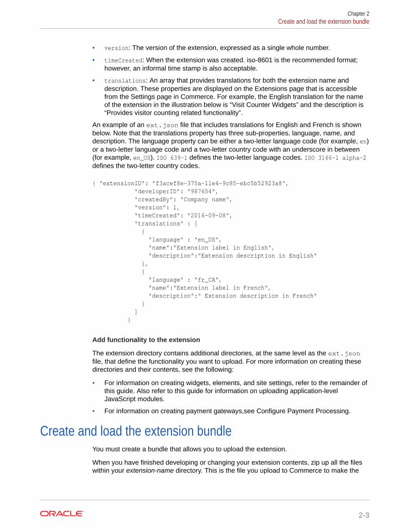
• translations: An array that provides translations for both the extension name anddescription. These properties are displayed on the Extensions page that is accessiblefrom the Settings page in Commerce. For example, the English translation for the nameof the extension in the illustration below is “Visit Counter Widgets” and the description is“Provides visitor counting related functionality”.
An example of an ext.json file that includes translations for English and French is shownbelow. Note that the translations property has three sub-properties, language, name, anddescription. The language property can be either a two-letter language code (for example, en)or a two-letter language code and a two-letter country code with an underscore in between(for example, en_US). ISO 639-1 defines the two-letter language codes. ISO 3166-1 alpha-2defines the two-letter country codes.
{ "extensionID": "f3acef8e-375a-11e4-9c85-ebc5b52923a8", "developerID": "987654", "createdBy": "Company name", "version": 1, "timeCreated": "2016-09-08", "translations" : [ { "language" : "en_US", "name":"Extension label in English", "description":"Extension description in English" }, { "language" : "fr_CA", "name":"Extension label in French", "description":" Extension description in French" } ] }
Add functionality to the extension
The extension directory contains additional directories, at the same level as the ext.jsonfile, that define the functionality you want to upload. For more information on creating thesedirectories and their contents, see the following:
• For information on creating widgets, elements, and site settings, refer to the remainder ofthis guide. Also refer to this guide for information on uploading application-levelJavaScript modules.
• For information on creating payment gateways,see Configure Payment Processing.
Create and load the extension bundleYou must create a bundle that allows you to upload the extension.
When you have finished developing or changing your extension contents, zip up all the fileswithin your extension-name directory. This is the file you upload to Commerce to make the
Chapter 2Create and load the extension bundle
2-3

extension available for use. On a Mac or Linux-based machine, you can do this withthe following command inside the extension-name directory:
zip -r extensionName.zip ./*
After creating the ZIP file, load it using the procedure below.
To load an extension, perform the following steps:
1. Log into Commerce.
2. Click the Settings menu icon.
3. Click Extensions.
4. Click the Upload Extension button and select the extension zip file from yourlocal file system.
The system now starts the upload and validation process. Any problems identifiedduring the validation checks are displayed in a warning message.
Chapter 2Create and load the extension bundle
2-4

3Create a Widget
A widget provides a unit of UI functionality that can be deployed on one or more pages ofyour web store.
This chapter introduces widgets and the files that configure them.
Understand widgetsWidgets are made up of a set of source files and resources.
A number of things provide the widget with its functionality and include the following:
• Templates: Display templates for showing content using knockout.js data bindings.
• JavaScript: View model per widget (optional).
• CSS: Styles for the widget. Can be pure CSS or Less (see http://www.lesscss.org).
• Locale resources: Translation resources per locale for the widget.
• Images: Images used for the widget, referenced via the widget asset mappings.
Widgets also consist of auxiliary files that contain help, configuration, and meta-datadescribing the widget. They include the following:
• Meta-data: The meta-data that describes the widget.
• Elements: Small pieces or fragments of functionality for a widget, including a displaytemplate snippet and a view model.
• Configurable widget settings: A mechanism for providing configurable widget settings thatthe page layout designer can use to customize the widget’s behavior on the Design page,for example, limiting the number of products to display on a Related Products widget.
• Configuration: Default configuration can be delivered with the widget.
Download widget source codeThe following sections provide details on how to create a new widget type from scratch.However, you can also download the source code for an existing widget type and use it as astarting point.
To download widget source code perform the following steps:
1. On the Design page, select a widget from the Widget Templates list.
2. Click the Download Source button and, when prompted, save the widget’s ZIP file.
Create the widget structureWidgets are added to an extension’s structure in a/widget directory that is at the same levelas the extension’s ext.json file.
3-1

When you create a new widget, it is important to ensure that the name is less than 50characters. An error will occur if the name contains more than 50 characters.
Each widget should have its own child directory in the /widget directory. Thefollowing example shows the directories and files that can be included for a widget:
<extension-name> : the root folder of your extension ext.json widget/ <widget-type>/ widget.json templates/ display.template js/ <widget-type>.js less widget.less locales/ <locale code, for example, en or en_US>/ ns.<widget-type>.json <other locale codes>/ ns.<widget-type>.json images/
If your widget does not involve the creation of user interface elements or requirecustom JavaScript, the widget structure can omit a number of directories and filesused for these purposes. The following shows the minimum set of files and directoriesneeded for a widget to pass validation on upload:
<extension-name> ext.json widget/ <widget-type>/ widget.json
Define widget meta-data in widget.jsonMuch like the ext.json file defines meta-data for an extension, a widget.json filedefines meta-data for a widget.
An example of a widget.json file is provided below:
{ "version": 1, "global": false, "javascript": "<widget-type-js>", "i18nresources": "<widget-type>", "availableToAllPages": true, "jsEditable": true, "config": { } "translations" : [ {
Chapter 3Define widget meta-data in widget.json
3-2
"language": "en", "name": "Name in English" }, { "language": "de", "name": "Name in German" } ] }
The following list describes all the properties that you might choose to include in awidget.json file.
• javascript: The name of the widget’s main JavaScript file, to which .js is appended, toload in the storefront. The convention is to use the widget-type as the JavaScript modulename without the .js suffix. This property is required if the widget includes one or moreJavaScript files and should refer to the main JavaScript file for the widget. OtherJavaScript files can be defined as dependencies in the main JavaScript file. See Includemultiple JavaScript files for more details.
• jsEditable: A flag that determines whether it is possible to edit the widget’s JavaScriptcode within the Design page. Defaults to false.
• i18nresources: The namespace name for the resources of this widget, to which ns isprepended and .json is appended. The convention is to use the widget-type for thisproperty, creating a file with a name like ns.widget-type.json. This property is requiredif the widget has resource files. See Localize a widget for more information.
• imports: By default, widgets have access to data and functions contained in the commonview models (user, cart, order and so on). However, in order for a widget to have accessto page-specific view models, those view models must be explicitly defined in theimports property. The possible values that are acceptable for the imports propertydepends on the type of page the widget will be placed on. See Acceptable values for theimports property for detailed information.
• availableToAllPages: Set this property to true to allow the widget to be placed on allpage types; the widget will appear in the Component library for all pages. Omit thisproperty altogether to restrict placement of the widget to the page types defined in thepageTypes property. Also, omit this property for global widgets (see the global propertybelow). Note that this property and the pageTypes property are mutually exclusive but oneof them must be set.
• pageTypes: Defines which page types the widget can be placed on; the widget will appearin the Component library for the specified pages. If you use this property, you must omitthe availableToAllPages property. Note that this property and the availableToAllPagesproperty are mutually exclusive but one of them must be set.Available page types include the following:
– product
– category
– home
– cart
– checkout
– confirmation
Chapter 3Define widget meta-data in widget.json
3-3
– article
– error
– searchResults
– noSearchResults
The widget will appear in the Component library for the page types you specify.
• translations: An array that provides translations for the widget name. This nameis displayed in the Components library panel that you use to add a widget to apage layout. Note that either the translations property or the name property,described below, is required.The translations property has two sub-properties, language and name. Thelanguage property can be either a two-letter language code (for example, en) or atwo-letter language code and a two-letter country code with an underscore inbetween (for example, en_US). ISO 639-1 defines the two-letter language codes.ISO 3166-1 alpha-2 defines the two-letter country codes.
• version: Specifies the version of the widget, used to ensure the right version of awidget is used in the storefront. See Understand widget versioning for moreinformation. Defaults to 1.
• name: If your storefront only uses one language, meaning you do not need multipletranslations for the name of the component, you can choose to use the nameproperty instead of the translations property. Note that one of the two properties isrequired.
• global: Defines the widget as a global widget. A global widget does not include adisplay template. It is automatically added to all pages but, due to the lack oftemplate, it is excluded from template rendering. Global widgets are useful fortasks like logging web analytics or loading JavaScript libraries. Defaults to false.
• minWidth: The minimum width that this widget will fit into it. The system will checkif the widget will fit in the region in Grid View.
• hiddenFromSiteStudio: A Boolean that determines whether the widget’s initialstate is to be hidden or not in the Component library. Set to false by default. See Customize your store layouts for details on showing or hiding widgets in theComponent library.
Acceptable values for the imports propertyWhen defining a widget, one of the properties you may choose to set in thewidget.json file is the imports property.
By default, widgets have access to data and functions contained in the common viewmodels (user, cart, site and so on). However, in order for a widget to have access topage-specific view models, those view models must be explicitly defined in the importsproperty. The possible values that are acceptable for the imports property depends onthe type of page the widget will be placed on. To determine which page-specific viewmodels your widget can have access to, determine the page type the widget will beplaced on and then review the acceptable values for that page type in the followingsections.
Note that some page types have no page-specific view models. These include home,order history, article, error, shopper wish list profile, search results, and no searchresults.
Chapter 3Acceptable values for the imports property
3-4

Category
Acceptable imports values include the following:
• category
• categoryId
• dimensionId
• productTypes
Product
Acceptable imports values include the following:
• product
• productTypes
• productVariantOptions
Cart
Acceptable imports values include the following:
• defaultShippingCountry
• order
• payment
• shippingCountries
• shippingCountriesPriceListGroup
• shippingmethods
Checkout
Acceptable imports values include the following:
• billingCountries
• defaultBillingCountry
• defaultShippingCountry
• order
• payment
• paymentauthorization
• shippingCountries
• shippingCountriesPriceListGroup
• shippingmethods
Confirmation
Acceptable imports values include the following:
• confirmation
Chapter 3Acceptable values for the imports property
3-5
• defaultShippingCountry
• shippingCountries
• shippingCountriesPriceListGroup
Order Details
Acceptable imports values include the following:
• defaultShippingCountry
• orderDetails
• shippingCountries
• shippingCountriesPriceListGroup
Shopper Profile
Acceptable imports values include the following:
• defaultShippingCountry
• shippingCountries
• shippingCountriesPriceListGroup
Wish List
Acceptable imports values include the following:
• space
Create the widget template fileWith the exception of global widgets, all widgets require a template file, calleddisplay.template, in the /widget/<widget-type>/templates directory.
The file takes the following structure:
<extension-name> : the root folder of your extension ext.json widget/ <widget-type>/ widget.json templates/ display.template
The template is rendered within the context of the widget and should be written asstraight HTML with no surrounding script tag. All knockout bindings and behavior areavailable in the HTML template code.
Note: Additional templates are required if you want to fragment your widget intoelements. See Fragment a widget into elements for more details.
The following is an example of the Loyalty Payment widget’s template file:
<!-- ko if: ($data.paymentsContainer().isLoyaltyEnabled() && ((CCRestClient.profileType ==
Chapter 3Create the widget template file
3-6

CCConstants.PROFILE_TYPE_AGENT && $data.user().selectedPriceListGroup().currency && $data.user().selectedPriceListGroup().currency.currencyType == CCConstants.LOYALTY_POINTS_PAYMENT_TYPE) || (CCRestClient.profileType != CCConstants.PROFILE_TYPE_AGENT && $data.cart().currency && $data.cart().currency.currencyType == CCConstants.LOYALTY_POINTS_PAYMENT_TYPE))) --> <div id="loyaltyPayment"> <!-- oc layout: panels --> <div class="oc-panel" data-oc-id="panel-1"> <!-- oc section: select-redeem-points --> <div data-bind="element: 'select-redeem-points'"></div> <!-- /oc --> </div> <!-- /oc --> </div><!-- /ko -->
Create custom widget JavaScriptYou can customize JavaScript to add functionality for your widgets.
To add custom JavaScript to a widget you must create a JavaScript file under theextension-name/widget/widget-type/js directory. The name of the JavaScript filemust match the value of the JavaScript property in the widget.json file, minus the .jsextension. The convention is to use the widget-type as the JavaScript file name, withoutthe .js suffix.
Note: As an easier coding option, there is JavaScript Code Layering feature that lets youextend the JavaScript of an Oracle Commerce provided widget with your own customJavaScript. With the JavaScript Code Layering User Interface feature you can open anadditional user interface that lets you layer custom JavaScript on top of the provided widgetand which then has the benefit of staying on the provided widget. For more details on thisfeature, see Modify Your Storefront Using Code Editing Tools and Use the JavaScript CodeLayering User Interface feature.
Custom JavaScript for a widget assumes that the file will perform some custom logic andreturn an object with extensions to the widget’s view model. The JavaScript file shouldimplement the following format using RequireJS
Note: The module must be defined anonymously, in other words, have no package namedefined in the module, as shown below.
define( // Dependencies ['jquery', 'knockout'], // Module Implementation function($,ko) { // We recommend enabling strict checking mode 'use strict'; // Private variables and functions can be defined here... var SOME_CONSTANT = 1024; var privateMethod = function () { // ...
Chapter 3Create custom widget JavaScript
3-7

}; return { // Widget JS // Some member variables... textInput: ko.observable(), // Some public methods... doSomethingWithInput: function () { //...
} } });
The define statement above can be modified to include widget-specific libraries orother JavaScript files, if required. When a widget is instantiated all properties returnedfrom the JavaScript file specified will be copied into that instance of the widget’s viewmodel. This allows you to define properties, make Web API calls, or handle UI events.
Understand this
Using this in the custom JavaScript is suitable when you refer to the widget itself, butbe careful of any callback methods where this may refer to a different context.
Include multiple JavaScript files
If your widget requires multiple JavaScript files, then any additional JavaScript filescan be loaded through the dependencies in the widget module’s define statement.
To derive the path of the dependency, use the path js/ to reference the widget’sJavaScript folder followed by the path to the dependency but omitting the .js extension.The following example is of widget called myWidget includes the following JavaScriptfiles:
myWidget/ js/ file1.js file2.js file3.js myWidget.js
And myWidget.js is the main JavaScript file for the widget and it is dependent on theother three JavaScript files, then the required dependencies in myWidget.js wouldlook like the following example:
// Dependencies ['js/file1','js/file2','js/file3'],
Chapter 3Create custom widget JavaScript
3-8

Running custom logic upon widget instantiation
If you must run custom logic when a widget is instantiated, then add an onLoad() function tothe widget JavaScript’s return object. The following is an example:
onLoad: function(widget) { //onLoad code here. }
onLoad() will run once the widget has finished loading and is populated with the necessarydata. This is the main access point to configure data for the widget after its properties havebeen loaded and the system is ready to display the widget. As the onLoad() function is onlycalled the first time the widget is instantiated, when returning to the same “page”, the widgetdoes not need to be re-instantiated, so onLoad() is not called again.
Running custom logic each time a widget appears on a page
If you require some logic to run each time the widget appears on the page, add thebeforeAppear() function to the widget JavaScript’s return object. The following is anexample:
beforeAppear: function(page) { // Code to run before showing the widget here. }
beforeAppear() is run once any re-population of mapping data has occurred. This can beuseful when a Web API call is required every time the widget is shown, or, some otherfunctionality required every time the widget is shown.
Specify a function runs when an HTML element is being rendered
onRender is a custom Commerce binding that tells a function to run when an HTML elementis being rendered on the page. The function is called in the current knockout context (typicallybound to the widget, but certain knockout constructs, such as for each, may alter the bindingcontext). For example, when the following div tag is rendered, theaddEventHandlersForAnchorClick function is called:
<div id="CC-customerProfile" data-bind="onRender: addEventHandlersForAnchorClick"> <!-- ... --> </div>
Rely on mapping for a property vs. initializing it via JavaScript
Most of a custom widget’s data will come from the JSON. This data does not need to beexplicitly defined in the widget’s view model; knockout mapping will automatically create it.
For any data that doesn’t come through JSON, the observable should be explicitly defined incustom JavaScript. Otherwise, an error will be thrown if a template tries to render theproperty while it’s undefined. For example, imagine a productName widget that is configuredwith a productId and uses that productId to look up a product in order to display its name.In this case, the productId can be a property defined via koMapping as it should be returnedby the JSON data. The product’s name, on the other hand, is expected to be populated whenthe product look up completes, so it needs to be defined in the JavaScript as productName:
Chapter 3Create custom widget JavaScript
3-9

ko.observable(). Otherwise, when the template is rendered, an error will be thrownbecause productName is not a valid binding (it would be undefined).
Configure a widget’s styleYou can customize your widgets by configuring the styles they use.
CSS specific to a widget is contained in the /widget/widget-type/less directory.The following is an example:
<extension-name> : the root folder of your extension ext.json widget/ <widget-type>/ widget.json less/ widget.less
These files are always named widget.less and any CSS can be added here.Styling across the storefront is built using Less. A Less file, like widget.less, candefine style using the Less language or native CSS. Less files are compiled to makeone CSS file.
For the storefront, there are some Bootstrap Less files, common Less files, andwidget-specific Less files, which are compiled together into storefront.css. Theoverall styling of the storefront is known as a Theme. Commerce provides tools tomanage Themes and allows merchants to change the storefront styling. You can usethe Theme Manager, or the Theme CSS to customize variables. See Customize yourtheme, or Modify theme code. For information on working with Bootstrap variables,refer to your Bootstrap documentation.
It is important that any style overridden within a widget Less file only applies to thatwidget, and does not change the style across the storefront. One way to achieve this isto format the widget’s styles using the Less nested format, for example:
.myWidgetClass { .myClass { color: red; } .otherClass { color: blue; } }
In this case myWidgetClass is a class applied at the top-level of the widget’s template,myClass is a class created for this widget and otherClass is a class that already existsbut the styles need to be modified slightly for this widget.
When this Less file is compiled, it produces CSS in the format shown below, whichensures the changes to the styles for otherClass are only applied within this widget.The following is an example:
.myWidgetClass .myClass { color: red;
Chapter 3Configure a widget’s style
3-10
} .myWidgetClass .otherClass { color: blue; }
Note: If you design a custom style as part of an extension, the Less style may not becompiled immediately after uploading the extension package. If this happens, open thewidget’s style in the code editor (on the Design page), make a superficial edit, and then save.This process forces compilation of the style.
Localize a widgetYou can customize widgets to recognize the language of the browser that your customer isusing.
Any text in a widget that does not come from a remote API call can be defined in a resourcebundle so that it can be localized. Note: You can include localized resources in your widgets/elements by including a /locales directory. However, this is not necessary. You can just aseasily hardcode strings inside the HTML templates or JavaScript source files.
Use resource files
The resources reside in the widget /locales directory, as shown in the following example:
<extension-name> : the root folder of your extension ext.json widget/ <widget-type>/ widget.json locales/ <locale code, for example, en or en_US>/ ns.<widget-type>.json <other locale codes>/ ns.<widget-type>.json
A child directory exists in the /locales directory for each locale you want to provideresources for and their names can be either a two-letter language code (for example, en) or atwo-letter language code and a two-letter country code with an underscore in between (forexample, en_US). ISO 639-1 defines the two-letter language codes. ISO 3166-1 alpha-2defines the two-letter country codes.
The naming convention for resource files contained in these directories is ns.<widget-type>.json, for example, ns.mywidget.json. The ns prefix stands for “namespace” andwidget-type corresponds to the /widget/widget-type directory. Resource files are inJSON format. Refer to the Resource loading section for more information on this format.
Localizable resources are defined using JSON objects composed of string keys mapped tostring values. The keys represent the resource names and the values represent the localizedversion of each resource. The i18next JavaScript library is used to perform the client-sidetranslations. An example locale file is shown below:
{ "resources": { "siteNavigationFooter" : "Site Navigation Footer",
Chapter 3Localize a widget
3-11
"editFooterHeader" : "Select Header Links (multi-select allowed)" } }
Use resources in widgets
Primarily, widget resources are used when text in a widget display template istranslated. A Knockout custom binding named widgetLocaleText is available on thestorefront to invoke the translation of the resource using the store’s current locale. Thiswill ultimately call the i18next library, but that is invisible to the widget templates. Thefollowing example shows using the widgetLocaleText binding in its simplest form,passing in the resource key:
<h2 data-bind="widgetLocaleText: 'cartHeader'"></h2>
The resource files defined for a widget for the current locale are used to replace thekey with the right resource. The locale is defined for the storefront when the page isloaded. In the current release of Commerce, the locale is defined for the Site. Theresources for the current locale are returned with the widget data when a page isloaded. These resources are mapped onto a widget and also as a namespace foril8next.
If you need to translate text within a widget’s JavaScript, use the translate function inthe widget view model. This would be required, for example, when sending a messagefor display on the notification bar.
notifier.sendSuccess(widget.WIDGET_ID, widget.translate('loginSuccessText'));
Use variable replacement
Rather than manually concatenating variables to localized strings, the il8next libraryhas support for variable replacement.
For example, a welcome message using the user’s first name can be defined in aresource, such as, Welcome __userName__. Then, in the display template, thetranslation can be invoked using a knockout object to set the userName variable, suchas the following:
<span data-bind="widgetLocaleText : {value:'welcome', attr:'innerText', params: {userName: firstName()}}"></span>
Note that in the JSON resource, a __doubleUnderscore__ notation marks the variablesbut, when the resource is invoked in HTML or JavaScript, the underscores are omitted.The i18Next library provides other mechanisms such as support for plurals. Refer tothe i18next section for more information.
Resource loading
By following the structure defined above for a widget, and putting the widget resourcesunder the /locales directory for a widget, the resources will be loaded for the widgetby the framework. The data to build a page in the storefront is retrieved from thePages Web API Endpoint. For the current page, this endpoint will return both context
Chapter 3Localize a widget
3-12

data and the data related to the layout of the page, such as the regions and widgets to load.
Included with the data about each widget are the resources. These resources are thenmapped onto the widget and loaded when the widget is loaded. The i18next namespace usedto load the resources is defined as part of the widget definition within the server-side PageRepository. When a new widget is created, its widget.json file defines a property calledi18nresources. The following is an example:
{ "name": "Widget Name", "version": 1, "javascript": "widget-type-js", "i18nresources": "widget-type", "availableToAllPages": true, "jsEditable": true, }
The i18nresources property for a widget is used to determine the file name for each localeresource file, in the format ns.<i18nresources property>.json.
So, for the widget definition shown above, the resources file name would be ns.widget-type.json. This i18nresources property is used in the storefront framework when loadingthe resources and expects the format to be as defined here. Since the resources are nolonger loaded directly via a URL, the file name itself is less important, but following theconvention allows for consistency.
Use common resources: i18next
Currently there are two sets of expected common resources, as described in the following:
• ns.common: Common text used across the store such as OK, Cancel, Close, and so on.
• ns.ccformats: Defines a format for a number.
Use common resources: moment
The moment.js library (see http://momentjs.com) is used in the storefront to format dates.This requires a resource file per language. The en version comes with moment but otherlanguages require a separate JavaScript file.
Bundle images or other assets within widgetThe simplest way to use custom resources (for example, images) in a widget is to host themon an external server. The visitor’s browser then accesses them from that location.
It is also possible to bundle custom images within the file structure of a widget. When theextension is uploaded, the images are copied to a directory on the VFS, and you can accessthem via the Widget Asset Mappings. If you have an image ‘image1.png’ stored in theimages/ directory of your widget, you can reference that resource in JavaScript with thefollowing snippet:
widget.assetMappings["/images/image1.png"]();
The asset mapping is an observable, so use parentheses in JavaScript code to extract thevalue.
Chapter 3Bundle images or other assets within widget
3-13

You can also access the asset mapping from a knockout template, and be aware ofthe current binding context (for example, if inside a loop, you may need touse $parent to get back to the widget context). The sample below shows the HTMLfor an asset mapping:
<img class="product-item-img" data-bind="attr: {src: assetMappings[ productImage ] }">
Use ccLink binding for quicker page loadingUsing the standard href link syntax, for example, <a href="/aboutUs">About Us<a/>,within a widget causes a full page load to occur.
For more efficiency, you should use the ccLink custom binding instead. When theccLink binding is used, widgets that are shared between the current page and thelinked page are maintained; in other words, they are not re-loaded and re-initialized.Instead, when a ccLink binding is invoked, only the widget deltas are loaded; that is,widgets that exist on the linked page but not on the current page.
The ccLink syntax for a hyperlink looks similar to the following:
<a data-bind="ccLink: 'aboutUs'"></a>
To facilitate the ccLink binding, each widget has a links observable that contains all ofthe data required to link to each of the page types in the storefront. The namespecified in the ccLink binding ('aboutUs' in the example above) is used to retrievedata from that widget.links() object. For example, the following illustration showsthe properties that the widget.links() object contains for the aboutUs name:
The ccLink binding uses two of these properties, route and displayName to generatethe code for the link. Specifically, it uses the route property for the link URL ("/aboutUs" in the example). It uses the displayName property for the link text if there isno existing text in the anchor tag ("About Us" in the example). Therefore, thegenerated code for the aboutUs link would look like the following:
<a data-bind="ccLink: 'aboutUs' href="/aboutUs">About Us</a>
Chapter 3Use ccLink binding for quicker page loading
3-14

As part of the code generation process, the ccLink binding adds a click event handler to theanchor tag element. This event handler invokes internal Commerce code that requests onlythe widget deltas for the linked page.
It is also possible to pass ccLink an object that contains all of the required data, rather thanusing the widget.links() object data, for example:
<a data-bind="ccLink: {route: '/aboutUs', displayName:'Our History'} "></a>
Passing an object with all the required data is useful when working with the product andcollection view models. In this case, you can pass the full view model object to the ccLinkbinding, for example:
<a data-bind="ccLink: product"></a>
Within the product view model are properties like the following (in addition to many others):
"displayName":"Block Table" "route":"/block-table/product/xprod2125"
With this usage, the generated code follows a similar approach, using the route property forthe link URL and the displayName property for the link text. The following is an example:
<a data-bind="ccLink :product" href="/block-table/product/xprod2125"> Block Table</a>
The same click event handler is added to the anchor tag for invoking the code that requestsonly the widget deltas for the linked page.
Understand widget versioningWidgets can be identified by their version.
If a version other than 1, which is the default, is specified for the version property in thewidget.json file, then Commerce will use that version number as part of the path forloading widget files. For example, the JavaScript file for the first version of a widget (eitherexplicitly stated as "version" : "1" or no version specified) is loaded using the URI. Thefollowing is an example:
/file/widget/myWidget/js/myWidget.js
If v1 is later replaced on the system with v2 of the same widget, then the JavaScript file isloaded using the URI, as shown in the following:
/file/widget/v2/myWidget/js/myWidget.js
In other words, the root folder for the widget has changed from /file/widget/myWidgetto /file/widget/v2/myWidget. This can provide a form of cache-busting, ensuring thatthe correct files are loaded for the widget.
Chapter 3Understand widget versioning
3-15

However, Commerce does not allow multiple versions of a widget to be uploaded atthe same time. That is, if a version of a widget (v1) is uploaded in an extension and, ata later time, a new version (v2) is to be uploaded, the extension containing v1 mustfirst be deactivated before the extension with v2 can be uploaded.
The version property in widget.json also serves as a useful reference for thewidget developer.
Add customizable widget settingsYou can add settings to a widget that provide a finer level control over the widget’sbehavior when it is added to a layout.
For example, the Related Products widget has settings that allow the page designer tospecify the number of related products to show and whether to display the name orprice for related products. Any customizable settings that have been configured for awidget are available via the widget’s Settings tab.
To view a widget’s Settings tab, perform the following steps:
1. From the Design menu, select the Layout tab.
2. From the Layout tab menu, select the layout that contains the widget whosesettings you want to view by clicking the grid view.The layout shows all of the widgets used in the layout.
3. Click on the widget’s setting icon to view the widget information. Depending onthe widget you select, you may see different tabs available, such as Layout,Settings and About.
4. When you have finished making your changes, click Save.
Any configurable widget settings you create are added to the widget’s view model andcan be referenced from the widget’s HTML template using a data-bind attribute.Examples for creating the data bind are provided later in this section.
Define a widget’s configurable settings
Widget settings are defined using a JSON-based schema. To add configurablesettings to your widget, add the following files to your directory structure:
<extension-name> : the root folder of your extension ext.json widget/ <widget-type>/ widget.json config/ config.json locales/ en_US.json fr_FR.json
The resource files for configurable widget settings are stored in locale files within the /<widget-type>/config/locales directory and are not read from the widget’slocalization resources. However, the structure of these locale files is identical to thosefor widget localization resources; please refer to Localize a widget for examples.
Chapter 3Add customizable widget settings
3-16

Note that defining the locales in the format language_country (en_US) may cause an errorindicating that the locale file cannot be found. The locale folder should be named using thelanguage only, and if country-specific strings are preferred, you can optionally include thelocale_country folder.
The structure of a config.json file looks similar to the following:
{ "widgetDescriptorName": "QuoteWidget", "properties": [ { "id": "quoteWidgetTitle", "type": "sectionTitleType", "helpTextResourceId": "quoteWidgetTitle1HelpText", "labelResourceId": "quoteWidgetTitle1Label" }, { "id": "quoteText", "type": "stringType", "helpTextResourceId": "quoteTextHelpText", "labelResourceId": "quoteTextLabel", "defaultValue": "", "required": true, "maxLength": 50, "minLength": 3, "pattern": "regex" }, { "id": "quoteSource", "type": "stringType", "helpTextResourceId": "quoteSourceHelpText", "labelResourceId": "quoteSourceLabel", "defaultValue": "" }, { "id": "quoteStyle", "type": "booleanType", "helpTextResourceId": "quoteStyleHelpText", "labelResourceId": "quoteStyleLabel", "defaultValue": true }, { "id": "quoteSize", "type": "optionType", "helpTextResourceId": "quoteSizeHelpText", "labelResourceId": "quoteSizeLabel", "defaultValue": "medium", "options": [ { "id": "quoteSizeSmall", "value": "small", "labelResourceId": "quoteSizeSmallLabel" }, { "id": "quoteSizeMedium", "value": "medium",
Chapter 3Add customizable widget settings
3-17

"labelResourceId": "quoteSizeMediumLabel" }, { "id": "quoteSizeLarge", "value": "large", "labelResourceId": "quoteSizeLargeLabel" } ] } ] }
The widgetDescriptorName property names the widget for which these settings aredefined and it must match the name property in the widget’s widget.json file. Theproperties array defines the configurable settings that should be added to the widget’sSettings tab. For each property, the following standard keys are supported:
• id: A unique ID for the property. You use this ID in the widget’s HTML template tocreate a data-bind to the property.
• name: A display name for the property that appears on the Settings tab. Note thatwhile this property is still available for backwards compatibility, it is preferable touse the labelResourceId property, described below, to set the label for a property.
• type: The data type of the property. Refer below for supported data types.
• helpTextResourceId: The name of the key in the resource files whose valueprovides help text for the property.
• labelResourceId: The name of the key in the resource files whose value providesa label for the property on the Settings tab.
• defaultValue: The property’s default value, which must be a valid value for theproperty’s data type. See Use supported data types for configuration for moreinformation on data types.
• required: A Boolean flag that determine if the property requires a value.
Use supported data types for configuration
There are a number of data types that are supported for widget settings. To specify thedata type for a setting, you set the type key to one of the following values:
• stringType: Produces a text entry field that allows the page designer to specify afree form text value.
• optionType: Produces a drop-down list of preset values. The values are specifiedusing an options array, shown in the example above.
• booleanType: Produces a checkbox that allows the property to be enabled ordisabled.
• mediaType: Produces a menu that allows you to select a media item (e.g. Image)from your library, or by uploading a new file.
Chapter 3Add customizable widget settings
3-18

• sectionTitleType: Produces a read-only Section Title, defined by the labelResourceId,and an optional block of descriptive help text, defined by the helpTextResourceId, toallow you to group widget settings together. For example:
{ "id": "quoteWidgetTitle", "type": "sectionTitleType", "helpTextResourceId": "quoteWidgetTitle1HelpText", "labelResourceId": "quoteWidgetTitle1Label" },
• collectionType: Produces a picker that allows you to select from the collections definedin your catalog. You define the maximum number of collections that can be chosen usingthe maxLength property. For example:
{ "id": "collectionItem", "type": "collectionType", "name": "collectionPickerValue", "helpTextResourceId": "collectionPickerValueHelpText", "labelResourceId": "collectionPickerValueLabel", "maxLength": 5 }
• multiSelectOptionType: Produces a list of preset values, as does optionType; however,you can select multiple values from this list. By default, the control created for this datatype is a drop-down list; however, you can add the displayAsCheckboxes property to thesetting definition and set it to true to display a set of checkboxes instead. For example:
{ "id": "paymentMethodTypes", "type": "multiSelectOptionType", "name": "paymentMethodTypes", "required": true, "helpTextResourceId": "paymentMethodsHelpText", "labelResourceId": "paymentMethodsLabel", "defaultValue": "card", "displayAsCheckboxes": true, "options": [ { "id": "card", "value": "card", "labelResourceId": "cardLabel" } ] }
Depending on the data type it uses, a property will also support a number of data type-specific keys. For the stringType data type, you can add the following keys:
• minLength: Minimum length of the string value.
• maxLength: Maximum length of the string value.
• pattern: A Java regular expression pattern to use for validating the string value. Thepattern key can also be used to handle number expressions. For example, the
Chapter 3Add customizable widget settings
3-19

configuration for a property that accepts a number in the range of 1 to 100 wouldlook similar to the following:
{ "id": "numberField", "type": "stringType", "name": "numberField", "helpTextResourceId": "numberHelpText", "labelResourceId": "numberLabel", "pattern": "^[1-9][0-9]?$|^100$" }
For the optionType and multiSelectOptionType data types, you can add an optionskey that contains a list of objects that describe the entries in the drop-down list. Eachoption has the following keys:
• id: Unique ID for the option.
• value: The value of the option.
• labelResourceId: The resource key used to display the option in the drop-downlist.
As previously mentioned, the configurable settings you create are added to thewidget’s view model and can be referenced from templates using a data-bindattribute. For example:
<div class="quoteContainer" data-bind="style : {fontSize : quoteSize}"> <!-- ko ifnot : quoteText() == '' --> <blockquote data-bind="css : {quoted : quoteStyle}"> <p data-bind="text: quoteText"></p> <!-- ko ifnot : quoteSource() == '' --> <footer data-bind="text : quoteSource"></footer> <!-- /ko --> </blockquote> <!-- /ko --> </div>
Assign a global widget to multiple sitesGlobal widgets are widgets that are available to all sites in your environment. You canuse these widgets to create consistency throughout your sites.
By default, global widgets apply to all sites in your Commerce instance. You mayoverride this default and assign a global widget to be used on only specified sites. Todo this, you issue a POST request using the updateSiteAssociations custom actionof the widgetDescriptors resource and provide a list of sites in a sites property. Forexample, the following request updates myGlobalWidget to execute on siteA andsiteB only:
POST /ccadmin/v1/widgetDescriptors/myGlobalWidget/updateSiteAssociations { "sites": ["siteA", "siteB"] }
Chapter 3Assign a global widget to multiple sites
3-20

To remove site associations, issue a POST request using the same custom action with thesites property set to null, as displayed in the following example:
POST /ccadmin/v1/widgetDescriptors/myGlobalWidget/updateSiteAssociations { "sites": [] }
The following is an example response for a call made using the updateSiteAssociationscustom action, as shown in the following example:
{ "result": true, "links": [ { "rel": "self", "href": http://localhost:9080/ccadmin/v1/widgetDescriptors/recommendationsTracking_v1/ updateSiteAssociations" } ] }
Note that any attempt to update site associations for a widget that is not global results in anerror, as will attempting to associate a global widget with a site whose ID does not exist.
Chapter 3Assign a global widget to multiple sites
3-21

4Fragment a Widget into Elements
You can separate widgets into discrete elements. This allows a business user to repositionindividual elements on a widget without requiring knowledge of, or access to, the underlyingpresentation code.
You can also use elements to create reusable chunks of functionality that is shared bymultiple widgets.
Understand elementsThe following are two types of elements you can create:
• Widget-specific elements belong to a specific widget type and cannot be used by anyother widget type.
• Stand-alone elements are widgets that are not tied to a specific widget type and can beused by multiple widget types.
As part of their configuration, elements define the widgets they can be placed on, eitherimplicitly (in the case of widget-specific elements) or explicitly (in the case of stand-aloneelements). Widgets can contain both widget-specific and stand-alone elements as necessary.Business users can re-arrange, show, or hide elements of both types using the tools in theDesign page without the need for coding knowledge.
While it is not a hard and fast rule, the primary difference between widget-specific elementsand stand-alone elements is in the location of the JavaScript on which they depend. Forwidget-specific elements, the JavaScript is typically contained in the parent widget’s<widget-type>.js file. In this case, the element functions as a display mechanism forfunctionality that exists in the parent widget. Removing an element of this type from a widgeton the Design page does not alter the functionality of the parent widget; it just removes theelement from the widget’s display.
Stand-alone elements typically have their own JavaScript functionality that is not dependenton any single widget. As such, they can be fully encapsulated, making it possible to sharethem among multiple widgets. Adding a stand-alone element to a widget adds additionalJavaScript functionality to the widget, along with display mechanisms for that functionality.Note that, if you have an existing widget, you can add a stand-alone element to it without theneed to upload the whole widget again.
For a widget-specific element, you do not need to explicitly specify that it belongs to its parentwidget because you place the element’s configuration and code underneath the parentwidget’s directory. For stand-alone elements, you do need to explicitly define which widgetscan use the element. The Create the element directory structure and Define widget meta-data in widget.json sections provide more details on these topics.
Choosing which kind of element to create depends on the purpose of the element. Forexample, if you need to create a “today-element” to be used across multiple widgets, the wisechoice would be to create a stand-alone element and calculate today’s date within thatelement’s JavaScript rather than rely on each widget to provide the date calculationfunctionality.
4-1

Create the element directory structureThe location where you create the element directory structure determines if anelement is widget-specific or stand-alone.
Widget-specific elements are included in an element/ directory under the directorystructure for the widget type they pertain to. The following is an example:
<extension-name> : the root folder of your extension ext.json widget/ <widget-type>/ widget.json element/ <element-name>/ element.json templates/ template.txt layouts/ <layout-name> widget.template templates/ display.template [additional widget-related directories for templates, JS, CSS, etc]
Stand-alone elements are included, in an element/ directory, under the extension root.The following is an example:
<extension-name> : the root folder of your extension ext.json element/ <element-name>/ element.json templates/ template.txt
Regardless of where you create your elements, each element must have a uniquename. An element directory may also contain one or more named directoriescontaining the JavaScript, HTML, and locale fragments related to the element, forexample:
<element-name>/ element.json js/ element.js locales/ <locale code, for example, en or en_US>/ ns.<element-name>.json <other locales>/ ns.<element-name>.json
Chapter 4Create the element directory structure
4-2

templates/ template.txt
Define element meta-data in an element.json fileYou must define your new elements by providing meta-data that defines key properties.
Similar to extensions and widgets, an element requires a manifest file, calledelement.json, to define key properties. The contents of an element.json file look similarto the following:
{ "inline" : false, "supportedWidgetType" : ["widget-type", "widget-type", ...], "translations" : [ { "language" : "en_EN", "title" : "Title in English", "description" : "Description in English" }, { "language" : "de_DE", "title" : "Title in German", "description" : "Description in German" } ] }
The attributes available for element.json manifests are as follows:
• inline: A flag denoting whether the element should be inserted as a span (inline=true)or div (inline=false) when it is added to a widget instance.
• supportedWidgetType: A list of widget-type names that determines the availability of theelement when editing widgets on the Design page. Either this property or theavailableToAllWidgets property, described below, is required for stand-alone elements.Widget-specific elements do not require either property because they are, by definition,consumed only by their parent widget.
• availableToAllWidgets: Set this property to true to allow a stand-alone element to beplaced on all widget types; the element will appear in the Element library for all widgets.Omit this property altogether to restrict placement of the stand-alone element to thewidget types defined in the supportedWidgetType property.
• translations: An array that provides translations for both the element title anddescription. The title is displayed in the Element library panel that you use to add anelement to its parent widget’s layout. The description is not displayed in the Commerceuser interface but can provide helpful information to a developer.The translations property has three sub-properties, language, name and description. Thelanguage property can be either a two-letter language code (for example, en) or a two-letter language code and a two-letter country code with an underscore in between (forexample, en_US). ISO 639-1 defines the two-letter language codes. ISO 3166-1 alpha-2defines the two-letter country codes.
Chapter 4Define element meta-data in an element.json file
4-3

Create the presentation for an elementWhen you create an element, you want to configure settings that allow you to presentthe element on your site.
To create the presentation for an element on the storefront, you have to do thefollowing:
• Create the HTML content for the element
• Modify the widget’s display.template to include the element, thereby creatingan element-based widget.
• Add a widget.template file to manage editing of the element-based widget onthe Design page.
Create the HTML for the element
Each element contains a block of HTML in a file called template.txt, located inelement-name/templates. The format of this file is pure render-able HTML contentwithout doctypes or non-body sections, for example:
<h1 data-bind="text: title"></h1>
Modify the display.template and widget.template to use elements
Element-based widgets require two of the following templates:
• The display.template, already discussed in Create the widget template file,provides the default presentation in the storefront for an element-based widgetbefore any changes are made via the Design page. It is located in extension-name/widget/widget-type/templates.
• The widget.template provides the starting point for editing the widget’s templatein the Design page. It is located in extension-name/widget/widget-type/layouts/layout-name/widget.template.
Both templates are required and they must have identical contents.
When designing an element-based widget, you need to add some additional tags toboth the display.template and widget.template files that enable elements tobe rendered as part of the output page and to be edited on the Design page. Anexample of the tags is shown below:
<!-- oc layout: panels --> <div class="row"> <div class="col-md-12" data-oc-id="panel-1"> <!-- oc section: product-image --> <div data-bind="element: 'product-image'"></div> <!-- /oc --> <!-- oc section: product-image-carousel --> <div data-bind="element: 'product-image-carousel'"> </div> <!-- /oc --> </div>
Chapter 4Create the presentation for an element
4-4

</div> <!-- /oc -->
The tags that support breaking a widget into elements include the following:
• The oc layout tag tells Commerce to start parsing this section of the template for use onthe Design page. Any code that resides before or after the oc layout tag is ignored by theDesign page. Code within the tag is editable on the Design page.
• The outer div, <div class="row">, creates a standard Bootstrap row to contain theelements. A widget template can have multiple rows to contain its elements.
• The inner div, <div class="col-md-12" data-oc-id="panel-1">, creates a panel withinthe row (note that this is a Design page panel, not a traditional Bootstrap panel). Panelscontain draggable user interface elements that can be repositioned when editing thewidget on the Design page. A row can contain multiple panels but their widths must addup to 12 (this is a requirement of the underlying Bootstrap grid). For information onBootstrap, refer to the Bootstrap documentation.Note: The Design page uses the data-oc-id attribute to identify each panel. Thiscustom attribute was created so that a page developer can alter the class or ID attributesof the panel div without breaking the Design page’s functionality. Also, the Design pageis currently restricted to Bootstrap’s desktop grid classes, for example, col-md-x.
• The oc section tags identify the individual draggable UI elements. Everything containedin an oc section tag is repositionable as one atomic unit, even though there may bemultiple lines of code or many sub-elements within the section.To specify an element within a panel, a <div> block is created and a data-bind is usedwith element as the binding attribute and the name of the element as a string. This namecorresponds to the element’s directory.
Important: When you use the element binding, you must ensure that the current bindingcontext is the widget, or that you can return easily to the widget. There are currentlyproblems if you try to use the element binding within a ko foreach as each iteration ofthe loop is bound to a list item.
The tags described above all use HTML comment syntax. This syntax is useful because thetags do not need to be removed before being sent to the browser as they have no visibleeffect on the storefront pages. Also, this format is familiar to Knockout developers.
Create custom element JavaScriptElements can include JavaScript if so required.
As with widgets, JavaScript for an element should be created as an anonymous Require.jsmodule using the format shown in the code example below. The module must be namedelement.js and saved in the <element-name>/js/ directory for the associated element.Within the module, you must create a variable called elementName and set that variable to thename of the element. For example, if the element files are added via an extension in<extension-name>/element/my-element, the value of elementName needs to be my-element. After these requirements are met, you can add whatever functionality your elementrequires to the module.
define( ['jquery', 'knockout', pubsub'], function($, ko, pubsub) { "use strict";
Chapter 4Create custom element JavaScript
4-5
return { elementName: 'my-element', }; } );
Note: See http://requirejs.org/docs/api.HTML#defdep for more details on Require.jsmodules.
When a widget is loaded, the JavaScript for its elements gets added to the widget’sview model. The element template is still loaded at the widget’s view model scope andthe element JavaScript is available via:
$data.elements['<elementName>']
It is a good practice to check for the element JavaScript before attempting to use it.This can be done in the element’s template, as shown in the following example:
<!-- ko if: initialized() && $data.elements.hasOwnProperty('<elementName>') --> [Element template code] <!-- /ko -->
Note that without the initialized() && condition, the JavaScript loads correctly butthe template code within the block is not displayed. This is because the widgettemplate has been rendered and the if statement already evaluated to false by thetime the element JavaScript loads. The check on the widget’s initialized observableensures that the if statement will be re-evaluated when the value of initializedchanges from false to true.
onLoad()
To run custom logic when the element is instantiated, add an onLoad() function to theelement JavaScript’s return object, as displayed in the following example:
onLoad: function(widget) { //onLoad code here. }
The onLoad() function runs once the element has finished loading and is populatedwith the necessary data. This is the main access point to configure data for theelement after its properties have been loaded and the system is ready to display theelement. As the onLoad() function is only called the first time the element isinstantiated, when returning to the same “page,” the element does not need to be re-instantiated and so onLoad() is not called again.
Chapter 4Create custom element JavaScript
4-6
5Use Stacks for Increased Widget LayoutControl
Page layouts are made up of regions into which widgets are placed.
By default, all widgets placed in a region take up the full width of the region and are renderedvertically, one on top of the other. To introduce greater control over how widgets are renderedwithin a region, you must create a stack extension. This chapter describes what a stackextension is and how to create one. It includes:
Understand stacksYou can use stacks to group your widgets into regions and flows, for example, creating aseries of steps.
Internally, a stack is represented as a region at the same level as the other regions in thepage layout. A stack contains sub-regions that, in turn, contain widgets. The following is anexample:
Page layout [Other page regions] Stack [internally represented as a region] Sub-region 1 Widget 1a Sub-region 2 Widget 2a Widget 2b Sub-region 3 Widget 3a Widget 3b [Other page regions]
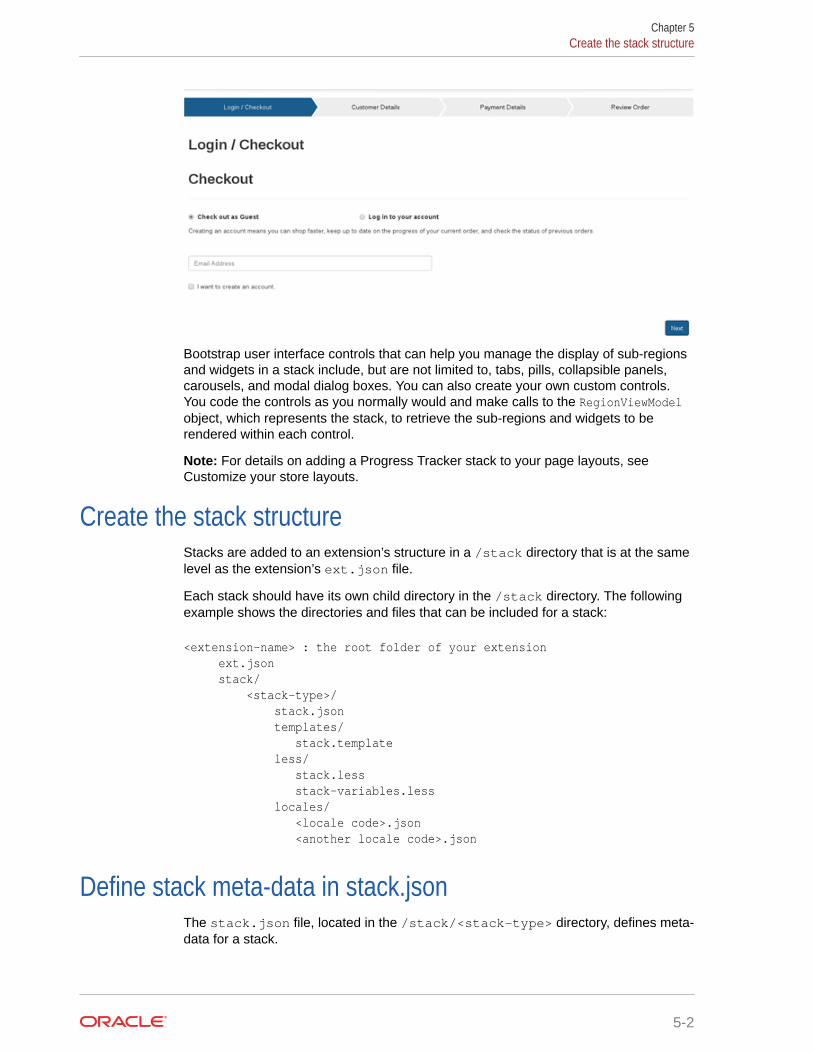
The template for the stack contains any logic you need to manage the rendering of thestack’s sub-regions and widgets. For example, a stack template can define a Bootstraptabbed container where each sub-region correlates to a tab and the widgets contained ineach sub-region are rendered on the associated tabs. This technique is used by the ProgressTracker stack, which is the only stack extension included with Commerce. Available on theCheckout layouts, the Progress Tracker allows you to create a series of steps for thecheckout process, for example, Login/Checkout, Customer Details, Payment Details, andReview Order. Each checkout step is rendered in its own tab and each tab contains thewidgets that are necessary to render the user interface for that step (along with a Next buttonto progress to the next step in the stack).
5-1
Bootstrap user interface controls that can help you manage the display of sub-regionsand widgets in a stack include, but are not limited to, tabs, pills, collapsible panels,carousels, and modal dialog boxes. You can also create your own custom controls.You code the controls as you normally would and make calls to the RegionViewModelobject, which represents the stack, to retrieve the sub-regions and widgets to berendered within each control.
Note: For details on adding a Progress Tracker stack to your page layouts, see Customize your store layouts.
Create the stack structureStacks are added to an extension’s structure in a /stack directory that is at the samelevel as the extension’s ext.json file.
Each stack should have its own child directory in the /stack directory. The followingexample shows the directories and files that can be included for a stack:
<extension-name> : the root folder of your extension ext.json stack/ <stack-type>/ stack.json templates/ stack.template less/ stack.less stack-variables.less locales/ <locale code>.json <another locale code>.json
Define stack meta-data in stack.jsonThe stack.json file, located in the /stack/<stack-type> directory, defines meta-data for a stack.
Chapter 5Create the stack structure
5-2

An example of a stack.json file is provided below:
{ "availableToAllPages": true, "configurable":false, "configuration": {}, "name": "Accordion Container", "regions": [ { "name": "Accordion 1", "width": 12 }, { "name": "Accordion 2", "width": 12 } ], "stackType": "accordionContainer", "styleSettings": {}, "version": 1 }
The following list describes all the properties that you might choose to include in astack.json file.
• availableToAllPages: Set this property to true to allow the stack to be placed on all pagetypes; the stack will appear in the Component library for all pages. Omit this propertyaltogether to restrict placement of the stack to the page types defined in the pageTypesproperty. Note that this property and the pageTypes property are mutually exclusive butone of them must be set.
• pageTypes: Defines which page types the stack can be placed on; the stack will appear inthe Component library for the specified pages. If you use this property, you must omit theavailableToAllPages property. Note that this property and the availableToAllPagesproperty are mutually exclusive but one of them must be set.Available page types include:
– product
– category
– home
– cart
– checkout
– confirmation
– article
– error
– searchResults
– noSearchResults
The stack will appear in the Component library for the page types you specify.
• configurable: Set this property to false. It is for future use.
Chapter 5Define stack meta-data in stack.json
5-3

• configuration: Leave this array empty. It is for future use.
• name: Defines the display name for the stack in the component library.
• regions: An array that defines the default sub-regions that are available within thestack when a new instance of this stack is created. Each item in the array includesthe following properties:
– name: The display name of the default region.
– width: This property is required to pass validation and should be set to 12.
• stackType: A unique identifier for the stack.
• styleSettings: Leave this array empty. It is for future use.
• version: The numeric version of the stack.
Create the stack templateEach stack requires a Knockout template called stack.template to render thestack.
The stack.template file must reside in the /stack/<stack-type>/templatesdirectory. Using the stack’s RegionViewModel object, the stack.template canaccess the sub-regions within the stack, via the regions observable array, and thewidgets within each sub-region, via the widgets observable array for each sub-region.
This section provides some examples to show you how you might create a templatethat integrates Bootstrap UI controls with a stack’s content. The following code sampleshows the stack template for a tabbed container:
<div class="tabbedContainer"> <!-- RENDER Bootstrap tabs --> <ul class="nav nav-tabs" data-bind="attr: { id: 'tabbedNav-'+id()+'-pills'}"> <!-- ko foreach: regions --> <li role="presentation" data-bind="css: {active: $index() === 0}, attr: { id: 'tabbedNav-'+$parent.id()+'-pill-'+$index() }"> <a data-toggle="tab" data-bind=" attr: { 'href':'#tabbedContainer-' + $parent.id() + '-tab-' + $index()}"> <span data-bind="text: displayName"></span> </a> </li> <!-- /ko --> </ul> <!—RENDER tabbed content --> <div class="tab-content"> <!-- ko foreach: regions --> <div role="tabpanel" class="stage tab-pane" data-bind=" attr: { id: 'tabbedContainer-'+$parent.id()+'-tab-'+$index() }, css: {active: $index() === 0}"> <!—RENDER widgets in each tab --> <!-- ko foreach: widgets --> <div data-bind=" template: {name: templateUrl(),templateSrc:
Chapter 5Create the stack template
5-4
templateSrc()}"> </div> <!-- /ko --> </div> <!-- /ko --> </div> </div>
This template includes two ko foreach: regions bindings. The first iterates over the stack’ssub-regions and creates a tab for each sub-region. The second iterates over the sub-regionsagain and renders the contents of each tab. The content rendering is accomplished through ako for each: widgets binding that iterates over the widgets contained in each sub-region.
Similarly, the following code excerpt shows the rendering of widgets in collapsible panels:
<!-- RENDER displayName from the stack --> <h2 data-bind="text:displayName"></h2> <div class="panel-group" id="accordion" role="tablist"> <!-- RENDER stack sub-regions --> <!-- ko foreach: regions --> <div class="panel panel-default"> <div class="panel-heading" role="tab" id="headingOne"> <h4 class="panel-title"> <a role="button" data-toggle="collapse" data-parent="#accordion" data-bind="attr: { 'href': '#accordionContainer-' + $parent.id() + '-tab-' + $index()}, text:displayName" aria-expanded="true" aria-controls="collapseOne> </a> </h4> </div> <div class="panel-collapse collapse" role="tabpanel" aria-labelledby="headingOne" data-bind="attr: { id: 'accordionContainer-'+$parent.id()+'-tab-'+$index() }, css: {in: $index() === 0}"> <div class="panel-body"> <!-- RENDER widgets within each sub-region --> <!-- ko foreach: widgets --> <div data-bind="template: { name: templateUrl(), templateSrc: templateSrc()}"> </div> <!-- /ko --> </div> </div> </div> <!-- /ko --> </div>
This code iterates over the sub-regions in the stack and renders a collapsible panel for eachone. To define the content for each panel, the code iterates over the widgets in each sub-region and renders them using the template defined in the template data-bind.
Chapter 5Create the stack template
5-5

Configure a stack’s styleCSS specific to a stack is contained in the /stack/<stack-type>/less directory.The following is an example:
<extension-name> : the root folder of your extension ext.json stack/ <stack-type>/ stack.json less/ stack.less stack-variables.less
A style file for a stack is always named stack.less and any variables referenced inthis style file are contained in a companion file called stack-variables.less. Anexample of a stack.less file is shown below:
.tabbedContainer { .nav-tabs { span { text-align: @tabTitleAlignment; } } .nav-tabs > li > a { background-color: @tabBackgroundColor; color: @tabTextColor; } .nav-tabs > li.active > a { background-color: @activeTabBackgroundColor; color: @activeTabTextColor; } }
A supporting stack-variables.less file for this example would look similar to thefollowing:
@activeTabBackgroundColor:#195D8E;@activeTabTextColor:#FFFFFF;@tabBackgroundColor:#d1d1d1;@tabTextColor:#3d3d3d;@tabTitleAlignment:center;
The stack.less file, like a widget.less file, can define a stack’s styles using theLess language or native CSS. Less files across the entire storefront are compiled tomake one CSS file.
Similar to widgets, it is important that any style overridden within a stack Less file onlyapplies to that stack, and does not change the style across the storefront. One way toachieve this is to format the stack’s styles using the Less nested format. For moredetails on this approach, see Configure a widget’s style.
Chapter 5Configure a stack’s style
5-6
Note: If you design a custom style as part of an extension, the Less style may not becompiled immediately after uploading the extension package. If this happens, open thestack’s style in the code editor (on the Design page) and make a superficial edit, then resave.This process forces compilation of the style.
Create a quick view popup using a popup stackPopup stacks enable a shopper to view information on a popup screen and are mostly relatedto product listings.
For further details on popup stacks, see Customize your store layouts.
One instance of the popup stack is the Quick View Popup Stack which is available within theCollection and Search Results layouts. You can apply the same quick view logic to theRelated Products widget, available on the Product layout, and the Product Recommendationswidget, available on all layouts.
The following illustrates applying the quick view popup logic to the Related Products widget:
1. Create a new instance of the Related Products widget within the Product layout.
2. Edit the related-products-carousel element by adding the global Quick View element,within the cc-item-detail HTML element. This should be bound with an instance of aProductViewModel.
<!-- ko foreach: relatedProductGroups --> <div class="item row" data-bind="css:{'active': $index()==0}, for each: $data"> <div data-bind="css: $parents[1].spanClass()" class="cc-product-item"> <div class="cc-item-detail"> <!-- Quick View --> <div data-bind="setContextVariable: {name:'product', value: $data}" class="quickViewElement"> <!-- ko with: $parents(1) --> <div data-bind="element: 'product-quickview', attr: { id:'product-quickview-grid-' + $parent.id() } "> </div> <!-- /ko --> </div> <!-- Quick View -->
3. Add CSS styling to the Quick View element within the Related Products widget.
#cc-relatedProducts { quick-view { position: absolute; display: none; padding: 5px 10px; background-color: #195d8d; color: white; border: 1px dotted white; cursor: pointer; p: { font-weight: bold;
Chapter 5Create a quick view popup using a popup stack
5-7
margin:0; } } .carousel.inner { .cc-item-detail { .quick-view { left: 32%; top: 50%; } } } .cc-item-detail: hover { .quick-view { display:inline-block; } }
4. Save your changes and open the Layout tab.
5. Open the Product layout and select Grid View from the configuration toolbar.
6. Locate the Product Details widget, add a new row below it, and drag a PopupStack to that new row.
7. Open the Main sub-region and drag the Related Products widget to it from theComponents menu.
8. Open the Popup sub-region and drag the Product Details widget to it from theComponents menu. Use the existing instance of the Product Quick View.
9. Publish the changes, and verify them on the storefront.
Notes
• Changing the Related Products Carousel element will not cause the RelatedProducts widget to break when it is not implemented with the Quick View, as thereis a check to ensure that the widgets exist within a stack before it displays thequick view link.
• The example assumes that some related products have already been set up in thecatalog, otherwise the widget is not displayed.
Chapter 5Create a quick view popup using a popup stack
5-8
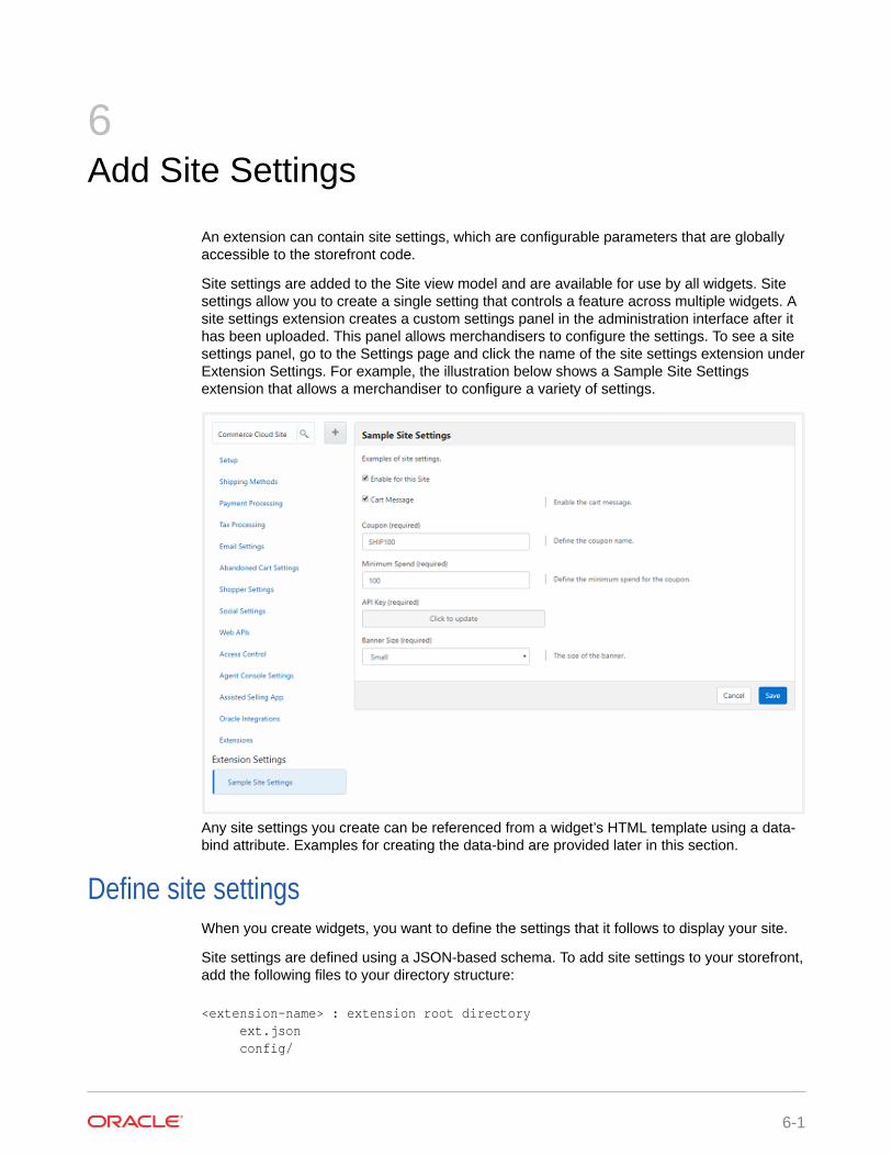
6Add Site Settings
An extension can contain site settings, which are configurable parameters that are globallyaccessible to the storefront code.
Site settings are added to the Site view model and are available for use by all widgets. Sitesettings allow you to create a single setting that controls a feature across multiple widgets. Asite settings extension creates a custom settings panel in the administration interface after ithas been uploaded. This panel allows merchandisers to configure the settings. To see a sitesettings panel, go to the Settings page and click the name of the site settings extension underExtension Settings. For example, the illustration below shows a Sample Site Settingsextension that allows a merchandiser to configure a variety of settings.
Any site settings you create can be referenced from a widget’s HTML template using a data-bind attribute. Examples for creating the data-bind are provided later in this section.
Define site settingsWhen you create widgets, you want to define the settings that it follows to display your site.
Site settings are defined using a JSON-based schema. To add site settings to your storefront,add the following files to your directory structure:
<extension-name> : extension root directory ext.json config/
6-1
<settingsID>/ : site settings root directory config.json locales/ en_US.json fr_FR.json
The resource bundles for site settings are stored in locale files under the /config/locales directory and look similar to the following:
{ "resources" : { "enabledHelpText": "Enable the cart message.", "enabledLabel": "Cart Message", "couponHelpText": "Define the coupon name.", "couponLabel": "Coupon", "minSpendHelpText": "Define the minimum spend amount for the coupon.", "minSpendLabel": "Minimum Spend", "sizeHelpText": "The size of the banner.", "sizeLabel": "Banner Size", "sizeSmallLabel": "Small", "sizeMediumLabel": "Medium", "sizeLargeLabel": "Large", "passwordHelpText": "Set the value for API key.", "passwordLabel": "API Key", "title": "Sample Site Settings", "description":"Examples of site settings." } }
The structure of these files is identical to those for widget localization resources. Referto Localize a widget for examples.
The structure of a config.json file looks similar to the following:
{ "widgetDescriptorName": "multisiteconfigdemo", "titleResourceId": "title", "descriptionResourceId": "description", "properties": [ { "id": "enabled", "type": "booleanType", "name": "enabled", "helpTextResourceId": "enabledHelpText", "labelResourceId": "enabledLabel", "defaultValue": true }, { "id": "coupon", "type": "stringType", "name": "coupon", "helpTextResourceId": "couponHelpText", "labelResourceId": "couponLabel",
Chapter 6Define site settings
6-2

"defaultValue": "SHIP100", "minLength": 6, "maxLength": 10, "required": true }, { "id": "minSpend", "type": "stringType", "name": "minSpend", "helpTextResourceId": "minSpendHelpText", "labelResourceId": "minSpendLabel", "defaultValue": "100", "required": true }, { "id": "password", "type": "passwordType", "name": "password", "helpTextResourceId": "passwordHelpText", "labelResourceId": "passwordLabel", "required": true }, { "id": "bannerSize", "type": "optionType", "name": "bannerSize", "required": true, "helpTextResourceId": "sizeHelpText", "labelResourceId": "sizeLabel", "defaultValue": "s", "options": [ { "id": "sizeSmall", "value": "s", "labelResourceId": "sizeSmallLabel" }, { "id": "sizeMedium", "value": "m", "labelResourceId": "sizeMediumLabel" }, { "id": "sizeLarge", "value": "l", "labelResourceId": "sizeLargeLabel" } ] } ] }
The titleResourceId property specifies a key in the resource bundles that is used to retrievethe title for the panel in the administration interface; for example, “Sample Site Settings” inthe illustration above. The descriptionResourceId property specifies a key for the
Chapter 6Define site settings
6-3

descriptive text that appears below the title. In the illustration, this is “Examples of sitesettings.”
The remainder of the config.json file consists of a properties array that definesindividual site settings and their key/value pairs. Site settings use the same standardkeys as configurable widget settings, namely id, name, type, helpTextResourceId,labelResourceId, defaultValue, and required. Site settings can also use the samedata types that are available to configurable widget settings, for example, stringType,multiSelectOptionType, and so on. Both the standard keys and the data types aredescribed in full detail in Define a widget's configurable settings.
Configure settings per site
Site settings can be configured on a site-by-site basis. If your Commerce instance isrunning multiple sites, the values a merchandiser specifies in a settings panel applyonly to the currently selected site. The merchandiser can then select another site andsupply different values for that site.
In some cases, a site settings panel may have settings that make sense for certainsites but not for others. In this situation, you can give merchandisers the option ofdisabling a site settings panel completely for individual sites. To do this, include thefollowing in the config.json file of the extension that creates the panel:
"enableSiteSpecific": true
This setting must appear in top-level array in the file (that is, not within the propertiesarray).
Setting enableSiteSpecific to true adds a checkbox to the panel for specifyingwhether the settings in the panel are enabled for the current site. The checkbox isinitially selected for each site, but a merchandiser can deselect it for individual sites.Deselecting the checkbox disables the panel for a site and causes the fields in thesettings panel to disappear for that site. The fields reappear if the merchandisersubsequently selects the checkbox again.
Reference site settings in widget templatesAny site settings you create are added to the Site view model and can be referencedfrom templates using a data-bind attribute, for example:
<p data-bind="text: site().extensionSiteSettings['settingsID']['propertyID']"></p>
Where settingsID is the name of the site settings root directory and propertyID is thevalue of the id property for the property you want to access, as defined in theproperties array. For example, assuming the earlier example has a site settings rootdirectory of my-settings and you want to access the mediaPicker property, you woulduse the following:
<p data-bind="text: site().extensionSiteSettings['my-settings']['mediaPicker']"></p>
Chapter 6Reference site settings in widget templates
6-4

To use multiple properties from the same site settings extension, you can use somethingsimilar to the following:
<!-- ko with: site().extensionSiteSettings['settingsID'] --> <p data-bind="text: propertyID"></p> <p data-bind="text: otherPropertyID"></p><!-- /ko -->
Chapter 6Reference site settings in widget templates
6-5
7Include Application-level JavaScript Modules
You can use an extension to upload application-level JavaScript files.
JavaScript files uploaded using this mechanism are loaded as part of the main module,before any endpoints have been fired and before any widgets have been loaded. As such,they can be referenced as a dependency in any widget, allowing you to build reusablemodules that can be shared among widgets and elements. The remainder of this sectiondescribes how to create an extension that contains application-level JavaScript modules andprovides some useful examples.
Create the extension structure for application-level JavaScriptTo add application-level JavaScript files to an extension, create a global/ directory in theextension’s root folder. The following is an example:
<extension-name> : The root folder of your extension ext.json global/ <application-level-module-1>.js <application-level-module-2>.js <application-level-module-n>.js
Place any application-level JavaScript files in this global/ directory. There is no limit to thenumber of files you can place in the global/ directory but the files themselves must followthese rules:
• They must be anonymous, that is, have no package name defined in the module.
• Structurally, they must be valid RequireJS modules.
• Each filename must be unique. If a file with the same name has been loaded in anotherextension, an error is returned.
Run custom logic upon module instantiationSimilar to widgets, you can use the onLoad() method to run custom logic once an application-level JavaScript module is instantiated, for example:
return { onLoad : function() { CCLogger.info("Loading Demo KO Bindings"); } };
7-1

Reference an application-level module in a widgetTo reference an application-level module in a widget, you must list the module as adependency using the ccResourceLoader library.
For example, the following code creates a dependency on thedemo.shared.viewmodels module:
define( //------------------------------------------------------------------- // DEPENDENCIES //------------------------------------------------------------------- ['jquery', 'knockout', 'ccLogger', 'ccResourceLoader!global/demo.shared.viewmodels'], //------------------------------------------------------------------- // Module definition //------------------------------------------------------------------- function ($, ko, ccLogger, sharedViewModel) { 'use strict'; return { onLoad : function(widget) { widget.firstName = sharedViewModel.viewModel().firstName; widget.surname = sharedViewModel.viewModel().surname; widget.doMessage = sharedViewModel.doMessage; } }; } );
Note that you cannot reference an application-level module from another application-level module. Application-level modules are loaded in parallel whenever a page isloaded, meaning that the order in which they are loaded is not guaranteed. Thismeans that you cannot have a dependency form one application-level module toanother.
Application-level JavaScript examplesThis section provides some useful examples for how you might use application-levelJavaScript modules.
This first example adds a reusable Knockout custom binding that can be used acrosswidgets:
define( //------------------------------------------------------------------- // DEPENDENCIES
Chapter 7Reference an application-level module in a widget
7-2
//------------------------------------------------------------------- ['jquery', 'knockout', 'ccLogger'], //------------------------------------------------------------------- // Module definition //------------------------------------------------------------------- function($, ko, CCLogger) { 'use strict'; // A simple binding that highlights an element when it loses focus. ko.bindingHandlers.highlight_on_blur = { init: function (element, valueAccessor, allBindings, viewModel, bindingContext) { $(element).on('blur.demo.ko', function() { $(this).css('background-color','yellow'); }); $(element).on('focus.demo.ko', function() { $(this).css('background-color','white'); }); } }; return { onLoad : function() { CCLogger.info("Loading Demo KO Bindings"); } }; } );
This example demonstrates how to create an application-level module with reusable methodsor view models:
define( //------------------------------------------------------------------- // DEPENDENCIES //------------------------------------------------------------------- ['jquery', 'knockout', 'ccLogger'], //------------------------------------------------------------------- // Module definition //------------------------------------------------------------------- function($, ko, CCLogger) { 'use strict'; return { onLoad : function() { CCLogger.info("Loading Demo Shared View Models"); }, doMessage : function() { alert("Shared View Models"); }, viewModel : ko.observable({ firstName : ko.observable('Bob'), surname : ko.observable('Test')
Chapter 7Application-level JavaScript examples
7-3

}) }; } );
Assign an application-level JavaScript module to multiplesites
You can create a JavaScript module that spans multiple sites.
By default, application-level JavaScript modules apply to all sites in your Commerceinstance. You may override this default and assign an application-level JavaScriptmodule to be used on only specified sites. To do this, you issue a POST request usingthe updateSiteAssociations custom action of the applicationJavaScript resourceand provide a list of sites in a sites property. For example, the following requestupdates myJSModule.js to execute on siteA and siteB only.
POST /ccadmin/v1/applicationJavaScript/myJSModule.js/updateSiteAssociations { "sites": ["siteA", "siteB"] }
To remove site associations, issue a POST request using the same custom action withthe sites property set to null. The following is an example:
POST /ccadmin/v1/applicationJavaScript/myJSModule.js/updateSiteAssociations { "sites": [] }
The following is an example response for a call using the updateSiteAssociationscustom action:
{ "result": true, "links": [ { "rel": "self", "href": http://localhost:9080/ccadmin/v1/applicationJavaScript/ demo.ko.extenders.js/updateSiteAssociations" } ]}
To retrieve a list of all application-level JavaScript modules along with the sites theyare associated with, issue a GET request to the applicationJavaScript resource. An
Chapter 7Assign an application-level JavaScript module to multiple sites
7-4

empty sites list means that a module will be loaded on all sites. The following is an example:
GET /ccadmin/v1/applicationJavaScript
For example:
{ "items": { "ext.ko.extenders.js": { "sites": [] }, "ext.shared.viewmodels.js": { "sites": [ "siteUS" ] } }, "links": [ { "rel": "self", "href": http://localhost/ccadmini/v1/applicationJavaScript/?sites=siteUS } ] }
Chapter 7Assign an application-level JavaScript module to multiple sites
7-5
8Filter REST Responses
You can define filters that limit the data returned in REST responses, thereby improvingperformance.
Response filters are persistent and defined ahead of time, and then passed as part of aREST request. The server uses the response filter to determine which fields to return inresponse to the request. A response filter has an identifying name (the response filter key),and two lists of fields, one for fields to include in the response and one for fields to exclude. Aresponse filter can configure fields to include, fields to exclude, or both. It is the responsefilter’s key that is passed in the data that is sent with a REST request. You create and updateresponse filters via the REST API. For details on how to do this, see Response filters. Thissection discusses how to use a response filter once it has been created.
Note: The response filter functionality described in this section is, at its core, a wrapper forthe existing fields and exclude query parameters in REST requests and it behaves thesame way. Instead of sending a complete list of fields to include or exclude in the queryparameters, you can create a persistent filter containing that data and then pass that filterinstead. To support backward compatibility, if you pass a fields or exclude query parameterand a filter in a request, the filter is ignored. For more information on the fields and excludequery parameters, see REST API query parameters.
Out-of-the-box response filtersA set of response filters has been defined out of the box and some out-of-the-box widgetsand one view model use them by default.
The following sections list the response filters along with the entities that use them.
• PLPData, used by the Product Listing widget
• categoryNavData, used by the Collection Navigation and Collection Navigation – Basicwidgets
• collectionData, used by the Collection widget
• productData, used by the cartViewModel when calling the listProducts endpoint.
You can send a request to the listFilters endpoint in the Admin API to retrieve a list of thefields that are included or excluded for each of these response filters noted above. For detailson how to do this, see Response filters.
Pass a response filter key in a REST call made from a widgetOnce you have created a response filter via the REST API, you can pass its key in the data awidget sends along with a REST request.
8-1
The server uses the key to locate the correct response filter and then returns dataaccordingly. The simplest way to include a response filter key is to hard code it in theREST call, for example:
data["filterKey"] = "my-filter-key";
ccRestClient.request(url, data, this.successFunc.bind(this), this.errorFunc.bind(this));
Commerce also provides a mechanism for programmatically determining the responsefilter key to pass in a REST call, allowing you to avoid hard coding it into the widgetitself. This mechanism is described in Programmatically determine the correctresponse filter key.
Programmatically determine the correct response filter keyCommerce also provides a mechanism for programmatically determining the responsefilter key to pass in a REST call, allowing you to avoid hard coding it into the widgetitself.
The programmatic mechanism for determining which response filter key to pass in aREST request has several parts, as follows:
• A context object that is instantiated in the widget’s JavaScript file.
• A filter map that is defined in an application-level JavaScript file.
• The CCStoreConfiguation library.
The context object contains the data required for locating the correct response filterkey in the filter map. The widget instantiates the context object with the necessary dataand then passes it to the CCStoreConfiguration library’s getFilterToUse() method,which locates the correct response filter key in the filter map and returns it to thewidget.
Enable programmatic filter key determination
You must enable programmatic filter key determination before you can use it. To do so,create an application-level JavaScript module that lists the CCStoreConfigurationlibrary as a dependency and includes the following code:
define( //------------------------------------------------------------------- // DEPENDENCIES //------------------------------------------------------------------- ['ccStoreConfiguration'], //------------------------------------------------------------------- // Module definition //------------------------------------------------------------------- function(CCStoreConfiguration) { 'use strict';
return { onLoad : function() { CCStoreConfiguration.getInstance().enableFilter();
Chapter 8Programmatically determine the correct response filter key
8-2

}, } } );
See Include Application-level JavaScript Modules for details on creating and uploading anapplication-level JavaScript module.
Understand the filter map
The filter map uses a prioritized structure of top-level objects and nested sub-objects.CCStoreConfiguration compares the data in the context object to that prioritized structurewhen locating the key. The following code sample shows the out-of-the-box filter map thatCommerce uses. In it, the filter map sets the priorityList variable to["endpoint","page","identifier"], meaning that CCStoreConfiguration will first try to finda top-level object that matches the endpoint in the context object, then it will search insidethat object for a matching page object, then it will search inside that object for a matchingidentifier object. The following is an example:
define( //------------------------------------------------------------------- // DEPENDENCIES //------------------------------------------------------------------- ['ccStoreConfiguration'], //------------------------------------------------------------------- // Module definition //------------------------------------------------------------------- function(CCStoreConfiguration) { 'use strict'; return { onLoad : function() { console.log("Loading Application Level JS"); var priorityList = ["endpoint","page","identifier"]; var newFilterMap = { "getCollection":{ "megaMenuNavigation": {"ccFilterConfigKey": "categoryNavData"}, "categoryNavigation": {"ccFilterConfigKey": "categoryNavData"} }, "listProducts":{ "productListingData": {"ccFilterConfigKey": "PLPData"}, "collectionWidget": {"ccFilterConfigKey": "collectionData"}, "getProductData": {"ccFilterConfigKey": "productData"}, "getProductDataAndRedirect": {"ccFilterConfigKey": "productData"} } }; CCStoreConfiguration.getInstance().updateFiltersToUse(newFilterMap); }, }
Chapter 8Programmatically determine the correct response filter key
8-3

} );
The top-level objects in the out-of-the-box filter map correspond to endpoints and theirsub-objects correspond to identifiers. In other words, getCollection andlistProducts represent endpoints and their children (megaMenuNavigation,categoryNavigation, productListingData, and so on) represent identifiers. (Notethat the getCollection and listProducts endpoints return data that is page-independent so, even though the priority list includes page, page objects are notdefined for these two endpoints in the out-of-the-box filter map.)
To understand how CCStoreConfiguration compares the contents of a context objectto the filter map, we will compare the following context object to the out-of-the-box filtermap:
var contextObj = {}; contextObj["endpoint"] = "getCollection"; contextObj["identifier"] = "categoryNavigation";
When considering this context object, CCStoreConfiguration first looks for a matchingendpoint among the top-level objects in the filter map (because endpoint is first in thepriority list). In this case, CCStoreConfiguration finds the getCollection top-levelobject. Next, CCStoreConfiguration looks for a matching page sub-object within thegetCollection top-level object (because page is second in the priority list). Thecontext object does not have page data, however, so CCStoreConfiguration moveson to find the next piece of data in the priority list, which is identifier. The thing tonote here is that CCStoreConfiguration continues to look for the next piece of data inthe current object. In other words, it looks for a categoryNavigation sub-object in thegetCollection top-level object. When CCStoreConfiguration finds thecategoryNavigation sub-object, it sees that the object has a ccFilterConfigKeydefined for it. CCStoreConfiguration retrieves this filter key, categoryNavData, andreturns it to the widget.
You can set your priority list and the object structure of your filter map in any way thatmakes sense for your implementation and then define context objects in your widgetsthat use that updated structure. However, keep in mind that the out-of-the-box filters,and the widgets that use them, may be affected by changes you make and may needmodifications as a result.
Create a context object and use it to retrieve the response filter key
To create a context object and use it to retrieve a response filter key, add code similarto the following to the widget’s JavaScript file. Note that you must also add adependency on the CCStoreConfiguration library. The following is an example:
// Add the CCStoreConfiguration library as a dependency for this widget // Create the context object and populate it var contextObj = {}; contextObj["endpoint"] = "endpoint-name"; contextObj["identifier"] = "identifier-in-filter-map"; // Call the getFilterToUse method to retrieve the response filter key var filterKey = CCStoreConfiguration.getInstance().getFilterToUse(contextObj); // Add the filterKey to the data passed with the REST call
Chapter 8Programmatically determine the correct response filter key
8-4

if (filterKey) { data["filterKey"] = filterKey; } //Make the REST call ccRestClient.request(url, data, this.successFunc.bind(this), this.errorFunc.bind(this)); }
Add a new response filter key to the out-of-the-box filter map
The following code sample creates new identifiers in the out-of-the-box filter map for callsmade to the getCollection and productListing endpoints. The new identifier for thegetCollection endpoint is customIdentifer1 and the response filter key that is returned forit is customFilterKey1. The new identifier for the productListing endpoint iscustomIdentifer2 and the response filter key that is returned for it is customFilterKey2. Thefollowing is an example:
define( //------------------------------------------------------------------- // DEPENDENCIES //------------------------------------------------------------------- ['ccStoreConfiguration'], //------------------------------------------------------------------- // Module definition //------------------------------------------------------------------- function(CCStoreConfiguration) { 'use strict'; return { onLoad : function() { console.log("Loading Application Level JS"); var priorityList = ["endpoint","page","identifier"]; var newFilterMap = { "getCollection":{ "megaMenuNavigation": {"ccFilterConfigKey": "categoryNavData"}, "categoryNavigation": {"ccFilterConfigKey": "categoryNavData"}, "customIdentifier1": {"ccFilterConfigKey": "customFilterKey1"} }, "listProducts":{ "productListingData": {"ccFilterConfigKey": "PLPData"}, "collectionWidget": {"ccFilterConfigKey": "collectionData"}, "getProductData": {"ccFilterConfigKey": "productData"}, "getProductDataAndRedirect": {"ccFilterConfigKey": "productData"}, "customIdentifier2": {"ccFilterConfigKey": "customFilterKey2"} } }; CCStoreConfiguration.getInstance().updateFiltersToUse(newFilterMap); }, }
Chapter 8Programmatically determine the correct response filter key
8-5
} );
Note that, when you override the filter map, the top-level objects you define completelyreplace any existing top-level objects. In other words, if you created a new filter mapthat looked as follows:
// This code overwrites the getCollection top-level object entirelyvar newFilterMap = { "getCollection":{ "customIdentifier1": {"ccFilterConfigKey": "customFilterKey1"} }, };
You would lose the megaMenuNavigation and categoryNavigation identifiers definedout of the box for the getCollection top-level object. However, the listProducts top-level object would remain unchanged because no new top-level object definition for ithas been introduced. For this reason, you should be careful to include the defaultidentifiers, shown earlier, along with any new identifiers you create unless youexplicitly intend to overwrite them.
Use defaults in the filter map
The filter map supports the concept of defaults at each object level. WhenCCStoreConfiguration cannot find a match for a piece of data in the context object, itlooks for a default. If it finds a default, it searches within that default object’s childrenfor the next piece of data in the priority list. If it cannot find a match or a default, it willnot return a response filter key.
The concept of default objects can exist at any level in a filter map. For example,consider this filter map that sets its priority list to["endpoint","page","identifier","viewport"]:
var newFilterMap = { "endpoint1": { "page1":{"cc-filter-config-key": "key1"}, "page2":{"cc-filter-config-key": "key2"}, "page3":{ "identifier1":{"cc-filter-config-key": "key3"}, "identifier2":{"cc-filter-config-key": "key4"}, "cc-filter-config-key": "key11", "default":{ "viewport1":{"cc-filter-config-key": "key5"}, "viewport2":{"cc-filter-config-key": "key6"}, "default":{"cc-filter-config-key": "key7"} } }, "cc-filter-config-key": "key8", "default":{
Chapter 8Programmatically determine the correct response filter key
8-6

"identifier1":{"cc-filter-config-key": "key9"}, "default":{"cc-filter-config-key": "key10"} } }};
The following table lists a variety of sample context objects and the response filter key thatwould be returned for them based on this filter map:
Context Object Data Filter Key Returned
endpoint1 key8
endpoint1, page1 key1
endpoint1, page3 key11
endpoint1, page3, identifier1 key3
endpoint1, page3, identifier2 key4
endpoint1, page1, identifier3 key1
endpoint1, page3, identifier3, viewport1 key5
endpoint1, page3, identifier3, viewport3 key7
endpoint1, page4 null
endpoint1, page4, identifier1 key9
endpoint1, page4, identifier2 key10
endpoint1, page1, identifier1 key1
Change response filters used by out-of-the-box widgetsIf you want to change the response filter used in one of the default widgets (described in Out-of-the-box response filters), Oracle recommends that you create a new response filter andassign it to the endpoint/identifier combination the widget uses in its context object.
To do this, you create an application-level JavaScript module that requires in theCCStoreConfiguration library and creates a modified version of the filter map. As a reminder,the default filter map looks like this:
define( //------------------------------------------------------------------- // DEPENDENCIES //------------------------------------------------------------------- ['ccStoreConfiguration'], //------------------------------------------------------------------- // Module definition //------------------------------------------------------------------- function(CCStoreConfiguration) { 'use strict'; return { onLoad : function() { console.log("Loading Application Level JS"); var filterMap = { "getCollection":{ "megaMenuNavigation": {"ccFilterConfigKey": "categoryNavData"}, "categoryNavigation": {"ccFilterConfigKey":
Chapter 8Change response filters used by out-of-the-box widgets
8-7

"categoryNavData"} }, "listProducts":{ "productListingData": {"ccFilterConfigKey": "PLPData"}, "collectionWidget": {"ccFilterConfigKey": "collectionData"}, "getProductData": {"ccFilterConfigKey": "productData"}, "getProductDataAndRedirect": {"ccFilterConfigKey": "productData"}, } }; CCStoreConfiguration.getInstance().updateFiltersToUse(newFilterMap); }, } } );
The code in this example changes the response filter key for the Collection Navigationwidget from categoryNavData to customFilterKey1.
define( //------------------------------------------------------------------- // DEPENDENCIES //------------------------------------------------------------------- ['ccStoreConfiguration'], //------------------------------------------------------------------- // Module definition //------------------------------------------------------------------- function(CCStoreConfiguration) { 'use strict'; return { onLoad : function() { console.log("Loading Application Level JS"); var filterMap = { "getCollection":{ "megaMenuNavigation": {"ccFilterConfigKey": "customFilterKey1"}, "categoryNavigation": {"ccFilterConfigKey": "categoryNavData"} }, "listProducts":{ "productListingData": {"ccFilterConfigKey": "PLPData"}, "collectionWidget": {"ccFilterConfigKey": "collectionData"}, "getProductData": {"ccFilterConfigKey": "productData"}, "getProductDataAndRedirect": {"ccFilterConfigKey": "productData"}, } };
Chapter 8Change response filters used by out-of-the-box widgets
8-8
CCStoreConfiguration.getInstance().updateFiltersToUse(newFilterMap); }, } } );
Remember that the top-level objects you define in the filter map override any default top-levelobjects. In other words, if you modify a top-level object in the filter map, only the identifiersyou explicitly include your top-level object are used by the CCStoreConfiguration library. Forthis reason, you should be careful to include the default identifiers in top-level objects to avoidoverwriting them. See Add a new response filter key to the out-of the-box filter map for moreinformation.
The following table defines which identifier and filter key combination is used by the defaultwidgets:
Widget Endpoint Identifier Response filter Key
Collection Navigation getCollection megaMenuNavigation categoryNavData
Collection Navigation –Basic
getCollection categoryNavigation categoryNavData
Product Listing listProducts productListingData PLPData
Collection listProducts collectionWidget collectionData
Filter REST calls made from within a view modelREST calls may also be made from within view models as the view models interact with theserver while doing do their work.
IMPORTANT: This section describes how to filter REST calls made from within a view model.Please note that dependencies exist between view models such that data retrieved by oneview model may be used by another. Care must be taken when filtering view model RESTcalls so that you do not filter out data needed by another view model.
Filtering the responses for view model REST calls uses the context object and filter mapcombination described in Programmatically determine the correct response filter key. Thecontext objects are defined within the view models themselves, however, so all you have todo to filter REST calls made from view models is create the filter map and upload it in anapplication-level JavaScript module (see Include Application-level JavaScript Modules formore information on creating this type of module).
The following filter map example shows the top-level objects that define which responsefilters are used for REST calls made from view models. It is not necessary to include all ofthese top-level objects in your filter map, only those for REST calls you want to filter.However, keep in mind that the top-level objects you include in your filter map will overwriteany existing top-level objects.
define(
//------------------------------------------------------------------- // DEPENDENCIES //------------------------------------------------------------------- ['ccStoreConfiguration'],
Chapter 8Filter REST calls made from within a view model
8-9

//------------------------------------------------------------------- // Module definition //------------------------------------------------------------------- function(CCStoreConfiguration) {
'use strict';
return { onLoad : function() {
console.log("Loading Application Level JS");
var priorityList = ["endpoint","page","identifier"];
var filterMap = { "getCollection":{ "megaMenuNavigation": {"ccFilterConfigKey": "categoryNavData"}, "categoryNavigation": {"ccFilterConfigKey": "categoryNavData"} }, "listProducts":{ "productListingData": {"ccFilterConfigKey": "PLPData"}, "collectionWidget": {"ccFilterConfigKey": "collectionData"}, "getProductData": {"ccFilterConfigKey": "productData"}, "getProductDataAndRedirect": {"ccFilterConfigKey": "productData"} } "listMembers": { "ccFilterConfigKey": "key-name" }, "getGiftWithPurchaseChoices": { "ccFilterConfigKey": "key-name" }, "getAllOrdersForProfile": { "ccFilterConfigKey": "key-name" }, "listScheduledOrdersByProfile": { "ccFilterConfigKey": "key-name" }, "getItemType": { "ccFilterConfigKey": "key-name" }, "getCurrentProfile": { "userData": {"ccFilterConfigKey": "key-name"} }, "getAllPrices": { "ccFilterConfigKey": "key-name" }, "getStockStatus": { "productStockStatus": {"ccFilterConfigKey": "key-name"}, "stockStatusForProdValidation": {"ccFilterConfigKey": "key-name"}
Chapter 8Filter REST calls made from within a view model
8-10
}, "getPaymentGroup": { "ccFilterConfigKey": "key-name" }, "getOrder": { "orderForSubmit": {"ccFilterConfigKey": "key-name"}, "templateOrder": {"ccFilterConfigKey": "key-name"}, }, "getScheduledOrder": { "loadOrder": {"ccFilterConfigKey": "key-name"} }, "getPage": { "home": { "layoutOnly":{"ccFilterConfigKey": "key-name"}, "cachableData":{"ccFilterConfigKey": "key-name"}, "currentData":{"ccFilterConfigKey": "key-name"} } }, "getIncompleteOrder": { "loadCartForProfile": {"ccFilterConfigKey": "key-name"}, "refreshCart": {"ccFilterConfigKey": "key-name"} }, "getStockStatuses": { "stockStatusesForCart": {"ccFilterConfigKey": "key-name"}, "stockStatsToValidateCart":{"ccFilterConfigKey": "key-name"}, "stockStatsForItem":{"ccFilterConfigKey": "key-name"} }, "getMetadata": { "dynamicProperties": {"ccFilterConfigKey": "key-name"} }, "listSkus": { "skuListing": {"ccFilterConfigKey": "key-name"} } }; CCStoreConfiguration.getInstance().updateFiltersToUse(newFilterMap); }, } });
The following tables describe the data that is returned for the view model REST calls to assistyou as you decide what calls you want to filter.
CartViewModel
This table describes the REST calls made from the CartViewModel and provides details onthe context objects that are used to locate a response filter for each type of REST call theview model makes.
Chapter 8Filter REST calls made from within a view model
8-11

Context Object Description
{endpoint:"getIncompleteOrder",
identifier:"loadCartForProfile"}
This context object is used for calls made tothe getIncompleteOrder endpoint. TheCartViewModel makes this call to retrieve thecurrent incomplete order and load it in theUserViewModel and the CartViewModel.This may happen when an anonymousshopper logs in or creates an account. Also,when a shopper accepts a quoted order andmoves to another page (other than thecheckout page), the quoted order is removedand the incomplete order is loaded. Similarly, ifa shopper is viewing an order that is pendingpayment and then moves to a page other thanthe checkout page, the pending payment orderis removed and the incomplete order is loaded.
{endpoint:"getIncompleteOrder",
identifier:"refreshCart"}
This context object is used for calls made tothe getIncompleteOrder endpoint. TheCartViewModel makes this call when theshopper changes pages or the system reloadsthe cart. The call retrieves any incompleteorder data for the logged-in shopper and thenpopulates the CartViewModel andUserViewModel properties with the data ithas retrieved.
{endpoint:"getMetadata",
identifier:"dynamicProperties"}
This context object is used for calls made tothe getMetadata endpoint. TheCartViewModel makes this call to retrievemetadata for dynamic order properties.
Note that if you are using dynamic orderproperties, you must customize the widgetcode to use the markDirty flag depending onyour preferences. You can, therefore choose tohandle changes to dynamic order propertieswhen all properties have been set, or updateon selection of each dynamic property.Marking the CartViewModel.isDirty() flagto true would trigger an update order call.
{endpoint:"getOrder",
identifier:"templateOrder"}
This context object is used for calls made tothe getOrder endpoint. The Scheduled Orderwidget triggers the CartViewModel to makethis call when the shopper clicks the PlaceOrder button. Clicking this button places thecontents of the scheduled order into theshopping cart, allowing the shopper to place aone-time order based on a scheduled order.See Configure page layouts for scheduledorders for more details.
{endpoint:"getStockStatus",
identifier:"stockStatusForProdValidation"}
This context object is used for calls made tothe getStockStatus endpoint. TheCartViewModel makes this call to retrievestock status information when the quantity of aproduct on the cart page is updated.
Chapter 8Filter REST calls made from within a view model
8-12

Context Object Description
{endpoint:"getStockStatuses",
identifier:"stockStatusesForCart"}
This context object is used for calls made tothe getStockStatuses endpoint. TheCartViewModel makes this call to get stockstatus information when it is refreshing productdata for items in the cart. This call is alsotriggered to get stock status information whena configurable product is reconfigured.
This call does not get made for orders in thePENDING_PAYMENT orPENDING_PAYMENT_TEMPLATE state becausethese orders cannot be edited; in other words,since the items in the order cannot be edited,stock status for those items is irrelevant.
{endpoint:"getStockStatuses",
identifier:"stockStatsToValidateCart"}
This context object is used for calls made tothe getStockStatuses endpoint. TheCartViewModel makes this call to retrievestock status information for the products in thecart during the checkout process. The call ismade when the shopper has clicked thecheckout link on the Checkout page and theprices of the products in the cart have notchanged.
Note: If the prices have changed, the shopperis redirected to the cart page and this call isnot made.
{endpoint:"getStockStatuses",
identifier:"stockStatsForItem"}
This context object is used for calls made tothe getStockStatuses endpoint. TheCartViewModel makes this call to get stockstatus information for all the SKUs (baseproduct and child SKUs) of a configurableproduct when that product is added to the cart.(Note that the view model method that makesthis call is generic enough that it can be usedfor adding a product to the cart that is notconfigurable.)
{endpoint:"listProducts",
identifier:"getProductData"}
This context object is used for calls made tothe listProducts endpoint. TheCartViewModel makes this call when it needsto check whether the order has stale productdata, for example, when the shopper movesfrom one page to another. Using this call, theCartViewModel retrieves product data fromthe server and then uses it to update theproducts in the cart on the client side. Bycomparing the new product data with theexisting product data, Commerce candetermine if the cart has become stale (forexample, prices have changed or a producthas been marked inactive) and whetherrepricing should be triggered.
Chapter 8Filter REST calls made from within a view model
8-13

Context Object Description
{endpoint:"listProducts",
identifier:"getProductDataAndRedirect"}
This context object is used for calls made tothe listProducts endpoint. TheCartViewModel makes this call when theshopper has clicked the checkout link and theview model needs to check whether the orderhas stale product data. Using this call, theCartViewModel retrieves product data fromthe server and then uses it to update theproducts in the cart on the client side. Bycomparing the new product data with theexisting product data, Commerce candetermine if the cart has become stale (forexample, prices have changed or a producthas been marked inactive) and whetherrepricing should be triggered or the shoppershould be redirected to the cart page.
{endpoint:"listSkus",
identifier:"skuListing"}
This context object is used for calls made tothe listSkus endpoint. The CartViewModelmakes this call to get product data for all theSKUs (base product and child SKUs) of aconfigurable product when that product isadded to the cart. (Note that the view modelmethod that makes this call is generic enoughthat it can be used for adding a product to thecart that is not configurable.)
delegatedAdminContacts view model
This table describes the REST calls made from the delegatedAdminContacts viewmodel and provides details on the context objects that are used to locate a responsefilter for each type of REST call the view model makes.
Context Object Description
{endpoint:"listMembers"} This context object is used for calls made tothe listMembers endpoint. ThedelegatedAdminContacts view modelmakes this call to retrieve a list of an account’scontacts.
GiftProductListingViewModel
This table describes the REST calls made from the GiftProductListingViewModeland provides details on the context objects that are used to locate a response filter foreach type of REST call the view model makes.
Context Object Description
{endpoint:"getGiftWithPurchaseChoices"}
This context object is used for calls made tothe getGiftWithPurchaseChoicesendpoint. TheGiftProductListingViewModel makes thiscall to retrieve the gift choices for a gift-with-purchase promotion that allows the shopper tochoose her gift.
Chapter 8Filter REST calls made from within a view model
8-14
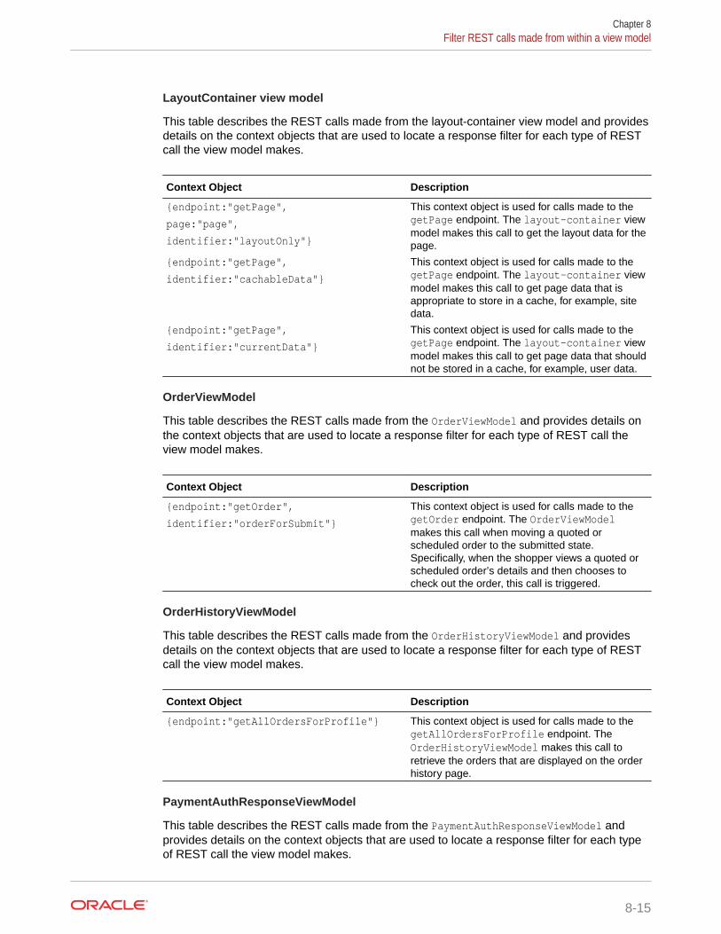
LayoutContainer view model
This table describes the REST calls made from the layout-container view model and providesdetails on the context objects that are used to locate a response filter for each type of RESTcall the view model makes.
Context Object Description
{endpoint:"getPage",
page:"page",
identifier:"layoutOnly"}
This context object is used for calls made to thegetPage endpoint. The layout-container viewmodel makes this call to get the layout data for thepage.
{endpoint:"getPage",
identifier:"cachableData"}
This context object is used for calls made to thegetPage endpoint. The layout-container viewmodel makes this call to get page data that isappropriate to store in a cache, for example, sitedata.
{endpoint:"getPage",
identifier:"currentData"}
This context object is used for calls made to thegetPage endpoint. The layout-container viewmodel makes this call to get page data that shouldnot be stored in a cache, for example, user data.
OrderViewModel
This table describes the REST calls made from the OrderViewModel and provides details onthe context objects that are used to locate a response filter for each type of REST call theview model makes.
Context Object Description
{endpoint:"getOrder",
identifier:"orderForSubmit"}
This context object is used for calls made to thegetOrder endpoint. The OrderViewModelmakes this call when moving a quoted orscheduled order to the submitted state.Specifically, when the shopper views a quoted orscheduled order’s details and then chooses tocheck out the order, this call is triggered.
OrderHistoryViewModel
This table describes the REST calls made from the OrderHistoryViewModel and providesdetails on the context objects that are used to locate a response filter for each type of RESTcall the view model makes.
Context Object Description
{endpoint:"getAllOrdersForProfile"} This context object is used for calls made to thegetAllOrdersForProfile endpoint. TheOrderHistoryViewModel makes this call toretrieve the orders that are displayed on the orderhistory page.
PaymentAuthResponseViewModel
This table describes the REST calls made from the PaymentAuthResponseViewModel andprovides details on the context objects that are used to locate a response filter for each typeof REST call the view model makes.
Chapter 8Filter REST calls made from within a view model
8-15

Context Object Description
{endpoint:"getPaymentGroup"} This context object is used for calls made tothe getPaymentGroup endpoint. ThePaymentAuthResponseViewModel makesthis call to get the current authorization statuswhen a shopper places an order usingCyberSource.
ProductViewModel
This table describes the REST calls made from the ProductViewModel and providesdetails on the context objects that are used to locate a response filter for each type ofREST call the view model makes.
Context Object Description
{endpoint:"getAllPrices"} This context object is used for calls made tothe getAllPrices endpoint. TheProductViewModel makes this call to get theprices for a product when a shopper moves toproduct page.
{endpoint:"getStockStatus",
identifier:"productStockStatus"}
This context object is used for calls made tothe getStockStatus endpoint. TheProductViewModel makes this call to getstock information for the product when ashopper moves to product page. The viewmodel also makes this call to get stockinformation for the gift choices a shopper canchoose when she is presented with a gift-with-purchase promotion that allows her to chooseher own gift.
scheduled-order view model
This table describes the REST calls made from the scheduled-order view model andprovides details on the context objects that are used to locate a response filter foreach type of REST call the view model makes.
Context Object Description
{endpoint:"getScheduledOrder",
identifier:"loadOrder"}
This context object is used for calls made tothe getScheduledOrder endpoint. Thescheduled-order view model makes this callto load a selected scheduled order’s details sothat it can be displayed by the ScheduledOrder widget.
scheduledOrderList view model
This table describes the REST calls made from the scheduledOrderList view modeland provides details on the context objects that are used to locate a response filter foreach type of REST call the view model makes.
Chapter 8Filter REST calls made from within a view model
8-16

Context Object Description
{endpoint:"listScheduledOrdersByProfile"}
This context object is used for calls made to thelistScheduledOrdersByProfile endpoint.The scheduledOrderList view model makesthis call to retrieve the list of scheduled orders forthe current profile.
skuPropertiesHandler view model
This table describes the REST calls made from the skuPropertiesHandler view model andprovides details on the context objects that are used to locate a response filter for each typeof REST call the view model makes.
Context Object Description
{endpoint:"getItemType"} This context object is used for calls made to thegetItemType endpoint. TheskuPropertiesHandler view model makes thiscall to get the properties for a SKU.
UserViewModel
This table describes the REST calls made from the UserViewModel and provides details onthe context objects that are used to locate a response filter for each type of REST call theview model makes.
Context Object Description
{endpoint:"getCurrentProfile"} This context object is used for calls made to thegetCurrentProfile endpoint. TheUserViewModel makes this call to get profile datafor the logged-in shopper.
Chapter 8Filter REST calls made from within a view model
8-17
9Resize Images
Images are automatically sized for your customer based on the devices that they use.However you can customize the image sizes as needed.
When a shopper views a page that contains images, Commerce automatically sizes them onthe client side for display on different devices, such as laptops, tablets, and mobile phones.To improve your storefront’s performance, you can resize images before they are downloadedto the client browser. To do this, Commerce provides the /images REST endpoint whichallows you to format the images returned from the server. This endpoint, however, requires aURL with a number of parameters that can be challenging to specify manually. To assist youin using the /images REST endpoint, Commerce provides the ccResizeImage customKnockout binding. You can use this binding in your widgets to create the URL that is sent tothe /images endpoint. The ccResizeImage binding also handles specifying a default imagesize as well as sizes for various viewports. This section provides information on using theccResizeImage binding as well as general information about the /images endpoint.
Note: Commerce also includes an earlier custom Knockout binding, productImageSource,that creates the URL sent to the /images endpoint. It has some limitations, however, in that itonly works with product images and it does not automatically detect the viewport. Oraclerecommends using the ccImageResize binding going forward but the productImageSourcebinding will continue to work. For more information on the productImageSource binding, referto the View Model JSDoc for Commerce.
Default image sizesThere are default image sizes available.
By default, Commerce uses the following maximum sizes (in pixels) for images:
• Extra Small: 100x100
• Small: 300x300
• Medium: 475x475
• Large: 940x940
Resize images using the ccResizeImage bindingThe custom ccResizeImage binding provides scaled images for display on the UI.
It also provides the ability to specify an alternate image and image text to be loaded in theevent that the image cannot be found. The ccResizeImage binding must be used inside an<img> tag, for example:
<img data-bind="ccResizeImage: { source: '/file/v2/products/AntiqueWoodChair_full.jpg', alt:'Antique Wood Chair',
9-1

errorSrc:'images/noImage.png', errorAlt:'No Image Found'}"></img>
Set override dimensions for specific viewports
When using the ccResizeImage binding, you can specify override dimensions forspecific viewports. You can also specify a default size for any viewport for which nooverride dimension is provided. For example, in the following code snippet, theccResizeImage binding returns an image of size 80x80 and 120x120 for xsmall andmediumviewports, respectively. For all other viewports, it returns an image of size50x50.
<img data-bind="ccResizeImage: { source: '/file/v2/products/AntiqueWoodChair_full.jpg', xsmall: '80,80', medium: '120,120', size:'50,50', alt: 'Antique Wood Chair', errorSrc:'images/noImage.png', errorAlt:'No Image Found'}"></img>
Convert images to JPEG format
The ccResizeImage binding can be used to convert images to JPEG using the optionaloutputFormat attribute. When outputFormat is set to JPEG (the only option currentlysupported), a source image is converted to a JPEG image. You can specify an optionalquality attribute to adjust the quality of the resulting JPEG image (0.0 is the lowestquality, 1.0 is the highest quality). For PNG images with a transparency layer, you cancontrol the background color of the converted JPEG (which does not supporttransparency) by setting the optional alphaChannelColor attribute. For example, thefollowing <img> tag converts the logo.png image to a JPEG with a quality factor of 0.8and replaces the transparent layer with the color black.
<img data-bind="ccResizeImage: { source: '/img/logo.png', outputFormat: 'JPEG', alphaChannelColor: '000000', quality: '0.8'}"></img>
Note: GIF images cannot be resized or converted to JPEG as they may containanimation which is lost after resizing and conversion.
Use a srcset to specify the image to load
HTML 5 introduced the srcset and sizes attributes to the <img> tag, which allow youto specify a set of images and the conditions under which each image should beloaded. The ccResizeImage binding can take advantage of this functionality by makinga set of differently sized images available to the browser. The browser picks the imageto load based on the width that is available for the image. As the browser is resized, oras the orientation of the view port is changed, the correct image is loaded. Also, onview ports that have a higher pixel density, the browser is able to pick a higherresolution image to load that is better suited to the view port. In all cases, bandwidthuse is improved because an image that is correctly sized for the circumstances isloaded.
Chapter 9Resize images using the ccResizeImage binding
9-2

To enable the srcset feature, you must set the isSrcSetEnabled attribute to true for theccResizeImage binding:
<img data-bind="ccResizeImage: { source: '/file/v2/products/AntiqueWoodChair_full.jpg', isSrcSetEnabled: true, alt: 'Antique Wood Chair', errorSrc:'images/noImage.png', errorAlt:'No Image Found'}"></img>
When the isSrcSetEnable attribute is set to true, the ccResizeImage binding uses the /ccstore/v1/images endpoint to create a set of differently sized versions of the image definedby the source attribute. It also creates an accompanying sizes attribute that specifies whichimage to load based on available width. The HTML generated for the example above lookssimilar to this:
<img data-bind="ccResizeImage: { isSrcSetEnabled : true, source:'/file/v2/products/AntiqueWoodChair_full.jpg', alt:'Antique Wood Chair', errorSrc:'/img/no-image.jpg', errorAlt:'No Image Found'}", alt="Antique Wood Chair", src="/file/v2/products/AntiqueWoodChair_full.jpg&height=475&width=475", srcset=" /file/v2/products/AntiqueWoodChair_full.jpg&height=100&width=100 100w, /file/v2/products/AntiqueWoodChair_full.jpg&height=300&width=300 300w, /file/v2/products/AntiqueWoodChair_full.jpg&height=475&width=475 475w, /file/v2/products/AntiqueWoodChair_full.jpg&height=940&width=940 940w", sizes=" (max-width:480px) 100px, (min-width:481px) and (max-width:768px) 300px, (min-width:769px) and (max-width:979px) 475px, (min-width:980px) 940px", style="display: block;}"></img>
You can exercise even more control over which image is loaded for specific view ports byusing one of the following attributes:
xsmall_img= "url-to-xsmall-image"; // Image size should be 100 * 100 pxsmall_img = "url-to-small-image"; // Image size Should be 300 * 300 pxmedium_img = "url-to-medium-image"; // Image size should be 475 * 475 pxlarge_img = "url-to-large-image" // Image size should be 940 * 940 px
These attributes provide URLs to specific images that have been uploaded to yourstorefront’s Media library (as opposed to the resized images generated by the ccResizeImagebinding). Media library images are used when they are available and, when they are not, the
Chapter 9Resize images using the ccResizeImage binding
9-3

resized images created by ccResizeImage are used. In this example, theAntiqueWoodChair_large.jpg image will be used for the large view port while theother view ports will use the resized images generated by ccResizeImage. TheAntiqueWoodChair_large.jpg image will be resized up to 300 x 300 pixels but nolarger, as is dictated by the optional large: '300,300' attribute.
<img data-bind="ccResizeImage: { source: '/file/v2/products/AntiqueWoodChair_small.jpg', isSrcSetEnabled: true, large_img: "/file/v2/products/AntiqueWoodChair_large.jpg', large:'300,300', alt: 'Antique Wood Chair', errorSrc:'images/noImage.png', errorAlt:'No Image Found'}"></img>
Reserve a minimum height for an image
By default, the ccResizeImage binding reserves a minimum height on the page layoutto accommodate an image before the image loads. This prevents the layout fromshifting after the image loads. To make this possible, the ccResizeImage bindinginjects a <div> tag into the HTML that wraps around the <img> tag and sets it to theminimum height of the image. In general, this approach provides for a superiorshopper experience, however, there are occasions where it may need to be disabled.For example, some browsers have problems with <div> tags placed inside <td> tags.For this reason, you have the option to disable the addition of the <div> tag by settingthe setMinHeightBeforeImageLoad attribute to false, for example:
<img data-bind="ccResizeImage: { source: '/file/v2/products/AntiqueWoodChair_full.jpg', alt:'Antique Wood Chair', errorSrc:'images/noImage.png', errorAlt:'No Image Found', setMinHeightBeforeImageLoad:false}"> </img>
ccResizeImage attributes
The following table describes the attributes you can use with the ccResizeImagebinding.
Attribute Description
source The image source URL.
large The override dimensions for the largeviewport, expressed as a comma-separatedlist of two values, the first for height and thesecond for width.
medium The override dimensions for the mediumviewport, expressed as a comma-separatedlist of two values, the first for height and thesecond for width.
small The override dimensions for the smallviewport, expressed as a comma-separatedlist of two values, the first for height and thesecond for width.
Chapter 9Resize images using the ccResizeImage binding
9-4

Attribute Description
xsmall The override dimensions for the xsmallviewport, expressed as a comma-separatedlist of two values, the first for height and thesecond for width.
size The dimensions used if an override dimensionhas not been specified for the current viewport.The value for this attribute can be a comma-delimited list of two values, the first for heightand the second for width, for example:
size: '50,50',
Alternatively, the value can be one of thefollowing: large, medium, small, or xsmall.If one of these values is specified and anoverride dimension is provided for that samesize, then that override dimension is used. Forexample, if size: 'medium' and medium:'120,120' are set and the image is beingviewed on a viewport without a specificoverride dimension, the image will be sized to120 x 120 pixels.
If size is set to large, medium, small, orxsmall and no override dimension is providedfor that same size, then the default dimensionsare used, which are:
xsmall: 100X100
small: 300X300
medium: 475X475
large: 940X940
alt The alternative text for the image.
errorSrc The error image URL.
errorAlt The alternative text for the error image.
outputFormat The format of the converted images. OnlyJPEG is supported.
Note: GIF images cannot be resized orconverted to JPEG as they may containanimation which is lost after resizing andconversion.
alphaChannelColor The hexadecimal color code for thereplacement color of the PNG alpha channel(default is white, FFFFFF).
quality A number that lets you control the imageresolution quality. The value of quality is anumber from 0.0 (worst resolution but fastestload time) to 1.0 (best resolution but slowestload time).
For example, you might want to reduce theresolution of product listing images to speedup image loading times.
The default value of, quality is 1.0.
Chapter 9Resize images using the ccResizeImage binding
9-5

Attribute Description
isSrcSetEnabled Makes a set of variously sized imagesavailable to the browser and defines theconditions under which each one is loaded.See Use a srcset to specify the image to loadfor more details.
xsmall_img A URL to an image in the Media library, usedwhen the available width for displaying theimage is less than 100 pixels. See Use asrcset to specify the image to load for moredetails.
small_img A URL to an image in the Media library, usedwhen the available width for displaying theimage is less than 300 pixels. See Use asrcset to specify the image to load for moredetails.
medium_img A URL to an image in the Media library, usedwhen the available width for displaying theimage is less than 475 pixels. See Use asrcset to specify the image to load for moredetails.
large_img A URL to an image in the Media library, usedwhen the available width for displaying theimage is less than 940 pixels. See Use asrcset to specify the image to load for moredetails.
setMinHeightBeforeImageLoad Reserves a minimum height on the pagelayout to accommodate an image before theimage loads. This prevents the layout fromshifting after the image loads. See Reserve aminimum height for an image for more details.
id This parameter is used by the binding tocreate a new wrapper <div> with a unique ID.This prevents all wrappers from using thesame ID.
Understand the image resizing REST APIsCommerce Service REST APIs allow you to resize images displayed on your storewhile optimizing load times and maintaining image quality.
Note: See Use the REST APIs for information you need to know before using theREST APIs.
View image file names and paths
To view file names and paths for uploaded images for a product or collection, issue aGET request to the /ccstore/v1/products/{id} or /ccstore/v1/collections/{id}endpoint. For example:
GET /ccstore/v1/products/prod10007 HTTP/1.1 Authorization: Bearer <access_token>
Chapter 9Understand the image resizing REST APIs
9-6

The following portion of the sample response shows the URLs of the product’s large image:
"primaryLargeImageURL":"/ccstore/v1/images/?source=/file/v7875483805069966233/products/APP_WeekendTrouser_large.jpg&height=940&width=940",
The path returned here is the full path to the location of the image file. (See Manage Mediafor Your Store for more information about the locations of uploaded images.)
Resize an image via the REST API
To resize an existing image, you use the Store API, which provides access to the storefront.Issue a GET request to the /ccstore/v1/images endpoint. The following table describes thequery parameters you specify in the request.
Property Description
source (Required) String that specifies the fully qualifiedURL for the image to resize. This is returned in theresponse to
GET /ccstore/v1/products/{id} or
GET /ccstore/v1/collections/{id}.
height (Required) The maximum height for the resizedimage, in pixels. If the request does not includeeither height or width, the source image is notresized.
width (Required) The maximum width for the resizedimage, in pixels. If the request does not includeeither height or width, the source image is notresized.
quality A number that lets you control the imageresolution quality. The value of quality is a numberfrom 0.0 (worst resolution but fastest load time) to1.0 (best resolution but slowest load time).
For example, you might want to reduce theresolution of product listing images to speed upimage loading times.
The default value of quality is 1.0.
outputFormat The format of the converted images. Only JPEG issupported.
alphaChannelColor The hexadecimal color code for the replacementcolor of the PNG alpha channel (default is white,FFFFFF).
For example, the following request resizes a product image to 500x500:
GET /ccstore/v1/images/?source=/file/v7875483805069966233/products /APP_WeekendTrouser_full.jpg&height=500&width=500
Chapter 9Understand the image resizing REST APIs
9-7

Manage image cachingCommerce images can be cached by the browser and the content delivery network(CDN) by default. Caching is desirable for performance reasons, but you must ensurethat it does not lead to out-of-date images displaying on your pages.
On a production site, calls to Commerce endpoints that refer to images, such asproduct, SKU, and collection endpoints, respond with image URLs that include asequence of numbers. For example:
/file/v7875483805069966233/products/APP_WeekendTrouser_full.jpg
In this example, v7875483805069966233 is a checksum of the file. Commerce updatesthis value automatically when the image is changed and published. The checksumensures that an earlier version of the image that has been cached in the browser orCDN is not displayed.
If you generate your own image URLs (for example, if you use images that are notexplicitly associated with products, SKUs, or collections), then when you modify animage, its URL typically does not change. As a result, an out-of-date cached version ofthe image may continue to be displayed. Similarly, if you reuse an existing image URLfor a new image, the old image may be displayed instead.
To prevent these issues, you should use a cache-busting strategy to ensure only up-to-date images are displayed. For example, the URLs you generate could incorporatea timestamp that gets updated each time the image is updated. You can implementthis by using the lastpublishtimestamp value from the ccRestClient module. Eachtime an image loaded with this parameter is modified and published, the value of theparameter changes, ensuring that previously cached versions are not displayed.Alternatively, you can get the full pathname for an image, including the checksumvalue, by calling the getFileURLs endpoint in the Store API. For example:
PUT /ccstore/v1/files/urlMappings HTTP/1.1
{ "filePaths": [ "/products/cat5cable_LARGE.jpg" ]}
The response includes the complete pathname, including the current checksum value:
{ "/products/cat5cable_LARGE.jpg": "http://myserver.example.com:7002/file/v2441433713947926995/products/cat5cable_LARGE.jpg", "links": [ { "rel": "self", "href": "http://myserver.example.com:7002/ccstore/v1/files/urlMappings" }
Chapter 9Manage image caching
9-8

]}
Chapter 9Manage image caching
9-9
10Manage Storefront Event Notification
The PubSub library allows you to manage your storefront notifications.
Commerce includes two mechanisms for storefront event notification:
• The PubSub library provides a way for code to publish and subscribe to a set of “global”messages. That is, any code in the application can publish messages about an event andany code can listen for those messages.
• The event-dispatcher module provides the ability to listen for events triggered by aspecific instance of an object.
Understand the PubSub libraryThe PubSub library is a publishing and subscription system based on jQuery.Callbacksfunctions.
With the PubSub library, messages can be published by any object in the system whenevents happen and subscribers can listen for those messages and perform additional tasksas needed. The backbone of the PubSub library is a list of topics identified by ID, for example,PAGE_READY and CART_ADD. Publishers (which are typically Commerce widgets) publishmessages to these topics when events happen. Subscribers to a given topic receive themessages published to that topic along with supporting data.
You can create custom topics and add them to the PubSub library; however, these customtopics may only be used by custom widgets that you build. Out-of-the-box widgets will nothave awareness of or access to custom PubSub topics.
Include the pubsub dependencyIn order to use the PubSub library from within a widget, you need to include pubsub as adependency in the widget’s JavaScript module with a statement similar to the following:
//--------------------------------------------- // DEPENDENCIES //--------------------------------------------- ['pubsub'],
Subscribe to a topicYou use the subscribe function to subscribe your callback function to a topic.
The data that has been published to a topic is then passed to the callback function.
There are two ways to use the subcribe() function. You can either provide the callbackfunction’s name or you can provide code for the callback function in-line. In this example,
10-1

whenever the PAGE_CHANGED topic has a message published to it, thegetPageUrlData() function is called.
$.Topic(pubsub.topicNames.PAGE_CHANGED).subscribe( widget.getPageUrlData);
In this example, whenever the PAGE_CHANGED topic has a message published to it, theanonymous, in-line function is executed.
$.Topic(pubsub.topicNames.PAGE_CHANGED).subscribe( function(value){ widget.isDisplayErrorPins(false); } );
Note that the value for this in your callback function may vary, depending on whetherthe message that triggered the callback function was published with context or not, soyou should save the current value of this if you need to guarantee that it remainsconstant. See Publish messages for more details on publishing messages withcontext.
To unsubscribe from a topic, use the unsubscribe() function, for example:
$.Topic(pubsub.topicNames.PAGE_LAYOUT_LOADED).unsubscribe( widget.resetOrderDetails);
Publish messagesTwo functions, publish() and publishWith(), are used to publish messages to topics.
The publish() function takes one parameter, the object you want to publish. In theexample below, the publish() function will send the data object to callback functionsthat are subscribed to the PAGE_READY topic.
$.Topic(PubSub.topicNames.PAGE_READY).publish(data);
In some cases, you may need to control the context in which subscribers receive thepublished data. When a publisher provides context, it is providing the subscriber withaccess to data or operations the subscriber needs to do its job. To control context, usethe publishWith() function instead of the publish() function. The publishWith()function takes two parameters; the first is the object to be used as this in thesubscriber’s callback function, the second is the object you want to publish. Forexample, the following code publishes the billing address as the context:
$.Topic(pubsub.topicNames.CHECKOUT_BILLING_ADDRESS).publishWith( widget.billingAddress(), [{ message: "success" }]);
Chapter 10Publish messages
10-2

This allows the subscriber to update the billing address with the value of this:
$.Topic(pubsub.topicNames.CHECKOUT_BILLING_ADDRESS).subscribe( function() { self.billingAddress(this); });
Create new topicsThe PubSub library includes a number of topics out of the box and these topics are describedlater in this section.
If you need to create a custom topic, you can do so using the topic() function, passing in theID of your topic. The topic() function returns an existing topic if the ID already exists. If notopics exist that match the passed ID, a new topic is created and returned.
Custom topic objects have the publish, publishWith, subscribe, and unsubscribe functions.Note that custom topics are available for subscription by custom widgets only; default widgetshave no knowledge of or access to custom topics. They are used exclusively to let onecustom widget know about an event that has happened in another custom widget. Oraclerecommends that any custom topics you create include a merchant-specific prefix in the topicID to avoid conflicts with default topics.
The following example shows the creation of a topic named MY_TOPIC in a custom widget:
$.Topic("MY_TOPIC.memory").publish("Message is here") ;
This example shows a subscription to MY_TOPIC in another custom widget:
$.Topic("MY_TOPIC.memory ").subscribe(function(message) { console.log("Message is: " + message); });
Note that this custom topic makes use of the .memory suffix, which enables memory for thetopic. Typically, for a callback function to be triggered, it has to be subscribed to a topic beforeany messages are published to that topic. The .memory suffix allows a callback function to betriggered for the most recently published message even if the function has subscribed to thetopic after the message was published.
PubSub topicsThere are topics included by default with the PubSub system.
Topics that have memory enabled are marked accordingly. As a reminder, having memoryenabled for a topic allows a callback function to be triggered for the most recently publishedmessage even if the function has subscribed to the topic after the message was published.See Create new topics for more information.
Chapter 10Create new topics
10-3

CART_ADD_SUCCESS
A message is published to this topic whenever a product is successfully added to thecart.
$.Topic(pubsub.topicNames.CART_ADD_SUCCESS).publish(product);
Arguments
product: A JSON object that includes data for the added product, for example:
{ "primaryFullImageURL" : "/ccstore/v1/images/?source=/file/v2/products/ mymovie_LARGE.jpg", "smallImageURLs" : ["/ccstore/v1/images/?source=/file/v2/products/ mymovie_LARGE.jpg&height=300&width=300"], "orderLimit" : null, "shippingSurcharges" : null, "salePrices" : null, "type" : null, "listPrices" : null, "primaryImageAltText" : "My Movie", "height" : null, "shippingSurcharge" : null, "listPrice" : 21.99, "description" : "A great movie that you should not miss.", "fullImageURLs" : ["/ccstore/v1/images/?source=/file/v2/products/ mymovie_LARGE.jpg"], "longDescription" : null, "unitOfMeasure" : null, "primaryMediumImageURL" : "/ccstore/v1/images/?source=/file/v2/products/ mymovie_LARGE.jpg&height=475&width=475", "CountryOfOrigin" : "US", "mediumImageURLs" : ["/ccstore/v1/images/?source=/file/v2/products/ mymovie_LARGE.jpg&height=475&width=475"], "primarySourceImageURL" : "/ccstore/v1/images/?source=/file/v2/products/ mymovie_LARGE.jpg&height=300&width=300", "seoKeywordsDerived" : "My Movie,Psychological Thrillers,Blockbuster, All Products,Thrillers-Clearance", "width" : null, "primaryThumbImageURL" : "/ccstore/v1/images/?source=/file/v2/products/ mymovie_LARGE.jpg&height=100&width=100", "primarySmallImageURL" : "/ccstore/v1/images/?source=/file/v2/products/ mymovie_LARGE.jpg&height=300&width=300", "relatedMediaContent" : [],
Chapter 10PubSub topics
10-4
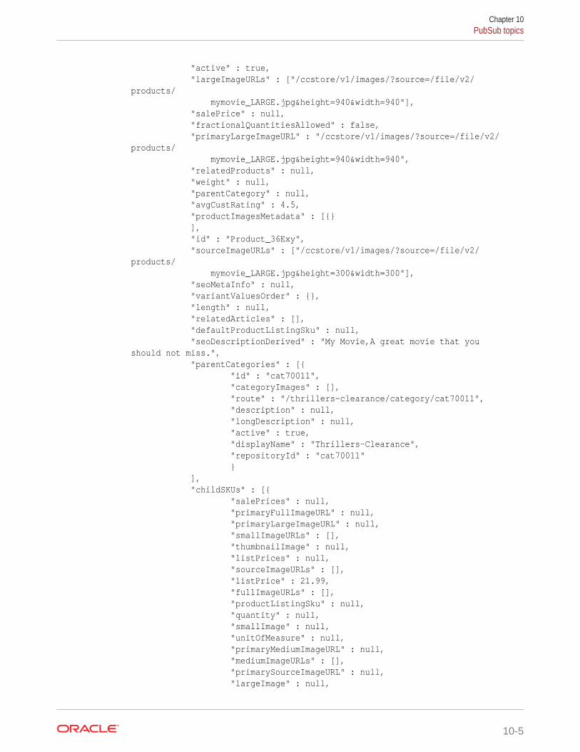
"active" : true, "largeImageURLs" : ["/ccstore/v1/images/?source=/file/v2/products/ mymovie_LARGE.jpg&height=940&width=940"], "salePrice" : null, "fractionalQuantitiesAllowed" : false, "primaryLargeImageURL" : "/ccstore/v1/images/?source=/file/v2/products/ mymovie_LARGE.jpg&height=940&width=940", "relatedProducts" : null, "weight" : null, "parentCategory" : null, "avgCustRating" : 4.5, "productImagesMetadata" : [{} ], "id" : "Product_36Exy", "sourceImageURLs" : ["/ccstore/v1/images/?source=/file/v2/products/ mymovie_LARGE.jpg&height=300&width=300"], "seoMetaInfo" : null, "variantValuesOrder" : {}, "length" : null, "relatedArticles" : [], "defaultProductListingSku" : null, "seoDescriptionDerived" : "My Movie,A great movie that you should not miss.", "parentCategories" : [{ "id" : "cat70011", "categoryImages" : [], "route" : "/thrillers-clearance/category/cat70011", "description" : null, "longDescription" : null, "active" : true, "displayName" : "Thrillers-Clearance", "repositoryId" : "cat70011" } ], "childSKUs" : [{ "salePrices" : null, "primaryFullImageURL" : null, "primaryLargeImageURL" : null, "smallImageURLs" : [], "thumbnailImage" : null, "listPrices" : null, "sourceImageURLs" : [], "listPrice" : 21.99, "fullImageURLs" : [], "productListingSku" : null, "quantity" : null, "smallImage" : null, "unitOfMeasure" : null, "primaryMediumImageURL" : null, "mediumImageURLs" : [], "primarySourceImageURL" : null, "largeImage" : null,
Chapter 10PubSub topics
10-5

"primaryThumbImageURL" : null, "primarySmallImageURL" : null, "repositoryId" : "Sku_36Fxy", "thumbImageURLs" : [], "salePriceEndDate" : null, "dynamicPropertyMapLong" : {}, "images" : [], "largeImageURLs" : [], "salePrice" : null, "salePriceStartDate" : null, "fractionalQuantitiesAllowed" : false } ], "repositoryId" : "Product_36Exy", "thumbImageURLs" : ["/ccstore/v1/images/?source=/file/v2/products/ mymovie_LARGE.jpg&height=100&width=100"], "primaryImageTitle" : "My Movie", "route" : "/my-movie/product/Product_36Exy", "brand" : null, "seoUrlSlugDerived" : "My Movie", "displayName" : "My Movie", "seoTitleDerived" : "My Movie", "selectedOptions" : [], "orderQuantity" : 1 }
Memory enabled
No
CART_READY
A message is published to this topic when the cart is loaded with items, either fromlocal storage for an anonymous shopper or from the persistent cart for a registeredshopper, and is ready for use. This topic allows subscribers to access the cart itemsand their associated product details.
$.Topic(PubSub.topicNames.CART_READY).publish(cart);
Arguments
cart: The current CartViewModel. See the View Model JSDoc for Commerce fordetails on what this view model contains.
Memory enabled
No
CART_UPDATED
A message is published to this topic when the cart is updated with the latest pricingresponse and saved to local storage.
$.Topic(pubsub.topicNames.CART_UPDATED).publish(cart);
Chapter 10PubSub topics
10-6

Arguments
cart: The current CartViewModel. See the View Model JSDoc for Commerce for details onwhat this view model contains.
Memory enabled
No
HISTORY_PUSH_STATE
A message is published to this topic when a shopper navigates from one page to another orrefreshes the page.
$.Topic(PubSub.topicNames.HISTORY_PUSH_STATE).publish(path);
Arguments
path: The path for the page being navigated to or refreshed, for example, /home, /cart, /checkout, /profile, and so on.
Memory enabled
Yes
ONERROR_EXCEPTION_HANDLER
A message is published to this topic when a runtime error occurs.
$.Topic(PubSub.topicNames.ONERROR_EXCEPTION_HANDLER).publish( errorMessage, errorUrl, errorLineNumber);
Arguments
errorMessage: Contains the error message, for example:
"Uncaught Error: Script error for: //abc.com/EEAdmin/js/ee/js/ atgsvcs-test.js http://requirejs.org/docs/errors.html#scripterror"
errorUrl: The URL value when the error occurred, for example:
http://localhost:8080/shared/js/libs/oraclejet/libs/require/require.js
errorLineNumber: The line of code the error occurred in.
Memory enabled
No
ORDER_SUBMISSION_SUCCESS
A message is published to this topic when the submission of an order is successfullycompleted.
$.Topic(PubSub.topicNames.ORDER_SUBMISSION_SUCCESS).publish(orderDetails);
Chapter 10PubSub topics
10-7

Arguments
orderDetails: A JSON array that includes data for the submitted order, for example:
[{ message : " success", id : "o30501", uuid : " 14f03075-1376-46dd-9e2c-1448255efa8f" }]
The properties in the JSON object include:
• message: This property has a value of success to indicate the order was submitted
• successfully.id: A system-generated ID for the order in the Order
• repository.uuid: A system-generated universally unique identifier for the order.
Memory enabled
No
PAGE_CHANGED, PAGE_VIEW_CHANGED
A message is published to these topics when a page has a view change or a contextchange. A view change means that the page type has changed, for example, from /home to /checkout. In this case, both the layout and the data change. A contextchange occurs when the page type remains the same but the data the page containschanges, for example, /product/prod1 to /product/prod2.
$.Topic(PubSub.topicNames.PAGE_CHANGED).publish(pageEventData);
Arguments
pageEventData: A JavaScript object that includes data related to the page changeevent, for example:
{ pageId:"category" contextId:"cat60041" seoslug:"controllers" previousContextId:"Product_36Exy" }
The properties in the JavaScript object include:
• pageId: An identifier for the page requested that represents either the page type(for example, product, collection, home, and so on) or, for article pages, the pageaddress that has been assigned in the Layout settings (for example, aboutUs,shipping, or returns, are all pages of type article).
• contextId: For contextual pages, a contextId is included and it may be a productID, category ID, an order ID, or an order confirmation ID. To determine the ID for aspecific product or category, you can view the item’s details on the Catalog page inCommerce. Order and order confirmation IDs are system-generated and cannotbe known beforehand but you can check for their existence in the JSON object.
Chapter 10PubSub topics
10-8

• seoslug: An SEO-friendly, internally-generated name for the product or category, basedon the product or category name. This property only has a value when changing to aproduct or category page.
• previousContextId: The context ID, if one exists, for the page that was rendered beforethe PAGE_CHANGED event occurred
Memory enabled
Yes
PAGE_VIEW_CHANGED is the same as PAGE_CHANGED, except that PAGE_VIEW_CHANGED reloadsonly the layout, while PAGE_CHANGED reloads the entire page.
PAGE_READY
A message is published to this topic when all the regions and widgets on a page are loaded.
$.Topic(PubSub.topicNames.PAGE_READY).publish(pageEventData);
Arguments
pageEventData: A JavaScript object that includes data about the loaded page, for example:
{ pageId:"category", contextId:"cat60041", seoslug:" psychological-thrillers" previousContextId: null, pageRepositoryId: "categoryPage" }
The properties in the JavaScript object include:
• pageId: An identifier for the page requested that represents either the page type (forexample, product, collection, home, and so on) or, for article pages, the page addressthat has been assigned in the Layout settings (for example, aboutUs, shipping, orreturns, are all pages of type article).
• contextId: For contextual pages, a contextId is included and it may be a product ID,category ID, an order ID, or an order confirmation ID. To determine the ID for a specificproduct or category, you can view the item’s details on the Catalog page in Commerce.Order and order confirmation IDs are system-generated and cannot be knownbeforehand but you can check for their existence in the JSON object.
• seoslug: An SEO-friendly, internally-generated name for the product or category, basedon the product or category name. This property only has a value when changing to aproduct or category page.
• previousContextId: The context ID, if one exists, for the page that was rendered beforethe PAGE_CHANGED event occurred.
• pageRepositoryId: The identifier for the page in the page repository. For the out of thebox pages, this value can be homePage, categoryPage, profilePage,checkoutPageWithGiftCard, userSpacesPage, orderHistoryPage, orderDetailsPage, oruserSpacesSettingsPage. For any additional pages created in Commerce, a system-generated ID is created, for example, pa100001.
Chapter 10PubSub topics
10-9
Memory enabled
Yes
PRODUCT_VIEWED
A message is published to this topic when the shopper views a product.
$.Topic(pubsub.topicNames.PRODUCT_VIEWED).publish(product);
Arguments
product: The current ProductViewModel. See the View Model JSDoc for Commercefor details on what this view model contains.
Memory enabled
Yes
SEARCH_RESULTS_UPDATED
A message is published to this topic when search results are retrieved or when anerror is returned while searching for a product. If search results are retrievedsuccessfully, those results are published with the message. If an error occurs, the erroris published with the message.
$.Topic(pubsub.topicNames.SEARCH_RESULTS_UPDATED).publishWith(searchResults, message);
Arguments
searchResults: The contents of this argument vary depending on whether the searchwas successful or not. If the search was successful, the argument consists of a JSONobject that includes the search results and meta-data about the search, for example:
{ searchResults : Array[5], isNewSearch:false, navigation : Array[5], pageCount : 15, pagingActionTemplate : JSONObject, recordOffSet : 0, recordsPerPage : 5, searchAdjustments :JSONObject, totalRecordsFound : 74 breadcrumbs:JSONObject }
The properties in the successful search JSON object include:
• searchResults: An array that contains the search results. The following codesample shows what an item in that array might look like:
{ "product.category" : ["Cameras and Camcorders"],
Chapter 10PubSub topics
10-10

"product.language" : ["en"], "record.type" : ["camera", "sku-camera"], "sku.listingId" : ["camera_1"], "product.priceRange" : ["JPY0 - JPY9"], "sku.activePrice" : ["3.990000"], "product.creationDate" : ["1466057558000"], "sku.url" : ["atgrep:/ProductCatalog/sku-camera/ camerasku_1_55?_product=camera_1&locale=en&priceListPair= salePrices_listPrices"], "product.priceListPair" : ["salePrices_listPrices"], "product.active" : ["1"], "sku.salePrice" : ["3.990000"], "sku.creationDate" : ["1466057558000"], "record.source" : ["ProductCatalog"], "product.url" : ["atgrep:/ProductCatalog/sku-camera/ camerasku_1_55?_product=camera_1&locale=en&priceListPair= salePrices_listPrices"], "sku.availabilityStatus" : ["OUTOFSTOCK"], "parentCategory.displayName" : ["Cameras and Camcorders"], "Endeca.Document.Language" : ["en"], "product.daysAvailable" : ["0"], "record.type.raw" : ["camera", "sku-camera"], "sku.baseUrl" : ["atgrep:/ProductCatalog/sku-camera/ camerasku_1_55"], "product.dateAvailable" : ["1466057558000"], "sku.repositoryId" : ["camerasku_1_55"], "product.baseUrl" : ["atgrep:/ProductCatalog/sku-camera/ camerasku_1_55"], "sku.listPrice" : ["399.990000"], "sku.onSale" : ["0"], "record.id" : ["sku-camera-camerasku__1__55..camera__1.en. salePrices__listPrices"], "product.route" : ["/digital-compact-system-camera/product/ camera_1"], "product.longDescription" : ["This digital compact system camera 14.1-megapixel,\n 4/3 Live MOS sensor allows you to capture sharp photos and record high-definition video footage with up\n to 1920 x 1080 resolution. Built-in Wi-Fi lets you easily share stored files.\n "], "sku.listingOptionIndex" : ["10000"], "id" : ["camera_1"], "repositoryId" : ["camera_1"], "displayName" : "Digital Compact System Camera", "shippingSurcharge" : 0, "listPrice" : 399.99, "salePrice" : null, "route" : "/digital-compact-system-camera/product/camera_1", "primaryImageAltText" : ["Digital Compact System Camera"], "primaryImageTitle" : ["Digital Compact System Camera"], "primaryLargeImageURL" : "/ccstore/v1/images/?source= /file/v2/products/OM_D_E_M10_LARGE.jpg&height=940&width=940", "primarySmallImageURL" : "/ccstore/v1/images/?source= /file/v2/products/OM_D_E_M10_LARGE.jpg&height=300&width=300", "primaryThumbImageURL" : "/ccstore/v1/images/?source=
Chapter 10PubSub topics
10-11
/file/v2/products/OM_D_E_M10_LARGE.jpg&height=100&width=100", "primaryMediumImageURL" : "/ccstore/v1/images/?source= /file/v2/products/OM_D_E_M10_LARGE.jpg&height=475&width=475", "primaryFullImageURL" : "/ccstore/v1/images/?source= /file/v2/products/OM_D_E_M10_LARGE.jpg", "childSKUs" : [{ "salePrice" : "3.990000", "listPrice" : "399.990000", "repositoryId" : ["camerasku_1_55"], "largeImage" : { "url" : "" }, "smallImage" : { "url" : "" }, "thumbnailImage" : { "url" : "" } } ], "maxActivePrice" : "399.990000", "minActivePrice" : "3.990000" }
• isNewSearch: A Boolean value that specifies whether this is a new search or not.
• navigation: An array of refinements elements, each of which contains therefinements available for a given dimension. These refinements are used topresent the shopper with a set of refinement links that she can use to further refinethe current search results. For example, the following JSON sample shows anexcerpt of the refinements available for the product.category dimension:
"refinements": [ { "multiSelect": false, "navigationState": "?N=4058976224&Nr=AND%28product.priceListPair%3AsalePrices_listPrices %2Cproduct.language%3Aen%29&Nrpp=12&Ntl=en&Ntt=cam&language=en& searchType=simple&visitId=-14ddf4e9%3A156217da656%3A-582e-10.170.102.150& visitorId=1298EspxGMOA_YEnEkrCS9sDr1JYUdQ6jpex06ADSHQzGuU30A4", "contentPath": "\/guidedsearch", "count": 2, "@class": "com.endeca.infront.cartridge.model.Refinement", "siteRootPath": "\/pages\/Default\/services", "siteState": { "contentPath": null, "siteId": "@error:siteNotFound", "@class": "com.endeca.infront.site.model.SiteState", "siteDisplayName": null, "validSite": false,
Chapter 10PubSub topics
10-12

"properties": { }, "siteDefinition": null, "matchedUrlPattern": null }, "label": "All Products", "properties": { "dimval.prop.category.ancestorCatalogIds": "cloudLakeCatalog", "dimval.prop.category.rootCatalogId": "cloudLakeCatalog", "dimval.prop.displayName_en": "All Products", "dimval.prop.category.repositoryId": "AllProdPagination", "dimval.prop.category.catalogs.repositoryId": "cloudCatalog,cloudLakeCatalog", "record.id": "atgrep:\/ProductCatalog\/category\/AllProdPagination? categoryPath=\/AllProdPagination", "DGraph.Spec": "AllProdPagination" } }, { "multiSelect": false, "navigationState": "?N=3881554706&Nr=AND%28product.priceListPair%3AsalePrices_listPrices% 2Cproduct.language%3Aen%29&Nrpp=12&Ntl=en&Ntt=cam&language=en& searchType=simple&visitId=-14ddf4e9%3A156217da656%3A-582e-10.170.102.150& visitorId=1298EspxGMOA_YEnEkrCS9sDr1JYUdQ6jpex06ADSHQzGuU30A4", "contentPath": "\/guidedsearch", "count": 1, "@class": "com.endeca.infront.cartridge.model.Refinement", "siteRootPath": "\/pages\/Default\/services", "siteState": { "contentPath": null, "siteId": "@error:siteNotFound", "@class": "com.endeca.infront.site.model.SiteState", "siteDisplayName": null, "validSite": false, "properties": { }, "siteDefinition": null, "matchedUrlPattern": null }, "label": "Blockbuster", "properties": { "dimval.prop.category.ancestorCatalogIds": "cloudLakeCatalog", "dimval.prop.category.rootCatalogId": "cloudLakeCatalog", "dimval.prop.displayName_en": "Blockbuster", "dimval.prop.category.repositoryId": "topLeaf", "dimval.prop.category.catalogs.repositoryId": "cloudCatalog,SiteContextDummyCatalog,ClassicalMoviesCatalog, cloudLakeCatalog", "record.id": "atgrep:\/ProductCatalog\/category\/topLeaf? categoryPath=\/topLeaf",
Chapter 10PubSub topics
10-13

"DGraph.Spec": "topLeaf" } }, …Additional refinements here… ], "multiSelect": false, "@type": "RefinementMenu", "name": "product.category", "ancestors": [ ], "displayName": "Category", "dimensionName": "product.category", "whyPrecedenceRuleFired": null },
• pageCount: The total number of pages of records. Each page contains the numberof records specified by recordsPerPage.
• pagingActionTemplate: A JSON object that returns data used to retrieve the nextpage of search results.
"pagingActionTemplate" : { "navigationState" : "?&Ntl=en&Ntt=camera&language=en&searchType=simple", "contentPath" : "/guidedsearch", "@class" : "com.endeca.infront.cartridge.model.NavigationAction", "siteRootPath" : "/pages/Default/services", "siteState" : { "contentPath" : null, "siteId" : "@error:siteNotFound", "@class" : "com.endeca.infront.site.model.SiteState", "siteDisplayName" : null, "validSite" : false, "properties" : {}, "siteDefinition" : null, "matchedUrlPattern" : null }, "label" : null }
• recordOffset: Identifies the page being viewed. For example, if you have 12records per page and recordOffset = 12, then page 2 is being viewed.
• recordsPerPage: The number of records to show per page, used for paginationcontrols.
• searchAdjustments: A JSON object that contains information about anyadjustments made to the original search terms.
– @type: Identifies the search adjustments portion of the JSON response.
– originalSearchTerms: The original search terms as entered by the shopper,including any wildcards.
– originalTerms: The original search terms entered by the shopper, minus anywildcards.
Chapter 10PubSub topics
10-14

• totalRecordsFound: The total number of records that match the search criteria.
• breadcrumbs: A JSON object that provides details on the user actions that led to thecurrent navigation state, for example:
"breadcrumbs" : { "removeAllAction" : { "navigationState" : "?Ntl=en&language=en&searchType=simple& visitId=null&visitorId=null", "contentPath" : "/guidedsearch", "@class" : "com.endeca.infront.cartridge.model.NavigationAction", "siteRootPath" : "/pages/Default/services", "siteState" : { "contentPath" : null, "siteId" : "@error:siteNotFound", "@class" : "com.endeca.infront.site.model.SiteState", "siteDisplayName" : null, "validSite" : false, "properties" : {}, "siteDefinition" : null, "matchedUrlPattern" : null }, "label" : null }, "refinementCrumbs" : [], "geoFilterCrumb" : null, "@type" : "Breadcrumbs", "endeca:auditInfo" : { "ecr:innerPath" : "breadcrumbs", "ecr:resourcePath" : "/pages/Default/services/guidedsearch" }, "searchCrumbs" : [{ "@class" : "com.endeca.infront.cartridge.model.SearchBreadcrumb", "terms" : "camera", "removeAction" : { "navigationState" : "?Nr=AND%28product.priceListPair%3AsalePrices_listPrices% 2Cproduct.language%3Aen%29&Nrpp=12&Ntl=en&language=en& searchType=simple&visitId=null&visitorId=null", "contentPath" : "/guidedsearch", "@class" : "com.endeca.infront.cartridge.model.NavigationAction", "siteRootPath" : "/pages/Default/services", "siteState" : { "contentPath" : null, "siteId" : "@error:siteNotFound", "@class" : "com.endeca.infront.site.model.SiteState", "siteDisplayName" : null, "validSite" : false, "properties" : {}, "siteDefinition" : null, "matchedUrlPattern" : null
Chapter 10PubSub topics
10-15

}, "label" : null }, "correctedTerms" : null, "key" : "All", "matchMode" : "allpartial" } ], "rangeFilterCrumbs" : []}
When the search has failed, the searchResults object contains details about the error,including:
• message: The runtime error message that indicates that the search has failed.
• status: Any HTTP status codes associated with the failed request.
• errorCode: An Commerce error code, which may be
GET_SEARCH_INTERNAL_ERROR = 31040,SEARCH_ADMIN_INTERNAL_ERROR = 31041, or SEARCH_ADMIN_INDEXING_INTERNAL_ERROR = 31042.
For example:
{ "message":"Unable to perform a search at this time", "status":"500", "errorCode":"31040" }
message: The second argument returned for the SEARCH_RESULTS_UPDATED topiccontains a JSON array that includes either a success or failure message and theSearchViewModel object, for example:
[{ message: "success", requestor: SearchViewModel}]
In the case of a failed search, this message property has a value of fail.
[{"message":"fail"}]
Memory enabled
Yes
Chapter 10PubSub topics
10-16

SKU_SELECTED
A message is published to this topic when a shopper selects all the variant options for aproduct, thereby identifying a specific SKU.
$.Topic(pubsub.topicNames.SKU_SELECTED).publish(product, selectedSku, variantOptions);
Arguments
product: The current ProductViewModel. See the View Model JSDoc for Commerce fordetails on what this view model contains.
selectedSku: A JSON object that includes data for the selected SKU, for example:
selectedSku = { "salePrices" : null, "resolution" : "14.1-megapixels", "listPrice" : 399.99, "quantity" : 5, "repositoryId" : "camerasku_1_18", "color" : "Black", "dynamicPropertyMapLong" : { "sku-camera_resolution" : 0, "sku-camera_color" : 8 }, "salePrice" : 399.99, "salePriceStartDate" : null, "fractionalQuantitiesAllowed" : false }
variantOptions: An array whose items reflect the variant options (such as color, size, finish,resolution, and so on) that can be selected for the SKU, along with any currently selectedvariant options. For example, the following JSON sample shows the color and resolutionvariants returned for the camera selected above.
[ { "optionDisplayName" : "color", "parent" : { "basePath" : "/", "deferredInit" : {}, "prevHistoryLength" : 7, "newHistoryLength" : 8, "localeSubscription" : { "R" : true }, "WIDGET_ID" : "productDetails", "imgMetadata" : [{} ], "firstTimeRender" : true }, "optionId" : "sku-camera_color",
Chapter 10PubSub topics
10-17

"actualOptionId" : "color", "optionCaption" : "Select color ...", "selectedOptionValue" : { "key" : "Antique Brass", "value" : 0 }, "originalOptionValues":[ { "key" : "Antique Brass", "value" : 0 }, { "key" : "Apricot", "value" : 1 }, { "key" : "Aquamarine", "value" : 2 }, ] }, { "optionDisplayName" : "resolution", "parent" : { "basePath" : "/", "deferredInit" : {}, "prevHistoryLength" : 7, "newHistoryLength" : 8, "localeSubscription" : { "R" : true }, "WIDGET_ID" : "productDetails", "imgMetadata" : [{} ], "firstTimeRender" : true }, "optionId" : "sku-camera_resolution", "actualOptionId" : "resolution", "optionCaption" : "Select resolution ...", "selectedOptionValue" : { "key" : "14.1-megapixels", "value" : 0 }, "originalOptionValues":[ { "key" : "14.1-megapixels", "value" : 0 }, { "key" : "24.3-megapixels", "value" : 1 }, ] }]
Chapter 10PubSub topics
10-18

Memory enabled
No
USER_LOGIN_SUCCESSFUL
A message is published to this topic when the shopper has successfully logged in. You cansubscribe to this topic to introduce logic that is specific to logged-in shoppers.
$.Topic(pubSub.topicNames.USER_LOGIN_SUCCESSFUL).publish();
Arguments
None
Memory enabled
No
USER_LOGOUT_SUCCESSFUL
A message is published to this topic when the shopper successfully logs out.
$.Topic(pubSub.topicNames.USER_LOGOUT_SUCCESSFUL).publish(message);
Arguments
message: A JSON array that includes a message property whose value is success.
[{"message":" success "}]
Memory enabled
No
USER_PASSWORD_EXPIRED
A message is published to this topic when the user password expires.
$.Topic(pubSub.topicNames.USER_PASSWORD_EXPIRED).publish();
Arguments
None
Memory enabled
No
USER_PROFILE_UPDATE_SUCCESSFUL
A message is published to this topic when the shopper’s profile is updated successfully with anew address, email, or name.
$.Topic(pubSub.topicNames.USER_PROFILE_UPDATE_SUCCESSFUL).publish(profileData);
Chapter 10PubSub topics
10-19

Arguments
profileData: A JSON object that contains the updated user profile data, for example:
{ "receiveEmail" : "yes", "lastName" : "Spencers", "locale" : "en_US", "contactBillingAddress" : "Address Object", "links" : [{ "rel" : "self", "href" : http://localhost:9080/ccstore/v1/profiles/current } ], "contactShippingAddress" : "Address Object", "repositoryId" : "se-570032", "parentOrganization" : null, "id" : "se-570032", "dynamicProperties" : [], "email" : "[email protected]", "shippingAddresses" : ["Address Object1","Address Object2"], "daytimeTelephoneNumber" : null, "secondaryAddresses" : { "Mom' s house" : "Address Object", "Work" : "Address Object", "Home" : "Address Object", }, "firstName" : "Mark", "shippingAddress" : "Address Object"}
Note that the Address Object references in the example above look similar to thefollowing:
"contactBillingAddress" : { "lastName" : "Spencers", "postalCode" : "36130", "phoneNumber" : "555-555-1234", "county" : null, "state" : "AL", "address1" : "123 Main St", "address2" : null, "firstName" : "Mark", "companyName" : null, "repositoryId" : "se-990032", "city" : "Montgomery", "country" : "US"},
Memory enabled
Yes
Chapter 10PubSub topics
10-20
USER_SESSION_EXPIRED
A message is published to this topic when the user session expires. You can subscribe to thistopic to clear any session-specific data once the session expires.
$.Topic(pubsub.topicNames.USER_SESSION_EXPIRED).publish();
Arguments
None
Memory enabled
Yes
Listen for messages from a particular object instanceThe PubSub library provides a way for code to publish and subscribe to a set of “global”messages.
Any code in the application can publish messages to a topic and any code can listen forthose messages. There may be a need, however, to listen for messages coming only from aspecific instance of an object. To manage this use case, Commerce includes the event-dispatcher module. Any object created from a module that extends event-dispatcher cantrigger events and allow other objects to register as listeners for those events.
The event-dispatcher module provides two functions, trigger() and on(), that facilitateevent triggering and event listening, respectively. In the example below, the ExampleDialogview model extends event-dispatcher and defines two events that can be fired, save-eventand cancel-event. To trigger the events, the view associated with ExampleDialog could callthe trigger() functions as needed, for example, when the Save or Cancel button is clicked.
/** * ExampleDialog.js */ define (["shared/ccLibs/event-dispatcher"], function(EventDispatcher) { "use strict"; /** * Example of a module that extends EventDispatcher, enabling instances of the * class to fire events to any listeners/event handlers registered. * @see EventDispatcher */ function ExampleDialog() { // Invoke superclass constructor to inherit any instance properties. EventDispatcher.call(this); this.p1 = "property 1 value"; this.p2 = "property 2 value"; } // Extend EventDispatcher so we can dispatch events. ExampleDialog.prototype = Object.create(EventDispatcher.prototype); ExampleDialog.prototype.constructor = ExampleDialog; // Define constants for any events we want to fire. These need only be unique // within this module because corresponding listeners receive
Chapter 10Listen for messages from a particular object instance
10-21
events from a // given instance of this module. ExampleDialog.SAVE = "save-event"; ExampleDialog.CANCEL = "cancel-event"; /** * Corresponding view could be set up to call this method when the * dialog's Save button is clicked, for example. */ ExampleDialog.prototype.save = function() { // Fire SAVE event. Any additional arguments (beyond the first) are // passed along to the event handler/listener. this.trigger(ExampleDialog.SAVE, this.p1); }; /** * Corresponding view could be set up to call this method when the * dialog's cancel button is clicked, for example. */ ExampleDialog.prototype.cancel = function() { // Fire CANCEL event. this.trigger(ExampleDialog.CANCEL); }; /** * Displays the dialog. */ ExampleDialog.prototype.show = function() { // Do something to display the dialog. Perhaps trigger an event as well. }; return ExampleDialog;});
This code sample creates an instance of ExampleDialog and provides listeners, usingthe on() function, for the save and cancel events triggered in that instance.
/** * Example.js */ define (["path/to/ExampleDialog"], function(ExampleDialog) { "use strict"; /** * Example of a module that listens for ExampleDialog events. Does nothing * real or useful other than establishing how to add listeners to an * EventDispatcher. * @see ExampleDialog */ function Example() { // Note: The code in this constructor might more typically be in an // initialize method or somewhere else. var dialog = new ExampleDialog();
Chapter 10Listen for messages from a particular object instance
10-22

// Add listeners for save and cancel events. 3rd arg, if provided, sets the // context for the listener dialog.on(ExampleDialog.SAVE, this.onSave, this); dialog.on(ExampleDialog.CANCEL, this.onCancel); dialog.show(); } /** * Listener/handler for dialog save events. * @param args {Array} Any args passed along when event is fired. */ Example.prototype.onSave = function(args) { // Do something... console.log(args[0]); }; /** * Listener/handler for dialog cancel events. * @param args {Array} Any args passed along when event is fired. */ Example.prototype.onCancel = function(args) { // Do something else... if (args.length === 0) { console.log("No args passed with cancel event."); } }; return Example;});
Chapter 10Listen for messages from a particular object instance
10-23

Glossary
Glossary-1

Index
Index-1