embroidery principles and elements of design
DESCRIPTION
Embroidery Principles and Elements of Design, Embroidery Principles and Elements of Design, Embroidery Principles and Elements of DesignTRANSCRIPT

PRINCIPLES AND ELEMENTS OF DESIGNMarlon L. [email protected]
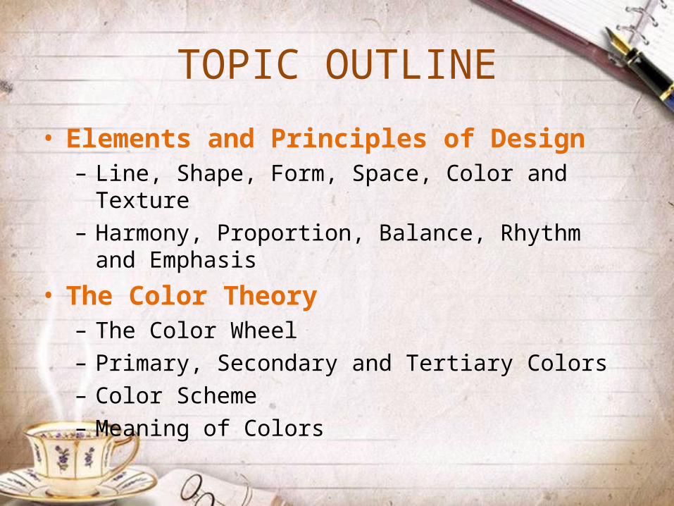
TOPIC OUTLINE
• Elements and Principles of Design– Line, Shape, Form, Space, Color and Texture– Harmony, Proportion, Balance, Rhythm and Emphasis
• The Color Theory– The Color Wheel– Primary, Secondary and Tertiary Colors– Color Scheme– Meaning of Colors

ELEMENTS OF DESIGN
PART I

Line is a mark with greater length than width. Lines can be horizontal, vertical or diagonal, straight or curved, thick or thin.
ELEMENTS OF DESIGN
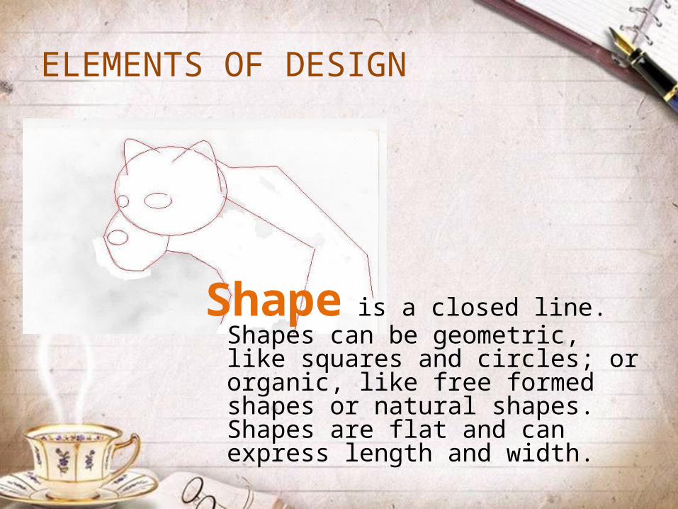
Shape is a closed line. Shapes can be geometric, like squares and circles; or organic, like free formed shapes or natural shapes. Shapes are flat and can express length and width.
ELEMENTS OF DESIGN

Forms are three-dimensional shapes, expressing length, width, and depth. Balls, cylinders, boxes and triangles are forms.
ELEMENTS OF DESIGN

Space is the area between and around objects. Space can also refer to the feeling of depth. In visual art when we can create the feeling or illusion of depth we call it space.
ELEMENTS OF DESIGN
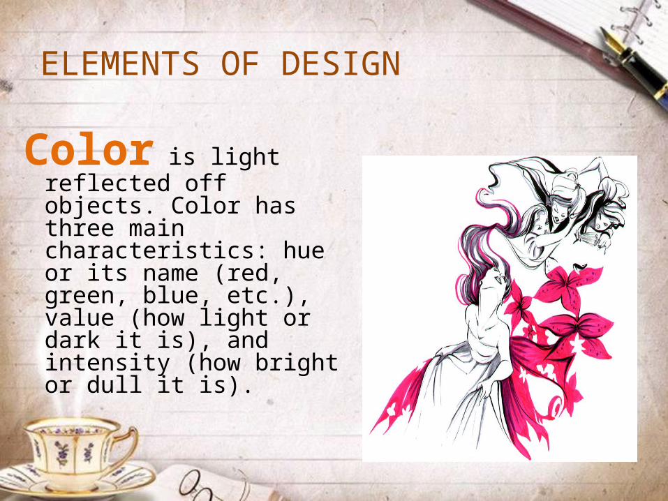
Color is light reflected off objects. Color has three main characteristics: hue or its name (red, green, blue, etc.), value (how light or dark it is), and intensity (how bright or dull it is).
ELEMENTS OF DESIGN

ELEMENTS OF DESIGN
Texture is the surface quality that can be seen and felt. Textures can be rough or smooth, soft or hard.

PRINCIPLES OF DESIGN
PART II

Harmony is the law of unity with variety. The repetition of line, form, shape and size. It can be defined as a pleasing arrangement of parts, whether it be music, poetry, color, or even an ice cream sundae.
PRINCIPLES OF DESIGN
PRINCIPLES OF DESIGN
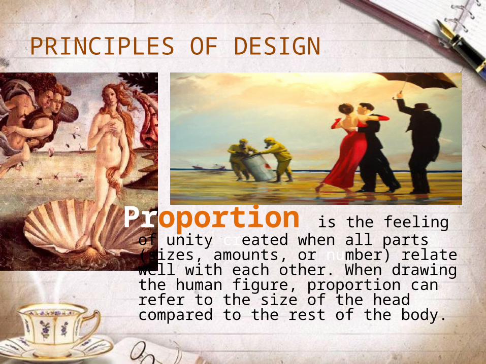
Proportion is the feeling of unity created when all parts (sizes, amounts, or number) relate well with each other. When drawing the human figure, proportion can refer to the size of the head compared to the rest of the body.

PRINCIPLES OF DESIGN
Balance is the distribution of the visual weight of objects, colors, texture, and space. If the design was a scale these elements should be balanced to make a design feel stable. In symmetrical balance, the elements used on one side of the design are similar to those on the other side; in asymmetrical balance, the sides are different but still look balanced.

PRINCIPLES OF DESIGNTwo Basic Approaches to Balance:
Symmetrical/Formal Balance
Asymmetrical /Informal Balance

PRINCIPLES OF DESIGN
Rhythm is a smooth related movement. It is created when one or more elements of design are used repeatedly to create a feeling of organized movement. Rhythm creates a mood like music or dancing.

PRINCIPLES OF DESIGN
Emphasis is the part of the design that catches the viewer’s attention. Usually the artist will make one area stand out by contrasting it with other areas. The area will be different in size, color, texture, shape, etc.

THE COLOR THEORY
PART III
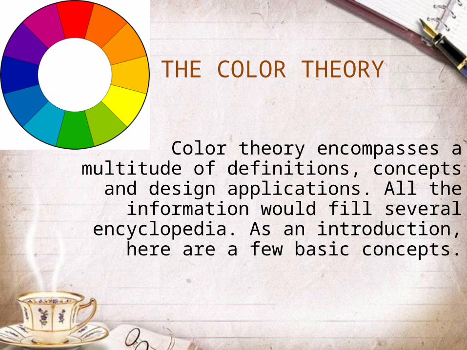
Color theory encompasses a multitude of definitions, concepts and design applications.
All the information would fill several encyclopedia. As an introduction, here are a
few basic concepts.
THE COLOR THEORY

A color circle, based on red, yellow and blue, is traditional in the field of art. Sir Isaac Newton developed the first circular diagram of colors in 1666. Since then scientists and artists have studied and designed numerous variations of this concept. In reality, any color circle or color wheel which presents a logically arranged sequence of pure hues has merit.
THE COLOR THEORY

Primary ColorsIn traditional color theory, these are the 3
pigment colors that can not be mixed or formed by any combination of other colors. All
other colors are derived from these 3 hues.
THE COLOR THEORY
PRIMARY COLORSRed, yellow and blue

Secondary ColorsThese are the colors formed by mixing the primary colors.
THE COLOR THEORY
SECONDARY COLORSGreen, orange and
purple

Tertiary ColorsThese are the colors formed by mixing a
primary and a secondary color. That's why the hue is a two word name, such as blue-green,
red-violet, and yellow-orange.
THE COLOR THEORY
TERTIARY COLORSYellow-orange, red-orange, red-purple, blue-purple, blue-green and yellow-green.

In visual experiences, color harmony is something that is pleasing to the eye. It engages the viewer and it creates an inner sense of order, a balance in the visual experience.
THE COLOR SCHEME

There are many theories for color schemes. The following illustrations and descriptions present some basic formulas .
• Related colors• Monochromatic Harmony• Analogous Harmony
• Contrasting Colors• Complementary• Double Complementary• Split Complementary• Triad
THE COLOR SCHEME

1. Monochromatic harmony has one color of different shade.
RELATED COLORS
2. Analogous harmony three neighboring colors, one of which is dominant.

1. Complementary colors opposite each other in the color wheel
CONTRASTING COLORS
2. Double complementary two neighboring colors and their opposite colors

3. Split Complementary three colors diagonal with each other
CONTRASTING COLORS
4. Triad the color in between three spaces in color wheel

Nature provides a perfect departure point for color harmony. In the illustration below, red yellow and green create a harmonious design, regardless of whether this combination fits into a technical formula for color harmony.
THE COLOR SCHEME
THE COLOR SCHEME
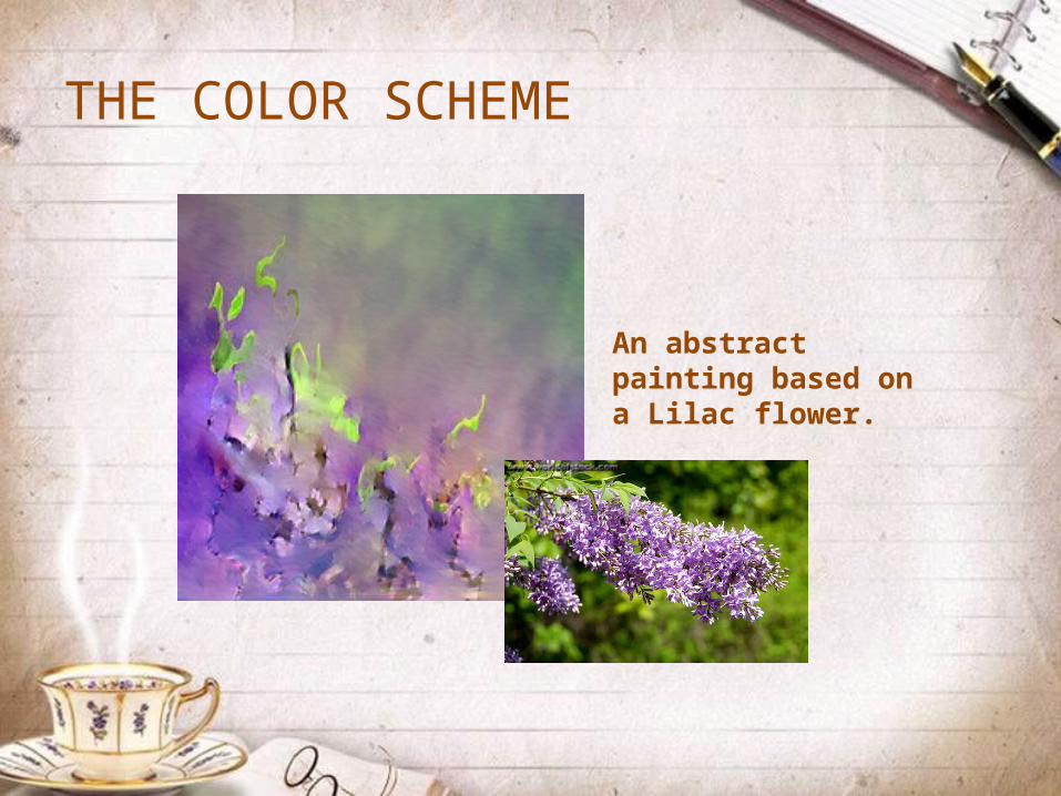
An abstract painting based on a Lilac flower.
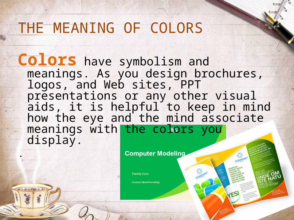
Colors have symbolism and meanings. As you design brochures, logos, and Web sites, PPT presentations or any other visual aids, it is helpful to keep in mind how the eye and the mind associate meanings with the colors you display.
.
THE MEANING OF COLORS
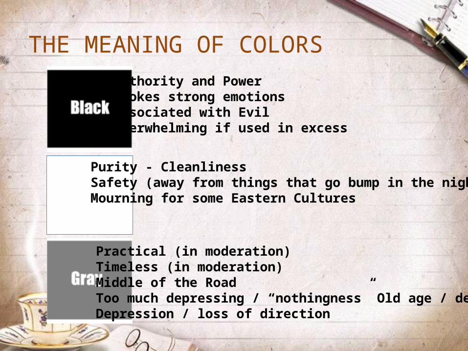
THE MEANING OF COLORS Authority and PowerEvokes strong emotionsAssociated with EvilOverwhelming if used in excess
Purity - CleanlinessSafety (away from things that go bump in the night)Mourning for some Eastern Cultures
Practical (in moderation)Timeless (in moderation)Middle of the RoadToo much depressing / “nothingness” Old age / deathDepression / loss of direction

THE MEANING OF COLORS Energy – Movement – ExcitementToo much – overwhelming, agitatedHolidays
Calming for lighter shadesCold and Uncaring some shades or too muchSteadfast – Dependable – LoyalProductive
Growth – Nature - MoneyCalming Forest Green = conservative, masculine and wealth)

THE MEANING OF COLORS Wealth – Prosperity – RichesSophisticationMystery – Wisdom - RespectToo much – Being Artificial
Cheerful – Laughter – HappinessOptimism – better timesToo much causes babies to cry and tempers to flareSpeeds up metabolism and creativity increases salesOverpowering if over used or associated with cowardice
FlamboyantFun times, happy energetic daysAmbition – New Dawn - Attitude
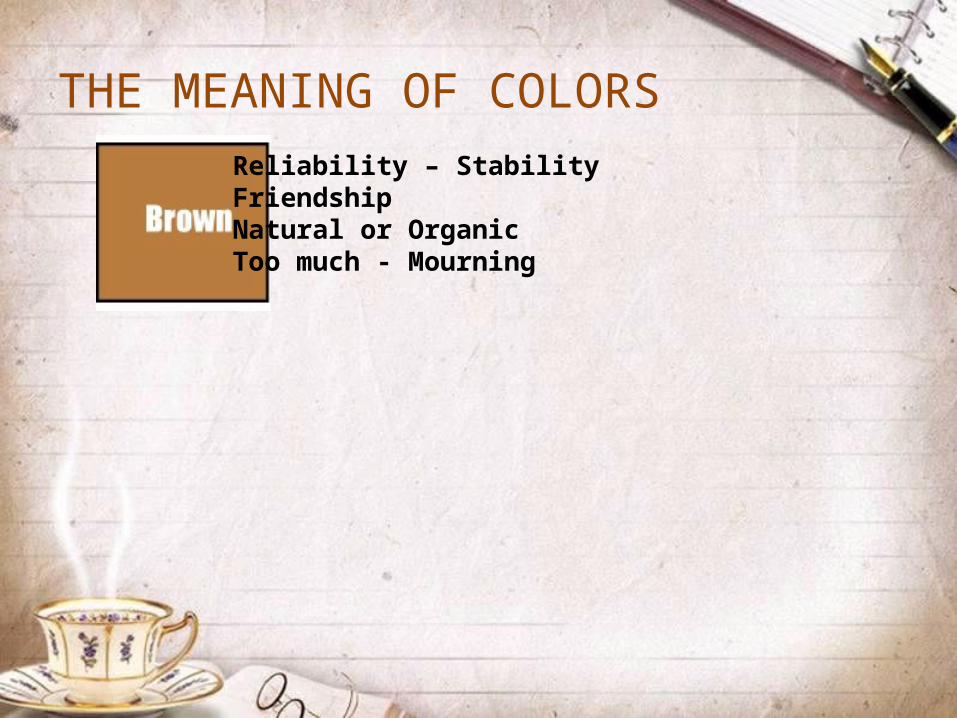
THE MEANING OF COLORS Reliability – StabilityFriendshipNatural or OrganicToo much - Mourning

REFERENCES
Technology and Livelihood Education K to 12 Exploratory Module – Handicraft , pp. 30-33
Bizness Concepts, Inc. Colors and Color Combinations. Retrieved from http://www.biznessconcepts.com/colors.htm
Color Matters. COLOR THEORY. Retrieved from http://www.colormatters.com/colortheory.html
Kid Space Arts. Elements & Principles of Design. Retrieved from http://www.4-hcurriculum.org/projects/kidspace/E-P.htm
THANKS FOR LISTENING!
“Enthusiasm is the best bait in chasing your creativity” - MLL