graphs, charts and tables bar charts line … charts and tables ... the bar graph shows the results...
TRANSCRIPT
Mathematics: Mathematics 2 (Int 1) Statistics – Student Materials 3
GRAPHS, CHARTS AND TABLES
By the end of this set of exercises, you should be able to
(a) extract and interpret data from bar charts, line graphs, pie charts
and stem-and-leaf diagrams, and interpret trends in graphs.
(b) construct bar charts, line graphs, stem-and-leaf diagrams,
and scattergraphs (scatter diagrams) from given data.
Also, draw a best-fitting line by eye on a scattergraph and use
it to estimate the value of one variable given the other.
(c) construct frequency tables from data without class intervals.

Mathematics: Mathematics 2 (Int 1) Statistics – Student Materials 4
Mathematics: Mathematics 2 (Int 1) Statistics – Student Materials 5
4 0
3 5
3 0
2 5
2 0
1 5
1 0
5
01 2 3 4 5
TV Channels
The Bar Graph (Chart)
Exercise 1
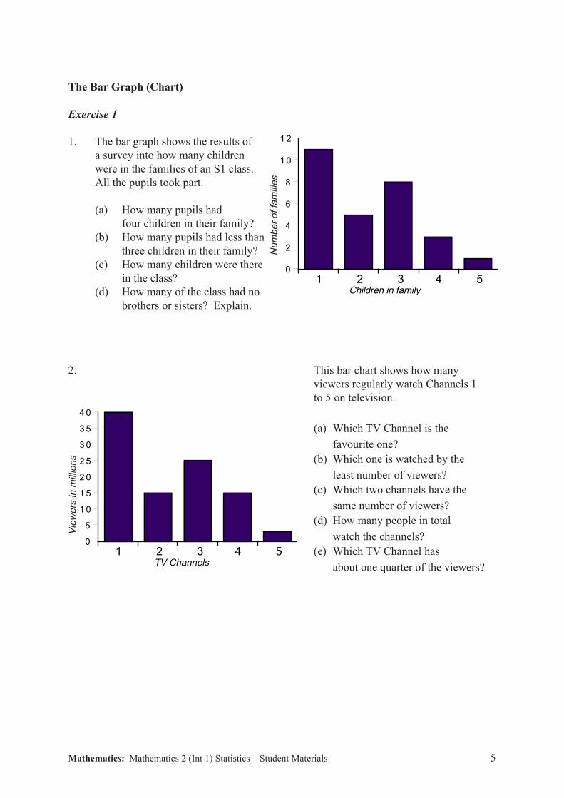
1. The bar graph shows the results of
a survey into how many children
were in the families of an S1 class.
All the pupils took part.
(a) How many pupils had
four children in their family?
(b) How many pupils had less than
three children in their family?
(c) How many children were there
in the class?
(d) How many of the class had no
brothers or sisters? Explain.
2. This bar chart shows how many
viewers regularly watch Channels 1
to 5 on television.
(a) Which TV Channel is the
favourite one?
(b) Which one is watched by the
least number of viewers?
(c) Which two channels have the
same number of viewers?
(d) How many people in total
watch the channels?
(e) Which TV Channel has
about one quarter of the viewers?
1 2
1 0
8
6
4
2
0
Children in family1 2 3 4 5
Vie
we
rs in
mill
ion
s
Nu
mb
er
of fa
mili
es
Mathematics: Mathematics 2 (Int 1) Statistics – Student Materials 6
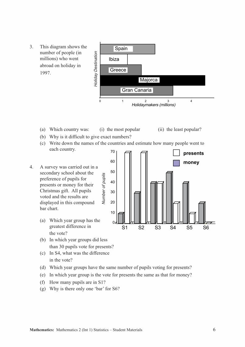
3. This diagram shows the
number of people (in
millions) who went
abroad on holiday in
1997.
(a) Which country was: (i) the most popular (ii) the least popular?
(b) Why is it difficult to give exact numbers?
(c) Write down the names of the countries and estimate how many people went to
each country.
4. A survey was carried out in a
secondary school about the
preference of pupils for
presents or money for their
Christmas gift. All pupils
voted and the results are
displayed in this compound
bar chart.
(a) Which year group has the
greatest difference in
the vote?
(b) In which year groups did less
than 30 pupils vote for presents?
(c) In S4, what was the difference
in the vote?
(d) Which year groups have the same number of pupils voting for presents?
(e) In which year group is the vote for presents the same as that for money?
(f) How many pupils are in S1?
(g) Why is there only one ‘bar’ for S6?
43210
Ibiza
Gran Canaria
Holidaymakers (millions)
Majorca
Greece
Spain
Ho
lida
y D
estin
atio
n
70
60
50
40
30
20
10
0
money
presents
Nu
mb
er
of
pu
pils
S1 S2 S3 S4 S5 S6
Mathematics: Mathematics 2 (Int 1) Statistics – Student Materials 7
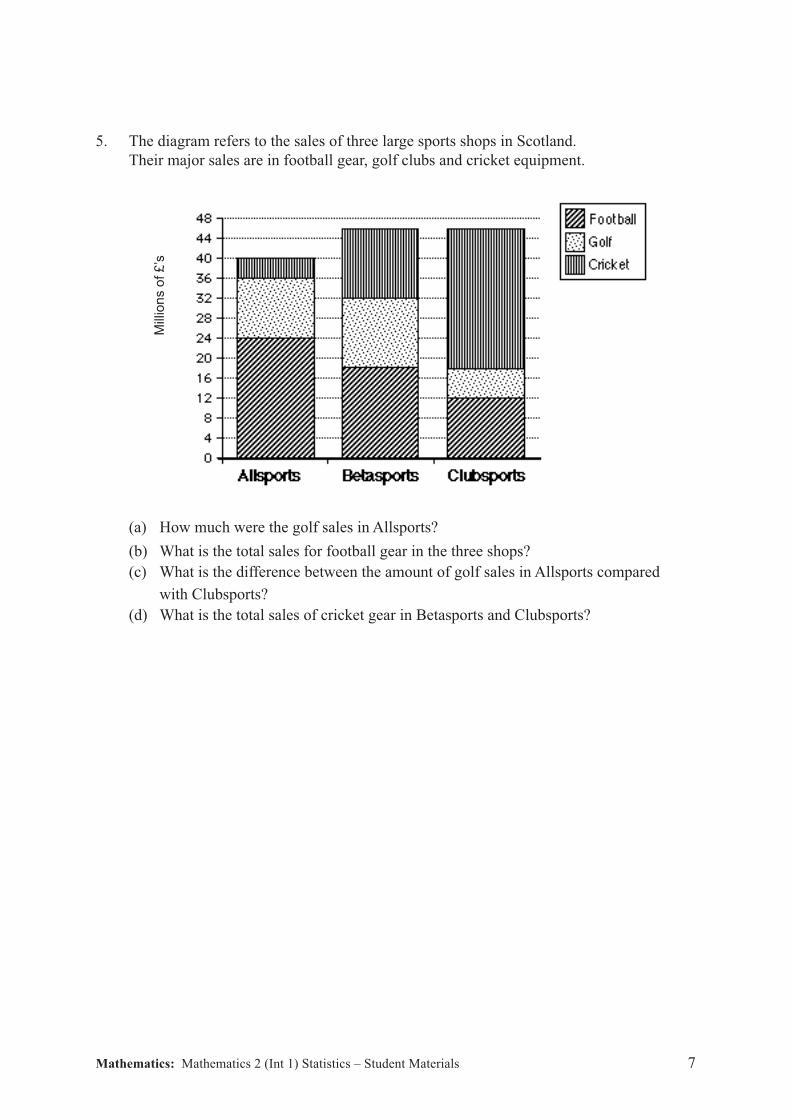
5. The diagram refers to the sales of three large sports shops in Scotland.
Their major sales are in football gear, golf clubs and cricket equipment.
(a) How much were the golf sales in Allsports?
(b) What is the total sales for football gear in the three shops?
(c) What is the difference between the amount of golf sales in Allsports compared
with Clubsports?
(d) What is the total sales of cricket gear in Betasports and Clubsports?
Mill
ion
s o
f £
’s
Mathematics: Mathematics 2 (Int 1) Statistics – Student Materials 8
The Line Graph
Exercise 2
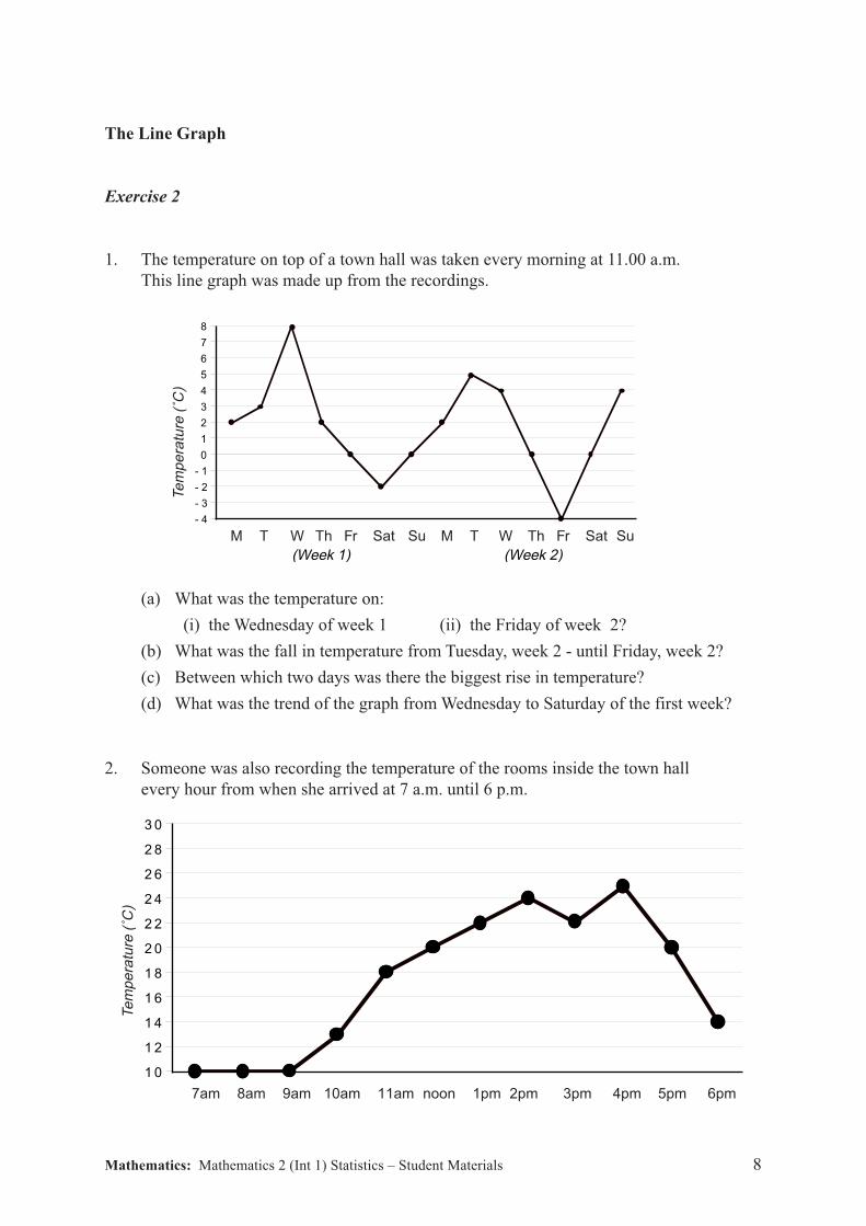
1. The temperature on top of a town hall was taken every morning at 11.00 a.m.
This line graph was made up from the recordings.
(a) What was the temperature on:
(i) the Wednesday of week 1 (ii) the Friday of week 2?
(b) What was the fall in temperature from Tuesday, week 2 - until Friday, week 2?
(c) Between which two days was there the biggest rise in temperature?
(d) What was the trend of the graph from Wednesday to Saturday of the first week?
2. Someone was also recording the temperature of the rooms inside the town hall
every hour from when she arrived at 7 a.m. until 6 p.m.
Te
mp
era
ture
(˚C
)
7am 8am 9am 10am 11am noon 1pm 2pm 3pm 4pm 5pm 6pm
3 0
2 8
2 6
2 4
2 2
2 0
1 8
1 6
1 4
1 2
1 0
Te
mp
era
ture
(˚C
)
8
7
6
5
4
3
2
1
0
- 1
- 2
- 3
- 4
M T W Th Fr Sat Su M T W Th Fr Sat Su
(Week 1) (Week 2)

Mathematics: Mathematics 2 (Int 1) Statistics – Student Materials 9
(a) When do you think that the heating was switched on?
(b) What was the highest temperature?
(c) When was this?
(d) Suggest a reason for the sudden dip from 2 p.m. till 3 p.m.
(e) Between which times did the temperature rise the most slowly?
(f) What was the longest time that the temperature kept rising?
(g) When was the heating officially switched off?
3. The line graph shows the number of swimming trunks, bikinis etc. bought in a
superstore during the months of January to October in a normal year.
(Sales month)
(a) Why are sales so low during January?
(b) When do the sales remain the same?
(three answers required).
(c) During which month do the sales rise the most?
(d) When is the most dramatic fall in sales and by how much?
(e) When are sales at a peak? Why is this?
(f) Although sales are not great in September - why do you think that swim wear
is still being bought?
Jan Feb March April May June July Aug Sept Oct
Sw
im W
ea
r (1
00
0’s
)
0
2
4
6
8
10
12
Mathematics: Mathematics 2 (Int 1) Statistics – Student Materials 10
The Pie Chart
Exercise 3
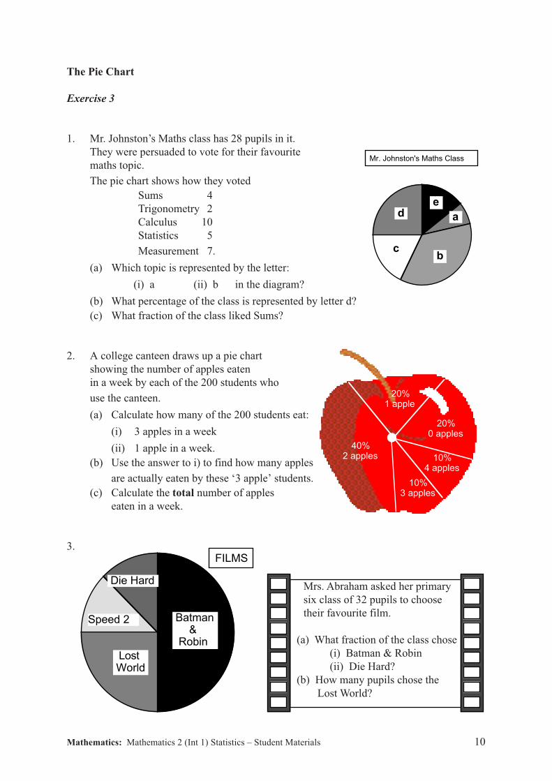
1. Mr. Johnston’s Maths class has 28 pupils in it.
They were persuaded to vote for their favourite
maths topic.
The pie chart shows how they voted
Sums 4
Trigonometry 2
Calculus 10
Statistics 5
Measurement 7.
(a) Which topic is represented by the letter:
(i) a (ii) b in the diagram?
(b) What percentage of the class is represented by letter d?
(c) What fraction of the class liked Sums?
2. A college canteen draws up a pie chart
showing the number of apples eaten
in a week by each of the 200 students who
use the canteen.
(a) Calculate how many of the 200 students eat:
(i) 3 apples in a week
(ii) 1 apple in a week.
(b) Use the answer to i) to find how many apples
are actually eaten by these ‘3 apple’ students.
(c) Calculate the total number of apples
eaten in a week.
3.
Mrs. Abraham asked her primary
six class of 32 pupils to choose
their favourite film.
(a) What fraction of the class chose
(i) Batman & Robin
(ii) Die Hard?
(b) How many pupils chose the
Lost World?
Mr. Johnston's Maths Class
b
a
e d
c
FILM
S
Die Hard
Speed 2
Lost World
Batman & Robin
FILMS
20%1 apple
20%0 apples
10%4 apples
10%3 apples
40%2 apples
Mathematics: Mathematics 2 (Int 1) Statistics – Student Materials 11
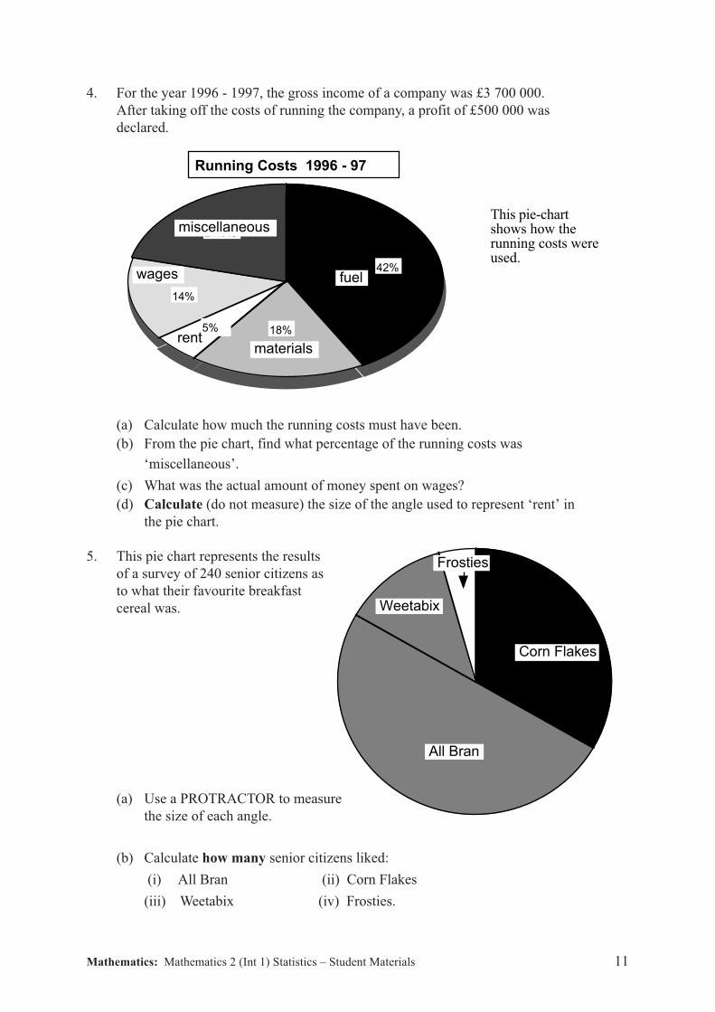
4. For the year 1996 - 1997, the gross income of a company was £3 700 000.
After taking off the costs of running the company, a profit of £500 000 was
declared.
(a) Calculate how much the running costs must have been.
(b) From the pie chart, find what percentage of the running costs was
‘miscellaneous’.
(c) What was the actual amount of money spent on wages?
(d) Calculate (do not measure) the size of the angle used to represent ‘rent’ in
the pie chart.
5. This pie chart represents the results
of a survey of 240 senior citizens as
to what their favourite breakfast
cereal was.
(a) Use a PROTRACTOR to measure
the size of each angle.
(b) Calculate how many senior citizens liked:
(i) All Bran (ii) Corn Flakes
(iii) Weetabix (iv) Frosties.
42%
18%5%
14%
21.0%
Running Costs 1996 - 97
fuel
materials
wages
rent
miscellaneousThis pie-chart shows how the running costs were used.
All Bran
Frosties
Weetabix
Corn Flakes
Mathematics: Mathematics 2 (Int 1) Statistics – Student Materials 12
4
3
2
1
0
Scara Island Phones
10 2 4 6 8 10
Scara Island Phones
Trends in Graphs
Exercise 4
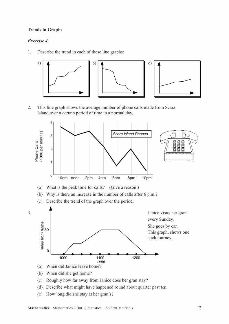
1. Describe the trend in each of these line graphs:
a) b) c)
2. This line graph shows the average number of phone calls made from Scara
Island over a certain period of time in a normal day.
(a) What is the peak time for calls? (Give a reason.)
(b) Why is there an increase in the number of calls after 6 p.m.?
(c) Describe the trend of the graph over the period.
3. Janice visits her gran
every Sunday.
She goes by car.
This graph, shows one
such journey.
(a) When did Janice leave home?
(b) When did she get home?
(c) Roughly how far away from Janice does her gran stay?
(d) Describe what might have happened round about quarter past ten.
(e) How long did she stay at her gran’s?
Ph
on
e C
alls
(10
00
pe
r m
inu
te)
mile
s f
rom
ho
me
1000
30
0
Time1100 1200
10am noon 2pm 4pm 6pm 8pm 10pm
Mathematics: Mathematics 2 (Int 1) Statistics – Student Materials 13
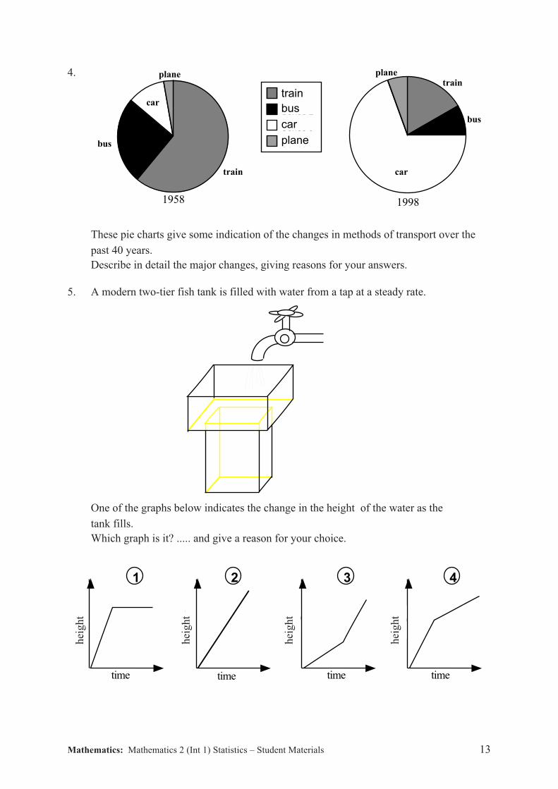
planetrain
car
bus
Series 1
Series 2
Series 3
Series 4
train
bus
car
plane
plane
train
car
bus
1958 1998
4.
These pie charts give some indication of the changes in methods of transport over the
past 40 years.
Describe in detail the major changes, giving reasons for your answers.
5. A modern two-tier fish tank is filled with water from a tap at a steady rate.
One of the graphs below indicates the change in the height of the water as the
tank fills.
Which graph is it? ..... and give a reason for your choice.
1 3time 2time time 4time
1 2 3 4
hei
gh
t
hei
gh
t
hei
gh
t
hei
gh
t
Mathematics: Mathematics 2 (Int 1) Statistics – Student Materials 14
The Scattergraph
Exercise 5
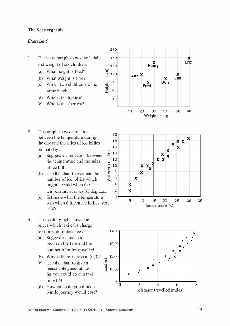
1. The scattergraph shows the height
and weight of six children.
(a) What height is Fred?
(b) What weight is Eric?
(c) Which two children are the
same height?
(d) Who is the lightest?
(e) Who is the shortest?
2. This graph shows a relation
between the temperature during
the day and the sales of ice lollies
on that day.
(a) Suggest a connection between
the temperature and the sales
of ice lollies.
(b) Use the chart to estimate the
number of ice lollies which
might be sold when the
temperature reaches 35 degrees.
(c) Estimate what the temperature
was when thirteen ice lollies were
sold?
3. This scattergraph shows the
prices which taxi cabs charge
for fairly short distances.
(a) Suggest a connection
between the fare and the
number of miles travelled.
(b) Why is there a cross at (0,0)?
(c) Use the chart to give a
reasonable guess at how
far you could go in a taxi
for £1·50.
(d) How much do you think a
6 mile journey would cost?
co
st
(£)
4
3
2
1
0
864200 2 4 6 8
distance travelled (miles)
0
£1·00
£2·00
£3·00
£4·00
210
180
150
120
9 0
6 0
3 0
0
x
xx
x
x
xHenry
Eric
JanDon
Fred
Ann
2 0
1 8
1 6
1 4
1 2
1 0
8
6
4
2
0
xx
xx
x x xx
xx
xxx
xx
x
xx
Sa
les o
f ic
e lo
llie
s
5 10 15 20 25 30 35
Temperature ˚C
He
igh
t (i
n c
m)
10 20 30 40 50 60
Weight (in kg)
Mathematics: Mathematics 2 (Int 1) Statistics – Student Materials 15
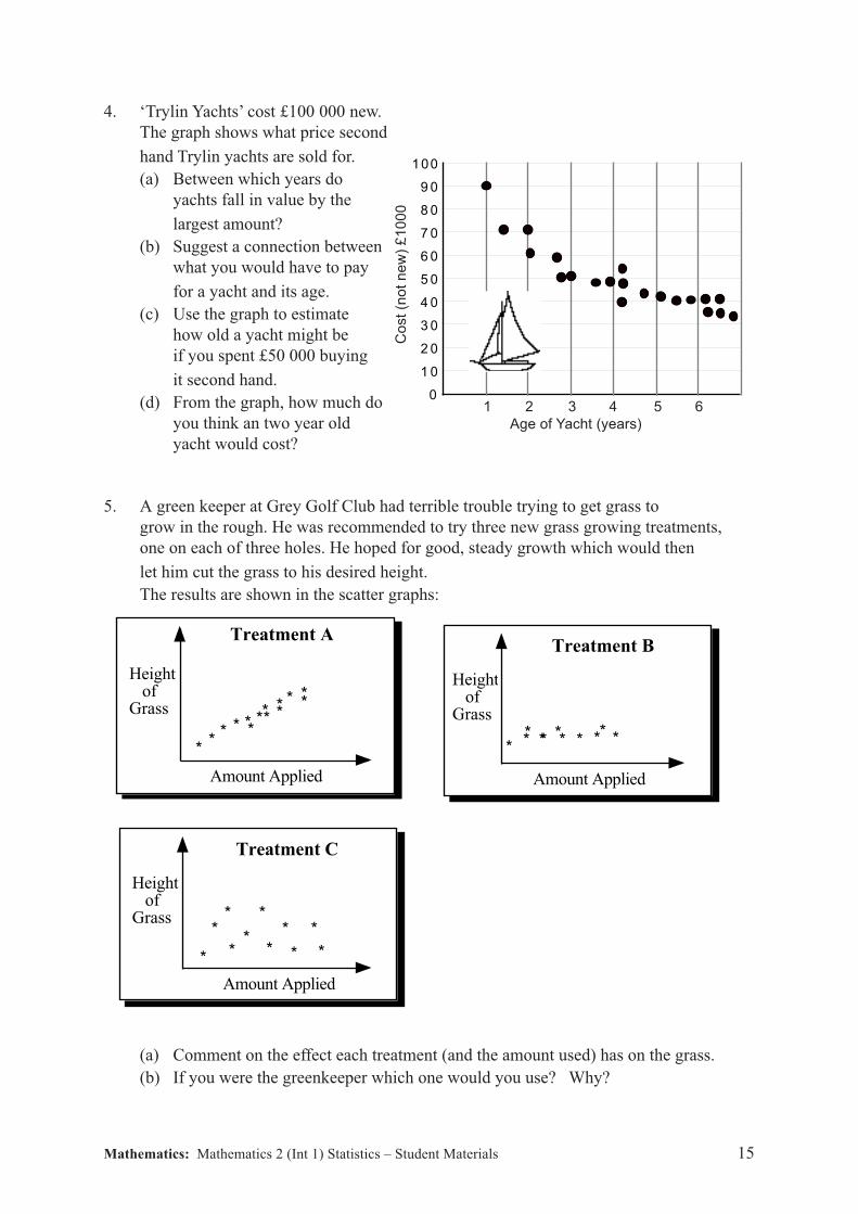
4. ‘Trylin Yachts’ cost £100 000 new.
The graph shows what price second
hand Trylin yachts are sold for.
(a) Between which years do
yachts fall in value by the
largest amount?
(b) Suggest a connection between
what you would have to pay
for a yacht and its age.
(c) Use the graph to estimate
how old a yacht might be
if you spent £50 000 buying
it second hand.
(d) From the graph, how much do
you think an two year old
yacht would cost?
5. A green keeper at Grey Golf Club had terrible trouble trying to get grass to
grow in the rough. He was recommended to try three new grass growing treatments,
one on each of three holes. He hoped for good, steady growth which would then
let him cut the grass to his desired height.
The results are shown in the scatter graphs:
(a) Comment on the effect each treatment (and the amount used) has on the grass.
(b) If you were the greenkeeper which one would you use? Why?
**
* * * *** * *
***
*
Amount Applied
Height of Grass
Treatment A
Height of Grass
* * * * * * ** * * *
Amount Applied
Treatment B
Height of Grass
*
*
**
**
*
*
*
* *
Amount Applied
Treatment C
100
9 0
8 0
7 0
6 0
5 0
4 0
3 0
2 0
1 0
0C
ost
(no
t n
ew
) £
10
00
1 2 3 4 5 6
Age of Yacht (years)
Mathematics: Mathematics 2 (Int 1) Statistics – Student Materials 16
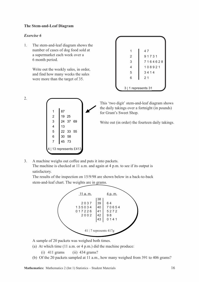
1 4 7
2 9 1 7 3 1
3 7 1 6 4 6 2 8
4 1 0 8 9 2 1
5 3 4 1 4
6 2 1
3 | 3 represents 31
The Stem-and-Leaf Diagram
Exercise 6
1. The stem-and-leaf diagram shows the
number of cases of dog food sold at
a supermarket each week over a
6 month period.
Write out the weekly sales, in order,
and find how many weeks the sales
were more than the target of 35.
2.
This ‘two digit’ stem-and-leaf diagram shows
the daily takings over a fortnight (in pounds)
for Grant’s Sweet Shop.
Write out (in order) the fourteen daily takings.
3. A machine weighs out coffee and puts it into packets.
The machine is checked at 11 a.m. and again at 4 p.m. to see if its output is
satisfactory.
The results of the inspection on 15/9/98 are shown below in a back-to-back
stem-and-leaf chart. The weights are in grams.
A sample of 20 packets was weighed both times.
(a) At which time (11 a.m. or 4 p.m.) did the machine produce:
(i) 411 grams (ii) 434 grams?
(b) Of the 20 packets sampled at 11 a.m., how many weighed from 391 to 406 grams?
1 87
2 19 25
3 24 37 69
4 13
5 22 33 55
6 30 58
7 45 73
4 | 13 represents 413
11 a. m. 4 p. m.
38
2 0 3 7 39 6 4
1 3 5 0 3 4 40 7 0 6 5 4
0 1 7 2 2 6 41 5 2 7 2
2 0 0 2 42 9 8
43 0 1 4 1
stem × 10leaves × 1041 | 7 represents 417g
3 | 1 represents 31
4 | 13 represents £413
Mathematics: Mathematics 2 (Int 1) Statistics – Student Materials 17
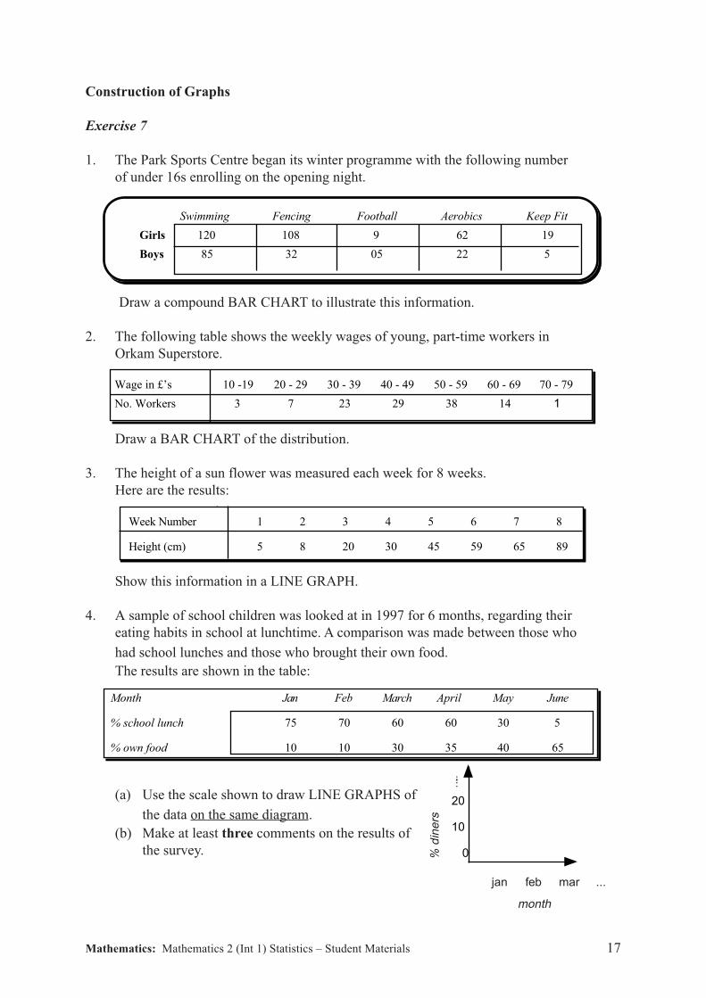
Construction of Graphs
Exercise 7
1. The Park Sports Centre began its winter programme with the following number
of under 16s enrolling on the opening night.
Swimming Fencing Football Aerobics Keep Fit
Girls 120 108 9 62 19
Boys 85 32 05 22 5
Draw a compound BAR CHART to illustrate this information.
2. The following table shows the weekly wages of young, part-time workers in
Orkam Superstore.
Wage in £’s 10 -19 20 - 29 30 - 39 40 - 49 50 - 59 60 - 69 70 - 79
No. Workers 3 7 23 29 38 14 1
Draw a BAR CHART of the distribution.
3. The height of a sun flower was measured each week for 8 weeks.
Here are the results:
Wage in £’s 10 -19 20 - 29 30 - 39 40 - 49 50 - 59 60 - 69 70 -
79 No. Workers 3 7 23 29 38
Week Number 1 2 3 4 5 6 7 8
Height (cm) 5 8 20 30 45 59 65 89
Show this information in a LINE GRAPH.
4. A sample of school children was looked at in 1997 for 6 months, regarding their
eating habits in school at lunchtime. A comparison was made between those who
had school lunches and those who brought their own food.
The results are shown in the table:
Month Jan Feb March April May June
% school lunch 75 70 60 60 30 5
% own food 10 10 30 35 40 65
(a) Use the scale shown to draw LINE GRAPHS of
the data on the same diagram.
(b) Make at least three comments on the results of
the survey.
20
10
0
jan feb mar ...
month
% d
ine
rs
Mathematics: Mathematics 2 (Int 1) Statistics – Student Materials 18
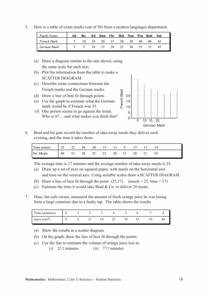
5 0
4 5
4 0
3 5
3 0
2 5
2 0
1 5
1 0
5
0F
ren
ch
Ma
rk5 10 15 20
German Mark
Time (mins) 25 22 20 20 15 13 9 15 17 14
No. Meals 40 33 30 32 22 20 13 20 21 19
5. Here is a table of exam marks (out of 50) from a modern languages department.
Pupils Name Ali Bo Ed Dan Flo Hal Nan Pen Rab Sid
French Mark 5 10 10 20 15 30 30 40 40 45
German Mark 5 5 10 15 20 25 30 35 35 45
(a) Draw a diagram similar to the one shown, using
the same scale for each axis.
(b) Plot the information from the table to make a
SCATTER DIAGRAM.
(c) Describe some connections between the
French marks and the German marks.
(d) Draw a line of best fit through points.
(e) Use the graph to estimate what the German
mark would be if French was 35.
(f) One person seems to go against the trend.
Who is it?.... and what makes you think that?
6. Brad and his pals record the number of take-away meals they deliver each
evening, and the time it takes them.
The average time is 17 minutes and the average number of take-away meals is 25.
(a) Draw up a set of axes on squared paper, with meals on the horizontal axis
and time on the vertical axis. Using suitable scales draw a SCATTER DIAGRAM.
(b) Draw a line of best fit through the point (25,17). (meals = 25, time = 17)
(c) Estimate the time it would take Brad & Co. to deliver 28 meals.
7. Dino, the cafe owner, measured the amount of fresh orange juice he was losing
from a large container due to a faulty tap. The table shows the results.
Time (minutes) 0 1 2 3 4 5 6 7 8
Juice (cm3) 0 6 11 18 25 30 35 43 48
(a) Show the results in a scatter diagram.
(b) On the graph, draw the line of best fit through the points.
(c) Use the line to estimate the volume of orange juice lost in:
(i) 21/2 minutes (ii) 71/2 minutes
Mathematics: Mathematics 2 (Int 1) Statistics – Student Materials 19
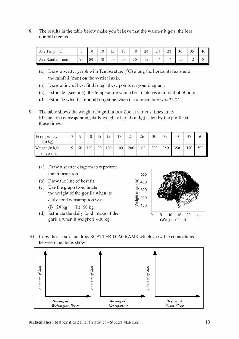
8. The results in the table below make you believe that the warmer it gets, the less
rainfall there is.
Ave Temp (°C) 5 10 10 12 15 18 20 24 28 30 35 40
Ave Rainfall (mm) 90 80 70 68 58 35 15 17 17 15 12 8
(a) Draw a scatter graph with Temperature (°C) along the horizontal axis and
the rainfall (mm) on the vertical axis.
(b) Draw a line of best fit through these points on your diagram.
(c) Estimate, (see line), the temperature which best matches a rainfall of 50 mm.
(d) Estimate what the rainfall might be when the temperature was 25°C.
9. The table shows the weight of a gorilla in a Zoo at various times in its
life, and the corresponding daily weight of food (in kg) eaten by the gorilla at
those times.
Food per day 3 9 10 15 15 18 25 26 30 35 40 45 50
(in kg)
Weight (in kg) 5 50 100 90 100 100 200 180 200 350 350 450 500
of gorilla
(a) Draw a scatter diagram to represent
the information.
(b) Draw the line of best fit.
(c) Use the graph to estimate:
the weight of the gorilla when its
daily food consumption was
(i) 20 kg (ii) 60 kg.
(d) Estimate the daily food intake of the
gorilla when it weighed 400 kg.
10. Copy these axes and draw SCATTER DIAGRAMS which show the connections
between the items shown.
0 5 10 15 20 etc
100
200
300
400
500
(Weight of food)
(We
igh
t o
f g
ori
lla)
Buying of
Swim Wear
Buying of
Wellington Boots
Buying of
Newspapers
Am
ou
nt
of
Su
n
Am
ou
nt
of
Su
n
Am
ou
nt
of
Su
n
Mathematics: Mathematics 2 (Int 1) Statistics – Student Materials 20
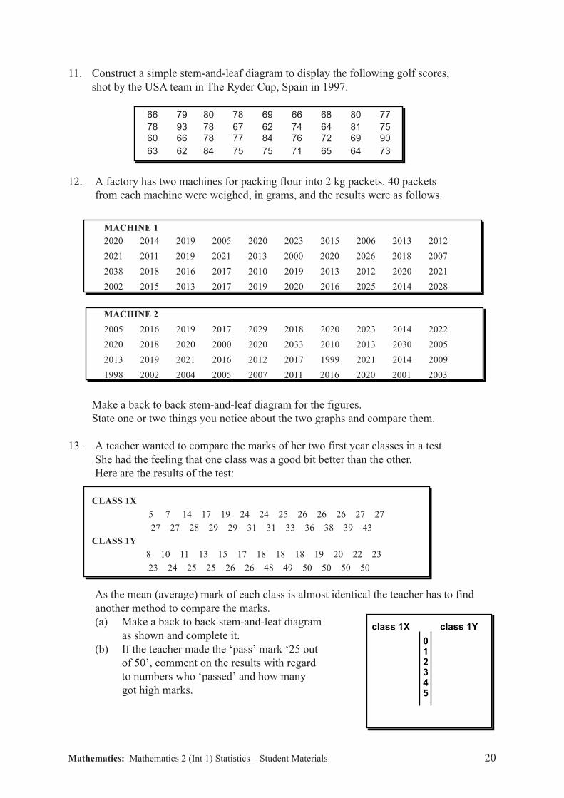
11. Construct a simple stem-and-leaf diagram to display the following golf scores,
shot by the USA team in The Ryder Cup, Spain in 1997.
66 79 80 78 69 66 68 80 77
78 93 78 67 62 74 64 81 75
60 66 78 77 84 76 72 69 90
63 62 84 75 75 71 65 64 73
12. A factory has two machines for packing flour into 2 kg packets. 40 packets
from each machine were weighed, in grams, and the results were as follows.
MACHINE 1
2020 2014 2019 2005 2020 2023 2015 2006 2013 2012
2021 2011 2019 2021 2013 2000 2020 2026 2018 2007
2038 2018 2016 2017 2010 2019 2013 2012 2020 2021
2002 2015 2013 2017 2019 2020 2016 2025 2014 2028
MACHINE 2
2005 2016 2019 2017 2029 2018 2020 2023 2014 2022
2020 2018 2020 2000 2020 2033 2010 2013 2030 2005
2013 2019 2021 2016 2012 2017 1999 2021 2014 2009
1998 2002 2004 2005 2007 2011 2016 2020 2001 2003
Make a back to back stem-and-leaf diagram for the figures.
State one or two things you notice about the two graphs and compare them.
13. A teacher wanted to compare the marks of her two first year classes in a test.
She had the feeling that one class was a good bit better than the other.
Here are the results of the test:
CLASS 1X
5 7 14 17 19 24 24 25 26 26 26 27 27
27 27 28 29 29 31 31 33 36 38 39 43
CLASS 1Y
8 10 11 13 15 17 18 18 18 19 20 22 23
23 24 25 25 26 26 48 49 50 50 50 50
As the mean (average) mark of each class is almost identical the teacher has to find
another method to compare the marks.
(a) Make a back to back stem-and-leaf diagram
as shown and complete it.
(b) If the teacher made the ‘pass’ mark ‘25 out
of 50’, comment on the results with regard
to numbers who ‘passed’ and how many
got high marks.
class 1X class 1Y
012345

Mathematics: Mathematics 2 (Int 1) Statistics – Student Materials 21
Frequency Tables
Exercise 8
1. What numbers do these tally marks stand for?
(a) (b)
2. A group of Primary Seven children were asked to vote for their class captain.
The ballot papers unfolded as follows:
Construct a frequency table like the one shown
and answer the following questions:
(a) Who won the election?
(b) One person voted for him/herself, and
that was the only vote he/she got.
Who was it?
(c) How many more votes did Gina get than Louise?
3. The results for the Scottish Hockey League on the last Saturday in Sept. 2010 are:
Construct a frequency table to illustrate the number of goals which will be scored!!!
IIII IIII IIII I IIIIIIII IIII IIII IIII IIII IIII
DAVID FRED LOUISE FRED LOUISE FRED
FRED DAVID DANIEL GINA GINA DANIEL
GINA DANIEL GINA GINA DANIEL FRED
LOUISE FRED FRED DAVID FRED GINA
DANIEL GINA LOUISE LOUISE GINA GINA
ALICE FRED FRED FRED LOUISE DAVID
Name Tally Frequency
Airdrie Thistle 1 Airdrie Athletic 4 Ayr Rovers 8 Ayr Thistle 5
Dundee Thistle 0 Dundee Rovers 0 Jedburgh 4 Peebles 4
Edinburgh Thistle 1 Edinburgh Athletic 2 Kilmarnock Rovers 2 Kilmarnock United 0
Stranraer Thistle 4 Stranraer Rovers 4 Aberdeen Rovers 1 Aberdeen Thistle 1
Elgin Thistle 6 Elgin Rovers 1 Oban Rovers 7 Oban Thistle 7
Stornoway Thistle 9 Stornaway United 3 Brechin Thistle 2 Brechin United 2
Dunfermline Rovers 1 Dunfermline Athletic 1 Troon Thistle 5 Prestwick United 2
Arbroath Rovers 2 Arbroath Thistle 1 Paisley Thistle 1 Johnstone Rovers 3
Bishopton Rovers 0 Clydebank Thistle 1 Perth Flyers 10 Perth Rovers 0
Mathematics: Mathematics 2 (Int 1) Statistics – Student Materials 22
MATHEMATICS 2 (INTERMEDIATE 1)
Checkup Exercise 1
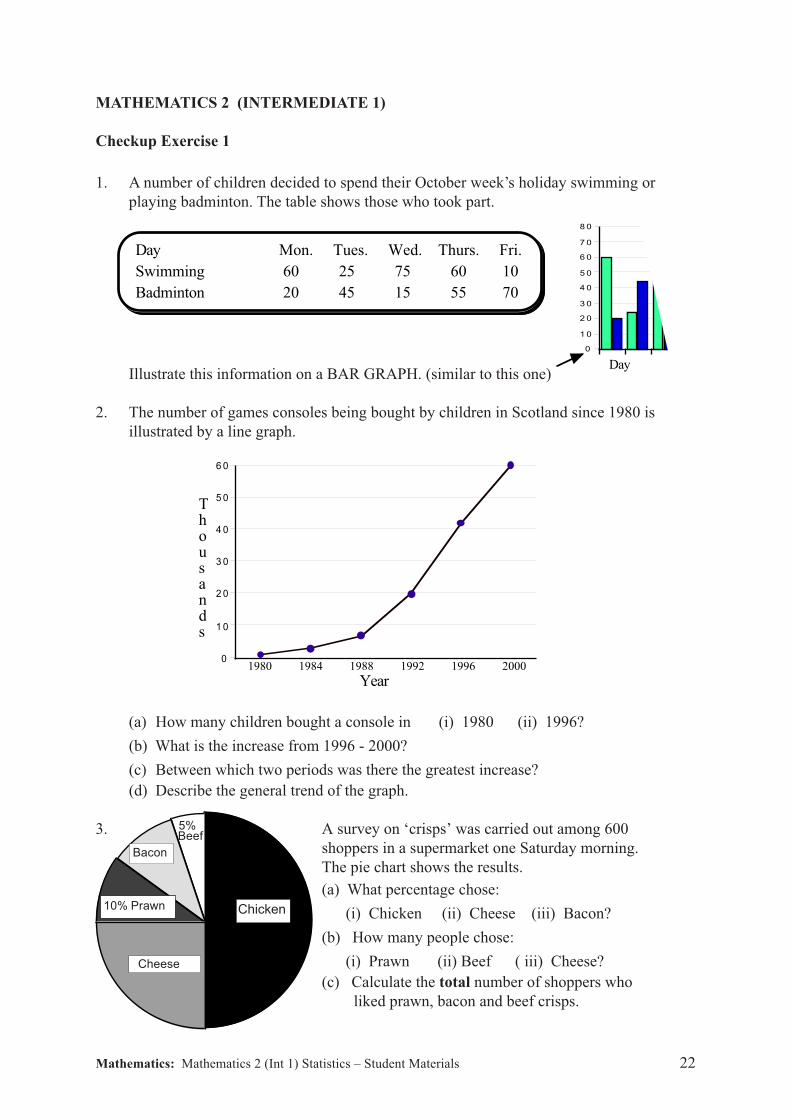
1. A number of children decided to spend their October week’s holiday swimming or
playing badminton. The table shows those who took part.
Illustrate this information on a BAR GRAPH. (similar to this one)
2. The number of games consoles being bought by children in Scotland since 1980 is
illustrated by a line graph.
(a) How many children bought a console in (i) 1980 (ii) 1996?
(b) What is the increase from 1996 - 2000?
(c) Between which two periods was there the greatest increase?
(d) Describe the general trend of the graph.
3. A survey on ‘crisps’ was carried out among 600
shoppers in a supermarket one Saturday morning.
The pie chart shows the results.
(a) What percentage chose:
(i) Chicken (ii) Cheese (iii) Bacon?
(b) How many people chose:
(i) Prawn (ii) Beef ( iii) Cheese?
(c) Calculate the total number of shoppers who
liked prawn, bacon and beef crisps.
Chicken
Day Mon. Tues. Wed. Thurs. Fri.
Swimming 60 25 75 60 10
Badminton 20 45 15 55 70
8 0
7 0
6 0
5 0
4 0
3 0
2 0
1 0
0
Day
6 0
5 0
4 0
3 0
2 0
1 0
0
m
i
l
l
i
o
n
s
1980 1984 1988 1992 1996 2000
Thousands
Year
Cheese
10% Prawn
Bacon
5%Beef
Mathematics: Mathematics 2 (Int 1) Statistics – Student Materials 23
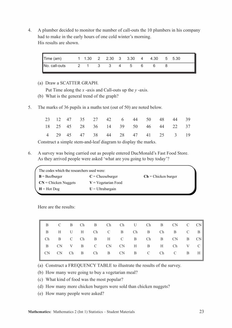
4. A plumber decided to monitor the number of call-outs the 10 plumbers in his company
had to make in the early hours of one cold winter’s morning.
His results are shown.
(a) Draw a SCATTER GRAPH.
Put Time along the x -axis and Call-outs up the y -axis.
(b) What is the general trend of the graph?
5. The marks of 36 pupils in a maths test (out of 50) are noted below.
23 12 47 35 27 42 6 44 50 48 44 39
18 25 45 28 36 14 39 50 46 44 22 37
4 29 45 47 38 44 28 47 41 25 3 19
Construct a simple stem-and-leaf diagram to display the marks.
6. A survey was being carried out as people entered DucMonald’s Fast Food Store.
As they arrived people were asked ‘what are you going to buy today’?
B = Beefburger C = Cheeseburger Ch = Chicken burger
CN = Chicken Nuggets V = Vegetarian Food
H = Hot Dog U = Ultrabargain
The codes which the researchers used were:
Here are the results:
B C B Ch B Ch Ch U Ch B CN C CN
B H U H Ch C B Ch B Ch B C B
Ch B C Ch B H C B Ch B CN B CN
B CN V B C CN CN H B H Ch V C
CN CN Ch B Ch B CN B C Ch C B H
(a) Construct a FREQUENCY TABLE to illustrate the results of the survey.
(b) How many were going to buy a vegetarian meal?
(c) What kind of food was the most popular?
(d) How many more chicken burgers were sold than chicken nuggets?
(e) How many people were asked?
Time (am) 1 1.30 2 2.30 3 3.30 4 4.30 5 5.30
No. call-outs 2 1 3 3 4 5 6 6 8

Mathematics: Mathematics 2 (Int 1) Statistics – Student Materials 24