hhsm-502005-00018i centers for medicare and medicaid services · pdf filemedicare hospice...
TRANSCRIPT

Medicare Hospice Payment Reform:
Analysis of How the Medicare Hospice
Benefit is Used
HHSM-502005-00018I
December 3, 2015
Prepared for: Centers for Medicare and
Medicaid Services Center for Medicare
Chronic Care Policy Group Joan Proctor, Project Officer
Prepared by: Michael Plotzke
T.J. Christian Elizabeth Axelrod
Meaghan Hunt Allison Muma
Abt Associates Inc. 55 Wheeler St.
Cambridge, MA 02138
In Partnership with: Pedro Gozalo
Joan Teno
Brown University Center for Gerontology and Healthcare
Research

Medicare Hospice Payment Reform: Analyses to Support Payment Reform HHSM-500-2005-00018I
Abt Associates Contents ▌pg. i
Table of Contents
1. Introduction .................................................................................................................................... 1 1.1 Background ........................................................................................................................ 1 1.2 Current Status of Hospice Payment Reform ...................................................................... 2 1.3 Outline of the 2015 Hospice Payment Reform Technical Report ..................................... 2
2. Construction of Data Files for the Analysis ................................................................................. 5 2.1 Specific Analytic Files Created ......................................................................................... 5
2.1.1 Hospice Claims-Level Analytic File ................................................................... 5 2.1.2 Hospice Day-Level Analytic File ........................................................................ 5
2.2 Data Sources Used ............................................................................................................. 6 2.2.1 Hospice Standard Analytic File ........................................................................... 6 2.2.2 Enrollment Database (EDB) ................................................................................ 7 2.2.3 Hospice Provider of Services (POS) File ............................................................ 7 2.2.4 Hospice Cost Reports .......................................................................................... 7
2.3 Construction of the Hospice Analytic Files ....................................................................... 8 2.3.1 Hospice Beneficiary Exclusions in the SSS File ................................................. 8 2.3.2 Additional Abt Processing of the SSS File to Create the Final Hospice
Analytic File ........................................................................................................ 8
3. Total Medicare Utilization by Hospice Beneficiaries in Federal Fiscal Year 2013 (Inside and Outside the Benefit) ............................................................................................................. 11
3.1 Background ...................................................................................................................... 11 3.2 Methodology .................................................................................................................... 11 3.3 Results ............................................................................................................................. 12
3.3.1 Total Medicare Hospice Days and Payments in FY2013 .................................. 12 3.3.2 Estimates of Medicare Expenditures for Parts A & B Non-Hospice
Services in FY2013 ........................................................................................... 12 3.3.3 Estimates of Parts A and B Medicare Expenditures for Non-Hospice
Services in FY2013 by Hospice Characteristic ................................................. 14 3.3.4 Estimates of Part A and B Medicare Expenditures for Non-Hospice
Services in FY2013 by State.............................................................................. 15 3.3.5 Estimates of Part D Gross Drug Costs for Drugs Received by Hospice
Beneficiaries in FY2013 .................................................................................... 16 3.3.6 Estimating the Total Medicare Utilization by Hospice Beneficiaries in
FY2013 .............................................................................................................. 17 3.3.7 Estimates of Total Medicare Expenditures During Hospice Enrollment by
Patient Diagnosis: Hospice, non-Hospice Part A, B, and D Total Spending in FY2013 .......................................................................................... 18
4. Pre-Hospice Spending .................................................................................................................. 21 4.1 Background ...................................................................................................................... 21 4.2 Methods ........................................................................................................................... 22 4.3 Results ............................................................................................................................. 23 4.4 Conclusion ....................................................................................................................... 31
4.4.1 Limitations ......................................................................................................... 31

HHSM-500-2005-00018I Medicare Hospice Payment Reform: Analyses to Support Payment Reform
pg. ii ▌Contents Abt Associates
4.4.2 Discussion ......................................................................................................... 31
5. Hospice Cost Reports—Benchmarks and Trends (2004-2013) ............................................... 33 5.1 Background ..................................................................................................................... 33 5.2 Methodology ................................................................................................................... 33 5.3 Results ............................................................................................................................. 34
5.3.1 Inpatient Care .................................................................................................... 34 5.3.2 Visiting Services (Labor) .................................................................................. 36 5.3.3 Other Hospice Services ..................................................................................... 38 5.3.4 Total Costs ........................................................................................................ 40
6. Trend Estimates of the Aggregate Cap and Seasonality Analyses .......................................... 41 6.1 Background ..................................................................................................................... 41 6.2 Methodology ................................................................................................................... 43 6.3 Recent Trends in the Aggregate Cap .............................................................................. 43
6.3.1 Comparing Hospices’ Year-End Aggregate Cap Percentage Received Over Time ......................................................................................................... 43
6.3.2 Comparing Above-Cap Hospices’ Aggregate Overpayments Over Time ........ 44 6.3.3 Comparing Hospices’ Year-End Aggregate Cap Percentage Received
Over Time ......................................................................................................... 45 6.3.4 Common Characteristics of Hospices Exceeding the Cap ................................ 46 6.3.5 Geographic Variation in the Rate of Cap Overpayments .................................. 47
6.4 Seasonality Patterns Related to the Aggregate Cap ........................................................ 48 6.4.1 Month-to-Month Live Discharge Rates by Year-End Aggregate Cap
Status ................................................................................................................. 49 6.4.2 By Cause Live Discharge Rates (vs. Discharge by Death) Across Cap
Risk Levels ........................................................................................................ 50 6.5 Analyses that Describe Alternative Methodologies for Constructing the Aggregate
Cap Amount .................................................................................................................... 52 6.5.1 Additional Background on the Per-Person Cap Amount .................................. 52 6.5.2 Re-estimating the Per-Person Cap Amount with Current Medicare
Utilization Data ................................................................................................. 53
7. Trends in Live Discharge ............................................................................................................ 57 7.1 Background ..................................................................................................................... 57 7.2 Methodology ................................................................................................................... 57 7.3 Results ............................................................................................................................. 57
8. Trends in Drug Reporting on Hospice Claims .......................................................................... 61 8.1 Background ..................................................................................................................... 61 8.2 Methodology ................................................................................................................... 61 8.3 Results ............................................................................................................................. 61 8.4 Conclusion ...................................................................................................................... 66
9. Evaluation and Management (E&M) Visits Prior to Starting Hospice Services ................... 67 9.1 Background ..................................................................................................................... 67 9.2 Methodology ................................................................................................................... 67 9.3 Results ............................................................................................................................. 68

Medicare Hospice Payment Reform: Analyses to Support Payment Reform HHSM-500-2005-00018I
Abt Associates Contents ▌pg. iii
10. A Comparison of Visits Provided between the Hospice Medicare Benefit and the Home Health Medicare Benefit ............................................................................................................ 71
10.1 Background ...................................................................................................................... 71 10.2 Methodology .................................................................................................................... 71 10.3 Results ............................................................................................................................. 72
11. Skilled Visits During the Last Two Days of Life ....................................................................... 77 11.1 Background ...................................................................................................................... 77 11.2 Methodology .................................................................................................................... 77 11.3 Results ............................................................................................................................. 77
12. Appendix A: Descriptive Statistics on Hospice Utilization for Federal Fiscal Year 2014 ..... 83
13. Appendix B: Geographic Variation in Hospice Utilization and Payments During FY 2014 .............................................................................................................................................. 93
13.1 Background ...................................................................................................................... 93 13.2 Methodology .................................................................................................................... 93 13.3 Results ............................................................................................................................. 93

HHSM-500-2005-00018I Medicare Hospice Payment Reform: Analyses to Support Payment Reform
pg. iv ▌Contents Abt Associates
CPT codes, descriptions and other data only are copyright 1995–2014 American Medical Association. All rights reserved. CPT is a registered trademark of the American Medical Association. Applicable FARS\DFARS Restrictions Apply to Government Use. Fee schedules, relative value units, conversion factors and/or related components are not assigned by the AMA, are not part of CPT, and the AMA is not recommending their use. The AMA does not directly or indirectly practice medicine or dispense medical services. The AMA assumes no liability for data contained or not contained herein.

Medicare Hospice Payment Reform: Analyses to Support Payment Reform HHSM-500-2005-00018I
Abt Associates 1. Introduction ▌pg. 1
1. Introduction
1.1 Background
Section 3132(a) of The Patient Protection and Affordable Care Act of 2010 (ACA) requires the Secretary of Health and Human Services (HHS) to revise Medicare’s payment system for hospice care. This legislation comes as a response to (1) significant changes in hospice utilization since the hospice benefit was established in 1983, and (2) recommendations by the Medicare Payment Advisory Commission (MedPAC) and others to update the hospice payment system. These updates, as required by the ACA, include revising the Routine Home Care (RHC) rate and its corresponding methodology, as well as the rates for other hospice services as deemed appropriate by the Secretary . Additionally, it allows for the Secretary to collect “…additional data and information as the Secretary determines appropriate to revise payments for hospice care.” These additional data collection efforts may include data on:
• Hospice-related charges, payments, costs, number of days, and number of visits attributable to each type of service
• Types of practitioners providing the hospice visit • Lengths of visits and other information related to visits • The number of hospice days attributable to Medicare beneficiaries enrolled under Part A • Charitable contributions and other revenues for hospice providers
From data such as these (which, as required by the legislation, the Secretary should begin collecting no later than January 1, 2011), HHS is required to implement revisions to the hospice payment methodology no earlier than October 1, 2013. The ACA mandates that the revisions to Medicare’s hospice payment system “…shall result in the same estimated amount of aggregate expenditures under this title for hospice care furnished in the fiscal year in which such revisions in payment are implemented as would have been made under this title for such care in such fiscal year if such revisions had not been implemented.” That is, revisions need to be budget neutral for the first year.1
Centers for Medicare and Medicaid Services (CMS)contracted with Abt Associates Inc., teaming with Social & Scientific Systems, Inc. and the Brown University Center for Gerontology and Healthcare Research, to conduct comprehensive data analyses. This report is a continuation of the April 24, 2013 report “Medicare Hospice Payment Reform: Hospice Study Technical Report” and the May 1, 2014 report “Medicare Hospice Payment Reform: Analyses to Support Payment Reform”.2 This report will share some initial results of additional data analyses performed since the May 2014 report as well as update some prior findings. The data analyses that the Abt Associates team has focused on throughout
1 The law does not provide HHS with the authority to change the eligibility and coverage requirements under the hospice
benefit. We also note that the ACA makes additional changes to the hospice program that are unrelated to payment reform (e.g., 3132(b), 3140, and 10326).
2 As of July 29, 2015, the 2013 report is available at https://www.cms.gov/Medicare/Medicare-Fee-for-Service-Payment/Hospice/Downloads/Hospice-Study-Technical-Report-4-29-13.pdf and the 2014 report is available at https://www.cms.gov/Medicare/Medicare-Fee-for-Service-Payment/Hospice/Downloads/May-2014-AnalysesToSupportPaymentReform.pdf.

HHSM-500-2005-00018I Medicare Hospice Payment Reform: Analyses to Support Payment Reform
pg. 2 ▌1. Introduction Abt Associates
this project have attempted to describe how the hospice benefit is currently utilized. Additionally, our analyses have sought to identify potential vulnerabilities within the hospice benefit. We continue to be interested in better understanding provider behaviors that may influence a beneficiary’s access to quality hospice services. Our objectives are to understand whether there are areas within the hospice benefit which could be improved in order to not only protect the fiscal integrity of the benefit but especially to provide better care for beneficiaries and their families at the end of life.
1.2 Current Status of Hospice Payment Reform
The Federal Fiscal Year 2016 (FY2016) Hospice Wage Index and Payment Rate Update and Hospice Quality Reporting Requirements Final Rule includes two provisions that, effective on January 1, 2016, will impact hospice payment policy:3
• The rule creates two different RHC payment rates based on the timing within an episode of care in which the beneficiary is receiving hospice services. These two payment rates replace the current single RHC per diem rate. The new base payment rate will be higher in the first 60 days of hospice care and then thereafter the base payment rate will be reduced for days 61 and later of hospice care days. For purposes of counting days in the event of a live discharge and readmission, the day count will be continued from the previous discharge if there was no more than a 60-day gap between election periods. If the gap between hospice elections exceeds 60 days then the day count will be reset after hospice readmission to day 1 for payment purposes. The two rates were calculated as proportional to the relative intensity of resource use in the two time periods (days 1–60 and 61+, respectively). For FY2016, but effective January 1, 2016, the per diem payments at the RHC level of care will be $186.84 for days 1–60 and $146.83 for days 61 and later.4
• The rule creates a service intensity add-on (SIA) payment that is correlated with any direct patient care provided by an RN or social worker which occurs during the last seven days of a beneficiary's life. The SIA payment will equal the Continuous Home Care (CHC) hourly payment rate, for up to four hours of patient care, if certain criteria are met.5 The SIA will be paid in addition to the RHC per diem payments already being paid during the last seven days of life.
1.3 Outline of the 2015 Hospice Payment Reform Technical Report
The subsequent chapters of this report are briefly described below:
• Chapter 2 describes the construction of the analytic files used for this project.
3 As of August 14, 2015, available at https://www.federalregister.gov/articles/2015/08/06/2015-
19033/medicare-program-fy-2016-hospice-wage-index-and-payment-rate-update-and-hospice-quality-reporting
4 These base rates assume hospices are fully compliant with their quality data reporting requirements. 5 The criteria for receiving the SIA payment are that the days is an RHC level of care day, the day occurs
during the last 7 days of life (and the beneficiary is discharged dead from hospice), and direct patient care is provided by an RN or a social worker on that day.

Medicare Hospice Payment Reform: Analyses to Support Payment Reform HHSM-500-2005-00018I
Abt Associates 1. Introduction ▌pg. 3
• Chapter 3 provides an analysis of the total costs associated with hospice during FY2013. This includes payments to hospice providers and Medicare non-hospice services utilized by beneficiaries on days during a hospice election.
• Chapter 4 presents an analysis of Medicare utilization immediately prior to a beneficiary’s first hospice admission among beneficiaries with different hospice primary diagnoses, and then compares that pre-hospice utilization to utilization of the hospice benefit.
• Chapter 5 describes trends and patterns in the Hospice Cost Reports from FY2004 through FY2013.
• Chapter 6 presents basic trends concerning hospices that have exceeded their annual aggregate Medicare reimbursement cap. Additionally, this chapter presents alternate estimates of the cap amount after applying the original cap methodology to the current hospice patient mix.
• Chapter 7 examines the rate of live discharge amongst hospices. • Chapter 8 presents descriptive estimates of drugs reported on the hospice claims, a result of a
new data-reporting requirement recently implemented by CMS. • Chapter 9 describes patterns in Evaluation and Management (E&M) codes to determine
whether beneficiaries are enrolled in hospice without having E&M services. • Chapter 10 compares visits received by beneficiaries electing the hospice benefit to visits
received through Medicare’s home health benefit. • Chapter 11 provides descriptive statistics on how frequently hospice beneficiaries lack skilled
visits during their last two days of life.

HHSM-500-2005-00018I Medicare Hospice Payment Reform: Analyses to Support Payment Reform
pg. 4 ▌1. Introduction Abt Associates
This page intentionally left blank.

Medicare Hospice Payment Reform: Analyses to Support Payment Reform HHSM-500-2005-00018I
Abt Associates 2. Construction of Data Files for the Analysis ▌pg. 5
2. Construction of Data Files for the Analysis
This chapter provides an overview of the data files used for the analyses presented in this report. We constructed multiple data files to support our analyses. The main set of analytic files is based on Medicare hospice claims and focuses on the following individuals:
• All Medicare beneficiaries who used at least one day of hospice services between 2005 and 2014 (n = 9,006,516)
These files are referred to as the “Hospice Beneficiary files” and are comprised of two file types: (i) the Hospice Claims file and (ii) the Hospice Day file. These files are used in many of the analyses discussed in this report. The analyses in Chapter 9 looking at Evaluation and Management (E&M) visits use claims data from the Chronic Condition Warehouse (CCW) Virtual Research Data Center (VRDC) environment. Throughout the analyses in this report we also utilize hospice-level files that include information on hospice characteristics (the Provider of Services or “POS” file) and the Medicare Hospice Cost Reports file (particularly in Chapter 5). These files are used in a variety of analyses to augment the claims-based files.
2.1 Specific Analytic Files Created 2.1.1 Hospice Claims-Level Analytic File
Social & Scientific Systems, Inc. (SSS) created a hospice claims-level analytic file using information from the Hospice Standard Analytic File (SAF). The unit of observation in this analytic file is a specific hospice claim for a particular beneficiary. This file contains claim-level information; that is, variables that do not change over the course of the claim. Examples of these variables include:
• Medicare provider number • Diagnoses codes • Payment amount • Claim from and through dates • Dates identifying the start and end of a hospice benefit period.
2.1.2 Hospice Day-Level Analytic File
SSS also created a day-level hospice analytic file using information from the Hospice SAF. The unit of observation in this file is an individual day of hospice services for a particular beneficiary at a specific hospice. The file is meant to describe the level of services (in terms of the number and length of visits and minutes) on a particular day of hospice enrollment. Examples variables from this analytic file include:
• Number of visits by discipline • Number of minutes of care by discipline • Level of care for a particular day of hospice • Site of service for a particular day of hospice • Daily payment amounts

HHSM-500-2005-00018I Medicare Hospice Payment Reform: Analyses to Support Payment Reform
pg. 6 ▌2. Construction of Data Files for the Analysis Abt Associates
Abt Associates has added information from the Medicare Enrollment Database (EDB) to this file, such as demographic data, and hospice enrollment period information for time periods prior to the earliest SAF file we acquired.
2.2 Data Sources Used
To analyze trends in Medicare hospice utilization, we have acquired several administrative data files from CMS, in addition to the Hospice SAF. These files are the:
• Hospice Provider of Services (POS) File • Medicare Enrollment Database (EDB) • Hospice Cost Reports • Inpatient SAF • Skilled Nursing Facility (SNF) SAF • Outpatient SAF • Home Health Agency SAF • Part B Claims (e.g. Carrier SAF) • Durable Medical Equipment (DME) SAF • Part D Drug Claims
2.2.1 Hospice Standard Analytic File
SSS used the Hospice SAF to create both the “Day-level” and “Claim-level” files described above. Both files currently include claims with “Through Dates” between January 2005 and December 2014. The 2014 Hospice data is based on the March 2015 update of the SAF. Table 2.1, below, provides counts of the number of beneficiaries, hospices, and hospice days represented in each year of data.
Table 2.1: Number of Beneficiaries, Hospices, and Days of Hospice as Found in the Analytic File Created from the Hospice Standard Analytic File after Medicare Enrollment Database information is Merged
Calendar Year Number of Unique Beneficiary IDs
Number of Unique Hospice Numbers
Number of Hospice Days
2005 870,825 2,880 49,980,720 2006 934,530 3,045 57,359,203 2007 996,950 3,249 64,872,222 2008 1,051,574 3,249 71,120,136 2009 1,090,824 3,386 76,920,390 2010 1,159,986 3,497 81,347,377 2011 1,219,839 3,584 85,037,661 2012 1,273,733 3,728 91,292,742 2013 1,315,490 3,926 92,213,992 2014 1,314,819 4,044 90,880,300 These numbers may differ slightly from previous file versions’ estimates due to changes in which beneficiaries were excluded from the analyses.

Medicare Hospice Payment Reform: Analyses to Support Payment Reform HHSM-500-2005-00018I
Abt Associates 2. Construction of Data Files for the Analysis ▌pg. 7
2.2.2 Enrollment Database (EDB)
As noted previously, we use and attach information from the Medicare Enrollment Database (EDB) to the Hospice Day-Level file.6
Items that we use from the EDB include:
• Birth and death dates • Sex and race/ethnicity • Indicators for Part A, B, D, Medicaid, and Medicare Advantage Coverage • Indicator for hospice election period
2.2.3 Hospice Provider of Services (POS) File
The Provider of Services (POS) file contains quarterly updates of information on the hospice itself. Examples of information found in this file include:
• Location (address and county) • Date of hospice’s Medicare certification • Medicare provider number • Staffing information (as of most recent survey)7 • Facility type (freestanding or facility-based) • Ownership type
We currently have the POS extracts that correspond to the following dates:
• POS as of January 1, 2008 • POS as of January 1, 2009 • POS as of January 1, 2010 • POS as of January 1, 2011 • POS as of April 1, 2011 • POS as of January 1, 2013 • POS as of April 1, 2013 • POS as of January 1, 2015 • POS as of April 1, 2015
2.2.4 Hospice Cost Reports
We have collected hospice Medicare costs reports for fiscal years 2004–2013. We use this information to study hospice costs by cost center. More information about how cost reports are trimmed and how they are used for analysis can be found in Chapter 5 of this report.
6 A small number of beneficiaries (roughly 300-500 per year) were dropped from the final analytic file
because they could not be matched to the EDB. 7 Hospice providers are not surveyed frequently. Examining the CMS POS file (as of April 2015) shows that
for active hospices, on average, 3.5 years have passed since their last survey. One hospice had not been surveyed in almost 25 years.

HHSM-500-2005-00018I Medicare Hospice Payment Reform: Analyses to Support Payment Reform
pg. 8 ▌2. Construction of Data Files for the Analysis Abt Associates
2.3 Construction of the Hospice Analytic Files
Below, we provide some additional detail describing the data, data elements, and exclusions used in the creation of the analytic file(s).
2.3.1 Hospice Beneficiary Exclusions in the SSS File
SSS excluded a number of beneficiaries from the analytic file they created from the Hospice SAF data due to missing or unusual data that would make the creation of the “day-level” file excessively complicated. These exclusions are made by looking at all years of the Hospice SAF combined (e.g., 2005–2014) and dropping a small number of beneficiaries (roughly 0.25% of the sample).8 Prior to the exclusions, there were 9,028,012 unique beneficiary IDs included in the file. Due to the exclusions listed below, 21,393 beneficiaries were dropped, leaving 9,006,619 beneficiaries in the SSS analytic files.9 All claims for a beneficiary were dropped if any of the following occurred:10
1. A claim for a beneficiary was missing a hospice start date [2,190 beneficiaries].
2. A line item for a beneficiary had revenue units equal to 0 and the revenue center code was not equal to “0001” [1,162 beneficiaries].
3. A line item for a beneficiary had a missing revenue date and the revenue center code was not equal to “0001” [10,959 beneficiaries].
4. A claim for a beneficiary had a benefit period start date that was later than the “from” date of the claim [3,346 beneficiaries].
5. Two claims (from the same hospice) for the same beneficiary covered overlapping time periods [3,409 beneficiaries].
6. A beneficiary had duplicate claims from different providers [153 beneficiaries].
7. A claim for a beneficiary had inconsistent or out of order start dates (based on the claim through date) [492 beneficiaries].
2.3.2 Additional Abt Processing of the SSS File to Create the Final Hospice Analytic File
With the analytic file that SSS provides, Abt Associates performs additional steps that append additional information to the file (resulting in a slight decrease in the total beneficiary count from the SSS version of the file): 8 Our beneficiary sample is slightly different from the samples referenced in the 2013 and 2014 technical
reports. This is due to different beneficiaries being excluded in one year versus another (i.e. a beneficiary may have been excluded in our 2013 technical report, but upon receiving new data for that beneficiary for this report we now may not exclude the beneficiary).
9 Due to the short length of time many individuals utilize hospice before they die, we did not cross-reference beneficiary IDs as it is unlikely that a beneficiary would switch IDs during the short length of time they were enrolled in hospice. However, it is possible that a single person may be represented in either the Hospice SAF data or any other Medicare claims we use under multiple beneficiary IDs.
10 Some beneficiaries may appear in multiple exclusions.

Medicare Hospice Payment Reform: Analyses to Support Payment Reform HHSM-500-2005-00018I
Abt Associates 2. Construction of Data Files for the Analysis ▌pg. 9
1. We first dropped all records in the SSS file where the hospice service flag was set to “0” or where the service-dates were beyond our window (of January 2004 through December 2014).
2. We next excluded any beneficiaries with over-lapping hospice enrollment periods. Enrollment periods were considered valid if they overlap by not more than a single day (e.g., a hospice discharge in the morning and a readmission later that evening). However, instances of overlapping periods more than a day were considered invalid and those beneficiaries and all their days were omitted.
3. We identified and exclude beneficiaries for which the EQHIC (or “Equated Health Insurance Claim”) beneficiary identifier was not consistent with the BENE_ID identifier from the Chronic Conditions Warehouse (or “CCW”).
4. For those remaining individuals, we use the CCW to identify matching records and obtain the beneficiaries’ birth and death dates, gender, race, and ethnicity, and eligibility and enrollment dates for Medicare Advantage, Part A, Part B, and Part D. We used this information to create a series of variables that provide information about the relationship between enrollment hospice periods (e.g., a counter of lifetime enrollment periods, a count of days until the next readmission after live discharge). We also use enrollment data to create a series of flags for any recorded enrollment (for Medicare Advantage, Part A, Part B, and Part D) among the 30 days period to hospice admission.
Prior to this processing, the SSS file had 9,006,619 individuals. The final hospice analytic file after additional Abt Associates processing and exclusions includes 9,006,516 individuals.

HHSM-500-2005-00018I Medicare Hospice Payment Reform: Analyses to Support Payment Reform
pg. 10 ▌2. Construction of Data Files for the Analysis Abt Associates
This page intentionally left blank.

Medicare Hospice Payment Reform: Analyses to Support Payment Reform HHSM-500-2005-00018I
Abt Associates 3. Total Medicare Utilization by Hospice Beneficiaries in FY2013 ▌pg. 11
3. Total Medicare Utilization by Hospice Beneficiaries in Federal Fiscal Year 2013 (Inside and Outside the Benefit)
3.1 Background
The analyses in this chapter estimate the entirety of Medicare utilization that occurred during hospice elections in FY2013. These expenditures include payments made to hospices for services provided through the hospice benefit in addition to utilization of non-hospice Medicare services by beneficiaries on days in which they elected hospice. From our 2014 Technical Report, Abt Associates calculated all expenditures related to Medicare utilization that occurred during a hospice election within calendar year (CY) 2012. We estimated that during CY2012, on days in which hospice beneficiaries elected the hospice benefit, there were $15.0 billion in services utilized through the hospice benefit, $710.1 million in non-hospice Medicare Parts A and B services paid by Medicare, $135.5 million in Medicare Parts A and B services paid as coinsurance by hospice beneficiaries, and another $417.9 million in drug utilization through Medicare Part D. All together, the total utilization for all Medicare services during hospice elections within CY2012 was $16.3 billion, $1.3 billion of which was for non-hospice Medicare utilization during hospice election periods. Our objective for this year’s technical report chapter is to replicate the CY2012 estimates for hospice elections occurring in FY2013.
As noted in our 2014 report, we do not examine the individual non-hospice services utilized. We cannot observe individual patients’ charts nor could we know the particulars of their medical conditions and needs. Therefore, we are unable to ascertain whether the non-hospice utilization that we observe is related or unrelated to the terminal illness and any related conditions of the beneficiary. The estimates produced through this analysis represent an “upper threshold” on Medicare utilization (related or unrelated) during hospice elections. The original intent of the hospice benefit was that the relatedness of non-hospice care would be determined on a case-by-case basis and CMS has never issued guidance, though the original Hospice Final Rule stated CMS’s belief that “hospices are required to provide virtually all care that is needed by terminally ill patients.”
3.2 Methodology
As described in Chapter 2, we used non-hospice claims for FY2013 which includes the utilization of Part B services (institutional and outpatient sources), inpatient care, DME, SNF, home health services, and drugs through the Part D benefit.11 We then constructed day-level analytic files indicating the dollar amount Medicare paid for services received by beneficiaries on each date. In cases where a range of service days was provided instead of cases where services were provided on a single day, we apportioned out an average payment for each day over the claim period.12 We cross-checked these records against our hospice day file to only retain those days during which the beneficiary received hospice services. We excluded non-hospice services received on the “boundary”
11 Note that home health patients do not pay Medicare coinsurance. 12 E.g., for a billed $700 hospital stay claim that lasted one week (seven days), we would assign $100 to each
date of that week.

HHSM-500-2005-00018I Medicare Hospice Payment Reform: Analyses to Support Payment Reform
pg. 12 ▌3. Total Medicare Utilization by Hospice Beneficiaries in FY2013 Abt Associates
days of a hospice election—hospice admission or live discharge days—to prevent the inclusion of services incurred on the admission day prior to the hospice admission decision or, similarly, later in the day after a hospice revocation/discharge decision.
For each hospice day serviced in FY2013, we aggregated the total expenditures for all non-hospice services. Our final analytic file retained the site of service field and primary ICD-9 diagnosis code from the hospice claims to examine whether non-hospice expenditures vary by service location or disease. We amended these records with POS file characteristics to examine whether non-hospice Medicare utilization varies by hospice program characteristics. For our analysis, the hospice characteristics on which we focused were the hospice decade of Medicare certification, hospice ownership type, freestanding/facility-based status, state & Census region, and urban/rural status.
3.3 Results 3.3.1 Total Medicare Hospice Days and Payments in FY2013
During FY2013, there were 90.7 million total hospice days that were neither admission days nor live discharge days. When we include admission and live discharge days, we calculate that 92.2 million service days were provided under the Medicare Hospice Benefit in FY2013. During that year, Medicare hospice payments for all of those hospice days—that is, also including the boundary admission and live discharge days—totaled $15.1 billion.
3.3.2 Estimates of Medicare Expenditures for Parts A & B Non-Hospice Services in FY2013
During FY2013, we estimate that Medicare Parts A and B paid in total approximately $694.1 million for DME, Home Health, Inpatient, Part B, and SNF services received by beneficiaries on days in which they elected the hospice benefit (again, excluding admission and live discharge days). For these same services, hospice beneficiaries’ coinsurance payments were $132.5 million.
Table 3.1 (below) displays Part A and B Medicare non-hospice spending totals (i.e., the amount that Medicare paid; no coinsurance included) and percentages of total non-hospice spending corresponding to each Medicare service category that occurred on hospice days in FY2013, excluding admission and live discharge days. Two-thirds of this total ($467.7 million out of $694.1 million) is attributable to combined Inpatient ($198.6 million, or 28.6% of the $694.1 million) and Physician/Supplier and Other Part B ($269.2 million, or 38.8% of total) expenditures that occurred during a hospice election.
Table 3.1: Parts A and B Non-Hospice Spending during Hospice by Claims Source, FY2013
Non-Hospice Medicare Total $ % of Total Total $694,130,854 100.0% Durable Medical Equipment $44,493,765 6.4% Home Health $29,671,882 4.3% Inpatient $198,561,453 28.6% Outpatient Part B $115,376,289 16.6% Physician/Supplier and Other Part B $269,186,392 38.8% Skilled Nursing Facilities $36,841,072 5.3%
Source: Abt Associates analysis of 100% FY2013 Medicare Claim Files

Medicare Hospice Payment Reform: Analyses to Support Payment Reform HHSM-500-2005-00018I
Abt Associates 3. Total Medicare Utilization by Hospice Beneficiaries in FY2013 ▌pg. 13
Table 3.2 below displays total hospice service days and Medicare expenditures and percentages of the total by hospice patients’ site of service, again excluding admission and live discharge days. Note, the site of service does not describe the type of non-hospice spending that occurs but instead describes where the patient is receiving hospice (as indicated on the hospice claim). In FY2013, beneficiaries in their own homes accounted for the majority of hospice service days (50.8 million days or 56.0% of all those serviced) and also received $300.1 million in non-hospice services (43.2% of the $694.1 million). Beneficiaries residing in nursing facilities accounted for a quarter of all service days (23.3 million days or 25.7% of the total serviced) and received $199.0 million (28.7%) in non-hospice services.
Table 3.2: Total Hospice Service Days and Parts A and B Non-Hospice Spending during Hospice by Hospice Sites of Service, FY2013
Hospice Site of Service
Total Hospice Service Days
% of Total Hospice
Service Days
Total Non-Hospice
Utilization ($)
% of Total Non-Hospice
Utilization Total 90,738,590 100.0% $694,130,854 100.0% Assisted living 13,701,795 15.1% $72,161,946 10.4% Patient's home 50,820,972 56.0% $300,133,298 43.2% Nursing facility 23,316,661 25.7% $199,007,402 28.7% Inpatient facility 1,714,933 1.9% $106,508,724 15.3% All other 1,184,229 1.3% $16,319,484 2.4% Source: Abt Associates analysis of 100% FY2013 Medicare Claim Files
Beneficiaries utilizing hospice in an inpatient setting make up only a small portion of hospice activity (in terms of days serviced in that setting) yet a disproportional amount of non-hospice utilization by hospice beneficiaries spending occurs at these sites. In FY2013, 1.7 million hospice days were at inpatient facility sites of service (including inpatient hospital [Q5005] and hospice inpatient units [Q5006]) out of the 90.7 million total hospice days that year—less than two percent of the total. Yet, total non-hospice expenditures on days which the beneficiary was in an inpatient facility setting were relatively sizeable: $106.5 million—or 15.3%—of the total expenditures for non-hospice services in FY2013 occurred in an inpatient setting. Across sites of services, daily rates of non-hospice Parts A and B spending were greatest when a beneficiary received hospice services in an inpatient facility ($62.11 per day); in comparison non-hospice rates were $5.91 per day in patients’ home, $8.53 per day in a nursing home, and $7.65 per day overall. The significantly higher rate of non-hospice expenditures for beneficiaries receiving hospice in the inpatient setting is driven by the much higher probability of receiving acute care services while in the inpatient setting, compared to other settings,13 and the relative costliness of acute care compared to the types of non-hospice spending that would occur for patients in a nursing facility or home care. Moreover, the “Inpatient Facility” row in Table 3.2 (above) combines acute inpatient and hospice inpatient facilities, although the rates of spending are quite disparate in each: $192.42 per day in acute inpatient facilities ($94 million over almost
13 While we observe inpatient spending for hospice utilization where the beneficiary is labeled as receiving
hospice in a non-inpatient setting we believe this is likely because of the hospice mislabeling where the patient is receiving hospice services. Note also that beneficiaries can receive hospice in an inpatient setting but not incur any non-hospice inpatient expenditures.

HHSM-500-2005-00018I Medicare Hospice Payment Reform: Analyses to Support Payment Reform
pg. 14 ▌3. Total Medicare Utilization by Hospice Beneficiaries in FY2013 Abt Associates
489,000 days) vs. $10.15 per day in hospice inpatient facilities (about $12.5 million over 1.2 million days). We had more closely examined inpatient utilization during hospice election in our 2014 Technical Report.14 We found that condition code “07” was present in 94% of the emergency room visits, observational stays, or inpatient stays occurring during a hospice election. Condition code “07” signifies that the service was not related to the treatment of the terminal condition for which hospice care was elected, and thus eligible to be billed to non-hospice Medicare during hospice election, per regulatory guidelines. Therefore, most of the non-hospice inpatient spending we observed was labelled unrelated to the treatment of the terminal condition for which hospice care was elected.
3.3.3 Estimates of Parts A and B Medicare Expenditures for Non-Hospice Services in FY2013 by Hospice Characteristic
Table 3.3 below presents estimates of total (non-boundary) hospice days, expenditures during hospice for non-hospice services, and rates of expenditures per hospice day for several hospice characteristics from the POS file. There appears to be little variation across hospice characteristics in terms of expenditures occurring outside the benefit. The characteristics where we do observe noticeable variation is for facility status ($7.99 daily in freestanding hospices vs. $5.70 daily in facility-based hospices) and geography ($6.66 daily for hospices in the Midwest, $7.13 daily in the Northeast, $10.25 daily in the South, and $3.86 daily in the West). We have also created a map (Figure 3.1 in the section that follows) to provide further details of variation in the state-by-state non-hospice spending rate.
14 Chapter 12 of the report entitled “Emergency Room Visits During Hospice Election of 2011 Hospice
Admissions”, available via: https://www.cms.gov/Medicare/Medicare-Fee-for-Service-Payment/Hospice/Downloads/May-2014-AnalysesToSupportPaymentReform.pdf (Accessed November 6, 2015).

Medicare Hospice Payment Reform: Analyses to Support Payment Reform HHSM-500-2005-00018I
Abt Associates 3. Total Medicare Utilization by Hospice Beneficiaries in FY2013 ▌pg. 15
Table 3.3: Non-Boundary Hospice Days and Parts A and B Non-Hospice Expenditures by Hospice Characteristics, FY2013
Hospice Days (Non-Boundary)
Other Medicare During Hospice ($)
{DME, HHA, Inpatient, Part B, SNF}
Other Medicare ($) Per Day
All hospice days 90,738,590 $694,130,854 $7.65 Decade of certification 1980s 26,663,823 $210,517,370 $7.90 1990s 26,980,017 $181,636,298 $6.73 2000s+ 37,084,451 $301,858,814 $8.14 Missing certification date 10,299 $118,373 $11.49 Ownership For-profit 50,188,076 $404,391,143 $8.06 Government 10,160,955 $72,944,444 $7.18 Non-profit 30,379,260 $216,676,894 $7.13 Missing Ownership type 10,299 $118,373 $11.49 Facility type Facility-based 13,645,691 $77,804,056 $5.70 Freestanding 77,082,600 $616,208,425 $7.99 Missing Facility type 10,299 $118,373 $11.49 Urban/rural status Rural 11,134,807 $88,578,360 $7.96 Urban 79,508,026 $605,037,719 $7.61 Missing Urban/Rural 95,757 $514,775 $5.38 Census region Midwest 20,163,027 $134,371,071 $6.66 Northeast 11,970,896 $85,402,340 $7.13 South 39,169,775 $401,532,296 $10.25 West 18,381,469 $70,901,201 $3.86 Outlying territories 1,053,423 $1,923,945 $1.83 Source: Abt Associates analysis of 100% FY2013 Medicare Claim Files
3.3.4 Estimates of Part A and B Medicare Expenditures for Non-Hospice Services in FY2013 by State
Figure 3.1 below displays geographic variation in daily rates of Parts A and B expenditures outside the hospice benefit across U.S. states. Statewide rates ranged from $1.77 (Hawaii) to $13.74 (West Virginia). As is noticeable on the map (and also as noted in the regional averages of Table 3.4 above), expenditure rates were higher in the Southern states, particularly Mississippi ($12.31 daily), Florida ($12.24 daily), and Texas ($12.10 daily).

HHSM-500-2005-00018I Medicare Hospice Payment Reform: Analyses to Support Payment Reform
pg. 16 ▌3. Total Medicare Utilization by Hospice Beneficiaries in FY2013 Abt Associates
Figure 3.1: Geographic Variation in Parts A & B Non-Hospice Medicare (Expenditures per Day), FY2013
Source: Abt Associates analysis of 100% FY2013 Medicare Claim Files
3.3.5 Estimates of Part D Gross Drug Costs for Drugs Received by Hospice Beneficiaries in FY2013
We estimated that during hospice election days in FY2013, hospice beneficiaries received drugs through Part D with a total gross cost of about $439.5 million on days in which they elected the hospice benefit (excluding admission and live discharge hospice days). We further examined what portion of this Part D utilization was paid by beneficiaries and what amount was paid by Medicare. The Part D files contain a field which indicates the “gross total cost” of drugs, and then six component fields indicating sources of payment. Table 3.4 below lists each component, gives a brief description, and in the final column indicates the total dollar amount for FY2013 drugs received by hospice beneficiaries. As indicated at the bottom of the table, the total of the six components ($435,515,566) does not equal the total reported gross cost of the drugs ($439,461,233). The Research Data Assistance Center (or “ResDAC”) 15 indicated they would not expect the totals to match due to reconciliations between the plan and Medicare which the data do not reflect. However, the exception is that the beneficiary paid amount (coinsurance) would be expected to be accurate, and as reported beneficiaries directly paid $50.9 million for drugs they received during a hospice election in FY2013 (about 11.7% of the total of the six components’ report totals).
15 http://www.resdac.org
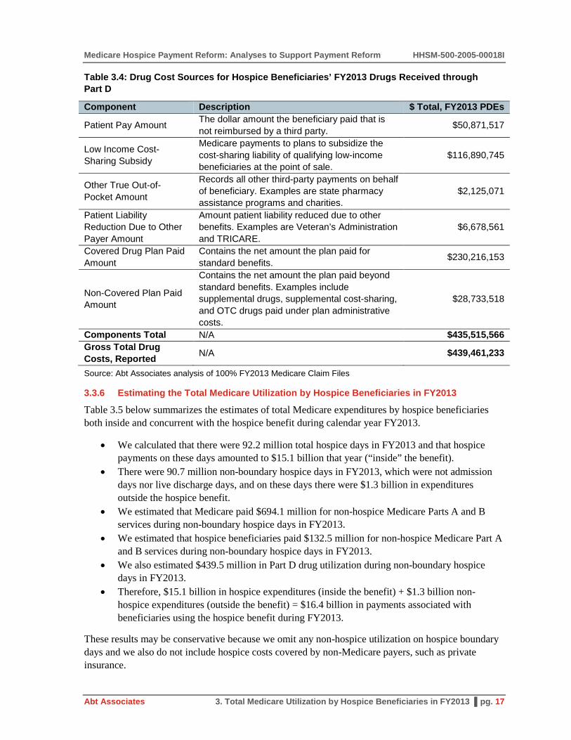
Medicare Hospice Payment Reform: Analyses to Support Payment Reform HHSM-500-2005-00018I
Abt Associates 3. Total Medicare Utilization by Hospice Beneficiaries in FY2013 ▌pg. 17
Table 3.4: Drug Cost Sources for Hospice Beneficiaries’ FY2013 Drugs Received through Part D
Component Description $ Total, FY2013 PDEs
Patient Pay Amount The dollar amount the beneficiary paid that is not reimbursed by a third party. $50,871,517
Low Income Cost-Sharing Subsidy
Medicare payments to plans to subsidize the cost-sharing liability of qualifying low-income beneficiaries at the point of sale.
$116,890,745
Other True Out-of-Pocket Amount
Records all other third-party payments on behalf of beneficiary. Examples are state pharmacy assistance programs and charities.
$2,125,071
Patient Liability Reduction Due to Other Payer Amount
Amount patient liability reduced due to other benefits. Examples are Veteran’s Administration and TRICARE.
$6,678,561
Covered Drug Plan Paid Amount
Contains the net amount the plan paid for standard benefits. $230,216,153
Non-Covered Plan Paid Amount
Contains the net amount the plan paid beyond standard benefits. Examples include supplemental drugs, supplemental cost-sharing, and OTC drugs paid under plan administrative costs.
$28,733,518
Components Total N/A $435,515,566 Gross Total Drug Costs, Reported N/A $439,461,233
Source: Abt Associates analysis of 100% FY2013 Medicare Claim Files
3.3.6 Estimating the Total Medicare Utilization by Hospice Beneficiaries in FY2013
Table 3.5 below summarizes the estimates of total Medicare expenditures by hospice beneficiaries both inside and concurrent with the hospice benefit during calendar year FY2013.
• We calculated that there were 92.2 million total hospice days in FY2013 and that hospice payments on these days amounted to $15.1 billion that year (“inside” the benefit).
• There were 90.7 million non-boundary hospice days in FY2013, which were not admission days nor live discharge days, and on these days there were $1.3 billion in expenditures outside the hospice benefit.
• We estimated that Medicare paid $694.1 million for non-hospice Medicare Parts A and B services during non-boundary hospice days in FY2013.
• We estimated that hospice beneficiaries paid $132.5 million for non-hospice Medicare Part A and B services during non-boundary hospice days in FY2013.
• We also estimated $439.5 million in Part D drug utilization during non-boundary hospice days in FY2013.
• Therefore, $15.1 billion in hospice expenditures (inside the benefit) + $1.3 billion non-hospice expenditures (outside the benefit) = $16.4 billion in payments associated with beneficiaries using the hospice benefit during FY2013.
These results may be conservative because we omit any non-hospice utilization on hospice boundary days and we also do not include hospice costs covered by non-Medicare payers, such as private insurance.

HHSM-500-2005-00018I Medicare Hospice Payment Reform: Analyses to Support Payment Reform
pg. 18 ▌3. Total Medicare Utilization by Hospice Beneficiaries in FY2013 Abt Associates
Table 3.5: The Total Medicare Cost of Hospice—Expenditures Inside and Outside the Benefit in FY2013
FY2013 Expenditures ($) Medicare hospice payments $15,113,838,216 Beneficiary coinsurance for services during hospice (Part B, Inpatient, DME, and SNF) $132,530,506
Medicare payments for services during hospice (Part B, Inpatient, DME, SNF, and HHA) $694,130,854
Estimated Part D utilization (Patient Pay Amount) $50,871,517 Estimated Part D utilization (Low Income Cost-Sharing Subsidy and Covered Drug Plan Paid Amount) $347,106,899
Estimated Part D utilization (All Other Sources) $41,482,817 Total cost of hospice (hospice payments and outside-benefit $) $16,379,960,809 Source: Abt Associates analysis of 100% FY2013 Medicare Claim Files
3.3.7 Estimates of Total Medicare Expenditures During Hospice Enrollment by Patient Diagnosis: Hospice, non-Hospice Part A, B, and D Total Spending in FY2013
Table 3.6 below displays estimates of total hospice payments during all days of hospice election, and additionally, payments for non-hospice Part A and B services and Part D total drug costs that occurred on (non-boundary) hospice days for numerous common hospice diagnoses. The table is sorted by total associated costs (except for the “All Other Diagnoses” miscellaneous category at the bottom). Hospice election days for patients admitted with a diagnosis of Non-Alzheimer’s Dementia were associated with the greatest aggregate cost ($2.9 billion), followed by Debility NOS ($1.8 billion), Non-Infectious Respiratory Diseases ($1.4 billion), and Congestive Heart Failure ($1.3 billion).
We note that greater associated non-hospice costs do not necessarily imply that the daily rate of spending is greater among patients of particular diagnoses. There is significant variation in the average lifetime lengths of stay among patients with different admission diagnoses. MedPAC has reported that patients with neurological conditions (including dementias) have the longest lengths of stay.16 Table 3.6 shows that such patients have the greatest amount of associated non-hospice spending during election. The finding that dementia patients have the greatest associated non-hospice spending likely partly results from these patients electing hospice a numerous aggregate number of days and thereby having a greater window of time to accumulate non-hospice services during their elections.
16 See Table 12-6 in http://medpac.gov/documents/reports/chapter-12-hospice-services-(march-2015-
report).pdf (Accessed August 17, 2015).

Medicare Hospice Payment Reform: Analyses to Support Payment Reform HHSM-500-2005-00018I
Abt Associates 3. Total Medicare Utilization by Hospice Beneficiaries in FY2013 ▌pg. 19
Table 3.6: Medicare Hospice and non-Hospice Parts A, B, and D Expenditures Occurring During Hospice Election in CY FY2013
Primary Diagnosis (or Disease Grouping) at Hospice Admission ICD-9 Codes
Medicare Hospice
Payments Medicare A &
B Payments
Beneficiary Payments,
A & B Services
Part D Gross Drug Costs (All Payers)
Non-Hospice Total
Hospice + Non Hospice Total
All Diagnoses All $15,113,838,216 $694,130,854 $132,530,506 $439,461,233 $1,266,122,593 $16,379,960,809
Non-Alzheimer's Dementia 290s;294s; 331s (not 331.0) $2,683,755,359 $101,803,779 $21,375,417 $68,738,294 $191,917,490 $2,875,672,849
Debility NOS 799.3 $1,670,177,612 $51,105,650 $11,605,724 $46,082,159 $108,793,533 $1,778,971,146 Non-Infectious Respiratory Diseases (inc. COPD) 490-496s $1,222,231,597 $76,200,929 $13,000,160 $52,175,517 $141,376,605 $1,363,608,203
Congestive Heart Failure 428s $1,202,571,096 $79,639,446 $14,320,530 $40,162,558 $134,122,534 $1,336,693,630 Alzheimer's Disease 331 $1,140,040,336 $35,448,906 $7,345,280 $27,905,979 $70,700,165 $1,210,740,501
Other Heart Diseases 390-398s; 402-404s; 410-417s; 420-427s;
429s $1,061,304,029 $68,378,151 $12,727,134 $33,472,309 $114,577,594 $1,175,881,623
Failure to Thrive 783.7 $917,943,706 $37,219,486 $7,986,392 $25,239,767 $70,445,645 $988,389,352 Lung Cancer 162-165s $781,865,550 $33,553,168 $5,944,856 $18,776,159 $58,274,183 $840,139,734 CVA/Stroke 430-434s; 436-438s $631,773,385 $30,452,977 $5,911,881 $16,963,267 $53,328,125 $685,101,510 Parkinson's 332-335s $537,686,377 $20,386,401 $4,140,437 $21,258,089 $45,784,927 $583,471,303 Colorectal Cancer 153-154s $311,836,759 $13,603,740 $2,466,372 $6,499,874 $22,569,986 $334,406,745 Breast Cancer 174-175s $240,722,377 $10,427,655 $1,874,002 $6,247,665 $18,549,321 $259,271,698 Pneumonia 480-488s; 510-519s $223,652,154 $10,614,151 $1,890,435 $6,565,371 $19,069,957 $242,722,111 Prostate Cancer 185s $199,188,399 $10,582,068 $1,776,854 $6,033,302 $18,392,224 $217,580,623 Blood/lymph Cancer 200-207s $189,563,955 $9,400,067 $1,673,138 $5,171,169 $16,244,374 $205,808,330 Chronic Kidney Disease 585-587s $179,744,323 $9,657,499 $1,751,846 $5,231,103 $16,640,447 $196,384,770 Pancreatic Cancer 157s $176,227,576 $7,463,689 $1,203,693 $3,695,923 $12,363,305 $188,590,881 Chronic Liver Disease 571-573s $119,442,230 $10,096,429 $1,622,260 $5,325,851 $17,044,540 $136,486,770 Liver Cancer 155-156s $119,528,463 $6,269,594 $1,024,769 $3,703,558 $10,997,920 $130,526,383 Bladder Cancer 188s $89,554,991 $4,685,460 $793,258 $1,718,864 $7,197,582 $96,752,573 Ovarian Cancer 183s $84,727,434 $3,388,868 $564,440 $1,504,797 $5,458,105 $90,185,538 Brain Cancer 191s $84,192,323 $2,717,488 $497,106 $1,723,413 $4,938,007 $89,130,330 Stomach Cancer 151s $49,878,065 $2,261,098 $420,164 $1,053,826 $3,735,088 $53,613,153 All Other Diagnoses All Other ICD-9 Codes $1,196,230,118 $58,774,157 $10,614,357 $34,212,421 $103,600,936 $1,299,831,054 Source: Analysis of 100% Hospice, Part A, Part B claims and 100% Part D event records (FY2013). Non-Hospice Expenditures include Inpatient, Outpatient, Physician/Supplier Part B, DME, Home Health, SNF and Part D utilization occurring in non-boundary days (i.e., admit and live discharge days).

HHSM-500-2005-00018I Medicare Hospice Payment Reform: Analyses to Support Payment Reform
pg. 20 ▌3. Total Medicare Utilization by Hospice Beneficiaries in FY2013 Abt Associates
This page intentionally left blank..

Medicare Hospice Payment Reform: Analyses to Support Payment Reform HHSM-500-2005-00018I
Abt Associates 4. Pre-Hospice Spending ▌pg. 21
4. Pre-Hospice Spending
4.1 Background
During the development of the Medicare hospice benefit in the 1980s, industry leaders and hospice families testified that hospices provide humane and high-quality care which would also reduce Medicare expenditures if a hospice benefit were implemented as an alternative to aggressive hospital care.17 A Congressional Budget Office study also supported the notion that a hospice benefit would produce sizable healthcare savings.18 However, over the thirty years since the creation of Medicare’s hospice benefit, the landscape of hospice care has evolved. When the benefit was first implemented, most hospice patients had cancer, but now such individuals are only a minority of the beneficiaries that hospices treat. As further evidence of change, at the time of the creation of the benefit the average hospice patient received between 55 and 75 lifetime days of care; at present, the average total lifetime use is nearly 90 days. Given these changes, the hospice payment system may benefit from updates which better align it with current patients’ needs and usage.
Medicare pays hospices per diem rates set to reflect expected daily resource use. Payments are adjusted for situations which necessitate more intensive care, but typically over 97% of service days are paid at the Routine Home Care (RHC) rate (which had a base rate of $153.46 in FY2013). RHC rates are adjusted for local wage differentials, but no consideration is given to individual patient resource requirements.
The FY2014 Hospice Final Rule19 mentioned that CMS would, upon collecting more accurate diagnosis data, evaluate whether a case-mix system could be created as part of future reform efforts. The objective of introducing a case-mix system into the hospice benefit would be to differentiate hospice payments by patient characteristics and thereby better align expenditures with individuals’ resource use. Given the information that is currently available on the hospice claim, it is not yet possible at this time to conduct a thorough assessment of whether a case-mix system is appropriate. However, as an initial step to begin thinking about a case mix system, in this chapter we examine pre-hospice Medicare spending. The objectives of these analyses are to determine the extent of variation in resource needs immediately prior to the start of hospice across different principal (hospice) diagnoses. Additionally, we compare the daily estimates of pre-hospice Medicare utilization to per diem hospice payment amounts received during hospice elections, and examine how differences in Medicare payments before and after hospice admission vary across common hospice diagnoses.
17 Subcommittee of Health of the Committee of Ways and Means, House of Representatives, March 25, 1982. 18 Mor V. Masterson-Allen S. (1987): Hospice care systems: Structure, process, costs and outcome. New
York: Springer Publishing Company. 19 Available via: http://www.gpo.gov/fdsys/pkg/FR-2013-08-07/pdf/2013-18838.pdf; see page
48272.(Accessed August 17, 2015).

HHSM-500-2005-00018I Medicare Hospice Payment Reform: Analyses to Support Payment Reform
pg. 22 ▌4. Pre-Hospice Spending Abt Associates
4.2 Methods
Using the hospice day file, we constructed a sample of Medicare beneficiaries that died during FY2013 (October 1st, 2012 through September 30th, 2013). For these beneficiaries, we subsequently included only those first-time hospice admissions20 occurring in 2006 and onwards21 who were age 66 and older at hospice admission and not enrolled in Medicare Advantage anytime in the 30 days prior to hospice admission.22
Among those remaining admissions, we calculated the total daily Medicare utilization rate—the daily total of all non-hospice Medicare payments for Parts A, B, and D services—prior to hospice admission separately within the 180, 90, and 30 day time periods prior to first-time hospice admission. For example, if a beneficiary’s total Medicare spending was $1,200 in the 30 days prior to hospice admission, then that beneficiary’s daily rate would be calculated as: $1,200/30 days = $40 per day.23 We only included the money that Medicare paid in these estimates; any beneficiary coinsurance amounts were omitted.24 We inflation-adjusted all dollar amounts into September 2013 dollars (which was the final month of FY2013) using the Consumer Price Index for Medical Care services (All Urban Consumers). We also calculated the total number of lifetime days of hospice use for each beneficiary remaining in our analytic file.
Lastly, we grouped admissions into seven categories based on the Ninth Revision of the International Classification of Diseases (ICD-9) code listed on hospice claims as the primary hospice diagnosis at admission:
1. Alzheimer’s Disease, non-Alzheimer’s Dementia, or Parkinson’s Disease 2. Cerebrovascular Accident/Stroke 3. Cancer 4. Chronic Kidney Disease 5. Heart Disease including Congestive Heart Failure (CHF)
20 As we discuss in the limitations section to this chapter, limiting our sample to first-time admissions may
not produce a representative sample of hospice users, as a non-trivial number of hospice admissions are readmissions. However, our concern was that hospice readmissions that received palliative care may not be a good indication of medical needs prior to any hospice.
21 Medicare Part D was implemented in 2006 and so total estimates of Medicare spending prior to the start of Part D would not be comparable with later estimates that also include drug costs. In practice, over half of the analytic sample was admitted to hospice in 2013 and over 95% was admitted in 2011 or later.
22 Medicare utilization records would not appear for beneficiaries enrolled in Medicare Advantage and so these individuals were excluded from the analysis.
23 As with our methodology for calculating non-hospice utilization Chapter 3, for those claims in which a payment is paid in lump sum for services that occurred over several days, we apportion-out the lump sum over the duration of care to determine Medicare payments in the 180, 90, and 30 days before hospice admission. So, a 3-day claim for which Medicare paid $3,000 would be a daily rate of $1,000 per day.
24 For Parts A and B, the Medicare Payment amount field was used to identify spending. For Part D, Medicare spending was calculated as the sum of the Covered D Plan Paid amount and Low Income Cost Sharing Subsidy amount.

Medicare Hospice Payment Reform: Analyses to Support Payment Reform HHSM-500-2005-00018I
Abt Associates 4. Pre-Hospice Spending ▌pg. 23
6. Lung Disease, specifically Chronic Obstructive Pulmonary Disease and Pneumonias 7. A miscellaneous category of all other diagnoses.
The codes used to group beneficiaries into each diagnosis category are shown in Table 4.1, below:
Table 4.1: Pre-Hospice Analysis Diagnosis Grouping Categories and Corresponding ICD-9 Codes Based upon Designated Primary Hospice Diagnosis at Hospice Admission
Diagnosis Category Included ICD-9 Codes, Primary Hospice Diagnosis at Admission
Alzheimer's, Dementia, and Parkinson's 290s, 294s, 331s, 332-335s
CVA/Stroke 430-434s, 436-438s Cancers 140-239s Chronic Kidney Disease 585-587s Heart (CHF and Other Heart Disease) 428s, 390-399s, 402-404s, 410-417s, 420-427s, 429s
Lung (COPD and Pneumonias) 490-496s, 480-488s, 510-519s All Other Diagnoses All Remaining ICD-9 Codes
4.3 Results
Table 4.2 (below) describes the composition of the analytic sample with respect to principle hospice diagnoses. In total, there were 694,673 beneficiaries that died in 2013, were admitted to hospice in 2006 or after, had no prior hospice utilization before that admission, were aged 66 or above at the time of that admission, and did not enter hospice from Medicare Advantage enrollment. Cancer patients were the most common grouping, yet were still a minority of the analytic sample, comprising about one-third of all beneficiaries (29.5%; n=205,051). Other large groups of patients were those entering hospice with Alzheimer’s, Dementia, or Parkinson’s (18.7%; n=129,991) and Heart Diseases (14.0%; n=97,396). Smaller groups were patients entering hospice with COPD and Pneumonias (9.6%; n=66,580), CVA/Stroke (5.7%; n=39,431), or Chronic Kidney Disease (2.8%; n=19,172). Lastly, there were 137,052 beneficiaries that were categorized into the “All Other Diagnoses” category. Of these, 96,646 (70.5%) entered hospice either with Debility (ICD-9 799.3) or Adult Failure to Thrive (ICD-9 783.7). Because CMS has recently issued guidance that these two ill-defined conditions should no longer be used for a primary hospice diagnosis, we decided neither disease would be reported as separate categories. However, we note that in earlier years when some individuals included in this this analysis were admitted to hospice, these conditions were still considered acceptable primary diagnoses.

HHSM-500-2005-00018I Medicare Hospice Payment Reform: Analyses to Support Payment Reform
pg. 24 ▌4. Pre-Hospice Spending Abt Associates
Table 4.2: Sample Size for Each Diagnosis Category
Primary Hospice Diagnosis at Admission # Beneficiaries % Beneficiaries All Episodes/Diagnoses 694,673 100.0% Alzheimer's, Dementia, and Parkinson's 129,991 18.7% CVA/Stroke 39,431 5.7% Cancers 205,051 29.5% Chronic Kidney Disease 19,172 2.8% Heart (CHF and Other Heart Disease) 97,396 14.0% Lung (COPD and Pneumonias) 66,580 9.6% All Other Diagnoses 137,052 19.7% Note: Estimates drawn from FY2013 hospice decedents who were first-time hospice admissions, ages 66+ at hospice admission, admitted since 2006, and not enrolled in Medicare Advantage prior to admission. All payments are inflation-adjusted to September 2013 dollars using the Consumer Price Index (Medical Care; All Urban Consumers).
Table 4.3 (below) displays estimates of the 25th, Median (50th), and 75th percentiles of total daily Medicare spending rates pre-hospice based on 180, 90, and 30 day look-back periods across diagnoses. Additionally, the table’s final column presents the mean estimate of total lifetime hospice utilization for each diagnosis category. We highlight several findings in particular below:
1. Pre-hospice spending rates are greater nearer to the hospice admission. Among all diagnoses, median daily pre-hospice spending is $117.73 in the 180 days prior to hospice, $157.89 in the 90 days prior to hospice (34.1% more than the 180 days prior estimate), and $266.84 in the 30 days prior to hospice (69.0% more than the 90 days prior estimate). Analogous patterns hold for individual disease groupings. This observation was expected given that medical needs typically intensify as patients approach the end-of-life.
2. Estimates of pre-hospice spending for beneficiaries entering hospice with Alzheimer’s, Dementia, or Parkinson’s are consistently less than the RHC payment amount. The FY2013 RHC rate was $153.45; median pre-hospice spending for the neurological conditions was $66.84 daily in the 180 days prior to hospice admission, $82.00 daily in the 90 days prior to admission, and $105.24 daily in the 30 days prior to hospice admission. To assist in visualizing that Alzheimer’s, Dementia, and Parkinson’s are unique in this respect compared to other hospice admission diagnoses, Figure 4.1 (below) displays estimates of median daily pre-hospice Medicare spending by diagnosis category for 180, 90, and 30 day look-back periods. The dashed horizontal line represents the FY2013 RHC rate ($153.45), and estimates of pre-hospice spending for Alzheimer’s, Dementia, and Parkinson’s diagnosis groupings are consistently below that line.
a. Based upon the 180 day look-back, pre-hospice spending medians are less than the RHC rate for the Alzheimer’s, Dementia, and Parkinson’s; CVA/Stroke; Cancer; Heart Diseases; Lung Diseases; and All Other Diagnoses diagnosis groupings (only the estimate for Chronic Kidney Disease exceeds the RHC rate).
b. Based upon the 90 day look-back, pre-hospice spending medians are less than the RHC rate for only the Alzheimer’s, Dementia, and Parkinson’s and All Other Diagnoses diagnosis groupings.
c. Based upon the 30 day look-back, pre-hospice spending medians are less than the RHC rate for only the Alzheimer’s, Dementia, and Parkinson’s diagnosis grouping.

Medicare Hospice Payment Reform: Analyses to Support Payment Reform HHSM-500-2005-00018I
Abt Associates 4. Pre-Hospice Spending ▌pg. 25
3. Across the diagnoses, there is an inverse relationship between pre-hospice spending rates and lifetime hospice utilization. Beneficiaries entering hospice with Alzheimer’s, Dementia, or Parkinson’s have the lowest rates of pre-hospice utilization (median $66.84 in the 180 days prior to admission) and the greatest lifetime hospice utilization (mean 119.3 days). In contrast, beneficiaries entering hospice with Chronic Kidney Disease have the highest rates of pre-hospice utilization (median $217.46 in the 180 days prior to admission) and the least lifetime hospice utilization (mean 27.3 days). To more easily observe the inverse pattern between pre-hospice spending and lifetime utilization, Figures 4.2, 4.3, and 4.4 (below) present scatter plots that display pre-hospice spending (for 180, 90, and 30 day look-back periods before hospice admission, respectively) on the horizontal axis and lifetime hospice utilization on the vertical axis.25 Each data point in these figures represents a diagnosis group, as labeled. The negative-sloped relationship (inverse association) between the amount of pre-hospice spending and lifetime hospice utilization is consistently apparent using data from each look-back time period.
25 These figures visually depict the estimates already reported in Table 2, above.

HHSM-500-2005-00018I Medicare Hospice Payment Reform: Analyses to Support Payment Reform
pg. 26 ▌4. Pre-Hospice Spending Abt Associates
Table 4.3: Median Pre-Hospice Daily Spending Estimates and Interquartile Range based on 180, 90, and 30 Day Look-Back Periods Prior to Initial Hospice Admission with Estimates of Average Lifetime Length of Stay (LOS) by Primary Diagnosis at Hospice Admission, FY2013
Estimates of Daily Non-Hospice Medicare Spending Prior to First Hospice Admission
Mean Lifetime LOS
180 Day Look-Back 90 Day Look-Back 30 Day Look-Back 25th Pct. Median 75th Pct. 25th Pct. Median 75th Pct. 25th Pct. Median 75th Pct.
All Diagnoses $47.04 $117.73 $240.73 $55.75 $157.89 $337.97 $57.66 $266.84 $545.44 73.8 Alzheimer's, Dementia, and Parkinson's $23.39 $66.84 $162.60 $23.06 $82.00 $220.12 $21.02 $105.24 $368.30 119.3
CVA/Stroke $56.18 $116.86 $239.30 $82.32 $170.40 $352.74 $150.21 $352.41 $622.23 47.4 Cancers $62.81 $143.56 $265.58 $78.30 $188.08 $360.92 $81.52 $289.85 $569.67 47.1 Chronic Kidney Disease $94.78 $217.46 $402.10 $126.41 $293.18 $541.41 $199.01 $466.25 $820.78 27.3 Heart (CHF and Other Heart Disease) $61.28 $135.48 $255.53 $80.62 $186.52 $364.24 $101.80 $325.15 $588.50 77.2
Lung (COPD and Pneumonias) $65.53 $142.78 $272.13 $90.68 $201.02 $401.12 $126.51 $367.68 $685.17 67.5
All Other Diagnoses $36.00 $99.80 $222.25 $39.45 $132.88 $316.15 $38.96 $213.84 $504.57 85.3 Source: All Medicare Parts A, B, and D claims for FY2013 from the Chronic Conditions Data Warehouse (CCW) retrieved March, 2015.
Note(s): Estimates drawn from FY2013 hospice decedents who were first-time hospice admissions, ages 66+ at hospice admission, admitted since 2006, and not enrolled in Medicare Advantage prior to admission. All payments are inflation-adjusted to September 2013 dollars using the Consumer Price Index (Medical Care; All Urban Consumers).

Medicare Hospice Payment Reform: Analyses to Support Payment Reform HHSM-500-2005-00018I
Abt Associates 4. Pre-Hospice Spending ▌pg. 27
Figure 4.1: Median Pre-Hospice Daily Spending Estimates based on 180, 90, and 30 Day Look-Back Periods Prior to Initial Hospice Admission with Estimates of Average Lifetime Length of Stay (LOS) by Primary Diagnosis at Hospice Admission, FY2013
Source: All Medicare Parts A, B, and D claims for FY2013 from the Chronic Conditions Data Warehouse (CCW) retrieved March, 2015. Note(s): Estimates drawn from FY2013 hospice decedents who were first-time hospice admissions, ages 66+ at hospice admission, admitted since 2006, and not enrolled in Medicare Advantage prior to admission. All payments are inflation-adjusted to September 2013 dollars using the Consumer Price Index (Medical Care; All Urban Consumers).

HHSM-500-2005-00018I Medicare Hospice Payment Reform: Analyses to Support Payment Reform
pg. 28 ▌4. Pre-Hospice Spending Abt Associates
Figure 4.2: Pre-Hospice Daily Spending Estimates based on a 180-day Look-Back Period Prior to Initial Hospice Admission with Estimates of Average Lifetime Length of Stay by Primary Diagnosis at Hospice Admission, FY2013
Source: All Medicare Parts A, B, and D claims for FY2013 from the Chronic Conditions Data Warehouse (CCW) retrieved March, 2015. Note(s): Estimates drawn from FY2013 hospice decedents who were first-time hospice admissions, ages 66+ at hospice admission, admitted since 2006, and not enrolled in Medicare Advantage prior to admission. All payments are inflation-adjusted to September 2013 dollars using the Consumer Price Index (Medical Care; All Urban Consumers).

Medicare Hospice Payment Reform: Analyses to Support Payment Reform HHSM-500-2005-00018I
Abt Associates 4. Pre-Hospice Spending ▌pg. 29
Figure 4.3: Average Pre-Hospice Daily Spending Estimates based on a 90-day Look-Back Period Prior to Initial Hospice Admission with Estimates of Lifetime Length of Stay by Primary Diagnosis at Hospice Admission, FY2013
Source: All Medicare Parts A, B, and D claims for FY2013 from the Chronic Conditions Data Warehouse (CCW) retrieved March, 2015. Note(s): Estimates drawn from FY2013 hospice decedents who were first-time hospice admissions, ages 66+ at hospice admission, admitted since 2006, and not enrolled in Medicare Advantage prior to admission. All payments are inflation-adjusted to September 2013 dollars using the Consumer Price Index (Medical Care; All Urban Consumers).

HHSM-500-2005-00018I Medicare Hospice Payment Reform: Analyses to Support Payment Reform
pg. 30 ▌4. Pre-Hospice Spending Abt Associates
Figure 4.4: Average Pre-Hospice Daily Spending Estimates based on a 30-day Look-Back Period Prior to Initial Hospice Admission with Estimates of Lifetime Length of Stay by Primary Diagnosis at Hospice Admission, FY2013
Source: All Medicare Parts A, B, and D claims for FY2013 from the Chronic Conditions Data Warehouse (CCW) retrieved March, 2015. Note(s): Estimates drawn from FY2013 hospice decedents who were first-time hospice admissions, ages 66+ at hospice admission, admitted since 2006, and not enrolled in Medicare Advantage prior to admission. All payments are inflation-adjusted to September 2013 dollars using the Consumer Price Index (Medical Care; All Urban Consumers).

Medicare Hospice Payment Reform: Analyses to Support Payment Reform HHSM-500-2005-00018I
Abt Associates 4. Pre-Hospice Spending ▌pg. 31
4.4 Conclusion
4.4.1 Limitations There are several limitations of this analysis that warrant mention:
1. After all exclusions, our analytic sample contained 694,673 beneficiaries, which is only about two-thirds of all FY2013Medicare decedents (n=1,006,790).
a. Our exclusions were necessary to remove those beneficiaries who entered hospice from Medicare Advantage. Because pre-hospice utilization data is not available for beneficiaries who were in managed care, we removed these beneficiaries in order to create a clean sample.
b. We also limited our sample to first-time hospice users in order to purge the individuals churning in and out of hospice. There is uncertainty as to whether non-hospice Medicare utilization during non-hospice “gaps” between two hospice episodes is comparable to non-hospice Medicare utilization immediately prior to a first hospice admission for an individual who had not yet entered hospice during their lifetime.
2. It does not necessarily follow that because there is variation in expenditures across diagnoses prior to hospice that there must also be variation in expenditures across those same diagnoses during hospice. Additionally, if there is variation in hospice costs, that variation may not mirror the variation seen in the pre-hospice spending.
a. Aggressive (pre-hospice) care has different and distinct goals from hospice and achieving those goals may require varying levels of resources based upon the underlying needs of patient, which may differ across medical conditions.
b. In contrast, palliative care has a common goal, which is to promote patients’ comfort. It is not clear that vastly different resource levels would be needed to meet this goal based on the diagnosis at hospice admission. In the hospice setting, there is still no documented cost variation across diagnoses (after accounting for differing lengths of stay) that would suggest that hospice payment policy would benefit from a case-mix system.
3. As documented in Chapter 3, there is also significant non-hospice utilization that occurs concurrently with hospice election. This comparison of pre-hospice non-hospice utilization and hospice payment rates omits any consideration of that additional non-hospice Medicare utilization during hospice election. If that information were also incorporated into the analysis, it may impact the degree of the spending variation that was observed across diagnoses.
4.4.2 Discussion This analysis was only intended as a preliminary examination as to any potential benefits from introducing a case-mix system into the hospice payment methodology. Future analyses that address the limitations of this analysis—particularly whether it is necessary to accommodate the large number of patient exclusions—could better inform policy makers and stakeholders. The results presented above indicate that hospice patients with the longest length of stay—patients with Alzheimer’s dementia, other non-Alzheimer’s dementias, and Parkinson’s disease (neurological conditions which are associated with more difficult prognostication)—have the least Medicare utilization prior to starting hospice, at daily rates which are on average less than the current per diem hospice payments.

HHSM-500-2005-00018I Medicare Hospice Payment Reform: Analyses to Support Payment Reform
pg. 32 ▌4. Pre-Hospice Spending Abt Associates
This finding is inconsistent with the concept of hospice as a cost-saver as it was promoted during the benefit’s creation.26
At the inception of the Medicare Hospice Benefit, end-of-life care was provided to a pool of predominantly cancer patients. Today, hospice beneficiaries are a substantially less homogeneous group, and cancer patients are in the minority. At least immediately prior to hospice initiation, at the time in which patients were still pursuing aggressive curative goals, there is discernable variation in Medicare expenditures across diseases. It is not yet understood whether such resource use differences also persist in a palliative care context, and further analysis should be done to better examine hospice patients’ resource needs during hospice and determine whether they also vary across diagnoses.
26 Relatedly, a recent article found that between 2004 and 2009 the expansion of hospice was associated with
a mean net increase in Medicare expenditures of $6,761: the overall increase in Medicare expenditures from hospice offset savings from less aggressive care at the end of life – Gozalo, P., Plotzke, M., Mor, V., Miller, S. & Teno, J. (2015). Changes in Medicare Costs with the Growth of Hospice Care in Nursing Homes. New England Journal of Medicine, 372:19, 1823–1831.

Medicare Hospice Payment Reform: Analyses to Support Payment Reform HHSM-500-2005-00018I
Abt Associates 5. Hospice Cost Reports—Benchmarks and Trends (2004-2013) ▌pg. 33
5. Hospice Cost Reports—Benchmarks and Trends (2004-2013)
5.1 Background
This chapter contains analyses of Healthcare Cost Report Information System (HCRIS) data to inform specific policy questions surrounding hospice payment reform. These analyses use FY2004–2013 cost reports from freestanding hospices to describe the sources of costs for hospices. In particular, we use this information to determine:
1. How much various cost centers contribute to total costs for a “typical” hospice 2. How sources of costs vary across hospices 3. How the average total costs per election period have changed over time
5.2 Methodology
The set of cost reports used for analyses was trimmed of cost reports that contain missing or unusual data values that may cause measures of “average” to be misleading. Specifically, the following exclusion restrictions were applied to the 2004 to 2013 free-standing hospice cost reports. The exclusions were made individually to each year of cost reports and were not applied sequentially. Therefore, any exclusion based on the distribution of costs, payments, or margins is calculated on the complete sample of hospices.
1. Short or long cost report periods: cost reports with a reporting period less than 10 months or greater than 14 months
2. Missing or negative value costs or payments: cost reports with missing information or negative reported values for total costs or payments
3. Top and bottom 1% of cost per day: hospices in the highest and lowest percentile in costs per days across all levels of care
4. Top and bottom 5% of hospice margins 5. Aggregate of cost centers does not equal total costs as reported
Using the trimmed sets of cost reports, cost centers are grouped into four broad categories: Inpatient Care, Visiting Services, Other Hospice Services, and Non-reimbursable Services. All costs are taken from Worksheet B of the freestanding hospice cost reports and include allocated costs from general services (e.g. A&G costs).27 Information regarding the number of patients and hospice patient-days is taken from worksheet S1 of the cost reports and includes patients from all payer sources. The patient count describes a census count of the number of election periods and, thus, patients with two or more election periods will be counted multiple times. The result of using such a census count is that figures calculated as “cost per patient” will more accurately provide a cost per election period and underestimate the true cost per patient. Additionally, if a patient’s election period spans two cost reporting periods, even if there is only has one election period, they will be counted as a patient in
27 General service costs include costs for capital, plant operation and maintenance, staff transportation,
volunteer service coordination, and administrative and general costs.

HHSM-500-2005-00018I Medicare Hospice Payment Reform: Analyses to Support Payment Reform
pg. 34 ▌5. Hospice Cost Reports—Benchmarks and Trends (2004-2013) Abt Associates
both cost reports. However, to be consistent with the cost report terminology the following refers to the patient count including duplicates as “patients.”
Throughout this chapter means are calculated two ways: over all hospices, and at the individual hospice provider level. If a mean is calculated over all hospices (weighted), then it is defined using the totals across hospices in a given year. For instance, the mean cost per patient calculated over all hospices is defined as the sum of costs across all hospices divided by the sum of patients across all hospices. When the mean is calculated in this manner, larger hospices influence the mean to a greater degree than smaller hospices and may be more representative of the industry as a whole.
Alternatively, when the mean is calculated at the hospice level, it is calculated for each hospice; then a mean of those hospice means is calculated. When calculated in this manner, smaller hospices and larger hospices have an equal weight in the calculation.
Below is a brief description of each broad cost category, as taken from the Provider Cost Reporting Forms and Instructions (Form CMS-1984-99), and accompanying tables regarding the costs for each year of cost reports. Again, the costs from each cost center include general service costs allocated to the cost centers that receive the services on a statistical basis.
5.3 Results 5.3.1 Inpatient Care
Inpatient care includes costs from general inpatient (GIP) care and inpatient respite care. Costs represent direct costs of furnishing routine and ancillary services associated with general inpatient or respite care—such as 24-hour nursing, meals, laundry, and housekeeping—and include drug costs incurred while the patient is in an inpatient unit. Direct patient care services, such as patient-specific nursing or therapy for patients receiving GIP or respite care, are recorded in the visiting services cost centers. If a hospice does not maintain its own inpatient beds, but furnishes inpatient care through a contractual arrangement with another facility, the contracted costs for routine and ancillary services are included.
Table 5.1 shows information regarding the average inpatient costs per patient for hospices. Panel A, Section (a) of Table 5.1 shows the mean inpatient costs when averaged over all hospices (i.e. all hospice inpatient costs divided by all patients from all hospices). Panel A, Section (b) shows the mean, standard deviation, and median costs per patient across hospices attributed to the inpatient care cost centers for freestanding hospices. The mean of costs is significantly higher than the median indicating that the data are skewed right. Given that these three measures of central tendency disagree, care should be taken when describing the “average” costs of inpatient care for hospices.
Panel A, Section (c) of Table 5.1 shows that roughly one-third of hospices report zero inpatient costs. As these costs should include contractual costs for inpatient care, if a hospice does not have inpatient beds, zero costs on the cost report should reflect zeros rather than differences in accounting.
Panel B, Section (d) of Table 5.1 shows the mean, standard deviation, and median for inpatient costs per patient for hospices that reported that they had inpatient costs.

Medicare Hospice Payment Reform: Analyses to Support Payment Reform HHSM-500-2005-00018I
Abt Associates 5. Hospice Cost Reports—Benchmarks and Trends (2004-2013) ▌pg. 35
Table 5.1: Inpatient Care Costs per Patient by Year, Nominal Dollars
2004 2005 2006 2007 2008 2009 2010 2011 2012 2013 PANEL Aa Number n = 1,047 n= 1,218 n = 1,490 n = 1,694 n = 1,834 n = 1,882 n = 1,929 n = 2,021 n = 2,126 N=2,253 (a) Costs per patient averaged over all hospices Mean $874 $945 $987 $1,018 $1,010 $1,065 $1,074 $1,139 $1,130 $1,092 (b) Hospice-level costs per patient Mean $638 $689 $627 $646 $636 $660 $605 $678 $674 $580 Std dev (2,093) (2,457) (1,330) (1,475) (1,340) (1,367) (1,180) (1,447) (1,554) (1,287) Median $178 $83 $80 $87 $96 $111 $109 $107 $112 $102 (c) Proportion of hospices reporting inpatient costs equal to 0 0.26 0.36 0.36 0.36 0.33 0.33 0.34 0.32 0.31 0.31 PANEL Bb Number n = 770 n= 776 n = 955 n = 1,090 n = 1,230 n = 1,260 n = 1,279 n = 1,367 n = 1,459 n =1,565 (d) Hospice-level costs per patient when costs exceed 0 Mean $867 $1,081 $978 $1,005 $948 $985 $912 $1,001 $982 $836 Std dev (2,400) (3,010) (1,554) (1,739) (1,543) (1,572) (1,350) (1,665) (1,794) (1,473) Median $330 $402 $392 $390 $344 $364 $346 $340 $317 $255 Data are from the Abt Trim sample of freestanding hospice cost reports. The total inpatient care service costs include inpatient general care and inpatient respite care. Costs are in nominal dollars. Costs of direct patient care provided by hospice staff are not included. aPanel A shows descriptive information on the Abt Trim sample of freestanding hospice cost reports for each fiscal year. bPanel B further restricts the sample to hospices with non-zero inpatient costs.

HHSM-500-2005-00018I Medicare Hospice Payment Reform: Analyses to Support Payment Reform
pg. 36 ▌5. Hospice Cost Reports—Benchmarks and Trends (2004-2013) Abt Associates
While investigating the high count of $0 inpatient costs, we found there is an issue with hospices reporting conflicting information regarding inpatient stays for hospice patients. Specifically, significant numbers of cost reports list a non-zero number of days but zero costs for inpatient care, i.e., conflicting information. A smaller proportion report non-zero costs and zero inpatient days. Table 5.2 below shows the cross tabulation of indicators for reports of non-zero inpatient costs and days, conflicting information is highlighted in bold.
Table 5.2: Cross Tabulation of Indicators for Reports of Non-Zero Inpatient Costs and Days
Inpatient Costs Inpatient Days > 0 No Inpatient Days Row Total Inpatient costs > 0 64.4% 2.8% 67.2% No inpatient costs 21.6% 11.3% 32.8% Column total 86.0% 14.0% —
In fiscal years 2004–2013, 11.3% of cost reports have both zero inpatient costs and zero inpatient days reported, and 64.4% of cost reports denote positive amounts of both inpatient costs and days. However, a significant proportion of hospices report that they did not incur inpatient costs but reported providing some inpatient days (21.6%); and a smaller proportion of cost reports denote serving zero inpatient days but positive inpatient costs (2.8%). This indicates some potential data quality issues.
5.3.2 Visiting Services (Labor)
As reported on the hospice cost reports, visiting services include thirteen labor disciplines: physician services, nursing care, nursing care—Continuous Home Care (CHC), physical therapy, occupational therapy, speech/language pathology, medical social services, spiritual counseling, dietary counseling, counseling-other, home health aide and homemaker, home health aide/homemaker-CHC, and other.
Table 5.3 shows the mean weighted visiting service costs per patient calculated over all hospices, as well as the mean, standard deviation, and median of hospice-level costs per patient in the visiting services (labor) cost centers. The weighted mean is slightly higher than the mean costs averaged at the hospice level. This suggests that smaller hospices have slightly lower visiting service costs per patient. For the hospice-level averages, the mean is greater than the median; but, the difference is not as dramatic as that seen for inpatient costs. This is partly because almost all hospices report some costs associated with visiting services. The mean value of nominal costs increases by a significant amount between 2004 and 2013 years. However, these changes are driven by high cost outliers—note the large standard deviations associated with these means (particularly in 2011 and 2012). Conversely, the median hospice visiting service cost per patient trends upward over time without significant year-to-year jumps in value.

Medicare Hospice Payment Reform: Analyses to Support Payment Reform HHSM-500-2005-00018I
Abt Associates 5. Hospice Cost Reports—Benchmarks and Trends (2004-2013) ▌pg. 37
Table 5.3: Visiting Services Costs per Patient by Year, Nominal Dollars
2004 2005 2006 2007 2008 2009 2010 2011 2012 2013 Number n = 1,047 n= 1,218 n = 1,490 n = 1,694 n = 1,834 n = 1,882 n = 1,929 n = 2,021 n = 2,126 N=2,253 Costs averaged over all hospices Mean $4,433 $4,695 $5,311 $5,811 $5,804 $6,139 $6,068 $6,240 $6,358 $6,395 Costs averaged at hospice level Mean $5,167 $5,939 $7,756 $6,877 $6,950 $7,137 $7,080 $7,650 $7,869 $7,547 Std dev (2,437) (6,045) (60,445) (5,155) (3,260) (3,096) (3,313) (10,362) (19,224) (4,719) Median $4,737 $5,293 $5,690 $6,208 $6,385 $6,640 $6,623 $6,821 $6,963 $6,903 Data are from the Abt Trim sample of freestanding hospice cost reports.

HHSM-500-2005-00018I Medicare Hospice Payment Reform: Analyses to Support Payment Reform
pg. 38 ▌5. Hospice Cost Reports—Benchmarks and Trends (2004-2013) Abt Associates
5.3.3 Other Hospice Services
Other Hospice Services include the following ten cost centers: drugs, biologicals, and infusion; durable medical equipment/oxygen; patient transportation; imaging services; labs and diagnostics; medical supplies; outpatient services (incl. E/R dept.); radiation therapy; chemotherapy; and “other”. For the drugs, biological, and infusion cost center, we have also aggregated the sub-lines (i.e. analgesics and sedatives/hypnotics) up to this center. Three costs centers—drugs, DME, and medical supplies—account for the majority of the “Other Hospice Service” costs. Only a few hospices (fewer than 5%) have more than half of other service costs come from cost centers other than these three; and three-quarters of hospices report that 90% or more of other service costs are attributed to these three cost centers.
Table 5.4 shows the proportion of total costs attributed to the other service costs lines for each year of cost reports. The means calculated over all facilities show the proportion of total costs over all hospices attributed to the other service cost centers (i.e. all hospice “other service” costs/ all hospice total costs). The bottom panel describes the proportion of total costs attributed to other service lines when calculated at the hospice level. There are not significant year-to-year changes in these proportions. However, there is a downward trend in this proportion over time.
Examining the drivers of a downward trend in other hospice service costs, Table 5.5 shows mean, standard deviation, and median costs of drugs, biologicals, and infusions per patient-day for hospices. Additionally, Table 5.5 presents the means of the costs per patient-day. The costs are in constant 2010 dollars, indexed using the producer price index for prescription pharmaceuticals. The information in Table 5.5 suggests that drug costs for hospices were trending downward significantly, in real dollars, from an average of $20 per patient day to $10 per patient day over the FY2004–2013. Conversely, in results not shown, the daily deflated mean costs of medical supplies increased from $3.80 in 2004 to $4.57 in 2013.
Non-reimbursable services include bereavement counseling, volunteer program, and fundraising costs. While there is a cost center line for “other” non-reimbursable costs on the cost report, these “other” costs are omitted from total costs and are not described below. Omitting “other” non-reimbursable costs is consistent with instructions for calculating the total costs and per diem costs on Worksheet D of the cost report.
As with inpatient costs, measures of “average” do not tend to agree; this is the result of a significant proportion of facilities reporting zero costs in these cost centers. 28.8% of cost reports from 2013 include $0 in non-reimbursable costs with the proportion of hospices reporting zero costs trending upward over time. The report of $0 in non-reimbursable costs comes despite the requirement of providing bereavement services.

Medicare Hospice Payment Reform: Analyses to Support Payment Reform HHSM-500-2005-00018I
Abt Associates 5. Hospice Cost Reports—Benchmarks and Trends (2004-2013) ▌pg. 39
Table 5.4: Proportion of Total Costs Attributed to “Other Hospice Service Costs” Lines
2004 2005 2006 2007 2008 2009 2010 2011 2012 2013 Number n = 1,047 n= 1,218 n = 1,490 n = 1,694 n = 1,834 n = 1,882 n = 1,929 n = 2,021 n = 2,126 N = 2,253 Calculated over all hospices Mean 0.228 0.216 0.212 0.204 0.200 0.196 0.198 0.191 0.189 0.186 Costs averaged at hospice level Mean 0.243 0.231 0.227 0.215 0.211 0.206 0.211 0.204 0.204 0.201 Median 0.239 0.220 0.213 0.204 0.203 0.201 0.205 0.200 0.199 0.194 Data are from the Abt Trim sample of freestanding hospice cost reports.
Table 5.5: Reported Drug Costs per Patient-Day by Year, 2010 Dollars
2004 2005 2006 2007 2008 2009 2010 2011 2012 2013
Number n = 1,047 n= 1,218 n = 1,490 n = 1,694 n = 1,834 n = 1,882 n = 1,929 n = 2,015 n = 2,126 N = 2,253 Hospice-level drug costs per patient-day Mean $20 $18 $17 $15 $14 $13 $12 $11 $11 $10 Std dev (10) (11) (11) (9) (9) (9) (7) (6) (6) (6) Median $20 $17 $16 $15 $14 $13 $12 $11 $10 $10 Trimmed means 1%-99% $21 $19 $17 $16 $15 $14 $13 $12 $11 $10 5%-95% $20 $18 $16 $15 $14 $13 $12 $11 $10 $10 Data are from the Abt Trim sample of freestanding hospice cost reports. The costs are averaged at the hospice-level and adjusted to constant 2010 dollars using the Producer Price Index for prescription pharmaceuticals.

HHSM-500-2005-00018I Medicare Hospice Payment Reform: Analyses to Support Payment Reform
pg. 40 ▌5. Hospice Cost Reports—Benchmarks and Trends (2004-2013) Abt Associates
5.3.4 Total Costs
Table 5.6 displays information regarding total costs. The top portions of Table 5.6 display the weighted proportion of total costs attributed to each broad group of cost centers and the average total costs per patient. The bottom portions of Table 5.6 display the hospice-level mean proportion of costs attributed to each broad cost center grouping and the median total cost per patient in each year. The costs per patient statistics have been adjusted to constant 2010 dollars using the hospital market basket update.
Using either the weighted or hospice-level measures suggests that the visiting services cost centers make up the largest (and an increasing) proportion of the total costs over time. Other hospice services account for the second largest proportion of costs; however, this proportion is declining over time.
The measures of average cost per patient when measured in constant dollars have remained fairly flat over time, trending upward until 2007 and downward after this time. The 2013 average costs per patient was roughly equivalent to the 2004 average costs per patient. Note that the mean costs per patient reflect costs associated with the mean length of election, which is significantly longer than the median length of election.
Table 5.6: Percent of Total Costs by Cost Center Grouping and Average Total Costs per Patient
Cost Center Group 2004 2005 2006 2007 2008 2009 2010 2011 2012 2013 Total costs by cost center group over all hospices Visiting services 61% 62% 63% 65% 65% 65% 66% 66% 66% 67% Other services 23% 22% 21% 20% 20% 20% 20% 19% 19% 19% Inpatient services 12% 12% 12% 11% 11% 11% 12% 12% 12% 11% Non-reimbursable services 4% 4% 4% 4% 4% 4% 3% 3% 3% 3%
Total costs per patient over all hospices (2010 dollars)a
$8,784 $8,871 $9,464 $9,798 $9,455 $9,578 $9,237 $9,165 $9,095 $8,768
Total costs by cost center group at hospice level Visiting services 65% 67% 67% 69% 70% 70% 70% 71% 71% 72% Other services 24% 23% 23% 21% 21% 21% 21% 20% 20% 20% Inpatient services 7% 7% 7% 7% 6% 6% 6% 7% 6% 6% Non-reimbursable services 4% 3% 3% 3% 3% 3% 2% 2% 2% 2%
Median of hospices’ average costs per patient (2010 dollars)
$8,847 $9,507 $9,515 $9,976 $9,801 $9,780 $9,524 $9,366 $9,354 $8,840
aCosts per patient are in 2010 dollars, normalized using the hospital market basket update.

Medicare Hospice Payment Reform: Analyses to Support Payment Reform HHSM-500-2005-00018I
Abt Associates 6. Trend Estimates of the Aggregate Cap and Seasonality Analyses ▌pg. 41
6. Trend Estimates of the Aggregate Cap and Seasonality Analyses
6.1 Background
This chapter updates analyses from our previous technical reports, which examined the aggregate Medicare reimbursement cap. The aggregate cap indicates the maximum (or capped) amount that CMS will pay to a hospice during a year. Upon determination of the annual cap, hospices are required to return to CMS any Medicare payments that they have received which are in excess of that amount.
The aggregate cap is calculated as follows:
Aggregate Cap Limith,y = (Cap Amounty) * (Beneficiariesh,y)
The equation states that the aggregate cap limit (𝐴𝐴𝐴𝐴𝐴𝐴𝐴𝐴𝐴𝐴𝐴𝐴𝐴𝐴𝐴𝐴𝐴𝐴 𝐶𝐶𝐴𝐴𝐶𝐶 𝐿𝐿𝐿𝐿𝐿𝐿𝐿𝐿𝐴𝐴ℎ,𝑦𝑦) for hospice h in cap year y is equal the product of two numbers multiplied together:
1. The per-beneficiary cap amount (𝐶𝐶𝐴𝐴𝐶𝐶 𝐴𝐴𝐿𝐿𝐴𝐴𝐴𝐴𝐴𝐴𝐴𝐴𝑦𝑦) for year y; the cap amount originated during the creation of the hospice benefit in the early 1980s with the intention of ensuring that the cost of hospice care would not exceed the cost of conventional care. The planned cap was intended to equal 40% of the average medical expenditures for cancer patients in the last six months of life.28 The original base cap amount was set at $6,500 in the 1983 Hospice Final Rule. This figure is updated each year using the CPI-U for medical care expenditures, and for 2014 the cap amount was $26,725.79.29
2. The number of beneficiaries electing hospice (𝐵𝐵𝐴𝐴𝐴𝐴𝐴𝐴𝐵𝐵𝐿𝐿𝐵𝐵𝐿𝐿𝐴𝐴𝐴𝐴𝐿𝐿𝐴𝐴𝐵𝐵ℎ,𝑦𝑦) in hospice h in year y; under the original method of counting beneficiaries, this number was specifically limited to “new” or “unduplicated” beneficiaries, defined as having not previously elected hospice in a prior cap year. However, beneficiaries receiving care from multiple hospices were counted proportionally, and assigned as “fractions” of a single beneficiary to each of the hospices from which they received service, allotted by the number of hospice days each hospice provided.
• This original beneficiary counting method is referred to as the “streamlined” methodology. • During FY2012 rulemaking CMS implemented a “proportional” counting methodology for
all new hospices, with existing hospices being given the option of using either counting method (with certain limitations). The “proportional” method assigns all multi-year and/or multi-hospice beneficiaries as fractions of individuals to those corresponding hospice/cap years.
28 A concise history of the aggregate cap is available here:
http://www.nhpco.org/sites/default/files/public/regulatory/History_of_Hospice_Cap.pdf (Accessed August 3, 2015).
29 Note: At 2014 RHC rates ($153.45 per day), this amount is equivalent to approximately 174 RHC hospice days.

HHSM-500-2005-00018I Medicare Hospice Payment Reform: Analyses to Support Payment Reform
pg. 42 ▌6. Trend Estimates of the Aggregate Cap and Seasonality Analyses Abt Associates
• For this chapter’s analyses we use the “streamlined” methodology for all hospices in all years. For the majority of our analyses’ time frame, all hospices used the “streamlined” method. We calculated above-cap percentages using both counting methods and found that both methods lead to very similar estimates for the overall percentage of hospices exceeding the cap each year.30
The cap calculation has previously employed a unique time period that is offset from the Federal Fiscal Year by one month. For purposes of calculating the cap:
• Medicare payments are counted beginning on November 1st through October 31st of the year that follows. This time period is referred to as the “cap year”, identified by the year of the October 31st ending date.
• Beneficiaries (under the streamlined method) are counted for the same cap year in a time period which is shifted slightly earlier. The time period for counting beneficiaries in the cap year begins on the September 28th approximately one month before the cap year payment counting begins (on November 1st) and continues through the following September 27th.
Although it does not affect these analyses, CMS stated in the FY2016 Final Rule that beginning with the 2017 cap year the cap time period will be realigned to coincide with the Federal Fiscal Year.
The aggregate cap gained notice after an increasing number of hospices began to exceed their cap during the 2000s. MedPAC reported in March 201531 that 2.6% of hospices exceeded their cap in 2002, which increased to a high of 12.5% in 2009. That percentage decreased slightly to 11.0% in 2012, in the last year MedPAC reported cap estimates. In 2012, the average amount of overpayments hospices received was $510,000 per above-cap hospice. That same year, MedPAC found that overpayments were equal to 1.4% of overall Medicare hospice spending (which was $15.0 billion in 2012), indicating that total cap overpayments were approximately $210 million. MedPAC also had previously linked above-cap status to other potential hospice vulnerabilities: higher rates of live discharge and higher percentages of beneficiaries with elections longer than 180 days.32
The remainder of this chapter addresses the following questions, which pertain to the aggregate cap:
6.1 What are the basic trends for cap years 2006–2014 in terms of the rate of hospices exceeding the cap, total cap overpayments, and overpayments per beneficiary? Where do hospices end their cap year in terms of payments received relative to their allowable limit, and has that changed over time? What are the common characteristics of hospices which exceed the cap? Is there strong geographic variation in the prevalence of above-cap hospices?
30 For illustration, comparison estimates are reported in Section 6.2.1. 31 See: http://medpac.gov/documents/reports/chapter-12-hospice-services-(march-2015-report).pdf [Accessed
August 3, 2015]. 32 These findings were documented in both the 2011 (available via:
http://medpac.gov/documents/reports/Mar11_Ch11.pdf) and 2012 (available via: http://medpac.gov/documents/reports/chapter-11-hospice-services-(march-2012-report).pdf) March MedPAC reports [Both accessed August 3, 2015].

Medicare Hospice Payment Reform: Analyses to Support Payment Reform HHSM-500-2005-00018I
Abt Associates 6. Trend Estimates of the Aggregate Cap and Seasonality Analyses ▌pg. 43
6.2 Is there seasonality in readmissions for discharges due to cap risk?
6.3 If the original methodology used to determine the per-beneficiary cap amount at the creation of the benefit was updated with current utilization data, how is the rate of hospices exceeding the cap impacted?
6.2 Methodology
Our data files include claims for ten calendar years, 2005 to 2014, of which we are able to calculate cap statuses for nine cap years: cap years ending 2006 through 2014. In constructing our estimates, we only included cap years in which the hospice had been in operation for the full cap year—i.e., hospices with a Medicare certification date prior to the start of the cap year. We made this exclusion because (i) new hospices have slightly different cap calculation rules and (ii) this allows a “grace period” of at least one year so that we only consider at least somewhat experienced hospices. To determine a hospice’s age, we used the Medicare certification date listed on the POS file, and we therefore excluded any hospice missing from that file as well. Finally, our results also only include those hospices still in operation at the final month of each cap year (i.e., October).
6.3 Recent Trends in the Aggregate Cap 6.3.1 Comparing Hospices’ Year-End Aggregate Cap Percentage Received Over Time
Figure 6.1 (below) presents estimates of the rates of hospices exceeding their aggregate cap in cap years 2006 through 2014. These patterns are analogous to those estimates reported by MedPAC: an increase in the 2000s with a peak at 2009, then a decline with the exception of a peak uptick in 2012. Again, the estimates for the full (dotted-line) series are calculated using the “streamlined” beneficiary counting methodology; for purposes of illustrative comparison the rates of hospice exceeding the cap using the “proportional” beneficiary counting cap calculation methodology are also displayed for years 2011-2013 (by the dashed-line series). Note that the “streamlined” method data series line represents what we estimate the prevalence of above-cap hospices to be if every hospice used that counting method and similarly the “proportional” method data series line represents our estimates of the above-cap rates if every hospice used that method. In reality, there was a mix of each method. Note that the estimates are almost the same. The estimate for “proportional” method in 2014 would be 7.2% but typically hospices using this method wait at least a year for the cap year calculation; many beneficiaries entering hospice in 2014 will also be receiving service in subsequent years and so if the cap is calculated immediately after these beneficiaries will be given too much “weight”, resulting in higher-than-actual caps and a lower rate of exceeding the cap.

HHSM-500-2005-00018I Medicare Hospice Payment Reform: Analyses to Support Payment Reform
pg. 44 ▌6. Trend Estimates of the Aggregate Cap and Seasonality Analyses Abt Associates
Figure 6.1: Percentage of Hospices Exceeding the Aggregate Cap, Cap Years 2006-2014
Source: Abt Associates analysis of 100% Medicare claims files, CY2005-2014.
6.3.2 Comparing Above-Cap Hospices’ Aggregate Overpayments Over Time
Figure 6.2 (below) presents estimates of average total overpayments per above-cap hospice (indicated by the bars’ height) and overpayments per-beneficiary within those hospices (indicated by the dashed line) over cap years 2006 through 2014. All above-cap calculations used the “streamlined” beneficiary counting method. Total overpayments per above-cap hospice decreased from a high of $770,172 in 2006 to $459,172 in 2011. Average total overpayments jumped up again in 2012 to $564,536 before falling to the lowest point in the nine cap years of $441,546 in 2014. In contrast, overpayments per-beneficiary in above-cap hospices has risen over the timeframe from a low of $8,708 in 2006 to a high of $18,495 in 2014. The reason that overpayments per-beneficiary trended upwards while at the same time total overpayments trended downwards is that over this time period above-cap hospices become smaller (in terms of beneficiaries treated). The average above-cap hospice had 133 beneficiaries in 2006, down (30.0%) to 93 in 2014.

Medicare Hospice Payment Reform: Analyses to Support Payment Reform HHSM-500-2005-00018I
Abt Associates 6. Trend Estimates of the Aggregate Cap and Seasonality Analyses ▌pg. 45
Figure 6.2: Hospice-Level Cap Overpayments Among Above-Cap Hospices, 2006-2014
Source: Abt Associates analysis of 100% Medicare claims files, CY2005-2014.
6.3.3 Comparing Hospices’ Year-End Aggregate Cap Percentage Received Over Time
We updated our analysis from the 2014 Technical Report that examined the proportion of hospices ending the cap year “just below” their cap threshold. For that analysis, we examined the distribution of where hospices ended their cap year in terms of Medicare reimbursements received relative to their aggregate cap limit.
We selected the two cap years at the extremes of our dataset—2006 and 2014. We then grouped all hospices by the percentage of their aggregate cap they had received in Medicare payments at the end of each cap year: 0–10%, 20–30%, …, 120%–130%, and 130% and above of their cap amount. Figure 6.3 (below) displays the percentage of hospices falling into each year-end reimbursements percentage-received group in 2006 (the light bars) and 2014 (the darker bars). The sets of bars which are the same color—that is, hospices within the same year—all sum to 100%. A dark vertical line is present at 100% to indicate the threshold of the aggregate cap.

HHSM-500-2005-00018I Medicare Hospice Payment Reform: Analyses to Support Payment Reform
pg. 46 ▌6. Trend Estimates of the Aggregate Cap and Seasonality Analyses Abt Associates
Figure 6.3: Year-End Aggregate Cap Percentages Received, Cap Years 2006 and 2014
Source: Abt Associates analysis of 100% Medicare claims files, CY2005-2014.
The figure indicates that a higher percentage of hospices ended cap year 2014 nearer to their cap limit than in cap year 2006. Between 30% and 60% of the aggregate cap received, the lighter bars being taller than the darker bars indicates that relatively more hospices ended cap year 2006 with that portion of the their aggregate cap than in 2014. Subsequently, the darker bars being taller than the light bars between 60% and 120% of their aggregate cap indicates that relatively more hospices ended cap year 2014 in that range of reimbursements received—nearer to the cap limit—than in 2006. Thereby this figure suggests a shift nearer to the cap limit even among those hospices with “below-cap” status.
6.3.4 Common Characteristics of Hospices Exceeding the Cap
In its 2012 Report to Congress,33 MedPAC analyzed 2009 hospice claims and determined that above-cap hospices tended to be “for profit, freestanding hospices and to have smaller patient loads” (p. 294). In Section 6.2.2 (above) we similarly reported finding that above-cap hospices are smaller (there were 133 beneficiaries on average in above-cap hospices vs. 93 in below-cap hospices). In Table 6.1 (below), we display the percentages of hospices exceeding the cap by POS file
33 Available via: http://www.medpac.gov/documents/reports/chapter-11-hospice-services-(March-2012-report).pdf (Accessed August 4, 2015).

Medicare Hospice Payment Reform: Analyses to Support Payment Reform HHSM-500-2005-00018I
Abt Associates 6. Trend Estimates of the Aggregate Cap and Seasonality Analyses ▌pg. 47
characteristics (age, tax status, facility type, and geography) for the two cap years at the extremes of our data.
This table replicates MedPAC’s findings: a higher percentage of above-cap hospices are for-profit and are freestanding (in 2014, 16.0% for-profit vs. 1.2% nonprofit & 13.1% freestanding vs. 2.7% facility-based). Additionally, this table shows hospices are more likely to be above-cap if they are newer (17.1% certified since 2000, 3.3% certified in the 1990s, and 0.7% certified in the 1980s), urban (12.4% urban vs. 5.3% rural), and in the West or South (17.5% West, 13.5% South, 2.9% Midwest, 2.7% Northeast). These patterns seemed to remain fairly consistent across time—the same characteristics were associated with higher rates of above-cap status in 2006 as in 2014.
Table 6.1: Above-Cap Status Rates by Hospice Characteristics; Cap Years 2006 & 2014
Hospice Characteristic 2006 2014 Overall All hospices 11.5% 10.6% Decade of Certification 1980s 0.8% 0.7% 1990s 8.3% 3.3% 2000s onward 24.1% 17.1% Ownership Government 4.5% 6.0% Non-profit 1.6% 1.2% For-profit 21.6% 16.0% Facility Type Facility-based 2.1% 2.7% Freestanding 16.1% 13.1% Region Northeast 1.4% 2.7% Midwest 4.1% 2.9% South 19.0% 13.5% West 12.4% 17.5% Outlying territories 13.9% 2.5% Urban/Rural Status Rural 11.3% 5.3% Urban 11.6% 12.4% Source: Abt Associates analysis of 100% Medicare claims files, CY2005-2014.
6.3.5 Geographic Variation in the Rate of Cap Overpayments
Table 6.1 (above) identified large regional variation in the prevalence of hospices exceeding the cap: hospices in the West and South exceeded the aggregate cap at a rate 5–6 times that of hospices in the Midwest and Northeast. Figure 6.4 (below) is a heat map illustrating state-by-state details for cap year 2014. States are assigned to one of five categories based on whether 0%–1%, 1%–5%, 5%–15%, 15%–25%, or 25%+ of hospices in that state exceeded the aggregate cap (recall that the national average in 2014 was 10.6% of hospices exceeding). Deeper shading indicates that a higher percentage of hospices in that state exceeded the aggregate cap. Noticeably, the southeastern through the southwestern states have higher rates of exceeding the cap than the northern states. The states with the highest rates of exceeding the cap in 2014 are Nevada (40.7%), South Carolina (29.6%), Mississippi

HHSM-500-2005-00018I Medicare Hospice Payment Reform: Analyses to Support Payment Reform
pg. 48 ▌6. Trend Estimates of the Aggregate Cap and Seasonality Analyses Abt Associates
(29.4%), and Georgia (27.2%). In contrast Alaska, Connecticut, Delaware, Iowa, Kentucky, Maryland, Maine, Montana, North Dakota, New Hampshire, Oregon, Rhode Island, South Dakota, Vermont, Washington, West Virginia, and Wyoming all had less than 1% of hospices exceed the cap.
Figure 6.4: Geographical Variation in Hospices Exceeding the Aggregate Cap, 2014
Source: Abt Associates analysis of 100% Medicare claims files, CY2013-2014.
6.4 Seasonality Patterns Related to the Aggregate Cap
The objectives of this section are to examine whether the timing of live discharges from hospices relate to the cap year or risk of exceeding the cap. This section updates findings documented in the 2014 Technical Report. In that report, Table 8.4 (p. 52) showed a positive relationship between the percentage of the aggregate cap the hospice had attained at the time of the end of the hospice episode—a measure of how near the hospice was to exceeding their aggregate cap—and the likelihood that the episode ended in live discharge. For example, when 0–20% of the cap had been received, 12.5% of all discharges were alive; when 20–40% of the cap had been received, 14.7% of all discharges were alive; when 80-100% of the cap had been received, 31.9% of all discharges were alive; and when 120–150% of the cap had been received, 59.9% of discharges were alive.
Analyses from this section utilize data collected as a result of the recent requirement that in instances of live discharges, providers are to record the reason the discharge occurred on the hospice claim. The potential reasons for live discharge are that the patient revoked the benefit, the patient transferred to another hospice, the patient was discharged for cause (meaning the behavior of the patient or another person in the patient’s home was so abusive, uncooperative, or unruly to the extent that it impeded the delivery of care), or that the patient was deemed no longer terminally ill (specifically, no longer expected to die within six months). Whereas the analysis in the 2014 Technical Report examined the overall live discharge rate, for this revision we were also interested in disaggregating by live

Medicare Hospice Payment Reform: Analyses to Support Payment Reform HHSM-500-2005-00018I
Abt Associates 6. Trend Estimates of the Aggregate Cap and Seasonality Analyses ▌pg. 49
discharge cause to see if there are different responses to the cap risk by reason. We were also interested more simply in whether seasonal patterns exist over the cap year and whether there are differences among those hospices which do and do not exceed their aggregate cap.
Importantly, the live discharge estimates for the estimates in this section will not represent actual rates but rather simulated/adjusted rates where patient characteristics were comparable. The estimates reported in the 2014 Technical Report were raw, unadjusted rates. For this analysis, live discharge rates will be calculated using linear regression models that adjust for hospice provider fixed effects in addition to patients’ age, gender, race/ethnicity, site of service (beneficiary resides in a nursing home or not), primary hospice diagnosis (cancer, Alzheimer’s, congestive heart failure, other heart diseases kidney disease, liver disease, stroke, debility NOS, adult Failure to thrive, non-Alzheimer’s dementias, lung disease, Parkinson’s, pneumonia, and all other diagnoses), and the month and year of discharge. Below- and above-cap hospices may face different patient-mixes, and the adjusted rates will simulate what live discharge rates would be if both types of hospices serviced similar patient types. Finally, due to computation limitations, for the simulations in these analyses we utilize a 10% random sample of beneficiaries.
6.4.1 Month-to-Month Live Discharge Rates by Year-End Aggregate Cap Status
Figure 6.5 (below) displays all-cause hospice adjusted live discharge rates by year-end cap status for each month of the cap year, which runs from November (the first month) through October (the final month). After adjusting for provider and patient characteristics, we note that the rate of live discharges increases sharply for the four final months of the cap year (July–October). This is true for both below-cap hospices, where the adjusted live discharge rate increases from 14.7% in June to 19.5% in July, and also above-cap hospices, where the adjusted live discharge rate increases from 12.8% in June to a discernably higher 23.9% in July. This increased rate of live discharges holds steady through the end of the cap year. In the last four months of the cap year, the adjusted live discharge rates for all hospices are higher than in the first eight months of the cap year, and for a greater extent among above-cap hospices than among below-cap hospices. The significance of this finding is that it supports the concern expressed by MedPAC after finding higher rates of live discharge in above-cap hospices, that some providers might be enrolling hospice-inappropriate beneficiaries who are later discharged alive when the provider risks exceeding their cap. Nearer to the end of the cap year, providers are likely more certain about their risk of exceeding the cap and therefore higher live discharge rates in the last few months of the cap year is consistent with the possibility MedPAC mentioned (although they do not ultimately exceed, for the same reasons live discharge rates may also increase as observed in the figure for below-cap hospices who are “close” to exceeding the cap).

HHSM-500-2005-00018I Medicare Hospice Payment Reform: Analyses to Support Payment Reform
pg. 50 ▌6. Trend Estimates of the Aggregate Cap and Seasonality Analyses Abt Associates
Figure 6.5: Within-Hospice Live Discharge Rates Adjusted for Patient Characteristics Across Months of the Cap Year, 10% Random Hospice Beneficiary Sample Cap Years 2012-2014.
Source: Abt Associates analysis of 100% Medicare claims files, CY2011-2014. Rates are adjusted for hospice fixed-effects and patient characteristics (age, gender, race & ethnicity, site of service, primary hospice diagnosis, and year of discharge).
6.4.2 By Cause Live Discharge Rates (vs. Discharge by Death) Across Cap Risk Levels
Figure 6.6 (below) is an update of Table 8.4 of the 2014 Technical Report (discussed above) which found live discharges rates are higher when greater percentages of the aggregate cap have been received. Figure 6.6 graphs the overall live discharge rate, the live discharge due to revocation rate, and the live discharge due to no longer terminally ill rate (all vs. being discharged deceased) across the levels of cap risk as measured by the percentage of the hospices aggregate cap received at the month of discharge, categories into several groups: 0–20%, 20–40%, 40–60%, 60–80%, 80–100%,

Medicare Hospice Payment Reform: Analyses to Support Payment Reform HHSM-500-2005-00018I
Abt Associates 6. Trend Estimates of the Aggregate Cap and Seasonality Analyses ▌pg. 51
100–120%, 120–150%, and 150% and above of the aggregate cap.34 The height of the bars which corresponds to the right-hand vertical axis indicates the total number of discharges that occurred at each level of cap risk in this 10% random sample of beneficiaries. All rates are adjusted for provider and patient characteristics.
Note that as hospices near (and exceed) the cap limit, the adjusted rates of overall live discharge increase (from 13.0% to 27.8% over the range of the figure), no longer terminally ill increase (from 7.1% to 19.3% overall), and revocations increase (from 5.0% to 13.4% overall). This finding should be investigated further to determine whether hospice preference for the anticipated risk of exceeding the cap contributes to the rates of potentially inappropriate live discharges or hospice-encouraged revocations.
34 We focus on these two causes as they account for over 87% of all live discharges—47.8% of live
discharges were due to the patient no longer being terminally ill and 39.9% were due to revocations. In contrast, only 12.1% of live discharges were transfers and less than one-quarter of a percent were discharges for cause.

HHSM-500-2005-00018I Medicare Hospice Payment Reform: Analyses to Support Payment Reform
pg. 52 ▌6. Trend Estimates of the Aggregate Cap and Seasonality Analyses Abt Associates
Figure 6.6: Within-Hospice Live Discharge Rates by Cause (All Causes, Revocations, and No Longer Terminally Ill) Adjusted for Patient Characteristics Across Cap Risk Levels as Measured by the Percentage of the Aggregate Cap Received at the Month of Discharge, 10% Random Hospice Beneficiary Sample Cap Years 2012–2014.
Source: Abt Associates analysis of 100% Medicare claims files, CY2011-2014. Rates are adjusted for hospice fixed-effects and patient characteristics (age, gender, race/ethnicity, site of service, primary hospice diagnosis, and year of discharge).
6.5 Analyses that Describe Alternative Methodologies for Constructing the Aggregate Cap Amount
6.5.1 Additional Background on the Per-Person Cap Amount
As mentioned above in Section 6.1, when Congress introduced the hospice benefit into Medicare in 1982, the aggregate cap on Medicare payments which an individual provider could receive in one year was included in order to check expenditure growth and specifically to ensure that the cost of

Medicare Hospice Payment Reform: Analyses to Support Payment Reform HHSM-500-2005-00018I
Abt Associates 6. Trend Estimates of the Aggregate Cap and Seasonality Analyses ▌pg. 53
hospice care would not exceed the costs of conventional, aggressive treatment at the end of life.35 The objective for the per-person cap amount—that would be multiplied by the number of beneficiaries the hospice treated during the year to determine the aggregate cap amount (or total allowable limit on payments—would be that it equal 40% of the average costs of traditional, curative treatment for cancer patients in the last six months of life). Again, at the time, hospice patients were predominantly those with cancer. The original base reimbursement limit (per-person) amount was set for $6,500, for which there was a consensus would be sufficient to provide compassionate, high-quality care.36
The 2014 cap amount of $26,725.79 is thus based on an estimate of $6,500 derived thirty years ago when hospice utilization patterns and costs of delivering medical services were different than today. At the hospice benefit’s creation, hospice patients were predominantly suffering from cancer; today, cancer patients are a minority of hospice beneficiaries. Additionally, it is possible that technological or other costing structure changes over time might have affected the cost of delivering hospice services in ways not captured by the CPI-U for medical care expenditures updating, which itself is a broad average. Thus, it is possible that applying current data to the original methodology might yield a different base payment amount.
We recognize that any changes to the hospice per-person cap amount would require a change to the existing statute and are not within the scope of current hospice payment reform efforts. The purpose of this analysis is exploratory. There are no initiatives at this time to formally rebase the cap amount, and we are only interested in how the current amount (inherited from updating the $6,500 base amount) compares to what the amount would be if the process were replicated.
6.5.2 Re-estimating the Per-Person Cap Amount with Current Medicare Utilization Data
To replicate the 1982 methodology to calculate the per-person cap amount, we enacted the following steps:
1. We identified all non-hospice Medicare decedents who died during CY2013. These individuals serve as our base analytic cohort (n=661,954).
2. We calculated each of these individuals’ total Medicare expenditures during the six months (specifically 183 days) before their deaths.37
35 In addition to the aggregate cap, there is also a cap on inpatient care, stating that the number of service days
at the GIP or IRC levels of care cannot exceed more than 20% of all service days in a year for the hospice. However, this cap is so rarely met that it is largely a non-issue. Looking at hospice service days in our file during FY2013, we identified only eight (8) hospices for which GIP or IRC days were more than 20% of all service days, which constitutes only a small fraction of a percent of all hospice providers in operation that year.
36 Originally, a cap amount set to 75% of end-of-life costs in the last six months was proposed, but that was later deemed to be too extensive and a 40% cap was determined to be more appropriate. Additionally, at the time of actually calculating the amount, there were errors, which led to an original per-person amount of approximately $4,200, an amount that hospices were concerned would restrict the provision of care. A subsequent amendment set the amount at $6,500, which was closer to the amount that had been expected prior to the errors that led to the $4,200 estimate.
37 183 days was chosen to better approximate the number of days in a six month time frame.

HHSM-500-2005-00018I Medicare Hospice Payment Reform: Analyses to Support Payment Reform
pg. 54 ▌6. Trend Estimates of the Aggregate Cap and Seasonality Analyses Abt Associates
3. We flagged each individual as either cancer (n = 42,035) or non-cancer (619,901) depending on whether we identified an inpatient claim in that time period with a principal diagnosis of cancer.
4. Using these expenditure totals, we calculated three averages of total Medicare expenditures: a. average expenditures for all non-hospice beneficiaries b. average expenditures for those non-hospice beneficiaries with cancer c. a weighted average of cancer/non-cancer non-hospice beneficiaries’ expenditures,
where the weighting reflects the proportion of cancer/non-cancer beneficiaries among hospice users.
With these estimates, we would calculate the analogous per-person cap for each as 40% of the estimate, and compare it to the actual per-person cap amount for 2013, which was $26,157.50. Table 6.2 (below) summarizes our findings for the three average end-of-life Medicare expenditures and estimates of the corresponding per-person cap amount after applying the original methodology.
Table 6.2: Total Medicare Expenditures in the Final Six Months of Life for CY2013 Decedents and Calculations of 40% of that Amount to Replicate the Original Methodology to Calculate the 1982 Per-Person Cap Amount
Medicare Decedents, CY2013 Total Medicare Costs, Final 6 Months of Life
Final 6 Months of Life, 40% of Estimate
All non-hospice beneficiaries $36,037.00 $14,414.80 All non-hospice beneficiaries with cancer diagnosis $59,701.03 $23,880.41
All non-hospice beneficiaries, weighted cancer/non-cancer mix hospice patient proportions
$40,194.09 $16,077.64
Source: Abt Associates analysis of 100% Medicare claims files, CY2012-2013.
We note that each of the three revised cap amounts is lower than the actual 2013 cap amount of $26,157.50. The estimate for non-hospice cancer beneficiaries is closest ($23,880.41 or 8.7% less) to the actual 2013 cap amount, but the estimate for all non-hospice beneficiaries (cancer and non-cancer together) is significantly less: $14,414.80, about 44.9% less. Figure 6.7 (below) displays estimates of the revised cap amounts from Table 6.2 above, with a horizontal line displaying the actual 2013 cap level to view the disparity between the actual and these revised amounts.
If any of these revised caps were hypothetically implemented, then every hospice’s aggregate cap would have been lower that year than the $26,157.50 amount actually in place. This would mean that more hospices would have exceeded their aggregate cap in 2013; additionally, those hospices that did exceed their cap with the actual cap amount of would have exceeded it by a greater amount. Both of these outcomes would mean that under any of the revised scenarios hospices collectively would have been required to return more total payments back to Medicare.
One important limitation to this analysis is that it is necessary to recognize the growth of hospice that has occurred over the past thirty years. At the present, almost one-half of all Medicare decedents will have used hospice at some point during their lives. Non-hospice users are a relatively smaller group of individuals today than when the benefit was created. It is possible that individuals today who never in their lives elect hospice (especially at a time with much more widespread hospice use than at the benefit’s creation, including diseases other than cancer), are systematically different in some way

Medicare Hospice Payment Reform: Analyses to Support Payment Reform HHSM-500-2005-00018I
Abt Associates 6. Trend Estimates of the Aggregate Cap and Seasonality Analyses ▌pg. 55
from non-hospice users thirty years ago; this would make comparisons of end-of-life costs today and at the benefit’s creation potentially improper. That the expansion of the hospice benefit would affect the patient mix in a way that alters average expenditures at the end-of-life was also recognized by a recent paper comparing hospice and non-hospice beneficiaries’ expenditures near death.38
Figure 6.7: Total Medicare Expenditures in the Final Six Months of Life for CY2013 Decedents and Calculations of 40% of that Amount to Replicate the Original Methodology to Calculate the 1982 Per-Person Cap Amount
Source: Abt Associates analysis of 100% Medicare claims files, CY2012-2013.
38 Gozalo, P., Plotzke, M., Mor, V., Miller, S. & Teno, J. (2015). Changes in Medicare Costs with the Growth of Hospice Care in Nursing Homes. New England Journal of Medicine, 372:19, 1823–1831.

HHSM-500-2005-00018I Medicare Hospice Payment Reform: Analyses to Support Payment Reform
pg. 56 ▌6. Trend Estimates of the Aggregate Cap and Seasonality Analyses Abt Associates
This page intentionally left blank.

Medicare Hospice Payment Reform: Analyses to Support Payment Reform HHSM-500-2005-00018I
Abt Associates 7. Trends in Live Discharge ▌pg. 57
7. Trends in Live Discharge
7.1 Background
In this chapter, we report statistics on the rate of live discharge in hospices using information from claims corresponding to FY2013. Live discharge has been identified as a potential vulnerability in the Medicare hospice benefit. Live discharge can occur for a variety of reasons including the beneficiary wishing to resume curative care or to receive services from another hospice. Additionally, live discharge could be indicative of poor behavior on the part of the provider if hospices show a pattern of discharging patients before the patient receives a costly service that is then paid outside of the hospice benefit. In some cases, the hospice is then found to re-enroll the patient after the patient receives the costly service.39 Live discharge may also indicate poor education of the beneficiary and the family as to what hospice services entail.
7.2 Methodology
For this analysis, we used hospice claims that had line items corresponding to dates in FY2013. Claims were identified as ending in a death discharge if the discharge status code on the claim equaled either “40”, “41”, or “42”. Claims were identified as ending in a live discharge if the discharge status code on the claim equaled any number besides “30”, “40”, “41”, and “42”. Those discharge status codes have the following meanings:
• 30 – “Patient is still a patient” • 40 – “Patient expired at home” • 41 – “Patient expired at medical facility” • 42 – “Patient expired at an unknown place”
7.3 Results
During FY2013, there were 1,159,852 discharges (either where the patient was dead or alive upon discharge). Of those discharges, 212,574 (18.3%) were discharges where the patient was alive. The rate of live discharge by individual hospices varies substantially from one hospice to the next. In order to reduce some of the variation, unless otherwise noted, we exclude smaller hospices for our sample. That is, we excluded hospices that had fewer than 50 discharges (either where the patient was dead or alive). In FY2013, 3,885 hospices submitted at least one hospice claim. Of those hospices, 789 (20.3%) had fewer than 50 discharges in FY2013 and 3,096 (79.7%) had 50 or more discharges in FY2013.
Table 7.1 shows the distribution of live discharges rates in FY2013 for hospices with 50 or more discharges. The median live discharge rate is 18.3%. However, there is substantial variation, with the 10th percentile value equaling 9.5% and the 90th percentile value equaling 39.1%. The top 10 percent
39 Teno, JM, Plotzke, M, Gozalo, P, Mor, V, “A National Study of Live Discharges from Hospice” J Palliat
Med 2013 17(10): 1121–7.

HHSM-500-2005-00018I Medicare Hospice Payment Reform: Analyses to Support Payment Reform
pg. 58 ▌7. Trends in Live Discharge Abt Associates
of hospices (with 50 or more discharges) in terms of the live discharge rate represented 5.9% of all hospice payments allocated to hospices with 50 or more discharges.
Table 7.1: Distribution of Live Discharge Rates in FY2013 for Hospices with 50 or More Discharges in FY2013 (n= 3,096)
Statistic Live Discharge Rate 5th percentile 8.1% 10th percentile 9.5% 25th percentile 12.9% Median 18.3% 75th percentile 26.6% 90th percentile 39.1% 95th percentile 50.0% Some geographic areas have a high rate of hospices with live discharge rates above the 90th percentile. For example, Mississippi and South Carolina are the states with the highest percentage of hospices above the 90th percentile for live discharge. Mississippi and South Carolina have 44.1% and 33.8% of their hospices (with at least 50 discharges) above the 90th percentile for live discharges, respectively. Then, there are four states (Georgia, Nevada, Alabama, and Arizona) which have between 20% and 30% of their hospices (with at least 50 discharges) above the 90th percentile for live discharges. The Virgin Islands has two out of its three hospices above the 90th percentile and Puerto Rico has 32.4% of its hospices above the 90th percentile.
The five states with the lowest live discharge rate40 for FY2013 are:41
• Kentucky (11.6%) • Illinois (11.7%) • Nebraska (12.3%) • Connecticut (13.1%) • Michigan (13.5%)
The five states with the highest live discharge rate for FY2013 are:42
• Mississippi (37.0%) • Alabama (30.3%) • South Carolina (29.8%) • District of Columbia (29.5%) • Arizona (25.8%)
40 The statewide live discharge rate is calculated by taking the total live discharges for the hospices located
within a particular state and dividing by the total discharges for the state. 41 Note, Guam had the lowest live discharge rate at 11.1% 42 Note, the Virgin Islands and Puerto Rico had the highest live discharge rates at 42.4% and 38.1%
respectively.

Medicare Hospice Payment Reform: Analyses to Support Payment Reform HHSM-500-2005-00018I
Abt Associates 7. Trends in Live Discharge ▌pg. 59
There was no noticeable difference in the percentage of providers above the 90th percentile for live discharge based on whether the hospice was located in an urban versus rural region. There were 9.9% of rural hospices over the 90th percentile for live discharge and 10.0% of urban hospices over the 90th percentile for live discharge. Agencies above the 90th percentile for live discharge were more commonly for-profit hospices. There were 15.3% of for-profit hospices above the 90th percentile for live discharges but only 2.9% of non-profit hospices were above the 90th percentile for live discharges.
There are some other noticeable differences in the characteristics of hospices that are either above or below the 90th percentile of live discharge. For example, hospices above the 90th percentile of live discharge provided on average 3.97 visits per week when looking at all six disciplines of care reported on the hospice claim. When focusing only on visits classified as skilled nursing or medical social services, these hospices provided on average 1.91 visits per week. The hospices below the 90th percentile for live discharge meanwhile provide more visits on average with 4.48 visits per week looking at all six disciplines of care and 2.35 visits per week when only looking at skilled nursing or medical social services.43 We calculated average visits per week using a simple average where each hospice in the sample had equal weight when determining the average. The average values for the findings in the remainder of this chapter were computed in the same way.
Similarly, hospices over the 90th percentile tended to have much longer average lengths of stays compared to hospices below the 90th percentile (159.4 days versus 90.8 days).44 Also, hospices over the 90th percentile tended to have higher non-hospice spending while the patient is enrolled in hospice compared to hospices below the 90th percentile ($18.54 in non-hospice spending per day versus $12.38 in non-hospice spending per day).45 Hospice over the 90th percentile tended to have a higher percentage of patients who did not receive skilled visits during the last two days of life (where the patient received RHC for the last two days of life) compared to hospices below the 90th percentile (22.3% versus 13.7%).46 Hospices above the 90th percentile had a lower percentage of days provided in a nursing home setting compared to hospices below the 90th percentile (11.8% versus 26.5%).47
43 Visits per week for each hospice was found by determining the hospice’s average visits per day and
multiplying by seven. 44 Average length of stay is calculated for each hospice by determining if anyone a hospice has ever provided
services to (as identified in hospice claims) died during FY2013. A hospice’s average length of stay is calculated by averaging together the lifetime length of stay for each of those decedents.
45 Non-hospice spending is any Part A, Part B, or Part D spending that occurs concurrently with hospice enrollment and does not appear on the hospice claim.
46 Patients were counted as dead if their last day of hospice equaled their day of death in the Medicare Enrollment Database or their final hospice claim had a discharge status code of “40”, “41” or “42”. A skilled visit represented a visit from a nurse, social worker, or therapist that was recorded on the claim. For each hospice, a rate of the percentage of patients whose last two days of life were RHC and did not receive skilled visits was calculated.
47 A hospice day in a nursing home setting was identified if the corresponding Q-code for the line item associated with the level of care HCPCS (651, 652, 655, or 656) equaled Q5003 or Q5004. For each hospice, a rate of the percentage of days where the site of service equaled a nursing home was calculated.

HHSM-500-2005-00018I Medicare Hospice Payment Reform: Analyses to Support Payment Reform
pg. 60 ▌7. Trends in Live Discharge Abt Associates
Information on whether a hospice was above the aggregate cap was available for 3,061 out of the 3,096 hospices that had at least 50 discharges in FY2013. Of those hospices, 120 out of the 298 (40.3%) hospices above the 90th percentile were also above the aggregate cap for the 2013 cap year. On the other hand, only 105 out of 2,763 (3.8%) hospices below the 90th percentile were above the aggregate cap.
Based on these results, a high rate of live discharge could be a marker for other questionable behavior a hospice may exhibit. That is, our findings show that hospices with high rates of live discharge provide fewer visiting services, have longer lengths of stay, have patients with higher non-hospice spending, and are more likely to exceed the aggregate cap.

Medicare Hospice Payment Reform: Analyses to Support Payment Reform HHSM-500-2005-00018I
Abt Associates 8. Trends in Drug Reporting on Hospice Claims ▌pg. 61
8. Trends in Drug Reporting on Hospice Claims
8.1 Background
Starting on April 1, 2014, hospices were required to report the following revenue codes on hospice claims:
• 0250 – Non-injectable Prescription Drugs • 029X – Infusion Pumps • 0636 – Injectable Drugs
Hospices are supposed to record an 11 digit National Drug Code (NDC) for drugs that are reported using revenue code 0250. Healthcare Common Procedure Coding System (HCPCS) codes (and in some cases NDCs) are used to identify the specific type of infusion pump or injectable drug that are reported.
In this chapter, we examine how hospices are reporting this new information on hospice claims.
8.2 Methodology
For this analysis, we used hospice claims from the December 2014 Hospice Standard Analytic File (SAF). That file covered hospice claims in calendar year 2014. From that file, we kept all claims with a through date on or after April 1, 2014. From those claims, we only kept line items where the revenue code equaled “0250”, “029X”, or “0636”.
In order to determine what drugs were being reported, we merged the information from the Hospice SAF to a NDC database file provided by the U.S. Food and Drug Administration (FDA).48 That FDA databases contained the drugs proprietary and non-proprietary names. Since that vast majority of line items report non-injectable prescription drugs we decided to focus the analyses in this chapter on the non-injectable drugs and their related NDCs. For this analysis, we only look at when drugs are provided but ignore the quantity provided.
We examined a number of simple statistics regarding drug information reported on the claims which we describe in the next section.
8.3 Results
We found there were 3,941 hospices and 909,678 beneficiaries in the data set. 92.6% of hospices had one claim with at least one non-injectable prescription drug listed. 24.7% of hospices had one claim with at least one infusion pump listed. 61.3% of hospices had one claim with at least one injectable prescription drug listed. 78.2% of beneficiaries had one claim with at least one non-injectable prescription drug listed. 1.4% of beneficiaries had one claim with at least one infusion pump listed. 8.6% of beneficiaries had one claim with at least one injectable prescription drug listed.
48 http://www.fda.gov/Drugs/InformationOnDrugs/ucm142438.htm

HHSM-500-2005-00018I Medicare Hospice Payment Reform: Analyses to Support Payment Reform
pg. 62 ▌8. Trends in Drug Reporting on Hospice Claims Abt Associates
For those beneficiaries who were only on hospice for a total of seven days (starting as of April 1, 2014; n=235,901), 55.6% had at least one non-injectable prescription drug listed. For those beneficiaries who were on hospice for at least 8 days (n=673,777), 86.1% had at least one non-injectable prescription drug listed. For those beneficiaries who were on hospice for at least 45 days (n= 367,529), 90.9% had at least one non-injectable prescription drug listed.
In the data set, there are 57,472,299 days of hospice represented. There are 12,230,221 non-injectable prescription drugs (or 0.21 per day) reported. There are 38,282 infusion pumps (or .00067 per day) reported. There are 330,751 injectable drugs (or 0.0058 per day) reported. Table 8.1 provides some statistics on the distribution of prescription drug line items per day reported on hospice claims. The table shows that there can be substantial variation in how many drug line items are recorded.
In the data, there are 62,440 NDCs listed for the non-injectable drugs. Of those, 20,787 NDCs merge to the FDA file and 41,653 do not. The NDCs that do not merge to the FDA file are not as common and only represent 1,347,621 line items. The NDCs that do merge to the FDA file represent 10,882,600 line items.
In our data, we found there were 12,599,254 line items that reported revenue codes “0250”, “029X”, or “0636”. 97.1% of the line items were for revenue code “0250”, 0.3% of the line items were for revenue code “029X”, and 2.6% of the line items were for revenue code “0636”. There did not appear to be much change in the number of line items reported over time. As shown in Figure 1, each month from April through September showed a similar number of non-injectable drug line items per day (between 48,579 and 55,883). The decline in line items per day in August and September might reflect that the December 2014 SAF may still be missing some claims from that time period. Note, in other parts of this chapter we include results from October, November, and December, but we do not include those results in Figure 8.1.

Medicare Hospice Payment Reform: Analyses to Support Payment Reform HHSM-500-2005-00018I
Abt Associates 8. Trends in Drug Reporting on Hospice Claims ▌pg. 63
Table 8.1: Beneficiary and Provider Level Statistics on Number of Prescription Drug Line Items per Day Reported on Hospice Claims
N 5th
Percentile 25th
Percentile Median 50th
Percentile 75th
Percentile Mean All beneficiaries 909,678 0.00 0.03 0.19 0.50 1.67 0.43 All beneficiaries with 7 or fewer days on hospice (starting April 1, 2014) 235,901 0.00 0.00 0.33 1.17 3.00 0.80
All beneficiaries with 8 or more days on hospice (starting April 1, 2014) 673,777 0.00 0.06 0.18 0.38 1.00 0.30
All hospices 3,941 0.00 0.12 0.19 0.26 0.38 0.20 All hospices serving at least 50 beneficiaries (as of April 1, 2014) 2,917 0.03 0.14 0.20 0.27 0.38 0.21

HHSM-500-2005-00018I Medicare Hospice Payment Reform: Analyses to Support Payment Reform
pg. 64 ▌8. Trends in Drug Reporting on Hospice Claims Abt Associates
Figure 8.1: Line Items Per Month
As shown in Figure 8.2, roughly 3.3% and 5.3% of the non-injectable drugs were provided on a Sunday and Saturday respectively. On each weekday though, roughly 17%–20% of the non-injectables were provided. The same difference is shown with the infusion pumps and injectable medicine, but to a lesser extent. For example, 10.7% and 11.6% of injectable drugs were provided on Sunday and Saturday respectively. On Monday through Friday, 15–16% of the injectable drugs were provided on each day.
Figure 8.2: Percentage of Line Items by Day of Week
As shown in Figure 8.3, 93.5% of all non-injectable prescription drug line items coincided with days where the beneficiary was receiving Routine Home Care (RHC). This is not surprising given the RHC occurs on roughly 97% of all hospice days. As might be expected, the infusion pumps (53.8%) and injectable drugs (73.2%) were commonly provided during General Inpatient (GIP) care.

Medicare Hospice Payment Reform: Analyses to Support Payment Reform HHSM-500-2005-00018I
Abt Associates 8. Trends in Drug Reporting on Hospice Claims ▌pg. 65
Figure 8.3: Percentage of Line Items by the Level of Care of the Patient
Table 8.2 shows the most common non-injectable drugs reported on hospice claims. No one drug is overwhelmingly common. The most common drug, lorazepam, makes up only 8.2% of the line items describing the non-injectable drugs. Overall, there are 1,682 unique drug names reported on the claims that correspond to the non-injectable drug line items.

HHSM-500-2005-00018I Medicare Hospice Payment Reform: Analyses to Support Payment Reform
pg. 66 ▌8. Trends in Drug Reporting on Hospice Claims Abt Associates
Table 8.2: Most Common Non-Injectable Drugs Reported on Hospice Claims
Generic Drug Name Number of Line Items Percent Cum. Lorazepam 891,679 8.19 8.19 Morphine sulfate 837,593 7.7 15.89 Furosemide 445,979 4.1 19.99 Bitartrate and acetaminophen 374,018 3.44 23.43 Haloperidol 272,951 2.51 25.93 Atropine sulfate 229,026 2.1 28.04 Omeprazole 218,983 2.01 30.05 Potassium chloride 216,493 1.99 32.04 Alprazolam 181,479 1.67 33.71 Bromide and albuterol sulfate 176,966 1.63 35.33 Quetiapine fumarate 170,393 1.57 36.9 Fentanyl 167,699 1.54 38.44 Oxycodone hydrochloride 165,512 1.52 39.96 Albuterol sulfate 159,775 1.47 41.43 Gabapentin 157,239 1.44 42.87 Trazodone hydrochloride 152,597 1.4 44.28 Prednisone 152,460 1.4 45.68 Acetaminophen 141,606 1.3 46.98 Mirtazapine 132,187 1.21 48.19 Prochlorperazine maleate 127,183 1.17 49.36 Tramadol hydrochloride 125,637 1.15 50.52 All Remaining Drugs 5,385,145 49.49 100 Table 8.3 shows the same listing, but limits it to drugs that were provided on the first three days of a hospice stay. This list shows that there is a more concentrated set of drugs being provided. Overall, there are 1,168 unique drug names reported on the claims.
Table 8.3: Most Common Non-Injectable Drugs Reported on Hospice Claims (First Three Days of a Hospice Stay)
Generic Drug Name Number of Line Items Percent Cum. Morphine sulfate 240,452 14.99 14.99 Lorazepam 227,546 14.18 29.17 Atropine sulfate 119,729 7.46 36.63 Haloperidol 98,573 6.14 42.77 Acetaminophen 63,542 3.96 46.73 Prochlorperazine maleate 61,124 3.81 50.54 All Remaining Drugs 793,527 49.46 100
8.4 Conclusion
This chapter provides a first look at the type of drug data that is now available on the hospice claim. Further analyses will be undertaken to better understand how drugs are being provided in a hospice setting.

Medicare Hospice Payment Reform: Analyses to Support Payment Reform HHSM-500-2005-00018I
Abt Associates 9. Evaluation and Management (E&M) Visits Prior to Starting Hospice Services ▌pg. 67
9. Evaluation and Management (E&M) Visits Prior to Starting Hospice Services
9.1 Background
To better understand how beneficiaries entered hospice services, and what type of healthcare they had prior to hospice, in this chapter we examine the frequency of beneficiaries receiving Evaluation and Management (E&M) physician visits prior to entering hospice.
9.2 Methodology
For this analysis, we used the Chronic Condition Warehouse (CCW) Virtual Data Resource Center (VDRC) to pull all hospice claims with a through date in 2010–2013. We kept a beneficiary’s first hospice claim if it occurred between October 1, 2012 and September 30, 2013 (FY2013). For those beneficiaries, we look at any Part B claims for that beneficiary that occurred in the 90 days prior to the start of the first hospice claim. From those Part B Claims, we focused on only those line items that had a HCPCS code ranging between 99201 and 99499 (i.e. the E&M codes). The Part B hospice claim lists the specialty of the provider. For certain parts of the analysis we drop codes that represent visits from physicians that are unlikely to represent physician visits from specialties that would assess the prognosis of a patient’s terminal illness. For this analysis, we call these providers non-standard providers. We had 8,420,382 line items in our sample when all providers were included. Dropping the non-standard providers reduced the sample by 8.9% to 7,666,935 line items. Those codes of the non-standard providers are shown in the Table below.
Table 9.1 Medicare Codes of Non-Standard Providers
Medicare Specialty Code Description 5 Physician/Anesthesiology 7 Physician/Dermatology 12 Physician/Osteopathic Manipulative Treatment 18 Physician/Ophthalmology 19 Oral Surgery (Dentist only) 20 Physician/Orthopedic Surgery 24 Physician/Plastic and Reconstructive Surgery 26 Physician/Psychiatry 32 Anesthesiology Assistant 35 Chiropractic 40 Physician/Hand Surgery 41 Optometry 42 Certified Nurse Midwife 43 Certified Registered Nurse Anesthetist 45 Mammography Center 47 Independent Diagnostic Testing Facility 48 Podiatry 49 Ambulatory Surgical Center 50 Nurse Practitioner 51 Medical Supply Company with Orthotist 52 Medical Supply Company with Prosthetist

HHSM-500-2005-00018I Medicare Hospice Payment Reform: Analyses to Support Payment Reform
pg. 68 ▌9. Evaluation and Management (E&M) Visits Prior to Starting Hospice Services Abt Associates
Medicare Specialty Code Description 53 Medical Supply Company with Orthotist-Prosthetist 54 Other Medical Supply Company 55 Individual Certified Orthotist 56 Individual Certified Prosthetist 57 Individual Certified Prosthetist-Orthotist 58 Medical Supply Company with Pharmacist 59 Ambulance Service Provider 62 Psychologist 63 Portable X-Ray Supplier 64 Audiologist 65 Physical Therapist in Private Practice 67 Occupational Therapist in Private Practice 68 Psychologist, Clinical 69 Clinical Laboratory 70 Clinic or Group Practice 71 Registered Dietitian or Nutrition Professional 73 Mass Immunizer Roster Biller 74 Radiation Therapy Center 75 Slide Preparation Facility 79 Physician/Addiction Medicine 80 Licensed Clinical Social Worker 85 Physician/Maxillofacial Surgery 87 All Other Suppliers 88 Unknown Supplier/Provider Specialty 89 Certified Clinical Nurse Specialist 95 Part B CAP Drug Vendor 96 Optician 97 Physician Assistant
9.3 Results
From our analysis, we found that there were 694,205 beneficiaries who used hospice for the first time in FY2013, did not have Medicare Advantage in the two months prior to the hospice claim starting, and were at least 65 and a half years old at the time of the hospice claim. Of those beneficiaries, 662,110 beneficiaries had at least one E&M visit in the 90 days prior to the hospice claim starting. 623,280 beneficiaries had at least one E&M visit in the 30 days prior to the hospice claim starting. Additionally, there were 599,084 beneficiaries with E&M visits in the 30 days prior after dropping visits from non-standard providers.
Most beneficiaries (599,084 out of 694,205, or 86.3%) have an E&M visit (after excluding the non-standard providers) in the 30 days prior to starting hospice. In our sample, 43.7% of beneficiaries (303,451 out of 694,205) receive an E&M visit in the 30 days prior to starting hospice services where the E&M visit is done by the attending physician listed on the hospice claim.
There is a wide distribution in the number of E&M visits that beneficiaries receive in the 30 days prior to starting hospice. Looking at just the beneficiaries with an E&M visit in the last 30 days (and dropping the non-standard providers), 30.3% of beneficiaries had between 1–3 visits (on average

Medicare Hospice Payment Reform: Analyses to Support Payment Reform HHSM-500-2005-00018I
Abt Associates 9. Evaluation and Management (E&M) Visits Prior to Starting Hospice Services ▌pg. 69
39.1% of those visits were from the attending physician) , 32.2% received between 4 and 11 visits (on average 8.0% of those visits were from the attending physician), and the remainder received 12 or more visits (on average 2.3% of those visits were from the attending physician). Roughly 10% of beneficiaries received more than 30 E&M visits. For beneficiaries with over 30 E&M visits, by far the most common codes billed were 99231, 99233, and 99232. Those codes made up 74.4% of the E&M line items for beneficiaries with over 30 E&M visits. Each of those codes refers to “Subsequent hospital care, per day, for the evaluation and management of a patient”, so it would appear these are related to hospital visits. For those individuals with 10 or fewer E&M visits, 99232 is still the most common code (13.2% of line items), but the next most common codes are 99214 (Office or outpatient visit—10.4% of line items), 99285 (Emergency Department Visit—8.3% of line items), and 99223 (Initial hospital care—7.85% of line items).
Most beneficiaries had these visits immediately prior to starting hospice. Again, looking at just the beneficiaries with an E&M visit in the last 30 days (and dropping the non-standard providers), 77.6% of beneficiaries had an E&M visit in the seven days before starting hospice. Future research should examine if the presence of E&M visits are related to any quality outcomes. The presence or absence of an E&M visit could impact whether entry into hospice is appropriate for the beneficiary and could also impact live discharge rates.

HHSM-500-2005-00018I Medicare Hospice Payment Reform: Analyses to Support Payment Reform
pg. 70 ▌9. Evaluation and Management (E&M) Visits Prior to Starting Hospice Services Abt Associates
This page intentionally left blank.

Medicare Hospice Payment Reform: Analyses to Support Payment Reform HHSM-500-2005-00018I
Abt Associates 10. Comparison of Visits between the Hospice and the Home Health Benefit ▌pg. 71
10. A Comparison of Visits Provided between the Hospice Medicare Benefit and the Home Health Medicare Benefit
10.1 Background
Many beneficiaries using hospice have also previously used the Home Health benefit. To better understand differences in service intensity across those two settings of care, in this chapter, we report on different aspects of how frequently hospices provide visits as reported on hospice claims and home health claims.
10.2 Methodology
For this analysis, we examine hospice service dates which correspond to FY2012.49 So that we can accurately count visits on each day of service, we only keep beneficiaries who have never had General Inpatient (GIP) services during the time period examined (n = 979,495 of 1,263,198; 77.5%), as daily visit reporting was not required for the GIP level of care during the time period examined. Beneficiaries who have multiple claims covering a hospice service day in their last seven days of life are dropped from the analysis (n=1,581 of 979,495, or 0.2%). Minutes reported on the claim are censored at 24 hours (i.e. 1,440 minutes) per discipline for a single day.
Beneficiaries and hospices are divided into several categories. Information on both average minutes of care and average number of visits is reported for each category as shown in Table 10.1. Table 10.1 reports results by multiplying the daily average for a particular outcome by seven days to estimate a weekly average. For the items looking at weekend and weekday visits, the same approach was taken. That is, for the line indicating weekend hospice days, the results indicate that the daily average found on those weekend days was multiplied by seven (even though there are only two weekend days in a given week).
In addition to analyses looking at services provided within the hospice stay, we also look at differences in services provided during home health stays and hospice stays for beneficiaries who use both services (Table 10.2). To do this, we look at both home health claims and hospice claims in calendar year 2012, using a home health line item file to determine the date a visit occurred and the hospice data described above. The home health analytic file started with 3,375,985 beneficiaries. There were 1,273,720 hospice beneficiaries. We dropped beneficiaries who ever had a hospice GIP stay, resulting in 986,932 beneficiaries. We drop any beneficiary who has a duplicate claim in their last seven days of hospice, resulting in 985,397 beneficiaries. Of those beneficiaries, we found 226,588 beneficiaries who had both a hospice and home health stay during the time period examined (CY2012). We drop all hospice beneficiaries whose first day in the sample is not in 2012 (n = 208,190 beneficiaries remain). We keep all beneficiaries whose home health stay is before a hospice stay and that have no subsequent home health after the hospice stay (n = 178,583 beneficiaries). If there is a gap in hospice service of more than 3 days, we delete any hospice days after that gap.
49 That is, hospice days that occurred between October 1, 2011 and September 30, 2012.

HHSM-500-2005-00018I Medicare Hospice Payment Reform: Analyses to Support Payment Reform
pg. 72 ▌10. Comparison of Visits between the Hospice and the Home Health Benefit Abt Associates
10.3 Results
Using the sample of beneficiaries, the visit and minutes information already discussed is presented for a variety of categories as shown in Table 10.2. Minutes reported on the claim are censored at 24 hours (i.e. 1,440 minutes) per discipline for a single day. When looking at services provided to beneficiaries utilizing both hospice and home health in Table 10.2, we find that beneficiaries receive fewer visits and less minutes of service in home health versus hospice. This information is also shown graphically in Figure 10.1 (examining all disciplines). Hospices performing more services than home health agencies is also true when looking at only nursing and social work visits and minutes (since therapy is rarely utilized in hospice). At the very beginning of a hospice stay (compared to the end of the home health stay) the number of minutes of service on average is more, but this difference diminishes the longer a beneficiary remains in hospice. These results suggest that consistent with hospices being paid a higher rate ($151.03 per day for RHC services in FY2012) than home health agencies (a base payment of $2,096.34 for a 60 day episode in CY 2012, or approximately $34.94 per day), hospices are also providing more visiting services.

Medicare Hospice Payment Reform: Analyses to Support Payment Reform HHSM-500-2005-00018I
Abt Associates 10. Comparison of Visits between the Hospice and the Home Health Benefit ▌pg. 73
Table 10.1: Average Weekly Visits and Minutes Only for Hospice Services Days in FY2012 (only for beneficiaries who never had GIP during that time period) Note, average visits and minutes for the days in each category below were multiplied by 7 to produce the average weekly visits and minutes. Minutes censored at 24 hours per day per discipline Analysis removes beneficiaries with a duplicate service day in the last 7 days of life (where beneficiary is discharged dead)
Description Days Nursing Minutes
Social Worker
Minutes Aide
Minutes Therapy Minutes
Total Minutes
Nursing and
Social Worker
Minutes Nursing
Visits
Social Worker
Visits Aide
Visits Therapy
Visits Total Visits
Nursing and
Social Worker
Visits All Hospice Days 80,071,090 126.0 19.3 155.4 0.3 301.0 145.3 1.8 0.4 2.2 0.0 4.5 2.2 All beneficiaries with a maximum lifetime length of stay in hospice between 1 and 7 days
742,682 767.8 87.4 138.0 0.2 993.3 855.1 6.1 1.3 1.5 0.0 8.9 7.4
All beneficiaries with a maximum lifetime length of stay in hospice between 8 and 14 days
1,129,690 505.4 60.7 162.2 0.5 728.8 566.1 4.4 1.0 1.9 0.0 7.3 5.4
All beneficiaries with a maximum lifetime length of stay in hospice between 15 and 30 days
2,569,209 315.4 40.4 151.3 0.6 507.7 355.8 3.2 0.7 1.9 0.0 5.9 4.0
All beneficiaries with a maximum lifetime length of stay in hospice between 31 and 60 days
4,917,835 196.8 28.6 140.2 0.6 366.3 225.4 2.4 0.5 1.9 0.0 4.9 3.0
All beneficiaries with a maximum lifetime length of stay in hospice between 61 and 180 days
19,423,246 124.5 20.0 139.7 0.5 284.7 144.6 1.8 0.4 2.0 0.0 4.2 2.3
All beneficiaries with a maximum lifetime length of stay in hospice longer than 180 days
51,288,428 92.6 15.1 163.1 0.2 271.1 107.7 1.6 0.3 2.4 0.0 4.3 1.9
Hospice day occurred at a hospice in the bottom quartile of average minutes of SN and MS provided per day
14,014,984 58.9 11.1 124.2 0.1 194.4 70.1 1.3 0.3 2.1 0.0 3.7 1.6
Hospice day occurred at a hospice in the second quartile of average minutes of SN and MS provided per day
21,785,404 91.9 17.8 161.6 0.3 271.5 109.7 1.6 0.4 2.2 0.0 4.3 2.0
Hospice day occurred at a hospice in the third quartile of average minutes of SN and MS provided per day
21,340,911 114.5 22.3 147.5 0.4 284.6 136.8 1.9 0.4 2.2 0.0 4.6 2.3
Hospice day occurred at a hospice in the top quartile of average minutes of SN and MS provided per day
22,929,791 210.2 22.8 176.1 0.4 409.4 232.9 2.2 0.4 2.3 0.0 5.0 2.6
Hospice day occurred on a weekday 56,915,368 155.4 26.4 203.1 0.4 385.3 181.8 2.3 0.5 3.0 0.0 5.8 2.9 Hospice day occurred on the weekend 23,155,722 53.8 1.6 38.3 0.0 93.8 55.4 0.5 0.0 0.5 0.0 1.0 0.6

HHSM-500-2005-00018I Medicare Hospice Payment Reform: Analyses to Support Payment Reform
pg. 74 ▌10. Comparison of Visits between the Hospice and the Home Health Benefit Abt Associates
Table 10.2 Average Weekly Visits and Minutes for Hospice and Home Health Days FY2012 (only for beneficiaries who never had GIP during that time period and who had both hospice and home health)
Note, average visits and minutes for the days in each category below were multiplied by 7 to produce the average weekly visits and minutes. Minutes censored at 24 hours per day per discipline Analysis removes beneficiaries with a duplicate service day in the last 7 days of life (where beneficiary is discharged dead)
Description Days Nursing Minutes
Social Worker
Minutes Aide
Minutes Therapy Minutes
Total Minutes
Nursing and Social
Worker Minutes
Nursing Visits
Social Worker
Visits Aide Visits Therapy
Visits Total Visits
Nursing and Social
Worker Visits
All remaining home health days 13,152,909 65.6 1.8 26.6 47.4 141.5 67.4 1.3 0.0 0.4 1.0 2.8 1.4 All remaining hospice days 8,815,571 170.7 24.1 150.0 0.6 345.3 194.7 2.2 0.5 2.1 0.0 4.8 2.7 All remaining home health days that are within 7 days of the end of the episode
1,203,513 73.4 3.1 23.3 44.3 144.2 76.5 1.4 0.0 0.4 0.9 2.7 1.5
All remaining hospice days that are within 7 days of the start of the hospice stay
1,111,445 416.1 71.5 120.3 0.7 608.6 487.6 3.9 1.1 1.5 0.0 6.5 5.0
All remaining home health days that are within 14 days of the end of the episode
2,286,316 68.8 2.7 23.8 47.0 142.4 71.5 1.3 0.0 0.4 1.0 2.7 1.4
All remaining hospice days that are within 14 days of the start of the hospice stay
1,948,924 329.3 49.8 133.3 0.8 513.2 379.1 3.3 0.8 1.8 0.0 5.9 4.1
All remaining home health days that are within 30 days of the end of the episode
4,333,767 67.6 2.5 24.6 51.1 145.7 70.1 1.3 0.0 0.4 1.0 2.8 1.4
All remaining hospice days that are within 30 days of the start of the hospice stay
3,363,710 259.5 36.9 140.2 0.8 437.4 296.4 2.8 0.6 1.9 0.0 5.4 3.5
All remaining home health days that are within 60 days of the end of the episode
6,966,414 68.5 2.3 25.2 51.6 147.5 70.8 1.4 0.0 0.4 1.0 2.8 1.4
All remaining hospice days that are within 60 days of the start of the hospice stay
5,131,644 215.1 30.2 143.3 0.7 389.4 245.3 2.5 0.5 2.0 0.0 5.1 3.1

Medicare Hospice Payment Reform: Analyses to Support Payment Reform HHSM-500-2005-00018I
Abt Associates 10. Comparison of Visits between the Hospice and the Home Health Benefit ▌pg. 75

HHSM-500-2005-00018I Medicare Hospice Payment Reform: Analyses to Support Payment Reform
pg. 76 ▌10. Comparison of Visits between the Hospice and the Home Health Benefit Abt Associates
This page intentionally left blank.

Medicare Hospice Payment Reform: Analyses to Support Payment Reform HHSM-500-2005-00018I
Abt Associates 11. Skilled Visits During the Last Two Days of Life ▌pg. 77
11. Skilled Visits During the Last Two Days of Life
11.1 Background
In this chapter, we provide descriptive statistics on how frequently hospice beneficiaries do not receive skilled visits during their last two days of life when those last two days of life are billed at the Routine Home Care (RHC) level of care. In some cases, an absence of any in-person visits by skilled hospice staff at the end-of-life may be an indication of poor quality of care.
11.2 Methodology
In this analysis, we examined 100% of hospice days with FY2014 service dates. We examined outcomes of beneficiaries who were either discharged dead or who had a date of death that equaled the beneficiary’s last day in hospice. Specifically, we only examined individuals whose last days of hospice enrollment were billed to the RHC level of care. A skilled visit was considered to be a visit from a nurse, social worker, therapist, or a physician visit as recorded on the hospice claim. Demographic information about the provider was found either from information on the claim or the Provider of Services file.
11.3 Results
Table 11.1, below, shows how frequently beneficiaries do not receive visits at the end of life.
Table 11.1: The Frequency of Hospice Beneficiaries Not Receiving Visits at the End of Life
Number of Decedents with No
Skilled Visits at End of Life
Number of Decedents
Percentage of Decedents with No
Skilled Visits at End of Life
No skilled visits on last day (and last day was RHC) 186,315 681,189 27.4%
No skilled visits on last two days (and last two days were RHC) 81,460 661,397 12.3%
No skilled visits on last three days (and last three days were RHC)
47,505 624,752 7.6%
No skilled visits on last four days (and last four days were RHC) 29,517 589,578 5.9%
A relatively high percentage (27.4%) of beneficiaries who have RHC on their last day of life do not receive skilled visits on the very last day of life. However, this large percentage is likely explained by beneficiaries dying suddenly or unexpectedly where a hospice would not be able to send out a staff person in time to perform a visit.
The percentage of beneficiaries without a skilled visit at the end of life falls as the lookback period is extended. For example, only 5.9% of the beneficiaries who have RHC on the last four days of life also have no skilled visits on any of those days. The remainder of this chapter will focus on beneficiaries who receive no skilled visits on their last two days of life and whose last two days of life were RHC.

HHSM-500-2005-00018I Medicare Hospice Payment Reform: Analyses to Support Payment Reform
pg. 78 ▌11. Skilled Visits During the Last Two Days of Life Abt Associates
Table 11.2 shows the percentage of beneficiaries without a visit by the day of the week on which they expired. Among beneficiaries dying on a Sunday (and therefore would need to have a visit either on Sunday or Saturday), 20.3% of received no skilled visits at the end of life. This is contrasted by individuals dying on a Tuesday (and therefore would need to have a visit either on a Monday or Tuesday). Only 7.4% of individuals dying on a Tuesday received no skilled visits at the end of life. In general (regardless of whether a beneficiary dies), fewer visits are provided on the weekend. Hospices that are less likely to provide daily care may represent a vulnerability in the current hospice benefit, particularly for beneficiaries at the very end of life.
Table 11.2: Number of Beneficiaries by Date of Death without Skilled Visits During the Last Two Days of Life
Description
Number of Beneficiaries with RHC on Last Two Days
of Life
% of Beneficiaries with RHC on Last Two Days of Life with No Skilled Visits on
Either Day Beneficiary died on a Sunday 95,979 20.3% Beneficiary died on a Monday 92,622 15.0% Beneficiary died on a Tuesday 92,127 7.4% Beneficiary died on a Wednesday 92,331 10.1% Beneficiary died on a Thursday 93,893 10.7% Beneficiary died on a Friday 96,517 10.0% Beneficiary died on a Saturday 98,088 12.5% Table 11.3 looks to see if the pattern of those who receive no visits during the last two days of life is influenced by the beneficiary’s lifetime length of stay in hospice. For the most part, length of stay does not appear to be largely related to the probability of receiving a visit at the end of life. Only 8.4% of very short stay beneficiaries (5 days or less) do not receive visits at the end of life. However, 12.9%–13.5% of beneficiaries in the other categories (6–30 days, 31–90 days, 91–180 days, and 181+ days) shown in Table 11.2 do not receive visits in the last two days. Excluding the very short stay beneficiaries, it does not appear that length of stay has a large impact on the probability of receiving a visit at the end of life.
Table 11.3: Number of Beneficiaries by Length of Stay without Skilled Visits During the Last Two Days of Life)
Description
Number of Beneficiaries with RHC on Last Two
Days of Life
% of Beneficiaries with RHC on Last Two Days of Life with No Skilled Visits
on Either Day Beneficiary's lifetime length of stay was 5 days or less 104,801 8.4%
Beneficiary's lifetime length of stay was between 6 and 30 days (inclusive) 215,349 12.9%
Beneficiary's lifetime length of stay was between 31 and 90 days (inclusive) 114,830 13.2%
Beneficiary's lifetime length of stay was between 91 and 180 days (inclusive) 57,993 13.3%
Beneficiary's lifetime length of stay was 181 days or longer 86,964 13.5%

Medicare Hospice Payment Reform: Analyses to Support Payment Reform HHSM-500-2005-00018I
Abt Associates 11. Skilled Visits During the Last Two Days of Life ▌pg. 79
As shown in Table 11.4, age at death seemed to be somewhat related to receiving no visits. For example, a higher percentage of those 85 or older (13.3%) did not receive a skilled visit compared to those between the age of 65 and 74 (22.0%).
Table 11.4: Number of Beneficiaries by Age without Skilled Visits During the Last Two Days of Life
Description
Number of Beneficiaries with RHC on Last Two
Days of Life
% of Beneficiaries with RHC on Last Two Days of Life with No Skilled Visits
on Either Day Beneficiary's age at death was under 65 31,637 11.6%
Beneficiary's age at death was between 65 and 74 (inclusive) 112,276 11.0%
Beneficiary's age at death was between 85 or higher (inclusive) 198,051 11.7%
Beneficiary's age at death was 85 or older 319,593 13.2%
Table 11.5 shows that the size of the hospice providing services was related to the provision of visits at the end of life. Beneficiaries in small hospices were more likely to go without a visit compared to beneficiaries in large hospices (17.1% versus 11.9%).
Table 11.5: Number of Beneficiaries without Skilled Visits During the Last Two Days of Life (2012), by Hospice Size
Description
Number of Beneficiaries with RHC on Last Two
Days of Life
% of Beneficiaries with RHC on Last Two Days of Life with No Skilled
Visits on Either Day Beneficiary died under the care of a "Small" hospice (3,499 or fewer RHC Days in 2012)
14,266 17.1%
Beneficiary died under the care of a "Medium" hospice (3,500 - 19,999 RHC Days in 2012)
165,049 13.1%
Beneficiary died under the care of a "Large" hospice (20,000+ RHC Days in 2012)
482,242 11.9%
Further, there was large regional variation in visits at the end of life based on the state of the beneficiary’s home address. The top five states with the lowest percentage of beneficiaries with no visits on the last two days of life included: Wisconsin (4.0%), Delaware (5.1%), Nebraska (5.4%), Michigan (7.6%), and Tennessee (7.7%). The top five states with the highest percentage of beneficiaries with no visits on the last two days of life included: Washington (19.7%), New Jersey (19.0%), Rhode Island (19.0%), Connecticut (18.8%), and Oregon (18.6%).

HHSM-500-2005-00018I Medicare Hospice Payment Reform: Analyses to Support Payment Reform
pg. 80 ▌11. Skilled Visits During the Last Two Days of Life Abt Associates
Finally, Table 11.6 shows facility-level rates of the percentage of beneficiaries who did not receive services during the last two days of life (and had RHC during the last two days of life). Overall, there is considerable variation, with some hospices never having this happen and other hospices having this happen for every decedent whose last two days are RHC. Overall, the difference between the 25th percentile (2.7%) and 75th percentile (20.0%) is 17.3%. The distribution of values looks similar even upon breaking out certain types of hospice providers. For example, for most categories, the median value ranges from 7–9%. Similarly, for most categories the difference between the 25th percentile and 75th percentile ranges between 15% and 20%.

Medicare Hospice Payment Reform: Analyses to Support Payment Reform HHSM-500-2005-00018I
Abt Associates 11. Skilled Visits During the Last Two Days of Life ▌pg. 81
Table 11.6: Hospice Level Rates of the Percent of Beneficiaries Who Died in Hospice and Whose Last Two Days Are RHC and Received No Skilled Visits on the Last Two Days
Type of Hospices Number of Providers
Minimum Value
1st Percentile
10th Percentile
25th Percentile Median
75th Percentile
90th Percentile
99th Percentile
Maximum Value
All providers 3,935 0.00% 0.00% 0.00% 2.70% 8.33% 20.00% 35.19% 100.00% 100.00% Non-profit provider 1,052 0.00% 0.00% 0.55% 2.67% 7.03% 17.29% 28.69% 74.79% 100.00% For-profit provider 2,339 0.00% 0.00% 0.00% 2.75% 9.55% 22.34% 37.87% 100.00% 100.00% Government/other provider 544 0.00% 0.00% 0.00% 2.70% 7.39% 18.59% 35.05% 100.00% 100.00% Small hospice (3,499 or fewer RHC Days in 2012) 745 0.00% 0.00% 0.00% 0.00% 7.69% 25.00% 55.56% 100.00% 100.00% Medium hospice (3,500 - 19,999 RHC Days in 2012) 1,885 0.00% 0.00% 0.00% 3.00% 8.70% 21.05% 36.76% 98.75% 100.00% Large hospice (20,000+ RHC Days in 2012) 1,305 0.00% 0.00% 1.35% 3.40% 8.10% 17.35% 28.36% 57.53% 99.37% New hospice (9 years or less since Medicare certification) 1800 0.00% 0.00% 0.00% 2.44% 9.76% 23.79% 42.94% 100.00% 100.00%
Old hospice (10 years or more since Medicare certification) 2,135 0.00% 0.00% 0.67% 2.86% 7.50% 18.18% 30.53% 88.89% 100.00%
Note: Each hospice's rates are defined by using the following numerator and denominator Numerator: Number of Beneficiaries who died in hospice and whose last two days were RHC and received no skilled visits on the last two days Denominator: Number of beneficiaries who died in hospice and whose last two days were RHC

HHSM-500-2005-00018I Medicare Hospice Payment Reform: Analyses to Support Payment Reform
pg. 82 ▌11. Skilled Visits During the Last Two Days of Life Abt Associates
This page intentionally left blank.

Medicare Hospice Payment Reform: Analyses to Support Payment Reform HHSM-500-2005-00018I
Abt Associates Inc. Appendix A: Descriptive Statistics on Hospice Utilization for FY2014 ▌pg. 83
12. Appendix A: Descriptive Statistics on Hospice Utilization for Federal Fiscal Year 2014
Data in the table below come from several Medicare data sources, including hospice claims, the Medicare enrollment database, a provider-level data file, and the area resource file.
We constructed the dataset by identifying beneficiaries who received any hospice service in calendar FY2014 and included all of their hospice episodes that occurred that year. A “hospice episode” was defined as contiguous days in the hospice program. Approximately 18% of the hospice episodes began prior to 10/1/2013. For these episodes, we included all hospice days that were part of the contiguous hospice stay (that is, days prior to 9/30/2014 that were part of the hospice episode). We excluded any episodes that do not include at least one claim in FY2014, unless otherwise noted. In all, there were 156,780,971 hospice days across 1,419,645 hospice episodes among 1,321,357 unique beneficiaries.
For the site of service stratification: (1) episode-level summary data was defined using all episodes where at least one claim in the episode indicated the corresponding site of service; and (2) beneficiary-level summary data was defined using all beneficiaries where at least one claim (across all episodes) indicated the corresponding site of service. For variables that can vary within a hospice episode (e.g., level of care, visits, and payment), only days that matched the specific site of service are included in the tabulation.
For discharge status, the “died in hospice” category includes beneficiaries who were enrolled in hospice as of 9/30/2014 and died sometime thereafter. We note that some of these beneficiaries may have subsequently been discharged from hospice before dying.
The “Visits per day per episode” results reflect the average visits per day within each episode, averaged across all episodes. Similarly, the “Spending per day per episode” results reflect the average spending per day within each episode, averaged across all episodes.
We note that the patterns of our estimates below are nearly identical to those produced in the Appendix A to our 2014 Technical Report, with the exception of those estimates that relate to diagnoses listed on the claim. The updated data we use to reflect CMS guidance (released in the interim) that (1) Debility NOS and Failure to Thrive are no longer appropriate to be listed as a primary diagnosis on a hospice claim and also that (2) all secondary diagnoses of the hospice patient must also be listed. Our 2014 report (which used CY2012 data) found 12.03% of episodes carried a diagnosis of Debility NOS and 6.45% carried a diagnosis of Failure to Thrive; in these (FY2014) data, those diagnoses have decreased to 1.81% and 1.08% of all episodes, respectively. Additionally, our 2014 report found 71.81% of episodes had a single diagnosis listed; in this report, we found only 44.48% of episodes had a single diagnosis listed.50
50 There were also differences in estimates from the 2014 report in regards to discharge status; however, these arose from data availability and a comparison between the two periods is not valid. In the 2014 report, we used an additional year of follow-up data to determine death dates, and because such a follow-up period was not available for this report, a much lower percentage of episodes were classified as “Died After Discharge”.

HHSM-500-2005-00018I Medicare Hospice Payment Reform: Analyses to Support Payment Reform
pg. 84 ▌ Appendix A: Descriptive Statistics on Hospice Utilization for FY2014 Abt Associates
Table A.1: Descriptive Statistics on Hospice Utilization for FY2014
Data item All episodes Patient home Nursing home Assisted living Beneficiary demographics Age as of 1st day of episode
<65 5.67% 6.73% 4.34% 1.42% 65–<75 17.01% 20.24% 11.83% 6.10% 75–<85 29.65% 31.51% 27.41% 23.36% 85+ 47.68% 41.51% 56.42% 69.12%
Gender Male 41.18% 44.43% 34.61% 30.98% Female 58.82% 55.57% 65.39% 69.02%
Race/ethnicity White, non-Hispanic 86.73% 84.89% 87.55% 94.74% African-American, non-Hispanic 8.51% 9.39% 8.62% 2.43% Hispanic 2.06% 2.50% 1.59% 1.23% Other, non-Hispanic 2.70% 3.22% 2.25% 1.59%
Disease and comorbidities Principal diagnosis on the first day of the episode
“Lung & other chest cavity cancer” 7.58% 10.18% 3.72% 2.36% ”Colorectal Cancer” 2.60% 3.36% 1.62% 1.11% “Alzheimer’s” 8.04% 6.13% 12.28% 15.38% “Non-Alzheimer’s dementia” 12.86% 9.33% 20.49% 24.35% “Cerebrovascular accident” 6.67% 4.68% 8.00% 5.96% “Congestive heart failure” 9.46% 9.96% 9.30% 9.94% “Other heart disease” 7.25% 7.65% 6.62% 8.65% “Non-infectious respiratory disease” 7.30% 8.63% 6.28% 5.44% “Failure to thrive—adult” 1.08% 0.97% 1.79% 2.28% “Debility NOS” 1.81% 1.73% 2.63% 4.18% “Parkinson & other degenerative” 2.81% 2.95% 3.50% 3.32% “Pneumonias and other lung diseases” 3.03% 1.97% 1.79% 1.31% “HIV/AIDS” 0.06% 0.06% 0.06% 0.02% “Chronic liver disease” 1.37% 1.51% 1.04% 0.42% “Chronic kidney disease” 2.66% 2.25% 2.67% 1.43% Other 25.40% 28.63% 18.22% 13.85%
Principal diagnosis on the first day of the episode was cancer vs. non-cancer Cancer 28.72% 37.23% 16.26% 11.60% Non-cancer 71.28% 62.77% 83.74% 88.40%

Medicare Hospice Payment Reform: Analyses to Support Payment Reform HHSM-500-2005-00018I
Abt Associates Inc. Appendix A: Descriptive Statistics on Hospice Utilization for FY2014 ▌pg. 85
Data item All episodes Patient home Nursing home Assisted living Comorbidities per episode (highest number over the time period examined)
1 diagnosis 44.48% 44.09% 42.00% 41.23% 2 diagnoses 15.02% 15.04% 15.34% 16.58% 3 diagnoses 11.17% 11.26% 11.26% 12.52% 4+ diagnoses 29.34% 29.61% 31.40% 29.67%
Medicare/Medicaid Dual eligibility status Dual -eligible 27.12% 19.21% 52.50% 13.34% Not Dual-eligible 72.88% 80.79% 47.50% 86.66%
Medicare Advantage enrollment status FFS enrollee (one month prior to election) 71.92% 69.30% 77.31% 71.45% MA enrollee (one month prior to election) 28.08% 30.70% 22.69% 28.55%
Hospice provider characteristics as of 1st day of episode Tax status
For-profit 46.36% 45.47% 55.01% 57.75% Non-profit 42.28% 43.00% 34.14% 31.60% Government 11.36% 11.53% 10.85% 10.65%
Ownership status Freestanding 78.04% 76.73% 80.69% 82.87% Hospital 8.65% 9.17% 6.87% 5.18% SNF 0.28% 0.21% 0.49% 0.17% HHA 13.03% 13.89% 11.95% 11.79%
Census regions Northeast 15.29% 14.55% 17.33% 9.97% Midwest 23.51% 19.63% 32.86% 23.14% South 41.43% 43.40% 36.18% 34.37% West 19.78% 22.42% 13.63% 32.52%
Census divisions New England 4.58% 4.05% 6.22% 2.80% Middle Atlantic 10.99% 10.96% 11.12% 7.43% South Atlantic 16.26% 13.97% 20.00% 16.84% East North Central 7.28% 5.74% 12.83% 6.33% East South Central 22.22% 22.38% 15.75% 23.38% West North Central 6.67% 8.02% 5.55% 2.40% West South Central 12.18% 12.42% 14.89% 8.26% Mountain 7.27% 7.57% 5.04% 12.65% Pacific 12.55% 14.90% 8.60% 19.91%

HHSM-500-2005-00018I Medicare Hospice Payment Reform: Analyses to Support Payment Reform
pg. 86 ▌ Appendix A: Descriptive Statistics on Hospice Utilization for FY2014 Abt Associates
Data item All episodes Patient home Nursing home Assisted living Rural/urban status
Urban 87.55% 86.18% 86.88% 91.79% Rural 12.45% 13.82% 13.12% 8.21%
Hospice level of care (LOC) Received any care (not mutually exclusive)
Any RHC 87.36% 99.51% 92.39% 99.41% Any CHC 5.49% 6.06% 3.86% 9.74% Any GIP 21.33% 0.50% 4.73% 0.26% Any IRC 4.45% 0.62% 9.08% 0.04%
LOC combinations (mutually exclusive) RHC only 70.73% 92.94% 82.80% 89.99% GIP only 12.20% 0.00% 2.37% 0.00% RHC/CHC 4.38% 5.52% 3.47% 9.13% RHC/GIP 7.33% 0.40% 1.96% 0.23% Other 5.37% 1.13% 9.40% 0.65%
Hospice Benefit Periods & Days Number of benefit periods per beneficiary
1 benefit period 61.08% 56.27% 50.66% 38.01% 2 benefit periods 11.95% 14.24% 13.00% 14.54% 3 benefit periods 6.13% 6.89% 7.20% 9.13% 4+ benefit periods 20.84% 22.59% 29.14% 38.33%
Number of days per episode among decedents Average number of TOTAL days per episode 85.59 85.56 84.46 127.95 Average number of RHC days per episode 83.44 85.21 83.43 127.18 Average number of CHC days per episode 0.34 0.37 0.21 0.76 Average number of GIP days per episode 1.52 0.02 0.27 0.01 Average number of IRC days per episode 0.29 0.03 0.55 0.00 Median number of TOTAL days per episode 21.00 29.00 18.00 51.00 Median number of RHC days per episode 19.00 28.00 17.00 50.00 Median number of CHC days per episode 0.00 0.00 0.00 0.00 Median number of GIP days per episode 0.00 0.00 0.00 0.00 Median number of IRC days per episode 0.00 0.00 0.00 0.00
Number of days per episode (categories), not restricted to decedents 1–3 days 13.14% 8.91% 12.40% 5.80% 4–7 days 13.25% 10.76% 15.42% 7.36% 8–10 days 6.15% 5.80% 6.46% 4.07% 11–14 days 5.60% 5.86% 5.47% 4.15% 15–30 days 12.01% 14.26% 11.72% 10.68%

Medicare Hospice Payment Reform: Analyses to Support Payment Reform HHSM-500-2005-00018I
Abt Associates Inc. Appendix A: Descriptive Statistics on Hospice Utilization for FY2014 ▌pg. 87
Data item All episodes Patient home Nursing home Assisted living 31–60 days 10.79% 13.45% 10.00% 11.53% 61–90 days 6.99% 8.38% 6.48% 8.83% 91–180 days 13.17% 14.58% 12.59% 18.45% 181+ days 18.92% 17.96% 19.46% 29.13%
Hospice Discharge Status at beneficiary level Died in hospice 81.53% 82.58% 83.24% 83.39% Alive and in hospice as of 9/30/2014 12.21% 11.57% 10.80% 10.68% Discharged from hospice—Alive after discharge 5.47% 5.07% 5.10% 5.10% Discharged from hospice—Died after discharge 0.80% 0.78% 0.84% 0.83% Average number of days until death 168.40 118.60 121.60 127.40
Hospice Visits Visits per episode
Average number of PART A VISITS 77.42 62.14 74.44 108.22 Average number of PART A PHYSICIAN/NP VISITS 1.04 0.50 0.31 0.66 Average number of PART A PER DIEM VISITS 76.38 61.65 74.13 107.56 Average number of PART A PER DIEM SKILLED NURSING VISITS 32.09 26.44 25.76 39.64 Average number of PART A PER DIEM HOME HEALTH AIDE VISITS 38.19 29.68 42.02 59.61 Average number of PART A PER DIEM SOCIAL SERVICE VISITS 6.01 5.42 6.28 8.21 Average number of PART A PER DIEM THERAPY VISITS (physical, speech, occupational)
0.09 0.11 0.06 0.10
Median number of PART A VISITS 24.00 23.00 21.00 52.00 Median number of PART A PHYSICIAN/NP VISITS 0.00 0.00 0.00 0.00 Median number of PART A PER DIEM VISITS 23.00 22.00 21.00 51.00 Median number of PART A PER DIEM SKILLED NURSING VISITS 13.00 13.00 10.00 22.00 Median number of PART A PER DIEM HOME HEALTH AIDE VISITS 5.00 4.00 7.00 20.00 Median number of PART A PER DIEM SOCIAL SERVICE VISITS 2.00 2.00 2.00 4.00 Median number of PART A PER DIEM THERAPY VISITS (physical, speech, occupational)
0.00 0.00 0.00 0.00
Visits per day per episode Average number of PART A VISITS 1.41 0.83 0.92 0.87 Average number of PART A PHYSICIAN/NP VISITS 0.06 0.01 0.01 0.01 Average number of PART A PER DIEM VISITS 1.35 0.82 0.91 0.86 Average number of PART A PER DIEM SKILLED NURSING VISITS 0.82 0.49 0.47 0.45 Average number of PART A PER DIEM HOME HEALTH AIDE VISITS 0.42 0.24 0.31 0.32 Average number of PART A PER DIEM SOCIAL SERVICE VISITS 0.11 0.10 0.12 0.09 Average number of PART A PER DIEM THERAPY VISITS (physical, speech, occupational)
0.00 0.00 0.00 0.00
Median number of PART A VISITS 0.78 0.69 0.76 0.72

HHSM-500-2005-00018I Medicare Hospice Payment Reform: Analyses to Support Payment Reform
pg. 88 ▌ Appendix A: Descriptive Statistics on Hospice Utilization for FY2014 Abt Associates
Data item All episodes Patient home Nursing home Assisted living Median number of PART A PHYSICIAN/NP VISITS 0.00 0.00 0.00 0.00 Median number of PART A PER DIEM VISITS 0.75 0.68 0.76 0.71 Median number of PART A PER DIEM SKILLED NURSING VISITS 0.34 0.33 0.31 0.29 Median number of PART A PER DIEM HOME HEALTH AIDE VISITS 0.25 0.20 0.28 0.28 Median number of PART A PER DIEM SOCIAL SERVICE VISITS 0.06 0.06 0.07 0.06 Median number of PART A PER DIEM THERAPY VISITS (physical, speech, occupational)
0.00 0.00 0.00 0.00
Source: FY2014 Medicare hospice claims.

Medicare Hospice Payment Reform: Analyses to Support Payment Reform HHSM-500-2005-00018I
Abt Associates Inc. Appendix A: Descriptive Statistics on Hospice Utilization for FY2014 ▌pg. 89
Figure A.1: Average Length of Hospice Stay Among Decedents: Overall and by Site of Service
Source: FY2014 Medicare hospice claims.

HHSM-500-2005-00018I Medicare Hospice Payment Reform: Analyses to Support Payment Reform
pg. 90 ▌ Appendix A: Descriptive Statistics on Hospice Utilization for FY2014 Abt Associates
Figure A.2: Discharge Status of Hospice Beneficiary: Overall and by Site of Service
Source: FY2014 Medicare hospice claims.

Medicare Hospice Payment Reform: Analyses to Support Payment Reform HHSM-500-2005-00018I
Abt Associates Inc. Appendix A: Descriptive Statistics on Hospice Utilization for FY2014 ▌pg. 91
Figure A.3: Average Number of Part A Visits During Hospice Stay: Overall and by Site
Source: FY2014 Medicare hospice claims.

HHSM-500-2005-00018I Medicare Hospice Payment Reform: Analyses to Support Payment Reform
pg. 92 ▌ Appendix A: Descriptive Statistics on Hospice Utilization for FY2014
This page intentionally left blank.

Medicare Hospice Payment Reform: Analyses to Support Payment Reform HHSM-500-2005-00018I
Abt Associates Inc. Appendix B: Geographic Variation in Hospice Utilization & Payments ▌pg. 93
13. Appendix B: Geographic Variation in Hospice Utilization and Payments During FY 2014
13.1 Background
The table and maps shown in this appendix display the geographic variation in Medicare hospice benefit utilization and payments during FY 2014.
13.2 Methodology
We identified all service days in the Hospice Day File that occurred during FY2014 and which were serviced by hospices located in the fifty U.S. states as identified by the first two digits of their Medicare provider ID. All hospice days serviced by providers located in an outlying territory or the District of Columbia were excluded (as they could not appear on the state-level heat maps we construct). After these territorial exclusions, we identified 90,364,862 service days for 1,310,816 unique beneficiaries that accounted for $14.8 billion in hospice payments.
13.3 Results
Table 1 on the following page presents estimates across states of total hospice payments, service days, and beneficiaries serviced51 during FY2014. These estimates are used to calculate the estimates of total payments and service days per beneficiary appearing in the fifth and sixth columns of the table, respectively. Figure 1 on the third page of the memo displays a heat map in red shades illustrating the fifth column of the table (“Total Hospice Payments per Beneficiary”) and Figure 2 on the fourth page of the memo displays a heat map in green shades illustrating the sixth column of the table (“Service Days per Beneficiary”). In both maps, states are grouped into quintiles (20% of states), so that each color shade corresponds to ten states on each map.
Nationwide, the average total payments per beneficiary was $10,475 (ranging from $6,557 in Wyoming to $13,824 in California); the average total service days per beneficiary was 65.6 (ranging from 42.2 in Wyoming to 90.7 in South Carolina).
51 Note that due to transfers beneficiaries are counted more once if they received hospice services from
providers in more than one state. The total in the beneficiaries column (1,315,620) of Table 1 exceeds the number of the unique beneficiaries in the dataset (1,310,816).

HHSM-500-2005-00018I Medicare Hospice Payment Reform: Analyses to Support Payment Reform
pg. 94 ▌ Appendix B: Geographic Variation in Hospice Utilization & Payments Abt Associates
Table 1: Geographic Variation in Hospice Utilization and Payment per Beneficiary During FY2014
Hospice State (by Medicare ID)
Total Hospice Payments
Total Service Days
Total Beneficiaries
Served by State Hospices
Total Hospice Payments per
Beneficiary
Service Days per
Beneficiary Alabama $348,330,550 2,534,157 28,117 $12,389 90.1 Alaska $5,947,635 33,464 699 $8,509 47.9 Arizona $450,849,620 2,659,370 34,711 $12,989 76.6 Arkansas $136,396,643 895,213 14,582 $9,354 61.4 California $1,655,833,854 8,512,837 119,782 $13,824 71.1 Colorado $196,124,445 1,179,926 18,167 $10,796 64.9 Connecticut $137,338,772 669,921 13,847 $9,918 48.4 Delaware $58,072,724 322,333 5,008 $11,596 64.4 Florida $1,419,339,877 7,766,145 112,903 $12,571 68.8 Georgia $550,003,946 3,537,403 42,207 $13,031 83.8 Hawaii $54,779,065 311,576 4,921 $11,132 63.3 Idaho $98,182,391 682,001 7,809 $12,573 87.3 Illinois $465,678,922 2,742,952 47,129 $9,881 58.2 Indiana $285,559,723 1,860,983 28,837 $9,903 64.5 Iowa $143,188,755 950,945 17,802 $8,043 53.4 Kansas $136,930,043 935,951 13,608 $10,062 68.8 Kentucky $131,531,285 805,032 16,515 $7,964 48.7 Louisiana $249,718,480 1,728,722 21,760 $11,476 79.4 Maine $57,109,237 358,511 6,400 $8,923 56.0 Maryland $185,248,094 1,089,441 19,359 $9,569 56.3 Massachusetts $300,848,578 1,700,874 26,797 $11,227 63.5 Michigan $491,805,854 3,209,158 50,155 $9,806 64.0 Minnesota $223,960,224 1,367,887 21,578 $10,379 63.4 Mississippi $185,269,326 1,312,383 15,130 $12,245 86.7 Missouri $318,104,975 2,168,694 31,116 $10,223 69.7 Montana $34,054,342 233,970 4,088 $8,330 57.2 Nebraska $72,903,316 486,386 7,960 $9,159 61.1 Nevada $139,487,088 756,597 10,296 $13,548 73.5 New Hampshire $51,607,416 304,826 5,236 $9,856 58.2 New Jersey $344,816,555 1,962,244 32,436 $10,631 60.5 New Mexico $111,742,701 714,993 8,938 $12,502 80.0 New York $441,539,724 2,296,442 45,988 $9,601 49.9 North Carolina $449,846,258 2,809,775 42,476 $10,591 66.1 North Dakota $18,194,696 134,061 2,377 $7,654 56.4 Ohio $729,776,633 4,544,200 64,717 $11,276 70.2 Oklahoma $225,610,887 1,626,927 20,078 $11,237 81.0 Oregon $182,236,095 1,074,929 19,195 $9,494 56.0 Pennsylvania $657,504,957 4,230,273 65,582 $10,026 64.5 Rhode Island $61,975,564 347,480 5,841 $10,610 59.5 South Carolina $370,004,357 2,472,623 27,270 $13,568 90.7 South Dakota $19,031,081 130,892 2,887 $6,592 45.3 Tennessee $262,394,655 1,812,444 27,718 $9,467 65.4

Medicare Hospice Payment Reform: Analyses to Support Payment Reform HHSM-500-2005-00018I
Abt Associates Inc. Appendix B: Geographic Variation in Hospice Utilization & Payments ▌pg. 95
Hospice State (by Medicare ID)
Total Hospice Payments
Total Service Days
Total Beneficiaries
Served by State Hospices
Total Hospice Payments per
Beneficiary
Service Days per
Beneficiary Texas $1,277,156,395 8,301,676 100,702 $12,683 82.4 Utah $132,486,916 913,006 10,983 $12,063 83.1 Vermont $20,658,345 129,030 2,222 $9,297 58.1 Virginia $282,129,448 1,857,263 28,143 $10,025 66.0 Washington $234,818,430 1,334,795 23,729 $9,896 56.3 West Virginia $88,741,634 615,950 9,113 $9,738 67.6 Wisconsin $302,150,065 1,888,240 27,522 $10,978 68.6 Wyoming $7,763,645 49,961 1,184 $6,557 42.2 All States $14,804,784,221 90,364,862 1,315,620 $11,253 68.7
Source: Abt Associates analysis of 100% Medicare Hospice Claims (FY2014); Estimates exclude hospice service in U.S. outlying territories and the District of Columbia

Medicare Hospice Payment Reform: Analyses to Support Payment Reform HHSM-500-2005-00018I
pg. 96 ▌ Appendix B: Geographic Variation in Hospice Utilization & Payments Abt Associates
Figure 1: Geographic Variation in Total Hospice Payment per Beneficiary During FY2014
Source: Abt Associates analysis of 100% Medicare Hospice Claims (FY2014); Estimates exclude hospice service in U.S. outlying territories and the District of Columbia

Medicare Hospice Payment Reform: Analyses to Support Payment Reform HHSM-500-2005-00018I
Abt Associates Inc. Appendix B: Geographic Variation in Hospice Utilization & Payments ▌pg. 97
Figure 2: Geographic Variation in Total Hospice Service Days per Beneficiary During FY2014
Source: Abt Associates analysis of 100% Medicare Hospice Claims (FY2014); Estimates exclude hospice service in U.S. outlying territories and the District of Columbia