inferential statistics and predictive analyticsinferential statistics and predictive analytics...
TRANSCRIPT

CHAPTER 5
Inferential Statistics and
Predictive Analytics
Inferential statistics draws valid inferences about a population based on ananalysis of a representative sample of that population. The results of suchan analysis are generalized to the larger population from which the sampleoriginates, in order to make assumptions or predictions about the populationin general. This chapter introduces linear, logistics, and polynomial regres-sion analyses for inferential statistics. The result of a regression analysis on asample is a predictive model in the form of a set of equations.
The �rst task of sample analysis is to make sure that the chosen sample isrepresentative of the population as a whole. We have previously discussed theone-way chi-square goodness-of-�t test for such a task by comparing the sam-ple distribution with an expected distribution. Here we present the chi-squaretwo-way test of independence to determine whether signi�cant di�erences ex-ist between the distributions in two or more categories. This test helps todetermine whether a candidate independent variable in a regression analysisis a true candidate predictor of the dependent variable, and to thus excludeirrelevant variables from consideration in the process.
We also generalize traditional regression analyses to Bayesian regressionanalyses, where the regression is undertaken within the context of the Bayesianinference. We present the most general Bayesian regression analysis, known asthe Gaussian process. Given its similarity to other decision tree learning tech-niques, we save discussion of the Classi�cation and Regression Tree (CART)technique for the later chapter on ML.
To use inferential statistics to infer latent concepts and variables and theirrelationships, this chapter includes a detailed description of principal com-ponent and factor analyses. To use inferential statistics for forecasting bymodeling time series data, we present survival analysis and autoregressiontechniques. Later in the book we devote a full chapter to AI- and ML-oriented
75
76 � Computational Business Analytics
techniques for modeling and forecasting from time series data, including dy-namic Bayesian networks and Kalman �ltering.
5.1 CHI-SQUARE TEST OF INDEPENDENCE
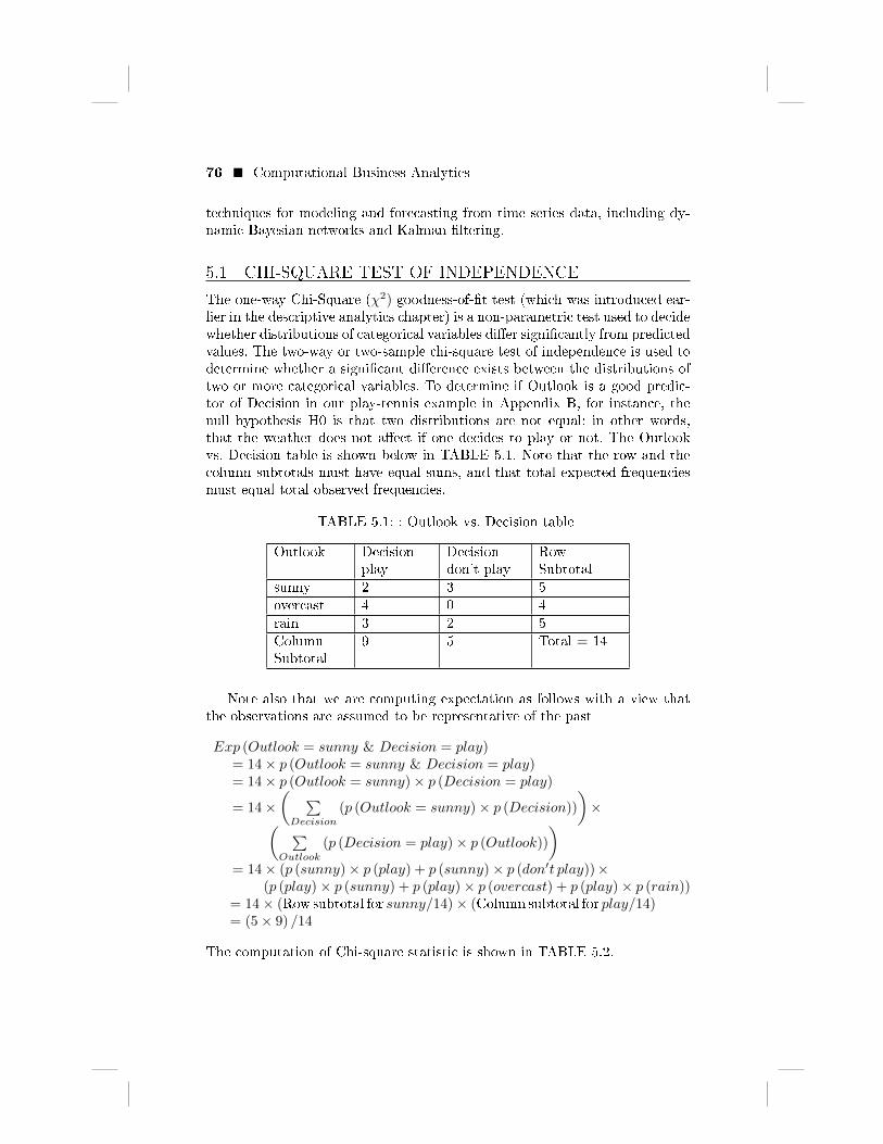
The one-way Chi-Square (χ2) goodness-of-�t test (which was introduced ear-lier in the descriptive analytics chapter) is a non-parametric test used to decidewhether distributions of categorical variables di�er signi�cantly from predictedvalues. The two-way or two-sample chi-square test of independence is used todetermine whether a signi�cant di�erence exists between the distributions oftwo or more categorical variables. To determine if Outlook is a good predic-tor of Decision in our play-tennis example in Appendix B, for instance, thenull hypothesis H0 is that two distributions are not equal; in other words,that the weather does not a�ect if one decides to play or not. The Outlookvs. Decision table is shown below in TABLE 5.1. Note that the row and thecolumn subtotals must have equal sums, and that total expected frequenciesmust equal total observed frequencies.
TABLE 5.1: : Outlook vs. Decision table
Outlook Decisionplay
Decisiondon't play
RowSubtotal
sunny 2 3 5
overcast 4 0 4
rain 3 2 5
ColumnSubtotal
9 5 Total = 14
Note also that we are computing expectation as follows with a view thatthe observations are assumed to be representative of the past
Exp (Outlook = sunny & Decision = play)= 14× p (Outlook = sunny & Decision = play)= 14× p (Outlook = sunny)× p (Decision = play)
= 14×( ∑Decision
(p (Outlook = sunny)× p (Decision))
)×( ∑
Outlook
(p (Decision = play)× p (Outlook))
)= 14× (p (sunny)× p (play) + p (sunny)× p (don′t play))×
(p (play)× p (sunny) + p (play)× p (overcast) + p (play)× p (rain))= 14× (Row subtotal for sunny/14)× (Column subtotal for play/14)= (5× 9) /14
The computation of Chi-square statistic is shown in TABLE 5.2.

Inferential Statistics and Predictive Analytics � 77
TABLE 5.2: : Computation of Chi-square statistic
Joint Variable Observed (O) Expected (E) (O-E)2/E
sunny & play 2 3.21 0.39
sunny & don't play 3 1.79 0.82
overcast & play 4 2.57 0.79
overcast & don't play 0 1.43 1.43
rainy & play 3 3.21 0.01
rainy & don't play 2 1.79 0.02
Therefore, Chi-square statistic =∑i
(O−E)2
E = 3.46
The degree of freedom is (3− 1) × (2− 1), that is, 2. With 95% as the levelof signi�cance, the critical value from the Chi-square table is 5.99. Since thevalue 3.46 is less than 5.99, so we would reject the null hypothesis that thereis signi�cant di�erence between the distributions in Outlook and Decision.Hence the weather does a�ect if one decides to play or not.
5.2 REGRESSION ANALYSES
In this section, we begin with simple and multiple linear regression techniques,then present logistic regression for handling categorical variables as the de-pendent variables, and, �nally, discuss polynomial regression for modelingnonlinearity in data.
5.2.1 Simple Linear Regression
Simple linear regression models the relationship between two variables X andY by �tting a linear equation to observed data:
Y = a+ bX
where X is called an explanatory variable and Y is called a dependent variable.The slope b and the intercept a in the above equation must be estimatedfrom a given set of observations. �Least-squares� is the most common methodfor �tting equations, wherein the best-�tting line for the observed data iscalculated by minimizing the sum of the squares of the vertical deviationsfrom each data point to the line.
Suppose the set (y1, x1) , ...., (yn, xn) of n observations are given. The ex-pression to be minimized is the sum of the squares of the residuals (i.e., thedi�erences between the observed and predicted values):
n∑i=1
(yi − a− bxi)2
By solving the two equations obtained by taking partial derivatives of the

78 � Computational Business Analytics
above expression with respect to a and b and then equating them to zero, theestimations of a and b can be obtained.
b =
n∑i=1
(xi−X)(yi−Y )n∑i=1
(xi−X)2
=
n∑i=1
xiyi− 1n
n∑i=1
xin∑j=1
yj
n∑i=1
x2i−
1n
(n∑i=1
xi
)2 = Cov(X,Y )V ar(X)
a = Y − bX
The plot in FIGURE 5.1 shows the observations and linear regression model(the straight line) of the two variables Temperature (Fahrenheit degree) andHumidity (%), with Temperature as the dependent variable. For any givenobservation of Humidity, the di�erence between the observed and predictedvalue of Temperature provides the residual error.
FIGURE 5.1 : Example linear regression
The correlation coe�cient measure between the observed and predictedvalues can be used to determine how close the residuals are to the regressionline.
5.2.2 Multiple Linear Regression
Multiple linear regression models the relationship between two or more re-sponse variables Xi and one dependent variable Y as follows:
Y = a+ b1X1 + ...+ bpXp
The given n observations (y1, x11, ..., x1p) , ...., (yn, xn1, ..., xnp) in matrix formare

Inferential Statistics and Predictive Analytics � 79
y1
y2
...yn
=
aa...a
+
b1b2...bp
T
x11 x21 ... xn1
x12 x22 ... xn2
... ... ... ...x1p x2p ... xnp
Or in abbreviated form
Y=A+BTX
The expression to be minimized is
n∑i=1
(yi − a− b1xi1 − ...− bpxip)2
The estimates of A and B are as follows:
B =(XTX
)−1XTY = Cov(X,Y)
V ar(X)
A = Y − BX
5.2.3 Logistic Regression
The dependent variable in logistic regression is binary. In order to predictcategorical attribute Decision in the play-tennis example in Appendix B froma new category Temperature, suppose the attribute Temp_0_1 represents acontinuous version of the attribute Decision, with 0 and 1 representing thevalues �don't play� and �play� respectively. FIGURE 5.2 shows the scatterplot and a line plot of Temperature vs. Temp_0_1 (left), and a scatter plotand logistic curve for the same (right). The scatter plot shows that there is a�uctuation among the observed values, in the sense that for a given Tempera-ture (say, 72), the value of the dependent variable (play/don't play) has beenobserved to be both 0 and 1 on two di�erent occasions. Consequently, the lineplot oscillates between 0 and 1 around that temperature. On the other hand,the logistic curve transitions smoothly from 0 to 1. We describe here brie�yhow logistic regression is formalized.
Since the value of the dependent variable is either 0 or 1, the most intu-itive way to apply linear regression would be to think of the response as aprobability value. The prediction will fall into one class or the other if theresponse crosses a certain threshold or not, and therefore the linear equationwill be of the form:
p (Y = 1|X) = a+ bX
However, the value of a+bX could be > 1 or < 0 for some X, giving probabil-ities that cannot exist. The solution is to use a di�erent probability represen-tation. Consider the following equation with a ratio as the response variable:
p
1− p= a+ bX

80 � Computational Business Analytics
FIGURE 5.2 : (left) Scatter and line plots of Temperature vs.
Temp_0_1, and (right) scatter plot and logistic curve for the same
The ratio ranges from 0 to ∞ for some X but the value of a + bX would bebelow 0 for some X. The solution is to take the log of the ratio:
log
(p
1− p
)= a+ bX
The logit function above transforms a probability statement de�ned in 0 <p < 1 to one de�ned in −∞ < a+ bX <∞. The value of p is as follows:
p =ea+bX
1 + ea+bX
A maximum likelihood method can be applied to estimate the parameters aand b of a logistic model with binary response:
• Y = 1 with probability p
• Y = 0 with probability 1− p
For each Yi = 1 the probability pi appears in the likelihood product. Simi-larly, for each Yi = 0 the probability 1 − pi appears in the product. Thus,the likelihood of the sample (y1, x1) , ...., (yn, xn) of n observations takes thefollowing form:
L (a, b; (y1, x1) , ...., (yn, xn))
=n∏i=1
pyi (1− p)1−yi
=n∏i=1
(ea+bxi
1+ea+bxi
)yi (1
1+ea+bxi
)1−yi
=n∏i=1
(ea+bxi)yi
1+ea+bxi
Alternatively, we can maximize the log likelihood, log (L (a, b;Data)), to solve

Inferential Statistics and Predictive Analytics � 81
for a and b. In the example above, the two values of a and b that maximizethe likelihood are 45.94 and -0.62, respectively. Hence the logistic equation is:
log
(p
1− p
)= 45.94− 0.62X
FIGURE 5.2 (right) shows the logistics curve plotted for the sample.
5.2.4 Polynomial Regression
The regression model
Y = a0 + a1X + a2X2 + ...+ akX
k
is called the k-th order polynomial model with one variable, where a0 is theY -intercept of X, a1 is called the linear e�ect parameter, a2 is called thequadratic e�ect parameter, and so on. The model is a linear regression modelfor k = 1. This model is non-linear in the X variable, but it is linear in theparameters a0, a1, a2, . . . and ak. One can also have higher-order polynomialregression involving more than one variable. For example, a second-order orquadratic polynomial regression with two variables X1 and X2 is
Y = a0 + a1X1 + a2X2 + a11X21 + a22X
22 + a12X1X2
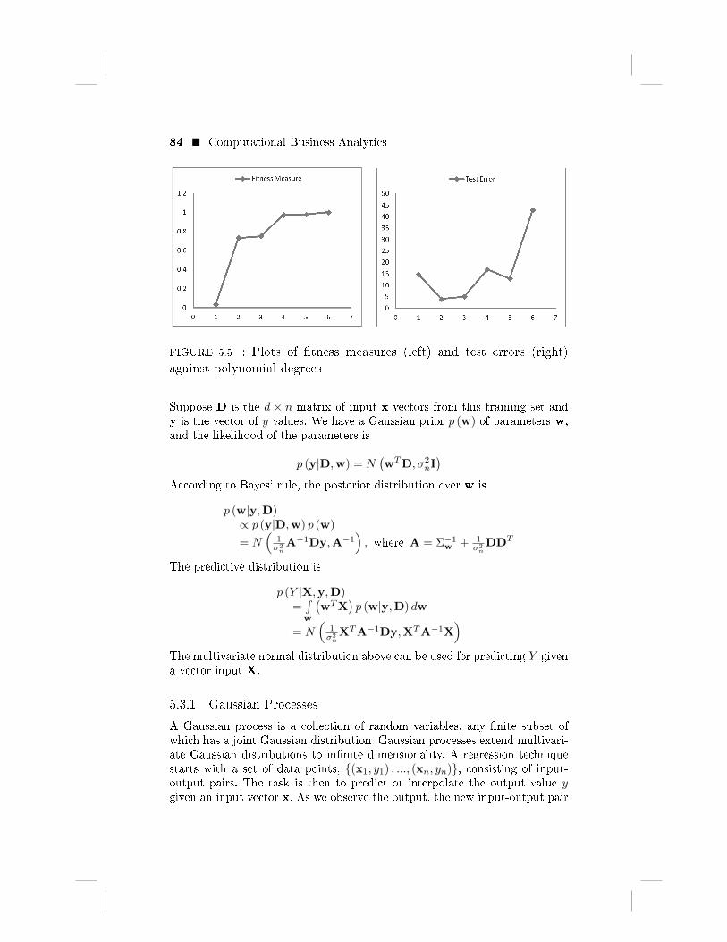
FIGURE 5.3 (left) shows a plot of 7 noisy, evenly-spaced random trainingsamples (x1, y1) , ..., (x7, y7) drawn from an underlying function f (shown indotted line). Note that a dataset of k+1 observations can be modeled perfectlyby a polynomial of degree k. In this case, a six-degree polynomial will �t thedata perfectly, but will �over-�t� the data and will not generalize well for testdata. To decide on the appropriate degree for a polynomial regression model,one can begin with a linear model and include higher-order terms one by oneuntil the highest-order term becomes non-signi�cant (determined by lookingat p-values for the t-test for slopes). One could also start with a high-ordermodel and exclude the non-signi�cant highest-order terms one by one untilthe remaining highest-order term becomes signi�cant. Here we measure �tnesswith respect to the test data of eight evenly-spaced samples as shown plottedin FIGURE 5.3 (right).
FIGURE 5.4 shows six di�erent polynomial regressions of degrees 1 to 6along with the sample data. Note that the polynomial regression of degree 6goes through all seven points and �ts perfectly.
The closest �t to the sample training data is based on the R2 measure inExcel. FIGURE 5.5 (left) shows this measure of �tness between the trainingdata and the predictions of each polynomial model of certain degree. As shownin the �gure, the polynomial of degree 6 has the perfect measure of �tness 1.0.The test error is based on the error measure
8∑i=1
|yi − f (xi)|

82 � Computational Business Analytics
FIGURE 5.3 : Sample (left) and test data (right) from a function
between the test data and the six polynomial regressions corresponding todegrees 1 to 6. We can see in FIGURE 5.5 (left) that while the measure of�tness is steadily increasing towards 1.0, the test error in FIGURE 5.5 (right)reaches a minimum at degree 2 (hence the best �t) and then increases rapidlyas the models begin to over-�t the training data.
5.3 BAYESIAN LINEAR REGRESSION
Bayesian linear regression views the regression problem as introduced aboveas an estimation of the functional dependence between an input variable X in<d and an output variable Y in < as shown below:
Y (X)
=M∑i=1
wiφi (X) + ε
= wTΦ (X) + ε
where wTΦ (X) (e.g., Φ (X) =(1, x, x2, ...
)) is a linear combination ofM pre-
de�ned nonlinear basis functions φi (X) with input in <d and output in <. Theobservations are additively corrupted by i.i.d. noise with normal distribution
ε ∼ N(0, σ2
n
)that has zero mean and variance σ2
n.The goal of Bayesian regression is to estimate the weights wi given a train-
ing set {(x1, y1) , ..., (xn, yn)} of data points. In contrast to classical regression,a Bayesian linear regression characterizes the uncertainty inw through a prob-ability distribution p (w). We use a multivariate normal distribution as prioron the weights as
p (w) = N (0,Σw)

Inferential Statistics and Predictive Analytics � 83
FIGURE 5.4 : Fitting polynomials of degrees 1 to 6
with zero mean and Σw as an M ×M -sized covariance matrix. Further ob-servations of data points modify this distribution using Bayes' theorem, withthe assumption that the data points have been generated via the likelihoodfunction. Let us illustrate Bayesian linear regression as
Y = wTX + ε
84 � Computational Business Analytics
FIGURE 5.5 : Plots of �tness measures (left) and test errors (right)
against polynomial degrees
Suppose D is the d × n matrix of input x vectors from this training set andy is the vector of y values. We have a Gaussian prior p (w) of parameters w,and the likelihood of the parameters is
p (y|D,w) = N(wTD, σ2
nI)
According to Bayes' rule, the posterior distribution over w is
p (w|y,D)∝ p (y|D,w) p (w)
= N(
1σ2nA−1Dy,A−1
), where A = Σ−1
w + 1σ2nDDT
The predictive distribution is
p (Y |X,y,D)=∫w
(wTX
)p (w|y,D) dw
= N(
1σ2nXTA−1Dy,XTA−1X
)The multivariate normal distribution above can be used for predicting Y givena vector input X.
5.3.1 Gaussian Processes
A Gaussian process is a collection of random variables, any �nite subset ofwhich has a joint Gaussian distribution. Gaussian processes extend multivari-ate Gaussian distributions to in�nite dimensionality. A regression techniquestarts with a set of data points, {(x1, y1) , ..., (xn, yn)}, consisting of input-output pairs. The task is then to predict or interpolate the output value ygiven an input vector x. As we observe the output, the new input-output pair

Inferential Statistics and Predictive Analytics � 85
is added to the observation data set. Thus the data set grows in size overtime. Any number of observations y1, ..., yn in an arbitrary data set can beviewed as a single point sampled from some multivariate Gaussian distribu-tion. Hence, a regression data set can be partnered with a Gaussian processwhere the prediction always takes into account the latest observations.
We consider a more general form of regression function for interpolation
Y = f (X) +N(0, σ2
n
)where each observation X can be thought of as related to an underlying func-tion f through some Gaussian noise model. We solve the above for the functionf . In fact, given n data points and new input X, our objective is to predictY and not the actual f since their expected values are identical (accordingto the above regression function). We can obtain a Gaussian process from theBayesian linear regression model:
f (X) = wTX with w ∼ N (0,Σw)where the mean is given by
E [f (X)] = E[wT]X = 0
and the covariance is given by
E[f (xi)
Tf (xj)
]= xTi E
[wwT
]xj = xTi Σwxj
It is often assumed that the mean of this Gaussian process is zero everywhere,but one observation is related to another observation via the covariance func-tion
k (xi,xj) = σ2f × e
−|xi−xj |22l2 + σ2
n × δ (xi,xj)
where the maximum allowable covariance is de�ned as σ2f , which should be
high (and hence not zero) for functions covering a broad range on the Y axis.The value of the kernel function approaches its maximum if xi ≈ xj . In thiscase f (xi) and f (xj) are perfectly correlated. This means the neighboringpoints yield very close functional values, making the function smooth, anddistant observations will have a negligible e�ect during interpolation of f at anew x value. The length parameterl determines the e�ect of this separation.δ (xi,xj) is known as the Kronecker delta function (δ (xi,xj) = 0 if xi 6= xjelse 1).
For Gaussian process regression, suppose the observation set is{(x1, y1) , ..., (xn, yn)} and a new input observation is x∗ We capture the co-variance functions k (xi,xj) for all possible xi,xj , and x∗ in the followingthree matrices:
K =
k (x1,x1) k (x1,x2) ... k (x1,xn)k (x2,x1) k (x2,x2) ... k (x2,xn)... ... ... ...k (xn,x1) k (xn,x2) ... k (xn,xn)

86 � Computational Business Analytics
K∗ =[k (x∗,x1) k (x∗,x2) ... k (x∗,xn)
]K∗∗ = k (x∗,x∗)
Note that k (xi,xi) = σ2f + σ2
n, for all i. As per the assumption of a Gaussianprocess, the data set can be represented as a multivariate Gaussian distribu-tion as follows: [
yy∗
]∼ N
(0,
[K KT
∗K∗ K∗∗
])We are interested in the conditional distribution p (y∗|y) which is given below:
y∗|y ∼ N(K∗K
−1y,K∗∗−K∗K−1KT
∗)
Therefore the best estimate for y∗ is the mean K∗K−1y of the above distri-
bution.
ExampleTo illustrate the Gaussian process, consider the sample data set of seven pointsin TABLE 5.3, a plot of which was shown earlier in FIGURE 5.3.
TABLE 5.3: : Sample data set
X Y
1 1
2 4.5
3 6.5
4 6
5 6.7
6 7
8 3
7.5 ?
Considering the covariance function:
k (xi,xj) = e−|xi−xj |2
2l2
With the value of l as 0.8 in the function k above, we calculate the covariancematrix K as shown in TABLE 5.4.
TABLE 5.4: : Matrix of covariance functions
1 0.457833 0.043937 0.000884 3.73E-06 3.29E-09 2.37E-17
0.457833 1 0.457833 0.043937 0.000884 3.73E-06 6.1E-13
0.043937 0.457833 1 0.457833 0.043937 0.000884 3.29E-09
0.000884 0.043937 0.457833 1 0.457833 0.043937 3.73E-06
3.73E-06 0.000884 0.043937 0.457833 1 0.457833 0.000884

Inferential Statistics and Predictive Analytics � 87
TABLE 5.4: : Matrix of covariance functions
3.29E-09 3.73E-06 0.000884 0.043937 0.457833 1 0.043937
2.37E-17 6.1E-13 3.29E-09 3.73E-06 0.000884 0.043937 1
It is clear from the above table that the closer the X values are to each other,the higher the values of the covariance function are. We also have K∗as shownin TABLE 5.5.
TABLE 5.5: : Vector of covariance functions
4.62E-15 5.45E-11 1.35E-07 6.98E-05 0.007576 0.172422 0.822578
The formula K∗K−1y provides 3.23 as the mean of the predicted y-value for
x = 7.5.
5.4 PRINCIPAL COMPONENT AND FACTOR ANALYSES
Principal component analysis (PCA) converts a set of measurements of possi-bly correlated variables into a set of values of linearly uncorrelated variablescalled principal components. PCA can be done by eigenvalue decompositionor SVD as introduced earlier in the background chapter.
Example
Consider the data set in FIGURE 5.6 with 6 variables and 51 observations ofthe US Electoral College votes, population, and area by state. The full dataset is given in Appendix B.
FIGURE 5.6 : United States Electoral College votes, population, and
area by state
The correlation matrix in FIGURE 5.7 clearly indicates two groups ofcorrelated variables. The fact that the number of electoral votes is proportionalto the population gives rise to the �rst set of correlated variables. The secondset of correlated variables is the set of all areas.

88 � Computational Business Analytics
FIGURE 5.7 : Correlation matrix for the data in FIGURE 5.6
All six eigenvalues and eigenvectors are shown in FIGURE 5.8, of whichthe �rst three are dominating as expected, given the two groups of correlatedvariables as shown in FIGURE 5.7 and the only remaining variable for density.The �rst principal component PRIN1 shows the domination of the coe�cientscorresponding to the three variables related to the areas. The second principalcomponent PRIN2 shows the domination of the coe�cients corresponding toElectoral Votes and Population.
FIGURE 5.8 : Eigenvalues and eigenvectors of the correlation matrix in
FIGURE 5.7
FIGURE 5.9 shows the principal component plot of the data set in FIG-URE 5.6 with the �rst two components. It is clear from the plot that thecomponent PRIN1 is about the area and PRIN2 is about the population.This is the reason why the state of Alaska has a large PRIN1 value but verylittle PRIN2, and DC is just opposite. The state of California has large valuesfor both PRIN1 and PRIN2.
Factor analysis (Anderson, 2003; Gorsuch, 1983) helps to obtain a smallset of independent variables, called factors or latent variables, from a largeset of correlated observed variables. Factor analysis describes the variabilityamong observed variables in order to gain better insight into categories orto provide a simpler prediction structure. For example, factor analysis canreduce a large number of �nancial ratios into categories of �nancial ratios on

Inferential Statistics and Predictive Analytics � 89
FIGURE 5.9 : Principal component plot of the data set in FIGURE 5.6
the basis of empirical evidence. It can help with �nding contributing factorsa�ecting, for example, prices of groups of stocks, GDPs of countries, andwater and air qualities. For exploratory factor analysis (EFA), there is no pre-de�ned idea of the structure or dimensions in a set of variables. On the otherhand, a con�rmatory factor analysis (CFA) tests speci�c hypotheses aboutthe structure or the number of dimensions underlying a set of variables.
The factor model proposes that observed responses X1, ..., Xn are partiallyin�uenced by underlying common factors F1, ..., Fm and partially by underly-ing unique factors e1, ..., en.
X1 = λ11F1 + λ12F2 + ...+ λ1mFm + e1
X2 = λ21F1 + λ22F2 + ....+ λ2mFm + e2
...Xn = λn1F1 + λn2F2 + ...+ λnmFm + en
The coe�cients λij are called the factor loadings, so that λij is the loadingof the ith variable on the jth factor. Factor loadings are the weights andcorrelations between each variable and the factor. The higher the loadingvalue, the more relevant the variable is in de�ning the factor's dimensionality.A negative value indicates an inverse impact on the factor. Thus a given factorin�uences some measures more than others, and this degree of in�uence isdetermined by loadings. The error terms e1, ..., en serve to indicate that thehypothesized relationships are not exact. The ith error term describes theresidual variation speci�c to the ith variable Xi. The factors are often called

90 � Computational Business Analytics
the common factors while the residual variables are often called the unique orspeci�c factors.
The number of factors m should be substantially smaller than n. If theoriginal variables X1, ..., Xn are at least moderately correlated, the basic di-mensionality of the system is less than n. The goal of factor analysis is toreduce the redundancy among the variables by using a smaller number offactors.
To start an EFA, we �rst extract initial factors, using principal componentsto decide on the number of factors. Eigenvalue is the amount of variance inthe data described by the factor, and eigenvalues help to choose the numberof factors. In principal components, the �rst factor describes most of the vari-ability. We then choose the number of factors to retain, and rotate axes tospread variability more evenly among factors. Rede�ning factors that loadingstend to make very high (-1 or 1) or very low (0) makes sharper distinctionsin the interpretations of the factors.
Example
We apply the principal component-based factoring method on the data in FIG-URE 5.6. The eigenvalues and the factor patterns are shown in FIGURE 5.10.
FIGURE 5.10 : Eigenvalues and factor patterns for the data in FIG-
URE 5.6
Now we apply the orthogonal Varimax rotation (maximizes the sum of thevariances of the squared loadings) to obtain rotated factor patterns, as shownin FIGURE 5.11, and the revised distribution of variance explained by eachfactor, as shown in FIGURE 5.12. The total variance explained remains thesame and gets evenly distributed between the major two factors.
Example
Here is an arti�cial example to check the validity and robustness of factoranalysis. The data from the Thurstone box problem (Thurstone, 1947), asshown in FIGURE 5.13, measures 20 di�erent characteristics of boxes, suchas individual surface areas and box inter-diagonals. If these measurements areonly linear combinations of the height, width, and depth of the box, then the

Inferential Statistics and Predictive Analytics � 91
FIGURE 5.11 : Rotated factor patterns from factors in FIGURE 5.10
FIGURE 5.12 : Variance explained by each factor in FIGURE 5.11
data set could be reproduced by knowing only these dimensions and by givingthem appropriate weights. These three dimensions are considered as factors.
FIGURE 5.13 : 20 variable box problem data set (Thurstone, 1947)
As shown in FIGURE 5.14, the three dimensions of space are approxi-mately discovered by the factor analysis, despite the fact that the box char-acteristics are not linear combinations of underlying factors but are insteadmultiplicative functions. Initial loadings and components are extracted usingPCA.
The question is how many factors to extract in a given data set. Kaiser'scriterion suggests that it is only worthwhile to extract factors which accountfor large variance. Therefore, we retain those factors with eigenvalues equalto or greater than 1.

92 � Computational Business Analytics
There are 20 observations, each a function of x, y or z or one of theircombinations. In FIGURE 5.14, Proportion indicates the relative weight ofeach factor in the total variance. For example, 12.6149/20 = 0.6307. So the�rst factor explains about 63% of the total variance. Cumulative shows thetotal amount of variance explained, and the �rst six eigenvalues explain almost99.6% of the total variance. From a factor analysis perspective the �rst threeeigenvalues suggest a factor model with three common factors. This is becausethe �rst two eigenvalues are greater than unity and the third one is closer tounity and together they explain over 98% of the total variance.
FIGURE 5.14 : Factor analysis of the data in FIGURE 5.13 shows the
eigenvalues for variance explained by each factor and three retained
factors
Rotating the components towards independence, rather than rotating theloadings towards simplicity, allows one to accurately recover the dimensionsof each box and also to produce simple loadings. FIGURE 5.15 shows thefactors of FIGURE 5.14 after an orthogonal Varimax rotation. The total ofeigenvalues for the factors remains the same, but variability among factors isevenly distributed.
There are some di�erences between EFA and PCA and they will providesomewhat di�erent results when applied to the same data. EFA assumes thatthe observations are based on the underlying factors, whereas in PCA theprincipal components are based on observations. The rotation of componentsis part of EFA but not PCA.
5.5 SURVIVAL ANALYSIS
Survival analysis (Kleinbaum and Klein, 2005; Hosmer et al., 2008) is a time-to-event analysis that measures the time from the beginning of a study to aterminal event, conclusion of the observation period, or loss of contact/with-

Inferential Statistics and Predictive Analytics � 93
FIGURE 5.15 : Factors of FIGURE 5.14 after an orthogonal Varimax
rotation
drawal from the study. Survival data consist of a response variable that mea-sures the duration of time (event time, failure time, or survival time) until aspeci�ed event occurs. Optionally, the data may contain a set of independentvariables that are possibly associated with the failure time variable. Exam-ples of survival analysis include determining the lifetime of a device (the timeafter installation until the device breaks down), the time until a company de-clares bankruptcy after its inception, the length of time an auto driver stayedaccident-free since becoming insured, the length of time a person stayed ona job, the retention time of customers, and the survival time (or time untildeath) for organ transplant patients since transplant surgery.
The censoring problem in survival analysis arises due to incomplete obser-vations of survival time during a period of study. Some subjects of study havecensored survival times because they may not be observed for the full studyperiod due to drop-out, loss to followup, or early termination of the study. Acensored subject may or may not have an event of interest if it occurs beforethe end of the study but their data is incomplete.
Example
FIGURE 5.16 illustrates the survival histories of six subjects in an exampleof a study that could be measuring implanted device lifetimes or post-organtransplant outcomes.
In the �gure, the terminal event of interest is �breakdown� or �death� whichmotivates a study of survival time. Not all devices will cease to work duringthe 325 days of the study period, but all will break down eventually. In the�gure, the solid line represents an observed period at risk, while the brokenline represents an unobserved period at risk. The letter �X� represents an

94 � Computational Business Analytics
FIGURE 5.16 : Survival histories of subjects for analysis
observed terminal event, the open circle represents the censoring time, andthe letter �N� represents an unobserved event.
An observation that is right-censored means the relevant event has not yetoccurred at the time of observation. An observation that is left-censored meansthe relevant event has occurred before the time of observation but the exacttime is not known. An observation is interval-censored if the event occurs atan unknown point in a time interval. Right-censored observations are the mostcommon kind.
Example
In FIGURE 5.16, the observation of subject 5 is right-censored. Subject 4joined the study late. Subject 6 is lost to observation for a while. Subject 2joined the study on time but was lost to observation after some time, and diedbefore the study period ended, but it is not known exactly when.
Consider the random variable T representing the survival time with den-sity f (t). The cumulative distribution function is F (t) = p (T ≤ t), whichrepresents the probability that a subject survives no longer than time t. S (t)is the survival function or the probability that a subject survives longer than

Inferential Statistics and Predictive Analytics � 95
time t, that is,
S (t) = p (T > t) = 1− F (t) =
∞∫t
f (s) ds.
A typical question to be asked is �What is the probability of the device lastingpast 300 days?� and the answer is S (300). The hazard function is de�ned as
h (t) =f (t)
S (t).
Methods for estimating survival function include life table analysis, Kaplan-Meier product-limit estimator, and Cox's semi-parametric proportional hazardmodel, of which the life table is the least complicated way to describe thesurvival in a sample. A straightforward multiple regression technique is notsuitable for survival analysis because of the problem of censoring and thesurvival time dependent variable, as well as the fact that other independentvariables are not normally distributed.
In the life table analysis, the distribution of survival times is divided into acertain number of intervals. For each interval we can then compute the numberand proportion of cases or objects that entered the respective interval, thenumber and proportion of terminal events, and the number of cases that werelost or censored in the respective interval. Several additional statistics can becomputed based on these numbers and proportions, especially the estimatedprobability pi of failure in the respective interval. This probability pi of theith interval is computed per unit of time as (ni − ni+1) /ti, where ni is theestimated cumulative proportion surviving at the beginning of the ith interval,ni+1 is the cumulative proportion surviving at the end of the ith interval,and ti is the width of the ith interval. Since the probabilities of survival areassumed to be independent across the intervals, the survival probability up toan interval is computed by multiplying out the probabilities of survival acrossall previous intervals.
The life table gives us a good indication of the distribution of survival overtime. However, for predictive purposes it is often desirable to understand theshape of the underlying survival function in the population. The two majordistributions that have been proposed for modeling survival or failure timesare the exponential and the Weibull distribution.
The Kaplan-Meier product-limit estimator (1958) is a life table analysis inwhich each time interval contains exactly one case. The method arranges thedata in increasing order of the observed values, noting the censored cases. Itthen computes the proportion of subjects who left the study after each changein the ordering. The advantage of using this estimator is that the resultingestimates do not depend on the grouping of the data into a certain number oftime intervals. Cox's proportional hazards model determines the underlyinghazard rate as a function of the independent variables.

96 � Computational Business Analytics
Example
We undertake a retrospective analysis of 863 records (part displayed in FIG-URE 5.17) of patients who underwent a kidney transplant during a certainperiod of time. The patient population examined contains males and females,and both black and white subjects.
FIGURE 5.17 : Example data for survival analysis (Ref:
http://www.mcw.edu/FileLibrary/Groups/Biostatistics/Public�les/
DataFromSection/DataFromSectionTXT/Data_from_section_1.7.txt)
Survival studies were calculated using the Kaplan-Meier Product-Limitmethod. The outcome endpoints were alive and dead. The data were groupedby the gender and race variables and hence there were four groups. The sur-vival functions for both white and black females are shown in FIGURE 5.18.
FIGURE 5.18 : An example survival analysis plots

Inferential Statistics and Predictive Analytics � 97
It's clear from the �gure that the average survival time is higher for thepopulation representing the distribution function on the left than on the right.Similar other conclusions can be drawn by studying and comparing the twodistribution functions.
5.6 AUTOREGRESSION MODELS
A process is stochastic if it evolves in time according to probabilistic laws.In this section, we introduce three types of stochastic processes, Autoregres-sive (AR), Moving Average (MA), and Autoregressive and Moving Average(ARMA), which are a special type of Gaussian process for modeling time-series data. A simple AR process, AR(1), is recursively de�ned as follows:
Xt = aXt−1 + εt
where a is the coe�cient, εt is white noise with εt ∼ N(0, σ2
)and εi and εj
are independent for i 6= j. By repeated substitution,
Xt = εt + aεt−1 + a2εt−2 + ...
Therefore, E [Xt] = 0 and V ar [Xt] = σ2(1 + a2 + a4 + ...
)= σ2
1−a2 , if |a| <1. More generally, an autoregression model of order p, AR(p), is de�ned as :
Xt = a1Xt−1 + ...+ apXt−p + εt
where Xt can be obtained by linear regression from Xt−1, ..., Xt−p.The MA process represents time series that are generated by passing the
white noise through a non-recursive linear �lter. The general MA process oforder q, MA(q), is de�ned as follows:
Xt = εt + b1εt−1 + ...+ bqεt−q
where bis are coe�cients and εi is white noise with εi ∼ N(0, σ2
). AR(p) and
MA(q) processes can be combined to de�ne ARMA(p, q) as
Xt = a1Xt−1 + ...+ apXt−p︸ ︷︷ ︸Autoregressive (AR)
+ εt + b1εt−1 + ...+ bqεt−q︸ ︷︷ ︸MovingAvergae (MA)
Example
FIGURE 5.19 is an autoregressive plot of forecasts of the closing values ofIntuit stock for seven days in the �rst half of January 2006. The order of theautoregressive process is 5 and the process employs a maximum likelihoodestimator method. The �gure also shows the 3 standard deviations from themean as the Lower Control Limit (LCL) and Upper Control Limit (UCL)values.
Note from the �gure that the autoregression process takes a time-step ortwo to predict a steep ascension or decline in the observed data.

98 � Computational Business Analytics
FIGURE 5.19 : Plot of forecasts by autoregression
5.7 FURTHER READING
Two very comprehensive books on applied regression analyses are (Gelmanand Hill, 2006) and (Kleinbaum et al., 2007). A great tutorial on survivalanalysis can be found in (Kleinbaum and Klein, 2005).