limits of iability isclaimer of arranty...fashion tips to help mature women tweak their chic®....
TRANSCRIPT
2 © 2015 Fabulous After 40 All rights reserved.
www.fabulousafter40.com
LIMITS OF LIABILITY/DISCLAIMER OF WARRANTY:
©Color Me Fabulous Deborah Boland 2015. All Rights Reserved
The author and publisher of this book and the accompanying materials have used their
best efforts in preparing this material. The authors and publisher make no
representation or warranties with respect to the accuracy, applicability, fitness, or
completeness of the contents of this program. They disclaim any warranties (expressed
or implied), in merchantability or fitness for any particular purpose. The authors and
publisher shall in no event be held liable for any loss or other damages, including but
not limited to special, incidental, consequential, or other damages. As always, the
advice of a competent legal, tax, accounting, or other professional should be sought.
This manual contains material protected under International and Federal Copyright
Laws and Treaties. Any unauthorized reprint or use of this material is prohibited. You
do not have the right to copy or distribute this guide.
3 © 2015 Fabulous After 40 All rights reserved.
www.fabulousafter40.com
Table ofContents
Limits of Liability/Disclaimer of Warranty
About Deborah Boland
Overcoming Abundant Black Disorder Add a Pop of Color
Try a Print
Jewelry Accessories
Make-up
Other Ways to Climb Out of Your Black Rut
Colors that Enhance Your Natural Coloring Color Analysis
How Color Analysis Works
Step 1 – Are you Warm or Cool? Step 2 - What Season are You?
Summer
Autumn Winter Spring
2
5
10
10
11
12
12
13
15
17
18
20
21
24
27
30
4 © 2015 Fabulous After 40 All rights reserved.
www.fabulousafter40.com
12 Color System
Wearing Colors that Aren’t in Your Seasonal Palette
Other Benefits of Identifying your Color Palette
How to Use Color to Flatter Your Figure and Proportions
How to Use Color to Express Your Personality
How to Use Color to Express Yourself and Communicate a Message
How to Use Color to Look Modern
The Newest Trend: Color Blocking
The Neon Trend – Can you Wear it After 40?
What about Pastels?
Nude and Blush
Are You Ready to Go Beyond Basic Black?
Special Thanks
33
33
33
34
38
42
51
54
56
57
58
59
60
5 © 2015 Fabulous After 40 All rights reserved.
www.fabulousafter40.com
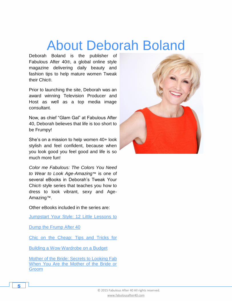
About Deborah Boland
Deborah Boland is the publisher of
Fabulous After 40®, a global online style
magazine delivering daily beauty and
fashion tips to help mature women Tweak
their Chic®.
Prior to launching the site, Deborah was an
award winning Television Producer and
Host as well as a top media image
consultant.
Now, as chief “Glam Gal” at Fabulous After
40, Deborah believes that life is too short to
be Frumpy!
She’s on a mission to help women 40+ look
stylish and feel confident, because when
you look good you feel good and life is so
much more fun!
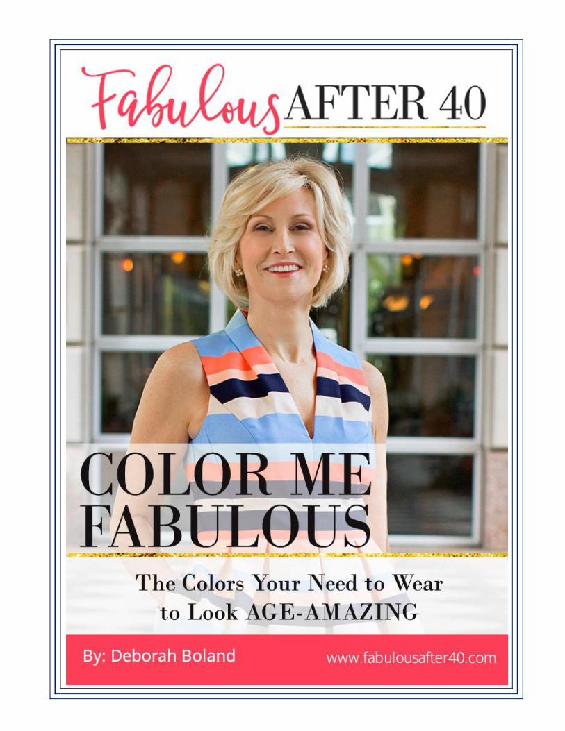
Color me Fabulous: The Colors You Need
to Wear to Look Age-Amazing™ is one of
several eBooks in Deborah’s Tweak Your
Chic® style series that teaches you how to
dress to look vibrant, sexy and Age-
Amazing™.
Other eBooks included in the series are:
Jumpstart Your Style: 12 Little Lessons to
Dump the Frump After 40
Chic on the Cheap: Tips and Tricks for
Building a Wow Wardrobe on a Budget
Mother of the Bride: Secrets to Looking Fab When You Are the Mother of the Bride or Groom

6 © 2015 Fabulous After 40 All rights reserved.
www.fabulousafter40.com
Color It’s the first thing people notice, and it communicates a powerful and lasting message
about who you are, how you feel about yourself, and what others can expect from you.
Color has the power to make you look healthy, vibrant, youthful, slim and beautiful. It
can also make you look sick, tired, burnt out, old, fat and unattractive.
As a style expert who specializes in helping women 40, 50 and beyond look Age-
Amazing™, I love Color! It’s a fabulous fashion tool that I’m thrilled to teach you more
about because I’ve seen it work magic, helping thousands of 40+ women dump the
frump and step up their style, instantly!
Are you ready to go over the rainbow? Let’s get started!
“Color is life; for a world without colors appears to us as
dead.”
- Johannes Itten,
the founder of color theory

7 © 2015 Fabulous After 40 All rights reserved.
www.fabulousafter40.com
Does this look like your closet?
A wardrobe full of dark, black clothes and little
else?
Then join the club because thousands of
women all over the world share this common
fashion dilemma.
After all, when it comes to clothing, who doesn’t
love black? Black is chic, it’s sexy, it makes you
look thin, and you can wear it practically
anywhere. But the reality is, when it comes to
building a stylish wardrobe that makes you look
fabulous at 40, 50 and beyond, it’s easy to fall
into a “black hole.”
If your closest is full of more black clothing and
accessories than a widow, and every time you
go shopping you can be overheard asking,
“Does this come in black?”, you’re suffering
from a common wardrobe dysfunction I have
nicknamed: ABD.
That’s short for Abundant Black Disorder!
Like most women, these gals could use some color in their wardrobes to perk up their style.
What is ABD?
Abundant Black Disorder is a problem that
can occur at any age but tends to peak
once a woman hits midlife. If you feel like
you’re too visible or you look too fat unless
you wear black, black and more black, then
it’s time for a color intervention.
Most women who suffer from ABD aren’t
even aware that all that black in their
wardrobe is cramping their style and
undermining their looks.
But here’s the truth. Too much black is
dreary and boring. It can make you look
tired, drained, and years older than you
actually are. How so?
8 © 2015 Fabulous After 40 All rights reserved.
www.fabulousafter40.com
As we age, our skin changes. Wrinkles appear and our skin starts to get pale and dull.
Dark spots from sun exposure surface creating an uneven complexion. Our hair and
eyebrows also start to lighten and fade away. In other words, we start to look worn and
washed out.
Wearing black, especially near your mature face limits the amount of light on your face
and saps the color from your skin. Black is notorious for emphasizing age spots, lines
and wrinkles and reinforces nasty dark shadows, especially under the eyes. The result
is a sharp and unflattering contrast between your face and black.
If you’re really honest with yourself then you’ve probably noticed that head-to-toe black
doesn`t look as great on you as it used to. In fact, it probably looks downright harsh.
If black is so unflattering after 40, then why do so many women keep buying it and
wearing it like there’s no tomorrow? Most would say it makes them look thin, but the
reality is any dark neutral can do that.
In my experience, the reason most women suffer from ABD is because there’s something
deeper going on.
If you constantly dress in black after 40 it sends the silent but powerful message, “Please
don’t notice me. I’m old.” Could it be you’re going overboard with black because you’ve
lost your confidence, feel like an old lady and secretly want to disappear into the crowd?
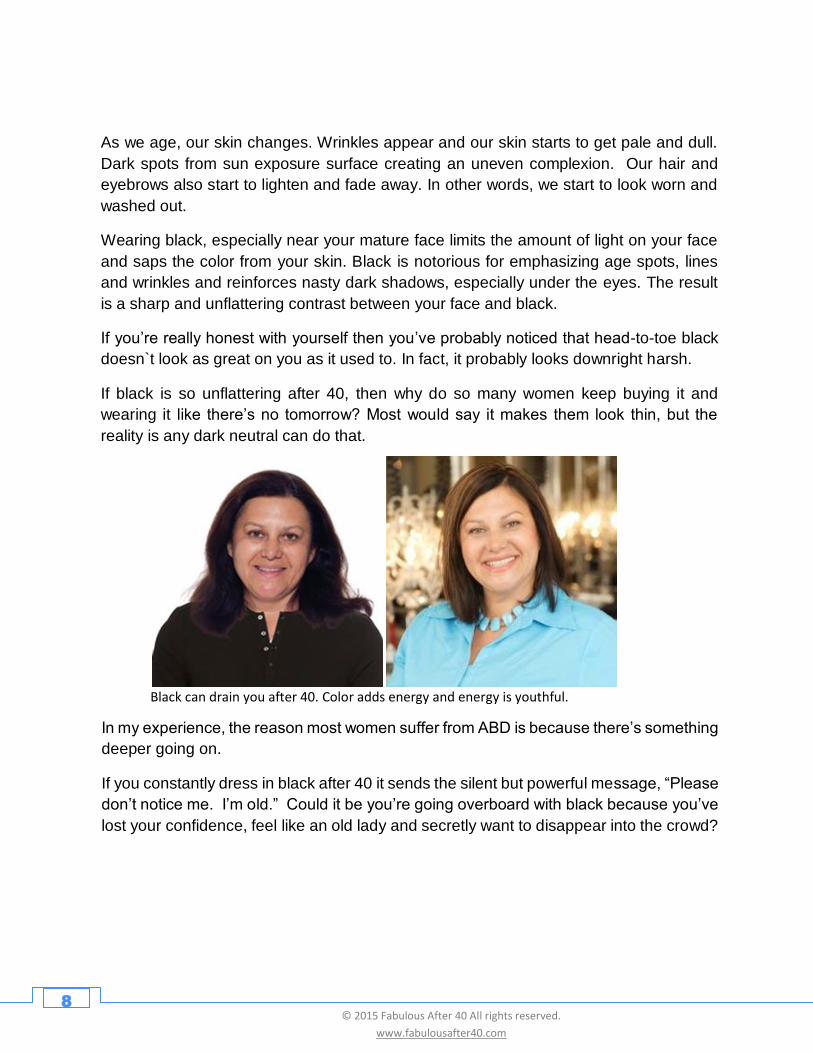
Black can drain you after 40. Color adds energy and energy is youthful.
9 © 2015 Fabulous After 40 All rights reserved.
www.fabulousafter40.com
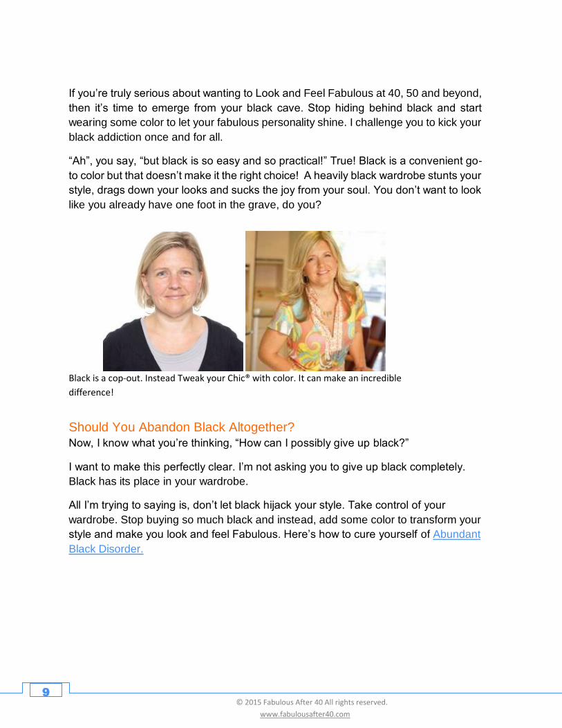
Black is a cop-out. Instead Tweak your Chic® with color. It can make an incredible
difference!
Should You Abandon Black Altogether? Now, I know what you’re thinking, “How can I possibly give up black?”
I want to make this perfectly clear. I’m not asking you to give up black completely.
Black has its place in your wardrobe.
All I’m trying to saying is, don’t let black hijack your style. Take control of your
wardrobe. Stop buying so much black and instead, add some color to transform your
style and make you look and feel Fabulous. Here’s how to cure yourself of Abundant
Black Disorder.
If you’re truly serious about wanting to Look and Feel Fabulous at 40, 50 and beyond,
then it’s time to emerge from your black cave. Stop hiding behind black and start
wearing some color to let your fabulous personality shine. I challenge you to kick your
black addiction once and for all.
“Ah”, you say, “but black is so easy and so practical!” True! Black is a convenient go-
to color but that doesn’t make it the right choice! A heavily black wardrobe stunts your
style, drags down your looks and sucks the joy from your soul. You don’t want to look
like you already have one foot in the grave, do you?
10 © 2015 Fabulous After 40 All rights reserved.
www.fabulousafter40.com
Polyvore: Barbara Gillespie/barbara-nonegativeoptions-gillespie.polyvore.com
Overcoming ABD: Inject Some Color
The easiest way to look more modern and youthful is to start adding small bursts of
color to your dark wardrobe. Why not:
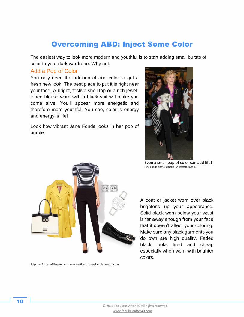
Even a small pop of color can add life! Jane Fonda photo: amedia/Shutterstock.com
Add a Pop of Color
You only need the addition of one color to get a
fresh new look. The best place to put it is right near
your face. A bright, festive shell top or a rich jewel-
toned blouse worn with a black suit will make you
come alive. You’ll appear more energetic and
therefore more youthful. You see, color is energy
and energy is life!
Look how vibrant Jane Fonda looks in her pop of
purple.
A coat or jacket worn over black
brightens up your appearance.
Solid black worn below your waist
is far away enough from your face
that it doesn’t affect your coloring.
Make sure any black garments you
do own are high quality. Faded
black looks tired and cheap
especially when worn with brighter
colors.
11 © 2015 Fabulous After 40 All rights reserved.
www.fabulousafter40.com
A bit of bling offsets the heaviness of black. Julia Roberts photo:sbukley/Shutterstock.com, Meredith Vierra, photo:HelgaEsteb/Shutterstock.com, Sela Ward, photo: Helga Esteb/Shutterstock.com
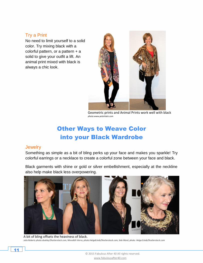
Try a Print
No need to limit yourself to a solid
color. Try mixing black with a
colorful pattern, or a pattern + a
solid to give your outfit a lift. An
animal print mixed with black is
always a chic look.
Geometric prints and Animal Prints work well with black photo:www.peterkate.com
Other Ways to Weave Color
into your Black Wardrobe
Jewelry
Something as simple as a bit of bling perks up your face and makes you sparkle! Try
colorful earrings or a necklace to create a colorful zone between your face and black.
Black garments with shine or gold or silver embellishment, especially at the neckline
also help make black less overpowering.
12 © 2015 Fabulous After 40 All rights reserved.
www.fabulousafter40.com
Scarves are a great way to transform black. Judi Dench photo:Featureflash/Shutterstock.com Maria Menounosphoto:DFree/Shutterstock.com , www.peterkate.com
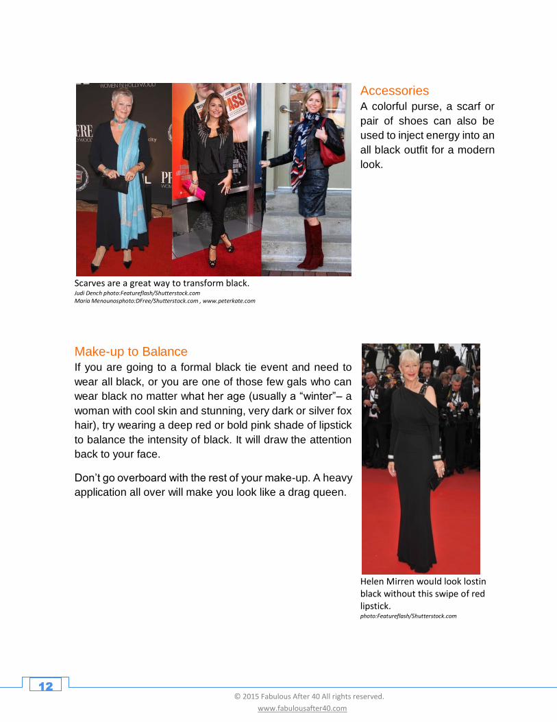
Make-up to Balance
If you are going to a formal black tie event and need to
wear all black, or you are one of those few gals who can
wear black no matter what her age (usually a “winter”– a
woman with cool skin and stunning, very dark or silver fox
hair), try wearing a deep red or bold pink shade of lipstick
to balance the intensity of black. It will draw the attention
back to your face.
Don’t go overboard with the rest of your make-up. A heavy
application all over will make you look like a drag queen.
Helen Mirren would look lostin black without this swipe of red lipstick. photo:Featureflash/Shutterstock.com
Accessories
A colorful purse, a scarf or
pair of shoes can also be
used to inject energy into an
all black outfit for a modern
look.
13 © 2015 Fabulous After 40 All rights reserved.
www.fabulousafter40.com
Other Ways to Climb Out of Your Black Rut
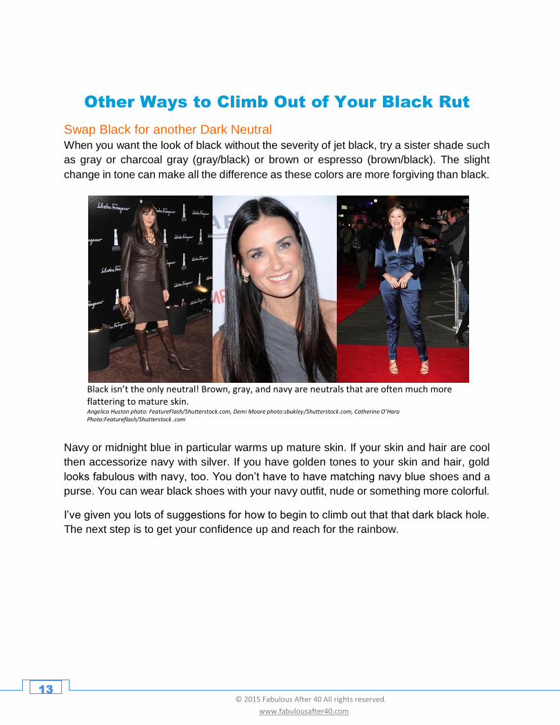
Swap Black for another Dark Neutral
When you want the look of black without the severity of jet black, try a sister shade such
as gray or charcoal gray (gray/black) or brown or espresso (brown/black). The slight
change in tone can make all the difference as these colors are more forgiving than black.
Black isn’t the only neutral! Brown, gray, and navy are neutrals that are often much more flattering to mature skin. Angelica Huston photo: FeatureFlash/Shutterstock.com, Demi Moore photo:sbukley/Shutterstock.com, Catherine O’Hara Photo:Featureflash/Shutterstock .com
Navy or midnight blue in particular warms up mature skin. If your skin and hair are cool
then accessorize navy with silver. If you have golden tones to your skin and hair, gold
looks fabulous with navy, too. You don’t have to have matching navy blue shoes and a
purse. You can wear black shoes with your navy outfit, nude or something more colorful.
I’ve given you lots of suggestions for how to begin to climb out that that dark black hole.
The next step is to get your confidence up and reach for the rainbow.
14 © 2015 Fabulous After 40 All rights reserved.
www.fabulousafter40.com
Learning to Embrace Color
As a style expert I specialize in helping women 40, 50 and
beyond look and feel fabulous. The one thing I hear over
and over again from women is, “I don’t want to look old, I
don’t want to look too young. I just want to look fabulous
for my age. In other words they want to look vibrant,
healthy, stylish, classy, or, as I like to say, Age-
Amazing™!
What’s My #1 secret to looking Age-Amazing?--- That’s
easy….Embrace Color!
A shot of color here or there is a great way to upgrade your
style, but to really look Age-Amazing™ you need to dive
deep into color.
Don’t let that scare you. It doesn’t mean you will have to
wear bright, wild colors. Remember, there are millions of
hues out there ranging from light to dark, bright to deep,
and clear to muted.
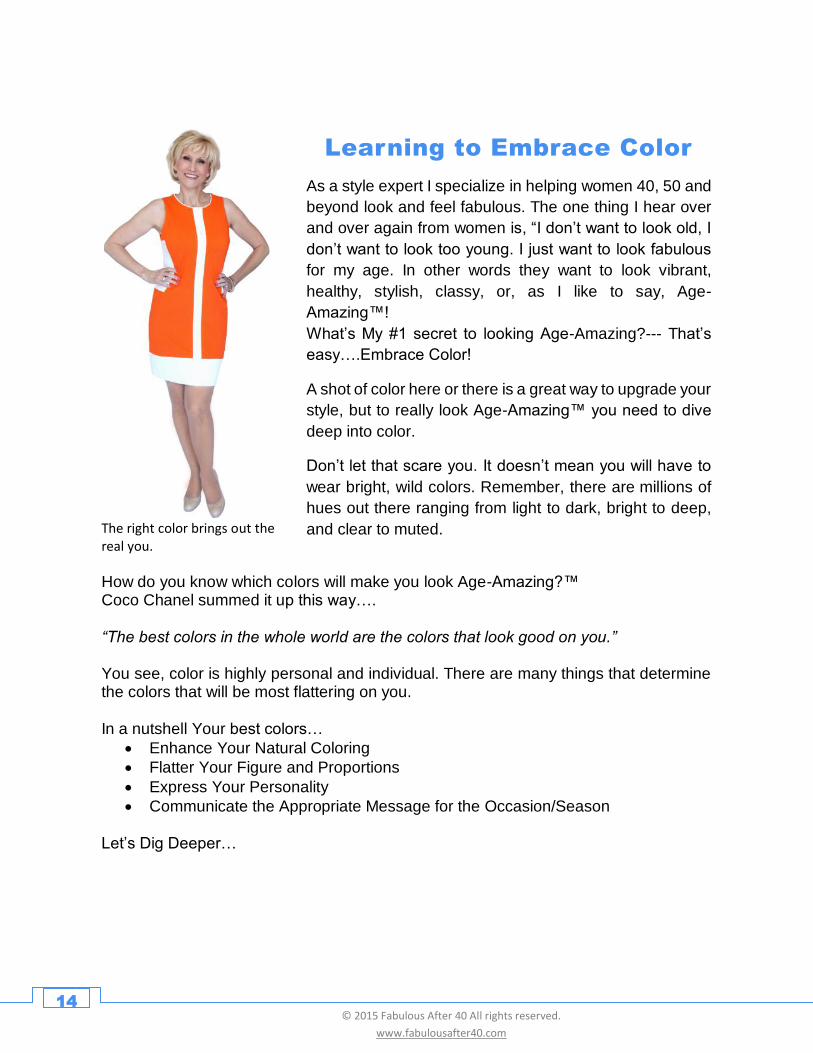
The right color brings out the real you.
How do you know which colors will make you look Age-Amazing?™ Coco Chanel summed it up this way…. “The best colors in the whole world are the colors that look good on you.” You see, color is highly personal and individual. There are many things that determine the colors that will be most flattering on you. In a nutshell Your best colors…
• Enhance Your Natural Coloring
• Flatter Your Figure and Proportions
• Express Your Personality
• Communicate the Appropriate Message for the Occasion/Season Let’s Dig Deeper…
15 © 2015 Fabulous After 40 All rights reserved.
www.fabulousafter40.com
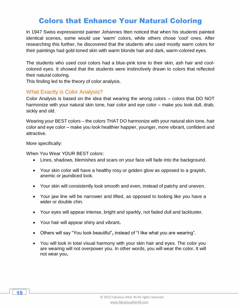
Colors that Enhance Your Natural Coloring
In 1947 Swiss expressionist painter Johannes Itten noticed that when his students painted
identical scenes, some would use 'warm' colors, while others chose 'cool' ones. After
researching this further, he discovered that the students who used mostly warm colors for
their paintings had gold-toned skin with warm blonde hair and dark, warm-colored eyes.
The students who used cool colors had a blue-pink tone to their skin, ash hair and cool-
colored eyes. It showed that the students were instinctively drawn to colors that reflected
their natural coloring.
This finding led to the theory of color analysis.
What Exactly is Color Analysis?
Color Analysis is based on the idea that wearing the wrong colors – colors that DO NOT
harmonize with your natural skin tone, hair color and eye color – make you look dull, drab,
sickly and old.
Wearing your BEST colors – the colors THAT DO harmonize with your natural skin tone, hair
color and eye color – make you look healthier happier, younger, more vibrant, confident and
attractive.
More specifically:
When You Wear YOUR BEST colors:
• Lines, shadows, blemishes and scars on your face will fade into the background.
• Your skin color will have a healthy rosy or golden glow as opposed to a grayish, anemic or jaundiced look.
• Your skin will consistently look smooth and even, instead of patchy and uneven.
• Your jaw line will be narrower and lifted, as opposed to looking like you have a wider or double chin.
• Your eyes will appear intense, bright and sparkly, not faded dull and lackluster.
• Your hair will appear shiny and vibrant.
• Others will say “You look beautiful”, instead of “I like what you are wearing”.
• You will look in total visual harmony with your skin hair and eyes. The color you are wearing will not overpower you. In other words, you will wear the color. It will not wear you.
16 © 2015 Fabulous After 40 All rights reserved.
www.fabulousafter40.com
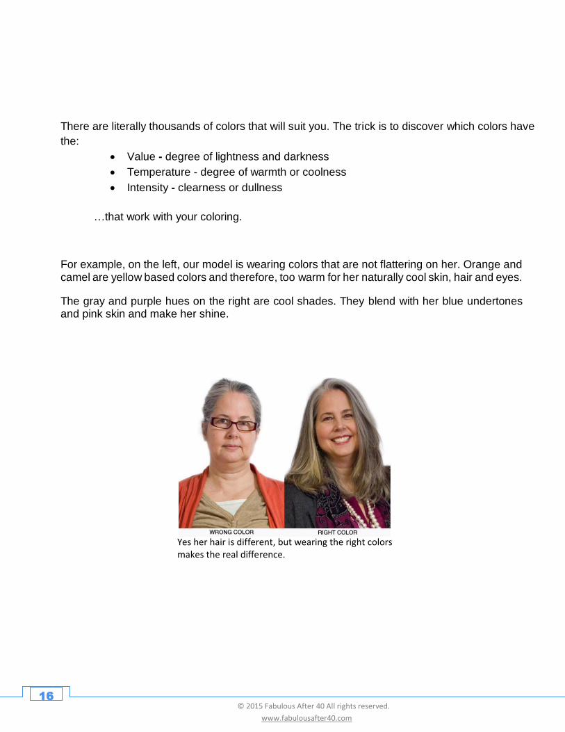
There are literally thousands of colors that will suit you. The trick is to discover which colors have
the:
• Value - degree of lightness and darkness
• Temperature - degree of warmth or coolness
• Intensity - clearness or dullness
…that work with your coloring.
For example, on the left, our model is wearing colors that are not flattering on her. Orange and camel are yellow based colors and therefore, too warm for her naturally cool skin, hair and eyes.
The gray and purple hues on the right are cool shades. They blend with her blue undertones and pink skin and make her shine.
Yes her hair is different, but wearing the right colors makes the real difference.
17 © 2015 Fabulous After 40 All rights reserved.
www.fabulousafter40.com
Seasonal color analysis is the most popular type of color analysis. This is based on
studying a person’s natural coloring and placing the person into one of four categories:
Summer, Autumn, Winter or Spring.
Carole Jackson made seasonal color analysis popular in the 80’s with her successful
book Color Me Beautiful. To discover the colors that enhance your natural coloring, I
suggest you have a professional Seasonal Color Analysis done by a Certified Image
Consultant. To find a qualified image professional in your area visit the directory at The
Association of Image Consultants International (AICI) at www.aici.org.
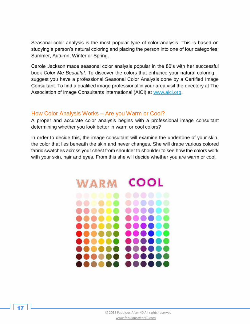
How Color Analysis Works – Are you Warm or Cool?
A proper and accurate color analysis begins with a professional image consultant
determining whether you look better in warm or cool colors?
In order to decide this, the image consultant will examine the undertone of your skin,
the color that lies beneath the skin and never changes. She will drape various colored
fabric swatches across your chest from shoulder to shoulder to see how the colors work
with your skin, hair and eyes. From this she will decide whether you are warm or cool.
18 © 2015 Fabulous After 40 All rights reserved.
www.fabulousafter40.com
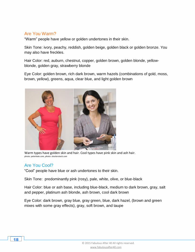
Are You Warm?
“Warm” people have yellow or golden undertones in their skin.
Skin Tone: ivory, peachy, reddish, golden beige, golden black or golden bronze. You
may also have freckles.
Hair Color: red, auburn, chestnut, copper, golden brown, golden blonde, yellow-
blonde, golden gray, strawberry blonde
Eye Color: golden brown, rich dark brown, warm hazels (combinations of gold, moss,
brown, yellow), greens, aqua, clear blue, and light golden brown
Are You Cool?
“Cool” people have blue or ash undertones to their skin.
Skin Tone: predominantly pink (rosy), pale, white, olive, or blue-black
Hair Color: blue or ash base, including blue-black, medium to dark brown, gray, salt
and pepper, platinum ash blonde, ash brown, cool dark brown
Eye Color: dark brown, gray blue, gray green, blue, dark hazel, (brown and green
mixes with some gray effects), gray, soft brown, and taupe
Warm types have golden skin and hair. Cool types have pink skin and ash hair. photo: peterkate.com, photo: shutterstock.com
19 © 2015 Fabulous After 40 All rights reserved.
www.fabulousafter40.com
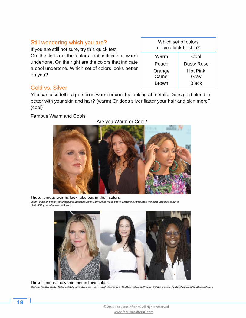
Still wondering which you are?
If you are still not sure, try this quick test.
On the left are the colors that indicate a warm
undertone. On the right are the colors that indicate
a cool undertone. Which set of colors looks better
on you?
Famous Warm and Cools Are you Warm or Cool?
These famous warms look fabulous in their colors. Sarah Ferguson photo:Featureflash/Shutterstock.com, Carrie Anne Inaba photo: FeatureFlash/Shutterstock.com, Beyonce Knowles
photo:PSJaguarh/Shutterstock.com
These famous cools shimmer in their colors. Michelle Pfeiffer photo: Helga Esteb/Shutterstock.com, Lucy Liu photo: Joe Seer/Shutterstock.com, Whoopi Goldberg photo: Featureflash.com/Shutterstock.com
Warm Cool
Peach Dusty Rose
Orange Hot Pink Camel Gray
Brown Black
Which set of colors do you look best in?
Gold vs. Silver
You can also tell if a person is warm or cool by looking at metals. Does gold blend in
better with your skin and hair? (warm) Or does silver flatter your hair and skin more?
(cool)
20 © 2015 Fabulous After 40 All rights reserved.
www.fabulousafter40.com
Step 2 – What Season are You?
Once an Image consultant determines whether you are warm or cool, she will pinpoint
your season. You’ll either be a Summer, Autumn, Winter or Spring.
To determine your season, dozens more fabric swatches are draped near your face to
see which colors make you come alive, and which ones drag you down.
Remember, she is looking at these colors and how well they flow with your skin and
natural haircolor. Eye color, eye pattern and even the color of your teeth are analyzed.
After much testing, a decision will be made as to whether you are a Summer, Autumn,
Winter or Spring.
Here’s what the four seasons look like:
21 © 2015 Fabulous After 40 All rights reserved.
www.fabulousafter40.com
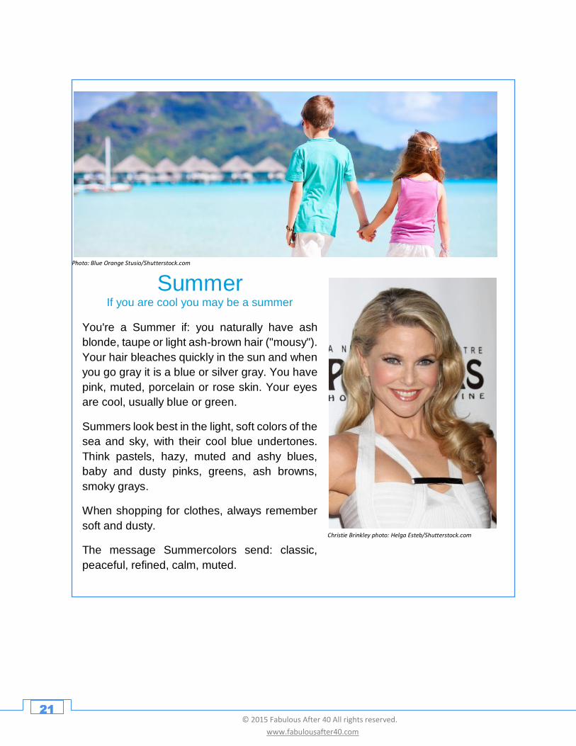
Summer If you are cool you may be a summer
Christie Brinkley photo: Helga Esteb/Shutterstock.com
Photo: Blue Orange Stusio/Shutterstock.com
You're a Summer if: you naturally have ash
blonde, taupe or light ash-brown hair ("mousy").
Your hair bleaches quickly in the sun and when
you go gray it is a blue or silver gray. You have
pink, muted, porcelain or rose skin. Your eyes
are cool, usually blue or green.
Summers look best in the light, soft colors of the
sea and sky, with their cool blue undertones.
Think pastels, hazy, muted and ashy blues,
baby and dusty pinks, greens, ash browns,
smoky grays.
When shopping for clothes, always remember
soft and dusty.
The message Summercolors send: classic,
peaceful, refined, calm, muted.
22 © 2015 Fabulous After 40 All rights reserved.
www.fabulousafter40.com
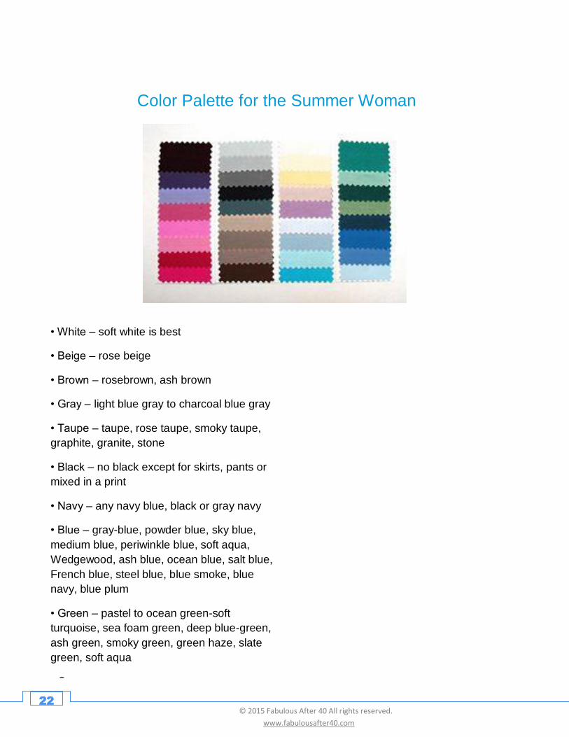
Color Palette for the Summer Woman
• White – soft white is best
• Beige – rose beige
• Brown – rosebrown, ash brown
• Gray – light blue gray to charcoal blue gray
• Taupe – taupe, rose taupe, smoky taupe,
graphite, granite, stone
• Black – no black except for skirts, pants or
mixed in a print
• Navy – any navy blue, black or gray navy
• Blue – gray-blue, powder blue, sky blue,
medium blue, periwinkle blue, soft aqua,
Wedgewood, ash blue, ocean blue, salt blue,
French blue, steel blue, blue smoke, blue
navy, blue plum
• Green – pastel to ocean green-soft
turquoise, sea foam green, deep blue-green,
ash green, smoky green, green haze, slate
green, soft aqua
• Orange – no orange
• Pink – pastel pink, powder pink, pink ash,
raised pink (medium to deep), dusty rose
23 © 2015 Fabulous After 40 All rights reserved.
www.fabulousafter40.com
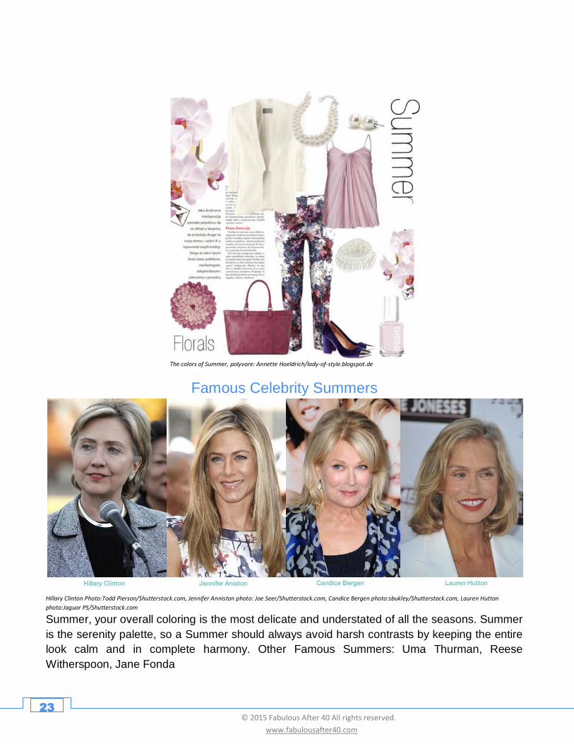
The colors of Summer, polyvore: Annette Hoeldrich/lady-of-style.blogspot.de
Famous Celebrity Summers
Hillary Clinton Photo:Todd Pierson/Shutterstock.com, Jennifer Anniston photo: Joe Seer/Shutterstock.com, Candice Bergen photo:sbukley/Shutterstock.com, Lauren Hutton
photo:Jaguar PS/Shutterstock.com
Summer, your overall coloring is the most delicate and understated of all the seasons. Summer
is the serenity palette, so a Summer should always avoid harsh contrasts by keeping the entire
look calm and in complete harmony. Other Famous Summers: Uma Thurman, Reese
Witherspoon, Jane Fonda
24 © 2015 Fabulous After 40 All rights reserved.
www.fabulousafter40.com
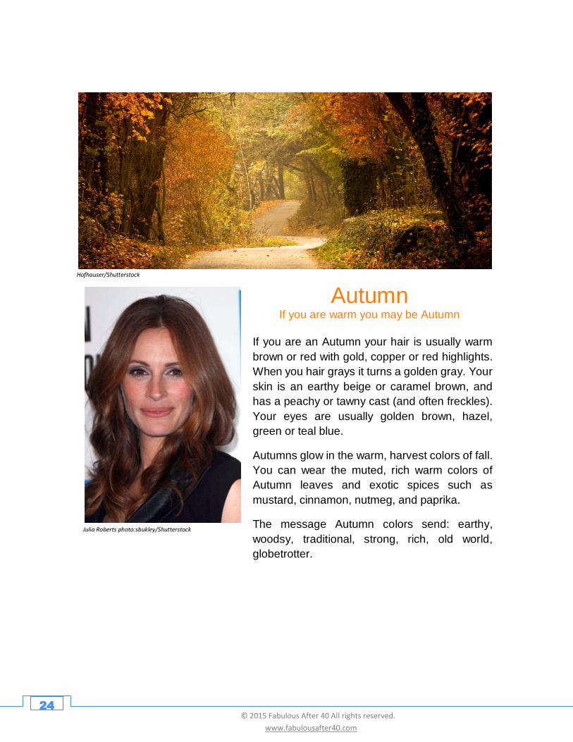
Autumn If you are warm you may be Autumn
Julia Roberts photo:sbukley/Shutterstock
Hofhauser/Shutterstock
If you are an Autumn your hair is usually warm
brown or red with gold, copper or red highlights.
When you hair grays it turns a golden gray. Your
skin is an earthy beige or caramel brown, and
has a peachy or tawny cast (and often freckles).
Your eyes are usually golden brown, hazel,
green or teal blue.
Autumns glow in the warm, harvest colors of fall.
You can wear the muted, rich warm colors of
Autumn leaves and exotic spices such as
mustard, cinnamon, nutmeg, and paprika.
The message Autumn colors send: earthy,
woodsy, traditional, strong, rich, old world,
globetrotter.
25 © 2015 Fabulous After 40 All rights reserved.
www.fabulousafter40.com
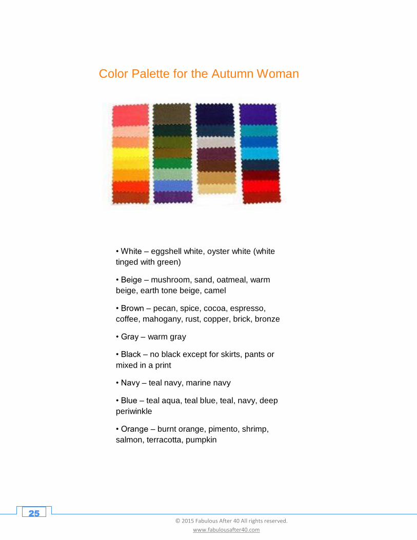
Color Palette for the Autumn Woman
• White – eggshell white, oyster white (white
tinged with green)
• Beige – mushroom, sand, oatmeal, warm
beige, earth tone beige, camel
• Brown – pecan, spice, cocoa, espresso,
coffee, mahogany, rust, copper, brick, bronze
• Gray – warm gray
• Black – no black except for skirts, pants or
mixed in a print
• Navy – teal navy, marine navy
• Blue – teal aqua, teal blue, teal, navy, deep
periwinkle
• Orange – burnt orange, pimento, shrimp,
salmon, terracotta, pumpkin
• Pink – no pink
• Red – orange-reds, bittersweet, dark tomato
• Burgundy – only brown burgundy
• Gold – any gold (marigold, harvest gold,
wheat, mustard, curry)
• Yellow – deeper yellow gold
26 © 2015 Fabulous After 40 All rights reserved.
www.fabulousafter40.com
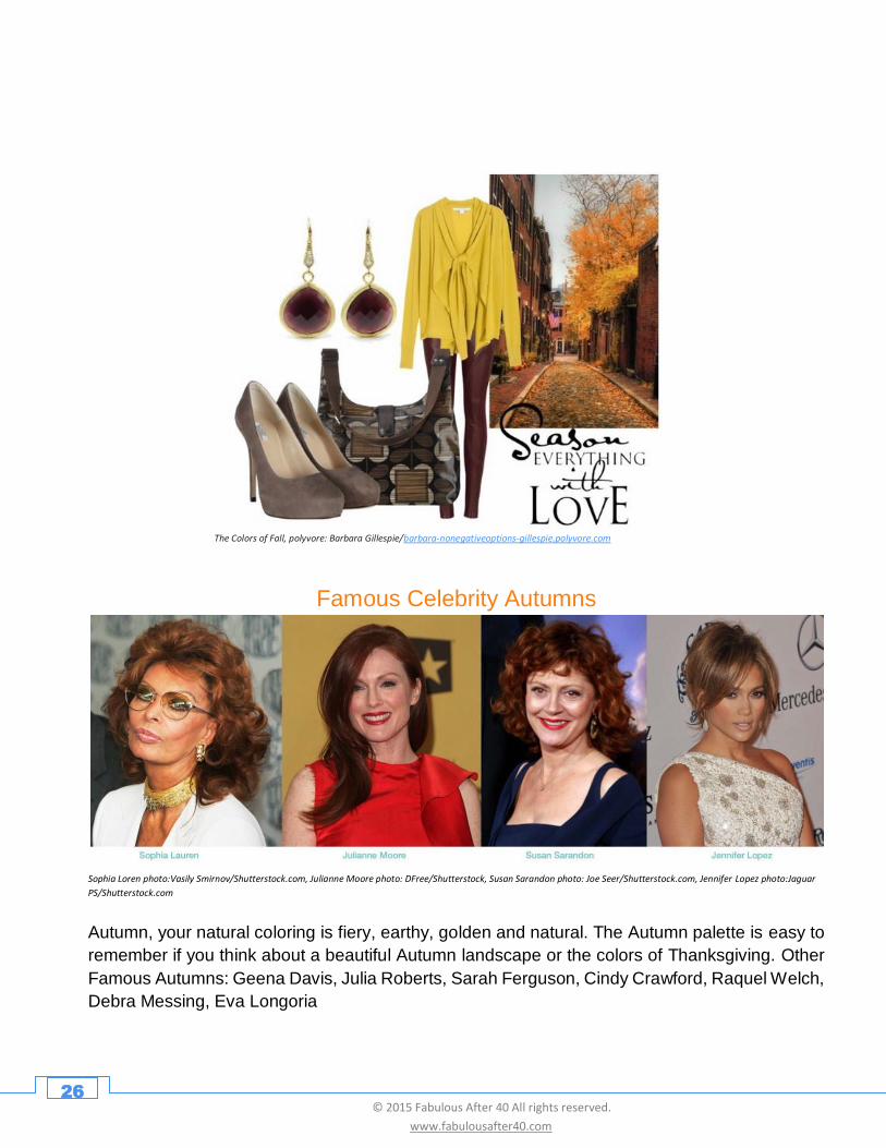
The Colors of Fall, polyvore: Barbara Gillespie/barbara-nonegativeoptions-gillespie.polyvore.com
Famous Celebrity Autumns
Sophia Loren photo:Vasily Smirnov/Shutterstock.com, Julianne Moore photo: DFree/Shutterstock, Susan Sarandon photo: Joe Seer/Shutterstock.com, Jennifer Lopez photo:Jaguar
PS/Shutterstock.com
Autumn, your natural coloring is fiery, earthy, golden and natural. The Autumn palette is easy to
remember if you think about a beautiful Autumn landscape or the colors of Thanksgiving. Other
Famous Autumns: Geena Davis, Julia Roberts, Sarah Ferguson, Cindy Crawford, Raquel Welch,
Debra Messing, Eva Longoria
27 © 2015 Fabulous After 40 All rights reserved.
www.fabulousafter40.com
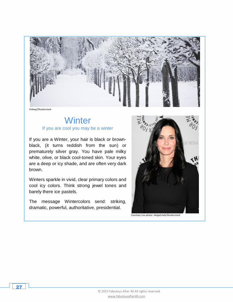
Winter If you are cool you may be a winter
Courtney Cox photo: HelgaEsteb/Shutterstock
Yellowj/Shutterstock
If you are a Winter, your hair is black or brown-
black, (it turns reddish from the sun) or
prematurely silver gray. You have pale milky
white, olive, or black cool-toned skin. Your eyes
are a deep or icy shade, and are often very dark
brown.
Winters sparkle in vivid, clear primary colors and
cool icy colors. Think strong jewel tones and
barely there ice pastels.
The message Wintercolors send: striking,
dramatic, powerful, authoritative, presidential.
28 © 2015 Fabulous After 40 All rights reserved.
www.fabulousafter40.com
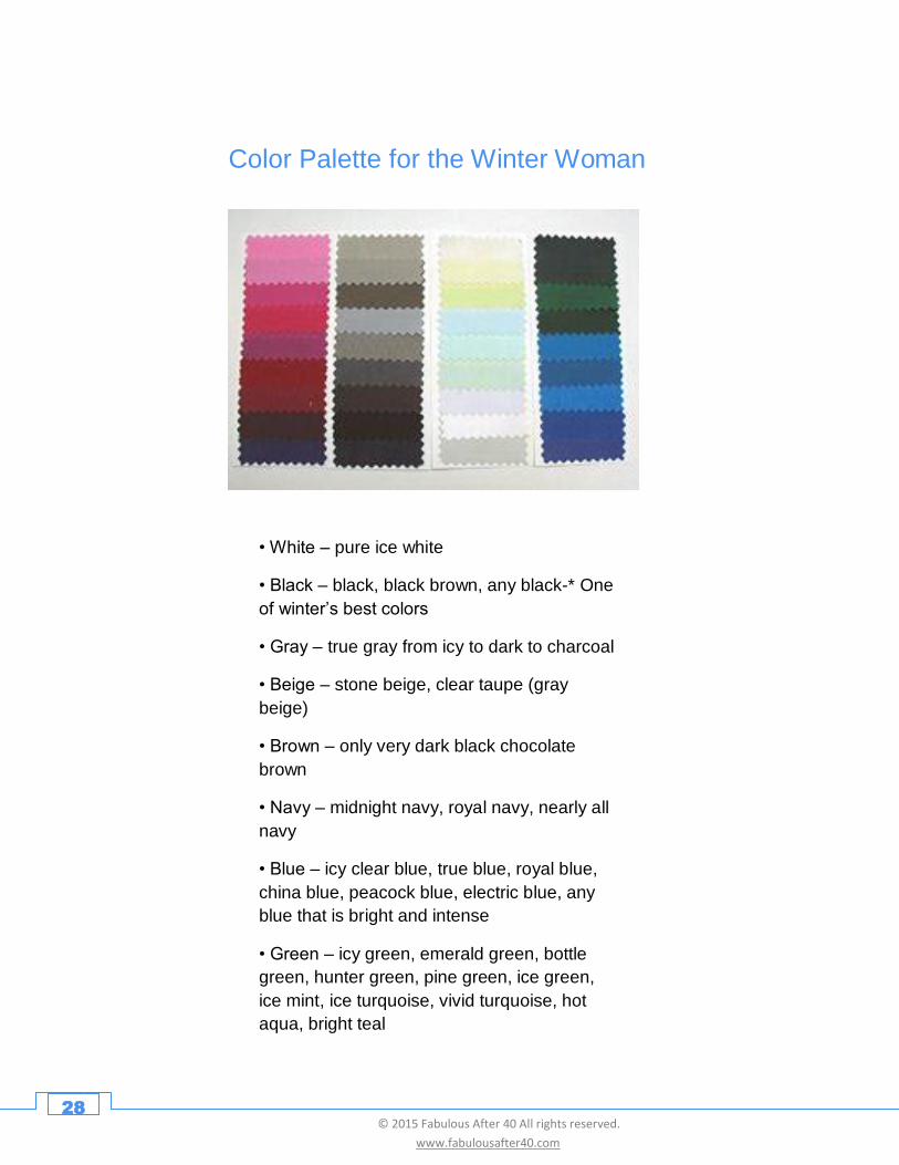
Color Palette for the Winter Woman
• White – pure ice white
• Black – black, black brown, any black-* One
of winter’s best colors
• Gray – true gray from icy to dark to charcoal
• Beige – stone beige, clear taupe (gray
beige)
• Brown – only very dark black chocolate
brown
• Navy – midnight navy, royal navy, nearly all
navy
• Blue – icy clear blue, true blue, royal blue,
china blue, peacock blue, electric blue, any
blue that is bright and intense
• Green – icy green, emerald green, bottle
green, hunter green, pine green, ice green,
ice mint, ice turquoise, vivid turquoise, hot
aqua, bright teal
• Orange – no orange
• Pink – icy pink, true pink, hot pink, shocking
pink, deep hot pink, magenta, fuchsia
• Red – cherry red, true red, blue red,

29 © 2015 Fabulous After 40 All rights reserved.
www.fabulousafter40.com
The colors of Winter, polyvore: Annette Hoeldrich/ladyof-of-style.blogspot.de
Famous Celebrity Winters
Jamie Lee Curtis photo:sbukley/Shutterstock.com, Kris Jenner photo: Joe Seer/Shutterstock.com, Joan Jett photo:sbuk ley/Shutterstock.com Selma Ward
photo:sbukley/Shutterstock.com
Winter, your coloring is crisp and distinctive like a Winter landscape. High contrast works well for
you such as black and white and you look fabulous in rich jewel tones. Other famous winters:
Janice Dickinson, Anne Hathaway, Sandra Bullock, Catherine Zeta Jones, Terri Hatcher, Lucy
Liu, Elizabeth Hurley.
30 © 2015 Fabulous After 40 All rights reserved.
www.fabulousafter40.com
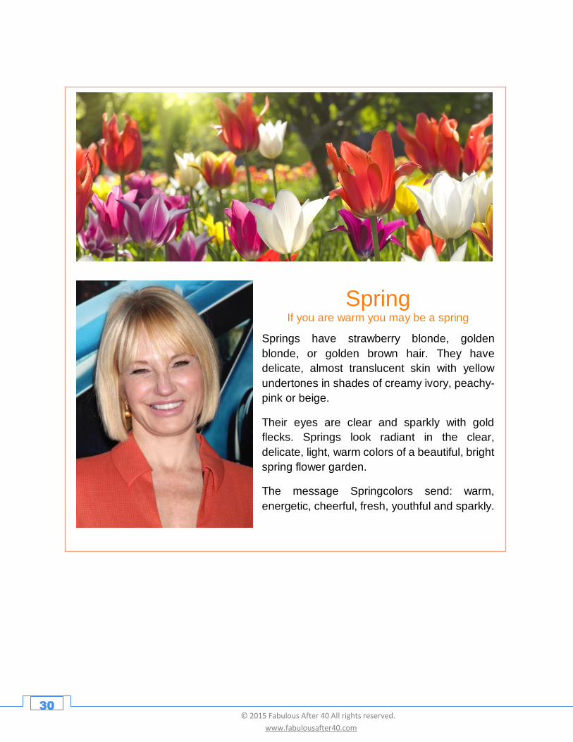
Spring If you are warm you may be a spring
Springs have strawberry blonde, golden
blonde, or golden brown hair. They have
delicate, almost translucent skin with yellow
undertones in shades of creamy ivory, peachy-
pink or beige.
Their eyes are clear and sparkly with gold
flecks. Springs look radiant in the clear,
delicate, light, warm colors of a beautiful, bright
spring flower garden.
The message Springcolors send: warm,
energetic, cheerful, fresh, youthful and sparkly.
31 © 2015 Fabulous After 40 All rights reserved.
www.fabulousafter40.com
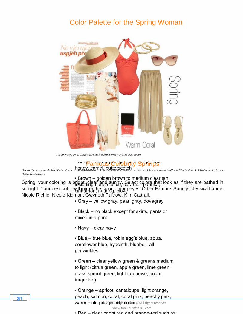
Color Palette for the Spring Woman
• White – ivory, cream (white tinged with yellow)
• Beige – creamy beige, clear beige, buff,
honey, camel, butterscotch
• Brown – golden brown to medium clear tan,
including butterscotch, caramel, paprika,
cinnamon, nutmeg, clove
• Gray – yellow gray, pearl gray, dovegray
• Black – no black except for skirts, pants or
mixed in a print
• Navy – clear navy
• Blue – true blue, robin egg’s blue, aqua,
cornflower blue, hyacinth, bluebell, all
periwinkles
• Green – clear yellow green & greens medium
to light (citrus green, apple green, lime green,
grass sprout green, light turquoise, bright
turquoise)
• Orange – apricot, cantaloupe, light orange,
peach, salmon, coral, coral pink, peachy pink,
warm pink, pink pearl, blush
• Red – clear bright red and orange-red such as
The Colors of Spring, polyvore: Annette Hoeldrich/lady-of-style.blogspot.de
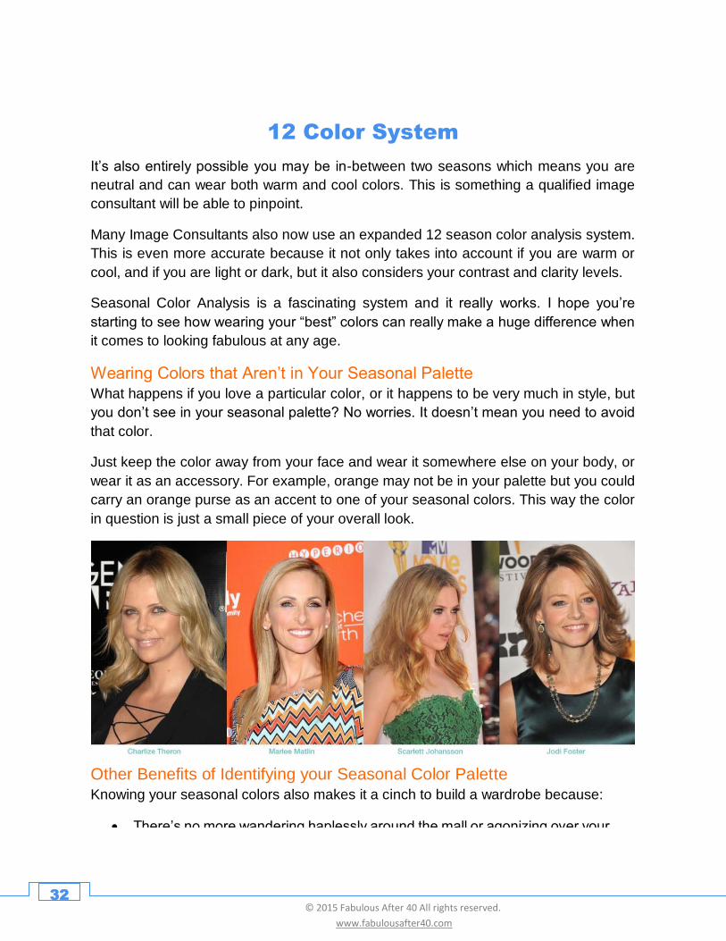
Famous Celebrity Springs CharlizeTheron photo: sbukley/Shutterstock.com, Marlee Matlin photo: Helga Esteb/Shutterstock.com, Scarlett Johansson photo:Paul Smith/Shutterstock, Jodi Foster photo: Jaguar
PS/Shutterstock.com
Spring, your coloring is bright, clear and sunny. Select colors that look as if they are bathed in
sunlight. Your best color will mirror the color of your eyes. Other Famous Springs: Jessica Lange,
Nicole Richie, Nicole Kidman, Gwyneth Paltrow, Kim Cattrall.
32 © 2015 Fabulous After 40 All rights reserved.
www.fabulousafter40.com
12 Color System
It’s also entirely possible you may be in-between two seasons which means you are
neutral and can wear both warm and cool colors. This is something a qualified image
consultant will be able to pinpoint.
Many Image Consultants also now use an expanded 12 season color analysis system.
This is even more accurate because it not only takes into account if you are warm or
cool, and if you are light or dark, but it also considers your contrast and clarity levels.
Seasonal Color Analysis is a fascinating system and it really works. I hope you’re
starting to see how wearing your “best” colors can really make a huge difference when
it comes to looking fabulous at any age.
Wearing Colors that Aren’t in Your Seasonal Palette
What happens if you love a particular color, or it happens to be very much in style, but
you don’t see in your seasonal palette? No worries. It doesn’t mean you need to avoid
that color.
Just keep the color away from your face and wear it somewhere else on your body, or
wear it as an accessory. For example, orange may not be in your palette but you could
carry an orange purse as an accent to one of your seasonal colors. This way the color
in question is just a small piece of your overall look.
Other Benefits of Identifying your Seasonal Color Palette
Knowing your seasonal colors also makes it a cinch to build a wardrobe because:
• There’s no more wandering haplessly around the mall or agonizing over your reflection in the fitting room mirror and no more wondering if what you’re wearing looks good on you. When you walk in a store and all they have on display are cool colors like grey and dusty rose, and you know you are a warm Spring, you can just move on.
• You’ll save money because the things you buy are things you will really wear – clothing in the colors that really make you look WOW!
33 © 2015 Fabulous After 40 All rights reserved.
www.fabulousafter40.com
How to Use Color to Flatter
Your Figure and Proportions
Not only can your best colors make you look more vibrant and youthful, they can also
affect your shape and size. There are many ways to wear and combine colors to make
you look taller and slimmer and to camouflage and highlight various parts of your body.
For example:
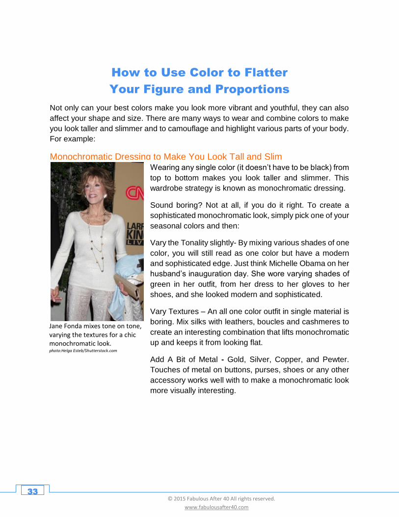
Monochromatic Dressing to Make You Look Tall and Slim
Jane Fonda mixes tone on tone, varying the textures for a chic monochromatic look. photo:Helga Esteb/Shutterstock.com
Wearing any single color (it doesn’t have to be black) from
top to bottom makes you look taller and slimmer. This
wardrobe strategy is known as monochromatic dressing.
Sound boring? Not at all, if you do it right. To create a
sophisticated monochromatic look, simply pick one of your
seasonal colors and then:
Vary the Tonality slightly- By mixing various shades of one
color, you will still read as one color but have a modern
and sophisticated edge. Just think Michelle Obama on her
husband’s inauguration day. She wore varying shades of
green in her outfit, from her dress to her gloves to her
shoes, and she looked modern and sophisticated.
Vary Textures – An all one color outfit in single material is
boring. Mix silks with leathers, boucles and cashmeres to
create an interesting combination that lifts monochromatic
up and keeps it from looking flat.
Add A Bit of Metal - Gold, Silver, Copper, and Pewter.
Touches of metal on buttons, purses, shoes or any other
accessory works well with to make a monochromatic look
more visually interesting.
34 © 2015 Fabulous After 40 All rights reserved.
www.fabulousafter40.com
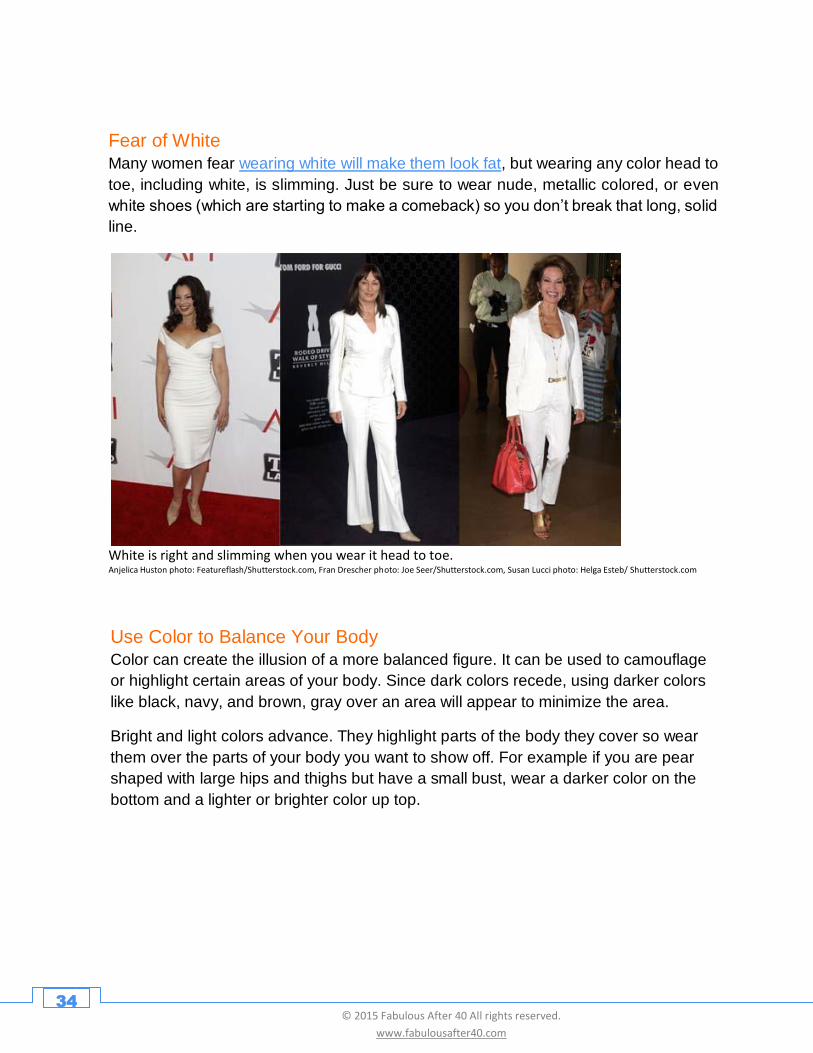
Fear of White
Many women fear wearing white will make them look fat, but wearing any color head to
toe, including white, is slimming. Just be sure to wear nude, metallic colored, or even
white shoes (which are starting to make a comeback) so you don’t break that long, solid
line.
White is right and slimming when you wear it head to toe. Anjelica Huston photo: Featureflash/Shutterstock.com, Fran Drescher photo: Joe Seer/Shutterstock.com, Susan Lucci photo: Helga Esteb/ Shutterstock.com
Use Color to Balance Your Body
Color can create the illusion of a more balanced figure. It can be used to camouflage
or highlight certain areas of your body. Since dark colors recede, using darker colors
like black, navy, and brown, gray over an area will appear to minimize the area.
Bright and light colors advance. They highlight parts of the body they cover so wear
them over the parts of your body you want to show off. For example if you are pear
shaped with large hips and thighs but have a small bust, wear a darker color on the
bottom and a lighter or brighter color up top.
35 © 2015 Fabulous After 40 All rights reserved.
www.fabulousafter40.com
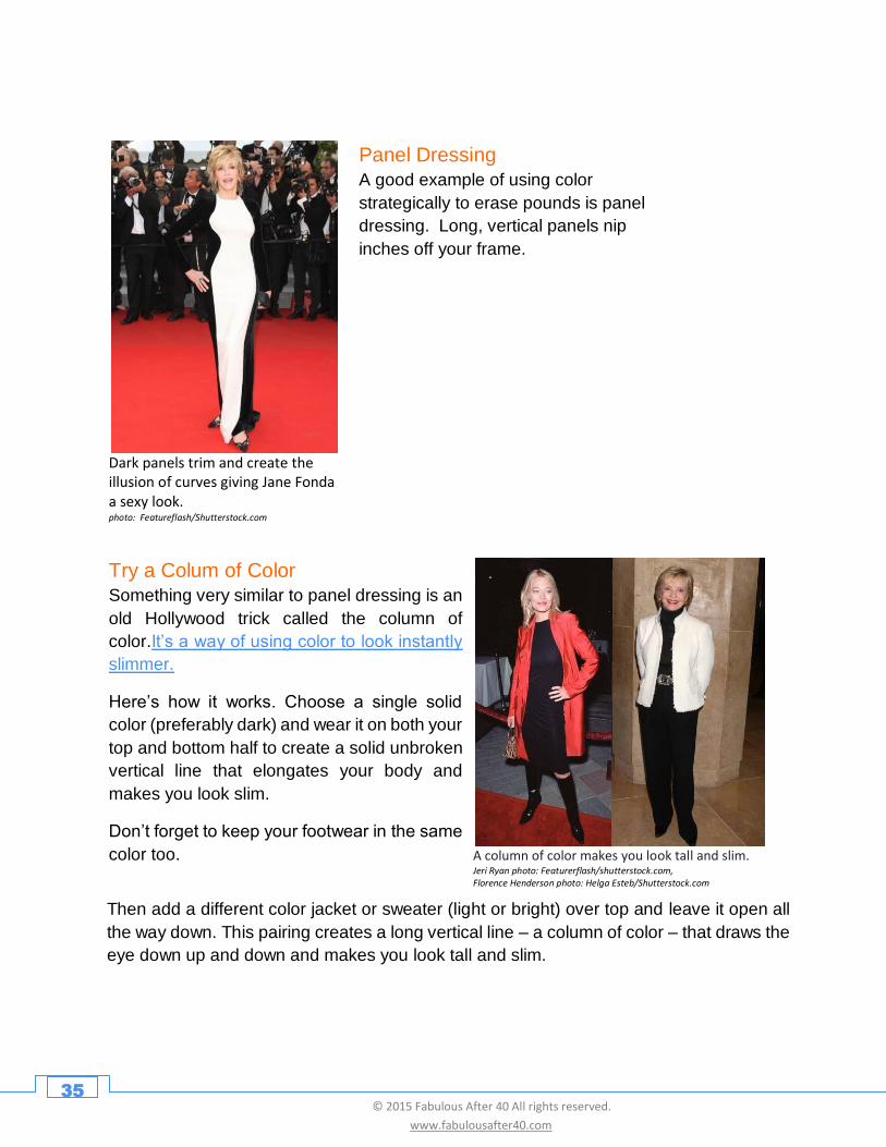
Panel Dressing
A good example of using color
strategically to erase pounds is panel
dressing. Long, vertical panels nip
inches off your frame.
Try a Colum of Color
Something very similar to panel dressing is an
old Hollywood trick called the column of
color.It’s a way of using color to look instantly
slimmer.
Here’s how it works. Choose a single solid
color (preferably dark) and wear it on both your
top and bottom half to create a solid unbroken
vertical line that elongates your body and
makes you look slim.
Don’t forget to keep your footwear in the same
color too.
Dark panels trim and create the illusion of curves giving Jane Fonda a sexy look. photo: Featureflash/Shutterstock.com
A column of color makes you look tall and slim.
Jeri Ryan photo: Featurerflash/shutterstock.com, Florence Henderson photo: Helga Esteb/Shutterstock.com
Then add a different color jacket or sweater (light or bright) over top and leave it open all
the way down. This pairing creates a long vertical line – a column of color – that draws the
eye down up and down and makes you look tall and slim.
36 © 2015 Fabulous After 40 All rights reserved.
www.fabulousafter40.com
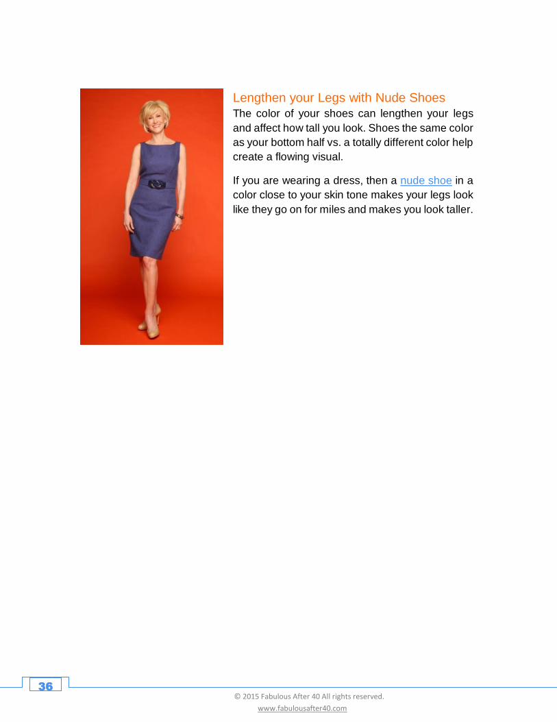
Lengthen your Legs with Nude Shoes
The color of your shoes can lengthen your legs
and affect how tall you look. Shoes the same color
as your bottom half vs. a totally different color help
create a flowing visual.
If you are wearing a dress, then a nude shoe in a
color close to your skin tone makes your legs look
like they go on for miles and makes you look taller.
37 © 2015 Fabulous After 40 All rights reserved.
www.fabulousafter40.com
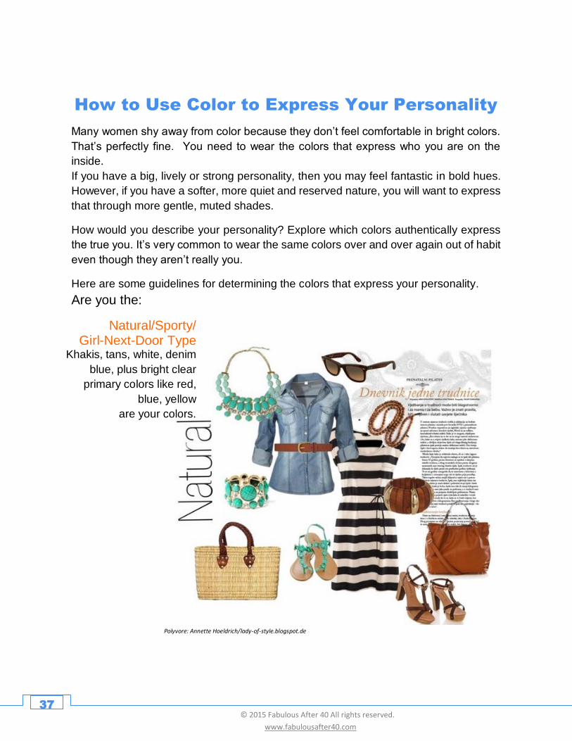
How to Use Color to Express Your Personality
Many women shy away from color because they don’t feel comfortable in bright colors.
That’s perfectly fine. You need to wear the colors that express who you are on the
inside.
If you have a big, lively or strong personality, then you may feel fantastic in bold hues.
However, if you have a softer, more quiet and reserved nature, you will want to express
that through more gentle, muted shades.
How would you describe your personality? Explore which colors authentically express
the true you. It’s very common to wear the same colors over and over again out of habit
even though they aren’t really you.
Here are some guidelines for determining the colors that express your personality.
Are you the:
Polyvore: Annette Hoeldrich/lady-of-style.blogspot.de
Natural/Sporty/ Girl-Next-Door Type
Khakis, tans, white, denim
blue, plus bright clear
primary colors like red,
blue, yellow
are your colors.
38 © 2015 Fabulous After 40 All rights reserved.
www.fabulousafter40.com
Jada Pinkett, photo: Featureflash/Shutterstock.com
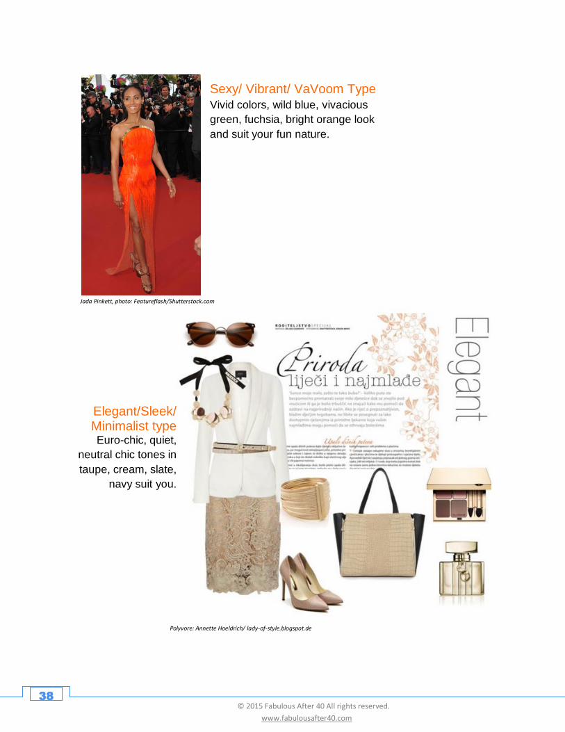
Sexy/ Vibrant/ VaVoom Type
Vivid colors, wild blue, vivacious
green, fuchsia, bright orange look
and suit your fun nature.
Polyvore: Annette Hoeldrich/ lady-of-style.blogspot.de
Elegant/Sleek/ Minimalist type Euro-chic, quiet,
neutral chic tones in
taupe, cream, slate,
navy suit you.
39 © 2015 Fabulous After 40 All rights reserved.
www.fabulousafter40.com
Rosanna Arquette, photo: Helga Esteb/Shutterstock.com
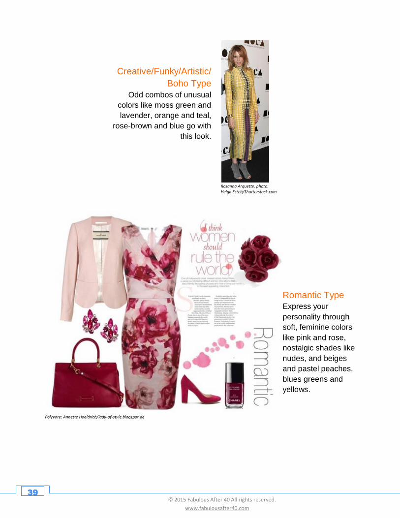
Creative/Funky/Artistic/
Boho Type
Odd combos of unusual
colors like moss green and
lavender, orange and teal,
rose-brown and blue go with
this look.
Polyvore: Annette Hoeldrich/lady-of-style.blogspot.de
Romantic Type
Express your
personality through
soft, feminine colors
like pink and rose,
nostalgic shades like
nudes, and beiges
and pastel peaches,
blues greens and
yellows.
40 © 2015 Fabulous After 40 All rights reserved.
www.fabulousafter40.com
Polyvore: Annette Hoeldrich/lady-of-style.blogspot.de
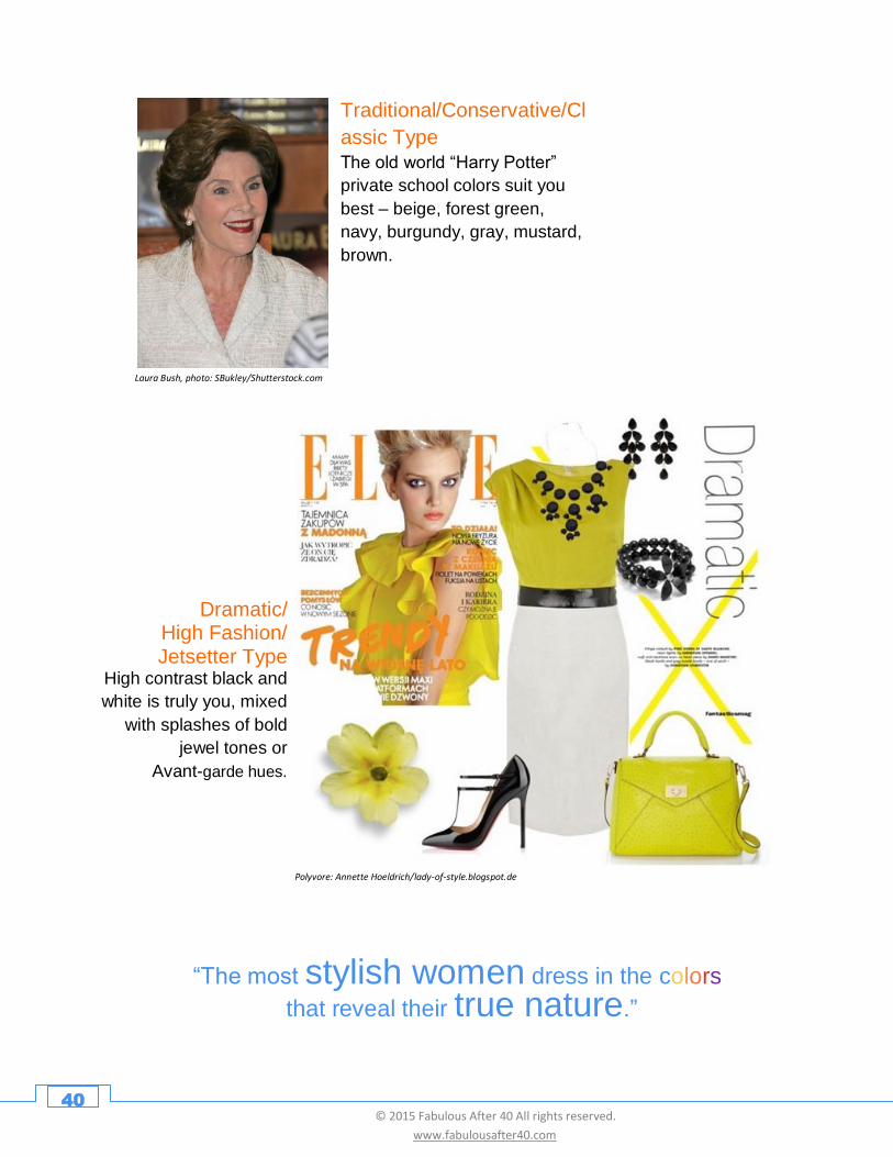
Dramatic/ High Fashion/ Jetsetter Type
High contrast black and
white is truly you, mixed
with splashes of bold
jewel tones or
Avant-garde hues.
Traditional/Conservative/Cl
assic Type
The old world “Harry Potter”
private school colors suit you
best – beige, forest green,
navy, burgundy, gray, mustard,
brown.
Laura Bush, photo: SBukley/Shutterstock.com
Dramatic/ High Fashion/ Jetsetter Type High contrast black and
white is truly you, mixed
with splashes of bold
jewel tones or
Avant guard hues.
“The most stylish women dress in the colors that reveal their true nature.”
41 © 2015 Fabulous After 40 All rights reserved.
www.fabulousafter40.com
How to Use Color to Express Yourself
Good communicators know that color is a powerful tool that can be used to transmit
messages. For example, if you are going for a job interview and you want to
communicate that you are reliable, then wear blue. If you are on a date and you want to
send the message that you are feeling soft and romantic, then choose pink.
Within seconds of meeting you, others respond to the color messages flashed by your
clothing. Wearing a particular color influences the way a person relates to you.
Medical studies show color affects the viewer's hormones, blood pressure and body
temperature. This is the reason bullfighters wave an “exciting” bright red flag in front of
a bull, or why hospital rooms and doctor’s offices are often painted in a “calming” pale
green. Color creates an emotional response which sways perception, judgment and
behavior.
Light colors energize and dark colors slow us down. Each hue has a different
psychological effect.
When choosing a color, be aware of its impact, specifically how a certain color makes
you feel, the message it sends to others, and what it communicates about your
personality.
and Communicate a Message
42 © 2015 Fabulous After 40 All rights reserved.
www.fabulousafter40.com
Polyvore: Annette Hoeldrich/lady-of-style.blogspot.de
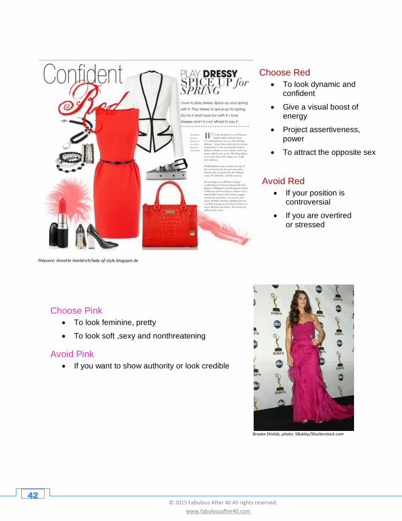
Choose Red
• To look dynamic and confident
• Give a visual boost of energy
• Project assertiveness, power
• To attract the opposite sex
Avoid Red
• If your position is controversial
• If you are overtired or stressed
Choose Pink
• To look feminine, pretty
• To look soft ,sexy and nonthreatening
Avoid Pink
• If you want to show authority or look credible
Brooke Shields, photo: SBukley/Shutterstock.com
43 © 2015 Fabulous After 40 All rights reserved.
www.fabulousafter40.com
Polyvore: Barbara Gillespie/barbara-nonegativeoptions-gillespie.polyvore.com
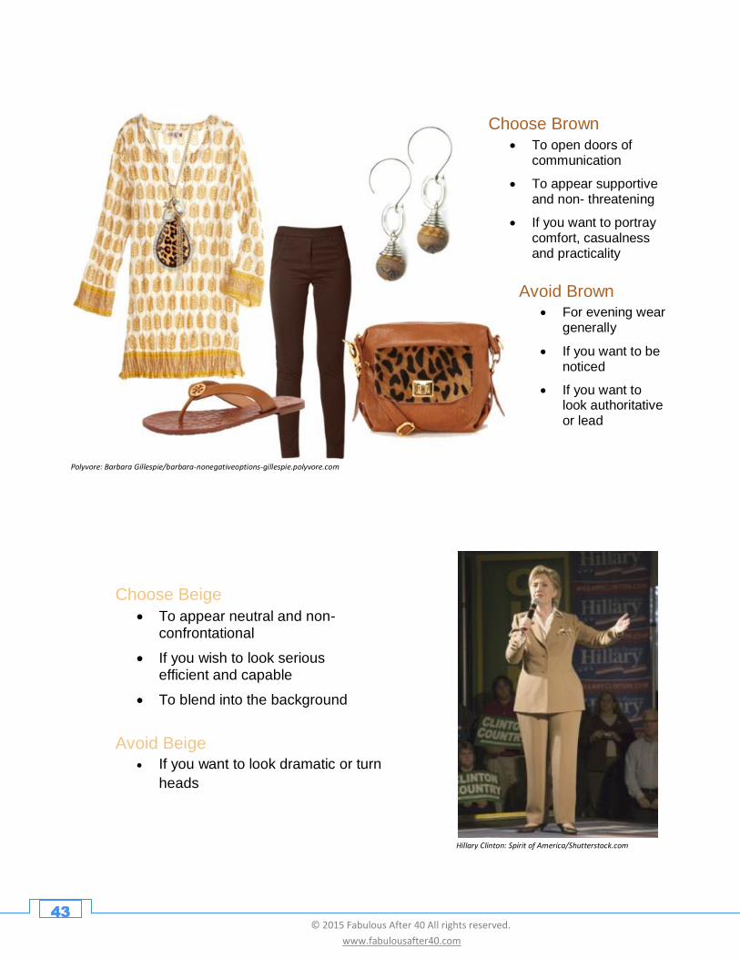
Choose Brown
• To open doors of communication
• To appear supportive and non- threatening
• If you want to portray comfort, casualness and practicality
Avoid Brown
• For evening wear generally
• If you want to be noticed
• If you want to look authoritative or lead
Choose Beige
• To appear neutral and non-confrontational
• If you wish to look serious efficient and capable
• To blend into the background
Avoid Beige
• If you want to look dramatic or turn
heads
Hillary Clinton: Spirit of America/Shutterstock.com
44 © 2015 Fabulous After 40 All rights reserved.
www.fabulousafter40.com
Polyvore: Annette Hoeldrich/lady-of-style.blogspot.de
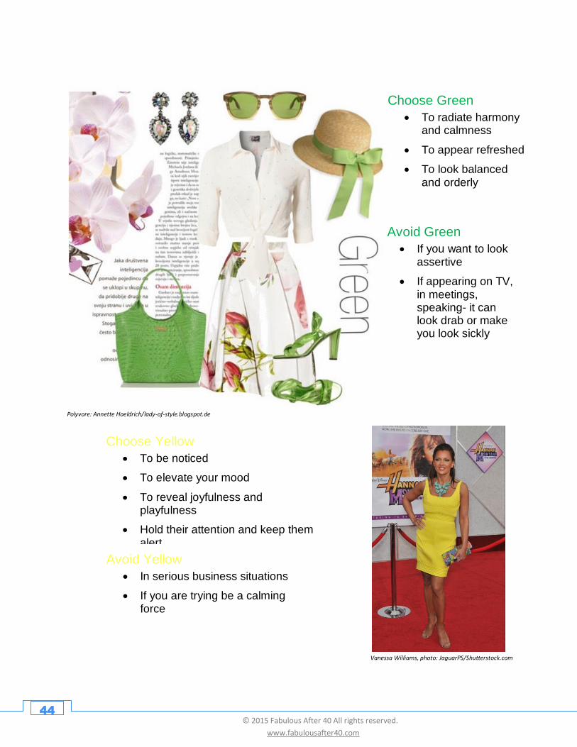
Choose Green
• To radiate harmony and calmness
• To appear refreshed
• To look balanced and orderly
Avoid Green
• If you want to look assertive
• If appearing on TV, in meetings, speaking- it can look drab or make you look sickly
Choose Yellow
• To be noticed
• To elevate your mood
• To reveal joyfulness and playfulness
• Hold their attention and keep them alert
Avoid Yellow
• In serious business situations
• If you are trying be a calming force
Vanessa Williams, photo: JaguarPS/Shutterstock.com
45 © 2015 Fabulous After 40 All rights reserved.
www.fabulousafter40.com
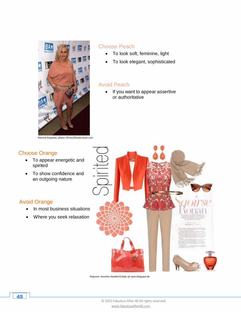
Patricia Arquette, photo: DFree/Shutterstock.com
Choose Peach
• To look soft, feminine, light
• To look elegant, sophisticated
Avoid Peach
• If you want to appear assertive or authoritative
Polyvore: Annette Hoeldrich/lady-of-style.blogspot.de
Choose Orange
• To appear energetic and spirited
• To show confidence and an outgoing nature
Avoid Orange
• In most business situations
• Where you seek relaxation
46 © 2015 Fabulous After 40 All rights reserved.
www.fabulousafter40.com
Jamie Lee Curtis, Sigourney Weaver/Shutterstock.com
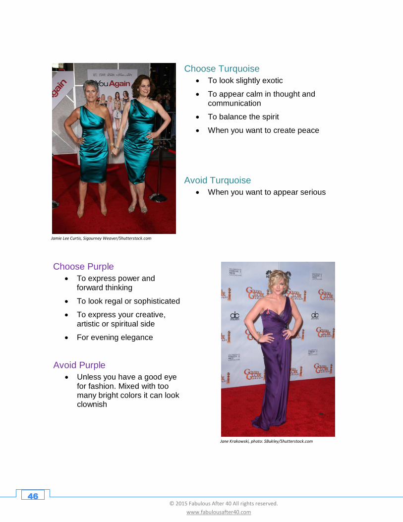
Avoid Turquoise
• When you want to appear serious
Choose Turquoise
• To look slightly exotic
• To appear calm in thought and communication
• To balance the spirit
• When you want to create peace
Choose Purple
• To express power and forward thinking
• To look regal or sophisticated
• To express your creative, artistic or spiritual side
• For evening elegance
Avoid Purple
• Unless you have a good eye for fashion. Mixed with too many bright colors it can look clownish
Jane Krakowski, photo: SBukley/Shutterstock.com
47 © 2015 Fabulous After 40 All rights reserved.
www.fabulousafter40.com
Polyvore: Annette Hoeldrich/lady-of-style.blogspot.de
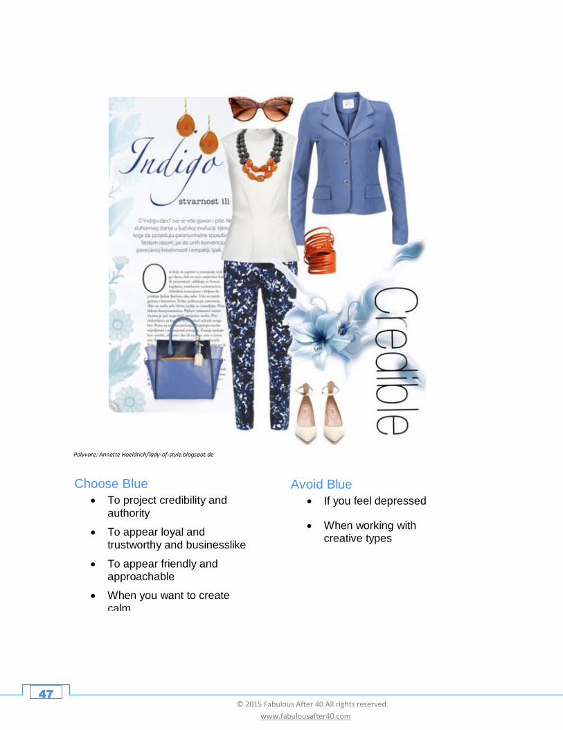
Choose Blue
• To project credibility and authority
• To appear loyal and trustworthy and businesslike
• To appear friendly and approachable
• When you want to create calm
Avoid Blue
• If you feel depressed
• When working with creative types
48 © 2015 Fabulous After 40 All rights reserved.
www.fabulousafter40.com
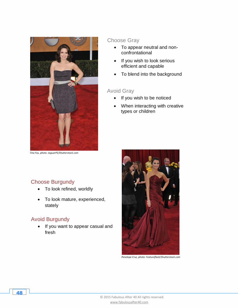
Choose Gray
• To appear neutral and non-confrontational
• If you wish to look serious efficient and capable
• To blend into the background
Avoid Gray
• If you wish to be noticed
• When interacting with creative types or children
Choose Burgundy
• To look refined, worldly
• To look mature, experienced,
stately
Avoid Burgundy
• If you want to appear casual and
fresh
Tina Fey, photo: JaguarPS/Shutterstock.com
Penelope Cruz, photo: Featureflash/Shutterstock.com
49 © 2015 Fabulous After 40 All rights reserved.
www.fabulousafter40.com
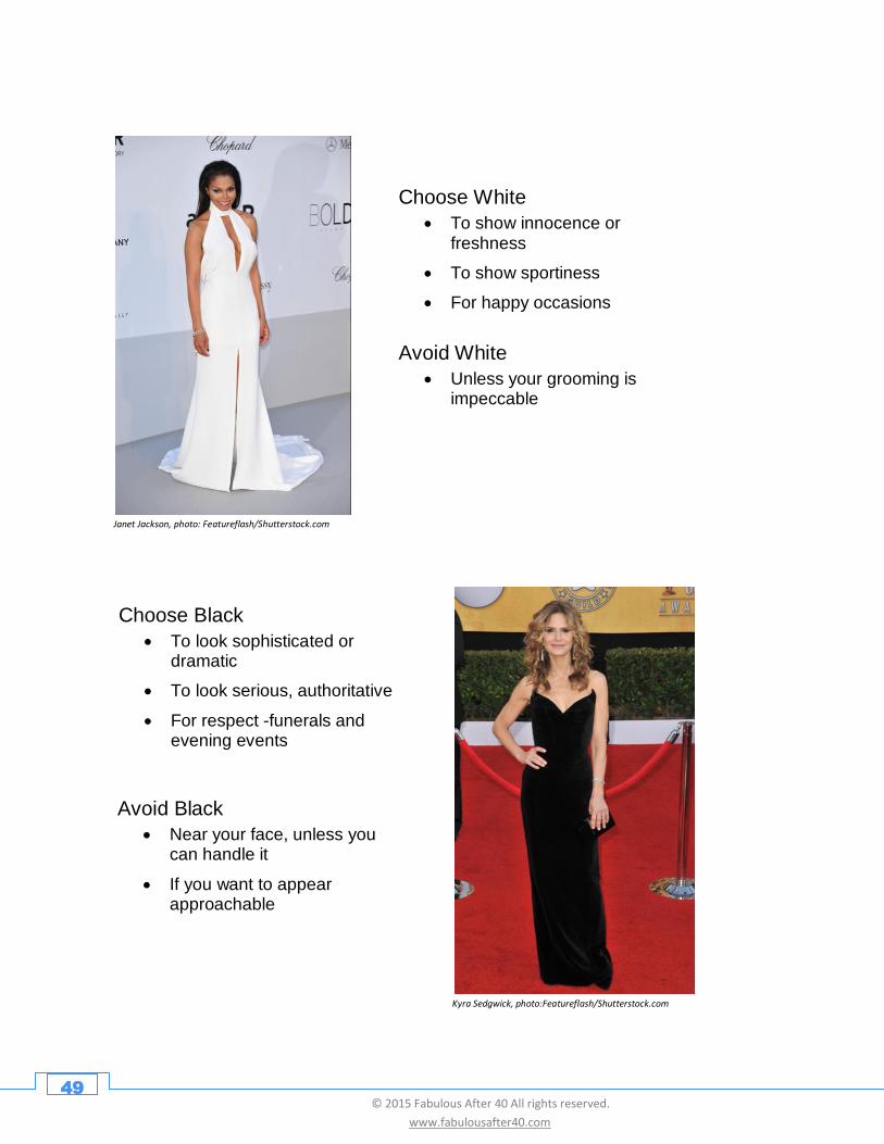
Choose White
• To show innocence or freshness
• To show sportiness
• For happy occasions
Avoid White
• Unless your grooming is impeccable
Choose Black
• To look sophisticated or dramatic
• To look serious, authoritative
• For respect -funerals and evening events
Avoid Black
• Near your face, unless you can handle it
• If you want to appear approachable
Kyra Sedgwick, photo:Featureflash/Shutterstock.com
Janet Jackson, photo: Featureflash/Shutterstock.com
50 © 2015 Fabulous After 40 All rights reserved.
www.fabulousafter40.com
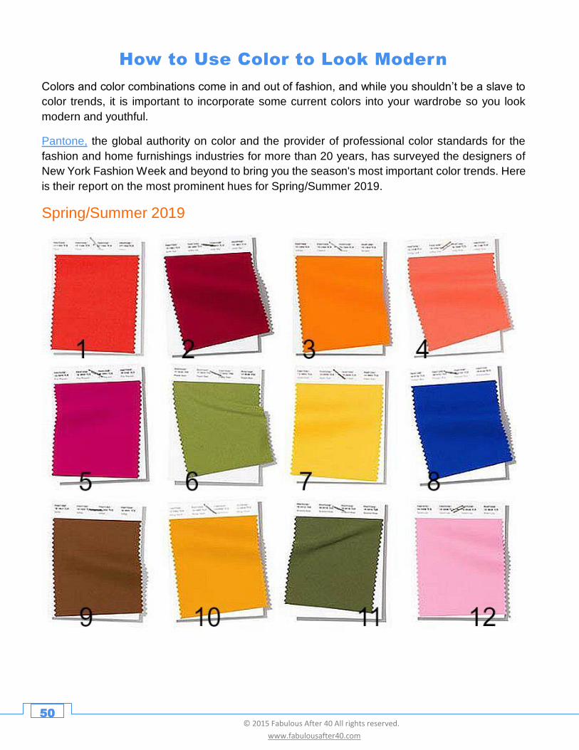
How to Use Color to Look Modern
Colors and color combinations come in and out of fashion, and while you shouldn’t be a slave to
color trends, it is important to incorporate some current colors into your wardrobe so you look
modern and youthful.
Pantone, the global authority on color and the provider of professional color standards for the
fashion and home furnishings industries for more than 20 years, has surveyed the designers of
New York Fashion Week and beyond to bring you the season's most important color trends. Here
is their report on the most prominent hues for Spring/Summer 2019.
Spring/Summer 2019
Autumnal hues that evoke the feeling of leaves on the forest floor, rich plumage and twilight
reveal a modern fall palette of deep and rich tones with outbursts of colorful surprise.
51 © 2015 Fabulous After 40 All rights reserved.
www.fabulousafter40.com
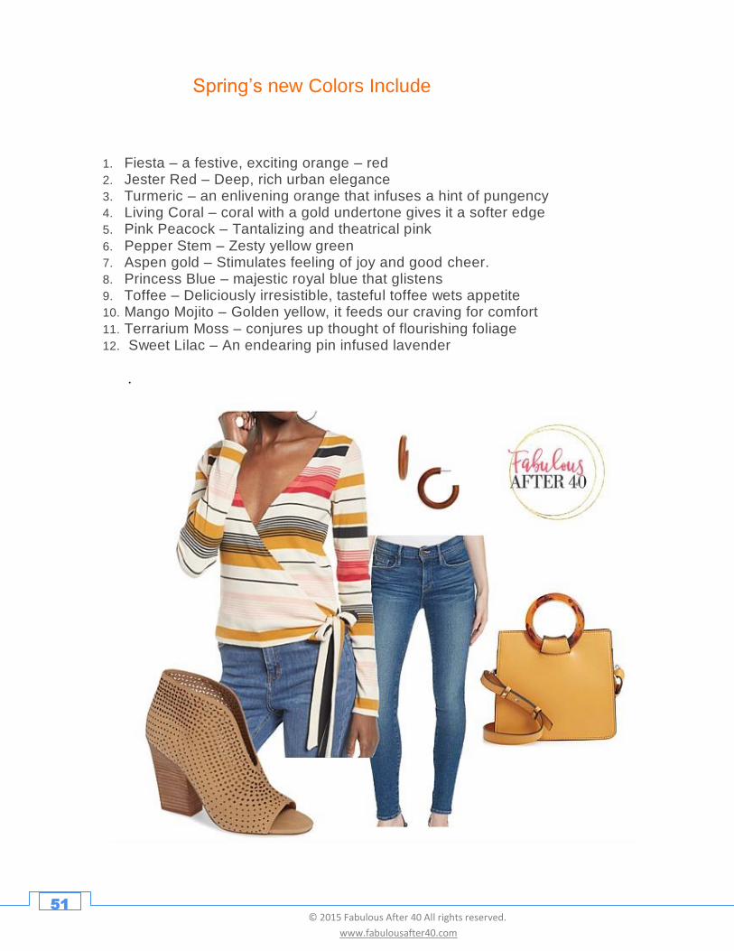
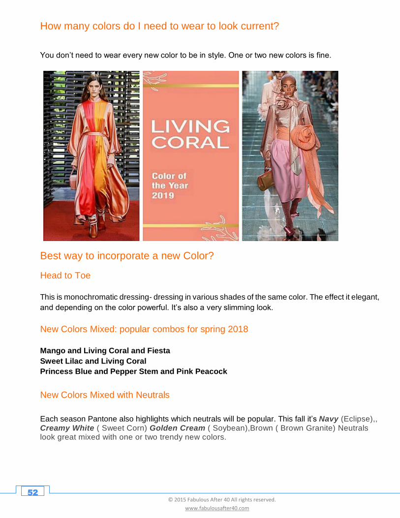
Spring’s new Colors Include
1. Fiesta – a festive, exciting orange – red 2. Jester Red – Deep, rich urban elegance 3. Turmeric – an enlivening orange that infuses a hint of pungency 4. Living Coral – coral with a gold undertone gives it a softer edge 5. Pink Peacock – Tantalizing and theatrical pink 6. Pepper Stem – Zesty yellow green 7. Aspen gold – Stimulates feeling of joy and good cheer. 8. Princess Blue – majestic royal blue that glistens 9. Toffee – Deliciously irresistible, tasteful toffee wets appetite 10. Mango Mojito – Golden yellow, it feeds our craving for comfort 11. Terrarium Moss – conjures up thought of flourishing foliage 12. Sweet Lilac – An endearing pin infused lavender
.
52 © 2015 Fabulous After 40 All rights reserved.
www.fabulousafter40.com
How many colors do I need to wear to look current?
You don’t need to wear every new color to be in style. One or two new colors is fine.
Best way to incorporate a new Color?
Head to Toe
This is monochromatic dressing- dressing in various shades of the same color. The effect it elegant,
and depending on the color powerful. It’s also a very slimming look.
New Colors Mixed: popular combos for spring 2018
Mango and Living Coral and Fiesta
Sweet Lilac and Living Coral
Princess Blue and Pepper Stem and Pink Peacock
New Colors Mixed with Neutrals
Each season Pantone also highlights which neutrals will be popular. This fall it’s Navy (Eclipse),, Creamy White ( Sweet Corn) Golden Cream ( Soybean),Brown ( Brown Granite) Neutrals look great mixed with one or two trendy new colors.
53 © 2015 Fabulous After 40 All rights reserved.
www.fabulousafter40.com
What if Colors Not in My Seasonal Palette?
Wear Away from Your Face
If a trending color is not in your seasonal palette, or is not your best color but you want to
wear it (i.e. it is a summer color and you are a winter), just don’t wear it near your face.
For example: Let’s say Terrarium Moss ( green) is not your best color, or you prefer cooler
or darker colors, then you might wear a Terrarium skirt instead of a Terrarium top.
Wear As an Accessory
Try wearing just a dash of a trendy color in an outfit . For example, a navy dress with a
yellow ( Aspen Gold ) belt or necklace.
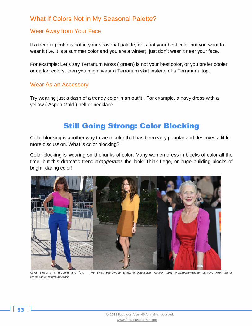
Still Going Strong: Color Blocking
Color blocking is another way to wear color that has been very popular and deserves a little
more discussion. What is color blocking?
Color blocking is wearing solid chunks of color. Many women dress in blocks of color all the
time, but this dramatic trend exaggerates the look. Think Lego, or huge building blocks of
bright, daring color!
Color Blocking is modern and fun. Tyra Banks photo:Helga Esteb/Shutterstock.com, Jennifer Lopez photo:sbukley/Shutterstock.com, Helen Mirren
photo:FeatureFlash/Shutterstock
54 © 2015 Fabulous After 40 All rights reserved.
www.fabulousafter40.com
Some of these candy colored brights are so vivid they’re almost neon. This is a playful,
dynamic and confident, look, but it is not for everyone. If you want to give it a try, here are a
few tips for putting together a color blocked outfit with class:
Stick to 2-3 Colors
Too many patches of color mixed together can look clownish and vulgar, especially after 40,
so keep it to 2 or 3 blocks of color.
Watch Where Colors Meet
These colors are intense so be careful where the two colors intersect. You don’t want two
jarring colors meeting at a trouble spot (think a large tummy) as it will highlight it.
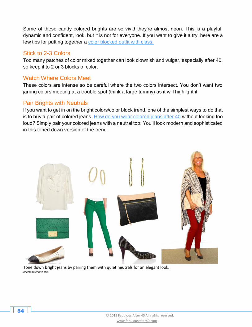
Pair Brights with Neutrals If you want to get in on the bright colors/color block trend, one of the simplest ways to do that
is to buy a pair of colored jeans. How do you wear colored jeans after 40 without looking too
loud? Simply pair your colored jeans with a neutral top. You’ll look modern and sophisticated
in this toned down version of the trend.
Tone down bright jeans by pairing them with quiet neutrals for an elegant look. photo: peterkate.com
55 © 2015 Fabulous After 40 All rights reserved.
www.fabulousafter40.com
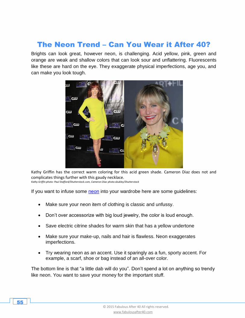
The Neon Trend – Can You Wear it After 40? Brights can look great, however neon, is challenging. Acid yellow, pink, green and
orange are weak and shallow colors that can look sour and unflattering. Fluorescents
like these are hard on the eye. They exaggerate physical imperfections, age you, and
can make you look tough.
Kathy Griffin has the correct warm coloring for this acid green shade. Cameron Diaz does not and complicates things further with this gaudy necklace. Kathy Griffin photo: Paul Stafford/Shutterstock.com, Cameron Diaz photo:sbukley/Shutterstock
If you want to infuse some neon into your wardrobe here are some guidelines:
• Make sure your neon item of clothing is classic and unfussy.
• Don’t over accessorize with big loud jewelry, the color is loud enough.
• Save electric citrine shades for warm skin that has a yellow undertone
• Make sure your make-up, nails and hair is flawless. Neon exaggerates imperfections.
• Try wearing neon as an accent. Use it sparingly as a fun, sporty accent. For example, a scarf, shoe or bag instead of an all-over color.
The bottom line is that “a little dab will do you”. Don’t spend a lot on anything so trendy
like neon. You want to save your money for the important stuff.
56 © 2015 Fabulous After 40 All rights reserved.
www.fabulousafter40.com
What about Pastels?
If you prefer quiet colors you may want to get in on the pastel trend. You need to be
careful how you wear pastels after 40. Powdery shades of pastels like dusty pink, pale
blue, light green or soft yellow, even if they’re within your seasonal palette, can make
you look old, powerless and frail after middle age.
Don’t believe me? Visit any senior’s center or nursing home and take a look around at
the sugary sweet color spectrum.
Faded flower colors like dusty rose, yellow, blue and mauve can drag you down after 40.
The key to wearing pastels is
1) Choose pastel clothing in simple, modern shapes - Avoid anything frilly, soft, or
flouncy that looks shapeless and senior.
2) Get the right mix - Make pastels look modern by pairing them with darker neutral
shades like black and gray, taupe.
3) Wear a pastel as an accessory- A touch may be all you need.
Read more about how not to look old in pastels here.
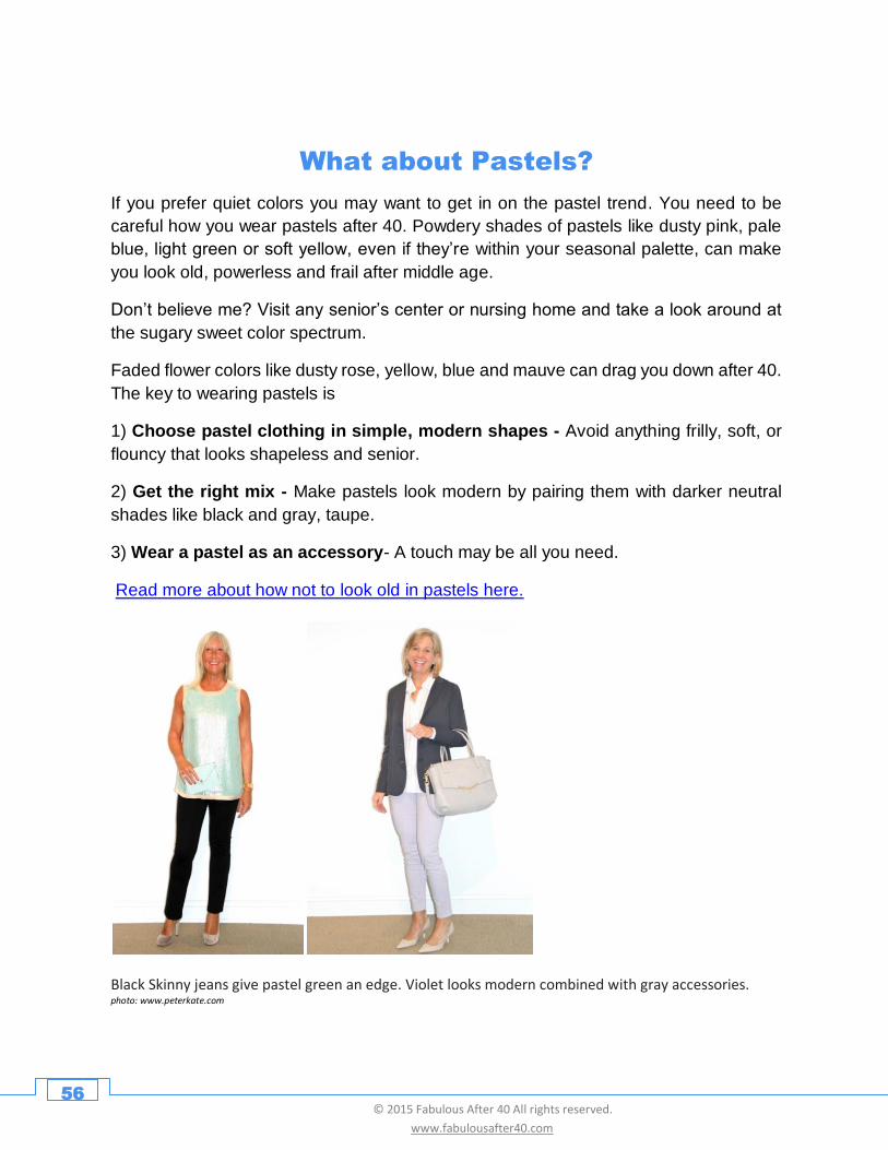
Black Skinny jeans give pastel green an edge. Violet looks modern combined with gray accessories. photo: www.peterkate.com
57 © 2015 Fabulous After 40 All rights reserved.
www.fabulousafter40.com
Nude and Blush
Nude and blush shades are similar to pastels and have been very popular in the last
couple of years. Nudes are supposed to resemble skin tones and come in a wide range
of subtle shades that have hints of beige, peach, pink, tan or gold.
They’re very soft like pastels, but more sophisticated and are great for women who don’t
like bright colors but need some warmth. You just have to make sure you get the right
shade. Springs and autumns need warmer (peachy) nude shades, while Summers and
Winters can go for the cooler (pinky) beige tones.
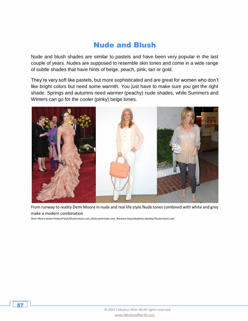
From runway to reality Demi Moore in nude and real life style.Nude tones combined with white and grey
make a modern combination Demi Moore photo:FeatureFlash/Shutterstock.com, photo:peterkate.com, Rosanna Arquettephoto:sbukley/Shutterstock.com
58 © 2015 Fabulous After 40 All rights reserved.
www.fabulousafter40.com
Are You Ready to Go
Beyond Basic Black?
Dressing after 40 is a challenge. It’s easy to feel insecure
about your aging body, and the lack of 40+ female role
models can easily make one feel invisible. But that’s no
reason to cop out and fade to black.
My mission at Fabulous after 40 has always been to guide
you, and cheer you on, so you can look and feel fabulous
in phase two of your beautiful life. I encourage you to stop
hiding behind black or a closet of drab clothing, and get out
there and shine!
As you’ve seen throughout this eBook, color is truly
magical. It has the power to transform -- to make you look
vibrant youthful, healthy, sexy and to help you feel excited
about life.
So let go! Be the artist of your life. Paint a picture of yourself as the Age-Amazing™ woman
you are by making color an important part of your style. Step away from all the black, let the
rainbow in and SHINE!
I hope you have enjoyed Color Me Fabulous: The Colors You need to Wear to Look Age-
AmazingTM
For more solutions to your style challenges over 40, check out my other eBooks:
Jumpstart Your Style: 12 Little Lessons to Dump the Frump After 40,
Chic on the Cheap: Tips and Tricks for Building a Wow Wardrobe on a Budget
Mother of the Bride: Secrets to Looking Fab When You Are the Mother of the Bride or Groom
Cheers,
Deborah Deborah Boland – Image &Style Expert and Publisher Fabulous After 40® www.fabulousafter40.com
59 © 2015 Fabulous After 40 All rights reserved.
www.fabulousafter40.com
Special Thanks
Peter Kate
Peter Kate, a women's clothing and shoe boutique located in beautiful Greenville, Delaware,
was established in 2001 by Kathy Savage and Sissy Harris. They specialize in stylish clothes
for women over 40. Visit them at www.peterkate.com
Annette Hoeldrich
Annette, who lives in Bavaria, Germany, presents her elegant yet wearable personal outfits
on her fashion blog, Lady of Style. She shows how women 40+ can look stylish and trendy
without spending a fortune. Her motto is, “Style is a reflection of your attitude and your
personality”. www.ladyofstyle.com
Amandine Nealton
Amandine is a personal stylist and fashion expert in the San Francisco Bay Area. Be sure to
visit her site at www.rendezvous-with-style.com