magazine advertisements research
TRANSCRIPT

Magazine AdvertisementsRESEARCH
Magazine Advertisements
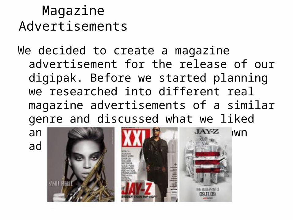
We decided to create a magazine advertisement for the release of our digipak. Before we started planning we researched into different real magazine advertisements of a similar genre and discussed what we liked and would include within our own advert.

Magazine Advertisements• One of the first magazine adverts we looked at was for
JessieJ’s album ‘Who You Are’ the reason for this as it was current and had been seen by both of us in magazines we owned.
• The advert itself is quite plain however very affective, and the colour scheme stand out with basic colours.
• The main shot of the artist ‘Jessie J’ instantly advertises who she is and what she is about and the close up of the artist helps to advertise her and her music.
• There is not lots of information at the bottom of the page but however there is enough to tell you about the product, again the colour scheme is basic but it isn't in your face or doesn’t give the feeling as though the ad is crowded, which is easier for the audience to look at.
• We both really liked this advert and decided that we may use some features from it, we both really liked the block of black colour which goes along the bottom of the page, the reason is because then the information is easier to read than if it was over the top of the picture.
• As well we liked the fact there was a close up of the artist which advertises the artist instantly.
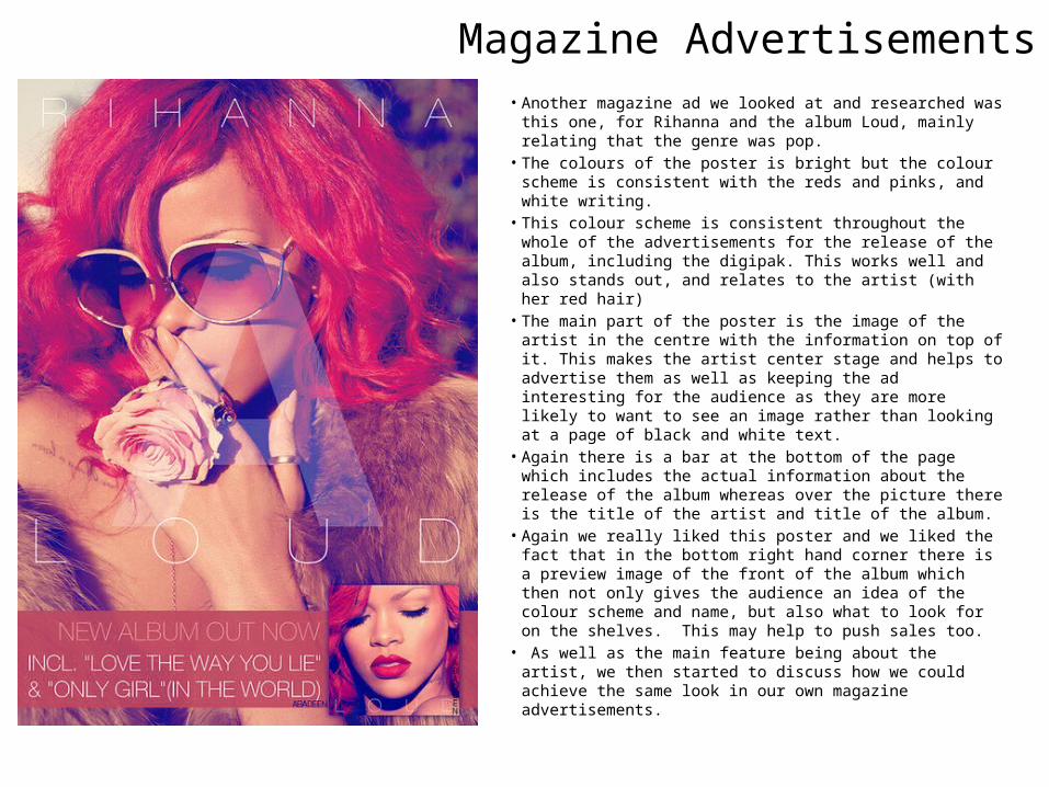
• Another magazine ad we looked at and researched was this one, for Rihanna and the album Loud, mainly relating that the genre was pop.
• The colours of the poster is bright but the colour scheme is consistent with the reds and pinks, and white writing.
• This colour scheme is consistent throughout the whole of the advertisements for the release of the album, including the digipak. This works well and also stands out, and relates to the artist (with her red hair)
• The main part of the poster is the image of the artist in the centre with the information on top of it. This makes the artist center stage and helps to advertise them as well as keeping the ad interesting for the audience as they are more likely to want to see an image rather than looking at a page of black and white text.
• Again there is a bar at the bottom of the page which includes the actual information about the release of the album whereas over the picture there is the title of the artist and title of the album.
• Again we really liked this poster and we liked the fact that in the bottom right hand corner there is a preview image of the front of the album which then not only gives the audience an idea of the colour scheme and name, but also what to look for on the shelves. This may help to push sales too.
• As well as the main feature being about the artist, we then started to discuss how we could achieve the same look in our own magazine advertisements.
Magazine Advertisements
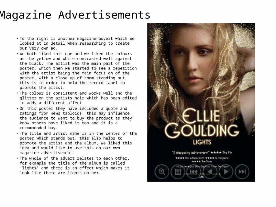
• To the right is another magazine advert which we looked at in detail when researching to create our very own ad.
• We both liked this one and we liked the colours as the yellow and white contrasted well against the black. The artist was the main part of the poster, which then we started to see a repetition with the artist being the main focus on of the poster, with a close up of them standing out, this is in order to help the record label to promote the artist.
• The colour is consistent and works well and the glitter on the artists hair which has been edited in adds a different affect.
• On this poster they have included a quote and ratings from news tabloids, this may influence the audience to want to buy the product as they know others have liked it too and it is a recommended buy.
• The title and artist name is in the center of the poster which stands out, this also helps to promote the artist and the album, we liked this idea and would like to use this on our own magazine advertisement.
• The whole of the advert relates to each other, for example the title of the album is called ‘lights’ and there is an effect which makes it look like there are lights on her.
Magazine Advertisements
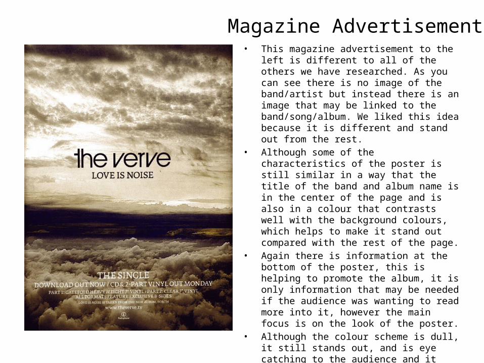
• This magazine advertisement to the left is different to all of the others we have researched. As you can see there is no image of the band/artist but instead there is an image that may be linked to the band/song/album. We liked this idea because it is different and stand out from the rest.
• Although some of the characteristics of the poster is still similar in a way that the title of the band and album name is in the center of the page and is also in a colour that contrasts well with the background colours, which helps to make it stand out compared with the rest of the page.
• Again there is information at the bottom of the poster, this is helping to promote the album, it is only information that may be needed if the audience was wanting to read more into it, however the main focus is on the look of the poster.
• Although the colour scheme is dull, it still stands out, and is eye catching to the audience and it still looks professional even though the main colours are black and white.
• We liked this idea because it was different from any other magazine advertisement we had previously looked at, and we thought about how we could challenge the conventions.
Magazine Advertisements

• The poster on the right is a lot similar to the other female artist magazine adverts we had previously researched.
• The main focus of the poster is the image of the artist in the center of the page with the name of the artist and the name of the album underneath which links the poster together and is eye catching for the audience.
• A part of the poster we liked was the fact that there is a preview of the album front cover in the bottom of the poster, this therefore means that instead of the audience knowing the title and colour scheme the album will be, they have an idea on what to look for when the album is on the shelves.
• The image in the background of the artist, looks like it has been painted which gives an unusual affect and is different to other posters. As well as helping the white to contrast more against the other colours.
• The writing has a different font which stands out, this is maybe to add the style of the artist on the poster as something different which stands out, and may be related back to the artist at a later reference.
Magazine Advertisements