moving averages and rates of change: tracking trend and...
TRANSCRIPT

In the last chapter, you learned a method of constructing and maintaining movingaverages. The method described there applies to the construction of what is called asimple moving average, a moving average that gives equal weight to all the datapoints included in that average. Other forms of moving averages assign greaterweight to more recent data points so that the average is more influenced by recentdata. This chapter provides additional information regarding the construction andapplication of moving averages.
The Purpose of Moving Averages Moving averages are used to smooth out the “noise” of shorter-term price fluctua-tions so as to more readily be able to identify and define significant underlyingtrends.
For example, Chart 3.1 shows the Nasdaq 100 Index along with three simple mov-ing averages, a ten-day moving average that reflects short-term trends in the market,a 50-day (if plotted weekly, a 10-week) moving average that reflects intermediatemarket trends, and a 200-day (or 40-week) average that reflects major trends in thestock market. (Moving averages can employ monthly entries for very major termtrends or, conversely, can be plotted even at one-minute intervals for very short-term, intra-day, day-trading purposes.)
3Moving Averages and Ratesof Change: Tracking Trendand Momentum
Appel_03.qxd 2/22/05 10:26 AM Page 43

44 Technical Analysis
Chart 3.1 The Nasdaq 100 Index with Moving Averages Reflecting Its Long-, Intermediate-,and Short-Term Trends
Chart 3.1 shows the Nasdaq 100 Index with three moving averages, reflecting different timeframes. The 200-day moving average reflects a longer-term trend in the stock market—in thiscase, clearly up. The 50-day or approximately 10-week moving average reflects intermediate-term trends in the stock market during this period, also clearly up. The ten-day moving aver-age reflects short-term trends in the stock market that, on this chart, show a bullish bias intheir patterns but are not consistently rising.
Chart 3.1 starts as the 2000–2002 bear market was moving toward completion, reach-ing its bear market lows and completing its transition into the emerging bull marketthat developed during 2003. The ten-day moving average was penetrated by dailyprice movement in mid-March that year, turning sharply upward. You can see howturns in the ten-day average took place, reflecting changing trends in daily pricemovement.
Let’s review this ten-day moving average more carefully. The slopes of movingaverage thrusts indicate the underlying strength of market trends. Examine theupturn in the ten-day moving average that took place in mid-February 2003 andcontinued into March. The slope and length of this upturn were moderate, as wasthe subsequent downturn into mid-March.
Now look at the upturn in the ten-day moving average that took place starting inmid-March: This had very different characteristics. The slope of the March advancewas much more vertical, indicating greater initial momentum, a sign of increasingmarket strength. The length of the initial upthrust lengthened, another positive indi-cation. The subsequent retracement into April took place at a lesser slope. Theadvancing leg had more vitality than the declining leg, which was of lesser duration.
2003 February April May June July August September November 2004 February April May June July
900
950
1000
1050
1100
1150
1200
1250
1300
1350
1400
1450
1500
1550
1600
900
950
1000
1050
1100
1150
1200
1250
1300
1350
1400
1450
1500
1550
1600
200-Day Moving Average
Nasdaq 100 Index
2003 - 2004
10-Day Moving Average
50-Day Moving Average
August
Appel_03.qxd 2/22/05 10:26 AM Page 44

Moving Averages and Rates of Change: Tracking Trend and Momentum 45
Let’s consider now the moving average pulses that developed in mid-April, lateMay, and early July. The April to late May advancing pulse was relatively long in itsconsistent advance, which developed at a strongly rising angle. The May to Junepulse was shorter (signifying lessening upside momentum or strength). The June toJuly pulse showed further reductions in its length and steepness of thrust, reflectingstill diminishing upside momentum.
As a rule, a series of diminishing upside pulses during a market advance suggeststhat a market correction lies ahead. A series of increasing upside pulses suggests thatfurther advances are likely.
You might want to review the series of pulses between August and November forfurther examples of these concepts. You might also want to notice the series of high-er highs and higher lows in the ten-day moving average, clearly signifying anuptrend in motion.
The Intermediate-Term Moving Average The ten-day moving average during the period in Chart 3.1 was clearly tracing outpatterns that, between March and October, signified a strong market climate.However, market indications produced by moving average patterns became some-what more ambiguous as October moved into early December. Upside pulses weak-ened, and a more neutral pattern developed.
Although short-term patterns were becoming more neutral, intermediate trendsremained strongly uptrended, as you can see from the 50-day moving average,which based during March and April, turned upward thereafter, and rose steadilythrough the end of the year.
When intermediate trends are strong, the strategy of choice is usually to buy whenprices fall to or below the shorter-term moving averages. Such patterns frequentlyprovide fine entry points within favorable, strongly rising stock market cycles. Therules are reversed during more bearish periods. When intermediate-term markettrends are clearly in decline, selling opportunities frequently develop when dailystock prices or market indices approach or penetrate shorter-term moving averagesfrom below.
The Long-Term 200-Day Moving Average The 200-day moving average reflects longer-term market trends. As you can see, itnaturally responds more slowly than the 50-day moving average to changes in thedirection of market movements. The 200-day average turned upward in April 2003and continued upward throughout the year, with the slope of its advance accelerat-ing and reflecting ongoing market strength. Again, accelerating slopes suggest exten-sions of trends in motion. Decelerating trends imply that current trends might beapproaching reversal. The 200-day moving average did lose momentum early in2004, reflecting the weakening stock market that year.
Be sure to check the lengths of pulses and the slope of moving averages that youare tracking. The longer the pulse is, the more vertical the slope is and the greater theodds there are of a continuation in trend. As pulses and slopes moderate, the oddsof an imminent market reversal increase.
Appel_03.qxd 2/22/05 10:26 AM Page 45
46 Technical Analysis
Using Weekly-Based Longer-Term Moving Averages
1995 1996 1997 1998 1999 2000 2001 2002 2003 2004
2500
3000
3500
4000
4500
5000
5500
6000
6500
7000
7500
2500
3000
3500
4000
4500
5000
5500
6000
6500
7000
7500
Moving AverageLends Support
B
New York Stock Exchange Index
Weekly
30-Week Moving Average
B
B
SS
S
S
B = Buy
S = Sell
(Not All Signals Shown)
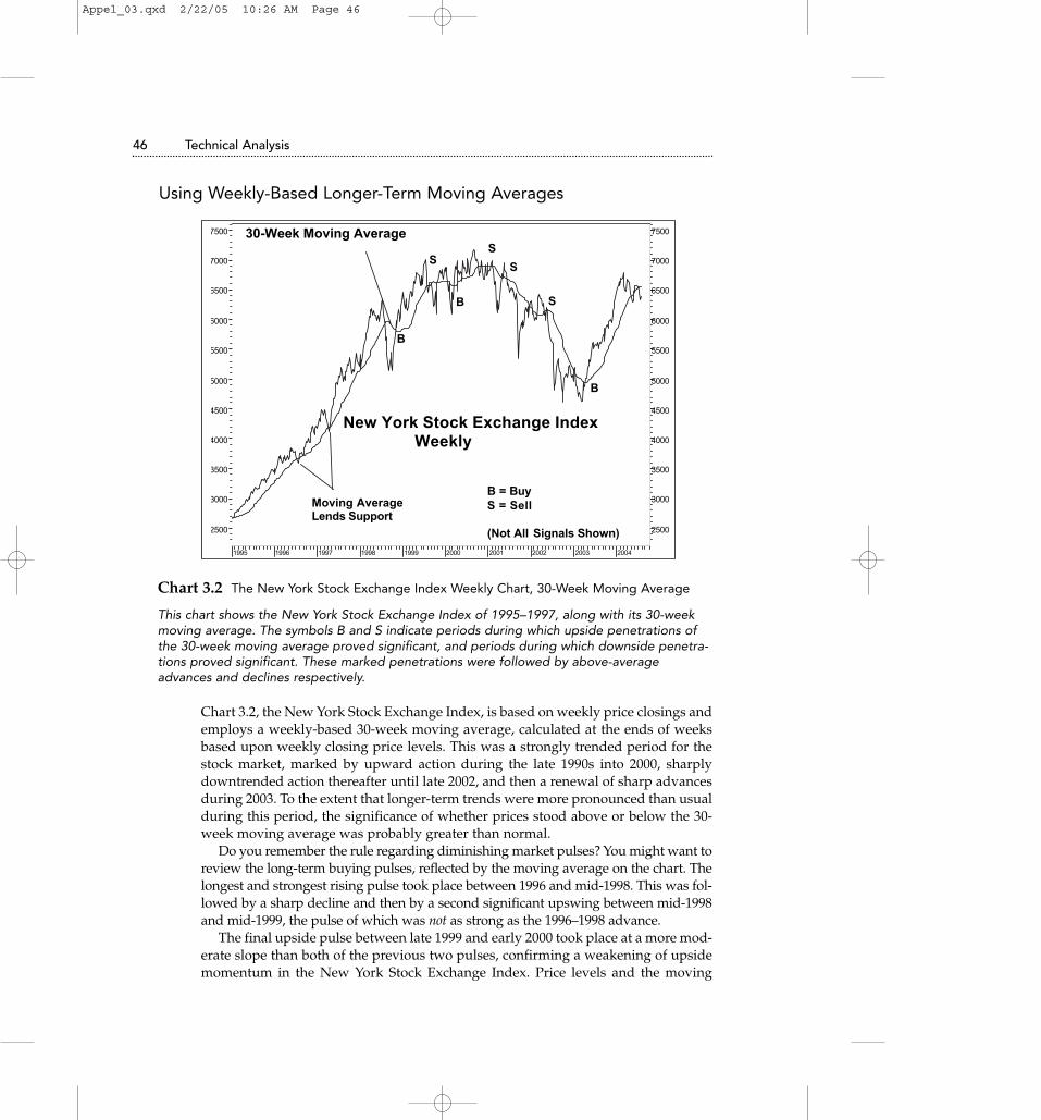
Chart 3.2 The New York Stock Exchange Index Weekly Chart, 30-Week Moving Average
This chart shows the New York Stock Exchange Index of 1995–1997, along with its 30-weekmoving average. The symbols B and S indicate periods during which upside penetrations ofthe 30-week moving average proved significant, and periods during which downside penetra-tions proved significant. These marked penetrations were followed by above-averageadvances and declines respectively.
Chart 3.2, the New York Stock Exchange Index, is based on weekly price closings andemploys a weekly-based 30-week moving average, calculated at the ends of weeksbased upon weekly closing price levels. This was a strongly trended period for thestock market, marked by upward action during the late 1990s into 2000, sharplydowntrended action thereafter until late 2002, and then a renewal of sharp advancesduring 2003. To the extent that longer-term trends were more pronounced than usualduring this period, the significance of whether prices stood above or below the 30-week moving average was probably greater than normal.
Do you remember the rule regarding diminishing market pulses? You might want toreview the long-term buying pulses, reflected by the moving average on the chart. Thelongest and strongest rising pulse took place between 1996 and mid-1998. This was fol-lowed by a sharp decline and then by a second significant upswing between mid-1998and mid-1999, the pulse of which was not as strong as the 1996–1998 advance.
The final upside pulse between late 1999 and early 2000 took place at a more mod-erate slope than both of the previous two pulses, confirming a weakening of upsidemomentum in the New York Stock Exchange Index. Price levels and the moving
Appel_03.qxd 2/22/05 10:26 AM Page 46

Moving Averages and Rates of Change: Tracking Trend and Momentum 47
average flattened quickly, a harbinger of the weakness to come. These are the samepatterns that are present in Chart 3.1, the daily price action of the Nasdaq 100 Index.
In both periods, the series of pulses involved were completed in three waves. Thisthree-wave pattern, which occurs frequently, appears to be associated with TheElliott Wave Theory, an approach to studying wave movements and their predictivesignificance that has a wide following among stock market technicians. We willreturn to the significance of pulse waves when we examine moving average tradingchannels, which I consider to be a very powerful market timing tool.
Moving Averages and Very Long-Term Moving AveragesMoving averages, as we have seen, may be applied to shorter-term, intermediate-term, and very long-term price movements. You may also apply them, if you are avery active trader, to intra-day market data for day trading purposes. Such data maybe plotted on hourly, 30-minute, 15-minute, and even 5-minute bases, but at this timewe are considering longer term applications.
Chart 3.3 is a monthly chart of the Standard & Poor’s 500 Index, posted with a 30-month moving average. You should note two items. First, consider the significanceof the moving average in providing areas of support for the stock market. Duringpositive market periods, price declines frequently come to an end in the area of keyintermediate- and major-term moving averages. Second, note that the acceleratingrise in the moving average creates a rising parabolic curve. Such formations usuallyoccur only during very speculative periods (for example, consider the price of goldin 1980) and are generally followed by long-lasting and serious market declines. Asyou can see, the highs of 2000 had still not been surpassed by early 2004. The peakin gold prices that developed during 1980 has to date remained unchallenged fornearly a quarter of a century.
1985 1986 1987 1988 1989 1990 1991 1992 1993 1994 1995 1996 1997 1998 1999 2000 2001 2002 2003 2004 20050
100
150
200
250
300
350400
450
500
550
600650
700750
800
850900
950
1000
10501100
11501200
12501300
1350
14001450
1500
1550
16001650
30-Month Moving Average
STANDARD & POOR’S 500 INDEX
Monthly
1985 - 2004
Chart 3.3 The Standard & Poor’s 500 Index, 1986–2003 30-Month Moving Average
Appel_03.qxd 2/22/05 10:26 AM Page 47

48 Technical Analysis
As illustrated in Chart 3.3, the stock market advanced in an accelerating, parabolic advancebetween 1986–2000, with the 30-month moving average line providing support throughoutthe rise. Market tops generally end in gradual decelerations, but sometimes advances aremarked by parabolic acceleration, such advances often ending with a spikelike peak.Parabolic patterns of this nature usually take place during highly speculative periods, whichare great fun for as long as they last, although they usually do end badly.
Moving Averages: Myths and Misconceptions It is frequently said that the stock market is in a bullish position because prices lieabove their 30-week moving averages or that it is bearish because prices lie belowtheir 30-week moving averages. Sometimes 10-week or 20-week moving averagesare referenced instead. There are some elements of truth to these generalizations, butstrategies of buying and selling stocks based on crossings of moving averages tendto add only moderately, if at all, to buy-and-hold performance.
For example, consider two possible strategies. The first strategy involves buyingthe Dow Industrials when its daily close exceeds its 200-day moving average, andselling at the close of days when its close declines to below the 200-day moving aver-age. The second strategy employs the same rules but is applied to crossings of the100-day moving average.
Trading the Dow Industrials on Moving Average Crossings (January 5, 1970–January 13, 2004)
200–Day Moving 100-Day MovingAverage Model Average Model
Total round-trip trades 120 195
Profitable trades 26 (21.7%) 44 (22.6%)
Unprofitable trades 94 (78.3%) 151 (77.4%)
Average gain, winning trades 14.1% 18.7%
Average loss, losing trades –1.2% –1.1%
Percentage of time invested 68.6% 65.5%
Rate of gain per annum while invested 9.6% 9.1%
Gain per annum, including cash periods 6.6% 6.0%
Open drawdown 44.2% 48.1%
Buy and hold: Gain per annum +7.8%; open drawdown –45.1%
* Gain per annum includes neither money market interest income while in cash, which has averaged approximately 2% per year, nor dividend payments. If these were included, gainsper annum for the trading and buy-and-hold strategies would have been essentially equal.
As you can see, there has been very little benefit or disadvantage to trading the DowIndustrial Average based on penetrations of either the 100-day or the 200-day mov-ing averages. The Dow has not been a particularly volatile or trendy market index.The Nasdaq Composite Index, more volatile and trendy, has generally proven in the
Appel_03.qxd 2/22/05 10:26 AM Page 48

Moving Averages and Rates of Change: Tracking Trend and Momentum 49
past to be somewhat more compatible with this form of timing model, although lessso in recent years because this market sector has lost a good deal of its autocorrela-tion, the tendency of rising market days to be followed by rising market days, andof market-declining days to be followed by market-declining days. Rising andfalling days are now more likely to occur in random order than in decades past.
Results of buying on upside penetrations of moving averages and selling ondownside penetrations seem to improve if exponential moving averages, whichprovide more weight to recent than distant past periods, are employed. The con-struction of exponential averages will be discussed in Chapter 6 when we reviewThe Weekly Impulse Signal. A special application of moving averages, moving aver-age trading bands, a means of predicting future market movement by past marketaction, has a chapter of its own (see Chapter 9, “Moving Average Trading Channels:Using Yesterday’s Action to Call Tomorrow’s Turns”).
Using Moving Averages to Identify the Four Stages of theMarket Cycle
Moving averages can be employed to define the four major stages of the typicalmarket cycle (see Chart 3.4). This identification leads readily to logical portfoliostrategies that accompany each stage.
1997 1998 1999 2000 2001 2002 2003 2004
550
600
650
700
750
800
850
900
950
1000
1050
1100
1150
1200
1250
1300
1350
1400
1450
1500
1550
1600
550
600
650
700
750
800
850
900
950
1000
1050
1100
1150
1200
1250
1300
1350
1400
1450
1500
1550
1600
40-Week
Moving AverageStage 2
Rising
THE FOUR STAGES OF MARKET MOVEMENT
Standard & Poor's 500 Index Weekly Based
20-Week
Moving Average
Stage 3 - Topping
Stage 4
Declining
Stage 1Basing
S&P 500
1996
Chart 3.4 The Four Stages of the Market Cycle
Chart 3.4 shows the four stages of the market cycle: rising, topping, declining, and finally bas-ing for the next Stage 2 advance. As you can see, during Stage 2 advances, prices mainlytrend above the key moving averages. During Stage 4 declines, prices mainly trend below thekey moving averages.
Appel_03.qxd 2/22/05 10:26 AM Page 49

50 Technical Analysis
Stage 1In this stage, the stock market makes a transition from a major bear market to amajor bull market. This is a period of base building as the market prepares foradvance. This stage encompasses a period that includes, at its beginning, the endingphase of bear markets or market declines that take place during shorter periods.These declines give way to neutral market action as stocks move from late-sellinginvestors to perspicacious investors accumulating positions for the next upswing. Inthe final phases of Stage 1, the stock market usually begins to inch upward, marketbreadth readings (measures of the extent to which large numbers of stocks are par-ticipating in market advances or declines) improve, and fewer stocks fall to new 52-week lows, the lowest price for each stock over the last 52 weeks.
Patterns of Moving Averages During Stage 1Shorter-term moving averages begin to show more favorable patterns as longer-term moving averages continue to decline. The downward slopes of all movingaverages mediate.
Selling pulses show diminishing length, slope, and momentum. Prices,which have been trailing below key moving averages, begin to rally to andthrough their key moving averages, which themselves become more horizontalin their movement.
Accumulate investment positions during periods of short-term market weakness,in anticipation of a significant trend reversal. There is a good chance that you will beable to assemble your portfolio leisurely because major term Stage 1 basing forma-tions often require weeks and sometimes even months for completion.
Stage 2Price advances become confirmed by the ability of the stock market to penetrate ini-tial resistance zones, price areas that previously rebuffed upside penetration.Investors become aware that a significant change in market tone is developing andbegin to buy aggressively. This is the best of periods in which to own stocks.
Stage 2 often originates in a burst of strength as prices move upward and abovethe trading ranges that developed during Stage 1. This is the period during which itbecomes widely recognized that a major trend change for the better is taking placeand is also usually a period in which selling strategies are unlikely to produce muchin the way of benefit.
Patterns of Moving Averages During Stage 2 Advances Intermediate- and then longer-term moving averages join short-term movingaverages in first reversing and then accelerating to the upside. Prices tend to findsupport at the level of their key moving averages, often moving averages of 25 daysto 10 weeks in length. Penetrations to the downside of moving average lines arebrief. Buying pulses are longer and at a sharper angle than selling pulses, as meas-ured by the slopes and lengths of moving average waves.
Appel_03.qxd 2/22/05 10:26 AM Page 50

Initiate long positions early in this phase, with plans to hold throughout the ris-ing cycle, if possible. The major portion of your portfolio should be in place rela-tively early in this stage of the market cycle.
Stage 3The market advance slows, with shares passing from earlier buyers to the hands ofinvestors who are becoming invested late. This period is marked by distribution,when savvy investors dispose of holdings to less savvy latecomers.
Patterns of Moving Averages During Stage 3 Distribution Periods The shorter-term and, later, intermediate- and longer-term moving averages loseupside momentum and flatten. Price declines carry prices as far beneath as abovekey moving averages. Uptrends give way to neutral price movement and to neutralpatterns in moving average movement. Fewer stocks and industry groups demon-strate rising moving average trends.
In many ways, this is a difficult period for many investors. This is partly becauseof the insidious way Stage 2 advances often give way to Stage 3 distribution. In addi-tion, many investors, actually more fearful of missing a profit than of taking a loss,are reluctant to concede that the happy bullish party might be coming to a close.
New purchases should be made selectively, with care. Selling strategies for exist-ing holdings should be established, profits should be protected with stop-lossorders, and portfolios should be lightened by selling stocks that have fallen in rela-tive strength. Rallies should be employed as opportunities for liquidation.
Stage 4Bear markets are in effect. Market declines broaden and accelerate. Short-term andthen longer-term moving averages turn down, with downtrends accelerating as bearmarkets progress. An increasing amount of price movement takes place beneath keymoving averages. Rallies tend to stop at or just above declining moving averages.Market rallies do take place and are sometimes sharp but generally relatively brief.
This is the stage during which investors accrue the greatest losses. Stage 4declines are often, but not always, marked by rising interest rates and usually startduring periods in which economic news remains favorable. In its price action, thestock market tends to anticipate changing economic news by approximately ninemonths to one year, rising in anticipation of improving economic conditions anddeclining in anticipation of deteriorating conditions. In the former case, initialmarket advances are usually greeted with some skepticism. In the latter case, stillfavorable economic news leads investors to ignore warnings provided by the stockmarket itself.
For most investors, it is probably best simply to maintain cash positions. Seriousmarket declines are usually associated with high interest rates, which can be securedwith minimal or no risk. Aggressive and accurate traders, of course, might attemptto profit from short selling. For the most part, it is not advisable to attempt to ride
Moving Averages and Rates of Change: Tracking Trend and Momentum 51
Appel_03.qxd 2/22/05 10:26 AM Page 51

52 Technical Analysis
through major market downtrends with fully invested positions. Although the verylong-term trend of the stock market is up, serious bear markets that have reducedasset values by as much as 75% periodically take place.
The Rate of Change Indicator: How to Measure and Analyzethe Momentum of the Stock Market
The Concept and Maintenance of the Rate of Change IndicatorRate of change measurements measure momentum, which is the rate at which pricechanges are taking place. Consider a golf drive, for example. A well-hit ball leavesthe tee quickly, rising and gaining altitude quickly. Momentum is very high.Although it might be difficult to estimate the carry of the drive in its initial rise fromthe tee, it is often possible to determine, from the initial rate of rise of the ball, thatthis is a well-hit drive, likely to carry for some considerable distance. Sooner orlater, the rate of climb of the ball clearly diminishes and the ball loses momentum.At this time, an estimate of the final distance of the drive can be more readily made.
The important concept involved is that rates of rise diminish before declines actu-ally get under way. The falling rate of change of the drive provides advance warn-ing that the ball is soon going to fall to the ground.
3 20 27 4 10September
24 1 8October
15 22 29 5 12November
19 26 3 10December
17 24 31 72002
14 22 28 4 11February
19 25 4March
11
-500-400-300-200-100
0100200300
-500-400-300-200-100
0100200300
21- Day Rate of Change
1350
1400
1450
1500
1550
1600
1650
1700
1750
1800
1850
1900
1950
2000
2050
2100
2150
1350
1400
1450
1500
1550
1600
1650
1700
1750
1800
1850
1900
1950
2000
2050
2100
2150
22 Trading Days
+311.43
September 26, 2001
Close 1464.04
October 25, 2001
1775.47
Rising Prices, Falling ROC= Negative Divergence
Nasdaq Composite Index
July 2001 - March 2002
Chart 3.5 The Nasdaq Composite Index 2001–2002
Appel_03.qxd 2/22/05 10:26 AM Page 52

Chart 3.5 illustrates the construction and application of the rate of change indicator. Twodates are marked on the chart: September 26, 2001, at which time the Nasdaq Compositeclosed at 1464.04, and October 25, 21 days later, at which time the Composite closed at1775.47. The Composite gained 311.43 over these 21 days of trading; the 21-day rate ofchange of the indicator on October 25 was +311.43, the rate at which the Nasdaq Com-posite was advancing. For the most part, rate of change measurements kept pace with pricemovement between October and early December, with momentum matching price move-ment. However, rate of change readings fell off sharply as prices reached a new high inJanuary 2002, a failure of momentum to confirm price gain, referred to as a negative diver-gence. Such patterns are often the precursor to serious market declines.
In its price movements, the stock market often demonstrates momentum character-istics that are very similar to the momentum characteristics of the golf drive.
For example, review Chart 3.5, which covers the period of September 2001 toMarch 2002. This was a bear market period, but spirited, if usually short-term, mar-ket rallies do take place during bear markets. Such an advance took place betweenlate September and early December 2001, when the stock market “golf ball” reachedan effective peak in momentum. Momentum had fallen off sharply by the time the“ball” reached its final zenith in early January 2002, giving investors ample warningthat the advance was reaching essential completion.
In reviewing the chart, you might notice that the initial lift in prices from the lateSeptember lows was accompanied by sharply rising rate of change readings.Momentum did not peak until five weeks had passed since the onset of the marketrise, tracking thereafter in a relatively high and level course until early December,when a downward trend in momentum readings diverged from a final high inprice levels.
This pattern of price levels reaching new highs as momentum readings fail to doso is referred to as a negative divergence. The divergence carries bearish implica-tions because of the decline in power suggested by the failure of momentum read-ings to keep up with market advances. A converse pattern, with price levels fallingto new lows while momentum readings turn upwards, reflects declining downsidemomentum and is referred to as a positive divergence because of its bullish impli-cations.
Of course, additional concepts are involved in the interpretation and use of rateof change readings—not to mention a neat short-term timing model based on suchmeasurements. However, first matters first....
Constructing Rate of Change MeasurementsRate of change measurement was discussed in the last chapter when we covered theyield indicator, but there is no harm in a refresher course. Rate of change measure-ments can be made for any period of time and can be based on hourly, daily, week-ly, or monthly data. In my own work, I frequently employ daily closing prices of keymarket indices or levels of the advance-decline line (a cumulative total of advancesminus declines on the NYSE or on Nasdaq) as my data stream.
I have found ten-day rate of change readings to be helpful for shorter-term trad-ing and 21-day to 25-day rate of change readings to be useful for intermediate-term
Moving Averages and Rates of Change: Tracking Trend and Momentum 53
Appel_03.qxd 2/22/05 10:26 AM Page 53

54 Technical Analysis
trading. It is helpful to maintain both shorter- and longer-term rate of change meas-urements. Often changes in direction in the shorter-term readings presage subse-quent changes in the direction of longer-term rate of change measurements.
Here is how your worksheet might look if you were maintaining a ten-day rateof change indicator stream of the Standard & Poor’s 500 Index from January 30th
into February 2004.
Date Closing Level, S&P 500 10-Day Rate of Change
1 January 30 1131.13
2 February 2 1135.26
3 February 3 1136.03
4 February 4 1126.52
5 February 5 1128.59
6 February 6 1142.76
7 February 9 1139.81
8 February 10 1145.54
9 February 11 1157.76
10 February 12 1152.11
11 February 13 1145.81 +14.68 (Day 11, 1145.81 – Day 1, 1131.13)
12 February 17 1156.99 +21.73 (Day 12, 1156.99 – Day 2, 1135.26)
As you can see, a data stream of at least one unit more than your rate of changemeasurement is required for maintenance, so for a ten-day rate of change reading tobe secured, at least eleven days of data must be maintained.
It is useful to plot both price and rate of change readings on the same chart sheet,to identify divergences, create trendlines, and so on. Daily rate of change lines canbe rather jagged, so moving averages of daily measurements are often useful tosmooth out patterns of the indicator.
Let’s start this section with Chart 3.6, which illustrates a number of the major con-cepts employed in interpreting rate of change measurements.
Appel_03.qxd 2/22/05 10:26 AM Page 54

Bull Market and Bear Market Rate of Change Patterns
Moving Averages and Rates of Change: Tracking Trend and Momentum 55
Mar Apr May Jun Jul Aug Sep Oct Nov Dec 2003 Feb Mar Apr May Jun Jul Aug Sep Oct Nov Dec 2004 Mar Apr May Jun Jul-250-200-150-100-50
050
100150200250
-1.0
-0.5
0.0
0.5
1.0
1.5
750
800
850
900
950
1000
1050
1100
1150
1200
1250
1300
1350
1400
1450
1500
1550
1600
750
800
850
900
950
1000
1050
1100
1150
1200
1250
1300
1350
1400
1450
1500
1550
1600Nasdaq 100 Index
Nasdaq 100 Index, Daily
July 2002 - August 2003
A
B Steady Rise, Even Momentum
C
D D = Positive Divergence
C = Negative Divergence
E
F
AB D
CE F
Aug
Chart 3.6 Nasdaq 100 Index, Daily, July 2002–August 2003
This chart shows the behavior of rate of change measurements during both bear and bullmarkets. As you can see, rate of change readings tend to be negative (below 0) during mar-ket declines and positive (above 0) during bull markets.
You would naturally expect stock prices to show generally negative rates of changeduring market declines and generally positive rates of change during marketadvances. This characteristic of rate of change lines is very apparent in the transitionof the stock market from a major bearish trend to a major bullish trend between 2002and 2003.
Market analysts often refer to the stock market as being “oversold” or “over-bought.” By this, they mean that the momentum of the market’s change in pricelevel has become unusually extended in a negative or positive direction, basedupon normal parameters of the indicator employed. For example, in recent years,the ten-day rate of change of the NYSE advance-decline line has tended to rangebetween +7,500 and –8,500. Forays beyond these boundaries represent overboughtand oversold conditions, respectively. In theory, when measurements of momen-tum reach certain levels, the stock market is likely to reverse direction, in the samemanner that a rubber band, when stretched, has a tendency to snap back to a stateof equilibrium.
Popular as this generalization is—and it’s usually accurate enough during neu-tral market periods—it becomes less reliable in its outcomes when the stock marketis strongly trended. For example, the very negative readings in rate of change meas-urements that developed during the spring and early summer of 2002 portended agreater likelihood of continuing decline than of immediate recovery because read-ings had become just about as negative as they ever get. Extreme weakness suggests
Appel_03.qxd 2/22/05 10:26 AM Page 55

56 Technical Analysis
further weakness to come. Extreme strength suggests further strength to come.Market reversals rarely take place without at least some prior neutralization of rateof change measurements.
Adjusting Overbought and Oversold Rate of Change Levels forMarket Trend
The levels at which momentum indicators can be considered “oversold” (with themarket likely to try to firm, especially during a neutral or bullish period) and “over-bought” (with the market likely to at least pause in its advance, especially during abearish or neutral period) often vary depending upon the general market climate.
During bullish market periods, rate of change readings rarely reach the negativeextremes that can exist for many weeks or even months during bear markets. Whenthey do decline to their lower ranges, the stock market frequently recovers rapidly.During bearish market periods, rate of change readings tend not to track at levels ashigh as those during better market climates; the stock market more likely declinesrapidly when readings reach relatively high levels for bear market periods.Referring to Chart 3.6 again, you can see examples of shifts in the parameters of rateof change indicator levels as the market’s major trend changed direction from bear-ish to bullish.
When assessing whether momentum indicators suggest an imminent marketreversal based on overbought or oversold levels, adjust your parameters based uponthe market’s current price trend, moving average direction, and rate of changeparameters that are currently operative. These adjustments are, of course, somewhatsubjective rather than completely objective.
For the most part, significant market advances do not start when rate of changeand other momentum oscillators stand at their most negative or oversold readings.They tend to begin after momentum oscillators have already advanced from theirmost negatively extreme readings. For example, review Chart 3.6 again. The October2002 advance did not start until the 21-day rate of change oscillator had alreadyestablished a rising, double-bottom pattern, the second low point of which was con-siderably higher than the first.
The end of the November–December market advance (see Chart 3.6) did not startuntil the 21-day rate of change oscillator had already retreated from its peak levels,with a descending double-top formation created in the process.
The summer 2002 decline did not end until rate of change measurements estab-lished a pattern of rising lows (diminishing downside momentum). A positivedivergence developed within Area A on the chart; the price level of the Nasdaq 100Index fell to new lows, whereas its 21-day rate of change level did not. You can alsosee a minor-term but nonetheless significant secondary positive divergence in AreaB, with prices declining to a final low while rate of change measurements becameless negative.
The recovery from the lows of September 2002 developed in a classical fashion.The first step was a strong leg upward that carried prices above a resistance area(the peak in August) and momentum readings to high levels, more positive than atany time since March. However, the initial spike came to an end after approxi-mately two months.
Appel_03.qxd 2/22/05 10:26 AM Page 56
Was there a warning of the forthcoming two-month decline? Yes, indeed. Checkout Area C on the chart, the area in which prices rose to new recovery peaks inNovember while rate of change levels declined, a classic negative divergence thatforetold developing market weakness.
The decline in the stock market in Area D appeared to be developing from a bear-ish-looking head and shoulders market top formation (defined in Chapter 6,“Bottom Fishing, Top Spotting, Staying the Course: Power Tools That CombineMomentum Oscillators with Market Breadth Measurements for Improved MarketTiming”), but the positive divergence (lower prices unconfirmed by rate of changepatterns) that developed in January 2003 argued for a more favorable outcome,which did develop.
Looking Deeper into Levels of the Rate of Change IndicatorThe rate of change oscillator conveys a good deal of information in and of itself, butit provides more information if the time is taken to study the market action that cre-ated the current reading.
More specifically, each day’s new rate of change indicator level actually involvestwo variables: the current day’s change in price level and direction of movement,and the level and direction of the price movement of the day that is being removedfrom the calculation being made.
If the day being removed was a day of market decline, rate of change measure-ments will turn upward even if today shows no gain in price, for as long as it showslesser loss than the day being removed. Therefore, if weaker market periods arebeing eliminated from rate of change calculations, rate of change levels tend to riseeasily, often before price trends turn upward. If today happens to be a rising day andthe day eliminated from the calculation was a falling day, rate of change measure-ments might rise rapidly.
Conversely, if the days being removed from your calculations were days of mar-ket advance, it will be more difficult for your rate of change indicator to gainground. During strong market periods, rate of change indicators are likely to tracksideways, but at relatively high levels. It might appear at such times that negativedivergences are taking place, but if you examine the data stream carefully, youmight notice that the stock market is not really weakening at all and that, in fact, theability of its rate of change readings to remain high is a sign of strength.
Let’s go back to Chart 3.5. September was a period of sharply declining stockprices, so rate of change levels rose quickly in October, even prior to price gains ofany significance. Not until the turn of the month into November were the days beingeliminated in the calculations rising market days. Rate of change measurementsremained flat, though high for several weeks. The inability of rate of change meas-urements to advance further was, in this instance, not a sign of market weakness,but rather simply a reflection of the ongoing strength that had been maintained overseveral weeks.
Relative strength readings (Chart 3.5) did not seriously begin to fail until the endof 2001, when, after a dip, prices rose to new highs while rate of change measure-ments clearly failed to do so. Prices and rate of change measurements declined
Moving Averages and Rates of Change: Tracking Trend and Momentum 57
Appel_03.qxd 2/22/05 10:26 AM Page 57

58 Technical Analysis
simultaneously early in 2002, the decline preceded by the negative divergence thathad developed between December 2001 and January 2002.
The first dip down in early December, accompanied by declines in the rate ofchange indicator, was not necessarily indicative of a more negative market climate.Even the strongest market advances have periods of consolidation. You might noticethat at no time did rate of change levels decline below 0 during December. However,a negative divergence, with more bearish implications, did develop at year end.
What made this negative divergence more significant than the flattening of therate of change indicator during October and November? Well, for one thing, rate ofchange readings were no longer tracking at high levels, declining to near the zeroline. For another, patterns of price movement had changed, with price trends flat-tening. As a third consideration, there was very little time between the time that therate of change failed to reach new peaks that would have confirmed new highs inprice, and the rapid turndown in price levels from the early January peak.
Again, declines in rate of change readings and the presence of negative diver-gences are more significant if they are accompanied by some weakening in pricetrend. Double-top formations in price (two peaks spaced a few days to a few weeksapart) accompanied by declining double top formations in rate of change measure-ments can be quite bearish.
Conversely, rising patterns in rate of change measurements are more significantif they are confirmed by a demonstrated ability of the stock market to turn upward.Double-bottom stock market formations, spaced a few days to a few weeks apart,accompanied by rising rate of change readings often provide excellent entry points.
The Triple Momentum Nasdaq Index Trading ModelYou will now learn about a simple-to-maintain timing model that is designed for usewith investment vehicles that track closely with the Nasdaq Composite. This is ashort-term, hit-and-run timing model that was invested only 45.9% of the time from1972 to May 2004, yet it outperformed buy-and-hold strategies during 20 of the 32years included in the study. Gains per winning trade were more than five times thesize of losses taken during losing trades. More performance data is shown after-ward, but first you should look at the logic and rules of the model.
Appel_03.qxd 2/22/05 10:26 AM Page 58

Chart 3.7 The Triple Momentum Timing Model (1999–2000)
This chart shows the Nasdaq Composite from late October 1999 through early October2000. Below the price chart are three rate of change charts: the 5-, 15-, and 25-day rates ofchange of the Nasdaq Composite, expressed in percentage (not in point) changes in thatindex. At the top of those three charts is a chart that is created by summing the daily read-ings of the separate rate of change measurements. B signifies a buy date, and S signifies asell date. You might notice that the shorter-term 5-day rate of change indicator leads thelonger-term 15-day and 25-day rate of change indicators in changing direction beforechanges in price direction. (This chart is based upon hypothetical study. There can be noassurance of future performance.)
Maintenance ProcedureThe procedure for maintaining this indicator is very straightforward.
You will need to maintain three daily rate of change measurements: a 5-day rateof change of the daily closing prices of the Nasdaq Composite, a 15-day rate ofchange measurement, and a 25-day rate of change measurement.
These are maintained as percentage changes, not as point changes. For example,if the closing price of the Nasdaq Composite today is 2000 and the closing level tendays previous is 1900, the ten-day rate of change would be +5.26%. (2000 – 1900 =100; 100 ÷ 1900 = .0526; .0526 × 100 = +5.26%.)
At the close of each day, you add the percentage-based levels for the 5-day, 15-day, and 25-day rates of change measurements to get a composite rate of change,the Triple Momentum figure for the day. For example, if the 5-day rate of changelevel is +3.0%, the 15-day rate of change level is +4.5%, and the 25-day rate ofchange level is +6.0%, the composite Triple Momentum Level would come to+13.5%, or to +13.5. A reading of this nature, positive across all time frames, wouldsuggest an uptrended stock market.
Moving Averages and Rates of Change: Tracking Trend and Momentum 59
S r October November December 2000 February March April May June July
020
020
0
20
0
20
0 0
-50
0
50
-50
0
502500
3000
3500
4000
4500
5000
2500
3000
3500
4000
4500
5000Nasdaq Composite
1999 - 2000 S B S
Sum - 5, 15, 25 Day Rates of Change
B
+4% Buy - Sell Line
5-Day % Rate of Change
15-Day % Rate of Change
25-Day % Rate of Change
B
B
S S
September
Appel_03.qxd 2/22/05 10:26 AM Page 59

60 Technical Analysis
There is only one buy rule and only one sell rule: You buy when the TripleMomentum Level, the sum of the 5-, 15-, and 25-day rates of change, crosses frombelow to above 4%. You sell when the Triple Momentum Level, the sum of the 5-, 15-,and 25-day rates of change, crosses from above to below 4%.
Again, there are no further rules. The model is almost elegant in its simplicity.Here are the year-to-year results.
The Triple Momentum Timing Model (1972–2004)Year Buy and Hold, Nasdaq Composite Triple Momentum
1972 +4.4% +2.3%
1973 –31.1 +7.5
1974 –35.1 –0.3
1975 +29.8 +32.9
1976 +26.1 +23.6
1977 +7.3 +5.3
1978 +12.3 +26.2
1979 +28.1 +25.3
1980 +33.9 +43.2
1981 –3.2 +9.8
1982 +18.7 +43.8
1983 +19.9 +29.4
1984 –11.2 +3.6
1985 +31.4 +31.3
1986 +7.4 +10.7
1987 –5.3 +24.1
1988 +15.4 +11.6
1989 +19.3 +15.2
1990 –17.8 +10.8
1991 +56.8 +32.9
1992 +15.5 +17.9
1993 +14.8 +7.4
1994 - 3.2 +2.0
1995 +39.9 +27.0
1996 +22.7 +20.3
1997 +21.6 +26.3
1998 +39.6 +50.9
1999 +85.6 +43.5
Continued
Appel_03.qxd 2/22/05 10:26 AM Page 60

The Triple Momentum Timing Model (1972–2004) (Continued)
Year Buy and Hold, Nasdaq Composite Triple Momentum
2000 –39.3 +8.6
2001 –21.1 +27.5
2002 –31.5 +4.9
2003 +50.0 +21.5
2004 (partial) –2.3 + 0.8
Summary of Performance ResultsBuy and Hold Triple Momentum
Gain per annum +9.0% +19.8%
Open drawdown –77.4% –17.5%
Round-trip trades 288 (8.9 per year)
Percentage of trades profitable 54.4%
Percentage of time invested 45.9%
Rate of gain while invested, annualized +9.0% + 43.1%
Average gain per profitable trade +4.8%
Average loss per losing trade –0.9%
Gain/loss per trade ratio 5.3
Total gain/loss ratio 6.2
Gains achieved by the Triple Momentum Timing Model were more than six timesthe amount of loss over this 32-year period. The model outperformed buy-and-holdby an average of 120% per year while being invested only 45.9% of the time. Interestincome derived at other times is not included in these calculations, but, for that mat-ter, neither are possible trading expenses or negative tax consequences that accruefrom active as opposed to passive stock investment.
The question might naturally arise whether it is really necessary to employ threerates of change measurements in this system or whether just one might do the job aswell. Actually, using three measurements seems to provide smoother results, withless trading and risk. For example, if the Nasdaq Composite was purchased on daysthat the 15-day rate of change alone rose from below to above 0 and sold on daysthat it fell below 0, the average annual gain would have been +18.3%, the maximumdrawdown would have risen to –28.6%, the number of trades would have risen to307, and the accuracy would have declined to 44.3%. Rates of return while investedwould have fallen from 43.1% to 30.7%, and profit/loss ratios per trade would havedeclined from 5.3 to 4.1. Comparisons with other alternative single rate of changestrategies seem to produce similar results.
This timing model has stood the test of time very well. Stock market techniciansand timing model developers have found that, in many cases, there have been
Moving Averages and Rates of Change: Tracking Trend and Momentum 61
Appel_03.qxd 2/22/05 10:26 AM Page 61

62 Technical Analysis
deteriorations in the performance of stock market timing models in recent decades.Models that worked well during the 1970s began to lose performance during the1980s, lost more during the 1990s, and lost even more during the bear market of2000–2002. Losses in efficiency have possibly resulted from rising daily marketvolatility over the years, increasing trading volume and day trading activity, a con-siderable reduction in day-to-day trendiness in the various stock market sectors, andprobably other factors as well.
You might find it reassuring to observe that the Triple Momentum Timing Modelhas shown consistent performance relative to buy-and-hold strategies over the pastthree decades, outperforming buy-and-hold most years during the 1970s and the1980s, and since 2000. During the 1990s, there were five years in which buy-and-hold strategies outperformed Triple Momentum, and five years in which the modeloutperformed buy-and-hold. In assessing the value of the model, you might want torecall that it is invested only 45.9% of the time.
Notes Regarding Research Structure By their nature, research designs employed in creating this sort of timing model tendto involve processes that often produce results that have been optimized for theperiod of time covered by the research data and that are not equaled in real timegoing forward. A way to reduce, if not totally eliminate, these problems connectedwith optimization is to test a model in two or more stages. Parameters are set basedon one period of time and then are applied to subsequent periods of time to see ifthe model continues to perform as well in a hypothetically established future as inthe past.
The Triple Momentum Timing Model was created and tested in the followingmanner. First, parameters were established based upon the time period ofSeptember 1972 to December 31, 1988. These parameters were then applied to theremainder of the test period, January 1 1989 to May 5, 2004. Comparative results areshown here.
The Triple Momentum Timing Model Performance by PeriodPeriod Used for Creation Forward Testing PeriodSeptember 1972–December 1988 January 1989–May 2004
Returns, buy and hold +7.6% +11.3%
Annual returns, trading +19.7% +19.6%
Number of trades 128 (7.8 per year) 162 (10.6 per year)
Percentage profitable trades 56.3% 51.9%
Percentage of time invested 43.4% 48.6%
Return while invested 45.3% 40.9%
Open drawdown –6.9% –17.5%
Average gain/average loss 8.0 4.1
Average gain per trade +2.5% +1.9%
Appel_03.qxd 2/22/05 10:26 AM Page 62

Although there was a certain amount of deterioration in performance between thecreation period (1972–1988) and the subsequent test period (1989–2004) of the TripleMomentum Timing Model, its performance actually remained relatively stable,given the increase in the daily volatility of the Nasdaq Composite during the1989–2004 period and the wide and erratic swings up during 1999 and down duringthe bear market (not to mention the reduction in day-to-day trendiness that hastaken place in the Nasdaq Composite since 1999). I have found in my research thatvery few timing models have maintained their performance in recent years, and thatthe Triple Momentum model has done far better than most.
Incidentally, research indicates that the principles of the Triple Momentum Modelcan be applied to other markets as well (for example, U.S. Treasury bonds). Backtesting suggests that risks can be considerably reduced with minimal impact onprofitability in this very difficult market to trade.
Rate of Change Patterns and the Four Stages of the StockMarket Cycle
Rate of change patterns can be employed in conjunction with moving averages todefine the four stages of the stock market cycle. Rate of change readings usuallychange direction in advance of moving averages; the momentum of price movementgenerally reverses in advance of changes of price movement.
Charts 3.5 and 3.6 in this chapter provide examples of the behavior of rate ofchange measurements as significant market trends reverse. Moving averages can bemade of daily rate of change measurements to smooth the often-jagged daily fluc-tuations of this indicator.
To sum up, moving averages, which reflect shorter and longer trends in the stockmarket, can help investors define the strength in the market by their direction, theirslope, and the angle and length of their pulses upward and downward. Rate ofchange measurements, which define the momentum of market advances anddecline, often provide advance warning of impending market reversals, as well as ameasure of the strength of trends in effect. Both moving averages and rate of changemeasurements provide significant indications of the four stages of major and shorter-term market cycles.
Moving Averages and Rates of Change: Tracking Trend and Momentum 63
Appel_03.qxd 2/22/05 10:26 AM Page 63

Appel_03.qxd 2/22/05 10:26 AM Page 64