opening sequence 2
TRANSCRIPT
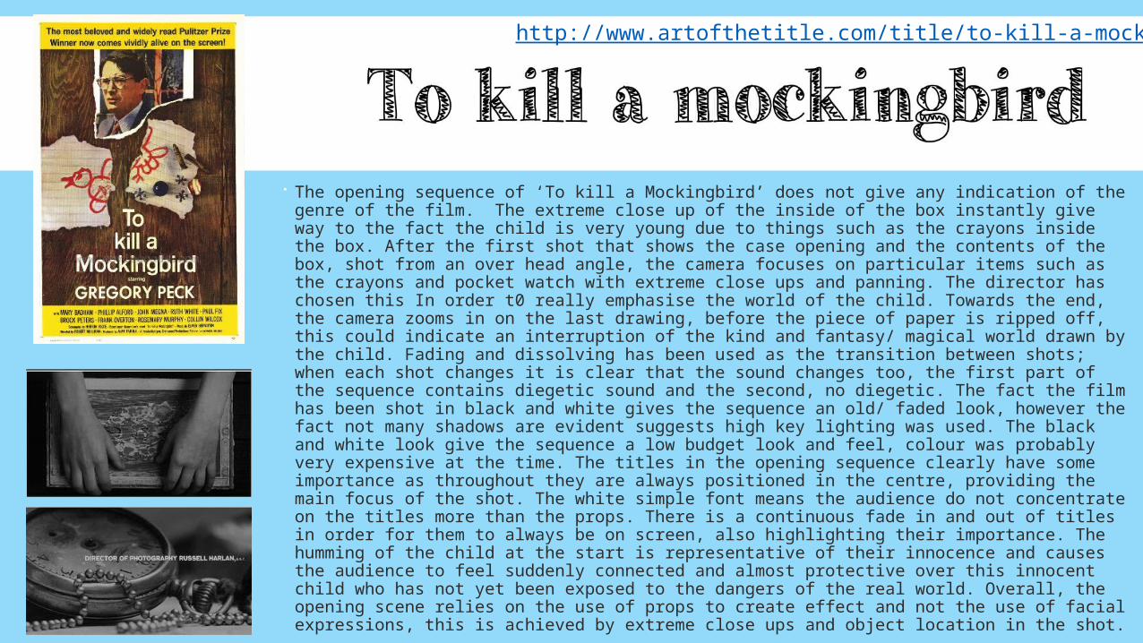
The opening sequence of ‘To kill a Mockingbird’ does not give any indication of the genre of the film. The extreme close up of the inside of the box instantly give way to the fact the child is very young due to things such as the crayons inside the box. After the first shot that shows the case opening and the contents of the box, shot from an over head angle, the camera focuses on particular items such as the crayons and pocket watch with extreme close ups and panning. The director has chosen this In order t0 really emphasise the world of the child. Towards the end, the camera zooms in on the last drawing, before the piece of paper is ripped off, this could indicate an interruption of the kind and fantasy/ magical world drawn by the child. Fading and dissolving has been used as the transition between shots; when each shot changes it is clear that the sound changes too, the first part of the sequence contains diegetic sound and the second, no diegetic. The fact the film has been shot in black and white gives the sequence an old/ faded look, however the fact not many shadows are evident suggests high key lighting was used. The black and white look give the sequence a low budget look and feel, colour was probably very expensive at the time. The titles in the opening sequence clearly have some importance as throughout they are always positioned in the centre, providing the main focus of the shot. The white simple font means the audience do not concentrate on the titles more than the props. There is a continuous fade in and out of titles in order for them to always be on screen, also highlighting their importance. The humming of the child at the start is representative of their innocence and causes the audience to feel suddenly connected and almost protective over this innocent child who has not yet been exposed to the dangers of the real world. Overall, the opening scene relies on the use of props to create effect and not the use of facial expressions, this is achieved by extreme close ups and object location in the shot.
http://www.artofthetitle.com/title/to-kill-a-mockingbird/

The opening sequence begins with a low angled extreme close up of a church bell as it rings; the pleonastic sound of the bell ringing adds a sense of doom and gloom to the scene, the low angle of the camera emphasises the size and power of the bell. The camera then tilts from the extreme close up to an high angled establishing shot, the sheer number of people below the bell emphasise the importance of it. The trombone and the trumpets then come in to add a more positive tone to the scene. Through mise en scene, we understand that the male character is religious. His all black attire represents him as quite an neutral character with underlying dark meaning. His all black clothes are indicative of his plain/basic personality. The synths come in and add a spiritual theme to the scene, especially as he walks under the ancient stone building. A sequence of cross fades, columns and mosaics create a religious feel and visual enjoyment when watching. The old stone columns suggest that the film is set in Italy in the 1930’s. Panning is used to create a fluidity to the sequence and the slow paced movement of the man are representative of his self control and dominance; they suggest a darker side to the “apparent serenity”. The white titles connote purity and virginal themes, this is typical of the religious genre. The low angled long shot of the stairs cause the stairs to look like a challenge to the man, the low angled shot is used in order to make the stairs look bigger than they are. The high key lighting of the scene give off positive vibes and create a sense of positivity. The type of hat the man is wearing is one at which people usually use to hide themselves, the hat gives the man a smart but suspicious look; the hat is something typical of the mafia. The fact the man is just a b lack silhouette throughout and shows no personality, leads me to think the aim of the sequence is for the audience to concentrate more on the setting and location than character. The shadow of the character follows him throughout, this may be foreshadowing the mans different self. The soundtrack towards the end involving the violins and synths, is typical of a child's fairy-tale and creates a positive mood. The mosaic may be indicative of the characters good organisation just like a mosaic. The mosaic is a complete oxymoron to the man which of whom is not represented as complex or unique such as the mosaic. The long shot of the graffiti and the man walking in to the church represent the church as a safe haven, as if it protects what's inside from the evil criminals on the outside. The shot may also help us as an audience to understand the character, it may suggest that although the man is a good man and religious he has an evil, bad side to him too.
http://www.artofthetitle.com/title/the-cardinal/
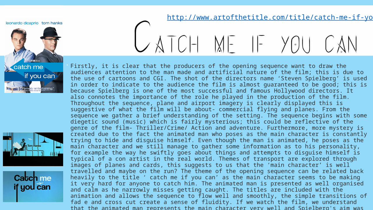
Firstly, it is clear that the producers of the opening sequence want to draw the audiences attention to the man made and artificial nature of the film; this is due to the use of cartoons and CGI. The shot of the directors name ‘Steven Spielberg’ is used in order to indicate to the audience the film is almost guaranteed to be good; this is because Spielberg is one of the most successful and famous Hollywood directors. It also connotes the importance of the role he played in the production of the film. Throughout the sequence, plane and airport imagery is clearly displayed this is suggestive of what the film will be about- commercial flying and planes. From the sequence we gather a brief understanding of the setting. The sequence begins with some diegetic sound (music) which is fairly mysterious; this could be reflective of the genre of the film- Thriller/Crime/ Action and adventure. Furthermore, more mystery is created due to the fact the animated man who poses as the main character is constantly trying to hide and disguise himself. Even though the man is animated, he poses as the main character and we still manage to gather some information as to his personality, for example the way he swiftly goes about things and attempts to disguise himself is typical of a con artist in the real world. Themes of transport are explored through images of planes and cards, this suggests to us that the ‘main character’ is well travelled and maybe on the run? The theme of the opening sequence can be related back heavily to the title ‘ catch me if you can’ as the main character seems to be making it very hard for anyone to catch him. The animated man is presented as well organised and calm as he narrowly misses getting caught. The titles are included with the animation and allows the sequence to flow well and smoothly, the simple transitions of fad e and cross cut create a sense of fluidity. If we watch the film, we understand that the animated man represents the main character very well and Spielberg's aim was to achieve this.
http://www.artofthetitle.com/title/catch-me-if-you-can/#
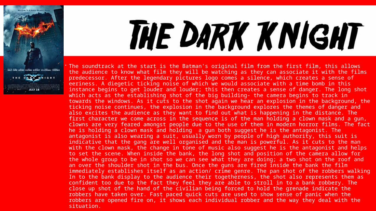
The soundtrack at the start is the Batman's original film from the first film, this allows the audience to know what film they will be watching as they can associate it with the films predecessor. After the legendary pictures logo comes a silence, which creates a sense of eeriness. A diegetic ticking noise of which we would associate with a time bomb in this instance begins to get louder and louder; this then creates a sense of danger. The long shot which acts as the establishing shot of the big building- the camera begins to track in towards the windows. As it cuts to the shot again we hear an explosion in the background, the ticking noise continues, the explosion in the background explores the themes of danger and also excites the audience as they want to find out what is happening in the distance. The first character we come across in the sequence is of the man holding a clown mask and a gun, clowns are very feared amongst people due to the use of them in modern horror films. The fact he is holding a clown mask and holding a gun both suggest he is the antagonist. The antagonist is also wearing a suit, usually worn by people of high authority, this suit is indicative that the gang are well organised and the man is powerful. As it cuts to the man with the clown mask, the change in tone of music also suggest he is the antagonist and helps to set the scene. When inside the bank, the long shot and position of the camera allow for the whole group to be in shot so we can see what they are doing; a two shot on the roof and an over the shoulder shot in the bus. Once the guns are fired inside the bank the film immediately establishes itself as an action/ crime genre. The pan shot of the robbers walking In to the bank display to the audience their togetherness, the shot also represents them as confident too due to the fact they feel they are able to stroll in to a bank robbery. The close up shot of the hand of the civilian being forced to hold the grenade indicate the robbers have taken over. Fast paced quick cuts are used to show sense of panic when the robbers are opened fire on, it shows each individual robber and the way they deal with the situation.
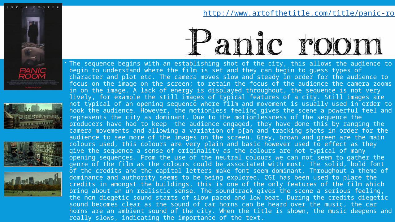
The sequence begins with an establishing shot of the city, this allows the audience to begin to understand where the film is set and they can begin to guess types of character and plot etc. The camera moves slow and steady in order for the audience to focus on the image on the screen; to retain the focus of the audience the camera zooms in on the image. A lack of energy is displayed throughout, the sequence is not very lively, for example the still images of typical features of a city. Still images are not typical of an opening sequence where film and movement is usually used in order to hook the audience. However, the motionless feeling gives the scene a powerful feel and represents the city as dominant. Due to the motionlessness of the sequence the producers have had to keep the audience engaged, they have done this by ranging the camera movements and allowing a variation of p[an and tracking shots in order for the audience to see more of the images on the screen. Grey, brown and green are the main colours used, this colours are very plain and basic however used to effect as they give the sequence a sense of originality as the colours are not typical of many opening sequences. From the use of the neutral colours we can not seem to gather the genre of the film as the colours could be associated with most. The solid, bold font of the credits and the capital letters make font seem dominant. Throughout a theme of dominance and authority seems to be being explored. CGI has been used to place the credits in amongst the buildings, this is one of the only features of the film which bring about an un realistic sense. The soundtrack gives the scene a serious feeling, the non diegetic sound starts of slow paced and low beat. During the credits diegetic sound becomes clear as the sound of car horns can be heard over the music, the car horns are an ambient sound of the city. When the title is shown, the music deepens and really slows, indicating the importance of the text.
http://www.artofthetitle.com/title/panic-room/