poster progression
TRANSCRIPT
Poster Progression
Shannon Cartlidge1022
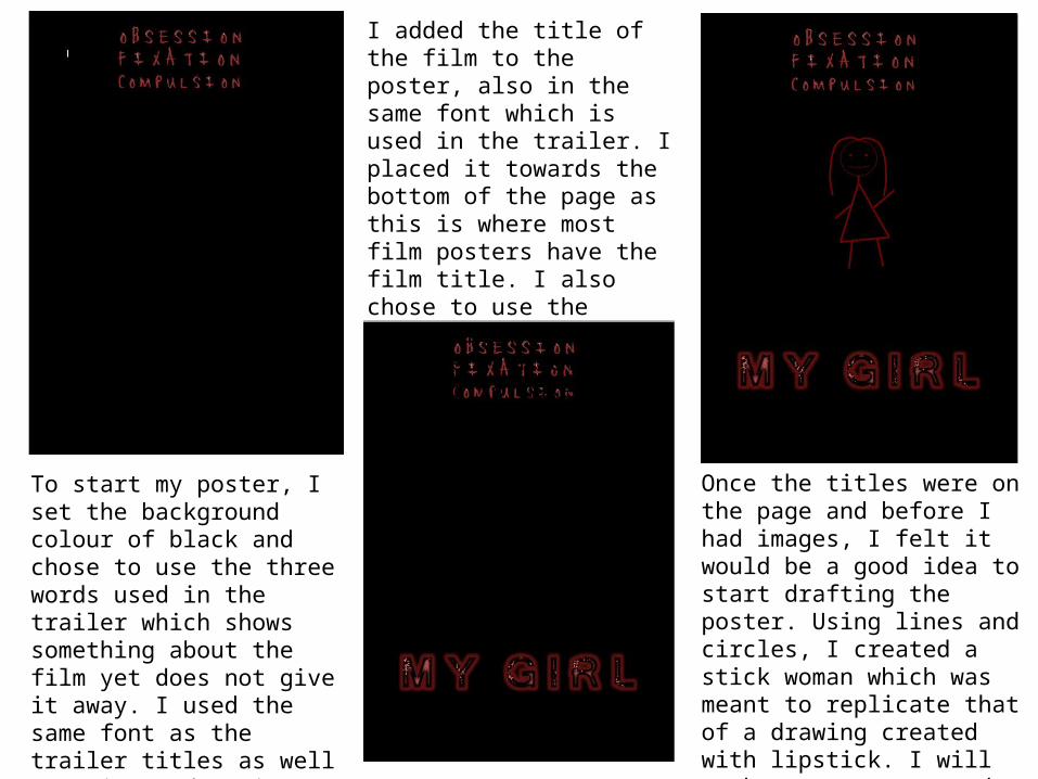
To start my poster, I set the background colour of black and chose to use the three words used in the trailer which shows something about the film yet does not give it away. I used the same font as the trailer titles as well as using red as it symbolises blood/danger/passion etc..
I added the title of the film to the poster, also in the same font which is used in the trailer. I placed it towards the bottom of the page as this is where most film posters have the film title. I also chose to use the colour red. I placed an effect on the writing to make it look different.
Once the titles were on the page and before I had images, I felt it would be a good idea to start drafting the poster. Using lines and circles, I created a stick woman which was meant to replicate that of a drawing created with lipstick. I will work my poster around an image in the centre of the page.
I changed the size of the stick woman in order to gage an average size of where any potential image would go if I used one. I was able to see if the titles worked in their positions as well as their sizes. I felt they were in appropriate positions so continued with this layout.
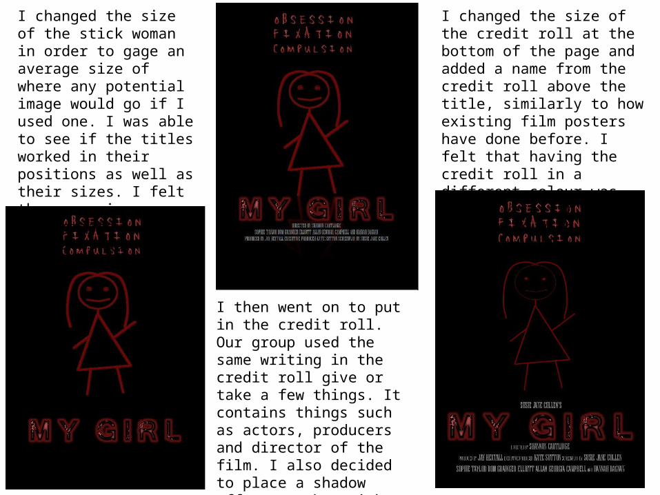
I then went on to put in the credit roll. Our group used the same writing in the credit roll give or take a few things. It contains things such as actors, producers and director of the film. I also decided to place a shadow effect on the stick woman to make it look more effective, mirroring the image beneath.
I changed the size of the credit roll at the bottom of the page and added a name from the credit roll above the title, similarly to how existing film posters have done before. I felt that having the credit roll in a different colour was effective as it does not mix in with the other red things on the page.
I went on to add the production company logos to the bottom of the page. We already had ‘graz productions.’ and I felt I needed more than one production name, therefore me and a group member came up with Ka$h Karton, a mixture of our names, and another group member made Hexagon.
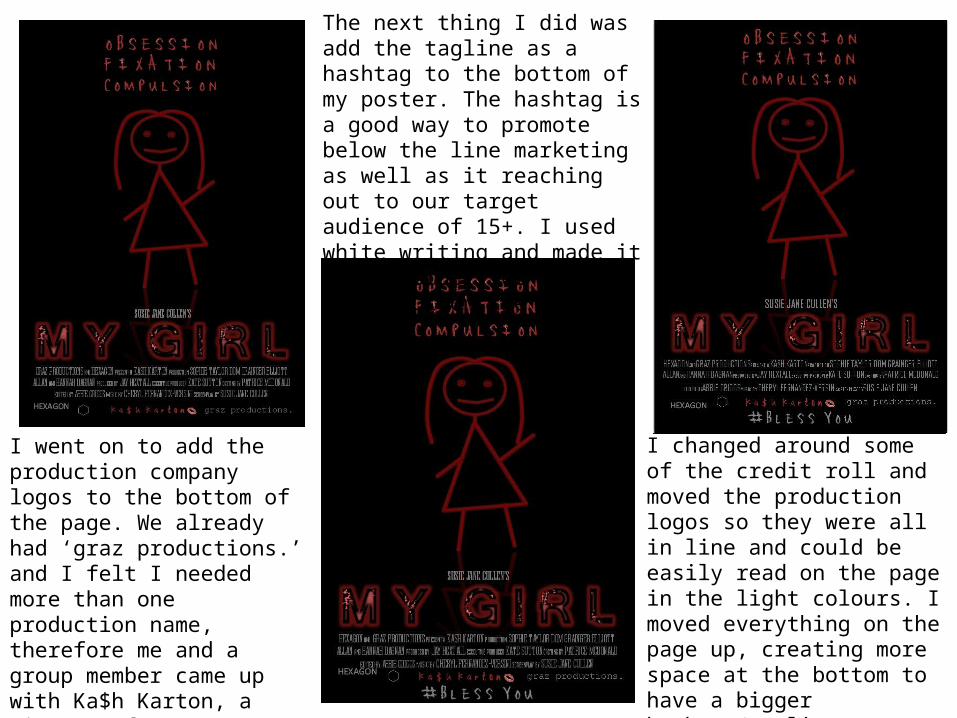
The next thing I did was add the tagline as a hashtag to the bottom of my poster. The hashtag is a good way to promote below the line marketing as well as it reaching out to our target audience of 15+. I used white writing and made it big in order for it to stand out on the page.
I changed around some of the credit roll and moved the production logos so they were all in line and could be easily read on the page in the light colours. I moved everything on the page up, creating more space at the bottom to have a bigger hashtag/tagline.
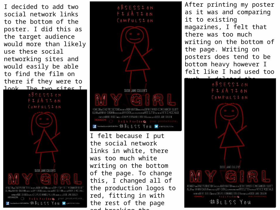
I decided to add two social network links to the bottom of the poster. I did this as the target audience would more than likely use these social networking sites and would easily be able to find the film on there if they were to look. The two sites I used were Facebook and Twitter, including their logos too.
I felt because I put the social network links in white, there was too much white writing on the bottom of the page. To change this, I changed all of the production logos to red, fitting in with the rest of the page and breaking the writing up slightly, making it easier on the eyes.
After printing my poster as it was and comparing it to existing magazines, I felt that there was too much writing on the bottom of the page. Writing on posters does tend to be bottom heavy however I felt like I had used too much. I deleted the social network links as I still have the hashtag which is linked to Twitter.
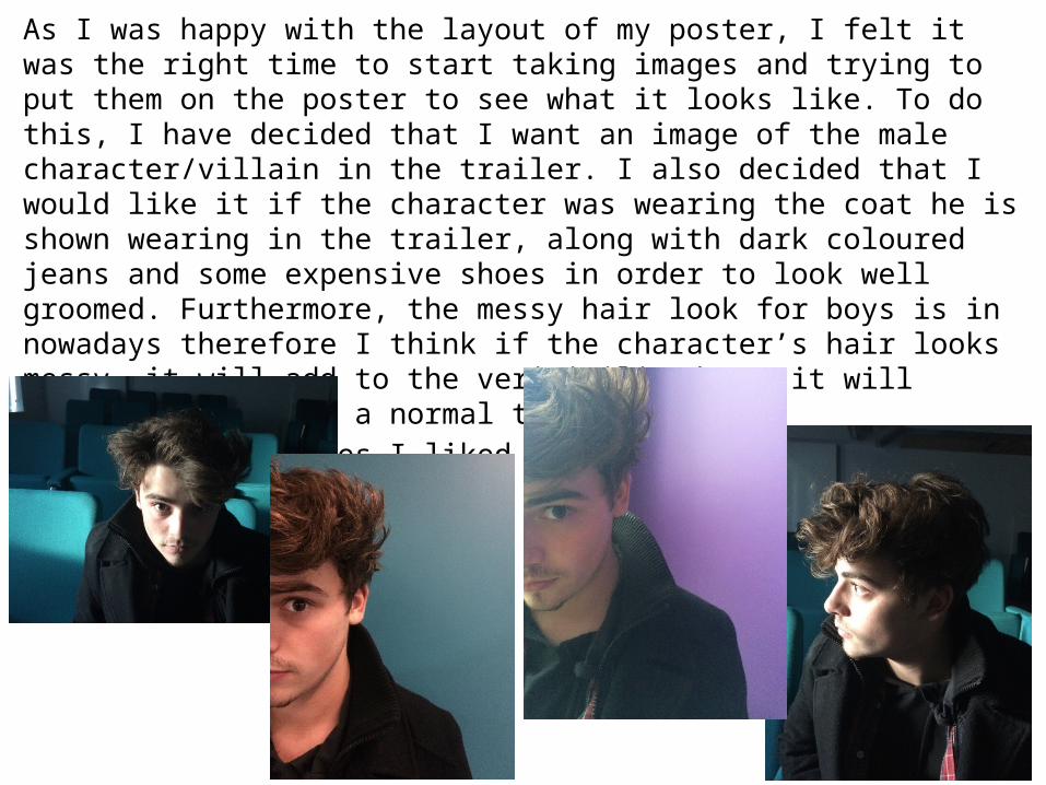
As I was happy with the layout of my poster, I felt it was the right time to start taking images and trying to put them on the poster to see what it looks like. To do this, I have decided that I want an image of the male character/villain in the trailer. I also decided that I would like it if the character was wearing the coat he is shown wearing in the trailer, along with dark coloured jeans and some expensive shoes in order to look well groomed. Furthermore, the messy hair look for boys is in nowadays therefore I think if the character’s hair looks messy, it will add to the verisimilitude as it will portray that he is a normal teenage boy.
Below are the images I liked the best out of the various images I shot.
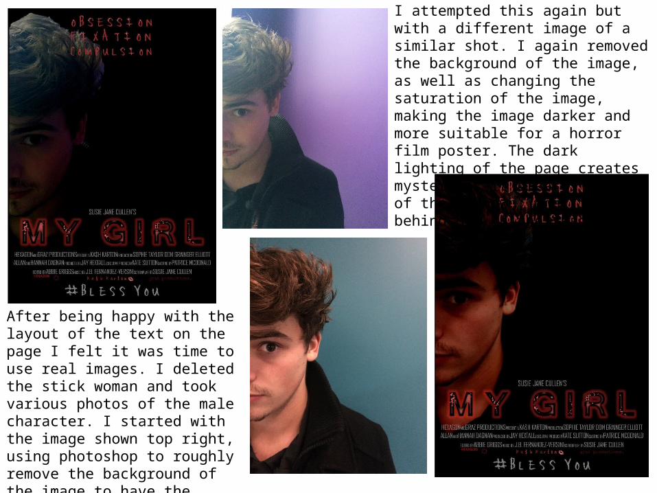
After being happy with the layout of the text on the page I felt it was time to use real images. I deleted the stick woman and took various photos of the male character. I started with the image shown top right, using photoshop to roughly remove the background of the image to have the character alone. I felt this looked too amateur.
I attempted this again but with a different image of a similar shot. I again removed the background of the image, as well as changing the saturation of the image, making the image darker and more suitable for a horror film poster. The dark lighting of the page creates mystery as it creates a fear of the unknown; what is behind him in the shadows?
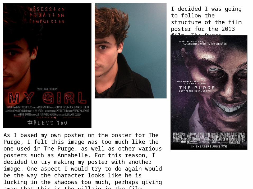
I decided I was going to follow the structure of the film poster for the 2013 film, The Purge, poster pictured below.
As I based my own poster on the poster for The Purge, I felt this image was too much like the one used in The Purge, as well as other various posters such as Annabelle. For this reason, I decided to try making my poster with another image. One aspect I would try to do again would be the way the character looks like he is lurking in the shadows too much, perhaps giving away that this is the villain in the film. Furthermore, some of the writing overlaps him too much and is unclear when printed.
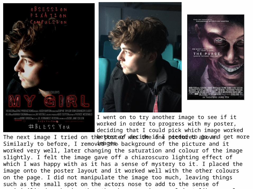
The next image I tried on the poster was the one pictured above. Similarly to before, I removed the background of the picture and it worked very well, later changing the saturation and colour of the image slightly. I felt the image gave off a chiaroscuro lighting effect of which I was happy with as it has a sense of mystery to it. I placed the image onto the poster layout and it worked well with the other colours on the page. I did not manipulate the image too much, leaving things such as the small spot on the actors nose to add to the sense of verisimilitude, showing that the character is normal just like normal teenagers. This is ironic when you watch the trailer and realise he is the villain, and is not in fact ‘normal’ in any way.
I went on to try another image to see if it worked in order to progress with my poster, deciding that I could pick which image worked better of decide if I needed to go and get more images.
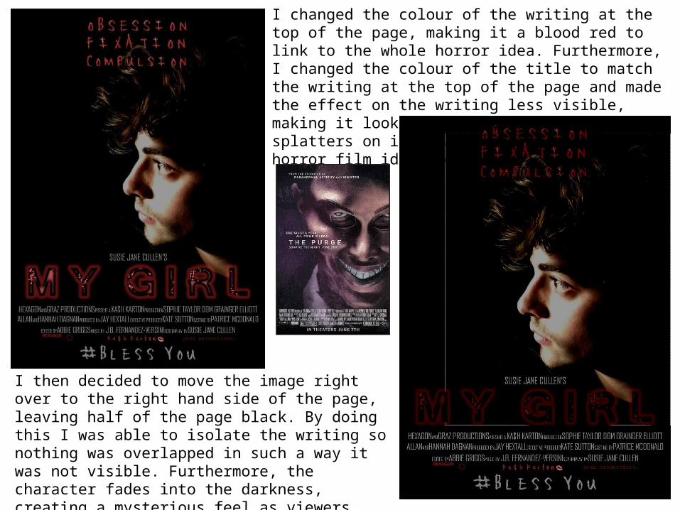
I then decided to move the image right over to the right hand side of the page, leaving half of the page black. By doing this I was able to isolate the writing so nothing was overlapped in such a way it was not visible. Furthermore, the character fades into the darkness, creating a mysterious feel as viewers question what is in the dark which surrounds him.
I changed the colour of the writing at the top of the page, making it a blood red to link to the whole horror idea. Furthermore, I changed the colour of the title to match the writing at the top of the page and made the effect on the writing less visible, making it look slightly more like blood splatters on it, again linking to the horror film idea (being gory).
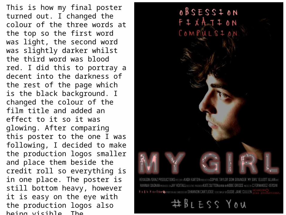
This is how my final poster turned out. I changed the colour of the three words at the top so the first word was light, the second word was slightly darker whilst the third word was blood red. I did this to portray a decent into the darkness of the rest of the page which is the black background. I changed the colour of the film title and added an effect to it so it was glowing. After comparing this poster to the one I was following, I decided to make the production logos smaller and place them beside the credit roll so everything is in one place. The poster is still bottom heavy, however it is easy on the eye with the production logos also being visible. The tagline/hashtag has its own space at the bottom of the page so it can be easily read. The image looks effective and overall the poster does not give too much away about the film.
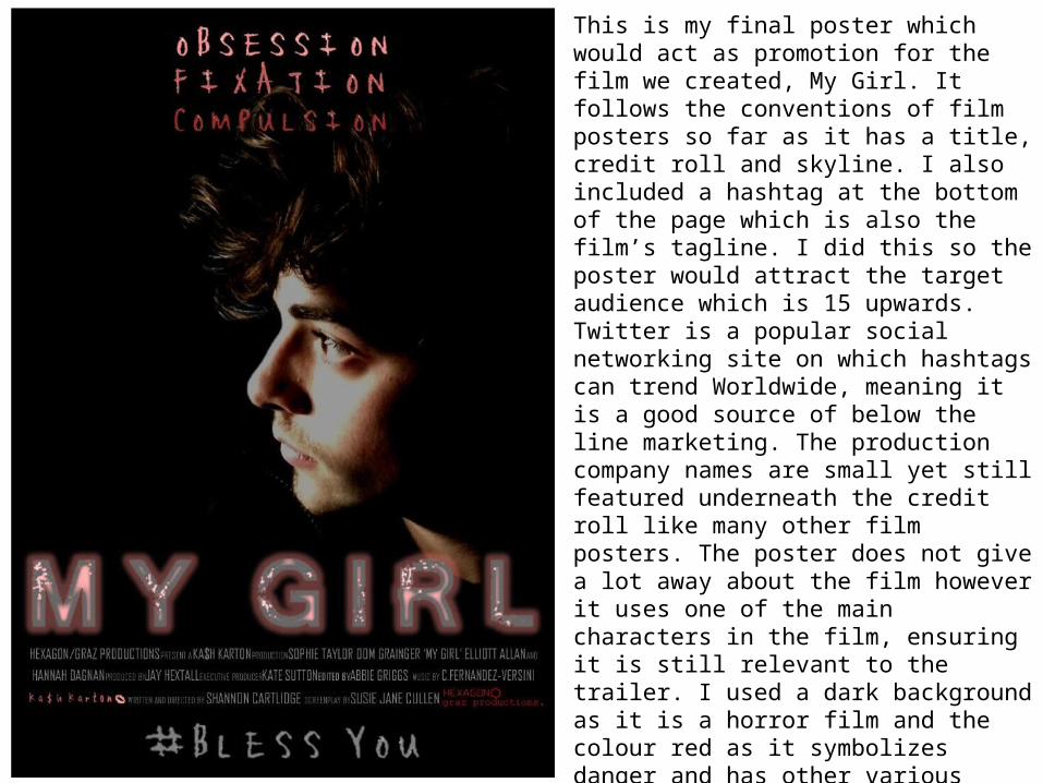
This is my final poster which would act as promotion for the film we created, My Girl. It follows the conventions of film posters so far as it has a title, credit roll and skyline. I also included a hashtag at the bottom of the page which is also the film’s tagline. I did this so the poster would attract the target audience which is 15 upwards. Twitter is a popular social networking site on which hashtags can trend Worldwide, meaning it is a good source of below the line marketing. The production company names are small yet still featured underneath the credit roll like many other film posters. The poster does not give a lot away about the film however it uses one of the main characters in the film, ensuring it is still relevant to the trailer. I used a dark background as it is a horror film and the colour red as it symbolizes danger and has other various connotations (blood etc..). The chiaroscuro lighting shows only one side of the characters face, with his other side being in the dark, portraying maybe he is dark himself, as well as showing a sense of mystery about him. Who is he? What role does he play in the film?