powerpoint design issues planning the right presentation for the right environment check the...
TRANSCRIPT

POWERPOINT DESIGN ISSUES

Planning the right presentation for the right environment
• Check the following: • Room size• Light sources• Electrical sockets, electrical extension
cables• Podium• Projector and screen• Microphone and amplifier• Computer speakers• Cordless Presenter

Physical issues leading to a successful presentation
• The seating can be set up to ensure clear sight-lines for the attendees

Design Considerations
•The environment in which the presentation will be delivered can impact design, color, text, and sound.
•Slides using a dark colored background with light colored text or black lettering on a light background are both very effective for audience readability.
•A serif font, such as Times New Roman, will make the text easier to read, however, a modern sans serif font, such as Arial, is also excellent for legibility.

Matching the presentation to the audience
– Determining the attendees’ level of knowledge of the subject:
• Basic - keep the presentation simple and concise. Define any specifically related terms.
• Moderate – presentation can contain more detail, specific terms and abbreviations where applicable.
• Expert – can contain in-depth information, jargon, and specific terms.

Pictures are worth a thousand words
• The majority of people are visual, rather than auditory, that is, they retain visual images in their memory often more easily than the spoken word.

Color issues within a presentation
• Certain colors, or a collection of colors, can elicit different emotional responses from individuals

Using a storyboard and time-line
• Planning a presentation using a “storyboard” and a “time-line” will provide the opportunity to focus on the key points, with the use of images and text to “tell the story”.

Slide Structure – Good
• Use 1-2 slides per minute of your presentation
• Write in point form, not complete sentences
• Include 4-5 points per slide• Avoid wordiness: use key words
and phrases only

Slide Structure - Bad
• This page contains too many words for a presentation slide. It is not written in point form, making it difficult both for your audience to read and for you to present each point. Although there are exactly the same number of points on this slide as the previous slide, it looks much more complicated. In short, your audience will spend too much time trying to read this paragraph instead of listening to you.

Slide Structure – Good
• Show one point at a time:– Will help audience concentrate on
what you are saying– Will prevent audience from reading
ahead– Will help you keep your
presentation focused

Slide Structure - Bad
• Do not use distracting animation
• Do not go overboard with the animation
• Be consistent with the animation that you use

Fonts - Good
• Use at least an 18-point font• Use different size fonts for main
points and secondary points– this font is 24-point, the main point
font is 28-point, and the title font is 36-point
• Use a standard font like Times New Roman or Arial

Fonts - Bad• If you use a small font, your audience won’t be able to read what you have
written
• CAPITALIZE ONLY WHEN NECESSARY. IT IS DIFFICULT TO READ
• Don’t use a complicated font
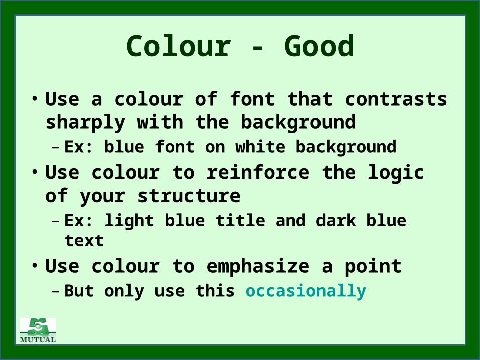
Colour - Good
• Use a colour of font that contrasts sharply with the background– Ex: blue font on white background
• Use colour to reinforce the logic of your structure– Ex: light blue title and dark blue text
• Use colour to emphasize a point– But only use this occasionally

Colour - Bad
• Using a font colour that does not contrast with the background colour is hard to read
• Using colour for decoration is distracting and annoying.
• Using a different colour for each point is unnecessary– Using a different colour for secondary
points is also unnecessary• Trying to be creative can also be
bad

Background - Good
• Use backgrounds such as this one that are attractive but simple
• Use backgrounds which are light
• Use the same background consistently throughout your presentation

Background – Bad
• Avoid backgrounds that are distracting or difficult to read from
• Always be consistent with the background that you use

Graphs - Good
• Use graphs rather than just charts and words– Data in graphs is easier to
comprehend & retain than is raw data
– Trends are easier to visualize in graph form
• Always title your graphs
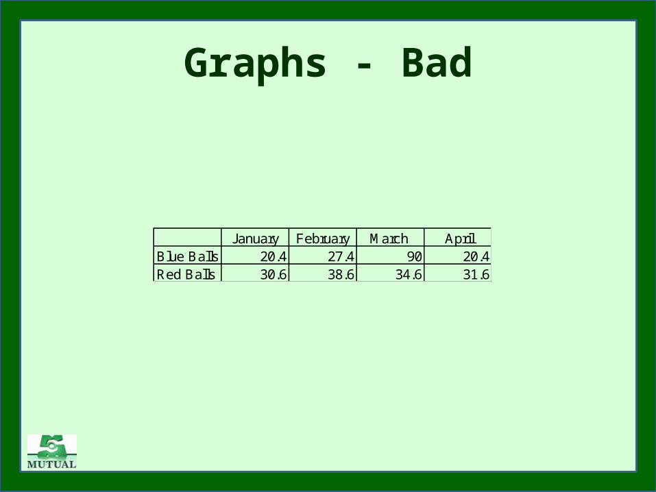
Graphs - Bad
January February March AprilBlue Balls 20.4 27.4 90 20.4Red Balls 30.6 38.6 34.6 31.6

Graphs - Good
Items Sold in First Quarter of 2002
0
10
20
30
40
50
60
70
80
90
100
January February March April
Blue Balls
Red Balls

Graphs - Bad
20.4
27.4
90
20.4
30.6
38.6
34.631.6
0
10
20
30
40
50
60
70
80
90
100
January February March April
Blue Balls
Red Balls

Graphs - Bad
• Minor gridlines are unnecessary• Font is too small• Colours are illogical• Title is missing• Shading is distracting

Spelling and Grammar
• Proof your slides for:– speling mistakes– the use of of repeated words– grammatical errors you might have
make
• If English is not your first language, please have someone else check your presentation!
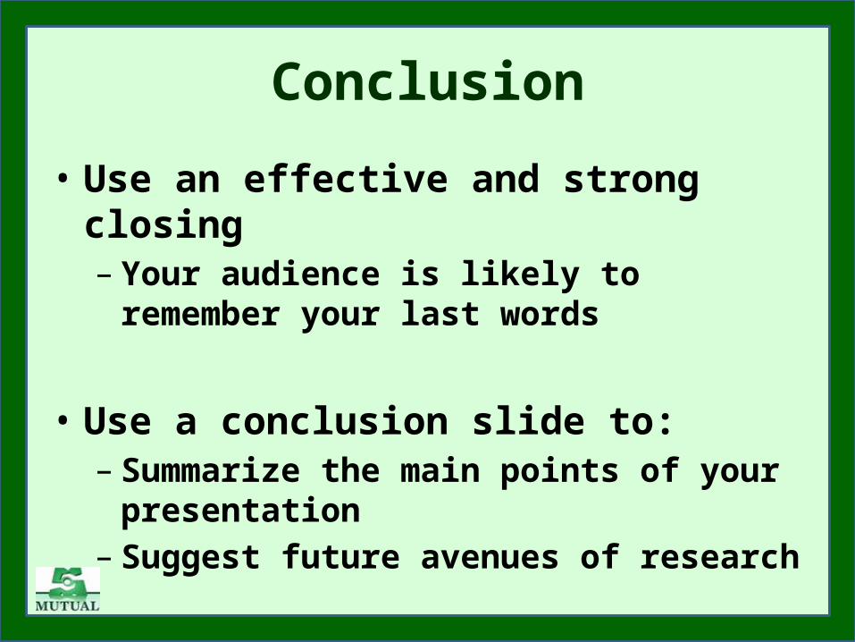
Conclusion
• Use an effective and strong closing– Your audience is likely to remember
your last words
• Use a conclusion slide to:– Summarize the main points of your
presentation– Suggest future avenues of research

Questions??
• End your presentation with a simple question slide to:– Invite your audience to ask
questions– Provide a visual aid during question
period– Avoid ending a presentation
abruptly