presntation final
TRANSCRIPT
AS MEDIA STUDIESEVALUATION
Hannah Hogan
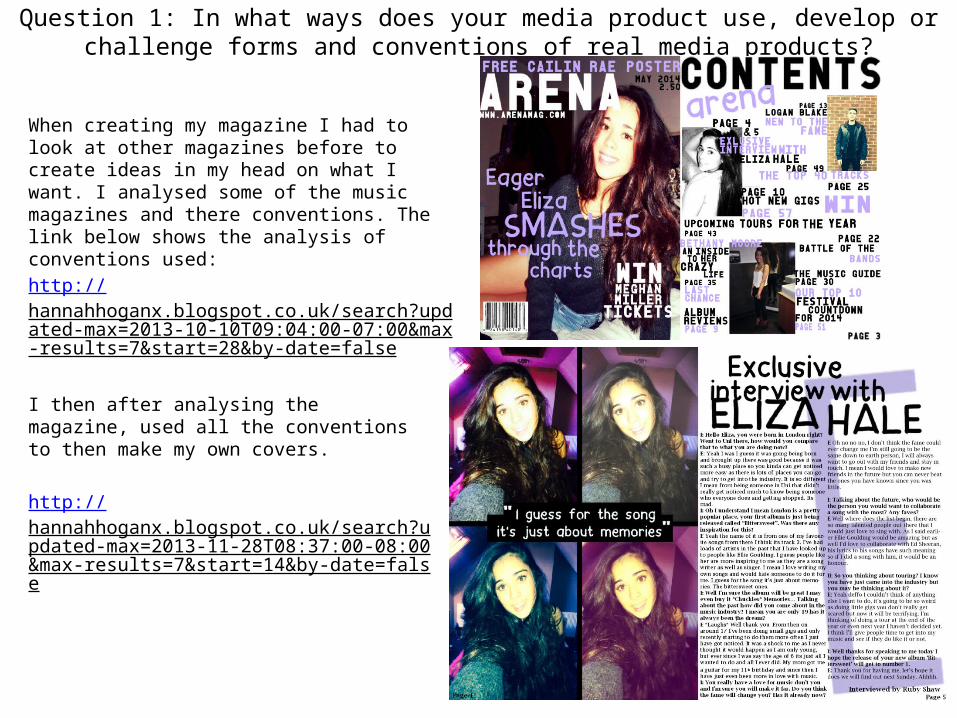
When creating my magazine I had to look at other magazines before to create ideas in my head on what I want. I analysed some of the music magazines and there conventions. The link below shows the analysis of conventions used:
http://hannahhoganx.blogspot.co.uk/search?updated-max=2013-10-10T09:04:00-07:00&max-results=7&start=28&by-date=false
I then after analysing the magazine, used all the conventions to then make my own covers.
http://hannahhoganx.blogspot.co.uk/search?updated-max=2013-11-28T08:37:00-08:00&max-results=7&start=14&by-date=false
Question 1: In what ways does your media product use, develop or challenge forms and conventions of real media products?
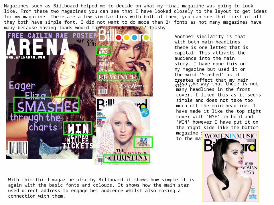
Magazines such as Billboard helped me to decide on what my final magazine was going to look like. From these two magazines you can see that I have looked closely to the layout to get ideas for my magazine. There are a few similarities with both of them, you can see that first of all they both have simple font. I did not want to do more than 2+ fonts as not many magazines have many because having loads would make it look messy / trashy.
Another similarity is that with both main headlines there is one letter that is capital. This attracts the audience into the main story. I have done this on my magazine but used it on the word 'Smashed' as it creates effect that my main star is.
Also the way that there is not many headlines in the front cover, I liked this as it seems simple and does not take too much off the main headline. I have made it like the top right cover with 'NYE' in bold and 'WIN' however I have put it on the right side like the bottom magazine so it is not too near to the main headline.
With this third magazine also by Billboard it shows how simple it is again with the basic fonts and colours. It shows how the main star used direct address to engage her audience whilst also making a connection with them.
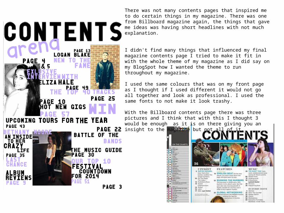
There was not many contents pages that inspired me to do certain things in my magazine. There was one from Billboard magazine again, the things that gave me ideas was having short headlines with not much explanation.
I didn't find many things that influenced my final magazine contents page I tried to make it fit in with the whole theme of my magazine as I did say on my BlogSpot how I wanted the theme to run throughout my magazine.
I used the same colours that was on my front page as I thought if I used different it would not go all together and look as professional. I used the same fonts to not make it look trashy.
With the Billboard contents page there was three pictures and I think that with this I thought 3 would be enough as it is on there giving you an insight to the magazine but not all of it.
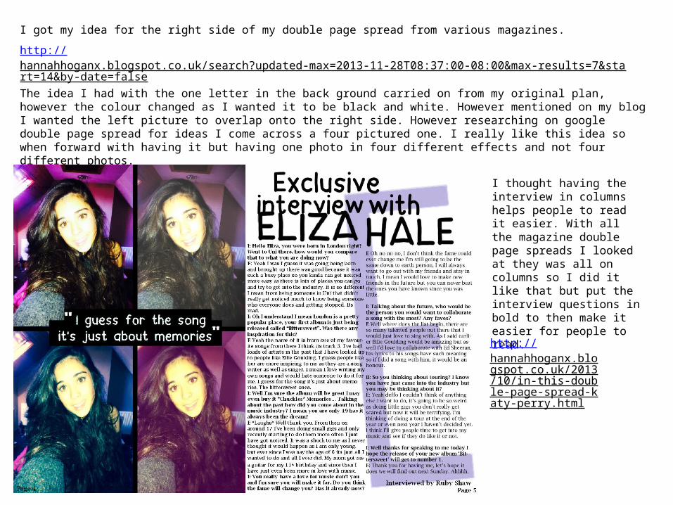
I got my idea for the right side of my double page spread from various magazines.
http://hannahhoganx.blogspot.co.uk/search?updated-max=2013-11-28T08:37:00-08:00&max-results=7&start=14&by-date=false The idea I had with the one letter in the back ground carried on from my original plan, however the colour changed as I wanted it to be black and white. However mentioned on my blog I wanted the left picture to overlap onto the right side. However researching on google double page spread for ideas I come across a four pictured one. I really like this idea so when forward with having it but having one photo in four different effects and not four different photos.
I thought having the interview in columns helps people to read it easier. With all the magazine double page spreads I looked at they was all on columns so I did it like that but put the interview questions in bold to then make it easier for people to read.
http://hannahhoganx.blogspot.co.uk/2013/10/in-this-double-page-spread-katy-perry.html
Question 2: How does your media product represent particular social groups?
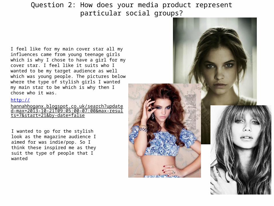
I feel like for my main cover star all my influences came from young teenage girls which is why I chose to have a girl for my cover star. I feel like it suits who I wanted to be my target audience as well which was young people. The pictures below where the type of stylish girls I wanted my main star to be which is why then I chose who it was.
http://hannahhoganx.blogspot.co.uk/search?updated-max=2013-10-21T09:05:00-07:00&max-results=7&start=21&by-date=false
I wanted to go for the stylish look as the magazine audience I aimed for was indie/pop. So I think these inspired me as they suit the type of people that I wanted
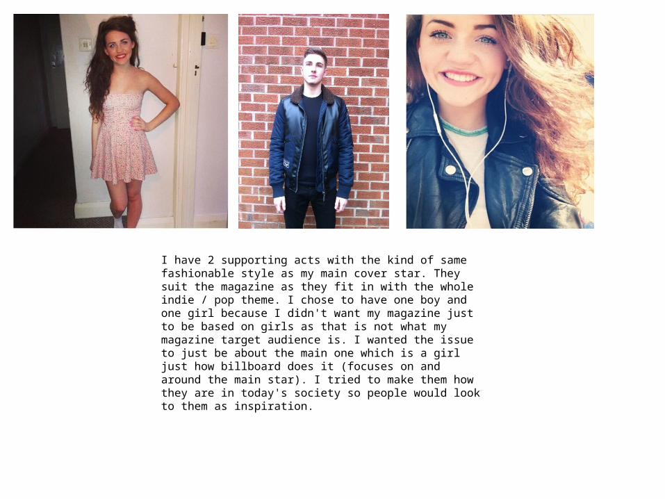
I have 2 supporting acts with the kind of same fashionable style as my main cover star. They suit the magazine as they fit in with the whole indie / pop theme. I chose to have one boy and one girl because I didn't want my magazine just to be based on girls as that is not what my magazine target audience is. I wanted the issue to just be about the main one which is a girl just how billboard does it (focuses on and around the main star). I tried to make them how they are in today's society so people would look to them as inspiration.
Question 3: What kind of media institution might distribute your media product and why?
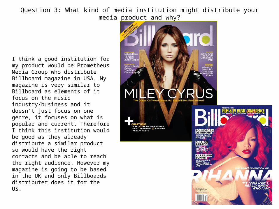
I think a good institution for my product would be Prometheus Media Group who distribute Billboard magazine in USA. My magazine is very similar to Billboard as elements of it focus on the music industry/business and it doesn’t just focus on one genre, it focuses on what is popular and current. Therefore I think this institution would be good as they already distribute a similar product so would have the right contacts and be able to reach the right audience. However my magazine is going to be based in the UK and only Billboards distributer does it for the US.
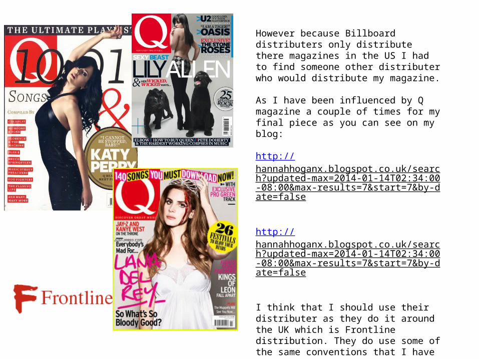
However because Billboard distributers only distribute there magazines in the US I had to find someone other distributer who would distribute my magazine.
As I have been influenced by Q magazine a couple of times for my final piece as you can see on my blog:
http://hannahhoganx.blogspot.co.uk/search?updated-max=2014-01-14T02:34:00-08:00&max-results=7&start=7&by-date=false
http://hannahhoganx.blogspot.co.uk/search?updated-max=2014-01-14T02:34:00-08:00&max-results=7&start=7&by-date=false
I think that I should use their distributer as they do it around the UK which is Frontline distribution. They do use some of the same conventions that I have used in my magazine so I feel like I can relate.
Question 4: Who would be the audience for your media product?
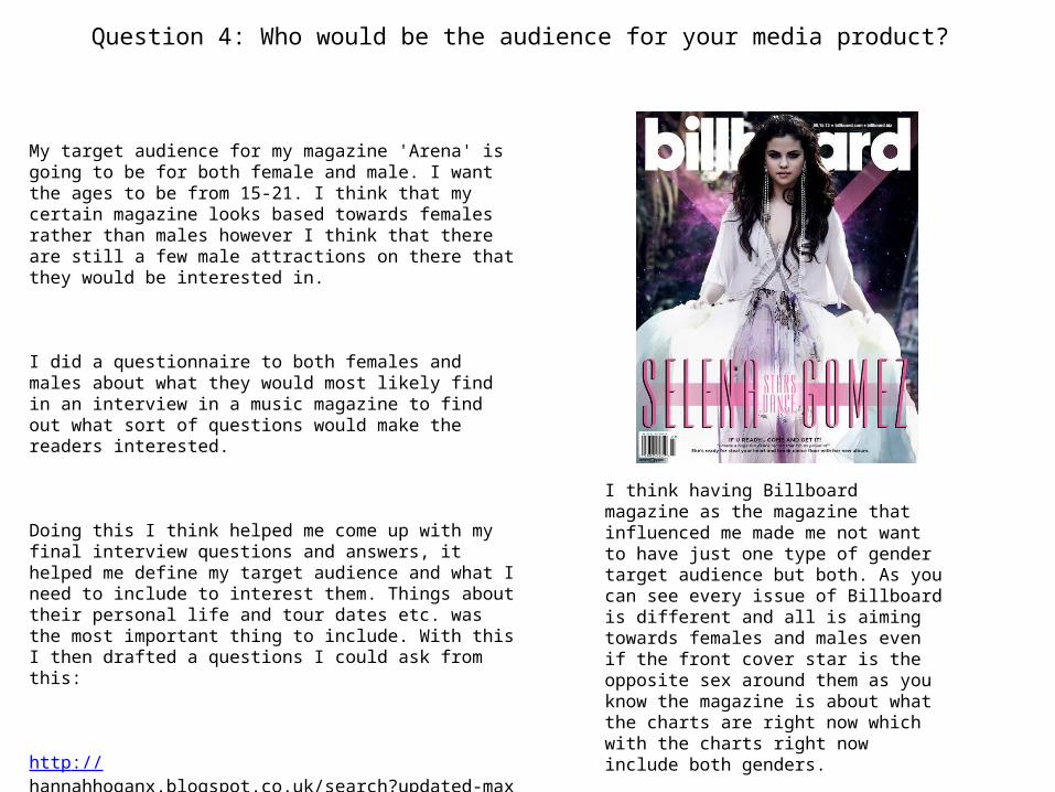
My target audience for my magazine 'Arena' is going to be for both female and male. I want the ages to be from 15-21. I think that my certain magazine looks based towards females rather than males however I think that there are still a few male attractions on there that they would be interested in.
I did a questionnaire to both females and males about what they would most likely find in an interview in a music magazine to find out what sort of questions would make the readers interested.
Doing this I think helped me come up with my final interview questions and answers, it helped me define my target audience and what I need to include to interest them. Things about their personal life and tour dates etc. was the most important thing to include. With this I then drafted a questions I could ask from this:
http://hannahhoganx.blogspot.co.uk/search?updated-max=2014-01-17T04:12:00-08:00&max-results=7&start=7&by-date=false
I think having Billboard magazine as the magazine that influenced me made me not want to have just one type of gender target audience but both. As you can see every issue of Billboard is different and all is aiming towards females and males even if the front cover star is the opposite sex around them as you know the magazine is about what the charts are right now which with the charts right now include both genders.
Question 5: How did you attract or address your audience?
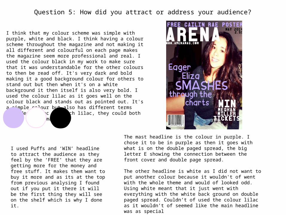
I think that my colour scheme was simple with purple, white and black. I think having a colour scheme throughout the magazine and not making it all different and colourful on each page makes the magazine seem more professional and real. I used the colour black in my work to make sure that it was understandable for the other colours to then be read off. It's very dark and bold making it a good background colour for others to stand out but then when it's on a white background it then itself is also very bold. I used the colour lilac as it goes well on the colour black and stands out as pointed out. It's a simple colour but also has different terms like deep lilac and rich lilac, they could both relate to the magazine.
The mast headline is the colour in purple. I chose it to be in purple as then it goes with what is on the double paged spread, the big letter E showing the connection between the front cover and double page spread.
The other headline is white as I did not want to put another colour because it wouldn't of went with the whole theme and would of looked odd. Using white meant that it just went with everything with the white back ground on double paged spread. Couldn’t of used the colour lilac as it wouldn’t of seemed like the main headline was as special
I used Puffs and ‘WIN’ headline to attract the audience as they feel by the ‘FREE’ that they are getting more for the money and free stuff. It makes them want to buy it more and as its at the top from previous analysing I found out if you put it there it will be the first thing they will see on the shelf which is why I done it.
Question 6: What have you learnt about technologies from the process of constructing the product?
The strengths of each programme:
Paint. Net-Was easy to follow.-You can cut out background of the image easy.-You can add things such as shapes and texts etc.
Microsoft Publisher-You can organise everything into places and easily put things behind each other ‘send to back’-You can use a range of texts such as Word art.-Spell check is on there.
PagePlus-There are templates you can use to show you where to put certain things.-Good cropping tools that let you cut out the background.-There are a range of different effects that you can use like blur.
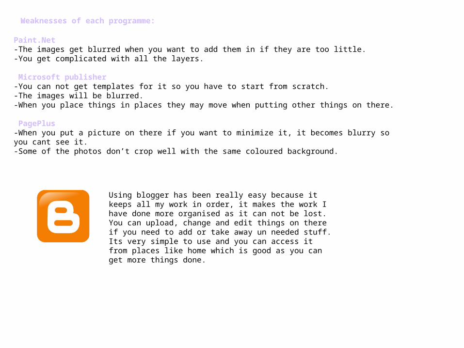
Weaknesses of each programme:
Paint.Net-The images get blurred when you want to add them in if they are too little.-You get complicated with all the layers.
Microsoft publisher-You can not get templates for it so you have to start from scratch.-The images will be blurred.-When you place things in places they may move when putting other things on there.
PagePlus-When you put a picture on there if you want to minimize it, it becomes blurry so you cant see it.-Some of the photos don’t crop well with the same coloured background.
Using blogger has been really easy because it keeps all my work in order, it makes the work I have done more organised as it can not be lost. You can upload, change and edit things on there if you need to add or take away un needed stuff. Its very simple to use and you can access it from places like home which is good as you can get more things done.
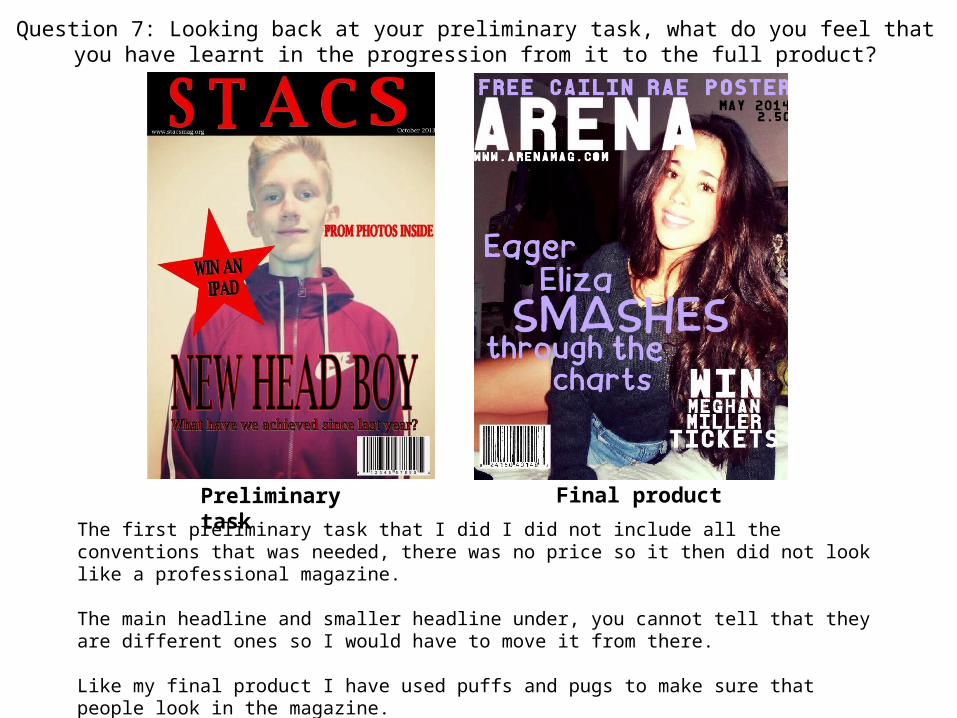
Question 7: Looking back at your preliminary task, what do you feel that you have learnt in the progression from it to the full product?
The first preliminary task that I did I did not include all the conventions that was needed, there was no price so it then did not look like a professional magazine.
The main headline and smaller headline under, you cannot tell that they are different ones so I would have to move it from there.
Like my final product I have used puffs and pugs to make sure that people look in the magazine.
Preliminary task Final product
Preliminary task Final product
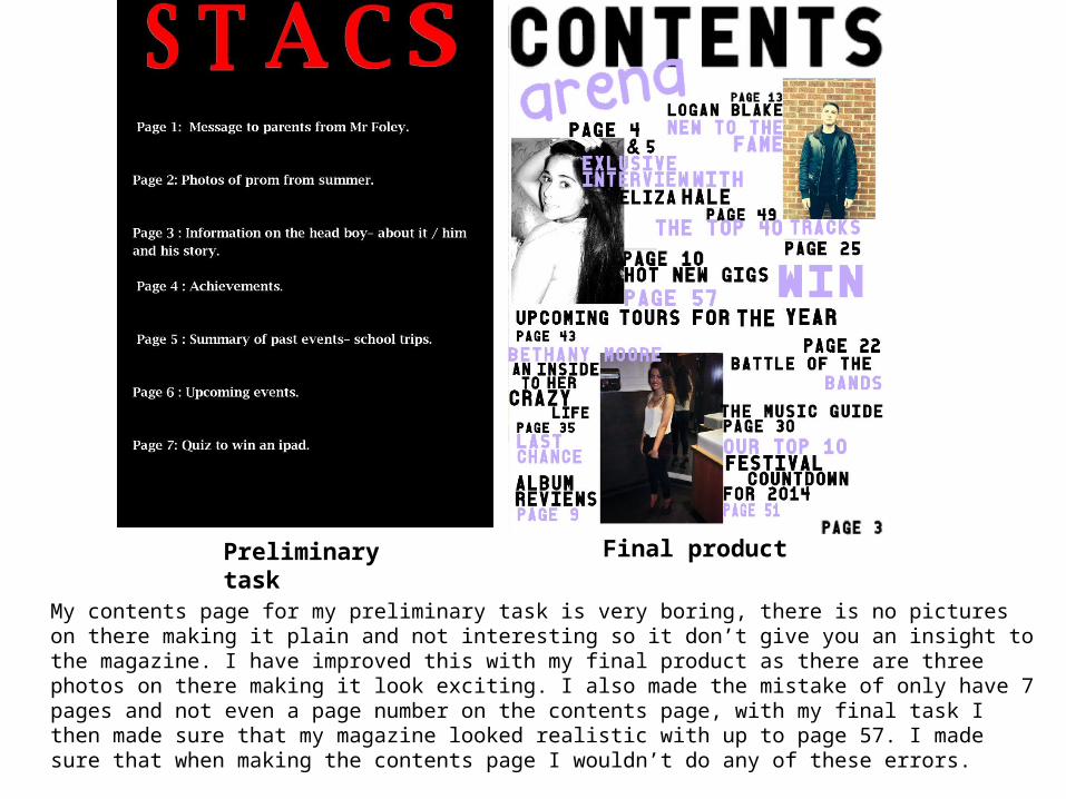
My contents page for my preliminary task is very boring, there is no pictures on there making it plain and not interesting so it don’t give you an insight to the magazine. I have improved this with my final product as there are three photos on there making it look exciting. I also made the mistake of only have 7 pages and not even a page number on the contents page, with my final task I then made sure that my magazine looked realistic with up to page 57. I made sure that when making the contents page I wouldn’t do any of these errors.
Question 8: How successful do you feel your end product is in fulfilling the task? How well does it fit the brief?
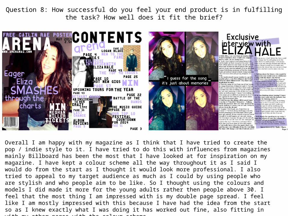
Overall I am happy with my magazine as I think that I have tried to create the pop / indie style to it. I have tried to do this with influences from magazines mainly Billboard has been the most that I have looked at for inspiration on my magazine. I have kept a colour scheme all the way throughout it as I said I would do from the start as I thought it would look more professional. I also tried to appeal to my target audience as much as I could by using people who are stylish and who people aim to be like. So I thought using the colours and models I did made it more for the young adults rather then people above 30. I feel that the most thing I am impressed with is my double page spread. I feel like I am mostly impressed with this because I have had the idea from the start so as I knew exactly what I was doing it has worked out fine, also fitting in with my other pages with the colour scheme.