primer on statistical analysisplaza.ufl.edu/cpiette/general/prob2.pdf · primer on statistical...
TRANSCRIPT

Primer on Statistical Analysis (Level 2)
Table of Contents
1. Introduction ..……………………………………….. 3 2. Nonparametric Statistics .…………………………… 3 2.1 Sign Test for Median 2.2 Wilcoxon Rank Sum Test 2.3 Wilcoxon Signed Rank Test 2.4 Kruskal-Wallis H-Test 3. Basics of Design of Experiments ..………………….. 8 4. Analysis of Variance .……………………………….. 9 4.1 One-Way Classification 4.2 Pairwise Comparison of Means (with Extrapolation Example) 4.3 Two-Way Classification 4.4 Two-Way with Replications 4.5 Latin Square 4.6 Failure of Assumptions 5. Categorical Data ..………………………………….. 24 5.1 One-Way Tables 5.2 Two-Way Tables 6. Linear Regression .....……………………………….. 29 6.1 The Basics 6.2 Least Squares 6.3 Statistical Significance 6.4 Prediction 6.5 Assumptions 6.6 Failure of Assumptions 6.7 Nonlinear “Linear” Regression 6.8 Multiple Linear Regression

Stat Primer 2-3
1. Introduction Level 1 of this statistics primer reviewed many of the basic concepts covered in any college level statistics course. Hopefully, if this primer accomplished its purpose, the topics were easier to understand than having to read them in a book. Having a firm grasp of the basic terms and procedures in Level 1 is essential for any type of analysis. Granted, the material itself is a little dry and theoretical, but those concepts form the building blocks of the more practical statistics that will be covered in the remainder of the primer. Using confidence intervals is fine for answering simple questions without dedicating a lot of resources. In the real world, however, few things are ever simple. The hypothesis tests discussed in Level 1 are also simple techniques, but they are more general and will arise over and over again in advanced statistical procedures. Some of those procedures discussed in Level 2 include nonparametric statistics, analysis of variance, categorical data, and regression. Most software packages (including spreadsheets) can perform many of these techniques. As with Level 1, this primer is intended for your reference. Don’t try to memorize this stuff… people will think you’re weird if you do.
2. Nonparametric Statistics An unfortunate drawback of many of the procedures from Level 1 is the assumption that the random variable of interest comes from a normal population. In many cases, the normality assumption is either invalid (not enough data points) or incorrect (data comes from a different distribution). In other situations, the data may not be measurable, quantitative results. In such instances, as long as the data can be ranked in some order, the analyst can use statistical tests that don’t rely on any assumptions about the underlying distribution. Such tests are logically called distribution-free tests. They make fewer assumptions than the tests discussed in Level 1 so they are not as powerful, but they are more applicable. Nonparametric statistics is a branch of inferential statistics devoted to distribution free tests. This section will cover a few common nonparametric techniques. If these techniques are not suitable, consult a statistics book for other tests. 2.1 Sign Test for Median The simplest of nonparametric tests, the sign test, is specifically designed for testing hypotheses about the median of any continuous population. The test is based on taking the difference between each observation and the desired median, Mo. Two special values are defined to account for the differences: S+ is equal to the number of positive differences (i.e., observations greater than Mo) and S- is equal to the number of negative differences (i.e., observations less than Mo). Note that nothing is done about observations that are equal to Mo. Under the null hypothesis, S+ and S- come from a binomial distribution with parameters p = 0.5 and n = S+ + S-. The following summarizes the test:

Stat Primer 2-4
Ho Ha Test Statistic Rejection Region
M ≥ Mo M < Mo S = S- p-value = P[Bin(n,0.5) ≥ S] < α M ≤ Mo M > Mo S = S+ p-value = P[Bin(n,0.5) ≥ S] < α M = Mo M ≠ Mo S = max(S+,S-) p-value = P[Bin(n,0.5) ≥ S] < α/2
For large samples (n ≥ 25), the sign test is simplified by taking advantage of the fact that the binomial distribution can be approximated by a normal. For such cases, the test statistic is
zS E S
V S
S n
n
S n
n=
−=
−=
−( )
)
.
( . )( . )
.
.(
05
05 05
05
05
The rejection region is z > zα for one-tailed tests and z > zα/2 for two-tailed tests. This approximation is especially handy when binomial tables (like Table 2 of Appendix A) are not available. The sign test can also be used to test two paired populations by using the median of the difference between the observations. In other words, the null hypothesis will be something like Ho: M(X - Y) = Mo (where M(X - Y) is the median of the difference of two random variables). Note if Mo = 0, the test is equivalent to Ho: X ~ Y (i.e., X and Y come from the same distribution). Example. The F-31 (Section 4.3 in Level 1) is undergoing bomb range tests. Because of the tight budget, only 10 flights were performed. For each mission, the number of bombs required to penetrate a hardened bunker were: 3.5, 2.5, 3.75, 6.0, 2.5, 4.0, 5.0, 3.25, 7.0, 5.0 (units are 2,000 pound bomb equivalents). As the lead analyst on the range, you are asked to determine if 4 bombs will be sufficient for real bombing missions. Since you do not want to assume normality and 10 data points are insufficient to invoke the Central Limit Theorem, you perform the sign test as follows: Ho: M ≤ 4 Ha: M > 4 (Remember, you want to put the result you want to prove as Ha.) The differences are: -0.5, -1.5, -0.25, 2.0, -1.5, 0.0, 1.0, -0.75, 3.0, 1.0 Test Statistic: S+ = 4 and S- = 5 (n = 4 + 5 = 9) P[Bin(0.5, 9) ≥ S+ = 4] = 1 - P[Bin(0.5,9) < 4] = 1 - 0.2539 = 0.7461
Since 0.7461 is greater than any respectable α, you fail to reject the null hypothesis and conclude an F-31 carrying four bombs will take out a hardened bunker at least 50 percent of the time. You normally wouldn’t make a claim that strong by failing to reject the null hypothesis, but with a p-value of 0.7461 it’s a pretty safe bet.
2.2 Wilcoxon Rank Sum Test When independent samples are taken to compare two populations which cannot be assumed to be normal, the Wilcoxon rank sum test is usually used. The test is also called the Mann-Whitney rank sum test by some computer programs. The first step in conducting the rank sum test is to rank the data from 1 to n with ties getting the average rank (e.g., if 4 observations tie for the 7th

Stat Primer 2-5
smallest observation, each would be given the rank of (7+8+9+10)/4 = 8.5 and the next observation is given a rank of 11). The rankings include observations from both samples. For convenience, define population 1 to be the one with fewer observations (i.e., n1 ≤ n2). Also, let D1 and D2 represent the relative frequency distributions for populations 1 and 2, respectively. The rank sum statistics are T1 and T2 which, as the name implies, are merely the sums of the ranks for the observations in samples 1 and 2. The test can be summarized as follows with <, =, and > referring to the shapes of D1 and D2 (e.g., “D1 > D2” is read “population 1 is shifted to the right of population 2”):
Ho Ha Test Statistic Rejection Region
D1 ≥ D2 D1 < D2 T = T1 T ≤ TL D1 ≤ D2 D1 > D2 T = T1 T ≥ TU D1 = D2 D1 ≠ D2 T = T1 T ≤ TL or T ≥ TU
where TL and TU come from Table 14 of Appendix A. Some statistics books will go one step further and introduce a U-statistic, but it’s basically the same test (no sense complicating it further). For large sample sizes (n1 and n2 ≥ 10), the rank sum test can take advantage of a normal approximation similar to the one discussed in the previous section. This is useful when the TL and TU you need are not on the table or you don’t have the table at all. The new test statistic is:
zT E(T )
V(T )
Tn n n n
n n n n=
−=
−+ +�
���
��
+ +1 1
1
11 2 1 1
1 2 1 2
1
2
1
12
( )
( )
The rejection regions for the three cases given in the table above are z < - zα, z > zα, and |z| > zα/2. Example. The PM for the F-31 comes to you wondering which of two techniques is best for patching defects in the paint. According to range tests, both techniques are equally effective, so you are looking for the quicker one. The times (in minutes) for method one are 35, 50, 25, 55, 10, 30, 20. For method two the times are 45, 50, 40, 35, 46, 45, 32. At first glance you guess the first technique is going to be faster so you set up your test to prove that. Ho: D1 ≥ D2 Ha: D1 < D2 The ranks for the observations are:

Stat Primer 2-6
Technique 1 Technique 2 Time (min) Rank Time (min) Rank
35 7.5 45 10 50 12.5 50 12.5 25 3 40 9 55 14 35 7.5 10 1 46 11 30 5 28 4 20 2 32 6
n1 = 7 T1 = 45 n2 = 7 T2 = 60 Test Statistic: T = T1 = 45
Rejection Region: Using an α = 0.05, the TL = 39 and TU = 66 Since 45 > 39 you cannot reject the null hypothesis and conclude that there is insufficient evidence to suggest the first technique is faster than the second. The decision must be postponed until more data is collected or must be based on other factors (e.g., cost, ease of setup, hazardous materials, etc.).
2.3 Wilcoxon Signed Rank Test (Matched Pairs) The Wilcoxon signed rank test is similar to the rank test discussed above except that it’s used for matched pairs instead of independent samples. In technical terms, a matched pairs design is a randomized block design with k = 2 treatments (see Section 3). In English, that means the data for the two populations considered are collected in pairs. For example, a taste test looking for differences between Coke and Pepsi will have a judge submit a score for each drink (i.e., pairs of data). The first step in the signed rank test is to get the differences between the matched pairs. Differences equal to zero are eliminated and the number of pairs n is reduced accordingly. The differences are then ranked by absolute value with ties getting the average rank. As in the sign test, special values are defined for the ranks: T- is the sum of the ranks for the negative differences and T+ is the sum of the ranks for the positive differences. Using the same notation as Section 2.2 (“D1 > D2” is read “population 1 is shifted to the right of population 2”), the test can be summarized as follows:
Ho Ha Test Statistic Rejection Region
D1 ≥ D2 D1 < D2 T = T+ T ≤ To D1 ≤ D2 D1 > D2 T = T- T ≤ To D1 = D2 D1 ≠ D2 T = min(T-, T+) T ≤ To
where To comes from Table 15 in Appendix A. Just like the sign test in Section 2.1 was adapted for pairs, the signed rank test can be adapted for a single population median. The only adjustment is to make the differences discussed above be the differences between the observations and the theorized median Mo. Note that the signed rank test does not make the assumption of a continuous distribution as the sign test did.
Stat Primer 2-7
Just like the other nonparametric tests, the signed rank test can also take advantage of the normal approximation for large sample sizes (n ≥ 25). In such cases, the test statistic is:
zT E(T)
V(T)
Tn(n )
n(n )( n )=
−=
−+
+ +
1
41 2 1
24
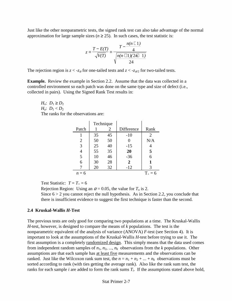
The rejection region is z < -zα for one-tailed tests and z < -zα/2 for two-tailed tests. Example. Review the example in Section 2.2. Assume that the data was collected in a controlled environment so each patch was done on the same type and size of defect (i.e., collected in pairs). Using the Signed Rank Test results in: Ho: D1 ≥ D2 Ha: D1 < D2 The ranks for the observations are:
Technique Patch 1 2 Difference Rank
1 35 45 -10 2 2 50 50 0 N/A 3 25 40 -15 4 4 55 35 20 5 5 10 46 -36 6 6 30 28 2 1 7 20 32 -12 3
n = 6 T+ = 6
Test Statistic: T = T+ = 6 Rejection Region: Using an α = 0.05, the value for To is 2. Since 6 > 2 you cannot reject the null hypothesis. As in Section 2.2, you conclude that there is insufficient evidence to suggest the first technique is faster than the second.
2.4 Kruskal-Wallis H-Test The previous tests are only good for comparing two populations at a time. The Kruskal-Wallis H-test, however, is designed to compare the means of k populations. The test is the nonparametric equivalent of the analysis of variance (ANOVA) F-test (see Section 4). It is important to look at the assumptions of the Kruskal-Wallis H-test before trying to use it. The first assumption is a completely randomized design. This simply means that the data used comes from independent random samples of n1, n2, ..., nk observations from the k populations. Other assumptions are that each sample has at least five measurements and the observations can be ranked. Just like the Wilcoxon rank sum test, the n = n1 + n2 + ... + nk observations must be sorted according to rank (with ties getting the average rank). Also like the rank sum test, the ranks for each sample i are added to form the rank sums Ti. If the assumptions stated above hold,

Stat Primer 2-8
the test statistic H will be approximated by a chi-square distribution with (k - 1) degrees of freedom. Here are the specifics of the test:
Ho: The k population probability distributions are identical Ha: At least two of the k population probability distributions differ in location
Test statistic: Hn n
T
nni
ii
k
=+
− +=�
12
13 1
2
1( )( )
Rejection Region: H > χ α ,( )k−12
Example. Going back to the example in section 2.2 again, assume there are actually four techniques and you want to know if any of them is significantly better (i.e., faster) than the others. The data for the first two are the same. For method three you have 9 observations: 25, 35, 30, 45, 20, 40, 23, 34, 28. There are 8 observations for technique four: 55, 40, 46, 35, 54, 50, 32, 42. You conduct an H-test by creating the following table:
Tech. 1 Rank Tech. 2 Rank Tech. 3 Rank Tech. 4 Rank 35 16.5 45 23 22 5 57 31 50 26.5 50 26.5 35 16.5 40 19.5 25 7 40 19.5 30 10.5 46 24.5 55 30 35 16.5 44 22 35 16.5 10 1 46 24.5 20 3.5 54 29 30 10.5 28 8.5 13 2 51 28 20 3.5 32 12 23 6 33 13 34 14 42 21 28 8.5 T1 = 95 T2 = 130.5 T3 = 88 T4 = 182.5
From the table you can calculate H:
H = + + +�
�
� − =
12
31 32
95
7
1305
7
88
9
182 5
83 32 9 797
2 2 2 2
( )
. .( ) .
Also, from Table 7 in Appendix A, you know that a χ2 with α = 0.05 and 3 df is 7.8147. Since 9.797 > 7.8147, you reject Ho and conclude that at least one of the four techniques is different than the others. From here you can go back and perform some of the two population tests to get more information.
3. Basics of Design of Experiments Up to this point in the primer there has been mention of completely randomized designs and other data collection techniques. The focus has been more on what to do with the data, rather than how to collect it. That’s where design of experiments (DOE) comes in. Basically DOE is a procedure for selecting sample data. If done correctly, DOE can save time and resources by
Stat Primer 2-9
obtaining more information from smaller samples. Here are a few definitions that should be enough to get through this level of the primer (Level 3 will go more in depth on DOE): Block - relatively homogeneous (similar) group of experimental units; observing treatments
within blocks is a method of eliminating known sources of data variation (see Section 4.3)
Experimental Design - method used to assign treatments to experiment units; 4 steps: 1 Select Factors 2 Decide How Much Information You Want 3 Choose Treatments & Number of Observations 4 Choose Experimental Design
Experimental Unit - object upon which measurements are made Factors - independent variables related to the response variable(s); factors are correlated with the
response(s), hence their importance, but they do not necessarily have direct influence on the response(s) (see Section 6.1)
Level - different levels or settings of a factor; also called the factor’s intensity Replication - number of observations per treatment Treatment - particular combination of levels for the factors involved in an experiment Setting up an experimental design requires four steps as mentioned above. The first step involves selecting the factors. This means identifying the parameters that are the object of the study and investigating what factors have an influence on them. Usually, the target parameters are the population means associated with the factor-level combinations. Once you know what you are looking for, the next step is to decide how much you want to know about it. That is, decide on the magnitude of the standard error(s) that you desire. (The standard error of a statistic is the standard deviation of its probability distribution; e.g., for the sample mean x , the standard
error is s n). The third step in an experimental design is to choose the factor-level combinations (i.e., treatments). Usually, each factor is only tested at two levels if its effect on the response(s) can be assumed to be linear. If the assumption cannot be made, the factor is set at three levels. Occasionally, factors may be assigned more than three levels, but it may complicate the design. Once all the treatments are decided for each factor, they are put into a design which will accomplish the desired objectives. Level 3 goes more into detail about specific designs.
4. Analysis of Variance Once data for a designed experiment has been collected, it must be analyzed. The usual technique is some form of analysis of variance (ANOVA). The basic idea behind an ANOVA is to see whether two (or more) treatment means differ based on the means of the independent random samples. Figure 1 shows the plots for two cases with five measurements for each sample. The open circles on the left side are from the first sample and the solid circles on the right are from the second sample. Horizontal lines pass through the means for the two samples,

Stat Primer 2-10
y1 and y2 . For Case A, it seems a fair statement to say that the sample means differ. It seems right because the distance (variation) between the sample means is greater than the variation within the y values for each of the two samples. The opposite is true in Case B which suggests the sample means do not differ.
y
0
10
8
6
4
2
y1
y2
Sample 1 Sample 2A
y
0
10
8
6
4
2
y1
y2
Sample 1 Sample 2B
Figure 1. Plots of Data for Two Cases 4.1 One-Way Classification As explained above, the basic idea behind an ANOVA is pretty simple. Unfortunately, when it comes time to actually do one, some math is required. Luckily, most software packages do all the calculations for you so you only need to worry about understanding the concepts in the remainder of this section. The simplest type of ANOVA is the one-way classification of a completely randomized design. Basically, that means there are a possible treatments to which experimental units are assigned randomly (with the same probability as the other treatments). Each treatment i has ni observations xi1, xi2, ..., xini. The population mean for treatment i is represented by µi⋅ and the population variance by σ 2 (note there is no subscript because the variance is assumed to be constant for each treatment). Therefore, the overall population mean is given by:
µµ
⋅⋅
⋅=
=
=�
�
n
n
i ii
a
ii
a1
1
In order to confuse you with the typical Mathenese you will find in a text book, here is what the sample mean and variance look like for treatment i:
xn
xii
ijj
ni
⋅=
= �1
1
( )s
x x
ni
ij ij
n
i
i
⋅
⋅==
−
−
�2
2
1
1

Stat Primer 2-11
Those equations look pretty complicated, especially with the little ⋅ everywhere (it’s used for two-way classifications). They are basically the same equations for sample mean and variance given in Level 1, except you only use the responses that pertain to treatment i. If you understand that, ANOVA will be no problem for you. Luckily, if you don’t understand it, you can let a computer do all the number crunching so it doesn’t matter. All the fancy equations are nice, but what do you do with them? You use them in other fancy equations! Before listing those, however, it is probably best to take a step back and look at where they fit into the ANOVA. A one-way classification has two basic assumptions:
1 All xij i~ , )N(µ σ⋅2 , i = 1, 2, ..., a; j = 1, 2, ..., ni
2 Model: xij = µ⋅⋅ + τi + εij
where xij = µi⋅+ εij, εij ~ N(0,σ 2), τi = µi⋅ - µ⋅⋅, ni ii
a
τ=� =
1
0
Talk about some fancy equations to impress your friends! Basically, the first assumptions says that each observation comes from a normal distribution with a specific mean for the respective treatment (µi⋅) and a constant variance (σ 2). The second assumption states that the basic model for each observation is the overall mean (µ⋅⋅) plus the deviation from the mean for the respective treatment (τi) plus some random error term (εij). All ANOVAs use some form of these two assumptions (unfortunately, they only get more complicated). The ANOVA for a one-way classification looks something like the following:
Source SS df MS F
Treatment SST a - 1 SST/(a - 1) MST/MSE Error SSE n - a SSE/(n - a) Total SS n - 1
Figure 2. ANOVA for One-Way Classification The SS column is for the sums of squares which represents the variability in the data caused by the source (treatment or error). If the treatment error (SST) is very small relative to the random error (SSE), you would conclude that the treatment is not significant to the response variable. To put that quantitatively, there is the F statistic computed in the last column. It is the ratio of the mean square error for treatment (MST) to the mean square error (MSE). Before moving on, it is important to note that the MSE is an estimate of the population variance σ 2. Also, you should be warned that statisticians are notorious for developing their own special notation, especially when it comes to regression and ANOVA. Some classical statisticians will even use something called the correction for the mean which changes SS to SStotal(corrected) and adds SSmean and SStotal. The terms and symbols used in this primer may not be exactly what you see in a text book or computer output, but the basic concepts are the same. Here is the formal hypothesis test for the F statistic:
Ho: µ1⋅ = µ2⋅ = ... = µa⋅ (i.e., the treatments have no affect on the response)

Stat Primer 2-12
Ha: µi⋅ ≠ µj⋅ for some i ≠ j (This is equivalent to: Ho: τ1 = τ2 = ... = τa = 0 and Ha: some τi ≠ 0) Test Statistic: F = MST/MSE Rejection Region: F > Fα, (a-1,n-a)
If for some unfortunate reason, you do not have access to a computer and you have to compute the ANOVA by hand, here are the equations you will need:
( ) ( )SSE = + = −⋅==
⋅=
�� �x x n sij ij
n
i
a
i ii
ai 2
11
2
1
1
( )SST = −⋅ ⋅⋅=�n x xi ii
a2
1
( )SS SS SST E= + = − = −⋅⋅== ==
⋅⋅�� ��x x x nxijj
n
i
a
ijj
n
i
ai i2
11
2
11
2
Example. Refer to the F-31 description in Section 4.3 of Level 1. After new range testing, the PM brings you data which he wants analyzed. The contractor has been experimenting with different painting techniques to get a better sortie rate. The three techniques take an equal amount of time to paint the F-31, but they seem to differ in how long they last before defects form during flight. The following table lists the hours of flight time before the paint needs to be fixed or reapplied:
Painting Technique 1 2 3 148 513 335 76 264 643 393 433 216 520 94 536 236 535 128 134 327 723 55 214 258 166 135 380 415 280 594 153 304 465
Totals 2,296 3,099 4,278
The PM wants to know if there is any significant difference between the techniques. Being an analyst on a big program like the F-31, you’re very happy that you have access to computers so you don’t have to do the tedious calculations by hand. First you set up the formal hypothesis test: Ho: µ1⋅ = µ2⋅ = µ3⋅ Ha: At least two of the three means differ Then you let the computer crunch some numbers and get:

Stat Primer 2-13
Source SS df MS F F.o5,(2,27) p-value
Treatment 198772 2 99386.2 3.48 3.35 0.045 Error 770671 27 28543.4 Total 969443 29
From here you conclude that you must reject Ho because F > Fα, (a-1,n-a) (the same conclusion is drawn by noting that p-value = 0.045 > α = 0.05). Therefore, with a 5 percent (α) chance of being wrong, you tell the PM that at least two of the three techniques differ in duration. The next section will expand on what can be done from here. 4.2 Pairwise Comparison of Means (with Extrapolation Example) If the null hypothesis of a one-way classification is rejected, there are several other tests that can be done to gain additional information about the treatments. The most common of these is the pairwise comparison of means. Basically, the comparison checks all or some of the possible ( )2
a pairs of treatment means to see which ones are not equal. There are three methods normally used:
Least Significant Difference (LSD): Ho: µi⋅ = µj⋅ (repeat as desired for all i = 1, 2, ..., a & j = 1, 2, ..., a with i ≠ j) Ha: µi⋅ ≠ µj⋅
Test Statistic: tx x
n n
i j
i j
=−
+�
�
�
⋅ ⋅
MSE
1 1
Rejection Region: |t| > tα/2, (n-a) Recall that a hypothesis test can also be performed as a confidence interval:
( )x x tn ni j n a
i j⋅ ⋅ −− ± +
�
�
� α / ,( )2
1 1MSE
Simultaneous Bonferroni CIs: Ho: µi⋅ = µj⋅ (test any m linear combinations up to ( )2
a )
Ha: µi⋅ ≠ µj⋅
Test Statistic: tx x
n n
i j
i j
=−
+�
�
�
⋅ ⋅
MSE
1 1 (same as LSD)
Rejection Region: |t| > t(α/2)/m, (n-a) (note change in level of confidence) Studentized Range (Tukey):
Ho: µi⋅ = µj⋅ (tests all ( )2a pairwise combinations)
Stat Primer 2-14
Ha: µi⋅ ≠ µj⋅
Test Statistic: tx x
n n
i j
i j
=−
+�
�
�
⋅ ⋅
1
2MSE
1 1
Rejection Region: |t| > qα, (a, n-a)
Requires n1 = n2 = ... = na to be an exact test The percentage points of the studentized range, q(p,v), can be found in Tables 12
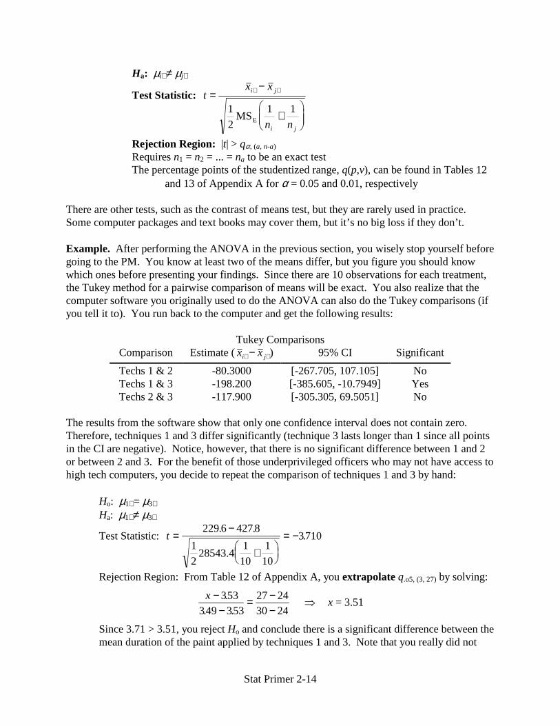
and 13 of Appendix A for α = 0.05 and 0.01, respectively There are other tests, such as the contrast of means test, but they are rarely used in practice. Some computer packages and text books may cover them, but it’s no big loss if they don’t. Example. After performing the ANOVA in the previous section, you wisely stop yourself before going to the PM. You know at least two of the means differ, but you figure you should know which ones before presenting your findings. Since there are 10 observations for each treatment, the Tukey method for a pairwise comparison of means will be exact. You also realize that the computer software you originally used to do the ANOVA can also do the Tukey comparisons (if you tell it to). You run back to the computer and get the following results:
Tukey Comparisons Comparison Estimate (x xi j⋅ ⋅− ) 95% CI Significant
Techs 1 & 2 -80.3000 [-267.705, 107.105] No Techs 1 & 3 -198.200 [-385.605, -10.7949] Yes Techs 2 & 3 -117.900 [-305.305, 69.5051] No
The results from the software show that only one confidence interval does not contain zero. Therefore, techniques 1 and 3 differ significantly (technique 3 lasts longer than 1 since all points in the CI are negative). Notice, however, that there is no significant difference between 1 and 2 or between 2 and 3. For the benefit of those underprivileged officers who may not have access to high tech computers, you decide to repeat the comparison of techniques 1 and 3 by hand: Ho: µ1⋅ = µ3⋅ Ha: µ1⋅ ≠ µ3⋅
Test Statistic: t =−
+�
��
= −229 6 427 8
1
10
1
10
3710. .
.1
228543.4
Rejection Region: From Table 12 of Appendix A, you extrapolate q.o5, (3, 27) by solving:
x −−
= −−
�353
349 35327 2430 24
.. .
x = 3.51
Since 3.71 > 3.51, you reject Ho and conclude there is a significant difference between the mean duration of the paint applied by techniques 1 and 3. Note that you really did not

Stat Primer 2-15
need to extrapolate since 3.71 is also larger than the more conservative 3.53. The extrapolation was done as a demonstration.
4.3 Two-Way Classification A natural extension of the one-way classification is to add a second factor. Statisticians have creatively called this a two-way classification. An important application of the second factor is to account for subject variability, which will be driven home with an example. Now, just to confuse the readers, most statistics books change notation from one-way to two-way classifications. In order to avoid upsetting the statistics world too much, this section will use the most common notation. For a two-way classification there are r treatments and c blocks with one observation per block per treatment (replications will be considered later). Similar to the one-way classification, each treatment i has a population mean represented by µi⋅ and the population variance by σ 2 (note there is no subscript because the variance is assumed to be constant for each treatment). Also, each block j has a population mean µ⋅j and variance σ 2. Block and treatment sample means and variances are computed as they are for the one-way classification. The population mean for each treatment-block pair is µij which really can’t be estimated since there are no replications. A two-way classification has two basic assumptions:
1 All xij ij~ , )N(µ σ 2 , i = 1, 2, ..., r; j = 1, 2, ..., c 2 Model: xij = µ⋅⋅ + τi + βj + εij
where xij = µij + εij, εij ~ N(0,σ 2), τi = µi⋅ - µ⋅⋅, τ ii
r
=� =
1
0 , βj = µ⋅j - µ⋅⋅, β jj
c
=� =
1
0
The interpretation of the assumptions is similar to that of a one-way classification, but a little more complicated. The two-way ANOVA looks something like the following:
Source SS df MS F
Treatment SST r - 1 SST/(r - 1) MST/MSE Block SSB c - 1 SSB/(c - 1) MSB/MSE Error SSE (r-1)(c-1) SSE/(r-1)(c-1) Total SS rc - 1
Figure 3. ANOVA for Two-Way Classification The equations given in Section 4.1 for SST and SSE are the same (after adjusting the ranges of the summations). The formula for SS only requires one modification: SS = SST + SSB + SSE. The equation for the new term is:
( )SSB = −⋅ ⋅⋅=�r x xjj
c 2
1
Here are the formal hypothesis tests for the two F statistics:
Ho: τ1 = τ2 = ... = τr = 0 (i.e., the treatments have no affect on the response) Ha: some τi ≠ 0

Stat Primer 2-16
Test Statistic: F = MST/MSE Rejection Region: F > Fα, (r-1,(r-1)(c-1))
Ho: ββββ1 = ββββ2 = ... = ββββc = 0 (i.e., the blocks have no affect on the response) Ha: some ββββj ≠ 0 Test Statistic: F = MSB/MSE Rejection Region: F > Fα, (c-1,(r-1)(c-1))
You may be wondering why someone would go through the extra trouble of doing a two-way classification. There are more equations, but by blocking the data, you can remove known (or suspected) sources of variation. That means you can get the same sensitivity (MSE) as a one-way classification using less data. If collecting data consumes a lot of resources, this is a good thing. The relative efficiency R of a two-way classification tells how many times as many observations you would need to obtain the same sensitivity with a one-way versus a two-way classification. The value can be found by:
Rc c r
rc= =
− + −−
�
�
( ) ( )
( )
σσ
one-way
two-way
B E
E
MS MS
MS
2
2
1 1
1
Example. Supposed you are busy reviewing bomb run data from the F-31. You notice that there are three difference methods used to deploy the bomb in question. While organizing the data, you also notice that there are four different pilots during the test flights. The data for the bomb miss distances in meters is listed here:
Pilot Totals Means 1 2 3 4
1 4.6 6.2 5.0 6.6 22.4 5.60 Method 2 4.9 6.3 5.4 6.8 23.4 5.85
3 4.4 5.9 5.4 6.3 22.0 5.50 Totals 13.9 18.4 15.8 19.7 67.8 Means 4.63 6.13 5.27 6.57
You decide to perform a two-way classification ANOVA to determine if either the bombing method or the pilots have a significant impact on the bomb miss distances. As shown in the table above, the bombing method is the treatment and the pilots are the blocks.
Source SS df MS F F.o5,(-,-) p-value
Method 0.26000 2 0.130000 4.18 5.14 0.073 Pilot 6.76333 3 2.25444 72.46 4.76 0.000 Error 0.186667 6 0.0311112 Total 7.21000 11
According to the computer output, the bombing method itself does not appear to have a significant impact on the bomb miss distance (p-value = 0.073 > α = 0.05). On the other hand,

Stat Primer 2-17
the pilots have enough variation between them that it does matter which pilot is flying the mission as to what the bomb miss distance is. The critical F statistics in the table are computed with (2,6) df and (3,6) df for the bombing methods and pilots, respectively (in case you really feel the urge to verify the table by hand; Table 9 of Appendix A). Without a two-way classification, the impact of the pilots would have been mixed in with the bombing methods. In other words, it may have appeared that the methods themselves were significantly different, when in fact, they aren’t. 4.4 Two-Way with Replications An easy way to impress your friends and complicate the notation is to add replications to a two-way classification. Having replications is actually a good thing because you gain more information about the population. A two-way classification with m ≥ 2 observations per cell can have the same information described above in addition to a term for interactions (a cell is a treatment-block pair). In the bomb miss distance example just discussed, the interaction term can tell whether there is a significant relationship between the pilots and the bombing methods. For example, pilots 1 and 3 might be best with method 1, but pilot 2 is best with method 3. In such a situation, there would be some interaction between the pilots and the bombing methods. If all pilots had similar standings among the methods, the interaction would not be significant. The notation is complicated by adding a third subscript to denote the replication. Therefore, xijk
is the kth observation of treatment i and block j. The equations given thus far can be modified to use the new subscript by just adding over all k. Also, the equation for SS now includes the SSI (Sum of Squares for Interaction) term as part of the sum. The changes begin with the two basic assumptions:
1 All xijk ij~ , )N(µ σ 2 , i = 1, 2, ..., r; j = 1, 2, ..., c, k = 1, 2, ..., m
(Note it is µij because the observation k does not affect the mean.) 2 Model: xijk = µ⋅⋅ + τi + βj + γij + εijk
where xijk = µij + εijk, εijk ~ N(0,σ 2), τi = µi⋅ - µ⋅⋅, τ ii
r
=� =
1
0 , βj = µ⋅j - µ⋅⋅,
β jj
c
=� =
1
0 , γ iji
r
j c=� = ∀ =
1
0 1 2 , , ..., , γ ijj
c
i r=� = ∀ =
1
0 1 2 , , ...,
Again, the interpretations of the assumptions are similar to before (but much more complicated). The important parts of the assumptions will be discussed in Section 4.6 so you don’t have to worry if you can’t recite these in your sleep. The revised ANOVA looks something like the following:

Stat Primer 2-18
Source SS df MS F
Treatment SST r - 1 SST/(r - 1) MST/MSE Block SSB c - 1 SSB/(c - 1) MSB/MSE Interaction SSI (r-1)(c-1) SSI/(r-1)(c-1) MSI/MSE Error SSE rc(m-1) SSE/rc(m-1) Total SS rcm - 1
Figure 4. ANOVA for Two-Way with Replications The equation for the new term is:
( )SSI = − − +⋅ ⋅⋅ ⋅ ⋅ ⋅⋅⋅==��m x x x xij i jj
c
i
r 2
11
Here are the formal hypothesis tests for the three F statistics:
Ho: τ1 = τ2 = ... = τr = 0 (i.e., the treatments have no affect on the response) Ha: some τi ≠ 0 Test Statistic: F = MST/MSE Rejection Region: F > Fα, (r-1,rc(m-1))
Ho: β1 = β2 = ... = βc = 0 (i.e., the blocks have no affect on the response) Ha: some βj ≠ 0 Test Statistic: F = MSB/MSE Rejection Region: F > Fα, (c-1, rc(m-1))
Ho: γij = 0 ∀ i = 1, 2, ..., r, j = 1, 2, ..., c (i.e., there is no interaction) Ha: some γij ≠ 0 Test Statistic: F = MSI/MSE Rejection Region: F > Fα, ((r-1)(c-1), rc(m-1))
If you are attempting to do a two-way classification with replications, you had better have a computer or you’ll spend all your time performing calculations and you’ll never get to the analysis part. Hopefully by now you understand how to interpret the output from an ANOVA so there’s really no need for another example on two-way classifications (it also saves time, paper, and ink). 4.5 Latin Square If you understand one and two-way classifications, it’s time to step into something a little further out there (there being defined as anywhere you don’t want to be). A latin square is similar to a one-way classification in that there is one factor with a possible treatments. In addition to that, there are two other factors with a treatments each (that’s a total of three factors for the mathematically challenged). The extra factors set up the data in such a way that it is possible to reduce the MSE without increasing the number of observations. It gets even better… these
Stat Primer 2-19
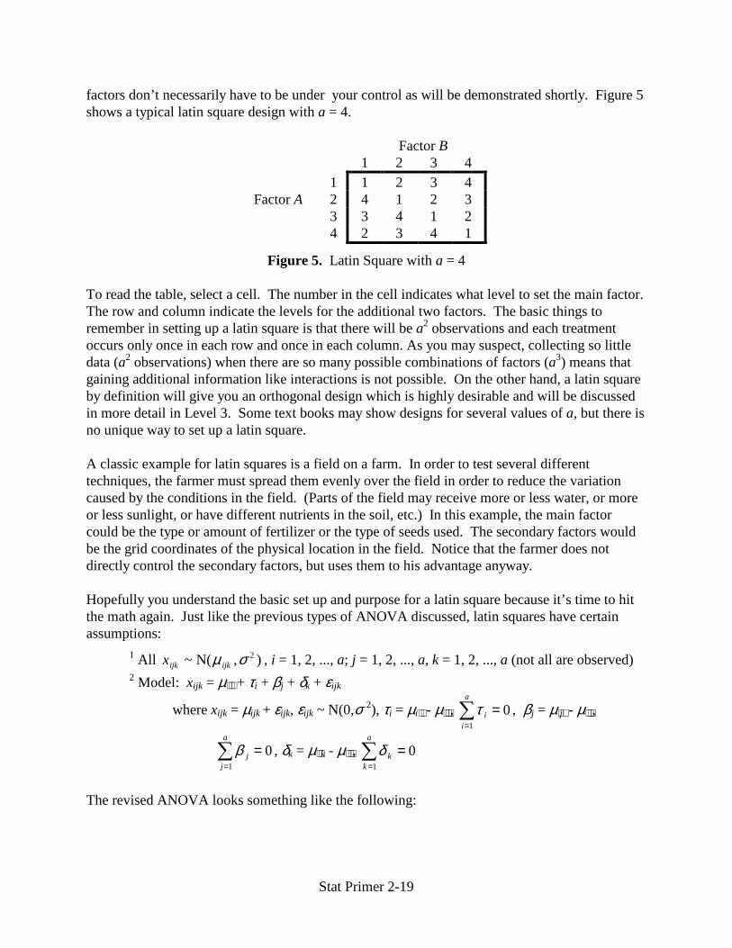
factors don’t necessarily have to be under your control as will be demonstrated shortly. Figure 5 shows a typical latin square design with a = 4.
Factor B 1 2 3 4 1 1 2 3 4 Factor A 2 4 1 2 3 3 3 4 1 2 4 2 3 4 1
Figure 5. Latin Square with a = 4 To read the table, select a cell. The number in the cell indicates what level to set the main factor. The row and column indicate the levels for the additional two factors. The basic things to remember in setting up a latin square is that there will be a2 observations and each treatment occurs only once in each row and once in each column. As you may suspect, collecting so little data (a2 observations) when there are so many possible combinations of factors (a3) means that gaining additional information like interactions is not possible. On the other hand, a latin square by definition will give you an orthogonal design which is highly desirable and will be discussed in more detail in Level 3. Some text books may show designs for several values of a, but there is no unique way to set up a latin square. A classic example for latin squares is a field on a farm. In order to test several different techniques, the farmer must spread them evenly over the field in order to reduce the variation caused by the conditions in the field. (Parts of the field may receive more or less water, or more or less sunlight, or have different nutrients in the soil, etc.) In this example, the main factor could be the type or amount of fertilizer or the type of seeds used. The secondary factors would be the grid coordinates of the physical location in the field. Notice that the farmer does not directly control the secondary factors, but uses them to his advantage anyway. Hopefully you understand the basic set up and purpose for a latin square because it’s time to hit the math again. Just like the previous types of ANOVA discussed, latin squares have certain assumptions:
1 All xijk ijk~ , )N(µ σ 2 , i = 1, 2, ..., a; j = 1, 2, ..., a, k = 1, 2, ..., a (not all are observed) 2 Model: xijk = µ⋅⋅⋅ + τi + βj + δk + εijk
where xijk = µijk + εijk, εijk ~ N(0,σ 2), τi = µi⋅⋅ - µ⋅⋅⋅, τ ii
a
=� =
1
0 , βj = µ⋅j⋅ - µ⋅⋅⋅,
β jj
a
=� =
1
0 , δk = µ⋅⋅k - µ⋅⋅⋅, δ kk
a
=� =
1
0
The revised ANOVA looks something like the following:

Stat Primer 2-20
Source SS df MS F
Rows SSR a - 1 SSR/(a - 1) MSR/MSE Columns SSC a - 1 SSC/(a - 1) MSC/MSE Treatment SST a - 1 SST/(a - 1) MST/MSE Error SSE (a-2)(a-1) SSE/(a-2)(a-1) Total SS a2 - 1
Figure 6. ANOVA for Latin Square Here are the formal hypothesis tests for which the three F statistics:
Ho: τ1 = τ2 = ... = τa = 0 (i.e., the row treatments have no affect on the response) Ha: some τi ≠ 0 Test Statistic: F = MSR/MSE Rejection Region: F > Fα, (a-1,(a-2)(a-1))
Ho: β1 = β2 = ... = βa = 0 (i.e., the column treatments have no affect on the response) Ha: some βj ≠ 0 Test Statistic: F = MSC/MSE Rejection Region: F > Fα, (a-1, (a-2)(a-1))
Ho: δ1 = δ2 = … = δa = 0 (i.e., the main treatment has no affect on the response) Ha: some δk ≠ 0 Test Statistic: F = MST/MSE Rejection Region: F > Fα, ((a-1), (a-2)(a-1))
Even though no one in their right mind would try to do stuff like this by hand, there is the occasional masochist so here are the necessary equations:
( )SSR = −⋅⋅ ⋅⋅⋅=�a x xii
a2
1
( )SSC = −⋅ ⋅ ⋅⋅⋅=�a x xjj
a 2
1
( )SST = −⋅⋅ ⋅⋅⋅=�a x xkk
a2
1
( )SSE = − − − +⋅⋅ ⋅ ⋅ ⋅⋅ ⋅⋅⋅==�� x x x x xijk i j kj
a
i
a
22
11
( )SS SS SS SS SSR C T E= + + + = − ⋅⋅⋅==�� x xijkj
a
i
a 2
11
Don’t those look like fun? Unfortunately, many software programs still do not incorporate latin squares so you may have to find out just how much fun it really is. If you have access to software that can perform two-way ANOVAs though, you might be able to persuade it do

Stat Primer 2-21
perform a latin square… if you ask it nicely. The way to do that is to duplicate and rearrange the data so the rows correspond to the main treatment. In other words, reorganize the data so all the values in the first row correspond to the first treatment, all the data points in the second row correspond to the second, etc. Now run a two-way using the original data (i.e., rows and columns are the treatment and block for the two-way). From here you can extract the values for SS, SSR, and SSC. Next you have to run another two-way on the rearranged data. The new term will be SST (if you’re quick, you’ll notice the other numbers are the same ones you got in the previous ANOVA). The final step is to compute SSE = SS - SSR - SSC - SST. With all these values it’s pretty easy to fill in the rest of the table. The example below shows how to do this trick in Microsoft Excel. Oh, things can get more complicated if you wish. Just like the one-way ANOVA discussed in Section 4.1, once you determine a treatment is significant, you probably want more information. Back then there was something called pairwise comparisons. That is exactly what you will do with the data from the latin square… see some things in the statistics world are simple. The way statisticians hold their job security is by not telling you what the subtle differences are. For example, you use MSE as the estimated variance for all the comparisons which means you now use [a,(a-2)(a-1)] degrees of freedom instead of what is written is Section 4.2. Example. You are probably thinking that all this stuff doesn’t sound easy, but when you have the computing power, a latin square is actually your friend. It was already shown that a latin square can be used for physical areas (farm example), but it can also account for time. Continuing the F-31 example, you are approached by the program director who is concerned about the safety of the workers in the paint shop. They wear protective gear, but it is only designed to protect up to certain tolerances and regardless of the suits, it is always best to keep levels of dangerous chemicals as low as possible (as to not offend the environmentalists). There are five distinct processes that involve the use of a certain hazardous chemical. You need to do some preliminary analysis before tackling such a large problem so you look over historical data of recorded amounts of the chemical in the air (in parts per million, ppm) and come up with a latin square design with a = 5:
Day Week M T W Th F Mean
1 18 (D) 17 (C) 14 (A) 21 (B) 17 (E) x1⋅⋅ = 17.4 2 13 (C) 34 (B) 21 (E) 16 (A) 15 (D) x2⋅⋅ = 19.8 3 7 (A) 29 (D) 32 (B) 27 (E) 13 (C) x3⋅⋅ = 21.6 4 17 (E) 13 (A) 24 (C) 31 (D) 25 (B) x4⋅⋅ = 22.0 5 21 (B) 26 (E) 26 (D) 31 (C) 7 (A) x5⋅⋅ = 22.2
Mean x⋅ ⋅1 = 15.2 x⋅ ⋅2 = 23.8 x⋅ ⋅3 = 23.4 x⋅ ⋅4 = 25.2 x⋅ ⋅5 = 15.4 x⋅⋅⋅ = 20.6 The designations A through E label the different processes. The various sample means are included for those sick people who like to try things by hand. In addition to those, you will need to go through the table and get sample means for the process treatments. Those are:

Stat Primer 2-22
x⋅⋅1= 11.4 x⋅⋅4 = 23.8 x⋅⋅2 = 26.6 x⋅⋅5= 21.6 x⋅⋅3= 19.6
Now you can go through all those equations or you can skillfully demonstrate your prowess on the computer and come up with the following results (see Appendix B for the Excel calculations):
Source SS df MS F F.o5,(4,12) P-value
Rows 82 4 20.5 1.30573 3.25916 0.32257 Columns 477.2 4 119.3 7.59873 3.25916 0.00273 Treatment 664.4 4 166.1 10.5796 3.25916 0.00066 Error 188.4 12 15.7 Total 1412.0 24
The information above indicates that both the processes (treatments) and the days of the week (columns) cause significant variation in the data. If a simple one-way classification was done instead, the fact that days of the week are significant would not have been noticed. There are several explanations why the days may be important. Two simple ones would be that the workers aren’t as productive on Mondays and Fridays. Another one is that the chemical may build up during the week. These situations would have to be investigated further. Knowing that there is also variation caused by the processes, you can perform more analyses to determine which processes are releasing the largest amounts of the hazardous chemical. The Tukey comparisons discussed in Section 4.2 can provide that information. Remember that the degrees of freedom will be different (5 & 12 in this case). 4.6 Failure of Assumptions After mention of it in Section 2, the many assumptions made for each ANOVA should have been dreadfully obvious. Luckily, those assumptions are valid in most cases. If they do not hold, however, the tests may not be accurate. This section will review the assumptions of normality and constant variance for the error terms (ε). Of course, working with the actual error terms is impossible because you need to know the actual population parameters to compute ε. As you may already suspect, we have to estimate the error terms. Those estimates are called residuals (e) and are defined to be the difference between the observed values and the fitted values. An observed value is the data that is collected while fitted values are those computed by the model developed from the data. The normality assumption is used to derive the F-tests for an ANOVA. The easiest way to verify the assumption is to compute the residuals and then calculate standardized residuals (e/MSE) which should be distributed as a standard normal. From here, there are three techniques. The first is to check for standardized residuals greater than 3 in absolute value (recall that 99 percent of them should fall within the interval from -3 to 3). The second test involves forming a histogram and examining the shape. The width of each bin is extremely important because it has a serious impact on the shape of the histogram (some software programs can determine widths

Stat Primer 2-23
for you). The most difficult and most accurate test is to calculate a Q-Q plot as described in Section 5.3 of Level 1. Luckily, this option requires just as many keystrokes on a computer as the other ones. If the checks for normality indicate that the residuals are not normal there are two options. The first is to ignore the problem. Before you get too excited, this option is only available if it’s only a moderate departure from normality. The reason for ignoring the problem is that the test statistics will only differ slightly from what they would be if the assumption was valid. If there is a serious departure from normality, the second option requires the nonparametric F-test. The first step in performing this test is to rank all the observations in increasing order with ties getting the average rank (see Section 2.2). Then repeat the ANOVA using the ranked data. If the normality assumption turns out to be valid based on the checks discussed above, you’re not out of hot water yet because you still have to check for constant variance. That assumption is used to prove that the MSE is an unbiased estimate of the population variance for the error terms. One way to test the assumption is to perform Bartlett’s Test which extends a simple comparison of two variances (see Section C.4 in Level 1) to a variances:
Ho: σ σ σ12
22 2= = =� a
Ha: some σ σi j2 2≠
Test Statistic: X 2 = M/C
( ) ( )[ ] ( ) ( )[ ]M n nii
a
i ii
a
= MS sE− − −= =� �1 1
1
2
1
ln ln
Ca n
nii
a
ii
a= 11
3 1
1
1
1
11
1
+− −
−−
�
�
�
=
=
��
( )( )
Rejection Region: X 2 > χ 2α, (a-1)
Unfortunately, Bartlett’s Test only tells whether the constant variance assumption is valid or not. It does not suggest any ways to remedy the situation. The Bartlett Test is also unthinkable without a computer so a graphical method is sometimes employed to verify the assumption. The graphical technique basically tries to find a pattern in the plot of the residuals versus the fitted values. Figure 7 summarizes the most common departures and corrections for the constant variance assumption. There are many other departures as well as many other tests, including some that get nasty enough to use derivatives. The material in this section should be enough for most cases. If you’re unfortunate enough to encounter a case where this is not enough, consult a statistics text book and request divine intervention.

Stat Primer 2-24
Type of Residuals Plot Correction e ~ N(0,σ 2) None Needed (it’s the assumption) σ 2 increases with fitted values ln transform data; redo ANOVA σ 2 decreases with fitted values ln transform data; redo ANOVA
Poisson transform data; redo ANOVA
Binomial sin-1 transform; redo ANOVA
Figure 7. Graphical Method for Non-Constant Variance
5. Categorical Data The ANOVA just discussed is a very powerful technique, but there is a large class of data for which it is invalid. Because of the normality assumption, ANOVA technically cannot be performed on discrete data, like counts for surveys. The most common type of categorical data comes from a multinomial distribution. That’s a fancy name for a generic finite discrete probability distribution with k possible outcomes (e.g., binomial has k = 2). The population parameters of interest are p1, p2, ..., pk, where pi is the probability of the i th outcome. As you
e
fitted
fitted
e
0
e
fitted
e
fitted
There is no set plot for binomial residuals.
e
fitted

Stat Primer 2-25
would expect, p1 + p2 + ... + pk = 1 (see Level 1, Section 4.1). A multinomial variable may also be called a qualitative variable because the only information it provides is which of the k bins it belongs to. The bin itself can provide further information (e.g., Pepsi drinker, Coke drinker, etc.). 5.1 One-Way Tables If there is only one qualitative variable for an experiment, the data is arranged in a one-way table as shown in Figure 8.
Category 1 2 ... k Total Count n1 n2 ... nk n Proportion �p1 �p2 ... �pk 1
Figure 8. One-Way Table of Category Counts The values n1, n2, ..., nk represent the category counts and n = n1 + n2 + ... + nk is the total number of observations. It is simple to estimate the population probabilities discussed above because a multinomial experiment can always be reduced to a binomial experiment by isolating one category. For example, the estimate for the i th category is
�pn
nii=
Similar to a binomial distribution, when n is large, �pi will be approximately normally distributed with
E p pi i( � ) =
and
V pp p
nii i( � )( )
=−1
You may recall from Level 1 that you can do simple confidence intervals (or hypothesis tests) for individual population proportions as well as for differences between any pair of proportions. As a reminder, if n is large, the (1 - α)100% confidence interval for pi is
�� ( � )
/p zp p
nii i±
−α 2
1
which is exactly the same as the CI for a binomial proportion given in Section C.3 of Level 1. A difference of proportions is a little more difficult because they are no longer independent. It can be shown that Cov(ni,nj) = -npipj and Cov(�pi , �p j ) = -pipj/n. These come in handy in calculating
the variance of the difference between �pi and �p j
V( �pi - �p j ) = V( �pi ) + V( �p j ) - 2Cov( �pi , �p j )

Stat Primer 2-26
Putting in the values and applying your knowledge form Level 1 (don’t panic), you can derive the CI for (pi - pj)
( )� �� ( � ) � ( � ) � �
/p p zp p p p p p
ni j
i i j j i j− ±− + − +
α 2
1 1 2
The previous two confidence intervals are useful, but it can be pretty tedious to calculate one for
all k population proportions and all ( )2k pairs of proportions. That’s where some nasty math
comes into play with a weighted sum of squared deviations between observed and expected cell counts… a good topic for conversation at parties. It sounds impressive, but it’s really not that difficult (especially if a computer is doing all the number crunching). Here is a summary of the hypothesis test for all population proportions:
Ho: p1 = p1,o, p2 = p2,o, ..., pk = pk,o (pi,o is hypothesized value for category i) Ha: some pi ≠ pi,o
Test Statistic: [ ]
Xn E n
E ni i
ii
k2
2
1
=−
=�
( )
( ) , where E(ni) = npi,o
Rejection Region: X 2 > χ 2α, (k-1)
The only assumption this test makes is that E(ni) ≥ 5 for all i. That’s not asking too much is it? Again, it may look complicated (all things with cool formulas do), but it’s pretty simple. The following example will prove it. Example. Continuing with the F-31 example, you are looking at the Viper’s susceptibility to detection. The plane was designed to have a typical four spike signature as shown here:
That is, the strongest reflected signal is at 45 degrees from the F-31’s heading (marker 1). For simplicity you only consider eight bearings for the tracking radar sites: 1 is the F-31’s heading and each bearing is 45 degrees from the next. The contractor claimed that 90 percent of all detections would come from the even bearings (45 degrees off). You want to verify that claim because it will make mission planning easier (you’ll know how to fly the missions to avoid detections). Assuming a uniform spread of detections between the four large spikes (and four smaller spikes), the expected proportions of detections are:
Bearing 1 2 3 4 5 6 7 8 P(Detect) 0.025 0.225 0.025 0.225 0.025 0.225 0.025 0.225
1
2
8
3 4
5
6 7

Stat Primer 2-27
You have data from the flight range that tells you how many detections there were from each bearing:
Bearing 1 2 3 4 5 6 7 8 Total # Detects 6 17 5 19 6 22 5 18 98
You set up the hypothesis test as discussed in this section:
Ho: p1 = 0.025, p2 = 0.225, ..., p8 = 0.225 Ha: some pi ≠ pi,o Rejection Region: X 2 > χ 2
α, 7df = 14.0671 (Table 7, Appendix A)
[ ]X
n E n
E ni i
ii
k2
2
1
=−
=�
( )
( )=
( ) ( ) ( )6 98 0 025
98 0025
17 98 0 225
98 0225
18 98 0 225
98 022517 92
2 2 2− ⋅⋅
+− ⋅
⋅+ +
− ⋅⋅
=.
.
.
.
.
..�
Since 17.92 > 14.0671, you reject the null hypothesis. Having access to those high tech computers, you’d probably just look at the p-value (i.e. P(χ 2
.o5,7) ≥ 17.92) which in this case is 0.01234. Granted this is only a test based on 98 detections at the range under “operational” conditions so it does not necessarily prove the contractor failed to meet the specifications (if it didn’t meet them you wouldn’t have the plane in OT&E).
5.2 Two-Way Tables Occasionally, you may have more than one type of category. A classic example is an election poll where the data is collected based on political party of the individuals and the candidate they plan to vote for. Another involves breaking out survey results based on demographic data. The generic layout out of such a two-way or contingency table is shown in Figure 9.
Column Row 1 2 … c Totals 1 n11 n12 … n1c R1 2 n21 n22 … n2c R2 Row � � � � �
r nr1 nr2 … nrc Rr Column Totals
C1 C2 … Cc n
Figure 9. Two-Way Table of Category Counts where nij is the number of observed counts for row i and column j
Cj = n1j + n2j + … + nrj Ri = ni1 + ni2 + … + nic
n = C1 + C2 + … + Cc = R1 + R2 + … + Rr = nijj
c
i
r
==��
11

Stat Primer 2-28
The table in Figure 9 can also be done as a contingency table of probabilities as shown in Figure 10. Of course, you will never know the actual probabilities with certainty, so they are usually estimated by the respective counts divided by the total number of observations n in which case all the p’s should be hatted (^).
Column Row 1 2 … c Totals 1 p11 p12 … p1c pR1 2 p21 p22 … p2c pR2 Row � � � � �
r pr1 pr2 … prc pRr Column Totals
pC1 pC2 … pCc 1
Figure 10. Two-Way Table of Category Probabilities where pij is the expected probability of the event in cell (i,j) occurring pRi = pi1 + pi2 + … + pic = probability of an event occurring in row I (marginal prob.) pCj = p1j + p2j + … + prj = probability of an event occurring in column j (marginal prob.) The objective of a contingency table is to determine whether the two classifications (rows & columns) are dependent. This tool is not as powerful as the one-way table which can test for specific probabilities, but it still has its uses. Going back to the definition of statistical independence discussed in Level 1 (Sections 2 and 4.2), recall that P(A∩B) = P(A)P(B) if A and B are independent. Applying that knowledge to Figure 10, if the rows and columns are independent you would expect pij = pRipCj. This is the assumption of the null hypothesis for the formal test:
Ho: The two classifications (rows & columns) are independent Ha: The two classifications are dependent
Test Statistic: [ ]
Xn E n
E nij ij
ijj
c
i
r2
2
11
=−
==��
( )
( ) , where E(nij) = np p n
R
n
C
n
R C
nRi Cji j i j
� � = =
Rejection Region: X 2 > χ 2α, (r-1)(c-1)
The degrees of freedom in the rejection region may seem odd, but it actually comes from some tricky algebra added to the knowledge of what is known and what is estimated. Basically you lose 1 df because all cell counts must equal n. You also lose (r-1) and (c-1) df because all but one of the marginal probabilities for the rows and columns must be estimated. The last one is automatically determined because the sum must equal 1. So, starting with rc possible degrees of freedom, you end up with rc - 1 - (r-1) - (c-1). Now test your algebra and see if you can come up with (r-1)(c-1). As in the one-way table, there is still the assumption that E(nij) ≥ 5 which can lead to problems as discussed in the example.

Stat Primer 2-29
A slight change must be made to the hypothesis test above if there are fixed marginal totals (i.e., a set number of observations for either the rows or the columns). That is, R1 = R2 = … = Rr or C1 = C2 = … = Cc. In such a situation, the null hypothesis changes to say that the proportions in each cell do not depend on the row or column (depending on which is fixed). Example. Expanding on the example in Section 5.1, you realize that mission planning can also be made easier if you can distinguish which types of radar to avoid. Again, you sort through the flight test data and class it according to mission profile (low, medium, high) and which type of radar made the detection (1, 2, 3). The data is shown here
Profile Row Low Medium High Totals 1 6 17 6 29 Radar 2 5 5 13 23 3 11 12 23 46 Col Totals 22 34 42 98
From here it’s a pretty straight forward number crunching problem. If you don’t have specific software that automatically computes the values for you, it’s not too hard to get a spreadsheet like Excel to do it. There is no need to rewrite the null and alternate hypotheses as they are the same every time for this type of test. The rejection region, however, is test specific and in this case it’s X 2 > χ 2
.o5, (2)(2) = 9.4877. The test statistic can be tedious to calculate by hand (and it takes up lots of space) so here is the abridged version
[ ] [ ] [ ]X 2
2 2 26 29 22 98
29 22 98
17 29 34 98
29 34 98
23 46 42 98
46 42 9811844=
−+
−+ +
−=
( )( ) /
( )( ) /
( )( ) /
( )( ) /...
( )( ) /
( )( ) /.
Since 11.844 > 9.4877, you reject the null hypothesis and conclude that there is some interaction between the types of radar and the mission profiles with respect to the number of detections. Looking at the data, it looks like you want to avoid radar 1 at medium altitudes and radar 3 just about everywhere. There are other tests that you can conduct to be more specific (don’t worry, all the tools are in the primer somewhere… you just have to find them). Incidentally, the p-value for this test is P(χ 2
.o5, (2)(2) > 11.844) = 0.01855.
6. Linear Regression One of the most frequently used (and misused) statistical tools is linear regression. The usual nomenclature (ooo, big word) states the definition as a technique that develops a functional relationship between a response (dependent) variable and one or more explanatory (independent) variables. See Appendix C for the hard core math stuff. 6.1 The Basics

Stat Primer 2-30
A critical subtlety about the definition is that “functional relationship” DOES NOT imply a causal relationship. That’s why it is preferred to use the terms response/explanatory variables versus dependent/independent variables. In fact, in most cases the variables can be swapped however you please because regression is just accounting for the correlation between the variables. One way to look at this with a real world example is regressing the number of violent crimes with the number of police officers in a city. Of course, you expect the two to increase with one another (just watch CNN for proof). You can argue that as crimes increase the city is forced to hire more officers. On the other hand, if there are more officers, there will be more arrests which make the crime statistics go up. So which causes which? It doesn’t matter… at least not as far as the regression is concerned. Assuming the response is caused by the explanatory variable(s) is probably the biggest error most people make in regression. Basically, regression can tell you what is expected to happen to a certain variable given the observed values of other variables. That’s it. With that pet peeve out of the way, a basic linear regression model looks something like the following:
yi = βo + β1x1i + β2x2i + … + βkxki + εi (i = 1,2,…,n)
This shows a response variable y which is related to the k explanatory variables x1, x2, …, xk as determined by the k’ = k+1 parameters βo, β1, … βk. The term βo is usually called the intercept and the other parameters are called partial regression coefficients or just coefficients for short. The intercept is the theoretical value that y will take on when all the explanatory variables are set to zero. In practice this definition is not valid if the data does not span the origin (see Section 6.4). The partial regression coefficient βj shows the change in the value of y when xj is increased by one unit and all other explanatory variables are held constant. The final term, ε, is the error term which will be discussed in the next section. The subscript i is just an index which denotes the number of the observation (out of a total of n). One important thing to notice about the model is that it’s linear in the parameters. That means there are no terms were some βjxj is raised to the βm power. Ready to be confused?… It would be fine if any βjxj term were raised to some constant because then you can just introduce βl = βj
c and xl = xj
c which gives βl xl (“linear!”). Yes, believe it or not, y can change in a nonlinear way with respect to any xj (e.g., y = x2). That’s because the “linear” in linear regression means that it’s linear in parameters… oh, those tricky statisticians. See Section 6.7 for more discussion on nonlinear “linear” regression. To drive the point home, from now until Section 6.8, most concepts will be explained with the simplest linear regression model… only one explanatory variable (yi = βo + β1xi + εi). If you run such a regression, the result can be that the response variable, y, increases linearly with x. That is, for each unit increase in x, y will increase by some constant (β1). Similarly, y can decrease linearly with x. And as was just discussed, y can also change in a nonlinear way with respect to x. Figure 11 shows some common cases that are possible in linear regression (see Section 6.7 for the nonlinear cases).

Stat Primer 2-31
x
y
Linearx
y
Linearx
y
Quadraticx
y
Quadratic
x
y
Exponentialx
y
Logarithmicx
y
Sinusoidal
Figure 11. Examples of “Linear” Regression
6.2 Least Squares If you understand everything so far, you’re ready to move on to the next hardest concept in linear regression… how to do it. The whole point of regression is to figure out what all the parameters (the β ’s) are so you can figure out the relationship between the variables. Obviously you don’t know the actual relationship (or you wouldn’t need the regression), so you have to estimate the parameters. Once they’re estimated of course, they get their party hats (^). That means the estimated regression equation will look like this
y x x x ei i i k ki i= + + + + +� � � ... �β β β β0 1 1 2 2 (i = 1,2,…,n)
Or for the one variable case:
y x ei i i= + +� �β β0 1 (i = 1,2,…,n)
Notice that the error term is now an e instead of an ε because it is also estimated. The e is called a residual and is the same as the one discussed in the ANOVA section. As a refresher, a residual is the difference between the actual value (the data point) and the fitted value (the one on the line). Speaking of fitted values, those get little hats (^) too because they are the result of an equation based on estimates. The easy way to picture the fitted value is to think of it being on the regression line, but it is actually the expected value of the response given the values of the explanatory variable(s). In mathy terms, that’s �yi = E(y|x1,x2,…,xk). It’s basically the same equation as before but you drop the error term:
� � �y xi i= +β β0 1 (i = 1,2,…,n)
There are actually many ways to perform regression, but by far the most common is least squares. Basically, least squares means you minimize the sum of the squared error terms (see Figure 12).

Stat Primer 2-32
x
y
y i
ei
xi
�yi
Figure 12. Least Squares Example
In other (mathy) words, least squares solves the following problem:
min eii
n2
1=�
s.t. y x ei i i= + +� �β β0 1 (i = 1,2,…,n)
Operations Research types would recognize this as a form of nonlinear programming, but that’s not important for solving the problem. Thanks to the miracle of computers, you can have the silicon to try a bunch of different regression lines. Then it can calculate the sum of squared errors for each and pick the one with the smallest sum. But that can take a long time if there are a lot of data points. Of course, some old guys way back before good computer games (or computers at all) had some free time so they figured out how to do this without a computer (the computer still makes it a lot easier though). It can be shown (see Appendix C) that the least squares estimators for the one variable case are:
� �β β0 1= −y x
�β11
2
1
2
=−
−==
=
�
�
x y nyx
x nx
S
S
i ii
n
ii
n
xy
xx
The main reason least squares is used for regression is that the least squares estimators are the Best Linear Unbiased Estimators (BLUE). The linear part has already been discussed. The unbiased part means the least squares estimates have an expected value equal to the true parameters they are trying to estimate. The best part means the estimators have the minimum variance of all other unbiased estimators. You can see Appendix C if you really want to learn more about the theoretical mathy stuff. Two last points before looking at an example. First, it is important to note that least squares is only one way to perform linear regression. One drawback to it is that there is a heavy penalty for
�β0 �β1
Stat Primer 2-33
outliers (see Level 1 Section 2) because of squaring the residuals. Another option is to minimize the sum of the absolute deviations:
min eii
n
=�
1
There aren’t as many software packages that can do this, however, so it may be easier to just look for outliers before running a regression. The final point for least squares (promise) is about the intercept term. For certain situations, you would expect the intercept term to be zero. For example, if you are plotting number of sorties versus the budget, you would expect that there will be no sorties flown if there is no budget. That being the case, you would force the regression line to go through the origin. Most software packages allow for this in the regression options so it will not be covered any further. Example. The F-31 is undergoing some range testing that is returning disturbing data. Apparently, on some test flights in the desert, the radar system seems to have too much internal noise to correctly identify targets at distances it usually has no problem with. You feel there may be a text book case here to highlight why operational test is required in addition to developmental test. The radar system passed its DT testing with flying colors, but that doesn’t mean it’s usable in a strike fighter like the F-31 which will encounter harsh environments. Your electrical engineers tell you internal noise can be measured, but it can also be calculated using the following formula
N = kTBFn
where N = Internal Noise of the Receiver (Watts) k = Boltzman’s Constant (1.38x10⁻²³ W⋅s/K) T = Temperature (K) B = Bandwidth (Hz) Fn = Noise Factor of Receiver (no units) They suspect something is causing the noise factor (Fn) to increase which is creating more internal noise than originally designed. A noise factor above 20 is too extreme to make a useful system on a fighter aircraft. You look over some flight test data to uncover the culprit. You find the bandwidth is relatively constant at 1 MHz (1x10⁶ Hz), but temperature may be the problem.

Stat Primer 2-34
N T (oF) T (K) Fn
6.9603E-14 60 288.56 17.479 6.9575E-14 62 289.67 17.405 7.0391E-14 67 292.44 17.442 7.0748E-14 69 293.56 17.464 7.1741E-14 73 295.78 17.576 7.2018E-14 73 295.78 17.644 7.3413E-14 76 297.44 17.885 7.244E-14 77 298.00 17.615 7.4404E-14 80 299.67 17.992 7.5251E-14 81 300.22 18.163 7.4756E-14 84 301.89 17.944 7.6991E-14 87 303.56 18.379 7.7445E-14 91 305.78 18.353 7.8525E-14 94 307.44 18.508 7.9123E-14 96 308.56 18.582 7.8464E-14 97 309.11 18.394 8.0878E-14 99 310.22 18.892 8.1082E-14 103 312.44 18.805 8.0639E-14 105 313.56 18.636 8.1272E-14 106 314.11 18.749 8.3756E-14 109 315.78 19.220 8.3711E-14 112 317.44 19.109 8.4289E-14 116 319.67 19.107 8.7087E-14 120 321.89 19.605 9.0632E-14 130 327.44 20.057
Line Fit Plot
17
18
19
20
21
280 290 300 310 320 330
T (K)
Fn

Stat Primer 2-35
You look at a plot of the noise factor versus temperature and for about a tenth of a second you think about calculating a regression by hand. Then you come to your senses and have the computer do it for you. Using the Analysis ToolPak in Excel, you get the following relationship between temperature and the noise factor (it’s the line that appears in the graph above):
Fn = -2.1682 + 0.06717⋅T
You don’t have to do this type of work in Excel. In fact, any specialized statistics package would probably be better from a statistical perspective, but Excel gives you the benefit of being able to play with your output to get the right format. Excel is also easier to learn and you can take the output and put it directly into Word for your report (like it is in this section). 6.3 Statistical Significance Once you know the relationship between the explanatory and response variables, there are usually two things that you may be interested in. The first is making inferences about the parameters (the β ’s). For example, does y increase or decrease with x, and if so, by how much. The other concern is making predictions about the response variable. Some people call this forecasting. Before hitting those practical issues though, you have to check if the regression itself is significant… sorry to spoil your fun. If you have computer software performing the regression this step boils down to looking at a couple of tables, the first of which is just an ANOVA like Figure 13. If you are unfortunate enough to have to fill in the blanks yourself see Appendix C.
Source SS df MS F
Regression SSR 1 SSR/1 MSR/MSE Residuals SSE n - 2 SSE/(n - 2) Total SS n - 1
Figure 13. ANOVA for Regression (One Variable) The formal hypothesis test checks to see if all the partial regression coefficients (in this case only β1) are equal to zero:
Ho: β1 = 0 Ha: β1 ≠ 0 Test Statistic: F = MSR/MSE Rejection Region: F > Fα,(1,n-2)
Once you know that the regression is significant based on the ANOVA (i.e. at least one coefficient is not equal to zero), you should look at the second table the software prints out. What you want to see are the results of the individual t-tests to see which ones are significant (see Figure 14). This can get to be a great deal of work if there are a lot of parameters and you have to crunch the numbers yourself. If you’re still living in the dark ages, refer to Appendix C for the grueling details.

Stat Primer 2-36
Variable Coefficient Std Err t Stat P-value
Intercept (βo) �β0 ( )V �β0
see
x (β1) �β1 ( )V �β1 below
Figure 14. Table of t-Tests for Individual Parameters The equations for the variances of the parameters can be found in Appendix C (they’re too scary for the regular text!). The general hypothesis test is the same as the one discussed in Level 1 (Section C.4) and is performed for each parameter in the model:
Ho: βi = 0 Ha: βi ≠ 0
Test Statistic: ( )
tV
i
i
=�
�
β
β
Rejection Region: t > tα/2,(n-2)
P-value: ( )
P tV
ni
i
αβ
β/ ,( )
�
�2 2− >
�
�
���
�
�
���
If a single parameter is insignificant, it’s a judgment call on whether to drop it or not. In other words, it depends. It depends on how insignificant the parameter is. It depends on what you plan to use the model for. It depends on the day of the week. Etc, etc. Actually, if you plan to use the model solely for prediction of the response, keeping the insignificant parameters won’t hurt. If you are building to model to make inference on the parameters themselves (e.g., “studies show that an increase in x leads to a four fold increase in y”) then you cannot include these parameters and be statistically correct (SC). There is one other thing to look at before moving on. Just because a regression is significant, does that mean it’s good? Well, again, the answer is, “It depends.” (You can call this fuzzy stat.) There is an additional measure that most software packages report when performing a regression. It’s called the coefficient of determination, or simply R2.
RSSSS
SSSS
2 R E= = −1
Put simply, R2 measures the proportion of variation in the data that is explained by the regression model. The value can range anywhere from zero to one (or 100 percent). If you’re brave enough to look at Appendix C (and you’re a math-geek), you’ll realize there is a problem with R2… it is a nondecreasing function of k (that is, it will always stay the same or increase as you add parameters). Don’t worry if you didn’t catch that mathy jargon because it really only applies to multiple regression (Section 6.8). To account for that drawback there is the adjusted R2:

Stat Primer 2-37
( )R R2 2= − − −− +
1 11
1
n
n k( )
A low adjusted R2 can indicate specification bias in the model. That is, you may have the wrong relationship between the response and explanatory variables. You should look at a plot of y versus x to see if there is a nonlinear relationship (see Section 6.7). Then again, it could just be that x and y are not sufficiently correlated (i.e., the regression is no good). Example. Before accepting your results in the previous section as gospel, you decide to actually read the rest of the output Excel gave you… it can be a lot of stuff if you clicked all the option boxes. After a little editing on the format, you get the following results:
Source SS df MS F P-value
Regression 12.0684 1 12.0684 470.232 8.23x10⁻¹⁷ Residuals 0.59029 23 0.02566 Total 12.6587 24
Variable Coefficient Std Err t Stat P-value
Constant -2.1682 0.94721 -2.2891 0.03159 T (K) 0.06717 0.00310 21.6848 8.23x10⁻¹⁷
From the ANOVA, you can tell the regression was significant by the p-value for the F-test. Actually, it’s VERY significant (i.e., 99.999999... percent confidence!). Of course, this is just an example with clean, sterile data. You probably won’t see anything this good in real life, but the idea is still the same. If you’re quick, you’ll notice the t-test for the slope parameter has the same p-value as the F-test. That’s because in one variable regression (with a constant term) the two tests are the same. If you don’t understand why, you probably need to re-read this section. According to the p-value, the constant term is also significant (α = 0.05 is the default in the world of statistics). You wouldn’t expect that since just about everything would be zero at 0 K. As mentioned in Section 6.1 (and 6.4), the value is worthless for interpreting because there is no data in that region (who’d be around to measure it?). Since it’s significant though, it’s best to keep it in because it will help with predictions. Before getting ahead of yourself, though, you still have to look at the R2. In this case it’s 0.95337. That means over 95 percent of the variability in the noise factor can be explained by the temperature. That sounds pretty impressive and it is, but remember that this is just an example. In the real world, any R2 above 0.6 is usually pretty good. 6.4 Prediction Once you’ve settled on a regression model that is significant and meets the assumptions (see Section 6.5) you can finally get to the practical stuff. The first thing you may want to do is make inferences about the parameters with hypothesis tests or confidence intervals. You already have the tools required, but just in case you need your hand held here’s how you do it:

Stat Primer 2-38
Ho: βi = βi* (where βi* is the hypothesized value) Ha: βi ≠ βi*
Test Statistic: ( )
tV
i i
i
= −�
�
*β β
β
Rejection Region: t > tα/2,(n-2)
Or you can do confidence intervals:
( )� �/ ,( )β βαi n it V± −2 2
You can also make inferences on the variance of the parameters, but that’s overkill for this section (see Appendix C here and in Level 1). Making inferences about the parameters is stuff you could probably have figured out for yourself. If you can guess how to make predictions though, you probably don’t need to be reading this primer. For those normal people out there, here’s how you do it for a one variable regression using confidence intervals (from there you can derive the hypothesis tests):
Predict Mean Response, ( )� |* *y E y x= (x* is the value at which you’re making the prediction)
( ) ( )� � */ ,( )
*
β β α0 1 2 2
2
1+ ± +−�
�
��
�
�
��
−x tn
x x
Snxx
MSE
where ( )S n V x x x x nxxx i ii
n
i
n
= − = − = −==��( ) ( )1
2 2
11
2
Predict Single Response, y*
( ) ( )� � */ ,( )
*
β β α0 1 2 2
2
11+ ± + +
−�
�
��
�
�
��
−x tn
x x
Snxx
MSE
Note from the equations how you lose confidence as the response variable’s value moves further away from the mean. Figure 15 illustrates the point with a little exaggeration (see the example for a similar graph with actual data).
Stat Primer 2-39
x
y
y
x
Mean Response
Single Response
Figure 15. Prediction Intervals
A very important final point on prediction is that it’s only valid within the scope of the data. That means if you want to estimate a response, each explanatory variable has to be set between its minimum and maximum in the original data. In reality predictions are more restricted than this, but this is a general rule that’s easy to follow. To learn how to do predictions with multiple variables, see Section 6.8. Example. Now you come to the practical part of the regression you ran in the previous sections. You know the noise factor of the receiver is increasing with temperature, but by how much? Well, you’re sure your boss will ask that so you construct a confidence interval on the slope parameter:
( ) [ ]� � . . . . , ./ ,( )β βα1 2 25 2 1 0 06717 2 069 0 00310 0 06076 0 07358± = ± ⋅ =−t V
Therefore, you know with 95 percent confidence that an increase in 1 Kelvin results in an increase of 0.060 to 0.073 in the noise factor. A more important application of the regression results would be to find out at what temperature the mean noise factor increases above 20. To do this, you can set the equation for predicted mean response equal to 20 and try to solve it for x*, or you can demonstrate your knowledge of practical mathematics (i.e., using a computer) and create a data table in Excel. Here is a piece of the output for both mean and single response prediction intervals:
T (oF) T (K) Fn (low) Fn (high) Fn (low) Fn (high)
125 324.67 19.502 19.78 19.282 20.000 130 327.44 19.673 19.983 19.462 20.193 135 330.22 19.843 20.185 19.641 20.387 140 333.00 20.013 20.389 19.820 20.582 145 335.78 20.183 20.592 19.998 20.777
Stat Primer 2-40
From the table, it appears the radar is not operationally effective above 135oF because the mean noise factor is predicted to be above 20. Granted the atmospheric temperature rarely gets this high, but inside the F-31’s nose it can easily get above that temperature. The next step from here would be to check on the radar’s cooling system. To emphasize the point of losing confidence with predictions as you move away from the mean, you can construct a graph similar to Figure 15 using the data form this example. This can be an exercise in using Excel, but it should be easy to do if you can reproduce the table above.
Prediction Intervals
16.5
17.5
18.5
19.5
20.5
21.5
22.5
275 295 315 335 355T (K)
Fn
Mean Single
T
6.5 Assumptions After reading the other sections in this level, you’re probably already asking yourself what all the assumptions and limitations of regression are (at least you should be). There are lots of them, but luckily most are usually valid and there a some easy fixes for the times they aren’t (see Section 6.6). This section will cover the nine most discussed assumptions of least squares. There is a tenth assumption related to causal relationships, but it’s only important to certain fields like econometrics. 1. Linear in Parameters - This has already been discussed in Section 6.1. 2. Relationship is Inexact - In other words, ε must exist for the regression to be valid. This is an implicit assumption of least squares because it leads to mathematical errors if there is no error term (e.g., division by zero or a singular [non-invertable] matrix). 3. Explanatory Variables not Perfectly Correlated - This is another implicit assumption of least squares because you will have a singular matrix in multiple regression (see Section 6.8). 4. Explanatory Variables are Nonstochastic - This is the first assumption that will not prevent you from calculating estimates if it does not hold. The assumption can be modified to say if the explanatory variables are stochastic, then they are independent of the error terms. In mathy terms that means Cov(ε,xk) = E(ε⋅xk) = 0. The main reason this is used is to cancel out a lot of stuff to

Stat Primer 2-41
make the equations nice and easy to use. The assumption is also kind of essential to have assumption nine hold. 5. εεεε is a random variable with E(εεεε) = 0 - This assumption is required to prove that the least squares estimates are unbiased. Fortunately, it is only required for the intercept term which is usually invalid anyway (see Section 6.1). 6. εεεε ~ N(0,σσσσ 2) - From here to the end are The Big Four… the most important, most frequently violated assumptions in linear regression. The normality assumption actually doesn’t have too large an impact because the least squares estimates are still BLUE (see Section 6.2) regardless of the distribution. The problem comes in the t and F tests discussed in Sections 6.3 and 6.4. If n is large and ε does not deviate from normality too much you’re OK. If not, you can try the methods discussed in Section 4.6 or resort to Bootstrapping (nonparametric regression which is way beyond the scope of this primer). 7. Homoscedasticity - Cool word isn’t it? Actually, the next three assumptions are just things for statisticians to talk about around other people so the stat-types will sound really smart using big words. Homoscedasticity basically means constant variance (σ 2). This assumption was already discussed in Section 4.3. Additional methods for detecting heteroscedasticity (another big word!) are the Goldfeld-Quant Test, Sprearman’s Rank Correlation Test, and the Park Test which can be found in any good, thick statistics book. 8. No Autocorrelation - Autocorrelation means that the error terms are correlated with each other. Another way to say no autocorrelation is to say the error terms are independent… that way some normal people may be able to understand you. This is probably the worst assumption to violate in linear regression because you can no longer guarantee that the least squares estimates are BLUE (see Section 6.2). The estimates are still linear and unbiased, but the variance of the estimate will be biased. That means the t and F tests will give inaccurate results and you will overestimate R2. Verifying and dealing with failures of this assumption are discussed in the next section. 9. No Multicollinearity - This assumption basically means that you can’t have an exact linear relationship among the explanatory variables. There are two situations: perfect (extreme) and severe. It’s pretty easy to detect perfect multicollinearity because you won’t be able to compute the least squares estimates (same as assumption 3). In the severe case, you can get the estimates but the variance-covariance matrix (see Section 6.8) of the estimates approaches infinity so the t-tests will be insignificant. The F-test and R2 are unaffected. Example. You got some good results from the regression on temperature and noise factor, but was it really a good regression (i.e., were the assumptions valid)? There’s really no need to review the first three assumptions as they are inherent to this model (only one variable using least squares). The fourth is pretty easy to verify by computing the correlation or covariance between the explanatory variable (temperature) and the residuals. In this example, both values are on the order of 10-13 which is close enough to zero.

Stat Primer 2-42
Verifying the regression assumptions doesn’t have to be a time consuming process. Many of the remaining assumptions can be considered together by looking at a couple of plots.
Residual Plot
-0.3
-0.2
-0.1
0
0.1
0.2
0.3
280 290 300 310 320 330
T (K)
Res
idua
ls
Histogram of Residuals
0
12
34
56
7
-2 -1 0 1 2
Mor
e
Bin
Fre
quen
cy
Q-Q Plot
-2
-1
0
1
2
-2 -1 0 1 2
m i
x(i
)

Stat Primer 2-43
All three plots suggest that assumptions five and six are valid. The first shows that the residuals are random. The second is a histogram of the standardized residuals (solid bars) overlaid by the expected histogram of 25 samples from a standard normal distribution (i.e., the same values used to generate the Q-Q plot). Although the histogram and Q-Q plot show a slight deviation from normality, that’s expected in a sample of only 25 observations. The deviation is not severe so it’s OK to accept the normality assumption. For added assurance, you compute the mean of the residuals to be -3.41x10⁻¹⁵ with a standard deviation of 0.1568. You don’t even need to construct a confidence interval to know that zero will be contained in it. The spread in the residual plots seems fairly constant all the way across so the homoscedasticity assumption is validated. Yes, it’s that easy sometimes. If there were a slight pattern of increasing or decreasing residuals, you would perform some quantitative tests, but in this case it’s fine. The final assumption to verify is no autocorrelation because multicollinearity doesn’t apply to the one variable case. Autocorrelation is discussed in more detail in the next section. As an aside to Excel users, the Q-Q plot above had to be generated the old fashioned way because Excel doesn’t do it for you (see Level 1 Section 5.3). 6.6 Failure of Assumptions The previous section gave a long list of assumptions that must be met in order to have a statistically correct regression model. Most of the time, people don’t care about this stuff and they post their results just because they like them (or they’re lazy). It’s not quite as bad as people who automatically assume that the regression relationship is causal, but it can be depending on what the results are used for. Most of the assumptions have already been discussed in enough detail in the primer so this section will only consider the last two assumptions (no autocorrelation and no multicollinearity). Autocorrelation. As mentioned earlier, autocorrelation is probably the worst assumption to violate so it should be one of the first ones you verify. There are several methods for checking the assumption and most software packages can do some of them for you. The simplest technique is the graphical method similar to the one for constant variance discussed in Section 4.6. Basically, you can plot the residuals versus time (ei vs. i) or versus lagged residuals (ei vs. ei-
t). A lagged residual is just one that has already been observed before the current one. Once you have a plot, all you have to do is look for patterns. It’s pretty subjective, but if you don’t see any patterns most likely there is no autocorrelation. As a guide, Figure 16 shows some basic results from the graphical method.

Stat Primer 2-44
i
e i
e i-t
e i
PositiveAutocorrelation
i
e i
e i-t
e i
No VisibleAutocorrelation
i
e i
e i-t
e i
NegativeAutocorrelation
Figure 16. Detecting Autocorrelation
A more quantitative technique for detecting autocorrelation is the Durbin-Watson Test. The test is limited in that it assumes an intercept term exists and cannot have missing values. It also only tests for a lag of one time period. Still, most software packages return the Durbin-Watson statistic d automatically so it’s not too difficult to apply the test (recall that ρ(x,y) is the correlation between x and y; Level 1 Section 6.2):
Ho: ( )ρe ei i, −1
= 0
Ha: ( )ρe ei i, −1
≠ 0
Test Statistic: ( )
[ ]de e
e
i ii
n
ii
n e ei i=
−≈ −
−=
=
�
�−
1
2
2
2
1
2 11
ρ( , )
Rejection Region: d < dL or d > 4 - dL (where dL comes from Table 23 of Appendix A) The test can be modified to specifically test for positive or negative autocorrelation, but you can figure out how with the information in the primer. Just to help you out though, Figure 17 gives a general look at where the significance points (dL and dU) fit in:

Stat Primer 2-45
Reject H 0
(PositiveAutocorr.)
Reject H 0
(NegativeAutocorr.)
Zone ofIndecision
Do notReject
Zone ofIndecision
0 4-d Ud Ud L 44-d L2
Figure 17. Regions of Durbin-Watson Statistic
There are many other tests designed to detect autocorrelation… statisticians really like getting their names in the books. Two of the more common ones are the Geary Test (also called Runs Test) and the Chi-Squared Test of Independence (see Section 5.2). You can read about these and more in the thicker statistics and econometrics books. If you suspect there is autocorrelation in the model, there are a couple quick fixes you can try. The easiest of these is to respecify the model. Perhaps the relationship isn’t linear. There could be a quadratic or logarithmic term. A second easy fix is to add a parameter for time, but that gets you into the slightly scary world of time-series forecasting. A method that generally works once the model is correctly specified is the Cochrane-Orcutt procedure. It is an iterative procedure meant to eliminate the correlation in the residuals. Basically, it starts off assuming the residuals have a lag of one (i.e., ρ(ei,ei-1) ≠ 0) and tries to estimate the correlation in order to reestimate the parameters. Here is an outline of the procedure… you really should have a computer to do it:
Cochrane-Orcutt Iterative Procedure
1. Run least squares to get the residuals and parameter estimates (ei, � , � ,..., �β β β0 1 k )
2. Run least squares on the model e ei i= −�ρ 1 ; or you can use the estimate �ρ ≈ −12d
(where d is the Durbin-Watson statistic)
3. Run least squares using n - 1 revised data points: y x x ei i k ki i* * * * * * *� � ... �= + + + +β β β0 1 1
(where y y yi i i* �= − −ρ 1 and x x xji ji j i
*( )
�= − −ρ 1 )
4. Calculate ei* from step 3 and go to step 2 until the change in �ρ is about 0.005
In addition to this fix, there is a Cochrane-Orcutt Two-Step procedure as well as a Durbin Two-Step procedure. Multicollinearity. Of The Big Four assumptions, multicollinearity is one of the easiest to detect. As mentioned in the previous section, for perfect multicollinearity you cannot compute the least squares estimates because of a singular matrix. In such a situation the only fix is to remove the variable that’s causing the problems. Most likely, there’s just a variable that is duplicated or one variable that is a linear function of the other explanatory variables. In severe multicollinearity, there are three things to look for to verify the assumption. The first is a low t-stat OR (not and) unexpected signs on all or some of the parameters. The second thing to look for is a high R2 and significant F-tests. If things look bad to this point, you can compute all the pairwise correlations of the explanatory variables. Now apply some fuzzy stat. If the t-stat, R2, and F-stat show multicollinearity may be a problem and there are high pairwise correlations

Stat Primer 2-46
between some of the variables, there’s probably some multicollinearity. How high is high? Whatever you want. Normally anything over 0.6 or 0.7 in absolute value. If that’s not quantitative enough for you, there’s always the condition index which has a cool formula with eigenvalues and everything. But you’ll have to go to a book to get it. Now comes the beauty of multicollinearity… the ease of fixing it. If your model does have severe multicollinearity the remedy depends on what you want the model for. Hopefully, you ran the regression to do prediction of the response variable because multicollinearity doesn’t affect the predictions. There is a problem with interpreting the results of the parameters as discussed in the previous section. Unfortunately, there’s really no solution to this problem except removing some explanatory variables (that’s usually not desired). A simple option (on paper) is to collect more data to increase the range and variability of the explanatory variables. Example. From the ongoing temperature and noise factor regression, the final assumption to validate is no autocorrelation. You can do that by producing a bunch of graphs like the following which show the relationship between the residuals and the ones which precede them.
ei vs. ei -1
e i -1
ei
ei vs. ei -2
e i -2
ei
ei vs. ei -3
e i -3
ei
ei vs. ei -4
e i -4
ei
The graphs look pretty good up to four times periods back. Depending on the importance of your regression and how much time you have, you can look at greater lags, but it’s highly unlikely that there will be anything significant past four time periods. If you insist on numbers, you can compute the Durbin-Watson statistic using the equation above (Excel doesn’t automatically do it). Doing so gives you d = 2.22901. Referring to Appendix A, you can figure out the rejection

Stat Primer 2-47
region is d < 1.206 or d > 2.794. That means, according to the test discussed in this section, there is no autocorrelation (with a lag of one). 6.7 Nonlinear “Linear” Regression As discussed in Section 6.1, there are many applications of linear regression to relationships that are obviously not linear (see Figure 11). Most of these cases really don’t take much work to get into the right format. Basically, what you want to do is use some dummy variables in place of the nonlinear ones to get things to look linear. For example, any time an explanatory variable must be raised to a power, say xj
c, just introduce xk+1 = xjc. The plot of y = xj
c vs. xj is obviously not linear, but the plot y vs. xk+1 = xj
c will be linear (see Figure 18). The greatest thing about this fix is that there’s really no real work involved. All you do is use the values for the explanatory variables that are already raised to their respective powers… all this talk of dummy variables just makes it look like you’re really doing something difficult. By the way, this sly technique also
works when you take the exponents, logs, reciprocals, and roots of xj (i.e., y ex j= , y = ln(xj), y =
1/xj, and y = x j ).
y x= +β β0 1
3 y x x x= + =β β0 13' , '
x
y
x'
y
Figure 18. Making Nonlinear “Linear” Regression Linear
Another type of nonlinear regression involves qualitative variables. A common example is using gender as an explanatory variable. That is, some variable xg which is set to 0 for females and 1 for males (or the other way around if you prefer to be statistically and politically correct). It’s cleverly called a binary variable. You can also have qualitative variables with more than two values. In such a situation you have to break it up and introduce several binary variables to account for the various values (“several” being equal to one less than the number of different values). For example, if you include regions in your regression and the possibilities are northeast, southeast, southwest, and northwest, you have to use three binary variables. One way to do it is
xSW =���
1
0
. if southwest
. else xNW =
���
1
0
. if northwest
. else xNE =
���
1
0
. if northeast
. else

Stat Primer 2-48
In this case, the default regression (i.e., xSW = xNW = xNE = 0) is the southeast region. Of course, you need to have a restriction that at most one of the three variables can be equal to one. For more information on qualitative regression consult a textbook. Example. A nonlinear relationship common to OT&E for all weapon systems is the survivability analysis. The general relationship between number of sorties (n), probability of survival (Ps), and attrition (A) is
A Psn=
That doesn’t look like something you can use regression with, but you can if you know the tricks. For example, if you take the natural logarithm of both sides you get
( )ln( ) ln ln( )A P n Psn
s= =
Now you have a relationship you can work with. It’s a one variable linear regression model with no intercept term. Once you get a relationship, you can use the parameter estimate to make inferences about the probability of survival (Ps). This is just one way of estimating Ps, and not necessarily the simplest way, but it emphasizes the point of doing nonlinear “linear” regression. The following table shows some output from a simulation of the F-31 in several dangerous, but typical missions at the start of a major conflict.
Sorties (n) Attrition (A) ln(A)
5 0.5904, 0.5758, 0.5898 -0.527, -0.552, -0.528 6 0.5337, 0.5549 -0.628, -0.589 7 0.4747, 0.4752, 0.4897 -0.745, -0.744, -0.714 8 0.4223, 0.4374, 0.4119, 0.4253 -0.862, -0.827, -0.887, -0.855 9 0.4148 -0.880 10 0.3386, 0.3492 -1.083, -1.052 12 0.2671 -1.320 13 0.2679 -1.317 14 0.2362, 0.2332, 0.2318 -1.443, -1.456, -1.462 15 0.2187, 0.1999 -1.520, -1.610 16 0.1919 -1.651 18 0.1509, 0.1468 -1.891, -1.919 19 0.1315 -2.029 20 0.1238 -2.089 23 0.0902, 0.0872 -2.406, -2.440 24 0.0831 -2.488 25 0.0679 -2.689 27 0.0583 -2.842
Running the regression with no intercept term you get the following results:

Stat Primer 2-49
Source SS df MS F P-value
Regression 14.9889 1 14.9889 14886.36 5.15x10-42 Residuals 0.0312 31 0.001007 Total 15.0201 32
Variable Coefficient Std Err t Stat P-value
Constant N/A N/A N/A N/A n -0.1052 3.84x10⁻⁴ -274.036 4.94x10-54
That means you can approximate Ps by e-0.1052 = 0.90014. It’s obvious from the tables above that the regression was significant. Notice this time, however, that the F-test and t-test are not the same. That’s because the regression only has one parameter so the degrees of freedom for the F-test are different than usual. The following graphs show the modified (linear) data and the original data as a final emphasis that you can do linear regression on nonlinear data.
Line Fit Plot
-3.000
-2.500
-2.000
-1.500
-1.000
-0.500
0.000
0 10 20 30
n
ln(A
)
Attrition vs. Sorties
0.0000
0.1000
0.2000
0.3000
0.4000
0.5000
0.6000
0 10 20 30n
A
6.8 Multiple Linear Regression

Stat Primer 2-50
Most of the examples and explanations so far have been based on only one explanatory variable. You will find, however, that this is rarely the case in practice. Knowing all that you do so far for regression won’t help you in the real world because there is usually more than just one explanatory variable. On the plus side, since you’ll probably do this type of work on a computer, the only difference is the amount of data you enter and the amount of output you get. Yeah, a couple of other things change, like some degrees of freedom on the tests discussed previously, but for the most part it’s the same. As a reminder here’s the general regression equation:
y x x x ei i i k ki i= + + + + +� � � ... �β β β β0 1 1 2 2 (i = 1,2,…,n)
Now for ease (or just to confuse people), most people switch to matrix notation when working with multiple regression. By the way, the “multiple” just means that you have more than one explanatory variable, not that you’re going to run more than one regression. Once again, those tricky statisticians are trying to confuse everyone… it’s job security. Here’s what the general regression equation looks like in matrix notation:
Y X E= +�β
Looks simple, right? Well, that’s only if you like doing all that matrix stuff. This might change your mind:
Y
y
y
yn
=
�
�
����
�
�
����
1
2
�, X
x x x
x x x
x x x
k
k
n n kn
=
�
�
����
�
�
����
1
1
1
11 21 1
12 22 2
1 2
�
�
� � � � �
�
, �
�
�
�
β
ββ
β
=
�
�
�����
�
�
�����
0
1
�
k
, E
e
e
en
=
�
�
����
�
�
����
1
2
�
(n x 1) (n x (k+1)) ((k+1) x 1) (n x 1)
Of course, if n and k are large, doing this kind of thing by hand would not be very fun. You can consult Appendix C for the details, but here are the basic changes to adapt the single regression stuff (this assumes you have a constant term, βo): Lease Squares Estimates. (Section 6.2)
( )� ' 'β = −X X X Y
1
X' is the transpose of the matrix X. F-Test. (Section 6.3) Figure 19 shows the updated ANOVA for multiple regression where k is the number of explanatory variables, k+1 is the number of parameters to estimate, and n is the number of observations.
Source SS df MS F
Regression SSR k SSR/k MSR/MSE Residuals SSE n - (k+1) SSE/(n - (k+1)

Stat Primer 2-51
Total SS n - 1
Figure 19. ANOVA for Regression (Multiple Variables) The rejection region for the F-test is modified to be F > Fα,[k,n-(k+1)]. Now it’s not as scary to look at the variance of the estimates (unless you have to calculate it by hand):
( ) ( )
( ) ( ) ( )( ) ( ) ( )( ) ( ) ( )
V X X
V V V
V V V
V V V
k
k
k k k
- Cov MS
- Cov - Cov
- Cov - Cov
- Cov - Cov
E
0 0
1 1� '
� � , � � , �
� , � � � , �
� , � � , � �
β
β β β β β
β β β β β
β β β β β
= =
�
�
�����
�
�
�����
−1
0 1
0 1
0 1
�
�
� � � �
�
MSE = =− +
�'
( )σε
2
1
E E
n k
t-Tests. (Section 6.3) The individual t-tests for the significance of each parameter is exactly the same as the one presented in Section 6.3. The only difference is the degrees of freedom in the rejection region which is now t > tα/2,[n-(k+1)]. Coefficient of Determination. (Section 6.3) No change:
RSS
SS
SS
SS2 R E= = − = −
−1
2
2
�' '
'
β X Y ny
Y Y ny
( )R R2 2= − − −− +
1 11
1
n
n k( )
Prediction. (Section 6.4) Making inferences about the individual parameters is the same as discussed in Section 6.4 with the degrees of freedom modified as they are for the t-tests. That is, use tα/2,[n-(k+1)] df. Predicting a mean response is done as follows:
( )X t X X X Xn k*
/ ,[ ( )]* *� 'β α± − +
−2 1
1MSE
where X* is a 1 x (k+1) row vector of explanatory variables at the levels you want to make the prediction (the value for the constant term, i.e., the first column, is always 1). Similarly, predicting an individual y value comes from:
( )[ ]X t X X X Xn k*
/ ,[ ( )]* *� 'β α± +− +
−2 1
11MSE
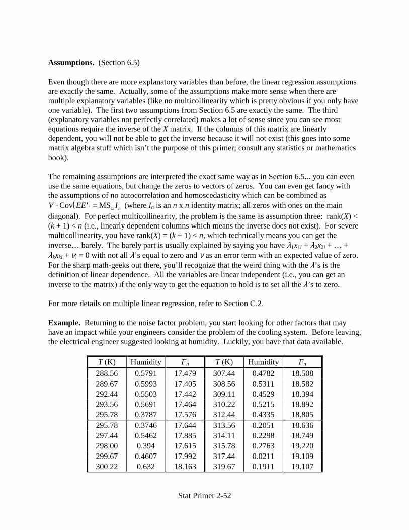
Stat Primer 2-52
Assumptions. (Section 6.5) Even though there are more explanatory variables than before, the linear regression assumptions are exactly the same. Actually, some of the assumptions make more sense when there are multiple explanatory variables (like no multicollinearity which is pretty obvious if you only have one variable). The first two assumptions from Section 6.5 are exactly the same. The third (explanatory variables not perfectly correlated) makes a lot of sense since you can see most equations require the inverse of the X matrix. If the columns of this matrix are linearly dependent, you will not be able to get the inverse because it will not exist (this goes into some matrix algebra stuff which isn’t the purpose of this primer; consult any statistics or mathematics book). The remaining assumptions are interpreted the exact same way as in Section 6.5... you can even use the same equations, but change the zeros to vectors of zeros. You can even get fancy with the assumptions of no autocorrelation and homoscedasticity which can be combined as
( )V EE In-Cov MSE' = (where In is an n x n identity matrix; all zeros with ones on the main diagonal). For perfect multicollinearity, the problem is the same as assumption three: rank(X) < (k + 1) < n (i.e., linearly dependent columns which means the inverse does not exist). For severe multicollinearity, you have rank(X) = (k + 1) < n, which technically means you can get the inverse… barely. The barely part is usually explained by saying you have λ1x1i + λ2x2i + … + λkxki + νi = 0 with not all λ’s equal to zero and ν as an error term with an expected value of zero. For the sharp math-geeks out there, you’ll recognize that the weird thing with the λ’s is the definition of linear dependence. All the variables are linear independent (i.e., you can get an inverse to the matrix) if the only way to get the equation to hold is to set all the λ’s to zero. For more details on multiple linear regression, refer to Section C.2. Example. Returning to the noise factor problem, you start looking for other factors that may have an impact while your engineers consider the problem of the cooling system. Before leaving, the electrical engineer suggested looking at humidity. Luckily, you have that data available.
T (K) Humidity Fn T (K) Humidity Fn
288.56 0.5791 17.479 307.44 0.4782 18.508 289.67 0.5993 17.405 308.56 0.5311 18.582 292.44 0.5503 17.442 309.11 0.4529 18.394 293.56 0.5691 17.464 310.22 0.5215 18.892 295.78 0.3787 17.576 312.44 0.4335 18.805 295.78 0.3746 17.644 313.56 0.2051 18.636 297.44 0.5462 17.885 314.11 0.2298 18.749 298.00 0.394 17.615 315.78 0.2763 19.220 299.67 0.4607 17.992 317.44 0.0211 19.109 300.22 0.632 18.163 319.67 0.1911 19.107

Stat Primer 2-53
301.89 0.4404 17.944 321.89 0.2957 19.605 303.56 0.4032 18.379 327.44 0.1123 20.057 305.78 0.6064 18.353
You run back to the computers and run a multiple regression of noise factor versus both temperature and humidity. Here are the results:
Source SS df MS F P-value
Regression 12.14895 2 6.074475 262.154 4.51x10⁻¹⁶ Residuals 0.50977 22 0.023171 Total 12.65872 24
Variable Coefficient Std Err t Stat P-value
Constant -4.22618 1.42435 -2.96710 0.00712 T (K) 0.07320 0.00437 16.73855 5.3x10⁻¹⁴ Humidity 0.52330 0.28072 1.86415 0.0757
It’s obvious from the ANOVA that the regression is still significant. That means that when all explanatory variables are considered together, at least one of them is significantly different than zero. You expected that though because there was a strong relationship between the noise factor and temperature anyway. The individual t-tests, however, show that humidity isn’t a significant explanatory variable. It’s close at 0.0757 so if you wanted to use the model for prediction it’s possible to leave it in. Just about any regression will work better with more explanatory variables (as long as you still meet all the assumptions). In this case the R2 jumped to 0.95973 with an adjusted R2 of 0.95606. Since that’s higher than the R2 for the one variable regression, you’d expect the two variable model to give better predictions. That’s echoed by the fact that MSE is slighter smaller as well (0.023171 versus 0.02566). If you look at temperature and humidity though, there’s a definite correlation between them (-0.71, i.e., as temperature increases, humidity drops). Therefore, if you’re going to use the model for anything other than predictions, you’ll have to worry about the multicollinearity problem. This concludes the second level of the primer. You now have a vast arsenal to accompany you in the realm of analytical analysis. There are lots of books out there that claim to help you, but hopefully, this primer was easier to understand (plus it’s lighter and it’s free!). It’s important to understand the concepts and know what’s available, but you shouldn’t waste gray matter on memorizing any of this stuff. That’s why you should keep the primer handy whenever you’re working. To further ingrain your array of tools, there’s a self-assessment in Appendix D with solutions in Appendix E.