process 2003 and 2010 image editing - pearsoncmg.com · process 2003 and 2010 image editing a...
TRANSCRIPT
Process 2003 and 2010 image editingA definitive guide to working with the image processing controls in the Develop module
The introduction of Process Version 2012 in Lightroom 4 means
that when Process 2012 is applied to an image in Lightroom
the Basic panel and localized adjustment controls are now
completely different. I believe that Lightroom users will prob-
ably want to use this new method of processing from now on.
However, it is still possible to apply Process 2003 or 2010 style
adjustments to the photos in your catalog. In order to cover this
method of operation fully, I have supplied the Process 2003/2010
instructions that were previously published in the Lightroom 3
book as a separate PDF.
THE ADOBE PHOTOSHOP LIGHTROOM BOOK 1
This PDF is given away free to readers of the Adobe Photoshop Lightroom book and is not intended for resale or distribution.
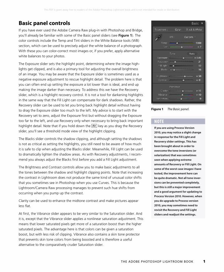
Basic panel controlsIf you have ever used the Adobe Camera Raw plug-in with Photoshop and Bridge,
you’ll already be familiar with some of the Basic panel sliders (see Figure 1). The
color controls include the Temp and Tint sliders in the White Balance tools (WB)
section, which can be used to precisely adjust the white balance of a photograph.
With these you can color-correct most images or, if you prefer, apply alternative
white balances to your photos.
The Exposure slider sets the highlight point, determining where the image high-
lights get clipped, and is also a primary tool for adjusting the overall brightness
of an image. You may be aware that the Exposure slider is sometimes used as a
negative exposure adjustment to rescue highlight detail. The problem here is that
you can often end up setting the exposure a lot lower than is ideal, and end up
making the image darker than necessary. To address this we have the Recovery
slider, which is a highlight recovery control. It is not a tool for darkening highlights
in the same way that the Fill Light can compensate for dark shadows. Rather, the
Recovery slider can be used to let you bring back highlight detail without having
to drag the Exposure slider too much to the left. My advice is to start with the
Recovery set to zero, adjust the Exposure first but without dragging the Exposure
too far to the left, and use Recovery only when necessary to bring back important
highlight detail. Note that if you hold down the a key as you drag the Recovery
slider, you’ll see a threshold mode view of the highlight clipping.
The Blacks slider controls the shadow clipping, and although setting the shadows
is not as critical as setting the highlights, you still need to be aware of how much
it is safe to clip when adjusting the Blacks slider. Meanwhile, Fill Light can be used
to dramatically lighten the shadow areas. As with Recovery adjustments, I recom-
mend you always adjust the Blacks first before you add a Fill Light adjustment.
The Brightness and Contrast controls allow you to make basic adjustments to all
the tones between the shadow and highlight clipping points. Note that increasing
the contrast in Lightroom does not produce the same kind of unusual color shifts
that you sometimes see in Photoshop when you use Curves. This is because the
Lightroom/Camera Raw processing manages to prevent such hue shifts from
occurring when you pump up the contrast.
Clarity can be used to enhance the midtone contrast and make pictures appear
less flat.
At first, the Vibrance slider appears to be very similar to the Saturation slider. And
it is, except that the Vibrance slider applies a nonlinear saturation adjustment. This
means that lower saturated pixels get more of a saturation boost than the higher
saturated pixels. The advantage here is that colors can be given a saturation
boost, but with less risk of clipping. Vibrance also contains a skin tone protector
that prevents skin tone colors from being boosted and is therefore a useful
alternative to the comparatively cruder Saturation slider.
Figure 1 The Basic panel.
NOTEIf you are using Process Version
2010, you may notice a slight change
in response for the Fill Light and
Recovery slider settings. This has
been brought about in order to
overcome the tone inversions (or
solarization) that was sometimes
seen when applying extreme
amounts of Recovery or Fill Light. On
some of the worst case images I have
tested, the improvement here can
be quite dramatic. Not all tone inver-
sions can be prevented completely,
but this is still a major improvement
and a good argument for updating to
Process Version 2010. However, when
you do upgrade to Process version
2010, you may sometimes need to
revisit the Recovery and Fill Light
sliders and readjust the settings.
THE ADOBE PHOTOSHOP LIGHTROOM BOOK 2
This PDF is given away free to readers of the Adobe Photoshop Lightroom book and is not intended for resale or distribution.
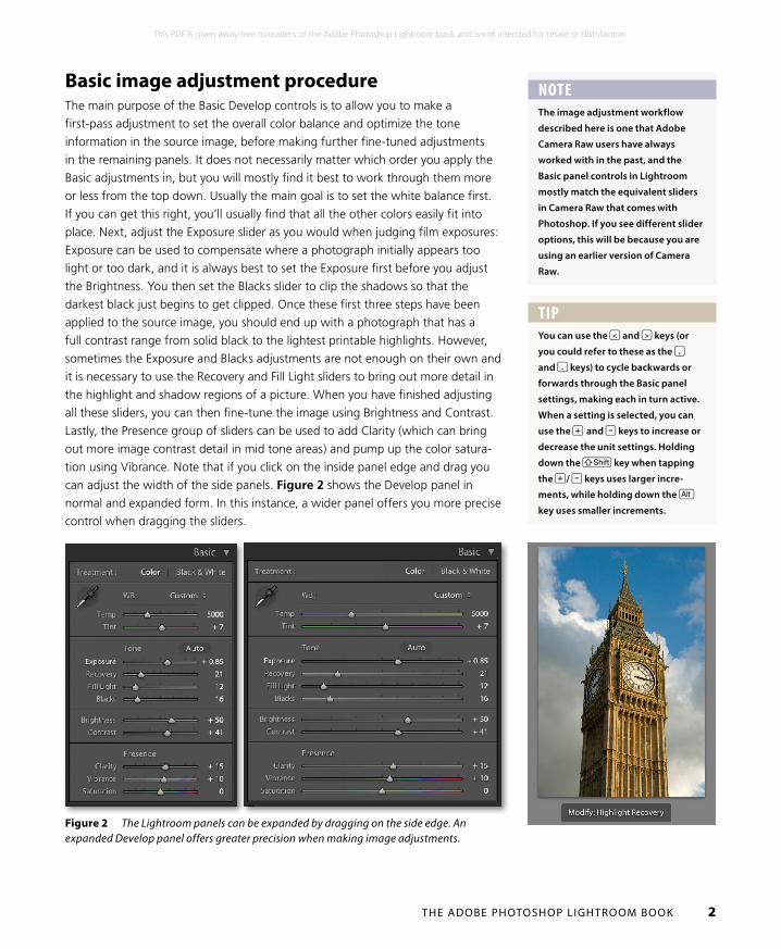
Figure 2 The Lightroom panels can be expanded by dragging on the side edge. An expanded Develop panel offers greater precision when making image adjustments.
Basic image adjustment procedureThe main purpose of the Basic Develop controls is to allow you to make a
first-pass adjustment to set the overall color balance and optimize the tone
information in the source image, before making further fine-tuned adjustments
in the remaining panels. It does not necessarily matter which order you apply the
Basic adjustments in, but you will mostly find it best to work through them more
or less from the top down. Usually the main goal is to set the white balance first.
If you can get this right, you’ll usually find that all the other colors easily fit into
place. Next, adjust the Exposure slider as you would when judging film exposures:
Exposure can be used to compensate where a photograph initially appears too
light or too dark, and it is always best to set the Exposure first before you adjust
the Brightness. You then set the Blacks slider to clip the shadows so that the
darkest black just begins to get clipped. Once these first three steps have been
applied to the source image, you should end up with a photograph that has a
full contrast range from solid black to the lightest printable highlights. However,
sometimes the Exposure and Blacks adjustments are not enough on their own and
it is necessary to use the Recovery and Fill Light sliders to bring out more detail in
the highlight and shadow regions of a picture. When you have finished adjusting
all these sliders, you can then fine-tune the image using Brightness and Contrast.
Lastly, the Presence group of sliders can be used to add Clarity (which can bring
out more image contrast detail in mid tone areas) and pump up the color satura-
tion using Vibrance. Note that if you click on the inside panel edge and drag you
can adjust the width of the side panels. Figure 2 shows the Develop panel in
normal and expanded form. In this instance, a wider panel offers you more precise
control when dragging the sliders.
NOTEThe image adjustment workflow
described here is one that Adobe
Camera Raw users have always
worked with in the past, and the
Basic panel controls in Lightroom
mostly match the equivalent sliders
in Camera Raw that comes with
Photoshop. If you see different slider
options, this will be because you are
using an earlier version of Camera
Raw.
TIPYou can use the < and > keys (or
you could refer to these as the ,
and . keys) to cycle backwards or
forwards through the Basic panel
settings, making each in turn active.
When a setting is selected, you can
use the + and - keys to increase or
decrease the unit settings. Holding
down the S key when tapping
the +/ - keys uses larger incre-
ments, while holding down the a
key uses smaller increments.

THE ADOBE PHOTOSHOP LIGHTROOM BOOK 3
This PDF is given away free to readers of the Adobe Photoshop Lightroom book and is not intended for resale or distribution.
Basic adjustments and the Histogram panelYou normally use the Exposure slider to set the overall image brightness, and
the Blacks slider to adjust for the shadow clipping. These two Basic tone adjust-
ments can make the biggest difference to the appearance of an image. Get the
highlights and shadows right and you will often find that all the in-between tones
look right too. But while the Exposure slider should be seen as the key tool for
controlling the brightness, it also acts as a highlight clipping control too. This is
where the Histogram panel comes in useful, because as you make an exposure
adjustment you can observe the image levels expanding to the right, just to the
point where the highlights should begin to clip. Figure 3 shows how the levels
were expanded as the Exposure was increased. But notice also how the highlight
clipping indicator (the triangle in the top right corner) lit up as I came within range
of where the highlights were about to clip (the color indicates which colors are
clipped). You can use the highlight clipping indicator as a guide to how far you
can safely push the Exposure adjustment before clipping occurs and you can
then use the Recovery slider to compensate for any unwanted highlight clipping.
As you drag the Recovery slider to the right the highlight end of the histogram
compresses to recover the clipped highlight detail, and the highlight clipping
indicator turns off at the optimum point where no more clipping occurs. As you
experiment with these two slider controls, you’ll soon discover how it is possible
to use Exposure to set what looks like the best exposure setting for the image
brightness (but within the range of clipping tolerance), and then use the Recovery
slider to compensate separately for any highlight clipping.
The Blacks slider is a shadow clipping tool. For raw camera files, the default
Blacks setting is “5.” This should be about right for most images and you can set
this lower if you like, but even with an underexposed image it is unlikely you will
want to set the Blacks below say 2 or 3. As you try to determine where best to
clip the shadows, the shadows clipping indicator also lights up to indicate where
any shadows point clipping is taking place. The Fill Light slider is not a shadow
recovery control in the same way as the Recovery slider can be used to rescue the
highlights, but it is ideal for lightening the dark tone areas, and can certainly make
quite a dramatic difference to photographs with heavy shadows. As you adjust
the Fill Light, the clipping indicator again hints at the ideal range of settings to
use. You can extend a Fill Light adjustment beyond this range, but overdoing so
can produce unnatural-looking results if you are still using Process 2003, so I sug-
gest you pay attention to what the clipping indicator is telling you. However, using
Process 2010 can really make a big improvement to the response of the Recovery
and Fill Light sliders.
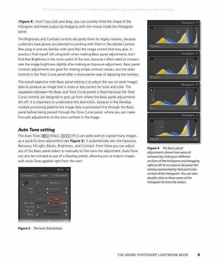
What’s really cool is that the histogram is more than just an information display.
You can also use it to actively adjust the four main Basic panel tone slider
controls: Exposure, Recovery, Fill Light, and Blacks. As you roll the mouse over
the histogram, you’ll see each of these four sections highlighted in the histogram
Figure 3 In the top histogram, the highlights need to be expanded to fill the width of the histogram. In the middle example, I adjusted the Exposure slider to make the image brighter, while keeping an eye on the highlight clipping indicator (circled) so as not to go beyond the clipping limits for the highlights. In the bottom example, I compensated with the Recovery slider to reduce the extreme highlight clipping, preserving more highlight detail but without compromising the exposure brightness adjustment.
THE ADOBE PHOTOSHOP LIGHTROOM BOOK 4
This PDF is given away free to readers of the Adobe Photoshop Lightroom book and is not intended for resale or distribution.
(Figure 4). And if you click and drag, you can actively mold the shape of the
histogram and levels output by dragging with the mouse inside the Histogram
panel.
The Brightness and Contrast controls are partly there for legacy reasons, because
customers have grown accustomed to working with them in the Adobe Camera
Raw plug-in and are familiar with (and like) the image control that they give. In
practice I find myself still using both when making Basic panel adjustments, but I
find that Brightness is the more useful of the two, because I often need to compen-
sate the image brightness slightly after making an Exposure adjustment. Basic panel
Contrast adjustments are great for making simple contrast tweaks, but the slider
controls in the Tone Curve panel offer a more precise way of adjusting the contrast.
The overall objective with Basic panel editing is to adjust the raw (or pixel image)
data to produce an image that is more or less correct for tone and color. The
separation between the Basic and Tone Curve panels is there because the Tone
Curve controls are designed to pick up from where the Basic panel adjustments
left off. It is important to understand this distinction, because in the Develop
module processing pipeline the image data is processed first through the Basic
panel before being passed through the Tone Curve panel, where you can make
fine-edit adjustments to the tone contrast in the image.
Auto Tone settingThe Auto Tone (#U [Mac], cU [PC]) can work well on a great many images
as a quick-fix tone adjustment (see Figure 5). It automatically sets the Exposure,
Recovery, Fill Light, Blacks, Brightness, and Contrast. From there you can adjust
any of the Basic panel sliders to manually to fine-tune the adjustment. Auto Tone
can also be included as pat of a Develop preset, allowing you to import images
with Auto Tone applied right from the start.
Figure 4 The Basic panel adjustments shown here were all achieved by clicking on different sections of the histogram and dragging right or left to increase or decrease the setting represented by that particular section of the histogram. You can also double-click on these areas of the histogram to reset the values.
Figure 5 The Auto Tone button.
THE ADOBE PHOTOSHOP LIGHTROOM BOOK 5
This PDF is given away free to readers of the Adobe Photoshop Lightroom book and is not intended for resale or distribution.
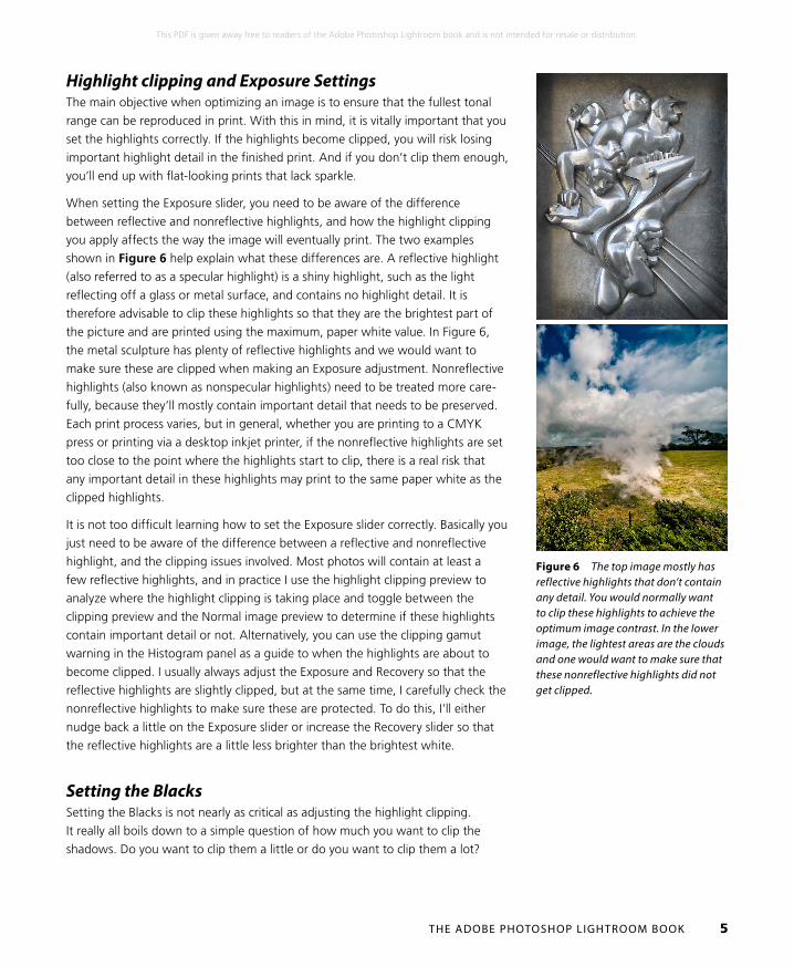
Figure 6 The top image mostly has reflective highlights that don’t contain any detail. You would normally want to clip these highlights to achieve the optimum image contrast. In the lower image, the lightest areas are the clouds and one would want to make sure that these nonreflective highlights did not get clipped.
Highlight clipping and Exposure SettingsThe main objective when optimizing an image is to ensure that the fullest tonal
range can be reproduced in print. With this in mind, it is vitally important that you
set the highlights correctly. If the highlights become clipped, you will risk losing
important highlight detail in the finished print. And if you don’t clip them enough,
you’ll end up with flat-looking prints that lack sparkle.
When setting the Exposure slider, you need to be aware of the difference
between reflective and nonreflective highlights, and how the highlight clipping
you apply affects the way the image will eventually print. The two examples
shown in Figure 6 help explain what these differences are. A reflective highlight
(also referred to as a specular highlight) is a shiny highlight, such as the light
reflecting off a glass or metal surface, and contains no highlight detail. It is
therefore advisable to clip these highlights so that they are the brightest part of
the picture and are printed using the maximum, paper white value. In Figure 6,
the metal sculpture has plenty of reflective highlights and we would want to
make sure these are clipped when making an Exposure adjustment. Nonreflective
highlights (also known as nonspecular highlights) need to be treated more care-
fully, because they’ll mostly contain important detail that needs to be preserved.
Each print process varies, but in general, whether you are printing to a CMYK
press or printing via a desktop inkjet printer, if the nonreflective highlights are set
too close to the point where the highlights start to clip, there is a real risk that
any important detail in these highlights may print to the same paper white as the
clipped highlights.
It is not too difficult learning how to set the Exposure slider correctly. Basically you
just need to be aware of the difference between a reflective and nonreflective
highlight, and the clipping issues involved. Most photos will contain at least a
few reflective highlights, and in practice I use the highlight clipping preview to
analyze where the highlight clipping is taking place and toggle between the
clipping preview and the Normal image preview to determine if these highlights
contain important detail or not. Alternatively, you can use the clipping gamut
warning in the Histogram panel as a guide to when the highlights are about to
become clipped. I usually always adjust the Exposure and Recovery so that the
reflective highlights are slightly clipped, but at the same time, I carefully check the
nonreflective highlights to make sure these are protected. To do this, I’ll either
nudge back a little on the Exposure slider or increase the Recovery slider so that
the reflective highlights are a little less brighter than the brightest white.
Setting the BlacksSetting the Blacks is not nearly as critical as adjusting the highlight clipping.
It really all boils down to a simple question of how much you want to clip the
shadows. Do you want to clip them a little or do you want to clip them a lot?
THE ADOBE PHOTOSHOP LIGHTROOM BOOK 6
This PDF is given away free to readers of the Adobe Photoshop Lightroom book and is not intended for resale or distribution.
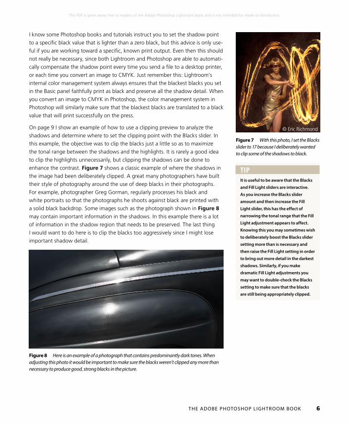
Figure 7 With this photo, I set the Blacks slider to 17 because I deliberately wanted to clip some of the shadows to black.
Figure 8 Here is an example of a photograph that contains predominantly dark tones. When adjusting this photo it would be important to make sure the blacks weren’t clipped any more than necessary to produce good, strong blacks in the picture.
I know some Photoshop books and tutorials instruct you to set the shadow point
to a specific black value that is lighter than a zero black, but this advice is only use-
ful if you are working toward a specific, known print output. Even then this should
not really be necessary, since both Lightroom and Photoshop are able to automati-
cally compensate the shadow point every time you send a file to a desktop printer,
or each time you convert an image to CMYK. Just remember this: Lightroom’s
internal color management system always ensures that the blackest blacks you set
in the Basic panel faithfully print as black and preserve all the shadow detail. When
you convert an image to CMYK in Photoshop, the color management system in
Photoshop will similarly make sure that the blackest blacks are translated to a black
value that will print successfully on the press.
On page 9 I show an example of how to use a clipping preview to analyze the
shadows and determine where to set the clipping point with the Blacks slider. In
this example, the objective was to clip the blacks just a little so as to maximize
the tonal range between the shadows and the highlights. It is rarely a good idea
to clip the highlights unnecessarily, but clipping the shadows can be done to
enhance the contrast. Figure 7 shows a classic example of where the shadows in
the image had been deliberately clipped. A great many photographers have built
their style of photography around the use of deep blacks in their photographs.
For example, photographer Greg Gorman, regularly processes his black and
white portraits so that the photographs he shoots against black are printed with
a solid black backdrop. Some images such as the photograph shown in Figure 8 may contain important information in the shadows. In this example there is a lot
of information in the shadow region that needs to be preserved. The last thing
I would want to do here is to clip the blacks too aggressively since I might lose
important shadow detail.
© Eric Richmond
TIPIt is useful to be aware that the Blacks
and Fill Light sliders are interactive.
As you increase the Blacks slider
amount and then increase the Fill
Light slider, this has the effect of
narrowing the tonal range that the Fill
Light adjustment appears to affect.
Knowing this you may sometimes wish
to deliberately boost the Blacks slider
setting more than is necessary and
then raise the Fill Light setting in order
to bring out more detail in the darkest
shadows. Similarly, if you make
dramatic Fill Light adjustments you
may want to double-check the Blacks
setting to make sure that the blacks
are still being appropriately clipped.
THE ADOBE PHOTOSHOP LIGHTROOM BOOK 7
This PDF is given away free to readers of the Adobe Photoshop Lightroom book and is not intended for resale or distribution.
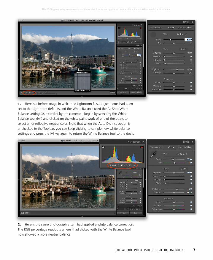
1. Here is a before image in which the Lightroom Basic adjustments had been
set to the Lightroom defaults and the White Balance used the As Shot White
Balance setting (as recorded by the camera). I began by selecting the White
Balance tool (W ) and clicked on the white paint work of one of the boats to
select a nonreflective neutral color. Note that when the Auto Dismiss option is
unchecked in the Toolbar, you can keep clicking to sample new white balance
settings and press the W key again to return the White Balance tool to the dock.
2. Here is the same photograph after I had applied a white balance correction.
The RGB percentage readouts where I had clicked with the White Balance tool
now showed a more neutral balance.

THE ADOBE PHOTOSHOP LIGHTROOM BOOK 8
This PDF is given away free to readers of the Adobe Photoshop Lightroom book and is not intended for resale or distribution.
3. I then used the Exposure slider to expand the tonal range. In this step I
adjusted the highlight clipping point to lighten the image.
4. The Recovery slider can be used to prevent highlight clipping. If you hold
down the a key as you drag the Recovery slider, you’ll see a clipping preview
that shows where the highlights are starting to get clipped. If the clipped high-
lights are specular (reflective) highlights, it is okay to clip them. But if they contain
nonreflective highlight detail it’s best to nudge the Recovery slider more to the
right to reduce such clipping. In this step I adjusted the Recovery slider until I was
confident that I had adequately preserved all the essential highlight detail
THE ADOBE PHOTOSHOP LIGHTROOM BOOK 9
This PDF is given away free to readers of the Adobe Photoshop Lightroom book and is not intended for resale or distribution.
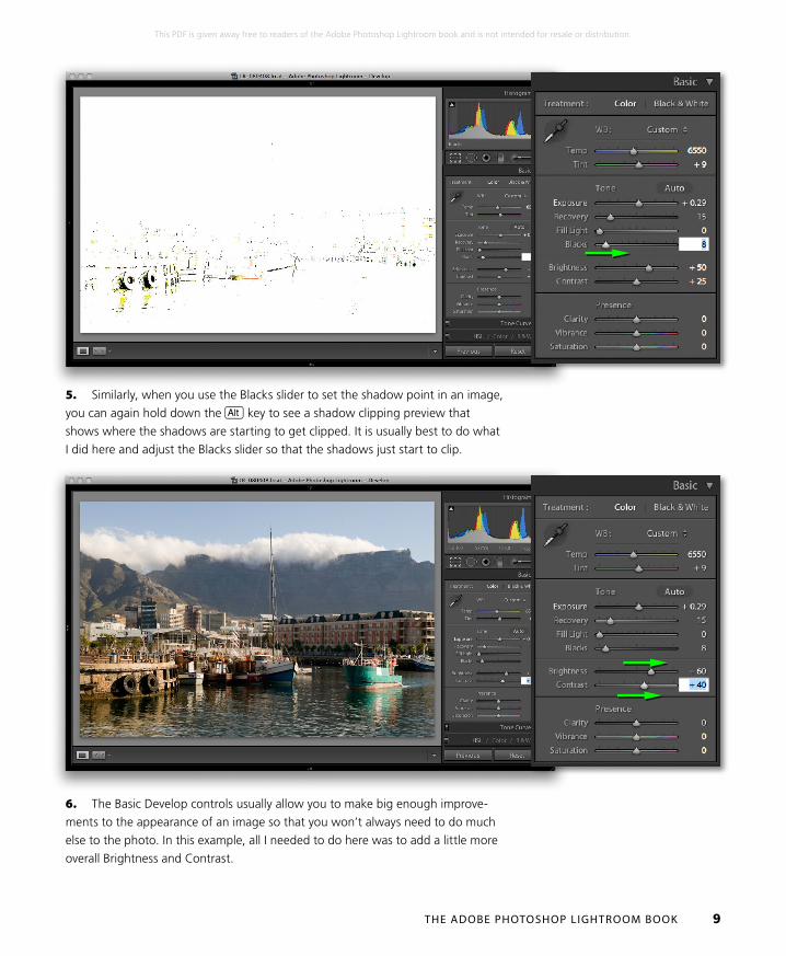
5. Similarly, when you use the Blacks slider to set the shadow point in an image,
you can again hold down the a key to see a shadow clipping preview that
shows where the shadows are starting to get clipped. It is usually best to do what
I did here and adjust the Blacks slider so that the shadows just start to clip.
6. The Basic Develop controls usually allow you to make big enough improve-
ments to the appearance of an image so that you won’t always need to do much
else to the photo. In this example, all I needed to do here was to add a little more
overall Brightness and Contrast.
THE ADOBE PHOTOSHOP LIGHTROOM BOOK 10
This PDF is given away free to readers of the Adobe Photoshop Lightroom book and is not intended for resale or distribution.
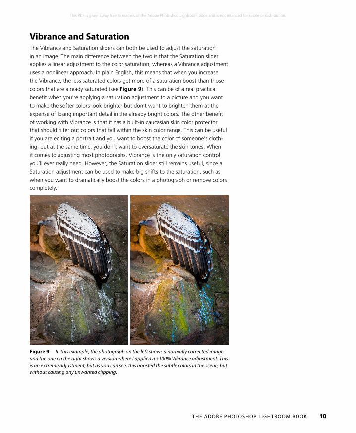
Vibrance and SaturationThe Vibrance and Saturation sliders can both be used to adjust the saturation
in an image. The main difference between the two is that the Saturation slider
applies a linear adjustment to the color saturation, whereas a Vibrance adjustment
uses a nonlinear approach. In plain English, this means that when you increase
the Vibrance, the less saturated colors get more of a saturation boost than those
colors that are already saturated (see Figure 9). This can be of a real practical
benefit when you’re applying a saturation adjustment to a picture and you want
to make the softer colors look brighter but don’t want to brighten them at the
expense of losing important detail in the already bright colors. The other benefit
of working with Vibrance is that it has a built-in caucasian skin color protector
that should filter out colors that fall within the skin color range. This can be useful
if you are editing a portrait and you want to boost the color of someone’s cloth-
ing, but at the same time, you don’t want to oversaturate the skin tones. When
it comes to adjusting most photographs, Vibrance is the only saturation control
you’ll ever really need. However, the Saturation slider still remains useful, since a
Saturation adjustment can be used to make big shifts to the saturation, such as
when you want to dramatically boost the colors in a photograph or remove colors
completely.
Figure 9 In this example, the photograph on the left shows a normally corrected image and the one on the right shows a version where I applied a +100% Vibrance adjustment. This is an extreme adjustment, but as you can see, this boosted the subtle colors in the scene, but without causing any unwanted clipping.

THE ADOBE PHOTOSHOP LIGHTROOM BOOK 11
This PDF is given away free to readers of the Adobe Photoshop Lightroom book and is not intended for resale or distribution.
Localized adjustmentsLet’s now take a look at the Adjustment brush and Graduated Filter tools. These
are more than just tools for dodging and burning, because you have a total of
seven effects to choose from, not to mention dual brush settings and an Auto
Mask option. Just like the Spot Removal and Red Eye Correction tools, the
Adjustment brush and Graduated Filter tools are completely nondestructive.
There is no need for Lightroom to create an edit copy of the master image first (if
that is what you want to achieve, then you can always use the Edit in Photoshop
command). The unique thing about these tools is that when localized adjustments
are applied to an image, the adjustments are saved as instruction edits that are
automatically updated as you make further Develop module adjustments. You
can even synchronize localized adjustment work across multiple images using the
Sync Settings command. Note that the Adjustment tool layouts were changed in
Lightroom 3, so read on to find out what’s new between the Process 2010 layout
in Lightroom 3 or later and previous versions of the program.
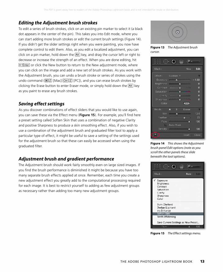
Initial Adjustment brush optionsWhen you first start working with the Adjustment brush (K ), the panel options
will look like those shown in Figure 10 or 11. To begin with, you will be in New
mode, ready to create a fresh set of brush strokes, but first you need to choose
a paint effect: Exposure, Brightness, Contrast, Saturation, Clarity, Sharpness,
or Color. These effects are not all exactly 100% comparable with the similarly
named sliders in the Basic panel. There are some minor differences, but they are
otherwise more or less the same. For example, the Saturation slider is actually a
hybrid of the Saturation and Vibrance adjustments found in the Basic panel.
In Figure 10, the Exposure effect was selected, where a positive value can be
used to lighten, or a negative value to darken—these are your basic dodge and
burn tool settings. But you can use any combination of sliders here to establish
different types of localized adjustment effects and save these as custom settings,
which can be accessed via the Effect menu (circled in Figure 10). If you want a
simpler interface to work with, click on the disclosure triangle next to the Effect
drop down menu (circled in Figure 11) to collapse the slider options. In Figure
11 there is just an Amount slider and whatever effect settings you have selected
in the Effect menu are now controlled by this single slider. You can expand the
Adjustment brush options by clicking on the disclosure triangle again. If you hold
down the a key, “Effect” will change to show “Reset” (Figure 12). Click on
this to reset all the sliders to zero and clear any currently selected color. Or, you
can hold down the a key and click on an Effect slider name to reset everything
except this slider setting. Below this are the Brush settings, where you have three
sliders. The Size slider controls the overall size of the brush cursor (Figure 13),
or you can use the ] and [ to make the cursor bigger or smaller. If your mouse
has a scroll wheel, you can also use this as a means to vary the brush size. The

THE ADOBE PHOTOSHOP LIGHTROOM BOOK 12
This PDF is given away free to readers of the Adobe Photoshop Lightroom book and is not intended for resale or distribution.
Figure 10 The full Adjustment brush options.
Figure 11 The Adjustment brush options in compact mode.
Figure 12 When you hold down the a key, Effect will change to show “Reset”. Click on this to reset all the Effects sliders.
reason the cursor has two circles is to show the hardness of the brush. The inner
circle represents the core brush size, while the outer circle represents the feather-
ing radius. As you adjust the Feather slider, the outer circle expands or contracts
to indicate the hardness or softness of the brush. Or, you can use S[ to
make the brush edge harder or S] to make it softer. The Flow slider is kind
of like an airbrush control: by selecting a low Flow setting you can apply a series
of brush strokes that successively build to create a stronger effect. You will notice
that as you brush back and forth with the Adjustment brush, the paint effect
gains opacity (if you are using a pressure-sensitive tablet such as a Wacom™, the
flow of the brush strokes is automatically linked to the pen pressure). The Density
slider at the bottom limits what the maximum brush opacity can be. At 100%
Density, the flow of the brush strokes builds to maximum opacity, but if you
reduce the Density, this limits the maximum opacity for the brush. In fact, if you
reduce the Density and paint, this allows you to erase the paint strokes back to
a desired Density setting and when Density is set to zero, the brush acts like an
eraser. It can often be useful though to set the Density to a low amount to begin
with and use multiple brush strokes to gradually build up a particular effect. The
A and B buttons allow you to create two separate brush settings so that you can
easily switch between two different brushes as you work. To exit the Adjustment
brush tool options, you can click the Close button, click the Adjustment brush
button at the top, or press K.
Now lets look at how to work with the Adjustment brush. Where you first click
adds a pin marker to the image. This is just like any other overlay, and you can
hide it using the H key (or use the View ➯ Tool Overlay options discussed earlier
to govern the show/hide behavior for these overlays). The pin overlay is therefore
like a marker for the brush strokes you are about to add and can later be used as
a reference marker when you need to locate and edit a particular group of brush
strokes. The important thing to understand here is that you click once and start
painting away on an area of the picture to form a collection of brush strokes.
When you edit the brush strokes, you can adjust the effect slider settings for the
group as a whole. So you can come back later and say “let’s make this series of
brush strokes a little stronger,” or “let’s add more saturation too.” Consequently,
you should only create new brush stroke groups when you need to shift the focus
of your retouching from one part of the photograph to another. Therefore, always
click the New button in the Adjustment brush’s panel when you need to create a
new (separate) group of brush strokes. You can use the On/Off button at the bot-
tom (circled in Figure 14) to toggle showing/hiding all Adjustment brush edits.
THE ADOBE PHOTOSHOP LIGHTROOM BOOK 13
This PDF is given away free to readers of the Adobe Photoshop Lightroom book and is not intended for resale or distribution.
Figure 14 This shows the Adjustment brush panel Edit options (note as you scroll the other panels these slide beneath the tool options).
Figure 15 The Effect settings menu.
Editing the Adjustment brush strokesTo edit a series of brush strokes, click on an existing pin marker to select it (a black
dot appears in the center of the pin). This takes you into Edit mode, where you
can start adding more brush strokes or edit the current brush settings (Figure 14).
If you didn’t get the slider settings right when you were painting, you now have
complete control to edit them. Also, as you edit a localized adjustment, you can
click on a pin marker, hold down the a key, and drag the cursor left or right to
decrease or increase the strength of an effect. When you are done editing, hit E or click the New button to return to the New adjustment mode, where
you can click on the image and add a new set of brush strokes. As you work with
the Adjustment brush, you can undo a brush stroke or series of strokes using the
undo command (#Z [Mac] cZ [PC]), and you can erase brush strokes by
clicking the Erase button to enter Eraser mode, or simply hold down the a key
as you paint to erase any brush strokes.
Saving effect settingsAs you discover combinations of effect sliders that you would like to use again,
you can save these via the Effect menu (Figure 15). For example, you’ll find here
a preset setting called Soften Skin that uses a combination of negative Clarity
and positive Sharpness to produce a skin smoothing effect. Also, if you wish to
use a combination of the adjustment brush and graduated filter tool to apply a
particular type of effect, it might be useful to save a setting of the settings used
for the adjustment brush so that these can easily be accessed when using the
graduated filter.
Adjustment brush and gradient performanceThe Adjustment brush should work fairly smoothly even on large sized images. If
you find the brush performance is diminished it might be because you have too
many separate brush effects applied at once. Remember, each time you create a
new adjustment effect you greatly add to the computational processing required
for each image. It is best to restrict yourself to adding as few adjustment groups
as necessary rather than adding too many new adjustment groups.
Figure 13 The Adjustment brush cursor.

THE ADOBE PHOTOSHOP LIGHTROOM BOOK 14
This PDF is given away free to readers of the Adobe Photoshop Lightroom book and is not intended for resale or distribution.
1. This shows a photograph where some Basic adjustments had been applied to
set the highlights and shadows and optimize the contrast.
2. In this example I used a modified Dodge (Lighten) effect to add a series of
positive Exposure brush strokes to lighten the body of the bird.
THE ADOBE PHOTOSHOP LIGHTROOM BOOK 15
This PDF is given away free to readers of the Adobe Photoshop Lightroom book and is not intended for resale or distribution.
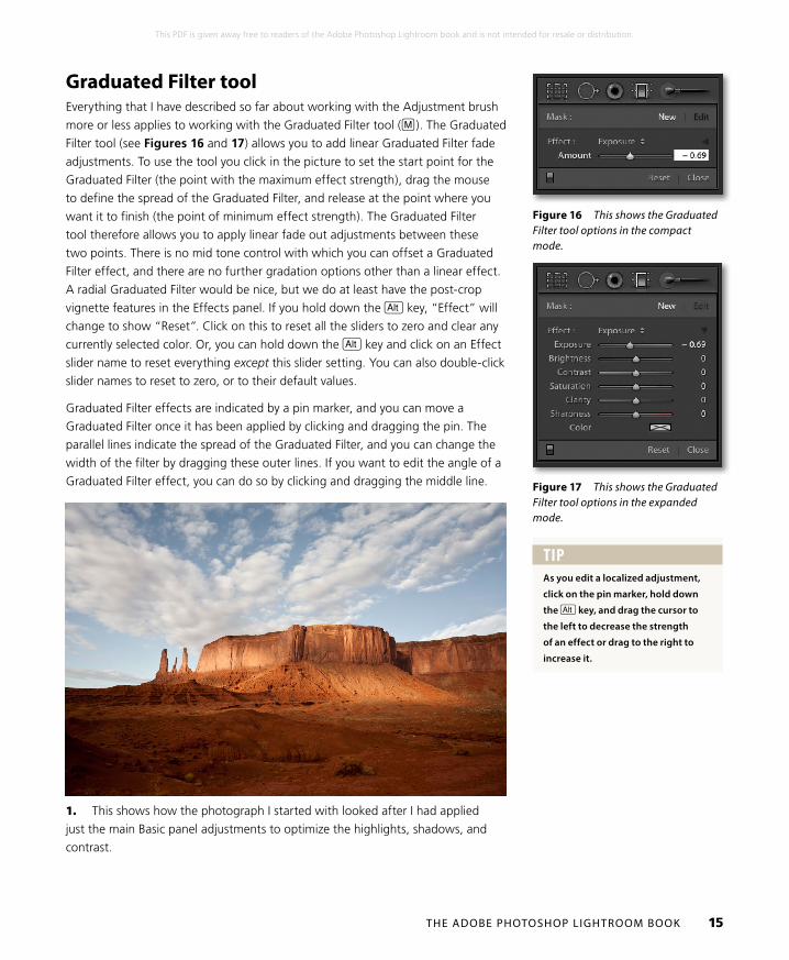
Graduated Filter toolEverything that I have described so far about working with the Adjustment brush
more or less applies to working with the Graduated Filter tool (M ). The Graduated
Filter tool (see Figures 16 and 17) allows you to add linear Graduated Filter fade
adjustments. To use the tool you click in the picture to set the start point for the
Graduated Filter (the point with the maximum effect strength), drag the mouse
to define the spread of the Graduated Filter, and release at the point where you
want it to finish (the point of minimum effect strength). The Graduated Filter
tool therefore allows you to apply linear fade out adjustments between these
two points. There is no mid tone control with which you can offset a Graduated
Filter effect, and there are no further gradation options other than a linear effect.
A radial Graduated Filter would be nice, but we do at least have the post-crop
vignette features in the Effects panel. If you hold down the a key, “Effect” will
change to show “Reset”. Click on this to reset all the sliders to zero and clear any
currently selected color. Or, you can hold down the a key and click on an Effect
slider name to reset everything except this slider setting. You can also double-click
slider names to reset to zero, or to their default values.
Graduated Filter effects are indicated by a pin marker, and you can move a
Graduated Filter once it has been applied by clicking and dragging the pin. The
parallel lines indicate the spread of the Graduated Filter, and you can change the
width of the filter by dragging these outer lines. If you want to edit the angle of a
Graduated Filter effect, you can do so by clicking and dragging the middle line.
Figure 16 This shows the Graduated Filter tool options in the compact mode.
Figure 17 This shows the Graduated Filter tool options in the expanded mode.
1. This shows how the photograph I started with looked after I had applied
just the main Basic panel adjustments to optimize the highlights, shadows, and
contrast.
TIPAs you edit a localized adjustment,
click on the pin marker, hold down
the a key, and drag the cursor to
the left to decrease the strength
of an effect or drag to the right to
increase it.
THE ADOBE PHOTOSHOP LIGHTROOM BOOK 16
This PDF is given away free to readers of the Adobe Photoshop Lightroom book and is not intended for resale or distribution.
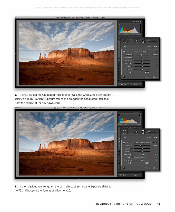
2. Here, I clicked the Graduated Filter tool to reveal the Graduated Filter options,
selected a Burn (Darken) Exposure effect and dragged the Graduated Filter tool
from the middle of the sky downward.
3. I then decided to strengthen the burn effect by setting the Exposure slider to
–0.75 and boosted the Saturation slider to +20.
THE ADOBE PHOTOSHOP LIGHTROOM BOOK 17
This PDF is given away free to readers of the Adobe Photoshop Lightroom book and is not intended for resale or distribution.
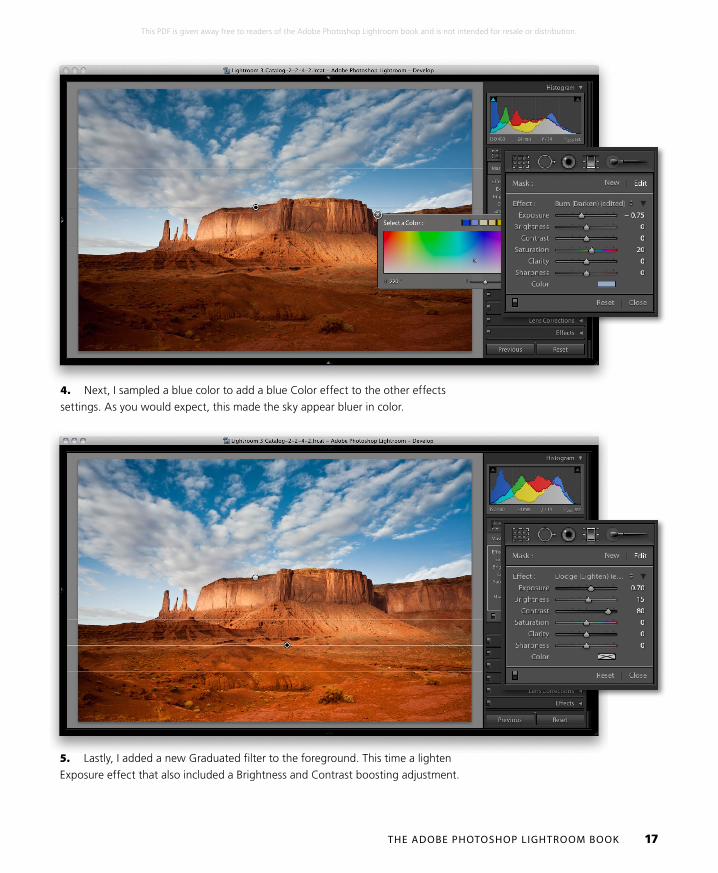
4. Next, I sampled a blue color to add a blue Color effect to the other effects
settings. As you would expect, this made the sky appear bluer in color.
5. Lastly, I added a new Graduated filter to the foreground. This time a lighten
Exposure effect that also included a Brightness and Contrast boosting adjustment.