projected energy market and emissions impact …
TRANSCRIPT

1
PROJECTED ENERGY MARKET AND EMISSIONS
IMPACT ANALYSIS OF THE CHAMPLAIN – HUDSON
POWER EXPRESS TRANSMISSION PROJECT FOR NEW
YORK
March 22, 2010
Prepared for
Transmission Developers Inc.
by
London Economics International LLC
717 Atlantic Avenue, Suite 1A
Boston, MA, USA

2
Important disclaimer notice
London Economics International LLC (LEI) was engaged by Transmission Developers Inc. (TDI) to prepare a market study for the Champlain – Hudson Power Express (CHPE) transmission project for purposes of submission to regulatory siting and permitting processes. The market study involved simulating the wholesale power markets in New York and New England over a long term horizon. LEI has made the qualifications noted below with respect to the information contained in this report and the circumstances under which the report was prepared.
While LEI has taken all reasonable care to ensure that its analysis is complete, power markets are highly dynamic, and thus certain recent developments may or may not be included in LEI‟s analysis. Investors, lenders, and others should note that:
LEI‟s analysis is not intended to be a complete and exhaustive analysis of the impact of the CHPE transmission project. All possible factors of importance have not necessarily been considered. The provision of an analysis by LEI does not obviate the need for interested parties to make further appropriate inquiries as to the accuracy of the information included therein, and to undertake their own analysis and due diligence.
No results provided or opinions given in LEI‟s analysis should be taken as a promise or guarantee as to the occurrence of any future events.
There can be substantial variation between assumptions and market outcomes analyzed by various organizations specializing in forecasting future outcomes in competitive power markets and the impact of investments in such markets. Neither TDI, nor LEI make any representation or warranty as to the consistency of LEI‟s analysis with that of other parties.
The contents of LEI‟s analysis do not constitute investment advice. LEI, its officers, employees and affiliates make no representations or recommendations.

London Economics International LLC 3 contact: 717 Atlantic Avenue, Suite 1A Julia Frayer/Matt Wittenstein Boston, MA 02111 617-933-7200 www.londoneconomics.com [email protected]
Projected Energy Market and Emissions Impact Analysis of the Champlain-Hudson Power Express Transmission Project for New York
March 22, 2010
Table of Contents
1 EXECUTIVE SUMMARY ................................................................................................................................ 6
2 OVERVIEW OF FORECASTING METHODOLOGY ............................................................................. 11
2.1 OVERVIEW OF THE ENERGY MARKET FORECASTING MODEL – POOLMOD ................................................. 11
3 SUMMARY OF THE ENERGY MARKET PRICE FORECASTS ........................................................... 14
3.1 ENERGY PRICES ........................................................................................................................................... 14 3.2 ESTIMATED RATEPAYER BENEFITS .............................................................................................................. 17
4 SUMMARY OF MODELED ENVIRONMENTAL BENEFITS .............................................................. 19
5 OTHER POTENTIAL BENEFITS FOR RATEPAYERS ........................................................................... 22
5.1 IMPACT ON CAPACITY MARKET ................................................................................................................... 22 5.2 ELIGIBILITY FOR PARTICIPATION IN RENEWABLES DEVELOPMENT PROGRAMS ............................................ 26 5.3 IMPACT ON REDUCTION OF POTENTIAL MARKET POWER ............................................................................. 27 5.4 IMPACT ON SYSTEM RELIABILITY ................................................................................................................ 28
6 APPENDIX A: SUMMARY OF KEY ASSUMPTIONS ............................................................................ 29
6.1 KEY MARKET DRIVERS ................................................................................................................................ 29 6.2 TRANSMISSION TOPOLOGY .......................................................................................................................... 30 6.3 EXISTING SUPPLY ........................................................................................................................................ 32 6.4 MARKET ENTRY AND RETIREMENTS ............................................................................................................ 33 6.5 ENVIRONMENTAL LIMITATIONS .................................................................................................................. 40 6.6 FUEL PRICE TRENDS .................................................................................................................................... 41
6.6.1 Natural gas ................................................................................................................................................ 42 6.6.2 Oil .............................................................................................................................................................. 44 6.6.3 Coal ........................................................................................................................................................... 45
6.7 HYDROLOGY ............................................................................................................................................... 46 6.8 DEMAND ..................................................................................................................................................... 47
6.8.1 NYISO ........................................................................................................................................................ 47 6.8.2 ISO-NE....................................................................................................................................................... 48
6.9 LONG-RUN PRICE TRENDS AND THE LEVELIZED COST OF NEW ENTRY ......................................................... 49
7 APPENDIX B: PRIOR APPLICATIONS OF THE POOLMOD ENERGY FORECASTING MODEL 56

London Economics International LLC 4 contact: 717 Atlantic Avenue, Suite 1A Julia Frayer/Matt Wittenstein Boston, MA 02111 617-933-7200 www.londoneconomics.com [email protected]
Table of Figures FIGURE 1. PROPOSED CHPE TRANSMISSION PROJECT ................................................................................................ 6 FIGURE 2. AGGREGATED NYISO ZONES ..................................................................................................................... 7 FIGURE 3. TRANSMISSION SERVICE AREAS IN NYCA ................................................................................................. 8 FIGURE 4. FORECAST ENERGY MARKET SAVINGS TO NEW YORK RATEPAYERS FROM 2,000 MW CHPE
TRANSMISSION PROJECT ....................................................................................................................................... 9 FIGURE 5. PROJECTED ANNUAL SO2 EMISSIONS IN NEW YORK AND NEW ENGLAND UNDER THE BASE CASE AND
PROJECT CASE ...................................................................................................................................................... 9 FIGURE 6. PROJECTED ANNUAL NOX EMISSIONS IN NEW YORK AND NEW ENGLAND UNDER THE BASE CASE AND
PROJECT CASE .................................................................................................................................................... 10 FIGURE 7. PROJECTED ANNUAL CO2 EMISSIONS IN NEW YORK AND NEW ENGLAND UNDER THE BASE CASE AND
PROJECT CASE .................................................................................................................................................... 10 FIGURE 8. POOLMOD‟S TWO-STAGE PROCESS .......................................................................................................... 12 FIGURE 9. PROJECTED AVERAGE ANNUAL SYSTEM-WIDE PRICES IN NYCA WITH AND WITHOUT CHPE (NOMINAL
$/MWH) ............................................................................................................................................................ 14 FIGURE 10. PROJECTED AVERAGE ANNUAL PRICES IN NYC WITH AND WITHOUT CHPE (NOMINAL $/MWH) .... 15 FIGURE 11. PROJECTED AVERAGE ANNUAL PRICES IN C-LHV WITH AND WITHOUT CHPE (NOMINAL $/MWH) 16 FIGURE 12. PROJECTED AVERAGE ANNUAL PRICES IN LI WITH AND WITHOUT CHPE (NOMINAL $/MWH) ......... 16 FIGURE 13. PROJECTED AVERAGE ANNUAL PRICES IN UPNY WITH AND WITHOUT CHPE (NOMINAL $/MWH) . 17 FIGURE 14. PROJECTED ENERGY MARKET BENEFITS FOR NEW YORK RATEPAYERS DUE TO CHPE .......................... 18 FIGURE 15. PROJECTED ANNUAL SO2 EMISSIONS IN NEW YORK AND NEW ENGLAND UNDER THE BASE CASE AND
PROJECT CASE .................................................................................................................................................... 20 FIGURE 16. PROJECTED ANNUAL NOX EMISSIONS IN NEW YORK AND NEW ENGLAND UNDER THE BASE CASE
AND PROJECT CASE ............................................................................................................................................ 20 FIGURE 17. PROJECTED ANNUAL CO2 EMISSIONS IN NEW YORK AND NEW ENGLAND UNDER THE BASE CASE
AND PROJECT CASE ............................................................................................................................................ 21 FIGURE 18. REPRESENTATIVE ICAP DEMAND CURVE FOR NYC, BASE CASE ........................................................... 23 FIGURE 19. REPRESENTATIVE ICAP DEMAND CURVE FOR NYC WITH DECREASED PEAKER REVENUES .................. 23 FIGURE 20. REPRESENTATIVE ICAP DEMAND CURVE FOR NYC WITH INCREASED RESERVE MARGIN ..................... 24 FIGURE 21. REPRESENTATIVE ICAP DEMAND CURVE FOR NYC WITH INCREASED ZERO POINT .............................. 24 FIGURE 22. REPRESENTATIVE ICAP DEMAND CURVE FOR NYC WITH INCREASED CAPACITY ................................. 25 FIGURE 23. MODELED NEW YORK AND NEW ENGLAND INTERNAL AND EXTERNAL SUB-REGIONS ....................... 30 FIGURE 24. AGGREGATED NYISO ZONES ................................................................................................................. 31 FIGURE 25. MAP OF EXISTING GENERATION IN NEW YORK AND NEW ENGLAND BY SIZE AND FUEL .................... 32 FIGURE 26. ANNOUNCED NEW ENTRY IN NEW YORK BASED ON INTERCONNECTION STUDY REQUESTS ................ 34 FIGURE 27. MODELED NEW ENTRY IN NEW YORK, 2015-2024 ................................................................................. 35 FIGURE 28. INCREMENTAL NEW GENERIC CAPACITY IN NEW YORK (SYSTEM-WIDE) IN THE BASE CASE, 2015-2024
............................................................................................................................................................................ 35 FIGURE 29. SHORT-TERM MODELED NEW ENTRY IN NEW ENGLAND BASED ON INTERCONNECTION STUDY
REQUESTS ............................................................................................................................................................ 36 FIGURE 30. FORECASTED PEAK DEMAND, ICR, AND IMPLIED RESERVE MARGIN ..................................................... 37 FIGURE 31. MODELED GENERIC NEW ENTRY IN NEW ENGLAND, BASE CASE, 2015-2024 ....................................... 37 FIGURE 32. INCREMENTAL NEW GENERIC CAPACITY IN NEW ENGLAND (SYSTEM-WIDE), BASE CASE, 2015-2024 38 FIGURE 33. MODELED RETIREMENTS NEW YORK OVER THE 2015-2019 PERIOD, BASE CASE AND PROJECT CASE . 39 FIGURE 34. MODELED RETIREMENTS IN NEW ENGLAND OVER THE 2015-2021 PERIOD, BASE CASE ...................... 40 FIGURE 35. ALLOWANCE PRICES BY POLLUTANT (NOMINAL $ PER TON) ................................................................. 41 FIGURE 36. PROJECTED COMMODITY FUEL PRICES (NOMINAL $/MMBTU) ............................................................. 42 FIGURE 37. FIVE-YEAR GAS PRICING DIFFERENTIALS BETWEEN HENRY HUB AND SELECTED PRICING POINTS ....... 43 FIGURE 38. PROJECTED DELIVERED GAS PRICING (NOMINAL $/MMBTU) ............................................................... 43 FIGURE 39. GAS PRICE SEASONALITY IN NYISO AND NEW ENGLAND .................................................................... 44 FIGURE 40. PROJECTED OIL PRICES FOR NEW YORK AND NEW ENGLAND (NOMINAL $/MMBTU) ....................... 44

London Economics International LLC 5 contact: 717 Atlantic Avenue, Suite 1A Julia Frayer/Matt Wittenstein Boston, MA 02111 617-933-7200 www.londoneconomics.com [email protected]
FIGURE 41. OIL SEASONALITY .................................................................................................................................... 45 FIGURE 42. PROJECTED DELIVERED COAL PRICES FOR NEW YORK AND NEW ENGLAND COAL-FIRED PLANTS
(NOMINAL $/MMBTU) ...................................................................................................................................... 45 FIGURE 43. AVERAGE MONTHLY HYDROELECTRIC ENERGY BUDGET FOR ALL EXISTING NEW YORK
HYDROELECTRIC PLANTS, INCLUSIVE OF PUMP-STORAGE (GWH/MONTH) ..................................................... 46 FIGURE 44. AVERAGE MONTHLY HYDROELECTRIC ENERGY BUDGET FOR ALL EXISTING NEW ENGLAND
HYDROELECTRIC PLANT, INCLUSIVE OF PUMP-STORAGE (GWH/MONTH) ...................................................... 47 FIGURE 45. HISTORICAL WEATHER ANALYSIS ........................................................................................................... 47 FIGURE 46. PROJECTED PEAK DEMAND AND ENERGY CONSUMPTION FOR NEW YORK ........................................... 48 FIGURE 47. PROJECTED PEAK DEMAND AND ENERGY CONSUMPTION FOR NEW ENGLAND .................................... 49 FIGURE 48. SELECTED COST INDEX FOR THE ENERGY SECTOR ................................................................................... 51 FIGURE 49. NETP ASSUMPTIONS FOR GENERIC CCGT IN 2015, 2019 AND 2024 IN C-LHV ................................... 52 FIGURE 50. NETP ASSUMPTIONS FOR GENERIC PEAKER PLANT IN 2015, 2019, AND 2024 IN C-LHV .................... 53 FIGURE 51. NETP ASSUMPTIONS FOR GENERIC WIND PLANT IN 2015, 2019, AND 2024 IN C-LHV ........................ 53

London Economics International LLC 6 contact: 717 Atlantic Avenue, Suite 1A Julia Frayer/Matt Wittenstein Boston, MA 02111 617-933-7200 www.londoneconomics.com [email protected]
1 Executive Summary
London Economics International LLC (LEI) was retained by Transmission Developers Inc. (TDI) in November 2009 to prepare a 10-year energy market price outlook for the New York and New England wholesale power markets, as well as forecast the impact of the proposed Champlain–Hudson Power Express (CHPE) HVdc project on New York and New England market prices. The CHPE HVdc project proposes to build a 2,000 MW DC-based transmission line that provides low cost, low-carbon renewable energy from the New York-Canada border into the New York City zone (which we refer to as the NYC sub-region in our modeling) within the market operated by New York Independent System Operator (NYISO), and into Southwestern Connecticut (which we refer to as the CT sub-region in our modeling), which is within the control area of ISO New England (ISO-NE). The transmission capacity will be evenly divided between the two “sink” regions (1,000 MW to NYC, and 1,000 MW to CT; see Figure 1).
Figure 1. Proposed CHPE transmission project
Source: Transmission Developers Inc.
LEI employed its proprietary production-cost based simulation model, POOLMod, to simulate future market conditions.1 We modeled the market outcomes for New York and New England, both with and without the 2,000 MW CHPE transmission project, from 2015 through 2024 in
1 We describe POOLMod in more detail in Section 2.1

London Economics International LLC 7 contact: 717 Atlantic Avenue, Suite 1A Julia Frayer/Matt Wittenstein Boston, MA 02111 617-933-7200 www.londoneconomics.com [email protected]
order to measure the expected future market impact of the CHPE transmission project from the perspective of consumers (ratepayers) in NYISO and ISO-NE, once CHPE begins commercial operation.2 We refer to the two scenarios as the Base Case (without CHPE) and the Project Case (with CHPE). In modeling the project case, we assumed renewable energy would flow on CHPE at levels equivalent to a 90% capacity factor.
In this report, which is being prepared for submission to New York Public Service Commission‟s siting process, we focus specifically on the modeling results for New York consumers and therefore the energy market price impacts related to the New York Control Area (NYCA). We include a summary of the New England modeling results in our discussion of the environmental impacts, as reductions in emissions is a common, supra-regional benefit. We also describe the assumed network topology and other assumptions related to New England portion of the modeling in Appendix A, which discusses all the critical model inputs and assumptions.
As we discuss further in the Appendix, we modeled New York as four separate sub-regions: Western and Northern New York (which we refer to as UPNY), the Capital and Lower Hudson Valley regions east of the Central-East Interface (which we refer to as C-LHV), New York City (NYC), and Long Island (LI). The modeled sub-regions represent an amalgamation of the 11 existing internal zones (A to K, see Figure 2). We model the four external zones (which NYISO labels M to P) as import/export regions, and therefore do not specifically model energy prices for these zones (Figure 3).
Figure 2. Aggregated NYISO zones
Western NY
Eastern NY
NYC
LI
Western NY
Eastern NY
NYC
LI
UPNY
C-LHV
2 The ten-year modeling timeframe provided for a reasonable timeframe for estimating and characterizing the benefit streams from CHPE. Although we recognize that the economic life of CHPE is much longer and that there are going to be benefits attributable to CHPE after 2024, we did not believe it was useful to complete the modeling for a longer time period because the results would be subject to a larger (and escalating) forecast error due to increased uncertainty in key inputs and assumptions the further one looks in time. Modeling results would not be very reliable over much longer periods of time.

London Economics International LLC 8 contact: 717 Atlantic Avenue, Suite 1A Julia Frayer/Matt Wittenstein Boston, MA 02111 617-933-7200 www.londoneconomics.com [email protected]
Figure 3. Transmission Service Areas in NYCA
ONTARIO
QUEBEC
NMP C
North
NYPA
North
NYSE&G
North
NEPOOL
NYSE&G
East
Central Hudson
Central
NMPC
Mohawk Valley
NYSE&G
Central
NMPC
Central
NMPC
West
NYSE&G
West
NMPC
Genessee
RG&E
PJM
NMPC
East
NYSE&G
Mechanicsville
Central Hudson
Orange &
Rockland
Con Edison
Mid Hudson
NYSE&G
Hudson
Con Edison Central
Con Edison
Con Edison North NYSE&G
Brewster
Long Island
Power Authority
LONG ISLAND ZONE KLONG ISLAND ZONE J
SPR/DUNWOODIE ZONE I
MILLWOOD ZONE H
MID HUDSON ZONE
CAPITAL ZONE F
UTICA ZONE E
A DIRONDACK ZONE D
SYRACUSE
ZONE C
GENESSEE
ZONE BFRONTIER
ZONE A
ONTARIO
QUEBEC
NMP C
North
NYPA
North
NYSE&G
North
NMP C
North
NYPA
North
NYSE&G
North
NEPOOL
NYSE&G
East
Central Hudson
Central
NMPC
Mohawk Valley
NYSE&G
East
Central Hudson
Central
NYSE&G
East
Central Hudson
Central
NMPC
Mohawk Valley
NMPC
Mohawk Valley
NYSE&G
Central
NMPC
Central
NYSE&G
Central
NMPC
Central
NMPC
Central
NMPC
West
NYSE&G
West
NMPC
West
NYSE&G
West
NMPC
Genessee
RG&E
NMPC
Genessee
RG&E
PJM
NMPC
East
NYSE&G
Mechanicsville
NMPC
East
NYSE&G
Mechanicsville
Central Hudson
Orange &
Rockland
Con Edison
Mid Hudson
NYSE&G
Hudson
Central Hudson
Orange &
Rockland
Con Edison
Mid Hudson
NYSE&G
Hudson
Con Edison Central
Con Edison
Con Edison North NYSE&G
Brewster
Con Edison North NYSE&G
Brewster
Long Island
Power Authority
LONG ISLAND ZONE KLONG ISLAND ZONE J
SPR/DUNWOODIE ZONE I
MILLWOOD ZONE H
MID HUDSON ZONE
CAPITAL ZONE F
UTICA ZONE E
A DIRONDACK ZONE D
SYRACUSE
ZONE C
GENESSEE
ZONE BFRONTIER
ZONE A
Source: NYISO. “Transmission Services Manual. “ 2005. Page 1-2.
A comparison of prices between the Base Case (without CHPE) and the Project Case (with the 2,000 MW CHPE) allows us to estimate the expected cost savings that the project produces for consumers. With the CHPE Project, we observe that, on average, annual LMPs in NYC will decline by $10.4 per MWh, annual LMPs in LI will decline by $7.9 per MWh, annual LMPs in C-LHV will decline by $5.5 per MWh, and LMPs in UPNY will increase by $0.1 per MWh, a change which we find to be statistically insignificant. On a load-weighted average basis, across the entire NYCA, ratepayers see a decline in energy prices of $5.5 per MWh. This translates to an annual average reduction in ratepayer costs of energy of $930.8 million. Ratepayer benefits from the decline in NYISO prices total $10.24 billion (undiscounted) over the ten-year modeling period. In Figure 4, we show total ratepayer benefits from energy price reduction for the NYCA in each year of the modeling horizon, under our Base Case assumptions.
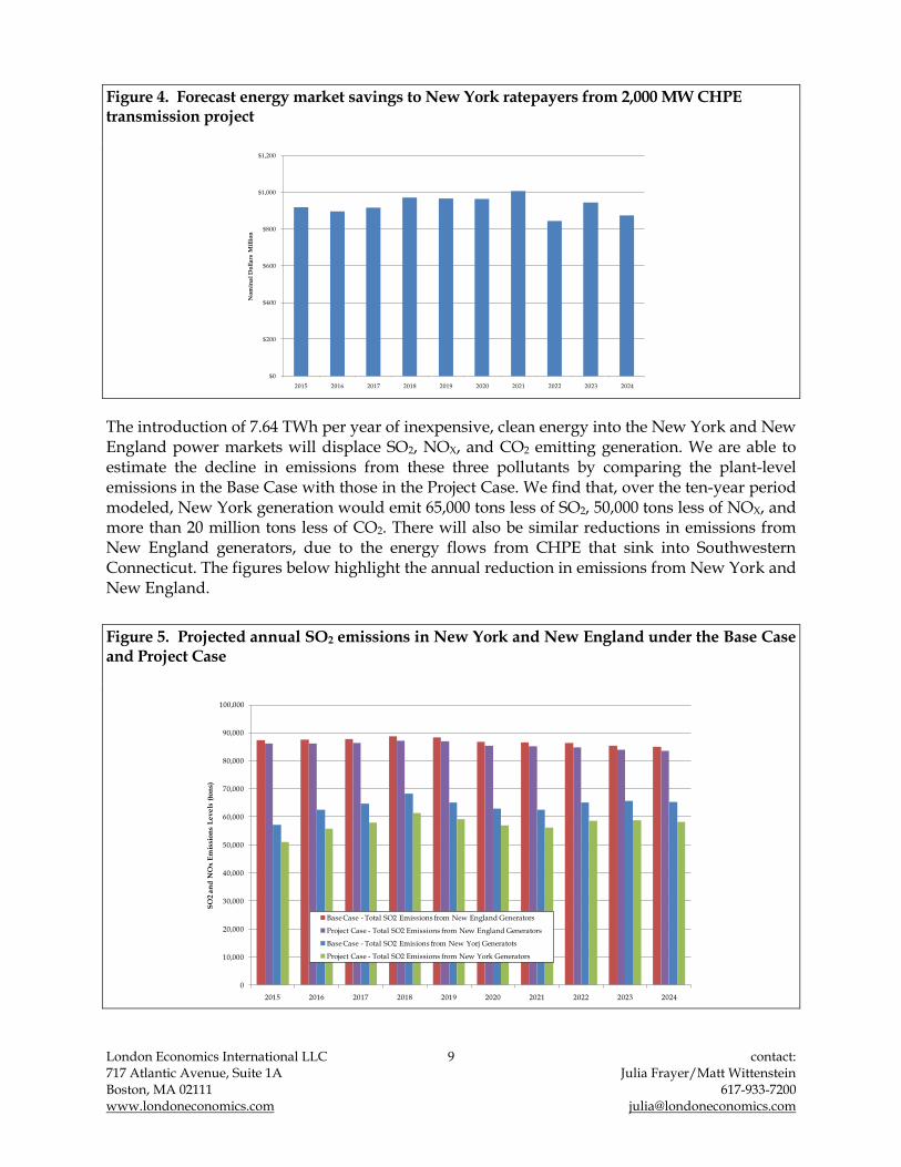
London Economics International LLC 9 contact: 717 Atlantic Avenue, Suite 1A Julia Frayer/Matt Wittenstein Boston, MA 02111 617-933-7200 www.londoneconomics.com [email protected]
Figure 4. Forecast energy market savings to New York ratepayers from 2,000 MW CHPE transmission project
$0
$200
$400
$600
$800
$1,000
$1,200
2015 2016 2017 2018 2019 2020 2021 2022 2023 2024
No
min
al
Do
lla
rs M
illi
on
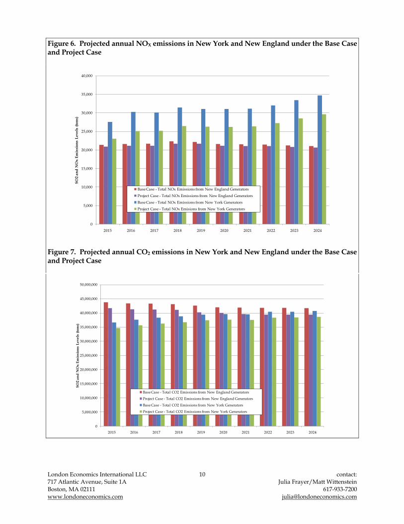
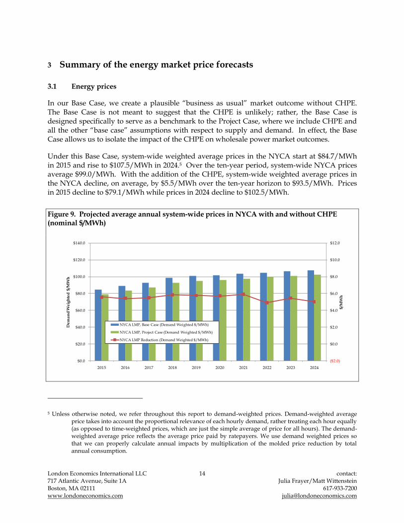
The introduction of 7.64 TWh per year of inexpensive, clean energy into the New York and New England power markets will displace SO2, NOX, and CO2 emitting generation. We are able to estimate the decline in emissions from these three pollutants by comparing the plant-level emissions in the Base Case with those in the Project Case. We find that, over the ten-year period modeled, New York generation would emit 65,000 tons less of SO2, 50,000 tons less of NOX, and more than 20 million tons less of CO2. There will also be similar reductions in emissions from New England generators, due to the energy flows from CHPE that sink into Southwestern Connecticut. The figures below highlight the annual reduction in emissions from New York and New England.
Figure 5. Projected annual SO2 emissions in New York and New England under the Base Case and Project Case
0
10,000
20,000
30,000
40,000
50,000
60,000
70,000
80,000
90,000
100,000
2015 2016 2017 2018 2019 2020 2021 2022 2023 2024
SO
2 a
nd
NO
x E
mis
sio
ns
Le
ve
ls (
ton
s)
Base Case - Total SO2 Emissions from New England Generators
Project Case - Total SO2 Emissions from New England Generators
Base Case - Total SO2 Emisions from New Yorj Generatots
Project Case - Total SO2 Emissions from New York Generators
London Economics International LLC 10 contact: 717 Atlantic Avenue, Suite 1A Julia Frayer/Matt Wittenstein Boston, MA 02111 617-933-7200 www.londoneconomics.com [email protected]
Figure 6. Projected annual NOX emissions in New York and New England under the Base Case and Project Case
0
5,000
10,000
15,000
20,000
25,000
30,000
35,000
40,000
2015 2016 2017 2018 2019 2020 2021 2022 2023 2024
SO
2 a
nd
NO
x E
mis
sio
ns
Le
ve
ls (
ton
s)
Base Case - Total NOx Emissions from New England Generators
Project Case - Total NOx Emissions from New England Generators
Base Case - Total NOx Emissions from New York Generators
Project Case - Total NOx Emisions from New York Generators
Figure 7. Projected annual CO2 emissions in New York and New England under the Base Case and Project Case
0
5,000,000
10,000,000
15,000,000
20,000,000
25,000,000
30,000,000
35,000,000
40,000,000
45,000,000
50,000,000
2015 2016 2017 2018 2019 2020 2021 2022 2023 2024
SO
2 a
nd
NO
x E
mis
sio
ns
Le
ve
ls (
ton
s)
Base Case - Total CO2 Emissions from New England Generators
Project Case - Total CO2 Emissions from New England Generators
Base Case - Total CO2 Emissions from New York Generators
Project Case - Total CO2 Emissions from New York Generators

London Economics International LLC 11 contact: 717 Atlantic Avenue, Suite 1A Julia Frayer/Matt Wittenstein Boston, MA 02111 617-933-7200 www.londoneconomics.com [email protected]
2 Overview of forecasting methodology
For this analysis, we first began by forecasting a Base Case, spanning a ten-year period of 2015 through 2024. The Base Case outlook represents the most likely set of market assumptions. We assume that: (i) the market remains balanced over the near to long-term, that reserve margin requirements are met in each year, and that current market expectations for fuel prices remain valid going forward. We then adapted our Base Case outlook to incorporate the CHPE project. The CHPE was represented as a 2,000 MW HVdc transmission project, with one 1,000 MW set of cables terminating in NYC and the other 1,000 MW set of cables terminating in CT. We further assumed that CHPE would allow low cost, renewable energy from Canada, totaling 7.64 TWh per year, to flow into NYC and into CT sub-regions.
The Base Case outlook is developed assuming a fairly stable and balanced supply-demand balance in the longer term, and the eventual convergence of long term energy and capacity price trends to levels sufficient to attract and remunerate generic entry in the long run and provide for a sustainable industry. Fuel price forecasts, which are a major driver of energy prices in the longer term, are based on forward market conditions as of second quarter 2009. CO2 emission reduction prices are based on the lower bound of the EIA‟s projections for CO2 costs in August 2009 for its analysis of the proposed federal legislation in H.R. 2454 (also known as “The American Clean Energy and Security Act), adjusted for inflation to bring them into nominal terms.
2.1 Overview of the energy market forecasting model – POOLMod
For the wholesale energy prices outlook, we employed our proprietary simulation model, POOLMod, as the foundation for our electricity price forecast. POOLMod simulates the dispatch of generating resources in the market subject to least cost dispatch principles to meet projected hourly load and technical assumptions on generation operating capacity and availability of transmission. In effect, POOLMod simulates locational based marginal prices (LBMPs).
POOLMod has been used extensively to support various mergers and acquisitions and strategic investment decisions, project financing, and regulatory decisions, both within the US and internationally. We describe specific projects where POOLMod has been employed in the past in Appendix B.
For this modeling exercise, we conservatively assumed perfect competition and therefore the bids of generators and external suppliers were based on marginal costs of production or competitive opportunity costs. Although policymakers have widely recognized (and we have quantified through the use of other complementary models in conjunction with POOLMod) that transmission can also create economic benefits associated with reduction in potential market power, we have conservatively excluded such benefits from this study.

London Economics International LLC 12 contact: 717 Atlantic Avenue, Suite 1A Julia Frayer/Matt Wittenstein Boston, MA 02111 617-933-7200 www.londoneconomics.com [email protected]
Figure 8. POOLMod’s two-stage process
Stage 1 - Commitment
Is plant available?
Stage 2 - Dispatch
Yes
No
Not committed for dispatch
Review technical capabilities of
units
Schedule hydro based on optimal
duration of operation
Incremental offers are sorted from lowest to
highest
Resources dispatched based on offer price
Market clearing price set equal to the bid of
the most expensive dispatched resource
Competitive bidding assumed
POOLMod consists of a number of key algorithms, such as maintenance scheduling, assignment of stochastic forced outages, hydro shadow pricing, commitment, and dispatch. The first stage of analysis requires the development of an availability schedule for system resources. POOLMod begins by determining a „near optimal‟ maintenance schedule on an annual basis, accounting for the need to preserve regional reserve margins across the year and a reasonable baseload, mid-merit, and peaking capacity mix. POOLMod then allocates forced (unplanned) outages randomly across the year based on the forced outage rate specified for each resource.
POOLMod next commits and dispatches plants on a daily basis. Commitment is based on the schedule of available plants net of maintenance, and takes into consideration the technical requirements of the units (such as minimum on and off times). During the commitment procedure, hydro resources are scheduled according to the optimal duration of operation in the scheduled day. They are then given a price just below the commitment price of the resource that would otherwise operate at that same schedule (i.e., the resource they are displacing). This is referred to as shadow-pricing. Shadow-pricing allows the resulting modeled clearing prices (LBMPs) to reflect the opportunity costs of hydroelectric resources that have the capacity to store water or shift their water release profile within the day and between days and seasons. This is important for the New York and New England markets, where there are several large-scale pumped storage hydroelectric plants and some conventional hydroelectric plants with storage capability.
POOLMod is a transportation-based model; therefore, it takes into account thermal limits and assumed transmission losses across the critical transmission interfaces selected by the modeler for representation in the modeling.3 We have modeled the NYISO and ISO-NE control areas on a sub-regional basis, as detailed in Section 6.2 below.
3 Transmission loss factors were calculated by dividing the historical hourly real-time loss component of the LBMP by the energy component by sub-region.

London Economics International LLC 13 contact: 717 Atlantic Avenue, Suite 1A Julia Frayer/Matt Wittenstein Boston, MA 02111 617-933-7200 www.londoneconomics.com [email protected]
POOLMod uses a heuristic, serial-limited transportation algorithm to determine LMPs subject to identified transmission limits. It is very similar to other production-cost based transportation models available commercially, like PROMOD and PROSYM.4 The other commercially available models typically approach the dispatch decisions through linear programming-based optimization. In our experience the heuristic approach and optimization approaches produce very similar results, assuming similar sets of input data. However, POOLMod has quicker run times given its heuristic algorithms, especially as modeled markets increase in terms of complexity. In addition, POOLMod has a sophisticated handling of both hydro shadow pricing, and stochastic outages and planned maintenance scheduling.
4 In addition to transportation algorithm models, there is another class of system models, referred to as AC-based or DC-based or load flow models (for example, GE Energy‟s Multi-Area Production Simulation Software, or GE MAPS). Such models stem from engineering tools used to model detailed transmission elements of the system. It takes substantial time to run these models given that most power systems are composed of thousands of transmission elements; thus, these models are typically less suited for long term economic analysis. Load flow models are typically run for a sample set of intervals (i.e., typical day or peak hour of the year) rather than chronologically for every hour of each day in a multi-year timeframe.
London Economics International LLC 14 contact: 717 Atlantic Avenue, Suite 1A Julia Frayer/Matt Wittenstein Boston, MA 02111 617-933-7200 www.londoneconomics.com [email protected]
3 Summary of the energy market price forecasts
3.1 Energy prices
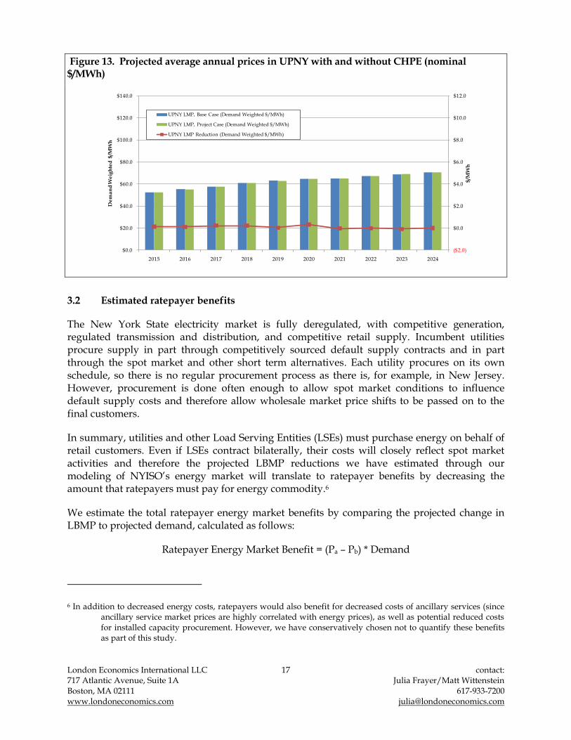
In our Base Case, we create a plausible “business as usual” market outcome without CHPE. The Base Case is not meant to suggest that the CHPE is unlikely; rather, the Base Case is designed specifically to serve as a benchmark to the Project Case, where we include CHPE and all the other “base case” assumptions with respect to supply and demand. In effect, the Base Case allows us to isolate the impact of the CHPE on wholesale power market outcomes.
Under this Base Case, system-wide weighted average prices in the NYCA start at $84.7/MWh in 2015 and rise to $107.5/MWh in 2024.5 Over the ten-year period, system-wide NYCA prices average $99.0/MWh. With the addition of the CHPE, system-wide weighted average prices in the NYCA decline, on average, by $5.5/MWh over the ten-year horizon to $93.5/MWh. Prices in 2015 decline to $79.1/MWh while prices in 2024 decline to $102.5/MWh.
Figure 9. Projected average annual system-wide prices in NYCA with and without CHPE (nominal $/MWh)
($2.0)
$0.0
$2.0
$4.0
$6.0
$8.0
$10.0
$12.0
$0.0
$20.0
$40.0
$60.0
$80.0
$100.0
$120.0
$140.0
2015 2016 2017 2018 2019 2020 2021 2022 2023 2024
$/M
Wh
De
ma
nd
We
igh
ted
$/M
Wh
NYCA LMP, Base Case (Demand Weighted $/MWh)
NYCA LMP, Project Case (Demand Weighted $/MWh)
NYCA LMP Reduction (Demand Weighted $/MWh)
5 Unless otherwise noted, we refer throughout this report to demand-weighted prices. Demand-weighted average price takes into account the proportional relevance of each hourly demand, rather treating each hour equally (as opposed to time-weighted prices, which are just the simple average of price for all hours). The demand-weighted average price reflects the average price paid by ratepayers. We use demand weighted prices so that we can properly calculate annual impacts by multiplication of the molded price reduction by total annual consumption.

London Economics International LLC 15 contact: 717 Atlantic Avenue, Suite 1A Julia Frayer/Matt Wittenstein Boston, MA 02111 617-933-7200 www.londoneconomics.com [email protected]
We also monitor the impact of the CHPE transmission project on LBMPs in the four modeled sub-regions within NYISO. Under the Base Case, annual demand-weighted average prices in NYC start out at $104.1 per MWh in 2015, rising thereafter in nominal terms in line with gas price trends and local supply-demand dynamics to reach $129.3 per MWh in 2024. Energy prices in UPNY start at $52.4 per MWh, rising to $70.5 per MWh in 2024. In C-LHV, energy prices start at $94.6 per MWh and rise to $120.8 per MWh in 2024, while in LI prices start at $104.9 per MWh and rise to $131.3 per MWh. The upward trend in Base Case prices across the sub-regions of the NYCA is driven mainly by rising natural gas prices (especially in UPNY, where heat rates remain fairly constant over the ten-year period) and CO2 prices.
In the Project Case, as a result of the low cost energy flowing on CHPE, NYC energy prices are estimated to decline to $94.0 per MWh in 2015, increasing to $119.1 per MWh in 2024. The price differential between the Base Case and the Project Case averages $10.4 per MWh over the period. In C-LHV prices decline by an average of $5.5 per MWh to $89.2 per MWh in 2015 and $114.9 per MWH in 2024, while in LI prices decline by an average of $7.9 per MWH to $96.2 per MWH in 2015 and $124.0 per MWh in 2025. In UPNY, meanwhile, prices increase by an average of $0.1 per MWh, a change which we have determined to be statistically insignificant or, in other words, equal to zero change. We detail the change in annual sub-regional prices in Figure 10 through Figure 13 below.
Figure 10. Projected average annual prices in NYC with and without CHPE (nominal $/MWh)
($2.0)
$0.0
$2.0
$4.0
$6.0
$8.0
$10.0
$12.0
$0.0
$20.0
$40.0
$60.0
$80.0
$100.0
$120.0
$140.0
2015 2016 2017 2018 2019 2020 2021 2022 2023 2024
$/M
Wh
De
ma
nd
We
igh
ted
$/M
Wh
NYC LMP, Base Case (Demand Weighted $/MWh)
NYC LMP, Project Case (Demand Weighted $/MWh)
NYC LMP Reduction (Demand Weighted $/MWh)

London Economics International LLC 16 contact: 717 Atlantic Avenue, Suite 1A Julia Frayer/Matt Wittenstein Boston, MA 02111 617-933-7200 www.londoneconomics.com [email protected]
Figure 11. Projected average annual prices in C-LHV with and without CHPE (nominal $/MWh)
($2.0)
$0.0
$2.0
$4.0
$6.0
$8.0
$10.0
$12.0
$0.0
$20.0
$40.0
$60.0
$80.0
$100.0
$120.0
$140.0
2015 2016 2017 2018 2019 2020 2021 2022 2023 2024
$/M
Wh
De
ma
nd
We
igh
ted
$/M
Wh
C-LHV LMP, Base Case (Demand Weighted $/MWh)
C-LHV LMP, Project Case (Demand Weighted $/MWh)
C-LHV LMP Reduction (Demand Weighted $/MWh)
Figure 12. Projected average annual prices in LI with and without CHPE (nominal $/MWh)
($2.0)
$0.0
$2.0
$4.0
$6.0
$8.0
$10.0
$12.0
$0.0
$20.0
$40.0
$60.0
$80.0
$100.0
$120.0
$140.0
2015 2016 2017 2018 2019 2020 2021 2022 2023 2024
$/M
Wh
De
ma
nd
We
igh
ted
$/M
Wh
LI LMP, Base Case (Demand Weighted $/MWh)
LI LMP, Project Case (Demand Weighted $/MWh)
LI LMP Reduction (Demand Weighted $/MWh)
London Economics International LLC 17 contact: 717 Atlantic Avenue, Suite 1A Julia Frayer/Matt Wittenstein Boston, MA 02111 617-933-7200 www.londoneconomics.com [email protected]
Figure 13. Projected average annual prices in UPNY with and without CHPE (nominal $/MWh)
($2.0)
$0.0
$2.0
$4.0
$6.0
$8.0
$10.0
$12.0
$0.0
$20.0
$40.0
$60.0
$80.0
$100.0
$120.0
$140.0
2015 2016 2017 2018 2019 2020 2021 2022 2023 2024
$/M
Wh
De
ma
nd
We
igh
ted
$/M
Wh
UPNY LMP, Base Case (Demand Weighted $/MWh)
UPNY LMP, Project Case (Demand Weighted $/MWh)
UPNY LMP Reduction (Demand Weighted $/MWh)
3.2 Estimated ratepayer benefits
The New York State electricity market is fully deregulated, with competitive generation, regulated transmission and distribution, and competitive retail supply. Incumbent utilities procure supply in part through competitively sourced default supply contracts and in part through the spot market and other short term alternatives. Each utility procures on its own schedule, so there is no regular procurement process as there is, for example, in New Jersey. However, procurement is done often enough to allow spot market conditions to influence default supply costs and therefore allow wholesale market price shifts to be passed on to the final customers.
In summary, utilities and other Load Serving Entities (LSEs) must purchase energy on behalf of retail customers. Even if LSEs contract bilaterally, their costs will closely reflect spot market activities and therefore the projected LBMP reductions we have estimated through our modeling of NYISO‟s energy market will translate to ratepayer benefits by decreasing the amount that ratepayers must pay for energy commodity.6
We estimate the total ratepayer energy market benefits by comparing the projected change in LBMP to projected demand, calculated as follows:
Ratepayer Energy Market Benefit = (Pa – Pb) * Demand
6 In addition to decreased energy costs, ratepayers would also benefit for decreased costs of ancillary services (since ancillary service market prices are highly correlated with energy prices), as well as potential reduced costs for installed capacity procurement. However, we have conservatively chosen not to quantify these benefits as part of this study.

London Economics International LLC 18 contact: 717 Atlantic Avenue, Suite 1A Julia Frayer/Matt Wittenstein Boston, MA 02111 617-933-7200 www.londoneconomics.com [email protected]
Where Pa is the demand-weighted average annual price from the Base Case (without CHPE) and Pb is the demand-weighted average annual price under the Project Case (with CHPE), and demand is the total annual consumption of electricity.
With the introduction of the 2,000 MW transmission line, ratepayers in New York see an average decline in energy prices of $5.5 per MWh over the ten-year modeling timeframe.7 This translates to an average decline in ratepayer costs of $930.8 million per year. New York ratepayer benefits total $10.24 billion over the ten-year period.
We detail the ratepayer benefits from the combined changes in energy and capacity prices in Figure 14 below.
Figure 14. Projected energy market benefits for New York ratepayers due to CHPE
$0
$200
$400
$600
$800
$1,000
$1,200
2015 2016 2017 2018 2019 2020 2021 2022 2023 2024
No
min
al
Do
lla
rs M
illi
on
The energy market benefits estimated above are conservative in that they exclude other potential benefits for the market (such as those related to ancillary services and capacity markets), reduction in market power (transmission will serve to expand the pool of competitive supply), renewable policy benefits, and improved system reliability (including possible reduction in transmission losses and source of incremental supply of reactive power). We discuss these incremental benefits in Section 5.
7 Ratepayers in New England also see a reduction in energy prices. We have not documented those reductions in this report.
London Economics International LLC 19 contact: 717 Atlantic Avenue, Suite 1A Julia Frayer/Matt Wittenstein Boston, MA 02111 617-933-7200 www.londoneconomics.com [email protected]
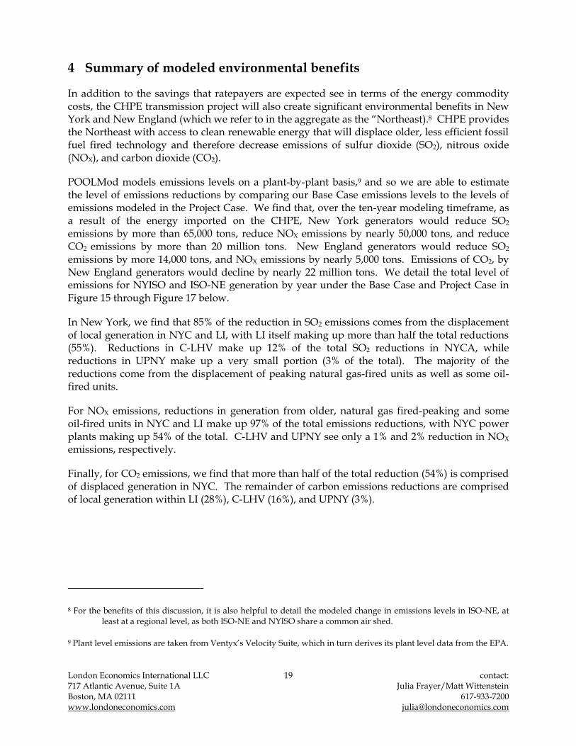
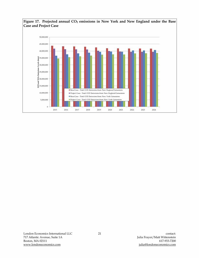
4 Summary of modeled environmental benefits
In addition to the savings that ratepayers are expected see in terms of the energy commodity costs, the CHPE transmission project will also create significant environmental benefits in New York and New England (which we refer to in the aggregate as the “Northeast).8 CHPE provides the Northeast with access to clean renewable energy that will displace older, less efficient fossil fuel fired technology and therefore decrease emissions of sulfur dioxide (SO2), nitrous oxide (NOX), and carbon dioxide (CO2).
POOLMod models emissions levels on a plant-by-plant basis,9 and so we are able to estimate the level of emissions reductions by comparing our Base Case emissions levels to the levels of emissions modeled in the Project Case. We find that, over the ten-year modeling timeframe, as a result of the energy imported on the CHPE, New York generators would reduce SO2 emissions by more than 65,000 tons, reduce NOX emissions by nearly 50,000 tons, and reduce CO2 emissions by more than 20 million tons. New England generators would reduce SO2
emissions by more 14,000 tons, and NOX emissions by nearly 5,000 tons. Emissions of CO2, by New England generators would decline by nearly 22 million tons. We detail the total level of emissions for NYISO and ISO-NE generation by year under the Base Case and Project Case in Figure 15 through Figure 17 below.
In New York, we find that 85% of the reduction in SO2 emissions comes from the displacement of local generation in NYC and LI, with LI itself making up more than half the total reductions (55%). Reductions in C-LHV make up 12% of the total SO2 reductions in NYCA, while reductions in UPNY make up a very small portion (3% of the total). The majority of the reductions come from the displacement of peaking natural gas-fired units as well as some oil-fired units.
For NOX emissions, reductions in generation from older, natural gas fired-peaking and some oil-fired units in NYC and LI make up 97% of the total emissions reductions, with NYC power plants making up 54% of the total. C-LHV and UPNY see only a 1% and 2% reduction in NOX emissions, respectively.
Finally, for CO2 emissions, we find that more than half of the total reduction (54%) is comprised of displaced generation in NYC. The remainder of carbon emissions reductions are comprised of local generation within LI (28%), C-LHV (16%), and UPNY (3%).
8 For the benefits of this discussion, it is also helpful to detail the modeled change in emissions levels in ISO-NE, at least at a regional level, as both ISO-NE and NYISO share a common air shed.
9 Plant level emissions are taken from Ventyx‟s Velocity Suite, which in turn derives its plant level data from the EPA.
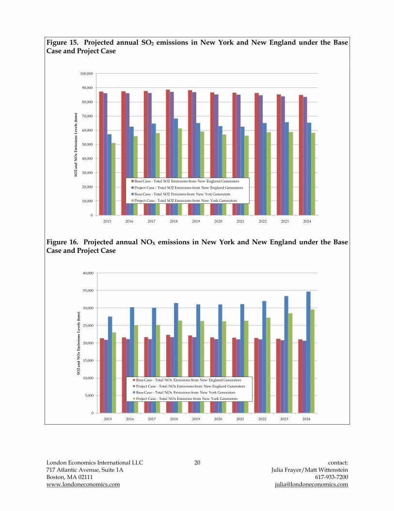
London Economics International LLC 20 contact: 717 Atlantic Avenue, Suite 1A Julia Frayer/Matt Wittenstein Boston, MA 02111 617-933-7200 www.londoneconomics.com [email protected]
Figure 15. Projected annual SO2 emissions in New York and New England under the Base Case and Project Case
0
10,000
20,000
30,000
40,000
50,000
60,000
70,000
80,000
90,000
100,000
2015 2016 2017 2018 2019 2020 2021 2022 2023 2024
SO
2 a
nd
NO
x E
mis
sio
ns
Le
ve
ls (
ton
s)
Base Case - Total SO2 Emissions from New England Generators
Project Case - Total SO2 Emissions from New England Generators
Base Case - Total SO2 Emisions from New Yorj Generatots
Project Case - Total SO2 Emissions from New York Generators
Figure 16. Projected annual NOX emissions in New York and New England under the Base Case and Project Case
0
5,000
10,000
15,000
20,000
25,000
30,000
35,000
40,000
2015 2016 2017 2018 2019 2020 2021 2022 2023 2024
SO
2 a
nd
NO
x E
mis
sio
ns
Le
ve
ls (
ton
s)
Base Case - Total NOx Emissions from New England Generators
Project Case - Total NOx Emissions from New England Generators
Base Case - Total NOx Emissions from New York Generators
Project Case - Total NOx Emisions from New York Generators
London Economics International LLC 21 contact: 717 Atlantic Avenue, Suite 1A Julia Frayer/Matt Wittenstein Boston, MA 02111 617-933-7200 www.londoneconomics.com [email protected]
Figure 17. Projected annual CO2 emissions in New York and New England under the Base Case and Project Case
0
5,000,000
10,000,000
15,000,000
20,000,000
25,000,000
30,000,000
35,000,000
40,000,000
45,000,000
50,000,000
2015 2016 2017 2018 2019 2020 2021 2022 2023 2024
SO
2 a
nd
NO
x E
mis
sio
ns
Le
ve
ls (
ton
s)
Base Case - Total CO2 Emissions from New England Generators
Project Case - Total CO2 Emissions from New England Generators
Base Case - Total CO2 Emissions from New York Generators
Project Case - Total CO2 Emissions from New York Generators
London Economics International LLC 22 contact: 717 Atlantic Avenue, Suite 1A Julia Frayer/Matt Wittenstein Boston, MA 02111 617-933-7200 www.londoneconomics.com [email protected]
5 Other potential benefits for ratepayers
Benefits to ratepayers extend beyond the reductions in energy prices. The introduction of the CHPE project would also likely reduce installed capacity market costs, at least in New York City. It would add a significant amount of new clean energy to the market, which would both increase the amount of capacity eligible to participate in New York State‟s Renewable Portfolio Standard (RPS) program as well as REC programs in neighboring regions like ISO-NE and PJM. The addition of 1,000 MW of competitively sourced generation would also decrease overall market concentration, and would improve overall system reliability. We discuss these potential benefits in more detail in the sections below.
5.1 Impact on capacity market
If the entire CHPE transmission line were granted the right to participate in New York‟s Installed Capacity (ICAP) market, the introduction of an additional 1,000 MW of capacity would certainly have an impact on ICAP prices. While it is possible to model the potential impact of the CHPE transmission project on the ICAP market, doing so accurately requires that we make certain assumptions about the level of unforced capacity deliverability rights (UDRs) that the transmission line would be granted. As this is currently uncertain (and subject to the project‟s qualification for Network Resource Interconnection Service from the NYISO), we have limited ourselves to a general qualitative discussion of how the transmission line might impact ICAP prices.
In the capacity market as a whole, we expect that prices in nominal terms will rise over the long term because of the increasing levelized costs of a hypothetical peaking unit on a $/kW per year basis. This levelized cost is used to set the reference prices on the ICAP demand curve. Levelized costs rise due to inflationary pressures on all segments of costs. These increasing costs lead to an increase in the reference prices by rotating the demand curve outward. This increase may be offset (or augmented) by four factors: changes in the hypothetical peaker plant‟s net revenues, which rotates the demand curve; changes in the required reserve margins, which shifts the demand curve; changes in the defined zero point, which rotates the demand curve; and changes in overall capacity, which affects the equilibrium capacity price. We must consider the potential impact on each of these factors in order to get a complete assessment of the impact on capacity prices. We show the impact of each of these changes on a variety of theoretical curves below (Figure 18 through Figure 22).10
10 These figures are meant to be purely representational, and do not reflect the actual NYC ICAP market conditions. For the sake of simplicity, we have assumed zero dollar bids for all spot market capacity.

London Economics International LLC 23 contact: 717 Atlantic Avenue, Suite 1A Julia Frayer/Matt Wittenstein Boston, MA 02111 617-933-7200 www.londoneconomics.com [email protected]
Figure 18. Representative ICAP demand curve for NYC, Base Case
$0.00
$5.00
$10.00
$15.00
$20.00
$25.00
$30.00
8,000 8,500 9,000 9,500 10,000 10,500 11,000 11,500 12,000 12,500 13,000 13,500 14,000 14,500 15,000
ICA
P P
rice
($
/kW
-mo
nth
)
ICAP (MW)
ICAP Curve - Base Case
Base Capacity
Figure 19. Representative ICAP demand curve for NYC with decreased peaker revenues
$0.00
$5.00
$10.00
$15.00
$20.00
$25.00
$30.00
8,000 8,500 9,000 9,500 10,000 10,500 11,000 11,500 12,000 12,500 13,000 13,500 14,000 14,500 15,000
ICA
P P
rice
($
/kW
-mo
nth
)
ICAP (MW)
ICAP Curve - Base Case
ICAP Demand Curve - Decreased Peaker Revenues
Base Capacity

London Economics International LLC 24 contact: 717 Atlantic Avenue, Suite 1A Julia Frayer/Matt Wittenstein Boston, MA 02111 617-933-7200 www.londoneconomics.com [email protected]
Figure 20. Representative ICAP demand curve for NYC with increased reserve margin
$0.00
$5.00
$10.00
$15.00
$20.00
$25.00
$30.00
8,000 8,500 9,000 9,500 10,000 10,500 11,000 11,500 12,000 12,500 13,000 13,500 14,000 14,500 15,000
ICA
P P
rice
($
/kW
-mo
nth
)
ICAP (MW)
ICAP Curve - Base Case
ICAP Demand Curve - Increased Reserve Margin
Base Capacity
Figure 21. Representative ICAP demand curve for NYC with increased zero point
$0.00
$5.00
$10.00
$15.00
$20.00
$25.00
$30.00
8,000 8,500 9,000 9,500 10,000 10,500 11,000 11,500 12,000 12,500 13,000 13,500 14,000 14,500 15,000
ICA
P P
rice
($
/kW
-mo
nth
)
ICAP (MW)
ICAP Curve - Base Case
ICAP Demand Curve - Increased Zero Point
Base Capacity

London Economics International LLC 25 contact: 717 Atlantic Avenue, Suite 1A Julia Frayer/Matt Wittenstein Boston, MA 02111 617-933-7200 www.londoneconomics.com [email protected]
Figure 22. Representative ICAP demand curve for NYC with increased capacity
$0.00
$5.00
$10.00
$15.00
$20.00
$25.00
$30.00
8,000 8,500 9,000 9,500 10,000 10,500 11,000 11,500 12,000 12,500 13,000 13,500 14,000 14,500 15,000
ICA
P P
rice
($
/kW
-mo
nth
)
ICAP (MW)
ICAP Curve - Base Case
Base Capacity
Additional Capacity
As the NYISO portion of the transmission line would terminate inside NYC, if the CHPE is granted UDRs, ICAP supplied by that facility would qualify as local capacity. It would, therefore, be included as capacity supply for purposes of both the Rest of State (ROS) auction, and in the auction for determining the price of the local New York City requirement. If the increase in capacity were the only change to these capacity markets, then on its own CHPE would lower prices in both NYC auction and ROS auction – and, in the case of NYC, most likely by a fairly significant amount, as 1,000 MW represents a significant percentage (10%) of the existing local requirement.
However, in response to the addition of the new transmission capacity, the NYISO, working in conjunction with the New York State Reliability Council (NYSRC), may change the local reserve margin requirement within NYC, or change the Installed Reserve Margin (IRM) for the NYCA as a whole. A decrease in the reserve margin for the local NYSC requirement would reinforce the reduction in NYCA ICAP prices due to additional supply. However, an increase in reserve margin would offset the decline in prices resulting in additional supply, though in all likelihood not by enough to counterbalance the decline altogether.
The projected energy market dynamic – that CHPE lowers energy prices - also means peaker plants may experience lower energy market revenues. Through the reference price determination process, the capacity market functions, in part, as a true-up mechanism for peaking plants‟ market remuneration. Therefore, a visible reduction in energy market revenues may shift the demand curve for installed capacity outward and put upward pressure on capacity prices. In NYC, this “revenue” impact would likely be small. While energy prices in NYC do decline as a result of the low cost, renewable energy flowing on the CHPE, from the perspective of a hypothetical generic peaker, the resulting energy prices are still relatively high. We would anticipate, therefore, that expectations about reduced peaker revenues from the energy market would have only a small impact on capacity prices in NYC.

London Economics International LLC 26 contact: 717 Atlantic Avenue, Suite 1A Julia Frayer/Matt Wittenstein Boston, MA 02111 617-933-7200 www.londoneconomics.com [email protected]
For the ROS capacity market, the net impact on capacity prices is less clear. In principal, CHPE does introduce additional supply of capacity to the ROS market, which should lower ROS capacity prices, holding all else equal. However, given the relative price of energy in the rest of the state as compared to NYC, a relatively small decline in peaker revenues may have a larger impact on the ROS ICAP demand curve, offsetting the impact of new supply. As a result, it is possible that ICAP throughout the rest of the state may change marginally (increase or decrease) or remain essentially unchanged. If capacity prices for ROS do rise marginally, we expect that any increase in capacity market costs would be more than offset by the decline in energy prices from the ratepayers‟ perspective. Therefore, New York consumers would still see a significant net market benefit due to CHPE.
5.2 Eligibility for participation in renewables development programs
New York State encourages the development of renewable resources through its Renewable Portfolio Standard (RPS) program. New York‟s RPS program was created by order of the New York State Public Service Commission (NYS PSC) on September 24, 2004,11 with an initial requirement that 25% of generation be provided by renewable resources by 2013. This has more recently been expanded to 30% by 2015.12 New York State currently derives approximately 21% of its generation needs from renewable resources, most of which (19.2%) comes from hydroelectric power. The CHPE transmission project would facilitate the importing of more than 7,647,480 MWh per annum of renewable energy for New York‟s consumption, which would expand the renewable energy base within the state by 13%. Moreover, one of the main criticisms of the RPS program, as it is currently being implemented, is that the majority of eligible projects are located in upstate New York. As the CHPE transmission project terminates in New York City, it would go a long way toward rebalancing the geographical distribution of renewable resources within the state.13
As we discuss further below, the renewable feature of the energy that will flow on the CHPE can be valued through the procurement-oriented mechanisms currently in place in New York, as well as external sales to neighboring states.
New York State‟s RPS program divides renewable resources into two tiers: (i) the “main tier,” comprised primarily of medium to large-scale generators that sell into the NYISO‟s wholesale market, and (ii) a “customer-sited tier,” which consists of smaller resources that only produce electricity for a single site. TDI anticipates that energy delivered from renewable resources through the CHPE transmission project may participate in the RPS program as “main tier” resources. New York State procures some or all main tier resources periodically through a competitive solicitation process, which is managed by a central procurement administrator
11 Case 03-E-0188, Proceeding on Motion of the Commission Regarding a Retail Renewable Portfolio Standard, Order Regarding Retail Renewable Portfolio Standard, September 24, 2004 (2004 RPS Order).
12 CASE 03-E-0188, Proceeding on Motion of the Commission Regarding a Retail Renewable Portfolio Standard, Order Establishing New RPS Goal and Resolving Main Tier Issues, January 8, 2010 (2010 RSP Order).
13 Ibid.

London Economics International LLC 27 contact: 717 Atlantic Avenue, Suite 1A Julia Frayer/Matt Wittenstein Boston, MA 02111 617-933-7200 www.londoneconomics.com [email protected]
(namely, the New York State Energy Research and Development Authority, or NYSERDA). Procurements are done via a sealed-bid auction. NYSERDA does not conduct procurements on a regular schedule, though it is required to conduct at least one procurement per year (and is allowed to conduct more should NYSERDA deem it necessary).
Renewable resources in New York State are compensated based on the amount of “RPS Attributes” that they provide. An RPS Attribute is defined as “the production and delivery into New York‟s power system of one MWh of electricity by an eligible RPS resource.”14 Though RPS Attributes are, at times, referred to as Renewable Energy Credits (RECs), they are in fact distinct from the RECs issued in other states in that they are not a „stand-alone,‟ tradable product. The New York RPS program administered by NYSERDA is funded via a “System Benefits/RPS Charge” that is applied to most ratepayers in the state.15 In 2007, the average charge for residential customers was $2.87 for the year, while the average charge for a non-residential customer was $30.24.16 Therefore, the additional competition of renewable resources that use the CHPE can make substantial reductions in New York ratepayer costs.
New York State resources are also eligible to sell RECs in ISO-NE so long as they are not committed as a resource capacity in their local control area. Within PJM, only New Jersey offers opportunities for resources within New York State to sell RECs, provided that the facility in question is approved by the New Jersey Department of Environmental Protection. Maryland had allowed resources from neighboring regions to participate in its REC market, but this rule was changed in 2008 with the passing of H.B. 375, which states that resources located in PJM-adjacent states are no longer eligible from 2011 onwards. In Pennsylvania, only resources that are physically located within the state are eligible to sell RECs.
5.3 Impact on reduction of potential market power
The most recent State of the Market Report released for New York State found that, at least in 2008, the energy, capacity, and ancillary services markets all performed competitively.17 The authors of the report found nothing to indicate that suppliers had withheld generation, either through economic or physical means.
However, as the report itself notes, asset ownership in NYC is heavily concentrated.18 Local market power potential is managed through specifically targeted market power mitigation
14 New York Renewable Program Evaluation Report, 2009 Review, pg 7
15 Ratepayers who receive electricity from a municipal utility, such as the New York Power Authority (NYPA) or the Long Island Power Authority (LIPA) are exempt from this fee, though the NYS PSC is actively encouraging these utilities to adopt a similar fee structure.
16 NYSERDA
17 2008 State of the Market Report, September 8, 2009, pg vi-vii
18 Ibid.
London Economics International LLC 28 contact: 717 Atlantic Avenue, Suite 1A Julia Frayer/Matt Wittenstein Boston, MA 02111 617-933-7200 www.londoneconomics.com [email protected]
measures. The addition of 1,000 MW of non-locally sourced generation resources to the NYC market – an increase of nearly 10% -- could further de-concentrate the market and structurally improve the competitiveness of the local market. While we would not go so far as to say that the addition of the CHPE transmission project would itself allow for the revision of the market power mitigation measures, it is safe to say that the net impact would be a positive one from a market power perspective.
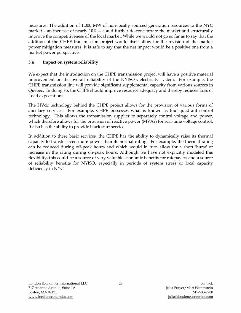
5.4 Impact on system reliability
We expect that the introduction on the CHPE transmission project will have a positive material improvement on the overall reliability of the NYISO‟s electricity system. For example, the CHPE transmission line will provide significant supplemental capacity from various sources in Quebec. In doing so, the CHPE should improve resource adequacy and thereby reduces Loss of Load expectations.
The HVdc technology behind the CHPE project allows for the provision of various forms of ancillary services. For example, CHPE possesses what is known as four-quadrant control technology. This allows the transmission supplier to separately control voltage and power, which therefore allows for the provision of reactive power (MVAr) for real-time voltage control. It also has the ability to provide black start service.
In addition to these basic services, the CHPE has the ability to dynamically raise its thermal capacity to transfer even more power than its normal rating. For example, the thermal rating can be reduced during off-peak hours and which would in turn allow for a short 'burst' or increase in the rating during on-peak hours. Although we have not explicitly modeled this flexibility, this could be a source of very valuable economic benefits for ratepayers and a source of reliability benefits for NYISO, especially in periods of system stress or local capacity deficiency in NYC.
London Economics International LLC 29 contact: 717 Atlantic Avenue, Suite 1A Julia Frayer/Matt Wittenstein Boston, MA 02111 617-933-7200 www.londoneconomics.com [email protected]
6 Appendix A: Summary of Key Assumptions
We simulate in the Base Case a “most likely” or “expected” future market for the whole of NYCA and ISO-NE, and begin by constructing a “balanced” supply-demand condition over the modeled timeframe. Consistent with long term modeling convention, we relied on 50/50 (weather normalized) demand forecasts based on the system operator‟s projections. We took into account unit-level information about existing generators. We analyze the system under the current transmission topology, whilst also factoring in any near-term planned expansions.
In the longer term, we assume that generators make “just-in-time” capacity investment decisions that are timed to load growth, as we are targeting an effective reserve margin on top of peak load. In other words, new entry is synchronized with reliability reserve requirements set by the system operators (as well as renewable portfolio standards set by state regulators). In addition, our new entry decisions are conditioned on modeled outcomes such that additional new entry is introduced if and when it is economically feasible, given the simulated market dynamics. We also take into account policy-related motivations for new entry, such as NY State‟s and New England States‟ renewable portfolio standards and their implications for additional renewables entry. In our modeling, we also consider retirements. Plants choose to exit the market if their revenues cannot cover the fixed costs going forward, consistent with economically rational business behavior. Therefore, the energy modeling is calibrated with capacity market rules and regulations (like the IRM).
Conservatively, generators are expected to offer into both the energy and capacity markets based on perfectly competitive market dynamics. This means that they will bid at their short run marginal cost in the energy market and minimum going forward fixed costs for the capacity market. Therefore, the most important drivers of generators‟ offers in the energy market are fuel prices and costs of emission allowances. For the fuel price, SO2 and NOx forecasts, we relied on market futures for the near term and in the medium and longer term, assumed escalation of nominal prices consistent with historical commodity price inflation trends. CO2 prices are based on the lower bound of the EIA‟s projection. As mentioned above, we have also assumed on-time transmission expansion of currently known and approved projects, per announced NYISO and ISO-NE‟s Board-approved plans.
6.1 Key market drivers
This section provides details of the methodology and key assumptions utilized in the development of the analytical models for this forecasting exercise. To simulate the New York and New England power markets and project future energy prices, we incorporate the following key drivers:
market topology, including the location and thermal limits of transmission constraints;
regional capacity information and operating characteristics of all existing and future generation, including seasonal capacity and thermal efficiency;
announced and economic market entry and retirements;
environmental limitations;

London Economics International LLC 30 contact: 717 Atlantic Avenue, Suite 1A Julia Frayer/Matt Wittenstein Boston, MA 02111 617-933-7200 www.londoneconomics.com [email protected]
forecasts of fuel prices for each plant and other variable costs of operation (such as emissions/allowance costs);
long-run price trends and the levelized cost of new entry; and
hourly forecasted demand profiles for each sub-region.
We discuss our assumptions, and the sources for these assumptions, in the subsections below. The assumptions used reflect current, as well as expected, market dynamics.
6.2 Transmission topology
We represent the topology of the combined New York and New England market model, including interconnections with the surrounding region, in Figure 23 below.
Figure 23. Modeled New York and New England internal and external sub-regions19
Central East:3,925 MW
NH
SEMA/RI Export: 3,000 MW
RI&SEMA
ME
SME
CMA & NEMA
CT
Surowiec South: 1,150 MW
ME-NH: 1,600 MW (adjusted for MPRP)
Boston Import: 4,900 MW
New Brunswick – NE: 1,000 MW
Maritimes
NY-NE: 1,450 MW
HQ-NE Phase 1: 1,400 MW
WMA&VT
North-South: 2,700 MW
HQ-NE High Gate:200 MW
EST
NYC LI
PJM WST
Sprainbrook:3,925 MW
LI:925 MW
Quebec to WNY:1,500 MW
PJM to WNY 1,500 MW
PJM to NYC 600-1,200 MW
Neptune: 660 MW
PJM to ENY 500MW
Ontario
Ontario to WNY: 1,850 MW
CH TXoptional plant –generic hydro
resources from Quebec,
modeled at90% LF
1,000 MWeach
East-West:: 3,500MW (with NEEWS)
CT Import: 3,600 MW (with NEEWS)
BOSTONQuebec
Sources: This topology was created by LEI for POOLMod; it relies on information from ISO-NE, NYISO and the New York State Reliability Council.
The NYISO‟s wholesale market design is based on a location-based marginal pricing (LBMP) congestion management system. Under an LMP system, energy prices are established at various nodes on the transmission system. Price differences arise across nodes when there is congestion on the system preventing the flow of power (which would equalize prices), and
19 In modeling a particular market, when we look at the external interties, we explicitly take into account the operating limits set by the ISO for the target market being studied and actual patterns of hourly energy interchanges. It is notable that neighboring ISOs may have different rating limits for those same interties based on their standards, and may also record slightly different actual hourly interchanges, based on submitted schedule differences. These discrepancies are generally within the 10-500 MW range, and are not likely to impact results substantially since import/export schedules are designed with a focus on the average level of flows rather than absolute limits or levels.
London Economics International LLC 31 contact: 717 Atlantic Avenue, Suite 1A Julia Frayer/Matt Wittenstein Boston, MA 02111 617-933-7200 www.londoneconomics.com [email protected]
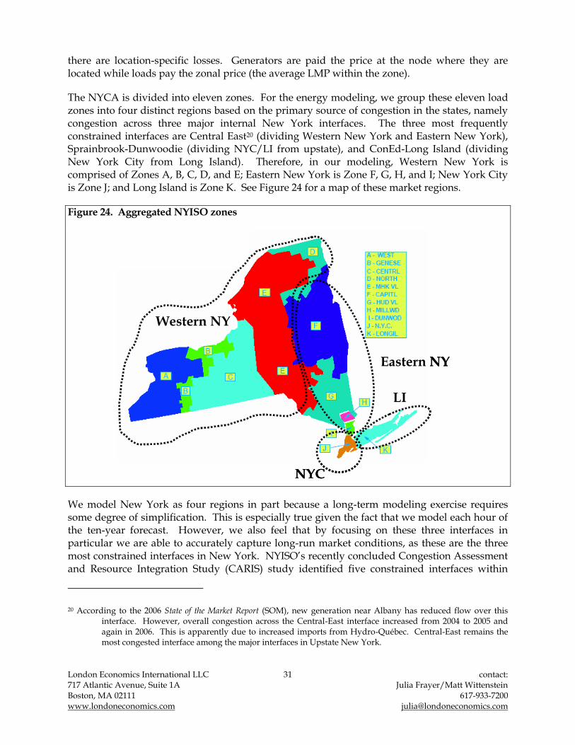
there are location-specific losses. Generators are paid the price at the node where they are located while loads pay the zonal price (the average LMP within the zone).
The NYCA is divided into eleven zones. For the energy modeling, we group these eleven load zones into four distinct regions based on the primary source of congestion in the states, namely congestion across three major internal New York interfaces. The three most frequently constrained interfaces are Central East20 (dividing Western New York and Eastern New York), Sprainbrook-Dunwoodie (dividing NYC/LI from upstate), and ConEd-Long Island (dividing New York City from Long Island). Therefore, in our modeling, Western New York is comprised of Zones A, B, C, D, and E; Eastern New York is Zone F, G, H, and I; New York City is Zone J; and Long Island is Zone K. See Figure 24 for a map of these market regions.
Figure 24. Aggregated NYISO zones
Western NY
Eastern NY
NYC
LI
Western NY
Eastern NY
NYC
LI
We model New York as four regions in part because a long-term modeling exercise requires some degree of simplification. This is especially true given the fact that we model each hour of the ten-year forecast. However, we also feel that by focusing on these three interfaces in particular we are able to accurately capture long-run market conditions, as these are the three most constrained interfaces in New York. NYISO‟s recently concluded Congestion Assessment and Resource Integration Study (CARIS) study identified five constrained interfaces within
20 According to the 2006 State of the Market Report (SOM), new generation near Albany has reduced flow over this interface. However, overall congestion across the Central-East interface increased from 2004 to 2005 and again in 2006. This is apparently due to increased imports from Hydro-Québec. Central-East remains the most congested interface among the major interfaces in Upstate New York.
London Economics International LLC 32 contact: 717 Atlantic Avenue, Suite 1A Julia Frayer/Matt Wittenstein Boston, MA 02111 617-933-7200 www.londoneconomics.com [email protected]
NYISO: West-Central, Central-East, Leeds-Pleasant Valley (which connects Zone G to the rest of C-LHV), Dunwoodie-Shore Road (which connects C-LHV to NYC), and Mott Haven-Rainey (which connects NYC to LI). Of these five, the three interfaces with the highest number of congested hours were Central East, Dunwoodie-Shore Road, and Mott Haven-Rainey.21 These are the interfaces that define our modeled sub-regions.
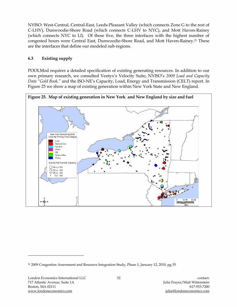
6.3 Existing supply
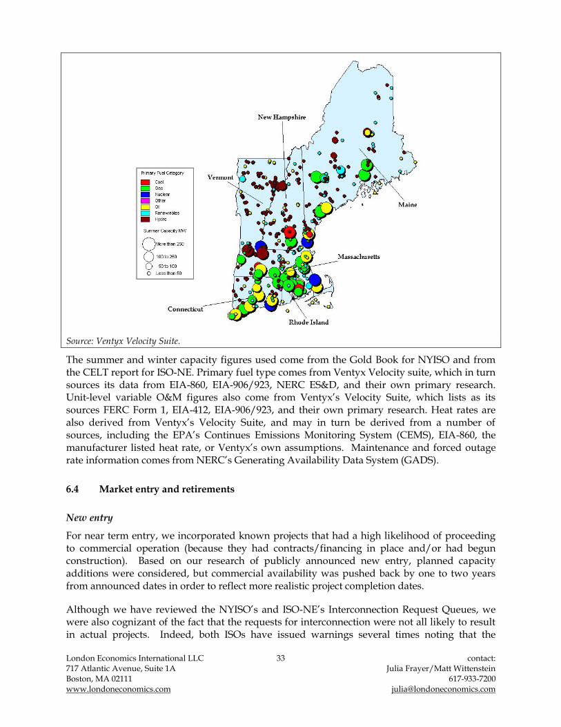
POOLMod requires a detailed specification of existing generating resources. In addition to our own primary research, we consulted Ventyx‟s Velocity Suite, NYISO‟s 2009 Load and Capacity Data “Gold Book,” and the ISO-NE‟s Capacity, Load, Energy and Transmission (CELT) report. In Figure 25 we show a map of existing generation within New York State and New England.
Figure 25. Map of existing generation in New York and New England by size and fuel
21 2009 Congestion Assessment and Resource Integration Study, Phase 1, January 12, 2010, pg 35
London Economics International LLC 33 contact: 717 Atlantic Avenue, Suite 1A Julia Frayer/Matt Wittenstein Boston, MA 02111 617-933-7200 www.londoneconomics.com [email protected]
Source: Ventyx Velocity Suite.
The summer and winter capacity figures used come from the Gold Book for NYISO and from the CELT report for ISO-NE. Primary fuel type comes from Ventyx Velocity suite, which in turn sources its data from EIA-860, EIA-906/923, NERC ES&D, and their own primary research. Unit-level variable O&M figures also come from Ventyx‟s Velocity Suite, which lists as its sources FERC Form 1, EIA-412, EIA-906/923, and their own primary research. Heat rates are also derived from Ventyx‟s Velocity Suite, and may in turn be derived from a number of sources, including the EPA‟s Continues Emissions Monitoring System (CEMS), EIA-860, the manufacturer listed heat rate, or Ventyx‟s own assumptions. Maintenance and forced outage rate information comes from NERC‟s Generating Availability Data System (GADS).
6.4 Market entry and retirements
New entry
For near term entry, we incorporated known projects that had a high likelihood of proceeding to commercial operation (because they had contracts/financing in place and/or had begun construction). Based on our research of publicly announced new entry, planned capacity additions were considered, but commercial availability was pushed back by one to two years from announced dates in order to reflect more realistic project completion dates.
Although we have reviewed the NYISO‟s and ISO-NE‟s Interconnection Request Queues, we were also cognizant of the fact that the requests for interconnection were not all likely to result in actual projects. Indeed, both ISOs have issued warnings several times noting that the

London Economics International LLC 34 contact: 717 Atlantic Avenue, Suite 1A Julia Frayer/Matt Wittenstein Boston, MA 02111 617-933-7200 www.londoneconomics.com [email protected]
marketplace frequently experiences the withdrawal of a significant portion of projects in the queue before the projects are built, as a result of project cost escalation, financing, siting, and permitting problems.
Currently there are over 16,000 MW of new projects in the New York interconnection study request process. Wind and natural gas make up the majority of new proposed projects over the next 5 years. However, many existing projects have run into delays getting the appropriate permits or land leases. It seems reasonable to assume that this trend will continue going forward, in which case some of the projects still in the proposal stage will be delayed past the current projected start date. Figure 26 shows announced new entry currently under construction in New York. We have conservatively included only these projects as short term new entry. In all, 2,289 MW of new capacity will come online by 2011 in our Base Case modeling.
Figure 26. Announced new entry in New York based on interconnection study requests
Year of Entry Plant Type DNC (MW)
Empire State Newsprint CCGT 330
Caithness Long Island CCGT 350
Spagnoli Energy Center CCGT 250
Bellmont Wind Park Wind 21
Munnsville Wind 20
CPV - Valley CCGT 630
Nine Mile Point Uprate Nuclear 168
2011 Astoria Energy - Phase 2 CCGT 520
2009
2010
Source: NYISO Interconnection Request Queue, November 2009.
In the longer term, our modeling for New York incorporates generic new entry by fuel type/technology. In terms of generic new entry quantity, there are two criteria guiding the amount of new capacity we added to the New York system under the Base Case. The RPS target for New York is also based on a percentage of energy sales or consumption of electricity. Given the 25% target,22 an additional 600 MW will be required to come from renewables by 2013. Given the existing renewable base23 and again assuming that 30% of the requirement is met by external resources (as allowed by New York‟s RPS), the state will need an additional 1,900 MW of renewable resources by 2024. In our Base Case modeling, the system‟s overall needs will be first met by generic renewable capacity (1,900 MW) and then by CCGTs (1,000 MW).
22 New York State Department of Public Service. <http://www.dps.state.ny.us/03e0188.htm>
23 We are confirming the qualified resources for selected plants with New York State Department of Public Service. The number presented here will be updated if necessary.

London Economics International LLC 35 contact: 717 Atlantic Avenue, Suite 1A Julia Frayer/Matt Wittenstein Boston, MA 02111 617-933-7200 www.londoneconomics.com [email protected]
Figure 27. Modeled new entry in New York, 2015-2024
Year Name Resource Type Capacity (MW)
ConEd Offshore Wind 1,400
Winergy NYC Wind Farm Wind 601
2017 SCGT in NYC SCGT 150
SCGT in NYC SCGT 200
Wind Project Wind 100
Biomass Biomass 20
SCGT in LI - SCGT 100
Wind Project Wind 100
Biomass Biomass 35
SCGT in NYC SCGT 200
Wind Project Wind 150
2022 SCGT in LI SCGT 125
Biomass Biomass 20
SCGT in NYC SCGT 100
Wind Project Wind 120
Biomass Biomass 20
SCGT in LI - SCGT 125
Wind Project Wind 150
2015
2019
2020
2021
2023
2024
Figure 28. Incremental new generic capacity in New York (system-wide) in the Base Case, 2015-2024
0
500
1,000
1,500
2,000
2,500
2015 2017 2019 2020 2021 2022 2023 2024
Ca
pa
city
(M
W)
Biomass
Wind
SCGT
Figure 27 and Figure 28 show the cumulative new entry by fuel type for the 2015-2024 period in New York (system-wide, without considering the potential incremental needs of New York City and Long Island) under our Base Case. In the Base Case, some economic entry is expected in addition to the entry necessary to meet the RPS requirements. We assume some CCGT entry to meet reliability requirements in NYC and LI. Generic renewables are added in UPNY in a manner consistent with the general profile of announced new entry. We estimated that more than 90% of new renewables will be wind projects, with the remainder coming from biomass. In the Project Case (with CHPE), the total quantum of new supply in New York is not affected by the new transmission line, because the economics are fundamentally not changed so much as to make such generation uneconomic, once taking into account production tax credit (PTC) income and some level of attribution for the RPS Attribute component of income.

London Economics International LLC 36 contact: 717 Atlantic Avenue, Suite 1A Julia Frayer/Matt Wittenstein Boston, MA 02111 617-933-7200 www.londoneconomics.com [email protected]
Figure 29 shows announced new entry currently under construction in New England or with more certain development paths (given achievement of regulatory approvals, successful negotiation of contracts, etc.). We conservatively include only these projects as short-term new entry. In all, 2,378 MW of new capacity will come online by 2014 in our modeling.
Figure 29. Short-term modeled new entry in New England based on interconnection study requests
Year Name Resource type Capacity (MW)
2009 UTC - P&WA Natural gas 7.5
Kimberly Clark-Unit 1 Natural gas 28
UMass Gas Turbine Natural gas 11.4
Swanton Gas Turbine I, II Natural gas 55.2
Barre Mass Landfill Gas Biomass/landfill 2
Sheffield Wind Project Wind 40
Wind Wind 27.8
Wind Wind 24
Wind Wind 26.2
Wind Wind 3.9
Berkshire Wind Power Project Wind 15
Kibby Wind Project I Wind 65
Kleen Energy Project Natural gas 620
Waterside Power - 180 MW Natural gas 207.2
Devon Units 15, 16, 17, 18 Natural gas 196.8
Biomass Project Biomass/landfill 26.75
Kibby Wind Project II Wind 65.5
Cape Wind Turbine Generators Wind 462
Hoosac Wind Project Wind 30
New Haven Peaker Natural gas 211
Middletown 11 Natural gas 110
South Norwalk Repowering Natural gas 48.9
Plainfield Renewable Energy Project Biomass/landfill 38.5
2014 Russell Biomass Biomass/landfill 55
2010
2011
2012
Source: ISO-NE. Interconnection Request Queue. August 1, 2009.
Currently there are about 19,000 MW of new projects active in the New England interconnection study request process. It is unlikely that all these projects will be developed. In fact, only 85 projects (totaling 14,715 MW) out of a total of 84,794 MW proposed projects have reached commercial operation since 1999.24
Natural gas, hydro, and wind make up the majority of new proposed projects over the next five years. However, many developing projects have run into delays getting the appropriate permits or land leases. It seems reasonable to assume that this trend will continue going forward, in which case some of the projects still in the proposal stage will be delayed past the current projected start date, or will be completely stalled and abandoned.
In the longer term, our modeling for New England, similar to the approach taken for determining modeling assumptions for New York, incorporates generic new entry by fuel type/technology. In terms of generic new entry quantity, two criteria guide the amount of new capacity we add to the New England system under the Base Case: the ICR and overall RPS
24 ISO-NE. Interconnection Request Queue, February 1, 2010.

London Economics International LLC 37 contact: 717 Atlantic Avenue, Suite 1A Julia Frayer/Matt Wittenstein Boston, MA 02111 617-933-7200 www.londoneconomics.com [email protected]
targets across the New England States. In accordance with Market Rules, the New England system has to meet the capacity reserve requirements, determined by the ISO and procured for in the capacity market. We use the ISO‟s forecast of ICR for 2010–2018, and extend this projection to 2024 by applying the 2018 implicit internal reserve margin requirement of 11.3%.
Figure 30. Forecasted peak demand, ICR, and implied reserve margin
2015 2016 2017 2018 2019 2020 2021 2022 2023 2024
Forecasted peak demand (MW) 30,120 30,410 30,690 30,955 31,239 31,525 31,814 32,106 32,401 32,698
Installed capacity requirement (MW) 33,370 33,757 34,120 34,454 34,770 35,088 35,410 35,735 36,063 36,394
Implied Internal Reserve Margin 10.8% 11.0% 11.2% 11.3% 11.3% 11.3% 11.3% 11.3% 11.3% 11.3%
In addition, each state in New England has its own RPS target, stated as a percentage of energy sales or electricity consumption. Maine maintains an RPS target of 40% by 2017, Massachusetts 15% by 2020, New Hampshire 23.8% by 2025, Rhode Island 16% by 2019, and Vermont 10% by 2013.25 These targets mean that additional renewable energy resources will be required to come online over the modeling timeframe. According to the 2009 RSP, New England states would need to generate an additional 13,628 GWh of renewable energy in 2020 to meet their combined RPS target. To generate this much renewable energy, New England would need over 33,000 MW of additional renewables capacity by 2020.26 In both our Base Case and the Project Case, the system‟s overall needs are first met by generic renewable capacity per RPS and then by CCGT.
Figure 31. Modeled generic new entry in New England, Base Case, 2015-2024
Year Name Resource Type Capacity (MW)
New generic biomass Wind 68
New generic wind Wind 442
New generic biomass Wind 70
New generic wind Wind 457
New generic biomass Wind 67
New generic wind Wind 438
New generic biomass Wind 66
New generic wind Wind 429
New generic biomass Wind 78
New generic wind Wind 510
New generic biomass Wind 42
New generic wind Wind 276
New generic CCGT Wind 500
New generic biomass Wind 32
New generic wind Wind 208
New generic CCGT Wind 300
New generic biomass Wind 32
New generic wind Wind 208
New generic CCGT Wind 300
New generic biomass Wind 32
New generic wind Wind 207
New generic CCGT Wind 300
New generic biomass Wind 32
New generic wind Wind 210
New generic CCGT Wind 400
2020
2021
2022
2023
2024
2015
2016
2017
2018
2019
25 Vermont‟s RPS target is voluntary.
26 We convert the RPS incremental renewable energy requirement for 2020 into an implied nameplate capacity value by using standard capacity factors and the composition of renewable projects that make up the current Interconnection Request Queue.

London Economics International LLC 38 contact: 717 Atlantic Avenue, Suite 1A Julia Frayer/Matt Wittenstein Boston, MA 02111 617-933-7200 www.londoneconomics.com [email protected]
Figure 32. Incremental new generic capacity in New England (system-wide), Base Case, 2015-2024
0
200
400
600
800
1,000
1,200
2015 2016 2017 2018 2019 2020 2021 2022 2023 2024
Ca
pa
city
(M
W)
Biomass
Wind
CCGT
Retirements
Economic retirements, as with environmentally-driven plant closures, were determined as an endogenous component of the analysis. In general, retirements occur as a result of non-competitive fuel costs and operating inefficiencies. Upon new entry, units with low capacity factors are displaced by more efficient technology in the merit order. This can result in significant changes in plant profitability and can ultimately lead to facility mothballing and retirement. Our methodology for identifying retirement candidates is based on projected economic performance. We used the following basic rule in our decision-making: a plant is retired when profits are insufficient to cover its minimum going forward fixed costs27 under rational investor behavior for three consecutive years. This three-year rule reflects observed inertia in deregulated markets across the US towards permanent plant closures, even in adverse market conditions. In order to model this paradigm, each plant‟s profitability is analyzed during the modeling timeframe. For each plant, combined revenues from all modeled markets (energy, FCM, and UCAP or LFRM) are catalogued and these profits are compared to each plant‟s estimated going forward fixed costs to derive net profits. In our Base Case and Project
27 The minimum going-forward fixed costs include fixed O&M costs as well as a market estimate of debt payments.
Debt should be included in the minimum going forward fixed costs because developers are treating it as „avoidable‟ in case of closure (as evidenced by distressed asset transfers to banks in instances where it was more economic for the developer to walk away).

London Economics International LLC 39 contact: 717 Atlantic Avenue, Suite 1A Julia Frayer/Matt Wittenstein Boston, MA 02111 617-933-7200 www.londoneconomics.com [email protected]
Case we model 2,110 MW of retirements, most of which are oil filed plants, over the modeling horizon. All of these retirements take place from 2015 to 2019 (Figure 33).
Figure 33. Modeled retirements New York over the 2015-2019 period, Base Case and Project Case
Year Resource Type Capacity (MW)
Oil 11
Oil 21
Oil 6
Oil 10
Oil 16
Oil 18
Natural Gas 17
Oil 8
Oil 18
Oil 11
2016 Oil 177
2017 Oil 844
2018 Oil 830
Oil 22
Oil 19
Oil 18
Oil 64
Total 2,110
2015
2019
Note: We do not model any retirements beyond 2019.
In New England, plants that submitted permanent delist bids in the FCAs are retired but only a few small plants delisted through the first three FCAs. We also consider some additional retirements in the modeling under the Base Case scenario (Figure 34). The overall amount of generic new supply resources in New England is reduced by 300 MW in 2019 in the Project Case (or 373 MW total), as the generic new CCGTs we added in the Base Case for Western Massachusetts region is no longer economic with the additional energy and capacity delivered through CHPE.28
28 In the long-term modeling we assume that plants that are not profitable for at least three years in a row will retire. After the introduction of the 1,000 MW of new capacity into CT, energy prices decline and FCM prices rise. The rise in FCM prices allows some plants to return to profitability within a three-year timeframe despite the decline in energy revenues. As a result, we retire only 300 MW of capacity after the introduction of the CHPE in the Project Case.

London Economics International LLC 40 contact: 717 Atlantic Avenue, Suite 1A Julia Frayer/Matt Wittenstein Boston, MA 02111 617-933-7200 www.londoneconomics.com [email protected]
Figure 34. Modeled retirements in New England over the 2015-2021 period, Base Case
Year Resource Type Capacity (MW)
2013 Natural Gas 85
Natural gas 560
Coal 108
Oil 543
Oil 41
Oil 455
Natural Gas 890
Oil 130
Oil 50
Natural Gas 187
Natural Gas 21
Oil 22
Oil 45
Natural Gas 635
Natural Gas 94
Oil 22
2019 Oil 73
2020 Oil 248
Natural Gas 17
Oil 47
Total 4,273
2017
2018
2021
2014
2015
2016
Note: We do not model any retirements beyond 2021.
6.5 Environmental limitations
We also considered environmental constraints in our modeling. Acid Rain and the Ozone Transport Commission are the two major US Federal level regulations that cap the SO2 and NOx emissions in the Northeast states.29
For CO2, we assume that the existing Regional Greenhouse Gas Initiative (RGGI) will be replaced by a national carbon cap and trade program by the start of our modeling timeframe in 2015. In our Base Case modeling, we assume that there will be auctioning of 100% of the CO2 allowances and all covered plants30 have to be 100% carbon neutral, which is consistent with RGGI guidelines. In other words, each covered plant is required to purchase an allowance to
29 In addition to the federal guidelines, in 2005 New York State created the Acid Deposition Reduction Program (ADRP), which put further limits on SO2 and NOX emissions. We include these requirements in our own assumptions for New York State emissions levels.
30 Note that we assume small plants are excluded from the requirement, consistent with the current RGGI assumptions.

London Economics International LLC 41 contact: 717 Atlantic Avenue, Suite 1A Julia Frayer/Matt Wittenstein Boston, MA 02111 617-933-7200 www.londoneconomics.com [email protected]
offset every ton of CO2 it emits. In this modeling, our allowance price assumptions are based on the lower bound of the EIA‟s projection, which is included in its analysis of the proposed federal bill No. H.R. 2454 (also known as “The American Clean Energy and Security Act). CO2 allowance prices begin at $25.0/ton in 2015, and rise to $60/ton by 2024 (in nominal dollar terms).
In order to model emissions cost adders for SO2 and NOx, we first examined each thermal plant‟s reported historical emission rates.31 When a plant‟s emission rates exceed the environmental emission compliance limits,32 a plant owner can either choose to install pollution abatement equipment or purchase emission allowances. A decision is made depending on which approach costs less on a present value basis. When a plant owner chooses to install pollution abatement equipment, capital costs (amortized over five years) are added to its going forward fixed costs. And these capital costs effectively increase the fixed going forward costs for covered plants. On the other hand, if a plant owner chooses to purchase emission allowances, allowance costs are added to the variable costs. Using emission rates (lbs/MMBtu) net of the emission limits for SO2 and NOx individually for each plant, we can estimate allowance purchase costs using this net emissions rate, plant specific heat rate and the current outlook for allowance prices. Since, in most instances, cost-effective pollution controls have already been added, the optimal compliance strategy is to purchase allowances in our Base Case modeling for New York and New England. We relied on Bloomberg for the forward SO2
allowance prices and NYMEX Green Exchange for the forward NOx allowance prices (see Figure 35). For the period beyond the forwards, we have incorporated a suitable inflation rate assumption (on average, 2.1% per year).
Figure 35. Allowance prices by pollutant (nominal $ per ton)
2015 2016 2017 2018 2019 2020 2021 2022 2023 2024
NYMEX Seasonal Emission Allowance Prices for NOx $77.7 $79.1 $80.6 $82.2 $83.8 $85.6 $87.5 $89.3 $91.2 $93.1
Bloomberg Emission Allowance Prices for SO2 $17.3 $12.0 $6.8 $6.9 $7.0 $7.2 $7.3 $7.5 $7.6 $7.8
CO2 Allowance Prices $25.0 $28.0 $31.0 $34.0 $37.0 $41.0 $45.0 $50.0 $54.0 $60.0
6.6 Fuel price trends
POOLMod relies on a monthly fuel prices in developing the marginal cost bids of generators in the energy market. Fuel price projections were developed based on market trends as of fourth quarter 2009. Short-term needs were driven by forward market expectations, as discussed further below, while longer term trends were based on more general commodity price paths. Figure 36 below summarizes the annual average trends for illustrative purposes.
31 Plant level emissions are taken from Ventyx‟s Velocity Suite, which in turn derives its plant level data from the EPA. Emissions levels are consistent with those assumed by NYISO, which also derives its data from the EPA.
32 We have assumed a cross-state emission allowance rate of 0.3 lbs/MMBtu for SO2 in New England, a national emission allowance rate of 0.4 lbs/MMBtu for SO2 in New York, and 0.15 lbs/MMBtu for NOx in general.

London Economics International LLC 42 contact: 717 Atlantic Avenue, Suite 1A Julia Frayer/Matt Wittenstein Boston, MA 02111 617-933-7200 www.londoneconomics.com [email protected]
Figure 36. Projected commodity fuel prices (nominal $/MMBtu)
$0.0
$5.0
$10.0
$15.0
$20.0
$25.0
$30.0
$35.0
2015 2016 2017 2018 2019 2020 2021 2022 2023 2024
$/M
MB
tu
Coal (average)
Distillate Oil
Residual Oil
Natural gas (HH)
6.6.1 Natural gas
Natural gas is generally priced with reference to the commodity price at Henry Hub, Louisiana plus an adder for transportation and local distribution charges. For the markets we cover in this report, the primary gas pricing points are listed below:
Western New York: Niagara
Eastern New York: Iroquois at Waddington
NYC and LI: Transco Zone 6
ISO-NE Boston Citygate
We examined the historical five-year differentials of the Henry Hub prices and the primarily gas pricing points listed above. Based on our research, a five-year average of the pricing differential provides a reasonable proxy for the transportation basis adder.
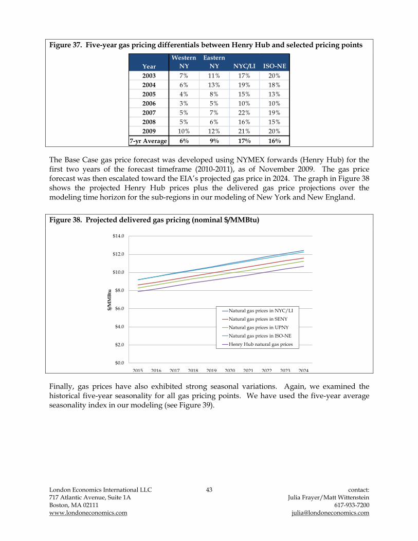
London Economics International LLC 43 contact: 717 Atlantic Avenue, Suite 1A Julia Frayer/Matt Wittenstein Boston, MA 02111 617-933-7200 www.londoneconomics.com [email protected]
Figure 37. Five-year gas pricing differentials between Henry Hub and selected pricing points
Year
Western
NY
Eastern
NY NYC/LI ISO-NE
2003 7% 11% 17% 20%
2004 6% 13% 19% 18%
2005 4% 8% 15% 13%
2006 3% 5% 10% 10%
2007 5% 7% 22% 19%
2008 5% 6% 16% 15%
2009 10% 12% 21% 20%
7-yr Average 6% 9% 17% 16%
The Base Case gas price forecast was developed using NYMEX forwards (Henry Hub) for the first two years of the forecast timeframe (2010-2011), as of November 2009. The gas price forecast was then escalated toward the EIA‟s projected gas price in 2024. The graph in Figure 38 shows the projected Henry Hub prices plus the delivered gas price projections over the modeling time horizon for the sub-regions in our modeling of New York and New England.
Figure 38. Projected delivered gas pricing (nominal $/MMBtu)
$0.0
$2.0
$4.0
$6.0
$8.0
$10.0
$12.0
$14.0
2015 2016 2017 2018 2019 2020 2021 2022 2023 2024
$/M
MB
tu
Natural gas prices in NYC/LI
Natural gas prices in SENY
Natural gas prices in UPNY
Natural gas prices in ISO-NE
Henry Hub natural gas prices
Finally, gas prices have also exhibited strong seasonal variations. Again, we examined the historical five-year seasonality for all gas pricing points. We have used the five-year average seasonality index in our modeling (see Figure 39).

London Economics International LLC 44 contact: 717 Atlantic Avenue, Suite 1A Julia Frayer/Matt Wittenstein Boston, MA 02111 617-933-7200 www.londoneconomics.com [email protected]
Figure 39. Gas price seasonality in NYISO and New England
0%
20%
40%
60%
80%
100%
120%
140%
160%
Jan Feb Mar Apr May Jun Jul Aug Sep Oct Nov Dec
Transco Zone 6
Niagara
Iroquois
New England
Note: Transco Zone 6 seasonality index was applied to CNY prices, Niagara was applied to UPNY prices, and Niagara was applied to Eastern NY (ENY) prices.
6.6.2 Oil
Our distillate oil price forecast is based on historical distillate oil prices, projected forward using the EIA‟s assumed growth rate in the Annual Energy Outlook 2009. Figure 40 below contains more details on projected oil price trends under the Base Case.
Figure 40. Projected oil prices for New York and New England (nominal $/MMBtu)
2015 2016 2017 2018 2019 2020 2021 2022 2023 2024
Distillate Oil 20.3$ 21.8$ 23.2$ 24.6$ 25.7$ 26.6$ 27.6$ 28.4$ 29.5$ 30.6$
Residual Oil 17.1$ 18.4$ 19.6$ 20.9$ 21.5$ 22.3$ 23.2$ 23.9$ 24.7$ 25.4$
Oil prices also present some level of seasonality, even though it is much weaker than the monthly seasonality for natural gas. We reviewed the historical New York Harbor distillate and residual prices between 2003 and 2008. Similar to natural gas seasonality, we employed the five-year average oil seasonality profile in our forecast, as shown in Figure 41.

London Economics International LLC 45 contact: 717 Atlantic Avenue, Suite 1A Julia Frayer/Matt Wittenstein Boston, MA 02111 617-933-7200 www.londoneconomics.com [email protected]
Figure 41. Oil seasonality
80%
85%
90%
95%
100%
105%
110%
Residual
Distilate
6.6.3 Coal
Given the diversity in coal sourcing, quality, and price, we have relied on plant-specific coal price outlooks since each coal plant has differing sulfur content levels and contracts for price and transportation, resulting in different delivered fuel costs. For coal plants in New York and New England, our coal price assumptions are based on the 2009 average delivered price to each plant escalated to nominal terms using the annual rate of change implied in the coal price index and inflation rate from EIA's Annual Energy Outlook 2009 (see Figure 42 for details on individual plants‟ projected delivered coal prices used in the Base Case).
Figure 42. Projected delivered coal prices for New York and New England coal-fired plants (nominal $/MMBtu)
2015 2016 2017 2018 2019 2020 2021 2022 2023 2024
CHG&E - Danskammer 4.3$ 4.4$ 4.5$ 4.6$ 4.7$ 4.9$ 5.0$ 5.1$ 5.2$ 5.4$
RG&E - Russell 1.2$ 1.3$ 1.3$ 1.3$ 1.3$ 1.4$ 1.4$ 1.4$ 1.5$ 1.5$
O&R - Lovett 1.4$ 1.5$ 1.5$ 1.6$ 1.6$ 1.6$ 1.7$ 1.7$ 1.8$ 1.8$
NRG - Dunkirk 2.9$ 3.0$ 3.1$ 3.1$ 3.2$ 3.3$ 3.4$ 3.4$ 3.5$ 3.6$
NRG - Huntley 3.3$ 3.4$ 3.5$ 3.6$ 3.7$ 3.8$ 3.9$ 4.0$ 4.1$ 4.2$
AES - Cayuga 3.5$ 3.6$ 3.7$ 3.8$ 3.9$ 4.0$ 4.1$ 4.2$ 4.3$ 4.4$
AES - Somerset 2.6$ 2.7$ 2.7$ 2.8$ 2.9$ 2.9$ 3.0$ 3.1$ 3.2$ 3.2$
AES - Westover 3.2$ 3.3$ 3.4$ 3.4$ 3.5$ 3.6$ 3.7$ 3.8$ 3.9$ 4.0$
Trigen-Syracuse 2.9$ 3.0$ 3.0$ 3.1$ 3.2$ 3.2$ 3.3$ 3.4$ 3.5$ 3.6$
Black River Power 1.6$ 1.6$ 1.7$ 1.7$ 1.8$ 1.8$ 1.9$ 1.9$ 2.0$ 2.0$
Salem Harbor 2.3$ 2.4$ 2.5$ 2.5$ 2.6$ 2.7$ 2.8$ 2.8$ 2.9$ 3.0$
AES Thames 3.2$ 3.3$ 3.4$ 3.5$ 3.6$ 3.7$ 3.8$ 4.0$ 4.1$ 4.2$
Merrimack 4.0$ 4.1$ 4.2$ 4.4$ 4.5$ 4.6$ 4.8$ 4.9$ 5.0$ 5.2$
Schiller 3.6$ 3.7$ 3.8$ 3.9$ 4.0$ 4.1$ 4.2$ 4.3$ 4.5$ 4.6$
Brayton 3.5$ 3.6$ 3.7$ 3.9$ 4.0$ 4.1$ 4.2$ 4.3$ 4.5$ 4.6$
Somerset 3.6$ 3.7$ 3.9$ 4.0$ 4.1$ 4.2$ 4.3$ 4.5$ 4.6$ 4.7$
Bridgeport Harbor 3.7$ 3.8$ 4.0$ 4.1$ 4.2$ 4.3$ 4.4$ 4.6$ 4.7$ 4.8$
Mt Tom 2.6$ 2.6$ 2.7$ 2.8$ 2.9$ 3.0$ 3.0$ 3.1$ 3.2$ 3.3$
3.0$ 3.1$ 3.1$ 3.2$ 3.3$ 3.4$ 3.5$ 3.6$ 3.7$ 3.8$
New
Yo
rkN
ew E
ng
lan
d
Average
Sources: Ventyx Energy Velocity Suite; EIA. Annual Energy Outlook. 2009.
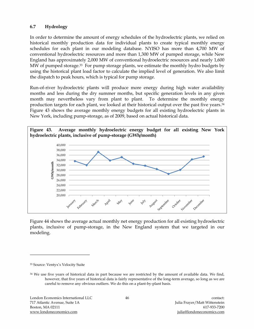
London Economics International LLC 46 contact: 717 Atlantic Avenue, Suite 1A Julia Frayer/Matt Wittenstein Boston, MA 02111 617-933-7200 www.londoneconomics.com [email protected]
6.7 Hydrology
In order to determine the amount of energy schedules of the hydroelectric plants, we relied on historical monthly production data for individual plants to create typical monthly energy schedules for each plant in our modeling database. NYISO has more than 4,700 MW of conventional hydroelectric resources and more than 1,300 MW of pumped storage, while New England has approximately 2,000 MW of conventional hydroelectric resources and nearly 1,600 MW of pumped storage.33 For pump storage plants, we estimate the monthly hydro budgets by using the historical plant load factor to calculate the implied level of generation. We also limit the dispatch to peak hours, which is typical for pump storage.
Run-of-river hydroelectric plants will produce more energy during high water availability months and less during the dry summer months, but specific generation levels in any given month may nevertheless vary from plant to plant. To determine the monthly energy production targets for each plant, we looked at their historical output over the past five years.34 Figure 43 shows the average monthly energy budgets for all existing hydroelectric plants in New York, including pump-storage, as of 2009, based on actual historical data.
Figure 43. Average monthly hydroelectric energy budget for all existing New York hydroelectric plants, inclusive of pump-storage (GWh/month)
20,000
22,000
24,000
26,000
28,000
30,000
32,000
34,000
36,000
38,000
40,000
GW
h/m
on
th
Figure 44 shows the average actual monthly net energy production for all existing hydroelectric plants, inclusive of pump-storage, in the New England system that we targeted in our modeling.
33 Source: Ventyx‟s Velocity Suite
34 We use five years of historical data in part because we are restricted by the amount of available data. We find, however, that five years of historical data is fairly representative of the long-term average, so long as we are careful to remove any obvious outliers. We do this on a plant-by-plant basis.

London Economics International LLC 47 contact: 717 Atlantic Avenue, Suite 1A Julia Frayer/Matt Wittenstein Boston, MA 02111 617-933-7200 www.londoneconomics.com [email protected]
Figure 44. Average monthly hydroelectric energy budget for all existing New England hydroelectric plant, inclusive of pump-storage (GWh/month)
0
500
1,000
1,500
2,000
2,500
3,000
3,500
4,000
GW
h
Source: Ventyx Energy Velocity Suite.
6.8 Demand
For our demand assumptions, we generally use each ISO‟s latest base case (or 50/50) forecasts for annual peak demand and total energy consumption. However, because our modeling requires hourly projections, we also develop a reasonable hourly profile by examining hourly historical data and heating and cooling days to determine either a specific year that best approximates the historical average or an average hourly profile.
6.8.1 NYISO
To forecast demand in New York, we selected an appropriate weather-normalized base year based on a review of average heating and cooling degree days in each year against the ten year average. As seen in the figure below, 2002 has the smallest overall deviation from the average; however, data constraints prevented us from using this year as our hourly profile. We chose instead to use 2007, which is still relatively close to the ten-year average
Figure 45. Historical weather analysis Heating Days Cooling Days
1999 -3.2% 40.6%
2000 -0.9% -1.1%
2001 -3.2% 0.6%
2002 -1.7% 1.1%
2003 -0.6% -2.4%
2004 -0.7% -2.1%
2005 1.6% -3.9%
2006 -0.3% -2.5%
2007 -0.6% -2.7%
2008 -7.5% 9.1%
2009 -4.7% -17.4% Source: Bloomberg.

London Economics International LLC 48 contact: 717 Atlantic Avenue, Suite 1A Julia Frayer/Matt Wittenstein Boston, MA 02111 617-933-7200 www.londoneconomics.com [email protected]
We then applied the 2009 ISO annual demand forecasts35 of total energy usage and summer peak demand to the hourly profile from 2007. All regions are trending upward, with overall demand in the entire state growing at an average rate of 0.79% p.a. Most of this new demand will come from Western New York, which will grow at an average rate of 0.74% p.a. Summer peak demand will grow fairly consistently across the state, at an average rate of 0.85% per annum.
Figure 46. Projected peak demand and energy consumption for New York
NYISO 2015 2016 2017 2018 2019 2020 2021 2022 2023 2024
Energy (GWH) 168,690 170,124 171,477 172,939 174,484 175,858 177,243 178,639 180,046 181,463 Growth in Energy demand 0.55% 0.85% 0.80% 0.85% 0.89% 0.79% 0.79% 0.79% 0.79% 0.79%
Summer Peak (MW) 34,483 34,809 35,103 35,450 35,792 36,096 36,403 36,712 37,024 37,339 Growth in Summer peak demand 0.51% 0.95% 0.84% 0.99% 0.96% 0.85% 0.85% 0.85% 0.85% 0.85%
West 2015 2016 2017 2018 2019 2020 2021 2022 2023 2024
Energy (GWH) 57,441 57,901 58,353 58,866 59,403 59,840 60,280 60,723 61,169 61,619
Growth in Energy demand 0.30% 0.80% 0.78% 0.88% 0.91% 0.74% 0.74% 0.74% 0.74% 0.74%
Summer Peak (MW) 9,576 9,654 9,731 9,816 9,905 9,978 10,052 10,126 10,201 10,276
Growth in Summer peak demand 0.30% 0.81% 0.80% 0.87% 0.91% 0.74% 0.74% 0.74% 0.74% 0.74%
East 2015 2016 2017 2018 2019 2020 2021 2022 2023 2024
Energy (GWH) 32,137 32,390 32,686 32,948 33,224 33,487 33,753 34,020 34,290 34,562 Growth in Energy demand 0.62% 0.79% 0.91% 0.80% 0.84% 0.79% 0.79% 0.79% 0.79% 0.79%
Summer Peak (MW) 6,868 6,924 6,991 6,455 7,119 7,177 7,235 7,294 7,354 7,414
Growth in Summer peak demand 0.47% 0.82% 0.97% -7.67% 10.29% 0.81% 0.81% 0.81% 0.81% 0.81%
NYC 2015 2016 2017 2018 2019 2020 2021 2022 2023 2024
Energy (GWH) 55,671 55,949 56,228 56,510 56,793 57,067 57,343 57,619 57,897 58,177 Growth in Energy demand 0.41% 0.50% 0.50% 0.50% 0.50% 0.48% 0.48% 0.48% 0.48% 0.48%
Summer Peak (MW) 12,440 12,555 12,665 12,775 12,886 12,988 13,090 13,193 13,297 13,402
Growth in Summer peak demand 0.40% 0.92% 0.88% 0.87% 0.87% 0.79% 0.79% 0.79% 0.79% 0.79%
LI 2015 2016 2017 2018 2019 2020 2021 2022 2023 2024
Energy (GWH) 23,441 23,884 24,210 24,615 25,064 25,471 25,884 26,304 26,731 27,164 Growth in Energy demand 1.36% 1.89% 1.36% 1.67% 1.82% 1.62% 1.62% 1.62% 1.62% 1.62%
Summer Peak (MW) 5,599 5,676 5,716 5,804 5,882 5,954 6,026 6,100 6,174 6,250
Growth in Summer peak demand 1.14% 1.38% 0.70% 1.54% 1.34% 1.22% 1.22% 1.22% 1.22% 1.22%
6.8.2 ISO-NE
ISO-NE demand data used in the modeling consists of hourly load data for each of the sub-regions for the duration of the analysis period. The 2015-2018 hourly load profiles of the sub-regions came directly from the ISO-NE‟s 50/50 (Reference Case) hourly demand forecast published in the 2009 CELT report.36 By definition, the 50/50 load forecast is an expected weather forecast wherein peak load has a 50% chance of exceeding the 50/50 load forecast. This is the most appropriate forecast to use in a long term modeling exercise, given the underlying logic for a long-term forecast. Thus, major assumptions and conditions – including weather – are assumed to approach or approximate the long-term average. We apply the previous year‟s growth rates forward to forecast hourly load after 2018.
Figure 47 outlines our assumptions about peak demand and energy consumption in each sub-region over the modeling horizon. All sub-regions are trending upward, with overall energy demand in the entire region growing at an average rate of 0.7% p.a. Connecticut energy
35 The most recent 2009 Load & Capacity Data “Gold Book” of New York was released on August 2009 while the ISO-NE RSP 2009 was issued on October 2009.
36 ISO-NE. “CELT Forecasting Details.” <http://www.iso-ne.com/trans/celt/fsct_detail/index.html>

London Economics International LLC 49 contact: 717 Atlantic Avenue, Suite 1A Julia Frayer/Matt Wittenstein Boston, MA 02111 617-933-7200 www.londoneconomics.com [email protected]
demand grows at an average rate of 0.4% p.a. Meanwhile, summer peak demand grows consistently across the region, at an average rate of 0.6% p.a.
Figure 47. Projected peak demand and energy consumption for New England
ISO-NE 2015 2016 2017 2018 2019 2020 2021 2022 2023 2024
Summer Peak (MW) ISO-NE RSP 2009 30,120 30,410 30,690 30,955 31,239 31,525 31,814 32,106 32,401 32,698
Growth in Peak (%) 1.3% 1.0% 0.9% 0.9% 0.9% 0.9% 0.9% 0.9% 0.9% 0.9%
Energy (GWh) ISO-NE RSP 2009 140,633 142,027 142,541 143,491 144,458 145,432 146,413 147,401 148,396 149,399
Growth in Energy (%) 0.8% 1.0% 0.4% 0.7% 0.7% 0.7% 0.7% 0.7% 0.7% 0.7%
ME 2015 2016 2017 2018 2019 2020 2021 2022 2023 2024
Summer Peak (MW) ISO-NE RSP 2009 1,610 1,620 1,640 1,655 1,670 1,686 1,701 1,717 1,733 1,749
Growth in Peak (%) 1.6% 0.6% 1.2% 0.9% 0.9% 0.9% 0.9% 0.9% 0.9% 0.9%
Energy (GWh) ISO-NE RSP 2009 9,063 9,126 9,149 9,207 9,256 9,304 9,353 9,403 9,452 9,502
Growth in Energy (%) 0.6% 0.7% 0.3% 0.6% 0.5% 0.5% 0.5% 0.5% 0.5% 0.5%
SME 2015 2016 2017 2018 2019 2020 2021 2022 2023 2024
Summer Peak (MW) ISO-NE RSP 2009 645 650 660 665 672 679 686 693 700 707
Growth in Peak (%) 1.6% 0.8% 1.5% 0.8% 1.0% 1.0% 1.0% 1.0% 1.0% 1.0%
Energy (GWh) ISO-NE RSP 2009 3,345 3,374 3,390 3,409 3,430 3,451 3,473 3,494 3,516 3,538
Growth in Energy (%) 0.7% 0.9% 0.5% 0.6% 0.6% 0.6% 0.6% 0.6% 0.6% 0.6%
NH 2015 2016 2017 2018 2019 2020 2021 2022 2023 2024
Summer Peak (MW) ISO-NE RSP 2009 2,250 2,280 2,305 2,330 2,357 2,385 2,413 2,441 2,470 2,499
Growth in Peak (%) 1.6% 1.3% 1.1% 1.1% 1.2% 1.2% 1.2% 1.2% 1.2% 1.2%
Energy (GWh) ISO-NE RSP 2009 10,639 10,774 10,854 10,964 11,075 11,187 11,300 11,414 11,529 11,645
Growth in Energy (%) 1.2% 1.3% 0.7% 1.0% 1.0% 1.0% 1.0% 1.0% 1.0% 1.0%
CMA+NEMA 2015 2016 2017 2018 2019 2020 2021 2022 2023 2024
Summer Peak (MW) ISO-NE RSP 2009 2,085 2,110 2,130 2,145 2,165 2,186 2,207 2,228 2,249 2,270
Growth in Peak (%) 1.2% 1.2% 0.9% 0.7% 1.0% 1.0% 1.0% 1.0% 1.0% 1.0%
Energy (GWh) ISO-NE RSP 2009 9,393 9,506 9,555 9,626 9,705 9,785 9,865 9,946 10,028 10,110
Growth in Energy (%) 1.0% 1.2% 0.5% 0.7% 0.8% 0.8% 0.8% 0.8% 0.8% 0.8%
BOSTON 2015 2016 2017 2018 2019 2020 2021 2022 2023 2024
Summer Peak (MW) ISO-NE RSP 2009 6,080 6,145 6,205 6,260 6,321 6,383 6,445 6,508 6,572 6,636
Growth in Peak (%) 1.2% 1.1% 1.0% 0.9% 1.0% 1.0% 1.0% 1.0% 1.0% 1.0%
Energy (GWh) ISO-NE RSP 2009 27,661 27,983 28,114 28,325 28,550 28,777 29,006 29,236 29,468 29,703
Growth in Energy (%) 0.9% 1.2% 0.5% 0.8% 0.8% 0.8% 0.8% 0.8% 0.8% 0.8%
SEMARI 2015 2016 2017 2018 2019 2020 2021 2022 2023 2024
Summer Peak (MW) ISO-NE RSP 2009 5,945 6,015 6,075 6,135 6,200 6,265 6,331 6,398 6,465 6,533
Growth in Peak (%) 1.5% 1.2% 1.0% 1.0% 1.1% 1.1% 1.1% 1.1% 1.1% 1.1%
Energy (GWh) ISO-NE RSP 2009 26,771 27,066 27,185 27,386 27,595 27,805 28,016 28,230 28,444 28,661
Growth in Energy (%) 0.9% 1.1% 0.4% 0.7% 0.8% 0.8% 0.8% 0.8% 0.8% 0.8%
WMA+VT 2015 2016 2017 2018 2019 2020 2021 2022 2023 2024
Summer Peak (MW) ISO-NE RSP 2009 3,635 3,670 3,710 3,745 3,782 3,820 3,858 3,897 3,936 3,975
Growth in Peak (%) 1.4% 1.0% 1.1% 0.9% 1.0% 1.0% 1.0% 1.0% 1.0% 1.0%
Energy (GWh) ISO-NE RSP 2009 18,800 18,995 19,076 19,218 19,359 19,502 19,645 19,790 19,935 20,082
Growth in Energy (%) 0.9% 1.0% 0.4% 0.7% 0.7% 0.7% 0.7% 0.7% 0.7% 0.7%
CT 2015 2016 2017 2018 2019 2020 2021 2022 2023 2024
Summer Peak (MW) ISO-NE RSP 2009 7,870 7,920 7,965 8,020 8,071 8,122 8,173 8,224 8,276 8,329
Growth in Peak (%) 0.9% 0.6% 0.6% 0.7% 0.6% 0.6% 0.6% 0.6% 0.6% 0.6%
Energy (GWh) ISO-NE RSP 2009 34,962 35,203 35,217 35,356 35,488 35,621 35,754 35,888 36,022 36,157
Growth in Energy (%) 0.5% 0.7% 0.0% 0.4% 0.4% 0.4% 0.4% 0.4% 0.4% 0.4%
Source: ISO-NE’s forecast of hourly sub-region demand.
6.9 Long-run price trends and the levelized cost of new entry
Taking into account the long-run price trends and levelized cost of new entry (CONE) allows us to benchmark whether modeled generic new entry is economic and therefore confirm that the

London Economics International LLC 50 contact: 717 Atlantic Avenue, Suite 1A Julia Frayer/Matt Wittenstein Boston, MA 02111 617-933-7200 www.londoneconomics.com [email protected]
balanced supply-demand paradigm presumed in the Base Case is achievable. It also allows us to see whether or not the combined energy and capacity price forecasts are converging to the long-run expectations we assumed in developing the Base Case. It is reasonable to assume that the sum of energy and capacity prices will converge to the blended cost of new entry for a typical CCGT plant and typical peaker, as CCGTs and/or peakers are the most likely (non-renewable) generic new entry candidates for these markets, both in terms of economics and price-setting. Rather than functioning as an explicit input into our model, both the long-run price trends and levelized CONE function are an implicit, albeit important, factor in our long-run price projections.
The New Entry Trigger Price (NETP) model looks at the total costs of a plant levelized over a certain amount of time for capital recovery and assumes a certain operating regime, or load factor. NETP is also used in determining whether, given current market conditions, new generation will be added based on whether or not it is economically viable to do so. It should also be noted that the NETP for peaker plants sets the reference price in the capacity model.
The NETP model covers capital, financing and operating costs and has five main components:
amortized carrying charge of the plant over the debt term, which looks at the interest expenses based on all-in capital cost during construction term, levelized over debt term, and adjusted in $ per MWh terms using the plant‟s optimal operating regime;
cost of debt , one element of the cost of capital;
cost of equity, second element of the cost of capital;
fuel cost;
variable operating and maintenance costs (VO&M); and
fixed operating and maintenance costs (FO&M), generally estimated as $/kW–year and then adjusted in $ per MWh terms using the plant‟s optimal operating regime.
While some NETP parameters are the same across all of New York State and New England, some parameters will vary by region. For example, we apply different capital costs as the land acquisition cost, labor costs and construction costs, to some degree, are region-specific inputs. We also apply different load factor (LF) assumptions, based on actual modeled dynamics rather than notional levels, as a peaker‟s running regime is different due to different supply-demand balances and fuel mix among regions.
EIA publishes capital costs assumptions for various technologies. However, the assumptions are on the low end and do not reflect recent trends. In light of significant increases in capital costs, we have surveyed recent announced costs estimated by developers, combined with assumptions published by ISOs, to derive our own calculations. In addition, the Handy Whitman Index, which reflects price changes in construction equipment and raw materials costs, has shown a 45% increase for the electric generation sector cost index between 2003 and

London Economics International LLC 51 contact: 717 Atlantic Avenue, Suite 1A Julia Frayer/Matt Wittenstein Boston, MA 02111 617-933-7200 www.londoneconomics.com [email protected]
2009 (see Figure 48), or an annual rate of inflation of 6.7%.37 The Producer Price Index for Electric Power from the Bureau of Labor Statistics also shows the same rising trend.38 Over the longer term, the Handy-Whitman index shows a 20-year average inflation for generator costs of 1.9%. This is generally consistent with the Energy Information Administration‟s (EIA) most recent Annual Energy Outlook (AEO) forecast for the GDP Chain-type Price Index, which assumes an average inflation rate of 1.9% through to 2035.39
Figure 48. Selected cost index for the energy sector
0.00
20.00
40.00
60.00
80.00
100.00
120.00
140.00
160.00
2003 2004 2005 2006 2007 2008 2009
Ind
ex
(20
03
= 1
00
)
Handy-Whitman Index (Total Plant - All Steam Generation)Bureau of Labor Statistics, PPI (Electric Power Generation)
The NETP incorporates the following assumptions over the modeling timeframe for the long run costs of CCGTs:
We inflate the capital cost assumptions with a 2% p.a. inflation rate, based on the 20-year historical inflation rate for electric generation sector from the Handy-Whitman Index and the current AEO forecast.
We inflate the operating cost assumptions (fixed and variable operating and maintenance costs) with 2% p.a., per the assumed inflation rate from US DOE AEO.
37 Source: Whitman, Requart & Associates, LLP.
38 Source: Bureau of Labor Statistics Producer Price Index (PPI) as of March 17, 2010.
39 Source: Annual Energy Outlook 2010 Early Release Overview, December 14, 2009.
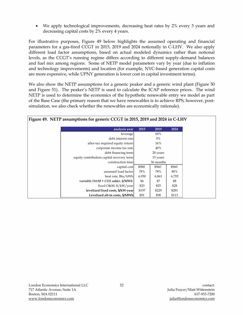
London Economics International LLC 52 contact: 717 Atlantic Avenue, Suite 1A Julia Frayer/Matt Wittenstein Boston, MA 02111 617-933-7200 www.londoneconomics.com [email protected]
We apply technological improvements, decreasing heat rates by 2% every 3 years and decreasing capital costs by 2% every 4 years.
For illustrative purposes, Figure 49 below highlights the assumed operating and financial parameters for a gas-fired CCGT in 2015, 2019 and 2024 notionally in C-LHV. We also apply different load factor assumptions, based on actual modeled dynamics rather than notional levels, as the CCGT‟s running regime differs according to different supply-demand balances and fuel mix among regions. Some of NETP model parameters vary by year (due to inflation and technology improvements) and location (for example, NYC-based generation capital costs are more expensive, while UPNY generation is lower cost in capital investment terms).
We also show the NETP assumptions for a generic peaker and a generic wind plant (Figure 50 and Figure 51). The peaker‟s NETP is used to calculate the ICAP reference prices. The wind NETP is used to determine the economics of the hypothetic renewable entry we model as part of the Base Case (the primary reason that we have renewables is to achieve RPS; however, post-simulation, we also check whether the renewables are economically rationale).
Figure 49. NETP assumptions for generic CCGT in 2015, 2019 and 2024 in C-LHV
analysis year 2015 2019 2024
leverage
debt interest rate
after-tax required equity return
corporate income tax rate
debt financing term
equity contribution capital recovery term
construction time
capital cost $980 $960 $960
assumed load factor 78% 78% 80%
heat rate, Btu/kWh 6,930 6,861 6,792
variable O&M + CO2 adder, $/MWh $6 $7 $8
fixed O&M, $/kW/year $23 $25 $28
levelized fixed costs, $/kW-year $197 $229 $281
Levelized all-in costs, $/MWh $91 $98 $113
36 months
60%
9%
16%
40%
20 years
15 years
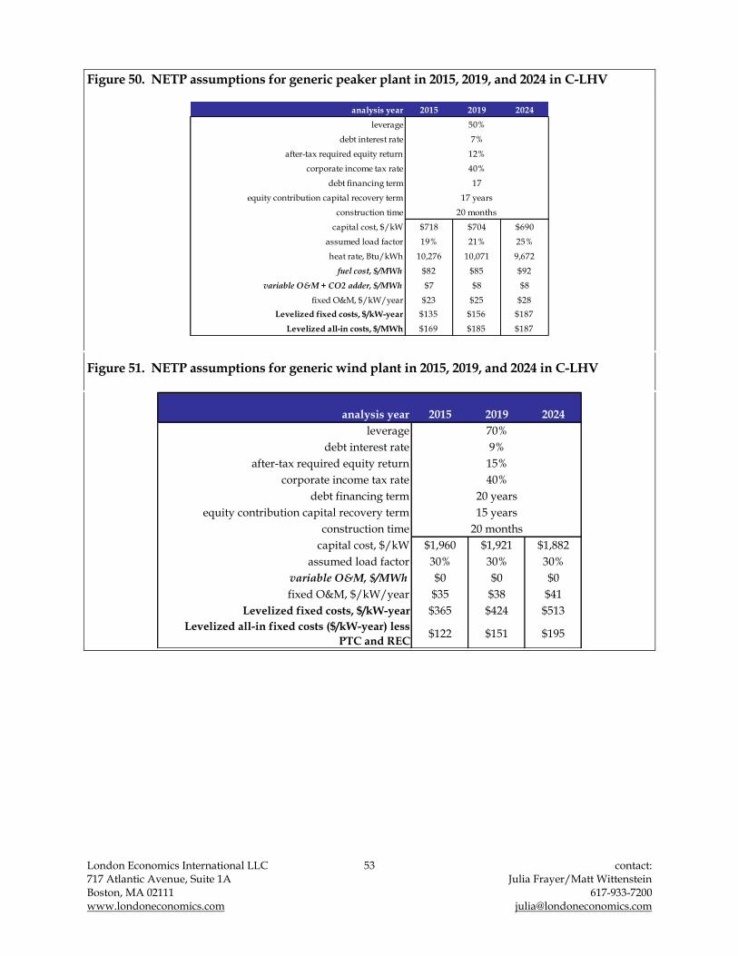
London Economics International LLC 53 contact: 717 Atlantic Avenue, Suite 1A Julia Frayer/Matt Wittenstein Boston, MA 02111 617-933-7200 www.londoneconomics.com [email protected]
Figure 50. NETP assumptions for generic peaker plant in 2015, 2019, and 2024 in C-LHV
analysis year 2015 2019 2024
leverage
debt interest rate
after-tax required equity return
corporate income tax rate
debt financing term
equity contribution capital recovery term
construction time
capital cost, $/kW $718 $704 $690
assumed load factor 19% 21% 25%
heat rate, Btu/kWh 10,276 10,071 9,672
fuel cost, $/MWh $82 $85 $92
variable O&M + CO2 adder, $/MWh $7 $8 $8
fixed O&M, $/kW/year $23 $25 $28
Levelized fixed costs, $/kW-year $135 $156 $187
Levelized all-in costs, $/MWh $169 $185 $187
17 years
50%
7%
12%
40%
17
20 months
Figure 51. NETP assumptions for generic wind plant in 2015, 2019, and 2024 in C-LHV
analysis year 2015 2019 2024
leverage
debt interest rate
after-tax required equity return
corporate income tax rate
debt financing term
equity contribution capital recovery term
construction time
capital cost, $/kW $1,960 $1,921 $1,882
assumed load factor 30% 30% 30%
variable O&M, $/MWh $0 $0 $0
fixed O&M, $/kW/year $35 $38 $41
Levelized fixed costs, $/kW-year $365 $424 $513
Levelized all-in fixed costs ($/kW-year) less
PTC and REC$122 $151 $195
20 years
15 years
70%
9%
15%
40%
20 months

London Economics International LLC 54 contact: 717 Atlantic Avenue, Suite 1A Julia Frayer/Matt Wittenstein Boston, MA 02111 617-933-7200 www.londoneconomics.com [email protected]
7 Appendix B: Prior applications of the POOLMod energy forecasting model
LEI has years of solid experience employing POOLMod in applications related to regulatory filings. The following are a list of projects that we have conducted in recent years that demonstrate the breadth and depth of our work in areas relevant to TDI‟s Article VII filing.
Evaluation of the economic benefits of transmission expansion within California: In support of the California ISO‟s Transmission Economic Assessment Methodology (TEAM), LEI developed an analytical methodology and used POOLMod and ConjectureMod (a Supply Function Equilibrium modeling tool), to perform a case study analysis of the expected market benefits of Path 26 expansion. LEI‟s methodological framework was included in CAISO filings to the CPUC.
Cost-benefit analysis: LEI staff submitted testimony on behalf of the Staff of the Maryland Public Service Commission (MPSC) to the MPSC which presented a cost-benefit analysis in relation to the proposed transaction between Constellation Energy Group, Inc. (CEG) and Électricité de France (EDF) whereby EDF would purchase from CEG a 49.99% interest in Constellation Energy Nuclear Group, LLC (CENG). Benefits related to the decreased likelihood of a Baltimore Gas & Electric (BGE) downgrade, increased likelihood of the Calvert Cliffs expansion being completed and several macroeconomic benefits stipulated to by EDF. Costs related to the limitation on the allocation costs of CEG corporate support services to CENG, increased risk of capital deprivation and reduced quality of service, and implications of CEG‟s more aggressive nuclear development. POOLMod was used to measure potential benefits from market impacts related to the Calvert Cliffs expansion
Analysis of the economic benefits of a proposed transmission line in New England: LEI simulated the New England wholesale electricity markets in order to compare the economic benefits between Greater Springfield Reliability Project and responses to the Connecticut Energy Advisory Boards‟ RFP for a non-transmission alternative (NTA) to GSRP. The NTA consisted of modeling a new CCGT plant. POOLMod was used to support the economic cost-benefit analyses. The study results were used to produce written testimony to the CSC, oral testimony was provided in late August and early September 2009. The modeling results were also submitted in testimony to the Massachusetts Energy Facilities Siting Board at the DPM.
Designing procurement process for CT DPUC to reduce costs of congestion for CT ratepayers: Assisted the CT DPUC in the evaluation of measures to reduce Federally Mandated Congestion Charges in the State of Connecticut. As part of this effort, LEI performed an economic evaluation of the New England and Connecticut energy markets using its proprietary production cost model, POOLMod. In addition, we modeled the Forward Capacity Market and the locational forward reserves market. LEI supervised the design and drafting of ISO-NE‟s RFP process, RFP documentation, and contract template. LEI also managed the procurement process, and evaluated project bids in comparison to anticipated market outcomes over the next 15 to 20 years. LEI‟s analysis was presented

London Economics International LLC 55 contact: 717 Atlantic Avenue, Suite 1A Julia Frayer/Matt Wittenstein Boston, MA 02111 617-933-7200 www.londoneconomics.com [email protected]
in contested case proceedings at the CT DPUC and supported timely and satisfactory end to an appeal.
Analysis of proposed market power mitigation measures: LEI was retained by one of the key players of the Alberta electricity market to analyze and propose recommendations on market power mitigation measures tabled by the Alberta Department of Energy. The work involved multiple simulations of the market outcomes and demonstration of the effectiveness of proposed measures in mitigating market power. LEI‟s network model, POOLMod, was used to support regulatory filings.
PPA valuation work for ENMAX: We reviewed the basis of the valuation adopted by expert consultants with respect to a PPA (as of December 2000), and identified shortcomings in the existing valuation. The analysis involved economic modeling to provide energy market price, volume and revenue forecasts for an existing PPA. LEI also valued the transaction using cost and market valuation approaches.
Advised Alberta Balancing Pool on holding restrictions: LEI was engaged by the Balancing Pool to devise relevant holding restrictions for the ancillary services market in Alberta. Our work included a survey of generators capable of providing ancillary services, technical and rules-based restrictions on the provision of these services, and stipulations regarding ESBI's procurement policies. Our report focused on regulating and operating reserves, but we also assessed the mechanisms associated with the other ancillary services required in Alberta: namely, transmission must-run (TMR) status, black start, reactive power and voltage control.
Advisory to the Maine Public Utilities Commission on RFP: LEI assisted the Commission on the RFP related to the procurement of electricity in response to statutory mandates and state policy preferences. LEI provided economic analyses of bid proposals by estimating the benefits and costs to the ratepayers, and is currently supporting Commission staff in negotiations with short-listed bidders. LEI utilized POOLMod in assessment of bid proposals.
Market design analysis and advisory services: LEI provided a comprehensive study estimating the monthly peak and off-peak price-cost markup index in Day-Ahead Locational Marginal Prices (LMPs) for the PJM Classic region over the period January 2003 through July 2006. The main task for the study was to estimate the effective energy prices assuming generators are offering their output exactly at short-run marginal costs (SRMC). Once short-run marginal cost-based prices are estimated, they were then compared against actual historical LMPs and a price-cost markup index was calculated for different periods within the study timeframe. In order to capture locational as well as time based trends in price-cost markups, the modeling explicitly recognized and considered the market separation that occurs within a market area due to internal transmission congestion.