pure design: classifieds
DESCRIPTION
The thirty-third "fable" from Mario Garcia's "Pure design"TRANSCRIPT


mario garcia
98
ClassifiedsClassifieds usually appear at the end of the day’s edition, a mass of
small type that nobody pays much attention to—except readers.
They eagerly await the classifieds to find that precious new job,
house, car, new pet, or soul mate.
It used to be rare to be asked to even look at the classified section
during a redesign. However, these days, no project is complete with-
out making efforts to improve the section.Where does one start?
Make sure that the typography of the section harmonizes with (or
is identical to) that of the rest the newspaper.
Section headers should match the rest of the paper. It is useless to
create a new “section header” for classifieds, when it appears
between business and sports. Why create typographic cacophony?
There must be a complete and easy to read navigator, an index
that describes each content section of the classifieds and where to
locate it, either by letter, number, or page number.
Icons help make locating each area easier, but are not the only way
to achieve this. Sometimes clear use of type—words—does as well.
Allow white space between categories. Readers search for informa-
tion here and there, and do not read an entire page.
Select a font for the text of small ads that is very easy to read, since
the reader will have to struggle enough to get to the information.
pure design
99
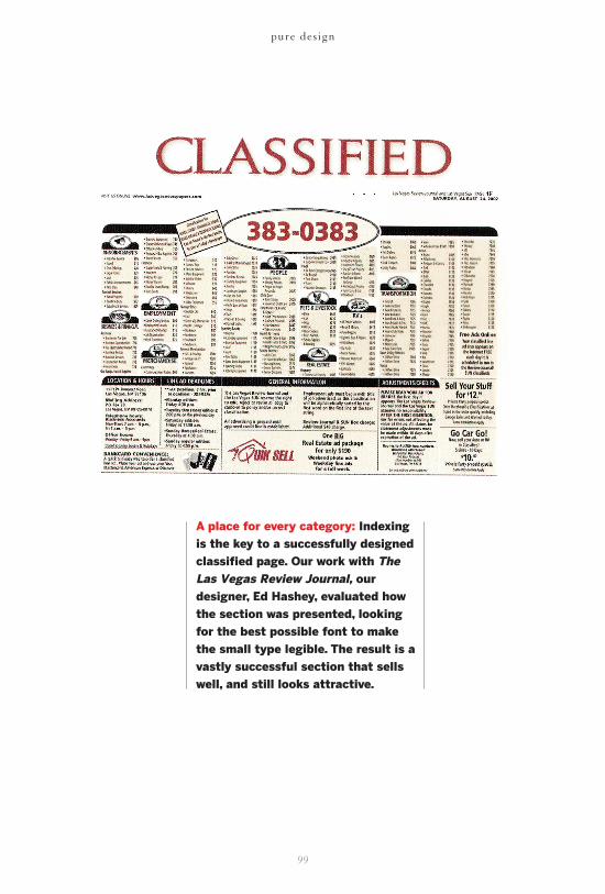
A place for every category: Indexingis the key to a successfully designedclassified page. Our work with TheLas Vegas Review Journal, ourdesigner, Ed Hashey, evaluated howthe section was presented, lookingfor the best possible font to makethe small type legible. The result is avastly successful section that sellswell, and still looks attractive.