pure design: whispers
DESCRIPTION
The fifth "fable" from Mario Garcia's "Pure design"TRANSCRIPT
mario garcia
20
WhispersThe storytelling process we design on the page or screen should,
as much as possible, imitate how we communicate the same stories
orally. This is an effective way to introduce contrast and surprises.
In normal conversation, there is seldom only one aspect of the story
taking place; instead, stories run parallel to each other. We start
talking to a friend about a movie we have seen but soon take detours
(sometimes better than the original story.)
Likewise, in design, we must present visual detours. Traditionally
called “sidebars”, they are more than just that. If we use the conver-
sation metaphor, these detours are “whispers”. Say you are at a busy
cocktail part and a speech is being presented. You “whisper” your
sidebar to the person standing next to you. You add to the story.
You bring in background information. You remind whomever you
are talking to of an event in the past that ties in to the speech of the
moment. When placed on the page, whispers are second readings,
normally short (no more than five to six paragraphs), and carry their
own headline, since many times they are read first.
Reporters and writers who understand the importance of storytelling
should suggest whispers in their stories from the start; in cases when
this does not happen, it is up to the designer to seek them out, to dis-
cuss possibilities with the writers and editors, and to present them.
As runners have known all along, sometimes the detour one takes
from the usual route can provide the ultimate surprise.
pure design
21
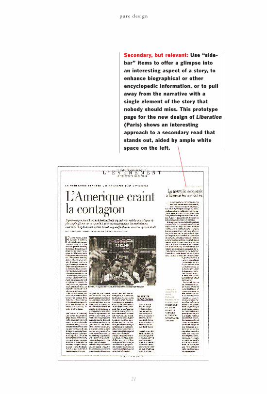
Secondary, but relevant: Use “side-bar” items to offer a glimpse into an interesting aspect of a story, toenhance biographical or other encyclopedic information, or to pullaway from the narrative with a single element of the story thatnobody should miss. This prototypepage for the new design of Liberation(Paris) shows an interestingapproach to a secondary read thatstands out, aided by ample whitespace on the left.