question 2 - how effective is the combination of your main product and ancillary texts?
TRANSCRIPT

Question 2: How effective is the combination of your main product and ancillary texts?
By Carmen Cheung
Mise en scène
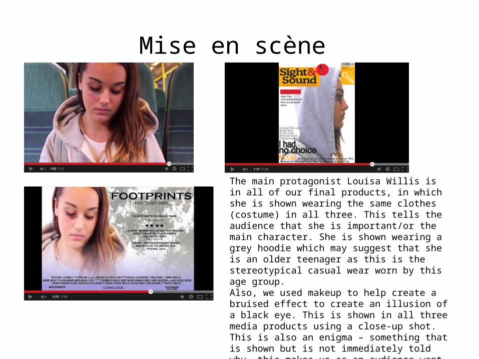
The main protagonist Louisa Willis is in all of our final products, in which she is shown wearing the same clothes (costume) in all three. This tells the audience that she is important/or the main character. She is shown wearing a grey hoodie which may suggest that she is an older teenager as this is the stereotypical casual wear worn by this age group. Also, we used makeup to help create a bruised effect to create an illusion of a black eye. This is shown in all three media products using a close-up shot. This is also an enigma – something that is shown but is not immediately told why, this makes us as an audience want to know who did this to her. The black eye is to symbolise that she has been abused by someone, emphasising that the film’s plot is based partly on that (may suggest a drama genre).

CameraWe have used a shot from the teaser trailer for our poster. This is used in most film marketing campaigns to give the audience an in sight of the location and an idea as to what the plot/genre is. During our research on drama film conventions, we came across ‘Safe Haven’ (Lasse Hallström, 2013). In the film poster on the right, we can see that they are near a beach (which is the typical location for most romantic/drama films) which conveys that it may be a romantic/drama based film. However, with our poster we have decided to keep it simple, yet with meaning. We have chosen to fade trees in the background and the shot of Louisa sitting on the train looking down. The location does not quite state what genre it is, but her facial expression is the main focus point. The character is looking down, possibly conveying the idea that she is in an emotional state and sadden. This tells us that it may potentially be a drama based film. The magazine cover is different compared to the poster image/teaser trailer shot as it is trying to give an even better USP (Unique Selling Point), this is because media texts such as trailers and posters are seen more often (e.g. YouTube ads, billboards, transport etc. So making the magazine cover stand out equally is essential.

Colour SchemeWe decided as a group to make our media products all a dark, dull colour. This is to emphasise the genre and conventions of a drama. For example, other drama films that we have researched are all mostly used with a darker colour scheme. This does not necessarily mean all black or red, which is mostly used in thriller/horror films. However, other ‘dull’ colours include grey, purple, blue, gold, bronze, brown etc. We had decided then to stick with the colours grey and purple (mostly shown on our film poster as in reality a film poster would be shown the most in public). We did a lilac (purple) gradient on our poster which helps emphasise the genre of a light, emotional drama (similar to the poster of The Lovely Bones). The grey fade makes the poster look mysterious and helps grab the attention of viewers.
ORIGINAL IMAGE
EDITED IMAGE
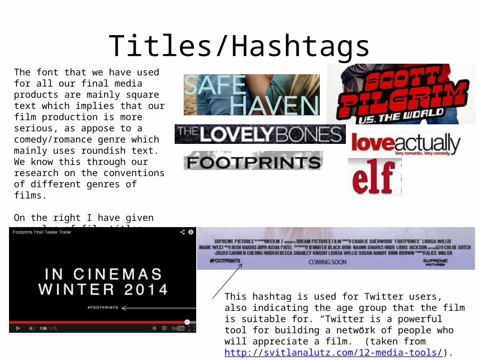
Titles/HashtagsThe font that we have used for all our final media products are mainly square text which implies that our film production is more serious, as appose to a comedy/romance genre which mainly uses roundish text. We know this through our research on the conventions of different genres of films.
On the right I have given examples of film titles which are split into categories of thriller, drama, horror etc, that use square text and romance/comedy that uses mainly roundish text.
This hashtag is used for Twitter users, also indicating the age group that the film is suitable for. “Twitter is a powerful tool for building a network of people who will appreciate a film.” (taken from http://svitlanalutz.com/12-media-tools/). It is used to create a ‘buzz’ for an upcoming release of a new film.
Tagline
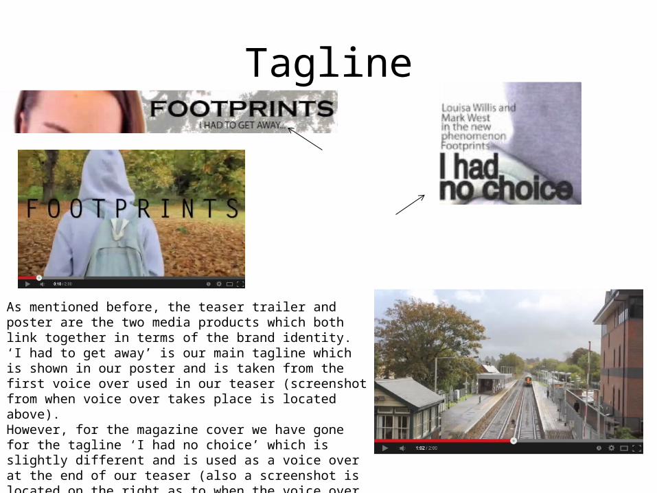
As mentioned before, the teaser trailer and poster are the two media products which both link together in terms of the brand identity. ‘I had to get away’ is our main tagline which is shown in our poster and is taken from the first voice over used in our teaser (screenshot from when voice over takes place is located above). However, for the magazine cover we have gone for the tagline ‘I had no choice’ which is slightly different and is used as a voice over at the end of our teaser (also a screenshot is located on the right as to when the voice over takes place). We did this because we wanted our magazine cover to stand out (as it isn’t shown as much) equally compared to our teaser trailer and poster.
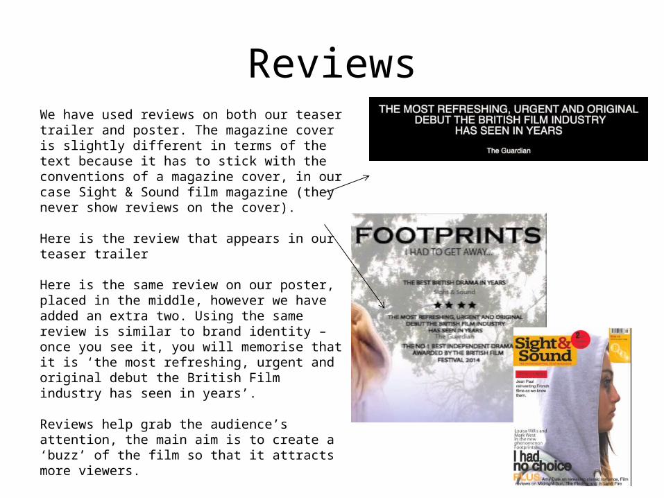
ReviewsWe have used reviews on both our teaser trailer and poster. The magazine cover is slightly different in terms of the text because it has to stick with the conventions of a magazine cover, in our case Sight & Sound film magazine (they never show reviews on the cover).
Here is the review that appears in our teaser trailer
Here is the same review on our poster, placed in the middle, however we have added an extra two. Using the same review is similar to brand identity – once you see it, you will memorise that it is ‘the most refreshing, urgent and original debut the British Film industry has seen in years’.
Reviews help grab the audience’s attention, the main aim is to create a ‘buzz’ of the film so that it attracts more viewers.