question 2 how effective is the combination of your main product and ancillary texts-
TRANSCRIPT
Question 2- How effective is the
combination of your main product and
ancillary texts?
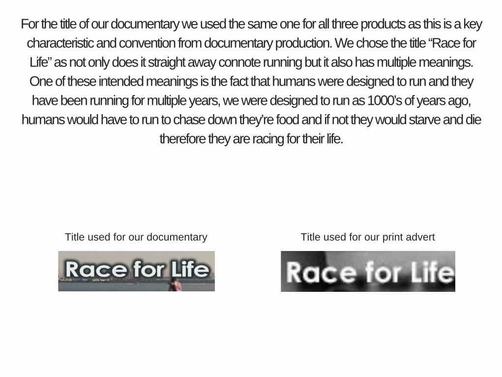
For the title of our documentary we used the same one for all three products as this is a key
characteristic and convention from documentary production. We chose the title “Race for
Life” as not only does it straight away connote running but it also has multiple meanings.
One of these intended meanings is the fact that humans were designed to run and they
have been running for multiple years, we were designed to run as 1000’s of years ago,
humans would have to run to chase down they’re food and if not they would starve and die
therefore they are racing for their life.
Title used for our print advertTitle used for our documentary
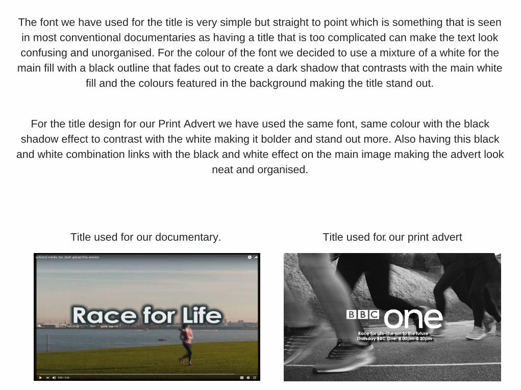
The font we have used for the title is very simple but straight to point which is something that is seen
in most conventional documentaries as having a title that is too complicated can make the text look
confusing and unorganised. For the colour of the font we decided to use a mixture of a white for the
main fill with a black outline that fades out to create a dark shadow that contrasts with the main white
fill and the colours featured in the background making the title stand out.
. Title used for our documentary.
For the title design for our Print Advert we have used the same font, same colour with the black
shadow effect to contrast with the white making it bolder and stand out more. Also having this black
and white combination links with the black and white effect on the main image making the advert look
neat and organised.
Title used for our print advert
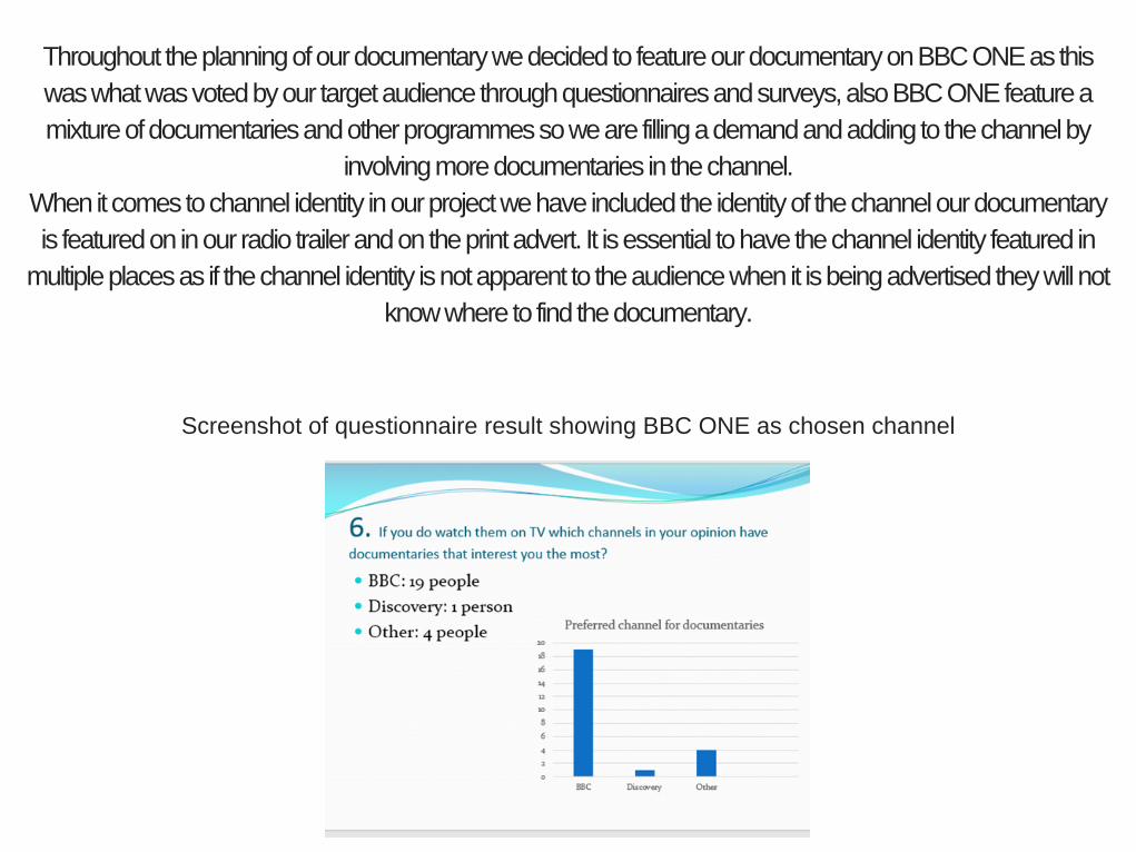
Throughout the planning of our documentary we decided to feature our documentary on BBC ONE as this
was what was voted by our target audience through questionnaires and surveys, also BBC ONE feature a
mixture of documentaries and other programmes so we are filling a demand and adding to the channel by
involving more documentaries in the channel.
When it comes to channel identity in our project we have included the identity of the channel our documentary
is featured on in our radio trailer and on the print advert. It is essential to have the channel identity featured in
multiple places as if the channel identity is not apparent to the audience when it is being advertised they will not
know where to find the documentary.
Screenshot of questionnaire result showing BBC ONE as chosen channel

On the print advert we have followed the format and conventions of a BBC ONE advert to
ensure we create a product that looks professional and high quality. We found that it was
common for the “BBC ONE” logo to be largely placed in the middle of the advert with the title,
tagline and schedule underneath the logo in a similar font, same colour but smaller size so
everything matches and looks organised and neat.
Scheduling Channel identity
Example of BBC ONE print advert.
In the radio trailer we have included the channel identity at the end of the
trailer by stating the documentary will be on BBC ONE at 8.00pm to 8.30pm
on Thursday. Having this is key characteristic and convention of a radio
trailer as it informs the audience the identity of the channel as it clearly says
BBC ONE but also informs them the schedule of when the documentary will
be shown.

We have used the same voiceover throughout all three products as it keeps
the products organised, professional and linked as if we had a different
person for different voiceover then it would become confusing. Also having
the same voiceover throughout means that the tone of voice and the way the
words are spoken will be the same and consistent.

Soundbites are used in our radio trailer to give the audience a quick insight
onto what they can expect to see in our documentary. We chose the most
important and interesting clips from the main interviews and parts of the
documentary for the soundbites as this will interest the audience making
them want to watch our documentary.
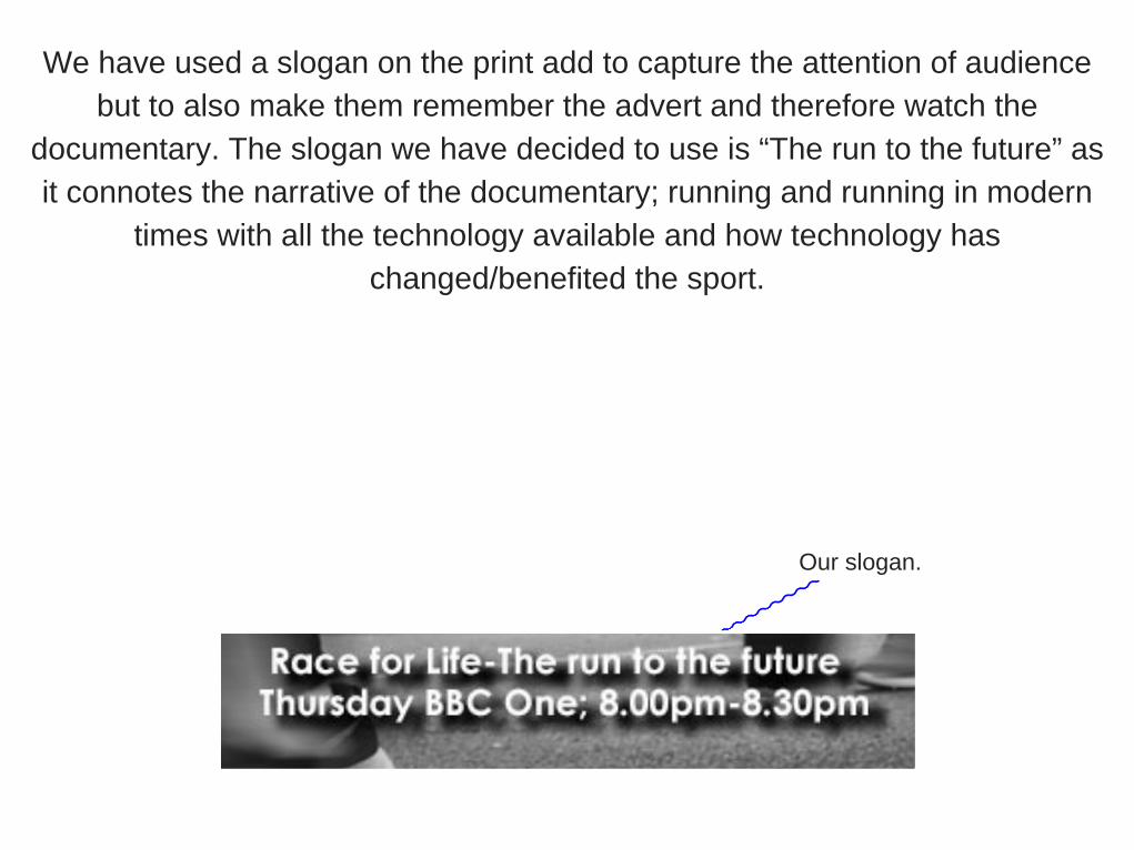
We have used a slogan on the print add to capture the attention of audience
but to also make them remember the advert and therefore watch the
documentary. The slogan we have decided to use is “The run to the future” as
it connotes the narrative of the documentary; running and running in modern
times with all the technology available and how technology has
changed/benefited the sport.
Our slogan.
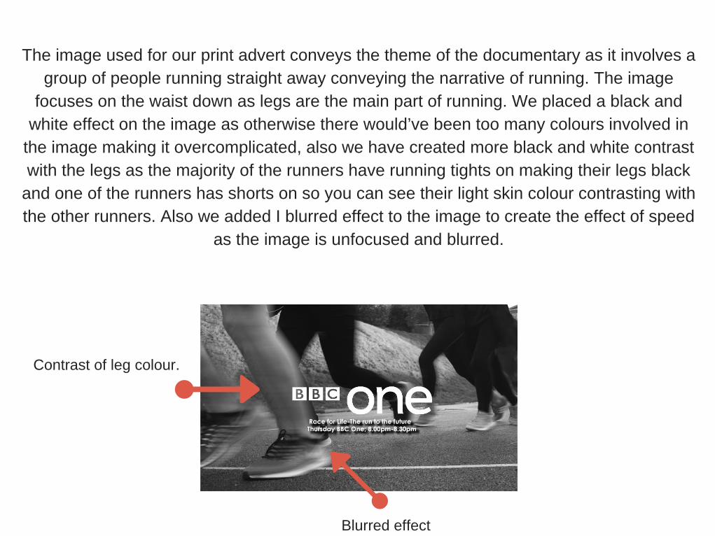
The image used for our print advert conveys the theme of the documentary as it involves a
group of people running straight away conveying the narrative of running. The image
focuses on the waist down as legs are the main part of running. We placed a black and
white effect on the image as otherwise there would’ve been too many colours involved in
the image making it overcomplicated, also we have created more black and white contrast
with the legs as the majority of the runners have running tights on making their legs black
and one of the runners has shorts on so you can see their light skin colour contrasting with
the other runners. Also we added I blurred effect to the image to create the effect of speed
as the image is unfocused and blurred.
Contrast of leg colour.
Blurred effect

The tone of our documentary can be seen in our other products from things including; use of
colours, music and choice of language. Starting off with music, in our documentary we have used
music that involves the theme of running somewhere so that we have audio that relates to the
narrative of our documentary making it tie in. The tone of the documentary can clearly been seen
from the choice of language and the mode of address. The mode of address used is between
casual and formal as we want it to seem professional and informing however we want it to be
semi-casual at the same time as running is a sport that beholds millions of members and isn’t a
serious/formal sport or topic therefore we want the products to represent this. Although the mode
of address is similar throughout however there are a some minor changes in parts. For example
interviews with professionals such as the sports masseuse interview has a much more formal
mode of address than the interviews with students as with the sports masseuse she was a
professional and was interviewed at her job place so she had to remain formal and professional,
whereas with the students it is a much more casual and relaxed form of address as they are
people we go to school and know.
We have used synergy to promote our 3 products as having multiple high quality and professional products
creates a good campaign and range of products to advertise the documentary creating the synergy effect that wil
make all 3 products greater than their individual sum making people more interested. Our documentary, print
advert and radio trailer all match and link together creating the campaign of products that work together to create
the synergy.