responsive design for mobile rendering - digital...
TRANSCRIPT

RESPONSIVE DESIGN FOR MOBILE RENDERINGDELIVER MOBILE-SPECIFIC CONTENT USING MEDIA QUERIES
With the widespread adoption of smartphones and tablets, proper email rendering in mobile devices has become crucial to the success of your email marketing efforts.
Finding a way to deliver an email that renders well in all screen sizes is a challenge. Currently, most marketers create a separate email for mobile users and deliver it based on subscriber preferences or provide a link in their email to open a mobile-friendly version in the device’s web browser. But by taking advantage of some new coding techniques, we can now deliver both desktop and mobile-friendly versions automatically depending on which device the email is viewed on.
It’s called responsive design and it is already being used in many websites today. Email marketers, however, are just beginning to take advantage of this technique, and it is changing the way we design our emails for improved rendering across different devices. Keep in mind, this is only a change to the way we code and design our emails and can be applied using your current ESP’s tool set.
WHITEPAPER
EXECUTIVE SUMMARY
©2014 Digital River, Inc. bluehornet.com
2©2014 Digital River, Inc.
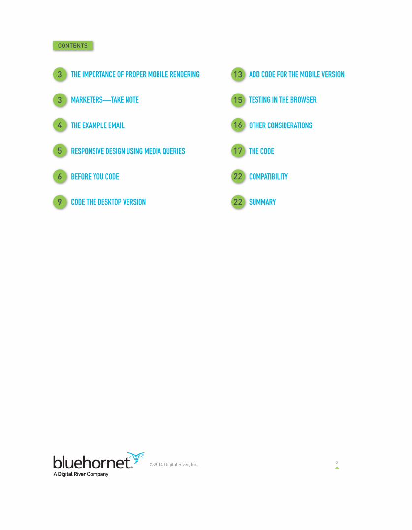
CONTENTS
THE IMPORTANCE OF PROPER MOBILE RENDERING
MARKETERS—TAKE NOTE
THE EXAMPLE EMAIL
RESPONSIVE DESIGN USING MEDIA QUERIES
BEFORE YOU CODE
CODE THE DESKTOP VERSION
ADD CODE FOR THE MOBILE VERSION
TESTING IN THE BROWSER
OTHER CONSIDERATIONS
THE CODE
COMPATIBILITY
SUMMARY
3 13
3 15
4 16
5 17
6 22
9 22

3©2014 Digital River, Inc.
THE IMPORTANCE OF PROPER MOBILE RENDERINGBefore we get into the nuts and bolts of this new coding technique, let’s take a look at how important a properly rendered email on a mobile device has become.
BlueHornet recently conducted a consumer survey on email behavior and found some interesting stats regarding mobile usage and rendering:
• 84.8% own a mobile device enabled to receive email. • 43% of consumers say they read emails most often on a mobile device. • 75.7% use their mobile device to sort through emails before they read them. • 80.3% delete an email if it doesn’t look good on their mobile device.• 75% of consumers say a poorly-designed email negatively affects their perception of a brand.
These numbers show how many people today are using their devices to read and sort their emails, that they are quick to delete poorly rendered ones, and that the quality of the email design affects consumers’ perception of a brand. Marketers can no longer afford to dismiss the need to send mobile-friendly campaigns.
To view the full report please visit: www.BlueHornet.com/Consumer2013
MARKETERS—TAKE NOTEThis document contains specific (and a bit technical) instructions on how to code your emails to render properly on any mobile device. You will want to pass this along to your designer(s) as a guide for how to implement this coding technology. However, as a marketer, this technology is important to you for a number of reasons. First, consumers are no longer viewing your emails solely on their desktop computers. Mobile usage continues to rise. In fact, the International Data Corporation has predicted a compound annual growth rate of 16.6 percent for mobile Internet use, with mobile Internet traffic eclipsing PCs and wired devices by 2015. Secondly, consumers expect to receive content when they want it, to whatever device they have access to at that moment. With the number of people viewing your emails on a mobile device continuously rising, you must create content that caters to their “anytime, anywhere” mentality. An inability to create mobile-friendly content can affect your brand in a negative way, as the survey data above shows.
We’re going to give you a set of instructions on how to create mobile-friendly emails that will essentially “convert” the desktop content into more user-friendly mobile content—bigger text, easy-to-click buttons, resized images, etc. By using this method, you’re designing in a way that makes it easy for the recipient to interact with your content on their mobile device.
Over 80% of people delete an email if it doesn’t look good on their mobile device.
4©2014 Digital River, Inc.
If you’re a marketer with limited design resources but you want to take advantage of this technology, BlueHornet can help. Flip to the end of this report for more information on how you can reach us to discuss your mobile email needs.
Ready to get started? Let’s take a look at our example email and how it renders in the desktop email client as well as a couple popular mobile devices.
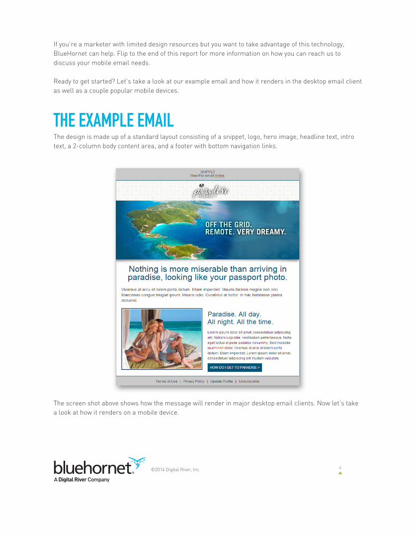
THE EXAMPLE EMAILThe design is made up of a standard layout consisting of a snippet, logo, hero image, headline text, intro text, a 2-column body content area, and a footer with bottom navigation links.
The screen shot above shows how the message will render in major desktop email clients. Now let’s take a look at how it renders on a mobile device.

5©2014 Digital River, Inc.
The above smartphones do a pretty good job of rendering desktop-formatted emails, but the need for zooming and scrolling due to the small screen size results in readability issues, difficulty in clicking call-to-action (CTA) links, and an overall poor user experience. Subscribers may be quick to delete an email that is not easy to read and interact with.
The mobile version of the email, however, has readable text, reduced-sized images, no horizontal scrolling and a clear and easily clickable CTA button. This is a much better user experience and will aid in getting the subscriber to interact, click-through and even sort to read later on their desktop computers.
RESPONSIVE DESIGN USING MEDIA QUERIESNow that we’ve established a clear need to have mobile friendly messages, how do we accomplish this task automatically? Say hello to our little friend, the media query.
A media query is a small snippet of code that sits in the head of your document and turns on a set of layout instructions (cascading style sheets or CSS) when a certain criteria is met. Traditionally, this has been used to target devices such as printers to change the layout of web pages for better printing, but with the increased usage of web browsing on mobile devices, designers are using the media query to target different screen resolutions and change the design depending on the device. This has been termed “responsive design” because the design can respond and adapt depending on the screen it is viewed on.
Android Desktop Android Mobile iPhone Desktop iPhone Mobile
The media query can serve up a special set of layout instructions depending on the size of the screen it is opened in.

6©2014 Digital River, Inc.
For example, if a media query is set to look for a screen resolution of 480 pixels or less (your typical smartphone size), the new CSS will load and change layout elements when the screen matches that resolution.
Many elements can be affected, including widths, heights, image paths and sizes, buttons, fonts, colors, etc. It is also possible to hide and reveal sections of content with this method, effectively allowing you to deliver a unique message to a user’s inbox depending on the device it is viewed on--automatically.
BEFORE YOU CODEAnalyze the DesignBefore you begin coding the email, it is important to analyze the creative and decide which elements of the design will need to be targeted and changed with the media query. In the image below, we’ve noted the main components of the email design.
7©2014 Digital River, Inc.
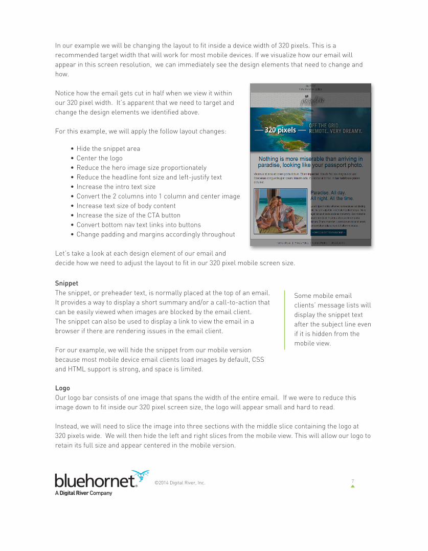
In our example we will be changing the layout to fit inside a device width of 320 pixels. This is a recommended target width that will work for most mobile devices. If we visualize how our email will appear in this screen resolution, we can immediately see the design elements that need to change and how.
Notice how the email gets cut in half when we view it within our 320 pixel width. It’s apparent that we need to target and change the design elements we identified above.
For this example, we will apply the follow layout changes:
• Hide the snippet area• Center the logo• Reduce the hero image size proportionately • Reduce the headline font size and left-justify text• Increase the intro text size• Convert the 2 columns into 1 column and center image• Increase text size of body content• Increase the size of the CTA button• Convert bottom nav text links into buttons• Change padding and margins accordingly throughout
Let’s take a look at each design element of our email and decide how we need to adjust the layout to fit in our 320 pixel mobile screen size.
SnippetThe snippet, or preheader text, is normally placed at the top of an email. It provides a way to display a short summary and/or a call-to-action that can be easily viewed when images are blocked by the email client. The snippet can also be used to display a link to view the email in a browser if there are rendering issues in the email client.
For our example, we will hide the snippet from our mobile version because most mobile device email clients load images by default, CSS and HTML support is strong, and space is limited.
LogoOur logo bar consists of one image that spans the width of the entire email. If we were to reduce this image down to fit inside our 320 pixel screen size, the logo will appear small and hard to read.
Instead, we will need to slice the image into three sections with the middle slice containing the logo at 320 pixels wide. We will then hide the left and right slices from the mobile view. This will allow our logo to retain its full size and appear centered in the mobile version.
Some mobile email clients’ message lists will display the snippet text after the subject line even if it is hidden from the mobile view.
8©2014 Digital River, Inc.
Hero ImageOur hero image will need to be re-sized proportionately down to the 320 pixel width.
When re-sizing images for the mobile version, make sure that any text in the image will appear legible at the smaller size. Our example email contains a large headline, so it shouldn’t be a problem to read when reduced down.
Headline and Intro TextFor the headline text, we will reduce the font size and left justify the text. The intro text font size will need to be increased for easy viewing on the small screen.
2-Column Body ContentThe 2-column section of our email will need to have several changes to fit properly in the mobile version. We will convert the 2-column format to a single column, change the font size of the headline and body text, and increase the width of our call-to-action button.
Footer with Bottom NavThe final section of the email contains the footer with a secondary navigation that includes profile management and unsubcribe links. For our mobile view we will change the background color of the footer and convert our text links into large clickable buttons.
Target with IDs and ClassesOnce we determine the design elements that will be affected, they need to be targeted with IDs and classes so our media query can assign the appropriate CSS properties and values.
You can see in the example below, we’ve named classes and IDs appropriately for either the design element they will affect or the action that will be assigned to them.
Some things to consider when choosing your IDs and classes:
• Use easy-to remember names to recognize your targeted elements when jumping between HTML and CSS.
• IDs can only be used once in a page, otherwise your HTML will fail validation.
• Classes can be used multiple times in a page, so use them for repeated elements.
While 12 pixel type works for desktop emails, it is a best practice to enlarge the fonts to be more easily read on mobile devices. We recommend 20-24 pixels for headlines, and a minimum 16 pixels for body copy.
Yahoo Mail will render the mobile styles unless attribute selectors are used.
By placing an ID on the <body> we can precede each of our CSS declarations with the attribute selector: body[id=yahoo] This will cause Yahoo to ignore the mobile styles and respect the inline CSS for the desktop version.

9©2014 Digital River, Inc.
CODE THE DESKTOP VERSIONKeep it SimpleBefore writing the mobile CSS rules, code the desktop version following best practices. Use a simple table-based layout when coding the email. Overuse of nested tables, spacer images, and other unnecessary tags will make it difficult to target and affect our design elements for the mobile version.
Use Inline CSSOur mobile styles will be written in the <head> of the document, but follow best practices and write all styles that affect the desktop version inline as you normally would. When the email is opened in the mobile device, the mobile styles will take precedence over the inline styles with the use of the !important keyword added to each declaration.
Add IDs and ClassesBe sure to add in the IDs and Classes to each of the targeted HTML tags. In our example we’ll be targeting the tags <table>, <td>, <span>, and <a>, but any tag can be targeted with CSS if needed.
Coding for Multiple ColumnsWhen coding multiple columns that will be converted to a single column in the mobile, use a <table> tag with multiple <td> tags. Then, with mobile specific CSS, convert each <td> tag into a block level element with the display:block definition. This will cause each column to stack vertically in the mobile version and horizontally in the desktop version.

10©2014 Digital River, Inc.
Validate and Test the CodeAfter the desktop version is coded, check the code for validation with WC3’s online HTML validation tool to ensure there are no errors.
The code should also be tested in all major email clients for possible rendering issues. There are some online tools that can make this job easier and offer the rendering of several email clients in one interface.
ADD CODE FOR THE MOBILE VERSIONThe Media QueryOnce the email is coded for the desktop, the HTML is validated, and rendering has been checked, it is time to add the media query and the CSS for the mobile version.
Both the media query and CSS declarations are written within a <style> tag in the <head> of the document. Some desktop email clients, such as Gmail, may strip the <head> tag completely, but because these styles are only used for mobile device rendering, this will not be a problem. It is worth noting that mobile versions of Gmail (both in the mobile browser and mobile email apps) will also strip this code, so don’t be surprised if the desktop version is displayed in these mobile email clients.
The media query is used to set a target resolution and display the appropriate CSS when that resolution is met. For example, if a max-width resolution of 480 pixels is set in the media query, any screen resolution of 480 pixels and under will trigger. Conversely, if a min-width resolution of 480 pixel is used, any screen resolution of 480 pixels and above will trigger the CSS.
Multiple media queries can be used together as resolution “breakpoints” to change the layout for different screen sizes such as tablets and large format devices, but we recommend sticking to just two: anything larger than 480 pixels and anything smaller than 480 pixels.
You’ll notice in the media query above that we have both max-width and max-device-width. The latter is all we will need to render properly in the mobile device, but the added max-width property will allow us to check the responsive design in the desktop browser for testing...more on that later.
<style>@media screen and (max-width: 480px), screen and (max-device-width: 480px) {mobile only CSS declarations}</style>
High pixels density displays, such as iPhone’s Retina, do not need to be targeted uniquely with the media query. They will respond to standard CSS pixel declarations.

11©2014 Digital River, Inc.
Mobile CSSNow that our media query is in place, it is time to write the CSS that will be used to change the email into the mobile-friendly version.
Change the WidthThe first step in the mobile conversion is to write CSS that will change the width to 320 pixels. We will use the already established class of mobile320 to change the width of the container table as well as any other elements within the design that need this width.
Be sure to append all CSS declarations with the keyword !important. This will allow the mobile CSS to take precedence over any inline CSS that was written for the desktop version.
Hide ContentBy utilizing the CSS “display” property we can hide sections of the email from the mobile view. We’ve already set up the class of mobileoff and have applied that class to all of the necessary HTML tags that will be hidden.
The illustration at the right highlights which parts will not be seen in the mobile view. They include the snippet, the hero shadow, the left and right images in the logo bar, and all borders. Be sure to add the mobileoff class to all of these tags and write the following CSS in the style list.
body[id=yahoo] .mobile320 { width:320px !important; margin:0px !important; padding:0px !important;}
Use the !important keyword in your mobile CSS declarations to override any inline CSS used for the desktop version.
body[id=yahoo] .mobileoff { display:none;}

12©2014 Digital River, Inc.
Hero ImageWe’ve already determined that the hero image will need to be reduced to fit snugly inside the mobile screen, so after adding the ID of hero to the image’s containing <td>, write following CSS rules that will change the dimensions.
When re-sizing images for the mobile view, be sure any text within the image will still be legible. Stick with large headline text of at least 24 pixels and stay away from any intricate fonts or CTA buttons that will be hard to read in the mobile version when reduced in size.
Headline and Intro TextFor the headline and intro text we will be adjusting font size, line height and padding for the mobile version. Left and right padding on a desktop email can range between 10 to 40 pixels to create sufficient spacing and margins, but on a mobile screen, this can be reduced down to 5 to 10 pixels.
When re-sizing body text for the mobile view, we recommend a minimum of 16 pixel font-size. Anything less may be hard to read on the smaller screen. Headline font sizes can be upwards of 20 to 24 pixels. Below is the CSS rules for both the headline and the intro text areas.
body[id=yahoo] td#headline { padding:5px 9px 9px 9px !important; font-size:24px !important; line-height:28px !important; text-align:left !important;}
body[id=yahoo] td#intro { font-size:16px !important; line-height:20px !important; padding:5px 9px 9px 9px !important;}
body[id=yahoo] td#hero img { width:320px !important; height:auto !important;}
16px is the recommendedminimum font size forlegible viewing of body copy on a mobile device.

13©2014 Digital River, Inc.
2-Column Body ContentThe 2-column section of our email will utilize the bulk of our CSS rules. For this section, we will be changing the padding and font sizes of the containing <td> tags.
We will also be converting each column <td> into a block level element. This will cause each column to take the full width of the email and force any adjacent columns to stack vertically.
For this example, we will also be changing the width of our CTA button, as well as centering it within the message. Because this button was set up as a text link within a <table>, our CSS will be targeting the <table> and <td> tags, and not the <a> tag.
body[id=yahoo] td.columns { padding:10px !important;}
body[id=yahoo] td.column { display:block !important; padding:0px !important;}
body[id=yahoo] td.subhead { font-size:20px !important; line-height:22px !important;}
body[id=yahoo] td.subtext { font-size:16px !important; line-height:22px !important;}
body[id=yahoo] table.button{ width:300px !important; margin:0px auto !important; font-weight:bold !important;}
body[id=yahoo] table.button td{ font-weight:bold !important; font-size:15px !important; padding:10px !important;}

14©2014 Digital River, Inc.
Footer with Bottom NavThe last order of business is to change the way the bottom navigation will appear in the mobile version. We can get a little fancy with this and use CSS to create stylized buttons from the text links that show in the desktop version. Using CSS 3, the buttons could be further stylized with gradients and border radius, but for this example we’ll stick with simple rectangle buttons.
If all of the HTML is written correctly, the IDs and classes are targeting the correct tags, and our media query and CSS are in place we should now see the mobile-friendly version magically appear in the supported mobile devices.
body[id=yahoo] a.bottom-nav-button { display:block; font-size: 16px !important; line-height: 16px; padding: 8px 5px; margin: 5px 0px; border: 1px solid #dfe0e1; text-align: center; color:#333 !important; background:#ffffff;}
15©2014 Digital River, Inc.
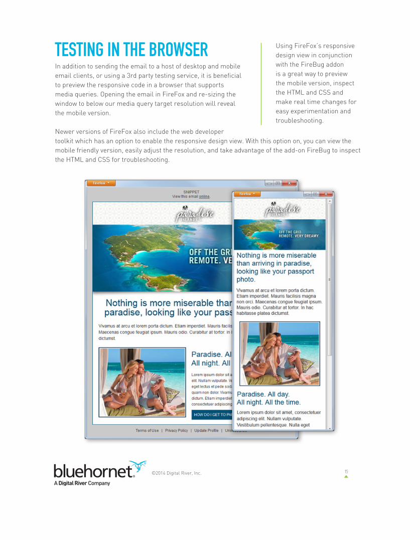
TESTING IN THE BROWSERIn addition to sending the email to a host of desktop and mobile email clients, or using a 3rd party testing service, it is beneficial to preview the responsive code in a browser that supports media queries. Opening the email in FireFox and re-sizing the window to below our media query target resolution will reveal the mobile version.
Newer versions of FireFox also include the web developer toolkit which has an option to enable the responsive design view. With this option on, you can view the mobile friendly version, easily adjust the resolution, and take advantage of the add-on FireBug to inspect the HTML and CSS for troubleshooting.
Using FireFox’s responsivedesign view in conjunctionwith the FireBug addonis a great way to previewthe mobile version, inspectthe HTML and CSS andmake real time changes foreasy experimentation andtroubleshooting.

16©2014 Digital River, Inc.
OTHER CONSIDERATIONSCongratulations! If all goes as planned, you should have a working responsive design email. There are alternate ways to approach responsive code and different designs may call for different coding techniques. In our example, we attempted to demonstrate how a simple layout with a 2 column format can be easily converted into an email that will render well in both desktop and mobile email clients.
While we attempted to cover most of the techniques, here are a few tips and tricks that may apply to other situations.
Text Size AdjustThe iPhone, and possibly other devices, may attempt to resize your text if it determines the text is too small to be legible. Sometimes the design calls for smaller text, such as disclaimer copy and fine print, so taking advantage of the webkit text size adjust property may be what you need to the keep phone from changing font sizes.
Simply add a new declaration to the body of your email code with the text size adjust value set to none.
Button SizeIt is a good idea to make all buttons large enough for a finger to be able to click them without accidentally clicking on a different link. Apple recommends a size of at least 44 X 44 pixels.
Fluid DesignIn our example we focused on a width of 320 pixels, but with new devices and screen sizes constantly changing, sometimes it is better to use 100% widths that will automatically size to the screen. By using percentage values instead of pixels in your mobile CSS, the content will collapse and expand as necessary. Just remember to use a height set to auto when re-sizing images.
Hiding Content From the Desktop VersionIn our example we used the display property to hide content from the mobile, but sometimes you may need to hide content from the desktop version and reveal in the mobile version. This can be done as well, but not without a few caveats.
Forwarding From OutlookOne thing to consider when hiding content from the desktop version is the fact that Outlook will show the hidden content if the email is forwarded from within the application. This can cause some pretty ugly results. If your target audience includes a large number of Outlook users, it may be wise to forgo this technique.
body { -webkit-text-size-adjust:none;}
17©2014 Digital River, Inc.
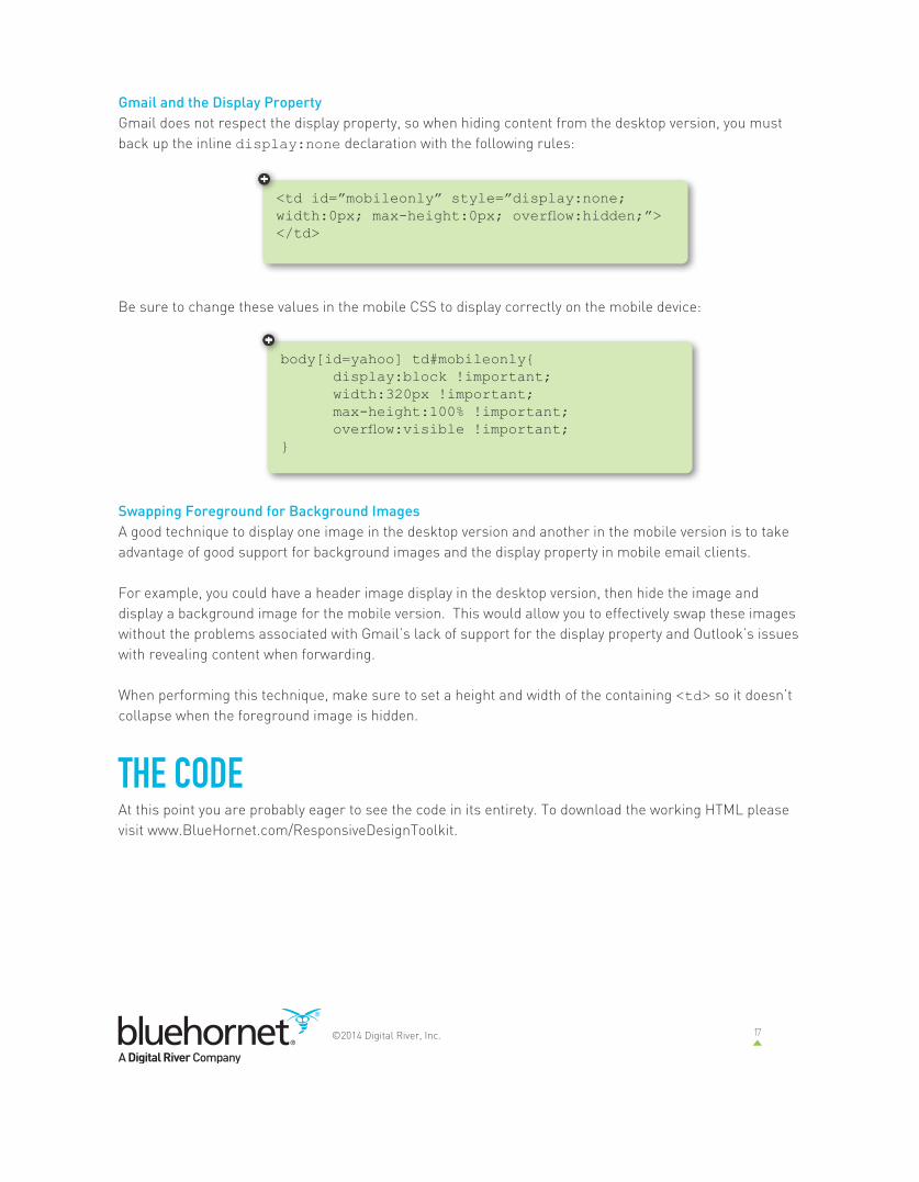
Gmail and the Display PropertyGmail does not respect the display property, so when hiding content from the desktop version, you must back up the inline display:none declaration with the following rules:
Be sure to change these values in the mobile CSS to display correctly on the mobile device:
Swapping Foreground for Background ImagesA good technique to display one image in the desktop version and another in the mobile version is to take advantage of good support for background images and the display property in mobile email clients.
For example, you could have a header image display in the desktop version, then hide the image and display a background image for the mobile version. This would allow you to effectively swap these images without the problems associated with Gmail’s lack of support for the display property and Outlook’s issues with revealing content when forwarding.
When performing this technique, make sure to set a height and width of the containing <td> so it doesn’t collapse when the foreground image is hidden.
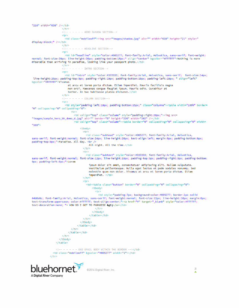
THE CODEAt this point you are probably eager to see the code in its entirety. To download the working HTML please visit www.BlueHornet.com/ResponsiveDesignToolkit.
<td id=”mobileonly” style=”display:none; width:0px; max-height:0px; overflow:hidden;”></td>
body[id=yahoo] td#mobileonly{ display:block !important; width:320px !important; max-height:100% !important; overflow:visible !important;}
18©2014 Digital River, Inc.
19©2014 Digital River, Inc.
20©2014 Digital River, Inc.

21©2014 Digital River, Inc.

22©2014 Digital River, Inc.
Limited time? Limited resources? BLUEHORNET CAN HELP.BlueHornet’s professional services team is well-versed in the ins and outs of responsive design, and we’re happy to help you apply it to your emails. Contact your account rep or support today to set up a consultation.
Not a BlueHornet client? We can still help! Here’s where you can find us:
COMPATIBILITYMedia queries are compatible with most modern browsers including Safari, FireFox, Chrome and Internet Explorer 9. Older versions of IE are not compatible. The same is true for most mobile browsers, however some mobile email clients use different rendering engines than their browsers. From the testing we’ve done, all mobile email clients support the media query except older versions of BlackBerry. If the media query is not supported, the desktop version will display. It is always a good idea to test your campaigns, and provide a link to view the email in a browser.
SUMMARYAs consumers continue to adopt mobile technologies, it will be increasingly important for marketers to rise above the noise and put your message everywhere your customers are, right when they want it. Responsive design is a great way to automatically provide a mobile-friendly version of your marketing message, as well as serve up content that changes depending on which device the message is viewed on—helping you extend brand reach beyond the desktop experience.
To download the entire responsive design toolkit which includes this whitepaper, example code and graphics and a PDF of the webinar Coding Email for Responsive Design, please visit www.BlueHornet.com/ResponsiveDesignToolkit
Contact Uswww.bluehornet.com(866) [email protected]: @bluehornetemail