singular value decomposition and its visualizationlingsong/research/svdvisual.pdf · singular value...
TRANSCRIPT

Singular Value Decomposition and Its Visualization
Lingsong Zhang∗, J. S. Marron, Haipeng Shen and Zhengyuan Zhu
January 21, 2007
Abstract
Singular Value Decomposition (SVD) is a useful tool in Functional Data Analysis (FDA).
Compared to Principal Component Analysis (PCA), SVD is more fundamental, because SVD
simultaneously provides the PCAs in both row and column spaces. We compare SVD and PCA
from the FDA view point, and extend the usual SVD to variations by considering different
centerings. A generalized scree plot is proposed to select an appropriate centering in practice.
Several matrix views of the SVD components are introduced to explore different features in data,
including SVD surface plots, rotation movies, curve movies and image plots. These methods
visualize both column and row information of a two-way matrix simultaneously, relate the matrix
to relevant curves, show local variations and interactions between columns and rows. Several
toy examples are designed to compare as well as reveal the different variations of SVD, and real
data examples are used to illustrate the usefulness of the visualization methods.
Key words: Exploratory Data Analysis, Functional Data Analysis, Principal Component Analysis.∗Correspondence to Lingsong Zhang, Department of Statistics and Operations Research, University of North
Carolina, Chapel Hill, NC, 27599-3260. Email: [email protected]
1

1 Introduction
Functional Data Analysis (FDA) is the study of curves (and more complex objects) as data (Ram-
say and Silverman, 1997, 2002). Methods related to Principal Component Analysis (PCA) have
provided many insights. Compared to the PCA method, Singular Value Decomposition (SVD) can
be thought of as more fundamental, because SVD not only provides a direct approach to calculate
the principal components (PCs), but also derives the PCAs in row and column spaces simultane-
ously. In this paper, we view a set of curves as a two-way data matrix, explore the connections
and differences between SVD and PCA from a FDA view point, and propose several visualization
methods for the SVD components.
Let X be a data matrix. In the statistical literature, the rows of X are often viewed as
observations for an experiment, and the columns of X are thought of as the covariates. SVD
provides a useful factorization of the data matrix X, while PCA provides a nearly parallel factoring,
via eigen-analysis of the sample covariance matrix, i.e. XT X, when X is column centered at 0. The
eigenvalues for XT X are then the squares of the singular values for X, and the eigenvectors for XT X
are the singular rows for X. In this paper, we extend the usual (column centered) PCA method
into a general SVD framework, and consider four types of SVDs based on different centerings.
Several criteria are discussed for model selection, i.e. selecting the appropriate type of SVD,
including approximation performance, complexity, and interpretability. We introduce a generalized
scree plot, which gives a simple way to understand the tradeoff between model complexity and
approximation performance, and provides a visual aid for model selection in terms of these two
criteria. See Section 3 and 5 for details.
Visualization methods can be very helpful in finding underlying features of a data set. In the
context of PCA or SVD, common visualization methods include the biplot (Gabriel, 1971), scatter
2

plots between singular columns or singular rows (Section 5.1 in Jolliffe (2002)), etc. The biplot
shows the relations between the rows and columns, and the scatter plot can be used to cluster
them. However, for FDA data sets, these plots fail to show the functional curves.
In the FDA field, it is also common to plot singular columns or singular rows as curves. Marron
et al. (2004) provided a visualization method for functional data (using functional PCA), which
shows the functional objects (curves), projections on the PCs and the residuals. When considering
a time series of curves, it used different colors to show the time ordering. These methods can also
be applied in the SVD framework, but to understand all the structure in the data, they need to
be applied twice, once for the rows and once for the columns. In addition, when the time series
structure is complicated, color coding curves might not be enough to reveal the time effect.
In this paper, we propose several visualization tools to provide matrix views of the SVD com-
ponents, which help to reveal new underlying features of the data set. The major tool is a set of
surface plots. Related to the surface plot, we introduce SVD rotation movies, SVD curve movies,
and SVD image plots. These visualization methods reveal different underlying information of the
components. In fact, the visualization method in Marron et al. (2004) (for example, the first column
in Figure 3 of their paper) can be viewed as one particular snapshot of the SVD rotation movie.
These visualization methods are motivated by an Internet traffic data set, which is discussed in
Section 2 to illustrate the usefulness of these tools. Two other real applications are reported in
Section 6. One chemometrics data set is used to show that a zoomed version of the surface plots and
the SVD movies highlight local behaviors. A Spanish mortality data set is analyzed to illustrate
that the image plot highlights the cohort effect (i.e., the interaction between age groups and years).
The remaining part of the paper is organized as follows. The motivating example in network
traffic analysis is in Section 2. Section 3 gives a brief introduction of SVD, and compares it with
3

PCA. Section 4 describes the generation of the plots and the movies in details. Section 5 shows
several toy examples to illustrate the four types of centerings. The chemometrics and demography
applications are reported in Section 6.
2 Motivating Example
Internet traffic, measured over time at a single location, forms a very noisy time series. Figure 1(a)
shows an example of network traffic data collected at the main Internet link of the UNC campus
network, as packet counts per half hour over a period of 7 weeks, which cover part of two sessions
of UNC summer school in 2003. The approximately 49 tall thin spikes represent peak daytime
network usage, which suggests that there is a strong daily effect. The tallest spikes are grouped
into clusters of 5 corresponding to weekdays, with in-between gaps corresponding to weekends.
500 1000 1500 20000.5
1
1.5
2
2.5
3
3.5
4
4.5
5x 10
9
Time (30m)
Pac
ket C
ount
1020
3040
1020
3040
1
2
3
4
5x 10
9
Time−of−day (30m)Day
Pac
ket C
ount
Figure 1: (a) Original time series plot of packet counts per half-an-hour over 49 days. (b) Mesh plot for the
original network traffic data.
Because of the expected similarity of the daily shapes, and as a device for studying potential
contrasts between these shapes (e.g. differences between weekdays and weekends), we analyze the
time series in an unusual way. We rearrange the data as a 49 × 48 matrix, so that each row
represents one day, and each column represents one half-hour interval within a day. This treatment4

is similar to the singular-spectrum analysis method (Golyandina et al., 2001). A mesh plot showing
the structure of the data matrix is in Figure 1(b). This shows that the data matrix is noisy, but
we can still see a weekly pattern and also clear daily shapes from it.
One way to analyze the data set is to treat the daily shapes, the rows of the data matrix, as
functions (curves), and to use some functional data analysis methods to understand underlying
features. PCA has proven to be very useful for this purpose. But observe that the columns of the
matrix are also curves (i.e. time series) of interest as well. In particular, for each fixed half hour
interval, these are the counts over day. A natural eigen-analysis for simultaneous PCA of rows
and columns is SVD of the matrix. This decomposition is similar to the analysis of call center
data sets in Shen and Huang (2005). Similar to the PCA method, SVD provides a useful first tool
for exploratory data analysis. SVD decomposes the data matrix into a sum of rank one matrices
(which are the SVD components). Each component provides insights into features of the data.
To find underlying data features using SVD, we provide a set of surface plots of the SVD
components, which help to examine the data matrix in both directions (i.e., both rows as data, and
columns as data). Long (1983) used a similar method to illustrate matrix approximation of SVD
from a mathematical education view point. Interpretation of the surface plots is aided by a movie
which shows the plots from different angles and a movie which highlights the rows and columns.
The movies can be used to demonstrate the time-varying features of the components, and highlight
some special features or outliers. These visualization methods can be used alone or with other
visualization methods, to find interesting structures in the data.
For the network traffic data, the SVD surface plot is in Figure 2. The top left is the mesh plot
for the original data matrix (the same as Figure 1(b)). The top middle is the first SVD component,
which resembles a smoothed version of the original data matrix, showing a clear weekly pattern.
5

2040
2040
2
4
x 109
Time−of−day
Original data
Day20
4020
40
2
4
x 109
Time−of−day
SV1, 0.97774 of TSS
Day20
4020
40
−5
0
5
x 108
Time−of−day
SV2, 0.013064 of TSS
Day
2040
2040
−5
0
5
x 108
Time−of−day
SV3, 0.0025745 of TSS
Day20
4020
40
2
4
x 109
Time−of−day
First 3 SVs approximation
Day20
4020
40
−505
10
x 108
Time−of−day
Residual
Day
Figure 2: SVD surface plot for the 49 days network traffic data. SV1-SV3 are a decomposition of the data
matrix. These are combined to give the model in the bottom middle panel, with corresponding residual
shown in the bottom right panel.
This first SVD component also indicates that weekdays and weekends might not share the same
daily shape (or magnitude of daily shapes). The top right is the second component, which has
a clear shape for weekends, and is relatively flat for weekdays. This indicates the existence of a
weekday-weekend effect, and suggests analyzing weekend and weekday data separately as a good
option. The lower left is the third component, which shows that there are very large bumps in some
days. These bumps indicate that the corresponding dates have some special features, as discussed
below.
The SVD movies for this data highlight those features. Figure 3 shows snapshots of the SVD
6

Figure 3: Three careful chosen snapshots of SVD curve movie for the third SVD component for the Network
data. They highlight several outlying days by showing high spikes on the surface.
curve movie for the third component. For example, in the left panel, the curve movie highlights
Sunday, June 29 as a possible outlier, by showing a large bump. This day had a network workload
that was between the normal weekday and weekend data. A check of the university calendar reveals
that this is the first Sunday for the second summer session, when a large number of students returned
from home after the summer session break, which made the network usage different from the other
weekends. All movies for this data set can be easily viewed at the web site of Zhang (2006). More
analysis of this network data is discussed in Section 6.1.
3 SVD and PCA
In this section, we give a brief introduction of the mathematical underpinnings of SVD (Section
3.1), its relation with PCA (Section 3.2), and a visual aid for selecting different centerings (Section
3.3).
7

3.1 SVD and its properties
Let X = (xij)m×n with rank(X) = r. The SVD of X is defined as
X = USV T = s1u1vT1 + s2u2vT
2 + · · ·+ srurvTr
where U = (u1,u2, · · · ,ur), V = (v1,v2, · · · ,vr), and S = diag{s1, s2, · · · , sr} with s1 ≥ s2 ≥
· · · ≥ sr > 0. The vectors {ui} and {vi} are called singular columns and singular rows respec-
tively (Gabriel and Odoroff, 1984); the scalars {si} are called singular values; and the matrices
{siuivTi }(i = 1, · · · , r) are referred to as SVD components.
Let {ri : i = 1, · · · ,m}, {cj : j = 1, · · · , n} be the row and column vectors of the matrix X
respectively. The singular columns {ui} form an orthonormal basis for the column space spanned
by {cj}, and the singular rows {vj} form an orthonormal basis for the row space spanned by {ri}.
The SVD factorization has an important approximation property. Let A be a rank k (k ≤ r)
(approximation) matrix, and define R = X − A = (rij)m×n as its residual matrix. We then define
the Residual Sum of Squares (RSS) of the matrix A as the Sum of Squares (SS) of the elements in
R, i.e., RSS(A) = SS(R) =m∑
i=1
n∑j=1
r2ij . Householder and Young (1938) showed that
arg minA:rank(A)=k
RSS(A) = Ak =k∑
l=1
slulvTl ,
and the corrsponding residual matrix R is R = X − Ak =r∑
l=k+1
slulvTl . In other words, the SVD
provides the best rank k approximation of the data matrix X.
3.2 Four types of centerings for SVD
As noted above, SVD and PCA are closely related. SVD as defined above provides a decomposition
of X. PCA is very similar with the only difference being column mean centering. Our matrix view
raises a natural question of: “why not do row mean centering?” We will study and compare four8

possible types of centerings and correspondingly four types of SVD: no centering (simple SVD
or SSVD), column centering (column SVD or CSVD), row centering (row SVD or RSVD) and
centering in both row and column directions, which is referred as double centering (Double SVD or
DSVD).
Let µ be the overall mean (or grand mean) of all the elements in X, µc be the column mean
vector with the elements being the means of the columns, and µr be the row mean vector with the
elements being the means of the corresponding rows. We define the sample column mean matrix
as CM = 1m×1µTc , sample row mean matrix as RM = µr11×n, and the sample double mean matrix
as DM = µr11×n + 1m×1µTc − µ1m×n. We can use the same formula X = A + R for all these four
types of SVD, where A is the approximation matrix, and R is the residual matrix. For no centering,
A = A(s) is the sum of the first several SVD components of X, which is the best approximation
matrix at the corresponding rank. For column centering, A = CM + A(c) where A(c) is the sum of
the first several SVD components of X−CM. Similarly, for row centering and double centering, we
have A = RM+A(r) and A = DM+A(d), where A(r) is the sum of the first several SVD components
of X −RM and A(d) is the sum of the first several SVD components of X −DM. Note that A here
is not the same for the four centerings, while we just use the same notation for simplicity. Note
that CM and RM have rank 1, and DM is at most rank 2.
Another natural choice of centering is removing the overall mean and then applying SVD. When
all the data observations are far away from the origin (the mean is relative larger than the variability
of the data set), removing the overall mean will decrease the magnitudes of the observations, and
thus improve the numerical stability of the SVD. However, Gabriel (1978) mentioned that, for
the model with an overall constant plus multiplicative terms, the least square estimation is not
equivalent to fitting the overall mean and then applying the SVD for the residual part. With a
9

functional data set, the overall mean does not provide informative curve information of the data
set. There are cases where removing the overall mean will cause the data result in losing some good
features, for example, the orthogonality of the curves (see one example in Zhang (2006)). Note
that the column/row/double centerings automatically remove the grand mean. Thus, we will not
discuss the case of just removing the overall mean. However, our programs do provide the option
of applying SVD after just removing the overall mean.
3.2.1 Approximation Diagram
Grand mean
Column mean Row mean
SV1(0) Double mean
Column mean + SV1(c) Row mean + SV1(r)
SV1(0) + SV2(0) Double mean + SV1(d)
...
ZZ ½½
(((((((((hhhhhhhhh
((((((((((hhhhhhhhhh
(((((((((hhhhhhhhh
(((((((((hhhhhhhhh
BB
BB
BB
££££££
BB
BB
BB
££££££
Figure 4: Relationship between approximations using the four types of SVD. A lower level approximation
is always worse than an upper level one. Note that the lower level also provides a simpler model than the
upper level.
Figure 4 shows the relative approximation relations among the four types of centerings. The
boxes on the same horizontal level have non-comparable RSS (i.e., either can give a better approx-
10

imation). Lower level boxes always have larger RSS than upper level boxes. The grand mean (i.e.,
the overall mean) provides the worst approximation (i.e. the largest RSS) of all rank 1 matrices,
and is worse than the column mean and row mean approximations. The line segments show direct
comparisons given in Equations (1)-(4). For example, the column mean provides a larger RSS
than both the double mean and the first SSVD component. So does the row mean (as shown in
Equations (1)-(2) with rank(A(s)) = 1). The first SSVD component has a larger RSS than either
RSVD or CSVD using the mean matrix plus one SVD component. So does the double mean.
This diagram also shows the level of complexity in the sense that models on the same level
share similar complexity, and the lower level models are simpler than the upper level models. For
example, As shown in Figure 4, a model using either column mean or row mean is simpler than
using double mean or the first SSVD component. In fact, the double mean can be viewed as the sum
of the row mean and the column mean (i.e., an additive model), while the first SSVD component
can be viewed as the product of the row and the column mean (i.e., a multiplicative model). This
is why we view them as having the same level of complexity.
3.2.2 Theoretical Comparisons
The following are theoretical comparisons between the four types of SVD, in terms of approximation
performance. Some of these results are reported in a different form in the appendix of Golyandina
et al. (2001).
1. If rank(A(c)
)= rank
(A(r)
)= rank
(A(d)
), we have
RSS(CM + A(c)
)≥ RSS
(DM + A(d)
), and RSS
(RM + A(r)
)≥ RSS
(DM + A(d)
). (1)
These equations show that the double centering gives a better approximation than either the
11

column centering or the row centering. Note that the rank of the approximation matrix of
the double centering (DM + A(d)) is usually greater than the other two.
2. If rank(A(c)
)= rank
(A(r)
)= rank
(A(s)
)− 1, we have
RSS(CM + A(c)
)≥ RSS
(A(s)
), and RSS
(RM + A(r)
)≥ RSS
(A(s)
). (2)
Similarly, the above two equations show that the SSVD approximation is better than either
the column or the row centering, if the approximation matrices have the same rank.
3. If rank(A(c)) = rank(A(r)) = rank(A(s)), we have
RSS(CM + A(c)
)≤ RSS
(A(s)
), and RSS
(RM + A(r)
)≤ RSS
(A(s)
). (3)
This suggests that, with the same number of SVD components, the RSVD and CSVD models
provide better approximation than the SSVD model. In this case, the approximation matrix
of RSVD and CSVD have a rank that is one larger than that of SSVD.
4. If rank(A(c)) = rank(A(r)) = rank(A(d)) + 1, we have
RSS(CM + A(c)
)≤ RSS
(DM + A(d)
), and RSS
(RM + A(r)
)≤ RSS
(DM + A(d)
). (4)
This shows that if approximation matrices have the same rank, the CSVD and RSVD models
have a better approximation performance than DSVD.
5. In terms of the RSS, there is no clear relationship between column centering and row centering
(either could be better), nor between double centering and no centering.
When a data set is being explored, sometimes the context may suggest the most appropriate
centering. Otherwise, we suggest to try all four centerings and decide which one is preferable. The
12

following criteria should be considered: the model should have a small RSS, few components and
be easy to interpret. In some situations, the aim of the problem and the constraints of the related
context should also be considered, as shown in Section 5.
3.3 Model Selection and Generalized Scree Plot
In this subsection, a generalized scree plot is proposed as a visual aid to determine the appropriate
centering and the number of components. In the context of PCA, the scree plot (Cattell, 1966) is
widely recommended to determine an “appropriate” number of PC components. Note that in some
contexts, the log-scale scree plot might convey an entirely different impression. See Section 6.1.3
in Jolliffe (2002).
Here we define the scree plot for the four types of centerings in a novel way, since the mean
matrices and their degree of the approximation need to be incorporated into the plot. Let Ak
be the approximation matrix of the four types of centerings with rank k (k + 1 for DSVD), i.e.
the sum of the first k SSVD components; or column (/row/double) mean matrix plus the first
k − 1 CSVD (/RSVD/DSVD) components. Rk is the residual matrix corresponding to Ak. We
denote lk = SS(Rk)/TSS (where the Total Sum of Squares (TSS) is TSS = SS(X)) as the residual
proportion of the TSS. The plot of (k, lk) is called the residual proportion plot. It is obvious that
lk is non-increasing, and we can use similar rules to decide the appropriate number of components.
As noticed in Section 3.2, if the approximation matrices of CSVD/RSVD/SSVD have the same
rank k, and DSVD has rank k + 1, we know SSVD is the best rank k approximation, while the
CSVD/RSVD has larger RSS than the first k SSVD components, but has smaller RSS than the
first k − 1 SSVD components (Equations (1)-(4) showed these comparisons). These comparisons
also hold in terms of model complexity, where smaller can be replaced by simpler. If we plot (k,
13

lk) for the usual SVD in the integer grid of k, the RSVD and CSVD residual proportion should
be in between k and k − 1. Thus we use the half-grid k − 1/2 here to show the approximation
performance of the RSVD/CSVD (i.e., plot (k − 1/2, lk) for RSVD/CSVD). The DSVD with one
larger rank has comparable RSS with SSVD, so we plot it at the same level as SSVD.
The resulting plot described above is defined as our generalized scree plot, where simpler models
are always to the left. The above special treatment (i.e., plotting (k − 1/2, lk) for the CSVD and
RSVD models instead of (k, lk)) makes the generalized scree plot have a good feature. The points
in the generalized scree plot correspond to (the models of) the rectangles in the approximation
diagram of Figure 4. And the levels from the bottom to the top in Figure 4 correspond to the grids
on the horizontal axis from the left to the right. Thus, the generalized scree plot simultaneously
visualizes the approximation performance and model complexity. In order to choose the appropriate
centering and number of components, one possible way to decide the number of components uses
the usual interpretation of scree plot. After this, one can select the one which is the leftmost.
Zhang (2006) provides a MATLAB function, gscreeplot.m, to generate the generalized scree plot,
which allows various options, including log-scale scree plot. Note that the scree plot assumes a
strong signal, with large variation relative to the noise component. If this assumption is violated,
other considerations should be used to select the optimal model.
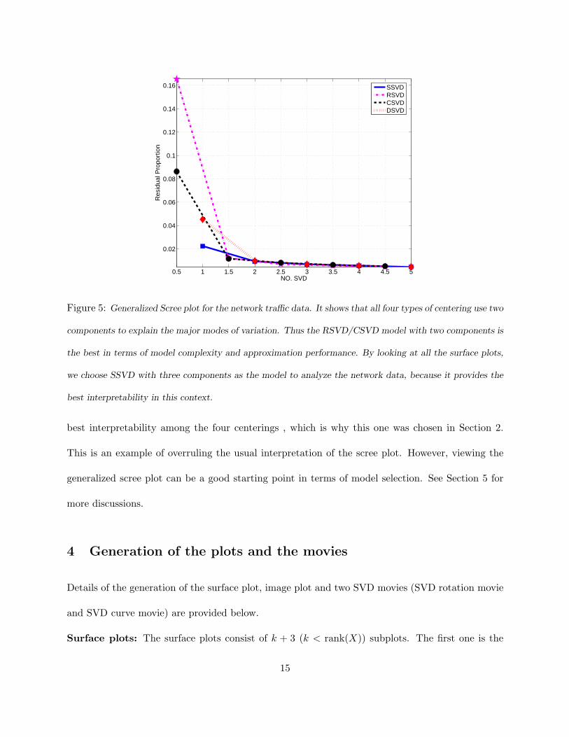
Figure 5 shows the generalized scree plot for the network data set in Section 2. From the plot,
we find that all four models use two components for the major modes of variation, and they have
similar approximation performance. In terms of model complexity, we might use either RSVD
or CSVD as the final model to find underlying features of the network data set. By looking at
the surface plots (the SSVD surface plot is in Figure 2, and the other three can be viewed at
Zhang (2006)) of all four types of centerings, we find SSVD with three components provides the
14
0.5 1 1.5 2 2.5 3 3.5 4 4.5 5
0.02
0.04
0.06
0.08
0.1
0.12
0.14
0.16
NO. SVD
Res
idua
l Pro
port
ion
SSVDRSVDCSVDDSVD
Figure 5: Generalized Scree plot for the network traffic data. It shows that all four types of centering use two
components to explain the major modes of variation. Thus the RSVD/CSVD model with two components is
the best in terms of model complexity and approximation performance. By looking at all the surface plots,
we choose SSVD with three components as the model to analyze the network data, because it provides the
best interpretability in this context.
best interpretability among the four centerings , which is why this one was chosen in Section 2.
This is an example of overruling the usual interpretation of the scree plot. However, viewing the
generalized scree plot can be a good starting point in terms of model selection. See Section 5 for
more discussions.
4 Generation of the plots and the movies
Details of the generation of the surface plot, image plot and two SVD movies (SVD rotation movie
and SVD curve movie) are provided below.
Surface plots: The surface plots consist of k + 3 (k < rank(X)) subplots. The first one is the
15

mesh plot for the original data matrix, the next k subplots are the mesh plots for the first k SVD
components (siuivTi ), the (k+2)nd subplot is the mesh plot for the k-component approximation of
the data matrix, i.e. the summation matrix of the first k components, and the last one is the mesh
plot for the residual. The surface plots can be generated using the MATLAB function svd3dplot.m,
which can be obtaiined from Zhang (2006).
Image plots: The image plots provide a special view angle of the SVD components, by showing
the image view of the original data matrix, the first k SVD components, the reconstruction of
the k components, and the residual after the approximation. In our design, we let the minimal
value of each component share a cool color (blue), and the maximum value share a hot color (red).
The SVD images provide a good view angle to highlight the local variations, data subgroups and
interactions between columns and rows. The program svd3dplot.m in Zhang (2006) with option
(’iimage’, 1) generates the image plots. See the demographical data (Section 6.3) as an example.
SVD rotation movie: Viewing the surface plots from different angles helps to find data features.
Another program svdviewbycomp.m in Zhang (2006) generates movies for different SVD compo-
nents with different angles of view. It rotates the surface plot of an SVD, so that different data
features are more clear from different view points. The SVD rotation movie for the network data
is explained in Section 6.1.
SVD curve movie: The SVD curve movie illustrates how the SVD components relate to classical
Functional Data Analysis. The curve movie of the ith SVD component (siuivTi ) builds on the
mesh plot of the component. Two reference curves with different colors and are used to indicate
how the surface is generated from the singular row (vi) and singular column vectors (ui). The blue
curve plots a scaled singular column (cuiui), where cui = maxkl((uivTi )kl)/maxk(|uik|); and the
green curve is the scaled singular row (cvivi), where cvi = maxkl((uivTi )kl)/maxk(|vik|). These
16

constants are chosen so that the reference curves share a comparable vertical range to the surface.
A red line varies from the first row to the last and then back to the first row, while a red dot moves
along the singular column (the blue curve) with respect to the red line. Then the red line varies
from the first column to the last and then back to the first column, while the corresponding red dot
varies along the singular row (the green curve). The motion shows how the curves change in both
directions, and highlights features of interest, such as outliers. The two functions svd3dplot.m and
svd3dzoomplot.m in Zhang (2006) can generate the SVD curve movie and its zoomed version. For
large data sets, it is helpful to restrict the range for rows or columns to get a zoomed SVD movie,
which demonstrates local features. Three snapshots of the curve movie for the network data are
provided in Figure 3. The zoomed curve movie is illustrated by an chemometrics data in Section
6.2.
5 Four types of SVD and toy examples
In this section, we use several simulated examples to illustrate model selection of the four types
of SVD. These examples make it clear that sometimes we do not have a “best” choice. Also
for real applications, it is not enough to use only the generalized scree plot to select appropriate
models. However, the generalized scree plot is still useful to give an initial impression of which
model might be a better candidate. It is also useful when the user does not have time for deep
exploration of the data sets. If time permits, we strongly recommend to apply the four types of
the centerings simultaneously, and use some visualization methods including the matrix views or
other information, and select the most interpretable model.
We designed several simulated data sets to illustrate the above idea of model selection. They
also showed that each of the four types of centerings can be the most appropriate model. Here we
17

just show three interesting data sets to save space. All these simulated data sets are designed as
49×48 matrices, the same as the network traffic data set we discussed in Section 2. In this setting,
e.g. the first and the third example, each row can be viewed as one daily usage profile, and each
column can be treated as a cross-day times series of one specific time in a day. These data sets are
designed to have clearly weekly patterns. A large number of plots and other simulated examples,
similar to those actually shown in this section, are available at Zhang (2006) to save space.
5.1 Example 1
The first example is used to illustrate a situation where CSVD gives the best approximation per-
formance. This example is designed to be the sum of a column mean matrix (i.e., µc(j) in equation
(5)), a multiplicative component (i.e., f2(i)g2(j) in equation (5)), and some noise. The model can
be written as
h1(i, j) = µc(j) + f1(i)g1(j) + ε(i, j) (5)
where µc(j) = sin(jπ/24), g1(j) = − cos(jπ/24), f1(i) = 1, when mod(i, 7) 6= 0 and 6; or f1(i) = 2
when otherwise. and ε(i, j) iid∼ N(0, .04). Note that we will use the same notation ε for different
realizations of all the simulated examples. In terms of network usages, the weekdays and weekends
do not have the same usage magnitudes (due to the multiplicative component), nor the same usage
patterns (because of the column mean component).
The generalized scree plot suggests that there are 2 components for the CSVD/DSVD/SSVD
models, while there are 3 components for the RSVD model. The RSVD is the worst model among
the four, because the row mean matrix explains a very low proportion of the TSS. The scree plot
shows that CSVD with 2 components is the leftmost one, which suggests the CSVD is the best
model among the four types of centerings, in terms of complexity and approximation performance.
18

We will use the surface plots to compare the interpretabilities of the four centerings.
0.5 1 1.5 2 2.5 3 3.5 4 4.5 5
−5.5
−5
−4.5
−4
−3.5
−3
−2.5
−2
−1.5
−1
−0.5
NO. SVD
Res
idua
l Pro
port
ion
(log)
SSVDRSVDCSVDDSVD
Figure 6: Log-scale generalized scree plot for the first toy example. By using the scree rule mentioned in
the text, one is suggested that there are two components for CSVD/SSVD/DSVD, and three components
for RSVD. CSVD is the leftmost one, thus it is the appropriate model for the first toy example.
By examining the surface plots of all four centerings, we find the RSVD and SSVD provide
similar decomposition, except, the RSVD has one row mean matrix. This similarity is due to the
low proportion of the row mean matrix, as discussed earlier. The surface plots of the CSVD (The
left four panels in Figure 7) show the common usage pattern in the second panel of the first row.
The first SVD component of the CSVD shows the contrast between the weekdays and weekends. It
shows that after removing a common daily usage profile, the contrast curves between the weekdays
and weekends have the same shape, but have different contrast magnitudes. It is hard to answer
the question of whether the contrast between them is different in daily shapes or in different usage
magnitudes.
Meanwhile, the surface plots for the SSVD (the right four panels in Figure 7) use two components
for the major variation of the data matrix. If the daily usages share the same usage pattern but with
different magnitudes, one SSVD component should be enough for the major modes of variation.
Thus, the two SSVD components for this example suggest that weekdays and weekends do have
19

2040
2040
−2
0
2
Column
Original data
Row20
4020
40
−1
0
1
Column
Column mean, 0.94618 of TSS
Row
2040
2040
−0.5
0
0.5
Column
SV1, 0.049349 of TSS
Row20
4020
40
−0.2
0
0.2
Column
Residual
Row
204020
40
−2
0
2
Original data
204020
40−2
0
2
SV1, 0.98311 of TSS
204020
40−0.4−0.2
00.20.4
SV2, 0.012485 of TSS
204020
40
−0.20
0.2
Residual
Figure 7: The left four panels are the surface plots of CSVD for the first toy example, and the right four
panels are the surface plot of SSVD for the first toy example, from equation (5). For the first toy example,
RSVD and DSVD are worse in terms of approximation. However, SSVD and the CSVD are candidates of
good approximation performance. CSVD is better than SSVD, because it contains simpler model. However,
SSVD shows that weekdays and weekends have different daily shapes and different magnitudes of daily
usages.
different usage patterns and different magnitudes. This suggests that the SSVD model for this
example has better interpretation than the CSVD model.
For the model selection of (5), we find that it is hard to distinguish whether SSVD or CSVD is
“better”. For the two good candidates, the CSVD is a simpler model (mean plus one multiplicative
CSVD component is simpler than two multiplicative SVD components), while the SSVD has better
interpretation (weekdays and weekends do not share the same usage pattern, nor do the usage
magnitudes).
5.2 Example 2
The second example is designed to illustrate that RSVD has the best approximation performance
among the four in a context that is much different from just the transpose of Example 1. The
20

model is set up as the sum of a row mean matrix (f2(i) in equation (6)), a multiplicative component
(f3(i)g3(j) in equation (6)) and noise, and can be written mathematically as
h2(i, j) = f2(i) + f3(i)g3(j) + ε(i, j) (6)
where f2(i) = cos(iπ/24), f3(i) = sin(iπ/24), g3(j) = 1, when 1 ≤ j ≤ 12 or 25 ≤ j ≤ 36; or
g3(i) = −1, when 13 ≤ j ≤ 24 or 37 ≤ j ≤ 48.
The model of the second simulated example is different from the first one in an important way.
The function g3(j) in the multiplicative component is orthogonal to the constant vector 148×1,
and f3(i) is orthogonal to f2(i). These make the row mean matrix f2(i) and the multiplicative
component f3(i)g3(j) orthogonal to each other in both the column space and the row space. In
this example, the rows of the simulated data are not useful models for daily network traffic.
0.5 1 1.5 2 2.5 3 3.5 4 4.5 5−3.5
−3
−2.5
−2
−1.5
−1
−0.5
NO. SVD
Res
idua
l Pro
port
ion
(log)
SSVDRSVDCSVDDSVD
Figure 8: Log-scale generalized scree plot for the second toy example. By using the scree rule mentioned in
the text, one is suggested that there are two components for DSVD/RSVD/SSVD, and three components
for CSVD. RSVD is the leftmost one, thus it is the appropriate model for the second toy example in terms
of approximation performance and complexity.
The generalized scree plot shows the CSVD is the worst model, because of the low percentage
of TSS explained by the column mean matrix. It also suggests that the RSVD and the SSVD are
21

better models. Based on the rules discussed in Section 3.3, the generalized scree plot suggests the
RSVD will be the “optimal” model among the four centerings.
204020
40
−101
Original data
204020
40
−1
0
1
SV1, 0.49182 of TSS
204020
40
−1
0
1
SV2, 0.47215 of TSS
204020
40
−0.5
0
0.5
Residual
2040
2040
−1
0
1
Column
Original data
Row20
4020
40−1
0
1
Column
Row mean, 0.47164 of TSS
Row
2040
2040
−1
0
1
Column
SV1, 0.49153 of TSS
Row20
4020
40
−0.5
0
0.5
Column
Residual
Row
Figure 9: The left four panels are the surface plots of the SSVD for the second toy example, and the right
four panels show the surface plots of the corresponding RSVD model. The SSVD picks the multiplicative
component in (6) as the first component. And the second SSVD component is close to the row mean matrix.
The reason for this is because these two components are orthogonal to each other in both the row and the
column space, and the multiplicative component has larger variations than the row mean matrix. The RSVD
gives an opposite decomposition, which is almost the same as the model where the data matrix is generated
from.
The SSVD surface plots are the left four panels in Figure 9, and the right four panels in Figure
9 show the RSVD surface plot of the simulated data set. By looking at the surface plots, we find
that the SSVD essentially picks the second part f3(i)g3(j) as the first SVD component, and the
first part f2(i) as the second component. In fact, the variation of the second part f3(i)g3(j) is
larger than the first part, thus the relative energy (i.e., the proportion of TSS) in the second part
dominates the first one, so that the SSVD picks it as the leading SVD component. The RSVD
gives the opposite decomposition with the data matrix almost the same as the model described in
22

equation (6).
In summary, for this data set, SSVD, RSVD and DSVD all provide good separation. We suggest
to use the most parsimonious one (the lowest level in the diagram (Figure 4)), the RSVD model.
This is close to the true model (6). Note that the interpretabilities of the SSVD model and the
RSVD model are essentially the same for this example.
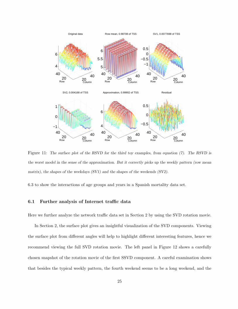
5.3 Example 3
The third example is used to illustrate that the CSVD is the best model when model complexity
and approximation performance are considered. On the other hand, the worst model in terms of the
above two criteria, the RSVD, provides the best model in terms of interpretability. This example
has a model, which contains an overall mean level shift (µ) and two multiplicative components.
The mathematical description of this simulated data set is
h3(i, j) = µ + f4(i)g4(j) + f5(i)g5(j) + ε(i, j), (7)
where f4(i) = 2, f5(i) = 0 when mod(i, 7) 6= 0 and 6, and f4(i) = 0, f5(i) = 1 when otherwise;
g4(j) = sin(jπ/48); g5(j) = cos(jπ/48). Here the two multiplicative components are orthogonal to
each other in both column and row spaces. In this example, we use µ = 5, such that all elements
in h3 are positive.
The generalized scree plot shows that the RSVD uses three components for the major modes
of variation, while other SVDs use two components, which suggest that the RSVD is the “worst”
model among the four types of centerings. The CSVD model is the best in terms of complexity
and approximation performance. However, after comparing all the surface plots (of the four types
of decomposition), we find that the RSVD, the “worst” model from the generalized scree plot,
provides the clearest decomposition using three components. The row mean matrix grasps the23

0.5 1 1.5 2 2.5 3 3.5 4 4.5 5
2
4
6
8
10
12
14
x 10−3
NO. SVD
Res
idua
l Pro
port
ion
SSVDRSVDCSVDDSVD
Figure 10: The generalized scree plot for the third toy example. By using the scree rule mentioned in
the text, one is suggested that there are two components for CSVD/DSVD/SSVD, and three components
for RSVD. CSVD is the leftmost one, thus it is the appropriate model for this toy example in terms of
approximation performance and model complexity. However, by looking at the surface plots of the four
different centerings, RSVD provides the “optimal” interpretation among them.
weekly pattern. The first RSVD component shows sine curves for the weekdays, and is near flat
in the weekends. And the second RSVD picks the cosine curves in the weekends, and stays close
to zero for the weekdays. This gives a perfect separation of the curves in model (7). For this
toy example, we might choose CSVD as the final model, because it is the best model in terms of
approximation performance and complexity. On the other hand, RSVD can also be selected as the
best choice, because it provides the best separation of the curves, thus it has the best interpretation.
6 Real Applications
In this section, we further illustrate the visualization methods. Section 6.1 continues the analysis
of the network data discussed in the Section 2. The chemometrics data set in Section 6.2 is used
to show the utilities of zoomed plots and zoomed movies. The image plot is illustrated in Section24
2040
2040
4
6
Column
Original data
Row20
4020
40
5
5.5
6
Column
Row mean, 0.98708 of TSS
Row20
4020
40
−1−0.5
00.5
Column
SV1, 0.0077698 of TSS
Row
2040
2040
−1
0
1
Column
SV2, 0.004168 of TSS
Row20
4020
40
4
6
Column
Approximation, 0.99902 of TSS
Row20
4020
40
−0.5
0
0.5
Column
Residual
Row
Figure 11: The surface plot of the RSVD for the third toy examples, from equation (7). The RSVD is
the worst model in the sense of the approximation. But it correctly picks up the weekly pattern (row mean
matrix), the shapes of the weekdays (SV1) and the shapes of the weekends (SV2).
6.3 to show the interactions of age groups and years in a Spanish mortality data set.
6.1 Further analysis of Internet traffic data
Here we further analyze the network traffic data set in Section 2 by using the SVD rotation movie.
In Section 2, the surface plot gives an insightful visualization of the SVD components. Viewing
the surface plot from different angles will help to highlight different interesting features, hence we
recommend viewing the full SVD rotation movie. The left panel in Figure 12 shows a carefully
chosen snapshot of the rotation movie of the first SSVD component. A careful examination shows
that besides the typical weekly pattern, the fourth weekend seems to be a long weekend, and the
25

Figure 12: Snapshots of the SSVD rotation movie with carefully chosen angles of view. (a) The first SSVD
component of the network traffic data set, showing the 4th weekend is a long weekend. (In fact, it contains
the July 4th holiday, a Friday that year.) (b) the second SSVD component of the network traffic data set,
showing the 19th row is a special weekday, which is similar to the weekends but with a smaller bump. (In
fact, it is the last registration day of UNC summer school.)
third weekend is kind of short. In fact, Friday July 4 makes the fourth weekend special, and Sunday
June 29 is in the third weekend, which has been discussed in Section 2.
The right panel in Figure 12 is also a carefully chosen snapshot of the rotation movie for the
second SVD component. We find that the 19th row of the second SVD is unusual because although
it is a weekday, it looks more like a weekend, but with a smaller bump. The 19th row was Friday
June 27, the last day for late registration for the UNC summer school second session. Checking the
original data set, we found that the network usage on that morning oscillates a lot, which might
be explained by bursts of usage after the end of each class time, followed by rapid departure of the
students.
The SVD rotation movie and SVD curve movie are useful for outlier identification, as discussed
here and in Section 2. The above outlying days can also be identified by other visualization
26

methods. For example, scatter plots between singular rows can be very helpful in finding outlying
days. Figure 13 shows the scatter plot between u1 and u2. From the scatter plot we find two
groups of points. Investigation suggests that they correspond to the weekdays and weekends, as
indicated using blue dots (for weekdays) and red plus (for weekends) respectively. Friday, July 4,
was a holiday, and it falls into the weekend group, which is not surprising because on that day most
students and school employees are away. Sunday, June 29, is between those two groups, for reasons
discussed above. Friday, July 27, might also be found through this scatter plot, with an unusually
low u2 value. But the confidence here might not be high, because this point is not that far away
from the weekday data points. Scatter plot of u1 and u3 can also show some outlying days, which
is skipped because no new outliers were found.
For this data set, although the scatter plots among singular columns are useful to find clusters
of days and some outlying days, a limitation is that they can not provide a functional view of the
daily shapes and can not directly show what drives those days to be outliers. When the user uses
SVD or PCA methods for a functional data set, we strongly recommend viewing surface plots and
the two types of SVD movies during the exploration.
0.05 0.1 0.15 0.2
−0.2
−0.1
0
0.1
0.2
0.3
Singular Column, U1
Sin
gula
r C
olum
n, U
2
06/27
06/29
07/04
Figure 13: Scatter plots between singular columns u1 vs. u2 for the Internet data.
27

6.2 Chemometrics data
The chemometrics data considered here consists of 70 Infrared (IR) spectra of various samples of
a polymeric material measured over a 27-day cooling period. Each IR spectrum has 1556 mea-
surements representing integers “frequency numbers”. Hence, the data matrix is 70× 1556. More
details about this data can be found in Marron et al. (2004), which examined it using PCA. The
IR spectra ideally can be expressed as a sum of “real” spectra, whose relative intensities change
over time. An important objective for studying the IR spectra is to find the underlying chemical
process, which is an open problem. In this subsection, we use CSVD to analyze this data, which
is suggested by the generalized scree plot (the right panel in Figure 14). This is essentially the
functional PCA in Marron et al. (2004). The new visualization tools discussed in Section 4 are
used here to explore special features of the data in the spectral direction, which may offer some
clue for addressing that open problem.
0.5 1 1.5 2 2.5 3 3.5 4 4.5 5
−12
−10
−8
−6
−4
−2
NO. SVD
Res
idua
l Pro
port
ion
(log)
SSVDRSVDCSVDDSVD
Figure 14: The left panel is the mesh plot of 70 spectra of the Chemometrics data. The right panel shows
the log-scale generalized scree plot for it. It suggests that the CSVD/DSVD/SSVD uses two components for
major modes of variations, while the RSVD uses three components. In terms of model complexity, CSVD is
recommended, which is exactly the functional PCA method used in Marron et al. (2004).
28

440
500
1
70−0.04
−0.02
0
0.02
0.04
SpectrumTime
SV
1
Figure 15: (a) First CSVD component mesh plot for chemometrics data; (b) Zoomed First CSVD component
(440-500 spectra) mesh plot.
The left panel of Figure 14 shows the mesh plot for the 70 IR spectra. The mesh plot in the time
direction is rather flat, which indicates that the variation between spectra is significantly smaller
than the mean spectra, and that most information is hidden in the deviations from the mean. The
column mean matrix explains almost all (99.99%) of the total SS, and we need to examine more
CSVD components for information on the underlying chemical process.
The first CSVD component (Figure 15(a)) explains 96.05% of the residual after removing the
column mean. Its surface plot shows some interesting features at the spectra range 300-500, which
is particularly interesting from a chemistry perspective. At some frequencies the curves change
from bottom to top, an indication of an increase of the percentage of chemical materials with high
spectrum at those frequencies during the cooling process, or a decrease of chemical materials with
low spectrum. At some other frequencies the opposite occurs. We can highlight those frequencies
by zooming in on the surface plot to the frequencies [300, 500] (Figure 15(b)). The zoomed SVD
curve movie for the first CSVD component can be used to view the local changing patterns.
The zoomed curve movie of this first CSVD component within the frequencies between 440-500
is available at Zhang (2006). Figure 16 shows some snapshots of the movie. For instance, we
29

Figure 16: Snapshots of the zoomed version of the SVD curve movie of the first CSVD component for
the Chemometrics data. The first row shows changing pattern in the time direction, while the second row
highlights some significant frequencies in the spectra direction.
find that at 467, the spectrum varies from lower (than average) to higher (than average); and at
476, the spectrum varies from higher (than average) to lower (than average). This means that the
chemical material corresponding to the frequency 467 changes from below the average to above the
average. Similar peaks representing shifts in material types can also be found in other movies in
Zhang (2006).
Besides highlighting signals in the spectral direction, the zoomed SVD movie also helps to
understand the time-varying features. The three plots of the second row in Figure 16 show some
snapshots of changing patterns in the time direction. The curve changes from a clear shape to a
rather flat line and then to a flipped version of the clear shape. This phenomenon shows that the
change is smooth with respect to time at all points in the spectra, which is also noted by using
colored curves in Marron et al. (2004).
The higher order CSVD components also show some interesting features at frequencies less than
30
500. The zoomed SVD surface plots and the zoomed curve movies highlight those features. The
analysis is skipped here to save space, and the pictures are available at Zhang (2006).
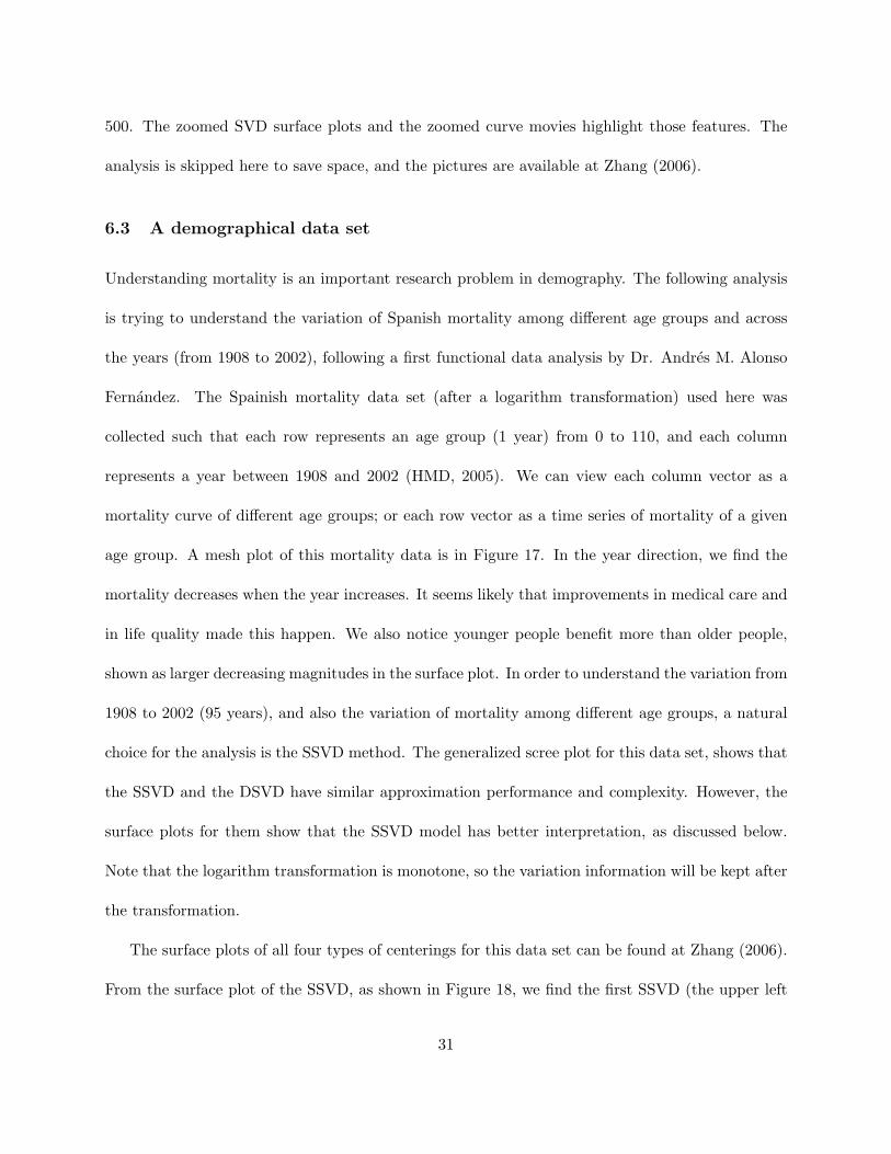
6.3 A demographical data set
Understanding mortality is an important research problem in demography. The following analysis
is trying to understand the variation of Spanish mortality among different age groups and across
the years (from 1908 to 2002), following a first functional data analysis by Dr. Andres M. Alonso
Fernandez. The Spainish mortality data set (after a logarithm transformation) used here was
collected such that each row represents an age group (1 year) from 0 to 110, and each column
represents a year between 1908 and 2002 (HMD, 2005). We can view each column vector as a
mortality curve of different age groups; or each row vector as a time series of mortality of a given
age group. A mesh plot of this mortality data is in Figure 17. In the year direction, we find the
mortality decreases when the year increases. It seems likely that improvements in medical care and
in life quality made this happen. We also notice younger people benefit more than older people,
shown as larger decreasing magnitudes in the surface plot. In order to understand the variation from
1908 to 2002 (95 years), and also the variation of mortality among different age groups, a natural
choice for the analysis is the SSVD method. The generalized scree plot for this data set, shows that
the SSVD and the DSVD have similar approximation performance and complexity. However, the
surface plots for them show that the SSVD model has better interpretation, as discussed below.
Note that the logarithm transformation is monotone, so the variation information will be kept after
the transformation.
The surface plots of all four types of centerings for this data set can be found at Zhang (2006).
From the surface plot of the SSVD, as shown in Figure 18, we find the first SSVD (the upper left
31

2040
6080
2040
6080
100
−8
−6
−4
−2
YearAge
Mor
talit
y (lo
g)
0.5 1 1.5 2 2.5 3
0.02
0.04
0.06
0.08
0.1
0.12
0.14
0.16
NO. SVD
Res
idua
l Pro
port
ion
SSVDRSVDCSVDDSVD
Figure 17: The left panel is the mesh plot for the Spain mortality data set (after the logarithm transforma-
tion). It shows that there is a generalized decreasing trend across years for all the age groups. Also notice
that the mortality of younger age groups decrease more significantly than that of older people. The right
panel is the generalized scree plot for this data set. It suggests that SSVD and DSVD are better models
in terms of approximation performance and complexity. By comparing the surface plots of these two types,
SSVD model provides better interpretability, as shown in the surface plot in Figure 18 and the image plot
in Figure 19.
panel) is a smoothed version of the original data. From it, we find the shape of the mortality curves
(at different ages) remain mostly the same, but there is a decreasing trend over time. There are
two medium bumps in the year direction. Checking the world history, we find these two outlying
periods correspond to the 1918 world influenza pandemic, and the 1936-1939 Spanish civil war,
which killed millions of people (in an unusual age distribution) in Spain. The second component
(the upper right panel) highlights an infant effect, because all the other age groups look relatively
flat in the surface. This shows that the mortality of infants decreasing significantly (compared to
the average). The third component (the lower left panel) seems to give an interesting clustering of
the data. For example, in the age direction, there are four prominent groups, lower than 3, from 3
to 18, from 18 to 45 and over 45. While in the year direction, there are four major groups as well,
32

which are from 1908-1935, 1936-1950, 1951-1985 and 1985-2002. Note that the first three years in
the year group 1936-1950, shown as relative larger bumps in the surface, correspond to the Spanish
civil war. The year group, from 1985 to 2002, corresponds to the increasing modern traffic fatalities.
There is also a large bump in the year group 1908-1935, which was driven by the 1918 influenza
pandemic. In addition, the third component shows several blocks in the matrix, which suggests
that the mortalities of different age groups were affected differently by these special events. For
example, the 1918 influenza pandemic, civil war and the modern traffic fatalities affected younger
people more than other age groups, shown as the higher blocks in the picture.
Figure 18: The surface plots for the SSVD of the Spanish mortality data set. The first SSVD components
is essentially the smoothed version of the original data set. It shows the general decreasing trend for the
same age groups, and the general contrast of different age groups. The second SSVD component shows the
infant effect by showing large bump at the corresponding age group. The third SSVD component shows
several blocks in the surface, which suggest some grouping information both in the age direction and in the
year direction, which is more straightforward in the image plot, as shown in Figure 19.
33

In order to highlight the local variation of each SSVD component, we look at the surface plots
from a special angle, directly above the plots, and indicate the height of the surface in color. This
leads to the image view of the matrices. The image plot for this data set is in Figure 19. As
discussed in Section 4, we assign the maximum value of each matrix to a hot color (red), and the
minimum of each matrix to a cool color (blue). The image view of the surface reveals relative
variation within each component.
In Figure 19, the image view of the first SSVD component (the upper middle panel), reveals
the decreasing trend among years. It also suggests that the decrease among younger people is more
significant than for older people. In addition, the image highlights the above two outlying periods
in years, by showing two dark red regions in the year 1918 and 1936-1945. Note that these two
outlying periods are more apparent in the image plot than in the surface plot.
The second component in the image view is almost the same as the surface plots, showing the
infant effect discussed above. The third component in the image view reveals the grouping infor-
mation for the ages or possibly also for the years. The interpretation of this is similar to the surface
plots, and is not reported here to save space, although the image view is more straightforward than
the surface plots. The image view of the residual matrix highlights some interesting features, which
might not be seen from other visualization methods. Instead of just showing noise as the surface
plot seems to do, the image view of the residual has some blue diagonal lines in the left bottom
area. These diagonal lines turn out to be the same population group (cohort) among the years. The
blue lines are evenly distributed among the age groups, are 10 years apart, and all end at around
80 years age of old. This strange behavior exists for about 40 years, i.e., until 1958. A very likely
reason for this is a rounding effect in the early years. This is believed to be due to imprecise death
record, e.g., if somebody died at age 39, the age at death was sometimes recorded as 40. It is clear
34

Year
Age
Original data
20 40 60 80
20
40
60
80
100
Year
Age
SV1, 0.99628 of TSS
20 40 60 80
20
40
60
80
100
Year
Age
SV2, 0.0029091 of TSS
20 40 60 80
20
40
60
80
100
Year
Age
SV3, 0.00045892 of TSS
20 40 60 80
20
40
60
80
100
Year
Age
Reconstruction, 0.99965 of TSS
20 40 60 80
20
40
60
80
100
Year
Age
Residual
20 40 60 80
20
40
60
80
100
Figure 19: The image plots of the SSVD for the Spain mortality data (after a logarithm transformation).
The first three components provides similar underlying features as shown in Figure 18. However, the local
variations here are more straightforward than the surface plots. The residual part shows blue diagonals in
the lower left region, which correspond to the cohort effects. One possible reason for this is the rounding
error when collecting data in the early 20th century.
that the image plot highlights this cohort effect (the interaction between age groups and years),
which is harder to find using more conventional PCA visualization methods.
7 Discussions
With noisy data, the SVD components can contain a lot of noise. Both two referees pointed out
that there is a lot of discussion between pre-smoothing before applying FDA methods or applying
smoothing-incorporated FDA methods, for example, see Chapter 7 of Ramsay and Silverman (1997).
35

For our functional SVD method, if one prefers, one can pre-smooth the data matrix using his favorite
smoother, and then apply our programs to gain some insights. We are working on incorporating
some regularized SVD methods (for example, Huang et al. (2005)) into our program, which gives
a more natural incorporation of smoothing.
A referee observed that our notion of the two-way data matrix requires that the data are
observed on common grid points. In cases with irregularly observed data points or missing data,
one could preprocess the data using some smoothing, interpolation or imputation methods to obtain
regular observed data matrices, before applying our visualization methods.
Acknowledgement
The authors gratefully acknowledge Dr. Andres M. Alonso Fernandez of Departamento de Es-
tadıstica in Universidad Carlos III de Madrid, for his initial FDA analysis of the mortality data.
Thanks also go to the two referees and an Associate Editor for their helpful comments and con-
structive suggestions. This research was partially supported by NSF GRANT DMS-0308331.
References
Cattell, R. B. (1966), “The scree test for the number of factors,” Multivariate Behavioral Research,
1, 245–276.
Gabriel, K. R. (1971), “The biplot graphic display of matrices with application to principal com-
ponent analysis,” Biometrika, 58, 453–467.
— (1978), “Least Squares Approximation of Matrices by Additive and Multiplicative Models,”
Journal of Royal Statistical Society. Series B, 40, 186–196.
36

Gabriel, K. R. and Odoroff, C. L. (1984), “Resistant lower rank approximation of Matrices,” in
Data analysis and Informatics, III, North-Holland, pp. 23–30.
Golyandina, N., Nekrutkin, V., and Zhigljavsky, A. (2001), Analysis of Time Series Structure,
Chapman and Hall.
HMD (2005), “Human Mortality Database,” University of California, Berkeley (USA), and Max
Planck Institute for Demographic Research (Germany). Available at www.mortality.org or
www.humanmortality.de.
Householder, A. S. and Young, G. (1938), “Matrix approximations and latent roots,” American
Mathematical Monthly, 45, 165–171.
Huang, J. Z., Shen, H., and Buja, A. (2005), Analysis of Two-Way Functional Data Using Regu-
larized Singular Value Decomposition, working paper.
Jolliffe, I. T. (2002), Principal Component Analysis, Springer-Verlag.
Long, C. (1983), “Visualization of Matrix Singular Value Decomposition,” Mathematics Magazine,
56, 161–167.
Marron, J. S., Wendelberger, J. R., and Kober, E. M. (2004), Time Series Functional Data Analysis,
Los Alamos National Lab, no. LA-UR-04-3911.
Ramsay, J. O. and Silverman, B. W. (1997), Functional Data Analysis, Springer-Verlag.
— (2002), Applied Functional Data Analysis, Methods and Case Studies, Springer-Verlag.
Shen, H. and Huang, J. Z. (2005), “Analysis of Call Center Arrival Data Using Singular Value
Decomposition,” Applied Stochastic Models in Business and Industry, 21, 251–263.
37

Zhang, L. (2006), “SVD movies and plots for Singular Value Decompositin and its Visualization,”
Available at http://www.unc.edu/˜lszhang/research/network/SVDmovie.
38