stages of development double page spread
TRANSCRIPT

This is the initial layout for my Double Page Spread. I have already added the article about my Artist, as well as the title of the magazine and the page numbers in the bottom left and right hand corners of the page. I plan on using the whole of the left page for an image, with a pull quote from the article. I have also left space above the article for a headline.
I began to edit the image that I plan to use on my double page spread. I will edit the levels, to make the image stand out more against the background, and make the colours bolder.
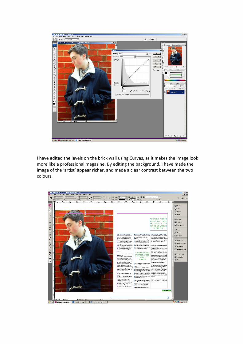
I have edited the levels on the brick wall using Curves, as it makes the image look more like a professional magazine. By editing the background, I have made the image of the ‘artist’ appear richer, and made a clear contrast between the two colours.

I placed the image onto my magazine layout. I have only used one image, which takes up an entire page, as this style is more commonly found in Indie/Folk magazines. As well as this, I wanted the image to dominate the page, so that it would catch the readers attention.
After editing the image, I added a pull quote from the article, and placed the masthead at the top of the article. The Double Page Spread is about an artist that has been voted as the ‘Rising Star of 2012’, so the questions in the interview and the masthead highlight this.

I chose not to add a background to the second page of the spread, as I felt that it would look simpler and more professional if left blank. As I based my Double Page Spread on magazines such as NME, I looked at their layouts, and saw that they were dominated by one image, and were made up of a simple layout, so I chose to reflect this in my own Spread.