strava club visualizer: a social fitness visualization on ... · strava club visualizer: a social...
TRANSCRIPT

Strava Club Visualizer: A Social Fitness Visualization on Cyclists
Collin Walker, Yitao Wang, Si Xie, Li Zeng
Fig 1. Strava Club Visualizer
Abstract—Recent years have seen the increasing popularity of fitness tracking applications, among which Strava plays a leading role in facilitating online communities by individual connections and activity-based clubs. Given the limited visualizations Strava currently offers regarding club activities, we propose Strava Club Visualizer, an exploratory visualization for Strava users, allowing cyclists to find prospective clubs, explore new routes and meet new partners. To better understand the problem space we adopted a user-centered design process where we interviewed Strava end-users to gather our design specifications. Our implementation reduces the visual cluster and allows users to query dynamically with spatial and temporal dimensions. In addition, our visualization yielded positive feedback regarding system’s usability, visual appearance, and the capability to facilitate interpersonal relationships. Index Terms— Information visualization; health; cycling; social fitness; spatio-temporal data
1 INTRODUCTION
In recent years, the growing availability of wearable devices and smartphones with built-in Global Positioning System (GPS) facilitate activity tracking and sharing via online activity-based platforms. In addition to self-tracking of personal activities, these platforms allow users to form their personal social networks by following a group of peers who may interact with or follow them, in return. Prior research has demonstrated that peer effects can affect health activity outcomes [4, 6] These newly emerging platforms are designed to promote an increase in users’ fitness and physical activities (e.g. running, cycling and swimming) as a result of peer to peer interaction [3]. Platforms like Strava that provide the ability for both professional and casual athletes to track their activities and find friends hence lie at the intersection of traditional social media (e.g. Facebook, Twitter, etc.) and self-tracking applications. In 2015, Strava was estimated to have 8.2 million accounts with 1.2 million active users. Strava users capture a large volume data set that includes fitness statistics, geographical data, and temporal information. It provides an opportunity for its users to explore their data and activities within their social circles, enables researchers to investigate online community behaviors in the domain of social fitness, and allows municipalities to improve transportation infrastructure in their areas.
Traditionally, physical distance limits opportunities for expanding social networks [9]. Online communities that are easily accessible could serve to facilitate users who are in the nearby areas
form connections, join up and perhaps work out together. Strava “clubs” are an example of these types of online communities. Strava clubs tie together a group of people who share the same interest regarding the activity types (e.g. cycling, running, or triathlon). Club members interact with each other by forming group rides, discussing recent activities online, and competing on the team leader board. Additionally, group cycling, or cycling activity that involves more than one person, promotes a perception of safety and motivates cyclists to contemplate future cycling [1]. Hence, we want to provide a tool that facilitates these activities better serve the needs of both club administrators and members, in particular for cyclists.
Currently, Strava provides a visualization for individual activities through personal heatmap across all time. On the other hand, group activities are accessible through the Flyby feature (see Fig 2) (the user can re-watch his and hers activity alongside with people who went to the same route over time), it is limited to one activity per request. Additionally, Strava users can explore potential routes through its Segment Explorer (see Fig 3), its map-centric approach overlooks the fact that Strava users’ interest in exploring new segments by other users within their social circle. Frequently, Strava users alternate between the activity view and segment explorer to identify their ideal routes and activity partners.
In this paper, we present the design and implementation of Strava Club Visualizer, an exploratory visualization tool that aims to facilitate club members of Strava, an online social network and activity tracking platform, to explore new cycling routes and discover potential cycling partners. The visualization allows the user to explore the dataset by dynamically query their search with both spatial and temporal dimensions. As a result, a list of relevant data in
• Collin Walker, Yitao Wang, and Si Xie is with University of Washington, Master in Human Computer Interaction and Design. E-mail: [email protected], [email protected], [email protected].
• Li Zeng is with University of Washington Information School. E-mail: [email protected].

2
regards to cycling segment-specific geographical characteristics (e.g.: distance, elevation, grade) and activity-specific attributes (time spent, speed) is shown to the riders.
2 RELATED WORK Visualization of dynamic movement and flow data has a long
history in cartography. According to Andrienko et al., three techniques in visualizing flows data includes a direct depiction of all data collected, plotting summarized view of original data by aggregating, generalizing or sampling, and derived computational patterns through data mining [2]. Spatio-temporal data are generally multivariate, approaches like direct depiction could result in illegible visualization due to visual cluster and scalability issue. Several methods were proposed in addressing movement data from the perspective of origins-destinations set. These include Edge Bundling (Holten and van Wijk, 2009) and Origin-Destination matrix [13]. Methods such as chorodots are effective in presenting the continuous data density within a specified region but do not communicate the exact trajectory from origin to destination [10].
For end users who are interested in exploring a route and its related attributes (e.g.: path infrastructure, a point of interest) within a specific geography context, a visualization communicating detailed path information will be more ideal. One of the examples that address both pathfinding and pattern-searching tasks is TaxiVis, a visual analytics system that supports exploration for both origin-destination presentation and route trajectory through user specified a visual query and view selection [5]. The system visualized the distribution of the taxi transit data through density heat map. To reduce visual clustering and address performance issue, the system proposed a level-of-detail reduction technique where it sorted and traversed locations in a binary tree structure built based on its spatial coordinates [5]. Additionally, the system utilized animations to illustrate the full trajectory of a trip. These techniques could be adapted to our design in creating a balanced visualization that presents both the geography characteristic of the map as well as the underlying social activity information of a particular route.
3 INVESTIGATION To understand current Strava users’ cycling habits and usage
behaviors, and create visualization addressing their needs, we adopted a user-centered design process by working with two Strava club users and implemented the Strava Club Visualizer system.
3.1 User Interviews We conducted interviews with two users from the University of
Washington to better understand the behaviors and needs of Strava users in the context of a cycling club, one as the officer of the collegiate racing team Husky Cycling Club, another one as a member of two Strava cycling clubs. This helped us surface the users needs from the perspectives of an administrator as well as a regular club member.
In the interviews, we asked both participants about their cycling habits, routes finding behaviors, motivations for joining a club and past group rides experiences. For the club officers, we also asked about the considerations for building routes for group rides and finding potential cyclists to join the club. We summarized our findings regarding the users’ needs into tasks that they would like to achieve.
3.1.1 Task for a regular user • To ride with people with similar cycling abilities. Both
participants mentioned that the riding ability such as speed would be their main concern regarding the riding partners. E.g. “It’s a lot fun to ride with people with the same speed.”
• To know where the club members are most active in and where the group rides will be held. Especially for people new to an area, knowing if the group rides are somewhere accessible to their current location is the concern regarding joining a club or not. E.g.: “There are so many people who are new to Seattle and UW, being able for them to see these [where we ride the most] would be pretty cool.”
• To include segments into the cycling routes. Both participants expressed their interests in competing with the Strava community by going through segments. E.g.: “I do use segment and I do compete for them. They are fun, that’s part of it.”
• To find new and safe routes. Both participants said that exploring new and safe route is part of their cycling habit. They would go to the segment explorer on Strava and find the ones that are more popular to ensure the safety of the routes. E.g.: “Number of people ridden a segment tells you a lot about what route might be good to go explore on.”
3.1.2 Task for a club officer • To find new potential cyclists to ride with online and invite
them to group rides. E.g.: “I have talked and connected with bunch of people there (on Strava). For the most part, being able to meet somebody online and then in-person.”
• To find new potential cyclists to ride with online and invite them to group rides. E.g.: “I have talked and connected with a bunch of people there (on Strava). For the most part, being able to meet somebody online and then in-person.”
• To build the group rides based on club members’ riding ability. E.g.: “Team practice route won’t be decided until the last minute since we will judge by people’s ability on that day.”
3.2 Design Requirement Based on the findings from our literature review and user
interviews, we identified that our design should include the following elements:
An overview of the active area within a cycling club: To better help prospective club members assess their fits with a club, a heat map of the active area is needed. Additionally, projecting the activity coordinates into small regions can help solve the map clustering issue.
Fig 2: The flyby feature
Fig 3: The segment explorer
3
Segments location and segments attempts: Segment is an important factor help users explore and assess the safety of a new cycling route. It also allows the club organizer to design new and customized group rides based on the popularity of each segment within the club.
Club members’ cycling abilities: Individual users expressed their preference for cycling with partners shared similar cycling abilities such as speed. Therefore, the club organizer can better design different levels of group rides to cater to everyone’s ability in the club.
Club members’ commitment: Showcasing the active members in the club help the organizer identify potential unmet cyclists that can be invited to group rides in-person, which helps grow up the cycling club and increase the interpersonal relationships within the club.
Timeline adjustment: It allows users to explore the club activity such as heatmap and the map of segments across a different period of time. More relevant information can be surfaced according to the time setting.
4 METHOD
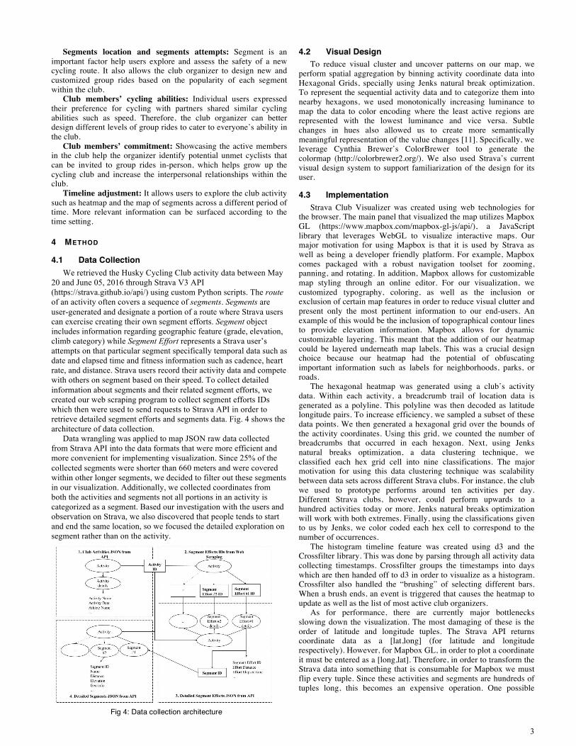
4.1 Data Collection We retrieved the Husky Cycling Club activity data between May
20 and June 05, 2016 through Strava V3 API (https://strava.github.io/api/) using custom Python scripts. The route of an activity often covers a sequence of segments. Segments are user-generated and designate a portion of a route where Strava users can exercise creating their own segment efforts. Segment object includes information regarding geographic feature (grade, elevation, climb category) while Segment Effort represents a Strava user’s attempts on that particular segment specifically temporal data such as date and elapsed time and fitness information such as cadence, heart rate, and distance. Strava users record their activity data and compete with others on segment based on their speed. To collect detailed information about segments and their related segment efforts, we created our web scraping program to collect segment efforts IDs which then were used to send requests to Strava API in order to retrieve detailed segment efforts and segments data. Fig. 4 shows the architecture of data collection.
Data wrangling was applied to map JSON raw data collected from Strava API into the data formats that were more efficient and more convenient for implementing visualization. Since 25% of the collected segments were shorter than 660 meters and were covered within other longer segments, we decided to filter out these segments in our visualization. Additionally, we collected coordinates from both the activities and segments not all portions in an activity is categorized as a segment. Based our investigation with the users and observation on Strava, we also discovered that people tends to start and end the same location, so we focused the detailed exploration on segment rather than on the activity.
4.2 Visual Design To reduce visual cluster and uncover patterns on our map, we
perform spatial aggregation by binning activity coordinate data into Hexagonal Grids, specially using Jenks natural break optimization. To represent the sequential activity data and to categorize them into nearby hexagons, we used monotonically increasing luminance to map the data to color encoding where the least active regions are represented with the lowest luminance and vice versa. Subtle changes in hues also allowed us to create more semantically meaningful representation of the value changes [11]. Specifically, we leverage Cynthia Brewer’s ColorBrewer tool to generate the colormap (http://colorbrewer2.org/). We also used Strava’s current visual design system to support familiarization of the design for its user.
4.3 Implementation Strava Club Visualizer was created using web technologies for
the browser. The main panel that visualized the map utilizes Mapbox GL (https://www.mapbox.com/mapbox-gl-js/api/), a JavaScript library that leverages WebGL to visualize interactive maps. Our major motivation for using Mapbox is that it is used by Strava as well as being a developer friendly platform. For example, Mapbox comes packaged with a robust navigation toolset for zooming, panning, and rotating. In addition, Mapbox allows for customizable map styling through an online editor. For our visualization, we customized typography, coloring, as well as the inclusion or exclusion of certain map features in order to reduce visual clutter and present only the most pertinent information to our end-users. An example of this would be the inclusion of topographical contour lines to provide elevation information. Mapbox allows for dynamic customizable layering. This meant that the addition of our heatmap could be layered underneath map labels. This was a crucial design choice because our heatmap had the potential of obfuscating important information such as labels for neighborhoods, parks, or roads.
The hexagonal heatmap was generated using a club’s activity data. Within each activity, a breadcrumb trail of location data is generated as a polyline. This polyline was then decoded as latitude longitude pairs. To increase efficiency, we sampled a subset of these data points. We then generated a hexagonal grid over the bounds of the activity coordinates. Using this grid, we counted the number of breadcrumbs that occurred in each hexagon. Next, using Jenks natural breaks optimization, a data clustering technique, we classified each hex grid cell into nine classifications. The major motivation for using this data clustering technique was scalability between data sets across different Strava clubs. For instance, the club we used to prototype performs around ten activities per day. Different Strava clubs, however, could perform upwards to a hundred activities today or more. Jenks natural breaks optimization will work with both extremes. Finally, using the classifications given to us by Jenks, we color coded each hex cell to correspond to the number of occurrences.
The histogram timeline feature was created using d3 and the Crossfilter library. This was done by parsing through all activity data collecting timestamps. Crossfilter groups the timestamps into days which are then handed off to d3 in order to visualize as a histogram. Crossfilter also handled the “brushing” of selecting different bars. When a brush ends, an event is triggered that causes the heatmap to update as well as the list of most active club organizers.
As for performance, there are currently major bottlenecks slowing down the visualization. The most damaging of these is the order of latitude and longitude tuples. The Strava API returns coordinate data as a [lat,long] (for latitude and longitude respectively). However, for Mapbox GL, in order to plot a coordinate it must be entered as a [long,lat]. Therefore, in order to transform the Strava data into something that is consumable for Mapbox we must flip every tuple. Since these activities and segments are hundreds of tuples long, this becomes an expensive operation. One possible
Fig 4: Data collection architecture

4
workaround would be to use the Mapbox.js variant rather than Mapbox GL. However, due to time constraints and the wildly different syntaxical implementation between the JavaScript and GL flavor of Mapbox, we stayed with the GL variant.
5 RESULT
5.1 User Interface Components and Interactions Based on the design requirements, our design included the
following interactive components and corresponding interactions. Our interactions follow one of the widely used patterns of navigation to help users make sense of the data, which is “Overview first, zoom and filter, then details-on-demand.” [7].
To first give users an overview of the distribution of the club activities on a map, we provided two map views. A heat map view (see Fig 5) displays the distribution of activities within the areas, and a segment view (see Fig 6) shows the distribution of segment and relevant information of a selected club. Both views can be displayed simultaneously on the map, controlled by the map views checkboxes.
We allowed users to limit the amount of data shown on the map
by brushing or sliding the activity timeline (see Fig 7). The x-axis of the timeline histogram refers to the time and the y-axis indicates the number of activities happened within a day. In response, it causes the corresponding activities and segments occurred in the span of time to appear on the map. The map view is zoomable and pannable to serve as a visual query to pull out a list of the segments that fall into the current view. The list will be updated correspondingly and sorted by the segment attempts. The map displays automatically interpolate between locations when users click on one of the segments on the list, making the highlighted segment fits within the view.
To reveal details-on-demand, we displayed a list of active users in response to the selected span of time as well as the detailed information of the segment being picked from the list.
6 DISCUSSION To evaluate our visualization, we conducted brief informal
usability sessions with 6 Strava users during the poster session on Jun 7, 2016. We first explained the goal of our design and allowed the users to explore the visualization with our guidance to gather feedback regarding tasks and corresponding motivations of our two user groups (regular Strava user and Club officer). Participants thought that the heatmap view was easy to comprehend and identify areas that were most active within the presented dataset, however, because of the constraint in our thematic mapping technique, areas that were mapped outside of the land were perceived as distractions for one of the participants (“There is no bike path in the river”). Moreover, users liked the map-based navigation to query the
segment results, and thought that the ability to view segment attempts within the club directly through the map was more meaningful rather than seeing the attempts across all Strava users. Overall, the participants showed positive feedback for our system regarding intuitive interactions, pleasing visual aesthetics, and support for data exploration.
We were also able to discover several interesting findings with the tool. For instance, in addition to riding around the university areas, cyclists in the Husky Cycling Club also explored segments that are near the coasts and by the mountains. Besides riding during the weekday, club members also rode frequently during the weekends. This high-level information could be potentially beneficial for the prospective club members who are looking for a club to meet in-person and ride with based on their schedules, geography preference, and type of rides. For club officers, they can leverage the most active members lists to identify riders that can recruit as future ride leader based on their riding capability, which can be found through the members’ Strava profile pages.
7 CONCLUSION AND FUTURE WORK In this paper, we presented a proof-of-concept case study of the
Strava Club Activity visualization with the Strava Club Visualizer. The visualization aims to help cyclists uncover the past and current trends in their club activities, and discover potential opportunities for future behaviors within their online communities. Our user-centered design process gave us a good understanding of the Strava club member's needs, behaviors and motivation in their regarding roles and subsequently guided our visualization decision and interaction model in supporting proposed design principles. We were able to draw findings through the exploratory tool.
One direction for our future exploration is to adapt Strava Club Visualizer to other Strava Club’s activity data and evaluate the scalability of our visualization technique regarding both implementation efficiency and user task performance. Additionally, we would like to perform structured usability studies with cyclists to assess our design. Since Strava data is heavily dependent on its user contribution to the platform, incorporating other data sets such as municipal level information (e.g., Seattle Department of Transportation Bike Map) can add more context to the existing map, for example, information about a newly built bike path is biker-friendly.
We would also like to apply our system to other activities such as running and triathlon, since Strava can track many other kinds of activities. We would like to give the users freedom to choose other kinds of activity for exploration. Additionally, by mapping different kinds of activities, our visualization may reveal the patterns of a certain activity (e.g. for cycling, the routes by the water tend to be more popular).
Finally, we would like to incorporate club community interaction features into the visualization. Even though the Strava currently provides a full list of club members and a club discussion board, it is separate from each other, as such it is hard for club members to synthesize information and interact with one another. Hence, it could help users find activity partners by adding more community interaction features such as providing links to the Strava page of club members who the user may be interested in buddying up.
ACKNOWLEDGMENTS We want to thank our participants who provided design insights
and suggestions for the visualization. Thanks to our instructors Jeffrey Heer, Michael Correll and Jane E Hoffswell for providing instructions and reviews for our design.
REFERENCES [1] Aldred, R. (2013). Cycling safety: Key messages and recommendations.
Cycling, Health and Safety, 17-35. doi:10.1787/9789282105955-1-en
Fig 6: The segment view Fig 5: The heat map view
Fig 7: The activity timeline
5
[2] Andrienko, G., Andrienko, N., Dykes, J., Fabrikant, S. I., & Wachowicz, M. (2008). Geovisualization of dynamics, movement and change: Key issues and developing approaches in visualization research. Inf Vis Information Visualization, 7(3-4), 173-180. doi:10.1057/ivs.2008.23
[3] Centola, Damon. "Social media and the science of health behavior."Circulation 127.21 (2013): 2135-2144.
[4] Christakis, N. A., & Fowler, J. H. (2007). The Spread of Obesity in a Large Social Network over 32 Years. New England Journal of Medicine N Engl J Med, 357(4), 370-379. doi:10.1056/nejmsa066082
[5] Ferreira, N., Poco, J., Vo, H. T., Freire, J., & Silva, C. T. (2013). Visual Exploration of Big Spatio-Temporal Urban Data: A Study of New York City Taxi Trips. IEEE Trans. Visual. Comput. Graphics IEEE Transactions on Visualization and Computer Graphics, 19(12), 2149-2158. doi:10.1109/tvcg.2013.226
[6] Fowler, J., & Christakis, N. (2008). Estimating peer effects on health in social networks: A response to Cohen-Cole and Fletcher; and Trogdon, Nonnemaker, and Pais. Journal of Health Economics, 27(5), 1400-1405. doi:10.1016/j.jhealeco.2008.07.001
[7] Heer, J., & Shneiderman, B. (2012). Interactive dynamics for visual analysis. Communications of the ACM Commun. ACM, 55(4), 45. doi:10.1145/2133806.2133821
[8] Holten, D., & Wijk, J. J. (2009). Force-Directed Edge Bundling for Graph Visualization. Computer Graphics Forum, 28(3), 983-990. doi:10.1111/j.1467-8659.2009.01450.x
[9] Latane, B., Liu, J. H., Nowak, A., Bonevento, M., & Zheng, L. (1995). Distance Matters: Physical Space and Social Impact. Personality and Social Psychology Bulletin, 21(8), 795-805. doi:10.1177/0146167295218002
[10] Maceachren, A. M., & Dibiase, D. (1991). Animated Maps of Aggregate Data: Conceptual and Practical Problems. Cartography and Geographic Information Science, 18(4), 221-229. doi:10.1559/152304091783786790
[11] Munzner, T. (2015). Visualization Analysis and Design. Chapter 10. Map Color and Other Channels, A K Peters Visualization Series, CRC Press, 2014.
[12] Slavonia, M. (2016). Sampling Strava. Retrieved June 08, 2016, from http://markslavonia.com/sampling-strava/
[13] Wood, J., Dykes, J., & Slingsby, A. (2010). Visualisation of Origins, Destinations and Flows with OD Maps. The Cartographic Journal, 47(2), 117-129. doi:10.1179/000870410x12658023467367