truthful the art -...
TRANSCRIPT

“Cairo sets the standard for how data should be understood, analyzed, and presented. The Truthful Art is both a manifesto and a manual for how to use data to accurately, clearly, engagingly, imaginatively, beautifully, and reliably inform the public.”
Jeff Jarvis, professor, CUNY Graduate School of Journalism, and author of Geeks Bearing Gifts: Imagining New Futures for News
the truthful
art data, charts, and maps for communication
alberto cairo
Praise for The Truthful Art
“ Alberto Cairo is widely acknowledged as journalism’s preeminent visualization wiz. He is also journalism’s preeminent data scholar. As newsrooms rush to embrace data journalism as a new tool—and toy—Cairo sets the standard for how data should be understood, analyzed, and presented. The Truthful Art is both a manifesto and a manual for how to use data to accurately, clearly, engagingly, imaginatively, beautifully, and reliably inform the public.”
— Jeff Jarvis, professor at CUNY Graduate School of Journalism and author of Geeks Bearing Gifts: Imagining New Futures for News
“ A feast for both the eyes and mind, Alberto Cairo’s The Truthful Art deftly explores the science—and art—of data visualization. The book is a must-read for scientists, educators, journalists, and just about anyone who cares about how to communicate effectively in the information age.”
— Michael E. Mann, Distinguished Professor, Penn State University and author of The Hockey Stick and the Climate Wars
“ Alberto Cairo is a great educator and an engaging storyteller. In The Truthful Art he takes us on a rich, informed, and well-visualized journey that depicts the process by which one scrutinizes data and represents information. The book synthesizes a lot of knowledge and carefully explains how to create effective visualizations with a focus on statistical principles. The Truthful Art will be incredibly useful to both practitioners and students, especially within the arts and humanities, such as those involved in data journalism and information design.”
— Isabel Meirelles, professor at OCAD University (Canada) and author of Design for Information
“ As soon as I started immersing myself in The Truthful Art, I was horrified (and somewhat ashamed) to realize how much I didn’t know about data visualization. I’ve spent most of my career pursuing a more illustrative way to present data, but Alberto Cairo’s clarifying prose superbly explained the finer points of data viz. Since Alberto warns us that “[data is] always noisy, dirty, and uncertain,” everyone in this business had better read his book to find out how to properly construct visualizations that not only tell the truth, but also allow us to interact meaningfully with them.”
—Nigel Holmes, founder of Explanation Graphics

“ To communicate data clearly, you have to think about it clearly. The Truthful Art dives deep and provides an enlightened introduction to the ‘power tools’ of data experts: science, statistics, and visualization.”
—Fernanda Viégas and Martin Wattenberg, Google
“ The Truthful Art is essential reading for my visual communication students and for anyone (at any level) who cares about telling a story visually. Get this book, read it, act on it. If you’re looking for help to put your data visualization on the right track, this is it.”
—John Grimwade, School of Visual Communication, Ohio University
“ If I were smarter, had more patience with academia, and was more focused, I might turn out to be more like Alberto, closer to the brilliance that he applies to the nature of information architecture. His title explains a lot: truth represents a most fundamental of attitudes, in questions asked, answers given, and journeys taken. This [book] is a must on your thoughtful shelf of understanding.”
—Richard Saul Wurman, founder of the TED Conference

“Cairo sets the standard for how data should be understood, analyzed, and presented. The Truthful Art is both a manifesto and a manual for how to use data to accurately, clearly, engagingly, imaginatively, beautifully, and reliably inform the public.”
Jeff Jarvis, professor, CUNY Graduate School of Journalism, and author of Geeks Bearing Gifts: Imagining New Futures for News
the truthful
art data, charts, and maps for communication
alberto cairo

The Truthful Art: Data, Charts, and Maps for CommunicationAlberto Cairo
New Riders
Find us on the Web at www.newriders.comNew Riders is an imprint of Peachpit, a division of Pearson Education.To report errors, please send a note to [email protected]
Copyright © 2016 by Alberto Cairo
Acquisitions Editor: Nikki Echler McDonaldProduction Editor: Tracey CroomDevelopment Editor: Cathy LaneCopy Editor: Cathy LaneProofers: Patricia Pane, Kim Wimpsett Compositor: Kim Scott, Bumpy DesignIndexer: James MinkinCover and Interior Designer: Mimi HeftCover Illustration: Moritz Stefaner
Notice of RightsAll rights reserved. No part of this book may be reproduced or transmitted in any form by any means, electronic, mechanical, photocopying, recording, or otherwise, without the prior writ-ten permission of the publisher. For information on getting permission for reprints and excerpts, contact [email protected].
Notice of LiabilityThe information in this book is distributed on an “As Is” basis without warranty. While every precaution has been taken in the preparation of the book, neither the author nor Peachpit shall have any liability to any person or entity with respect to any loss or damage caused or alleged to be caused directly or indirectly by the instructions contained in this book or by the computer software and hardware products described in it.
TrademarksMany of the designations used by manufacturers and sellers to distinguish their products are claimed as trademarks. Where those designations appear in this book, and Peachpit was aware of a trademark claim, the designations appear as requested by the owner of the trademark. All other product names and services identified throughout this book are used in editorial fashion only and for the benefit of such companies with no intention of infringement of the trademark. No such use, or the use of any trade name, is intended to convey endorsement or other affiliation with this book.
ISBN 13: 9780321934079ISBN 10: 0321934075
9 8 7 6 5 4 3 2 1
Printed and bound in the United States of America

To my father

AcknowledgmentsI always chuckle when someone calls me an “expert” on visualization or info-graphics. As a journalist, I’ve made a profession of being an amateur, in the two senses of the word: someone who doesn’t have a deep understanding of anything, but also someone who does what he does due to unabashed love for the craft.
This book is a tribute to that second kind of amateur, folks who bring good data to the world in a time when society is drowning in tsunamis of spin and misin-formation. They know that it is possible to change the world for the better if we repeat the truth often and loud enough.
❘❘❘❙❚❚n❙❘❘❘
I’d like to first thank my University of Miami (UM) colleague Rich Beckman. It’s not an exaggeration to say that I wouldn’t be where I am today without his help, advice, and mentorship.
Seth Hamblin, a friend at The Wall Street Journal, passed away while I was writ-ing this book. Seth was in love with infographics and visualization. When I told him about The Truthful Art, he got as excited as a kid. He was a beautiful human being, and he’ll be missed.
To Greg Shepherd, dean of UM’s School of Communication; Nick Tsinoremas, director of UM’s Center for Computational Science (CCS); Sawsan Khuri, also from CCS, a great colleague and better friend; Sam Terilli, head of our department of journalism; and Kim Grinfeder, who leads our Interactive Media program. Also at UM, I’d like to thank my colleagues in the departments of Journalism and Interactive Media, and at the Center for Communication, Culture, and Change.
To Phil Meyer, whose book Precision Journalism inspired me many years ago. In fact, I wrote The Truthful Art with the goal of being a Precision Journalism for the new century.
To my past colleagues at La Voz de Galicia, Diario16, DPI Comunicación, El Mundo, and Editora Globo. Among them, Helio Gurovitz, the former managing editor at Globo’s Época magazine, who combines a deep knowledge of journalism with an unusual sensibility of how to use numbers and graphics.
Also, to my clients and partners worldwide, particularly Jim Friedland, for all his support in the past two years.

❘❘❘❙❚❚n❙❘❘❘
Many people read this book while it was in the works. My editor, Nikki McDonald, and my copyeditor, Cathy Lane, kept an eye on me at all times, and did their best to make me meet deadlines (they failed).
Stephen Few sent me detailed notes about each chapter. Steve is both a friend and arguably my most severe critic. I’ve done my best to incorporate as much from his feedback as possible, but not all. I know that Steve will still disagree with some of my musings, but those disagreements can be great topics to ponder while enjoying some fine wine and cheese.
Erik Jacobsen also provided detailed feedback. His notes have been invaluable.
Three statisticians, Diego Kuonen, Heather Krause, and Jerzy Wieczorek, read the most technical chapters and made sure that I was not writing anything par-ticularly silly. Others who commented on the book are: Andy Cotgreage, Kenneth Field, Jeff Jarvis, Scott Klein, Michael E. Mann, Isabel Meirelles, Fernanda Viégas, Martin Wattenberg, and Sisi Wei. Thank you all.
Thanks also to all the individuals and organizations who let me showcase their work in The Truthful Art. You’re too numerous to mention, but you’ll see your names in pages to come.
Some of my followers on Twitter volunteered for the last round of proofreading. They are: Mohit Chawla, Fernando Cucchietti, Stijn Debrouwere, Alex Lea, Neil Richards, Frédéric Schütz, and Tom Shanley.
Special thanks to Moritz Stefaner, for giving me permission to use one of his amazing graphics on the cover of this book.
❘❘❘❙❚❚n❙❘❘❘
To Nancy.
❘❘❘❙❚❚n❙❘❘❘
Finally, and above all, thanks to my family.

Additional MaterialsI designed many of the charts and maps you’re about to see in The Truthful Art, but I haven’t written much about the software I used to create them. If you’re inter-ested in learning about tools, please visit my weblog, www.thefunctionalart.com, and go to the Tutorials and Resources section on the upper menu.
There, you will find several articles and video lessons I recorded about programs and languages like R, iNzight, and Yeeron, among others.
About the AuthorAlberto Cairo is the Knight Chair in Visual Journalism at the School of Com-munication of the University of Miami (UM), where he heads specializations in infographics and data visualization. He’s also director of the visualization program at UM’s Center for Computational Science, and Visualization Innovator in Residence at Univisión.
He is the author of the books Infografía 2.0: Visualización interactiva de información en prensa, published just in Spain in 2008, and The Functional Art: An Introduction to Information Graphics and Visualization (New Riders, 2012).
In the past two decades, Cairo has been director of infographics and visualization at news organizations in Spain and Brazil, besides consulting with companies and educational institutions in more than 20 countries. He also was a professor at the University of North Carolina-Chapel Hill between 2005 and 2009.
Cairo’s personal weblog is www.thefunctionalart.com. His corporate website is www.albertocairo.com.
His Twitter handle is @albertocairo.
Contents Preface xiii
Introduction 1
PART I foundations
1 What We Talk About When We Talk About Visualization 27
To Learn More 40
2 The Five Qualities of Great Visualizations 41
The Hockey Stick Chart 43Truthful 45Functional 50Beautiful 53Insightful 59Enlightening 60To Learn More 65
PART II truthful
3 The Truth Continuum 69
Dubious Models 71The Mind, That Clumsy Modeler 76
Why Are We So Often Mistaken? 79Mind Bug 1: Patternicity 81Mind Bug 2: Storytelling 82Mind Bug 3: Confirmation 84
Truth Is Neither Absolute, Nor Relative 86The Skills of the Educated Person 97To Learn More 97
4 Of Conjectures and Uncertainty 99
The Scientific Stance 100From Curiosity to Conjectures 101
Hypothesizing 105An Aside on Variables 105

On Studies 107Doing Experiments 110About Uncertainty 112To Learn More 116
PART III functional
5 Basic Principles of Visualization 121
Visually Encoding Data 123Choosing Graphic Forms 125
A Grain of Salt 129Practical Tips About those Tricky Scales 135
Organizing the Display 138Put Your Work to the Test 141To Learn More 148
6 Exploring Data with Simple Charts 151
The Norm and the Exceptions 152The Mode, the Median, and the Mean 153Weighting Means 155Range 157Some Fun with Ranges 160To Learn More 166
7 Visualizing Distributions 167
The Variance and the Standard Deviation 171Standard Deviation and Standard Scores 173Presenting Stories with Frequency Charts 178How Standardized Scores Mislead Us 183Peculiarities of the Normal Distribution 188
Percentiles, Quartiles, and the Box Plot 191Manipulating Data 194Frequency Over Time 195To Learn More 197
8 Revealing Change 199
Trend, Seasonality, and Noise 201Decomposing a Time Series 201Visualizing Indexes 210
the truthful artx

From Ratios to Logs 214How Time Series Charts Mislead 217
Communicating Change 220To Learn More 231
9 Seeing Relationships 233
From Association to Correlation 236Smoothers 240Matrices and Parallel Coordinate Plots 242
Correlation for Communication 248Regression 257
From Correlation to Causation 259Data Transformation 261To Learn More 262
10 Mapping Data 263
Projection 265Data on Maps 271
Point Data Maps 271Line Maps 277
The Basics of Choropleth Maps 280Classifying Data 282Using Choropleth Maps 287Other Kinds of Data Maps 293To Learn More 296
11 Uncertainty and Significance 299
Back to Distributions 302The Standard Error 305Building Confidence Intervals 308Disclosing Uncertainty 312
The Best Advice You’ll Ever Get: Ask 316How Has Stuff Been Measured? 317Dispatches from the Data Jungle 318Significance, Size, and Power 321To Learn More 325
contents xi

PART IV practice
12 On Creativity and Innovation 329
The Popularizers 334News Applications 338Those Enchanting Europeans 356Making Science Visual 360Culture Data 364The Artistic Fringes 367
Epilogue 375
Index 376
the truthful artxii
Preface
It All Begins with a SparkWhy is it that when one man builds a wall, the next man immediately needs to know what’s on the other side?
—Tyrion Lannister in George R.R. Martin’s A Game of Thrones
There’s probably something you don’t know about college professors: we tend to have peculiar hobbies.
In October 2014, I spent my entire fall recess catching up with R, a programming language for statistical analysis; ggplot2, an R library that creates nice-looking charts; and Tableau, a data visualization program.1 Learning any software tool without using it is impossible, so I needed some data to play with, and not just any data, but data I could care about.
A few months back, my family and I had moved to a new home, so I had briefly visited the Miami-Dade County Public Schools website (DadeSchools.net) to check the quality of the elementary school, middle school, and high school in our area. Each had a grade of A. I had felt reassured at the time, but also a bit
1 I hope that this doesn’t impress you. I am by no means an advanced user of any of these tools. All graphics in these pages were designed with very little knowledge of how to use them properly. For more information, visit http://www.r-project.org/, http://ggplot2.org/, and http://www.tableau.com.

uneasy, as I hadn’t done any comparison with schools in other neighborhoods. Perhaps my learning R and Tableau could be the perfect opportunity to do so.
DadeSchools.net has a neat data section, so I visited it and downloaded a spread-sheet of performance scores from all schools in the county. You can see a small portion of it—the spreadsheet is 461 rows tall—in Figure P.1. The figures in the Reading2012 and Reading2013 columns are the percentage of students from each school who attained a reading level considered as satisfactory in those two consecutive years. Math2012 and Math2013 correspond to the percentage of students who were deemed reasonably numerate for their age.
While learning how to write childishly simple scripts in R, I created rankings and bar charts to compare all schools. I didn’t get any striking insight out of this exercise, although I ascertained that the three public schools in our neighborhood are decent indeed. My job was done, but I didn’t stop there. I played a bit more.
I made R generate a scatter plot (Figure P.2). Each dot is one school. The posi-tion on the X-axis is the percentage of students who read at their proper level in 2013. The Y-axis is the same percentage for math proficiency. Both variables
Figure P.1 The top portion of a spreadsheet with data from public schools in Miami-Dade County.
the truthful artxiv

are clearly linked: the larger one gets, the larger the other one tends to become.2 This makes sense. There is nothing very surprising other than a few outliers, and the fact that there are some schools in which no student is considered proficient in reading and/or math. This could be due to mistakes in the data set, of course.
After that, I learned how to write a short script to design not just one but sev-eral scatter plots, one for each of the nine school board districts in Miami-Dade County. It was then that I became really intrigued. See the results in Figure P.3.
There are quite a few interesting facts in that array. For instance, most schools in Districts 3, 7, and 8 are fine. Students in Districts 1 and 2, on the other hand, perform rather poorly.
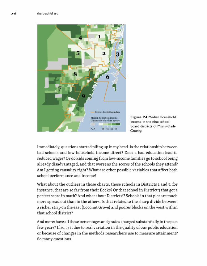
At the time I was not familiar with the geography of the Miami-Dade school system, so I went online to find a map of it. I also visited the Census Bureau website to get a map of income data. I redesigned and overlaid them. (See Figure P.4. Warning: I didn’t make any adjustment to these maps, so the overlap isn’t perfect.) I got what I foresaw: the worst-performing districts, 1 and 2, encompass low-income neighborhoods, like Liberty City, Little Haiti, and Overtown.
2 In statistics, we may call this a “strong positive correlation.” But I’m getting a bit ahead of myself.
0
25
50
75
100
0 25 50 75 100Reading % Satisfactory
Mat
h %
Sat
isfa
ctor
y
Figure P.2 Each dot on the chart is a school. Reading and math skills are strongly related.
1 2 3
0
25
50
75
100
0
25
50
75
100
0
25
50
75
100
0 25 50 75 100 0 25 50 75 100 0 25 50 75 100
Reading % Satisfactory
Mat
h %
Sat
isfa
ctor
y
4 5 6
0 25 50 75 100 0 25 50 75 100 0 25 50 75 100
7 8 9
0 25 50 75 100 0 25 50 75 100 0 25 50 75 100
Figure P.3 The same data, divided by school board.
preface · it all begins with a spark xv
35 45 55 75N/A
Median household income(thousands of dollars a year)
School district boundary
4
5 2
1
3
6
97
8
Figure P.4 Median household income in the nine school board districts of Miami-Dade County.
Immediately, questions started piling up in my head. Is the relationship between bad schools and low household income direct? Does a bad education lead to reduced wages? Or do kids coming from low-income families go to school being already disadvantaged, and that worsens the scores of the schools they attend? Am I getting causality right? What are other possible variables that affect both school performance and income?
What about the outliers in those charts, those schools in Districts 1 and 7, for instance, that are so far from their flocks? Or that school in District 3 that got a perfect score in math? And what about District 6? Schools in that plot are much more spread out than in the others. Is that related to the sharp divide between a richer strip on the east (Coconut Grove) and poorer blocks on the west within that school district?
And more: have all these percentages and grades changed substantially in the past few years? If so, is it due to real variation in the quality of our public education or because of changes in the methods researchers use to measure attainment? So many questions.
the truthful artxvi

And so the seeds for many potential stories got planted. I didn’t have an idea of what they might be at that point or if any of them would be worth telling. I just got a glimpse, an enticing clue. As most visualization designers and data journalists I know will tell you, sometimes it is not you who finds good ideas when you’re seeking them. Instead, good ideas find you in the most unexpected circumstances.
Good ideas are fleeting things, so I feverishly scribbled notes in a computer appli-cation called Stickies, short messages for my future self, musings of a mind in a state of joyous flow. I added, “Find some education experts.3 Ask them. Contact the folks running dadeschools.net. You’ll likely need more data from the U.S. Census Bureau’s website.” And so on and so forth.
As the saying goes, every great story begins with a spark. Fun ensues.
3 Here’s Robert B. Reich—who isn’t an expert on education but was Secretary of Labor under President Bill Clinton—in his book Saving Capitalism (2015): “A large portion of the money to support public schools comes from local property taxes. The federal government provides only about 10 percent of all funding, and the states provide 45 percent, on average. The rest is raised locally (…) Real estate markets in lower-income communities remain weak, so local tax reve-nues are down. As we segregate by income into different communities, schools in lower-income areas have fewer resources than ever. The result is widening disparities in funding per pupil, to the direct disadvantage of poor kids.” Another possible clue to follow.
preface · it all begins with a spark xvii

This page intentionally left blank

This page intentionally left blank

4
Of Conjectures and Uncertainty
We live in a world with a surfeit of information at our service. It is our choice whether we seek out data that reinforce our biases or choose to look at the world in a critical, rational manner, and allow reality to bend our preconceptions. In the long run, the truth will work better for us than our cherished fictions.
—Razib Khan, “The Abortion Stereotype,” The New York Times (January 2, 2015)
To become a visualization designer, it is advisable to get acquainted with the language of research. Getting to know how the methods of science work will help us ascertain that we’re not being fooled by our sources. We will still be fooled on a regular basis, but at least we’ll be better equipped to avoid it if we’re careful.
Up to this point I’ve done my best to prove that interpreting data and visualizations is to a great extent based on applying simple rules of thumb such as “compared to what/who/where/when,” “always look for the pieces that are missing in the model,” and “increase depth and breadth up to a reasonable point.” I stressed

those strategies first because in the past two decades I’ve seen that many design-ers and journalists are terrified by science and math for no good reason.1
It’s time to get a bit more technical.
The Scientific StanceScience isn’t only what scientists do. Science is a stance, a way to look at the world, that everybody and anybody, regardless of cultural origins or background, can embrace—I’ll refrain from writing “should,” although I feel tempted. Here’s one of my favorite definitions: “Science is a systematic enterprise that builds, organizes, and shares knowledge in the form of testable explanations and predictions.”2 Science is, then, a set of methods, a body of knowledge, and the means to communicate it.
Scientific discovery consists of an algorithm that, in a highly idealized form, looks like this:
1. You grow curious about a phenomenon, you explore it for a while, and then you formulate a plausible conjecture to describe it, explain it, or predict its behavior. This conjecture is just an informed hunch for now.
2. You transform your conjecture into a formal and testable proposition, called a hypothesis.
3. You thoroughly study and measure the phenomenon (under controlled conditions whenever it’s possible). These measurements become data that you can use to test your hypothesis.
4. You draw conclusions, based on the evidence you have obtained. Your data and tests may force you to reject your hypothesis, in which case you’ll need go to back to the beginning. Or your hypothesis may be tentatively corroborated.
1 Journalists and designers aren’t to blame. The education we’ve all endured is. Many of my peers in journalism school, back in the mid-1990s, claimed that they weren’t “good at math” and that they only wanted to write. I still hear this from some of my students at the University of Miami. I guess that something similar can be seen among designers (“I just want to design!”). My response is usually, “If you cannot evaluate and manipulate data and evidence at all, what are you going to write (design) about?”2 From Mark Chang’s Principles of Scientific Methods (2014). Another source to consult is
“ Science and Statistics,” a 1976 article by George E. P. Box. http://www-sop.inria.fr/members/Ian.Jermyn/philosophy/writings/Boxonmaths.pdf
the truthful art100

5. Eventually, after repeated tests and after your work has been reviewed by your peers, members of your knowledge or scientific community, you may be able to put together a systematic set of interrelated hypotheses to describe, explain, or predict phenomena. We call this a theory. From this point on, always remember what the word “theory” really means. A theory isn’t just a careless hunch.
These steps may open researchers’ eyes to new paths to explore, so they don’t constitute a process with a beginning and an end point but a loop. As you’re probably guessing, we are returning to themes we’ve already visited in this book: good answers lead to more good questions. The scientific stance will never take us all the way to an absolute, immutable truth. What it may do—and it does it well—is to move us further to the right in the truth continuum.
From Curiosity to ConjecturesI use Twitter a lot, and on days when I spend more than one hour on it, I feel that I’m more distracted and not as productive as usual. I believe that this is something that many other writers experience. Am I right or am I wrong? Is this just something that I feel or something that is happening to everyone else? Can I transform my hunch into a general claim? For instance, can I say that an X percent increase of Twitter usage a day leads a majority of writers to a Y percent decrease in productivity? After all, I have read some books that make the bold claim that the Internet changes our brains in a negative way.3
What I’ve just done is to notice an interesting pattern, a possible cause-effect relationship (more Twitter = less productivity), and made a conjecture about it. It’s a conjecture that:
1. It makes sense intuitively in the light of what we know about the world.
2. It is testable somehow.
3. It is made of ingredients that are naturally and logically connected to each other in a way that if you change any of them, the entire conjecture will crumble. This will become clearer in just a bit.
3 The most famous one is The Shallows (2010), by Nicholas Carr. I am quite skeptical of this kind of claim, as anything that we do, see, hear, and so on, “changes” the wiring inside our skulls.
4 · of conjectures and uncertainty 101

These are the requirements of any rational conjecture. Conjectures first need to make sense (even if they eventually end up being wrong) based on existing knowledge of how nature works. The universe of stupid conjectures is infinite, after all. Not all conjectures are born equal. Some are more plausible a priori than others.
My favorite example of conjecture that doesn’t make sense is the famous Sports Illustrated cover jinx. This superstitious urban legend says that appearing on the cover of Sports Illustrated magazine makes many athletes perform worse than they did before.
To illustrate this, I have created Figure 4.1, based on three different fictional athletes. Their performance curve (measured in goals, hits, scores, whatever) goes up, and then it drops after being featured on the cover of Sports Illustrated.
Saying that this is a curse is a bad conjecture because we can come up with a much more simple and natural explanation: athletes are usually featured on magazine covers when they are at the peak of their careers. Keeping yourself in the upper ranks of any sport is not just hard work, it also requires tons of good luck. Therefore, after making the cover of Sports Illustrated, it is more probable that the performance of most athletes will worsen, not improve even more. Over time, an athlete is more likely to move closer to his or her average performance rate than away from it. Moreover, aging plays an important role in most sports.
What I’ve just described is regression toward the mean, and it’s pervasive.4 Here’s how I’d explain it to my kids: imagine that you’re in bed today with a cold. To cure you, I go to your room wearing a tiara of dyed goose feathers and a robe made of oak leaves, dance Brazilian samba in front of you—feel free to picture this scene in your head, dear reader—and give you a potion made of water, sugar, and an infinitesimally tiny amount of viral particles. One or two days later, you
4 When playing with any sort of data set, if you randomly draw one value and obtain one that is extremely far from the mean (that is, the average value), the next one that you draw will probably be closer to the mean than even further away from it. Regression toward the mean was first described by Sir Francis Galton in the late nineteenth century, but under a slightly different name: regression toward mediocrity. Galton observed that parents who were very tall tended to have children who were shorter than they were and that parents who were very short had children who were taller than them. Galton said that extreme traits tended to
“regress” toward “mediocrity.” His paper is available online, and it’s a delight: http://galton.org/essays/1880-1889/galton-1886-jaigi-regression-stature.pdf.
the truthful art102

feel better. Did I cure you? Of course not. It was your body regressing to its most probable state, one of good health.5
For a conjecture to be good, it also needs to be testable. In principle, you should be able to weigh your conjecture against evidence. Evidence comes in many forms: repeated observations, experimental tests, mathematical analysis, rigorous mental or logic experiments, or various combinations of any of these.6
Being testable also implies being falsifiable. A conjecture that can’t possibly be refuted will never be a good conjecture, as rational thought progresses only if our current ideas can be substituted for better-grounded ones later, when new evidence comes in.
Sadly, we humans love to come up with non-testable conjectures, and we use them when arguing with others. Philosopher Bertrand Russell came up with a splendid illustration of how ludicrous non-testable conjectures can be:
If I were to suggest that between the Earth and Mars there is a china tea-pot revolving about the sun in an elliptical orbit, nobody would be able to
5 Think about this next the time that anyone tries to sell you an overpriced “alternative medicine” product or treatment. The popularity of snake oil-like stuff is based on our propensity to see causality where there’s only a sequence of unconnected events (“follow my unsubstantiated advice—feel better”) and our lack of understanding of regression toward the mean.6 If you read any of the books recommended in this chapter, be aware that many scientists and philosophers of science are more stringent than I am when evaluating if a particular procedure really qualifies as a test.
Time
Made the cover of Sports Illustrated
PerformanceAthlete 1
Athlete 2
Athlete 3
Figure 4.1 Athletes tend to underperform after they’ve appeared on the cover of Sports Illustrated magazine. Does the publication cast a curse on them?
4 · of conjectures and uncertainty 103

disprove my assertion provided I were careful to add that the teapot is too small to be revealed even by our most powerful telescopes. But if I were to go on to say that, since my assertion cannot be disproved, it is intolerable presumption on the part of human reason to doubt it, I should rightly be thought to be talking nonsense. (Illustrated magazine, 1952)
Making sense and being testable alone don’t suffice, though. A good conjecture is made of several components, and these need to be hard to change without making the whole conjecture useless. In the words of physicist David Deutsch, a good conjecture is “hard to vary, because all its details play a functional role.” The components of our conjectures need to be logically related to the nature of the phenomenon we’re studying.
Imagine that a sparsely populated region in Africa is being ravaged by an infec-tious disease. You observe that people become ill mostly after attending religious services on Sunday. You are a local shaman and propose that the origin of the disease is some sort of negative energy that oozes out of the spiritual aura of priests and permeates the temples where they preach.
This is a bad conjecture not just because it doesn’t make sense or isn’t testable. It is testable, actually: when people gather in temples and in the presence of priests, a lot of them get the disease. There, I got my conjecture tested and corroborated!
Not really. This conjecture is bad because we could equally say that the disease is caused by invisible pixies who fly inside the temples, the souls of the departed who still linger around them, or by any other kind of supernatural agent. Changing our premises keeps the body of our conjecture unchanged. Therefore, a flexible conjecture is always a bad conjecture.
It would be different if you said that the disease may be transmitted in crowded places because the agent that provokes it, whether a virus or a bacterium, is airborne. The closer people are to each other, the more likely it is that someone will sneeze, spreading particles that carry the disease. These particles will be breathed by other people and, after reaching their lungs, the agent will spread.
This is a good conjecture because all its components are naturally connected to each other. Take away any of them and the whole edifice of your conjecture will fall, forcing you to rebuild it from scratch in a different way. After being compared to the evidence, this conjecture may end up being completely wrong, but it will forever be a good conjecture.
the truthful art104

HypothesizingA conjecture that is formalized to be tested empirically is called a hypothesis.
To give you an example (and be warned that not all hypotheses are formulated like this): if I were to test my hunch that using Twitter for too long reduces writers’ productivity, I’d need to explain what I mean by “too long” and by “productiv-ity” and how I’m planning to measure them. I’d also need to make some sort of prediction that I can assess, like “each increase of Twitter usage reduces the average number of words that writers are able to write in a day.”
I’ve just defined two variables. A variable is something whose values can change somehow (yes-no, female-male, unemployment rate of 5.6, 6.8, or 7.1 percent, and so on). The first variable in our hypothesis is “increase of Twitter usage.” We can call it a predictor or explanatory variable, although you may see it called an independent variable in many studies.
The second element in our hypothesis is “reduction of average number of words that writers write in a day.” This is the outcome or response variable, also known as the dependent variable.
Deciding on what and how to measure is quite tricky, and it greatly depends on how the exploration of the topic is designed. When getting information from any source, sharpen your skepticism and ask yourself: do the variables defined in the study, and the way they are measured and compared, reflect the reality that the authors are analyzing?
An Aside on VariablesVariables come in many flavors. It is important to remember them because not only are they crucial for working with data, but later in the book they will also help us pick methods of representation for our visualizations.
The first way to classify variables is to pay attention to the scales by which they’re measured.
NominalIn a nominal (or categorical) scale, values don’t have any quantitative weight. They are distinguished just by their identity. Sex (male or female) and location (Miami, Jacksonville, Tampa, and so on) are examples of nominal variables. So
4 · of conjectures and uncertainty 105

are certain questions in opinion surveys. Imagine that I ask you what party you’re planning to vote, and the options are Democratic, Republican, Other, None, and Don’t Know.
In some cases, we may use numbers to describe our nominal variables. We may write “0” for male and “1” for female, for instance, but those numbers don’t represent any amount or position in a ranking. They would be similar to the numbers that soccer players display on their back. They exist just to identify players, not to tell you which are better or worse.
OrdinalIn an ordinal scale, values are organized or ranked according to a magnitude, but without revealing their exact size in comparison to each other.
For example, you may be analyzing all countries in the world according to their Gross Domestic Product (GDP) per capita but, instead of showing me the specific GDP values, you just tell me which country is the first, the second, the third, and so on. This is an ordinal variable, as I’ve just learned about the countries’ rankings according to their economic performance, but I don’t know anything about how far apart they are in terms of GDP size.
In a survey, an example of ordinal scale would be a question about your happiness level: 1. Very happy; 2. Happy; 3. Not that happy; 4. Unhappy; 5. Very unhappy.
IntervalAn interval scale of measurement is based on increments of the same size, but also on the lack of a true zero point, in the sense of that being the absolute low-est value. I know, it sounds confusing, so let me explain.
Imagine that you are measuring temperature in degrees Fahrenheit. The distance between 5 and 10 degrees is the same as the distance between 20 and 25 degrees: 5 units. So you can add and subtract temperatures, but you cannot say that 10 degrees is twice as hot as 5 degrees, even though 2 × 5 equals 10. The reason is related to the lack of a real zero. The zero point is just an arbitrary number, one like any other on the scale, not an absolute point of reference.
An example of interval scale coming from psychology is the intellectual quotient (IQ). If one person has an IQ of 140 and another person has an IQ of 70, you can say that the former is 70 units larger than the latter, but you cannot say that the former is twice as intelligent as the latter.
the truthful art106

RatioRatio scales have all the properties of the other previous scales, plus they also have a meaningful zero point. Weight, height, speed, and so on, are examples of ratio variables. If one car is traveling at 100 mph and another one is at 50, you can say that the first one is going 50 miles faster than the second, and you can also say that it’s going twice as fast. If my daughter’s height is 3 feet and mine is 6 feet (I wish), I am twice as tall as her.
Variables can be also classified into discrete and continuous. A discrete vari-able is one that can only adopt certain values. For instance, people can only have cousins in amounts that are whole numbers—four or five, that is, not 4.5 cousins. On the other hand, a continuous variable is one that can—at least in theory—adopt any value on the scale of measurement that you’re using. Your weight in pounds can be 90, 90.1, 90.12, 90.125, or 90.1256. There’s no limit to the number of decimal places that you can add to that. Continuous variables can be measured with a virtually endless degree of precision, if you have the right instruments.
In practical terms, the distinction between continuous and discrete variables isn’t always clear. Sometimes you will treat a discrete variable as if it were continuous. Imagine that you’re analyzing the number of children per couple in a certain country. You could say that the average is 1.8, which doesn’t make a lot of sense for a truly discrete variable.
Similarly, you can treat a continuous variable as if it were discrete. Imagine that you’re measuring the distance between galaxy centers. You could use nanome-ters with an infinite number of decimals (you’ll end up with more digits than atoms in the universe!), but it would be better to use light-years and perhaps limit values to whole units. If the distance between two stars is 4.43457864… light-years, you could just round the figure to 4 light-years.
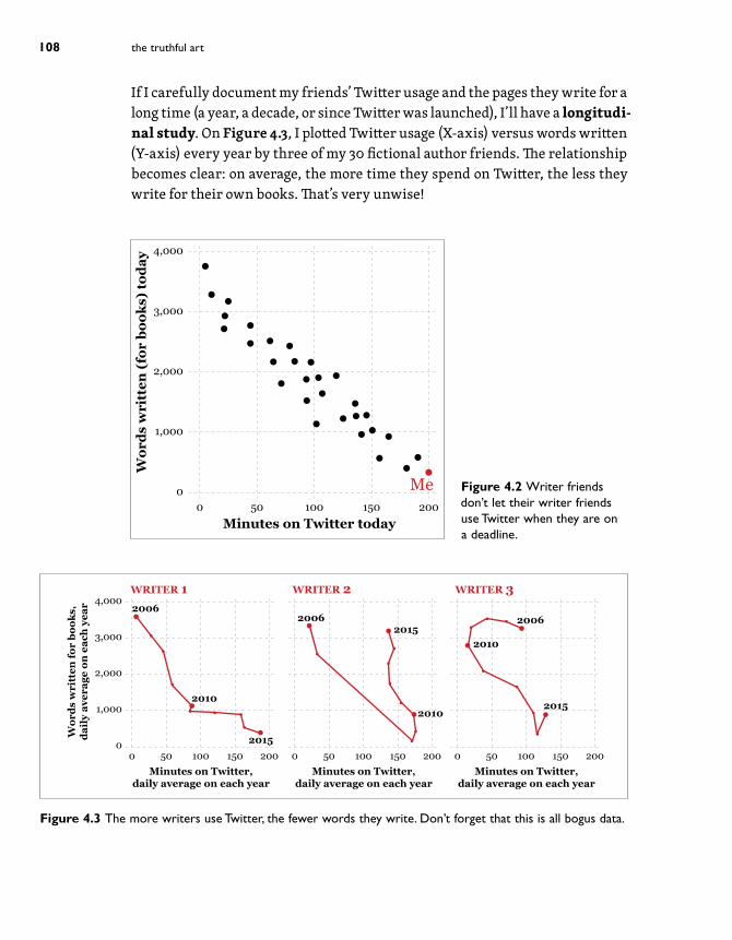
On StudiesOnce a hypothesis is posed, it’s time to test it against reality. I wish to measure if increased Twitter usage reduces book-writing output. I send an online poll to 30 friends who happen to be writers, asking them for the minutes spent on Twitter today and the words they have written. My (completely made up) results are on Figure 4.2. This is an observational study. To be more precise, it’s a cross-sectional study, which means that it takes into account data collected just at a particular point in time.
4 · of conjectures and uncertainty 107
00
1,000
2,000
3,000
4,000
50 100 150 200Minutes on Twitter today
Wor
ds w
ritt
en (
for
book
s) to
day
Me Figure 4.2 Writer friends don’t let their writer friends use Twitter when they are on a deadline.
00
1,000
2,000
3,000
4,000
50 100 150 200Minutes on Twitter,
daily average on each year
Wor
ds w
ritt
en fo
r bo
oks,
dail
y av
erag
e on
eac
h ye
ar
0 50 100 150 200Minutes on Twitter,
daily average on each year
0 50 100 150 200Minutes on Twitter,
daily average on each year
WRITER 1 WRITER 2 WRITER 3
2015
2015
2015
2006
20102010
2010
2006 2006
Figure 4.3 The more writers use Twitter, the fewer words they write. Don’t forget that this is all bogus data.
If I carefully document my friends’ Twitter usage and the pages they write for a long time (a year, a decade, or since Twitter was launched), I’ll have a longitudi-nal study. On Figure 4.3, I plotted Twitter usage (X-axis) versus words written (Y-axis) every year by three of my 30 fictional author friends. The relationship becomes clear: on average, the more time they spend on Twitter, the less they write for their own books. That’s very unwise!
the truthful art108
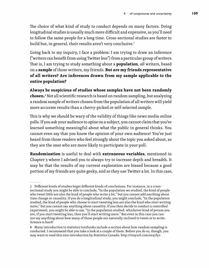
The choice of what kind of study to conduct depends on many factors. Doing longitudinal studies is usually much more difficult and expensive, as you’ll need to follow the same people for a long time. Cross-sectional studies are faster to build but, in general, their results aren’t very conclusive.7
Going back to my inquiry, I face a problem: I am trying to draw an inference (“writers can benefit from using Twitter less”) from a particular group of writers. That is, I am trying to study something about a population, all writers, based on a sample of those writers, my friends. But are my friends representative of all writers? Are inferences drawn from my sample applicable to the entire population?
Always be suspicious of studies whose samples have not been randomly chosen.8 Not all scientific research is based on random sampling, but analyzing a random sample of writers chosen from the population of all writers will yield more accurate results than a cherry-picked or self-selected sample.
This is why we should be wary of the validity of things like news media online polls. If you ask your audience to opine on a subject, you cannot claim that you’ve learned something meaningful about what the public in general thinks. You cannot even say that you know the opinion of your own audience! You’ve just heard from those readers who feel strongly about the topic you asked about, as they are the ones who are more likely to participate in your poll.
Randomization is useful to deal with extraneous variables, mentioned in Chapter 3 where I advised you to always try to increase depth and breadth. It may be that the results of my current exploration are biased because a good portion of my friends are quite geeky, and so they use Twitter a lot. In this case,
7 Different kinds of studies beget different kinds of conclusions. For instance, in a cross-sectional study you might be able to conclude, “In the population we studied, the kind of people who tweet little are also the kind of people who write a lot,” but you cannot add anything about time change or causality. If you do a longitudinal study, you might conclude, “In the population studied, the kind of people who choose to start tweeting less are also the kind who start writing more,” but you cannot say anything about causality. If you then decide to conduct a controlled experiment, you might be able to say, “In the population studied, whichever kind of person you are, if you start tweeting less, then you’ll start writing more.” But even in this case you can-not say anything about how many of those people are naturally inclined to tweet or to write. Science is hard!8 Many introduction to statistics textbooks include a section about how random sampling is conducted. I recommend that you take a look at a couple of them. Before you do so, though, you may want to read this nice introduction by Statistics Canada: http://tinyurl.com/or47fyr.
4 · of conjectures and uncertainty 109

the geekiness level, if it could be measured, would distort my model, as it would affect the relationship between predictor and outcome variable.
Some researchers distinguish between two kinds of extraneous variables. Some-times we can identify an extraneous variable and incorporate it into our model, in which case we’d be dealing with a confounding variable. I know that it may affect my results, so I consider it for my inquiry to minimize its impact. In an example seen in previous chapters, we controlled for population change and for variation in number of motor vehicles when analyzing deaths in traffic accidents.
There’s a second, more insidious kind of extraneous variable. Imagine that I don’t know that my friends are indeed geeky. If I were unaware of this, I’d be dealing with a lurking variable. A lurking variable is an extraneous variable that we don’t include in our analysis for the simple reason that its existence is unknown to us, or because we can’t explain its connection to the phenomenon we’re studying.
When reading studies, surveys, polls, and so on, always ask yourself: did the authors rigorously search for lurking variables and transform them into con-founding variables that they can ponder? Or are there other possible factors that they ignored and that may have distorted their results?9
Doing ExperimentsWhenever it is realistic and feasible to do so, researchers go beyond observational studies and design controlled experiments, as these can help minimize the influence of confounding variables. There are many kinds of experiments, but many of them share some characteristics:
1. They observe a large number of subjects that are representative of the population they want to learn about. Subjects aren’t necessarily people. A subject can be any entity (a person, an animal, an object, etc.) that can be studied in controlled conditions, in isolation from external influences.
9 One of the best quotes about the imperfection of all our rational inquiry methods, including science, comes from former Secretary of Defense Donald Rumsfeld. In a 2002 press conference about using the possible existence of weapons of mass destruction in Iraq as a reason to go to war with that country, he said, “Reports that say that something hasn’t happened are always interesting to me, because as we know, there are known knowns; there are things we know we know. We also know there are known unknowns; that is to say we know there are some things we do not know. But there are also unknown unknowns—the ones we don’t know we don’t know. And if one looks throughout the history of our country and other free countries, it is the latter category that tends to be the difficult one.” It’s acceptable to argue that Rumsfeld was being disingenuous, as some of those “unknown unknowns” were actually “known unknowns” or even “known knowns.”
the truthful art110

2. Subjects are divided into at least two groups, an experimental group and a control group. This division will in most cases be made blindly: the researchers and/or the subjects don’t know which group each subject is assigned to.
3. Subjects in the experimental group are exposed to some sort of condition, while the control group subjects are exposed to a different condition or to no condition at all. This condition can be, for instance, adding different chemical compounds to fluids and comparing the changes they suffer, or exposing groups of people to different kinds of movies to test how they influence their behavior.
4. Researchers measure what happens to subjects in the experimental group and what happens to subjects in the control group, and they compare the results.
If the differences between experimental and control groups are noticeable enough, researchers may conclude that the condition under study may have played some role.10
We’ll learn more about this process in Chapter 11.
When doing visualizations based on the results of experiments, it’s important to not just read the abstract of the paper or article and its conclusions. Check if the journal in which it appeared is peer reviewed and how it’s regarded in its knowledge community.11 Then, take a close look at the paper’s methodology. Learn about how the experiments were designed and, in case you don’t understand it, contact other researchers in the same area and ask. This is also valid for obser-vational studies. A small dose of constructive skepticism can be very healthy.
❘❘❘❙❚❚n❙❘❘❘
In October 2013, many news publications echoed the results of a study by psy-chologists David Comer Kidd and Emanuele Castano which showed that reading literary fiction temporarily enhances our capacity to understand other people’s
10 To be more precise, scientists compare these differences to a hypothetical range of stud-ies with the same sample size and design but where the condition is known to have no effect. This check (statistical hypothesis testing) helps to prevent spurious conclusions due to small samples or high variability. This check isn’t about whether the effect is large in an absolute/pragmatic sense, as we’ll see soon.11 You can search for the impact factor (IF) of the publication. This is a measure of how much it is cited by other publications. It’s not a perfect quality measure, but it helps.
4 · of conjectures and uncertainty 111
mental states. The media immediately started writing headlines like “Reading fiction improves empathy!”12
The finding was consistent with previous observations and experiments, but reporting on a study after reading just its abstract is dangerous. What were the researchers really comparing?
In one of the experiments, they made two groups of people read either three works of literary fiction or three works of nonfiction. After the readings, the people in the literary fiction group were better at identifying facially expressed emotions than those in the nonfiction group.
The study looked sound to me when I read it, but it left crucial questions in the air: what kinds of literary fiction and nonfiction did the subjects read? It seems predictable that you’ll feel more empathetic toward your neighbor after reading To Kill a Mockingbird than after, say, Thomas Piketty’s Capital in the Twenty-First Century, a brick-sized treaty on modern economics that many bought—myself included—but just a few read.
But what if researchers had compared To Kill a Mockingbird to Katherine Boo’s Behind the Beautiful Forevers, a haunting and emotional piece of journalistic reporting? And, even if they had compared literary fiction with literary non-fiction, is it even possible to measure how “literary” either book is? Those are the kinds of questions that you need to ask either to the researchers that conducted the study or, in case they cannot be reached for comment, to other experts in the same knowledge domain.
About UncertaintyHere’s a dirty little secret about data: it’s always noisy and uncertain.13
To understand this critical idea, let’s begin with a very simple study. I want to know my weight. I’ve been exercising lately, and I want to check the results. I step on the scale one morning and I read 192 lbs.
12 “Reading Literary Fiction Improves Theory of Mind.” http://scottbarrykaufman.com/ wp-content/uploads/2013/10/Science-2013-Kidd-science.1239918.pdf13 Moreover, data sets are sometimes incomplete and contain errors, redundancies, typos, and more. For an overview, see Paul D. Allison’s Missing Data (2002). To deal with this problem, tools like OpenRefine (http://openrefine.org/) may come in handy.
the truthful art112
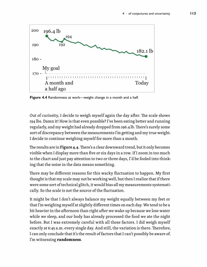
Out of curiosity, I decide to weigh myself again the day after. The scale shows 194 lbs. Damn it! How is that even possible? I’ve been eating better and running regularly, and my weight had already dropped from 196.4 lb. There’s surely some sort of discrepancy between the measurements I’m getting and my true weight. I decide to continue weighing myself for more than a month.
The results are in Figure 4.4. There’s a clear downward trend, but it only becomes visible when I display more than five or six days in a row. If I zoom in too much to the chart and just pay attention to two or three days, I’d be fooled into think-ing that the noise in the data means something.
There may be different reasons for this wacky fluctuation to happen. My first thought is that my scale may not be working well, but then I realize that if there were some sort of technical glitch, it would bias all my measurements systemati-cally. So the scale is not the source of the fluctuation.
It might be that I don’t always balance my weight equally between my feet or that I’m weighing myself at slightly different times on each day. We tend to be a bit heavier in the afternoon than right after we wake up because we lose water while we sleep, and our body has already processed the food we ate the night before. But I was extremely careful with all those factors. I did weigh myself exactly at 6:45 a.m. every single day. And still, the variation is there. Therefore, I can only conclude that it’s the result of factors that I can’t possibly be aware of. I’m witnessing randomness.
A month anda half ago
Today
196.4 lb194
192
My goal
182.1 lb
200
180
170
190
Figure 4.4 Randomness at work—weight change in a month and a half.
4 · of conjectures and uncertainty 113

Data always vary randomly because the object of our inquiries, nature itself, is also random. We can analyze and predict events in nature with an increasing amount of precision and accuracy, thanks to improvements in our techniques and instruments, but a certain amount of random variation, which gives rise to uncertainty, is inevitable. This is as true for weight measurements at home as it is true for anything else that you want to study: stock prices, annual movie box office takings, ocean acidity, variation of the number of animals in a region, rainfall or droughts—anything.
If we pick a random sample of 1,000 people to analyze political opinions in the United States, we cannot be 100 percent certain that they are perfectly repre-sentative of the entire country, no matter how thorough we are. If our results are that 48.2 percent of our sample are liberals and 51.8 percent are conserva-tives, we cannot conclude that the entire U.S. population is exactly 48.2 percent liberal and 51.8 percent conservative.
Here’s why: if we pick a completely different random sample of people, the results may be 48.4 percent liberal and 51.6 percent conservative. If we then draw a third sample, the results may be 48.7 percent liberal and 51.3 percent conservative (and so forth).
Even if our methods for drawing random samples of 1,000 people are rigorous, there will always be some amount of uncertainty. We may end up with a slightly higher or lower percentage of liberals or conservatives out of pure chance. This is called sample variation.
Uncertainty is the reason why researchers will never just tell you that 51.8 percent of the U.S. population is conservative, after observing their sample of 1,000 people. What they will tell you, with a high degree of confidence (usually 95 percent, but it may be more or less than that), is that the percentage of con-servatives seems to be indeed 51.8 percent, but that there’s an error of plus or minus 3 percentage points (or any other figure) in that number.
Uncertainty can be represented in our visualizations. See the two charts in Figure 4.5, designed by professor Adrian E. Raftery, from the University of Washington. As they display projections, the amount of uncertainty increases with time: the farther away we depart from the present, the more uncertain our projections will become, meaning that the value that the variable “population” could adopt falls inside an increasingly wider range.
the truthful art114

Figure 4.5 Charts by Adrian E. Raftery ( University of Washington) who explains,
“The top chart shows world population pro-jected to 2100. Dotted lines are the range of error using the older scenarios in which women would have 0.5 children more or less than what’s predicted. Shaded regions are the uncertainties. The darker shading is the 80 percent confidence bars, and the lighter shading shows the 95 percent confidence bars. The bottom chart represents popula-tion projections for each continent.” http://www.sciencedaily.com/releases/2014/09/140918141446.htm
The hockey stick chart of world temperatures, in Chapter 2, is another example of uncertainty visualized. In that chart, there’s a light gray strip behind the dark line representing the estimated temperature variation. This gray strip is the uncertainty. It grows narrower the closer we get to the twentieth century because instruments to measure temperature, and our historical records, have become much more reliable.
❘❘❘❙❚❚n❙❘❘❘
We’ll return to testing, uncertainty, and confidence in Chapter 11. Right now, after clarifying the meaning of important terms, it’s time to begin explor-ing and visualizing data.
4 · of conjectures and uncertainty 115

To Learn More• Skeptical Raptor’s “How to evaluate the quality of scientific research.”
http://www.skepticalraptor.com/skepticalraptorblog.php/how-evaluate- quality-scientific-research/
• Nature magazine’s “Twenty Tips For Interpreting Scientific Claims.” http://www.nature.com/news/policy-twenty-tips-for-interpreting-scientific- claims-1.14183
• Box, George E. P. “Science and Statistics.” Journal of the American Statisti-cal Association, Vol. 71, No. 356. (Dec., 1976), pp. 791-799. Available online: http://www-sop.inria.fr/members/Ian.Jermyn/philosophy/writings/Boxonmaths.pdf
• Prothero, Donald R. Evolution: What the Fossils Say and Why It Matters. New York: Columbia University Press, 2007. Yes, it’s a book about paleontology, but, leaving aside the fact that prehistoric beasts are fascinating, the author offers one of the clearest and most concise introductions to science I’ve read.
the truthful art116

This page intentionally left blank

Index
AAbel, Guy, 314Accurat, 57–58, 367–371aesthetics, 56–57, 221Agrawala, Maneesh, 220Albrecht, Kim, 364All Marketers Are Liars (Godin), 14Andrews, Wilson, 344animated transitions, 339annotation layer, 334ANOVA test, 171napophenia, 81Armstrong, Zan, 219articulacy skills, 97Atlas of Knowledge (Börner), 148author’s website, 152
BBacon, Sir Francis, 87Bad Science (Goldacre), 17n, 23Baltimore Sun, 272, 273bar charts, 29, 139, 140, 225, 226,
313baselines, 135–137beautiful graphics, 53–59Beauty (Scruton), 65Beckman, Rick, 342Beginning of Infinity, The
(Deutsch), 97Behrens, John T., 197, 231, 299Believing Brain, The (Shermer), 97Berliner Morgenpost, 287, 289,
290, 357–358Bertin, Jacques, 125, 148Bertini, Enrico, 41, 45Beschizza, Rob, 76Bestiario, 277, 278Blow, Charles, 344Boix, Esteve, 60, 62, 63Bondarenko, Anatoly, 76Börner, Katy, 125, 148Bostock, Mike, 294, 295, 344, 347Box, George E.P., 116box plots, 192–193
Boyer, Brian, 53, 338Bradley, Raymond S., 42breadth of information, 92, 94–95Brewer, Cynthia, 296Broderick, Tim, 256Bui, Quoctrung, 133, 338, 339bullet graphs, 334, 336Burdarelli, Rodrigo, 248Bycoffe, Aaron, 354
CCain, Patrick, 254–255Caldwell, Sally, 166Camões, Jorge, 220–228, 231candid communication, 13Capital in the Twenty-First Century
(Piketty), 130Cartesian coordinate system, 28cartograms, 292Cartographer’s Toolkit
(Peterson), 297Castano, Emanuele, 111causation and correlation,
259–261Central Limit Theorem, 307nchange rate, 214–217charts
bar, 29, 139, 140, 225, 226, 313definition of, 28dot, 29, 313fan, 314, 315frequency, 178–183horizon, 220–223line, 139, 140, 141, 229lollipop, 28, 29pie, 50–51radar, 141–143, 145, 146relationship, 261scatter, 29, 228, 230, 242–246seasonal subseries, 209–210slope, 29, 51, 143stacked area, 133time series, 29, 133, 201–230,
313See also plots
choropleth maps, 129, 280–292classifying data in, 282–287examples of using, 287–292
Christiansen, Jen, 361clarity, 45–46, 78Clark, Jeff, 364, 366classes, choropleth map, 282Cleveland, William S., 27, 125,
128, 129, 148, 224, 275, 336Clinton, Hillary, 354Coase, Ronald H., 200coefficient of determination, 259Coghlan, Avril, 231cognitive dissonance, 83, 84nCohen, Geoffrey, 84ColorBrewer website, 296communication
candid vs. strategic, 13–16correlation for, 248–259
conclusions, scientific, 100confidence intervals
building, 308–312margin of error and, 300
confidence level, 308confirmation bias, 83confirmation bug, 80, 84–85conformal projections, 267confounding variables, 110conjectures, 100, 101–104
requirements for rational, 101–102
testability of, 103–104connected scatter plot, 228, 230continuous variables, 107control group, 111, 321controlled experiments, 110–111correlation coefficient, 237, 259correlations
associations and, 236–247causation and, 259–261for communication, 248–259examples of spurious, 233–236key points about, 237–238regression and, 257–259
Correll, Michael, 313

Elements of Journalism, The (Kovach and Rosenstiel), 21
Emery, Ann K., 125, 127Emotional Design (Norman), 56enlightening graphics, 60, 62–65Época magazine, 143, 144, 249equal-area projections, 268Erickson, B. H., 155, 197Ericson, Matt, 344error
margin of, 300sampling, 91standard, 305–308
error bars, 313Estadão Dados, 248, 250, 251Evolution (Prothero), 16, 116exceptions and the norm, 152, 194experimental group, 111, 321experiments, 110–111explanatory variables, 105, 257exploratory data analysis, 151–166Exploratory Data Analysis
(Hartwig and Dearing), 166extraneous variables, 109–110
FFairchild, Hannah, 252fan charts, 314, 315Fessenden, Ford, 344Few, Stephen, 125, 148, 246–247,
262, 334, 336Feynman, Richard, 86, 167Field, Andy, 325Field, Zoë, 325Fisher-Jenks algorithm, 286FiveThirtyEight.com, 353–355Flagg, Anna, 342flow charts, 28flow maps, 277–279Ford, Doug (and Rob), 254frequency
over time, 195–197of values, 158
frequency charts, 178–183
Design for the Real World (Papanek), 65
Designing Better Maps (Brewer), 296
Designing Data Visualizations (Steele and Iliinsky), 149
Deutsch, David, 97, 104developable surfaces, 265diagrams
Sankey, 10, 28, 131use of term, 28See also charts
Discovering Statistics Using R (Field, Miles, and Field), 325
Discovery Institute, 16discrete variables, 107distributions
level of, 153, 194normal, 188–190sample means, 306shape of, 158, 194skewed, 155, 159spread of, 194unimodal, 154
divergent color schemes, 285, 286Donahue, Rafe M. J., 211, 231dot chart/plot, 29, 313dot maps, 271–272, 273Dowd, Maureen, 1dubious models, 71–76Duenes, Steve, 344
EEames, Charles, 59Ebbinghaus illusion, 275ecological fallacy, 259nEconomist, The, 131effect size, 323Eigenfactor project, 10Einstein, Albert, 82nEl Financiero, 251, 252El País, 299–302Elements of Graphing Data, The
(Cleveland), 125, 148
Cotgreave, Andy, 28Cox, Amanda, 347creationism, 16critical value, 309, 310cross-sectional studies, 107, 109Cuadra, Alberto, 360Cult of Statistical Significance, The
(Ziliak and McCloskey), 325Culturegraphy project, 364, 365cumulative probability, 188
DDaily Herald, 255–256, 257Damasio, Antonio, 55ndata, 100
classification of, 282–287manipulation of, 194–195mapping of, 263–297transformation of, 261visually encoding, 123–125
Data at Work (Camões), 220, 231data decoration, 56data maps, 29, 129–130, 271–296data visualizations, 31Dataclysm: Who We Are (Rudder),
167Davies, Jason, 294, 296Dear Data project, 372Dearing, Brian E., 166Death and Life of American
Journalism, The (McChesney and Nichols), 23
DeBold, Tynan, 350deceiving vs. lying, 15deciles, 191DeGroot, Len, 195dependent variable, 105, 257ndepth of information, 92, 94–95Deresiewicz, William, 329“Design and Redesign in Data
Visualization” (Viégas and Wattenberg), 351
Design for Information (Meirelles), 149
377index
interactive multimedia storytelling, 342–343
intercept, 258Interquartile Range (IQR), 193interval scales, 106intervals of constant size, 283Introduction to the Practice of
Statistics (Moore and McCabe), 262
intuition, 80isarithmic maps, 293–294island of knowledge metaphor,
6–7, 10Island of Knowledge, The
(Gleiser), 23
JJacobs, Brian, 343Jarvis, Jeff, 21Jerven, Morten, 317Jordan, Michael, 155Journal of Nutrition, 235journalism, 14, 17–18
fulfilling the purpose of, 21study on graduates majoring
in, 89–93visual design and, 20–23
KKamal, Raj, 83Karabell, Zachary, 318, 325Katz, Josh, 344Khan, Razib, 99Kidd, David Comer, 111Klein, Scott, 53, 316, 333knowledge, island of, 6–7, 10knowledge-building insight,
59, 60Kong, Nicholas, 220Kosara, Robert, 252Kosslyn, Stephen, 125Krause, Heather, 318–320Krugman, Paul, 217–218Krusz, Alex, 313, 314Kuonen, Diego, 193kurtosis, 159n
HHarris, Robert L., 40Hartwig, Frederick, 166Hawking, Stephen, 70n, 82nheat maps, 224, 225, 244–246,
253–254, 350Heer, Jeffrey, 220Heisenberg, Werner, 317Hello World: Where Design Meets
Life (Rawsthorn), 65hierarchy of elementary
perceptual tasks, 125, 128, 129
histograms, 158–160, 163, 166, 303
hockey stick chart, 42, 43–45Holiday, Ryan, 18Holmes, Nigel, 78nhonesty, 48horizon charts, 220–223How Maps Work (MacEachren),
296How to Lie With Maps
(Monmonier), 263n, 297Huang, Jon, 253Hughes, Malcolm K., 42Huxley, Thomas Henry, 86hypotheses
definition of, 100, 105testing, 100, 107
IIdeb index, 152–153Iliinsky, Noah, 125, 149independent variable, 105, 257nindex origin, 212indexes
calculating, 210–213zero-based, 212–213
infographicsdefinition of, 14, 31examples of, 30, 32–33
Information Graphics (Harris), 40Information Graphics
(Rendgen), 40Inselberg, Al, 246insightful graphics, 59–60, 61
Friedman, Dov, 350Fuller, Jack, 20Functional Art, The (Cairo), 40,
50, 70nfunctional graphics, 50–51Fundamental Statistical
Concepts in Presenting Data (Donahue), 231
Fung, Kaiser, 199funnel plots, 185, 336–337
GGalton, Sir Francis, 102n, 185Galton probability box, 185–188“garbage in, garbage out”
dictum, 317Gates, Gary, 337Gebeloff, Robert, 344Gelman, Andrew, 197, 317Gigerenzer, Gerd, 80Gleicher, Michael, 313Gleiser, Marcelo, 6, 23Global News, 254, 257Godfrey-Smith, Peter, 97Godin, Seth, 14, 15Goldacre, Ben, 17n, 23Golder, Scott, 344Goode’s Homolosine projection,
267, 268Grabell, Michael, 341gradient plots, 313, 314Grand Design, The (Hawking and
Mlodinow), 70ngrand mean, 156graphicacy skills, 97graphs
bullet, 334, 336use of term, 28See also charts
Gregg, Xan, 336–338Groeger, Lena, 341Guardian, The, 37–38Guimarães, Camila, 248Gurovitz, Helio, 146gut feelings, 80
the truthful art378

modelsdescription of good, 70dubious or unsatisfactory, 71–76truth continuum related to,
86–97visualizations as, 69–70, 86
modified box plot, 313, 314Moholy-Nagy, Laszlo, 21Mollweide projection, 267, 268Monmonier, Mark, 97, 263n,
267n, 297Moore, David S., 240, 260, 262moving average, 204–205, 206Munzner, Tamara, 125
NNaked Statistics (Wheelan), 166National Cable &
Telecommunications Association (NCTA), 46, 47, 71
National Public Radio (NPR), 133, 134, 338–339
Nature magazine, 116Nelson, John, 270nested legends, 276New England Journal of
Medicine, 233New York Times, 252, 253–254,
334, 337, 344–348news applications, 31, 34–37news organizations, 17–20Nichols, John, 23935 Lies (Lewis), 23NOAA forecast map, 314, 315noise, 201, 219Nolan, Deborah, 197nominal scales, 105–106non-resistant statistics, 191, 238norm (or smooth), 152, 194normal distribution, 188–190Norman, Donald A., 56Nosanchuk, T. A., 155, 197Novel Views project, 364, 366null hypothesis, 301, 321numeracy skills, 97numerical summaries of
spread, 170
heat, 224, 225, 244–246, 253–254
isarithmic, 293–294point data, 271–277projections for, 265–270proportional symbol, 272, 273,
274–277scale of, 264thematic, 271uncertainty on, 314, 315Voronoi, 294, 295, 296
margin of error, 300marketing, 14–15Martin, George R. R., xiiimatrices, scatter plot, 242–246McCabe, George P., 240, 260, 262McCann, Allison, 353McChesney, Robert Waterman,
23McCloskey, Deirdre N., 325McGill, Robert, 125, 128, 129,
224, 275mean, 154
distribution of sample, 306grand (or mean of means), 156regression toward, 102–103standard error of, 306, 307–308weighted, 157
measures of central tendency, 153–154
median, 154, 191Meirelles, Isabel, 125, 149Mercator projection, 267, 268, 281Messerli, Franz H., 233–234,
235nmetadata, 317Miami Herald, 18Microsoft Excel, 220Miles, Jeremy, 325Minard, Charles Joseph, 28nmind bugs, 79–80
confirmation, 80, 84–85patternicity, 79, 81–82storytelling, 80, 82–83
Misbehaving (Thaler), 121, 146mix effects, 219Mlodinow, Leonard, 70nmode, 153–154model-dependent realism, 70n
LLambert cylindrical projection,
267, 268Lambrechts, Maarten, 358–360Lamstein, Ari, 281large-scale maps, 264Larsen, Reif, 263Latour, Bruno, 49nLaws of Simplicity, The (Maeda), 97Leading Indicators, The (Karabell),
318, 325legends for maps, 276–277Lemmon, Vance, 329–331level of distribution, 153, 194Lewis, Charles, 17, 22, 23Lightner, Renee, 348line charts, 139, 140, 141, 229line maps, 277–279linear legends, 276linear relationships, 238literacy skills, 97Little Book of R for Time Series, A
(Coghlan), 231Llaneras, Kiko, 180, 181log transformation, 216logarithmic scale, 215lollipop chart, 28, 29longitudinal studies, 108, 109López, Hugo, 251Los Angeles Times, 195, 196Lotan, Gilad, 10–12LOWESS trend line, 241Lupi, Giorgia, 367, 369, 372Lupton, Ellen, 268lurking variables, 110lying vs. deceiving, 15
MMacEachren, Alan M., 296Maeda, John, 97Maia, Maurício, 20–21, 22Mann, Michael E., 42, 44Mapping It Out (Monmonier), 97maps, 29, 263–297
choropleth, 129, 280–292data, 29, 129–130, 271–296dot, 271–272, 273flow, 277–279
379index

responsive design, 338Ribecca, Severino, 125, 126Richter scale, 216nRobbins, Naomi, 125, 336Roberts, Graham, 252Rodríguez, Gerardo, 248Roser, Max, 229–230Rousseff, Dilma, 248, 251Rudder, Christian, 167, 168, 169Rumsfeld, Donald, 110nRussell, Bertrand, 103
SSagan, Carl, 323Sagara, Eric, 340sample size, 188, 310, 323sample variation, 114sampling
error in, 91random, 109, 114
Sankey diagrams, 10, 28, 131scale of maps, 264scatter plots, 29
connected, 228, 230matrices for, 242–246
Scientific American, 360–363scientific stance, 100–101Scruton, Roger, 55, 65seasonal subseries chart,
209–210seasonality, 201, 208self-deception, 48Semiology of Graphics (Bertin), 148shape of distribution, 158, 194Shaw, Al, 343Shermer, Michael, 81, 97Shipler, David K., 63Show Me the Numbers (Few),
125, 148Signal (Few), 246, 262significance, 322–325Silver, Nate, 353Simmon, Rob, 296simplicity, 97Simpson’s Paradox, 219Siruela, Jacobo, 201Skeptical Raptor, 116Skeptics and True Believers
(Raymo), 23
populations, 109Posavec, Stefanie, 372power of tests, 323, 324Poynter Institute, 89practical significance, 323predictor variable, 105probability
cumulative vs. individual, 188Galton box for testing, 185–188p values related to, 321, 322
projections, 265–270proportional symbol maps, 272,
273, 274–277ProPublica, 49, 95, 291, 316,
340–343Prothero, Donald R., 16, 116proxy variables, 43public relations, 14nPulitzer Center, 63, 64Putin, Vladimir, 76
Qquantiles method, 284quartiles, 191, 192quintiles, 191
Rradar charts, 141–143, 145, 146Raftery, Adrian E., 114, 115random sampling, 109, 114randomness, 81–82, 113–114ranges, 157–166ratio scales, 107Rawsthorn, Alice, 56, 59, 65Raymo, Chet, 6, 23Razo, Jhasua, 251reasoning, errors in, 79–80regression
correlation and, 257–259toward the mean, 102–103
Reich, Robert B., xviiReijner, Hannes, 220Reinhart, Alex, 321, 324, 325relationship charts, 261Rendgen, Sandra, 40replication, 323resistant statistics, 154, 191response variable, 105, 257
Oobservational studies, 107optimal classification, 286ordinal scales, 106organizing displays, 138–141Ornstein, Charles, 340Ortiz, Santiago, 373OurWorldInData project,
229–230outcome variable, 105outliers, 155, 238overpowered tests, 323
Pp values, 321, 322Papanek, Victor, 65paradoxes, 219parallel coordinates plot,
246–247parameters, 154npatternicity bug, 79, 81–82patterns and trends, 152, 194percentage change formula, 212percentiles, 191, 192, 284Periscopic, 31, 34, 65, 363Peterson, Gretchen N., 297Pew Research Center, 16, 288,
331, 332, 334, 335Picturing the Uncertain World
(Wainer), 197pie charts, 50–51, 122nPiketty, Thomas, 130Pilhofer, Aron, 253Playfair, William, 121plots, 28
box, 192–193dot, 29, 313funnel, 185, 336–337gradient, 313, 314modified box, 313, 314parallel coordinates, 246–247scatter, 29, 228, 230, 242–246strip, 161–163, 164–165violin, 163, 166, 313, 314you-are-here, 211See also charts
point data maps, 271–277point estimate, 309
the truthful art380
Uuncertainty, 114–115
confidence intervals and, 308–312
methods for disclosing, 312–315underpowered tests, 323, 324Understanding Data (Erickson and
Nosanchuk), 155, 197unimodal distributions, 154univariate least squares
regression, 257Unpersuadables, The (Storr), 82
VVan Dam, Andrew, 348variables
defined, 105explanatory, 105, 257extraneous, 109–110proxy, 43response, 105, 257scales measuring, 105–107types of, 105, 107, 109–110
variance, 171–172Vaux, Bert, 344Viégas, Fernanda, 351–353violin plots, 163, 166Visual Display of Quantitative
Information, The (Tufte), 65visualizations
aesthetics of, 53–59, 221basic principles of, 121–149characteristics of good, 12choosing graphic forms for,
124–138definition of, 28depth and breadth of, 94–95enlightening, 60, 62–65functional, 50–52insightful, 59–60, 61as models, 69–70, 86qualities of great, 45truthful, 45–49
visually encoding data, 123–125visually exploring data, 152Voronoi maps, 294, 295, 296
studies, 107–110Svensson, Valentine, 351symbol placement, 275–276
Tt critical values, 310, 311Teaching Statistics (Gelman and
Nolan), 197testing hypotheses, 100Texty.org, 76, 79, 182Thaler, Richard H., 121–123, 147Thematic Cartography
and Geovisualization (Slocum), 297
thematic maps, 271theories, 101Theory and Reality
(Godfrey-Smith), 97Thinking With Type (Lupton), 268Thorp, Jer, 373, 374time series charts, 29, 133,
201–230bar chart example, 225change rate and, 214–217decomposition of, 201–210how they mislead, 217–230indexes and, 210–213line chart example, 229visualizing uncertainty on, 313
Toledo, José Roberto de, 248Tolkien, J. R. R., 374Tory, John, 254“Tragedy of the Risk-Perception
Commons, The” (Kahan), 84–85
trend lines, 202, 204, 237, 238, 241
trendsobserving patterns and, 152, 194in time series charts, 201
Trust Me, I’m Lying (Holiday), 18truth continuum, 86–97truthful graphics, 45–49Tufte, Edward R., 65, 122n, 336Tukey, John W., 41, 151, 154n, 191,
192, 336Tulp, Jan Willem, 361tunnel-vision effect, 83
skewed distributions, 155, 159skills of the educated person, 97Slocum, Terry A., 297slope, 258slope charts, 29, 51small-scale maps, 264Smith, Gary, 49snap judgments, 80Sockman, Ralph W., 6South China Morning Post, 38, 39spinning planets exercise, 2–6spontaneous insight, 59, 60Sports Illustrated, 102–103spread of distribution, 194Spurious Correlations
website, 234stacked area charts, 133standard deviation
example of using, 173–175formula for calculating, 172standard scores and,
174–178, 304variance and, 171–172
standard error of the mean, 306, 307–308
standard lines, 265, 266standard normal distribution,
189, 305standard scores
examples of misleading, 183–188
standard deviation and, 174–178, 304
Starkman, Dean, 23statistical significance, 322–325statistics, 152
non-resistant, 191, 238resistant, 154, 191
Statistics Done Wrong (Reinhart), 324, 325
Statistics Unplugged (Caldwell), 166
Steele, Julie, 149Stefaner, Moritz, 7, 8, 10, 28, 362Stigler, Stephen, 185nStorr, Will, 82storytelling bug, 80, 82–83strategic communication, 14–16strip plots, 161–163, 164–165
381index

XX- and Y-axis, 135
YYanukovych, Viktor, 77Yau, Nathan, 125, 271you-are-here plots, 211
ZZappa, Frank, 329Zeit Online, 292, 294, 356–357zero baselines, 136, 137zero-based indexes, 212–213Ziliak, Stephen T., 325z-score, 174–178, 304
WWainer, Howard, 185, 197Wall Street Journal, 34, 348–350Washington Post, 179Watchdog Didn’t Bark, The
(Starkman), 23Watkins, Derek, 347Wattenberg, Martin, 219, 351–353website of author, 152Wei, Sisi, 10weighted mean, 157Whedon, Joss, 60Wheelan, Charles, 166Wieczorek, Jerzy, 301, 323Wilkinson, Leland, 336Wind Map of U.S., 352Wired magazine, 75Wright, John C., 69Wurman, Richard Saul, 45
the truthful art382