understanding and presenting your data or what to do with all those numbers you’re recording
TRANSCRIPT

Understanding and Presenting Understanding and Presenting Your DataYour Data
OR
What to Do with All Those What to Do with All Those Numbers You’re RecordingNumbers You’re Recording

The primary question underlying many biology
experiments is whether, on average, one condition
(treatment) has a greater effect on a certain
variable than another condition
This type of question is answered by comparing the
mean (average) response of a group of organisms
under two or more treatments
Does your experiment involve this kind of question?
Comparison of Means

If we could measure the variable of interest in
every animal from our chosen population (for
example, a species exposed to a certain
treatment) we could calculate the variable’s “true”
mean (average of all individuals) in that population
If we did this for each population we wanted to
compare, we could tell for sure whether these
populations differed by seeing if their “true” means
differed for the variable in question
Comparison of Means

As you might guess, it would be impossible to
measure each individual of each population involved
in our hypothesis!
We solve this problem by measuring a very small,
but representative, subset of each relevant
population
This specially selected subset is called a sample
We use data from a sample to make inferences
(predictions) about the population
Comparison of Means

Comparison of Means
Because a sample is so much smaller than the population from which it is taken, the values we calculate from the sample (for example, the sample mean) should be “taken with a grain of salt” when using them to predict population values
Statistics is a set of calculations and rules that tell us how probable it is that our sample-based predictions will hold true for the population
Now we’ll discuss an example where we use statistics to test a hypothesis about sea slugs

Say that you have observed sea slugs for
some time and noticed that these slow-
moving animals signal their readiness to mate
by performing a simple “head bob”
Your team wants to determine what factors
have the greatest effect on how often this
simple courtship display occurs in sea slugs
Example - Sea Slugs

Based on a journal article you’ve read, and some preliminary
observations, your team predicts that:
Example - Sea Slugs
Sea slugs living on a rocky substrate will show
more head bobs/month than sea slugs living
on a silty substrate.
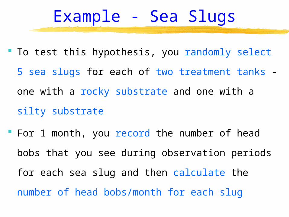
To test this hypothesis, you randomly select 5 sea
slugs for each of two treatment tanks - one with a
rocky substrate and one with a silty substrate
For 1 month, you record the number of head bobs
that you see during observation periods for each
sea slug and then calculate the number of head
bobs/month for each slug
Example - Sea Slugs
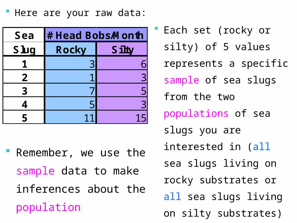
Here are your raw data: Each set (rocky or silty)
of 5 values represents
a specific sample of
sea slugs from the two
populations of sea
slugs you are
interested in (all sea
slugs living on rocky
substrates or all sea
slugs living on silty
substrates)
Remember, we use the
sample data to make
inferences about the
population
Sea # Head Bobs/MonthSlug Rocky Silty
1 3 62 1 33 7 54 5 35 11 15

Raw data:
What would be your first steps in
summarizing these data?
Sea # Head Bobs/MonthSlug Rocky Silty
1 3 62 1 33 7 54 5 35 11 15

The first step would be to
calculate the mean
(average) number of head
bobs/month for each
substrate treatment
The AVERAGE
function in Excel will
calculate this for you
Sea # Head Bobs/MonthSlug Rocky Silty
1 3 62 1 33 7 54 5 35 11 15
AVG 5.4 6.3 The sample mean is a
measure of the central
tendency of a
population ; i.e., where
the center of the
population of interest
tends to be located for
the variable in question

The next step would be
to calculate the standard
deviation (SD) for each
substrate treatment
The STDEV function
in Excel will
calculate this for you
Sea # Head Bobs/MonthSlug Rocky Silty
1 3 62 1 33 7 54 5 35 11 15
AVG 5.4 6.3SD 3.8 5.1
The SD is a measure of
the dispersion (spread)
of your data; that is, a
value that summarizes
how far individual values
are from the mean value

Another important step is
to calculate the standard
error of the mean (SE) for
each substrate treatment
s individual of no.
SDSE
Sea # Head Bobs/MonthSlug Rocky Silty
1 3 62 1 33 7 54 5 35 11 15
AVG 5.4 6.3SD 3.8 5.1SE 1.7 2.3
The SE is a measure of
how far the “true”
(population) mean is
likely to be from the
calculated sample
mean (remember the
“grain of salt”)

For small samples (such as ours), the range of values 2 standard errors (2*SE) on either side of the sample mean has about a 90% chance of containing the “true” (population) mean
Thus, for the rocky substrate sea slugs, the population mean has about a 90% chance of being between 2.0 and 8.8 head bobs/month
2.0 = (5.4 - 2*1.7) 8.8 = (5.4 + 2*1.7)
Sea # Head Bobs/MonthSlug Rocky Silty
1 3 62 1 33 7 54 5 35 11 15
AVG 5.4 6.3SD 3.8 5.1SE 1.7 2.3

Question for you:
For the silty substrate
sea slugs, what is the
range within which the
population mean has
about a 90% chance of
being located?
1.7 and 10.9 head bobs/month
1.7 = (6.3 - 2*2.3) 10.9 = (6.3 + 2*2.3)
Sea # Head Bobs/MonthSlug Rocky Silty
1 3 62 1 33 7 54 5 35 11 15
AVG 5.4 6.3SD 3.8 5.1SE 1.7 2.3

Once all these
statistics (mean, SD,
SE) have been
calculated for your
sample, the next step
is to visually describe
your data
This is done using a figure of the proper sort
Sea # Head Bobs/MonthSlug Rocky Silty
1 3 62 1 33 7 54 5 35 11 15
AVG 5.4 6.3SD 3.8 5.1SE 1.7 2.3

This column graph shows the value for each sea slug from each substrate tank
Can you tell on which substrate sea slugs show more head bobs per month?
What is the meaning of the sea slug # on the X-axis?

What kind of graph would be a better way to
visually summarize on which of the two
substrates sea slugs do more head bobbing?

This column graph shows the sample mean for each substrate group
Now can you tell on which substrate sea slugs show more head bobs per month?
Is the answer completely clear or could two reasonable people disagree?

If you measured 5 other sea slugs in each of the two
substrate tanks would the sample means be the
same as in the first experiment?
What could you add to this graph to give a sense of
how well these sample means predict the mean of
the population from which they come?

Now we’ve added error bars representing 1 SE on either side of the sample mean
Even though the means of these two samples differ, because the SE bars for the two groups overlap (the upper bar for rocky overlaps the lower bar for silty), we have no good evidence that the “true” means for the rocky and silty substrates actually differ

In this case, we would have fairly certain evidence
of a difference between groups -- that is, that the
“true” means for the rocky and silty substrates differ
If our data looked like this instead, the SE bars of the 2
groups would not overlap by a substantial amount

Rules of thumb for using SE bars to judge significant diffs :
Two means will never be significantly different if: their SE intervals overlap -- at all the gap between the two SE intervals is < 1/3 the
length of the shorter SE interval When the gap between the two SE intervals is > 1/3
the length of the shorter SE interval, the two means may be significantly different (you will need to use a statistical test to know with more certainty)

Thus, SE bars give us an accepted standard for judging how certain we are that two treatments produce different effects on the variable of interest
In other words, two reasonable people should now agree that substrate type does not produce a significant difference in the number of head bobs per month in sea slugs

Once you have collected your raw data:
calculate the mean, standard deviation (SD), and standard error of the mean (SE) for each treatment group sample
graph the mean values for each treatment group in a column graph, adding error bars above and below the mean equal to 1 SE
use the rules of thumb about SE interval overlap to determine how probable it is that any means you are comparing are actually different
Recap

How to Get the PP Presentation
Website where PowerPoint file “Understanding
and Presenting Your Data” can be downloaded:
http://minerva.stkate.edu/offices/academic/
biology.nsf/pages/myersgb
Tutorial Written By: Dr. Marcie J. Myers College of St. Catherine St. Paul, MN