visual dashboards for self-service bi - …download.101com.com/pub/tdwi/files/081314sas.pdf ·...
TRANSCRIPT

Visual Dashboards for Self-Service BI
Cindi HowsonBI Scorecard
August 13, 2014
Sponsor

3
Speakers
Cindi HowsonFounder,
BI Scorecard
Justin ChoySenior Manager,
BI Product Management,SAS

© BI Scorecard 2014 4
Visual Dashboards for Self-Service BI
August 2014Cindi Howson
Contact: [email protected]: @BIScorecard

© BI Scorecard 2014 5
Outline
• Industry trends• Benefits of self-service BI & visual data
discovery• Relationship with dashboards• Key solutions on the market• Features and differentiators• Recommendations

© BI Scorecard 2014
Business Users Are Excited About BI
6
Visual Data Discovery DriversVisual Data Discovery Drivers
Visual Appeal
Ease of Use
Agility Collab-oration

© BI Scorecard 2014
Visual Data Discovery Opportunity
7
Tech
-no
logy
Better BI

© BI Scorecard 2014
Visual Data Discovery Defined
8
Visual Data Discovery tools speed the time to insight through the use of visualizations, best practices in visual perception, and easy exploration. Such tools support business agility and self-service BI through a variety of innovations that may include in-memoryprocessing and mashing of multiple data sources.

© BI Scorecard 2014 9
The Vision for Self Service BI
• Business users are empowered to get to all data necessary to make decisions at the speed of business
• IT eliminates report back log and focuses on only data storage, performance optimization, or complicated requests
© BI Scorecard 2014
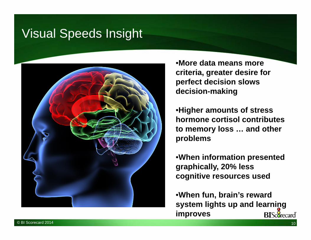
Visual Speeds Insight
10
•More data means more criteria, greater desire for perfect decision slows decision-making
•Higher amounts of stress hormone cortisol contributes to memory loss … and other problems
•When information presented graphically, 20% less cognitive resources used
•When fun, brain’s reward system lights up and learning improves

© BI Scorecard 2014 11
Visualization vs. Visual Data Discovery
BI Platforms & Dashboards• Common charts types
– Bar, line, pie• Sometimes additional chart
types such as maps, gauge• Query, get tabular result, then
visualize• Data often from DW or OLAP
cube - modeled• Interactivity not guaranteed
Visual Data Discovery• Less common chart types
– Small multiples, waterfall, network, heat or tree map, spark line, tag cloud
• Single-step query and visualize• Highly interactive• Data mashed from DW, marts,
spreadsheets– Not modeled
• Ability to manipulate data– Calculations, bins, groups
• Best practices in visualization– No pies, smart use of color
• May be “personal” analytic tool

© BI Scorecard 2014
Self-Service BI Continuum
Access Any DataFree-form
SQL & spreadsheets
Query & Report
Cleansed Data
Business query, broad data access
Explore & Visualize a Subset of
DataVisual data
discovery, or DSS
application
Monitor at a GlanceDashboards
Tweak a Report
Interactive Reporting
High Technical Skills Required
Minimal IT Skills Required
IT defines semantic layer;
tabular reporting
User loads data; visual

© BI Scorecard 2014 13
Dashboard Definition
“A dashboard is a visual display of the most important information … on a single screen so the information can be monitored at a glance.”
—Stephen Few, visualization expert
• Multiple data sources• Multiple visual
indicators
• Interactive• Integrated• Smart visualizations• Actionable

© BI Scorecard 2014
Types of Dashboards
Operational Dashboards• Real-time, granular data• IT designs• Alerting critical
Management Dashboards• Summary data• Users may design/assemble• Alerting optional
14

© BI Scorecard 2014
Overlapping Segments
15
BI Platform
Pure Play Dashboards
Visual Data Discovery
Predictive

© BI Scorecard 2014
Overlapping Segments
16
BI Platform
Pure Play Dashboards
Visual Data Discovery
Predictive
QlikView Tableau SAS JMP
SAS EBI
SAP BusinessObjects
SAS Visual Analytics
DundasSAP Lumira

© BI Scorecard 2014
Balance Agility and Control
Visual Data Discovery• Fast time to value• Department-specific• Data closer to the experts• Visual dashboards
Enterprise BI• Consistent• Trusted data with SOX
compliance• Shared resource• Historically report-centric

© BI Scorecard 2014
BI Platform Dashboards
18
• SAS Visual Analytics Designer• SAP BusinessObjects
– Xcelsius, in v4 renamed Dashboards– Design Studio replaces Web Application Designer for BW and Hana
• IBM Cognos Workspace• Oracle Interactive Dashboards • Microsoft:
– Dashboard Designer in SharePoint Performance Point – Excel-based dashboards with PowerPivot and PowerView
• MicroStrategy Enterprise Dashboards designed in Report Services• Information Builders Portal
© BI Scorecard 2014
Pure Play Dashboard Vendors & Products
• QlikView– In-memory, associate search, rapid deployment
• JackBe– Multiple data sources, real-time, operational dashboards
• Antivia– Integrates with SAP BusinessObjects Dashboards and
other data sources• Dundas Dashboard
– Historically Microsoft focus, extensible and embeddable• iDashboards• OLAP Viewers
– Panorama, arcplan, Strategy Companion
19

© BI Scorecard 2014
Visual Data Discovery Tools
• Specialty– Tableau Software – TIBCO Spotfire– QlikView (dashboard that supports discovery)– Datawatch
• From BI platform vendors– SAS JMP & Visual Analytics Explorer (Q1 2012)
– MicroStrategy Visual Insight (Q3 2011)
– Microsoft Power View (Q1 2012)
– Cognos Visual Insight (Q1 2012) and Watson Analytics– SAP BusinessObjects Explorer (2009) & Lumira (Q2 2012)
• Oracle Endeca Information Discovery (acq. Q4 2011)
• LogiVision (Q1 2014)
20
© BI Scorecard 2014
Key Considerations in Evaluating Dashboards and Visual Discovery Tools
• Strategic– Vendor finances, account management, technical
support, pricing, breadth of capabilities• Functional
– Presentation and layout– Interactivity and exploration– Design and analysis– Delivery – web, mobile, PowerPoint– Architecture– Administrative
21

© BI Scorecard 2014
Layout and Presentation
• Visual appeal• Multiple objects• Multiple panels, layers, or tabs• Chart types
– Maps, trellis, spark lines, bullet graphs, heat and tree maps, bubble chart, network, tag cloud
• Content types– KPIs, RSS Feeds, images and video
22
© BI Scorecard 2014
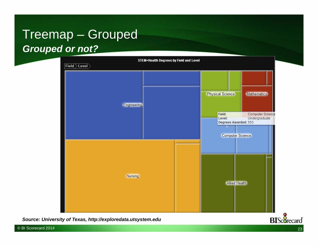
Treemap – Grouped
23
Grouped or not?
Source: University of Texas, http://exploredata.utsystem.edu
© BI Scorecard 2014
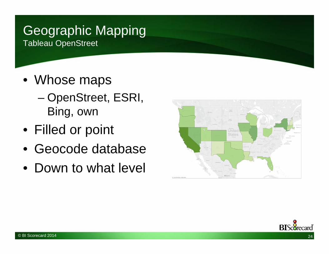
Geographic MappingTableau OpenStreet
• Whose maps– OpenStreet, ESRI,
Bing, own• Filled or point• Geocode database• Down to what level
24
© BI Scorecard 2014
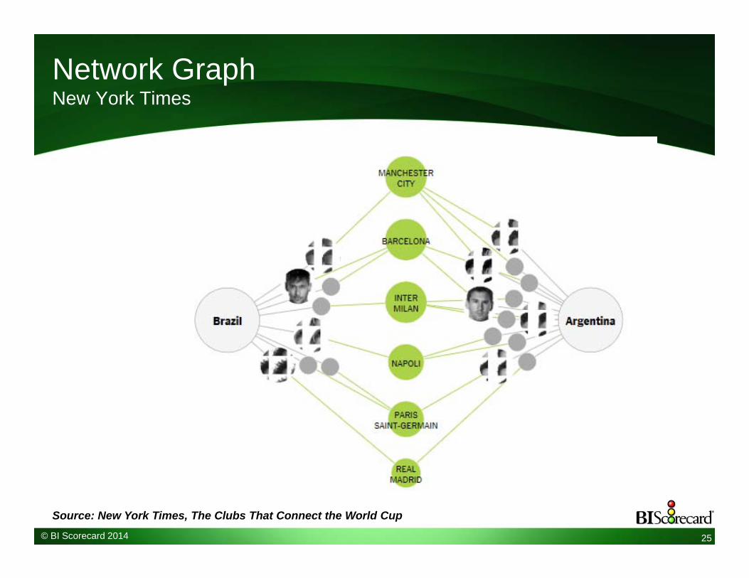
Network GraphNew York Times
25
Source: New York Times, The Clubs That Connect the World Cup

© BI Scorecard 2014
Decision TreeSAS Visual Analytics
26

© BI Scorecard 2014
Consumption: Interactivity & Visual Exploration
• Expand/zoom individual object• Filters – global and individual• Sort• Lasso• Drill down or pivot• Animation (Flash, SilverLight, AJAX, HTML5)• View detailed data• What-if analysis• Change display type (table to chart)• Collaborate and Annotate• Global search or Find
27

© BI Scorecard 2014
Analysis
• Data transformations– Rename, parse, replace
• Bins• Groups• Percentages• Rank• Segmentation• Time period comparisons• Calculations• Forecasting• Set analysis
28

© BI Scorecard 2014
Bins
Order Volume18182224
50050010002500
29
Order VolumeSmallSmallSmallSmallMidMid
LargeLarge
Software can propose the bins or user defines
© BI Scorecard 2014
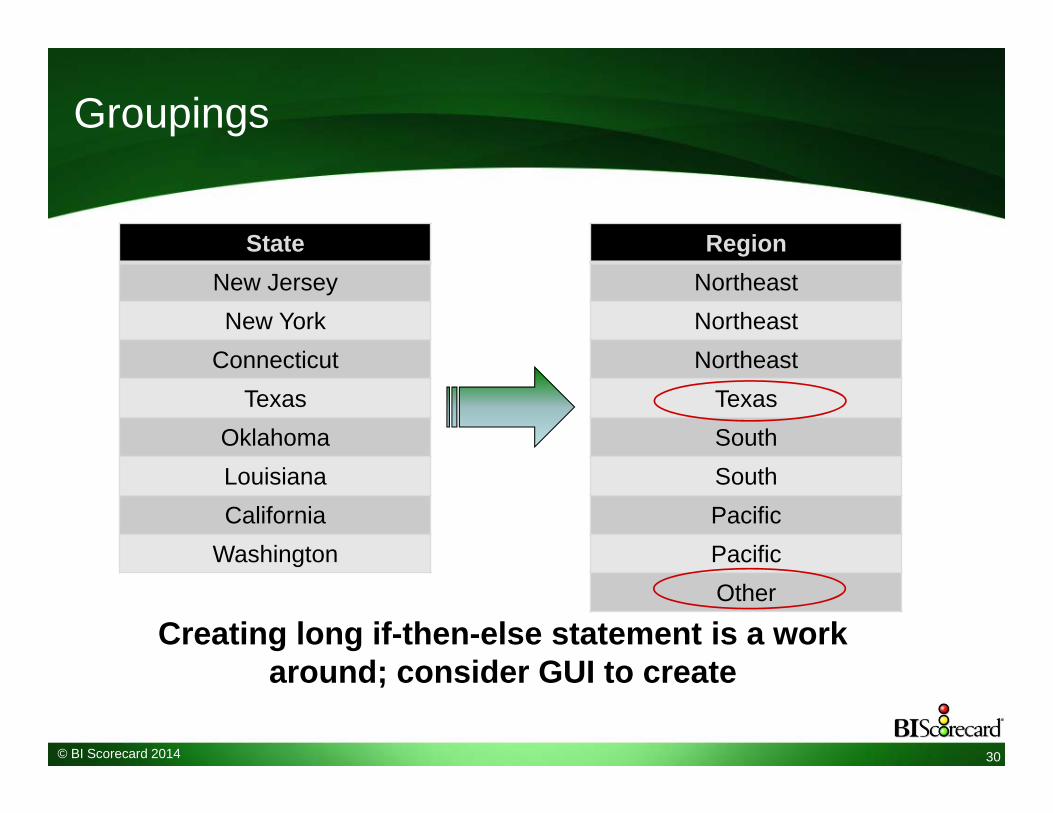
Groupings
StateNew JerseyNew York
ConnecticutTexas
OklahomaLouisianaCalifornia
Washington
30
RegionNortheastNortheastNortheast
TexasSouthSouthPacificPacificOther
Creating long if-then-else statement is a work around; consider GUI to create

© BI Scorecard 2014
Dashboard Design
• Desktop or Web authoring• Business user assembled or IT designed• Re-usability of dashboard elements• Ease to define interactions• Undo, WYSIWYG, rulers, templates• Data loading and modeling; multi source
– User blending or admin only?• Scripting and SDK
31

© BI Scorecard 2014
SAS Visual Analytics Explorer
32

© BI Scorecard 2014
SAS Visual Analytics Explorer – Trellis Chart
33

© BI Scorecard 2014 34
In-memory : DW Accelerate or Datamart?
Financial
Sales
Purchasing
Extract,Load,
Transform
Data warehouseSource Systems
Sales Purchases
Star schemas
Web LogsExtract 1
External flat file
Rel
atio
nal,
disk
In-memory App
Europe USAIn-M
emor
y
Appliance or software only?

What Innovations Will Make Users Embrace BI?
35
Recommendations for Visual Discovery & Self-Service
Make self-service BI part of your mantraBusiness agility is key for BI successEvolve your BI tool portfolio to include dashboards, visual data discovery, mobileEmpower business unitsFocus on business value not the tool

Copyr igh t © 2014, SAS Ins t i tu te Inc . A l l r igh ts reserved.
VISUAL DASHBOARDS FOR SELF-SERVICE BIJUSTIN CHOY, BI PRODUCT MANAGEMENT, SAS

Copyr igh t © 2014, SAS Ins t i tu te Inc . A l l r igh ts reserved.
SAS® VISUAL ANALYTICS BUSINESS VISUALIZATION DRIVEN BY ANALYTICS
ENTERPRISE/DEPARTMENTALAND SELF SERVICE
VISUALIZATION POWERED BYSAS ANALYTICS
REPORTING, MOBILECOLLABORATION

Copyr igh t © 2014, SAS Ins t i tu te Inc . A l l r igh ts reserved.
COLLABORATION AND INFORMATION SHARING
VISUALIZATIONS REPORTS DASHBOARDS COMMENTS INSIGHTS
DESKTOP APPLICATIONS WEB
COLLABORATIONAPPLICATIONSMOBILE
Copyr igh t © 2014, SAS Ins t i tu te Inc . A l l r igh ts reserved.
SAS® VISUAL ANALYTICSPRODUCT DEMONSTRATION

40
Questions?

41
Contact Information
If you have further questions or comments:
Cindi Howson, BI [email protected]
Justin Choy, [email protected]