analyzing passenger travel disruptions 20100819 - mitweb.mit.edu/vikrantv/www/doc/trc.pdf ·...
TRANSCRIPT
Analyzing passenger travel disruptions in the
National Air Transportation System
Cynthia Barnhart
Department of Civil and Environmental Engineering, Massachusetts Institute of Technology
Douglas Fearing
Technology and Operations Management, Harvard Business School
Vikrant Vaze
Department of Civil and Environmental Engineering, Massachusetts Institute of Technology,
Abstract: Many of the existing methods for evaluating an airline’s on-time performance are based on flight-centric measures of flight delay. However, recent research has demonstrated that as much as 50% of passenger delays are caused by passenger travel disruptions, either flight cancelations or missed connections. The propensity for disruptions varies significantly across airports and carriers, based on key factors such as scheduling practices, network structures, and passenger connections. In this paper, we analyze the causes and costs of U.S. passenger travel disruptions by applying data analysis and statistical modeling to historical flight and passenger data. The passenger travel and delay data we use for our analysis is estimated from publicly available data sources using a methodology previously developed to disaggregate passenger demand data. We find that cancelations, which are the largest cause of disruption-related passenger delays, vary substantially across carriers, even when accounting for baseline variability across airports. Passenger and operational considerations also play a significant role in cancelation decisions. Regarding missed connections, much of the variability can be explained just by flight delays for the airport and carrier, though flight schedule construction is also a critical factor. Highly peaked (or banked) flight schedules tend to reduce connection times and therefore increase the risk of missed connections. Last, we demonstrate the importance of a variety of factors on the ease of
reaccommodating disrupted passengers.
Draft August 19th, 2010
1 Introduction
For 2007, the last full year of peak air travel demand before the recent economic downturn, the cost of
U.S. air transportation delays was estimated at $33.2 billion (Ball, et al., 2010). Of this $33.2 billion,
$9.4 billion was based on time lost due to passenger delays, estimated according to the methodology
developed in Barnhart, Fearing, and Vaze (2010). Consistent with earlier results from Bratu and Barnhart
(2005) and Sherry, Wang, and Donohue (2007), these results suggests that almost 50% of domestic U.S.
passenger delays are caused by travel disruptions (i.e, flight cancelations and missed connections). Thus,
in this paper, we focus on analyzing the causes and costs of air travel disruptions. In Sections 2 and 3, we
analyze flight cancelations and missed connections, respectively. Last, in Section 4, we analyze the cost
of disruptions in terms of the delays to re-accommodated passengers. In each of these sections, we use
data analysis and statistical modeling to develop insights into the disruption performance of the U.S.
National Air Transportation System.

2
Performing these analyses requires data on both flights and passengers. Data on 2007 flight performance,
including flight cancelations, are publicly available in the Airline Service Quality Performance (ASQP)
database, which includes all airlines that carry at least 1% of U.S. domestic passengers (Bureau of
Transportation Statistics, 2007). For calendar year 2007, the database contains information for 20
airlines, ranging from Aloha Airlines with 46,360 flights to Southwest Airlines with 1,168,871 flights.
Publicly available passenger datasets, on the other hand, are insufficient because they do not include
information at a passenger itinerary level – we use the term passenger itinerary to refer to a scheduled,
non-stop or one-stop, one-way passenger trip. Instead the datasets are aggregated over time, either
monthly or quarterly, and report flows based only on the origin, connection, and destination airports.
Thus, to perform our analysis, we use the estimated passenger itinerary flows developed and shared
publicly in Barnhart, Fearing, and Vaze (2010), along with the corresponding passenger delays. In
Section 1.1, we briefly review this methodology.
The results we report in the paper often reference carriers (airlines) and airports by their International Air
Transport Association (IATA) abbreviations. For ease of reference, each of the carrier and airport
abbreviations used is listed in the Appendix.
1.1 Modeling Passenger Travel
The Bureau of Transportation Statistics maintains two datasets relating to air transportation passenger
demand. The first dataset is Schedule T-100, which includes aggregated passenger travel data for
domestic flights operated by U.S. carriers. The T-100 dataset reports passenger demands aggregated by
month for each carrier-segment. A carrier-segment is defined as the combination of a carrier, origin, and
destination, where the carrier provides non-stop flight access between the origin and destination. The
second dataset is the Airline Origin and Destination Survey (DB1B), which provides a 10% sample of
domestic passenger trips for reporting carriers, including those contained in ASQP. The DB1B dataset
reports the 10%-sampled passenger demands aggregated by quarter for each carrier-route. A carrier-
route is defined as a sequence of either one or two carrier-segments representing either a non-stop or one-
stop trip respectively.
To disaggregate the passenger demand data reported by T-100 and DB1B down to individual itineraries,
the following steps are performed.
1. Plausible non-stop and one-stop, one-way itineraries are generated based on the flights in ASQP.
2. The carrier-route data reported in DB1B are scaled relative to T-100 to account for the 10%-
sampling and monthly variation.
3
3. Individual carrier-route passengers are allocated to matching itineraries based on a discrete
choice allocation model estimated using proprietary booking data.
Following these steps allows us to analyze air transportation disruption performance in terms of flights,
using ASQP, and passengers, using the estimated passenger travel data and resulting delays. Further
details regarding this approach can be found in Barnhart, Fearing, and Vaze (2010).
2 Flight Cancelations
Flight cancelations are the second largest source of passenger delays. For calendar year 2007, only 2.1%
of passengers were disrupted due to flight cancelations, and yet, these passengers accumulated 30.4% of
the total passenger delays experienced for the year. Thus, it is important to understand the factors that
influence flight cancelations. In this section, we attempt to identify these factors and present models to
distinguish their impacts. The majority of our analysis of flight cancelations is based on flight
performance information provided in the ASQP database. In our discussion, we will often use the term
flight cancelation rate (or simply, cancelation rate), defined as the ratio of number of canceled flights to
the number of scheduled flights, which we express as a percentage.
2.1 Airports and Carriers
Flight cancelation rates vary dramatically across airports and carriers. However, these effects are strongly
related, because each airport has a different distribution of operations (arrivals and departures) across
carriers. In this section, we demonstrate the dependence of flight cancelation rates on airports and
carriers. In Section 2.3, we will present models to separate these effects.
For the analysis of cancelation rates across airports, we consider the top 50 busiest airports in the U.S. in
terms of number of flight operations per day. These airports constitute 77.9% of all flight operations,
with 99.2% of ASQP flights departing from and / or arriving at one of these 50 airports. In our analysis,
we categorize flights based on their departure airport.
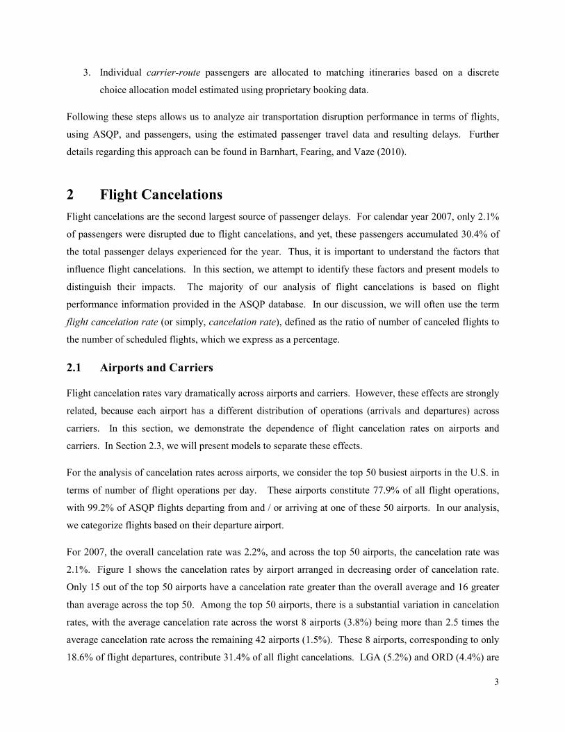
For 2007, the overall cancelation rate was 2.2%, and across the top 50 airports, the cancelation rate was
2.1%. Figure 1 shows the cancelation rates by airport arranged in decreasing order of cancelation rate.
Only 15 out of the top 50 airports have a cancelation rate greater than the overall average and 16 greater
than average across the top 50. Among the top 50 airports, there is a substantial variation in cancelation
rates, with the average cancelation rate across the worst 8 airports (3.8%) being more than 2.5 times the
average cancelation rate across the remaining 42 airports (1.5%). These 8 airports, corresponding to only
18.6% of flight departures, contribute 31.4% of all flight cancelations. LGA (5.2%) and ORD (4.4%) are

4
the airports with highest cancelation rates, the only two airports with cancelation rates more than twice
the overall average. Each of the next six airports, EWR, DCA, BOS, JFK, IAD and DFW, has a
cancelation rate between 3.2% and 3.8%. After DFW, there is a significant drop-off, with no other airport
in the top 50 having a cancelation rate of more than 2.4%.
Figure 1: Cancelation rates for the top 50 busiest airports
In terms of the number of canceled flights, ATL, DFW and ORD top the list among U.S. airports, which
is hardly surprising given that they are also the three busiest airports in terms of number of scheduled
departures. These three airports correspond to 14.6% of flight departures and 19.7% of flight
cancelations. The cancelation rate at ATL is well below the overall average, but the total number of
cancelations is high because ATL is the busiest domestic airport, responsible for 5.6% of flight
departures. ORD is the second busiest domestic airport with 5.0% of departures, but has the largest
number of flight cancelations. It is interesting that the next three busiest airports in terms of total number
of departures (DEN, LAX and PHX) correspond to 15.3% of all departures and yet only 9.6% of all
cancelations. This result is due to the fact that the average cancelation rate for ATL, DFW and ORD
(3.0%) is more than twice of that of DEN, LAX and PHX (1.3%).
For carrier-specific analysis, we classify carriers that have less than 80% of their operations in the
continental U.S. as non-continental carriers. We further categorize the remaining 17 continental carriers
as legacy network carriers, low-cost carriers and regional carriers. We categorize American Airlines
0%
1%
2%
3%
4%
5%
6%
LG
AO
RD
EW
RD
CA
BO
SJF
KIA
DD
FW
CM
HPH
LD
TW
IND
MSP
PIT
CV
GR
DU
STL
DA
LM
EM
SFO
CLE
MC
IC
LT
SN
AH
OU
ATL
BW
IA
US
BN
AD
EN
SA
TM
DW
LA
XM
IAO
AK
SJC
SA
NPH
XO
NT
FLL
IAH
LA
SSEA
SM
FA
BQ
MC
OTPA
SLC
PD
XH
NL
Cancelation Rate
Airport
Top 50 Average
Cancelation Rate

5
(AA), Continental Airlines (CO), Delta Airlines (DL), Northwest Airlines (NW), United Airlines (UA),
and US Airways (US) as legacy network carriers. JetBlue Airways (B6), Frontier Airlines (F9), AirTran
Airways (FL), and Southwest Airlines (WN) are classified as low-cost carriers; and Pinnacle Airlines
(9E), Atlantic Southeast Airlines (EV), American Eagle Airlines (MQ), Comair (OH), Skywest Airlines
(OO), Expressjet Airlines (XE), and Mesa Airlines (YV) as regional carriers. Aloha Airlines (AQ),
Hawaiian Airlines (HA) and Alaska Airlines (AS) are the three non-continental carriers. For this
analysis, a passenger scheduled to travel on a one-stop itinerary which includes flights operated by two
different carriers is categorized based on the carrier for the first flight in the itinerary.
Among the four categories of carriers, cancelation rates are highest for the regional carriers, and lowest
for the low-cost carriers, followed closely by the non-continental carriers. Legacy network carriers fall
between these two extremes. The average cancelation rate for regional carriers (3.2%) is more than three
times the average cancelation rate for low-cost carriers (1.0%). As a result, 39.0% of the passenger
delays for regional carriers are caused by flight cancelations, as compared to 23.2% for low-cost carriers.
The average cancelation rate for legacy network carriers is 2.0% and for non-continental carriers it is
1.2%. Figure 2 plots the cancelation rate for each airline arranged in decreasing order. In the plot,
regional carriers are highlighted in blue, legacy network carriers in green, regional carriers in orange, and
non-continental carriers in grey. The worst 5 carriers in terms of cancelation rates are all regional
carriers, and no regional carrier has a cancelation rate below the overall average. On the other hand,
every one of the low-cost and non-continental carriers has a cancelation rate below this average.
Figure 2: Cancelation rates by carrier and carrier type
It can be difficult to separate out carrier performance from the impacts of airports. Among the legacy
carriers, AA (2.8%) and UA (2.4%) have the two highest cancelation rates and are the only two legacy
carriers with a cancelation rates higher than the overall average. Similarly, the cancelation rate of MQ
(4.2%) is higher than all other regional carriers. In Figure 3, we chart the distribution of flight departures
0.0%
0.5%
1.0%
1.5%
2.0%
2.5%
3.0%
3.5%
4.0%
4.5%
MQ
YV
OH
EV 9E
AA
XE
UA
OO B6
NW US
AS
DL
FL
CO
WN
AQ
HA F9
Cancelation Rate
Carrier
Overall Average
Cancelation Rate

6
for the two worst airports in terms of flight cancelation rates (LGA and ORD). MQ, UA and AA are the
top three carriers in terms of number of departures at LGA and ORD. Of the flights departing from either
LGA or ORD, 22.3% are operated by MQ, 20.5% by UA and 19.4% by AA. In addition, approximately
18.7% of the flights operated by MQ, UA, or AA depart from either LGA or ORD. This interdependence
between the carrier-specific and airport-specific factors is explored in further detail in Section 2.3.
Figure 3: Distribution of flight departures at the two airports with the highest cancelation rates (LGA and ORD)
2.2 Flight Frequency and Load Factors
Flight frequency and load factors play an important role in airline decisions about whether or not to
cancel a flight (Rupp and Holmes, 2002; Tien, Churchill and Ball, 2009). Higher frequency and lower
load factors decrease the delays to disrupted passengers, a topic which we explore further in Section 4. In
this section, we focus on how these factors impact the cancelation decision as opposed to the
reaccommodation process. For our analysis, we compute average daily flight frequencies, average
cancelation rates and average load factors for each carrier-segment (as defined in Section 1.1) over the
course of the year. To perform these calculations, we combine the flight performance data in ASQP with
the aggregate passenger demand data in T-100.
All else being equal, our results suggest that airlines prefer canceling flights on segments with higher
daily frequency, most likely because higher frequency facilitates an easier recovery of passenger
itineraries. In the ASQP database, there is a positive correlation of +7.3% between average daily
frequency and cancelation rate, which is statistically significant at more than the 99% confidence level.
The correlation between flight frequency and cancelation rates is especially strong for non-regional
carriers in the continental U.S. For legacy network carriers, the correlation coefficient is +32.0%, and for
low-cost carriers, it is +34.5%. The correlation is weaker for regional (+6.5%) and non-continental
MQ, 22.3%
UA, 20.5%
AA, 19.4%
OO, 10.1%
YV, 6.3%
DL, 5.0%
Others, 16.4%

7
(+3.9%) carriers. Table 1 shows the correlation coefficient along with its statistical significance for each
of the 10 carriers in continental United States, excluding the regional carriers. The correlation coefficient
is positive for all 10 carriers and is statistically significant with at least a 98% confidence level for all
carriers except F9.
Carrier Correlation p-value
AA +51.6% 0.00
B6 +33.6% 0.00
CO +16.0% 0.02
DL +22.8% 0.00
F9 +3.3% 0.78
FL +20.5% 0.00
NW +21.3% 0.00
UA +40.3% 0.00
US +33.5% 0.00
WN +71.0% 0.00
Table 1: Correlation between average flight frequency and flight cancelation rates across carrier-segments
The correlation between flight frequency and cancelation rate is highest for Southwest Airline (WN), so
we conduct further analysis of Southwest’s cancelation rates. For Table 2, we categorize segments based
on average daily flight frequency, and display the average cancelation rates for each group. The table
shows dramatic variation in cancelation rates across the three categories: at least 10 flights per day,
between 4 and 9 flights per day, and at most 3 flights per day. The 1.7% cancelation rate for segments
with at least 10 flights per day is more than double the cancelation rate for segments with 4 to 9 flights
per day. The segments with the highest frequency correspond to 43.0% of Southwest’s cancelations but
only 22.2% of its flights. On the other extreme, for Southwest segments with 3 or fewer flights per day,
the average cancelation rate is only 0.4%, representing 12.3% of Southwest cancelations.
Daily Flight
Frequency
% of Southwest
Cancelations
% of Southwest
Flights
Cancelation
Rate
At least 10 43.0% 22.2% 1.7%
4 to 9 44.7% 51.7% 0.7%
At most 3 12.3% 26.1% 0.4%
Table 2: Variation in Southwest Airlines’ flight cancelation rates based on daily flight frequency
Load factors represent another important consideration in flight cancelation decisions, because they
directly impact the ease of passenger recovery. In this regard, high load factors are a problem for two
reasons; they indicate that more passengers will need to be reaccommodated and that there will be fewer
8
seats available on later flights. Therefore, all else being equal, airlines should prefer canceling flights on
segments with lower load factors rather than higher load factors. To test this hypothesis, we divided all
carrier-segment combinations into two categories by comparing the load factor with the median load
factor value. High load factor category consists of all carrier-segment combinations with load factors
greater than the median load factor and low load factor category consists of all the carrier-segment
combinations with load factors less than or equal to the median load factor. Note that there was less than
a 2% difference between the average daily frequencies for the high load factor category (4.83) and the
low load factor category (4.89). Nonetheless, the average cancelation rate for the low load factor
category of carrier-segments (2.4%) was found to be approximately 25% greater than that for high load
factor category (1.9%), confirming that load factors are a critical part of the cancelation decision.
2.3 Carrier Effect
Scheduling, operational, and philosophical differences between different carriers clearly impact
cancelation rates. At the same time, congestion and weather patterns at an airport impact the cancelation
rates for all flights at the airport, across carriers. Because the distribution of airport operations varies
significantly across carriers, we would expect some carriers to have worse cancelation rates than others.
For example, DL which has a primary hub in ATL is likely not forced to cancel as many flights as AA,
which has a primary hub in ORD (due to persistent weather / capacity issues). Therefore, it is not clear
how much of the difference between DL’s 1.4% cancelation rate and AA’s 2.8% cancelation rate is due to
network differences (i.e., where the airlines operate their flights). In an effort to separate the carrier-
specific impacts from the airport-specific ones, we develop a metric called carrier effect. The goal of
carrier effect is to measure the relative impact of each carrier’s cancelation decision-making.
First, for each airport, a, we set the baseline cancelation rate, ��a, equal to the historical cancelation rate
for scheduled departures by non-hub carriers at the airport. We say that a carrier is a non-hub carrier if its
operations at the airport constitute less than 10% of its total operations. We choose to eliminate hub
carriers from the baseline because of the additional flexibility these carriers have based on the large
number of gates, aircraft, and crews at their disposal. In Equation 1, we define ��a, letting N�� and C��
represent the number of departures and cancelations respectively for carrier c at airport a, and ℋa
represent the set of non-hub carriers at airport a.
��� = ∑ C���∈ℋa�
∑ N���∈ℋa� (1)
Next, we calculate the carrier effect, E�, for carrier c as the historical number of cancelations divided by
the baseline number of cancelations. The baseline number of cancelations for each carrier, c, and airport,

9
a, is calculated by multiplying the number of scheduled departures, N��, by the baseline cancelation rate,
��a. In Equation 2, we formally define the carrier effect, Ec.
E� = ∑ C���∑ N�� × ��a�
(2)
A smaller value of carrier effect is more desirable, because it indicates fewer cancelations than the
baseline based on the distribution of flight departure airports. Table 3 lists the historical and baseline
cancelation rates, the carrier effect, and the rank based on historical cancelation rate and carrier effect for
each carrier. The rows in the table are sorted in increasing order based on carrier effect.
Carrier
Historical
Cancelation
Rate
Baseline
Cancelation
Rate Carrier Effect
Historical
Cancelation
Rate Rank
Carrier Effect
Rank
F9 0.41% 1.81% 22% 1 1
CO 0.91% 2.39% 38% 5 2
FL 0.99% 2.20% 45% 6 3
WN 0.85% 1.44% 59% 4 4
DL 1.37% 2.23% 61% 7 5
HA 0.42% 0.68% 62% 2 6
B6 1.94% 2.69% 72% 11 7
NW 1.89% 2.44% 77% 10 8
US 1.84% 2.05% 90% 9 9
UA 2.43% 2.49% 98% 13 10
XE 2.48% 2.46% 101% 14 11
AS 1.60% 1.50% 107% 8 12
9E 3.07% 2.87% 107% 16 13
OO 2.37% 2.09% 114% 12 14
EV 3.12% 2.72% 114% 17 15
AQ 0.84% 0.71% 117% 3 16
AA 2.83% 2.36% 120% 15 17
OH 3.78% 3.12% 121% 18 18
MQ 4.22% 3.18% 133% 20 19
YV 3.83% 2.51% 153% 19 20
Table 3: Carrier effects
Many of the differences between the rankings according to historical cancelation rate and carrier effect
are small. Out of the 20 carriers, 11 have a difference in rank of 2 or less (4 zeros, 2 ones, and 5 twos).
The largest rank improvement is with B6, which has a rank of 11 based on historical cancelation rates and

10
7 based on carrier effect. At its two busiest departure airports, JFK and BOS, the B6 cancelation counts
are well below the baseline totals. CO is ranked 5th in terms of historical cancelation rates. It is the
legacy carrier with the lowest cancelation rate in spite of the fact that it has one of its hubs at EWR, where
other carriers have much higher cancelation rates. When this effect is accounted for, CO becomes the
second best carrier in terms of the carrier effect. Excluding the non-continental carriers, WN has the 2nd
lowest historical cancelation rate, because it operates predominantly at airports with low cancelation rates
such as LAS, PHX and MDW. In terms of carrier effect, WN stays in 4th place overall, but moves below
both CO and FL. HA has lowest cancelation rates, and nearly 90% of its operations are at airports in the
Hawaii region. These airports have very low cancelation rates in general. Therefore, in terms of carrier
effect HA drops a few slots into 6th, although it still performs quite well historically canceling only 62%
of the baseline. The other Hawaii based carrier, AQ, which also has about 89% of its operations in the
airports in the Hawaii region, has the largest absolute change in rank, dropping from 3rd place to 16th
place, when the carrier effect, rather than absolute cancelation rate, is considered. Though the differences
are in most cases minor, in context, each of the changes is easy to understand. Thus, we believe carrier
effect represents a better metric for evaluating the cancelation-performance of domestic air carriers as
compared to the historical cancelation rate.
Many major U.S. carriers operate hub-and-spoke networks and many others have focus airports where the
bulk of their activity is concentrated. Large proportions of the one-stop passengers traveling on these
carriers usually connect at these hubs or focus airports. Such concentration of activity has important
implications for the flight cancelation rates. More operational flexibility at the hub airport enables better
recovery processes, which should be reflected in lower cancelation rates for the hubbing carrier as
compared to other carriers at the airport. To measure the impact of this effect, we extend the carrier effect
developed above to measure the hub-carrier effect, Echub. The hub-carrier effect for a given carrier is
defined in Equation 3 as the ratio of its cancelation rate at its primary airport of operations, hub, to the
cancelation rate of non-hub carriers at that airport.
Echub = C�hub
N�hub × ��hub (3)
In Equation 4, we define the carrier’s coefficient of hubbing, �chub, as the ratio of hub-carrier effect to
carrier effect. We use the carrier’s coefficient of hubbing to determine how much additional flexibility
each carrier has at its primary hub of operations.
�chub = Echub
E� (4)

11
In Table 4, for each of the legacy network and low-cost carriers, we list the values of Echub and �chub,
along with the carrier effect, E�. With the exceptions of AA and WN, the coefficient of hub effect is
lower than 1 for each of these carriers. WN has, by far, the most distributed operations across different
airports. Only 7.1% of the WN operations are concentrated at LAS, which contains the largest number of
WN operations. No other airline in Table 4 has less than 15% of its operations at its main airport.
Therefore, any operational flexibility afforded by having a hub is likely not as high for WN as all the
other carriers, resulting in WN losing out on any incremental advantage. AA is the other carrier with a
coefficient of hubbing effect greater than 1.0. AA operates at a disadvantage relative to other carriers at
DFW, because flight delays and cancelations are often propagated from its secondary hub at ORD. If we
were to instead treat ORD as AA’s primary hub, the hub-carrier effect would be 0.81 and the coefficient
of hubbing would be 0.67, which is in line with the coefficient of hubbing for other carriers.
Carrier Main Hub
% of
Operations at
Main Hub
Carrier Effect
(Ec) Hub-Carrier
Effect (Echub) Coefficient of
Hubbing (Eh) AA DFW 26.0% 1.22 1.39 1.14
B6 JFK 30.6% 0.77 0.62 0.79
CO IAH 28.5% 0.47 0.26 0.54
DL ATL 32.1% 0.64 0.41 0.64
F9 DEN 48.7% 0.26 0.24 0.91
FL ATL 33.3% 0.51 0.42 0.82
NW MSP 22.5% 0.78 0.57 0.74
UA ORD 19.3% 0.97 0.68 0.70
US CLT 15.3% 0.88 0.50 0.57
WN LAS 7.1% 0.61 0.71 1.15
Table 4: Effects of primary hub on cancelation rates
These results suggest that there is a substantial operational advantage for flights departing from a carrier’s
primary hub. This makes sense, because at a primary hub, carriers typically have numerous aircraft and
crew available, providing operational flexibility that can be exploited if there are any issues with aircraft
availability or crew work requirements. To further confirm this intuition, we can compare flights arriving
into the primary hub with those departing from it. The operational advantages associated with the
primary hub should not be afforded to flights departing from other airports, even those arriving at the
primary hub. On the other hand, the impact of the airport-specific issues such as bad weather, congestion,
etc. on arriving and departing flights should be comparable. Thus, the difference in cancelation rates
between flights entering and exiting each carrier’s primary hub provides another measure of the
operational flexibility afforded by the hub.

12
Across the 20 carriers, the average cancelation rate for flights arriving at their respective primary hub
airports (1.7%) is 9.2% higher than the cancelation rate for flights departing from their respective primary
hub airports (1.6%). Table 5 shows the cancelation rates for flights entering and exiting the primary hub
for each carrier in the continental U.S. excluding the regional carriers. It can be observed from Table 5
that the cancelation rate for flights entering the primary hub is higher than that for the flights exiting the
primary hub in the case of all carriers except WN. The cancelation rates are calculated for all of 2007,
suggesting that this effect is both significant and persistent. For WN, the cancelation rate for flights
entering and exiting the main hub is almost equivalent. Thus, WN’s distributed operation appears to once
again deprive it of the operational flexibility afforded to other carriers at their respective primary hub
airports.
Carrier
Primary
Hub
Cancelation Rate % w/ at Least 30 Minutes of Delay
For Flights
from Main
Hub
For Flights
into Main
Hub
%
Increase
For Flights
from Main
Hub
For Flights
into Main
Hub
%
Increase
AA DFW 3.0% 3.1% 2.5% 19.3% 15.1% -21.5%
B6 JFK 2.4% 2.4% 2.3% 20.4% 21.1% 3.5%
CO IAH 0.4% 0.5% 22.8% 13.9% 10.7% -23.4%
DL ATL 0.9% 1.1% 21.0% 12.7% 10.5% -17.2%
F9 DEN 0.4% 0.5% 27.8% 12.6% 9.3% -26.3%
FL ATL 0.8% 1.0% 19.6% 14.3% 11.8% -17.5%
NW MSP 1.5% 1.6% 12.2% 18.1% 13.5% -25.5%
UA ORD 3.2% 3.5% 8.5% 22.0% 17.2% -21.5%
US CLT 1.2% 1.5% 25.3% 18.8% 13.8% -27.0%
WN LAS 0.7% 0.7% -0.9% 11.9% 9.4% -20.7%
Total 1.6% 1.7% 9.2% 16.4% 13.2% -19.9%
Table 5: Cancelation rates and large delays for flights entering and exiting the primary hub
Table 5 also lists the percentage of flights entering and exiting the main hub that suffer large delays,
where large is defined as any delay greater than or equal to 30 minutes. The overall percentage of flights
with large delays arriving into a primary hub (13.2%) is 19.9% lower than that for the flights departing
from the primary hub. The same effect that is observed in aggregate is also observed at the individual
carrier level for all carriers except B6. The flight delay results are consistent with the cancelation rates in
that they suggest that carriers are able to absorb more delay and still operate the departing flight out of a
primary hub.
3 Missed Connections
Missed connections are the most significant cause of travel disruptions for one-stop passengers. For these
passengers, missed connections are responsible for 57.2% of all disruptions and 40.9% of all the delays.

13
In this section, we analyze the most important factors affecting missed connections. In our discussion, we
will often use the term, misconnection rate which is defined as the ratio between the number of one-stop
passengers who missed their connections (due to delays on the first flight in their itinerary) and the total
number of one-stop passengers, which, as with cancelation rate, we will express as a percentage. Note
that one-stop passengers who have at least one canceled flight in their planned itineraries are excluded
from both the numerator and the denominator of the expression for misconnection rates. The analysis in
this section incorporates both the flight performance data in ASQP and the estimated passenger travel and
delay data described in Section 1.1.
3.1 Airports and Carriers
Just as we did for the case of the cancelation rates, for the airport-specific analysis of misconnection rates,
we consider the top 50 airports in the U.S. in terms of number of flight operations per day. These top 50
airports correspond to 99.1% of planned one-stop passenger connections and 99.4% of missed passenger
connections. For the following analysis, all passengers are categorized based on their connection airports.
For 2007, the average misconnection rate in the U.S. was 4.5%. For the top 50 airports, the
misconnection rate ranges from 8.6% at EWR to 1.9% at TPA. In Figure 4, we plot misconnection rates
at these airports arranged in decreasing order of misconnection rate. EWR and LGA (7.8%) are the two
airports with, by far, the highest misconnection rates. At each of the next seven airports: IAD, ORD,
PHL, JFK, CLE, SFO and MIA, the misconnection rate is in the range of 6.0% to 6.6%. After MIA, there
is another significant drop-off, with the 41 remaining airports having misconnection rates of at most
5.4%. The average misconnection rate at the 9 worst connecting airports (6.4%) is greater than 1.5 times
the misconnection rate (4.1%) at the remaining 41.

14
Figure 4: Misconnection rates for the top 50 busiest airports
Obviously large delays to the first flight in an itinerary are primarily responsible for misconnections.
Therefore, it is not a surprise that out of the 9 worst airports in terms of cancelation rates, EWR, JFK,
LGA, ORD, PHL and SFO are the 6 worst airports in terms of average arrival delays. But, clearly
average arrival delays do not explain the whole story. For example, IAD, has a much lower average
arrival delay than either ORD, PHL or JFK, but lies above these three in terms of misconnection rate.
Another example is CLE, which is the 7th worst airport in terms of misconnection rates. CLE has a lower
average arrival delay (15.0 minutes) than the overall US average (15.3 minutes), but ranks in this list
above several other airports with much higher flight delays. We will address this apparent anomaly in
Section 3.2 when we discuss schedule banking.
Much like our analysis of cancelation rates by carrier, here we categorize one-stop passengers based on
the carrier of the first flight in the itinerary. Among the three categories of carriers in the continental
United States, regional carriers are most severely impacted by missed connections. For regional carriers,
23.8% of all passenger delays (including both non-stop and one-stop passengers) are caused by missed
connections. Low-cost carriers, on the other hand, are the least impacted by missed connections, with
only 11.6% of all delays caused by misconnections. For legacy network carriers, 19.1% of all passenger
delays are due to missed connections. The two drivers of this disparity are the percentage of connecting
passengers and the misconnection rate, both of which are highest for regional carriers (39.6% and 6%
0%
1%
2%
3%
4%
5%
6%
7%
8%
9%
10%
EW
RLG
AIA
DO
RD
PH
LJF
KC
LE
SFO
MIA
SN
AM
EM
CM
HPIT
SEA
CV
GBO
SD
FW
LA
XD
TW
DEN
DC
AM
SP
IND
ATL
RD
UC
LT
PD
XLA
SPH
XIA
HSLC
SA
NFLL
STL
AU
SSJC
HN
LH
OU
SM
FSA
TD
AL
MC
IO
NT
ABQ
BW
IM
DW
MC
OBN
AO
AK
TPA
Misconnection Rate
Airport
Top 50 Average
Misconnection Rate
15
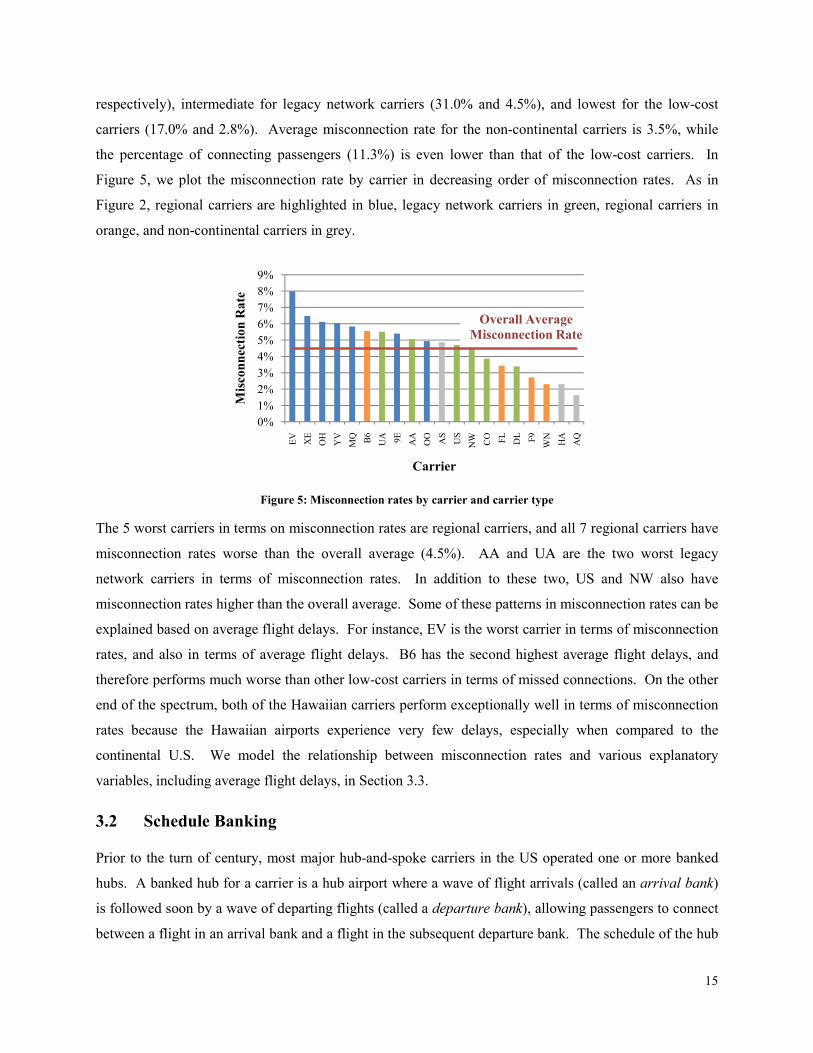
respectively), intermediate for legacy network carriers (31.0% and 4.5%), and lowest for the low-cost
carriers (17.0% and 2.8%). Average misconnection rate for the non-continental carriers is 3.5%, while
the percentage of connecting passengers (11.3%) is even lower than that of the low-cost carriers. In
Figure 5, we plot the misconnection rate by carrier in decreasing order of misconnection rates. As in
Figure 2, regional carriers are highlighted in blue, legacy network carriers in green, regional carriers in
orange, and non-continental carriers in grey.
Figure 5: Misconnection rates by carrier and carrier type
The 5 worst carriers in terms on misconnection rates are regional carriers, and all 7 regional carriers have
misconnection rates worse than the overall average (4.5%). AA and UA are the two worst legacy
network carriers in terms of misconnection rates. In addition to these two, US and NW also have
misconnection rates higher than the overall average. Some of these patterns in misconnection rates can be
explained based on average flight delays. For instance, EV is the worst carrier in terms of misconnection
rates, and also in terms of average flight delays. B6 has the second highest average flight delays, and
therefore performs much worse than other low-cost carriers in terms of missed connections. On the other
end of the spectrum, both of the Hawaiian carriers perform exceptionally well in terms of misconnection
rates because the Hawaiian airports experience very few delays, especially when compared to the
continental U.S. We model the relationship between misconnection rates and various explanatory
variables, including average flight delays, in Section 3.3.
3.2 Schedule Banking
Prior to the turn of century, most major hub-and-spoke carriers in the US operated one or more banked
hubs. A banked hub for a carrier is a hub airport where a wave of flight arrivals (called an arrival bank)
is followed soon by a wave of departing flights (called a departure bank), allowing passengers to connect
between a flight in an arrival bank and a flight in the subsequent departure bank. The schedule of the hub
0%
1%
2%
3%
4%
5%
6%
7%
8%
9%
EV
XE
OH
YV
MQ B6
UA 9E
AA
OO
AS
US
NW CO FL
DL F9
WN
HA
AQ
Misconnection Rate
Carrier
Overall Average
Misconnection Rate

16
operator carrier at a typical banked hub airport contains several such banks often separated by periods of
limited activity. An example of a banked hub is provided in Figure 6, which shows the number of flight
arrivals and departures for each hour of the day (from 7:00am to 10:00pm) for NW at MEM for the year
2007. Visually, it is easy to identify the three distinct banks operated by NW at MEM.
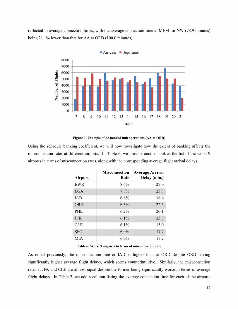
Figure 6: Example of banked hub operations (NW at MEM)
In the early 2000s, several major U.S. carriers as well as some European carriers started de-banking their
schedules. De-banking allows carriers to balance resource utilization over the course of the day, reducing
costs and increasing operational efficiency. An important effect of hub de-banking was an increase in
average passenger connection times (Jiang, 2006). The trend was led by AA, who de-banked its hubs at
ORD, DFW and MIA. Subsequently, UA de-banked its hubs at ORD and LAX, DL de-banked ATL and
CO de-banked EWR. An example of a de-banked hub is provided in Figure 7, which shows the flight
arrivals and departures per hour of the day for AA at the ORD airport for the year 2007. It can be
observed that the distribution of arrivals (as well as departures) per hour is much flatter than that shown in
Figure 6. To measure the extent of banked operations by a carrier at an airport, we develop a metric
called the schedule banking coefficient. The schedule banking coefficient for a carrier at an airport is
defined as the coefficient of variation (i.e., the ratio of standard deviation to mean) of the number of
arrivals per hour for that carrier at that airport, which we express as a percentage. Note that if the number
of departures per hour were constant, the schedule banking coefficient would equal 0%. Larger schedule
banking coefficients represent a greater extent of banked operations. For example, the schedule banking
coefficient for NW at MEM is 120.9% while that for AA at ORD is 25.2%. This difference is also
0
1000
2000
3000
4000
5000
6000
7000
7 8 9 10 11 12 13 14 15 16 17 18 19 20 21
Number of Flights
Hour
Arrivals Departures
17
reflected in average connection times, with the average connection time at MEM for NW (78.9 minutes)
being 21.1% lower than that for AA at ORD (100.0 minutes).
Figure 7: Example of de-banked hub operations (AA at ORD)
Using the schedule banking coefficient, we will now investigate how the extent of banking affects the
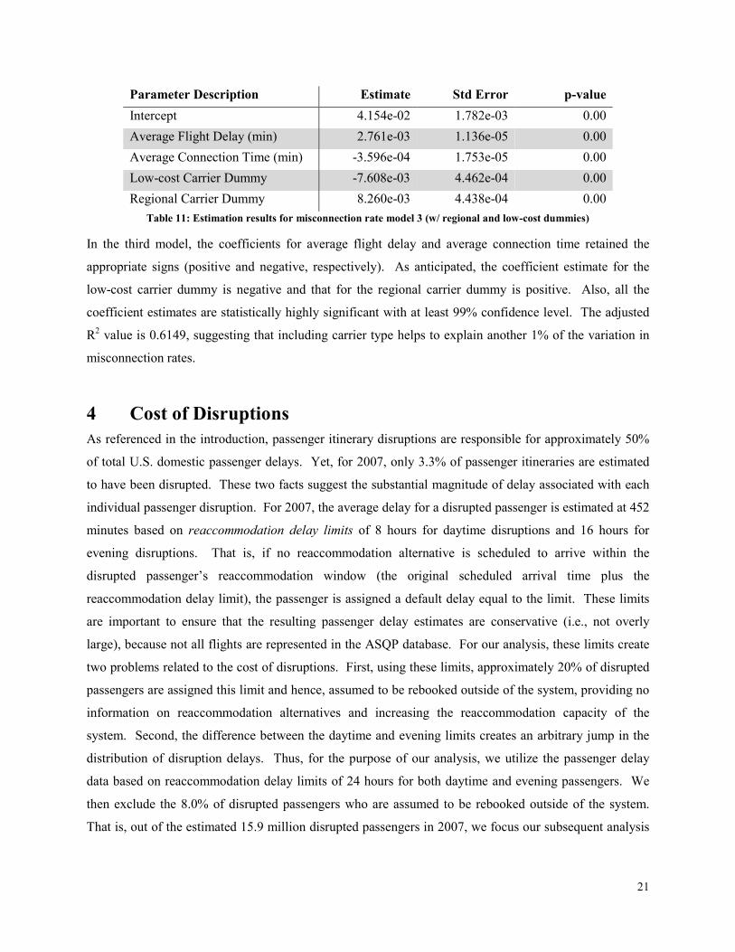
misconnection rates at different airports. In Table 6, we provide another look at the list of the worst 9
airports in terms of misconnection rates, along with the corresponding average flight arrival delays.
Airport
Misconnection
Rate
Average Arrival
Delay (min.)
EWR 8.6% 29.0
LGA 7.8% 23.8
IAD 6.6% 16.6
ORD 6.3% 22.6
PHL 6.2% 20.1
JFK 6.1% 23.8
CLE 6.1% 15.0
SFO 6.0% 17.7
MIA 6.0% 17.2
Table 6: Worst 9 airports in terms of misconnection rate
As noted previously, the misconnection rate at IAD is higher than at ORD despite ORD having
significantly higher average flight delays, which seems counterintuitive. Similarly, the misconnection
rates at JFK and CLE are almost equal despite the former being significantly worse in terms of average
flight delays. In Table 7, we add a column listing the average connection time for each of the airports
0
1000
2000
3000
4000
5000
6000
7000
8000
7 8 9 10 11 12 13 14 15 16 17 18 19 20 21
Number of Flights
Hour
Arrivals Departures

18
included in Table 6, which helps to explain these apparent anomalies. For example, although the average
flight delay at IAD is 6.0 minutes lower than at ORD, the average connection time at IAD is 12.8 minutes
lower on average, resulting in a higher misconnection rate at IAD than at ORD. Similarly, although the
average flight delay at CLE is 8.8 minutes less than at JFK, the average connection time is 22.1 minutes
lower on average, resulting in nearly identical misconnection rates at JFK and CLE.
Airport
Misconnection
Rate
Average Flight
Delay (min)
Average
Connection Time
(min)
EWR 8.6% 29.0 100.2
LGA 7.8% 23.8 90.1
IAD 6.6% 16.6 86.1
ORD 6.3% 22.6 98.9
PHL 6.2% 20.1 96.3
JFK 6.1% 23.8 103.9
CLE 6.1% 15.0 81.8
SFO 6.0% 17.7 102.00
MIA 6.0% 17.2 112.7
Table 7: Worst 9 airports in terms of misconnection rates with average connection times
Given that the results presented in this research are based on the passenger itinerary flows obtained from
discrete choice model estimation, we need to address the question of whether the differences in
connection times are simply a construct of the passenger itinerary flow estimates or if they indicate
something more fundamental about the schedule structure at these airports. In order to answer this
question, we look at the schedule banking coefficients for the major carriers IAD, ORD, JFK and CLE.
For each of these airports and each carrier that serves at least 10% of the airport’s connecting passengers,
Table 8 lists the schedule banking coefficients and the average connection times. The schedule banking
coefficient for each major carrier at IAD is at least 3 times that for each major carrier at ORD, which
results in much shorter average connection times at IAD than at ORD. Similarly, the schedule banking
coefficient for each major carrier at CLE is at least 3 times that of B6 (the only major carrier at JFK)
resulting in much shorter average connection times at CLE than at JFK. These results suggest that the
lower average connection time values at IAD and CLE (and the resulting high misconnection rates) are
due to the banked nature of the carrier operations at the airport rather than due to any artifacts of the
passenger itinerary flow estimation procedure.

19
Airport Carrier
% of Airport's
Connecting
Passengers
Schedule
Banking
Coefficient
Average
Connection Time
(min)
IAD UA 54.6% 98.7% 88.7
IAD YV 39.5% 99.3% 80.7
ORD UA 36.5% 23.7% 99.6
ORD AA 27.5% 25.2% 100.0
ORD MQ 19.2% 25.3% 96.9
JFK B6 81.2% 28.7% 105.1
CLE XE 57.0% 64.2% 78.4
CLE CO 40.6% 73.6% 85.6
Table 8: Schedule banking coefficients for primary carriers at IAD, ORD, JFK, and CLE
3.3 Modeling Missed Connections
In this section, we present regression models to explain the variability in misconnection rates based on the
insights gleaned above. As above, we categorize one-stop passengers based on the carrier that operates
the first flight in the itinerary. In order to predict the misconnection rate using a linear regression
approach, we aggregate individual passenger itineraries. For our model, each combination of carrier,
connection airport and day corresponds to a single observation. In order to eliminate issues relating to
sample size, we consider only those carrier-airport-day combinations which include at least 100
connecting passengers. This approach results in 41,491 observations that cover approximately 98% of all
one-stop passengers.
The dependent variable for our models is the average misconnection rate across the passengers
corresponding to each observation. In our results, we present three regression models, each one building
on the last. The incremental nature of these models allows us to determine the relative impact of each of
the explanatory variables. As with the dependent variable, each of the explanatory variables is calculated
by averaging the appropriate value across the passengers corresponding to the observation. Each of the
regressions models is estimated by weighting the observations based on the number of connecting
passengers corresponding to each carrier-airport-day combination.
As discussed at the end of Section 3.1, there is strong relationship between average flight delays at an
airport and the corresponding misconnection rate. Thus, our first regression model attempts to predict the
misconnection rate using average flight delays as the only explanatory variable, along with an intercept.
Table 9 provides the estimation results for this first model.

20
Parameter Description Estimate Std Error p-value
Intercept 4.113e-03 2.485e-04 0.00
Average Flight Delay (min) 2.833e-03 1.156e-05 0.00
Table 9: Estimation results for misconnection rate model 1 (w/ flight delays)
As expected, the coefficient of average flight delay is positive, meaning that the greater the average flight
delay, the higher the misconnection rate. Also, both coefficient estimates are statistically highly
significant with at least 99% confidence level. The adjusted R2 value is 0.5915, suggesting that average
flight delays explain 59% of the variation in misconnection rates across our observations.
As mentioned in 3.2, in addition to flight delays, schedule banking and connection times impact the
misconnection rates, because longer connections imply reduced risks of missing a connection. Therefore,
in model 2, we add average connection time as another explanatory variable to the model. Table 10
shows the estimation results for this second model.
Parameter Description Estimate Std Error p-value
Intercept 6.689e-02 1.571e-03 0.00
Average Flight Delay (min) 2.803e-03 1.136e-05 0.00
Average Connection Time (min) -6.173e-04 1.526e-05 0.00
Table 10: Estimation results for misconnection rate model 2 (w/ connection times)
The coefficient estimate for average connection times is negative, implying that the higher the average
connection time, the lower the misconnection rate. Also, all three coefficient estimates are statistically
highly significant with at least a 99% confidence level. The adjusted R2 value is 0.6070, suggesting that
average connection times help explain another 1% of the variation in misconnection rates.
As seen in Figure 5 and discussed in Section 3.1, among different carrier types, low-cost carriers have the
lowest misconnection rates while regional carriers have the highest misconnection rates. To understand
the magnitude of this effect, we add a 0-1 dummy variable each for the low-cost carriers and for the
regional carriers. That is, any observation corresponding to the first flight being operated by a low-cost
carrier will have value 1 for the low-cost carrier dummy and all other observations will have a value 0.
Similarly, any observation corresponding to the first flight being operated by a regional carrier will have
value 1 for the regional carrier dummy and all other observations will have a value 0. Table 11 shows the
estimation results for this third and final model.
21
Parameter Description Estimate Std Error p-value
Intercept 4.154e-02 1.782e-03 0.00
Average Flight Delay (min) 2.761e-03 1.136e-05 0.00
Average Connection Time (min) -3.596e-04 1.753e-05 0.00
Low-cost Carrier Dummy -7.608e-03 4.462e-04 0.00
Regional Carrier Dummy 8.260e-03 4.438e-04 0.00
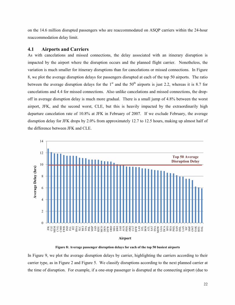
Table 11: Estimation results for misconnection rate model 3 (w/ regional and low-cost dummies)
In the third model, the coefficients for average flight delay and average connection time retained the
appropriate signs (positive and negative, respectively). As anticipated, the coefficient estimate for the
low-cost carrier dummy is negative and that for the regional carrier dummy is positive. Also, all the
coefficient estimates are statistically highly significant with at least 99% confidence level. The adjusted
R2 value is 0.6149, suggesting that including carrier type helps to explain another 1% of the variation in
misconnection rates.
4 Cost of Disruptions
As referenced in the introduction, passenger itinerary disruptions are responsible for approximately 50%
of total U.S. domestic passenger delays. Yet, for 2007, only 3.3% of passenger itineraries are estimated
to have been disrupted. These two facts suggest the substantial magnitude of delay associated with each
individual passenger disruption. For 2007, the average delay for a disrupted passenger is estimated at 452
minutes based on reaccommodation delay limits of 8 hours for daytime disruptions and 16 hours for
evening disruptions. That is, if no reaccommodation alternative is scheduled to arrive within the
disrupted passenger’s reaccommodation window (the original scheduled arrival time plus the
reaccommodation delay limit), the passenger is assigned a default delay equal to the limit. These limits
are important to ensure that the resulting passenger delay estimates are conservative (i.e., not overly
large), because not all flights are represented in the ASQP database. For our analysis, these limits create
two problems related to the cost of disruptions. First, using these limits, approximately 20% of disrupted
passengers are assigned this limit and hence, assumed to be rebooked outside of the system, providing no
information on reaccommodation alternatives and increasing the reaccommodation capacity of the
system. Second, the difference between the daytime and evening limits creates an arbitrary jump in the
distribution of disruption delays. Thus, for the purpose of our analysis, we utilize the passenger delay
data based on reaccommodation delay limits of 24 hours for both daytime and evening passengers. We
then exclude the 8.0% of disrupted passengers who are assumed to be rebooked outside of the system.
That is, out of the estimated 15.9 million disrupted passengers in 2007, we focus our subsequent analysis
22
on the 14.6 million disrupted passengers who are reaccommodated on ASQP carriers within the 24-hour
reaccommodation delay limit.
4.1 Airports and Carriers
As with cancelations and missed connections, the delay associated with an itinerary disruption is
impacted by the airport where the disruption occurs and the planned flight carrier. Nonetheless, the
variation is much smaller for itinerary disruptions than for cancelations or missed connections. In Figure
8, we plot the average disruption delays for passengers disrupted at each of the top 50 airports. The ratio
between the average disruption delays for the 1st and the 50th airports is just 2.2, whereas it is 8.7 for
cancelations and 4.4 for missed connections. Also unlike cancelations and missed connections, the drop-
off in average disruption delay is much more gradual. There is a small jump of 4.8% between the worst
airport, JFK, and the second worst, CLE, but this is heavily impacted by the extraordinarily high
departure cancelation rate of 10.8% at JFK in February of 2007. If we exclude February, the average
disruption delay for JFK drops by 2.0% from approximately 12.7 to 12.5 hours, making up almost half of
the difference between JFK and CLE.
Figure 8: Average passenger disruption delays for each of the top 50 busiest airports
In Figure 9, we plot the average disruption delays by carrier, highlighting the carriers according to their
carrier type, as in Figure 2 and Figure 5. We classify disruptions according to the next planned carrier at
the time of disruption. For example, if a one-stop passenger is disrupted at the connecting airport (due to
0
2
4
6
8
10
12
14
JFK
CLE
MEM
CV
G
CM
H
EW
R
IND
FLL
PIT
BN
A
SLC
MC
I
TPA
PH
L
MSP
IAD
RD
U
MC
O
DEN
DTW
OR
D
MIA
BW
I
IAH
AU
S
PD
X
ABQ
CLT
DFW
LA
S
STL
BO
S
ATL
SA
T
SN
A
MD
W
LG
A
DC
A
SFO
SEA
PH
X
SA
N
HN
L
LA
X
SJC
SM
F
ON
T
OA
K
HO
U
DA
L
Average Delay (hrs)
Airport
Top 50 Average
Disruption Delay

23
a missed connection or second flight cancelation), the disruption would be classified according to the
planned carrier for the second flight in the itinerary. As with airports, the average disruption delay is less
sensitive to carrier than either the cancelation rate or the misconnection rate. The ratio between the
average disruption delay for the 1st and 20th carriers is 2.4, whereas it is 10.4 for the cancelation rate and
4.9 for the misconnection rate. The worst carrier in terms of average disruption delay is B6, which is not
surprising given that 30.6% of B6’s operations are at JFK. While February 2007 was a particularly bad
month for JFK in general, it was even worse for B6 with over 60% of B6 flights into or out of JFK. Over
a six-day period starting with Valentine’s Day, February 14th, 2007 B6 canceled 44% of its flight
operations (Inspector General Calvin L. Scovel III, 2007). Huckman, Pisano, and Fuller (2008) provide a
good case study regarding the B6 crisis at JFK. Excluding February, the average disruption delay for B6
is reduced by 10.2% to 11.9 hours, moving it from 1st to 3rd, between OH and 9E.
Figure 9: Average passenger disruption delays by carrier and carrier type
As with cancelations and missed connections, it is difficult to separate the impact of airport-based
congestion with carrier operations. In Section 4.3, we develop a linear regression model for estimating
disruption reaccommodation delays in order to tease out these effects.
4.2 Time of Disruption
Beyond the disruption airport and carrier, the most significant factor in determining passenger disruption
delays is the time of disruption. In Figure 10, we plot the number of passengers disrupted at each hour of
the day, along with their corresponding average disruption delay. Both the number of disruptions and the
average disruption delay steadily increase from 6:00 or 7:00 in the morning until approximately 7:00 at
night. At that point, the number of disruptions begins to decrease rapidly, but the average delay continues
to increase before staying relatively constant from 9:00pm until 3:00am the following morning. After
7:00pm, there are fewer potential passengers to be disrupted, but most disrupted passengers are forced to
overnight at the disruption airport, leading to long delays.
0
2
4
6
8
10
12
14
B6
XE
OH 9E
YV
OO
MQ F9
NW FL
EV
CO
AA
US
UA
DL
AS
HA
WN
AQ
Average Delay (hrs)
Carrier
Overall Average
Disruption Delay

24
Figure 10: Number of disruptions and average passenger disruption delay by hour of disruption
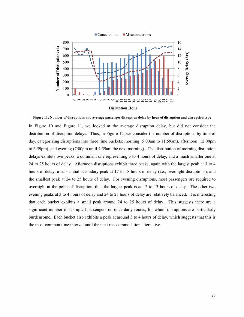
It is also interesting to partition this data based on the type of disruption, either cancelation or missed
connection, which we do in Figure 11, plotting the data associated with cancelations in blue and missed
connections in red. Other than very late at night, when there are few disruptions, the delay associated
with a missed connection is consistently lower than that associated with a cancelation. This makes sense,
because passengers who miss connections compete with fewer people for available seats on
reaccommodation alternatives. For flight cancelations, all of the disrupted non-stop passengers are forced
to compete for seats on the same set of reaccommodation alternatives. Another interesting, though not
surprising, feature of this plot is the difference in the distribution of disruptions due to cancelations and
missed connections over the course of the day. Between 6:00 in the morning and 5:00 in the afternoon,
disruptions due to cancelations and missed connections increase at a similar rate. From 5:00pm on, the
number of disruptions due to cancelations falls, whereas the number of disruptions due to missed
connections continues to increase through 9:00pm. The distribution of missed connections is lagged as
compared to cancelations because connections tend to occur later in the day.
0
2
4
6
8
10
12
14
16
0
200
400
600
800
1000
1200
0 1 2 3 4 5 6 7 8 910
11
12
13
14
15
16
17
18
19
20
21
22
23
Average Delay (hrs)
Number Disru
ptions (k)
Disruption Hour
25
Figure 11: Number of disruptions and average passenger disruption delay by hour of disruption and disruption type
In Figure 10 and Figure 11, we looked at the average disruption delay, but did not consider the
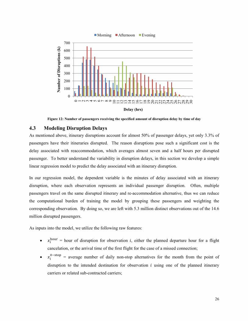
distribution of disruption delays. Thus, in Figure 12, we consider the number of disruptions by time of
day, categorizing disruptions into three time buckets: morning (5:00am to 11:59am), afternoon (12:00pm
to 6:59pm), and evening (7:00pm until 4:59am the next morning). The distribution of morning disruption
delays exhibits two peaks, a dominant one representing 3 to 4 hours of delay, and a much smaller one at
24 to 25 hours of delay. Afternoon disruptions exhibit three peaks, again with the largest peak at 3 to 4
hours of delay, a substantial secondary peak at 17 to 18 hours of delay (i.e., overnight disruptions), and
the smallest peak at 24 to 25 hours of delay. For evening disruptions, most passengers are required to
overnight at the point of disruption, thus the largest peak is at 12 to 13 hours of delay. The other two
evening peaks at 3 to 4 hours of delay and 24 to 25 hours of delay are relatively balanced. It is interesting
that each bucket exhibits a small peak around 24 to 25 hours of delay. This suggests there are a
significant number of disrupted passengers on once-daily routes, for whom disruptions are particularly
burdensome. Each bucket also exhibits a peak at around 3 to 4 hours of delay, which suggests that this is
the most common time interval until the next reaccommodation alternative.
0
2
4
6
8
10
12
14
16
0
100
200
300
400
500
600
700
800
0 1 2 3 4 5 6 7 8 910
11
12
13
14
15
16
17
18
19
20
21
22
23
Average Delay (hrs)
Number of Disru
ptions (k)
Disruption Hour
Cancelations Misconnections
26
Figure 12: Number of passengers receiving the specified amount of disruption delay by time of day
4.3 Modeling Disruption Delays
As mentioned above, itinerary disruptions account for almost 50% of passenger delays, yet only 3.3% of
passengers have their itineraries disrupted. The reason disruptions pose such a significant cost is the
delay associated with reaccommodation, which averages almost seven and a half hours per disrupted
passenger. To better understand the variability in disruption delays, in this section we develop a simple
linear regression model to predict the delay associated with an itinerary disruption.
In our regression model, the dependent variable is the minutes of delay associated with an itinerary
disruption, where each observation represents an individual passenger disruption. Often, multiple
passengers travel on the same disrupted itinerary and re-accommodation alternative, thus we can reduce
the computational burden of training the model by grouping these passengers and weighting the
corresponding observation. By doing so, we are left with 5.3 million distinct observations out of the 14.6
million disrupted passengers.
As inputs into the model, we utilize the following raw features:
• ������ = hour of disruption for observation �, either the planned departure hour for a flight
cancelation, or the arrival time of the first flight for the case of a missed connection;
• ���� �!
= average number of daily non-stop alternatives for the month from the point of
disruption to the intended destination for observation � using one of the planned itinerary
carriers or related sub-contracted carriers;
0
100
200
300
400
500
600
700
0 1 2 3 4 5 6 7 8 910
11
12
13
14
15
16
17
18
19
20
21
22
23
24
25
26
27
28
29
30
Number of Disru
ptions (k)
Delay (hrs)
Morning Afternoon Evening
27
• ���"��# = average load factor for the month on non-stop flights from the point of disruption to
the intended destination for observation � using one of the planned itinerary carriers or related
sub-contracted carriers;
• ��$� �!
= average number of daily one-stop alternatives for the month from the point of
disruption to the intended destination for observation � using one or more of the planned
itinerary carriers or related sub-contracted carriers;
• ��#��� = the disruption carrier for observation �; • ��
!��% = 1 if disruption for observation � occurs at the disruption carrier’s primary hub airport
(as defined in Section 2.3), and 0 otherwise;
• ��##"&
= the average arrival delay across flights that departed from the disruption airport
operated by the disruption carrier in the month of disruption for observation �; • ��#�� = the average departure cancelation rate for flights scheduled to depart from the
disruption airport and to be operated by the disruption carrier during the month of disruption for
observation �; • ����'�(" = 1 if the disruption for observation � is due to a flight cancelation, and 0 otherwise; and
• ��� �!�
= number of planned stops remaining at the time of disruption for observation � (e.g., either 0 or 1).
In addition to the raw features listed above, we derive the following features:
• ��overnight
= min{5 − ������, 0}, which represents the time until morning (i.e., 5:00am) if the
disruption for observation � occurs between midnight and 5:00am;
• ��0-empty
= ���� �! ∗ (1 − ���"��#) , which represents the seats available for reaccommodation
(measured in the number of full aircraft loads) using a non-stop flight on one of the planned
carriers or related sub-contracted carriers from the disruption airport to the final destination for
observation �; • ��
0-empty(1) = min{ ��
0-empty, ?0-empty}, which represents the first piece of the piecewise separation
of ��0-empty
into two pieces, with ?0-empty a constant breakpoint across all observations;
• ��0-empty(2)
= max{ ��0-empty − ?0-empty, 0}, which represents the second piece the piecewise
separation of ��0-empty
into two pieces, with ?0-empty a constant breakpoint across all observations;

28
• ��$� �!($)
= min{ ��$� �!, ?1-stop}, which represents the first piece of the piecewise separation of
��$� �!
into two pieces, with ?1-stop a constant breakpoint across all observations; and
• ��$� �!(D)
= max{��$� �! − ?1-stop, 0}, which represents the second piece of the piecewise
separation of ��$� �!
into two pieces, with ?1-stop a constant breakpoint across all observations.
For the piecewise separation of non-stop and one-stop alternatives, we use values of 3 and 30 for ?0-empty
and ?1-stop respectively. Based on these features, we estimate the disruption delay E�(��) using the
regression function represented in equation (4-1), where ℐ(∙) represents the indicator function for the
expression argument.
E�(��) = H� + H��'�("����'�(" + J HK����ℐ(������ = ℎ)DD
KMN+ HDD����ℐ(������ = 23)
+H�P(�'QR� ��overnight + H$
�(S! &��0-empty(1) + HD
�(S! &��0-empty(2)
+H$1-stop��
$� �!($) + HD1-stop��
$� �!(D) + H� �!���� �!� +
+H$$� �!(T)��
$� �!($)��� �!� + HD
$� �!(T)��$� �!(D)��
� �!�
+Hphub��phub + Hddly��
ddly + Hdcrt��dcrt
(4-1)
For additional context, we provide a brief description of each of the parameters utilized in the regression
function:
• H� – the baseline delay for a disruption during the 5:00am hour;
• H��'�(" – the impact of flight cancelations on disruption delays (as compared to missed
connections);
• HK���� – disruption delay associated with each possible hour of disruption between 6:00am and
11:59pm. Disruptions between 10:00pm and 11:59pm are grouped together due to a limited
amount of data;
• H�P(�'QR� – disruption delay factor for each hour between the hour of disruption and 5:00am for
pre-dawn disruptions (i.e., midnight through 4:59am);
• HW�(S! &
– change in disruption delay based on the daily frequency of empty non-stop
alternatives for the Xth piece of the piecewise linear function;
• HW$� �!
– change in disruption delay based on the daily frequency of one-stop alternatives
(ignoring load factors) for the Xth piece of the piecewise linear function;
• H� �!� – impact of disruptions that occur prior to the first flight in a one-stop itinerary (i.e., the
impact of the first flight in a one-stop itinerary being canceled);

29
• HW$� �!�(T)
– additional change in disruption delays based on the daily frequency of one-stop
alternatives for the Xth piece of the piecewise linear function, when the one-stop itinerary is
disrupted prior the first flight;
• Hphub – increase in disruption delays if the origin of the disruption is a primary hub airport for the
disruption carrier (negative values indicate a decrease);
• Hddly – the change in disruption delays for each additional minute of average delays for flights
departing from the disruption airport by the disruption carrier during the disruption month; and
• Hdcrt – the change in disruption delays based on the flight cancelation rate for departures
scheduled at the disruption airport by the disruption carrier during the disruption month.
In Table 12, we list the estimated regression function parameter values, along with the standard errors and
t-values. Each of the parameters other than HYhour is significantly different from 0 at the 99.9% confidence
level (under a classical t-test, the probability of exceeding the magnitude of the t-value never exceeds 10-
15). The HYhour parameter is significantly different from 0 at the 95% confidence level. The estimate for
HYhour is -6.1 minutes, which regardless of statistical significance, suggests that the delays associated
disruptions during the 9:00am hour are practically indistinguishable from those during the 5:00am hour.
The overall model has an adjusted R2 value of 0.3112.

30
Parameter Estimate Std Error p-value
H� 451.49 2.40 188.51
H��'�(" 188.70 0.37 509.94
HN���� -69.52 2.46 -28.30
HZ���� -43.25 2.47 -17.53
H[���� -20.70 2.46 -8.43
HY���� -6.12 2.44 0.01
H$����� 33.17 2.44 13.59
H$$���� 53.65 2.43 22.09
H$D���� 102.12 2.43 42.02
H$\���� 189.02 2.42 78.07
H$]���� 219.26 2.42 90.56
H$�̂��� 241.91 2.42 100.05
H$N���� 268.63 2.41 111.40
H$Z���� 305.62 2.41 126.96
H$[���� 350.33 2.41 145.16
H$Y���� 395.72 2.41 163.94
HD����� 429.47 2.43 176.98
HD$���� 470.32 2.44 193.11
HDD���� 477.17 2.44 195.28
H�P(�'QR� 108.29 0.60 180.92
H$�(S! &
-171.66 0.22 -795.17
HD�(S! &
-25.46 0.28 -89.54
H$$� �!
-2.25 0.02 -121.95
HD$� �!
0.81 0.02 42.60
H� �!� -105.64 0.83 -126.68
H$$� �!(T)
-9.78 0.07 -139.20
HD$� �!(T)
1.93 0.09 20.70
H!��% -4.19 0.36 -11.53
H##"& 1.70 0.02 82.24
H#�� 1021.13 6.39 159.92
Table 12: Estimated disruption delay regression function parameters with standard errors and t-values
Based on the parameter estimates, we find that as the hour of disruption becomes later, the average
disruption delay increases until it hits a plateau around 9:00pm. Beyond midnight, the average disruption

31
delay decreases to the minimum reached during the 6:00am hour. The fact that H�P(�'QR� is greater than
60 suggests that the parameter is picking up additional correlated effects beyond the lack of available
reaccommodation alternatives between midnight and 5:00am. The availability of non-stop alternatives
(both flights and seats) is the most beneficial factor for reducing passenger delays, though the smaller
magnitude of HD�(S! &
as compared to H$�(S! &
suggests that there is a substantially diminished return
beyond the piecewise linear threshold. The availability of one-stop alternatives is also beneficial,
especially when the disruption occurs prior to the first flight in a planned one-stop itinerary. The fact that
HD$� �!
and HD$� �!(T)
are both positive, suggests that not only is there a diminishing return, but that
there other correlated factors outweighing this diminished benefit. The parameters for primary hub
airport, average delays, and cancelation rate all have the correct signs and reasonable magnitudes. For
example, a 2% absolute increase in the departure cancelation rate increases average disruption delays by
just over 20 minutes. The estimates for H��'�(" and H� �!� indicate that delays associated with disruptions
are lowest for missed connections, followed by first flight cancelations in a one-stop itinerary, and highest
for last flight cancelations (either for a non-stop itinerary or for the second flight in a one-stop itinerary).
This ordering is consistent with the number of disrupted passengers competing for seats on re-
accommodation alternatives. That is, typically with a missed connection, only a few passengers are
disrupted, making it easier to find seats to re-accommodate them. Alternatively, when the first flight in a
one-stop itinerary is canceled, the disrupted passengers can often be re-accommodated through a different
connecting airport, avoiding competition for seats with the non-stop passengers. A cancelation for the
last flight in a passenger’s itinerary leads to the highest disruption delays, because there are typically
many passengers competing for the same seats on non-stop re-accommodation alternatives.
By extending this base model with dummy variables to represent the disruption carrier, we can measure
the impact of each carrier on average disruption delays, controlling for all of the features already included
in the model above. Adding the carrier-specific parameters increases the adjusted R2 value to 0.3145,
suggesting that including carrier-specific parameters does provide a significant improvement in fit. In
Table 13, we list just the carrier-specific parameter estimates, because changes to other parameters
estimates are minor. For the purpose of estimation, 9E is taken to be the baseline carrier with an
adjustment of 0. Other than F9, all of the other carrier-specific parameter estimates are significantly
different from 9E at the 99% confidence level. The parameter estimates for F9 and 9E are significantly
different at the 90% confidence level, though the parameter estimate of -3.7 for F9 suggests that the
practical differences are small.

32
Carrier Estimate Std Error p-value
9E 0.00 fixed N/A
AA 25.47 1.08 0.00
AQ 18.18 3.34 0.00
AS -39.21 1.48 0.00
B6 61.22 1.40 0.00
CO 41.75 1.25 0.00
DL 10.42 1.11 0.00
EV -46.68 1.34 0.00
F9 -3.74 2.15 0.08
FL 4.82 1.35 0.00
HA 169.31 2.68 0.00
MQ 34.42 1.18 0.00
NW 13.41 1.14 0.00
OH 12.96 1.42 0.00
OO 18.23 1.20 0.00
UA -5.11 1.10 0.00
US -9.21 1.13 0.00
WN 8.63 1.18 0.00
XE 33.56 1.33 0.00
YV -35.50 1.27 0.00
Table 13: Carrier-specific parameter values with standard errors and p-values for extended model
Excluding the non-continental carriers, the difference between the maximum carrier-specific adjustment
parameter of 61.2 for B6 and the minimum carrier-specific adjustment parameter of -46.7 for EV is just
under 2 hours. This is much smaller than the difference between B6 and WN, the worst and best non-
continental carriers with respect to average disruption delays plotted in Figure 9. The difference of 6
hours between the average disruption delays for B6 and WN is more than three times the difference
between the carrier-specific adjustment parameters. This suggests that most of the difference in
disruption delays between carriers can be explained by the underlying features of the model.
Our regression models suggest significant variability in the delays associated with itinerary disruptions,
although even for morning disruptions, estimated delays start out at more than 6 hours. As such, air travel
disruptions represent an enormous burden for affected passengers, with an estimated 50% of total
passenger delays falling on the shoulders of just 3.3% of U.S. air travelers. Shedding light on the factors
that influence these disruptions and their costs is important not only to address the underlying problems,
but also to provide passengers with better information for making purchasing decisions. We believe our

33
work represents a first step in this direction, though there remains more analysis to be completed in the
future.
Appendix
IATA
Code Carrier Name
9E Pinnacle Airlines
AA American Airlines
AQ Aloha Airlines
AS Alaska Airlines
B6 JetBlue Airways
CO Continental Airlines
DL Delta Air Lines
EV Atlantic Southeast Airlines
F9 Frontier Airlines
FL AirTran Airways
HA Hawaiian Airlines
MQ American Eagle Airlines
NW Northwest Airlines
OH Midwest Airlines
OO SkyWest Airlines
UA United Airlines
US US Airways
WN Southwest Airlines
XE ExpressJet Airlines
YV Mesa Airlines
Table 14: Carrier names and IATA codes

34
IATA
Code Airport Name
IATA
Code Airport Name
ABQ Albuquerqe International Sunport LGA New York LaGuardia
ATL Hartsfield-Jackson Atlanta International MCI Kansas City International
AUS Austin-Bergstrom International MCO Orlando International
BNA Nashville International MDW Chicago Midway International
BOS Boston Logan International MEM Memphis International
BWI Baltimore Washington International MIA Miama International
CLE Cleveland Hopkins International MSP Minneapolis - St. Paul International
CLT Charlotte Douglas International OAK Oakland International
CMH Columbus Regional ONT Ontario International
CVG Cincinnati / Northern Kentucky International ORD Chicago O'Hare International
DAL Dallas Love Field PDX Portland International
DCA Reagan National PHL Philadelphia International
DEN Denver International PHX Phoenix Sky Harbor International
DFW Dallas / Fort Worth International PIT Pittsburgh International
DTW Detroit Metro RDU Raleigh-Durham International
EWR Newark Liberty International SAN San Diego International
FLL Fort Lauderdale - Hollywood International SAT San Antonio International
HNL Honolulu International SEA Seattle - Tacoma International
HOU Houston Hobby SFO San Francisco International
IAD Washington Dulles International SJC Mineta San Jose International
IAH Houston George Bush SLC Salt Lake City International
IND Indianapolis International SMF Sacramento International
JFK John F Kennedy International SNA John Wayne
LAS Las Vegas - McCarran International STL Lambert-St. Louis International
LAX Los Angeles International TPA Tampa International
Table 15: Airport names and IATA codes
References
Ball, M., Barnhart, C., Dresner, M., Hansen, M., Neels, K., Odoni, A., et al. (2010). Total delay impact study: a
comprehensive assessment of the costs and impacts of flight delay in the United States. Washington, D.C.: FAA.
Barnhart, C., Fearing, D., & Vaze, V. (2010). Modeling passenger travel and delays in the National Air
Transportation System. MIT working paper .
Bratu, S., & Barnhart, C. (2005). An analysis of passenger delays using flight operations and passenger booking
data. Air Traffic Control Quarterly , 13 (1), 1-27.
Bureau of Transportation Statistics. (2007). TranStats. Retrieved September 3, 2009, from On-Time Performance:
http://transtats.bts.gov/TableInfo.asp?Table_ID=236&DB_Short_Name=On-Time&Info_Only=0

35
Huckman, R., Pisano, G., & Fuller, V. (2008). JetBlue Airways: Valentine's Day 2007. Boston: Harvard Business
School.
Inspector General Calvin L. Scovel III. (2007, September 25). Memorandum regarding actions needed to minimize
long, on-board flight delays. Report Number AV-2007-077 , p. 8. Washington, D.C.: Office of the Secretary of
Transportation.
Jiang, H. (2006). Dynamic airline scheduling and robust airline schedule de-peaking. Cambridge, MA:
Massachusetts Institute of Technology.
Rupp, N., & Holmes, G. (2003). Why are so many flights canceled? Working paper .
Sherry, L., Wang, D., & Donohue, G. (2007). Air travel consumer protection: metric for passenger on-time
performance. Transportation Research Record , 22-27.
Tien, S., Churchill, A., & Ball, M. (2009). Quantifying the relationship between airline load factors and flight
cancellation trends. Transportation Research Record , 2106, 39-46.