caroline's portfolio comm 130
TRANSCRIPT

PORTFOLIOCaroline Wilhite Shillig

Table of Contents• Business Identity
• Montage• Magazine Cover
• Prezi• Infographic
• Coding• Web Page Mockup
• Brochure• PhotoDesign
3040 Ward StreetVidor, TX
409 656 5593
Caroline Wilhite Shillig
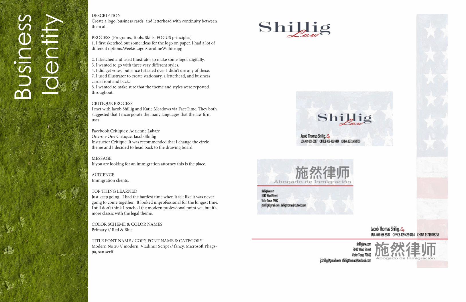
DESCRIPTIONCreate a logo, business cards, and letterhead with continuity between them all.
PROCESS (Programs, Tools, Skills, FOCUS principles)1. I first sketched out some ideas for the logo on paper. I had a lot of different options.Week6LogosCarolineWilhite.jpg
2. I sketched and used Illustrator to make some logos digitally.3. I wanted to go with three very different styles.4. I did get votes, but since I started over I didn’t use any of these.7. I used illustrator to create stationary, a letterhead, and business cards front and back.8. I wanted to make sure that the theme and styles were repeated throughout.
CRITIQUE PROCESSI met with Jacob Shillig and Katie Meadows via FaceTime. They both suggested that I incorporate the many languages that the law firm uses.
Facebook Critiques: Adrienne LabareOne-on-One Critique: Jacob ShilligInstructor Critique: It was recommended that I change the circle theme and I decided to head back to the drawing board.
MESSAGEIf you are looking for an immigration attorney this is the place.
AUDIENCEImmigration clients.
TOP THING LEARNEDJust keep going. I had the hardest time when it felt like it was never going to come together. It looked unprofessional for the longest time. I still don’t think I reached the modern professional point yet, but it’s more classic with the legal theme.
COLOR SCHEME & COLOR NAMESPrimary // Red & Blue
TITLE FONT NAME / COPY FONT NAME & CATEGORYModern No 20 // modern, Vladimir Script // fancy, Microsoft Phags-pa, san serif
Busin
ess
Ide
ntit
y

DESCRIPTION
Blend images
PROCESS (Programs, Tools, Skills, FOCUS principles)I first did my project incorrectly and spent many hours watching videos and tutorials. I shed some tears, said some prayers, and tried again (and again).
1. I used Photoshop to combine the two pictures. I created the mon-tage effect by blending the layers with the layer tools, brushes, lasso, and stamp. I did my best to blend the images seamlessly.2. I used my favorite quote from Mother Teresa to create a spiritual message.3. I tried to follow the design principles we have been taught this semester.
CRITIQUE PROCESS
I spent hours sharing my project to my sister in law in person, my husband via facetime, and my friend Katie via google chat. I took their feedback to heart and continued to work until I was able to blend the images like the examples I showed them.
Facebook Critiques were done by various members of my class and Sister Tranberg.One-on-One Critique: Katie MeadowsInstructor Critique: I was told that I used the incorrect method and therefore started over based on this critique.
MESSAGEThat we are to love more than judge.
AUDIENCEThose who wish to love one another as Christ taught us.
TOP THING LEARNEDTry and try and try again. Take the time to pray.
COLOR SCHEME & COLOR NAMESI chose a neutral color scheme of blue, brown, and white.
TITLE and COPY FONT NAME & CATEGORY
Century Gothic and Bodini MT
Mo
nta
ge
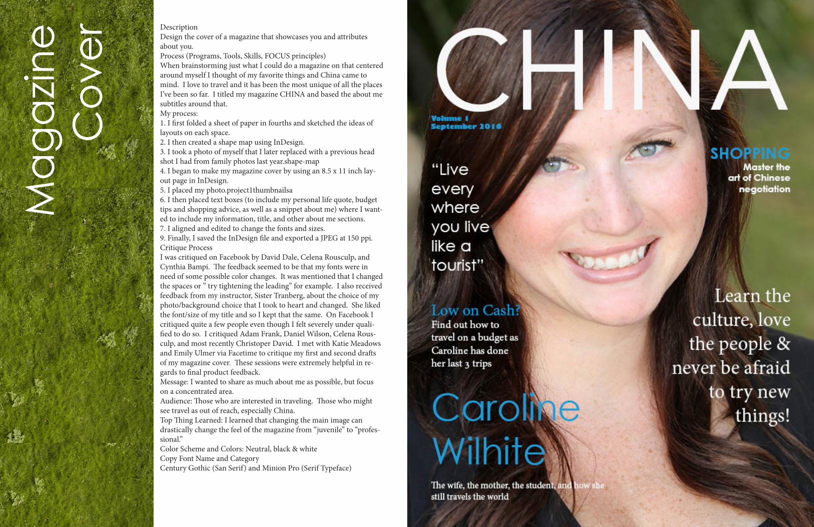
DescriptionDesign the cover of a magazine that showcases you and attributes about you.Process (Programs, Tools, Skills, FOCUS principles) When brainstorming just what I could do a magazine on that centered around myself I thought of my favorite things and China came to mind. I love to travel and it has been the most unique of all the places I’ve been so far. I titled my magazine CHINA and based the about me subtitles around that.My process:1. I first folded a sheet of paper in fourths and sketched the ideas of layouts on each space.2. I then created a shape map using InDesign.3. I took a photo of myself that I later replaced with a previous head shot I had from family photos last year.shape-map4. I began to make my magazine cover by using an 8.5 x 11 inch lay-out page in InDesign.5. I placed my photo.project1thumbnailsa6. I then placed text boxes (to include my personal life quote, budget tips and shopping advice, as well as a snippet about me) where I want-ed to include my information, title, and other about me sections.7. I aligned and edited to change the fonts and sizes.9. Finally, I saved the InDesign file and exported a JPEG at 150 ppi.Critique ProcessI was critiqued on Facebook by David Dale, Celena Rousculp, and Cynthia Bampi. The feedback seemed to be that my fonts were in need of some possible color changes. It was mentioned that I changed the spaces or ” try tightening the leading” for example. I also received feedback from my instructor, Sister Tranberg, about the choice of my photo/background choice that I took to heart and changed. She liked the font/size of my title and so I kept that the same. On Facebook I critiqued quite a few people even though I felt severely under quali-fied to do so. I critiqued Adam Frank, Daniel Wilson, Celena Rous-culp, and most recently Christoper David. I met with Katie Meadows and Emily Ulmer via Facetime to critique my first and second drafts of my magazine cover. These sessions were extremely helpful in re-gards to final product feedback.Message: I wanted to share as much about me as possible, but focus on a concentrated area.Audience: Those who are interested in traveling. Those who might see travel as out of reach, especially China.Top Thing Learned: I learned that changing the main image can drastically change the feel of the magazine from “juvenile” to “profes-sional.”Color Scheme and Colors: Neutral, black & whiteCopy Font Name and CategoryCentury Gothic (San Serif) and Minion Pro (Serif Typeface)
Ma
ga
zin
e
Co
ver

Pre
zi DESCRIPTIONCreate a presentation using Prezi.
PROCESS (Programs, Tools, Skills, FOCUS principles)I had never even heard of Prezi before this assignment so the learning curve was steep. Below are my steps.
1. I am not a naturally artsy person so I went with a simple block design idea. I drew out the design using the rule of thirds.project-1thumbnailsa
2. I downloaded some backgrounds to use from textures.com
3. Next I used InDesign to make the main layout with background and photos.
4. I then went to Prezi to add in my body so that the text would show up at the bottom for the “transcript.”
CRITIQUE PROCESSI shared my presentation with two friends far away and my husband. They helped with some feedback on straightening my fonts and align-ment.
Facebook Critiques: I posted, but due to time contraints was not able to follow-up.One-on-One Critique: Jacob Shillig, my husbandInstructor Critique: I emailed my instructor, but was unable to change things since I was traveling out of the country.
MESSAGEDo what you can, even if small.
AUDIENCEThose who are worried about their environment.
TOP THING LEARNEDThat this is an amazing tool if utilized correctly.
COLOR SCHEME & COLOR NAMESPrimary/Secondary Colors // Pink, Blue, Green, Orange, White, Black
TITLE FONT NAME & CATEGORYArimo // Sans Serif
COPY FONT NAME & CATEGORYArimo // Sans Serif
https://prezi.com/atjt_fjn8slw/how-to-save-water/?utm_cam-paign=share&utm_medium=copy

Info
gra
ph
icDESCRIPTIONCreate an infographic to organize data that is visually pleasing to the eye.
PROCESS (Programs, Tools, Skills, FOCUS principles)1. I started by researching topics forever hoping to somehow find something that clicked just right for me.artboard-1
2. After too much time searching the specific topic of immigration I switched over to a general compare/contrast.3. I made a plan and a rough draft that I submitted for critique.
4. I used illustrator to create the graphic beginning with a background I found online.5. I created the graphics, bar graph, and fonts to organize the data.
CRITIQUE PROCESSI shared my project with my husband via WeChat to see if the data was headed in the right direction and I met with Kaley Parish to show her my more finished project. The critiques were about placement of graphics and content to help with flow.
Facebook Critiques: Adrienne Labare and Adam FrankOne-on-One Critique: Kaley ParishInstructor Critique: It was recommended that I blend things and work on higharchy and flow.
MESSAGETo share facts about America and China.
AUDIENCEAnyone who is interested in learning about America or China.
TOP THING LEARNEDIllustrator is not easy and I have much to learn for that polished look.
COLOR SCHEME & COLOR NAMESPrimary Colors // Red and Blue
TITLE & COPY FONT NAME & CATEGORYTwin Cen MT & Freestyle // Sans Serif & Script

Co
din
g DESCRIPTIONCode a custom webpage with HTML and CSS.
PROCESS (Programs, Tools, Skills, FOCUS principles)1. First I opened my previous logo in Illustrator.2. I watched a video and resized my logo to be 250×250 and adjusted the artboard accordingly.3. I created my HTML file in handcraft.4. Then I created my CSS file, renamed it, and made sure to link it in the HTML code.5. I made MANY changes in my CSS to match the colors in my logo and changed the fonts to what I preferred. I downloaded the eyedrop-per in chrome to match the colors of my logo.6. I created the background with a map I found online.7. I then made sure to validate my HTML and CSS.
CRITIQUE PROCESSI worked closely with Adrienne and Caitlyn from class and they walked me through many many things when it came to the specifics and proofreading of my code. I sent my link repeatedly to my friend, Katie, who helped me with the aesthetic look of it.
Facebook Critiques: Melanie and Adam gave great feedback to help with some holes in my code.One-on-One Critique: Adrienne LabareInstructor Critique: My instructor couldn’t give me much in the form of critique since I was still in the bare bones stage.
MESSAGEAdvertise immigration law firm for my husband.
AUDIENCEThose interested in immigration.
TOP THING LEARNEDTry to fix all cosmetic things via CSS.
COLOR SCHEME & COLOR NAMESNeutral//blue and grey
TITLE & COPY FONT NAME & CATEGORYVerdana // Sans Serif

DESCRIPTIONDesign a website homepage using a grid.
PROCESS (Programs, Tools, Skills, FOCUS principles)1. I chose the topic of my husband’s recently started law firm.2. I sketched ideas of how I wanted it to ultimately look.3. I used the grid to create the wire frame to give me an idea of just how I wanted to lay things out.4. I then used Photoshop to add actual content and make the mock up.5. My final design was a complete 180 after reading many blogs about law websites and trying to go a little more traditional.
CRITIQUE PROCESSI shared my idea via google chat/video with my friend Katie in Ne-vada. She gave me some feedback and critiques that were helpful. I changed the idea based on her feedback about color scheme.
Facebook Critiques: David, David, Caitlin, Adrienne, CelenaOne-on-One Critique: Emily UlmerInstructor Critique: My instructor gave me the idea to look up top ten law websites for example.
MESSAGEAdvertise an immigration law firm.
AUDIENCEAnyone interested in immigration.
TOP THING LEARNEDThe use of folders/layers.
COLOR SCHEME & COLOR NAMESNeutral // Brown, Black, White, Gray, Blue
TITLE FONT NAME & CATEGORYCasteller // Serif
COPY FONT NAME & CATEGORYCentury Gothic // Sans Serif
We
b P
ag
e
Mo
cku
p

DESCRIPTIONDesign a brochure for a company.
PROCESS (Programs, Tools, Skills, FOCUS principles)1. I first created the logo and placed it on both pages.2. Then I used InDesign and to start designing my brochure. I wrote my body copy in Word.3. I added photos, headings, subheadings, and body copy to replace text place holders.4. I then exported the brochure document as JPEGS.
CRITIQUE PROCESSI shared my brochure via google hangouts with my friend Katie from NV. She is also going to school online through BYU-I. She suggested lightening up the gray so the logo stood out more.
Facebook Critique: CaitlinOne-on-One Critique: Jacob Shillig
Instructor Critique: My instructor told me to work on some spac-ing issues, the size of the stroke on my images, and the gray that was masking the logo.
MESSAGETo share the info of business and immigration opportunities
AUDIENCEThose interested in immigration mostly
TOP THING LEARNEDThe print settings have a setup tab that flips things when you print them
COLOR SCHEME & COLOR NAMESNeutral gray/white/black with a pop of dark red.
TITLE FONT NAME & CATEGORYMinion Pro// Serif
COPY FONT NAME & CATEGORYMicrosoft Sans Serif // Sans Serif
Bro
ch
ure
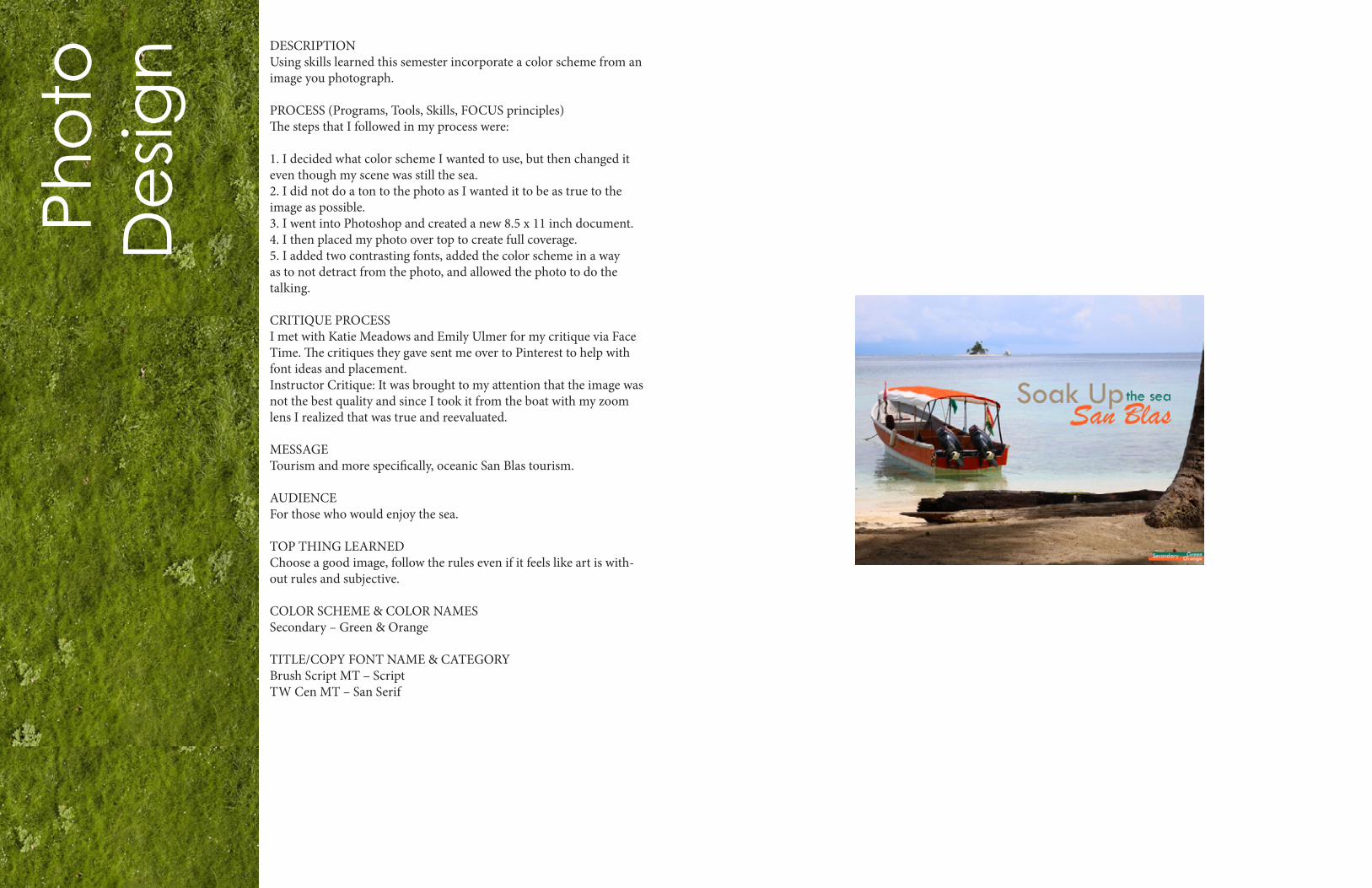
DESCRIPTIONUsing skills learned this semester incorporate a color scheme from an image you photograph.
PROCESS (Programs, Tools, Skills, FOCUS principles)The steps that I followed in my process were:
1. I decided what color scheme I wanted to use, but then changed it even though my scene was still the sea.2. I did not do a ton to the photo as I wanted it to be as true to the image as possible.3. I went into Photoshop and created a new 8.5 x 11 inch document.4. I then placed my photo over top to create full coverage.5. I added two contrasting fonts, added the color scheme in a way as to not detract from the photo, and allowed the photo to do the talking.
CRITIQUE PROCESSI met with Katie Meadows and Emily Ulmer for my critique via Face Time. The critiques they gave sent me over to Pinterest to help with font ideas and placement.Instructor Critique: It was brought to my attention that the image was not the best quality and since I took it from the boat with my zoom lens I realized that was true and reevaluated.
MESSAGETourism and more specifically, oceanic San Blas tourism.
AUDIENCEFor those who would enjoy the sea.
TOP THING LEARNEDChoose a good image, follow the rules even if it feels like art is with-out rules and subjective.
COLOR SCHEME & COLOR NAMESSecondary – Green & Orange
TITLE/COPY FONT NAME & CATEGORYBrush Script MT – ScriptTW Cen MT – San Serif
Pho
to
De
sign