comm-130 portfolio
TRANSCRIPT
portfolio...Kylee Priest
Kylee Priest:617 W Goldenrod Way
Saratoga Springs, UT 84045
385.335.9961www.kyleepriest.wordpress.com
contact table of contents
Magazie Cover
Prezi Presentation
Photo Design
Montage
Business Identity
Infographic
Coding
Web Page Mockup
Brochure
Outside Projects
Logo
Photography
Photo Design
1
2
3
4
5
6
7
8
9
10
11
12
magazine cover
Description:
Process:
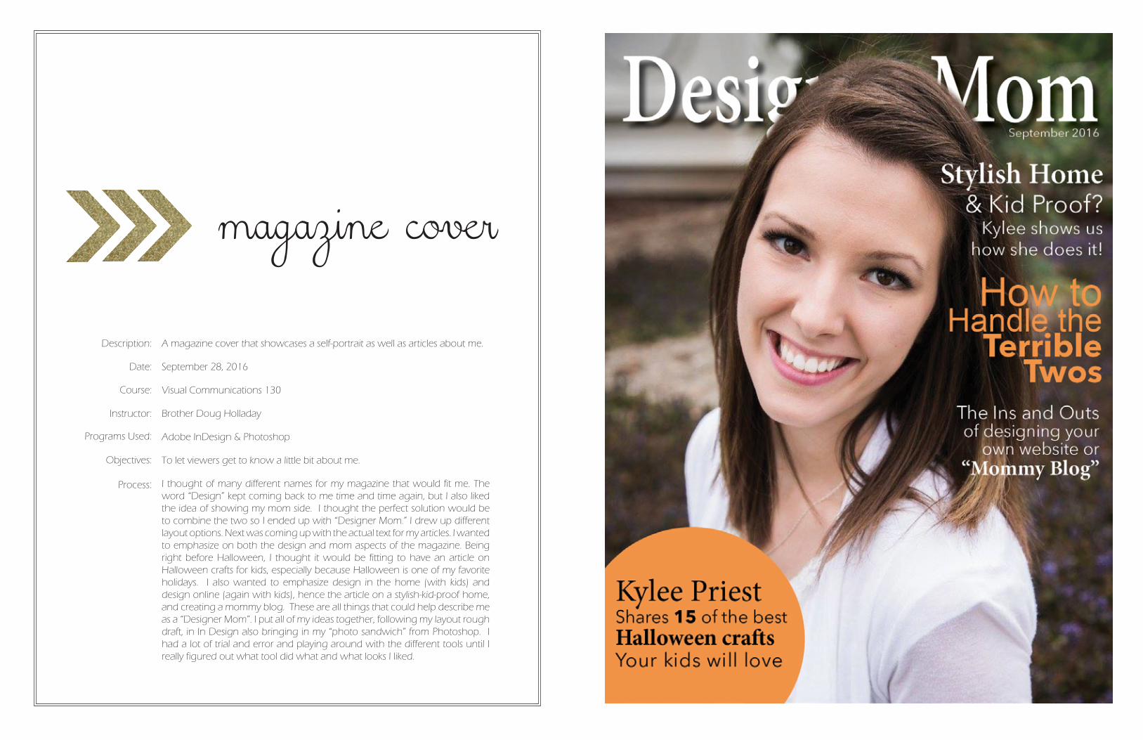
A magazine cover that showcases a self-portrait as well as articles about me.
September 28, 2016
Visual Communications 130
Brother Doug Holladay
Adobe InDesign & Photoshop
To let viewers get to know a little bit about me.
I thought of many different names for my magazine that would fit me. The word “Design” kept coming back to me time and time again, but I also liked the idea of showing my mom side. I thought the perfect solution would be to combine the two so I ended up with “Designer Mom.” I drew up different layout options. Next was coming up with the actual text for my articles. I wanted to emphasize on both the design and mom aspects of the magazine. Being right before Halloween, I thought it would be fitting to have an article on Halloween crafts for kids, especially because Halloween is one of my favorite holidays. I also wanted to emphasize design in the home (with kids) and design online (again with kids), hence the article on a stylish-kid-proof home, and creating a mommy blog. These are all things that could help describe me as a “Designer Mom”. I put all of my ideas together, following my layout rough draft, in In Design also bringing in my “photo sandwich” from Photoshop. I had a lot of trial and error and playing around with the different tools until I really figured out what tool did what and what looks I liked.
Date:
Course:
Instructor:
Programs Used:
Objectives:
prezi presentationDescription:
Process:
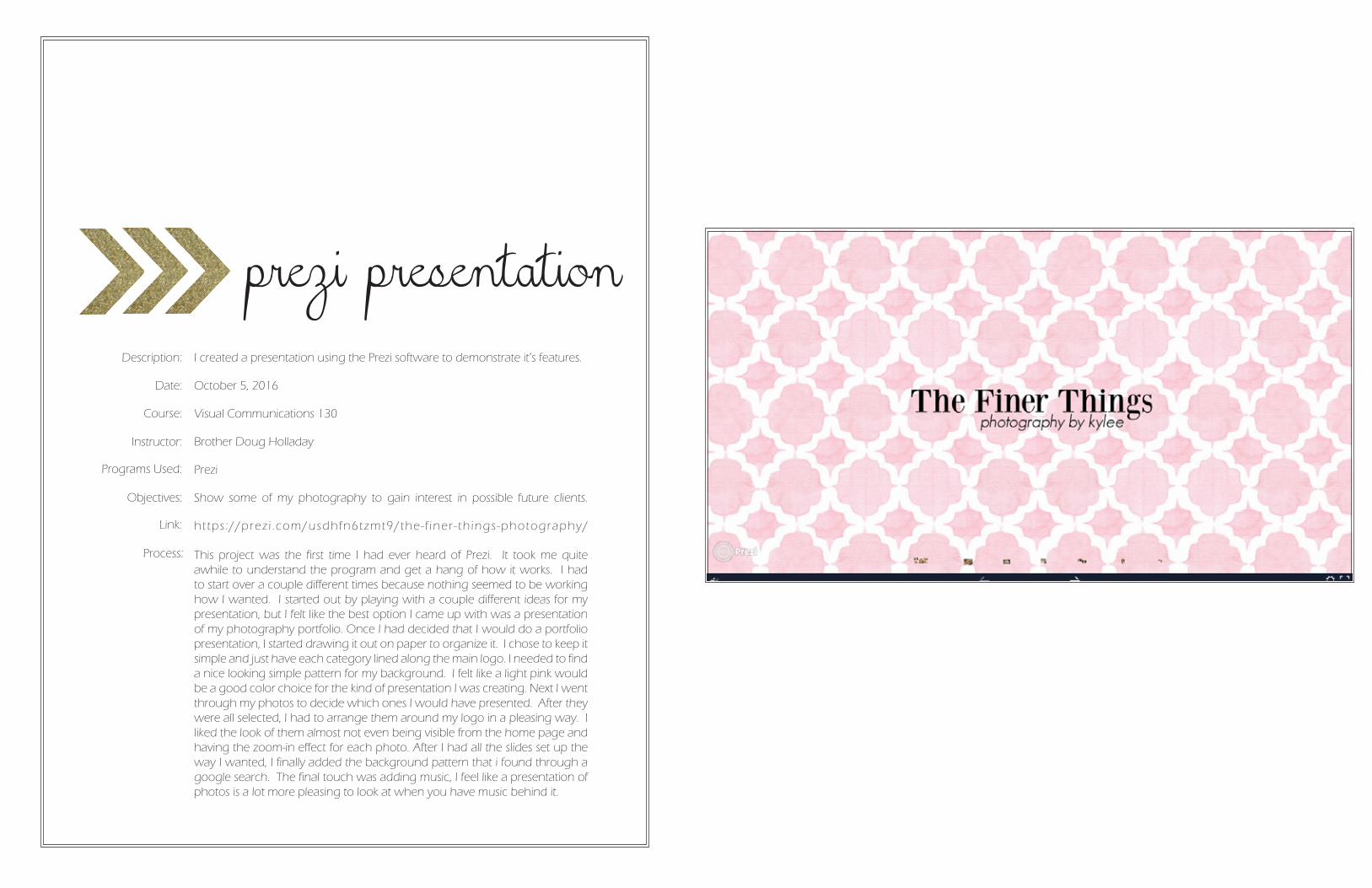
I created a presentation using the Prezi software to demonstrate it’s features.
October 5, 2016
Visual Communications 130
Brother Doug Holladay
Prezi
Show some of my photography to gain interest in possible future clients.
ht tps ://prez i .com/usdhfn6tzmt9/the- f iner - th ings-photography/
This project was the first time I had ever heard of Prezi. It took me quite awhile to understand the program and get a hang of how it works. I had to start over a couple different times because nothing seemed to be working how I wanted. I started out by playing with a couple different ideas for my presentation, but I felt like the best option I came up with was a presentation of my photography portfolio. Once I had decided that I would do a portfolio presentation, I started drawing it out on paper to organize it. I chose to keep it simple and just have each category lined along the main logo. I needed to find a nice looking simple pattern for my background. I felt like a light pink would be a good color choice for the kind of presentation I was creating. Next I went through my photos to decide which ones I would have presented. After they were all selected, I had to arrange them around my logo in a pleasing way. I liked the look of them almost not even being visible from the home page and having the zoom-in effect for each photo. After I had all the slides set up the way I wanted, I finally added the background pattern that i found through a google search. The final touch was adding music, I feel like a presentation of photos is a lot more pleasing to look at when you have music behind it.
Date:
Course:
Instructor:
Programs Used:
Objectives:
Link:
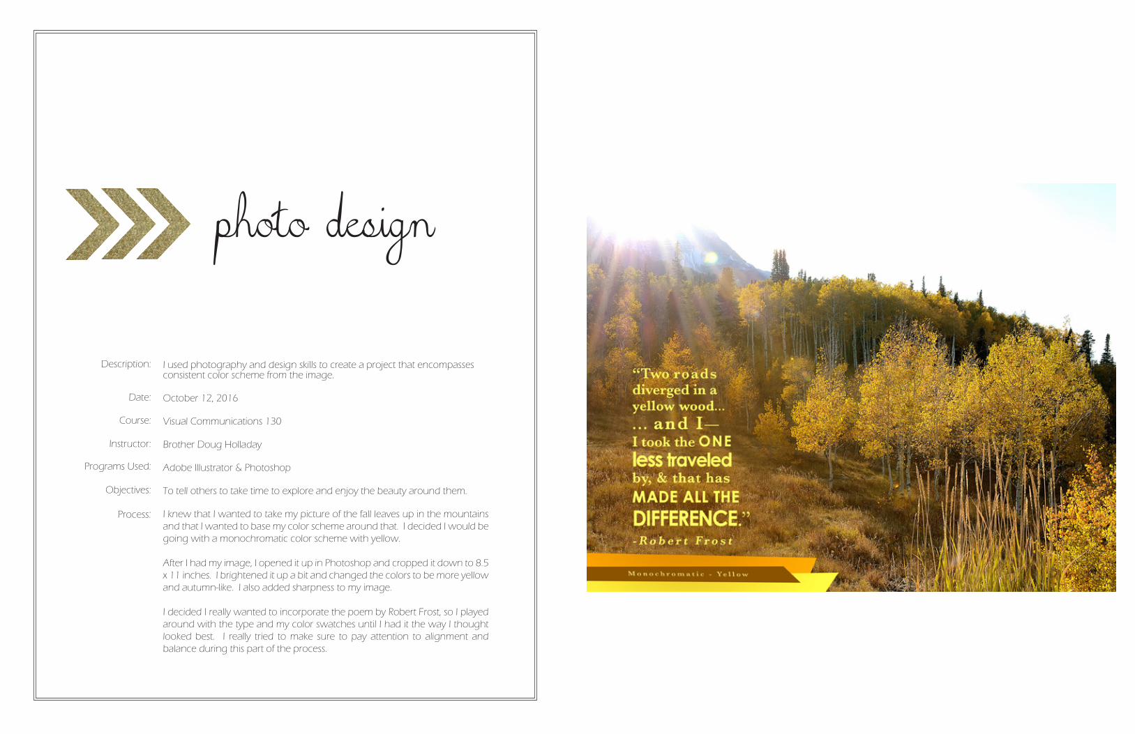
photo design
Description:
Process:
I used photography and design skills to create a project that encompasses consistent color scheme from the image.
October 12, 2016
Visual Communications 130
Brother Doug Holladay
Adobe Illustrator & Photoshop
To tell others to take time to explore and enjoy the beauty around them.
I knew that I wanted to take my picture of the fall leaves up in the mountains and that I wanted to base my color scheme around that. I decided I would be going with a monochromatic color scheme with yellow.
After I had my image, I opened it up in Photoshop and cropped it down to 8.5 x 11 inches. I brightened it up a bit and changed the colors to be more yellow and autumn-like. I also added sharpness to my image.
I decided I really wanted to incorporate the poem by Robert Frost, so I played around with the type and my color swatches until I had it the way I thought looked best. I really tried to make sure to pay attention to alignment and balance during this part of the process.
Date:
Course:
Instructor:
Programs Used:
Objectives:
montage
Description:
Process:
Design a spiritual poster montage using the blend of images and type.
October 19, 2016
Visual Communications 130
Brother Doug Holladay
Adobe Illustrator & Photoshop
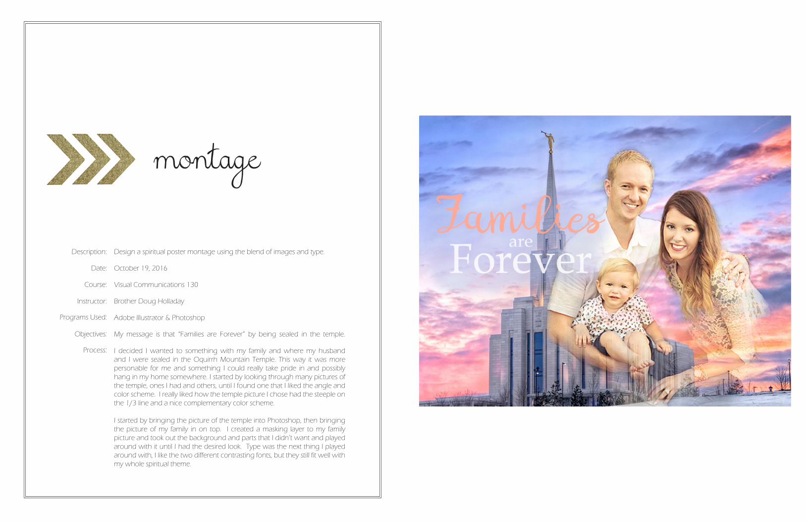
My message is that “Families are Forever” by being sealed in the temple.
I decided I wanted to something with my family and where my husband and I were sealed in the Oquirrh Mountain Temple. This way it was more personable for me and something I could really take pride in and possibly hang in my home somewhere. I started by looking through many pictures of the temple, ones I had and others, until I found one that I liked the angle and color scheme. I really liked how the temple picture I chose had the steeple on the 1/3 line and a nice complementary color scheme.
I started by bringing the picture of the temple into Photoshop, then bringing the picture of my family in on top. I created a masking layer to my family picture and took out the background and parts that I didn’t want and played around with it until I had the desired look. Type was the next thing I played around with, I like the two different contrasting fonts, but they still fit well with my whole spiritual theme.
Date:
Course:
Instructor:
Programs Used:
Objectives:
business identity
logos
Description:
Process:
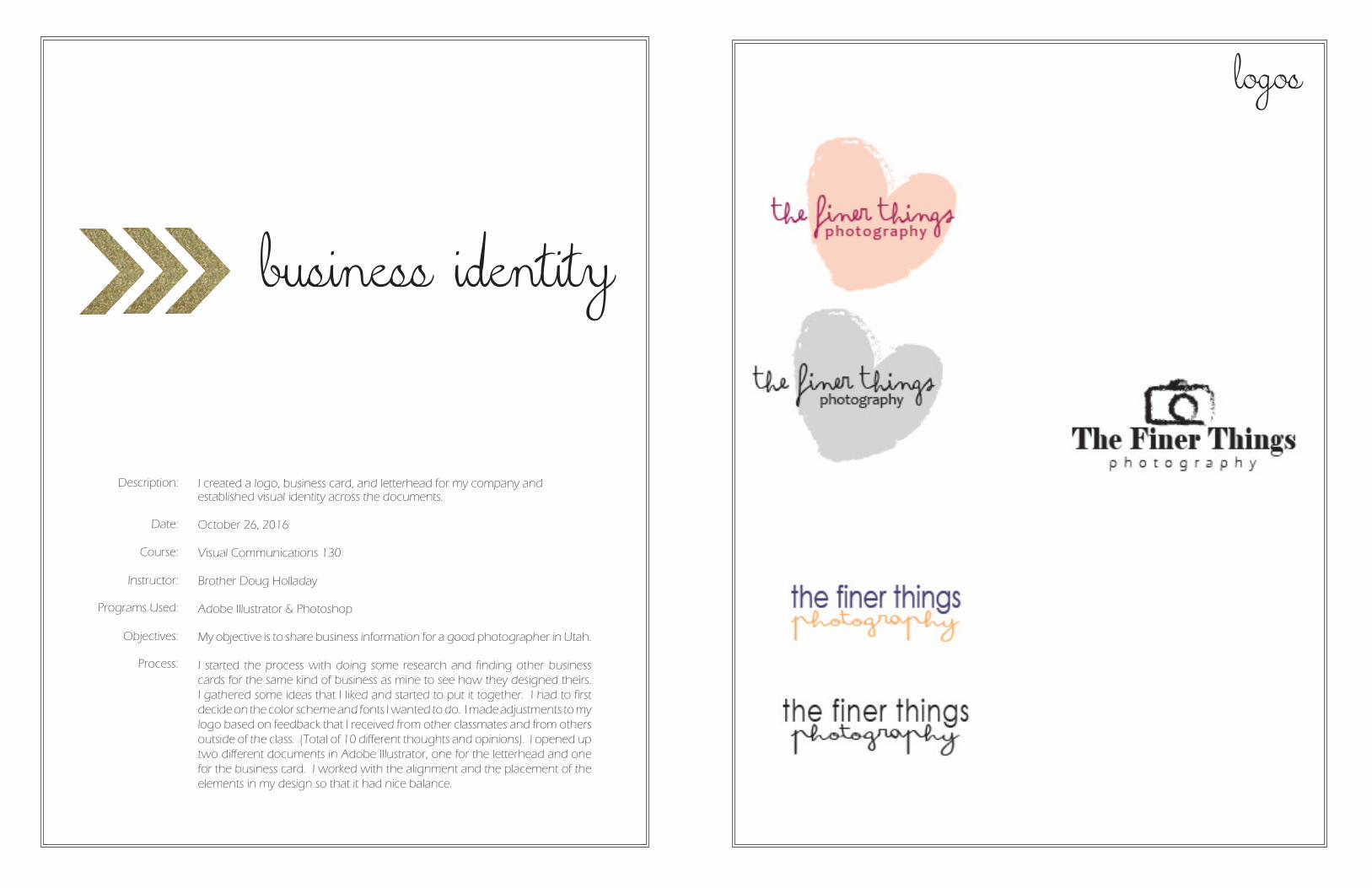
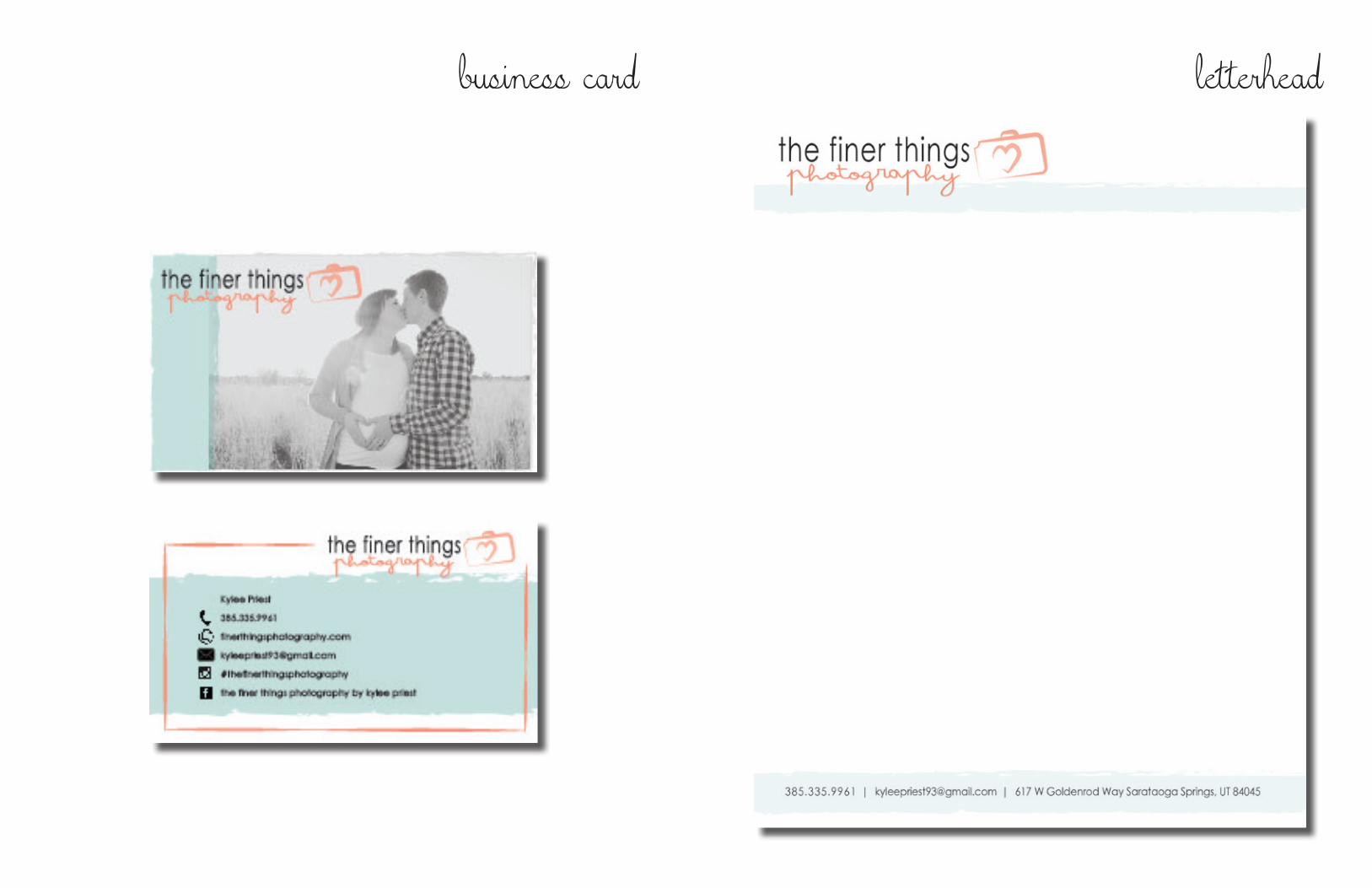
I created a logo, business card, and letterhead for my company and established visual identity across the documents.
October 26, 2016
Visual Communications 130
Brother Doug Holladay
Adobe Illustrator & Photoshop
My objective is to share business information for a good photographer in Utah.
I started the process with doing some research and finding other business cards for the same kind of business as mine to see how they designed theirs. I gathered some ideas that I liked and started to put it together. I had to first decide on the color scheme and fonts I wanted to do. I made adjustments to my logo based on feedback that I received from other classmates and from others outside of the class. (Total of 10 different thoughts and opinions). I opened up two different documents in Adobe Illustrator, one for the letterhead and one for the business card. I worked with the alignment and the placement of the elements in my design so that it had nice balance.
Date:
Course:
Instructor:
Programs Used:
Objectives:
logos
business card letterhead
infographic
Description:
Process:
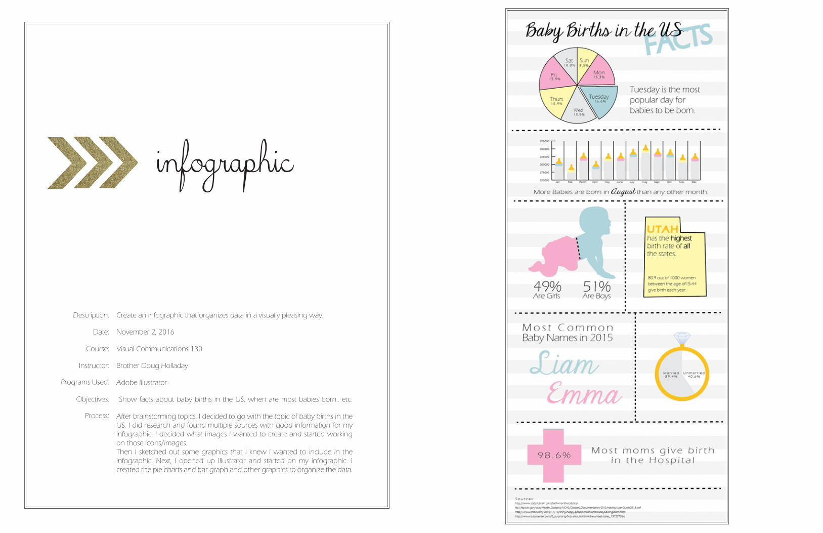
Create an infographic that organizes data in a visually pleasing way.
November 2, 2016
Visual Communications 130
Brother Doug Holladay
Adobe Illustrator
Show facts about baby births in the US, when are most babies born.. etc.
After brainstorming topics, I decided to go with the topic of baby births in the US. I did research and found multiple sources with good information for my infographic. I decided what images I wanted to create and started working on those icons/images.Then I sketched out some graphics that I knew I wanted to include in the infographic. Next, I opened up Illustrator and started on my infographic. I created the pie charts and bar graph and other graphics to organize the data.
Date:
Course:
Instructor:
Programs Used:
Objectives:
coding
Description:
Process:
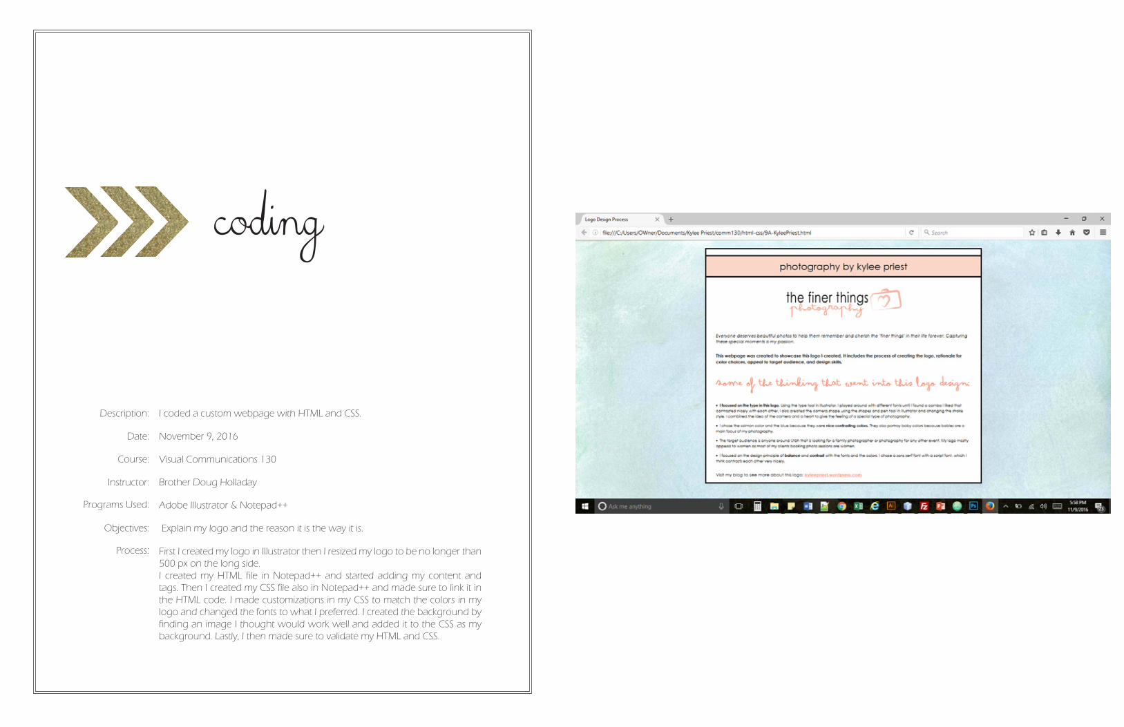
I coded a custom webpage with HTML and CSS.
November 9, 2016
Visual Communications 130
Brother Doug Holladay
Adobe Illustrator & Notepad++
Explain my logo and the reason it is the way it is.
First I created my logo in Illustrator then I resized my logo to be no longer than 500 px on the long side.I created my HTML file in Notepad++ and started adding my content and tags. Then I created my CSS file also in Notepad++ and made sure to link it in the HTML code. I made customizations in my CSS to match the colors in my logo and changed the fonts to what I preferred. I created the background by finding an image I thought would work well and added it to the CSS as my background. Lastly, I then made sure to validate my HTML and CSS.
Date:
Course:
Instructor:
Programs Used:
Objectives:
web page mockup
Description:
Process:
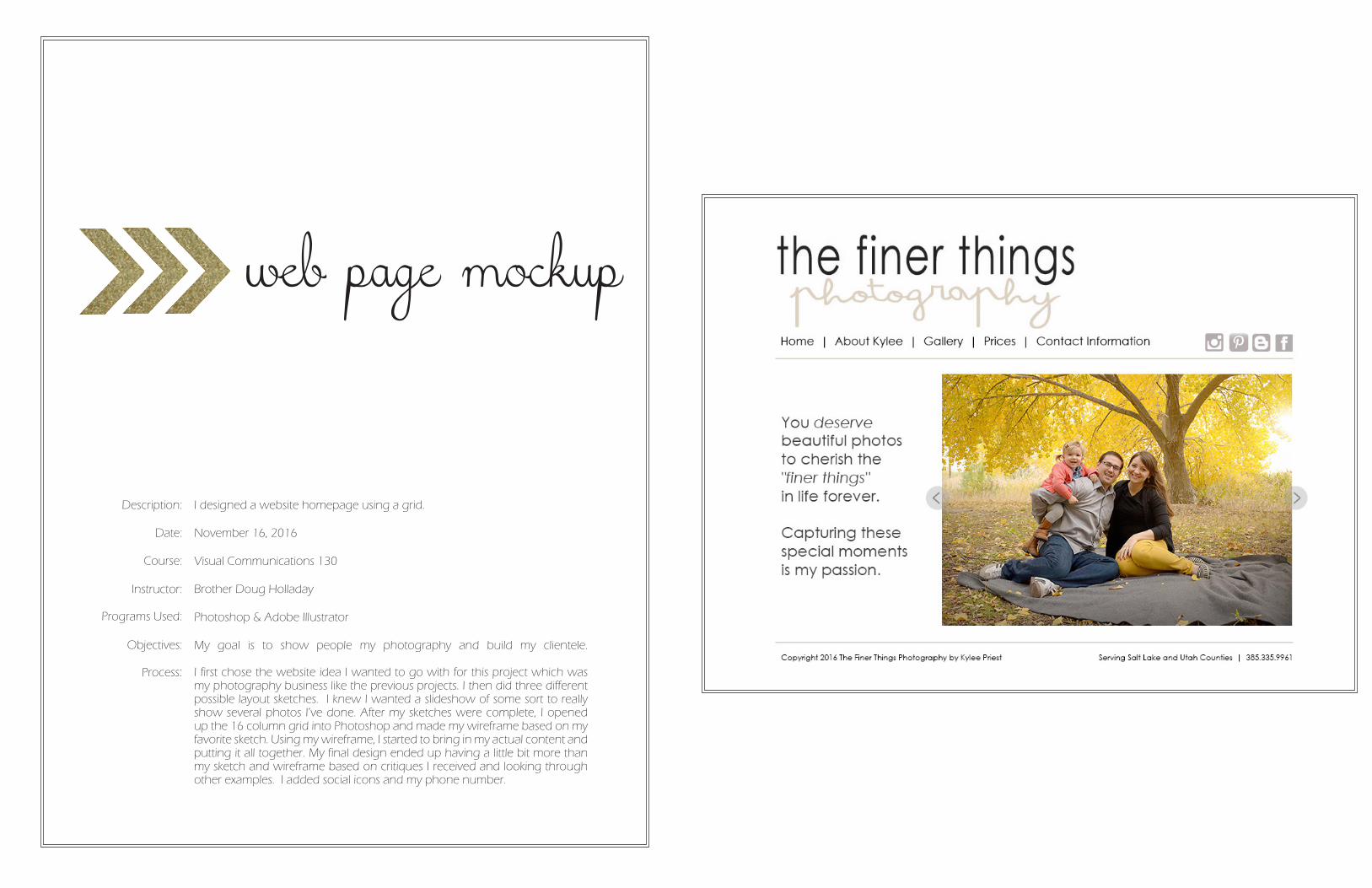
I designed a website homepage using a grid.
November 16, 2016
Visual Communications 130
Brother Doug Holladay
Photoshop & Adobe Illustrator
My goal is to show people my photography and build my clientele.
I first chose the website idea I wanted to go with for this project which was my photography business like the previous projects. I then did three different possible layout sketches. I knew I wanted a slideshow of some sort to really show several photos I’ve done. After my sketches were complete, I opened up the 16 column grid into Photoshop and made my wireframe based on my favorite sketch. Using my wireframe, I started to bring in my actual content and putting it all together. My final design ended up having a little bit more than my sketch and wireframe based on critiques I received and looking through other examples. I added social icons and my phone number.
Date:
Course:
Instructor:
Programs Used:
Objectives:
brochure
Description:
Process:
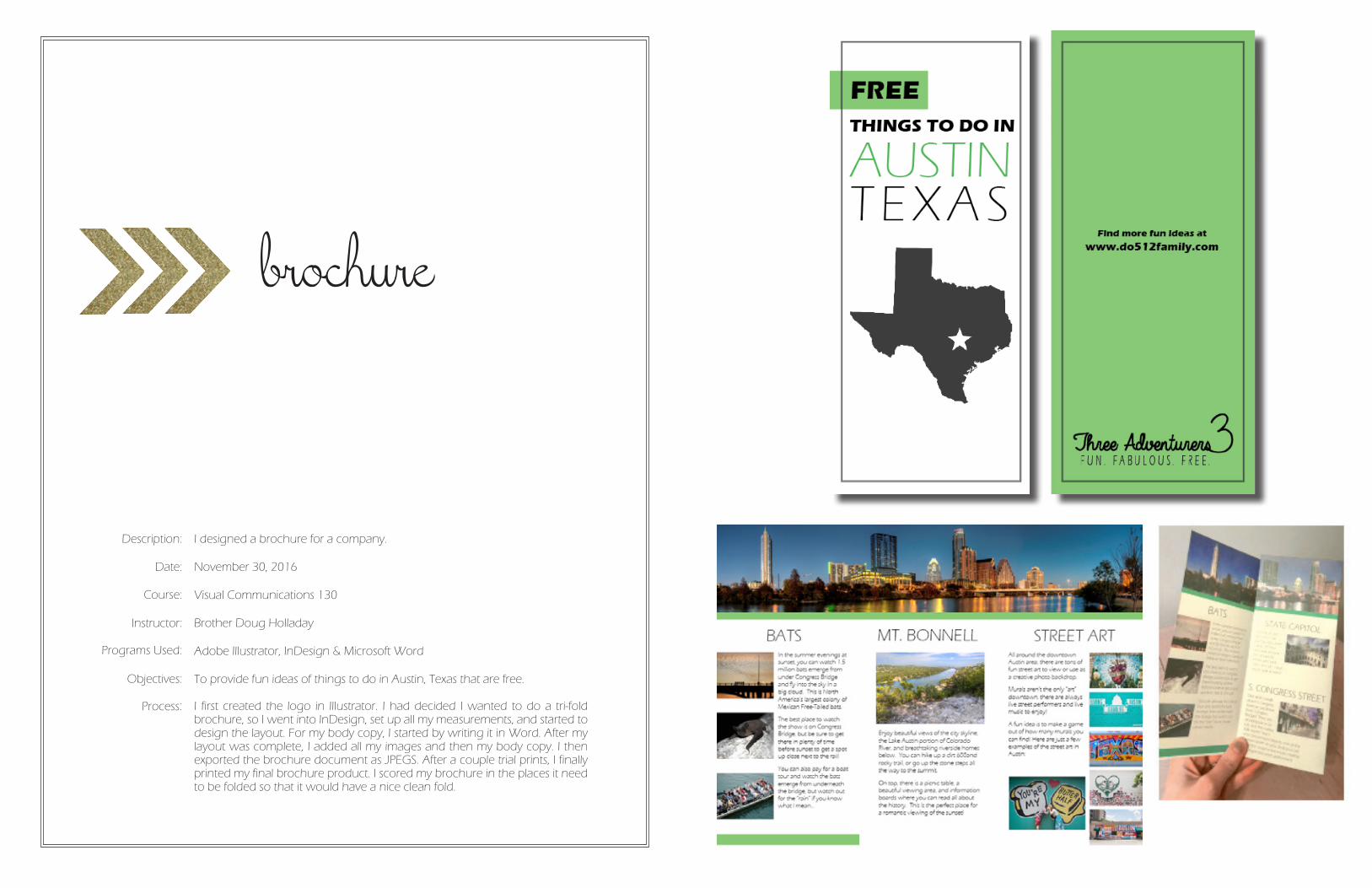
I designed a brochure for a company.
November 30, 2016
Visual Communications 130
Brother Doug Holladay
Adobe Illustrator, InDesign & Microsoft Word
To provide fun ideas of things to do in Austin, Texas that are free.
I first created the logo in Illustrator. I had decided I wanted to do a tri-fold brochure, so I went into InDesign, set up all my measurements, and started to design the layout. For my body copy, I started by writing it in Word. After my layout was complete, I added all my images and then my body copy. I then exported the brochure document as JPEGS. After a couple trial prints, I finally printed my final brochure product. I scored my brochure in the places it need to be folded so that it would have a nice clean fold.
Date:
Course:
Instructor:
Programs Used:
Objectives:
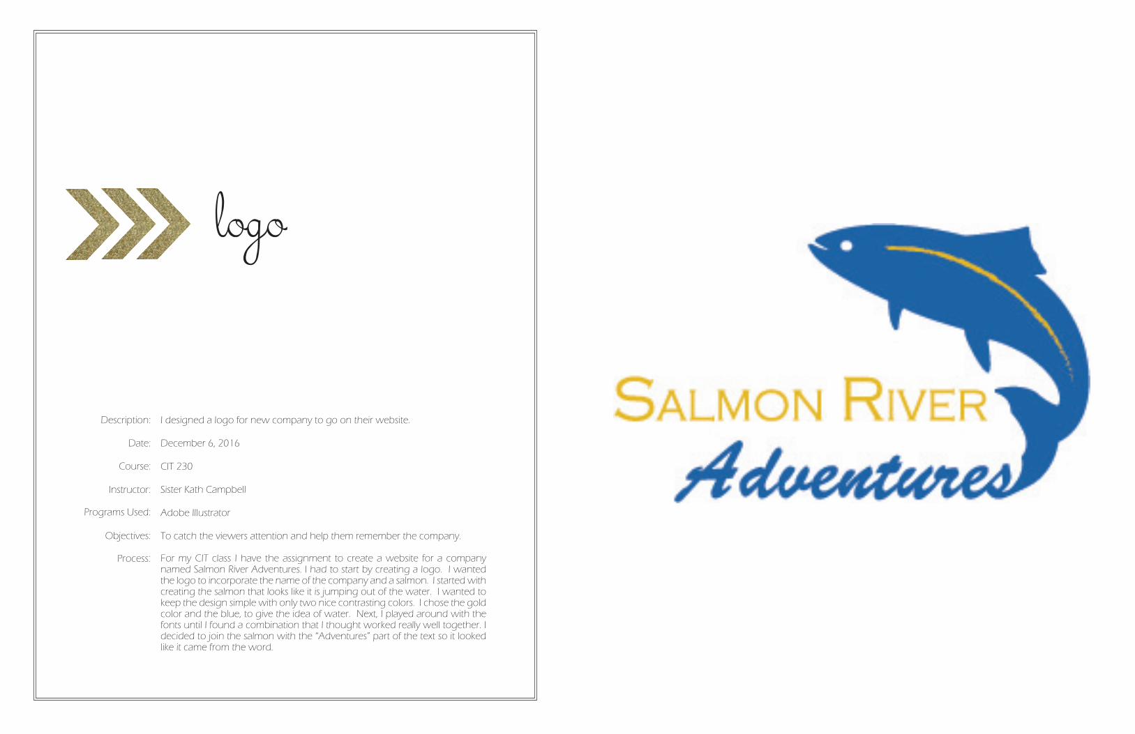
logo
Description:
Process:
I designed a logo for new company to go on their website.
December 6, 2016
CIT 230
Sister Kath Campbell
Adobe Illustrator
To catch the viewers attention and help them remember the company.
For my CIT class I have the assignment to create a website for a company named Salmon River Adventures. I had to start by creating a logo. I wanted the logo to incorporate the name of the company and a salmon. I started with creating the salmon that looks like it is jumping out of the water. I wanted to keep the design simple with only two nice contrasting colors. I chose the gold color and the blue, to give the idea of water. Next, I played around with the fonts until I found a combination that I thought worked really well together. I decided to join the salmon with the “Adventures” part of the text so it looked like it came from the word.
Date:
Course:
Instructor:
Programs Used:
Objectives:
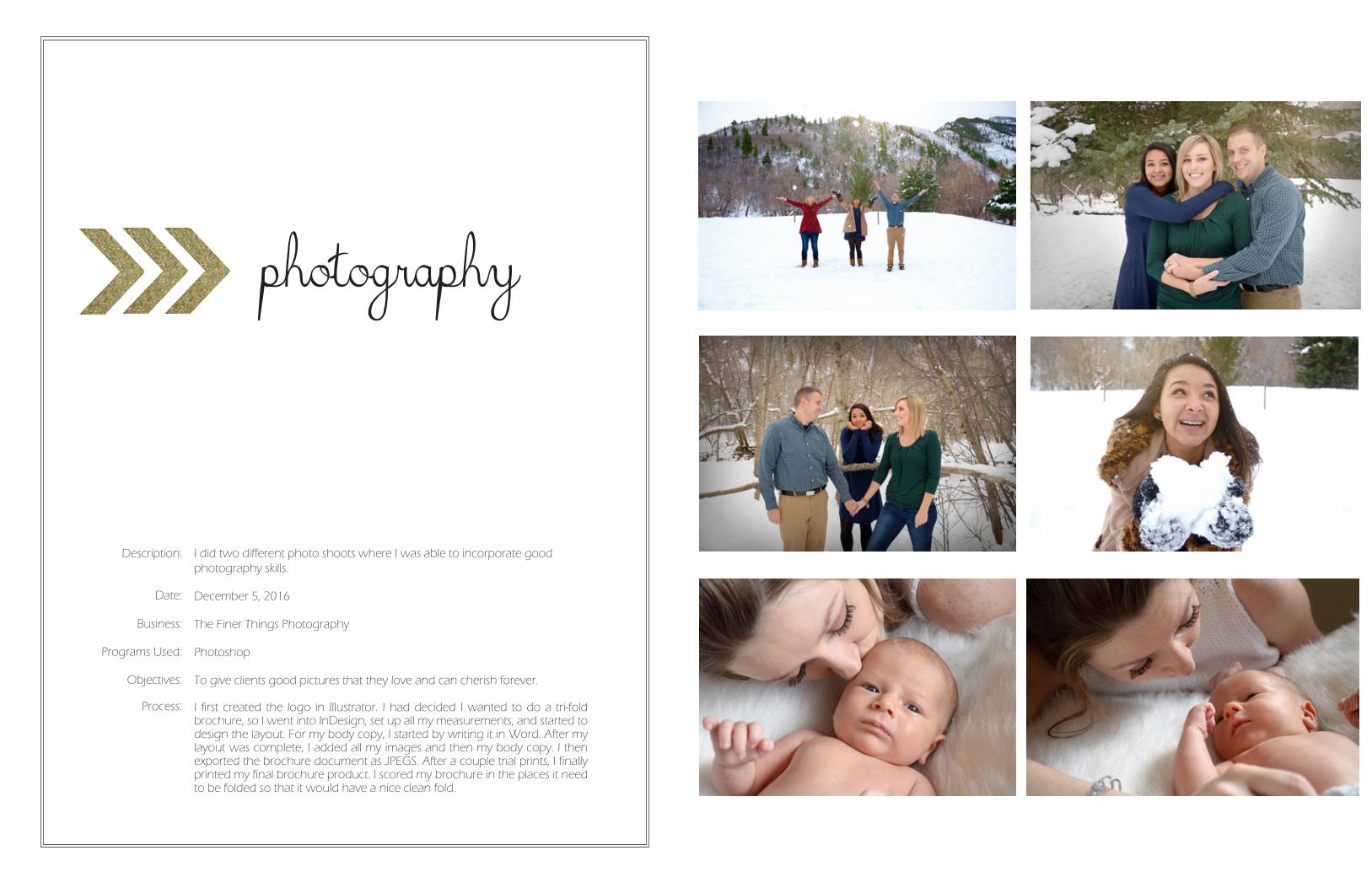
photography
Description:
Process:
I did two different photo shoots where I was able to incorporate good photography skills.
December 5, 2016
The Finer Things Photography
Photoshop
To give clients good pictures that they love and can cherish forever.
I first created the logo in Illustrator. I had decided I wanted to do a tri-fold brochure, so I went into InDesign, set up all my measurements, and started to design the layout. For my body copy, I started by writing it in Word. After my layout was complete, I added all my images and then my body copy. I then exported the brochure document as JPEGS. After a couple trial prints, I finally printed my final brochure product. I scored my brochure in the places it need to be folded so that it would have a nice clean fold.
Date:
Business:
Programs Used:
Objectives:
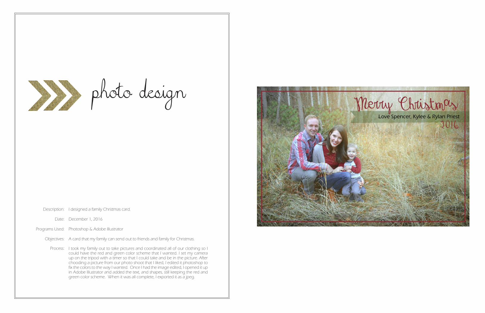
photo design
Description:
Process:
I designed a family Christmas card.
December 1, 2016
Photoshop & Adobe Illustrator
A card that my family can send out to friends and family for Christmas.
I took my family out to take pictures and coordinated all of our clothing so I could have the red and green color scheme that I wanted. I set my camera up on the tripod with a timer so that I could take and be in the picture. After chooding a picture from our photo shoot that I liked, I edited it photoshop to fix the colors to the way I wanted. Once I had the image edited, I opened it up in Adobe Illustrator and added the text, and shapes, still keeping the red and green color scheme. When it was all complete, I exported it as a jpeg.
Date:
Programs Used:
Objectives: