chapter 1 – exploring data...1 chapter 1 – exploring data lesson objectives: in this chapter we...
TRANSCRIPT

1
Chapter 1 – Exploring Data Lesson Objectives: In this chapter we will focus on creating appropriate graphs based upon both categorical and quantitative data sets. We will also learn how to describe the main features of a given data set (Shape, Center, Spread, and Outliers). The purpose of learning how to do this kind of exploratory data analysis is to gain an understanding about the topic that is being analyzed so that in latter chapters we can gather information from the data collected from samples in order to draw conclusions about the whole population.
Date Topics Objectives: Students will be able to… Assignment
Jan 29
Chapter 1 Introduction
• Identify the individuals and variables in a set of data.
• Classify variables as categorical or quantitative. Identify units of measurement for a quantitative variable.
TPS: Read pg. 4 – 5 Complete page 2 of Chapter 1 Packet
1.1 Bar Graphs and Pie Charts,
• Make a bar graph of the distribution of a categorical variable or, in general, to compare related quantities.
• Recognize when a pie chart can and cannot be used.
•
TPS: Read pg. 8 – 10. Watch Video #1 – Take notes. Complete pg. 3 - 4 of Chapter 1 Packet
1.2 Dotplots, Describing Shape, Comparing Distributions, Stemplots
• Make a dotplot or stemplot to display small sets of data.
• Describe the overall pattern (shape, center, spread) of a distribution and identify any major departures from the pattern (like outliers).
• Identify the shape of a distribution from a dotplot, stemplot, or histogram as roughly symmetric or skewed. Identify the number of modes.
TPS: Read pg. 11 - 16. Watch Video #2 – Take notes. Complete page 5 -6 of Chapter 1 Packet
Jan 30
1.2 Histograms, Using Histograms Wisely
• Make a histogram with a reasonable choice of classes.
• Identify the shape of a distribution from a dotplot, stemplot, or histogram as roughly symmetric or skewed. Identify the number of modes.
• Interpret histograms.
TPS: Read pg. 18 -22. Watch Video #3 – Take notes. Complete pg. 7 - 9 of Chapter 1 Packet
1.2 Measuring Center: Mean and Median, Comparing Mean and Median, Measuring Spread: IQR, Identifying Outliers
• Calculate and interpret measures of center (mean, median)
• Calculate and interpret measures of spread (IQR)
• Identify outliers using the 1.5 × IQR rule.
TPS: Read pg. 37 - 44. Watch Video #4 – Take notes. Complete pg. 10 -12 of Chapter 1 Packet
Feb 1
1.2 Five Number Summary and Boxplots, Measuring Spread: Standard Deviation, Choosing Measures of Center and Spread
• Make a boxplot. • Calculate and interpret measures of spread
(standard deviation) • Select appropriate measures of center and
spread • Use appropriate graphs and numerical
summaries to compare distributions of quantitative variables.
TPS: Read pg. 44 - 52. Watch Video #5 – Take notes. Complete pg. 14 -17 of Chapter 1 Packet
Chapter 1 Packet Due Feb. 2, 2018. Start Chapter 2 Packet.
2
Chapter 1 - Introduction
Answer the following questions as you read Chapter 1. READ FOR UNDERSTANDING! 1. What is statistics? _____________________________________________________________
2. Define Individuals. _____________________________________________________________
_____________________________________________________________________________
3. Define a variable. ______________________________________________________________
_____________________________________________________________________________
4. Define a categorical variable. _____________________________________________________
_____________________________________________________________________________
5. Define a quantitative variable. _____________________________________________________
_____________________________________________________________________________
6. Give three examples of categorical variables that are numerical (do NOT include zip codes!!!)
a. _______________________ b. _______________________ c. ______________________
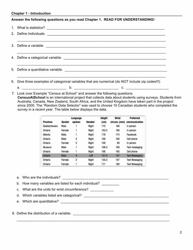
7. Look over Example “Census at School” and answer the following questions. CensusAtSchool is an international project that collects data about students using surveys. Students from Australia, Canada, New Zealand, South Africa, and the United Kingdom have taken part in the project since 2000. The “Random Data Selector” was used to choose 10 Canadian students who completed the survey in a recent year. The table below displays the data.
a. Who are the individuals? _______________________________________________________
b. How many variables are listed for each individual? _________
c. What are the units for wrist circumference? ____________
d. Which variables listed are categorical? ____________________________________________
e. Which are quantitative? ________________________________________________________
8. Define the distribution of a variable. __________________________________________________
_______________________________________________________________________________

3
Section 1.1 – Analyzing Categorical Data [Watch VIDEO #1]
Graphing Categorical Variables: Pie Chart & Bar Graph
The following table displays the sales figures and market share (percent of total sales) achieved by several major soft drink companies in 1999. That year, a total of 9930 million cases of soft drink were sold. Company Cases sold (millions) Market Share (percent) Coca-Cola Co. 4377.5 44.1 Pepsi-Cola Co. 3119.5 31.4 Dr. Pepper / 7-Up 1455.1 14.7 Cott Corp. 310.0 3.1 National Beverage 205 2.1 Royal Crown 115.4 1.2 Other 347.5 3.4 To Create a Bar Graph:
1. Label your axes and title your graph.
2. Scale your axes. Use the counts in each category to help you scale your vertical axis. Write the category names at equally spaced intervals beneath the horizontal axis.
3. Draw a vertical bar above each category name to the height
that corresponds to the count in that category. Leave spaces between the bars.
***Variations*** - Segmented and Side-by-Side Bar Graphs
• Segmented: used to compare two or more differences within the same variable (gender, grade level, etc.) o Each bar ALWAYS goes to 100% o Each category’s bar is one-dimensional (length)
• Side-by-Side: like a segmented, but each category’s
bar can be two-dimensional (length and width)

4
To Create a Pie Chart: 1. Calculate what percent of the whole each category is
(if its not given to you!).
2. Multiply the percent by 360 to determine what portion of a circle the category should take up.
3. Draw a circle and draw the “slices” the appropriate size.
Don’t forget to label!
Company Cases sold (millions) Market Share (%) Portion of a Circle Coca-Cola Co. 4377.5 44.1% 159° Pepsi-Cola Co. 3119.5 31.4% 113° Dr. Pepper / 7-Up 1455.1 14.7% 53° Cott Corp. 310.0 3.1% 11° National Beverage 205 2.1% 8° Royal Crown 115.4 1.2% 4° Other 347.5 3.4% 12°

5
Section 1.2 – Displaying Quantitative Data with Graphs [Watch VIDEO #2]
Graphing Quantitative Variables: Dotplot
Construct a dotplot of the test scores below:
The whole purpose of making a graph is to gain a better understanding of the data set.
We will call this “describing a distribution”. When asked to describe a distribution use your S(O)CS!
1. Describe the distribution’s Shape. Some of the choices are: a. Symmetric b. Approximately Normal
c. Skewed to the Left d. Skewed to the Right
e. Bimodal f. Uniform
2. Identify any Outliers, which are values that fall outside the overall pattern of the graph. Does the
Chapter 1 data contain any outliers? ________ If so, which one(s)? _________________
3. Give the Center.
a. Median
b. Mean
c. Mode*
4. State the Spread. Your options are:
a. Range: _____________________
b. IQR
c. Standard Deviation
AP Statistics Chapter 1 Test Scores (2011)
25 27 27 27.5 30 30 30 30.5 30.5
31 31 31 31.5 32 32 32 32.5 33
33 33 34 34 34 34 34.5 35
25 27 29 31 33 35 AP Statistics Chapter 1 Test Scores (2011)

6
Graphing Quantitative Variables: Stemplot Make a split and back-to-back stemplot of the following data. Regular Stemplot Split Stemplot Back-to-Back Stemplot Key:
Stemplots with Decimal Data
Dr. Moore, who lives a few miles outside a college town, records the time he takes to drive to the college each morning. Here are the times (in minutes) for 42 consecutive weekdays, with the dates in order along the rows.
8.28 7.83 8.30 8.42 8.50 8.67 8.17 9.00 9.00 8.17 7.82 9.11 8.50 9.00 7.75 7.92 8.00 8.08 8.42 8.75 8.08 9.75 8.33 7.83 7.92 8.58 7.83 8.42 7.75 7.42 6.75 7.42 8.50
8.67 10.17 8.75 8.58 8.67 9.17 9.08 8.83 8.67
Make a stemplot of the data set and describe the distribution. S: O: C: S: Key:
AP Statistics Final Exam Scores (2011) By Gender
Female Scores: 64%, 69%, 74%, 81%, 85%, 86%, 90%, 91%, 91%, 94%, 95%, 96%, 97%, 98%
Male Scores: 51%, 65%, 72%, 73%, 79%, 81%, 88%, 89%, 91%, 101%, 101%, 105%
5
6
7
8
9
10
5 5 6 6 7 7 8 8 9 9
10 10
5
6
7
8
9
10
Males Females 1
4 5 9
2 3 4 9
1 1 5 6 8 9
0 1 1 1 4 5 6 7 8
1 1 5

7
Graphing Quantitative Variables: Histogram [VIDEO #3]
A Histogram IS NOT a bar graph! • It displays the distribution of a quantitative variable (Not a categorical variable) • The bars will NOT have spaces between them (because all numerical x-axis values will be used).
How old are presidents at their inaugurations? Was Barak Obama, at age 47, unusually young? The table below gives the ages of all U.S. presidents when they took office.
President Age President Age President Age
Washington 57 Lincoln 52 Hoover 54 J. Adams 61 A. Johnson 56 F.D. Roosevelt 51 Jefferson 57 Grant 46 Truman 60 Madison 57 Hayes 54 Eisenhower 61 Monroe 58 Garfield 49 Kennedy 43 J.Q. Adams 57 Arthur 51 L.B. Johnson 55 Jackson 61 Cleveland 47 Nixon 56 Van Buren 54 B. Harrison 55 Ford 61 W.H. Harrison 68 Cleveland 55 Carter 52 Tyler 51 McKinley 54 Reagan 69 Polk 49 T. Roosevelt 42 G. Bush 64 Taylor 64 Taft 51 Clinton 46 Fillmore 50 Wilson 56 G.W. Bush 54 Buchanan 65 Coolidge 51 Obama 47
To Create a Histogram: 1. Divide the range of the data into classes of equal width. 2. Count the number of observations in each class. 3. Label and scale your axes. 4. Create the frequency histogram by drawing a bar that represents the count in each class.
A relative frequency histogram would use the percent of presidents that fall in each class. Describe the distribution of president ages at inauguration.
Class Count 40 – 44 2 45 – 49 7 50 – 54 13 55 – 59 12 60 – 64 7 65 – 69 3
8
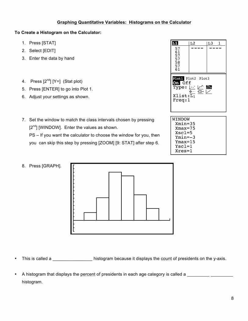
Graphing Quantitative Variables: Histograms on the Calculator
To Create a Histogram on the Calculator:
1. Press [STAT]
2. Select [EDIT]
3. Enter the data by hand
4. Press [2nd] [Y=] (Stat plot)
5. Press [ENTER] to go into Plot 1.
6. Adjust your settings as shown.
7. Set the window to match the class intervals chosen by pressing
[2nd] [WINDOW]. Enter the values as shown.
PS – If you want the calculator to choose the window for you, then
you can skip this step by pressing [ZOOM] [9: STAT] after step 6.
8. Press [GRAPH].
• This is called a ________________ histogram because it displays the count of presidents on the y-axis.
• A histogram that displays the percent of presidents in each age category is called a _________ _________
histogram.

9
1. Construct a histogram
for these data.
2. Describe shape, center, & spread of this distribution
3. Are there any outliers?

10
Section 1.3 – Describing Quantitative Data with Numbers [VIDEO #4] Measuring Center: Mean / Median
sigma

11
Ex 1: You get a part time job working at a restaurant. When you were interviewing for the position, the manager told you that the average wage earned by employees at the restaurant is $20/hr. You took the job without hesitation! When you got your first paycheck you realized that you were being paid minimum wage. Outraged, you began to ask your coworkers what they make, and found out that they all make minimum wage. There are 4 employees other than your boss. How much does your boss have to make per hour to have told the truth about the average hourly wage? Assume minimum wage is $5.50/hr. The mean is nonresistant! Definition: _______________________________________________________________________________ The mean is not the only way to describe the center of a distribution. Another natural idea is to use the “middle value”. What is the median wage earned by employees at the restaurant? ___________
Suppose we exclude the boss’ salary:
• How would that affect the mean? • How would that affect the median?
Extending the Ideas
1. What does it mean to be resistant?
2. Is the mean or median resistant?

12
Generalizations:
1. When the distribution is skewed to the left, the mean is _________________ the median.
2. When the distribution is symmetrical, the mean is _____________________ the median.
3. When the distribution is skewed to the right, the mean is ___________________ the median.
The mean is always pulled towards _______________ of the distribution!
If you are to describe a set of data by center, which do you choose? Mean or Median???
• ___________________________ works for symmetric (or approximately normal) distributions. • _____________________ will give a more accurate picture of the distribution if it is skewed left or right.
*********************************************************************************************************************

13

14
Graphing Quantitative Variables: Boxplots [VIDEO #5] There are five main features to any data set:
1. ________________________________ 2. ________________________________ 3. ________________________________ 4. ________________________________ 5. ________________________________
These five figures make up the five-number summary and lead to a new graph, the boxplot.
The EASIEST way to get these values is with your CALCULATOR!!!! A modified boxplot shows outliers as dots or asterisks that are separate from the rest of the boxplot. The outlier rule will help us to determine whether a data set has outliers. Use your calculator to determine the five-number summaries for each data set below: Set 1 à Min = ____, Q1 = ____, M =____, Q3 = ____ , Max = ____
Set 2 à Min = ____, Q1 = ____, M =____, Q3 = ____ , Max = ____ Test both data sets for outliers. Construct a modified boxplot:

15
Measuring Spread: Standard Deviation Although the five-number summary is a common way of describing the distribution of a data set, the most common way to describe a distribution is by noting the mean and standard deviation.
¿ Description:____________________________________________________________________
_____________________________________________________________________________
¿ Symbol for the standard deviation of a sample: ______
¿ To calculate standard deviation, you must first calculate variance (symbol: _____ )
¿ Formula:
Ex 1: In summer school, there was a math class with 5 students in it. On the chapter 1 test, the scores of the
5 students were as follows: 20%, 80%, 85%, 92%, 97%. Calculate the standard deviation of the test scores.
1. Calculate the mean: ___________. 2. Calculate how much each score deviates from the mean.
3. Divide the total (Obs – Mean)2 by (n-1) 4. Take the square root.
FAQ’s: 1. If we want to know the average deviation about the mean, why don’t we just take the average of the
second column (𝑥! − 𝑥)?
2. What are the properties of the standard deviation? a. s measures __________________________ and should be used only when _________________
__________________________________________.
b. s = 0 only when _____________________________. This happens only when all observations have
_________________________________. Otherwise s > 0. As the observations become more spread
out about their mean, s gets _____________.
c. s, like the mean x , is strongly influenced by ____________________________.
3. May I use my calculator to calculate s? _________________________________
Observation xi
Obs – Mean (𝑥! − 𝑥)
(Obs – Mean)2 𝑥! − 𝑥 !
20
80
85
92
97

16
Chapter 1 Review
1. What are your two MAIN options for the measure of the center of a distribution?
2. What are the three basic options for the measure of the spread of a distribution?
3. Draw a picture of a distribution that is: a. Skewed to the right b. Skewed to the left
4. Give an example of a type of data that tends to be symmetric. ______________________________
5. Give an example of a type of data that tends to be skewed right. ____________________________
6. Give an example of a type of data that tends to be skewed left. _____________________________
7. An outlier is any value that falls more than _____________ above _____ or below ______.
8. Write the outlier rule symbolically. ____________________________________________________
9. When describing a distribution you must address the distribution’s _________________________ , ______________________ , ____________________, and ______________________________.
10. Give an example of a categorical variable. _____________________________________________
11. Give an example of a quantitative variable. _____________________________________________
12. In a left skewed distribution, the mean is _________________ the median.

17
13. The total return on a stock is the change in its market price plus any dividends payments made. Total
return is usually expressed as a percent of the beginning price. The figure shown is a histogram of the distribution of total returns for all 1528 stocks listed in the New York Stock Exchange in one year. Use the graph to complete the following: a. Shape: ____________________________
b. Center: ____________________________
c. Smallest: ___________________________
d. Largest: ____________________________
e. What % of stocks lost money? __________
14. The figure shown is a histogram of the number of days in the month of April on which the temperature fell
below freezing at Greenwich, England. The data cover a period of 65 years. Use the graph to complete
the following:
d. Shape: _____________________________
e. Center: _____________________________
f. Spread: ____________________________
g. Outliers? ___________________________
h. In what % of these 65 years did the temp
never fall below freezing in April? _______

18
After completing Chapter 1, you should know:
q How to construct and analyze a stemplot, split stem plot, back-to-back stemplot. Know which one to
use depending on the situation.
q The difference between categorical and quantitative variables and be able to identify them.
q How to draw and analyze a histogram.
q How to describe a distribution with SOCS
q How to describe and analyze data in specific terms by calculating:
o Mean
o Median
o Five Number Summary (Min, Q1, Med, Q3, Max)
o Range
o IQR
o Outliers
o Standard Deviation
q How to draw and analyze a regular and modified box plot.
q The properties of the mean and median (resistant or not, and how they can be used to determine
whether a distribution is skewed left, right, or is symmetrical).
q The properties of standard deviation, what standard deviation represents, and how to calculate it. (You
may use the calculator to do this).