fishr vignette base plotting - derek...
TRANSCRIPT

fishR Vignette - Base PlottingDr. Derek Ogle, Northland College December 16, 2013
R provides amazing plotting capabilities. However, the default base plots in R may not serve the needs forpresentations and publications produced by fisheries biologists. Fortunately, nearly all aspects of the plot canbe customized to fit one’s needs. In this vignette, I introduce some of the basic methods used to customizebase R plots1. This vignette is not an exhaustive treatise on plotting. I have simply tried to bring togethermethods to handle what I see as the most common situations among fisheries students and professionals.I will begin by showing how to construct three common graphics types – i.e., scatterplots, line plots, andhistograms – with common simple modifications to each. I will then illustrate how setting options in a basefunction – i.e., par() – can be used to control the finer details of each type of plot.
Several fisheries-related data frames are available in the FSAdata package, which is loaded with the first linebelow. Data frames used throughout this vignette are loaded and the structure and first six rows examinedwith the remaining lines below.
> library(FSAdata)
> data(BullTroutRML1)
> str(BullTroutRML1)
'data.frame': 137 obs. of 3 variables:
$ fl : int 90 180 201 346 359 362 373 380 375 396 ...
$ mass: int 11 107 119 587 539 659 719 779 839 755 ...
$ era : Factor w/ 2 levels "1977-79","2001": 1 1 1 1 1 1 1 1 1 1 ...
> head(BullTroutRML1)
fl mass era
1 90 11 1977-79
2 180 107 1977-79
3 201 119 1977-79
4 346 587 1977-79
5 359 539 1977-79
6 362 659 1977-79
> data(BullTroutRML2)
> str(BullTroutRML2)
'data.frame': 96 obs. of 4 variables:
$ age : int 14 12 10 10 9 9 9 8 8 7 ...
$ fl : int 459 449 471 446 400 440 462 480 449 437 ...
$ lake: Factor w/ 2 levels "Harrison","Osprey": 1 1 1 1 1 1 1 1 1 1 ...
$ era : Factor w/ 2 levels "1977-80","1997-01": 1 1 1 1 1 1 1 1 1 1 ...
> head(BullTroutRML2)
age fl lake era
1 14 459 Harrison 1977-80
2 12 449 Harrison 1977-80
3 10 471 Harrison 1977-80
4 10 446 Harrison 1977-80
5 9 400 Harrison 1977-80
6 9 440 Harrison 1977-80
> data(BloaterLH)
> str(BloaterLH)
'data.frame': 16 obs. of 3 variables:
$ year: int 1981 1982 1983 1984 1985 1986 1987 1988 1989 1990 ...
$ eggs: num 0.0402 0.0602 0.1205 0.1807 0.7229 ...
$ age3: num 5.14 154.29 65.14 102.86 102.86 ...
1One may also want to look into the lattice and ggplots2 packages for other plotting options.
1

> head(BloaterLH)
year eggs age3
1 1981 0.0402 5.143
2 1982 0.0602 154.286
3 1983 0.1205 65.143
4 1984 0.1807 102.857
5 1985 0.7229 102.857
6 1986 0.5321 200.571
In addition, functions from the FSA package maintained by the author and the plotrix package are alsorequired. These packages are loaded with
> library(FSA)
> library(plotrix) # for plotH()
1 Scatterplots
1.1 Default
Scatterplots are created with plot(). The variables to be plotted can be provided to plot() in a varietyof ways, but I prefer to use the “formula notation.” In formula notation, the variables are presented with aformula of the type y~x where x and y generically represent the variables on the x- and y-axes, respectively.When using the formula notation, the data frame containing these variables must be included in the data=
argument. Thus, the default scatterplot (Figure 1) of mass versus fork length for the Rocky Mountain bulltrout data set was constructed with
> plot(mass~fl,data=BullTroutRML1)
100 200 300 400
050
010
0015
00
fl
mas
s
Figure 1. Default scatterplot of mass versus fork length for bull trout.
1.2 Simple Common Modifications
Of course the x- and y-axes should be labeled more appropriately. The x- and y-axes labels are labeled withstrings in the xlab= and ylab= arguments, respectively. Figure 2 shows the results of
2

> plot(mass~fl,data=BullTroutRML1,ylab="Mass (g)",xlab="Fork Length (mm)")
100 200 300 400
050
010
0015
00
Fork Length (mm)
Mas
s (g
)
Figure 2. Scatterplot of mass versus fork length for bull trout showing use of xlab= and ylab= to label x-and y-axes.
The x- and y-axis limits can be controlled by a vector of size two, containing the minimum and maximumvalues for the axis, in the xlim= and ylim= arguments, respectively. For example, the x-axis limit in Figure3 was constrained to be between 0 and 500 with
> plot(mass~fl,data=BullTroutRML1,ylab="Mass (g)",xlab="Fork Length (mm)",xlim=c(0,500))
0 100 200 300 400 500
050
010
0015
00
Fork Length (mm)
Mas
s (g
)
Figure 3. Scatterplot of mass versus fork length for bull trout showing use of the xlim= argument.
The default plotting symbol in R is the open-circle. Other symbols are used by setting the pch= argument2
to an integer value that corresponds to a particular symbol (Appendix A). In addition, the color of theplotted symbol is changed by setting the col= argument to a numerical representation of a color3 or a string
2The pch= argument stands for “plotting character.”3The numbers 0-8 are used and represent white, black, red, green, blue, cyan, magenta, yellow, and grey.
3

that is one of the 637 named colors in R (Appendix B)4. For example, a “small” filled red circle can be usedas the plotting symbol (Figure 4) by including pch=20 and col="red" as follows
> plot(mass~fl,data=BullTroutRML1,ylab="Mass (g)",xlab="Fork Length (mm)",
xlim=c(0,500),pch=20,col="red")
0 100 200 300 400 500
050
010
0015
00
Fork Length (mm)
Mas
s (g
)
Figure 4. Scatterplot of mass versus fork length for bull trout showing use of non-default plotting symbolsand colors.
1.3 Scatterplot By Group
A scatterplot with different symbols or colors for the different levels of a factor variable is often useful. Thistype of plot can be constructed with an understanding of how R “codes” factor variables and modificationsof the pch= or col= arguments. A factor variable is a “group membership” variable in R – i.e., typically a“word” that says to which group an individual belongs. R will show the “word” for the category level but“behind-the-scenes” a numeric value is stored with the first level coded as a “1”, the second level coded asa “2”, and so on. For example, the factor level and the corresponding code for the era variable for rows 1,21, 41, and 81 (chosen for illustrative purposes only) in the bull trout data frame can be seen with
> with(BullTroutRML1[c(1,21,41,81),],data.frame(era,code=as.numeric(era)))
era code
1 1977-79 1
2 1977-79 1
3 2001 2
4 2001 2
Ultimately, the underlying numeric codes can be used to extract specific positions out of vectors that representthe col= or pch= values to use.
Suppose that the two plotting symbols and colors to be used to represent the two groups in the data are putinto vectors as follows
> symbs <- c(19,1)
> cols <- c("black","red")
4Also see this excellent website about R colors at Stowers Institute.
4
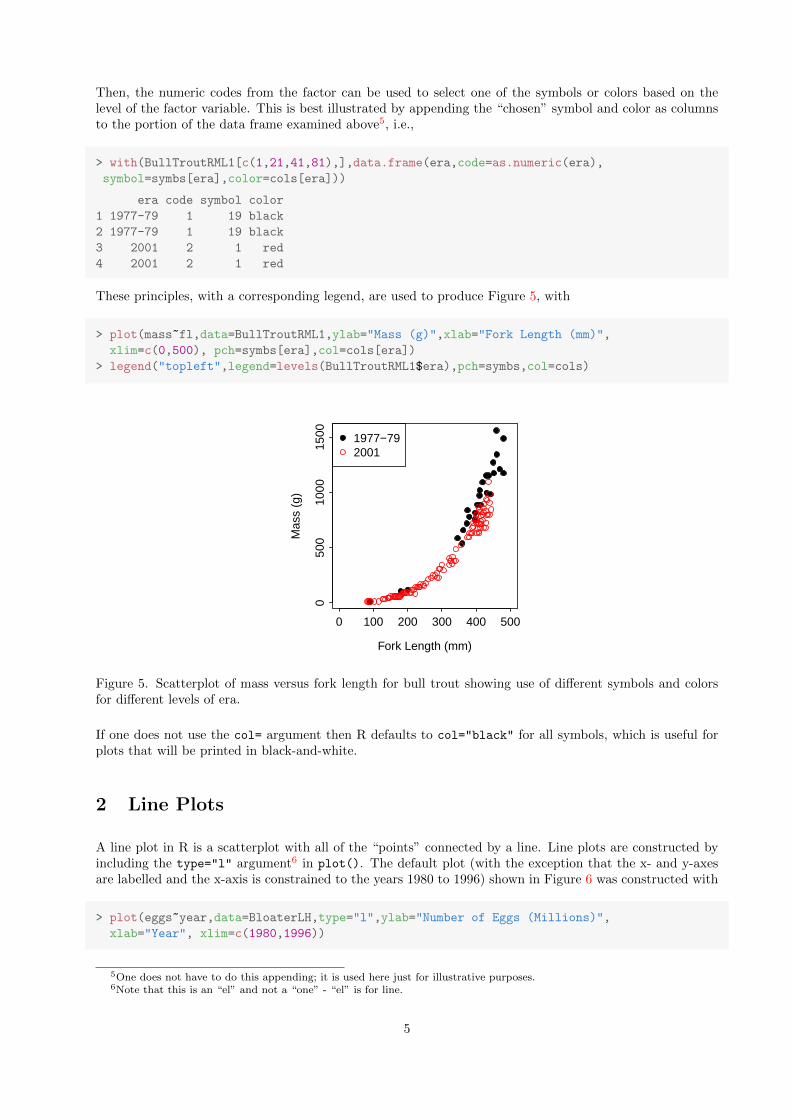
Then, the numeric codes from the factor can be used to select one of the symbols or colors based on thelevel of the factor variable. This is best illustrated by appending the “chosen” symbol and color as columnsto the portion of the data frame examined above5, i.e.,
> with(BullTroutRML1[c(1,21,41,81),],data.frame(era,code=as.numeric(era),
symbol=symbs[era],color=cols[era]))
era code symbol color
1 1977-79 1 19 black
2 1977-79 1 19 black
3 2001 2 1 red
4 2001 2 1 red
These principles, with a corresponding legend, are used to produce Figure 5, with
> plot(mass~fl,data=BullTroutRML1,ylab="Mass (g)",xlab="Fork Length (mm)",
xlim=c(0,500), pch=symbs[era],col=cols[era])
> legend("topleft",legend=levels(BullTroutRML1$era),pch=symbs,col=cols)
0 100 200 300 400 500
050
010
0015
00
Fork Length (mm)
Mas
s (g
)
1977−792001
Figure 5. Scatterplot of mass versus fork length for bull trout showing use of different symbols and colorsfor different levels of era.
If one does not use the col= argument then R defaults to col="black" for all symbols, which is useful forplots that will be printed in black-and-white.
2 Line Plots
A line plot in R is a scatterplot with all of the “points” connected by a line. Line plots are constructed byincluding the type="l" argument6 in plot(). The default plot (with the exception that the x- and y-axesare labelled and the x-axis is constrained to the years 1980 to 1996) shown in Figure 6 was constructed with
> plot(eggs~year,data=BloaterLH,type="l",ylab="Number of Eggs (Millions)",
xlab="Year", xlim=c(1980,1996))
5One does not have to do this appending; it is used here just for illustrative purposes.6Note that this is an “el” and not a “one” - “el” is for line.
5

1980 1985 1990 1995
0.0
0.5
1.0
1.5
2.0
Year
Num
ber
of E
ggs
(Mill
ions
)
Figure 6. Default line plot of number of bloater eggs versus year.
The line style can be modified by including an integer code between 0 and 6, where 0 indicates the use ofa blank line (Appendix D), in the lty= argument7. The width of the line can be increased by using valuesgreater than one, with larger values meaning thicker lines, in the lwd= argument8. For example, a widerdashed blue line (Figure 7) is used with
> plot(eggs~year,data=BloaterLH,type="l",ylab="Number of Eggs (Millions)",
xlab="Year", xlim=c(1980,1996),lty=2,lwd=3,col="blue")
1980 1985 1990 1995
0.0
0.5
1.0
1.5
2.0
Year
Num
ber
of E
ggs
(Mill
ions
)
Figure 7. Line plot of number of bloater eggs versus year illustrating non-default choices of line type, linewidth, and color.
Both lines and points can be plotted with the type="b" argument to plot(). The points and the lines inthis mixed plot can be modified as described separately for points and lines above9. A plot with “small”filled circles and dotted connected lines (Figure 8) is constructed with
7The lty argument stands for “line type.”8The lwd argument stands for “line width.”9It is not, however, straightforward how to have a different color for the points and the lines.
6

> plot(eggs~year,data=BloaterLH,type="b",ylab="Number of Eggs (Millions)",
xlab="Year", xlim=c(1980,1996),pch=19,lty=3,lwd=2)
1980 1985 1990 1995
0.0
0.5
1.0
1.5
2.0
Year
Num
ber
of E
ggs
(Mill
ions
)
Figure 8. Mixed line and scatter plot of number of bloater eggs versus year illustrating non-default choicesof line type, line width, and point type.
7

3 Histograms
3.1 Default
Histograms can be constructed in R with hist(). However, a modified version of this function is provided inthe FSA package that ultimately allows the user to simultaneously make histograms of a single quantitativevariable separated by the levels in a factor variable. As this flexibility is often needed by the fisheriesbiologist, I will use the version of hist() from the FSA package throughout the following descriptions. TheFSA package is loaded with
> library(FSA)
The hist() function in FSA requires a first argument that is a formula followed by a data= argument. Ifyou simply want to create a histogram of a variable withOUT separation by groups then this formula mustbe of the type x~1. For example, the default (with the exception that the x-axis label has been modified)histogram of fork length for the Rocky Mountain bull trout data (Figure 9) is constructed with
> hist(~fl,data=BullTroutRML1,xlab="Fork Length (mm)")
Fork Length (mm)
Fre
quen
cy
100 200 300 400 500
010
2030
40
Figure 9. Default histogram of the fork length of bull trout.
The default histogram likely did not use bin choices desired by a fisheries biologist. The bins can be chosenexplicitly with a vector of specific break values in the breaks= argument. Assuming bins of equal width, theeasiest way to construct the breaks is with seq(), which requires the minimum value as the first argument,the maximum value as the second argument, and the “step” value as the third argument. For example, thesequence of values from 100 to 200 in steps of 10 is created with
> seq(100,200,10)
[1] 100 110 120 130 140 150 160 170 180 190 200
A modified histogram for fork length from 80 to 500 in steps of 20 is created with
> hist(~fl,data=BullTroutRML1,xlab="Fork Length (mm)",breaks=seq(80,500,20))
It should be noted that the histogram version in FSA defaults to a “left-closed” and “right-open” bin con-struction, which is opposite of the bin construction used in the histogram in base R10. For example, in the
10This behaior can be reversed, to follow the default for base R, by including right=TRUE.
8

Fork Length (mm)
Fre
quen
cy100 200 300 400 500
05
1015
20
Figure 10. Histogram of the fork length of bull trout using user-defined breaks.
“left-closed, and “right-open” construction a 100-mm individual would be placed in the 100-110 mm binrather than in the 90-100 bin. This is likely the form of bin construction to be favored by fisheries biologists.
Finally, bar colors can be modified with the col= argument. In addition, “cross-hatchings” can be used byincluding a numeric value in the density= argument and an angle for the hatching in the angle= argument(default is 45 degrees). Larger numeric values in density= produce more “dense” cross-hatchings. Examplehistograms (Figure 11) using color and cross-hatchings are produced with
> hist(~fl,data=BullTroutRML1,xlab="Fork Length (mm)",right=TRUE,
breaks=seq(80,500,10),col="gray")
> hist(~fl,data=BullTroutRML1,xlab="Fork Length (mm)",right=TRUE,
breaks=seq(80,500,10),density=20,angle=10)
Fork Length (mm)
Fre
quen
cy
100 200 300 400 500
02
46
810
12
Fork Length (mm)
Fre
quen
cy
100 200 300 400 500
02
46
810
12
Figure 11. Histograms of the fork length of bull trout illustrating the use of colored bars (left) and cross-hatching (right).
9

3.2 Histograms By Group
Histograms separated by the levels of a factor variable (i.e., by group) can be constructed with a formulaof the form quantitative~factor, where quantitative is the quantitative variable and factor is thefactor variable that identifies group membership, to hist() along with an appropriate data= argument. Forexample, the histogram of bull trout fork length by era (Figure 12) is constructed with
> hist(fl~era,data=BullTroutRML1,xlab="Fork Length (mm)",right=TRUE,
breaks=seq(80,500,10), col="gray")
1977−79
Fork Length (mm)
Fre
quen
cy
100 200 300 400 500
02
46
810
2001
Fork Length (mm)
Fre
quen
cy
100 200 300 400 500
02
46
810
Figure 12. Histograms of the fork length of bull trout by era.
In the default version of hist() the separate histograms will use the same breaks and the same limits onthe y-axis. These options can be “turned off” by setting same.breaks=FALSE and same.ylim=FALSE. Eachhistogram has a main title constructed from the levels of the factor variable. A prefix can be appended tothese titles by including that prefix in the pre.main= argument. Alternatively, if pre.main=NULL then nomain title will be printed above each histogram. Finally, the number of rows and columns to be displayedin the “grid” of histograms is controlled by the nrow= and ncol= arguments. An example histogram withdifferent bin breaks, different y-axis limits, and user-defined main title prefixes (Figure 13) is constructedwith
> hist(fl~era,data=BullTroutRML1,xlab="Fork Length (mm)",right=TRUE,same.breaks=FALSE,
same.ylim=FALSE,pre.main="Era = ")
4 Bar Plots
Bar plots are used to visualize the frequency of individuals in the various levels of a factor variable. Barplots are constructed in R with barplot() which requires a table of frequencies as the first argument. Thetable of frequencies, then, must be constructed with table() prior to calling barplot(). For example, thenumber of sampled fish in each era for the bull trout data frame (Figure 14) can be visualized with11
11The extra parentheses around the first line force R to print the result at the same time that the result is being saved to theobject.
10

Era = 1977−79
Fork Length (mm)
Fre
quen
cy
100 200 300 400 500
02
46
810
Era = 2001
Fork Length (mm)
Fre
quen
cy
100 200 300 400
05
1020
30
Figure 13. Histograms of the fork length of bull trout by era illustrating different bin breaks, y-axis limits,and main title labels.
> ( eraBT <- table(BullTroutRML1$era) )
1977-79 2001
27 110
> barplot(eraBT,xlab="Era",ylab="Number of Captured Fish")
1977−79 2001
Era
Num
ber
of C
aptu
red
Fis
h
020
4060
8010
0
Figure 14. Bar plot of number of bull trout captured by era.
Fisheries biologists also commontly need to plot values other than frequencies against levels with bars. Asimple method for constructing some plots is to use plotH() from the plotrix package 12. This functiontakes a formula of the form Y~X, where Y is the quantitative variable to be plotted on the y-axis and X is aquantitative or factor variable to be plotted on the x-axis. For example, the plot of number of eggs versusyear for the Lake Huron bloater data frame (Figure 15) is constructed with
12The plotrix package was loaded at the beginning of this vignette with library(plotrix).
11

> plotH(eggs~year,data=BloaterLH,ylab="Number of Eggs (Millions)",
xlab="Year",xlim=c(1980,1996))
1980 1985 1990 1995
0.0
0.5
1.0
1.5
2.0
Year
Num
ber
of E
ggs
(Mill
ions
)
Figure 15. Plot of number of bloater eggs versus year illustrating using bars.
The plot of mean length-at-age for the bull trout data frame can be constructed by first summarizing thelengths with
> ( sumBTlen <- Summarize(fl~age,data=BullTroutRML2) )
Warning: To continue, variable(s) on RHS of formula were converted to a factor.
age n mean sd min Q1 median Q3 max percZero
1 0 3 37.33 15.822 20 30.5 41.0 46 51 0
2 1 4 96.25 24.185 75 84.8 89.5 101 131 0
3 2 5 178.60 22.766 143 171.0 184.0 196 199 0
4 3 10 239.40 34.361 180 214.0 246.0 269 279 0
5 4 12 291.83 46.213 221 256.0 295.0 316 372 0
6 5 13 339.38 43.183 245 326.0 341.0 363 419 0
7 6 9 364.33 31.253 320 347.0 360.0 385 409 0
8 7 14 370.50 59.255 245 335.0 391.0 418 437 0
9 8 9 397.11 48.704 332 360.0 381.0 434 480 0
10 9 7 422.43 23.593 400 403.0 415.0 437 462 0
11 10 5 429.60 38.148 369 422.0 440.0 446 471 0
12 11 2 558.00 183.848 428 493.0 558.0 623 688 0
13 12 2 444.50 6.364 440 442.0 444.0 447 449 0
14 14 1 459.00 NA 459 459.0 459.0 459 459 0
A look at the structure for this summary data frame shows that age is a factor varaible. If the plot isconstructed with this variable it will treat ages sequentially and the break between age-12 and age-14 willnot be seen13. This problem can be avoided by converting the age levels to numeric values using fact2num()
from FSA. Thus, a proper plot of mean length-at-age for the bull trout data frame is consttructed with
> plotH(mean~fact2num(age),data=sumBTlen,ylab="Mean Fork Length (mm)",
ylim=c(0,600),xlab="Age (years)")
13To see this problem try plotH(mean ~ age,data=sumBTlen).
12

0 2 4 6 8 10 12 14
010
030
050
0
Age (years)
Mea
n F
ork
Leng
th (
mm
)
Figure 16. Plot of mean length-at-age using bars for Rocky Mountain bull trout.
13

5 Finer Control with par()
The finer points of graphics are controlled through a number of options defined in par(). Some commonarguments defined in par() are shown in Appendix C. The current graphical settings can be seen at anytime by typing par() and some of these arguments can be used in other functions such as plot(), axis(),text(), and curve().
5.1 Margins and Axis Label Positions
Each14 plot consists of three regions – the plot area, the figure area, and the outer margin area. In Figure 17the area contained within the red box is the plot area and is where the points or bars will be plotted. Thearea between the red box and the blue box is the figure area and is where the axis ticks, labels, and title willappear. The area between the blue box and the green box is the outer margin area and is generally usedfor adding extra space around the graphic or for providing other areas to place text. In most instances (andthe default), the outer margin area is 0 on all sides of the graph and, thus, there would be no area betweenthe blue and greeen boxes in Figure 17. As the outer margin area is usally zero15, it will not be discussedfurther here16.
Plot Area
Figure
Outer Margin
Figure 17. Plot schematic illustrating the plotting area (inside the red box), the figure area (between theblue and red boxes), and the outer margin area (between the green and blue boxes).
The size of the margins in the figure region are measured in “lines” and can be separately set for “south”(bottom), “west” (left), “north” (top), and “east” (right) sides (in that order, respectively) in the mar=
argument to par(). The default values for the margins are c(5.1,4.1,4.1,2.1) and are illustrated in(Figure 18). I think that the default margins are too big and will thus reduce my margins to c(3.5,3.5,1,1).The mgp= argument in par() controls on which lines the axis title, labels, and line, respectively, will beplotted. The default locations for these axis characteristics are at c(3,1,0) as seen in (Figure 18)17. Igenerally prefer my axis labels and axis titles to be a bit closer to the axis line so I set the mgp= argumentto c(2.1,0.4,0). Thus, my preferences and the graphing parameters used for all graphs in the previoussection, are
> par(mar=c(3.5,3.5,1,1),mgp=c(2.1,0.4,0))
14Information in this section was heavily borrowed from this site at Stowers Institute.15The default outer margin sizes are set with par(oma=c(0,0,0,0)).16But see an example usage in Section 7.17Note how the axis titles line up with the “line = 3” label and the axis labels line up with the “line = 1” labels.
14

X
Y Plot Area
line = 0line = 1line = 2line = 3line = 4
3 5 7 9
line
= 0
line
= 1
line
= 2
line
= 3
46
810
line = 0line = 1line = 2line = 3
line
= 0
line
= 1
mar = c(5.1,4.1,4.1,2.1)
mgp = c(3,1,0)
Figure 18. Plot schematic illustrating the lines in each margin of the plotting area.
5.2 Changing Axis Types
The plotting axes in R default to find “pretty labels” to data that has been extended by 4% at both endsof the axis. This rule is problematic if the user wants a plot with axes that cross at specific x- and y-axispoints; for example, at the origin. For example, examine the “origin” of Figure 3. If you prefer that the endpoints of the x- and y-axes occur at the minimum value of each axis (Figure 19) then include the xaxs="i"
and yaxs="i" arguments to par() before the plot() function, as follows
> par(mar=c(3.5,3.5,1,1),mgp=c(2.1,0.4,0),xaxs="i",yaxs="i", tcl=-0.2)
> plot(mass~fl,data=BullTroutRML1,ylab="Mass (g)",xlab="Fork Length (mm)",
xlim=c(0,500),ylim=c(0,1500),pch=20)
0 100 200 300 400 500
020
060
010
0014
00
Fork Length (mm)
Mas
s (g
)
Figure 19. Scatterplot of mass versus fork length for bull trout showing use of different types of axes.
Also note that I prefer to make the tick lengths smaller with the tcl= argument.
15

5.3 Orientation of Axis Labels
One may also want to change the direction of the labels on the y-axis so that they are oriented in the samedirection as the labels on the x-axis (Figure 20). This is accomplished with las=1 in par() with
> par(mar=c(3.5,3.5,1,1),mgp=c(2.1,0.4,0),xaxs="i",yaxs="i",las=1, tcl=-0.2)
> plot(mass~fl,data=BullTroutRML1,ylab="Mass (g)",xlab="Fork Length (mm)",
xlim=c(0,500),ylim=c(0,1500),pch=20)
0 100 200 300 400 5000
200
400
600
800
1000
1200
1400
Fork Length (mm)
Mas
s (g
)
Figure 20. Scatterplot of mass versus fork length for bull trout showing the change in orientation of they-axis.
5.4 Changing Size of Plotted Points or Labels
R uses a series of character expansion multipliers (i.e., cex) to modify the size of objects on the plot. Forexample, if the cex= argument to par() is set to 1.5 then all items in the plot (points, labels, and titles)will be 1.5 times or 50% bigger. For example, all aspects of Figure 19 were made 50% bigger in Figure 21with the following code18,
> par(mar=c(3.5,3.5,1,1),mgp=c(2.1,0.4,0),xaxs="i",yaxs="i",tcl=-0.2,cex=1.5)
> plot(mass~fl,data=BullTroutRML1,ylab="Mass (g)",xlab="Fork Length (mm)",
xlim=c(0,500),ylim=c(0,1500),pch=20)
Of course, it is more useful to be able to control the sizes of specific aspects of the plot rather than all aspectsof the plot. Just the points can be expanded (Figure 22) by including the cex= argument in the originalplot() call rather than in par(). For example, only the points are 50% bigger with
> par(mar=c(3.5,3.5,1,1),mgp=c(2.1,0.4,0),xaxs="i",yaxs="i",tcl=-0.2)
> plot(mass~fl,data=BullTroutRML1,ylab="Mass (g)",xlab="Fork Length (mm)",
xlim=c(0,500),ylim=c(0,1500),pch=20,cex=1.5)
The axis title labels can be expanded by using cex.lab= and the axis values can be expanded by usingcex.axis=. For example (Figure 23), just the axis titles are made 50% bigger with
18Note that I did not change the overall size of the figure.
16

0 200 4000
400
1000
Fork Length (mm)
Mas
s (g
)
Figure 21. Scatterplot of mass versus fork length for bull trout with a character expansion factor of 1.5(compare to Figure 19).
0 100 200 300 400 500
020
060
010
0014
00
Fork Length (mm)
Mas
s (g
)
Figure 22. Scatterplot of mass versus fork length for bull trout with a character expansion factor of 1.5ONLY for the plotted points (compare to Figure 19 and Figure 21).
17

> par(mar=c(3.5,3.5,1,1),mgp=c(2.1,0.4,0),xaxs="i",yaxs="i",tcl=-0.2,cex.lab=1.5)
> plot(mass~fl,data=BullTroutRML1,ylab="Mass (g)",xlab="Fork Length (mm)",
xlim=c(0,500),ylim=c(0,1500),pch=20)
0 100 200 300 400 500
020
060
010
0014
00
Fork Length (mm)
Mas
s (g
)
Figure 23. Scatterplot of mass versus fork length for bull trout with a character expansion factor of 1.5ONLY for the axis titles (compare to Figure 19 and Figure 21).
5.5 Changing Font
The font= argument in par() does not change the font family ; rather it changes the font face – i.e., whetherit is bold or italic. The font= argument defaults to a value of “1” which corresponds to plain text. A valueof “2” means bold, a value of “3” means italics, and a value of “4” means bold and italics. The use of font=changes all of the text in the plot. However, font.axis= and font.lab= change the axis values and the axistitle labels, respectively.
The font family can be changed with the family= argument in par(). The actual fonts that can be displayeddepend on the type of graphics device being used. Thus, these will be discussed in more detail in Section 8.
5.6 Side-by-Side or One-Over-the-Other Plots
It may be instructive to plot two plots side-by-side or one-over-the-other. This type of construction isaccomplished with either the mfrow= or mfcol= arguments to par(). Both of these arguments requirea vector of size two that indicates the number of rows and columns to be used, respectively. The onlydifference between mfrow= and mfcol= is whether the individual plots should be placed by rows first or bycolumns first. For example, the side-by-side (i.e., one row, two columns) plot in Figure 24 is constructedwith
> par(mar=c(3.5,3.5,1,1),mgp=c(2.1,0.4,0),tcl=-0.2,mfrow=c(1,2))
> plot(mass~fl,data=BullTroutRML1,ylab="Mass (g)",xlab="Fork Length (mm)",
xlim=c(0,500),ylim=c(0,1500),pch=20)
> hist(fl~1,data=BullTroutRML1,xlab="Fork Length (mm)",breaks=seq(80,500,10))
The one-over-the-other plot (i.e., two rows and one column) in Figure 25 is constructed with
18

0 100 200 300 400 500
050
010
0015
00
Fork Length (mm)
Mas
s (g
)
Fork Length (mm)
Fre
quen
cy
100 200 300 400 500
02
46
810
12
Figure 24. Scatterplot of mass versus fork length (left) and histogram of fork length (right) for bull troutshowing how to construct a side-by-side plot.
> par(mar=c(3.5,3.5,1,1),mgp=c(2.1,0.4,0),tcl=-0.2,mfrow=c(2,1))
> plot(mass~fl,data=BullTroutRML1,ylab="Mass (g)",xlab="Fork Length (mm)",
xlim=c(0,500),ylim=c(0,1500),pch=20)
> hist(~fl,data=BullTroutRML1,xlab="Fork Length (mm)",breaks=seq(80,500,10))
19

0 100 200 300 400 500
050
010
0015
00
Fork Length (mm)
Mas
s (g
)
Fork Length (mm)
Fre
quen
cy
100 200 300 400 500
02
46
810
12
Figure 25. Scatterplot of mass versus fork length (top) and histogram of fork length (bottom) for bull troutshowing how to construct a one-over-the-other plot.
20

6 Plotting Fitted Lines or Curves
In many instances a fisheries biologist will fit a particular model to data and will want to produce a graphicthat illustrates the “model” superimposed on the data. The examples in this section illustrate how to createsuch plots in special cases and more generally.
6.1 Following a Linear Model Fit
Most commonly, one will want to illustrate the fit of a linear model to data. In the following example, thefit of a linear model to the natural log of mass on the natural log of fork length for the Rocky Mountainbull trout data is exhibited. To fully perform this example, the natural log of both the fork length and massvariables must be created and appended to the original data frame. This is illustrated with
> BullTroutRML1$logFL <- log(BullTroutRML1$fl)
> BullTroutRML1$logMass <- log(BullTroutRML1$mass)
The linear model is then fit with lm() where the first argument is a formula of the form y~x and the secondargument is the data frame in which y and x can be found. The estimated intercept and slope can beextracted from the saved lm object with coef() as follows
> lm1 <- lm(logMass~logFL,data=BullTroutRML1)
> coef(lm1)
(Intercept) logFL
-10.318 2.822
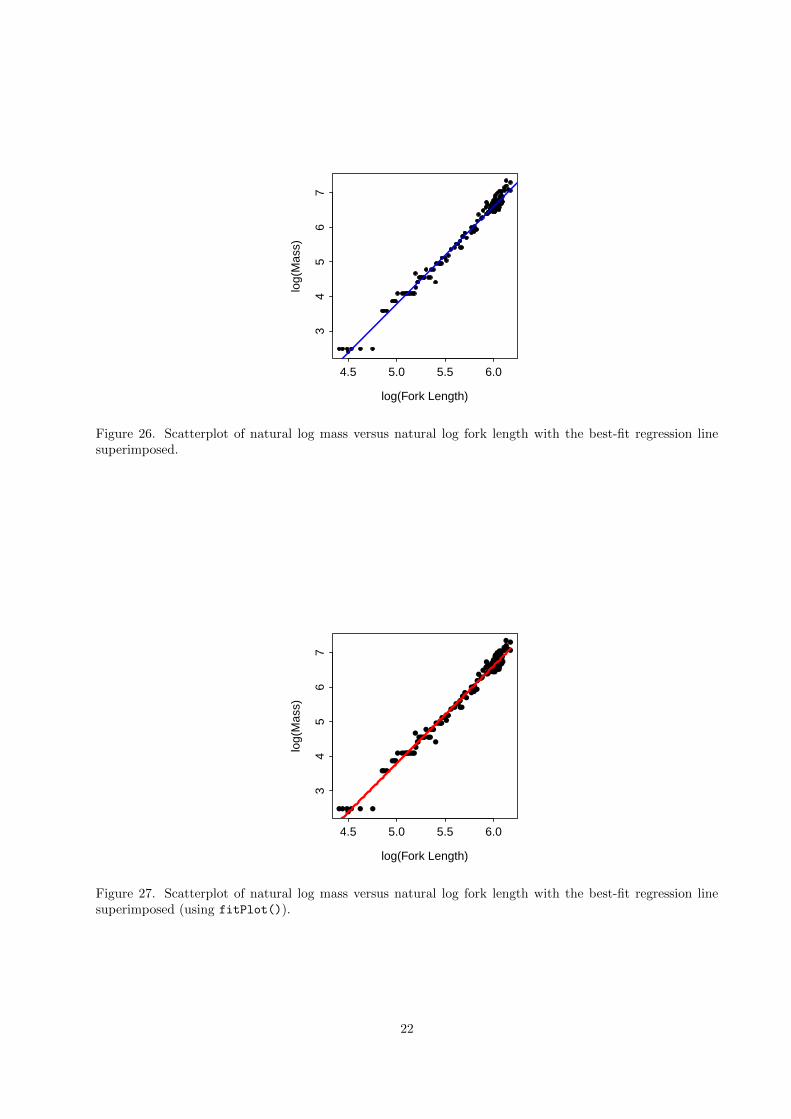
The linear model can be superimposed on to the scatterplot with abline(). In this case the scatterplot mustbe constructed first and must still be active. The abline() function, with the saved lm object as its onlyargument, will then superimpose the best-fit line onto the original scatterplot. The abline() function willaccept lty=, lwd=, and col= arguments if the user wants to modify the characteristics of the superimposedbest-fit line. For example, the base scatterplot and a superimposed best-fit line (in blue with increasedwidth; Figure 26) is constructed with the following code,
> plot(logMass~logFL,data=BullTroutRML1,xlab="log(Fork Length)",ylab="log(Mass)",pch=20)
> abline(lm1,lwd=2,col="blue")
An alternative to using abline() is to use fitPlot() from the FSA package. This function will createthe base scatterplot and superimpose the best-fit line by simply receiving the saved lm object as its firstargument. The fitPlot() function differs from abline() in that it shows the fitted line only over the rangeof the data. An example for the transformed fork length and mass of the Rocky Mountain bull trout (Figure27) is constructed with
> fitPlot(lm1,xlab="log(Fork Length)",ylab="log(Mass)",main="")
A second alternative is to use curve(). While curve() is more general (see the next section) it is slightlymore complicated to use and likely not worthwhile for a simple linear model. However, it’s use will beintroduced here with the linear model. The first argument to curve() is an equation of the right-hand-side of the best-fit model with an “x” replacing the actual explanatory (i.e., independent) variable. Thisequation usually needs to be constructed “by hand” using the coefficients from the fitted model. The from=
and the to= arguments are used to set the domain over which the equation should be plotted. The curve()
function will plot the equation over the domain but, more usefully, it will plot the function over the domainsuperiposed over an existing scatterplot if the add=TRUE argument is used. As with abline() and fitPlot(),curve() will accept lty=, lwd=, and col= arguments if the user wants to modify the characteristics of thesuperimposed best-fit line. For example, the fitted-line plot for the natural log mass versus natural log forklength for the Rocky Mountain bull trout example (Figure 28) is constructed with curve() as follows
21
4.5 5.0 5.5 6.0
34
56
7
log(Fork Length)
log(
Mas
s)
Figure 26. Scatterplot of natural log mass versus natural log fork length with the best-fit regression linesuperimposed.
4.5 5.0 5.5 6.0
34
56
7
log(Fork Length)
log(
Mas
s)
Figure 27. Scatterplot of natural log mass versus natural log fork length with the best-fit regression linesuperimposed (using fitPlot()).
22

> plot(logMass~logFL,data=BullTroutRML1,xlab="log(Fork Length)",ylab="log(Mass)",
pch=20,xlim=c(4,6.5),ylim=c(1,8))
> curve(coef(lm1)[1]+coef(lm1)[2]*x,from=4,to=6.5,add=TRUE,col="red",lwd=2)
4.0 4.5 5.0 5.5 6.0 6.5
12
34
56
78
log(Fork Length)
log(
Mas
s)
Figure 28. Scatterplot of natural log mass versus natural log fork length with the best-fit regression linesuperimposed (using curve()).
6.2 General Model with Parameter Estimates
6.2.1 Length-Weight Example
The advantage of using to learn curve() is that it can be used to plot the best-fit model on the original scalerather than being restricted to the scale on which the model was fit. For example, the raw power functionfor the length-weight regression can be visualized (Figure 29) using curve() with
> plot(mass~fl,data=BullTroutRML1,xlab="Fork Length (mm)",ylab="Mass (g)",pch=20,
xlim=c(0,500))
> curve(exp(coef(lm1)[1])*x^coef(lm1)[2],from=0,to=500,add=TRUE,col="red",lwd=2)
6.2.2 von Bertalanffy Model Example
The following example shows the ultimate flexibility of curve(). However, to follow the code prior to theline with symbs, one will need to have a basic understanding of fitting von Bertalanffy growth curves withnls(), which is described in the von Bertalanffy vignette.
> data(BullTroutRML2)
> str(BullTroutRML2)
'data.frame': 96 obs. of 4 variables:
$ age : int 14 12 10 10 9 9 9 8 8 7 ...
$ fl : int 459 449 471 446 400 440 462 480 449 437 ...
$ lake: Factor w/ 2 levels "Harrison","Osprey": 1 1 1 1 1 1 1 1 1 1 ...
$ era : Factor w/ 2 levels "1977-80","1997-01": 1 1 1 1 1 1 1 1 1 1 ...
23

0 100 200 300 400 500
050
010
0015
00Fork Length (mm)
Mas
s (g
)
Figure 29. Scatterplot of mass versus fork length with the best-fit back-transformed regression line super-imposed.
> svCom <- vbStarts(fl~age,data=BullTroutRML2,type="typical")
> svGen <- lapply(svCom,rep,2)
> vbGen <- fl~Linf[era]*(1-exp(-K[era]*(age-t0[era])))
> vb1 <- nls(vbGen,start=svGen,data=BullTroutRML2)
> symbs <- c(19,1)
> cols <- c("black","red")
> plot(fl~jitter(age,0.4),data=BullTroutRML2,ylab="Fork Length (mm)",xlab="Age (years)",
pch=symbs[era],col=cols[era],xlim=c(0,15))
> curve(coef(vb1)["Linf1"]*(1-exp(-coef(vb1)["K1"]*(x-coef(vb1)["t01"]))),from=0,
to=15,add=TRUE,col=cols[1],lwd=2)
> curve(coef(vb1)["Linf2"]*(1-exp(-coef(vb1)["K2"]*(x-coef(vb1)["t02"]))),from=0,
to=15,add=TRUE,col=cols[2],lwd=2)
> legend("topleft",legend=levels(BullTroutRML1$era),pch=symbs,col=cols,lwd=2)
0 5 10 15
010
030
050
070
0
Age (years)
For
k Le
ngth
(m
m)
1977−792001
Figure 30. Scatterplot of fork length versus age for bull trout with best-fit von Bertalanffy growth modelssuperimposed for different eras.
24

7 More Complex Layouts for Multiple Graphs
Illustrating complex ideas can require constructing a single plot that is the combination of several subplots.The side-by-side (Figure 24) and one-over-the-other (Figure 25) plots were simple examples. More complexexample can be constructed in R and are the focus of this section.
7.1 Common Axis Labels on a Grid of Subplots
One common graphical desire is to plot multiple graphics in a grid-like format with one axis label that servesas the label for each graph. One way to do this is to exploit the use of the outer margin area and othersettings in par(), some of which were described in Section 5. For example, the arguments to par() belowcreate a plot that has an outer margin of 3 “lines” on the bottom and left and 0 “lines” on top and right; afigure area that contains a 2 row by 2 column grid for subplots that will be filled by row; a figure area with1 “line” of margin on the bottom, 1.5 “lines” of margin on the left and right, and 3 “lines” of margin on top;and adjusted lines for plotting axis labels, values, and ticks.
> par(oma=c(3,3,0,0),mfrow=c(2,2),mar=c(1,1.5,3,1.5),mgp=c(2.1,0.4,0),tcl=-0.2)
The four subplot areas can then be populated with scatterplots as follows (note that the x- and y-axis labelshave been set to empty strings to suppress labeling the axes)
> xlmts <- c(-0.5,14.5)
> ylmts <- c(0,700)
> plot(fl~age,data=BullTroutRML2,subset=(lake=="Harrison" & era=="1977-80"),xlab="",
ylab="",main="Harrison, 1977-80",pch=20,cex=1.5,xlim=xlmts,ylim=ylmts)
> plot(fl~age,data=BullTroutRML2,subset=(lake=="Osprey" & era=="1977-80"),xlab="",
ylab="",main="Osprey, 1977-80",pch=20,cex=1.5,xlim=xlmts,ylim=ylmts)
> plot(fl~age,data=BullTroutRML2,subset=(lake=="Harrison" & era=="1997-01"),xlab="",
ylab="",main="Harrison, 1997-01",pch=20,cex=1.5,xlim=xlmts,ylim=ylmts)
> plot(fl~age,data=BullTroutRML2,subset=(lake=="Osprey" & era=="1997-01"),xlab="",
ylab="",main="Osprey, 1997-01",pch=20,cex=1.5,xlim=xlmts,ylim=ylmts)
0 5 10 15
010
030
050
070
0 Harrison, 1977−80
0 5 10 15
010
030
050
070
0 Osprey, 1977−80
25

0 5 10 15
010
030
050
070
0 Harrison, 1997−01
0 5 10 15
010
030
050
070
0 Osprey, 1997−01
The common x- and y-axis labels can then be placed in the outer margin areas with mtext(). In thiscapacity, mtext() requires the text to be written as the first argument, a number in side= indicating themargin on which to print the text (with the same scheme as with previous arguments – 1=bottom, 2=left,3=top, 4=right), a number in line= indicating the line on which to print the text (defaults to 0), andouter=TRUE to force the text into the outer margin area. For example, the common x- and y-axis labels areadded to the plots constructed above with
> mtext("Age (years)",outer=TRUE,side=1,line=1.5,cex=1.5)
> mtext("Fork Length (mm)",outer=TRUE,side=2,line=1.5,cex=1.5)
The final plot is shown in Figure 31.
26

0 5 10 15
010
030
050
070
0
Harrison, 1977−80
0 5 10 15
010
030
050
070
0
Osprey, 1977−80
0 5 10 15
010
030
050
070
0
Harrison, 1997−01
0 5 10 15
010
030
050
070
0
Osprey, 1997−01
Age (years)
For
k Le
ngth
(m
m)
Figure 31. Illustration of using the outer margin area to provide common axis labels.
27

7.2 Complex Grid Layouts with layout()
The layout() function in R allows for more complicated organizations of graphics. The only requiredargument to layout() is a matrix that specifies the positions, as a grid, for a series of plots. For example,the following code constructs a 2x2 grid for four plots19,
> ( m <- matrix(c(1,2,3,4),nrow=2,byrow=TRUE) )
[,1] [,2]
[1,] 1 2
[2,] 3 4
> layout(m)
> layout.show(n=4)
1 2
3 4
Figure 32. Illustration of 2x2 layout grid for graphics.
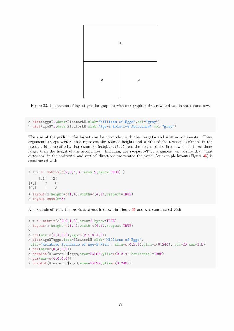
The 2x2 grid in Figure 32 is not that interesting because that layout could just as easily have been constructedwith the mfrow= argument in par() as shown previously. A more interesting example is to construct a gridwhere the entire first row is one graphic and the second row is two graphics. This graphic grid would beconstructed by including a “1” in the first two positions of the layout matrix. For example, the layout gridshown in Figure 33 is constructed with
> ( m <- matrix(c(1,1,2,3),nrow=2,byrow=TRUE) )
[,1] [,2]
[1,] 1 1
[2,] 2 3
> layout(m)
> layout.show(n=3)
The following code populates the grids in the layout shown in Figure 33 with the result shown in Figure 34,
> m <- matrix(c(1,1,2,3),nrow=2,byrow=TRUE)
> layout(m)
> plot(age3~eggs,data=BloaterLH,xlab="Millions of Eggs",
ylab="Relative Abundance of Age-3 Fish", pch=20,cex=1.5)
19the layout.show() function can be used to illustrate how the layout grid has been constructed.
28
1
2 3
Figure 33. Illustration of layout grid for graphics with one graph in first row and two in the second row.
> hist(eggs~1,data=BloaterLH,xlab="Millions of Eggs",col="gray")
> hist(age3~1,data=BloaterLH,xlab="Age-3 Relative Abundance",col="gray")
The size of the grids in the layout can be controlled with the height= and width= arguments. Thesearguments accept vectors that represent the relative heights and widths of the rows and columns in thelayout grid, respectively. For example, height=c(3,1) sets the height of the first row to be three timeslarger than the height of the second row. Including the respect=TRUE argument will assure that “unitdistances” in the horizontal and vertical directions are treated the same. An example layout (Figure 35) isconstructed with
> ( m <- matrix(c(2,0,1,3),nrow=2,byrow=TRUE) )
[,1] [,2]
[1,] 2 0
[2,] 1 3
> layout(m,height=c(1,4),width=c(4,1),respect=TRUE)
> layout.show(n=3)
An example of using the previous layout is shown in Figure 36 and was constructed with
> m <- matrix(c(2,0,1,3),nrow=2,byrow=TRUE)
> layout(m,height=c(1,4),width=c(4,1),respect=TRUE)
>
> par(mar=c(4,4,0,0),mgp=c(2.1,0.4,0))
> plot(age3~eggs,data=BloaterLH,xlab="Millions of Eggs",
ylab="Relative Abundance of Age-3 Fish", xlim=c(0,2.4),ylim=c(0,240), pch=20,cex=1.5)
> par(mar=c(0,4,0,0))
> boxplot(BloaterLH$eggs,axes=FALSE,ylim=c(0,2.4),horizontal=TRUE)
> par(mar=c(4,0,0,0))
> boxplot(BloaterLH$age3,axes=FALSE,ylim=c(0,240))
29

0.0 0.5 1.0 1.5 2.0
050
100
150
200
Millions of Eggs
Rel
ativ
e A
bund
ance
of A
ge−
3 F
ish
Millions of Eggs
Fre
quen
cy
0.0 0.5 1.0 1.5 2.0 2.5
01
23
45
6
Age−3 Relative Abundance
Fre
quen
cy
0 50 100 200
01
23
45
67
Figure 34. Illustration of layout grid for graphics with one graph in first row and two in the second row.
1
2
3
Figure 35. Illustration of layout grid for graphics with differing row heights and column widths.
30

0.0 0.5 1.0 1.5 2.0
050
100
150
200
Millions of Eggs
Rel
ativ
e A
bund
ance
of A
ge−
3 F
ish
Figure 36. Illustration of layout grid with differing heights and widths such that a scatterplot appears in the“middle” with corresponding boxplots on the “sides.”
31

Another, slightly more complex, example ...
> ( m <- matrix(c(0,1,2,3,5,6,4,7,8),nrow=3,byrow=TRUE) )
[,1] [,2] [,3]
[1,] 0 1 2
[2,] 3 5 6
[3,] 4 7 8
> layout(m,height=c(1,8,8),width=c(1,8,8),respect=TRUE)
>
> par(mar=c(0,0,0,0))
> plot.new(); text(0.5,0.3,"Harrison",cex=2)
> plot.new(); text(0.5,0.3,"Osprey",cex=2)
> plot.new(); text(0.3,0.5,"Era = 1977-1980",srt=90,cex=2)
> plot.new(); text(0.3,0.5,"Era = 1997-2001",srt=90,cex=2)
> par(mar=c(3.75,3.75,1,1),mgp=c(2.1,0.4,0))
> plot(fl~age,data=BullTroutRML2,subset=(lake=="Harrison" & era=="1977-80"),
xlab="",ylab="Fork Length",pch=20,cex=1.5,xlim=c(-0.5,14.5),ylim=c(0,700))
> plot(fl~age,data=BullTroutRML2,subset=(lake=="Osprey" & era=="1977-80"),xlab="",
ylab="",pch=20,cex=1.5,xlim=c(-0.5,14.5),ylim=c(0,700))
> plot(fl~age,data=BullTroutRML2,subset=(lake=="Harrison" & era=="1997-01"),xlab="Age",
ylab="Fork Length",pch=20,cex=1.5,xlim=c(-0.5,14.5),ylim=c(0,700))
> plot(fl~age,data=BullTroutRML2,subset=(lake=="Osprey" & era=="1997-01"),xlab="Age",
ylab="",pch=20,cex=1.5,xlim=c(-0.5,14.5),ylim=c(0,700))
Harrison Osprey
Era
= 1
977−
1980
Era
= 1
997−
2001
0 5 10 15
010
030
050
070
0
For
k Le
ngth
0 5 10 15
010
030
050
070
0
0 5 10 15
010
030
050
070
0
Age
For
k Le
ngth
0 5 10 15
010
030
050
070
0
Age
Figure 37. Illustration of layout grid with differing heights and widths such that labels can be placed on thesides.
32

8 Graphical Output Formats
STILL NEED TO DO
33

Appendices
A Plotting Symbols
●0 1 2 3 4
5 6 7 8 9
● ●10 11 12 13 14
● ●15 16 17 18 19
● ●20 21 22 23 24 25
34

B Plotting Colors
35

C Arguments to par()
Argument Meaning Valuesbty A character string which determines the
type of box which is drawn about plots.One of "o", "l", "7", "c", "u", or "]" the result-ing box resembles the corresponding upper caseletter. A value of "n" suppresses the box. Defaultis "o".
cex A numerical value giving the amount bywhich plotting text and symbols shouldbe magnified relative to the default.
Multiplier values. Default is 1.
cex.axis The magnification to be used for axis an-notation relative to the current setting ofcex.
Multiplier values. Default is 1.
cex.lab The magnification to be used for x andy labels relative to the current setting ofcex.
Multiplier values. Default is 1.
family The name of a font family for drawingtext.
Standard values are "serif", "sans" and "mono",and the Hershey font families are also available.Values depend on the graphing device. Defaultdepends on graphing device.
font An integer which specifies which font touse for text.
A 1 corresponds to plain text, 2 to bold face, 3 toitalic, and 4 to bold italic. Also, font 5 is expectedto be the symbol font, in Adobe symbol encoding.Default is 1.
las A numeric that specifies the style of axislabels.
A 0 corresponds to always parallel to the axis, 1to always horizontal, 2 to always perpendicular tothe axis, and 3 always vertical. Default is 0.
mar A numerical vector which gives the num-ber of lines of margin to be specified onthe four sides of the plot.
A vector of the form c(bottom, left, top,
right). Default is c(5,4,4,2)+0.1.
mfrow,mfcol
A numerical vector that forms a layoutwhere figures will be drawn in an nr-by-nc array on the device by rows (or bycolumns).
A vector of the form c(nr, nc). Default isc(1,1).
mgp A numerical vector controlling the marginline for the axis title, axis labels and axisline.
A vector of the form c(title,labels,line). De-fault is c(3,1,0).
oma A numerical vector giving the size of theouter margins in lines of text.
A vector of the form c(bottom, left, top, right).Default is c(0,0,0,0)
srt The string rotation, for example for axislabels, in degrees.
A numeric value. Default is 0.
xaxs,yaxs
The style of axis interval calculation to beused for the x(y)-axis.
Style "r" (regular) first extends the data range by4 percent at each end and then finds an axis withpretty labels that fits within the extended range.Style "i" (internal) finds an axis with pretty labelsthat fits within the original data range. Default is"r".
xaxt,yaxt
A character which specifies the x(y)-axistype.
Style "n" suppresses plotting the x-axis. Anyother value plots the x-axis. Default is "s".
xlog,ylog
A logical value indicating whether thex(y)-axis should be logged.
TRUE means use log scales, FALSE means use linearscale. Default is FALSE
36

D Line Types
lty=1
lty=2
lty=3
lty=4
lty=5
37

Reproducibility Information
Version Information
� Compiled Date: Mon Dec 16 2013
� Compiled Time: 7:54:15 PM
� Code Execution Time: 5.43 s
R Information
� R Version: R version 3.0.2 (2013-09-25)
� System: Windows, i386-w64-mingw32/i386 (32-bit)
� Base Packages: base, datasets, graphics, grDevices, methods, stats, utils
� Other Packages: FSA 0.4.3, FSAdata 0.1.4, gdata 2.13.2, knitr 1.5.15, plotrix 3.5-2
� Loaded-Only Packages: bitops 1.0-6, car 2.0-19, caTools 1.16, cluster 1.14.4, evaluate 0.5.1, for-matR 0.10, Formula 1.1-1, gplots 2.12.1, grid 3.0.2, gtools 3.1.1, highr 0.3, Hmisc 3.13-0, KernSmooth 2.23-10, lattice 0.20-24, MASS 7.3-29, multcomp 1.3-1, mvtnorm 0.9-9996, nlme 3.1-113, nnet 7.3-7, quantreg 5.05,sandwich 2.3-0, sciplot 1.1-0, SparseM 1.03, splines 3.0.2, stringr 0.6.2, survival 2.37-4, tools 3.0.2,zoo 1.7-10
� Required Packages: FSA, FSAdata, plotrix and their dependencies (car, gdata, gplots, Hmisc, knitr,multcomp, nlme, quantreg, sciplot)
38