flowcharting with excel - poms conferences main · pdf fileflowcharting with excel ... and...
TRANSCRIPT

Flowcharting with Excel
Daniel R. Heiser, DePaul University Paul Schikora, Indiana State University
Contact: Daniel R. Heiser, Ph.D. JD DePaul University Department of Management 1 East Jackson Boulevard Chicago, Illinois 60604-2287 Phone: (312) 362-8423 Fax: (312) 362-6973 [email protected]
Focus on the Classroom
Abstract:
In this article we present a method for teaching the art of flowcharting to graduate
and undergraduate business students using Microsoft Excel. Although the focus is on the
academic environment, several aspects of the discussion are relevant for corporate
trainers and novice flowcharters. The approach used is to treat flowcharting as a
graphical language, complete with its own vocabulary and syntax. A number of practical
suggestions and cautions are offered to enhance the legibility and communicative power
of the tool. In addition, several extensions are offered to allow customization of
individual process maps to the specific needs of a particular application.
Keywords:
Process Mapping, Service Blueprinting, Process Analysis, Process Reengineering

Flowcharting with Excel
Introduction:
An old adage holds that “a picture is worth a thousand words.” It should then
come as no surprise that one of the most useful tools for analyzing operational processes
is the flowchart – a simple picture of the stream of work and information. This graphical
tool can easily be customized to support business process reengineering, document
processes for training and quality manuals, or illustrate the interaction of cross-functional
teams. Perhaps as a consequence of their versatility, flowcharts appear under many
names – including process maps, service blueprints, and block diagrams. Yet regardless
of the label, the power of this humble tool is its chameleon-like potential to fit the task at
hand.
Many excellent texts describe the use of flowcharts in process analysis. Both
Galloway (1994) and Damelio (1996) provide a relatively straightforward treatment of
the subject, while Harrington (1991) and Roberts (1994) provide a more extensive
discussion. Our intention here is not to replicate this analysis, but to focus on the creative
process itself – the art of flowcharting. This note outlines the process used in our
classrooms to teach both graduate and undergraduate business students how to create and
capture process maps on a digital canvas with Microsoft Excel.
The Initial Draft:
Although software is required to generate a professional-caliber graphic, we
highly recommend manufacturing the initial draft by hand. We make this

recommendation because most processes worthy of flowcharting are sufficiently complex
to require input from a team of analysts or process experts. Indeed, a common goal of
flowcharting is to develop a common understanding among affected personnel of the
flow of work and information related to a particular process. When multiple participants
attempt to generate a flowchart directly on the computer, the result is a team huddle
around the terminal. In addition to the highly questionable ergonomics, the keyboard
operator serves as both a filter and a bottleneck to the free flow of information –
inhibiting the desired team dynamic and exchange of perspectives. Even when a map
author is working alone, the limitations of even the largest computer display make it
difficult to step back and consider the big picture. In a flowchart of even modest
complexity, only a small portion of the graphic will be visible on the screen at any given
time in normal view – and in a full-page view, legibility is sacrificed.
The necessary spirit of inquiry is also hindered if the process moves too quickly to
a formal document. The flowcharting process is inherently messy. Forgotten tasks need
to be inserted, side paths explored, and logical dead-ends tied back into the main flow of
work. Our experience indicates that good initial drafts emerge from chaotic
environments. Although we don’t claim to understand the psychology, novice operators
appear intolerant of multiple revisions to their computer-generated charts. As a result, we
recommend capturing the chart digitally only in its final, or near final, version to formally
document the current state of knowledge and facilitate sharing the chart through written
reports, presentations, or intranets.
Paper & Post-It Notes®:
The material of choice for initial drafts include either a wide roll of brown
wrapping paper or flip chart pads and square Post-It Notes® (or the generic equivalent).
The large paper serves as the working surface and can be rolled up at the end of the
session to facilitate storage or transport. The Post-It Notes® are used to represent the
individual steps in the process. Their weak adhesive allows them to be readily moved
and reoriented as the process map develops. While the notes are generally secure when
the map is rolled up, caution should be used to avoid dislodging the notes when unrolling
the map to begin work anew. In the later stages of development, it may become
advisable to secure the notes to the paper with a stronger adhesive tape.
Beginning Vocabulary:
Flowcharting is perhaps best approached as a graphical language. It is designed
to illustrate complex relationships through simple visual cues. Thus, an appropriate
starting point is to learn the pictorial alphabet of flowcharting symbols. However, this
task is complicated by the fact that industrial engineers, software programmers and many
business disciplines have independently developed their own unique symbolic
vocabularies. To add to the confusion, there are literally thousands of proprietary
symbols in flowcharting software packages available on the market today. As a
consequence, we recommend a very limited vocabulary in the initial stages of
development. This enables us to share our flowcharts across multiple disciplines and
with non-team members without the need for lengthy explanations or glossary of
symbols.

In the beginning, we recommend limiting the vocabulary to two symbols – a
square, representing a process step and a diamond, representing a decision point. As
Figure 1 illustrates, these two symbols are readily achieved using our Post-It Notes®. In
the case of a process step, a short description of the operation is written horizontally
within the note. In the case of a decision, a brief description of the assessment to be
made is written at a forty-five degree angle within the note.
Figure 1
Two comments are worth mention in the use of these two symbols. First, the
narrative description should be kept to a bare minimum. Flowcharting is intended to be a
visual language – not a method of formatting paragraphs. The audience should be able
to glance at each symbol and capture its meaning. Second, decision diamonds are
reserved for steps that create a divergence or branch in the flow of work or information
through the process. The rationale for this reservation is that we are using the flowchart
to analyze the process, not the design of individual tasks. As a consequence, each
diamond should have a minimum of two exiting flows. In our experience, the most
common mistake made by novice flowcharters is to represent a process step that does not
impact the process flow as a decision. While the job design of that particular task may
require an exercise of judgment, the underlying nature of the task should be ignored
unless it gives rise to a divergence in the flow of work.
Process
Step Decision
Syntax:
As with every other language, flowcharting requires a syntax – rules for ordering
its linguistic elements to create logical phrases and clauses that communicate meaning to
the intended audience. In flowcharting, this syntax relies on directional arrows
connecting the individual symbols to illustrate the relationship between each step. In
general, solid arrows are used to indicate physical work flows and dotted line arrows
represent the transfer of information.
In the special case of the arrows exiting decision diamonds, each flow should be
clearly labeled. In general, each diamond should be labeled with a simple question, with
each exiting arrow representing one of the alternative answers to the question posed. In
many cases, arrows might simply be labeled “yes” and “no” or “pass” and “fail.”
However, whenever possible we encourage the use of more descriptive – yet still brief –
labels. For example, in a manufacturing process, the production flow might diverge into
three separate streams as the product enters a packaging area. In this case, the flow might
be modeled to enter a decision diamond labeled “package type?” The three exiting
arrows might then be labeled “single serving,” six-pack,” and “carton” (Figure 2). By
labeling each arrow as an answer to the question at hand the audience is provided more
informative signposts to orient their travel through the map.
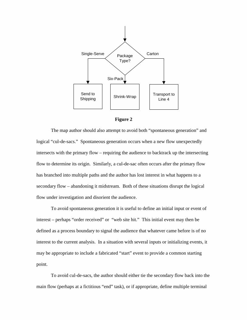
Figure 2
The map author should also attempt to avoid both “spontaneous generation” and
logical “cul-de-sacs.” Spontaneous generation occurs when a new flow unexpectedly
intersects with the primary flow – requiring the audience to backtrack up the intersecting
flow to determine its origin. Similarly, a cul-de-sac often occurs after the primary flow
has branched into multiple paths and the author has lost interest in what happens to a
secondary flow – abandoning it midstream. Both of these situations disrupt the logical
flow under investigation and disorient the audience.
To avoid spontaneous generation it is useful to define an initial input or event of
interest – perhaps “order received” or “web site hit.” This initial event may then be
defined as a process boundary to signal the audience that whatever came before is of no
interest to the current analysis. In a situation with several inputs or initializing events, it
may be appropriate to include a fabricated “start” event to provide a common starting
point.
To avoid cul-de-sacs, the author should either tie the secondary flow back into the
main flow (perhaps at a fictitious “end” task), or if appropriate, define multiple terminal
Single-Serve Carton
Six-Pack
Shrink-WrapSend to Shipping
Transport to Line 4
Package Type?

boundaries. For example, a process might have one flow ending with “purchase
declined” and another with “ship UPS.” In any case, secondary flows should be
explicitly terminated, not simply abandoned.
In order to visually represent that a step is designated as a boundary, authors may
use a unique color or shape of Post-It® note or simply draw rounded corners on their
existing stock. Later, when the chart is converted to digital form, rectangles with
rounded corners (Figure 3) will be used to identify both beginning and ending
boundaries.
Figure 3
A final grammatical element is the modeling of time. In general, temporal flow
should be implicitly represented along either the vertical or horizontal axis. While
rework loops are obviously not intended to evoke time travel, maintaining a dominant
linear flow throughout the graphic greatly enhances the legibility of the flowchart. In the
special case of cycle time analysis it may be beneficial to include an explicit timeline
along a chosen axis.
Flowcharting with Excel:
In order to convert our paper chart to digital form, our software of choice is
Microsoft Excel. It should be noted that there are a number of relatively inexpensive
software packages that are specifically designed for authoring flowcharts. A strong
argument can be made that most – if not all – of these software packages outperform
Order Received Order Processed Parcel Shipped

Excel in the fundamental activity of generating flowcharts. However, our choice is not
based solely upon the efficiency of the software, but also considers associated transaction
costs – particularly those inherent in the academic environment. After spending
thousands of dollars on tuition, many students balk at any additional expense for software
that receives only limited use in the classroom. Second, by utilizing a general-purpose
spreadsheet application, the hassle and expense of securing a site license for in-class
demonstration and computer labs is avoided. Further, the widespread availability of
spreadsheet software in the post-graduation work environment allows easy application of
the new skill. Finally, we’ve observed a positive side effect – increased familiarity with
the drawing functions of Excel boost student confidence and performance with the other
capabilities of the software. Although these arguments are directed to academic users,
we also believe that corporate trainers and light users of flowcharting software may face
comparable incentives.
The Drawing Toolbar:
The primary tools for flowcharting within Excel can be found on the Drawing
toolbar. This toolbar is not visible when the spreadsheet application is initially opened
with the general default settings. As a result, new users should be shown how to access
the toolbar by clicking on View on the main toolbar, then Toolbars, then Drawing, as
illustrated in Figure 4.

Figure 4
AutoShapes & Connectors:
Access to the basic flowcharting shapes and arrows can be obtained by clicking
on the AutoShapes button on the Drawing toolbar as illustrated in Figure 5. Users may
note that Excel offers “helpful” hints when the mouse cursor is held over each AutoShape
(Figure 5). Novice users should be warned that software engineers programmed these
hints and they can be misleading. Many business users will not recognize individual
symbols to have the same meaning as that offered by Excel.

Figure 5
Flowchart authors are strongly encouraged to use the arrowhead Connectors
available via the AutoShapes button rather than simple arrows directly available on the
Drawing toolbar. By clicking on a Connector and passing the mouse cursor over an
AutoShape users will find that small blue squares appear on each side of the AutoShape.
By clicking on one of the blue squares, the Connector becomes affixed to the AutoShape.
A second click on one of the blue squares of the appropriate downstream AutoShape
completes the process. This feature becomes particularly useful when the flowchart is
subject to further refinement or amendment. The author only moves one AutoShape and
the Connector automatically maintains its connections. Users may also convert a solid
arrow Connector to a dotted-line Connector by first using the computer mouse to click on
the Connector, and then accessing the line formatting functions of the Drawing toolbar as
illustrated in Figure 6.

Figure 6
Align & Distribute:
Aligning and distributing individual AutoShapes further enhances the legibility of
a flowchart. Related flows should be linearly oriented to each other with the white space
between shapes kept relatively consistent throughout the chart. While this may be
accomplished manually, the Align and Distribute function available via the Draw button
on the Drawing toolbar greatly facilitates the process. The user first right-clicks on one
of the AutoShapes to be aligned, then depresses and holds the Shift key down while using
the mouse to click on all of the AutoShapes that are to become part of a single linear
arrangement. While all of the appropriate AutoShapes remain highlighted, the user then
clicks on the Draw button as illustrated in Figure 7. The author may then use the specific
alignment and distribution functions as appropriate.
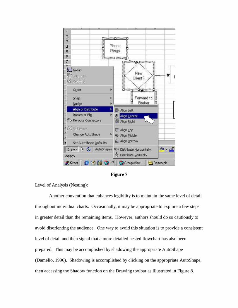
Figure 7
Level of Analysis (Nesting):
Another convention that enhances legibility is to maintain the same level of detail
throughout individual charts. Occasionally, it may be appropriate to explore a few steps
in greater detail than the remaining items. However, authors should do so cautiously to
avoid disorienting the audience. One way to avoid this situation is to provide a consistent
level of detail and then signal that a more detailed nested flowchart has also been
prepared. This may be accomplished by shadowing the appropriate AutoShape
(Damelio, 1996). Shadowing is accomplished by clicking on the appropriate AutoShape,
then accessing the Shadow function on the Drawing toolbar as illustrated in Figure 8.
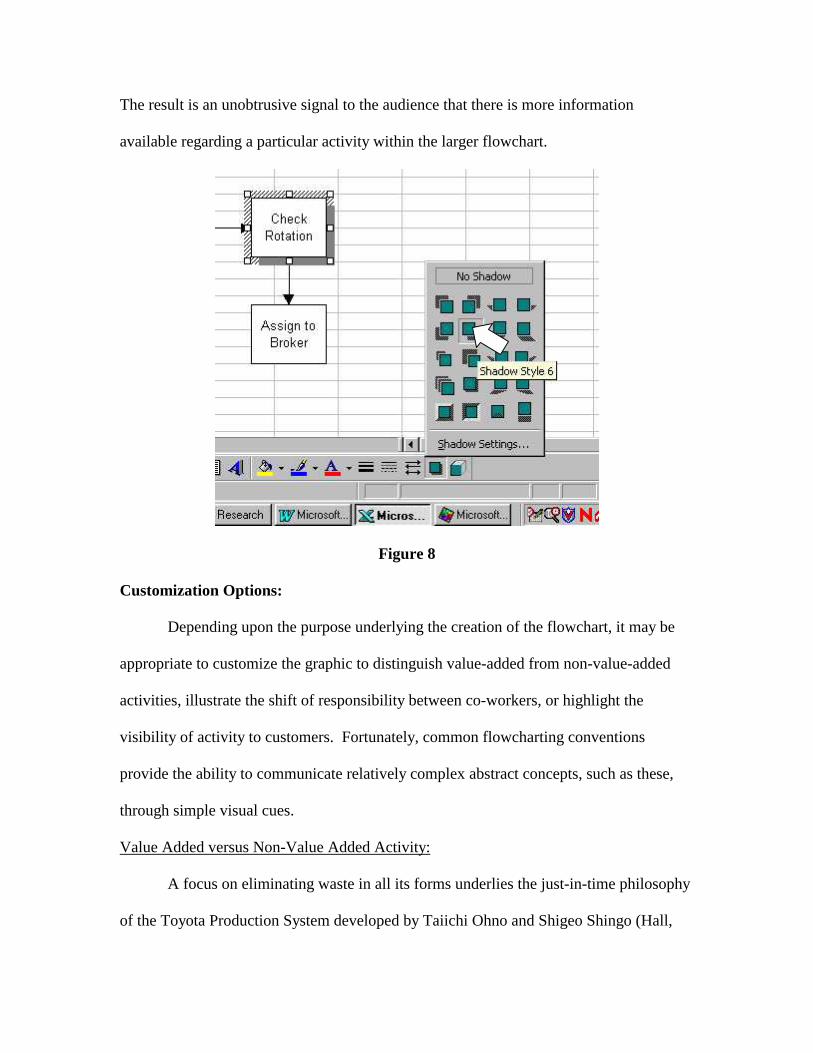
The result is an unobtrusive signal to the audience that there is more information
available regarding a particular activity within the larger flowchart.
Figure 8
Customization Options:
Depending upon the purpose underlying the creation of the flowchart, it may be
appropriate to customize the graphic to distinguish value-added from non-value-added
activities, illustrate the shift of responsibility between co-workers, or highlight the
visibility of activity to customers. Fortunately, common flowcharting conventions
provide the ability to communicate relatively complex abstract concepts, such as these,
through simple visual cues.
Value Added versus Non-Value Added Activity:
A focus on eliminating waste in all its forms underlies the just-in-time philosophy
of the Toyota Production System developed by Taiichi Ohno and Shigeo Shingo (Hall,
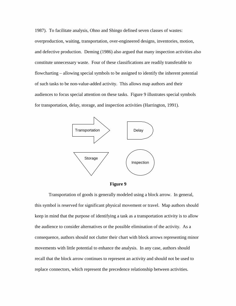
1987). To facilitate analysis, Ohno and Shingo defined seven classes of wastes:
overproduction, waiting, transportation, over-engineered designs, inventories, motion,
and defective production. Deming (1986) also argued that many inspection activities also
constitute unnecessary waste. Four of these classifications are readily transferable to
flowcharting – allowing special symbols to be assigned to identify the inherent potential
of such tasks to be non-value-added activity. This allows map authors and their
audiences to focus special attention on these tasks. Figure 9 illustrates special symbols
for transportation, delay, storage, and inspection activities (Harrington, 1991).
Figure 9
Transportation of goods is generally modeled using a block arrow. In general,
this symbol is reserved for significant physical movement or travel. Map authors should
keep in mind that the purpose of identifying a task as a transportation activity is to allow
the audience to consider alternatives or the possible elimination of the activity. As a
consequence, authors should not clutter their chart with block arrows representing minor
movements with little potential to enhance the analysis. In any case, authors should
recall that the block arrow continues to represent an activity and should not be used to
replace connectors, which represent the precedence relationship between activities.
Transportation Delay
InspectionStorage
Delays or queues are generally modeled using a blunted rectangle, bullet, or D
shaped symbol. This symbol is used when forward movement through the process flow
is temporarily delayed. This type of a delay might be due to a busy downstream
workstation blocking forward movement – resulting in a queue of work. Alternatively,
the delay might be caused by the workstation being starved for a particular input. In
either case, the use of the delay symbol emphasizes the temporary nature of the
interruption in flow. Once the restricting condition is removed, work is expected to
automatically resume.
In contrast, intentional stores and longer-term inventories are modeled as an
inverted triangle. Common storage points include raw materials, finished goods, repair
parts, or supplies. An inventory or store is distinguished from a delay because an
intervening operation is required to call the input out of storage for further processing.
Finally, a large circle is used to signify an inspection or appraisal operation.
Examples include using calipers to measure a physical attribute of a product,
proofreading a document, or even kicking the tires of a used car. Generally, the input to
an inspection activity remains unchanged as it passes through to the next operation.
Depending upon the level of detail, the flowchart might simply indicate that an inspection
occurs. In more detailed cases, the inspection might be followed by a decision diamond
that reveals the divergent paths taken depending upon whether a unit of production
passed or failed the inspection. In either case we recommend using the inspection
activity to identify the focus of the inspection. In a detailed case, the subsequent decision
diamond can be used to define the relevant tolerance limits (Figure 10).

Figure 10
Authors should be cautioned to use the four symbols of Figure 9 carefully. The
inherent character of transportation, delay, storage, and inspection merely suggests the
potential that the underlying task is non-value-added. Designation of a particular task
with one of the above classifications should not be used as a substitute for substantive
analysis. In addition, these symbols should only be used if they support the underlying
purpose for creating the flowchart. Use of these additional symbols adds visual clutter.
As a result, they create the possibility of confusing and distracting the audience. In
addition, it cannot be assumed that the audience will automatically understand their
meaning. To aid communication, authors must assume the responsibility of either
educating the audience or incorporating a glossary of symbols into the report or manual
where they plan to publish the flowchart.
Too Small Too Big
Pass
Diameter
10.0 to 11.0 mm?
Assembly Queue
Rework QueueScrap Rework

Functional Responsibility:
Cross-functional flowcharts are commonly utilized to illustrate the shift in
responsibility between co-workers. A functional flowchart utilizes horizontal or vertical
bands to represent the scope of responsibility assigned to each worker or department that
contributes to the process under analysis. The individual AutoShapes representing tasks
assigned to specific workers are then oriented so that they appear within the appropriate
band of responsibility. Each time a Connector crosses into a new band, a shift in
responsibility occurs. A process analyst may be especially concerned with these cross-
functional interfaces because each handoff represents an opportunity for
miscommunication or failure to assume accountability. When responsibility for a
particular task is assigned to multiple parties, the AutoShape may straddle the relevant
bands (this may require some forethought on the way the bands of responsibility are
initially laid out). Figure 11 illustrates a simple functional flowchart.

Figure 11
Line of Visibility:
A final customization option is the line of visibility (Anthony & Heskett, 1992).
This technique is conceptually similar to a cross-functional flowchart. However, in this
case the dotted line represents a division between front and back-office activities. Use of
Reception Nurse Doctor
No Yes
Yes
Yes
No
Patient Arrives
Patient Registers at Desk
Review Worksheet
Patient Completes Worksheet
Complete?
Instruct Patient
Patient Waits Room Assigned
Office Exam & Diagnosis
Follow-up?
Schedule Appointment
Patient Departs
File in Queue
Consult on Schedule
Consult with Nurse
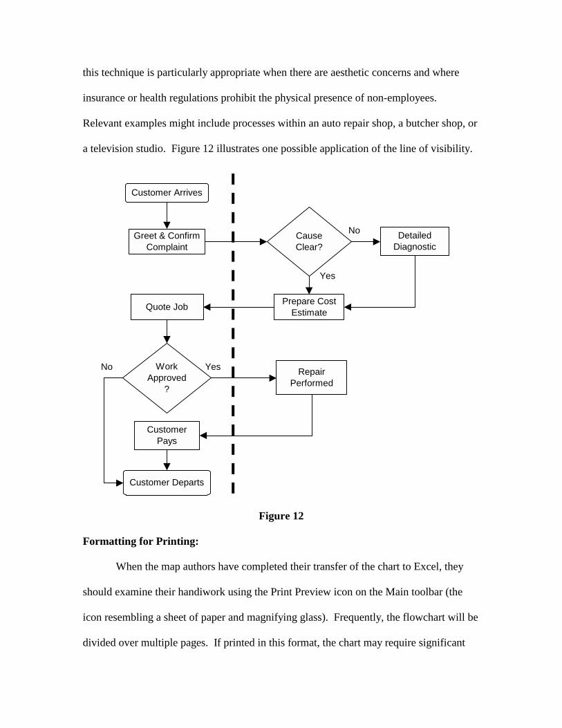
this technique is particularly appropriate when there are aesthetic concerns and where
insurance or health regulations prohibit the physical presence of non-employees.
Relevant examples might include processes within an auto repair shop, a butcher shop, or
a television studio. Figure 12 illustrates one possible application of the line of visibility.
Figure 12
Formatting for Printing:
When the map authors have completed their transfer of the chart to Excel, they
should examine their handiwork using the Print Preview icon on the Main toolbar (the
icon resembling a sheet of paper and magnifying glass). Frequently, the flowchart will be
divided over multiple pages. If printed in this format, the chart may require significant
No
Yes
No Yes
Customer Arrives
Greet & Confirm Complaint
Cause Clear?
Detailed Diagnostic
Prepare Cost Estimate
Work Approved
?
Quote Job
Repair Performed
Customer Pays
Customer Departs
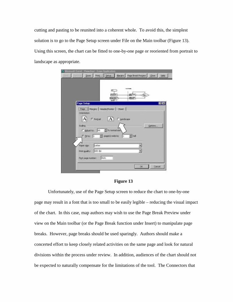
cutting and pasting to be reunited into a coherent whole. To avoid this, the simplest
solution is to go to the Page Setup screen under File on the Main toolbar (Figure 13).
Using this screen, the chart can be fitted to one-by-one page or reoriented from portrait to
landscape as appropriate.
Figure 13
Unfortunately, use of the Page Setup screen to reduce the chart to one-by-one
page may result in a font that is too small to be easily legible – reducing the visual impact
of the chart. In this case, map authors may wish to use the Page Break Preview under
view on the Main toolbar (or the Page Break function under Insert) to manipulate page
breaks. However, page breaks should be used sparingly. Authors should make a
concerted effort to keep closely related activities on the same page and look for natural
divisions within the process under review. In addition, audiences of the chart should not
be expected to naturally compensate for the limitations of the tool. The Connectors that
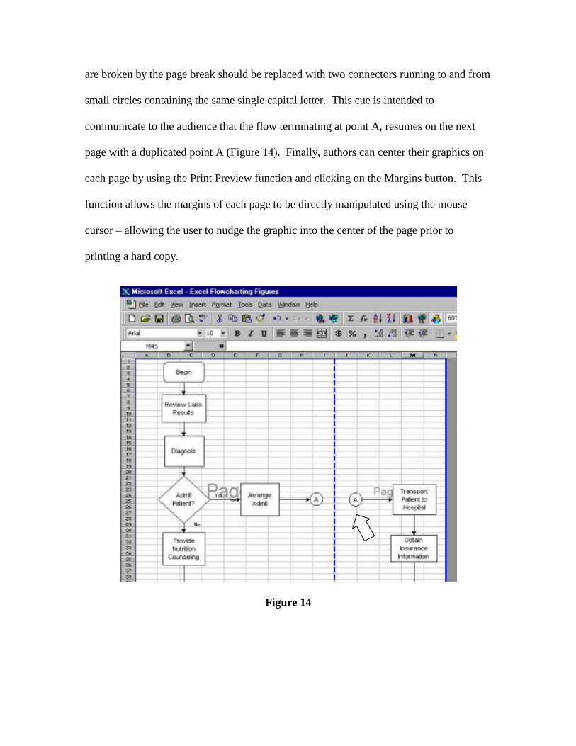
are broken by the page break should be replaced with two connectors running to and from
small circles containing the same single capital letter. This cue is intended to
communicate to the audience that the flow terminating at point A, resumes on the next
page with a duplicated point A (Figure 14). Finally, authors can center their graphics on
each page by using the Print Preview function and clicking on the Margins button. This
function allows the margins of each page to be directly manipulated using the mouse
cursor – allowing the user to nudge the graphic into the center of the page prior to
printing a hard copy.
Figure 14

Final Thoughts:
Feedback from our students has been almost universally positive. Their
comments suggest that they both enjoy and value the development of their flowcharting
talent. As with any skill, immediate application enhances the degree of learning and
long-term retention. To facilitate this, we frequently assign the virtual company tours
available via www.mhhe.com/pom/ and other web sites to provide practice in developing
process maps.

References:
Anthony, Robert, Note on Service Mapping, 1992, Boston: Harvard Business School Publishing. Damelio, Robert, The Basics of Process Mapping, 1996, New York: Quality Resources. Deming, W. Edwards, Out of the Crisis, 1986, Cambridge: MIT Center for Advanced Engineering Study. Galloway, Dianne, Mapping Work Processes, 1994, Milwaukee: ASQ Quality Press. Hall, Robert, Zero Inventories, 1987, Homewood: Dow Jones-Irwin. Harrington, H. James, Business Process Improvement, 1991, New York: McGraw-Hill. Roberts, Lon, Process Reengineering, 1994, Milwaukee: ASQ Quality Press.