fun with control charts - vermont oxford with control charts or: how to impress your friends with...
TRANSCRIPT
Fun With Control Charts
Asaph Rolnitsky, MD
April 5, 2016 1
FUN WITH CONTROL CHARTSOR: HOW TO IMPRESS YOUR FRIENDS WITH PROCESS CONTROL
Asaph Rolnitsky, MD
Sunnybrook Health Sciences Centre NICU, University Of Toronto
MSc candidate, Queen’s University
VAQS Graduate
DISCLOSURE
• No conflicts to disclose

Fun With Control Charts
Asaph Rolnitsky, MD
April 5, 2016 2
OBJECTIVES
• To understands what SPC is
• To understand a run chart
• To understand a control chart
• To find tools for use
• To have fun
CONTENT
• History
• SPC simplified
• Basic definitions
• Run charts examples
• Control charts examples
• Analysis by rules
• Available tools
• Demonstration?

Fun With Control Charts
Asaph Rolnitsky, MD
April 5, 2016 3
“YOU IDIOTS!!.. WE’LL NEVER GET THING DOWN THE HOLE.”You idiots! We’ll never get this thing
down the hole!
HISTORY
• Walter Shewhart (1891 – 1967), a physicist,
engineer, and statistician.
• The father of statistical quality control, the control
charts and the Shewhart (PDSA) cycle.
• Working in Bell labs, Shewart developed a methods
of measuring, analyzing, and presenting changes in
product quality.
Fun With Control Charts
Asaph Rolnitsky, MD
April 5, 2016 4
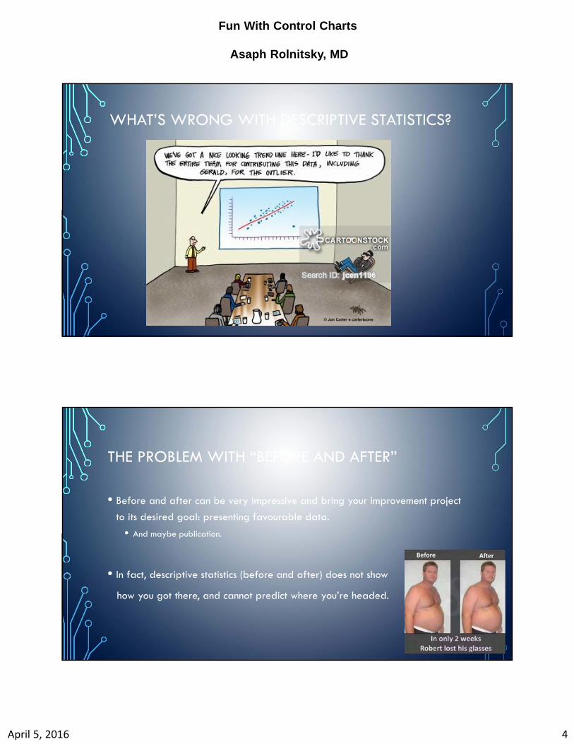
WHAT’S WRONG WITH DESCRIPTIVE STATISTICS?
THE PROBLEM WITH “BEFORE AND AFTER”
• Before and after can be very impressive and bring your improvement project
to its desired goal: presenting favourable data.
• And maybe publication.
• In fact, descriptive statistics (before and after) does not show
how you got there, and cannot predict where you’re headed.
Fun With Control Charts
Asaph Rolnitsky, MD
April 5, 2016 5
6.3%
3.4%
1 2 3 4 5 6 7 8 9 10 11 12 13 14 15 16 17 18 19 20 21 22 23 24 25 26 27 280.00%
2.00%
4.00%
6.00%
8.00%
10.00%
12.00%
Belly massage to reduce mor tality in hernia repair patients
Average
Massage q8h
6.3%
3.4%
1 2 3 4 5 6 7 8 9 10 11 12 13 14 15 16 17 18 19 20 21 22 23 24 25 26 27 280.00%
2.00%
4.00%
6.00%
8.00%
10.00%
12.00%
Belly massage to reduce mor tality in hernia repair patients
Average Linear (Average)
Massage q8h
PROCESS CONTROL VS DESCRIPTIVE STATISTICS
6.3%
3.4%
1 2 3 4 5 6 7 8 9 10 11 12 13 14 15 16 17 18 19 20 21 22 23 24 25 26 27 280.00%
2.00%
4.00%
6.00%
8.00%
10.00%
12.00%
Belly massage to reduce mor tality in hernia repair patients
Average Mortality Linear (Average)
Massage q8h
TREND LINE VS SPC

Fun With Control Charts
Asaph Rolnitsky, MD
April 5, 2016 6
WHAT ARE CONTROL CHARTS?
• Control charts present data dispersion over time.
• They show the limits of the process, based on standard deviation of the data
and where data is within the limits.
CONTROL CHART- WHY?
• To distinguish between common cause and special cause variation.
• (Out of control/special cause can be good)
• Center line often the mean.
• UCL and LCL similar to standard deviation.
• Type of analysis depends on distribution of data.

Fun With Control Charts
Asaph Rolnitsky, MD
April 5, 2016 7
Visual display of data over time.
DeMauro Pediatrics 2013
CONTROL CHART: REDUCING HYPOTHERMIA AT ADMISSION
Fun With Control Charts
Asaph Rolnitsky, MD
April 5, 2016 8
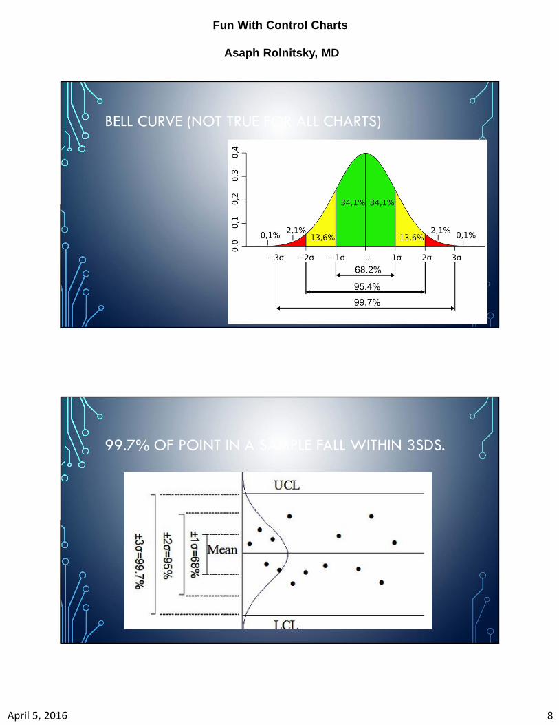
BELL CURVE (NOT TRUE FOR ALL CHARTS)
99.7% OF POINT IN A SAMPLE FALL WITHIN 3SDS.
Fun With Control Charts
Asaph Rolnitsky, MD
April 5, 2016 9
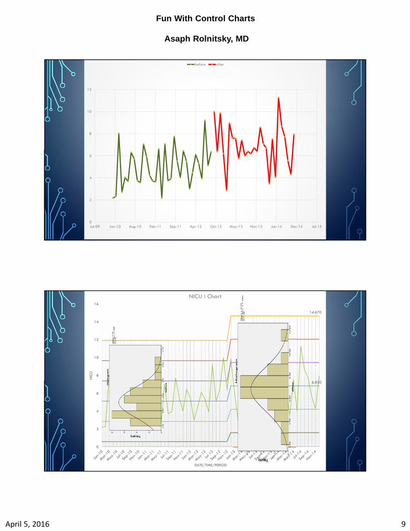
0
2
4
6
8
10
12
Jul-09 Jan-10 Aug-10 Feb-11 Sep-11 Apr-12 Oct-12 May-13 Nov-13 Jun-14 Dec-14 Jul-15
before after
44
UCL
14.670
CL
6.830
0
2
4
6
8
10
12
14
16
NIC
U
DATE/TIME/PERIOD
NICU i Chart
Fun With Control Charts
Asaph Rolnitsky, MD
April 5, 2016 10
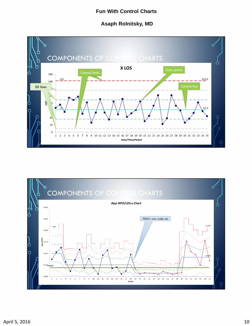
COMPONENTS OF CONTROL CHARTS
Data pointsData pointsControl limits
Central lineSD linesSD linesSD linesSD lines
COMPONENTS OF CONTROL CHARTS
PDSA1: new order set
target
Fun With Control Charts
Asaph Rolnitsky, MD
April 5, 2016 11
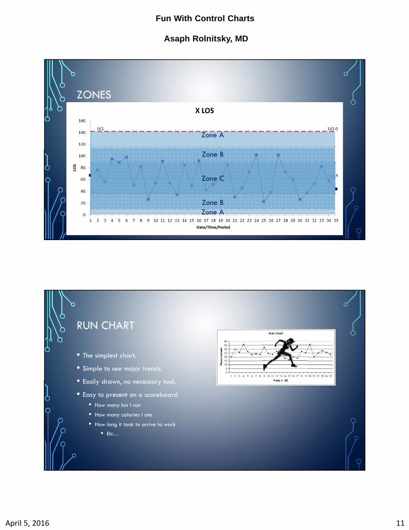
ZONES
Zone A
Zone A
Zone B
Zone B
Zone C
RUN CHART
• The simplest chart.
• Simple to see major trends.
• Easily drawn, no necessary tool.
• Easy to present on a scoreboard
• How many km I ran
• How many calories I ate
• How long it took to arrive to work
• Etc…

Fun With Control Charts
Asaph Rolnitsky, MD
April 5, 2016 12
RUN CHART
• A “run” is a point or a cluster of points in any side of the MEDIAN line (and
not ON the median).
• Special cause variation indication:
• Too many/few runs (available table)
• A shift: ≥8 points on any side of the median.
• A trend of ≥6 (or 7?) up or down.
• “Astronomical point”

Fun With Control Charts
Asaph Rolnitsky, MD
April 5, 2016 13
• Special cause:
• Too many/few runs?
• 13/13.
• A shift: ≥8 points?
• no
• A trend of ≥6?
• No
• Astronomical point?
• ?No
Run Charts Control Charts
Simple & easy to understand and interpret
More Easy to create with paper or in Excel
Less sensitive and can miss some special
cause signals
No measure of the amount of variation or
‘precision’ in the data
Minimum 10 data points
complex, not just one type to consider
Need a special template or special
software
More sensitive and powerful tool—control
limits
provide additional tests
Control limits show the precision and more
accurately predict future behaviour
Minimum 25 data points

Fun With Control Charts
Asaph Rolnitsky, MD
April 5, 2016 14
TYPES OF CONTROL CHARTS
• Each chart looks at different characteristics of your data.
• Weight loss
• Medication errors
• Proportion of ROP
• Each has different charts.
WHAT ARE WE MEASURING?
• Sepsis episodes/month (some months have less patients)
• Patients with sepsis/month? (one patient can have>1)
• Sepsis episodes/100 patient days
• Days between sepsis
• Line insertions between infections

Fun With Control Charts
Asaph Rolnitsky, MD
April 5, 2016 15
WHAT TYPE?
Discrete counts, different
distribution
Continuous variables, normally distributed
WHAT TYPE?
Measurement for one
observation (ie: Time to admission)
Counts for EVENTS, or AFFECTED subjects (ie:
intubation attempts vs intubated
patients

Fun With Control Charts
Asaph Rolnitsky, MD
April 5, 2016 16
Type?Type?
continuouscontinuous
XmR (I)XmR (I)
attributeattribute
What are you counting?
What are you counting?
Events
(“defects”)
i.e.: Sepsis episodes
Events
(“defects”)
i.e.: Sepsis episodes
UU
C if constant sample or sample=1
C if constant sample or sample=1
Subjects (“defectives”)
i.e.: children that had sepsis
Subjects (“defectives”)
i.e.: children that had sepsis
PP
nP if constant sample or sample=1
nP if constant sample or sample=1
EXAMPLES:KQI Type of chart Why?
Temperature at admission X Measured continuous variable
Number of blood transfusions given in the NICU C Counted (“defects”) or “events”
Sepsis workups, intubation attempts C Counted “events”
Abx days/100 patient U Counted “defects”, corrected/patient
EBM feeds/Total feeds P Counted defects, corrected/variable denominator
TPN days/100 admission days Np Counted defects, corrected/constant denominator
Days between line sepsis T Counted time between event
IVH>2 C Counted “events”
Complaints/patient P Counted defects, corrected/variable denominator

Fun With Control Charts
Asaph Rolnitsky, MD
April 5, 2016 17
WHY IS THE TYPE IMPORTANT?
• Each control chart has specific calculation of control limits.
• Choosing the wrong chart may falsely show your process is in control or not.
• Some expert suggest to use I chart (XmR) as much as possible.
COMMON CAUSE VS SPECIAL CAUSE VARIATION
• Common cause variation is the expected, random variability in data signals.
• If process is stable but not optimal, may mean need for redesign.
• i.e.: Sepsis rate is stable, but high.

Fun With Control Charts
Asaph Rolnitsky, MD
April 5, 2016 18
COMMON CAUSE VS SPECIAL CAUSE VARIATION
• Special cause is a signal that is statistically significantly deviating from the
previous collection of points.
• May mean a change to study, or may mean that a change is indeed causing an effect.
RULES OF SPECIAL CAUSE
Control Chart RulesWestgard
Nelson-Juran
AIAG Montgomery Western Electric Healthcare
1. Points above UCL or Below LCL 1 1 1 1 1 1
2. Zone A n of n + 1 points above/below 2 sigma 2 2 2 2 2 2
3. Zone B n of n + 1 points above/below 1 sigma 4 4 4 4
4. n points in a row above or below center line 8 9 7 8 8 8
5. Trends of n points in a row increasing or decreasing 7 6 6 6 6
6. Zone C - n points in a row inside Zone C (hugging) 15 15 15 15
7. n points in a row alternating up and down 14 14 14
8. Zone C - n points in a row outside Zone C 8 8 89. Zone B n points above/below 1sigma; 2 points one above, one below 2sigma 4

Fun With Control Charts
Asaph Rolnitsky, MD
April 5, 2016 19
CONTROL CHART RULES
0%
20%
40%
60%
80%
100%
120%
Date/Time/Period
P chart: Feeding Error RatesRule 1: 1 Point above/Below CL
Rule 6: 15 Points in zone C
(HUGGING)
Rule 5: 6 Points trending
Rule 4: 8 Points in one side of CL
(SHIFT)
Rule 2: 2/3 Points above/Below 2SDs
Fun With Control Charts
Asaph Rolnitsky, MD
April 5, 2016 20
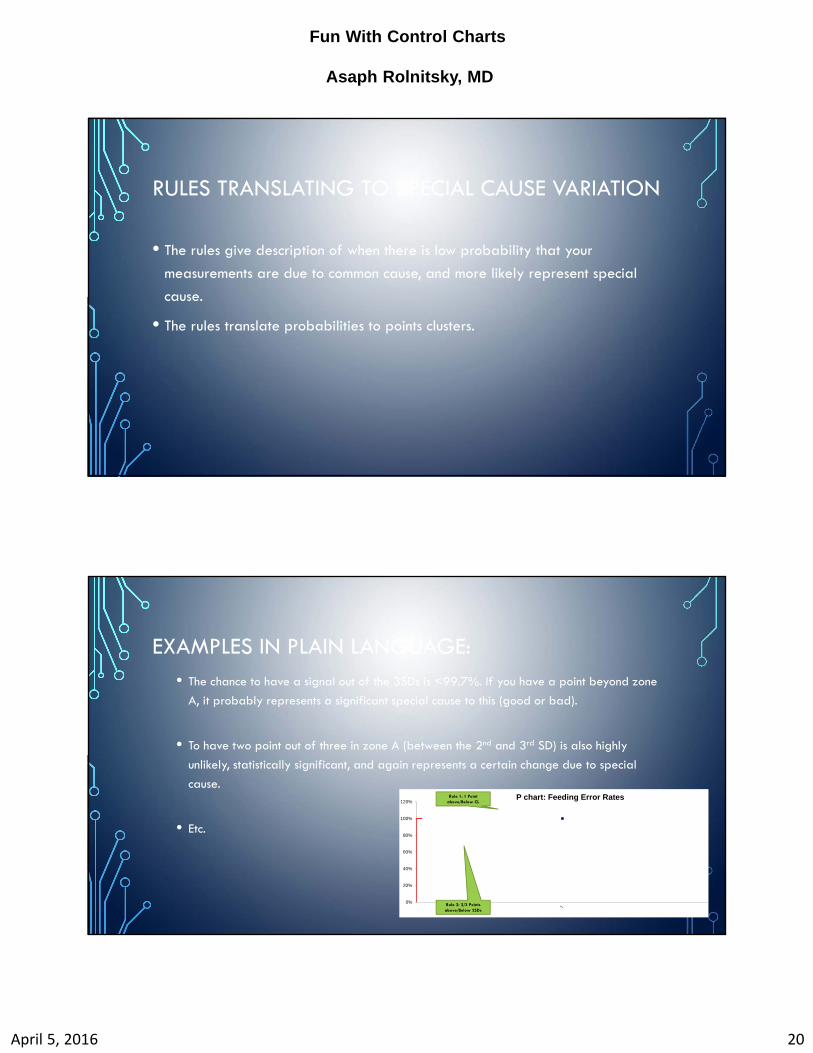
RULES TRANSLATING TO SPECIAL CAUSE VARIATION
• The rules give description of when there is low probability that your
measurements are due to common cause, and more likely represent special
cause.
• The rules translate probabilities to points clusters.
EXAMPLES IN PLAIN LANGUAGE: • The chance to have a signal out of the 3SDs is <99.7%. If you have a point beyond zone
A, it probably represents a significant special cause to this (good or bad).
• To have two point out of three in zone A (between the 2nd and 3rd SD) is also highly
unlikely, statistically significant, and again represents a certain change due to special
cause.
• Etc.
0%
20%
40%
60%
80%
100%
120%P chart: Feeding Error RatesRule 1: 1 Point
above/Below CL
Rule 2: 2/3 Points above/Below 2SDs

Fun With Control Charts
Asaph Rolnitsky, MD
April 5, 2016 21
HOW TO BUILD ONE
• Everything is Googleable.
• There are available free templates and professional macros to purchase.
1. Plan the what you measure.
2. Choose the chart type.
3. Start charting
4. Calculate the mean, UCL, LCL and SDs.
5. Analyze the data.
HOW MANY POINTS DO WE NEED?
• Theoretically: ARL= 1/p
• Rule #1 (out of 3SDs): 1/(1-0.9973)=1/0.0027)=370!
• For all rules together: 25
Fun With Control Charts
Asaph Rolnitsky, MD
April 5, 2016 22
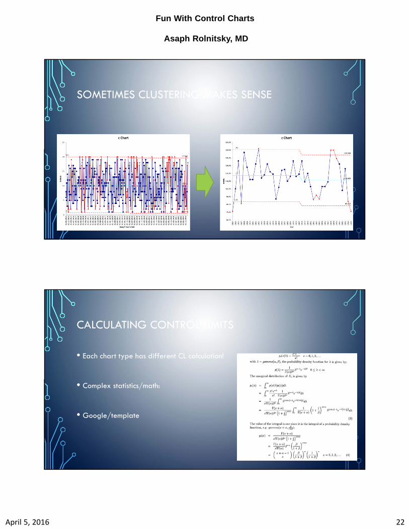
SOMETIMES CLUSTERING MAKES SENSE
CALCULATING CONTROL LIMITS
• Each chart type has different CL calculation!
• Complex statistics/math:
• Google/template
Fun With Control Charts
Asaph Rolnitsky, MD
April 5, 2016 23
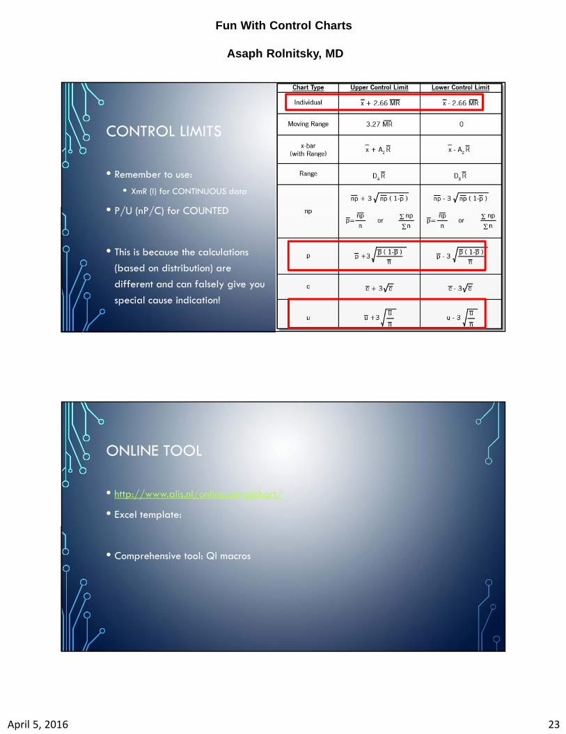
CONTROL LIMITS
• Remember to use:
• XmR (I) for CONTINUOUS data
• P/U (nP/C) for COUNTED
• This is because the calculations
(based on distribution) are
different and can falsely give you
special cause indication!
ONLINE TOOL
• http://www.alis.nl/onlinecontrolchart/
• Excel template:
• Comprehensive tool: QI macros

Fun With Control Charts
Asaph Rolnitsky, MD
April 5, 2016 24
WHAT TO DO WITH IT?