how effective is the combination of your magazine
TRANSCRIPT

How effective is the combination of your magazine, trailer and poster?
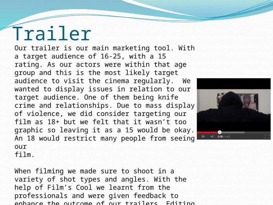
TrailerOur trailer is our main marketing tool. With a target audience of 16-25, with a 15 rating. As our actors were within that age group and this is the most likely target audience to visit the cinema regularly. We wanted to display issues in relation to our target audience. One of them being knife crime and relationships. Due to mass display of violence, we did consider targeting our film as 18+ but we felt that it wasn’t too graphic so leaving it as a 15 would be okay. An 18 would restrict many people from seeing ourfilm.
When filming we made sure to shoot in a variety of shot types and angles. With the help of Film’s Cool we learnt from the professionals and were given feedback to enhance the outcome of our trailers. Editing was the hardest stage but overall I believe we have created a successful trailer, on a zero to nothing budget. By using advanced software such as Final Cut Pro, After Effects and Celtx, this gave our trailer an extremely professional outcome.

MagazineThe magazine features a close up/ mid shot of our masked protagonist. The photo is very central , making him the main focus and an eye catcher. Magazines are used as marketing and promotion tools that create a hype for the film. When editing we stuck with the same colour scheme as our trailer. Which were very dark tones such as grey, red and black. However, to broaden our audience we included colours some primary colours to make it slightly more appealing. The capitalized font highlights the conventions and features of magazines.
By advertising ‘free posters’ and ‘exclusive interviews” this gives potential readers an insight as to what is in the magazine. Which will then make them want to buy it. They’ll know that they are receiving good value for their money.
The movie title is a big as the magazine name. This makes it stand out despite its faded effect. Even if a passerbyer doesn’t buy our magazine the name will be stuck in their head. This could lead to them going home to research into the film.
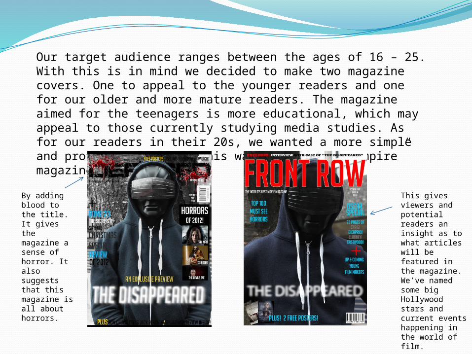
Our target audience ranges between the ages of 16 – 25. With this is in mind we decided to make two magazine covers. One to appeal to the younger readers and one for our older and more mature readers. The magazine aimed for the teenagers is more educational, which may appeal to those currently studying media studies. As for our readers in their 20s, we wanted a more simple and professional look. This was inspired by “Empire” magazine.
By adding blood to the title. It gives the magazine a sense of horror. It also suggests that this magazine is all about horrors.
This gives viewers and potential readers an insight as to what articles will be featured in the magazine. We’ve named some big Hollywood stars and current events happening in the world of film.

Poster
Researching and analysing other horror posters gave us examples to aspire to when making our own. We created it from scratch using Photoshop. We used the same image as we used on our magazine cover, as we want it to become recognisable to those who see it more than once.

Overlay of protagonist and tress makes it appear as if he is looking through them. He is masked and fading into the trees. This inflicts fear onto the audience, as they are unaware as to who it may be.
Film rating gives viewers an outsider’s opinion on the film and if it is worth seeing. These ratings are usually given by highly respected film reviewers and newspapers.
The dark, gloomy and earthy colours conveys that is a horror . Red is also a colour that is associated with horror but we decided to use it subtlety.
Although it is written in a very small font, this is section with all the information such as actors, producers, directors etc. Due to our small budget we are unable to have ‘star power’ but it is common for trailers to use unknown actors.
The block of flats gives the audience an insight as to where the film is set. We chose this location as this is a place where our target audience is familiar with and knows what reputation they uphold.
We wanted the title to look as if it was disappearing and fading away. This is because it contrasts well with the name of the film.
Overall, I believe that our media products work effectively and complement each other well. The use of synergy is seen across all three media platforms. All were successfully marketed and will benefit towards our film campaign.