optimal audio-visual representations for illiterate users ...optimal audio-visual representations...
TRANSCRIPT
Optimal Audio-Visual Representations for Illiterate Users of Computers
Indrani Medhi
Archana Prasad Microsoft Research Labs India
“Scientia”, 196/36, 2nd Main Sadashivnagar, Bangalore-
560080, India [email protected]
Kentaro Toyama
ABSTRACT We present research leading toward an understanding of the optimal audio-visual representation for illustrating concepts for illiterate and semi-literate users of computers. In our user study, which to our knowledge is the first of its kind, we presented to 200 illiterate subjects each of 13 different health symptoms in one representation randomly selected among the following ten: text, static drawings, static photographs, hand-drawn animations, and video, each with and without voice annotation. The goal was to see how comprehensible these representation types were for an illiterate audience. We used a methodology for generating each of the representations tested in a way that fairly stacks one representational type against the others.
Our main results are that (1) voice annotation generally helps in speed of comprehension, but bimodal audio-visual information can be confusing for the target population; (2) richer information is not necessarily better understood overall; (3) the relative value of dynamic imagery versus static imagery depends on various factors. Analysis of these statistically significant results and additional detailed results are also provided.
ACM Classification Keywords H.5.2 [Information Interfaces and Presentation]: User Interfaces — Input devices and strategies, Interaction styles, Evaluation/methodology, Graphical user interfaces (GUI), User-centered design
General Terms Design, Human Factors
Keywords Illiterate users; audio-visual icons; text-free user interfaces.
1. INTRODUCTION Recent work under the banner of “information and communication for development” considers how computing technology can impact socio-economic development for poor communities [27, 28, 29, 35, 36, 41, 47]. Much of this work is devoted to providing computer applications to support activities in agriculture [41, 47], healthcare [15], or education [27].
These communities share characteristics other than economic hardship, even across geographies, because poverty is correlated with other factors such as poor education. Among these shared traits is illiteracy. Even conservative estimates of illiteracy suggest that there are over one billion illiterate people in the world [23], and many more are semi-literate – just barely able to write their own names or recognize common words. Any computing application meant to aid impoverished communities would therefore be more accessible, if provisions were made for illiterate users. The sheer abundance of text in standard interfaces suggests that there would be significant challenges in developing applications that do not rely on the ability to read text.
Previous work in designing UIs for illiterate and semi-literate populations focuses on broad elements, recommending features such as the use of graphical icons [18, 27, 28, 29, 35, 36, 37], minimal use of text [5, 18, 28], voice annotation [28, 29, 37], easy navigability [5, 18, 29, 28, 35, 36, 37], and the use of numbers for subjects who may be illiterate but not innumerate [29, 35, 36, 37]. All such previous work suggests that information should be provided in graphical, rather than textual, form, with voice annotation on mouse-over as an important component. On the whole, these are obvious and intuitive features.
What is not so obvious, however, is the optimal representation for illustrating a given concept. Are photographs better than abstracted hand-drawn graphics? Are videos or animations better than static imagery? Does the visual representation matter at all, if there is clear voice annotation? Etc.
In this paper, we present a body of research that provides initial answers to these and other questions.
In our initial field studies to identify an application domain, we had seen that the health workers were unable to monitor health information effectively. The ratio of number of paramedical individuals to households was very low. We also saw that in most government-run hospitals, due to the extremely low doctor-patient ratio, long queues of waiting patients abounded. Collecting health information was a time consuming process and most doctors/ health workers felt that tremendous amount of their time would be saved if the target community were facilitated to provide their individual records of basic subjective evidence of disease. We therefore decided to design a text-free health information monitoring form that could be filled out by the patients themselves. This would be stored and sent to both medical practitioners and the public health care department for effective identification of disease and useful information
Copyright is held by the International World Wide Web Conference Committee (IW3C2). Distribution of these papers is limited to classroom use, and personal use by others. WWW 2007, May 8–12, 2007, Banff, Alberta, Canada. ACM 978-1-59593-654-7/07/0005.
WWW 2007 / Track: Technology for Developing Regions Session: Communication in Developing Regions
873
sharing. As we were dealing with an illiterate audience, the interface had to use the medium of graphical representation, and the main question that arose was - which medium of graphical representation would be best suited to aid better understanding of decontextual information
Our goal was to compare ten different kinds of representations – text, static drawings, static photographs, hand-drawn animations, and video, each with and without voice annotation – to see how comprehensible they were for an illiterate audience.
To this end, we ran a user study with 200 illiterate subjects who were each presented with 13 different health-related concepts to identify, in one of the ten representations mentioned above.
The experiments revealed some unexpected results. Among the findings, (1) voice annotation generally helps in speed of comprehension, but bimodal audio-visual information can be confusing for some illiterate users; (2) richer information does not appear to be better overall, with hand-drawn cartoons faring better than photorealistic representations; and (3) the relative value of dynamic imagery (video and animation) versus static imagery (photo and drawings) depends on many factors. More results will be presented in the penultimate section.
In addition to the results of the user study, we also present a methodology we developed to suit our specific target user group, to generate each of the representations tested. This methodology addresses three of the concerns we had at the beginning of the work: First, what was a meaningful, concrete domain in which to test the abstract representations? Second, how could we ensure that the visual representations we used for the test were comprehensible to the target community, especially when there were cultural differences between the testers (us) and the subjects? Third, how could we ensure a “fair” test between the representation types so that no undue bias existed in the content itself?
2. TARGET COMMUNITY We based our project in five urban slum communities in Bangalore, India. We gained access into these communities by working with a non-governmental organization (NGO) and a government-run hospital, both of which have been working with people from these slum communities for the past 15+ years.
Most of the people in these slums were either semi-illiterate or illiterate. They were all, however, numerate, and were comfortable reading and writing numbers and performing arithmetic. The age group of people we worked with was between 25 and 55. They all belong to the lower income bracket, with a combined family income of between 20 to 50 USD per month [1]. All were comfortable with the local language, Kannada; some additionally spoke Hindi or Tamil.
As potential traits which may have biased our results, we report that the subjects were predominantly women (the men were far less accessible, as they worked outside the slums), and all the subjects volunteered to participate in the design process.
3. DESIGN ITERATIONS There were a number of challenges we faced in designing the experiment itself.
First, we needed to identify a good domain in which our ten representations could be compared. It is good to try to compare
videos against photographs, but what should the videos be of, that our subjects would respond meaningfully?
Second, we needed to ensure that the visual representations that we used were maximally comprehensible to our test subjects. We took special care to ensure that the representations were not our own representations for the concepts, as our subjects had cultural biases different from ours.
Third, we did our best to normalize the representations so that the comparative tests would differentiate between the representation type and not the specific instances of representation.
We describe our approach to solving these methodological issues below.
3.1 Choice of Domain: Health Symptoms We first needed to identify a domain that would allow us to test the various representations meaningfully. In particular, we felt it was important to work in a domain in which concepts would…
1) Admit to visual representations, 2) Consist of information which they are not exposed to
on a daily basis, 3) Have universally recognized meaning, 4) Offer a range of cognitive complexity, and 5) Offer a range of visual complexity.
In addition, we wanted to work in a domain where the immediate results of our experiments could be applied to a practical purpose. Among the different domains we considered – including education, job-related information, government programs, religious rites and rituals, and so on – healthcare seemed to best fit these criteria.
Specifically, we decided to test representations of common symptoms of illness. Medical symptoms readily have visual representations and have semantics that can be understood regardless of culture. They also offer a range of cognitive and visual complexity. We settled on the following thirteen commonly occurring health symptoms: headache, vomiting, difficulty in getting up from sitting position, difficulty in breathing on mild exertion, fever, lockjaw, back ache, skin infection, weakness, swelling of feet, stiff neck, sore throat, and bleeding gums. These symptoms are multimodal in nature, involving elements of color, temperature, and proprioception, while some require motion, spanning some temporal duration, to be clearly illustrated.
Finally, our field studies suggested that efficient medical data-gathering was a pressing need. Much effort could be saved if there were quicker ways to capture health information than through verbally administered interviews. Thus it was appropriate to design a graphical health information collection form which could be installed at primary health-care kiosks so that illiterate patients would be able to enter their own individual health data.
3.2 Culturally Appropriate Representations Once we decided to use health symptoms as a test domain, we then needed to ensure that the visual and audio representations we supplied were appropriate for the test group.
To accomplish this, we involved a sample design group of subjects, who were part of the same community from which we
WWW 2007 / Track: Technology for Developing Regions Session: Communication in Developing Regions
874
drew our test group, in our design process. (Note that there was no overlap between the design group and the test group.) Using participatory design methods, we involved the design group in generating gestures for the visual representation of the health symptoms.
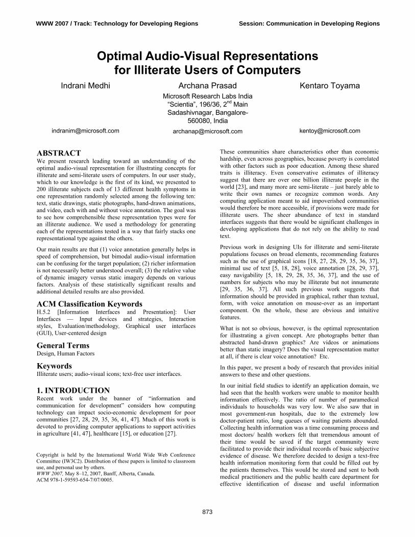
3.2.1 Generating Gestures for Graphics We asked our design group to help us generate gestures and other visual indicators to represent each symptom. There were 20 participants who took part in this exercise. Each participant performed the exercise in isolation, without interaction with other participants. Two techniques were used to elicit the appropriate gestures from our subjects:
3.2.1.1 2D paper cut-out dolls…………………………. The limbs of these dolls could be manipulated. The participants of the exercise were asked to depict a given symptom using these paper dolls.
Figure 1. Subjects maneuvering the paper dolls in the participatory design exercise.
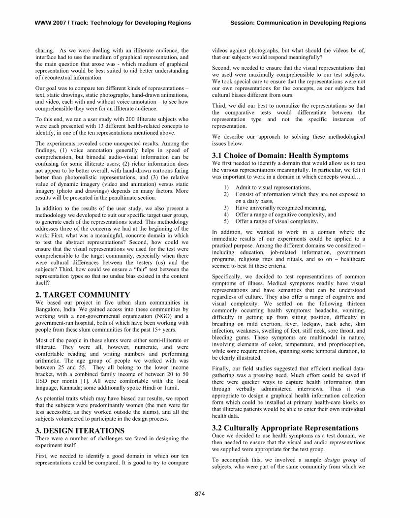
3.2.1.2 Enacting The participants were asked to enact the given symptom without using verbal communication.
Figure 2. Subject enacting the word- “weakness”.
Participants came in one after another and were asked to go through one of the exercises depending on which they preferred. The session was photographed extensively so that these gestures could then be captured in the design of the graphical elements by a professional artist. Reassuringly, we found that most of the participants showed similar gestures for a given symptom.
In both exercises, we additionally asked verbally, how the symptom ought to be depicted. These questions elicited additional information, such as indications of skin color, etc., that was not immediately captured by the paper-doll or enactment exercises.
All voice annotations were generated by colleagues who spoke the native language of the subjects.
3.2.2 Cultural Observations It should be noted that this design step was essential for the experiment. There were differences in the way we, as experimenters, thought certain words and phrases should be depicted, and the way they were actually depicted by design-
group participants. As an example, to depict the symptom “weakness,” we imagined a man feeling dizzy, holding his head, and possibly fainting. But, the participatory design exercise revealed a different depiction: across the board, our subjects identified weakness with physical pain in the limbs. In retrospect, this is consistent with the fact that their daily occupation involved hard physical labor.
3.3 Consistency across Representations Our final concern was whether we could fairly represent health symptoms in each of the different visual representations such that there was no bias toward a given representation. To arrive at some consistency, we undertook the following process:
Video: We began by shooting a full-color video clip of the gestures offered by our design group. Videos consisted of short recorded clips of a primary actor performing actions that described a given symptom, as indicated by our design group. The videos also captured secondary information such as skin coloration and background visual context. Videos were shot to take no more time than needed to illustrate the concept as determined by the design group. This resulted in videos of average 13.5 seconds duration.
Photograph: Next, we took the video and extracted one key frame that the design group felt best represented the concept, using the key frame as the photographic representation of the symptom. As with video, textures and colors are captured in this form of visual representation.
Animation: We then asked a professional animator to animate the concept, using the videos as a basis. In all cases, the animator drew cartoon sketches which traced the outlines of only the visual elements relevant to the symptom. Thus, the result was dynamic imagery like video but without photorealistic detail. Color and textural elements were preserved only if relevant in illustrating the symptom.
Static Drawing: Finally, we took the sketch corresponding to the key frame selected for the photograph for the static drawing. Color and textural elements were preserved only if relevant in illustrating the symptom, but obviously, motion elements were lost.
Text: This version consisted of words of written text in the local language, Kannada. The written phrase corresponded with the voice annotation used to represent the symptom.
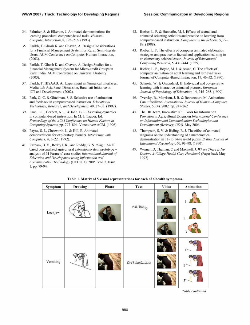
The result of this process is shown in Table 1.
3.4 Designer Biases To compare designer intuitions with actual experimental results, we also created a framework to indicate whether we thought a dynamic or static representation would be better suited to capturing each symptom. For example, the designers felt that a dynamic mode of representation (animation) to depict swollen feet was better because a time-based progression from a normal foot to its extreme swollen state would be far more informative than a static visual. Another example is that the designers felt a photograph to represent skin pigmentation was better because colour and texture were the primary visual cues for the accurate recognition of this information. Table 3 shows these categorizations in detail.
WWW 2007 / Track: Technology for Developing Regions Session: Communication in Developing Regions
875
4. EXPERIMENTS AND RESULTS
4.1 Participants for the Test Our 200 subjects were illiterate and semi-literate and were drawn from the same community as mentioned in the target community section. Most of them were never previously exposed to computers. The tests were conducted in community centers near their homes or at their residences, in an environment they were familiar with.
4.2 Experimental Set-Up We tested all ten representational types, based on the combination of the five visual representations (text, drawing, photograph, animation, and video) and the two audio representations (no audio, voice annotation). We randomized the experiment such that each representational type was tested on 10% of the participants (20 subjects for each representation).
The three-step process of testing was as follows:
1) The subject was shown the representation on a computer, and asked to explain the word or phrase that first came to mind, in regards to the symptom that the character in each representation was suffering from.
2) The subject would then be told what symptom the representation had intended to convey.
3) The subject would finally be asked to enact or depict the intended symptom in a manner that they thought was best representative of it. This step was meant to provide additional insight into the analysis of the data.
Each subject saw only one of the ten representations. For each symptom, we recorded the time taken to respond, as well as the total number of correct answers. In addition, all verbal remarks made throughout the exercise were transcribed for later analysis.
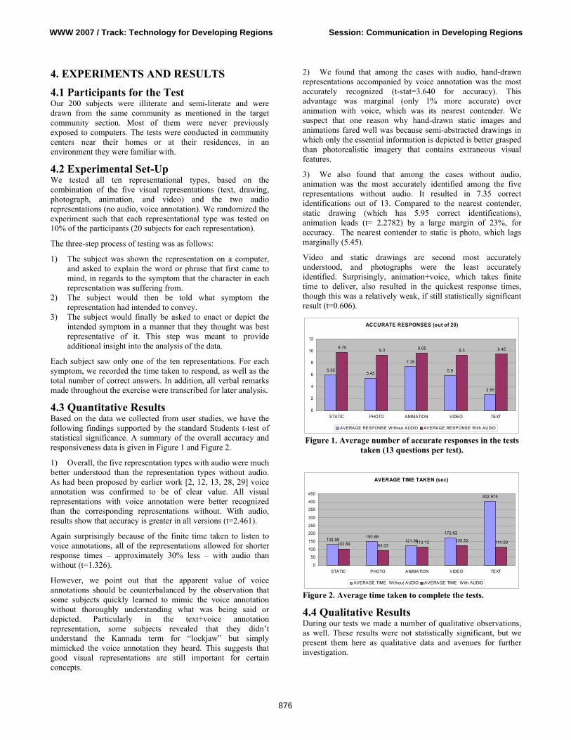
4.3 Quantitative Results Based on the data we collected from user studies, we have the following findings supported by the standard Students t-test of statistical significance. A summary of the overall accuracy and responsiveness data is given in Figure 1 and Figure 2.
1) Overall, the five representation types with audio were much better understood than the representation types without audio. As had been proposed by earlier work [2, 12, 13, 28, 29] voice annotation was confirmed to be of clear value. All visual representations with voice annotation were better recognized than the corresponding representations without. With audio, results show that accuracy is greater in all versions (t=2.461).
Again surprisingly because of the finite time taken to listen to voice annotations, all of the representations allowed for shorter response times – approximately 30% less – with audio than without (t=1.326).
However, we point out that the apparent value of voice annotations should be counterbalanced by the observation that some subjects quickly learned to mimic the voice annotation without thoroughly understanding what was being said or depicted. Particularly in the text+voice annotation representation, some subjects revealed that they didn’t understand the Kannada term for “lockjaw” but simply mimicked the voice annotation they heard. This suggests that good visual representations are still important for certain concepts.
2) We found that among the cases with audio, hand-drawn representations accompanied by voice annotation was the most accurately recognized (t-stat=3.640 for accuracy). This advantage was marginal (only 1% more accurate) over animation with voice, which was its nearest contender. We suspect that one reason why hand-drawn static images and animations fared well was because semi-abstracted drawings in which only the essential information is depicted is better grasped than photorealistic imagery that contains extraneous visual features.
3) We also found that among the cases without audio, animation was the most accurately identified among the five representations without audio. It resulted in 7.35 correct identifications out of 13. Compared to the nearest contender, static drawing (which has 5.95 correct identifications), animation leads (t= 2.2782) by a large margin of 23%, for accuracy. The nearest contender to static is photo, which lags marginally (5.45).
Video and static drawings are second most accurately understood, and photographs were the least accurately identified. Surprisingly, animation+voice, which takes finite time to deliver, also resulted in the quickest response times, though this was a relatively weak, if still statistically significant result (t=0.606).
ACCURATE RESPONSES (out of 20)
5.955.45
7.35
5.9
2.65
9.75 9.3 9.65 9.3 9.45
0
2
4
6
8
10
12
STATIC PHOTO ANIMATION VIDEO TEXT
AVERAGE RESPONSE Without AUDIO AVERAGE RESPONSE With AUDIO
Figure 1. Average number of accurate responses in the tests taken (13 questions per test).
AVERAGE TIME TAKEN (sec)
130.98150.66
121.98
172.62
402.975
103.89 93.03113.13 125.52 114.09
0
50
100
150
200
250
300
350
400
450
STATIC PHOTO ANIMATION VIDEO TEXT
AVERAGE TIME Without AUDIO AVERAGE TIME With AUDIO
Figure 2. Average time taken to complete the tests.
4.4 Qualitative Results During our tests we made a number of qualitative observations, as well. These results were not statistically significant, but we present them here as qualitative data and avenues for further investigation.
WWW 2007 / Track: Technology for Developing Regions Session: Communication in Developing Regions
876
4.4.1 Richer information is not necessarily better understood overall: We were interested to test whether our designers’ bias [Table 2] was justified by the results. In certain cases we noticed that richer information was not necessarily better for the audiences’ understanding. For example while depicting the symptom of weakness the designers’ bias was with video (dynamic mode of representation) so as to lay the context of intense physical activity before showing the state of inertia caused by weakness. However static drawing proved to be better as the audience were confused by the additional rich information (of intense physical activity) before the primary action (principal actor feeling weak) and thus drew inaccurate conclusions.
4.4.2 Unrelated context laying activity changes value of static versus dynamic imagery: Although aggregate data is presented above, an interesting question is whether different symptoms are better represented by different representation types. The answer seems to be a qualified “yes”. Table 2 shows the best-guessed representations by symptom. The pattern observed, with the visual representations without audio assist, was that placing a context-laying activity that was unrelated to the principal action cue caused confusion amongst the subjects. For example, while describing the symptom of mild fever the video used the context laying activity of an attendant wringing the cloth and then placing it as a cold compress on the fevered forehead of a patient. The photo representation of the same symptom showed only the action cue of the principal actor (the patient) lying down with a cold compress being placed on forehead. The latter version was more clearly interpreted by the subjects. 4.4.3 Socio-economic conditions correlated with cognition: We had based our project in five urban slum communities. Within each community, the residents came from similar caste groups and socio-economic conditions. We noticed that subjects from the economically better-off slums who typically had more formal education performed better overall throughout the experiment, generally responding more quickly, accurately, and with greater confidence. 4.4.4 For some, audio-visual cognitive coordination was difficult: In the representation types with voice annotation, we saw that some of our subjects were unable to fully process the bimodal stimulus. They inevitably used a strategy of focusing either on the graphic or the audio, but not both. If not told, some of them did not understand that the voice annotation was meant to explain the visual graphic presented on the screen at that moment. This phenomenon was particularly pronounced in subjects from the economically worse slums.
When we tested the text+voice representation with totally illiterate subjects, they listened intently to the audio cue, and ignored the on-screen text completely.
4.5 Experimental Issues A number of issues came up during the experiments which could have biased the results in one way or another. We do not feel
these were serious enough to invalidate the results, but we record them here, so that our results can be taken with the appropriate caveats. 4.5.1 Short-term category conditioning: If the presentation of symptoms was in an order where each of the consecutive symptoms was associated with a complaint of one kind (e.g., some sort of pain or ache), the subject’s seemed to become inclined to think only of symptoms of the same category. For example, if the first three symptoms presented in were headache, backache, sore throat, one after another, then the user was more likely to perceive the next symptom presented as an ache or pain of some sort. This issue was mitigated by the fact that all representation types suffered from the same issue, as the symptoms were presented in the same order for all subjects and all representation types. 4.5.2 Test/text anxiety of subjects Subjects who had some basic level of schooling exhibited significant nervousness when they were shown the text based version, as they seemed to feel the same pressures they may have faced in school. We did our best to allay their fears, but the results may nevertheless show a slight bias against the text representations.
5. RELATED WORK There are four areas of related work which are particularly relevant for our research. The first is the various representational techniques and media in visual communication. The second is research that explores the use of auditory interfaces for information communication. The third is the literature that looks at developing a specific kind of representation for a given target audience in the health industry. The fourth is the literature investigating graphical user interfaces for non-literate users. To our knowledge, our work occurs at the unexplored intersection of these four streams, with some differences from existing research that distinguish this work.
Representational techniques and media in visual communication: The first stream looks at various representational techniques and media from a visual communication perspective. This literature is rich and spans decades. For our purposes this literature can be categorized into two categories: (a) Research that looks at one representational style or technique in-depth and (b) research that looks at multiple representational styles or techniques either categorizing or comparing these styles to establish which enables better communication.
In the first category, most of the work has been done in developing iconography, visual and pictorial symbols. Among these are works on international graphic symbols [10, 16, 17] handbooks for pictorial symbols [30] icons and symbols for graphical user interfaces [16, 24, 25, 8], design principles and frame of reference for designers to develop new symbols [16]. Very little of the recommendations presented in this body of work, however, is based on rigorous tests with live human subjects, and definitely not with illiterate populations.
In the second category, there is a large body of research works compare two representational styles [4, 6, 20, 22, 32, 31, 34, 38, 39, 40, 42, 45, 48, 43]. Again there is one paper that categorizes representational styles into a unified progressive framework [9].
WWW 2007 / Track: Technology for Developing Regions Session: Communication in Developing Regions
877
Most of the work that compares representational styles draws comparison between animation and static imagery [20, 22, 32, 38, 48, 45,]. Among these works, there are papers that have claimed the benefit of using animation in a variety of learning environments [22, 32, 38, 45, 48,]. There are other works which have failed in finding benefits of animation [4, 31, 6, 39, 40, 34, 42, 43]. Again there is a research paper [46] that looks at the reasons how bias towards a particular representation style (animation in this case), in terms of content presented and experimentation procedures have led to emergence of results in favor of animation. This is in agreement with our process of generating representations without bias towards any particular type of representation. Existing literature also suggests that clever schematization of static diagrams may be just as effective as animation [46]. This particular research work supports our finding that static imagery when carefully designed to consist of distilled information without extraneous details can be accurately understood.
Most of the work in this category of existing literature however does not compare other representational techniques and media and does not address the population we are addressing.
Effectiveness of auditory interfaces for information communication: In this stream there are research papers which have demonstrated the utility of auditory icons in addition to standard graphical feedback in communicating information to users [2, 12, 13, 28, 29]. This confirms our finding that graphical icons with voice annotation generally help users in speed of comprehension. Existing literature also suggests that auditory icons are an intuitively accessible way to use sound to provide multidimensional, organized information to users [13]. Developing a representation for a given target audience in the health domain: The third stream of relevant work focuses on developing a specific kind of representation for disseminating and gathering information designed for a given target audience. Much of this work has been done in the healthcare domain. In this stream there is a body of work looking separately at the use of iconic graphical language, photographs and illustrations in the health care industry. One research group has looked at designing an iconic graphical language for an interface of a mobile computing device to be used by health workers in emerging markets with minimal exposure to computing technology [15]. Another group has developed a graphical iconography to help people with limited English proficiency navigate health care facilities [1]. A few researchers look at photography as a tool for imparting health education and collection of data on diabetes [11]. Another group emphasizes preventive healthcare and health education, through illustrations to make difficult information easily accessible [49]. Graphical UIs for illiterates: The fourth stream of relevant work is more recent and it investigates user interfaces for non-literate users. Early researchers in this area place emphasis on the need for contextual design methods to explore this problem, as non-literate users are very different from the target user imagined by most UI designers [7]. We follow this lead, and have spent literally hundreds of hours in the field, working with non-literate women. Most previous work with non-literate users suggests the use of graphical information. In particular, researchers immediately intuited the value of
imagery in place of text, and extensive use of graphics is advocated by most of this work [15, 18, 28, 29, 35, 36]. Among these, some also investigated on the value of voice annotations and instructions, which are of obvious value to non-literate users [28, 29, 37]. Some authors note the plausible inclusion of number, as non-literate users are often numerate [28, 29, 35, 36, 37]. Others focus on the need for ultra-simplified navigability as a design element [15]. While this previous work suggests excellent UI design elements for the non-literate user, none so far look at investigating the optimal representational mode in graphics imagery based on comparison of various media. All such previous work suggests that information should be provided in graphical, rather than textual, form. Following this lead we further look in depth through our methodology of fairly stacking one representational style against the other and investigate the optimal representation for illustrating a given concept for illiterate users. We have performed a controlled experiment testing a variety of representation types against one another and with some confidence have established that semi-abstracted static imagery accompanied by voice annotation in the best representation for illiterate users on computing devices.
In summary while exploring representational techniques for visual communication and audio icons is not entirely new, our work takes one step further and compares different representational techniques and media using a methodology that fairly stacks one representation style against another and performs rigorous experiments with human subjects to establish which style is the most accurately understood by our target audience. To our knowledge, the work presented in this paper is novel because (1) it addresses a population that is generally ignored by the computing industry, (2) it performs a controlled experiment testing a variety of representation types against one another, and (3) it confirms with some confidence that voice annotation and semi-abstracted drawings are ideal for illiterate users of computing devices.
6. CONCLUSION AND FUTURE WORK In order to better understand the optimal audio-visual representation for illustrating concepts to illiterate users, we presented 13 different health-related symptoms to a group of 200 illiterate subjects for them to identify. Results show that (1) voice annotation generally helps in speed of comprehension, but bimodal audio-visual information can be confusing for the target population; (2) richer information is not necessarily better overall, with hand-drawn cartoons faring better than photorealistic representations; and (3) the relative value of dynamic imagery (video and animation) versus static imagery (photo and drawings) is mixed. These results were shown with statistical significance, and we believe that these concepts could be applicable to designing UIs for other illiterate user groups in other information domains.
In future work, we are looking at applying these principles which we discovered to the UI design of an application in a relevant domain to illiterate populations. We would like to take the work presented in this paper, and apply it directly to a health form for effective health-status monitoring of remote rural areas where the number of health practitioners who monitor health information is proportionately very low. With a better understanding of the best representation to use, we hope that our design will make it easier to collect health data.
WWW 2007 / Track: Technology for Developing Regions Session: Communication in Developing Regions
878
7. REFERENCES 1. Bery, S. National Council of Applied Economic Research,
2006. Http://www.rediff.com/money/2004/mar/09shining.htm
2. Blattner, M. M., Sumikawa, D. A. and Greenberg, R. M. Earcons and icons: Their structure and common design principles. Human-Computer Interaction, 1989. 4, 11--44.
3. Bolek, J. and Cowgill, J. Development of a symbol system for use in the health care industry. Proceedings of the 2005 Conference on Designing for User eXperience, November 2005.
4. Byrne, M. D., Catrambone, R. and Stasko, J. T. Evaluating animations as student aids in learning computer algorithms. Computers & Education, 33, 253–278. (1999).
5. Chand, A. Designing for the Indian rural population: Interaction design challenges. Proc. Development by Design Conference, (2002).
6. ChanLin, L.-J. Animation to teach students of different knowledge levels. Journal of Instructional Psychology, 25, 166–175. (1998).
7. Cooper, A. and Reimann, R. About Face 2.0, The Essentials of Interaction Design. Wiley Publishing Inc. USA, (2003).
8. DelGaldo, M. and Nielsen, J. International users interface, John Wiley & Sons, Inc., New York, NY, 1996
9. Dowhal, D. A seven-dimensional approach to graphics, Proceedings of the 14th annual international conference on Systems documentation, October 1996.
10. Dreyfuss, H. Symbol Sourcebook: An Authoritative Guide to International Graphic Symbols. New York: Van Nostrand Reinhold, 1984.
11. Frost, J., and Smith, B.K. Focusing on user-to-product relationships: Visualizing health: imagery in diabetes education, Proceedings of the 2003 conference on Designing for User Experiences. June 2003
12. Gaver, W. W. Auditory icons: Using sound in computer interfaces. Human-Computer Interaction, 2, 167--177. (1989).
13. Gaver, W.W. The sonicfinder: An interface that uses auditory icons. Human-Computer Interaction, 4:67–94, (1989).
14. Goetze, M., and Strothotte, T. An approach to help functionally illiterate people with graphical reading aids. In Smart Graphics Symposium UK 2001.
15. Grisedale, S., Graves, M and Grünsteidl, A. Designing a graphical user interface for healthcare workers in rural India, Proceedings of the SIGCHI conference on Human factors in computing systems, p.471-478, March 22-27, 1997, Atlanta, Georgia, United States
16. Horton, W. The Icon Book: Visual Symbols for Computer Systems and Documentation. New York: John Wiley, 1994.
17. Horton, W. Designing icons and visual symbols, Conference Companion on Human Factors in Computing Systems: Common Ground, April 1996
18. Huenerfauth, M. Developing design recommendations for computer interfaces accessible to illiterate users. Master’s thesis, University College Dublin, (2002).
19. Khai, N. Truong, Gillian R. Hayes, Gregory D. Abowd Interaction design methods 1: Storyboarding: an empirical determination of best practices and effective guidelines June 2006 Proceedings of the 6th ACM conference on Designing Interactive systems DIS '06
20. Kieras, D. E. Diagrammatic displays for engineered systems: effects on human performance in interacting with malfunctioning systems. International Journal of Man-Machine Studies, 36, 861–895. (1992).
21. Kress, G. and Van Leeuwen, T. Reading Images: The Grammar of Visual Design. London: Routledge. 1996
22. Large, A., Beheshti, J., Breuleux, A. & Renaud, A. The effect of animation in enhancing descriptive and procedural texts in a multimedia learning environment. Journal of the American Society for Information Science, 47, 437–448. 1996.
23. Lourie S. World literacy: where we stand today - One Billion Illiterates – editorial, UNESCO Courier. (July 1990).
24. Marcus, A. Icon and Symbol Design Issues for Graphical User Interfaces, International Users Interface, John Wiley & Sons, Inc., New York, NY, 1996
25. Marcus, A. Icons, Symbols, and Signs: Visible Languages to Facilitate Communication, Interactions, v.10 n.3, May + June 2003
26. Marcus, A. Smilonich, N. and Thompson, L. The cross-GUI handbook for multiplatform user interface design, Addison-Wesley Longman Publishing Co., Inc., Boston, MA, 1994
27. Mitra. S. Self organizing systems for mass computer literacy: Findings from the hole in the wall experiments. International Journal of Development Issues, Vol. 4, No. 1 (2005) 71 – 81.
28. Medhi, I. Pitti B. and Toyama K. Text-Free UI for Employment Search. Proc. Asian Applied Computing Conference. Nepal, December 2005.
29. Medhi, I., Sagar A., and Toyama K. Text-Free User Interfaces for Illiterate and Semi-Literate Users. International Conference on Information and Communication Technologies and Development (Berkeley, USA), May 2006.
30. Modley, R., Myers, W. R., and Comer, D. G. Handbook of Pictorial Symbols (Dover Pictorial Archive Series) (Paperback- Jun 1, 1976).
31. Morrison, J. B . and Tversky, B. The (in)effectiveness of animation in instruction. In J. Jacko & A. Sears, Eds. Extended Abstracts of the ACM Conference on Human Factors in Computing Systems, pp. 377–378. Seattle: ACM. (2001).
32. Nathan, M. J., Kintsch, W. & Young, E. A theory of algebra-word-problem comprehension and its implications for the design of learning environments. Cognition and Instruction, 9, 329–389. (1992).
33. Palmiter, S. L., Elkerton, J. & Baggett, P. Animated demonstrations vs. written instructions for learning procedural tasks: a preliminary investigation. International Journal of Man–Machine Studies, 34, 687–701. (1991).
WWW 2007 / Track: Technology for Developing Regions Session: Communication in Developing Regions
879
34. Palmiter, S. & Elkerton, J. Animated demonstrations for learning procedural computer-based tasks. Human–Computer Interaction, 8, 193–216. (1993).
35. Parikh, T. Ghosh K. and Chavan, A. Design Considerations for a Financial Management System for Rural, Semi-literate Users. ACM Conference on Computer-Human Interaction, (2003).
36. Parikh, T. Ghosh K. and Chavan, A. Design Studies for a Financial Management System for Micro-credit Groups in Rural India. ACM Conference on Universal Usability, (2003).
37. Parikh, T. HISAAB: An Experiment in Numerical Interfaces, Media Lab Asia Panel Discussion, Baramati Initiative on ICT and Development, (2002).
38. Park, O.-C. & Gittelman, S. S. Selective use of animation and feedback in computerbased instruction. Educational Technology, Research, and Development, 40, 27–38. (1992).
39. Pane, J. F., Corbett, A. T. & John, B. E. Assessing dynamics in computer-based instruction. In M. J. Tauber, Ed. Proceedings of the ACM Conference on Human Factors in Computing Systems, pp. 797–804. Vancouver: ACM. (1996).
40. Payne, S. J., Chesworth, L. & Hill, E. Animated demonstrations for exploratory learners. Interacting with Computers, 4, 3–22. (1992).
41. Ratnam, B. V., Reddy P.K., and Reddy, G. S. eSagu: An IT based personalized agricultural extension system prototype – analysis of 51 Farmers’ case studies International Journal of Education and Development using Information and Communication Technology (IJEDICT), 2005, Vol. 2, Issue 1, pp. 79-94.………………………………………...
42. Rieber, L. P. & Hannafin, M. J. Effects of textual and animated orienting activities and practice on learning from computer-based instruction. Computers in the Schools, 5, 77–89. (1988).
43. Rieber, L. P. The effects of computer animated elaboration strategies and practice on factual and application learning in an elementary science lesson. Journal of Educational Computing Research, 5, 431–444. (1989).
44. Rieber, L. P., Boyce, M. J. & Assad, C. The effects of computer animation on adult learning and retrieval tasks. Journal of Computer-Based Instruction, 17, 46–52. (1990).
45. Schnotz, W. & Grzondziel, H. Individual and co-operative learning with interactive animated pictures. European Journal of Psychology of Education, 14, 245–265. (1999).
46. Tversky, B., Morrison, J. B. & Betrancourt, M. Animation: Can it facilitate? International Journal of Human--Computer Studies. 57(4). 2002. pp. 247-262
47. The DIL team, Innovative ICT Tools for Information Provision in Agricultural Extension International Conference on Information and Communication Technologies and Development (Berkeley, USA), May 2006.
48. Thompson, S. V. & Riding, R. J. The effect of animated diagrams on the understanding of a mathematical demonstration in 11- to 14-year-old pupils. British Journal of Educational Psychology, 60, 93–98. (1990).
49. Werner, D, Thuman, C and Maxwell, J. Where There Is No Doctor: A Village Health Care Handbook (Paper back May 1992)
Table 1. Matrix of 5 visual representations for each of 6 health symptoms.
Symptom Drawing Photo Text Video Animation
Lockjaw
1
2
3
Vomiting
1
2
3
Table continued
WWW 2007 / Track: Technology for Developing Regions Session: Communication in Developing Regions
880
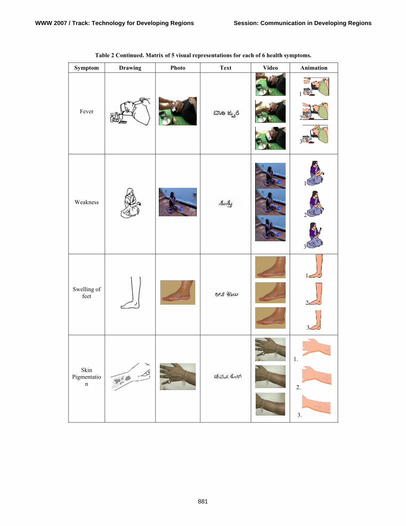
Table 2 Continued. Matrix of 5 visual representations for each of 6 health symptoms.
Symptom Drawing Photo Text Video Animation
Fever
1
2
3
Weakness
1
2
3
Swelling of feet
1
2
3
Skin Pigmentatio
n
1.
2.
3.
WWW 2007 / Track: Technology for Developing Regions Session: Communication in Developing Regions
881
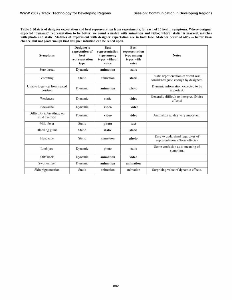
Table 3. Matrix of designer expectation and best representation from experiments, for each of 13 health symptoms. Where designer expected ‘dynamic’ representation to be better, we count a match with animation and video; where ‘static’ is marked, matches with photo and static. Matches of experiment with designer expectation are in bold face. Matches occur at 60% -- better than chance, but not good enough that designer intuition can be relied upon.
Symptoms
Designer’s expectation of
best representation
type
Best representation
type among types without
voice
Best representation
type among types with
voice
Notes
Sore throat Dynamic animation static
Vomiting Static animation static Static representation of vomit was considered good enough by designers.
Unable to get-up from seated position Dynamic animation photo Dynamic information expected to be
important.
Weakness Dynamic static video Generally difficult to interpret. (Noise effects)
Backache Dynamic video video
Difficulty in breathing on mild exertion Dynamic video video Animation quality very important.
Mild fever Static photo text
Bleeding gums Static static static
Headache Static animation photo Easy to understand regardless of representation. (Noise effects)
Lock jaw Dynamic photo static Some confusion as to meaning of symptom.
Stiff neck Dynamic animation video
Swollen feet Dynamic animation animation
Skin pigmentation Static animation animation Surprising value of dynamic effects.
WWW 2007 / Track: Technology for Developing Regions Session: Communication in Developing Regions
882