poster editing
TRANSCRIPT

Poster Editing
• To create our poster we have used Photoshop as it has many tools we can use to make out movie poster look professional.
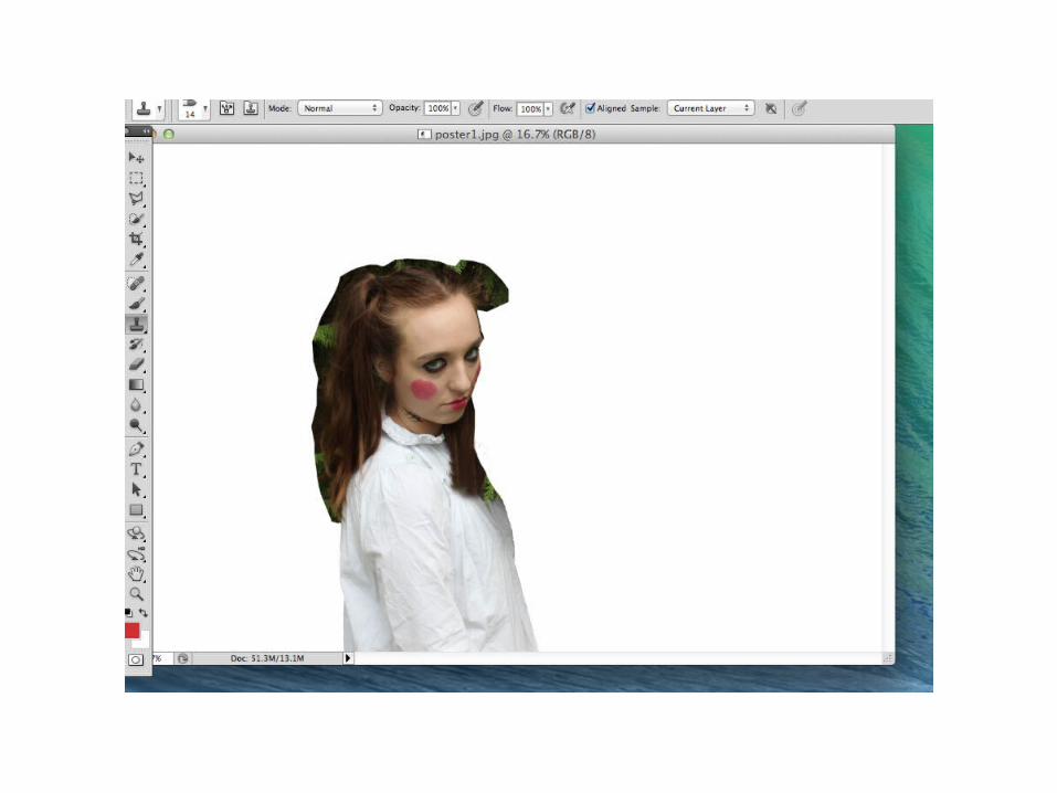
• We started off by cutting around an image of Maddie’s character so that we could put her easily against our background.
• It took us a long time to cut around her image as there were a lot of folds in her clothes and hairs coming off her head which were difficult to cut around.
• To cut around her we used the cutting tool that is on Photoshop.
•
•


• We then got the picture of our background (the woods) and put it in a vignette filter to use as the background.
• We have decided to use the woods as the background as it is a main location of our film and it also creates a spooky effect. We have made it vignette so that the focus is on Maddie and to again create a chilling effect.
• The woods is also a conventional location of a horror and connotes isolation and mystery.
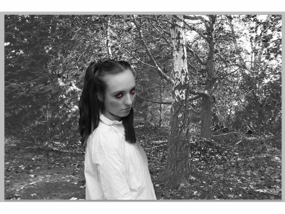
• Once we had put the background in we then decided to put Maddie on our poster in the rule of thirds (her being in the first third) so that the main focus is on her but so you can also clearly see the background.
• We then decided that our poster should be in black and white as it looks more professional and also creates a ghostly effect.
• We then made Maddie’s eye’s a piercing, bright red to connote that she is evil and to also make it look like she is giving this piercing look to the viewer of the poster.
• Red eyes on a horror movie poster is a typical convention and helps to set the dark mood of the poster.
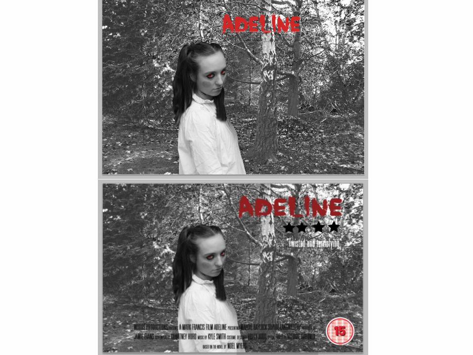

• We have now added the typical conventions of a movie poster such as title, reviews, a billing block and the age rating.
• We have made our title red and in the top centre of the poster so that it is a main focus point and people will know the movie we are advertising.
• We then cut out four black stars which we got off the internet and wrote a review in white.
• Finally we wrote out the billing block, containing all the names of important people who have helped create the film and put it at the bottom next to the age rating.
• We have kept the colours black, white and red to connote horror, blood and supernaturalism and to keep within the mood of our poster.
••
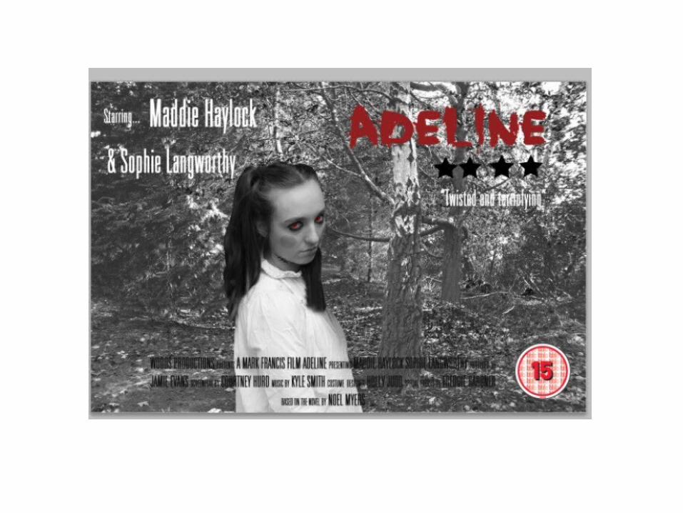

• This is our first finished poster draft.
• We have decided to add another convention of a movie poster by adding names of the actors that appear within the film.
• By seeing what actors appear in our film, viewers may enjoy these actors and think they are talented and therefore be more persuaded to see our film.