process of magazine jaye
TRANSCRIPT
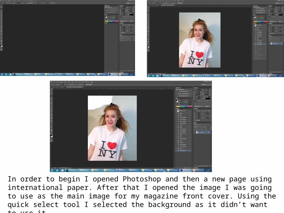
In order to begin I opened Photoshop and then a new page using international paper. After that I opened the image I was going to use as the main image for my magazine front cover. Using the quick select tool I selected the background as it didn’t want to use it.
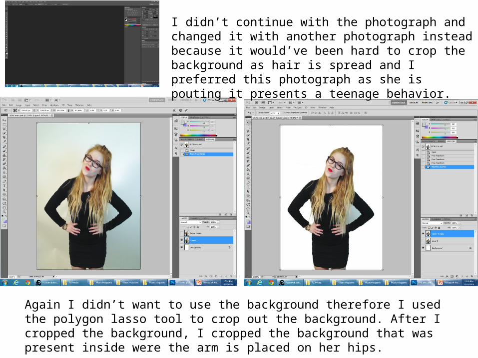
I didn’t continue with the photograph and changed it with another photograph instead because it would’ve been hard to crop the background as hair is spread and I preferred this photograph as she is pouting it presents a teenage behavior.
Again I didn’t want to use the background therefore I used the polygon lasso tool to crop out the background. After I cropped the background, I cropped the background that was present inside were the arm is placed on her hips.
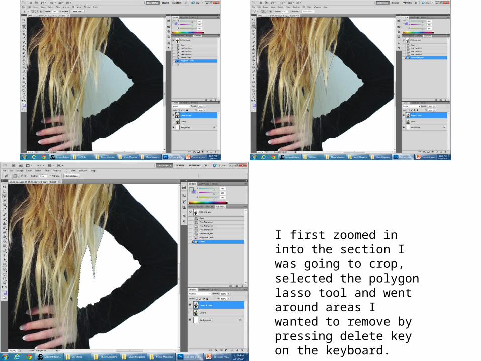
I first zoomed in into the section I was going to crop, selected the polygon lasso tool and went around areas I wanted to remove by pressing delete key on the keyboard.

I chose my font from 101 fonts online, saved it and then opened it on Photoshop to remove the background. I used the background eraser tool to do this.
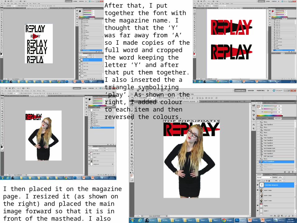
After that, I put together the font with the magazine name. I thought that the ‘Y’ was far away from ‘A’ so I made copies of the full word and cropped the word keeping the letter ‘Y’ and after that put them together. I also inserted the a triangle symbolizing ‘play’. As shown on the right, I added colour to each item and then reversed the colours.
I then placed it on the magazine page. I resized it (as shown on the right) and placed the main image forward so that it is in front of the masthead. I also added the skyline and fitted it to the space.

I then, changed the colour of the skyline. I added the issue no inside the letter ‘R’ vertically. I inserted a barcode at the bottom right corner and above I placed the issue date and above that the price of the magazine. I made those texts into a golden yellow colour.
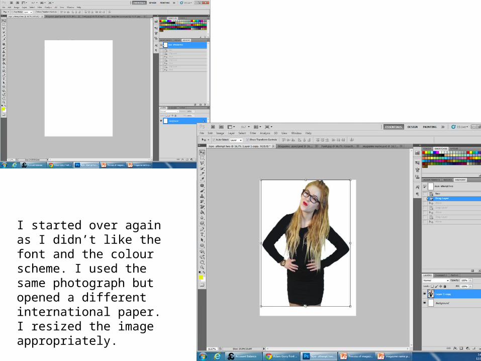
I started over again as I didn’t like the font and the colour scheme. I used the same photograph but opened a different international paper. I resized the image appropriately.
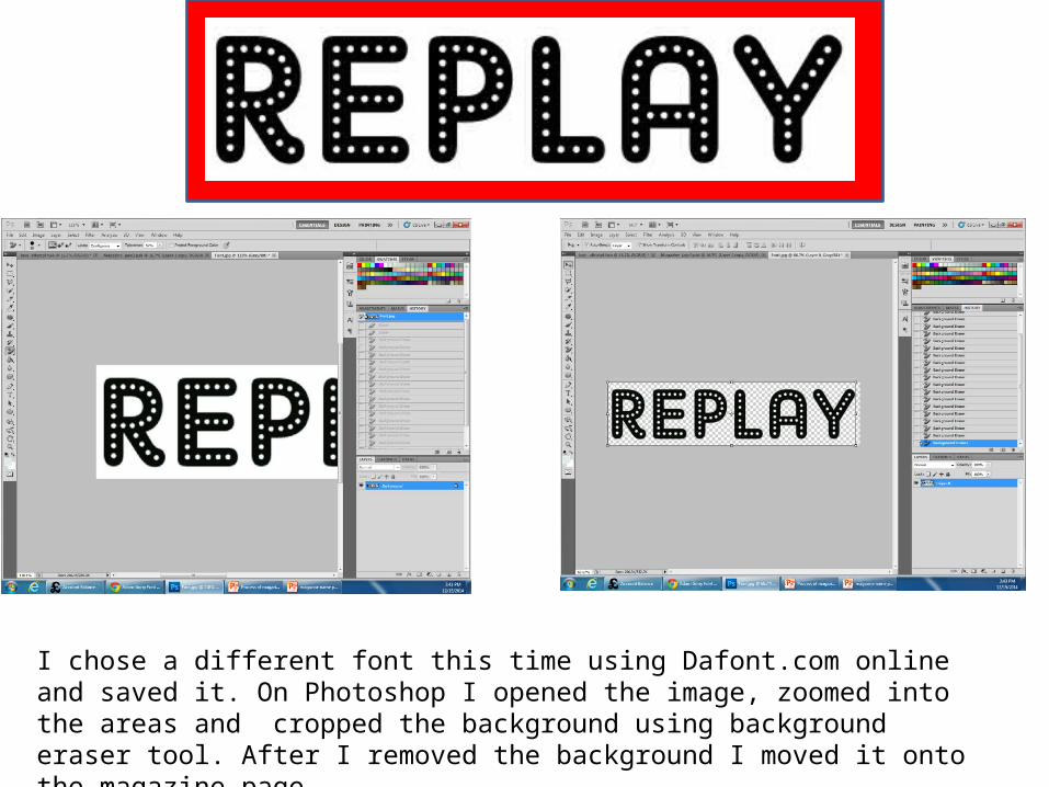
I chose a different font this time using Dafont.com online and saved it. On Photoshop I opened the image, zoomed into the areas and cropped the background using background eraser tool. After I removed the background I moved it onto the magazine page.

Going through the same process I inserted a triangle symbolizing ‘play’, behind the text ‘Replay’. I made the colour of the triangle red and left the text in black.
I resize the triangle making it bigger and then as shown on the right I changed the colour into illuminous yellow and then resized the text to fit on the triangle.
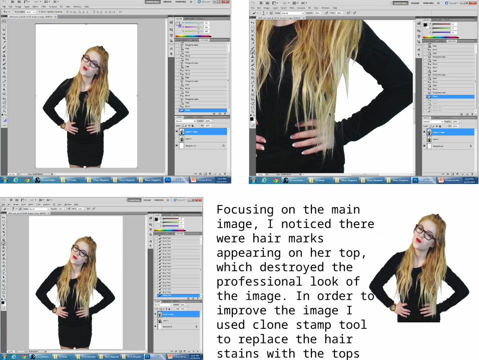
Focusing on the main image, I noticed there were hair marks appearing on her top, which destroyed the professional look of the image. In order to improve the image I used clone stamp tool to replace the hair stains with the tops original colour. An example of where the stain is present is on the right
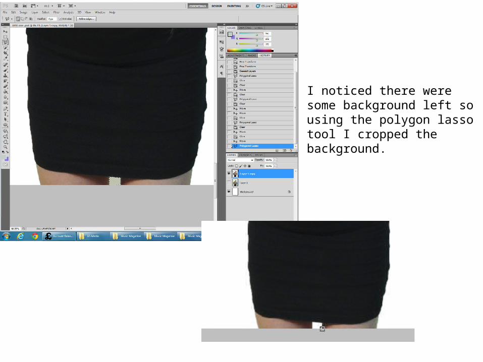
I noticed there were some background left so using the polygon lasso tool I cropped the background.
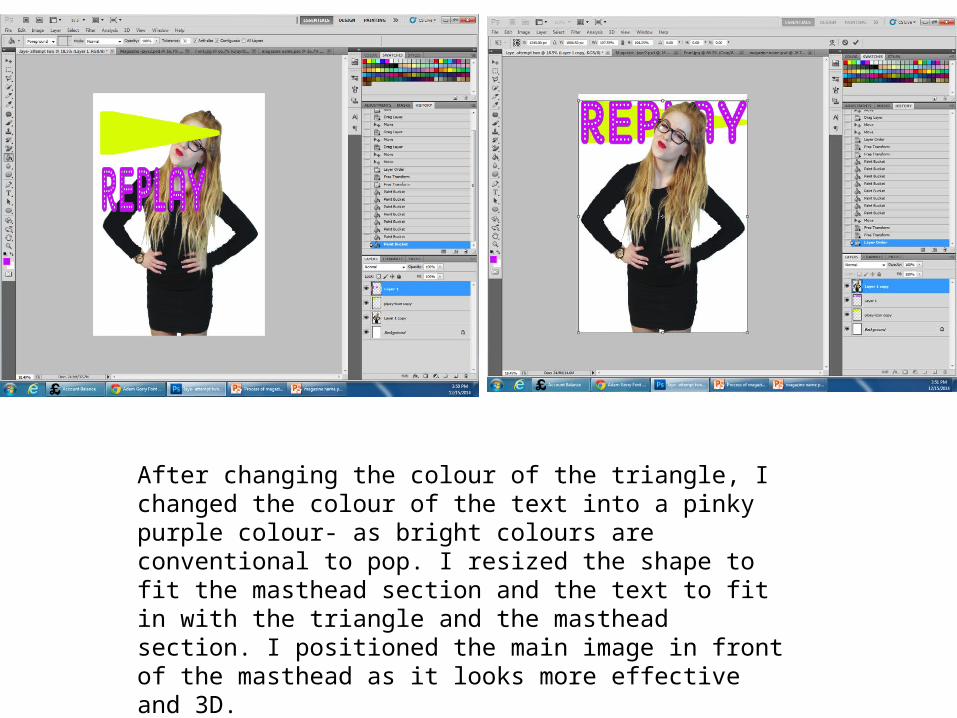
After changing the colour of the triangle, I changed the colour of the text into a pinky purple colour- as bright colours are conventional to pop. I resized the shape to fit the masthead section and the text to fit in with the triangle and the masthead section. I positioned the main image in front of the masthead as it looks more effective and 3D.
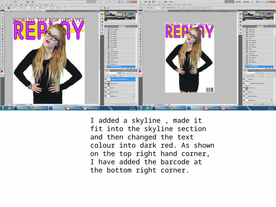
I added a skyline , made it fit into the skyline section and then changed the text colour into dark red. As shown on the top right hand corner, I have added the barcode at the bottom right corner.
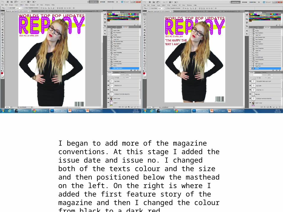
I began to add more of the magazine conventions. At this stage I added the issue date and issue no. I changed both of the texts colour and the size and then positioned below the masthead on the left. On the right is where I added the first feature story of the magazine and then I changed the colour from black to a dark red.
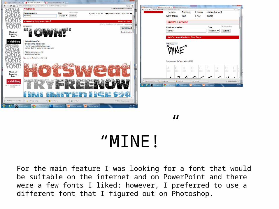
“MINE!”For the main feature I was looking for a font that would be suitable on the internet and on PowerPoint and there were a few fonts I liked; however, I preferred to use a different font that I figured out on Photoshop.
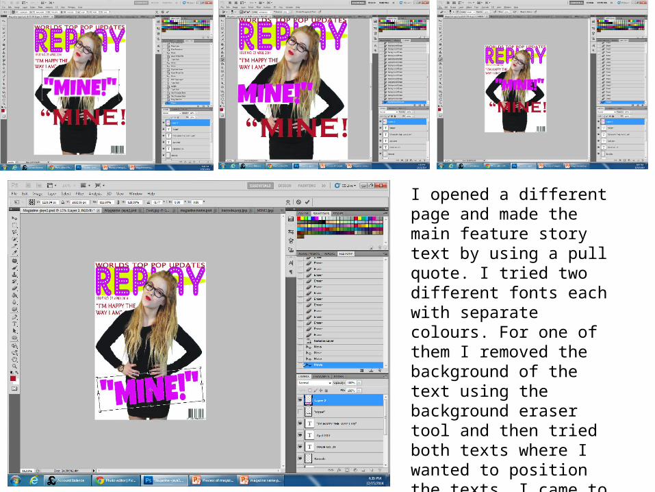
I opened a different page and made the main feature story text by using a pull quote. I tried two different fonts each with separate colours. For one of them I removed the background of the text using the background eraser tool and then tried both texts where I wanted to position the texts. I came to a decision that I preferred the one shown on the left. After deciding on the one I preferred I put the text on a slant.
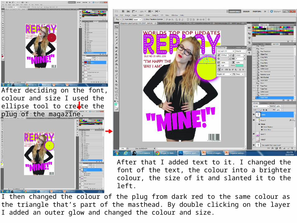
After deciding on the font, colour and size I used the ellipse tool to create the plug of the magazine.
I then changed the colour of the plug from dark red to the same colour as the triangle that’s part of the masthead. By double clicking on the layer I added an outer glow and changed the colour and size.
After that I added text to it. I changed the font of the text, the colour into a brighter colour, the size of it and slanted it to the left.
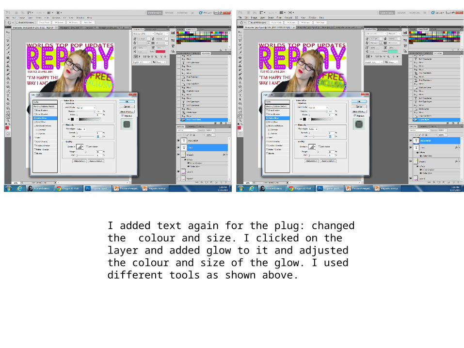
I added text again for the plug: changed the colour and size. I clicked on the layer and added glow to it and adjusted the colour and size of the glow. I used different tools as shown above.

I entered another text to go into the plug and edited the text by double clicking on the layer and made it the same colour as the word ‘FREE’ to show a pattern with in the plug. I then added another final text ‘2014’ following the colour and format within the plug. I added shadows and changed fonts to make it look attractive.

I clicked on the layer to make differences in the appearance to make it more appealing and attractive. As shown above I have used elements from the inner and outer glow. I used contour from the outer glow to make the main feature story 3D and different from the rest of the magazine. I also added noise to the outline of the text which makes it more appealing to the audience. For each element I changed the colour at an appropriate extent.
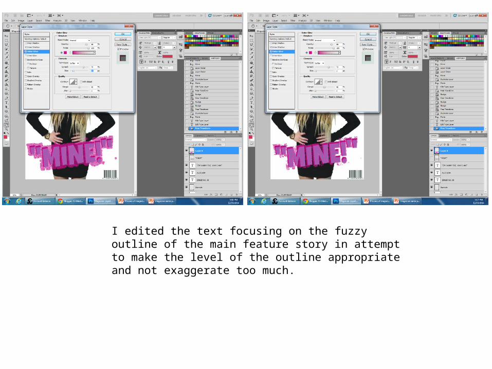
I edited the text focusing on the fuzzy outline of the main feature story in attempt to make the level of the outline appropriate and not exaggerate too much.
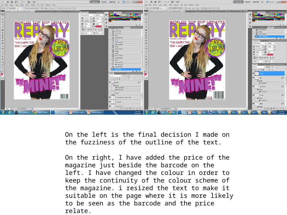
On the left is the final decision I made on the fuzziness of the outline of the text.
On the right, I have added the price of the magazine just beside the barcode on the left. I have changed the colour in order to keep the continuity of the colour scheme of the magazine. i resized the text to make it suitable on the page where it is more likely to be seen as the barcode and the price relate.
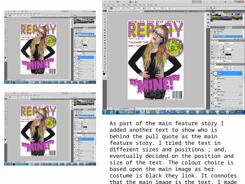
As part of the main feature story I added another text to show who is behind the pull quote as the main feature story. I tried the text in different sizes and positions ; and, eventually decided on the position and size of the text. The colour choice is based upon the main image as her costume is black they link. It connotes that the main image is the text. I made the outline of the text as white for it to stand out.
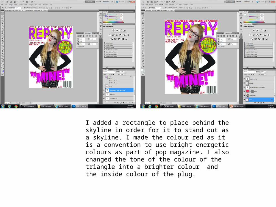
I added a rectangle to place behind the skyline in order for it to stand out as a skyline. I made the colour red as it is a convention to use bright energetic colours as part of pop magazine. I also changed the tone of the colour of the triangle into a brighter colour and the inside colour of the plug.
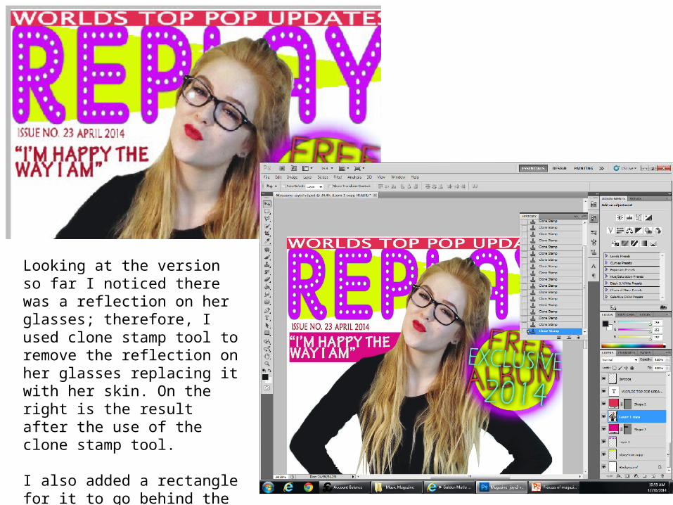
Looking at the version so far I noticed there was a reflection on her glasses; therefore, I used clone stamp tool to remove the reflection on her glasses replacing it with her skin. On the right is the result after the use of the clone stamp tool.
I also added a rectangle for it to go behind the first feature story and made the colour a convention of pop.
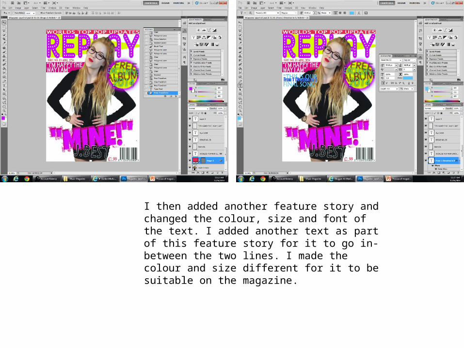
I then added another feature story and changed the colour, size and font of the text. I added another text as part of this feature story for it to go in-between the two lines. I made the colour and size different for it to be suitable on the magazine.
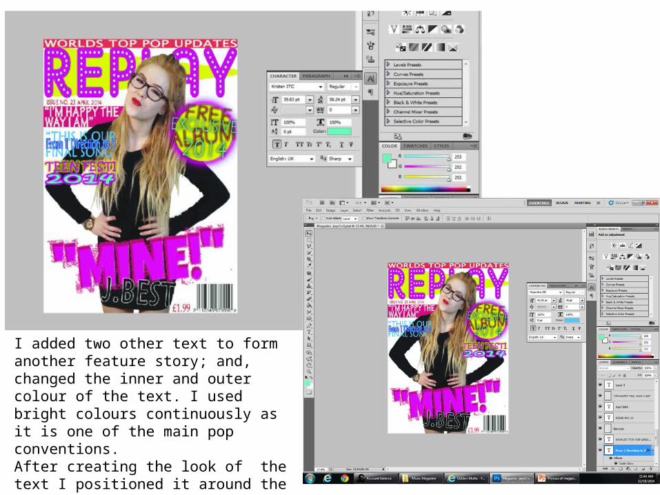
I added two other text to form another feature story; and, changed the inner and outer colour of the text. I used bright colours continuously as it is one of the main pop conventions.After creating the look of the text I positioned it around the magazine page to see where it best looks. I decided to locate it on the right hand size just below the plug.
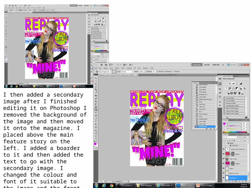
I then added a secondary image after I finished editing it on Photoshop I removed the background of the image and then moved it onto the magazine. I placed above the main feature story on the left. I added a boarder to it and then added the text to go with the secondary image. I changed the colour and font of it suitable to the image and the front cover magazine.
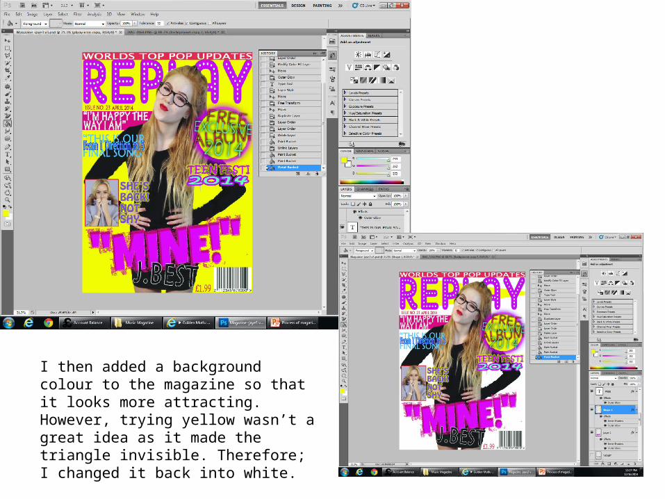
I then added a background colour to the magazine so that it looks more attracting. However, trying yellow wasn’t a great idea as it made the triangle invisible. Therefore; I changed it back into white.
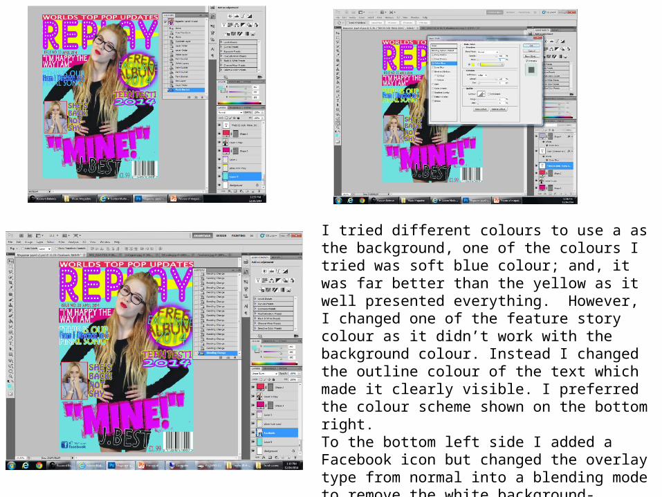
I tried different colours to use a as the background, one of the colours I tried was soft blue colour; and, it was far better than the yellow as it well presented everything. However, I changed one of the feature story colour as it didn’t work with the background colour. Instead I changed the outline colour of the text which made it clearly visible. I preferred the colour scheme shown on the bottom right.To the bottom left side I added a Facebook icon but changed the overlay type from normal into a blending mode to remove the white background- because I got it from the internet there was a white background and I didn’t want the background. The reason I added Facebook icon was because as my target audience are teenagers they are more into social media; therefore, it is more appealing to them
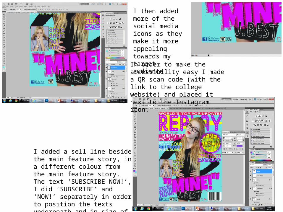
I then added more of the social media icons as they make it more appealing towards my target audience.
In order to make the accessibility easy I made a QR scan code (with the link to the college website) and placed it next to the Instagram icon.
I added a sell line beside the main feature story, in a different colour from the main feature story. The text ‘SUBSCRIBE NOW!’, I did ‘SUBSCRIBE’ and ‘NOW!’ separately in order to position the texts underneath and in size of each other.
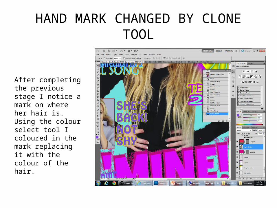
HAND MARK CHANGED BY CLONE TOOL
After completing the previous stage I notice a mark on where her hair is. Using the colour select tool I coloured in the mark replacing it with the colour of the hair.
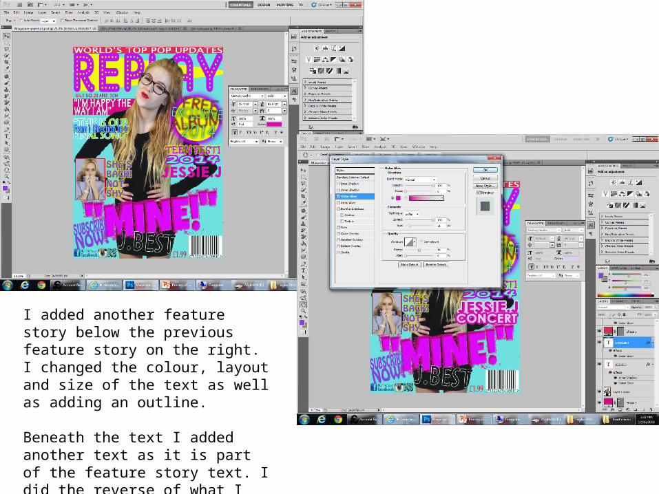
I added another feature story below the previous feature story on the right. I changed the colour, layout and size of the text as well as adding an outline.
Beneath the text I added another text as it is part of the feature story text. I did the reverse of what I did on the text above and made the size fit the above text using the same font.
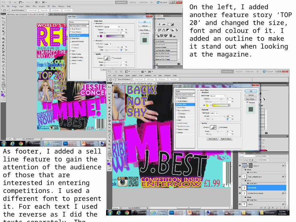
On the left, I added another feature story ‘TOP 20’ and changed the size, font and colour of it. I added an outline to make it stand out when looking at the magazine.
As footer, I added a sell line feature to gain the attention of the audience of those that are interested in entering competitions. I used a different font to present it. For each text I used the reverse as I did the texts separately. The colours I used where the same but I reverse ways as shown on the right
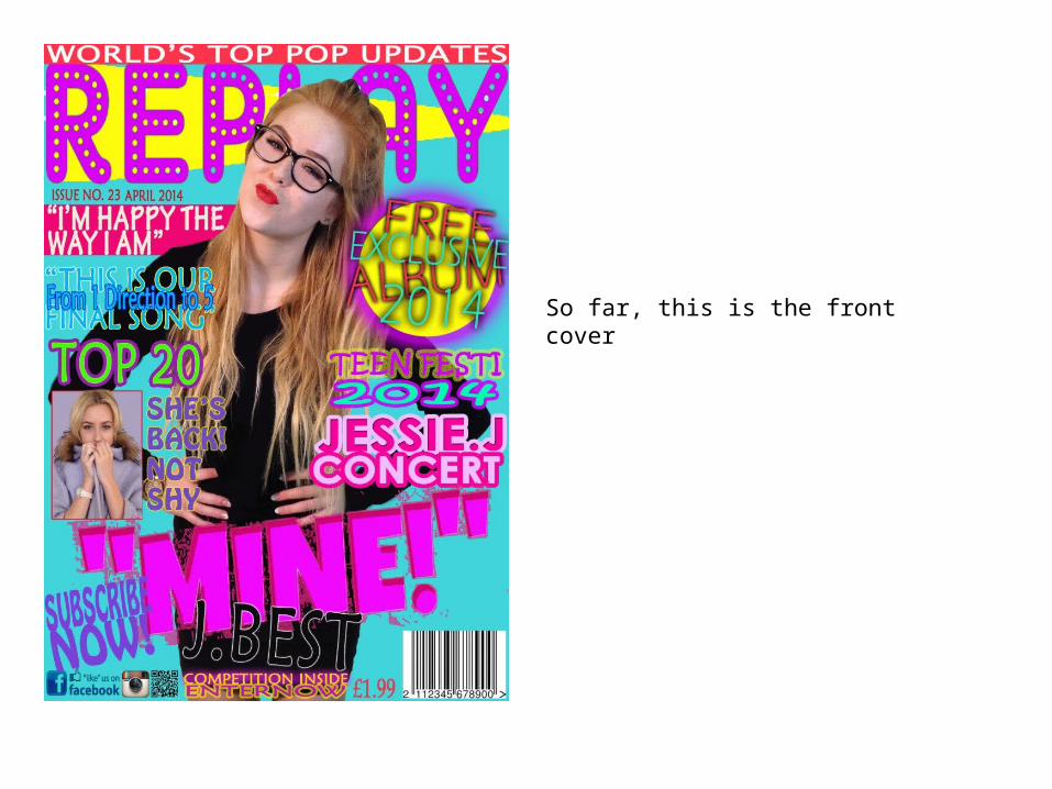
So far, this is the front cover
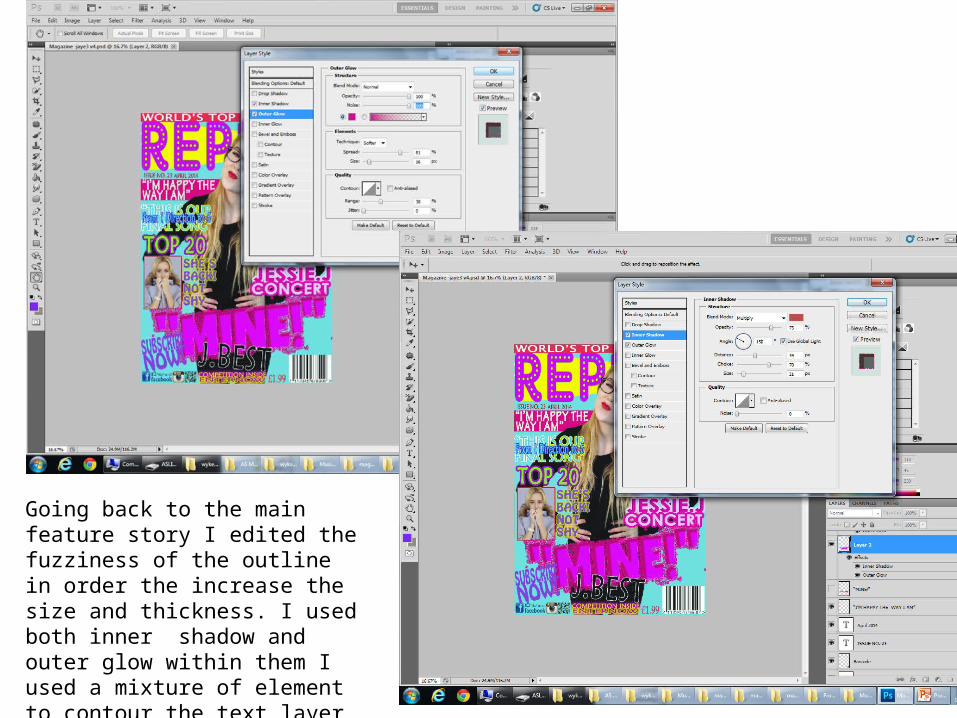
Going back to the main feature story I edited the fuzziness of the outline in order the increase the size and thickness. I used both inner shadow and outer glow within them I used a mixture of element to contour the text layer as shown above and the right.
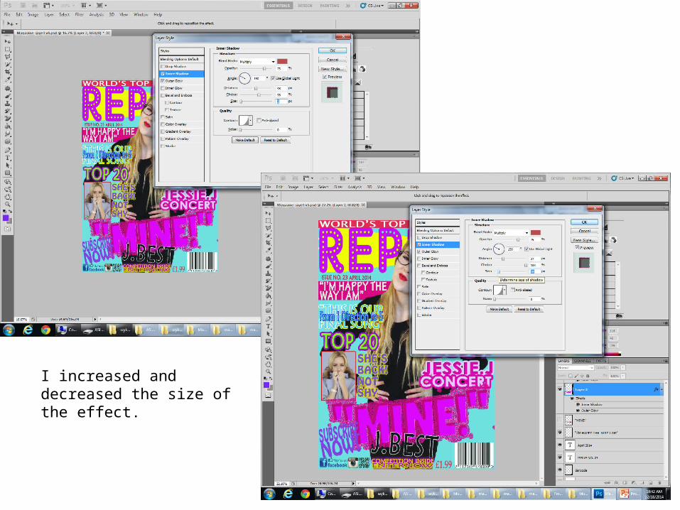
I increased and decreased the size of the effect.

The magazines progression with the changes made so far.
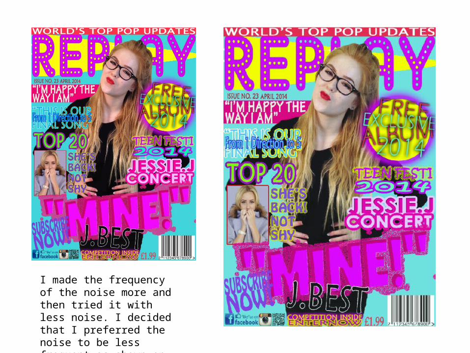
I made the frequency of the noise more and then tried it with less noise. I decided that I preferred the noise to be less frequent-as shown on the right.
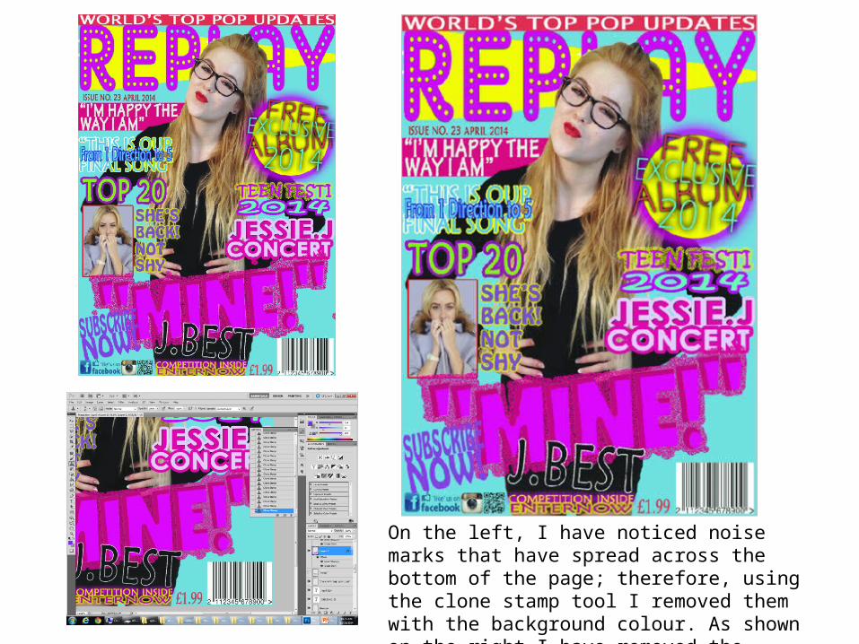
On the left, I have noticed noise marks that have spread across the bottom of the page; therefore, using the clone stamp tool I removed them with the background colour. As shown on the right I have removed the marks.
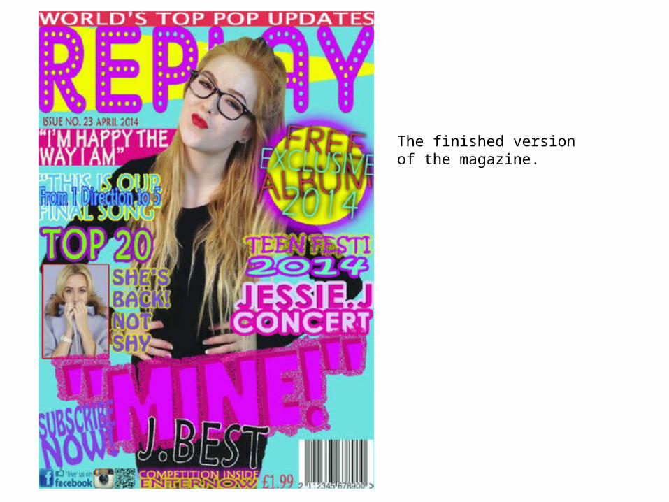
The finished version of the magazine.
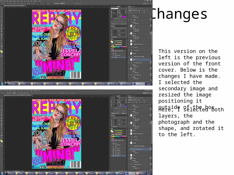
Changes
This version on the left is the previous version of the front cover. Below is the changes I have made. I selected the secondary image and resized the image positioning it outside of the box.
Here, I selected both layers, the photograph and the shape, and rotated it to the left.
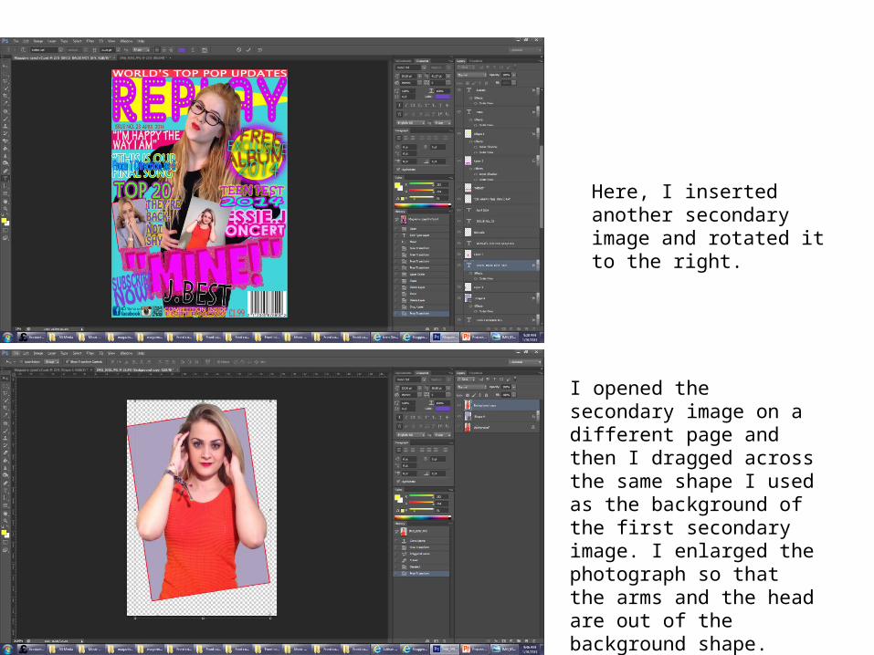
Here, I inserted another secondary image and rotated it to the right.
I opened the secondary image on a different page and then I dragged across the same shape I used as the background of the first secondary image. I enlarged the photograph so that the arms and the head are out of the background shape. Thereafter, using the rubber tool I rubbed the bottom of the photograph in order to fit in within the background shape.
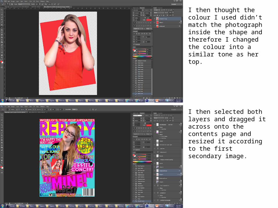
I then thought the colour I used didn’t match the photograph inside the shape and therefore I changed the colour into a similar tone as her top.
I then selected both layers and dragged it across onto the contents page and resized it according to the first secondary image.
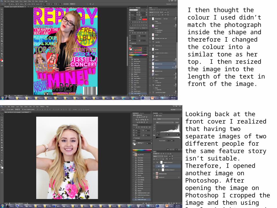
I then thought the colour I used didn’t match the photograph inside the shape and therefore I changed the colour into a similar tone as her top. I then resized the image into the length of the text in front of the image.
Looking back at the front cover I realized that having two separate images of two different people for the same feature story isn’t suitable. Therefore, I opened another image on Photoshop. After opening the image on Photoshop I cropped the image and then using levels, brightness and contrast I altered the photograph which gave a better quality to the image.
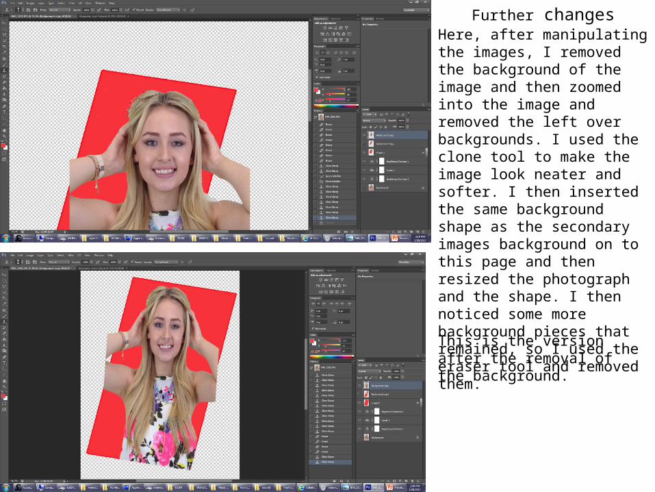
Further changesHere, after manipulating the images, I removed the background of the image and then zoomed into the image and removed the left over backgrounds. I used the clone tool to make the image look neater and softer. I then inserted the same background shape as the secondary images background on to this page and then resized the photograph and the shape. I then noticed some more background pieces that remained, so I used the eraser tool and removed them.
This is the version after the removal of the background.
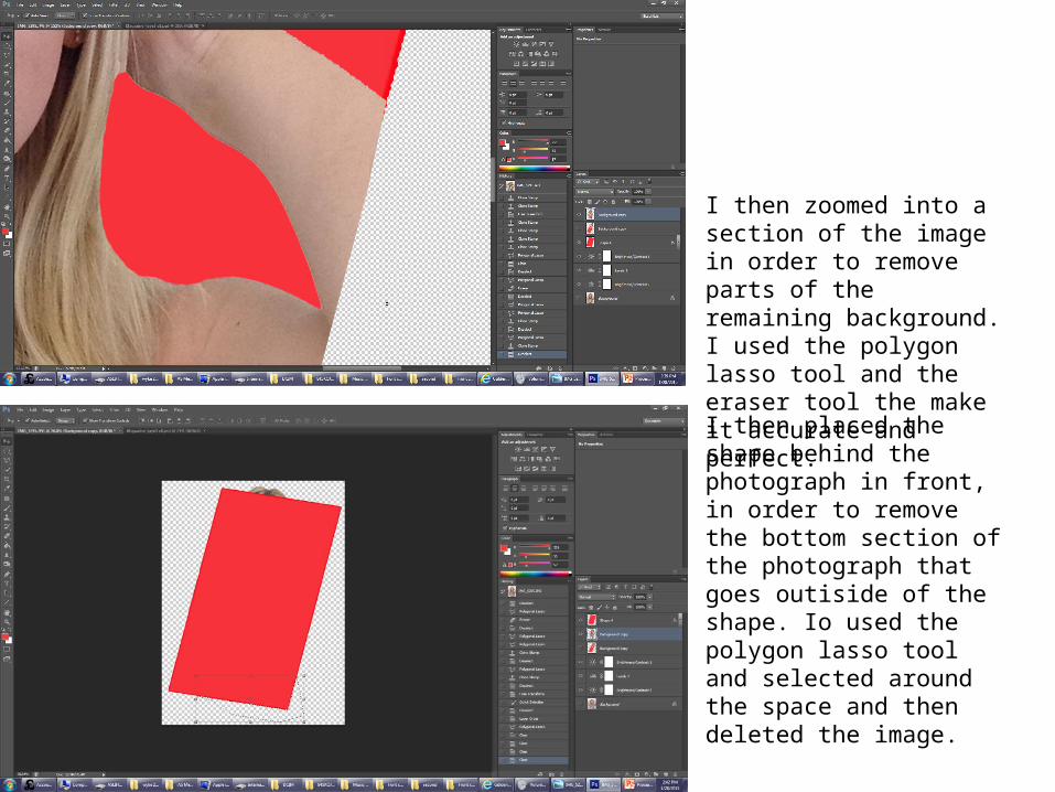
I then zoomed into a section of the image in order to remove parts of the remaining background. I used the polygon lasso tool and the eraser tool the make it accurate and perfect.
I then placed the shape behind the photograph in front, in order to remove the bottom section of the photograph that goes outiside of the shape. Io used the polygon lasso tool and selected around the space and then deleted the image.
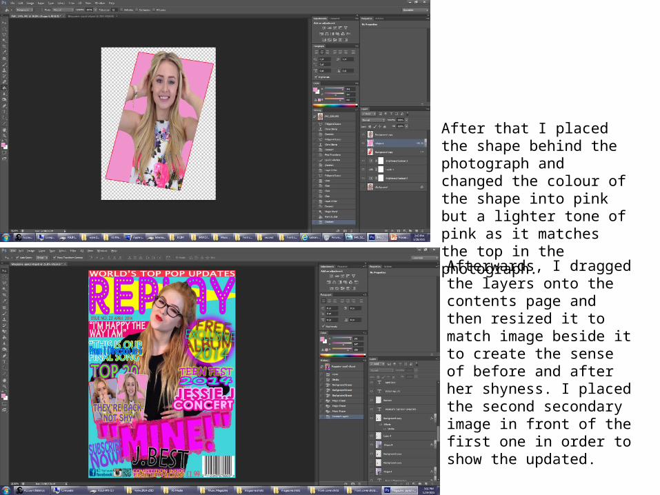
After that I placed the shape behind the photograph and changed the colour of the shape into pink but a lighter tone of pink as it matches the top in the photograph.
Afterwards, I dragged the layers onto the contents page and then resized it to match image beside it to create the sense of before and after her shyness. I placed the second secondary image in front of the first one in order to show the updated.
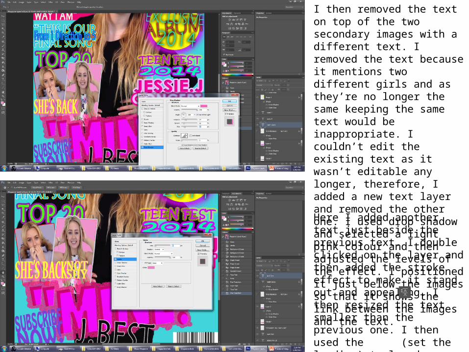
I then removed the text on top of the two secondary images with a different text. I removed the text because it mentions two different girls and as they’re no longer the same keeping the same text would be inappropriate. I couldn’t edit the existing text as it wasn’t editable any longer, therefore, I added a new text layer and removed the other one. I used drop shadow and selected a light pink colour and then adjusted the levels of the effect. I positioned it just below the images so that it shows the link between the images and the text.
Here I added another text just beside the previous text. I double clicked on the layer and then added the stroke effect to make it stand out and appealing. I then resized the text smaller than the previous one. I then used the (set the leading) tool and shortened the space between the texts and fitted it within the length of the larger text.
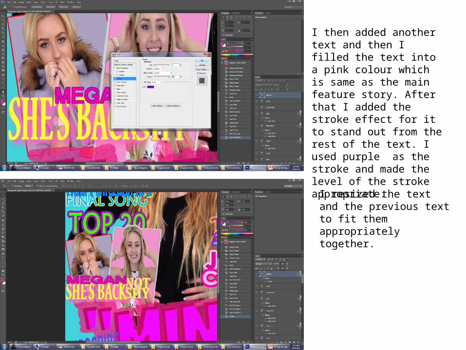
I then added another text and then I filled the text into a pink colour which is same as the main feature story. After that I added the stroke effect for it to stand out from the rest of the text. I used purple as the stroke and made the level of the stroke appropriate.
I resized the text and the previous text to fit them appropriately together.
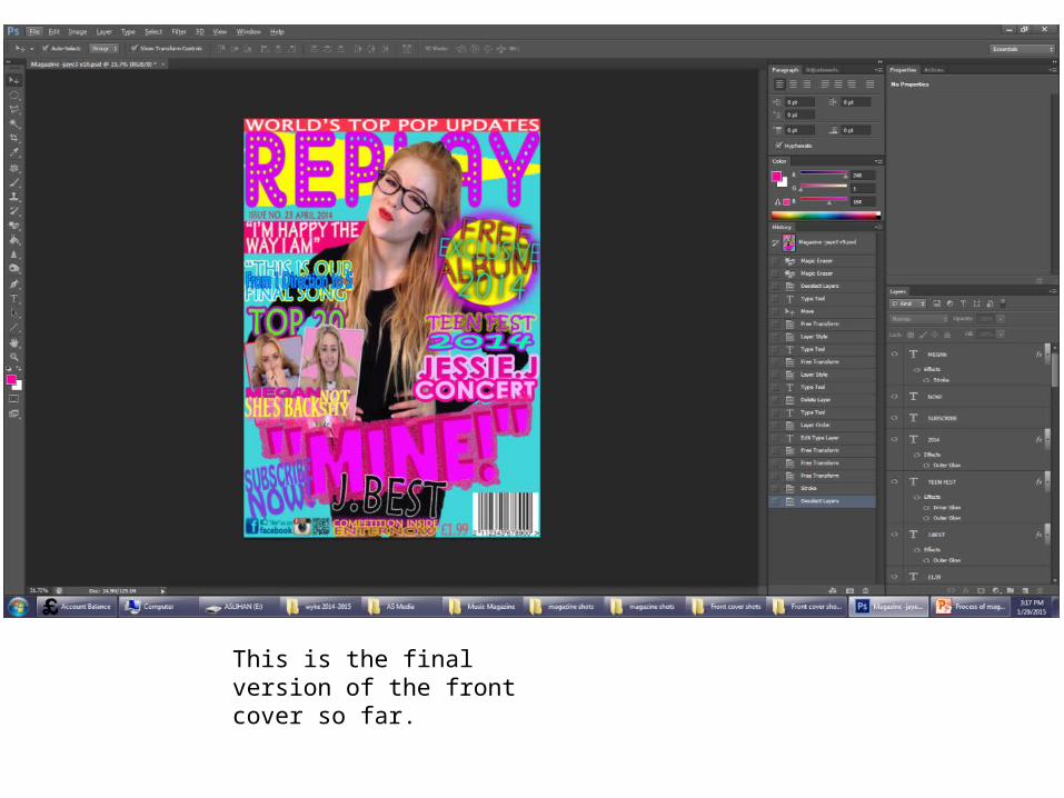
This is the final version of the front cover so far.
This is the final look of the front cover.
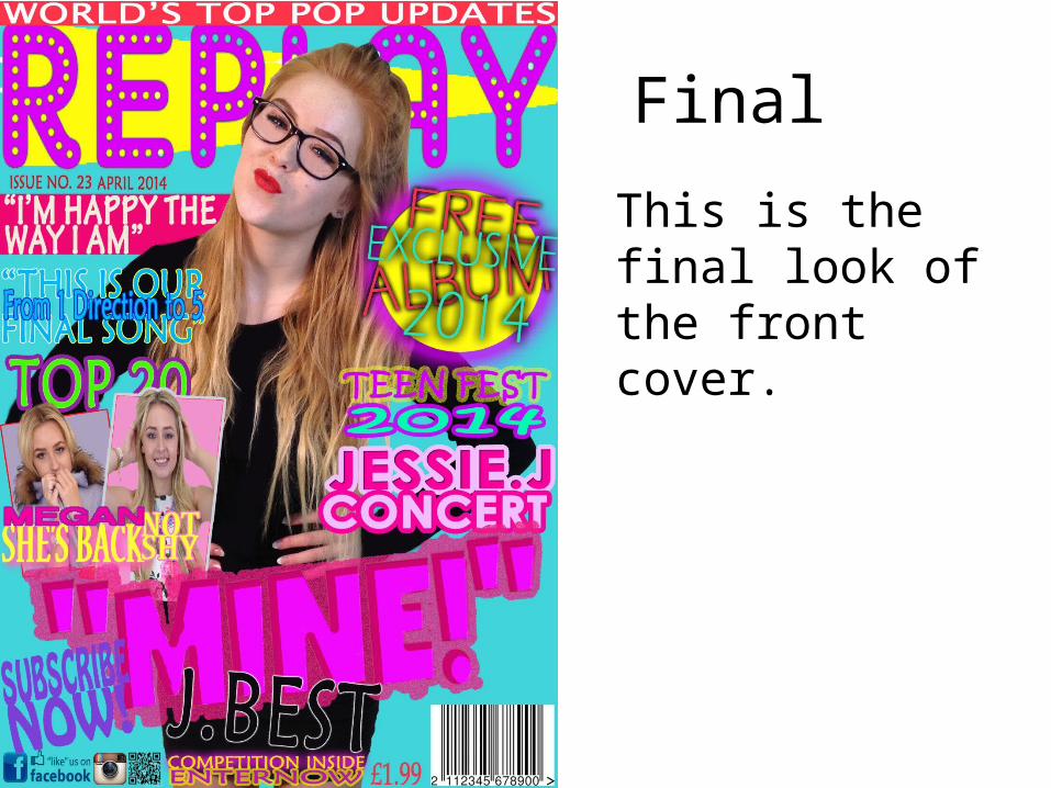
Final
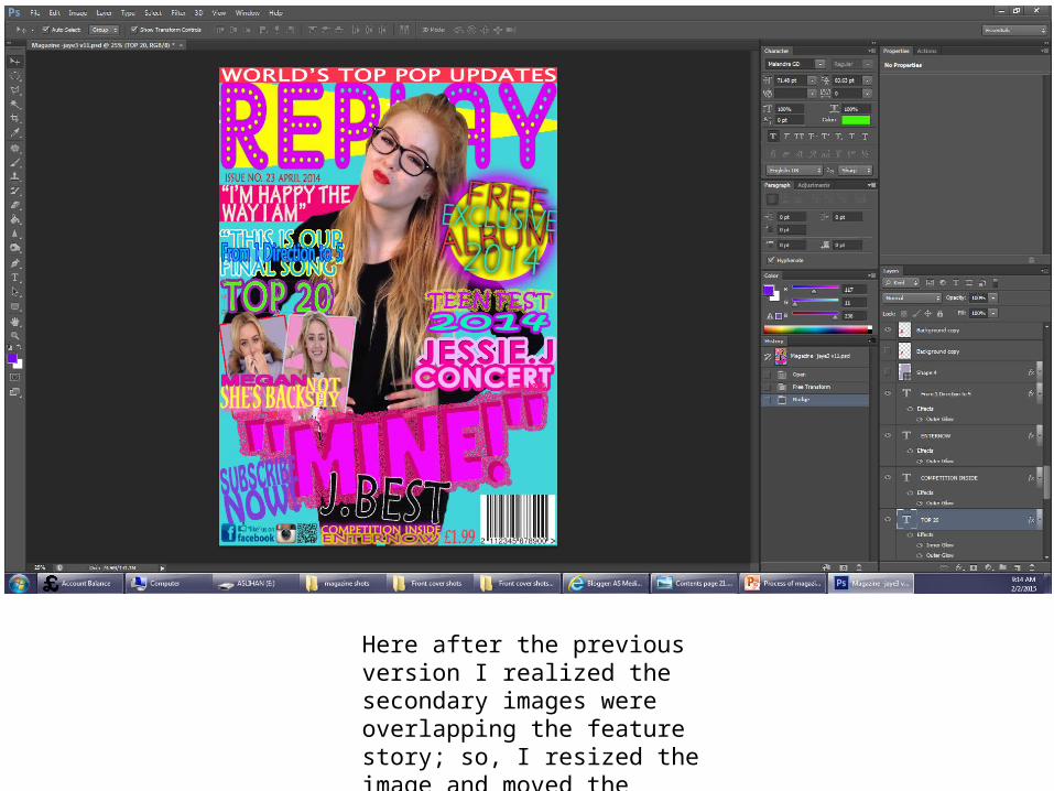
Here after the previous version I realized the secondary images were overlapping the feature story; so, I resized the image and moved the feature story upwards slightly
This is the final version of the magazine front cover.
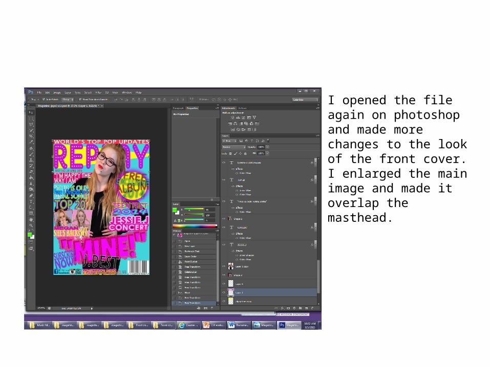
I opened the file again on photoshop and made more changes to the look of the front cover. I enlarged the main image and made it overlap the masthead.
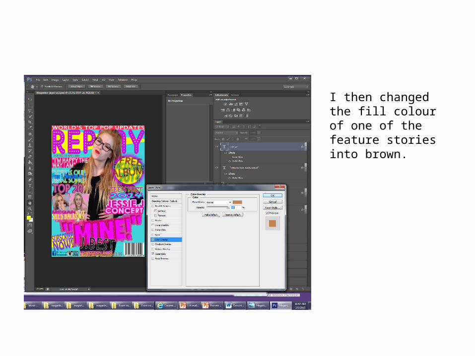
I then changed the fill colour of one of the feature stories into brown.
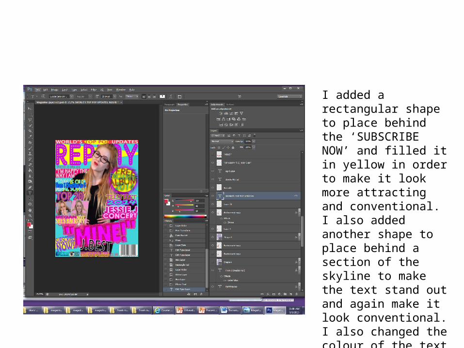
I added a rectangular shape to place behind the ‘SUBSCRIBE NOW’ and filled it in yellow in order to make it look more attracting and conventional. I also added another shape to place behind a section of the skyline to make the text stand out and again make it look conventional. I also changed the colour of the text into the colour of Jaye’s lip stick as when I placed the shape behind it because it was difficult to see.
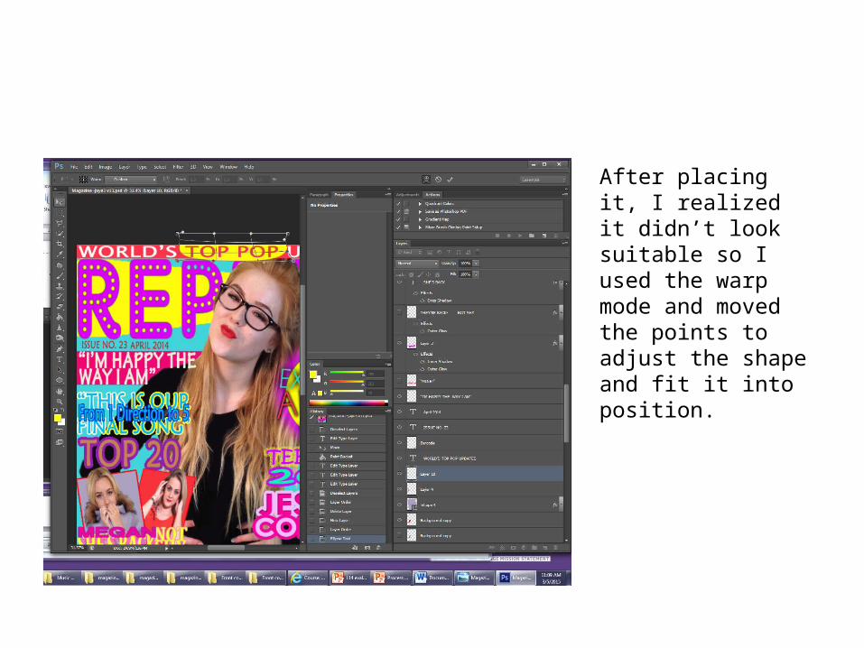
After placing it, I realized it didn’t look suitable so I used the warp mode and moved the points to adjust the shape and fit it into position.

I continued to use the warp mode and neatened the shape.
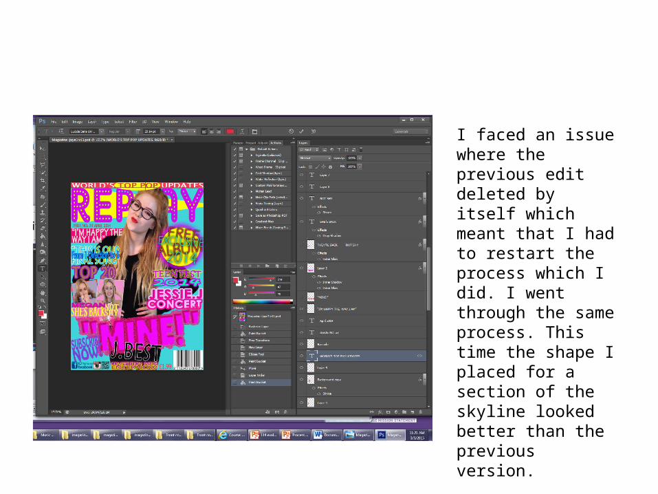
I faced an issue where the previous edit deleted by itself which meant that I had to restart the process which I did. I went through the same process. This time the shape I placed for a section of the skyline looked better than the previous version.
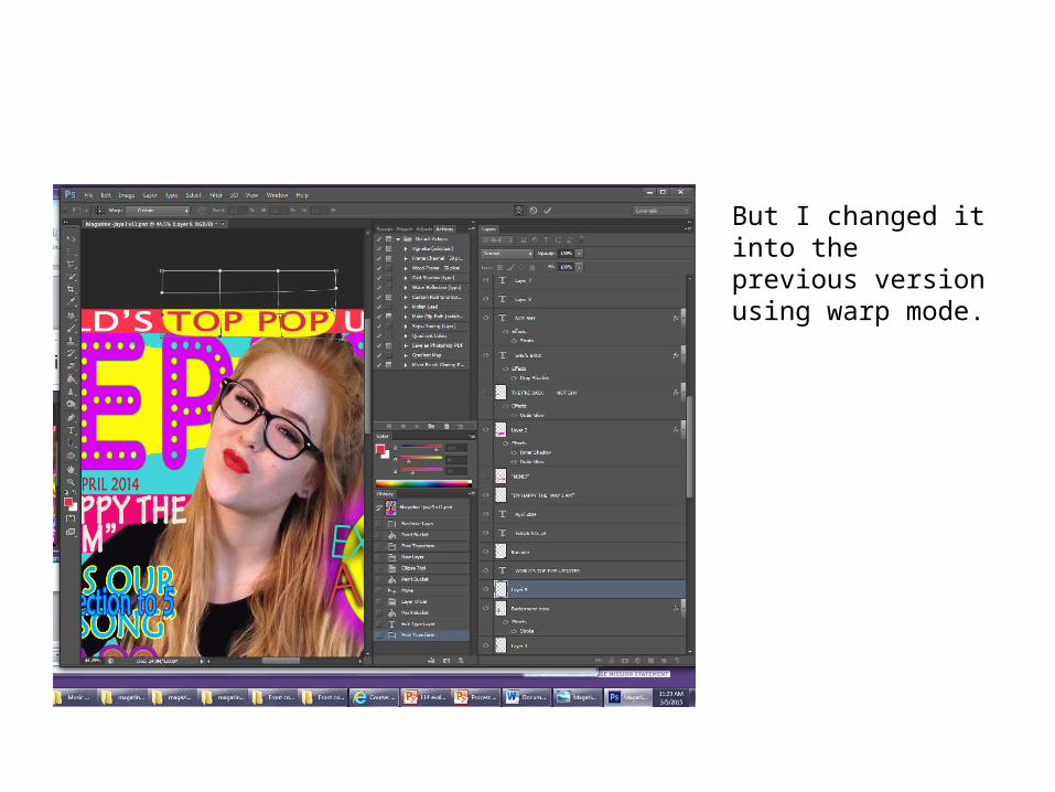
But I changed it into the previous version using warp mode.
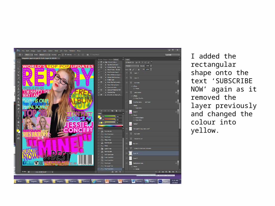
I added the rectangular shape onto the text ‘SUBSCRIBE NOW’ again as it removed the layer previously and changed the colour into yellow.
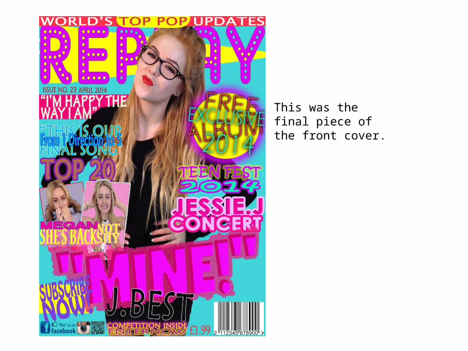
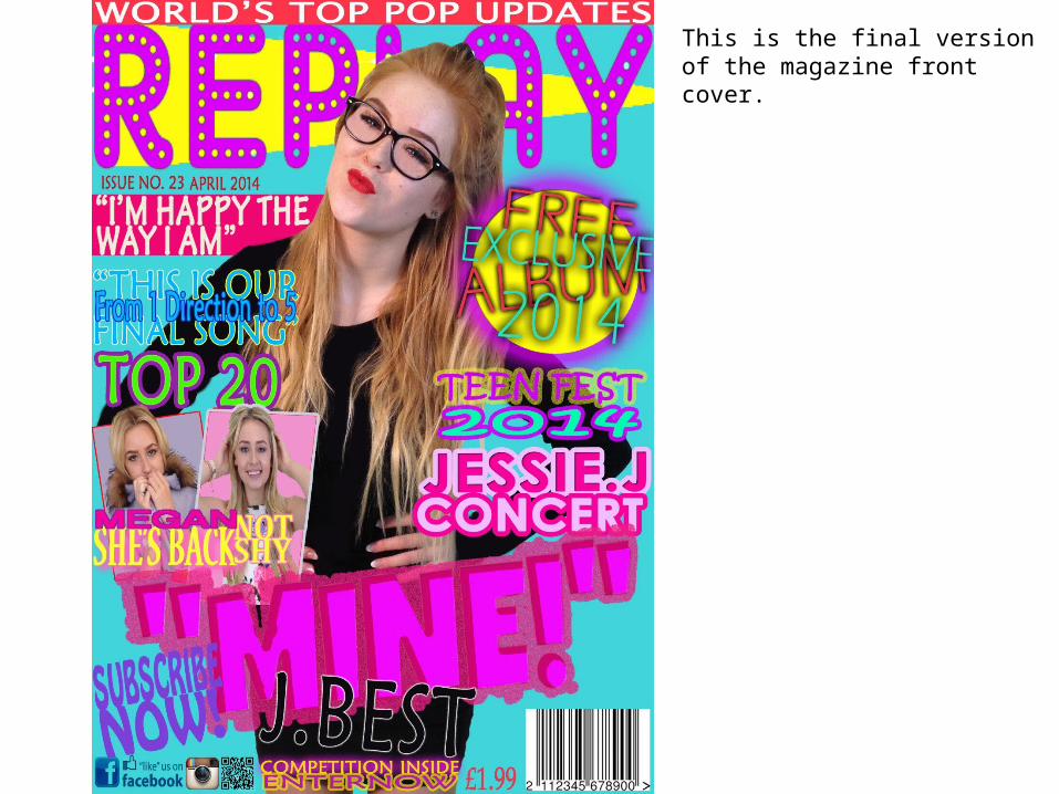
This was the final piece of the front cover.
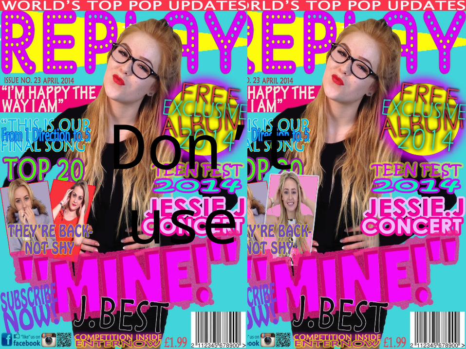
Don’t use