scher - ucla design media arts / browse...
TRANSCRIPT

Paula Scher
For over three decades Paula Scher has been at the forefront of graphic design. Scher studied at the Tyler School of Art in Philadelphia and began her graphic design career as a record cover art director at both Atlantic and CBS Records in the 1970s. In 1984 she co-founded Koppel & Scher, and in 1991 she joined Pentagram as a partner.
Areas of design: Identity design, packaging design, publication design, environmental graphics

Born 1948, Washington, D.C.BFA Tyler School of Art & Doctor of Fine Arts Honoris Causa from the Corcoran College of Art and DesignBegan her career as an art director in the 1970s and early 80s at CBS Records and Atlantic 1984 Co-founded Koppel & Scher 1991 Partner at Pentagram 1998 Art Directors Club Hall of Fame1998-2000 President of AIGA’s NY chapter2000 Chystler Award for Innovation in Design2001 AIGA Medal (recognition of her achievement and contributions to the field of design)2002 Make It Bigger published
Her teaching career includes over two decades at the School of Visual Arts, along with positions at the Coo-per Union, Yale University and the Tyler School of Art.
Her work is represented in the permanent collections of the Museum of Modern Art and the Cooper-Hewitt National Design Museum, New York; the Library of Congress, Washington, D.C.; the Museum für Gestal-tung Zürich; the Denver Art Museum; and the Bibliothèque nationale de France and the Centre Georges Pom-pidou, Paris.

Jeane-Pierre Rampal cover, 1978. Composed of a variety of woodblock prints. The back cover was radiacalfor its times because the typography is detailed, without an underlying or accompanying image. (CBS Records)
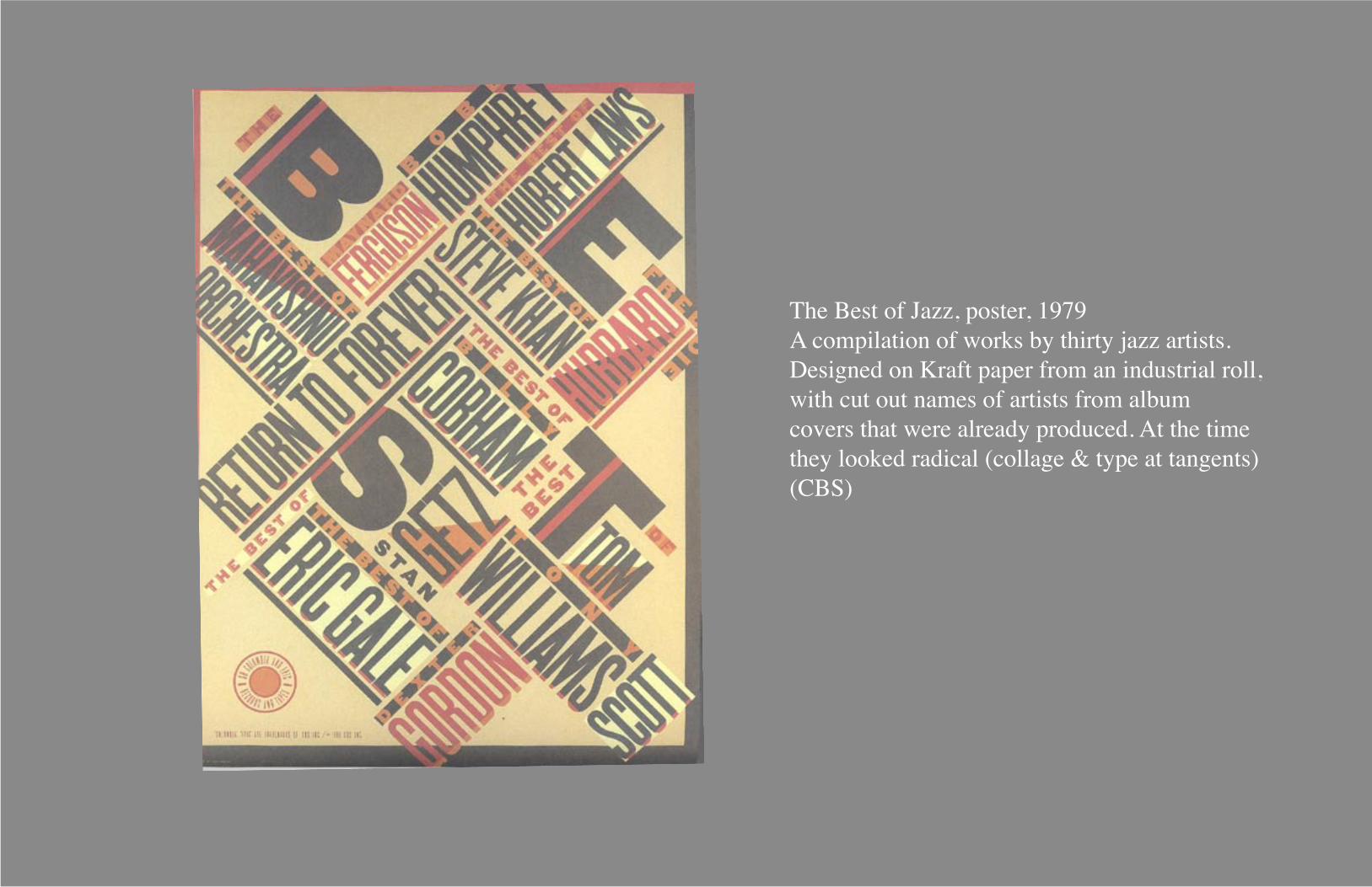
Scher considers album-cover and book-jacket design to be the act of making small posters.
Jeane-Pierre Rampal cover, 1978. Composed of a variety of woodblock prints. The back cover was radiacalfor its times because the typography is detailed, without an underlying or accompanying image. (CBS Records)
The Best of Jazz, poster, 1979A compilation of works by thirty jazz artists. Designed on Kraft paper from an industrial roll, with cut out names of artists from album covers that were already produced. At the time they looked radical (collage & type at tangents)(CBS)
Scher considers album-cover and book-jacket design to be the act of making small posters.

Great Beginnings, 1984A promotional small book that featured the 1st two paragraphs of famous novels designed in the period style in which they had been written. Successful in gaining new clients for their firm, although it was a gag and didn’t represent their actual style.Koppel & Scher

Great Beginnings, 1984A promotional small book that featured the 1st two paragraphs of famous novels designed in the period style in which they had been written. Successful in gaining new clients for their firm, although it was a gag and didn’t represent their actual style.Koppel & Scher
Collection of book jackets, 1987-1990

ÖOLA, 1986Swedish entrepreneurs approached Scher about designing an identity and some packaging for a chain of candy stores that they were planning to open in shopping malls on the East Coast. They already owned stores in Sweden and the UK.Their main attraction were large glass cylinders filled with brightly colored candy. Didn’t make the candy, but were selling an environment and an experience. She didn’t think of it as branding, but designing an environment, entertainment.Originally called Sweetwave, but Scher came up with ÖOLA. Chose the color palette and and designed interior and exterior signage. (Best working environment, willing to take risks, designer as consultant, 2 decision makers.)

ÖOLA, 1986Swedish entrepreneurs approached Scher about designing an identity and some packaging for a chain of candy stores that they were planning to open in shopping malls on the East Coast. They already owned stores in Sweden and the UK.Their main attraction were large glass cylinders filled with brightly colored candy. Didn’t make the candy, but were selling an environment and an experience. She didn’t think of it as branding, but designing an environment, entertainment.Originally called Sweetwave, but Scher came up with ÖOLA. Chose the color palette and and designed interior and exterior signage. (Best working environment, willing to take risks, designer as consultant, 2 decision makers.)
Swatch Watch USA, 1984Design posters for a new youth-orientedproduct, being introduces in the US. Spoof of Herbert Matter posters fir Swisstravel (Schweiz).

Beautiful Faces / Dingbats, 1986Promotion for Champion Papers for their Carnival paper line. Wanted to create some kind of tool, that was useful for designers. Collected Victorian, art noveau, art deco, streamline, etc. typefaces. Scher selected 20 odd fonts and laid their alphabets out on a grid on a 11-by-17 inch photocopier (popular tool of the 80s). The typefaces were then printed on Champion Carnival papers, inserted into a protfolio and distributed to 40,000 graphic designers. It became the mostrequested promotional piece in Champion’s history. It gave the design community access to a reproducible type portfoliofor free and had the greatest individual impact Scher would make on the design style of the times.

Beautiful Faces / Dingbats, 1986Promotion for Champion Papers for their Carnival paper line. Wanted to create some kind of tool, that was useful for designers. Collected Victorian, art noveau, art deco, streamline, etc. typefaces. Scher selected 20 odd fonts and laid their alphabets out on a grid on a 11-by-17 inch photocopier (popular tool of the 80s). The typefaces were then printed on Champion Carnival papers, inserted into a protfolio and distributed to 40,000 graphic designers. It became the mostrequested promotional piece in Champion’s history. It gave the design community access to a reproducible type portfoliofor free and had the greatest individual impact Scher would make on the design style of the times.

Ambassador Arts, c.1988Ambassador Arts, a silkscreen printing company, adopted the “Big A” as its identity and suggested the creation ofan entire alphabet. Scher arranged a cross-promotion with Champion papers and selected 12 designers to produce the alphabet. Scher specified the size of the poster, a red-and-black color pallette, and assigned the letters. Scher did the g and i.

Ambassador Arts, c.1988Ambassador Arts, a silkscreen printing company, adopted the “Big A” as its identity and suggested the creation ofan entire alphabet. Scher arranged a cross-promotion with Champion papers and selected 12 designers to produce the alphabet. Scher specified the size of the poster, a red-and-black color pallette, and assigned the letters. Scher did the g and i.
Posters
The Chrysler Building composed of a listof the entire membership of the AIGA NY Chapter, 1989
For Scher’s show in Osaka, Japan, 1999
For Scher’s show. She smoked two and half packs of Parliaments at the time.

More Posters
Design Renaissance Conference in Glasgow, Scotland, 1993Blah Blah Blah: When asked by Worth Magazine to make a visual comment on the future of technology, this is Scher’s response.A poster advocating literacy, designed for the Denver Chapter of the AIGA, 1997Poster honoring the centenary of Toulouse-Lautrec’s death, 2001.
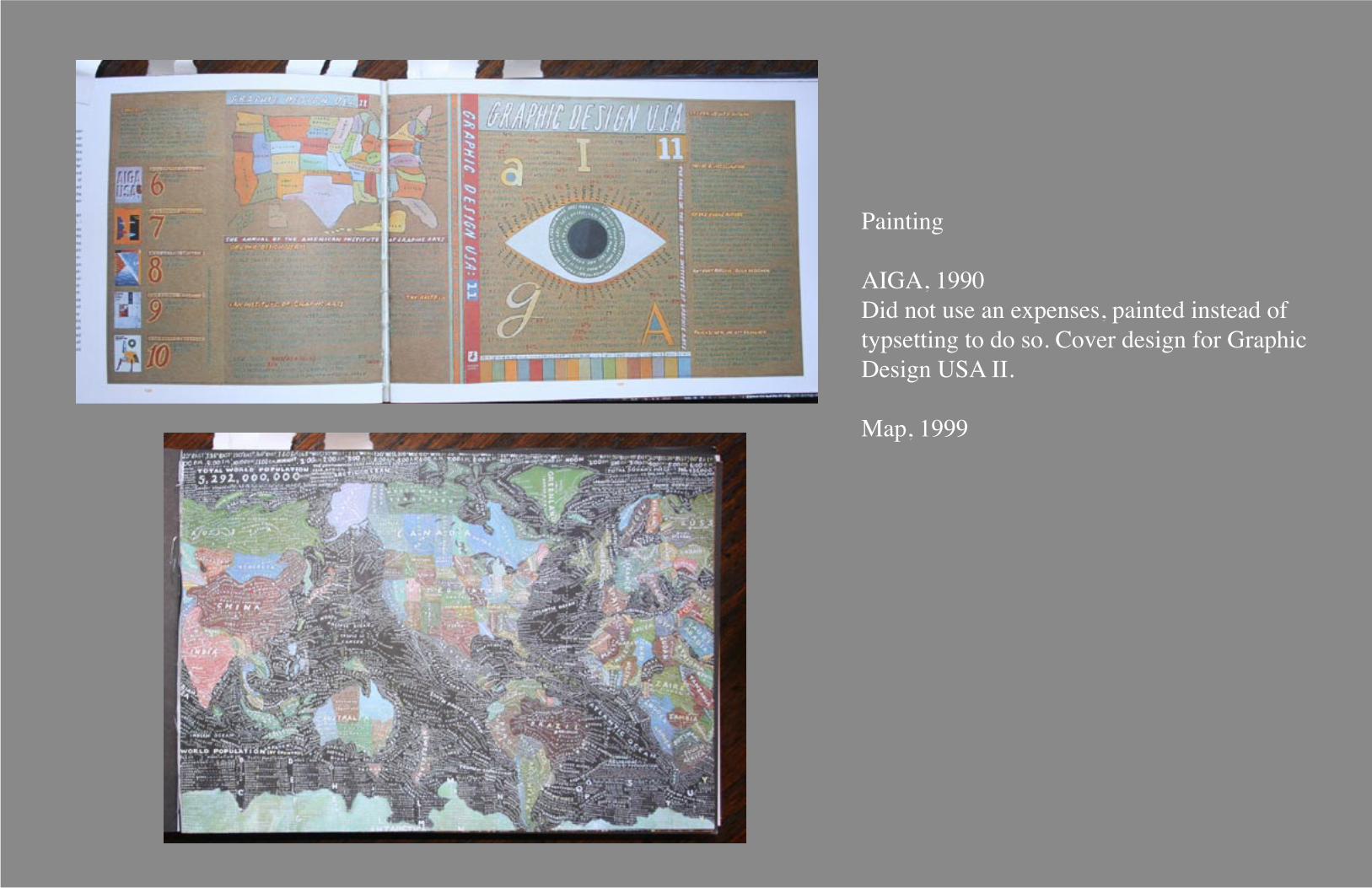
Painting
AIGA, 1990Did not use an expenses, painted instead oftypsetting to do so. Cover design for GraphicDesign USA II.
Map, 1999

The Public Theater (posters), 1994Guess Who & Jenifer Lewis’s one-woman showThe Public Theater fused high and low into a wholly new symbology for cultural institutions.

The Public Theater (posters), 1994Guess Who & Jenifer Lewis’s one-woman showThe Public Theater fused high and low into a wholly new symbology for cultural institutions.
CITI, 1998Traveler’s Group and Citicorp merged. Traveler’s had a red umbrella for a logo and Citigroup’s logo had italic type with a dingbat at the end of it called “the compass rose”. Another feature was a blue band. Scher designed their new logo.

Poster for the 1997 season of Ballet techAfter designing for the Public Theater, Scher designed for Ballet Tech.

Poster for the 1997 season of Ballet techAfter designing for the Public Theater, Scher designed for Ballet Tech.
Ballet Tech poster, 1999 & 2000

MetropolisOversized, the editors were anxious to reduce the size, giving Scher the opportunity to redesign the magazine.

MetropolisOversized, the editors were anxious to reduce the size, giving Scher the opportunity to redesign the magazine.
NJPAC, 2000The New Jersey Performing Arts Center had received funding to convert an old school building (1940’s) into a high schoolfor the performing arts. The building was depressing, and there wasn’t a large budget for anything other than painting.Scher used the nooks, crannies, and turrets of the castle-like structure to display the typography. Her work re-imaginedthe urban landscape as a dynamic environment of dimensional graphic design.

“...design isn’t quite that simple. You don’t just make something, have people go ‘Ooh!’ and you’re done. What generally happens is that the reason you have to make something at all comes from some very complicated problem or issue that involves lots and lots of people that are afraid and jealous and suspicious, so before you even get to make the thing you have to really suss out the lay of the land so you can get everybody over all the stuff that’s upsetting them, so they can be prepared to get excited about it.”

References
Make It BiggerPaula Scherr2002
InspirabilityPash2005
AIGA WebsiteGallery: Paula Scher2006
Pentagram WebsitePartners: Paula Scher2006