shewhart control charts and its application for rare...
TRANSCRIPT

- 14 -
CHAPTER 2
Shewhart control charts and its application
for rare events in healthcare
The control charts considered in this chapter are those that are described in
introductory text books on statistical process control for industrial processes. This
chapter provides examples of their use for monitoring medical processes, the
development and the use of control charts to monitor adverse events in health care.
2.1 Basics of control charts
There is extensive interest in the use of statistical process control (SPC) in
healthcare. While SPC is part of an overall philosophy aimed at delivering recurrent
development, the implementation of SPC usually requires the production of control
charts. Since SPC is relatively new to healthcare and does not routinely feature in
medical statistics texts/courses, there is a need to explain some of the basic steps and
issues involved in selecting and producing control charts. Here I tried to show how to
plot control charts and guidance on the selection and construction of control charts that
are relevant to healthcare. The primary objective of using control charts is to
distinguish between common (chance) and special (assignable) causes of variation. The
former is generic to any (stable) process and its reduction requires action on the
constraints of the process, whereas special cause variation requires investigation to find
the cause and, where appropriate, action to eliminate it. The control chart is one of an
array of quality improvement techniques that can be used to deliver continual
improvement.
Before constructing control charts, it is essential to have a clear aim and clear
action plans on how special cause data points will be investigated, or how a process
exhibiting only common cause variation might be improved. Mohammed (2004) make

- 15 -
sure individuals involved in the project are aware of the SPC approach to
understanding variation. Furthermore, the data collection method should be designed to
provide a dataset that adequately reflects the underlying process. Issues such as
measurement system analysis, sampling, rational subgrouping and operational
definitions are relevant to this and have been discussed by Kelly (1999), Carey (2003),
Ryan (2000) and Wheeler (1992).
In industrial practice, Woodall (2000) found useful to distinguish between two
phases in the application of control charts. In phase I, historical data are used to
provide a baseline, assess stability, detect special causes and estimate the parameters
that describe the behavior of the process. Phase II consists of ongoing monitoring with
data samples taken successively over time and an assumed underlying probability
distribution which is appropriate to the process. Shewhart control charts are highly
recommended for phase I whereas cumulative sum (CUSUM) and exponentially
weighted moving average (EWMA) charts have been shown to detect smaller process
shifts in phase II, although it is generally acknowledged that a combination of charts is
likely to be advantageous (Woodall, 2000).
Control charts include a plot of the data over time with three additional lines-
the centre line (usually based on the mean) and an upper and lower control limit,
typically set at ±3 standard deviations (SDs) from the mean, respectively. When data
points appear, without any unusual patterns, within the control limits the process is said
to be exhibiting common cause variation and is therefore considered to be in statistical
control. However, control charts can also be used to identify special causes of
variation. There are several guidelines that indicate when a signal of special cause
variation has occurred on a control chart. The first and foremost is that a data point
appears outside the control limits. Since the control limits are usually set at 3 SD from
the mean, we can state that for a process which is producing normally distributed data
(only really demonstrable in artificial simulations) the probability of a point appearing
outside the precisely determined phase II control limits is about 1 in 370. Although
such a calculation gives some guidance about the ‘‘statistical performance’’ of this

- 16 -
particular rule, it is important not to believe normality as a precondition on the use of a
control chart (Wheeler, 1992; Woodall, 2000 & Nelson, 1999).
Several other tests can also detect signals of special cause variation based on
patterns of data points occurring within the control limits. Although there is
disagreement about some of the guidelines, three rules are widely recommended:
Ø A run of eight (some prefer seven) or more points on one side of the centre line.
Ø Two out of three consecutive points appearing beyond 2 SD on the same side of
the centre line (i.e., two-thirds of the way towards the control limits).
Ø A run of eight (some prefer seven) or more points all trending up or down.
Lee and McGreevey (2002) recommended the first rule and the trend rule with six
consecutive points either all increasing or all decreasing. Any test for runs must be
used with care. For example, Davis and Woodall (1988) showed that the trend rule
does not detect trends in the underlying parameter, and the CUSUM chart can work
better than the runs rules in phase II, as shown by Champ and Woodall (1987).
Practitioners should note that, as the number of supplementary rules used increases, the
number of false alarms will also tend to increase.
Another rule is that patterns on the control chart should be read and interpreted
with insight and knowledge about the process. This will help the user to identify those
unusual patterns that also indicate special cause variation but may not be covered in the
three rules above. For example, imagine a process that performs suboptimally every
Monday (and in so doing, produces a data point near, but not beyond, the lower control
limit). If a day-by-day control chart is plotted, the pattern for Saturday would be
repeated every seven data points. Although the three rules above do not capture this
scenario, clearly, consideration of the process would raise the question, why Mondays?
On the other hand, there is a natural human tendency to see patterns in purely random
data.
There are many different types of control chart, and the chart to be used is
determined largely by the type of data to be plotted. Two important types of data are:
continuous (measurement) data and discrete (or count or attribute) data. Continuous
data involve measurement: for example, weight, height, blood pressure, length of stay

- 17 -
and time from referral to surgery. Discrete data involve counts: for example, number of
admissions, number of prescriptions, number of errors and number of patients waiting.
For continuous data that are available a point at a time (i.e., not in subgroups) the xmr-
chart (also known as the individuals chart) is often appropriate. For discrete data, the p-
chart, u-chart and the c-chart are relevant. We will see how to construct the xmr-chart,
p-chart, u-chart and c-chart using examples.
2.2 Standard Control Charts
This section provides example of their use for monitoring quality characteristic
of clinical and administrative medical processes given in Morton (2005). This section
is concerned with the control chart for monitoring quality characteristic expressed in
terms of numerical measurement, count and proportion.
(A) Control chart for Numerical data
A control chart using sample from a process to monitor its average is called � chart and the process variability may be monitored with either S chart, to control the
SDs of samples, or an R chart, to control the range of the samples. A description of
these charts and instructions for their construction may be found in Montgomory
(2005, Chapter 5). Morton (2005) recommended the use of S chart to control process
variability. Such charts can be useful for displaying aspects of resource use, such as
ward occupancy and pharmacy utilization. In health care, most of the times data having
sample size � �; that is, sample consist of individual observation. In such situations,
the control chart for individual ���� is used. The procedure is illustrated in the following example.

- 18 -
The ��� chart
Suppose that a quality characteristic is normally distributed with mean � anad standard deviation �, where both � and � are known. If ��� ��� � � �� is a sample of size �, then,
�� � ������� and ������ � !�"�#$�%�
where ��� &�� ' ��%�&( ) *�� � �. The xmr-chart consists of two charts: x-chart and
mr-chart. The x-chart is a control chart of the n observed values, ��� ��� � � ��, and the mr-chart is a control chart of the moving ranges of the data.
Consider the data in the Table 2.1, which shows the heart rate readings for a
patient in the morning over 30 consecutive days. Since these are continuous (numerical
measurement) data, we shall plot them using an xmr-chart.
Table 2.1: The Heart rate reading for a patient in the morning over 30 consecutive days
Reading number 1 2 3 4 5 6 7 8 9 10 11 12 13 14 15
Heart rate (x) 99 113 80 100 94 95 105 85 70 102 96 90 104 95 100
Moving range (mr) - 14 33 20 6 1 10 20 15 32 6 6 14 9 5
Reading number 16 17 18 19 20 21 22 23 24 25 26 27 28 29 30
Heart rate (x) 93 88 91 95 94 80 107 90 87 93 75 88 114 103 91
Moving range (mr) 7 5 3 4 1 14 27 17 3 6 18 13 26 11 12
The first steps in producing an xmr-chart first calculate the magnitudes of the
differences between successive values of the data (i.e., the moving range). We drop the
minus sign as we are only interested in the magnitude of the difference, not the
direction. The moving ranges are shown in the Table 2.1.
In the second step, to produce the x-chart, plot the heart rate readings (x) on a
chart against time. The central line for this chart is given by the mean of x, which is
denoted by �� and it is 93.9. The control limits for the x-chart are given by the formula:
�� + ,���*- �������

- 19 -
where ������ � !�"�#$�%� 12.3 is mean moving range and 1.128 is empirical constant. The
calculated upper control limit and lower control limit are 126.7 and 61.1 respectively.
The x-chart is shown in the figure 2.1(a).
In the last step, for producing the moving range (mr) chart, plot the moving
ranges against time. The centre line is simply the mean moving range ������� and the upper control limit is given by ,�*./������� which gives 40.3. The lower control limit
for a mr-chart is taken to be 0. The mr-chart is shown in the figure 2.1(b).
Although the estimation of the process standard deviation (sigma) is based on
an underlying normal distribution, it is important to appreciate that the xmr-chart is
robust (like other exploratory tools) to departures from the assumption of normality.
Thus it is not necessary to ensure that the data behave according to the normal
distribution before plotting a control chart. Woodall (2006) noted that, when the data
are clearly not normally distributed the statistical performance measures of the charts
evaluated under the assumption of normality cannot be trusted to be accurate.
One characteristic of time-ordered data that should be assessed is independence
over time. Independence means that there is no relationship or autocorrelation between
successive data points. With positively autocorrelated data, there will be a tendency for
high values to follow high values and low values to follow low values, resulting in
cyclic behaviour. With negatively autocorrelated data (less common in applications)
high values tend to follow low values and vice versa. Wheeler (1995) shows that even
with moderate autocorrelations, the xmr-chart behaves well (i.e., the control limits
remain similar), but when the correlation is large (e.g., with a lag 1 correlation
coefficient r > 0.6) then the control limits need to be widened by a correction factor.
However, Maragah and Woodall (1992) found that even moderate autocorrelation can
adversely influence the statistical performance of a chart to the extent that time-series
based methods may be more appropriate for autocorrelated data. A common approach
is to model the time series and use control charts on the residuals to detect changes in
the process.

Figure 2.1(a): x-chart using the heart rate reading of patients.
- 20 -
chart using the heart rate reading of patients.

Figure 2.1(b): mr-chart using the heart rate reading of patients.
It is possible that sometimes the lower control limit will be
under question come from a process in
then the lower control limit
20–25 data points are needed on an
‘‘firmed-up’’ so that if a process is
data points then we can c
reasonable advice, but it does not imply that a control chart
not useful (Wheeler, 1995)
regarded as being ‘‘soft’’ or
stream of data, ‘‘provisional’’ control limits can be computed and
with additional data in due course. Another
- 21 -
chart using the heart rate reading of patients.
It is possible that sometimes the lower control limit will be below 0. If the data
under question come from a process in which negative measurements are not feasible
control limit is routinely reset to 0 to reflect this. It is often stated
25 data points are needed on an xmr-chart before the limits are sufficiently
up’’ so that if a process is showing common cause variation over these 20
then we can confidently conclude that it is stable (Carey, 2003)
reasonable advice, but it does not imply that a control chart with fewer data points is
(Wheeler, 1995). With fewer data points, the resulting control limits
or ‘‘provisional’’ control limits. In practice, where there is a
of data, ‘‘provisional’’ control limits can be computed and refined (firmed up)
with additional data in due course. Another important reason for re-computing the
below 0. If the data
which negative measurements are not feasible
It is often stated that
the limits are sufficiently
showing common cause variation over these 20–25
(Carey, 2003). This is
with fewer data points is
the resulting control limits are
‘‘provisional’’ control limits. In practice, where there is a
refined (firmed up)
computing the

- 22 -
control limits is when knowledge about the underlying process deems it necessary
(e.g., a revised definition of the data, material changes to the process, etc.). Jensen et al.
(2006) reviewed the literature on the effect of estimation on control chart performance.
They showed that sample sizes need to be fairly large to achieve the statistical
performance expected under the known parameters case.
The xmr-chart is a robust, adaptable chart that has been used with a variety of
processes. However, when the underlying data exhibit seasonality or the data are for
rare events then preliminary work with the data is required before it can be placed on
an xmr-chart (Wheeler, 2003). There is disagreement in the literature on the use of the
xmr-chart (Woodall, 2006). Some have argued that the EWMA chart is superior to the
xmr-chart in phase II applications. Others have shown that for time-between-events
data, or successes between - failures data, other charts suggested by Benneyan (2001)
and Quesenberry (2000) are superior. However, the xmr-chart continues to be a useful,
if not always optimal, tool for identifying special causes of variation in many practical
applications (Wheeler, 1995). Even when the data are from a highly skewed
distribution (e.g., exponential waiting times, see Normality section below) a
straightforward double square root transformation �0 11� will often render the
data suitable for an xmr- chart (Montgomery, 2005). According to Wheeler (1995,
2003), the xmr-chart is even useful when considering count (attribute) data.
It is customary to produce the xmr-chart using the mean (of the data and the
moving ranges) statistic for the centre line. However, the median statistic may also be
used, but the constants used in the formulas to produce the three-sigma limits will be
different (Wheeler, 1992) (3.145 instead of 2.66 for the x-chart and 3.865 instead of
3.267 for the mr-chart). Wheeler and Chambers (1992) suggest that when the mean
moving range appears to be inflated by just a few data points, xmr-charts based on the
median may be a more suitable choice, because the median statistic, although less
efficient in its use of the data compared with the mean, affords greater resistance (to
extreme data points) than the mean.

- 23 -
It is sometimes argued that a precondition to the use of a control chart is for
assumptions of normality to be met (Nelson, 1999; Wheeler 1995). This is not correct.
(This issue has been discussed in depth by Woodall (2000)). Control charts have been
shown to be robust to the assumptions of normality. Furthermore during phase I
applications the distributional assumption cannot even be checked because the
underlying process may not be stable. As special causes of variation are removed the
process becomes more stable. Also the form of the hypothesized distribution becomes
more apparent and useful in defining the statistical performance characteristics of the
control chart. According to Woodall (2006), during phase I applications, practitioners
need to be aware that the probability of signals of special cause variation depend
primarily on the shape of the underlying distribution, the degree of autocorrelation and
the number of samples.

- 24 -
(B) Control chart for Proportion data
In industry, the Shewhart 2 control chart is used to monitor the fraction of items
that do not conform to one or a number of standards. Its design and an example
showing how it may implemented to monitor the output of an industrial production
process is given by Montgomery (2005, Chapter 6). Morton (2005) gives examples of
its use to monitor complications that occur in the medical context. It was used to
monitor the proportion whose length of stay (LOS) exceeds a certain percentile for the
relevant diagnosis related group (DRG), the proportion of surgical patients with
surgical site infections, mortality in large general purpose intensive care units in public
hospitals, which is about 15% , and the proportion of various hospital record that are
completed correctly. Control limits may be set using the normal approximation of
binomial distribution but, if the number of trials small, the Camp-Poulson
approximation (Gebhardt, 1968), derived from the F-distribution, is a more appropriate
approximation.
If the expected proportion is less than 10%, Morton et al. (2001) proposed that
the Poisson approximation to the Binomial distribution be used for data analysis. The
data are grouped into block such that there is one expected complication per block, if
the process is in control. Then any special cause variation may be detected by
monitoring the complications with Shewhart 3 control charts. This monitoring scheme
has been superseded by count data CUSUM charts.
Morton (2005) found that control charts such as EWMA or CUSUM charts are
better than Shewhart charts for detecting small step changes in any quality measure
being monitored. If that measure is a proportion of less than 10% for the in control
process, count data CUSUM schemes nay be used to detect step shifts in the
proportion. Beiles and Morton (2004, figure 6 and 7) illustrate the CUSUM methods
with an example where the rate of surgical site infections are monitored to detect a shift
from a surgical site infection rate of approximately 3% for the process in control to a
rate of approximately 6% for the process out of control. In the informal CUSUM graph
the cumulative numbers of infections are plotted against the number of operations

- 25 -
undertaken. An out of control signal occurs if the CUSUM graph crosses above the line
given by Infections = 0.06 4 Operations. In the CUSUM test, the surgical site infection
data are grouped into a blocks of 30 operations so that the expected number of
infections is approximately one per block. He then implements a CUSUM schemes
which is equivalent to the decision interval CUSUM scheme for Poisson data given by
Hawkins and Olwell (1998). Ismail et al. (2003) developed a monitoring scheme based
on scan statistics which they found sensitive in detecting changes in surgical site
infection rates that might not be detected using standard control chart methods such as
the CUSUM test.
The 5 chart
Consider the data in Table 2.2. We are interested in finding whether variation in
mortality over time is consistent with common cause variation, we shall use a p-chart.
Table 2.2: Number of patients who were admitted with a fractured neck of femur and
number who died over 24 consecutive quarters.
Quarter 1 2 3 4 5 6 7 8 9 10 11 12
Number of patients (n) 58 74 63 72 49 57 80 50 69 54 95 43
Number of died (x) 10 12 11 10 9 13 14 12 8 6 10 7
Quarter 13 14 15 16 17 18 19 20 21 22 23 24
Number of patients (n) 67 47 51 48 62 99 74 61 77 76 82 60
Number of died (x) 10 9 11 5 7 18 14 12 10 11 15 12
The central line is 2� 6��. (overall mean mortality) and the control limits for
p-chart are given by the formula:
2� + ,72�8�� ' 2���

To plot a p-chart for the given
the time (quarter) on the
repeated for each quarter to finally produce
control limits thus produced
changes in the sample sizes between quarters. There is no ev
variation. Improvement in this case requires a closer look at
process, perhaps with the aid of a Pareto
reasons for death.
Figure 2.2: p-chart based on the
for patient with a fractured neck of femur.
The assumptions of the p
(i) binary (can only have two states, e
admitted, etc.);
- 26 -
given data, plot the proportion of deaths (p) on the
) on the x-axis and then add the control limits. This calculation is
repeated for each quarter to finally produce the control chart shown in figure 2.2
control limits thus produced are stepped (see figure 2.2) because they reflect the
sample sizes between quarters. There is no evidence of special
variation. Improvement in this case requires a closer look at the constraints of the
process, perhaps with the aid of a Pareto chart (Ryan, 2000) showing the most frequent
chart based on the proportion of deaths following admission to hospital
for patient with a fractured neck of femur.
The assumptions of the p-chart are that the events (deaths in our case) are:
) binary (can only have two states, e.g., alive/dead, infected/not infected, admitted/not
) on the y axis and
calculation is
the control chart shown in figure 2.2. The
) because they reflect the
idence of special cause
the constraints of the
showing the most frequent
proportion of deaths following admission to hospital
our case) are:
, admitted/not

- 27 -
(ii) have a constant underlying probability of occurring; and
(iii) that they are independent of each other.
One simple process that can meet all these requirements is the repeated tossing
of a coin, but it is indeed impossible for a healthcare process to meet all these
assumptions exactly. Nevertheless experience indicates that the p-chart is useful in
practical circumstances, even where there is gross departure from the ideal conditions.
For instance, Deming (1986) shows an example of inspection data that appeared to
have much less variation than expected. The control limits were very wide and the data
appeared to ‘‘hug’’ the central line. This ‘‘under-dispersion’’ was subsequently traced
to an inspector who was too frightened to record the proper failure rates, choosing
instead to make up the figures to be just below the minimum target. Clearly,
assumptions (ii) and (iii) were being violated. Conversely, when the observed variation
is much greater than expected a substantial number of the data points fall outside the
control limits. This is termed ‘‘over-dispersion’’ and often indicates that assumption
(ii) and/or (iii) have been violated. While there are statistical techniques for allowing
for ‘‘over dispersion’’, this technical fix does not itself address the fundamental
question of why ‘‘over-dispersion’’ exists. This requires detective work to understand
the underlying process and learn why it is behaving in this way. (Wheeler (1995)
recommends using the xmr-chart in this situation.).
When using the p-chart to plot percentages, all the proportions, the centre line
and the control limits are multiplied by 100. In the case where the upper control limit is
above 1, or the lower control limit is below 0, such limits are customarily reset to 1 and
0 respectively, because proportions cannot be negative or larger than 1. We do not have
a signal if the observed value was to fall exactly on the reset limit.
The standard deviation of a binomial variable is usually derived using
92�8�� ' 2� ��: , hence giving the control limits as 2� + ,92�8�� ' 2� ��: . According to
Xie et al. (2002) this approximation is good as long as and as is the case in the worked
example above, because under these conditions the binomial distribution is fairly
symmetrical and so the Shewhart three-sigma concept works well. However, when
these conditions are not satisfied, then a different approach is required. One method is

- 28 -
to calculate the exact limits using the probability distribution function of the binomial
distribution, which, with modern software such as popular spreadsheet packages and
statistical packages, is relatively straightforward. Other approaches involving
transformations and regression-based limits have also been documented by Ryan
(1997; 2000).
A common application of a graph similar to the p-chart is a comparison of the
performance of healthcare providers over a fixed period. In this instance there is no
time order to the data. The proportions, such as the proportions of readmissions, are
plotted as a function of the subgroup sizes (n). The resultant chart is a ‘‘funnel’’ shape
which is visually attractive and statistically intuitive because the funnel shows how the
variation due to ‘‘chance’’ reduces with increasing sample sizes. This avoids the
misleading ranking of the providers in league tables and its attendant negative
consequences (Adab, 2002; Shewhart, 1980).

- 29 -
(C) Control chart for Count data
In the industrial context, Shewhart 3 charts are used to monitor number of non-
conforming items in sample of constant size n. The number of non-conforming items
from an in control process is assumed to follow Poisson distribution with parameter c,
if the expected number of non-conforming items is known, or with an estimated
parameter 3�, if the number of non-conforming is unknown. The estimated, 3�, may be
the observed average of non-conformities in a preliminary data set. If the size of the
sample is not constant, the number of non-conforming item may be monitored using
Shewhart ; chart, where the average numbers of non-conformities per inspection unit
are monitored. Details of the use and construction of 3 and ; chart given in Montgomery (2005).
The Shewhart 3 charts have been used in the clinical context to monitor
monthly counts of bacteraemias where there is no reason to doubt the bacteraemias are
independent and it is assumed the counts follow an approximate Poisson approximate
(Morton, 2005). Monitoring monthly counts using 3 chart is appropriate, if the monthly
number of occupied bed days in the hospital is relatively stable. Where there is a
considerable variation in a hospital’s occupancy, the appropriate monitoring tool is the
U control chart which monitors the number of bacteraemias or infections per 1,000
occupied bed days.
The < chart
Consider the data in Table 2.3, which shows the number of falls in a hospital
department over a 13-month period. To investigate the type of variation in these data
we shall use a u-chart.
To plot a u-chart for the above data, plot the fall rate per patient-day (u) on the
y-axis and the time (months) on the x axis. Then add the central line and the control
limits as they are calculated. To determine the central line, compute the overall fall rate

- 30 -
�;� which is given by the total number of falls divided by the total number of patient-
days and it is ;� 6�66=�*. Table 2.3: Number of falls in a hospital department over a 12-month period
Month Jan Feb Mar Apr May Jun July Aug Sept Oct Nov Dec
Number of falls 2 4 1 3 2 0 6 8 1 2 3 4
Number of patient days
812 791 902 608 598 690 838 550 527 639 601 929
Thus, �;� indicates where to place the central line on the y-axis. To derive the control
limits we apply this overall average and the number of days in each time period ��� in turn using the formula:
;� + ,7;��� This calculation is repeated for each time period to finally produce the control
chart shown in figure 2.3. When the calculated lower control limit falls below 0 it is
customarily reset to 0 because count/attribute data cannot fall below 0. As can be seen
from figure 2.3, the control limits thus produced are stepped because they reflect the
changes in the area of opportunity (number of patient-days) between sampling periods.
There is no special cause of variation in months.
The assumptions of the u-chart are that the events:
(i) occur one at a time with no multiple events occurring simultaneously or in the same
location; and
(ii) are independent in that the occurrence of an event in one time period or region does
not affect the probability of the occurrence of any other event.
Although it is rare for all these assumptions to be met exactly in practice,
experience indicates that the u-chart is useful in practical circumstances, even where
there is a marked departure from the ideal conditions.

Figure 2.3: u-chart based on number of falls per patient
Typically low frequency events (e
surgery) are plotted using u
control limits are based on an underlying Poisson distribution which is
infrequent events. To aid communication
expressed: for example, using our falls data, in
days, which is 0.00246 falls per patient
100 patient-days by multiplying by 100 (2/812
make no difference to the analysis since a
patient-days will give the same messages
in a unit of analysis which may be more intuitive to healthcare practitioners.
- 31 -
chart based on number of falls per patient-day over a 12 month period.
Typically low frequency events (e.g., number of major complications following
u-charts. This is appropriate because the calculations for the
limits are based on an underlying Poisson distribution which is reasonable for
infrequent events. To aid communication though, the low frequency event is often re
example, using our falls data, in January there was 2 fall in
falls per patient-day, but this can be re-expressed as a rate per
multiplying by 100 (2/812*100=0.246). Such an adjustment
make no difference to the analysis since a u-chart with the y-axis as falls per 100
days will give the same messages as the one with falls per patient
which may be more intuitive to healthcare practitioners.
day over a 12 month period.
complications following
se the calculations for the
reasonable for
though, the low frequency event is often re-
fall in 812 patient-
expressed as a rate per
). Such an adjustment will
axis as falls per 100
as the one with falls per patient-day, though
which may be more intuitive to healthcare practitioners.

- 32 -
The > chart
Consider the data in Table 2.4 which shows the number of emergency
admissions over 24 consecutive Mondays (2 January 2006 to 12 June 2006) to one
large hospital in India.
Table 2.4: The number of emergency admissions over 24 consecutive Mondays.
Monday number 1 2 3 4 5 6 7 8 9 10 11 12 Number of emergency
admissions (c) 62 53 71 90 55 81 89 62 57 77 49 57
Monday number 13 14 15 16 17 18 19 20 21 22 23 24 Number of emergency
admissions (c) 83 90 97 88 69 74 80 66 84 50 98 75
If we regard the people in this hospital’s catchment area as being the underlying
population from which these admissions occur, we can see that (i) the events are
relatively low frequency (in comparison with the size of the underlying population) but
(ii) the size of that underlying population is unknown. Assuming that the underlying
population is large and fairly constant, we can analyse these data using a c chart, which
is essentially a u-chart with �� �� ) �� *� � �. For a c-chart, plot the number of
admissions (c) on the y-axis and the days (time) on the x-axis, and then add the central
line and the control limits as they are calculated. To determine the central line, compute
the overall mean number of admissions which is given by the total number of
admissions divided by the total number of days and it is 3� /,�*. The control limits
are set at 3� + ,13� since, the standard deviation of a Poisson distribution is the square root of the mean. Hence the upper control limits is 98.9 and lower control limit is 47.5.
The final c-chart is shown in figure 2.4

Figure 2.4: c-chart using the number of emergency admissions on consecutive
Mondays.
The assumptions of the
(i) occur one at a time with no multiple events occurring simultaneously or
location; and
(ii) are independent in that the
not affect the probability of the occurrence of any other event.
It is impossible for all these assumptions to be met
indicates that the c-chart is useful
significant departure from the ideal conditions. It is important to note
preferred to the c-chart when sample sizes or
vary considerably. When such an area of opportunity information is not available then
- 33 -
chart using the number of emergency admissions on consecutive
The assumptions of the c-chart are that the events:
at a time with no multiple events occurring simultaneously or
) are independent in that the occurrence of an event in one time period or region does
affect the probability of the occurrence of any other event.
t is impossible for all these assumptions to be met exactly in practice;
chart is useful in practical conditions, even where there is
departure from the ideal conditions. It is important to note that the
chart when sample sizes or areas of opportunity are available and
such an area of opportunity information is not available then
chart using the number of emergency admissions on consecutive
at a time with no multiple events occurring simultaneously or in the same
occurrence of an event in one time period or region does
exactly in practice; experience
in practical conditions, even where there is
that the u-chart is
available and
such an area of opportunity information is not available then

- 34 -
the c-chart is the only real option, provided that it is reasonable to assume that the
underlying areas of opportunity are relatively large and fairly constant – as is the case
in our emergency admissions example here.
The control limits for a c-chart are derived from 3� + ,13�. According to Ryan
(2000), when 3� ? �6 as is the case here, the Poisson distribution is roughly symmetrical and so the Shewhart three-sigma concept works well. However, when 3� ? �6 is not satisfied, then a different approach is required. One method is to
calculate the exact limits using the probability distribution function of the Poisson
distribution with the help of computer software or statistical tables. Other approaches,
using transformations as well as regression-based limits, have also been suggested by
Ryan (1997). When 3� � @ the computation of the lower control limit produces a value
below 0, which is customarily reset to 0 because the process is not capable of
producing a negative count. However, the negative lower control limit is also an
indication that the Poisson distribution is not symmetrical and the computation of exact
limits is then recommended. Furthermore, according to Wheeler (1995) the c-chart will
break down when the mean number of events falls below 1, at which point plotting the
time between events can be helpful (Wheeler, 2003).
In this worked example we plotted the number of emergency admissions on
consecutive Mondays instead of consecutive days. The reason for this is related to
rational subgrouping. Some processes are made up of different underlying cause–effect
subprocesses and an emergency admission to hospitals is one example. So for instance
we do not expect the probability of an emergency admission to hospital to be the same
for weekends (Saturday/Sunday) and weekdays, nor do we expect Fridays to be the
same as other weekdays. In other words, the process exhibits seasonality. In order not
to violate the requirements of rational subgrouping, we split the emergency admissions
data by day of week and used Mondays as an illustrative example. If a control chart for
emergency admissions for consecutive days is required then methods which first
deseasonalise the data must be used (Wheeler, 2003).Developing research and practice

- 35 -
2.3 Hospital epidemiology and infection control
Epidemiology in the broadest perspective is concerned with the study,
identification and prevention of adverse health care events, disease transmission and
contagious outbreaks with particular focus within hospital on nosocomial infections
and infection control. Nosocomial infections essential are any infections that are
acquired or spread as a direct result of a patient’s hospital stay (rather than being pre-
existent as an admitting condition), with a few examples including surgical site
infection, catheter infection, pneumonia, bacteremia, urinary tract infections, cutaneous
wound infections, bloodstream infections, gastrointestinal infections and others.
With estimates of the national costs of nosocomial infections ranging from
approximately 8.7 million additional hospital days and 20,000 deaths per year (Finison
et al., 1993) to 2 million infections and 80,000 deaths per year (Lasalandra, 1998), it is
clear that these problems represents quite considerable health and cost concerns. It is
also seen that, the number of U.S. hospital patients injured due to medical error and
adverse events has been estimated between 7,70,000 and 2 million per year, with the
national cost of adverse drug events estimated at $4.2 billion annually and an estimated
1,80,000 deaths caused partly by iatrogenic injury national wide per year (Bates, 1997;
Bedell et al., 1991; Bonger, 1994; Brennan et al., 1991; Cullen et al., 1997 and Leape,
1994). The costs of a signal nosocomial infection or adverse events have been
estimated both to average between $2,000 and $3,000 per episode. The National
Academy of Science, Institute of Medicine recently estimated that more Americans die
each year from medical mistakes than from traffic accidents, breast cancer, or AIDS,
with $8.8 billion spent annually as a result of medical mistakes (Kohn et al., 1999).
Dr. Deming (1992) wrote about the need to view health care as a collection of
processes, and the application of quality control charts to hospital epidemiology and
infection control had been suggested by Birnbaum (1984). Moreover, various
regulatory and accreditation bodies are expressing a growing interest in the concept of
variation reduction and the use of control charts. For example: Joint Commission on
Accreditation of Health care organizations (JCAHO), the National Committee for

- 36 -
Quality Assurance (NCQA), the U.S. center for Disease Control (CDC), the Health
Care Financing Administration (HCFA) and others… require or strongly encourage
that hospitals and HMO’s to apply both classical epidemiology and more modern
continuous quality improvement (CQI) methodologies to these significant process
concerns, including the use of statistical methods such as statistical process control
(SPC). For example, the Joint Commission on Accreditation of Health care
Organizations (1997) recently stated their position on the use of SPC as follows:
“An understanding of statistical quality control, including SPC and
variation is essential for an effective assessment process… Statistical
tools such as run charts, control charts, and histograms are especially
helpful in comparing performance with historical patterns and assessing
variation and stability.”
Similarly, a recent paper by several epidemiology from the U.S. Center for
Disease Control (Martone, 1991) stated that
“Many of the leading approaches to directing quality improvement in
hospitals are based on the principles of W.E. Deming. These principles
include use of statistical measures designed to determine whether
improvement in quality has been achieved. These measures should include
nosocomial infection rates.”
Conventional epidemiology methods include both various statistical and
graphical tools for retrospective analysis, such as described by Mausner and Kramer
(1985) and Gordis (1996), and several more surveillance-oriented methods, such as
reviewed by Larson (1980). It is worth noting that collectively these methods tend to be
concerned with both epidemic (outbreaks) and endemic (systemic) events, with in SPC
terminology equates to unnatural (special cause) and natural (common cause)
variability, respectively. Several epidemiologists have proposed monitoring certain
infection and adverse events more dynamically over time, rather than “time
statistically”, in manners that are quite similar in nature and philosophy to SPC. It is

- 37 -
also is interesting that, Dr. Deming (1942) advocated the important potential of SPC in
disease surveillance and to rare events.
The application of standard SPC methods to healthcare processes, infection
control, and hospital epidemiology has been discussed by several authors, including a
comprehensive review in a recent series in Infection control and hospital epidemiology
by Benneyan (1998). Examples application include medication errors, patient falls and
slips, central line infections, surgical complications, and others adverse events. In some
cases, however, none of the most common types of control charts will be appropriate,
for example due to the manner in which data are collected, pre-established measuring
and reporting metrics, or low occurrence rates and infrequent data. One example of
particular note is the use of events-between, number-between, days-between, or time-
between type of data that occasionally are used by convention in some healthcare and
other settings. Several important clinical applications of such measures are described
below, we tried to illustrate appropriate control charts for these cases, such as for the
number of procedures, opportunities, or days between infrequent adverse events.
SPC charts are chronological displays of process data used to help statistically
understand, control and improve a system, here an infection control or adverse event
process. Observed process data, such as the monthly rate of infection or the number of
procedures between infections, are plotted on the chart and interpreted in a little while
after they become available. Three horizontal control lines plotted, which are
calculated statistically and help define the central tendency and the range of natural
variation of the plotted values, assuming that the rate of occurrence does not change.
By observing and interpreting the behavior of these process data, plotted over time on
an appropriate control chart, a determination can be made about the stability of the
process according to the following criteria.
Values that are fall outside the control limits exceed their probabilistic range
and therefore are strong indications that non-systemic causes almost certainly exits that
should be identified and removed in order to achieve a single, stable, and predictable
process. There also should be no evidence of non-random behavior between the limits,
such as trends, cycles, and shifts above or below the center line. To help in the

- 38 -
objective interpretation of such data patterns, various “within limit” rules have been
defined. See Duncan (1986) and Grant and Leaven worth (1988) for further
information about statistical process control in general and Benneyan (1998, 1998 &
1995) for discussion and application of SPC to healthcare processes.
Several approaches to applying SPC to hospital infections or others adverse
events are possible, dependent on the situation and ranging in complexity and data
required. For example, two standard approaches are to use u or p Shewhart control
charts, such as, for the number or the fraction of patients, respectively, per time period
who acquire a particular type of infection. For example, figure 2.5 illustrates a recent u
chart for the quarterly number of infections per 100 patient days, although it should be
noted that this example ideally should contain many more subgroups (time period) of
data. In terms of proper control chart selection, note that each type of chart is based on
a particular underlying probability model and is appropriate in different types of
settings. In this particular example, a Poisson based u chart would be appropriate if
each patient day is considered as an “area of opportunity” in which one or more
infections theoretically could occur. Alternatively, a binomial based p chart would be
more appropriate if the data were recorded as the number of patient days with one or
more infections (i.e., Bernoulli trials). Further information on different types of control
charts and scenarios in which each is appropriate can be found in the references
(Duncan, 1986; Benneyan, 1998; Grant and Leaven worth, 1988).
In either of the above cases, note that some knowledge of the denominator is
required to construct the corresponding chart, such as the number of patient days,
discharges, or surgeries per time period. A more troubling problem is that use of these
charts in some cases can result in an inadequate number of points to plot or in data
becoming available too infrequently to be able to make rational decisions in a timely
manner. For example, recall that a minimum of at least 25-35 subgroups are
recommended to confidently determine whether a process is in statistical control and
that, in the case of p and np charts, a conventional rule of thumb for forming binomial
subgroups is to pick a subgroup size, n, at least large enough so that np A 5. For

Figure 2.5: u chart with number of infections per quarter
processes with low infection rates, say
comments can be a significant increase in total sample size across all subgroups and in
the average run length until a
0.01, this translates to 500 data per subgroup
Furthermore, this can be necessitate waiting until the end of linger time periods (e.g.,
week, month, or perhaps quart
perhaps being too late to react to important changes in a critical process and no longer
in best alignment with the philosophy of process monitoring in as real
Note that similar subgroup size rules of thumb exist for
same general dilemma as for
charts consider the number of infections or adverse events either at the end of some
time period or after some pre
- 39 -
chart with number of infections per quarter
processes with low infection rates, say p < 0.01, the consequence of the above
comments can be a significant increase in total sample size across all subgroups and in
the average run length until a process change is detected. For example, even for
0.01, this translates to 500 data per subgroup 25 subgroups = 12,500 total data.
Furthermore, this can be necessitate waiting until the end of linger time periods (e.g.,
week, month, or perhaps quarter) to calculate, plot, and interpret each subgroup value,
perhaps being too late to react to important changes in a critical process and no longer
in best alignment with the philosophy of process monitoring in as real-time as possible.
ubgroup size rules of thumb exist for c and u charts, and lead to the
same general dilemma as for np and p charts, in part because all conventional control
charts consider the number of infections or adverse events either at the end of some
after some pre-determined number of cases.
< 0.01, the consequence of the above
comments can be a significant increase in total sample size across all subgroups and in
process change is detected. For example, even for p =
25 subgroups = 12,500 total data.
Furthermore, this can be necessitate waiting until the end of linger time periods (e.g.,
er) to calculate, plot, and interpret each subgroup value,
perhaps being too late to react to important changes in a critical process and no longer
time as possible.
charts, and lead to the
charts, in part because all conventional control
charts consider the number of infections or adverse events either at the end of some

- 40 -
To overcome above mentioned difficulties, the number of procedure, events, or
days between infections has been proposed due to easiness of use, more timely
feedback, near immediate availability of each individual observation, low infection
rates, and the simplicity with which non-technical personnel can implement such
measures. Being easy to calculate, a control chart can be updated immediately in real
time, on the hospital floor, without knowledge the census or other base denominator. In
some settings “number - between” or “time - between” types of process measures
simply may be preferred as a standard or traditional manner in which to report
outcomes.
Examples of the traditional use of such measures, Nelson et al. (1995)
examined the number of open heart surgeries between post-operative sterna wound
infections, Pohlen et al. (1996) analyzed the number of infection free coronary artery
bypass graft (CABG) procedures between adverse events, Finison et al. (1993)
considered the number of days between Clostridium difficile colitis positive stool
assays, Jacquez et al. (1996) analyzed the number of time intervals between
occurrences of infectious diseases, Nugent et al. (1994) described the use of time
between adverse events as a key hospital-wide metric, Pohlen (1996) monitored the
time between insulin reactions, and Benneyan (1998) discussed the number of cases
between needle sticks.
In order to plot any of these types of data on control charts, however, note that
none of the standard charts are appropriate. For example, standard c and u control
charts are based on discrete Poisson distribution, np and p charts based on discrete
binomial distributions, and � and B charts are based on continuous Gaussian
distributions. By description, conversely, the number of cases between infections most
closely fits the classic definition of a geometric random variable, as discussed below
and illustrated by the histogram in figure 2.6 of surgeries-between infections empirical
data. Note that if the infection rate is unchanged (i.e.; in statistics control), then the
probability, p, of an infection occurring will be reasonably constant for each case then
this satisfies the definition of a geometric random variable.

- 41 -
As can be seen by comparison with the corresponding geometric distribution
(with the infection probability p estimated via the method of maximum likelihood),
these data exhibit a geometric decaying shape that is very close to the theoretic model.
Appropriate control charts for these data therefore should be based on underlying
geometric distribution, as developed and illustrated below, rather than using any of the
above traditional charts. Use of inappropriate discrete distributions and control charts
can lead to erroneous conclusions about the variability and state of statistical control of
the infection rate, a situation which has been described previously (Benneyan, 1994;
Jacquez, 1972; Kaminsky et al. 1992) and is shown in some of the examples in section
2.4.

- 42 -
2.4 g and h control charts
The use of control chart techniques for time oriented rare event data is
problematical. As the number of events being controlled diminishes, standard control
chart techniques such as Individual Value / Moving Range, lose their effectiveness due
to the small amount of data. Also with rare event data such as surgical complications,
central line infections where the area of opportunity is not unique for each event, the
condition for control charting Poisson data or binomial data is violated. In such
situation g-type control chart becomes useful. Benneyan (2000, 2001) proposed a g-
type control chart based on geometric distribution for monitoring adverse events like
number of open heart surgeries between post-operative sternal wound infections,
number of time intervals between occurrences of infectious diseases, time between
insulin reactions, number of cases between needle sticks etc. Benneyan (1991) and
Kaminsky et al. (1992) were developed and investigated g and h charts based on
underlying geometric and negative binomial distributions. These new charts were
developed specifically to be appropriate for the following three general scenarios:
Ø for situations dealing with classic geometric random variables, such as for the
various “number – between” type of application
Ø for more desirable or powerful control (i.e., greater sensitivity) of low
frequency process data than by np and p charts; and
Ø If a geometrically decaying shape simply appears naturally, such as periodically
observed in histograms of empirical data, even though the existence of a classic
geometric scenario may not be apparent.
The first two scenarios are of particular interest in this section given the above
discussion, with a few examples of the third type of application briefly also illustrated.
As shown below, in case with low infection rates and with immediate availability of
each observation, consideration Bernoulli processes with respect to geometric rather
than traditional binomial probability distributions can produce more plotted subgroup
data and greater ability to more quickly detect process changes.

- 43 -
The mathematical development of g and h chart is given here, because some
healthcare practitioners, epidemiologist and other readers might not be familiar with
these. Recall that if each case (e.g., procedure, catheter, day etc.) is considered as an
independent Bernoulli trial with reasonably the same probability of resulting in a
“failure” (e.g., an infection or other adverse event), then the number of Bernoulli trials
units the first failure and the number of Bernoulli trials before the first failure are
random variables with Type I and Type II geometric distributions respectively. For
example: Let X = number of cases between infections, and p = probability of infection
occurring. Here X most closely fits the classic geometric distribution. Since when
infection rate is in statistical control, then the probability p will be reasonably constant
for each case. Probability of the next infection occurring on the �CD case or immediately after the �CD case are well known to be E� � 2�� ' 2�%F888888GH�8� I� I J �� I J *��
where a is the minimum possible number of event, a = 1 for Type I (number until) and
a = 0 for Type II (number - before) geometric data, with the sum of n independent and
identically distributed geometric random variables K � J � JLJ � being negative binomial with probability function
E�K �I J M N� J M ' �� ' � O82��� ' 2P888GH�8M 6� �� *� �
Since the event � is identical to the event K the distribution of � is negative binomial
distribution. This knowledge is useful in evaluating the probabilities of Type I and
Type II errors that can be ascribed to a single subgroup. The expected values,
variances, and standard deviations of the total number of cases T and the average
number of cases � before (a = 0) or until (a = 1) the next n infections or adverse events occur then are
Q�K � N� ' 22 J IO �8888888R�K ��� ' 22� �8888888�S 7��� ' 22� 8
- 44 -
and
Q�� � ' 22 J I�8888888R�� � ' 2�2� �8888888�T� 7� ' 2�2� 88888888888 where n = 1 and n A 1 for the geometric and negative binomial cases, respectively. In
cases where the Bernoulli parameter p is not known, it can be estimated in several
manners, with the conventional method of maximum likelihood and method of moment
estimators both producing
2U �V ' I J � where V the average of all the individual data in all subgroups or samples (i.e., the
average number of procedures, days between infections or adverse events)
corresponding to k - sigma control charts for parameters known and parameter
estimated cases can be developed. The number – until and number – before Bernoulli
cases, the uniform minimum variance unbiased estimator (MVUE) is recommended,
especially when dealing with very few data, because the 2U tends to slightly over estimate p.
2U W ' �X ' � �V ' I J �8W ' �W
where t is the sum of all the individual data adjusted for the shift parameters a to equate
to the Type I case,
X YY�Z��[���
Z�� ' �I ' �W
and W � �Z Z�� is the total number of infections or adverse events in all � subgroups
in general or N = nm if all subgroups are of the same size n.
The above result can be used to develop appropriate k-sigma or probability based
control charts for the cases where the parameter p is known and the case where this
probability must be estimated from historical data (Benneyan, 1991). These
calculations, for conventional k-sigma type g and h charts, are summarized in the Table

- 45 -
2.5. Table 2.6 summarized for the simplest and most likely case where the subgroup
size n = 1 and a = 0 (number - between individual occurrences).
Table 2.5: Parameter known and parameter estimated g and h control chart calculations
g chart: Total number events per subgroup
Center line Upper control limit / Lower control limit
Rate known � N� ' 22 J IO � N� ' 22 J IO + \7��� ' 22�
Rate estimated ��] ��] + \9���] ' I��] ' I J � MVUE
WW ' � ^� N�] J � ' IW O_ `a + WW ' �\7� N�] ' I J �WO ��] ' I J � h chart: Average number events per subgroup
Rate known N� ' 22 J IO N� ' 22 J IO + \7�� ' 2�2�
Rate estimated �] �] + \7��] ' I��] ' I J ��
MVUE WW ' � ^�] J � ' IW _ `a + WW ' �\7�� N�] ' I J �WO ��] ' I J �
Table 2.6: Calculations for individual adverse event g control chart (n=1).
(number - before type scenarios, a=0)
Center line Upper control limit / Lower control limit
Rate known � ' 22
� ' 22 + \7�� ' 22�
Rate estimated �] �] + \9�]��] J � MVUE
�� ' � ^�] J ��_ `a + �� ' �\7N�] J ��O ��] J �

- 46 -
Table 2.7: Calculations for individual adverse event g control chart (n=1).
(number - after type scenarios, a=1).
Number - until applications (a=1)
Center line Upper control limit / Lower control limit
Rate known �2 �2 + \7�� ' 22�
Rate estimated �] �] + \9�]��] ' � MVUE
�� ' ��] `a + �� ' �\7N�] ' � J ��O�]
where: �]b the average number of procedures, events, or days between infections;
n: the subgroup size
m: the number of subgroups used to calculate the center line and control limits;
N: the total number of data used to calculate the center line and control limits;
p: the infection or adverse event rate (if known); and
k: the number of standard deviations in control limits
Note that a negative lower control limit by convention usually is rounded up to
a = 0, as plotting observed values beneath this is not possible given the non-negative
nature of “number - between” data. A slight variation, if the number - until the next
occurrence are plotted (a = 1), such as for the number of catheters until the next
infection (i.e., up to and including the first infected catheter), then the alternate
calculations shown in Table 2.7 should be used, with the minimum possible value for
the LCL now being a = 1 (i.e., on the first Bernoulli trial). Note that both approaches
always will yield precisely identical results and statistical properties (e.g., the
geometric type I event of exactly X cases until the next infection is identical to the
geometric type II event of exactly X-1 cases before the next infection), and thus the
choice is strictly a matter of user preference.
- 47 -
Also note that an alternative approach to constructing these charts, especially
given the skewness of geometric data, could be to use probability based limits and a
center line equal to the median rather than the traditional arithmetic mean.
Additionally, although traditionally 3–sigma control limits almost always should be
used, the k-sigma notation is meant to recognize that in some special cases k can be set
to different values (hopefully only when based on sound analysis) in order to achieve
the most preferable tradeoff between the false alarm rate, power to detect an infection
rate change, and associated costs. These concepts are explored in detail below.
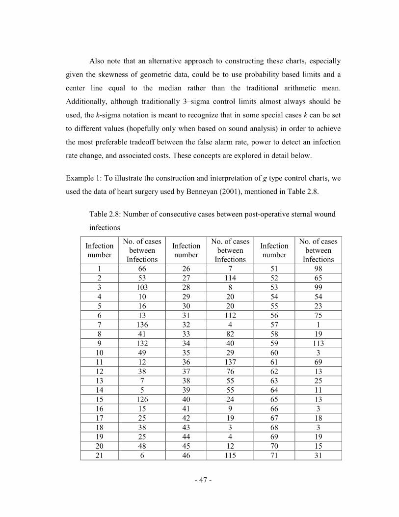
Example 1: To illustrate the construction and interpretation of g type control charts, we
used the data of heart surgery used by Benneyan (2001), mentioned in Table 2.8.
Table 2.8: Number of consecutive cases between post-operative sternal wound
infections
Infection number
No. of cases between Infections
Infection number
No. of cases between Infections
Infection number
No. of cases between Infections
1 66 26 7 51 98 2 53 27 114 52 65 3 103 28 8 53 99 4 10 29 20 54 54 5 16 30 20 55 23 6 13 31 112 56 75 7 136 32 4 57 1 8 41 33 82 58 19 9 132 34 40 59 113 10 49 35 29 60 3 11 12 36 137 61 69 12 38 37 76 62 13 13 7 38 55 63 25 14 5 39 55 64 11 15 126 40 24 65 13 16 15 41 9 66 3 17 25 42 19 67 18 18 38 43 3 68 3 19 25 44 4 69 19 20 48 45 12 70 15 21 6 46 115 71 31
- 48 -
22 5 47 4 72 87 23 25 48 29 73 6 24 15 49 5 74 76 25 29 50 70 75 60
Figure 2.6: Comparison of empirical heart surgery infection data with geometric
distribution
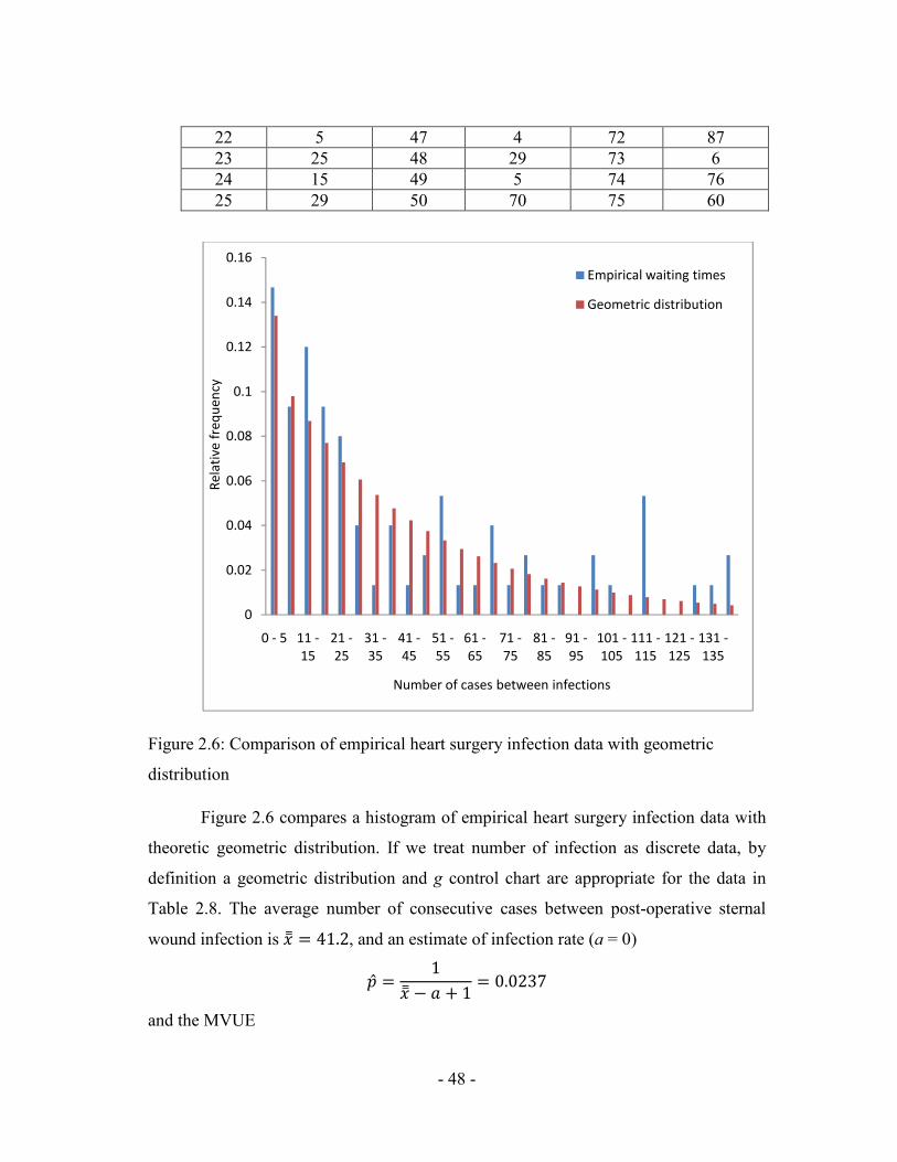
Figure 2.6 compares a histogram of empirical heart surgery infection data with
theoretic geometric distribution. If we treat number of infection as discrete data, by
definition a geometric distribution and g control chart are appropriate for the data in
Table 2.8. The average number of consecutive cases between post-operative sternal
wound infection is �] =��*, and an estimate of infection rate (a = 0)
2U ��] ' I J � 6�6*,/ and the MVUE
0
0.02
0.04
0.06
0.08
0.1
0.12
0.14
0.16
0 - 5 11 -15
21 -25
31 -35
41 -45
51 -55
61 -65
71 -75
81 -85
91 -95
101 -105
111 -115
121 -125
131 -135
Rela
tive
freq
uenc
y
Number of cases between infections
Empirical waiting times
Geometric distribution

- 49 -
2U �V ' I J �8W ' �W 6�6*,=8Table 2.9 shows that control limits calculated using Table 2.7 for rate estimated and
MVUE, which are very similar.
Table 2.9: Control limits for g-chart (rate estimate and MVUE) and c-chart
Chart type CL UCL LCL
Rate estimated (g-chart) 41.2 166.3 0
MVUE (g-chart) 41.8 168.6 0
c-chart 41.2 60.5 21.9
Here the infection control g-chart for this data is shown in figure 2.7, with the control
limits for a conventional c chart also added for comparison. Here we see that a
decrease in the number of cases between infections corresponds to an increase in the
infection rate and, unlike the case for more familiar types of charts, to values now
closer to, rather than further from , the horizontal x- axis. Here the process appears to
exhibit a state of statistical control throughout the entire time period examined i.e. the
rate of infection by this criterion thus appears to be in a state of statistical control (i.e.,
unchanged), several within limits signals indicate a rate increase between observations
16 and 31, 60 and 75. An epidemiologic investigation thus might be conducted in an
attempt to determine and remove the cause(s) of this increase. As an aside note that if a
traditional c chart had been incorrectly used for these “count” data, entirely different
and erroneous conclusion would have been drawn about the consistency of the process,
due to a grossly inflated false alarm c probability, with approximately 72% of the in-
control values incorrectly being interpreted as out of control.

Figure 2.7: Heart surgery infection control
Example 2:
As a second example for which
histogram of the number of days between positive
stool assays with the appropriate theoretical geometric distribution probability
distribution. If we treat the number of days as discrete data then by definition a
geometric distribution, g control chart are appropriate for these data. Note that while
ideally in such situations it would be preferable to know the exact number of cases,
rather than the number of days, between positive specimens in order to have a more
precise infection rate measure; in many cases such detailed data may not be available
easily. Related examples for which the true underlying sample size typically may not
be easy to obtain include the number of catheters used between catheter
- 50 -
Figure 2.7: Heart surgery infection control g chart
As a second example for which g chart are applicable, figure 2.8 compare a
histogram of the number of days between positive Clostridium difficile colitis
stool assays with the appropriate theoretical geometric distribution probability
distribution. If we treat the number of days as discrete data then by definition a
control chart are appropriate for these data. Note that while
ideally in such situations it would be preferable to know the exact number of cases,
rather than the number of days, between positive specimens in order to have a more
asure; in many cases such detailed data may not be available
easily. Related examples for which the true underlying sample size typically may not
be easy to obtain include the number of catheters used between catheter
chart are applicable, figure 2.8 compare a
Clostridium difficile colitis infected
stool assays with the appropriate theoretical geometric distribution probability
distribution. If we treat the number of days as discrete data then by definition a
control chart are appropriate for these data. Note that while
ideally in such situations it would be preferable to know the exact number of cases,
rather than the number of days, between positive specimens in order to have a more
asure; in many cases such detailed data may not be available
easily. Related examples for which the true underlying sample size typically may not
be easy to obtain include the number of catheters used between catheter-associated

- 51 -
infections, the number of needle handling between accidental sticks, the number of
medications administered between adverse drug events (ADE’s), and so on.
Figure 2.8: Number of days between Clostridium difficile colitis toxin positive stool
assays.
In such cases, the number of days or other time periods often can serve as a
reasonable surrogate, especially given the important considerations of feasibility of use
and implementation by practitioners. For example, the corresponding g control chart of
days-between-infections for the above Clostridium difficile data is shown in figure 2.9.
Here all points are contained within the control limits and the rate of infection by this
criterion thus appears to be in a state of statistical control (i.e., unchanged), several
within limits signals indicate a rate increase between observations 34 and 55. Under the
philosophy of statistical process control, therefore, a first step in reducing the infection
rate would be to bring this process into a state of statistical control so that it operating
with only natural variability. An epidemiologic investigation thus might be conducted
in an attempt to determine and remove the cause(s) of this increase. (As previously,
again note that the significant error in the UCL if a c control chart incorrectly had been
0
5
10
15
20
25
30
1 2 3 4 5 6 7 8 9 10 11
Freq
uenc
y
Days between nosocomial infections
Days Between Infections
Geometric Distribution

used based on the reasoning that these are integer count data, which is not appropriate
as by definition this process is not Poisson also figure 2.10)
Figure 2.9: Clostridium difficile colitis infection
If days-between and other
then a slight variation of the
would be used. For practical purposes, this alternative would only be appropriate if the
specific time of day were
more accurate approximation.
In addition to the above examples, similar
other types of adverse healthcare events and medical concerns, especially in cases for
which occurrence rates are low, data are scare or infrequent, and immediate
interpretation of each data value is of interest, such as for needle stick staff exposures,
- 52 -
used based on the reasoning that these are integer count data, which is not appropriate
as by definition this process is not Poisson also figure 2.10)
Figure 2.9: Clostridium difficile colitis infection g control chart
between and other time-between measures recorded as continuous data
then a slight variation of the g chart, now based on a negative exponential distribution,
would be used. For practical purposes, this alternative would only be appropriate if the
specific time of day were recorded, otherwise a g chart should be used to produce a
more accurate approximation.
In addition to the above examples, similar g charts also may be applicable to
other types of adverse healthcare events and medical concerns, especially in cases for
ch occurrence rates are low, data are scare or infrequent, and immediate
interpretation of each data value is of interest, such as for needle stick staff exposures,
used based on the reasoning that these are integer count data, which is not appropriate
between measures recorded as continuous data
chart, now based on a negative exponential distribution,
would be used. For practical purposes, this alternative would only be appropriate if the
chart should be used to produce a
charts also may be applicable to
other types of adverse healthcare events and medical concerns, especially in cases for
ch occurrence rates are low, data are scare or infrequent, and immediate
interpretation of each data value is of interest, such as for needle stick staff exposures,

medication errors, and other types of patient complications. Figures 10 and 11 illustrate
g chart for the number of time intervals between infectious disease (Jacquez, 1996),
and the number of days between needle sticks (Benneyan, 1998), respectively. In the
second case note that ideally a better basis for comparison might be the number of
“potential sticks” (procedures, injections, etc.) between actual sticks and the number of
patients between diagnoses (especially if the assumptions of a relatively constant
probability day-to-day or patient
extremely unlikely to be available easily. Thus in such cases the number of days or
time periods again may suffice as a very reasonable surrogate.
Figure 2.10: Time between infectious diseases
- 53 -
medication errors, and other types of patient complications. Figures 10 and 11 illustrate
chart for the number of time intervals between infectious disease (Jacquez, 1996),
and the number of days between needle sticks (Benneyan, 1998), respectively. In the
second case note that ideally a better basis for comparison might be the number of
ntial sticks” (procedures, injections, etc.) between actual sticks and the number of
patients between diagnoses (especially if the assumptions of a relatively constant
day or patient-to-patient are not reasonable), although these data ar
extremely unlikely to be available easily. Thus in such cases the number of days or
time periods again may suffice as a very reasonable surrogate.
Figure 2.10: Time between infectious diseases g control chart
medication errors, and other types of patient complications. Figures 10 and 11 illustrate
chart for the number of time intervals between infectious disease (Jacquez, 1996),
and the number of days between needle sticks (Benneyan, 1998), respectively. In the
second case note that ideally a better basis for comparison might be the number of
ntial sticks” (procedures, injections, etc.) between actual sticks and the number of
patients between diagnoses (especially if the assumptions of a relatively constant
patient are not reasonable), although these data are
extremely unlikely to be available easily. Thus in such cases the number of days or
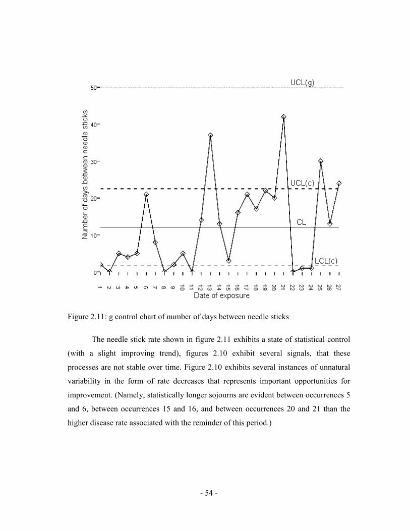
Figure 2.11: g control chart of number of days between needle sticks
The needle stick rate shown in figure 2.11 exhibits a state of statistical control
(with a slight improving trend), figures 2.10 exhibit several signals, that these
processes are not stable over time. Figure 2.10 exhibits several instances of unnatural
variability in the form of rate decreases that represents important opportunities for
improvement. (Namely, statistically longer sojourns are evident between occurrences 5
and 6, between occurrences 15 and 16, and between occurrences 20 and 21 than the
higher disease rate associated with the reminder of this period.)
- 54 -
Figure 2.11: g control chart of number of days between needle sticks
The needle stick rate shown in figure 2.11 exhibits a state of statistical control
(with a slight improving trend), figures 2.10 exhibit several signals, that these
able over time. Figure 2.10 exhibits several instances of unnatural
variability in the form of rate decreases that represents important opportunities for
improvement. (Namely, statistically longer sojourns are evident between occurrences 5
ccurrences 15 and 16, and between occurrences 20 and 21 than the
higher disease rate associated with the reminder of this period.)
The needle stick rate shown in figure 2.11 exhibits a state of statistical control
(with a slight improving trend), figures 2.10 exhibit several signals, that these
able over time. Figure 2.10 exhibits several instances of unnatural
variability in the form of rate decreases that represents important opportunities for
improvement. (Namely, statistically longer sojourns are evident between occurrences 5
ccurrences 15 and 16, and between occurrences 20 and 21 than the

- 55 -
Other recent “number-between” and “time-between” applications in which g
control charts have been useful include:
Ø The number of days between gram stain errors;
Ø The number of patients between catheter-associated infections;
Ø The number of blood cultures taken from patients with pyrexia between blood
stream infections (BSI);
Ø The number of days between preventable adverse drug events; and
Ø The number of medical intensive care unit patient colonized with
staphylococcus aureus between methicillin resistant (MRSA) cases.
Additionally, healthcare and other situations for which geometric distributions
and g charts have been found to be appropriate simply as a “state of nature”, although
sometimes counter-intuitive, have included certain patient length of stay (LOS) data,
recidivism (number of revisits per patient), the number of re-worked welds per
manufactured item, the number of detected software bugs, the number of items on
delivery trucks, and the number of invoices received per day (Benneyan, 1994). It is
important to note that these applications will not always be appropriate and, just as is
the case for other control charts, g chart should not be blindly applied without
investigating and verifying the under lying statistical distribution.